Too often people ask me, “what have you been reading lately?” and I don’t even remember. So here’s a way to keep track of/share at least some what I’m reading, especially the good stuff. I’m going to see if I can do it on a monthly basis:
MAY 2015
Really? I read just four short comics in the entire month of May? Pitiful. Embarassing. Well, maybe posting this disgracefully short list will be a lesson to me — and I’ll do better in June!
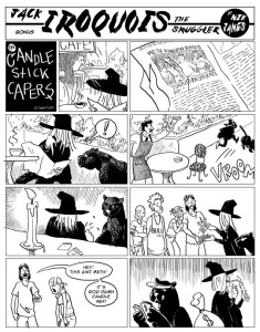
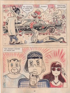
Transfatal Express by Nik James.  Even in the universe of alt-indie comics, this is a very eccentric book.  It’s done as a series of 1930s style “Sundays,” full pages, telling a pulpy tale of gangsters and molls, cursed jewels, hard-boiled cops, and … whatever.  What makes this so cool and weird is the way James stays true to the spirit of his main model (Roy Crane, as he helpfully points out in a clever “wanted poster” extra), while not slavishly copying a graphic style… the black and white art evokes Crane and other 30s strip artists — but also Ditko — and the “hero” of the comic, Jack Iroquois the smuggler, looks more like he wandered in out of a Leiji Matsumoto western.  Anyway, the whole thing is strange, fun and beautiful to look at.
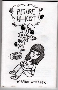
Future Ghost by Aaron Whitaker.  A 36 page mini from 2009; I don’t know how it ended up in my pile, being out of print, but glad it did.  A sad and funny story, very cleverly structured, about a young woman who house-sits a home with a ghostly presence. The way this comic works is very “medium-specific,” in its handling of time, of an invisible, inauduble character, and simultaneous dialogue.  Read it (if you can find a copy — its sold out, but i’ll lend you mine if you promise to give it back) and try to imagine it in cinematic or prose terms — wouldn’t work anywhere near the same.  The artist had some thoughts on this matter as well.
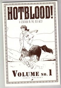
Hotblood! by Toril Orlesky. A pick-up from MICE 2014 (yes, that’s how behind I am in my reading), and a nice surprise. A western set in a slightly alternate reality in which centaurs and humans live side-by-side. This is a print version of a webcomic, and not being much in that world I don’t know how widely read it is. But as a book it’s quite good. The drawing has a loose rendering style but solid underpinnings, and Orlesky’s feel for the genre, characters and dialogue seems strong as well. She also lays out a well-conceived fantasy world, describing the culture and geographic distribution of the centaur minority.
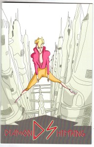
Diamond Shifting by Murray Huber III. A short first chapter of a science fiction story. Disaffected youth of the future, hanging around in the ruins of a 20th century city for laughs, then heading back to the gleaming towers far above. I really like the super-fine line drawing and unusual color sense; no clue where the story is headed, but it has a nice sci-fi slice-of-life feel. Acquired at MECAF 2015, where it made its debut.
February-March 2015
I’ve been too busy to update this… but it’s never too late, right?  February and early March were really slow for reading — I didn’t crack the mini-pile much, but made it through three GN’s:
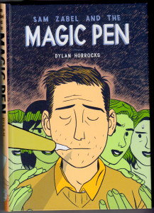
Sam Zabel and the Magic Pen by Dylan Horrocks.  I love the way Horrocks draws, and the colors make it even nicer. I really like seeing him apply his clean, indie style to fantasy and superhero imagery. Somewhat disappointed in the book overall, though.  Like most of Horrocks’ previous work, this is a comic about comics, but where Hicksville and Atlas are weird and inspired, Sam Zabel plays more off of stereotypes without ever really transcending them.  It’s fun enough, but rather thin. Horrocks seems most concerned with correcting mainstream comics’ tendency to feed male sex-and-power fantasies, a worthy goal,  but it results here in a cautious, eager-for-approval tone that has little depth.
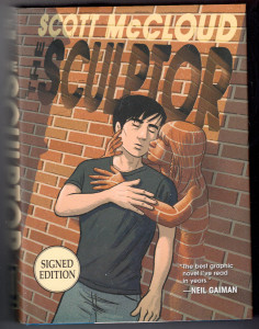
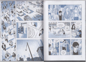
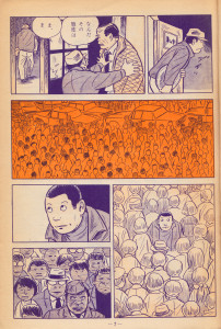
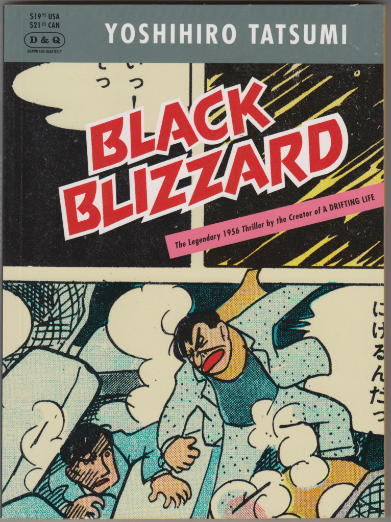
The Sculptor by Scott McCloud. I was struck by how much manga influence there is in McCloud’s work now.  I especially noticed a similiarty to Tatsumi as in the examples below (though the vertical panels and heavy use of “aspect to aspect” paneling, as McCloud calls it, aren’t Tatsumi features).  As for the story and characters in this 500 page tome, the less said the better.
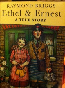
Ethel and Ernest by Raymond Briggs.  I haven’t read as much Briggs as I ought (he hasn’t done that many comics), other than The Snowman.  This graphic novel about his parents’ 50-year marriage is just lovely, focusing on the small, almost private world of their relationship and life together, as British 20th century history unfolds around them.  The watercolor art evokes children’s book illustration (which is what Briggs has mostly done).  As unpretentious, subtle and natural as those last two books are… not.
And just a couple of small-press gems:
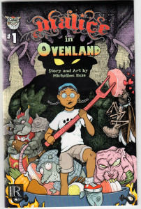
Malice in Ovenland #1 by Micheline Hess.  The first issue of a fun all-ages comic. Doing her kitchen chores, a girl falls into a creepy, smelly, greasy, magical world inside the filthy oven.  Hess’ drawing is colorful, simple and fun —  but not too simple: her pen-and-ink hatching helps create a fun/gross atmosphere for her fantasy world.  Recommended for kids — looking forward to the next issue.  From Rosarium Publishing.
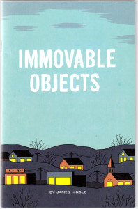
Immovable Objects by James Hindle. A nicely done minicomic, from 2012.  In the “sad, frustrated guy” genre of indie comics, looking like a minimalist Dan Clowes/Chris Ware/Adrian Tomine kinda thing… maybe that genre is a little overdone by now, but this one was worth the read: formally interesting and a nice text/image interplay.  The flatness of the visuals corresponds to the flatness of the protagonist’s affect.
JANUARY 2015
Not the sort of reading month I had planned — little progress in my huge pile of minis and graphic novels I’ve acquired over the last… oh, year, year and a half. Alexander Danner and I were asked to contribute a chapter on “The International Graphic Novel,” for a collection, so I re-read some stuff for that — which is great. Hard to find time to re-read things, but it’s always worthwhile. I did squeeze in some “first reads” as well…
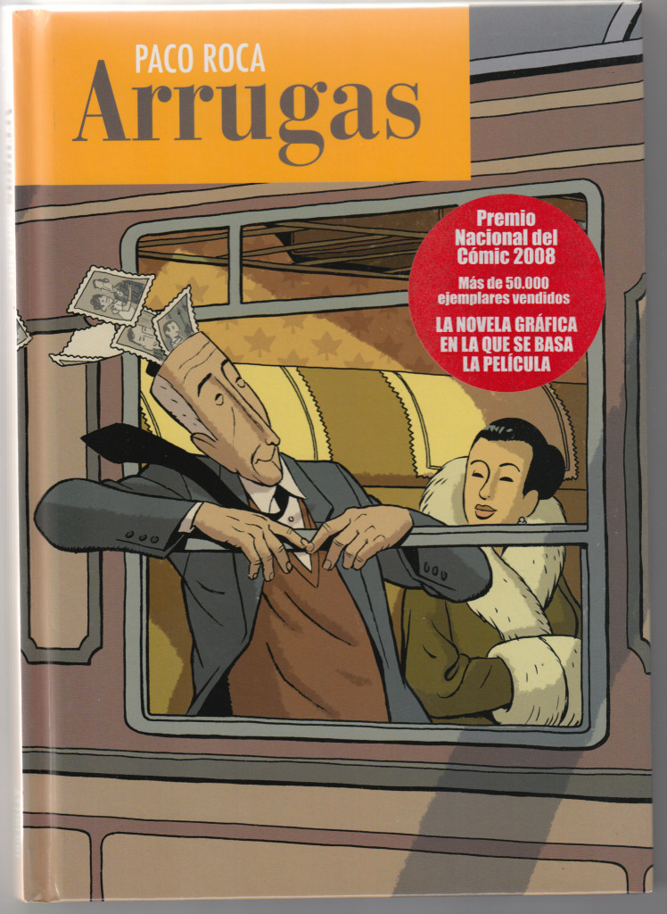
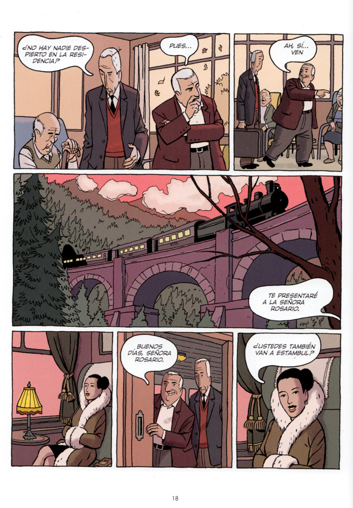
Arrugas by Paco Roca. A really wonderful Spanish graphic novel, about an elderly man (in the very early stages of Alzheimer’s) shipped off to a nursing home. Tthe community in the nursing home is very well developed, with the central focus on the relationship between the protagonist and his roommate, who starts off as sort of a scoundrel (he takes advantage of the more far-gone residents, to rip them off), but gradually becomes a well-rounded character. We switch between present day and the memories/dementia delusions of the characters. Of course there’s a lot of sadness, but the great thing about it is that despite the subject matter it’s also a very funny book and the humor can be pretty dark, without seeming cruel. Well drawn too.
 |
 |
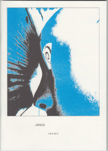 |
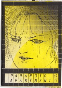
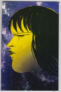
Paranoid Apartment, Alien Invasion & Janus by Lala Albert. Albert’s comics are alienated, strange and mesmerizing, her drawing style very distinctive. She draws her characters’ faces like sad, sullen masks, so it’s appropriate that the most recent (I think) and longest of these 3 mini comics, Janus, is about a woman whose identity is so unstable that she has no face of her own, but wears a mask and a sort of skin-suit to make herself feel real. The crumbly texture created by the riso printing goes nicely with the idea of dissolving self.
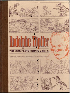
Rodolphe Töpffer The Complete Comic Strips, translated and edited by David Kunzle. I re-read the first four translated stories in Kunzle’s collection of Rodolphe Töpffer’s “littérature en estampes” (literature in prints): Monsieur Jabot, Monsieur Crepin, Monsieur Vieux-Bois and Monsieur Pencil.  As far as I’m concerned, Töpffer invented comics.  Who cares, right?  But maybe it’s not surprising that the originator of a form would do it with such inventive, witty, and imaginative energy: after nearly 2 centuries, these comics remain hilarious.  And check out that self-portrait — what a hipster!
DECEMBERÂ 2014
I Â didn’t read a whole lot of comics this month, compared to previous months. Especially not a lot of minicomics. I think the only minis I cleared from my huge “to-read” pile were:
 |
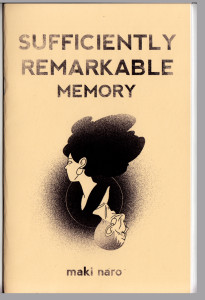 |
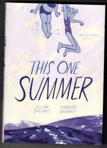
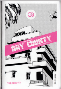
| Dry County by Rich Tommaso. I’ve always liked Tommaso, who works in the alt-comics tradition of Dan Clowes, Charles Burns, David Mazzuchelli et al.; his work has a similiar style and themes to those guys but has never hit it big with a graphic novel (yet). This one is a Florida-set noir-ish mini about a down-at-the-mouth cartoonist (what a surprise) and a femme fatale with some fucked-up baggage (it’s chapter one, I think the series runs on Act-i-vate, but I’d rather find the next mini). (update: I ordered it from him online at http://recoilcomics.bigcartel.com/) | Sufficiently Remarkable: Memory by Maki Naro. A mini I got at MICE 2014. Another one that comes out of a webcomic, it’s a touching little comics poem about the protagonist’s grandfather’s failing memory. |
I spent some time this month catching up on a few of the GNs that got a lot of attention this year, including a couple that made a lot of the “Best of the year” lists:
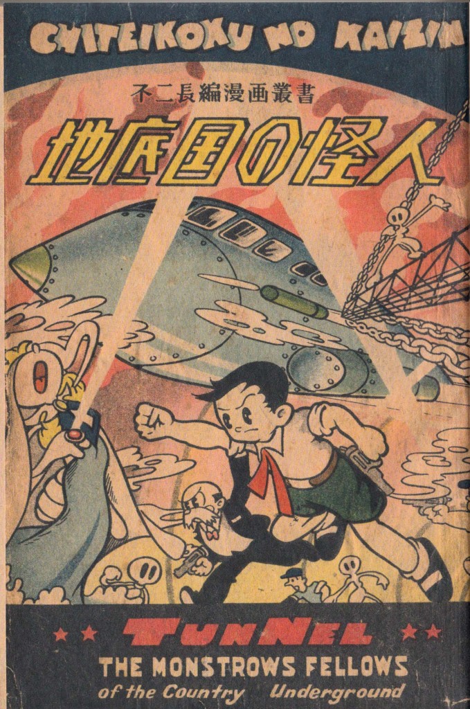
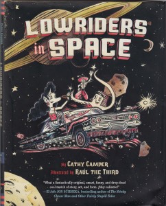
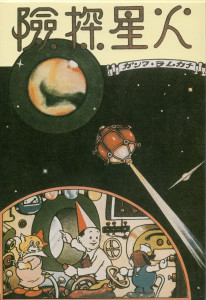
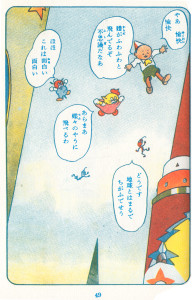
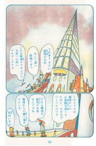
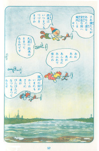
Then, two great kids’ adventures in space comics, made on two different continents, 75 years apart, but seem to me to have a certain kinship:
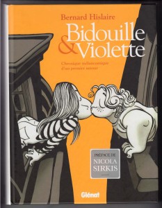
It doesn’t come up in any of the histories of Franco-Belgian comics that I’ve read, but I saw this page online while browsing original art sites. 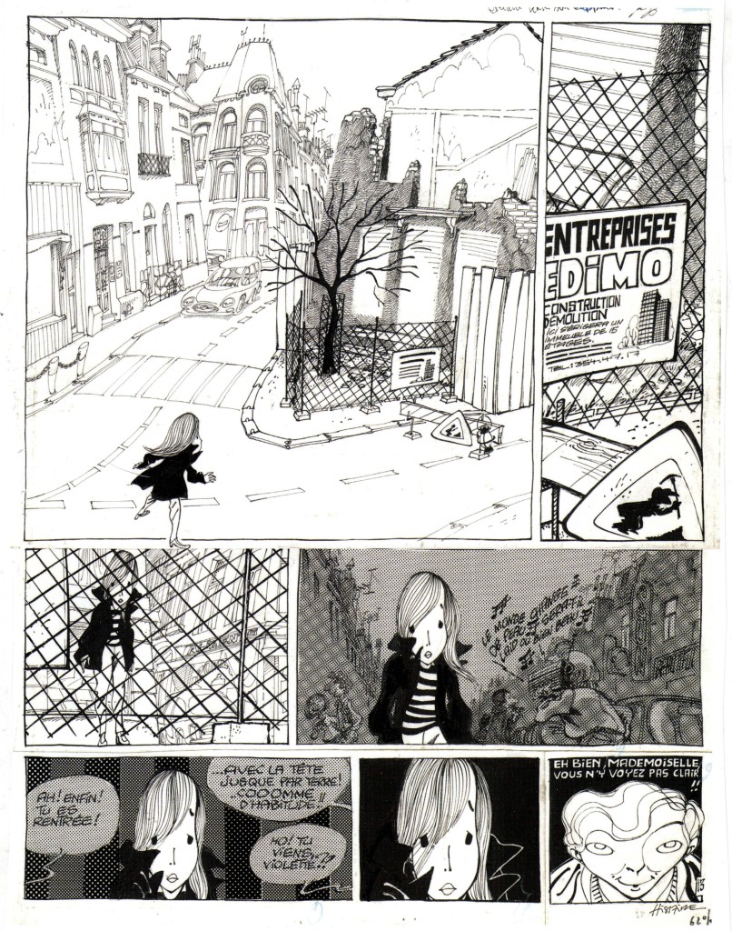 I was intrigued by the unusual line-work and atmosphere, the drama created by the page, the way he draws the hair and the weird eyes. Â The page stuck in my mind, and after some months of vacillating, I sprang for the collection from Amazon France.
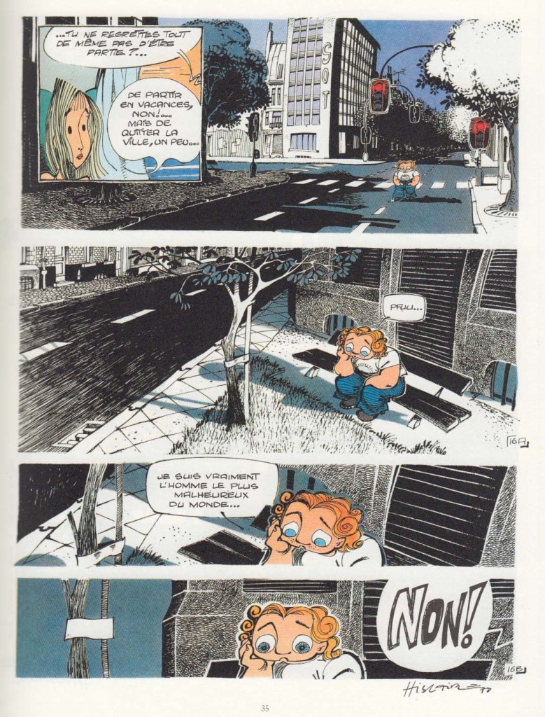
The love is between two shy teenagers in a provincial French-or-Belgian city (the fictional town of Mayon, so that the inhabitants can be referred to as Mayonnaise, *chuckle*), their innocent youthful passions somewhat inexplicably foiled by un-supportive parents. At first, I found the comic a little too twee, but by the end of the book, which comprises material that made up four albums, I felt positively about it; it’s rather uneven, perhaps reflecting the youth of its artist-writer Hislaire (just 21 years old when the series began). The early chapters do verge on twee-ness, as we meet the tender young proagonists and follow their halting progress toward young love. There’s a lot of graphic energy and inventiveness, though: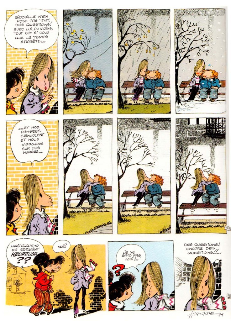
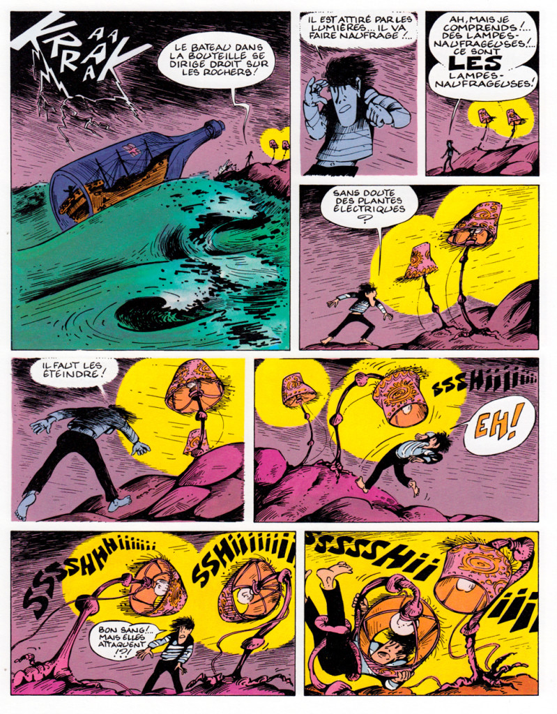
Then there are some episodes of misunderstandings and jealousy, from which we veer into a psychedelic dream sequence that takes up nearly a full album…
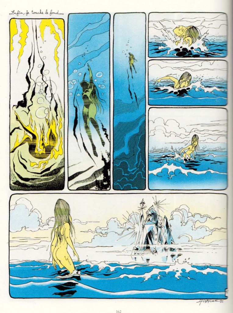 …followed by a slightly absurbist episode of B & V going on an urban “mountain climbing” adventure over the roofs of the town. Â
…followed by a slightly absurbist episode of B & V going on an urban “mountain climbing” adventure over the roofs of the town.  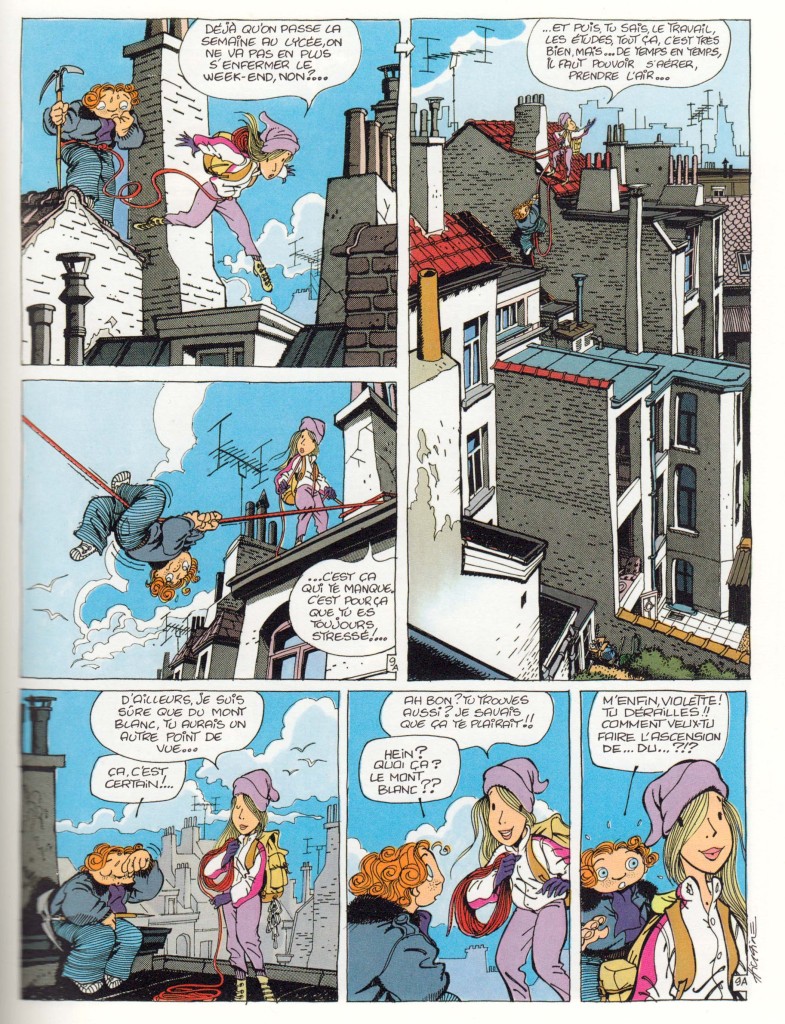 Finally the story resolved by invoking Romeo and Juliet for a surprisingly dark conclusion.
Despite this somewhat flailing approach to story, there’s a sincerity and intensity of feeling that I bet accounts for the fond memories it inspires in those who read it as adolescents. Throughout it all, I remained fascinated by Hislaire’s style, which falls into neither of the two dominant Franco-Belgian “schools”: the precise, Hergean ligne claire style, or the rounded Andre Franquin-ish look that generally charactertized Spirou. Hislaire favors eccentric shapes for his characters’ heads and figures, a wide variety of types of line and texture marks, all contributing to the loose, askew world he creates. 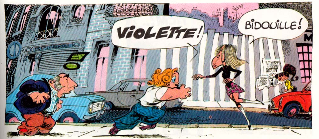  His style (or his graphisme, as the French would say) reminds me a little bit of Fred, the artist of Philemon, though they work in very different modes, of course.(1)
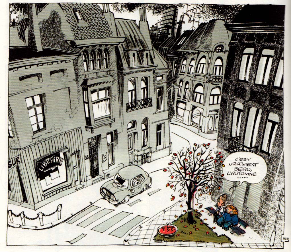
Hislaire especially excels at drawing the settings his characters inhabit and move through, using them to create mood, especially the cityscapes.
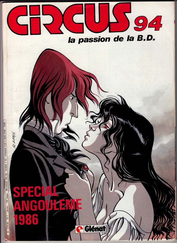
 After Bidouille & Violette, Hislaire launched the series that really made him a bande dessinee star: Sambre, which ran in the new journal, Circus. Very very different from B&V, a more serious and adult romantic adventure, set against the French revolution of 1848, and drawn in a completely different, more “realistic” style. To punctuate this dramatic shift in style and tone, Hislaire even changed the spelling of his name to Yslaire. I haven’t read Sambre; I’d always lumped it in with what I consider a mediocre slate of historical comics in Circus, but, as with Bidouille & Violette, there’s something about the look of it that’s always intrigued me; I think I’ll give it a shot sometime soon.
(1)NOTE: I should point out that two of Fred’s fantastic Philemon adventures were finally released in English this past year by Toon books – with no fanfare whatsoever. I haven’t seen the English versions, but these are really wonderful imaginative French classics, for all ages.
