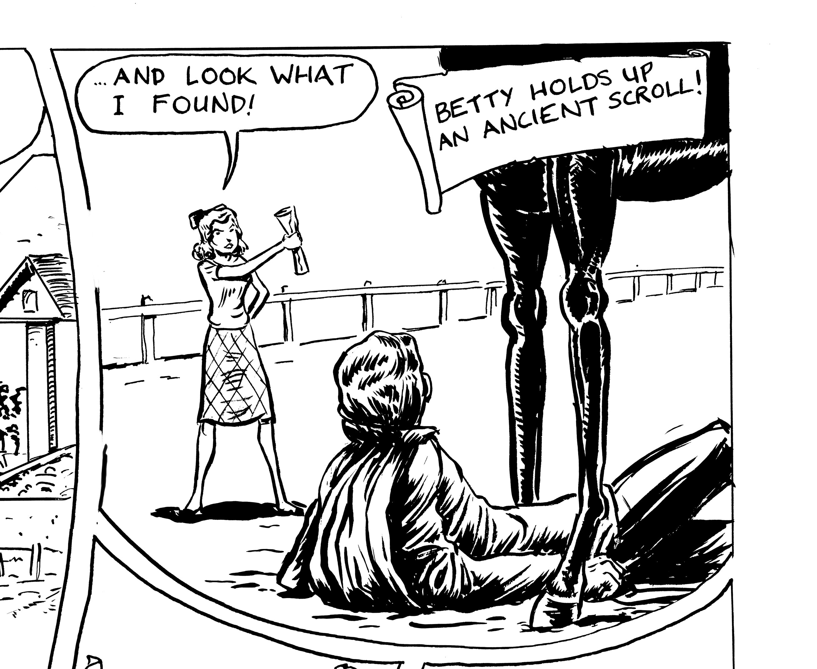
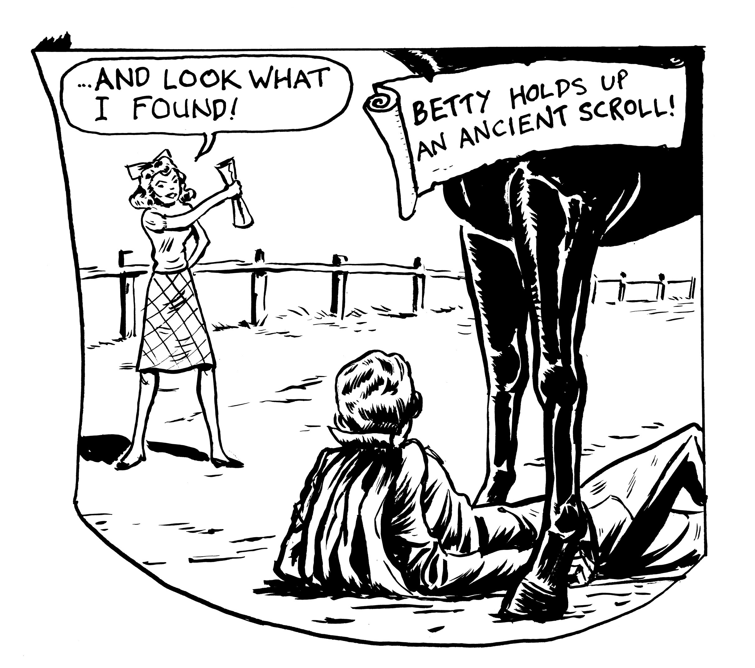
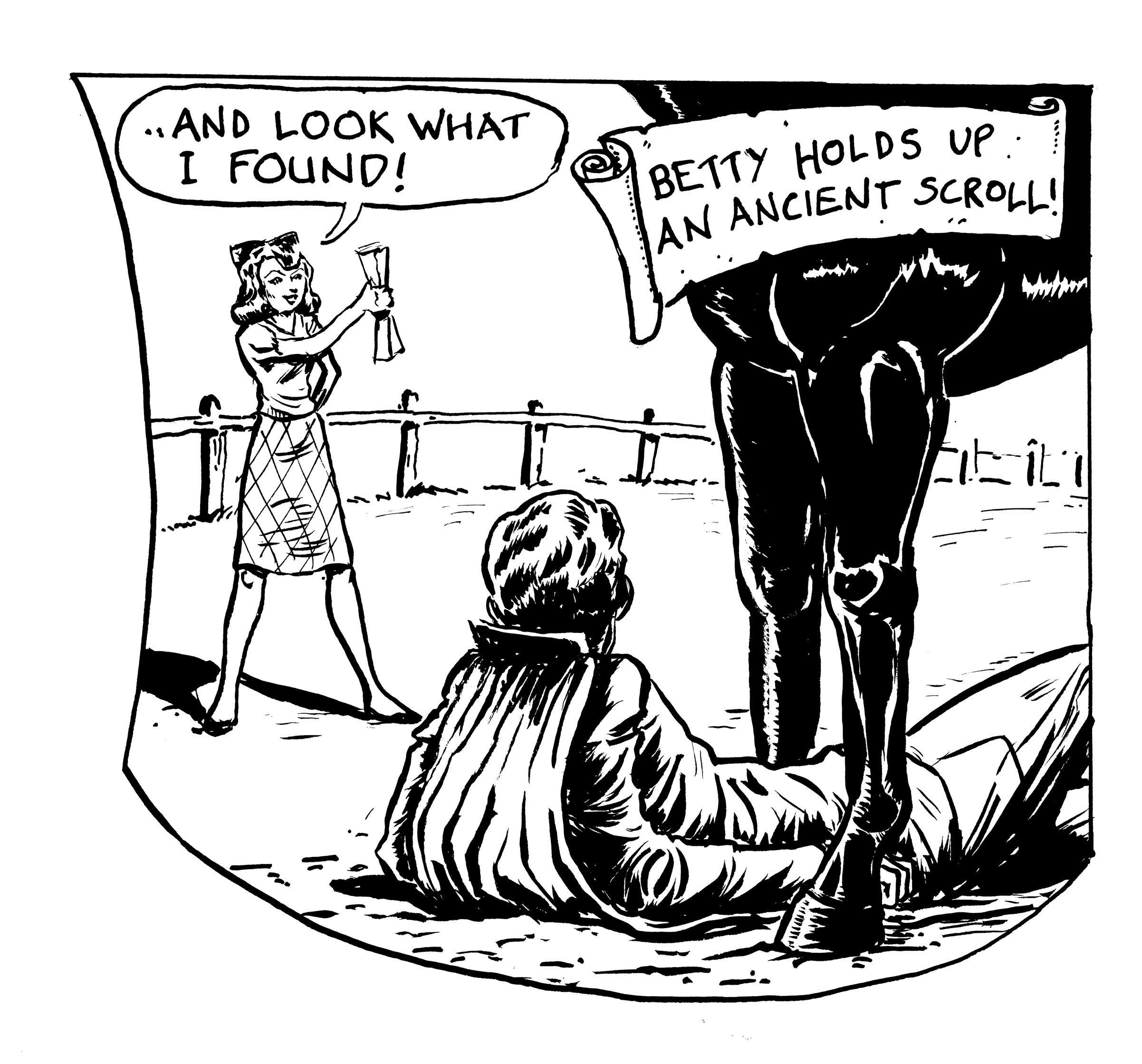
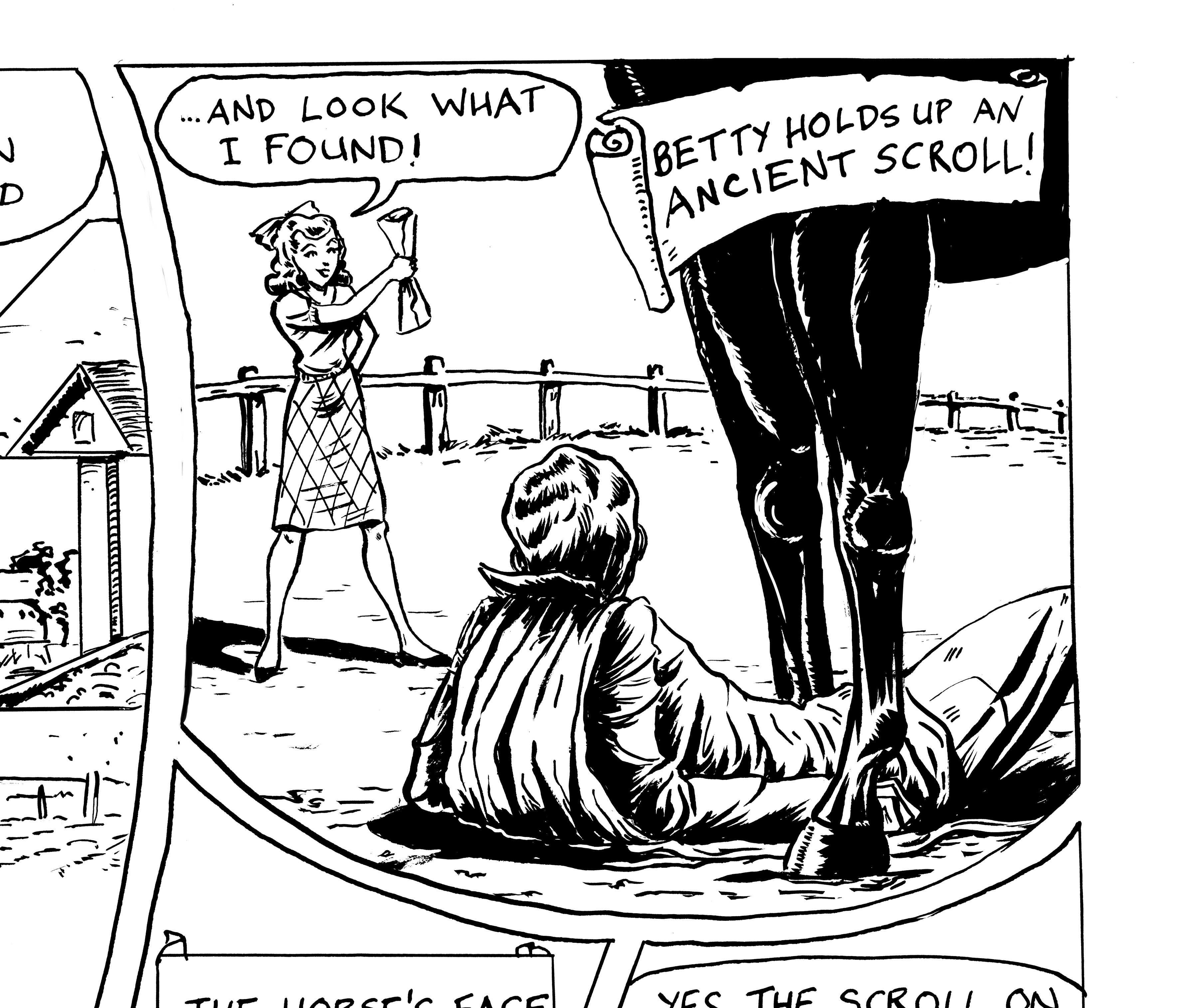
Another bout of obsessive panel re-drawing…. Â Today, it is the second panel of page ten (next-to-last page of the story!) of “Hooves of Death,” the faux-Golden Age story I’m drawing from a script by Troy Minkowsky….

When I finished the page, I realized that I had messed up the perspective in this panel. Â Either Betty is about twenty-four inches tall, or the horse is gigantic. Â I could have probably figured out the perspective if I’d taken the time… but it’s the next to last page of the story, and I’m getting rushed and lazy! Â I tried to convince myself to just leave it as it is and move on. Â I took the page to the Boston Comics Roundtable meeting, though, and got some good feedback (as usual). Â As well as the scale problem, it was pointed out that the horse’s legs are funny — more like table legs.
Well, it’s not like I haven’t studied horse anatomy a bit in the course of this project, but since I’m getting rushed and lazy (see above), I thought I could wing it, and not actually look at horse reference this one time. Â The result: it looks like the Ghost has had a bit too much to drink and finds himself under the dining room table, which for some reason is on a racetrack.
Again, I tried to convince myself I could live with this… but… my consience nagged at me, and it was draw-it-over time.
What followed was a strange blend of diligence and laziness. Â I just started re-drawing, perfectly willing to draw the whole panel over and over, but still refusing to do any diagrammatic “figuring out” of the perspective (though I did look at horse-leg reference), going with trial-and-error instead. I just felt like doing it the stupid way (or the intuitive way, to be kinder), that’s all I can say. Â I got Betty better-sized, but then the relative sizes of the Ghost and the horse’s legs would seem wrong, so I tried it again… and again…
Did I stop when I got it right? Â Or did I just run out of gas? Â You be the judge….

I think the Ghost looks too small relative to the horse.

Now I think the Ghost looks too BIG relative to horse, and the horse’s legs are too squat.

A little better. I think my favorite drawing of Betty so far, and the relative sizes of the figures seem okay… though the horse’s right leg looks not quite right… but there’s the bell, class is over!