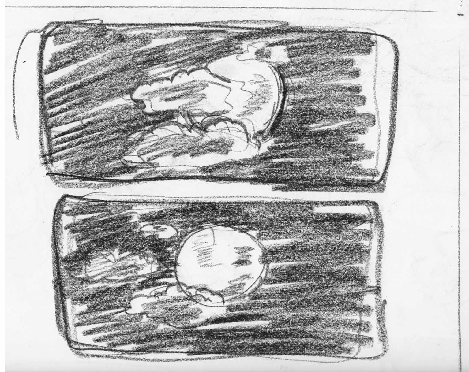
Still stealing little bits of time when I can.  I’m still fiddling with the page layouts.  I feel like I want an additional baby reaction image in there, to break up the 3 moon pages in a row in the latest thumbnail.  To keep the page count the same I’m pondering doing a panel page: 2 moon images on one page, with the clouds moving away from in front of  it:
Maybe.
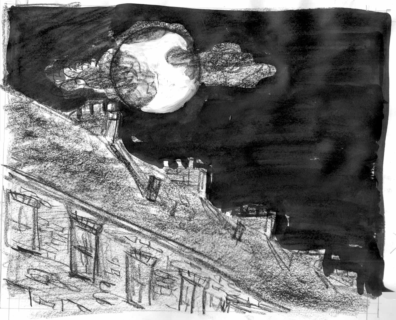
But that’s jumping ahead. Â I did a rough version of the fourth page:
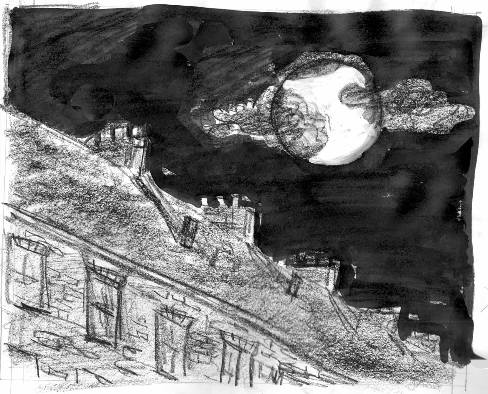
Or is it better this way (digitally altered for now):
I think that composition gives a better feeling of the moon “looking down” at us.
(work interrupted for a few days by going to Small Press Expo in Bethesda. Â When I come back and asses….)
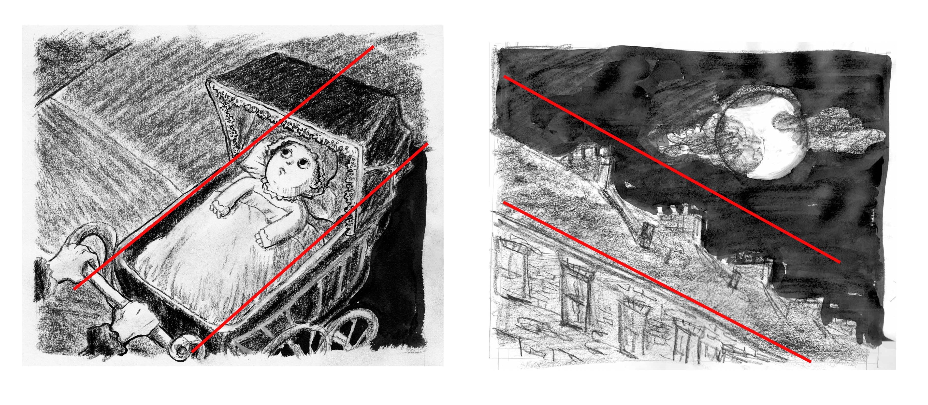
Now I begin to question my composition of this spread. Â Thinking in terms of the sort of “eye flow” that I usually take into account when laying out a panel page, I’ve been pretty convinced that the complementary angles between the 2 facing pages was crucial :Â 
But looking at it, I feel like this composition doesn’t actually work as well, in terms of feeling the 2nd page as the point-of-view of the baby on the first page. Â Going back to an earlier sketch (but using the moon/clouds from this one), I think this works better:
I definitely think that in the bottom spread you feel much more that you are the baby looking up at that moon in the second page. The angle of the rooftops is how the baby would see it (unless she’s looking across the street).


