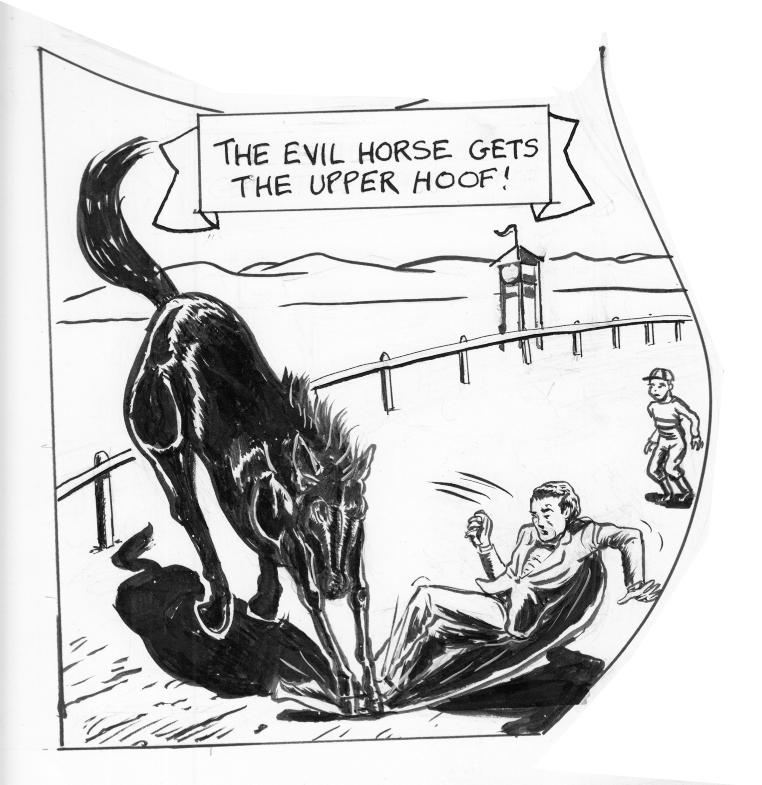
I just drew the same panel — page 8, panel 5 — four times. Â  Version 1, in the original page. Â I got feedback that it looked like the horse was crushing his feet, and I didn’t like the falling figure much, and I thought I could do better on the horse.
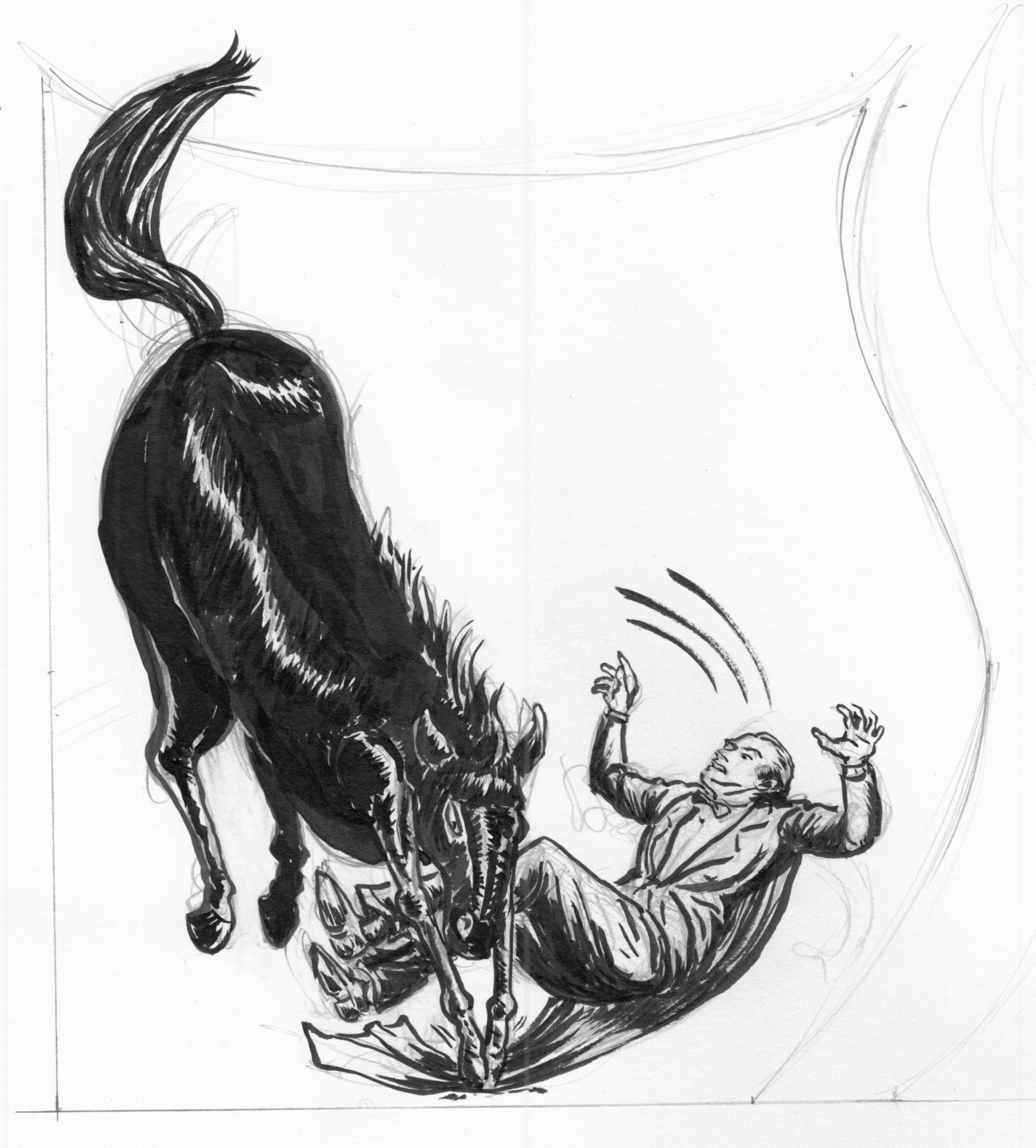
Version 1, in the original page.  I got feedback that it looked like the horse was crushing his feet, and I didn’t like the falling figure much, and I thought I could do better on the horse.  Version 2 (aborted). I can’t remember what I didn’t like about this one, actually.  Maybe the fact that the horse looks like a large sausage,  not enough detail in the reflections off the fur.  Oh also I think the guy is too big relative to the horse?
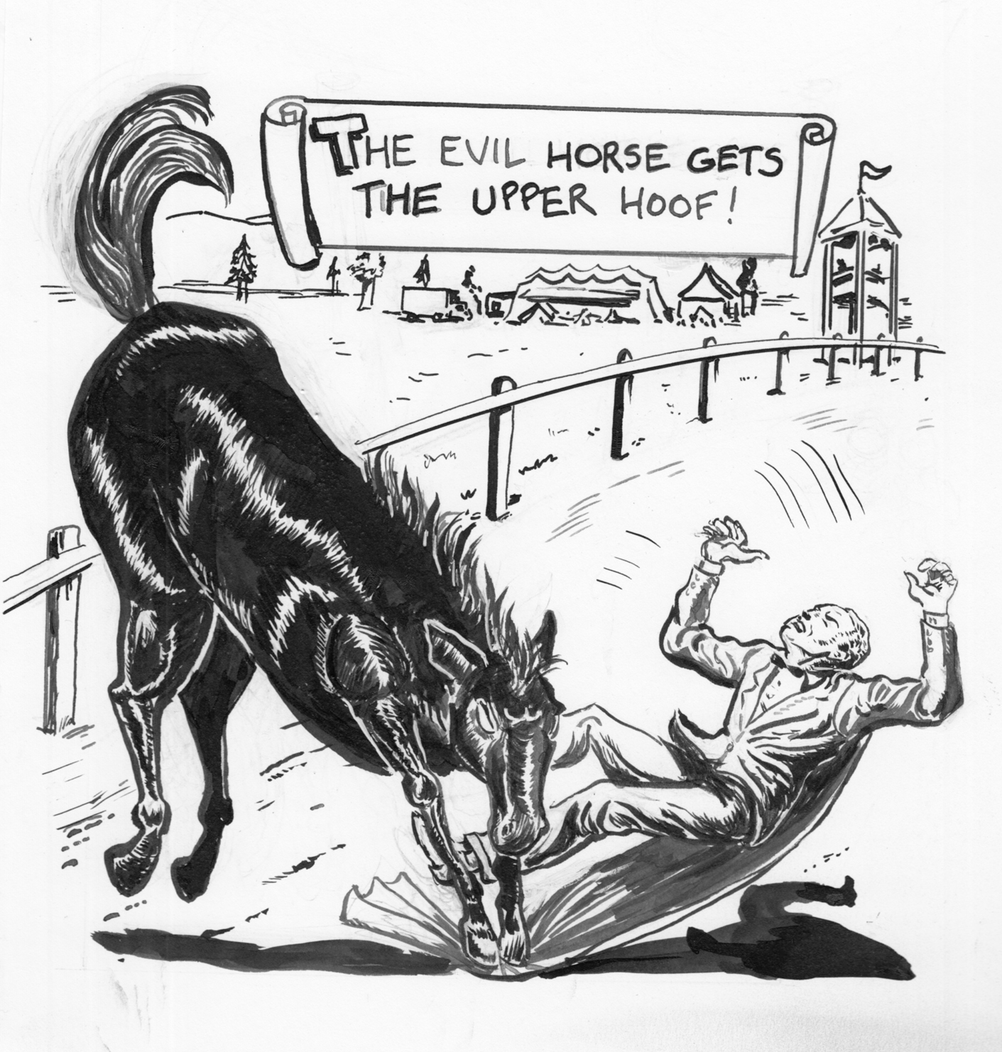
  Version 3… Everything better, except the way I changed the position of the horse (in order to make it bigger), making the panel less dynamic. Now the horse looks stiff and even more sausage-y.  Also, still relative size problems.  Either a very large man or a pony, not a horse.
Version 3… Everything better, except the way I changed the position of the horse (in order to make it bigger), making the panel less dynamic. Now the horse looks stiff and even more sausage-y. Â Also, still relative size problems. Â Either a very large man or a pony, not a horse.
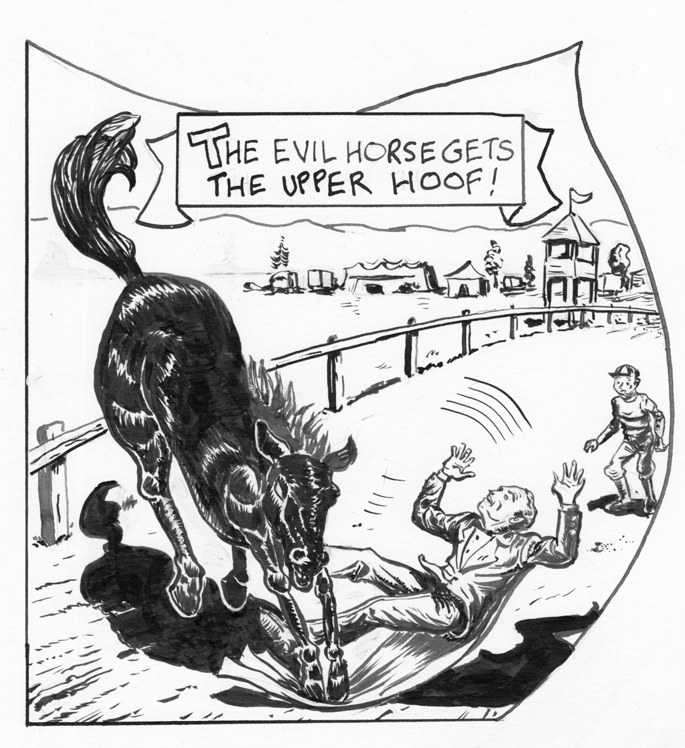
 OK.  The figure was probably better in 2 and 3, but overall the best, I think. Composition works… I think my best horse, and put more care into the background details as well. Oh, well, time to move on…  wait, actually… I think there should be heavier shadows on the guy’s right leg…