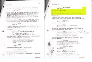
A peek into my personal process, from script to finished page, for a single page of my comic “The New Kid,” chapter 2 of which can be seen (or soon, anyway) in “Outbound #3” fromRiverbird Studios.
We begin, at least in this case, with the script (sometimes I don’t write a full script, just thumbnails with dialogue notes). The yellow highlighted area is the section of script represented on the page in question — a pretty small amount of writing for what will be a 5-panel page, but maybe that’s the comics equivalent of the screenwriting maxim that action-heavy writing translates into more minutes-of-screentime-per-page than dialogue-heavy writing.
So I’m just really working on those three lines of description, but I want to make it exciting, dramatic, emotional.
In this comic, I’m trying to layout pages with as much variety and playfulness as I can. I decided to do a page of vertical panels as Jamie runs through the crowd. The idea is that the tight, tall panels would reinforce the claustrophobia of the crowd as well as the movement across a distance. I was inspired by some panels from Osamu Tezuka comics I’ve read lately: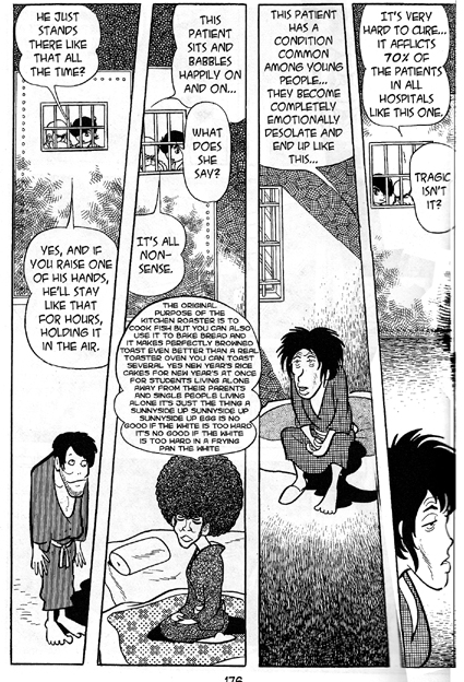 Above is a page from “Apollo’s Song.” The protagonist looks into a series of cells in a mental ward — the thin vertical framing suggests the patients’ captivity, and allows a distance between the voyeurs and the patients, down the length of the vertical. Next is a page from “Insect Woman”:
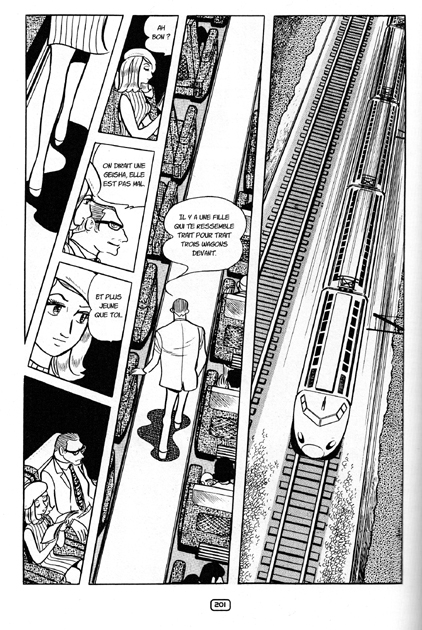
Here, the characters are on a train, so the verticals mimic the narrow interior of a train, and provides a format for speedy forward movement (albeit on the up-down instead of the right-left axis).
As Tezuka does in those pages, I chose not only a vertical format, but one with irregular diagonals, to support the hectic movement of the character through a large, crowded space. In fact I wanted my diagonals to be even more irrational and eccentric.
I begin by thumbnail sketches in pencil, usually in a sketchpad or copy paper. They’re about 3-4 inches high, and I do as many of them as needed until it feels right. Here are three thumbnails for the page: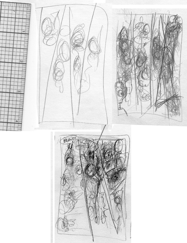
They’re scribbly and probably no one but me could make head or tail of them, which is fine.
By this point I was realizing I needed a little dialogue in the page, to dramatize Jamie’s efforts to a) call to his mom and b)get through the crowd. You can see little word balloons in the thumbnails.
I usually don’t go straight from thumbnails to the final page, I like to take one more intermediate step (sometimes two steps, but in this case just one, for reasons I’ll get to).
I do a rough pencil drawing at the size that the page will ultimately be reproduced — in this case, about 8″x5″. At this stage I:
a)further refine the layout, and
b) reassure myself that all the information — visual and text — that I’m putting on the page will be legible at the final size.
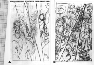 (Click to enlarge, by the way)
As you can see, I scribbled these pages out in pencil and then inked loosely with a marker, to get a clearer idea of where the shapes will be. I was still looking for the right panel shapes in the first one, and abandoned it. The second one is pretty close to where I’ll end up.
I tried to give the panel shapes a sort of off-balance, “tipping over” feeling, falling from left to right, hinging on the lower left corner of the page.
I had also decided to split the fourth vertical panel into two, with the smaller one at the bottom like a little punctuation mark for the page as Jamie falls on his ass. The onomoatopoeic “thud” gives a little finality to the action.
I added some more dialogue, now realizing that it would also be helpful for the pacing as the reader’s eye moves over the page – it’s a fast moving little sequence, but I want the reader to take a little time with it.
I was satisfied that things were working as far as the story-telling, layout, etc., and ready to draw the final page… which I’ll do in Part 2!
