With the page layout solidly established by the rough sketch, I proceed to draw the final page in blue pencil. I switched to blue pencil from regular pencil a few years ago, mostly for the convenience of not having to erase (it’s easy to remove the blue in photoshop), since I do a lot of “finding” in my pencils. But there’s another benefit to it as well:
I’ve found that drawing in blue pencil, which is generally a waxy and unexpressive line, and very limiting as far as shading, I’m much less likely to do a “drawing” that I become attached to for its own sake… and then ruin with inks! The subtleties and softness of graphite are very difficult to translate into ink, while a rough blue-pencil sketch can function as more of a blueprint for the real drawing: which is the inks.
Here’s the blue pencil for this page: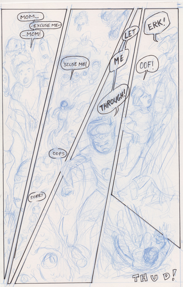
As you can see, I’ve inked the panel borders, lettering and word balloons as well. I did that with a micron-type pen (the thicker letters I did with something else, I don’t remember, maybe a brush pen).
I made some further refinements to the composition, arranging the position of Jamie’s figure in the first three panels so that the eye of the reader follows him in a downward diagonal (reinforcing that “falling over” panel arrangement)… then is “pulled up short” as he is, when he slams into the creature’s chest… leading to the straight-down drop to the final “thud.” 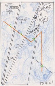
It’s not that the artist can force the reader’s eye along any path; rather, when we’re reading a comic we DO want to follow the main character or action from panel to panel, so I’m just trying to place the character in a way that is a) natural for the eye to land on, and b) arranged for a dynamic motion, that I feel suits the action and mood of this specific page — for other types of pages a looser or more nuanced composition would be better (and this is all in the context of an overall stylistic choice for this story: to use a lot of variety in the layout, to be playful with panel shapes, an “ostentatious” layout as Thierry Groensteen refers to it in “The System of Comics.”)
I think the placement of the dialogue balloons generally help the layout effect I was going for, though I’m not sure about the “oops” and “sorry” in panel 2…
Inks. Or, rather, “Inks…”
..because I decided to ink this story digitally — in Photoshop, with a wacom tablet. I’ve used this method for the occasional illustration or panel gag or one-pager before, but every real story I’ve ever done, I’ve used brush- or pen-and-ink. There’s no replacing the risks and rewards of wet ink and physical drawing instruments, but I like the pressure sensitive line of the wacom fairly well, and in this case, wanting a somewhat slicker-than-usual feel, I opted for 100% digital inks (except for the panel borders and word balloons, perversely enough: I don’t want it to LOOK digitally inked, so I figured such hand-drawn touches might work subliminally toward that end).
The biggest pitfall of using the wacom is that it encourages fussiness — you can correct and correct and correct — so I try to live with my first line as much as possible, or when I correct, to erase an entire line and star over as opposed to fussing.
I inked the page in a couple different layers, for maximum flexibility. The blue-pencil is its own layer, of course. First I created a layer for the main figure inks, and executed thus: 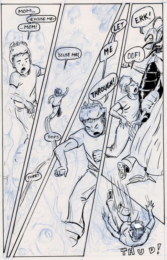
Next I create another layer to ink the background figures. I use a thinner brush with no variation in line thickness, to make the foreground figures stand out more: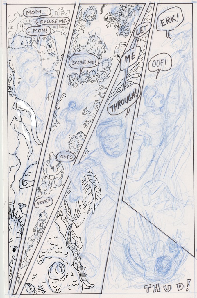
I’ll make another layer to do some “whiteout” and corrections, such as this one, so that Jamie’s face makes more contact with the creature when he smashes into it: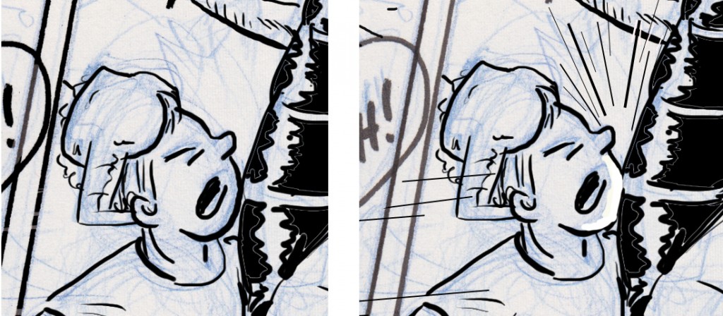 …then another layer for speed lines, impact lines, that kind of thing, some of which I did freehand, others using the line tool, put it all together and voila:
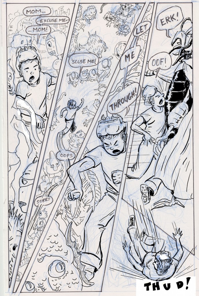
Oh, and then just remove the blue-pencil layer**, and there you are: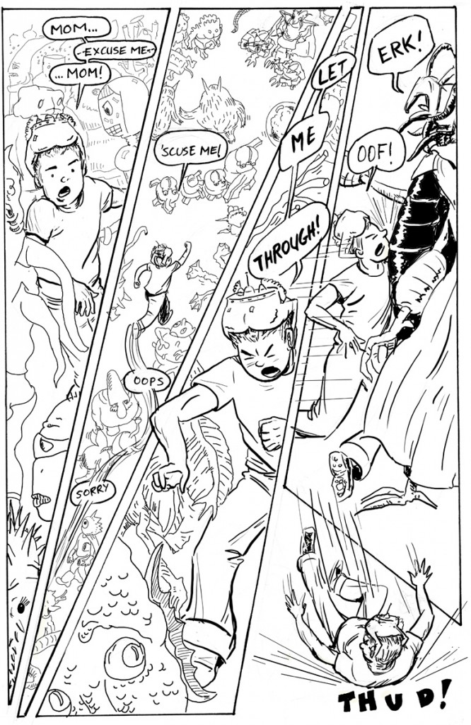
****Note on removing blue pencil: if i had inked the page conventionally, after scanning I would open the “channels” window in photoshop, create a copy of the blue layer, then go to “Image/Mode” and change it to grayscale. The blue disappears. Some of the heavier pencil lines might faintly remain, but you can get rid of those by adjusting the levels or contrast. In the case of this page, I went through that process only to create a separate layer for the panel borders and hand lettering; that was my first step after scanning: copy the blue pencil layer, perform the above set of steps to get black borders and letters, then re-insert the blue pencils layer to ink over.