The format of the book is square (8″ by 8″) and I’m planning to tell this story in 11 pages. Â There will be an introductory page with some set-up information. Â Something like this:
” In 1701, war broke out between England and France. In the New World, the English colonies and New France (Canada) soon followed suit. Much of the fighting was done by Native American tribes allied with the two colonial powers. Settlements in the western frontier of New England were especially vulnerable to Indian raids; for the French, these raids served to terrorize and demoralize their British rivals, while for the Natives – Mohawk, Huron, Abenaki – a main goal was the taking of prisoners. Most of the captives were then ransomed back to the English for profit. Most, but not all…”
Except for the scenes in which they both appear, the comic will be divided into “Eunice†and “John†sequences, corresponding to full pages as often as possible. The John sequences will be narrated, wherever possible with excerpts from his actual writing. The Eunice sequences will have no narration, and not much dialogue.
My “script” is minimal, since I’m writing it for myself alone. Â Here is how I scripted page one (the text in quotes is from John Williams’ book, “The Redeemed Captive.”):
PAGE 1:
“ON the twenty-ninth of February, 1704, not long before the break of day, the enemy came in like a flood upon us.â€
Mohawk warriors scale the fence and enter the town.
 John is woken, in bed, reaches for his pistol but is jumped by several Indians as it misfires.Â
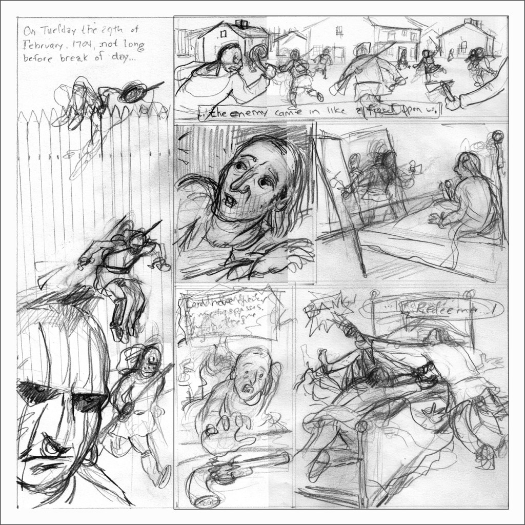
That’s all I wrote. Â And here are my rough pencils:
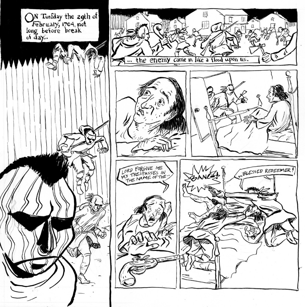
For the first time, on this project I am using a light box, so I can stay closer to my planned compositions. Â I re-pencil over the roughs on the light box, then ink (with the lightbox off). Â Thus:
Nope. Â Not happy with it. Â For a few reasons, but mainly the drawing style. Â In too much of a hurry to get started, I didn’t keep in mind the sort of stylization I was planning to employ. Â The style in which I drew John’s face, in panels 3-5, is blandly “realistic.”
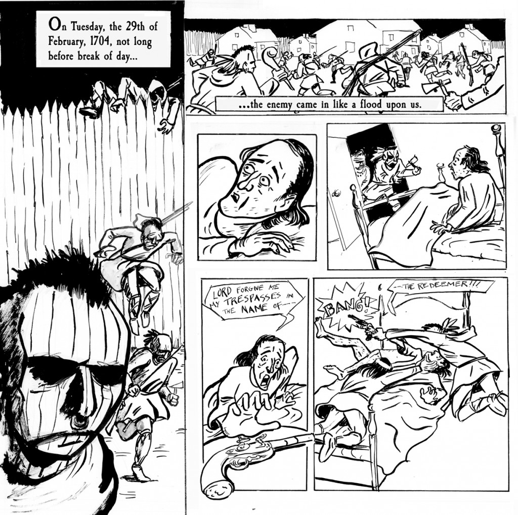
I’m happy enough with the composition though, so thanks to my new best-friend the lightbox, I can concentrate on the drawing in the next version:
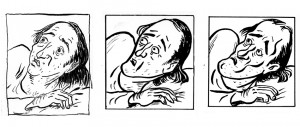
NOW I’m very happy with that head in panel 3. Â Being more aggressive with a stylized approach: fewer and bolder lines, stronger shapes. Â It looks like someone better than me drew it! Â (panel 3, Â on the other hand, looks like an inexplicable cameo by Harvey Pekar, but OKAY!! Â Enough!! Â Move ON!)
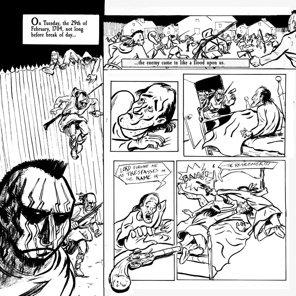
….and yet… Â if we can peek forward in time a little, I will have found that, in subsequent pages, Â my depiction of John has changed from when I drew that head. Â I hate to lose it, ’cause I still like it, but he just didn’t end up looking like that, so I have to go back and re-draw yet again those panels:
Plus I fixed a few things in that first panel. Â Okay now I’m done with the first page. Â At least for now.
(Oh and don’t forget: these pages are going to have to be colored, too!)
