
Continuing the process of drawing a short comic about John and Eunice Williams and the Deerfield Raid of 1704, for Colonial Comics anthology from Fulcrum Press…
Where the first 5 pages were primarily visual, these two switch to a dialogue mode. Â The majority of the dialogue is taken from John Williams’ text, some of it moved around from different parts of the book. Â For instance, the story John tells Eunice of the girl who’s forced to wear the cross, was actually a story told to John by his son (who was also captured) in a letter. Â I’m not sure if John had heard this story when he met with Eunice for the first time at Kahnwake, but I thought it presented his attitude toward children in captivity pretty well.
My script:
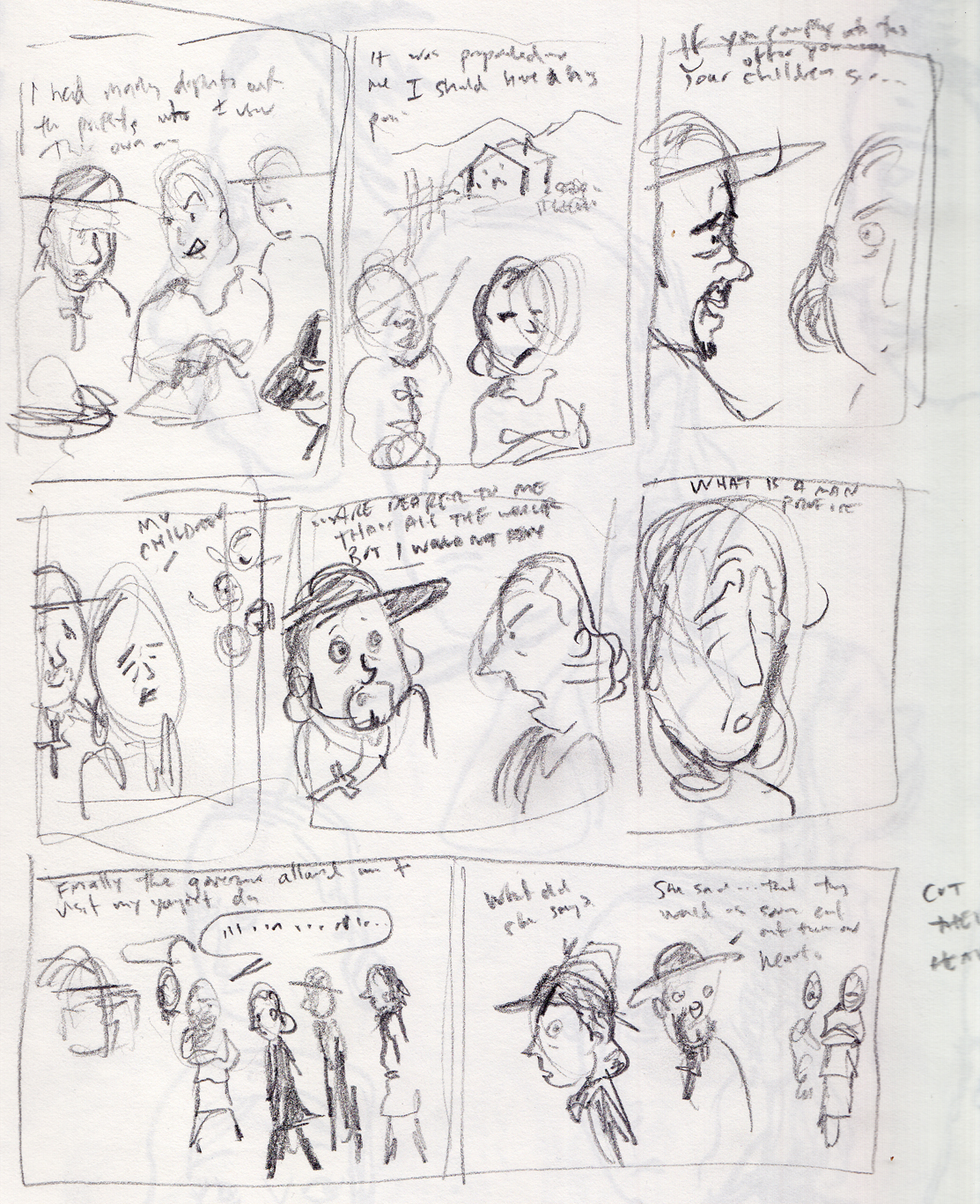
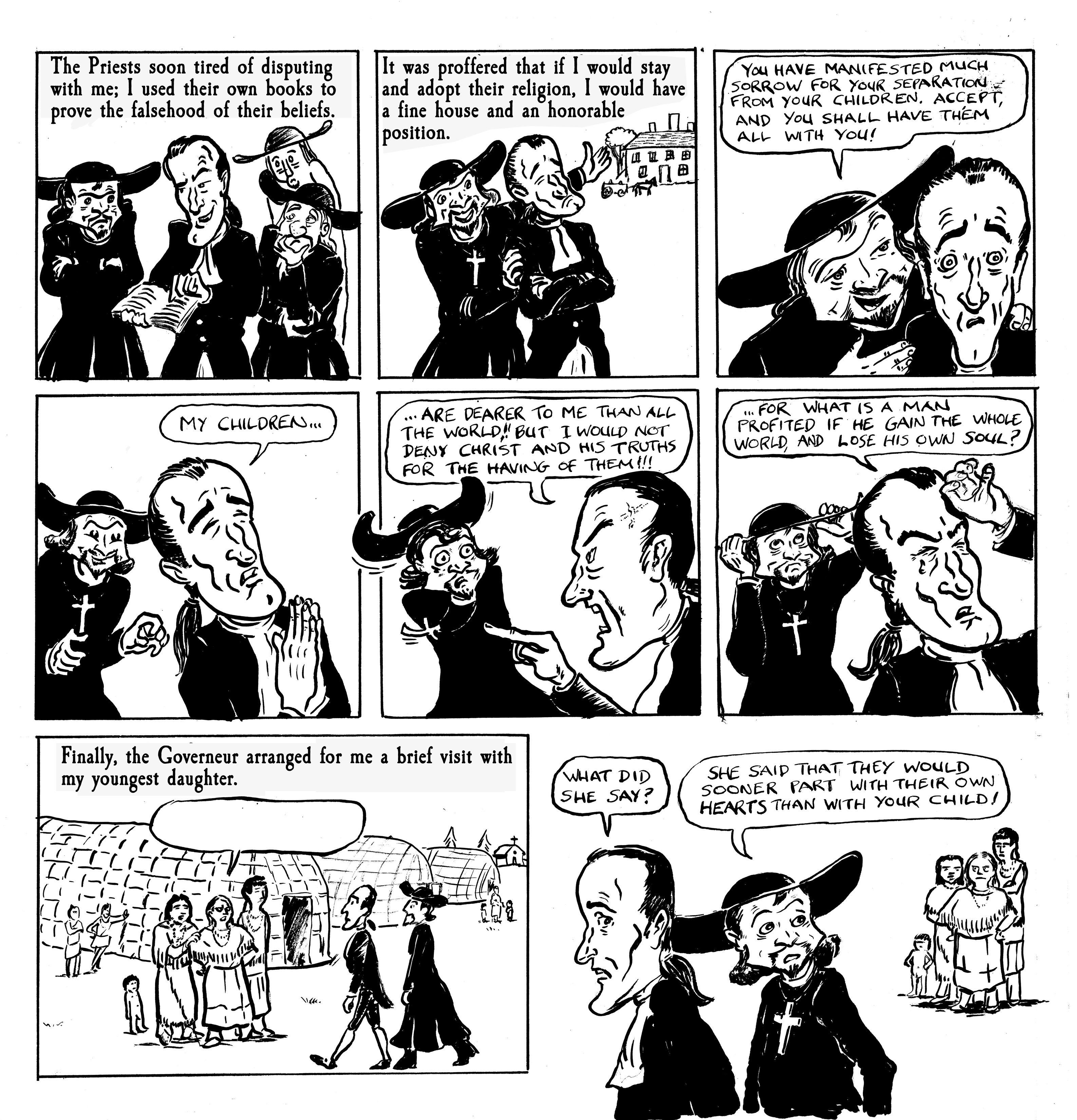
PAGE 6.
The Jesuits attempt to get John to convert (“by all means of flatteries and threats). Some of the following text to be used:
 I had many disputes with the priests who came thither; and when I used their own authors to confute some of their positions, my books, borrowed of them, were taken away from me, for they said, I made an ill use of them.
It was propounded to me, if I would stay among them, and be of their religion, I should have a great and honourable pension from the king every year. The superiour of the Jesuits said, “Sir, you have manifested much grief and sorrow for your separation from so many of your neighhours and children; if you will now comply with this offer and proposal, you may have all your children with you; and here will be enough for an honourable maintenance for you and them.†(and never expect to have them on any other terms)I told them, my children were dearer to me than all the world, but I would not deny Christ and his truths for the having of them with me.  What is a man profited if he gain the whole world, and lose his own soul?
 “After much supplication, Governour de Vaudreuil (of New France), arranged for me to see my youngest daughter.â€
 John is brought to Kahnawake see Eunice. Before he sees her, the Mohawk tell him that “they would as soon part with their hearts as my child.â€
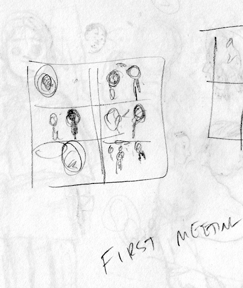
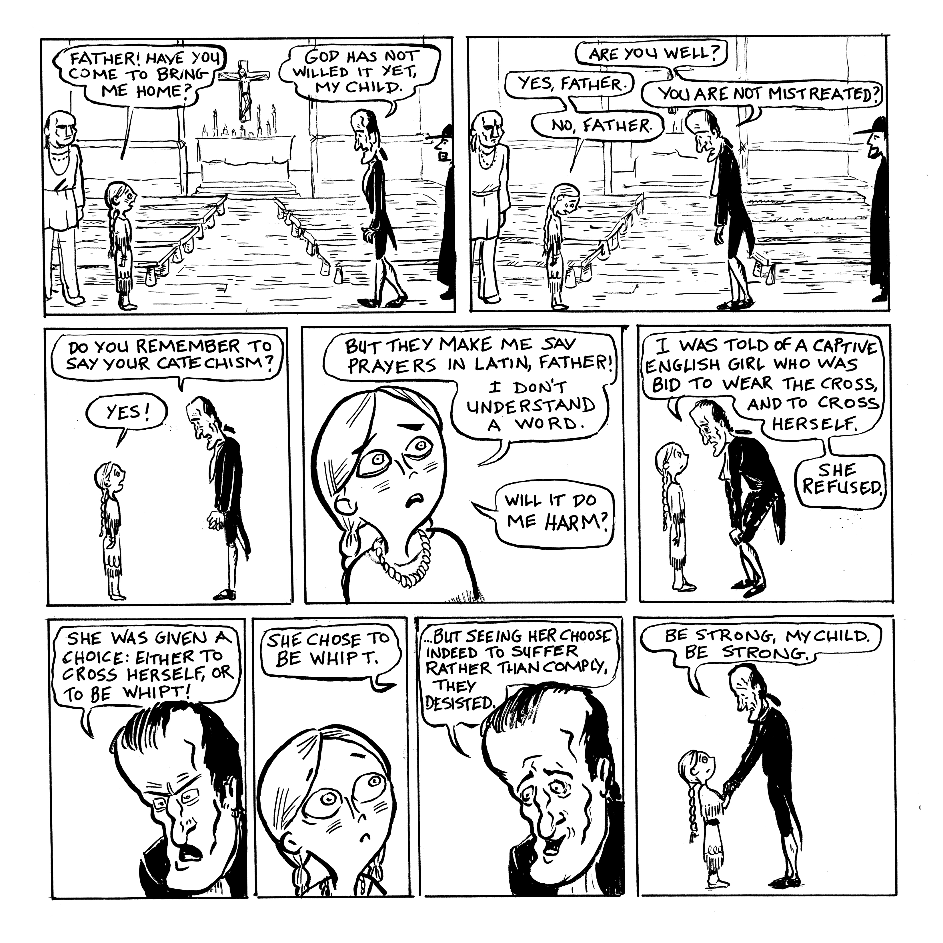
 PAGE 7
The first meeting between John and Eunice, in the church at Kahnawake, with Jesuits present.
EUNICE: Father! Have you come to take me home?
JOHN: God has not willed that yet. Are you well?Â
She looks downcast.
EUNICE: Yes, father.
JOHN: Have you been mistreated?
JOHN: Do you remember to say your catechism?
EUNICE: Yes! But they make me say prayers in Latin, father! I don’t understand a word. Will it do me harm?
JOHN: Be strong: I have been told of an English girl bid to take and wear the cross, and cross her self: She refused; they threatened her: either to cross herself, or be whipt, she chose to be whipt; but seeing her choosing indeed to suffer rather than comply, they desisted.Â
Eunice doesn’t seem encouraged.Â
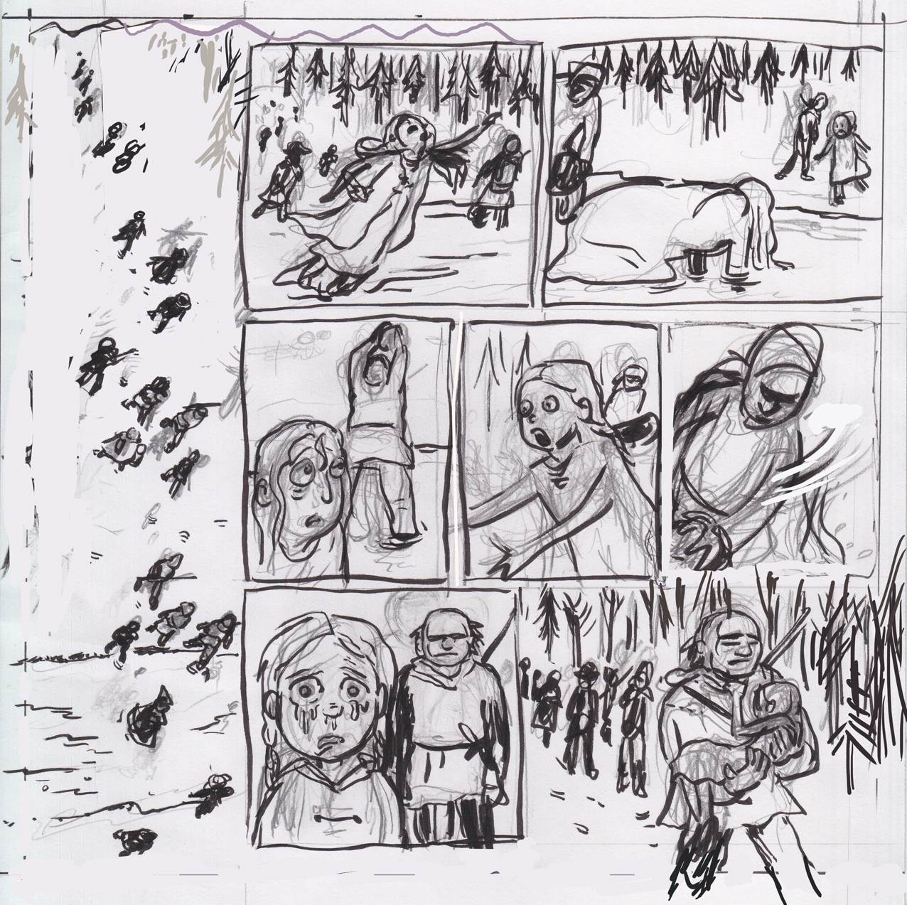
The layouts of these pages are fairly straightforward, my thumbnails were loose — extremely so in the case of page 7. Â I didn’t bother scanning the roughs, which I usually only do if I’m piecing them together from sketches and other attempts.
Drawing these two pages was much faster than the previous ones. My main focus was on the stylization/schematization of the characters. Â The style of drawing the two characters turns out to be different. John is more of a caricature style – almost Mort Drucker-ish at times , while Eunice is more of a Manga-influenced indie-comics look, that’s a little new for me; I’m really enjoying the simplicity and expressiveness this approach to her character allows. Even so, keeping the depiction of the characters consistent from page to page is proving a challenge.
The final line art:


