MICE stuff, SPX preparations and other things I had to do pretty much completely ate up all my work time this week. Â Somewhere in there I managed to sit down and do a couple of sketches of clouds and moon, which will be useful when I get back to work, hopefully, after SPX. Â These were drawn with charcoal pencil and black, white and gray acrylics. Â Not much of a week’s work, but I like the way these turned out so that makes me feel optimistic.
Author: Dan
Lives in: Cambridge, Mass.
Does: comics.
Used to live in: Topanga Canyon, California
But grew up in: Cambridge, mostly
Used to do (maybe still?): Screenwriter, journalist, teaches some too
I’m entering a time of the year where I usually find it hard to get much work done. Â There’s MICE, plus a variety of other personal and professional distractions.
This past Friday, having been on a pretty good run with posting process/progress reports about “Lunatic,” I came to the end of the day without having done a single bit of work on the project. Â With a process post in mind, I made myself sit down and do this little gem of a two-minute sketch for the next page:
If I hadn’t felt guilty about not posting, I might have done nothing that day! Â So that’s something.
The next two days, I did nothing.
Got back on the horse the next day after three unsatisfactory attempts at page 3. Â Took a deep breath and tried to stay in control.
I’m okay with the expression. Â Trying to make it a little more neutral, less scared or worried. Â In fact, what was wrong with this version? Â There was something I didn’t like about it, because I did it again, this time switching from the woven-textured charcoal paper back to regular drawing paper.
I finished this and I wasn’t satisfied… overdoing the textures? Â Getting fussy with the details? Â Muddy? Â Airless? Â Without even time to scan it, I brought it with me to the BCR meeting and put it up on the board. Â By the end of the meeting I was feeling actually pretty okay with it. Â Time to move on. Â When the time comes, I’m not even sure which version of this page I will like best. Â But this last one seems the most polished.
Having been quite pleased with myself for my work on page 2, I made any excuse possible to avoid getting started on page 3. Â I was able to procrastinate all day, really, squeezing my available work time down to a little over an hour at the end of the day, to guarantee the failure I was afraid of (because I would be rushing it). Â Three attempts at the image, all disappointing.
I’ve changed the composition since the earlier sketches, so that you see more of the carriage from above, to get the nurse’s hands in (I think it makes a better transition from the side-view of her pushing the carriage). Â This means the baby’s face is smaller, which makes it a little harder to get the expression right:
Terrible expression. Â Terrible carriage wheel
Working on getting the tonalities better here. I have also decided to switch to charcoal paper, with that woven texture, because I liked it in earlier sketches, has a real “fine-art” look! Â But, makes it harder to work on fine details. Â The expression is here is better, but the drawing is muddy.
I actually like this expression pretty well. Â I switched back to regular drawing paper, but looking at it here on the screen I liked the way the texture worked in the middle pictures, especially in the sidewalk on the upper right, where I smudged it up a bit. Â Better than the scribbly lines in the bottom image.
Oh well, at least I did something today. Â Hopefully I can nail this tomorrow.
“Lunatic” 9-5-16
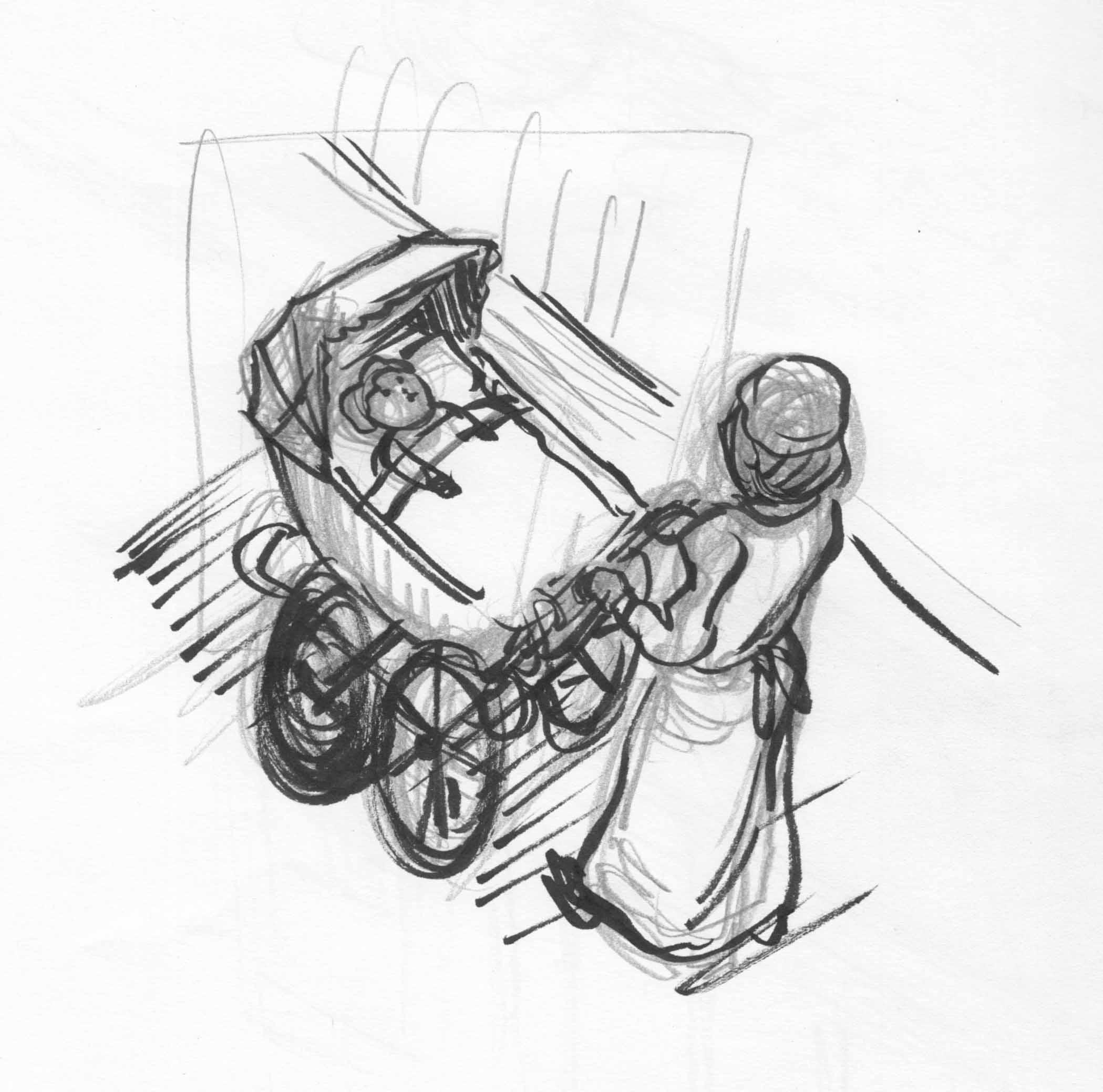
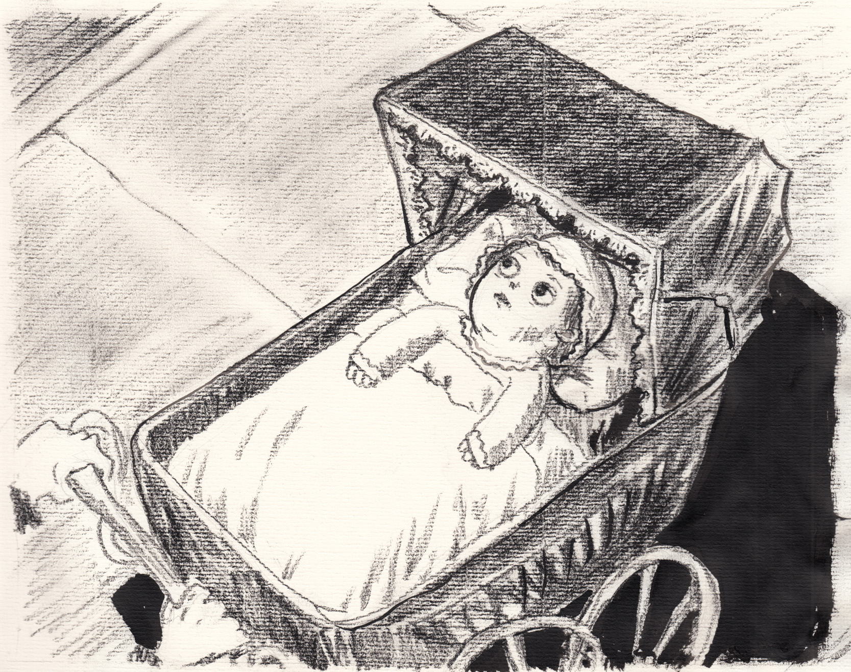
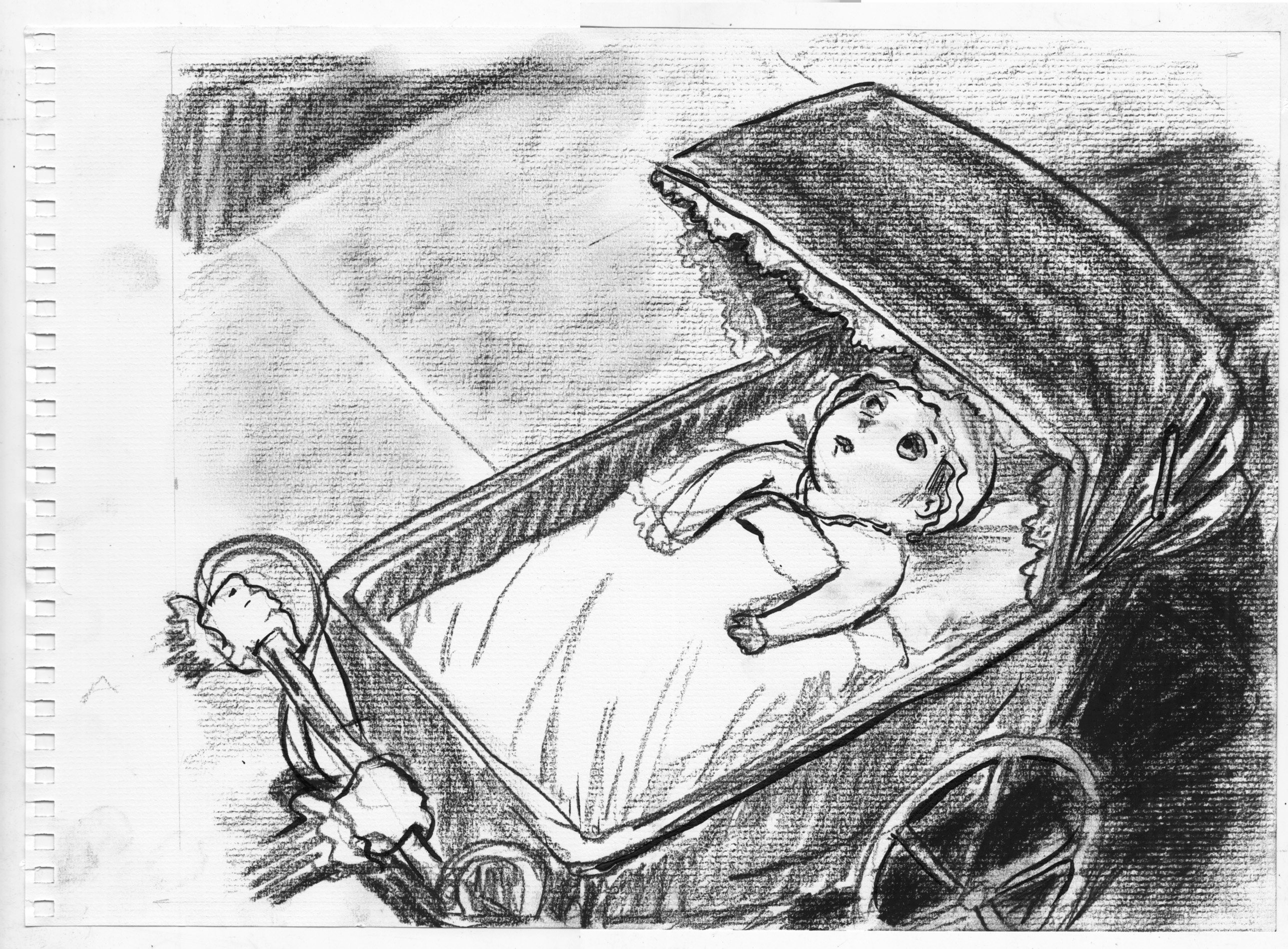
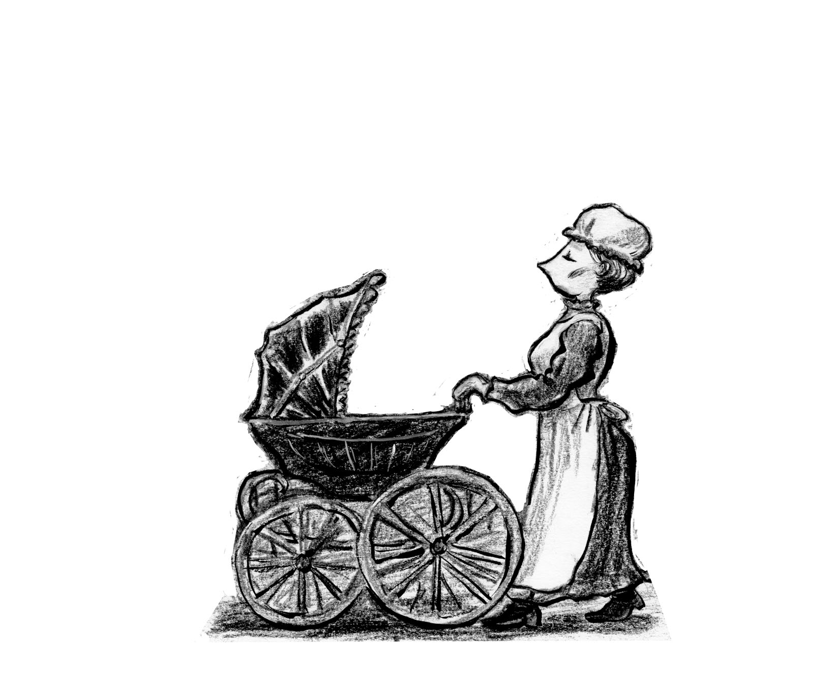
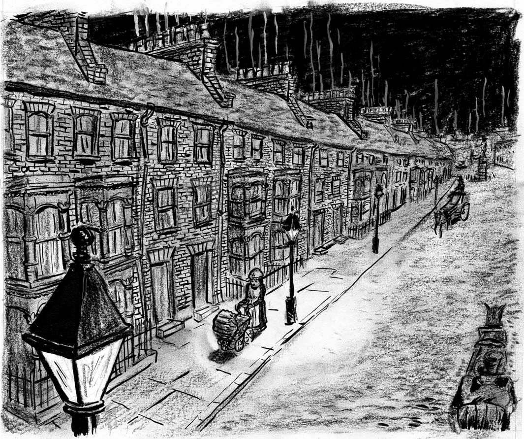
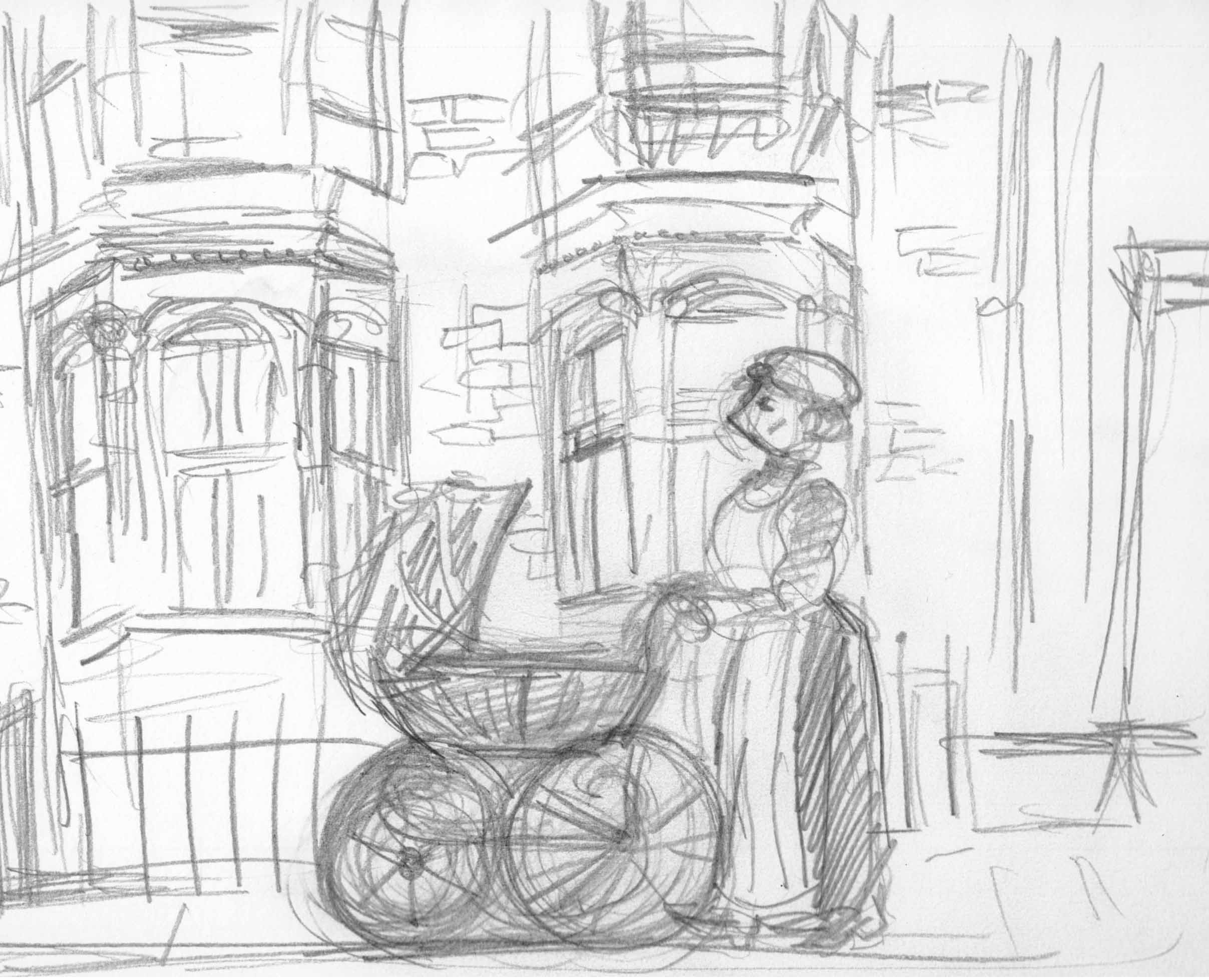
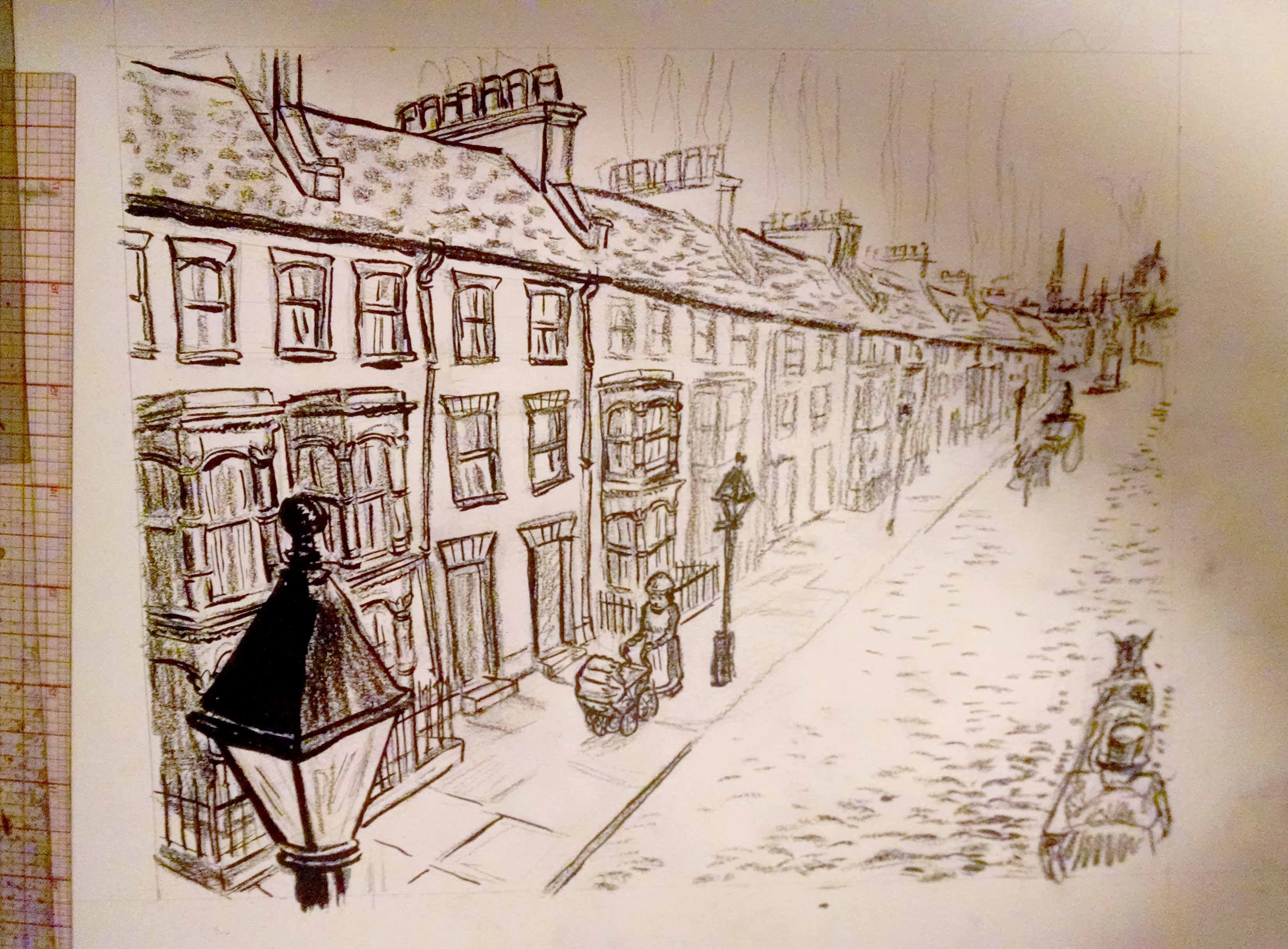
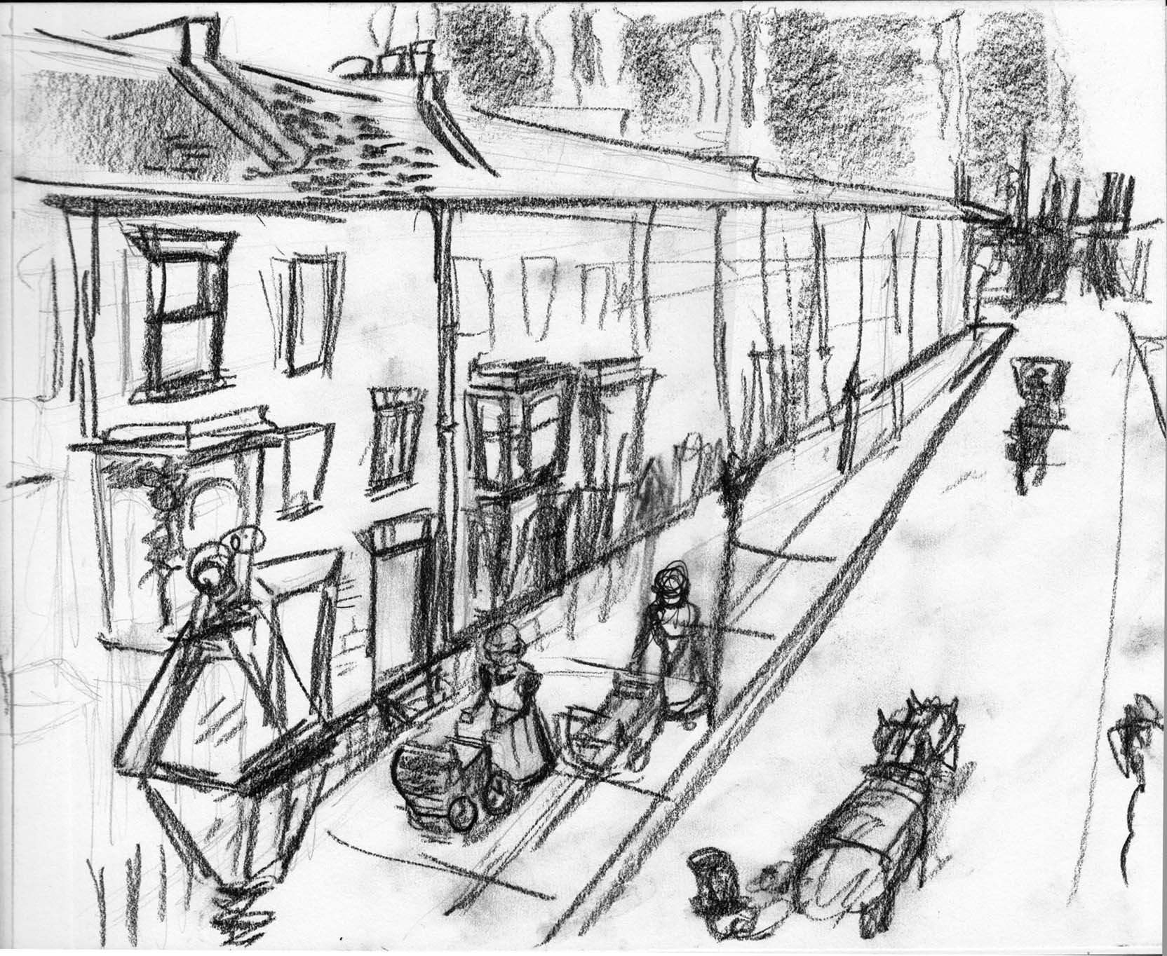
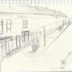
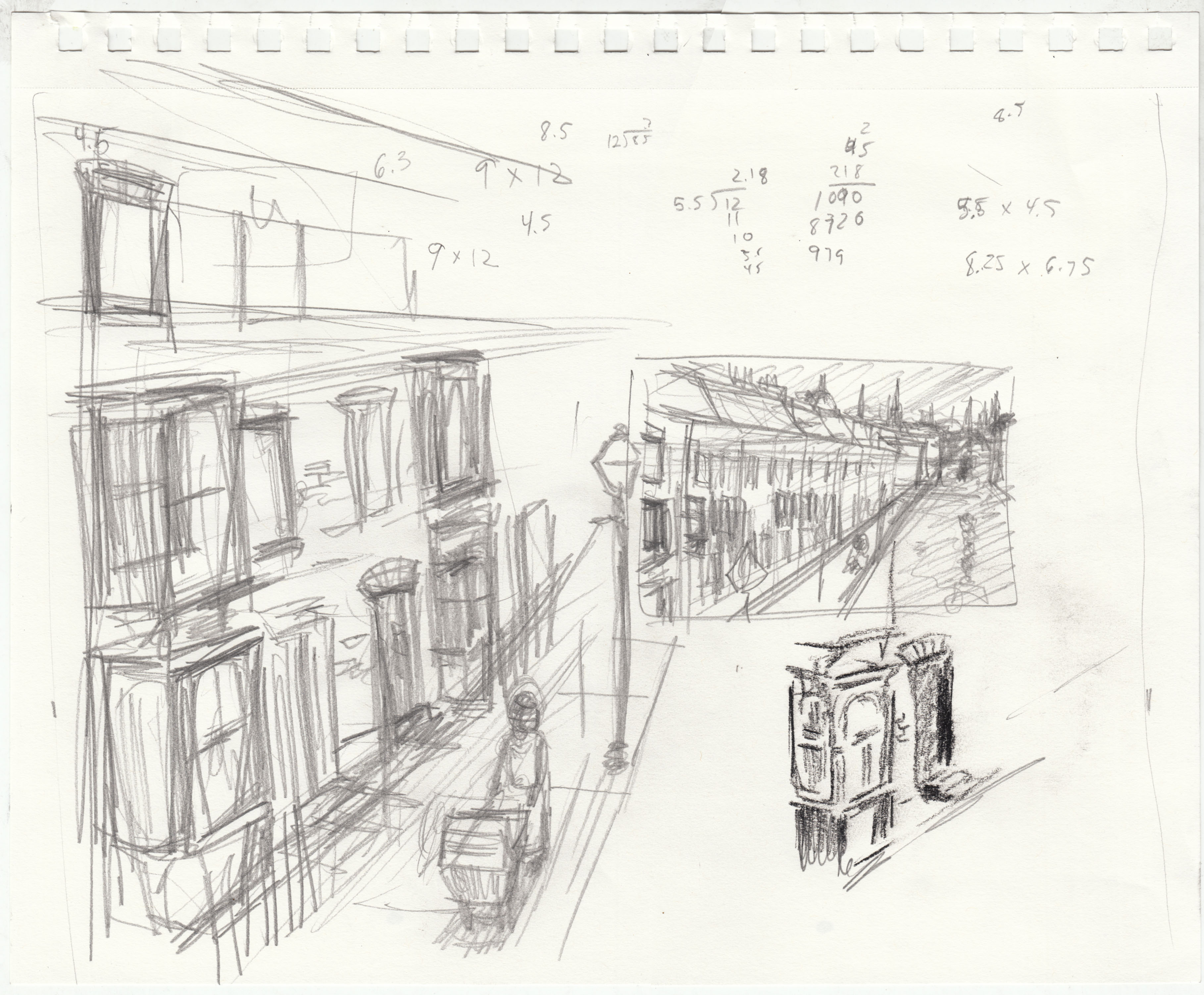
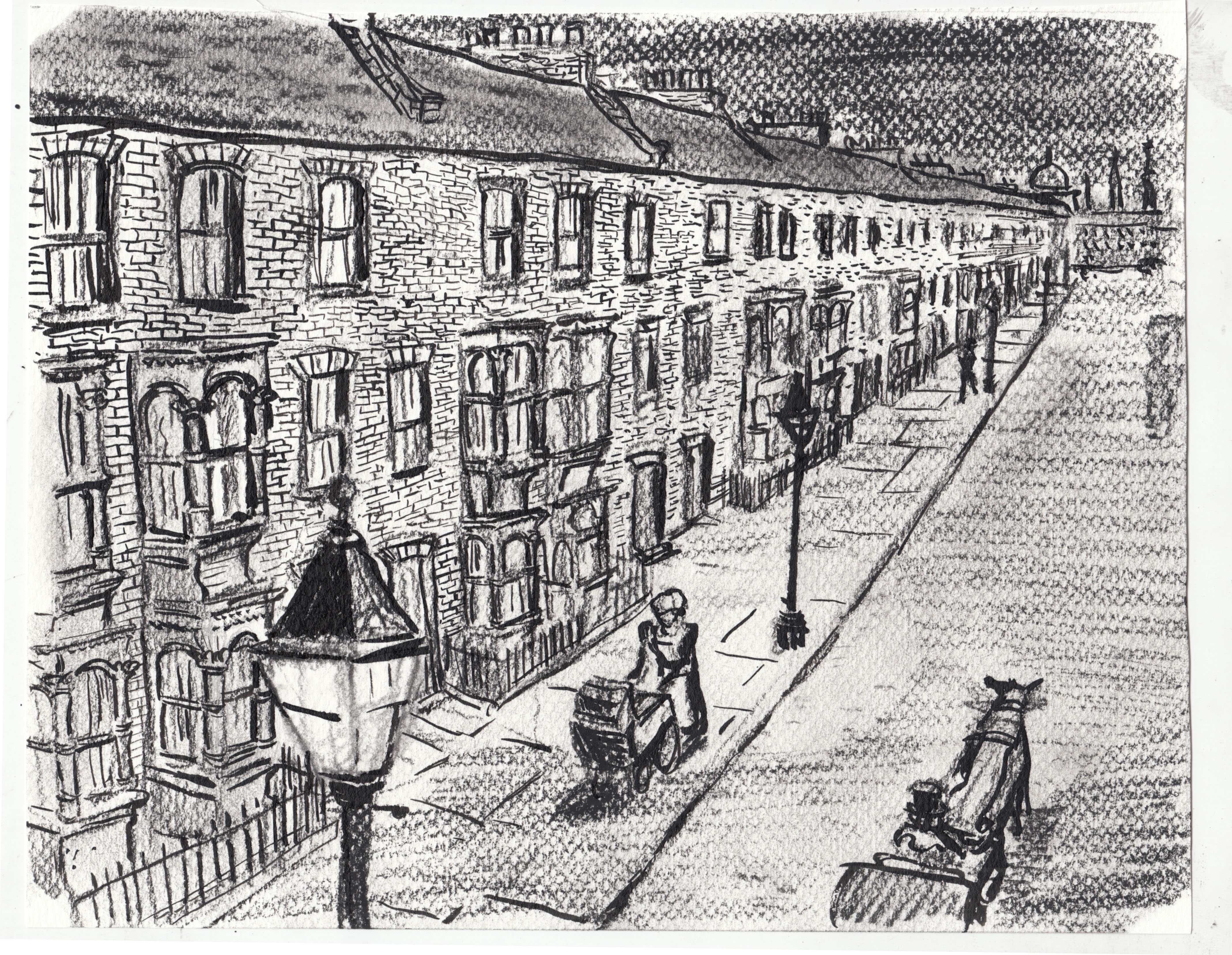
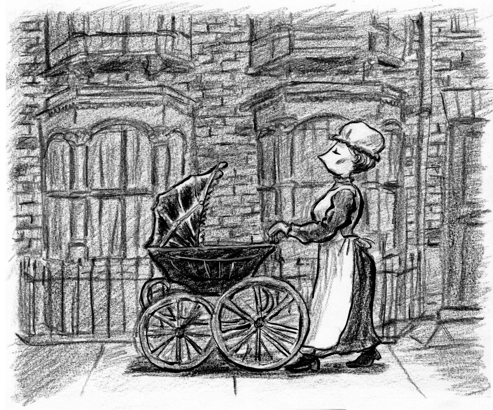
Pretty full day of work today, on the Labor Day holiday monday.  I finished page 2.  In general, happy.  I think I am doing a little better using conte crayons for tone.  The composition works okay, and after some fussing and using acrylic to white-out, I like the expression on the nursemaid’s face.  The whole thing is drawn in conte crayon, and then I used black ink and white acrylic to punch up the figure and carriage so they stand out from the background:
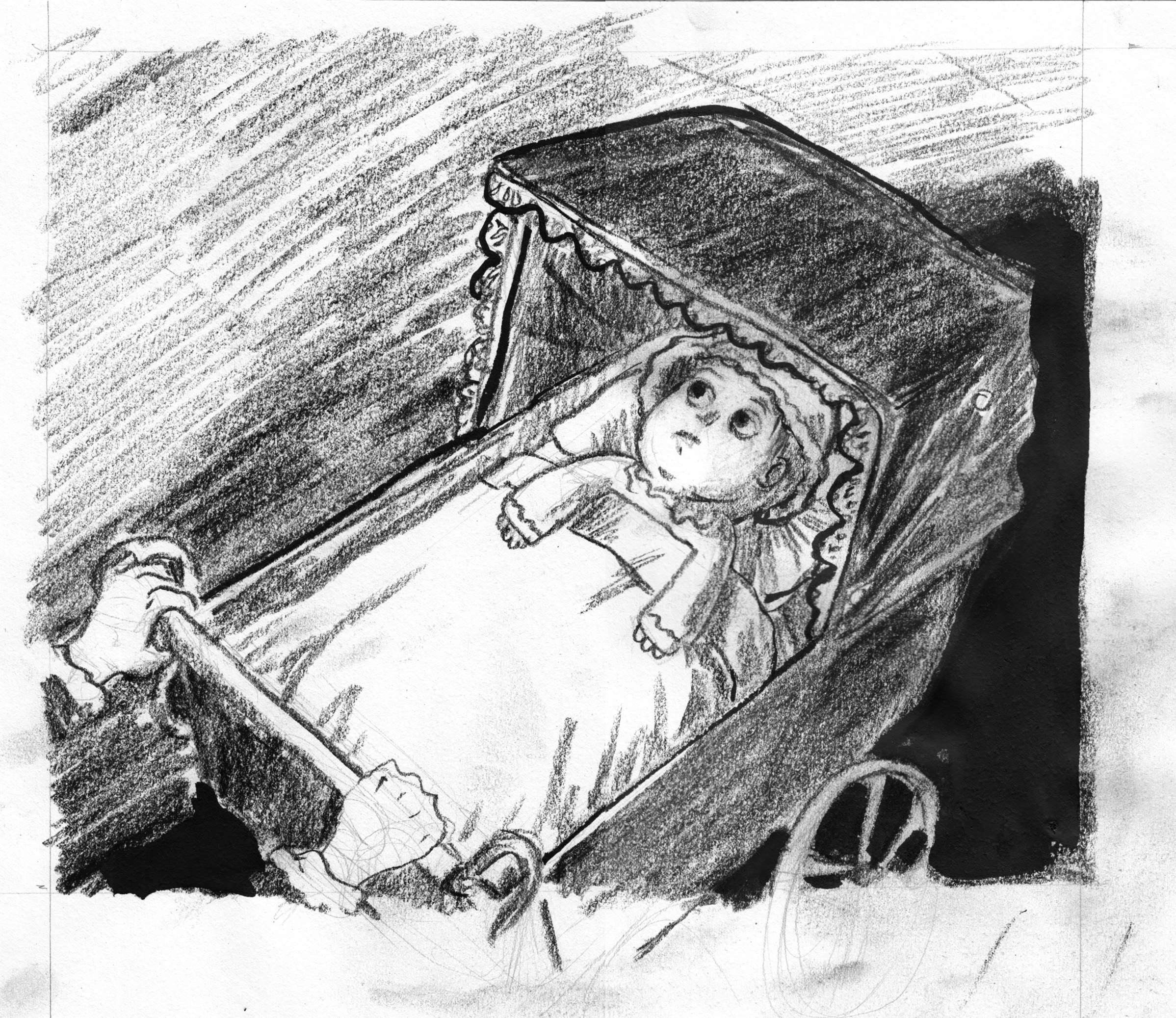
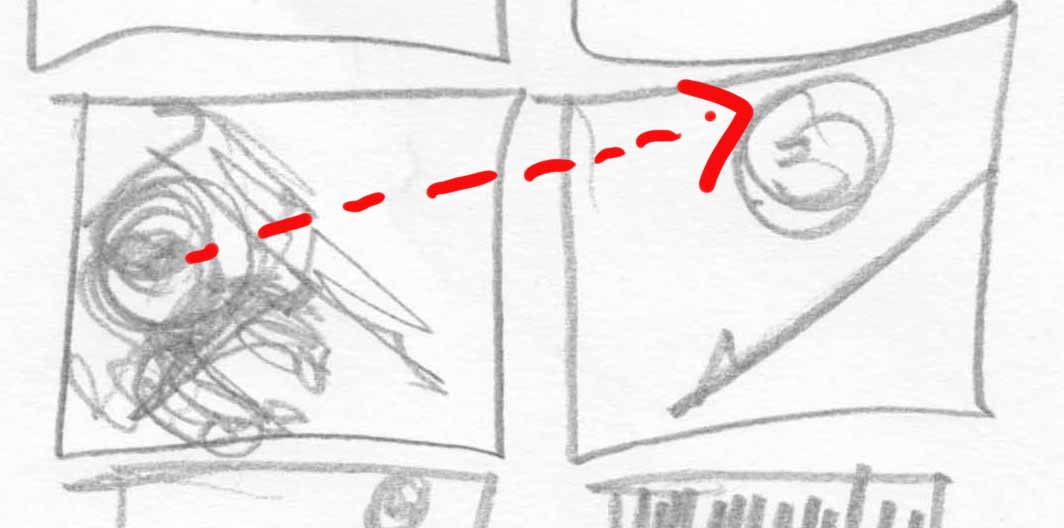
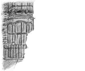
My one sorrow: I actually measured to try and get the two window-things to be the same size.. yknow, like they would be on an actual building. Â But in the frantic heat of drawing, I somehow ended up with the one on the right much narrower.
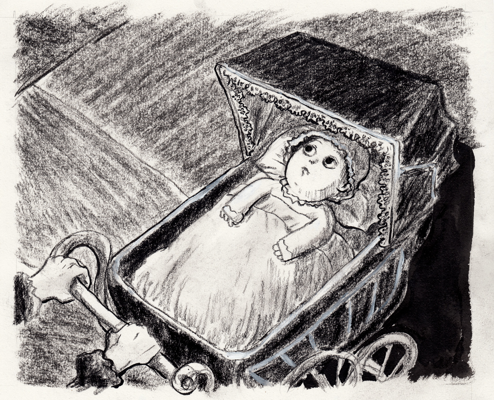
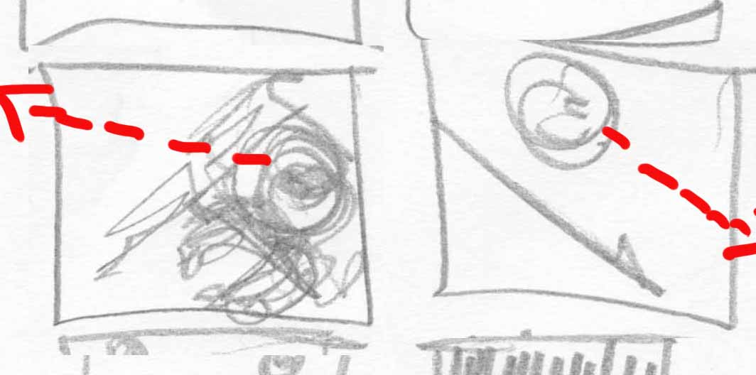
I guess I could cheat, and squeeze the left side oft he picture in photoshop. Â It goes against all my principles, but I’ll do it. Â First I use the marquee tool to isolate different parts of the picture as separate layers:
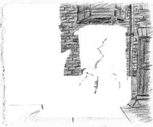
Then, I stretch the right window layer out slightly… and squeeze the left window to be a little smaller, and combine all ingredients:
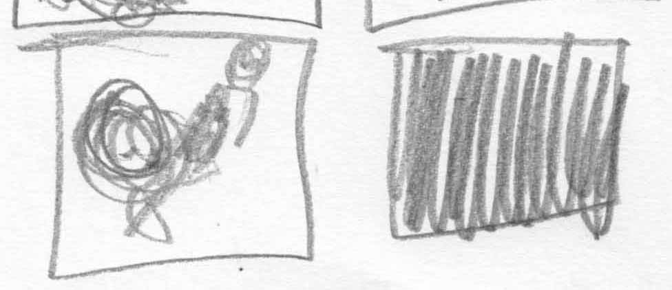
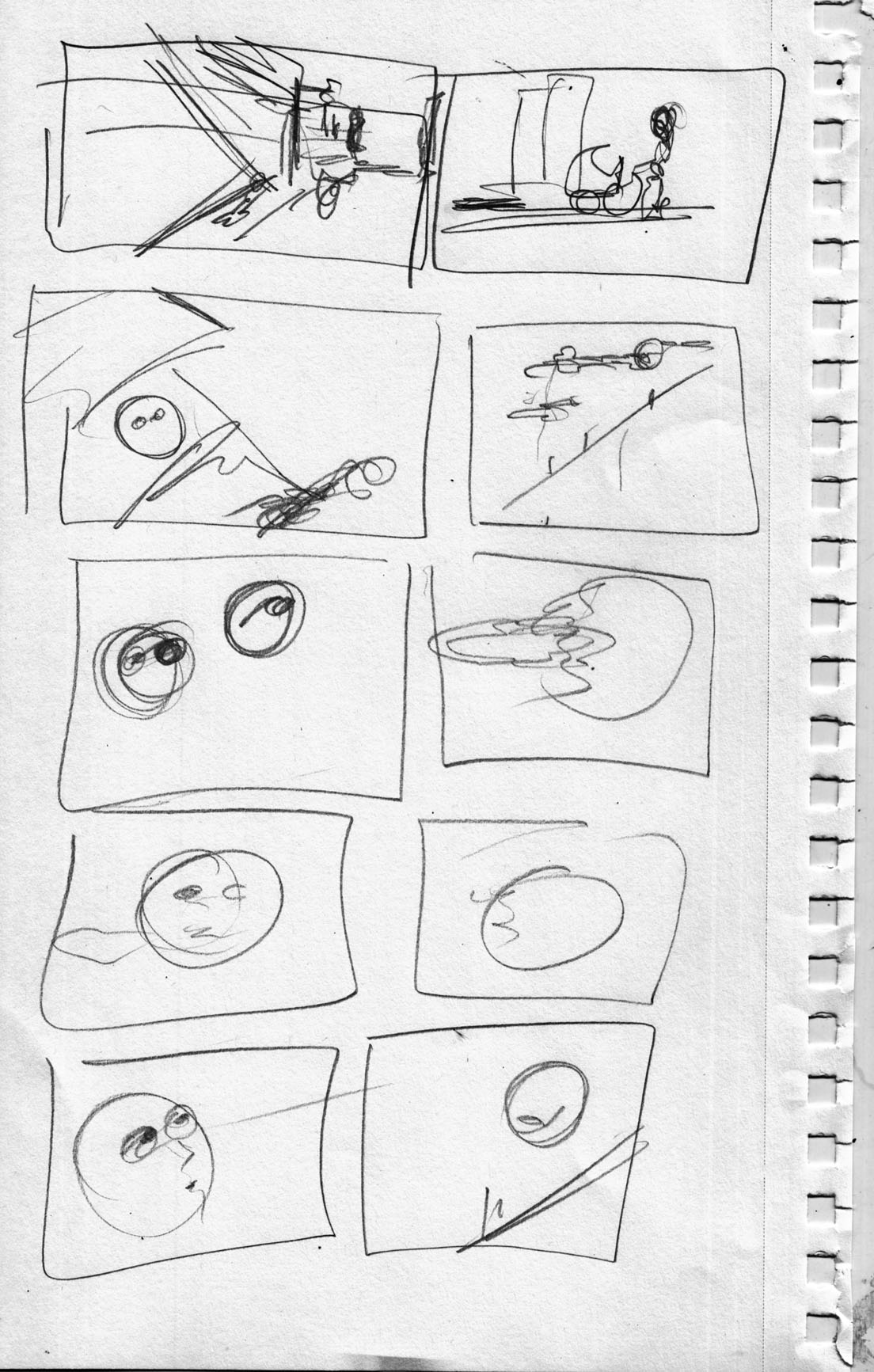
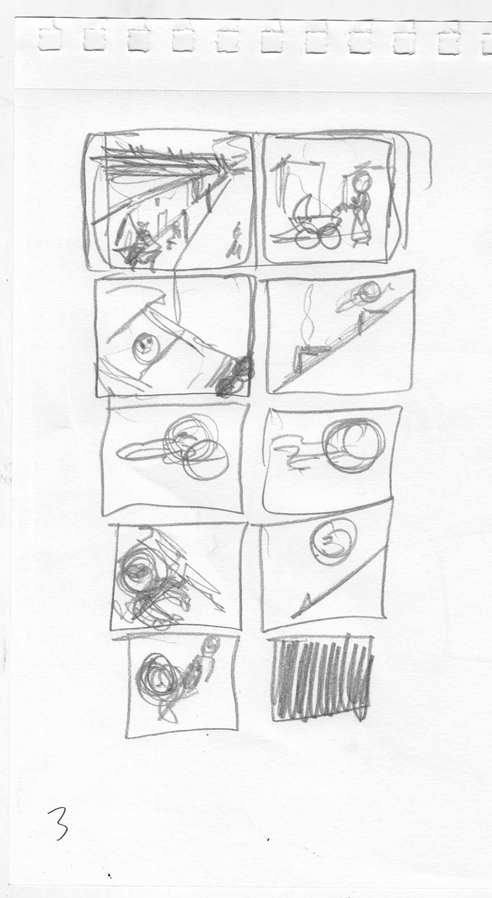
Barely noticeable, but it makes me happier, and took less than an hour. Â And I even had some time to start sketching/planning next moves. Â Back to thumbnails.
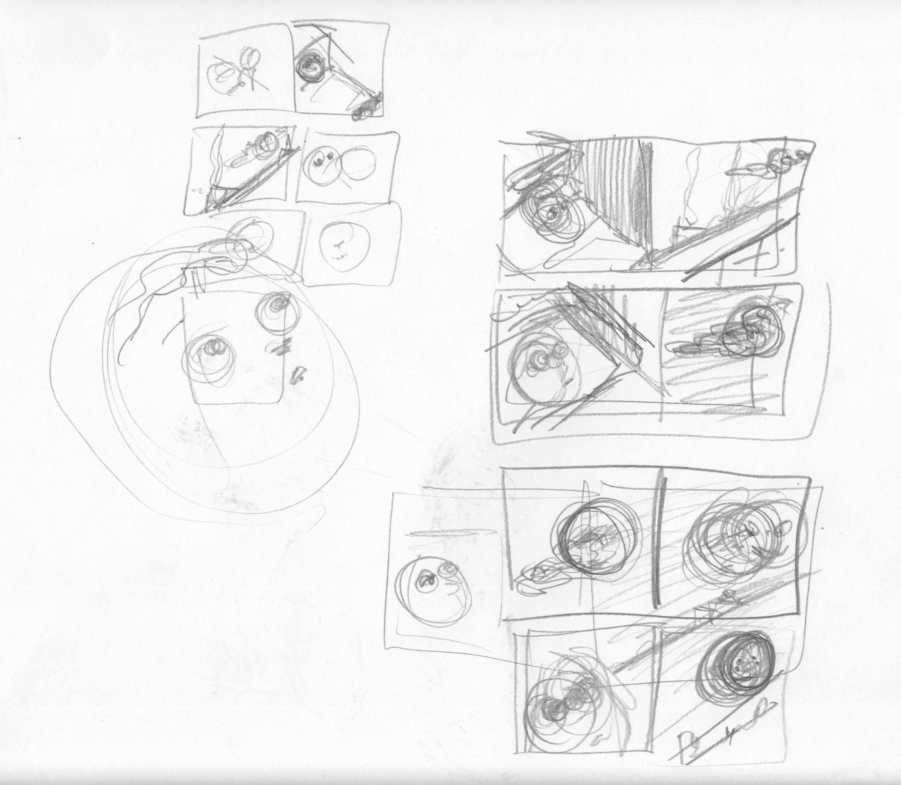
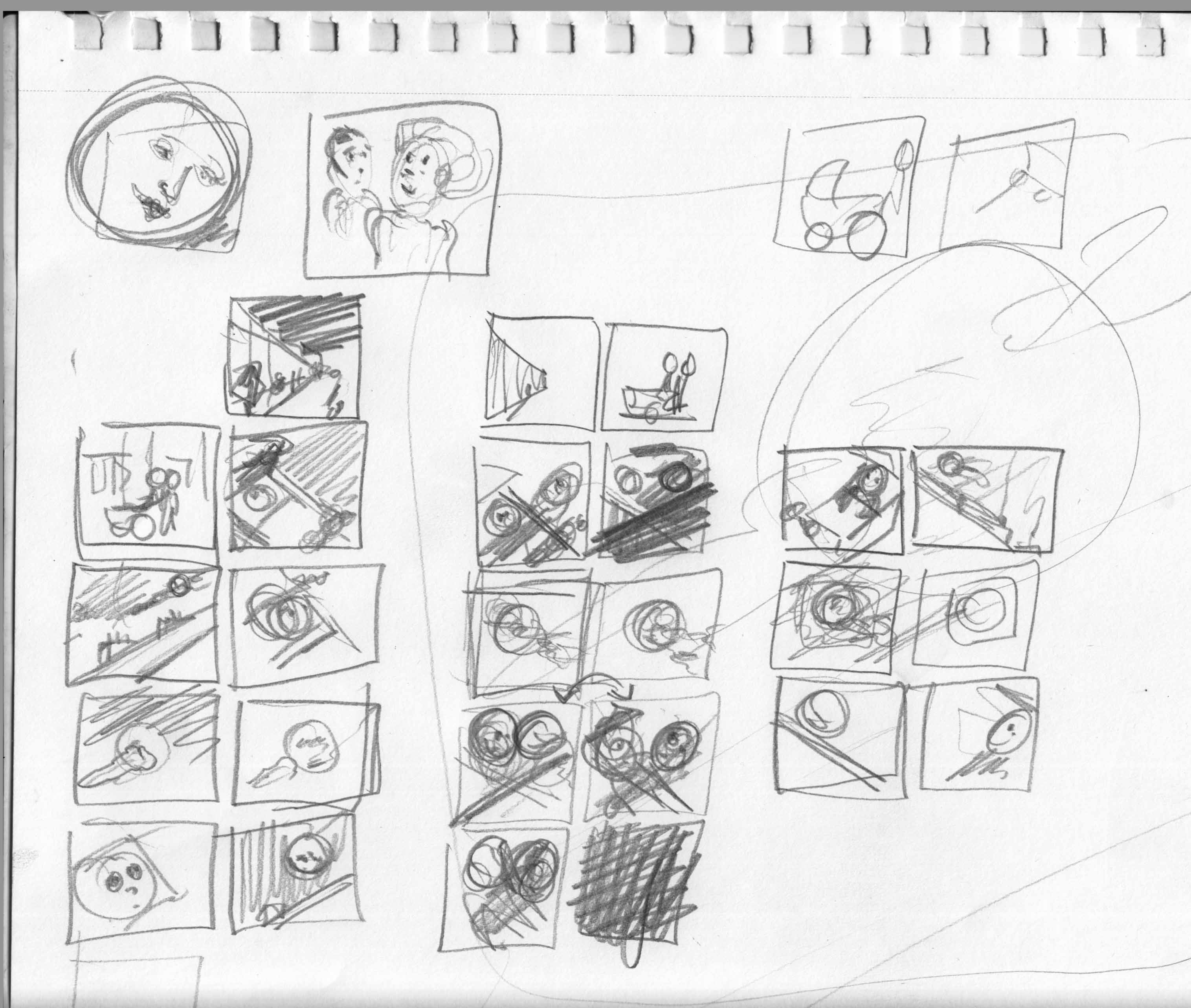
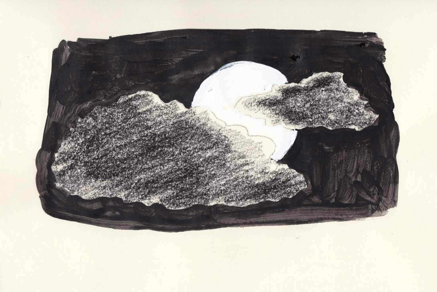
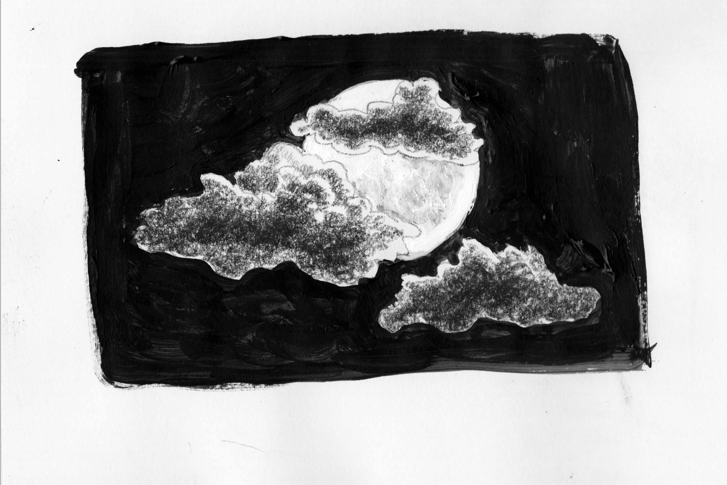
Grappling with some basic questions for the spreads, and at this point I have to nail it down: the baby is looking up at the moon. The moon is looking down at the baby. Â Does it work better to have them “facing” each other across the fold?
That seems the more obvious, reinforcing the left-right reading direction.
Or is it better to have them facing opposite directions.. baby on the left page, looking up and to the left / moon on the right-hand page (i think they’re called recto and verso), looking down to the right.
I feel like that could help the reader take in each image on its own, slow down the flow from image to image.
I fiddled with the layout a bit, and made another decision: have the baby reach for the moon, perhaps smiling, in the last page of the chapter. Â Well, no, the LAST page would be black. Â Which has some meaning: the baby reaches but grasps nothing of course.
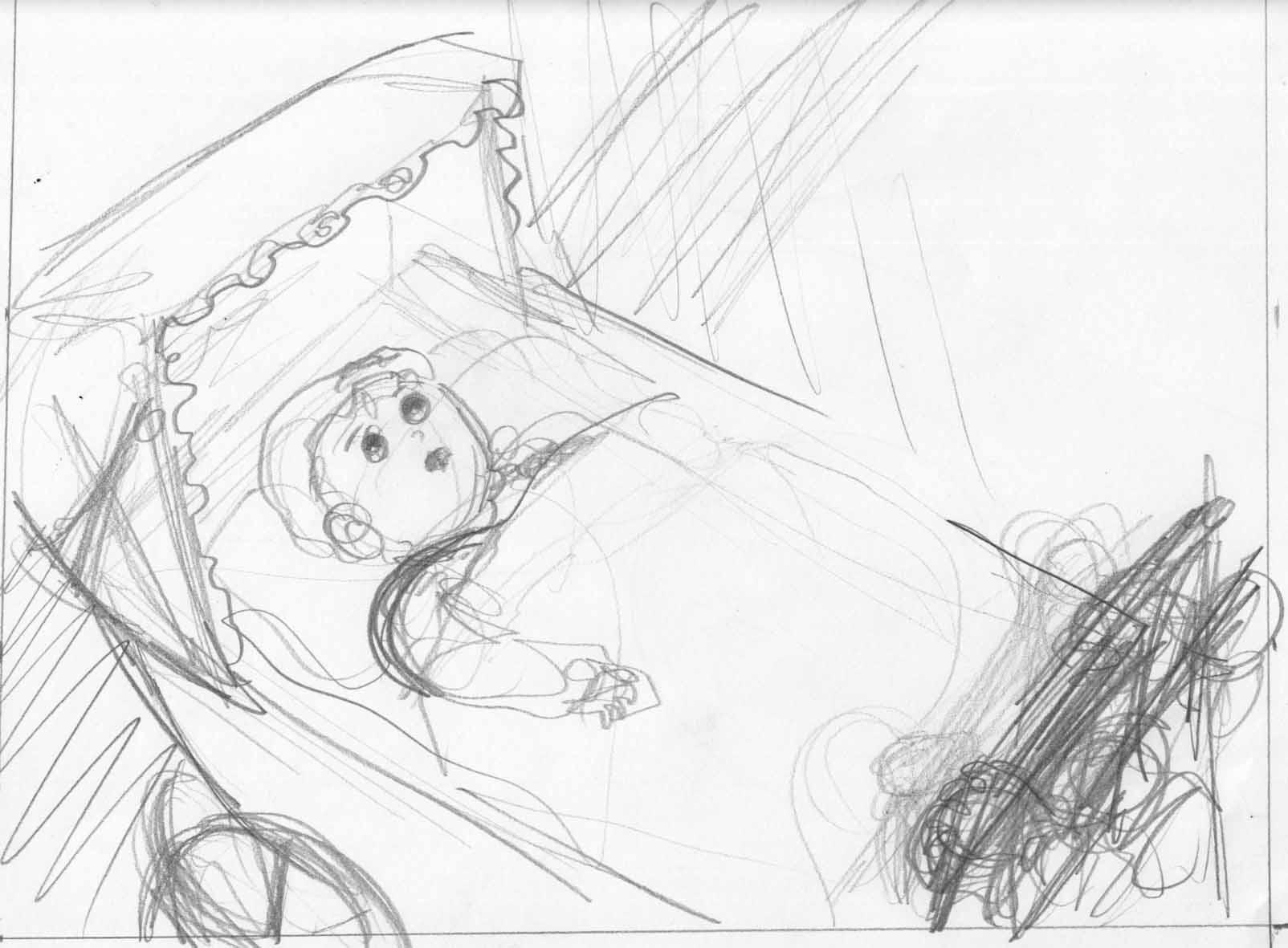
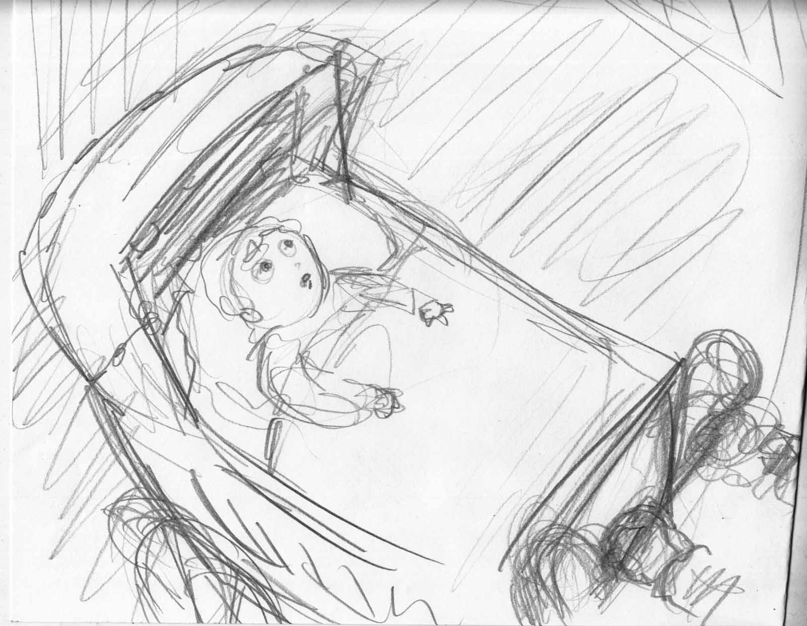
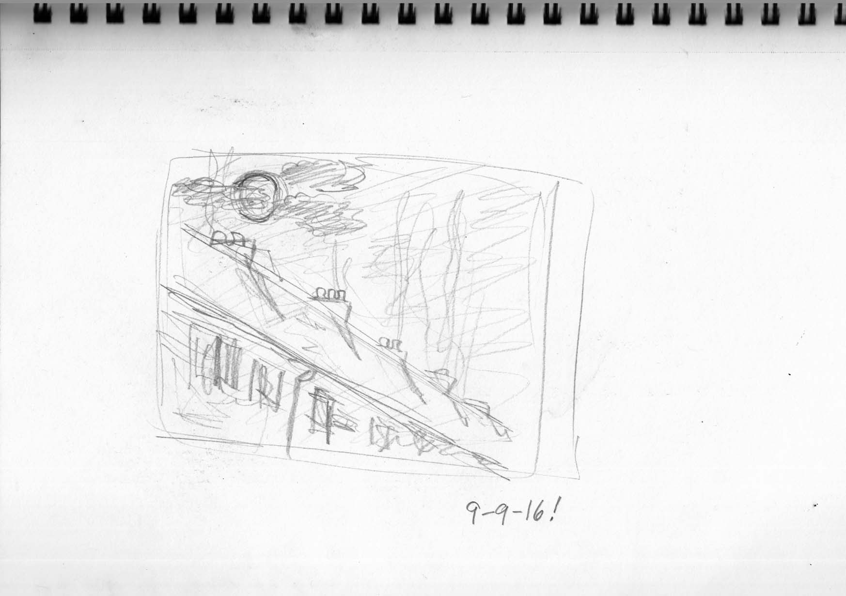
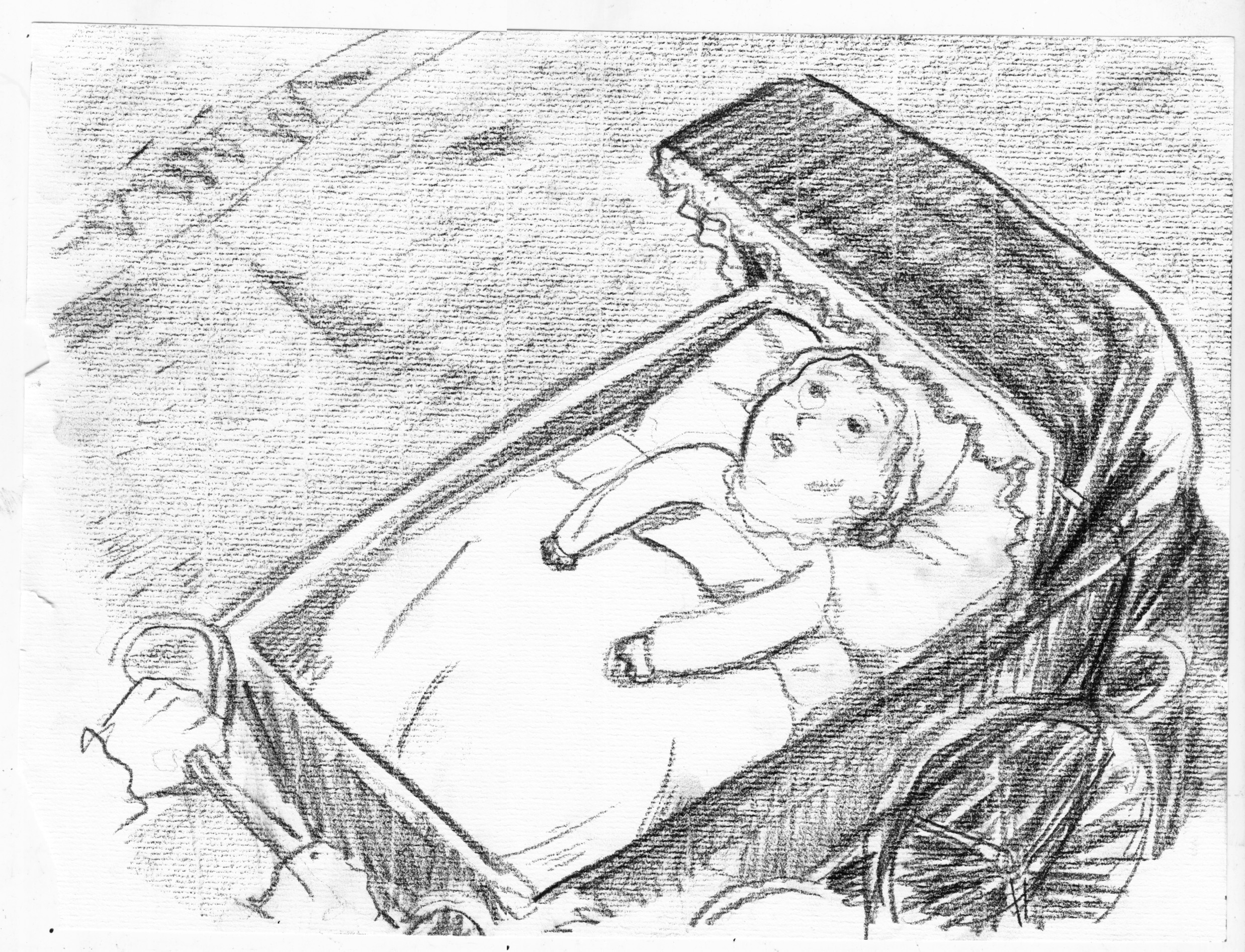
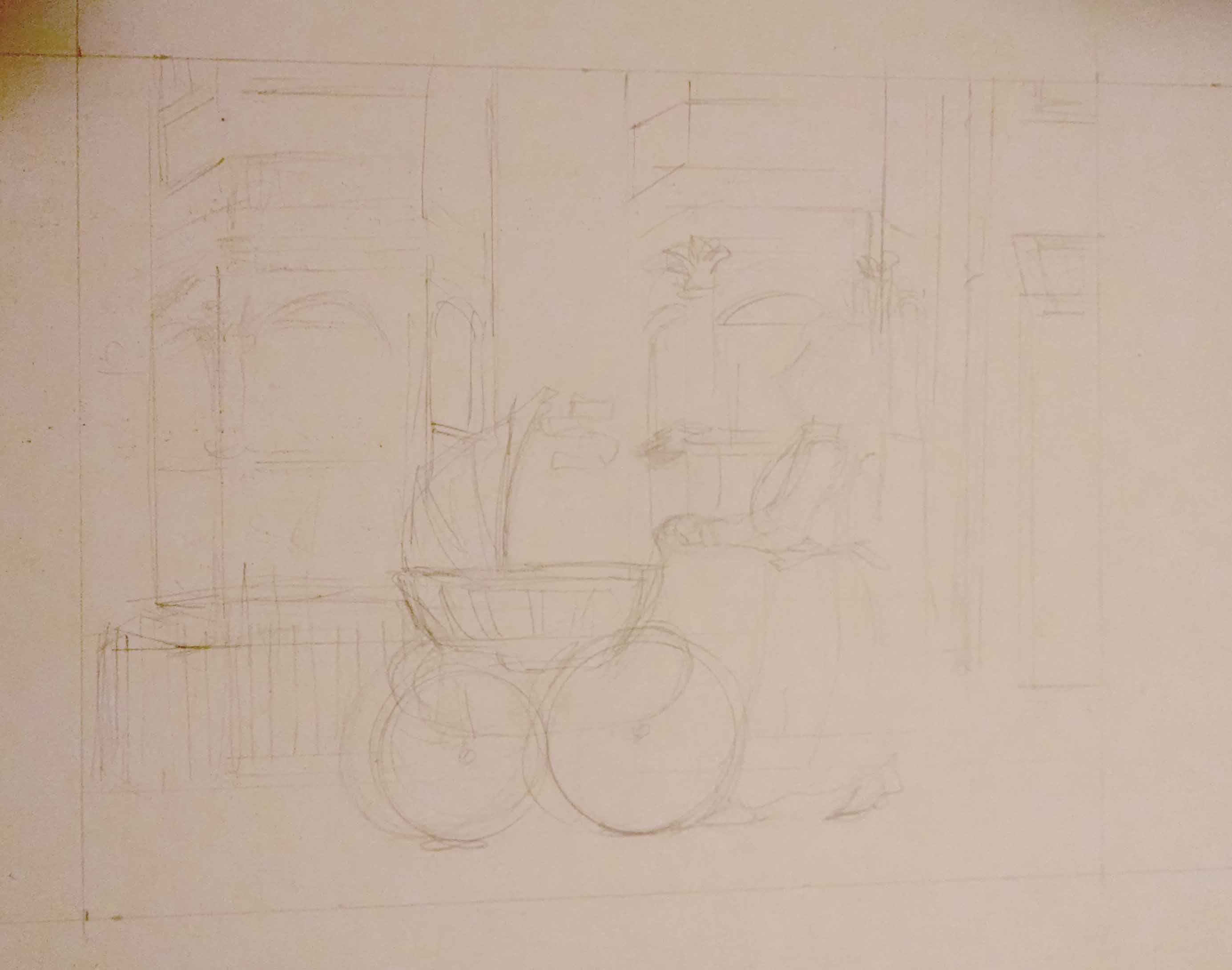
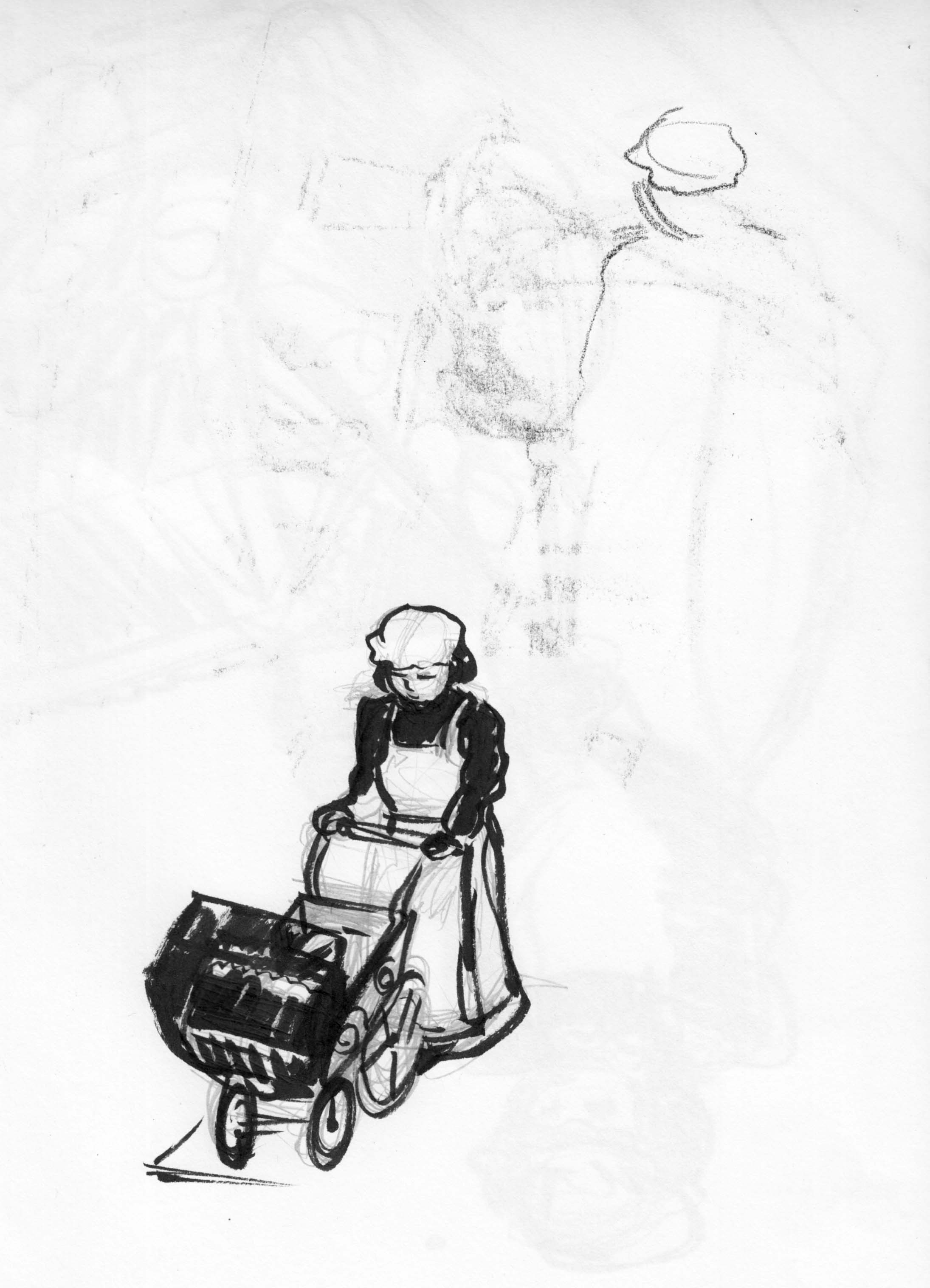
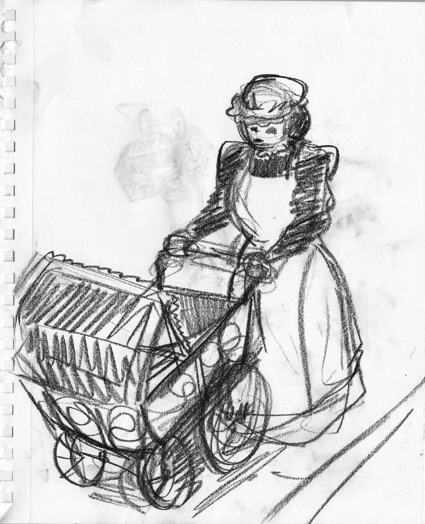
Sketches of page 2. Â Working out the perspective. Â If the baby’s going to reach in the last image, then her arms should be on top of the blanket (at least one arm should, and it has to be the left arm because when she reaches I don’t want it to block her face).
“Lunatic” 9-4-16
Am I over-sketching, over-fussing page in the preparations 2?  In danger of losing what’s good about the sketches, the freshness?  We’ll see All I did today on the project was to start pencillling lightly…. trying to be a little more careful about the architecture and perspective, I even used a ruler!
“Lunatic” progress: 9-3-16
…finished page one.
I wasn’t feeling so happy after finishing this page. Â Didn’t really feel in control of the shading with conte and charcoal… felt muddy. Â Even though it’s a fairly elaborate drawing, I still felt I rushed in places. Â Not happy with the figure and the vehicles, after all those sketches.
But… better not to pay attention to those negative thoughts and move on. Â Progress, not perfection!
(Still I might re-draw it at some point… MWAHAHAHAHAHHAHAHHHHAAAAHAHAAA!!!)
And I even had time to do some sketches of the next page.
just fine-tuning the composition/placement of architecture in the background:
Okay.
Although I used ink-spatter technique in the bg of my first sketch of this page, and had ideas of trying different techniques from page to page, I think that’ll be too much, it’ll be cacaphonous. Â I’m going to stick with conte and ink again for this page. Â There will still be a variety of media, as I’m going to use acrylics for the images of the moon, but that should be enough. Â I’ll try the spattering again later, probably for chapter 3.
Still on that first page, and didn’t have a lot of time to work on it today. Â I wanted to get a better fix on the figure of the nanny, so I did a couple sketches:
Then a little more fussing with the composition.
In the last post I said I was thinking about the personality of the picture, and I think what I mean by that is something of a playful quality, like children’s illustration.  Is this a book for children?  Not exactly… it will be acceptable for children, but I;m not really reaching out to children the way you have to in a kids’ book. I  think of it more as having the mood and aesthetic qualities of a fairly serious children’s story, but probably more for an older reader.
Anyway, even though it’s not a humorous story, I want some sense of whimsy in the style. Â Looking for inspiration on my comics shelf, I chose one of my favorite comics, Gare Centrale, by Lewis Trondheim (writer) and Jean-Pierre Duffour (art).

This book really should be published in English translation, I think people would love it. Â It’s a Kafkaesque tale set in a train station, very funny and beautifully drawn. Lunatic is really nothing like it at all, in terms of story or drawing style, but sometimes something very different can still be an inspiration.
Lunatic 8/30-31
This is two-day’s work.
Day one: Â I think I have the first chapter roughed out, here are my revisions after the mock-up.
So now I circle back to the first page, the “establishing shot.” Â Since I first drew a rough version, I seem to have changed the dimensions that I’ll be working in… horizontal rectangle now, instead of a square. Â I did a few sketches, getting all hung up on the perspective:
Day two:
Getting closer.
(those numbers are me trying to work out the dimensions of the final… based a little more on the way the mock-up worked. Â I am now thinking 5.5 x 4.5)
Then I tried a “final” version, on this fancy drawing paper I bought. Â Using pencil, conte crayon, brush and ink:
I don’t really get this paper… the texture is too intrusive. Â Maybe it’s just not to be used for this level of detail.
Otherwise, while I like this picture okay, I feel it’s lacking personality. Â A little too “straight” of a drawing for this project. Â I will try another approach tomorrow.