Boston Comics Roundtable tabled at this comics and gaming show at Hanscom Air Force Base, with Jason Wiser, Julie Di Salvio and Scott Harris-King. The people were wonderful, and it was great to show our comics to the families there, and even sell a few. BCR’s first show on a military base — in fact, Jason and I confessed to each other that it was the first time on a military base for either of us, ever!
The previous cover was deemed a bit too dark and moody – though it captured the “noir” feel of Eisner’s work, the thinking was that it would put off prospective readers who weren’t hip to that tone. So without changing the line art at all, the setting is changed from nighttime to sunrise. It was a difficult process to go through, but I’m happy with the new cover.
A video version of a short comic I made in 2021. This one has it all: high school basketball, Kewpie dolls, comics history… Well that’s about all it has. Oh, and a great public domain ragtime score.
A small (approx 4″ by 6″) stapled pamphlet, this is an illustrated story called Satsuki Hime 五月姫, which seems to translate as “May Princess,” written by Manabe Kureo 眞鍋呉夫, with pictures by Watanabe Ikuko 渡辺郁子. 42 pages long on newsprint.
I would have guessed it to be pre-war, but it’s an early post-war publication. Though I’m not able to read the Japanese, the illustrations have a very classic shoujo look, reminiscent of artists like Hiroshi Katsuyama and Junichi Nakahara.
The inside cover spread, capturing the pensive tone of much shoujo literature and illustration, the only full-color art in the interior of the book.
The story seems to be in the classic shoujo genre, a schoolgirl friendship, wistful and sad in tone. The delicate illustrations, printed in two-color (read and black) apart from the covers and an inside cover spread, which are full color are delicate and sensitive (contrasting charmingly with the cheap, off-register printing). They show the passage of time via the changing seasons, and various youthful activities, like a party game of blind man’s bluff, and focusing on two main characters, clearly close friends. Toward the end the story turns tragic, with illustrations of one of the girls in a hospital bed, and then her friend bringing flowers to a grave.
The red ink used in the illustrations is also employed for decorative floral designs on the text pages, interestingly printed over the text itself in spots.
This fragile publication evoking nostalgia even for someone who wasn’t born at the time or anywhere near Japan, is one I collected through Yahoo Japan Auctions in 2016, at a cost of 1200 yen (a little under $9 USD).
Now through September 17, Boston Comics Roundtable is raising funds for the second year of “Boston Powers,” Superhero comics for kids, set in and around Boston:
A virtual reading/signing for Lunatic will be hosted by the Harvard Bookstore on Thursday, January 28 at 7 pm. The event is free, and will feature a “reading” and a conversation about the book with the great Whit Taylor.
Two recent positive reviews for “Lunatic.” In the Boston Globe, Nina McLaughlin wrote on December 17: “Moonglow. Cambridge native Dan Mazur’s magic new book “Lunatic†(Ninth Art) is an elegant, moving wordless story of a woman’s ardent relationship with the moon. The illustrations move from her infancy to her adulthood, as she tilts her gaze upwards, dreamy and yearning, to see a companion peering back down at her. She devotes herself to its study at university, and launches herself towards it in more literal ways. The atmosphere of illustration shifts as time moves; Mazur, a co-founder of the Boston Comics Roundtable and the Massachusetts Independent Comics Expo, uses ink washes, pencil and nib pen, acrylic paints, giving each lifestage a distinct energy. The main character has a force and vitality to her, and a solitude. There is ardor in her, and melancholy, too. Mazur takes her on an otherworldly journey, and opens us to the different incarnations intimacy and life meaning can take. He also offers a behind-the-scenes look at the process and decision-making that went into the making of the book, a compelling look at artistic choices for both artists and readers alike.”
My new character, The Blue Lobster, makes his debut in issue 3 of “Boston Powers,” the kid-friendly, Boston-based superhero comic from Boston Comics Roundtable (which I also edited, so no wonder my story made it in!) You can buy it! Here: http://bostoncomics.com/boston-powers-on-sale-now/
I got my copies of the “official” Fanfare edition of Lunatic, so I now have the book available in 2 sizes: the Fanfare version is 240 by 190 mm (about 8.5 x 7.5 inches). My first version was printed at 12 by 9 inches, so… bigger! I still have a few of those left for sale, the downside being it doesn’t have the 11-page “process” epilogue added for Fanfare. But they’re both $20 (plus $5 for shlepping and handling), so take your pick! Asking your local comics shop or bookstore to order it for you works too!
Order here – please specify which version you want (price is the same $20 = $5 shipping)
Please choose edition:
Fanfare edition: 9.5″ x7.5″ with process epilogue
LImited edition: 12″ x 9″ (no process section)
My graphic novel/wordless book “Lunatic” will be published by Fanfare Presents and available in stores this winter; I’ll have copies this month, and it can be pre-ordered on Amazon as well.
But RIGHT NOW I have a copies of a Special Limited Edition, printed before Fanfare picked up the book. One feature of this version is that it’s printed at the actual art size (the book is 12″x9″). The regular edition will be slightly smaller (approx 9.5 x 7.5″). It’ll look great at that size too of course.
Relative sizes of Limited Edition (left) and Fanfare edition (right)
Relative sizes of a 2-page spread in the Special Edition (above) and Fanfare version (below)
Both editions are hardcover, and both will cost $20, plus shipping & handling ($5 in the U.S., contact me for overseas shipping). I don’t have many of the limited edition ones though!
I’ve gone back and added a few pages to the final chapter of Lunatic,… a chance to do more spattering!
Pencils:
Inks:
The globe-y thing in the middle is supposed to be casting light, so I want to shade the character’s clothing and face using ink-spatter. I mask off the areas that will NOT be shaded, using lots of little pieces of blue tape (and a piece of paper to block off the rest of the page):
Then pull out the old toothbrush-dipped-in-black ink and flick it at the paper a bunch of times:
Take away the tape, and:
I want to have some effects in the swirly images in the middle too. So I cut shapes in paper for spattering:
And I do some pretty heavy spattering, getting almost solid blacks:
But I want to have some lighter spatter around these shapes, so I cut some more shapes, this time in a piece of vellum:
i spatter, cutting away a little more as I go to get a somewhat gradated effect:
Then I want to create the glow from the globe, so I mask the globe off with a circle of paper, and cut a slightly larger round hole in a larger piece of paper, and spatter white ink in the exposed area:
At this point in the process I got too into what I was doing, and forgot to take more pictures! But basically I kept cutting/tearing away at that circular hole, spattering more white ink around, the globe. Final result:
And more spattering, from the next page. I experimented with different masking techniques, and for this I decided to go with vellum again. So, pencils:
Inks:
Vellum stencil:
Then a long process of spattering, using torns bit of blue tape along the way so that some areas ended up getting more spatter than others, trying to create a “core shadow” affect and give more volume to the shading:
Voila:
Again, I got too involved in what I was doing to keep documenting the process, but a lot more spattering to create a “moon” and “moonglow,” with circular stencils similar to the previous page. Final result:
For the last pages of this, the last chapter, I’m doing toothbrush ink spatter effects, for an alien/spacecraft that shows up (spoiler, sorry). Here are some process shots:
First the basic black ink on bristol. drawing, as the alien pulls the character toward the spacecraft:
Next I cut masks or stencils out of paper, and taped them over the page in the configuration I desired, to get the spatter effect around the alien & craft:
Then I dipped a toothbrush in white Kuratake ink, and (wearing surgical gloves), flick the ink over the paper:
Peel away the paper, and it looks like this:
(OH I didn’t document the process of getting that black spatter around the opening in the space-globe-thing, but it was about the same).
Getting very fussy now: I want to get that white “glow” around those objects, but I also don’t want the edge of the spatter to be too sharp, so I replace the paper mask, but peel back the tape for a slightly larger spatter area…
And repeat, another light dusting of spatter:
See…?
One last thing though. I wasn’t happy with the figure of the character, so I decided to redraw, first brushing black ink over:
For this chapter, since I’m changing media or style in each chapter, I decided to try black, white and gray acrylic paint. After trying some different kinds of paper I settled on Borden & Riley vellum film as the best support.
Here are some process steps for Chapter 8, page 4
First, a rough sketch with watery, black acrylic. The borders are marked off with blue tape, so I don’t have to have a pencil line in the image.
One great feature of working in acrylics is the ability to paint over and make changes. I decided the figure of the woman was too tall in the sketch, making the doorway seem not as large as I wanted. So as I added detail gradually to the overall picture, I was able to paint over the figure in white, and re-draw at a better scale:
Gradually building up tone and texture:
The final image. Lots of little adjustments to tone and texture, and thanks to the flexibility of acrylics I was able to mess around a lot with the positioning of the front figure carrying the piece of sheet metal, until i was happy with it:
And page 5. She gets to work. I wanted to convey strength, like the WPA murals of Diego Rivera, Thomas Hart Benton, etc.
Page 5, first loose sketch. With acrylics, you don’t have to “pencil,” just start right in.
…and gradually refine, add tones… I decided the wild hair was too much, and with the background gray paint, reshaped it.
Leaving the window unpainted, so that when scanned it will be the lightest spot in the image, the light source.
Close to final….Finished, and converted to grayscale.
Page 6. The first thumbnail (in acrylics), and a more detailed sketch in pencil and pen (with a revised composition):
Page 6, final. Starting with a loose sketch and adding layers of paint, pushing and pulling the contrasts until I think it’s right:
The Comics Journal has published my article on artist Ibrahim Njoya, who lived and worked in Cameroon during the first half of the 20th Century. Historical context, formal analysis, and most of all, images of Njoya’s beautiful work, like this:
With my one-page, transitional chapter 6 out of the way, I can move on to the next sequence. I want to get away from the cinematic, storyboard approach that I’ve been getting more and more into, pulled by the inexorable attraction of the filmic model. In other words, get as much information into a single image as possible.
At the Boston Comics Roundtable meeting on Jan 10, I doodled these sketches. Looks like a single comics page, but ideas for two pages of Chapter 7:
Here is the finished spread, based more or less on those sketches:
I have been away from the project since the summer (it’s now January), for one or another reason. Getting back to something after a while always presents its challenges.
Luckily, I left off at the end of a chapter, so I can start somewhat fresh, and in this case “Chapter 6” is a transition… actually a single-page, single-image chapter, so not a bad way to ease back into the process (and to drawing in general).
Basically, it’s a graduation “photo,” to mark the end of her “youth” and into the next phase of the story. I looked at some circa 1900 graduation pictures for reference:
Some sketches:
I don’t want to belabor this process, especially getting back into it after so long. I like the looseness of the sketches. But I also want the eye to go to “her” in the scene. I have an idea!
First, I draw the whole scene, at a small size (about 50% of the size of the pages I’ve drawn so far):
She’s the second from the left, top row.
Now I draw her, at much much larger scale:
And I insert that drawing into the group, reducing to fit the alloted space:
I didn’t draw enough of her torso to fit the space I’ll have for her, so I tried it again:
But, I liked the face on the first drawing better (don’t you??), so I digitially combine the group drawing, with the face from the first try and the body from the second. Plus some other digital folderol to darken the shadows on her robe:
After the last chapter ballooned to 34 pages, I decided to compress my story-telling for a while. The next section is transitional, showing the character’s college career, as she knuckles down and studies hard. I knew that it would be showing her studying long and hard in the library, and I decided it to do it in only 3 images, a progression taking place over a few hours.  I chose to draw the same scene 3 times, from the same vantage point, a bird’s eye view of the library, with the character far below, close to the center of the image.  The changing positions of the characters, and the changing light, tells the story. I have some ideas how I will add tones/shading, sticking to my principle of changing techniques or materials in each chapter.
Some pencil sketches:
I want the drawing to be precise, the line clean. An ink test:
The laborious, one-point perspective this required me to draw, seemed to me to mirror the dull hours of scientific study required for the character to achieve her goal. At least, that’s what I told myself as I found myself burdened with endless ruler-drawing.
Drawing the high-angle “shot” in one-point perspective isn’t really that difficult — just boring takes a lot of patience.
First couple tries at the first page:
final blue pencils for page 1:
The inking process turned into a battle between me and a succession of pens. I’ve generally avoided using brush pens, fountain pens or technical pens in my comics, in favor of more traditional brushes or nib pens. But because I needed to use a ruler (and nib pens and rulers don’t work well together, the ink OFTEN runs under the ruler edge and blobs up), I decided to use a Rotring art pen, VF point. This worked well at first, but there’s one problem: if I do make a mistake, the non-waterproof ink cannot be corrected with any form of white-out that I know of… they’re all water-based, and the ink just smears. See the column in the lower left of the page:
At this point, I still had a goal of nice clean originals, so rather than just correct in photoshop, I decided to fill Rotring cartridges with my usual, waterproof India ink. I was able to do this, but I quickly found that it’s the thick ink itself that causes the blotching under the rulers — it was no cleaner than using a nib pen. I went back to the Rotring regular cartridge, resigned to correcting blotches (and other errors) in photoshop.
Page 1’s final line-art. It turned out pretty clean anyway:
Moving on to page 2, and things got messy. Maybe it was because the Rotring’s nib had loosened up, but it was bleeding and blotching all over the place:
So I really sold out all my artistic principles and switched to a Micron to finish the page! I cut out a new piece of paper to completely re-draw/paste on, the shelves on the right side of the page:
But I have to say, I really don’t like the line quality of Microns. Plus, the Micron ink is non-waterproof ink still can’t be whited out on the paper. I went to Artist & Craftsman Supply in Central Square and bought a few different technical pens with pigment (ie. permanent, ie. waterproof) ink. I don’t think they had these a few years ago! The one I ended up using was the  (I used the .08 and the .05 tips). Good pen!
Line work for page 3. By this time I knew what I was doing well enough to only need one version:
Now I moved onto the shading. The shading was going to be very important, because it tells of the passage of time, and creates the mood. Since my philosophy (or creative restraint) on the project is to change up the style or methods or materials in each chapter, I didnt want to repeat ink wash shading which I’d used before, and I had an idea of using litho crayon, because I love the look of lithographs, especially old French ones by Lautrec et al, or lithographs by Kathe Kollwitz.
I have to admit, that I think this decision was a little arbitrary: at least in my own mind, each of the change-ups of style/technique in previous chapters seemed motivated by the point of the chapter. Now I feel a little that I am reaching for difference for difference’s sake. This may become a real problem in ensuing chapters, but I’ll cross the bridge when I get there.
Also, lithography crayon is designed for, well, lithography, so using it on Bristol paper might not be the best fit. Anyway, I didn’t have the confidence to start crayoning over the line work, so I decided to do it on separate paper (using a light box with the line work under), and combine it on photoshop, so I drew things like this:
My initial idea was not to shade the first page at all, since it’s set during the daytime. So I started with page 2. Here are some attempts at the traditionally-drawn-but-photoshopped-on shading:
(Here you can see that I had I decided that the effect of the “nearly empty” library was diminished by the character at the other table, so I took her out, digitally).
Not satisfied with the texture of the shading, and uncertain how to handle the light on the floor area. After some input at the BCR meeting, I tried combining wash and litho crayon:
I was now realizing that the shading is actually where the real story-telling takes place, and was at least as challenging as the line-drawing. Even more than the other developments in the drawing (going from crowded library, to nearly-empty library, to empty library and she’s asleep), the shading immediately communicates the progress of time and the changing mood.
My plan had been to keep page 1 just to the line drawing, no shading at all. But as I looked at the progression of page 1 to page 2, I felt the contrast was too stark:
Also, I wanted to make the room feel as crowded and lively as possible so I added two new figures in the lower left:
Added shadows, especially darkening in the bookshelves, which overall improved the definition and drama of the space, I think.
But my main probems were with page 2. I obsessively kept re-doing the shading, and made other changes as well. I decided the character’s gesture in page 2 wasn’t doing anything for me, and that the figure of the man re-shelving books was detracting from the emptying-out quality of the room.
Reaching the stage where I can no longer discern which versions are better. I re-did the wash over the “floor” section of the drawing several times. I had been drawing on bristol. Wash on bristol sucks. My final (I think) version I re-drew just the “floor” section on watercolor paper.
At this point, I started to question whether this was the best way to draw the chapter, repeating the same view each time. I became convinced that, ultimately, it would be better to “zoom in” gradually so that the sleeping character would fill the page on page 3. I felt like I had to go on and finish the original plan though, and try not to feel stupid laboriously drawing the library in perspective over again, despite my suspicion that it wouldn’t work.
Page 3 was actually much simpler, just a dark room with a circle of light where the figure will be, drawn in litho crayon over a light wash:
And photo-shopped over the line art:
(NOTE: unlike the earlier chapters, I’m planning to have a bleed on these pages).
So, the three-page chapter goes something like this. One:
Two:
Three:
EPILOGUE
I guess now I no longer think it would be better with the “zoom-in,” but I can try it anyway, digitally:
Nope, I think it works better the original way. What do you think?
(A diary of the making of this chapter, which begins with the first day’s work at the bottom, and moves up)March 13: summing up the last 6 months of work.
Yes, six months later, and I am still working on chapter 4. The slow pace partly because of interruptions and creative blocks, but also because this chapter turns out to be the longest so far, and I run into certain problems. And I’m still not finished with it!
So I’ll bring this up to date, starting with page 2, which I completed in late September. Pencils:
Inks (still just inkwashes, the line work remains pencil):
Page 3. I went through several versions of this, over the last couple weeks of October (MICE season. A pencil version that I abandoned. I don’t really remember what I didnt like about this. The placement of the figure, maybe? Â
More pencils:
And the ink washes added to that version:
Again, five months later and I’m not sure why I wasn’t satisfied with this. But, apparently, I wasn’t. The shape of the skirt is a little blobby, maybe that was it. Anyway, here’s the final version. Maybe I’ll end up using the previous one, I don’t know. I got options!
Onto page 4, which was pretty simple, just one try (11/2/17):September 20: Page one, at last!
After the slow process of the last few chapters, I’ve resolved to be more spontaneous, and allow myself fewer “re-do’s.” Here’s the first page, drawn in one try, without any additional rough versions. I changed the composition from the rough I’d done for the mockup, from this:Â
To this, the pencils for the final page:
Before diving straight into the washes, I did a little digital experiment with tones, just to see how it might look, leaving the ground white and darkening the gate in the FG almost to black:
Good enough, so I did the same thing with washes. I made some other changes first. I added the professorial figure with the cane, on the right, to reinforce the academic setting. Then, digitally, I adjusted the lettering on the gate a little, because it felt out of perspective to me (by the way, that’s Latin for “knowledge is power.”) Final page:
Looking at it now, I think I might digitally darken the washes, and erase the pavement lines, to leave the ground a solid white shape with darker figures against it — more like the digital-tone version above. That’s more of the graphic look I’d like for this.
September 11-14: testing the media
While working out the rough dummy, see below, I took a few moments to test the media I plan to use in this chapter. Basically, pencil with ink washes. I experimented with trying to get a slightly grungy texture in the washes (trying to look more like a printmaking look). I tried using litho crayon and then smearing it around with the wash. Eh, I don’t think it’s the way to go.
August 9-September 13. Interruptions & progress
This was a little over a month during which “one thing or another” kept me from getting much work done on this project. I tried when possible to do a little bit here and there on it, just to keep my hand in and my mind on it. As of today, I’ve gotten somewhere & hopefully back on track.
First, a few scribbled thumbnails:
Then I spent a few days sitting at a table at Boston Comic Con. Didn’t exactly work on this comic there, but I drew studies from old photographs as background:
This was fun, made me feel like I was working on the project in some way, and that last one I actually sold at the show.
There followed another couple weeks where I couldn’t get to work on this at all, then I found a little time to finish up the set of scribbly thumbnails I’d started before the Con:
(somewhere in there I also did this rough sketch test of wash over conte crayon:
)
At this point I felt like I had a decent thumbnail sense of the story, but as I’ve learned in the previous 3 chapters, this “one image per page” style of storytelling is very exacting as far as the page turns and the pace/clarity of the story, so I set about to draw full-sized roughs of each page, from which I would then create a mock-up/dummy of the chapter.
I did a set of roughs, here they are laid out in 2-page spreads:
Here they are in a pile on the floor:
I laid these out and printed them out as a little booklet…
I took it to the BCR meeting, got some valuable input from Heide Solbrig. The issue is, are her reactions to the classroom images clear, and then, is the communication between moon and protagonist clear? I don’t want to be OVERLY heavy-handed, if the reader has to do some work and piece the meaning together, even based on what happens in the next chapter, but at least give the reader a fighting chance of understanding what I mean. So some changes are needed.  But then… Another 9-10 days without being able to work. When things cleared up….
…I added some pages, to make the story clearer, and made a new dummy:
Here’s the revised layout. I fiddled with  the projected moon images & her reactions, and added 2 new beats to her “conversation” with the moon after she leaves the classroom. The page count increased from 23 to 27 pages.
Some of this works better, but some places are still not quite clear in meaning, I don’t think. It’s frustrating to me, also, because I would really like to get away from the shot-by-shot “storyboard” approach to narrative in this comic, but I don’t seem to be able to do it, and each new page that I add just increases that faux-cinematic feel. But, given a choice between less-cinematic-ness and clarity, I’m not confident enough to risk un-clarity.
Anyway, I did some more revisions, still in the same two sections of the chapter: reactions to the projected images, and the interaction with the moon. Plus, not sure the conclusion of the chapter works, either. The point is that when she returns to the classroom it’s with a new determination to learn the scientific facts about the moon, so I’m going to add a “close-up” of her hand taking notes. Again, more “cinematic” storytelling, but… (see above paragraph).
So, I added a few new beats, the page count ballooning to 31:
This is getting pretty insane, so I decided I’d better wrap up this phase and get to the final drawings. Plus, it seemed to be working better. BUT I did want to trim it down, eliminate unnecessary pages. It was getting kind of complicated, changing the layout of the book over and over, so, though I felt it was close, I decided to cut up the pages separately so I could move them around, and finalize the layout, now reduced back to 27 pages. Hopefully I can cut a few more out along the way.
Finally I can start drawing the chapter.  I want to be able to work faster this time, for two reasons. Of course to be done sooner, duh. But also to keep the freshness of approach. I’m already worried that, for a few of these pages, I won’t like the final version as much as the rough!
August 8: little toe in the water
Still the same strategy of making sure i do some little bit of work related to Lunatic every day. Â More reference visuals, this time of a college lecture hall, as old fashioned as I can find.
(spending a lot of time searching and saving images like these… obsessive, but valuable)
And a little thumbnail of one of the pages that will take place in this setting:
(yes, that means something to me)
August 7: toe in the water
At this point, I have so many other tasks and projects keeping me from focusing on this (and on drawing in general), that my goal is just to keep my head and hand in the project just a little, by doing something every day, however small. Â I’ve been gathering up a lot of reference visuals of the college gates/seal which we’ll see in the first page::
When it was completed in 1889, Johnston Gate stood alone. The other gates and even the brick and iron fence that now encloses the Yard were still in the future. And while nothing quite as grand as its delicate ironwork and massive brick and sandstone piers had ever graced the spot before, the location of the gate has served as the Yard’s main entrance since the end of the 17th century.
The gate is named for Samuel Johnston, Class of 1855, who left Harvard $10,000 for its construction. A resident of Chicago, Johnston is described in his 1886 obituary as a bachelor and a “well-known capitalist,” and by a fellow member of the Chicago Club as “a short, ruddy faced bon-vivant.” A book of reminiscences by one of Johnston’s neighbors describes him drinking a toast on the front steps of his house as the Chicago fire blazed nearby.
Designed by the Boston architectural firm of McKim, Mead, and White, Johnston Gate was the first example at Harvard of Colonial Revival, a style that, during the late 19th and early 20th centuries became almost standard for Harvard buildings. Built of salvaged bricks chosen for their varied texture and color, the structure also helped to popularize what has come to be known in the building trade as “Harvard water-struck brick,” used on most Harvard buildings since that time.
The gate bears two plaques inscribed with the earliest records of Harvard’s founding, an inscription from “New England’s First Fruits” (1643) and the records of the General Court of Massachusetts Bay establishing the College.
(I have lots more)
Then some scribbly studies:
August 6: Testing the waters
I’m trying out a technique of pencil and ink wash only. Â I want a soft effect, like that achieved by Manuele Fior in Mademoiselle Else, which also seems inspired by the Nabis, Munch, the kind of art that I want to evoke:
Of course not working in color, as Fior was, will be challenging. Â Have to figure out how to get that softness without graying-out the whole page.
August 1: the baby’s getting smaller!!
I worked more on the thumbnails. Â I have a decision to eventually make about the story in this chapter. The woman goes to a class and sees a lecture on the moon which inspires her, that’s basically what happens. But I have another idea, in which she is at first horrified to see her beloved moon “dissected” by the images on the prof’s magic lantern slides. Â She runs out in horror, and sees the moon in the sky looking down at her; it’s look, this time, tells her no, you must learn about me, and so she goes back in. Â I go back and forth on whether this last complication in her “learning process” is too melodramatic, or will come across clearly. Â Anyway, on this day I scribbled out some more thumbnails, trying to figure it out. Â Again, so rough that by the time I’m posting this I can hardly decipher them myself. And yes, it’s about 20 minutes of work, at most:
July 31: still baby steps
I’m not getting full days of work these days, because I’m doing some MICE planning. Â After those preliminary sketches that had to do with the first or second page, I decided I’d better thumbnail the chapter before getting too involved in any one page. Â These thumbnails are so scribbly that I doubt I’ll even be able to understand them in a few days.
I’m also thinking about the first images, the “establishing” images of the college campus:
July 28: baby steps
I have the beats of this chapter in my head, but nothing on paper yet, not even thumbnails. Â The setting now is a university campus, in the period setting. Â This comic isn’t set in any particular place or time, just vaguely Victorian or Edwardian period, in a setting that looks like America or England. It’s not a realistic story, so I can take whatever liberties I like and considerate an alternate reality if need be.
But nothing jarring. Â I want it to feel like the past, in a recognizable reality.
Anyway, I have a lot of thoughts about the feel for this chapter. Â Once again I will change medium, and I think I want to get away from hard blacks, and go with a gauzier, grayscale feeling. Maybe drawn in pencil and washes. A visual style of early Modernism, such as the Nabis or Maurice Prendergast:
I can’t say that Prendergast is a favorite, but you always run into him in museums, and there’s one of the early images in this chapter, which I want to model a little on Prendergast, and the parade-like crowds he always featured.
So, without giving much thought to it, I begin the work for this chapter by doing some sketches for what will be the background of one of the first few images (with our protagonist in the foreground, but I’m not drawing her yet).
I fiddle around. drawing from imagination, with different media: pencil, ink, inkwash.Â
This is done by first drawing with a brush dipped only in water, then applying ink from a brush pen to the wet area:
When I was in Barcelona in 2013, I bought two copies (dated 26 November 1908 & 7 December, 1910) of Cu-cut, the Catalan satirical magazine at a flea market. I didn’t realize until much later that the language was Catalan, as I mostly just looked at the cartoons. I won’t pretend to understand the early 20th century Catalan politics, except to conjecture that probably many of the issues linger to this day. For more on the journal: https://en.wikipedia.org/wiki/%C2%A1Cu-Cut!
The journal was published between 1902 and 1912, and featured as a mascot this character, known as “The Catalan” (on the covers his hat, bow-tie and nose are bright red).
Cu-cut’s mascot, “The Catalan.”Cu-Cut, which is Catalan for “cuckoo,”  was at the center of civil unrest in December 1905 when, after publishing a cover satirizing the military, its offices were attacked and trashed by some 200 army officers. The incident resulted in curtailment of freedom of the press and had a major impact on Catalan politics and on the power of the military in Spanish civil affairs. Â
But anyway, here are the cartoons!
CU-CUT, November 26, 1908. Front cover
The back cover of the 26 November 1908 issue features a political cartoon showing Catalan Prime Minister Moret carrying a watering can leaking all his promises and good intentions as he hurries to the “Presidential garden.”
As well as political humor, the cartoons satirize contemporary society, as in this one, “la moda.” The one dandy asks the other if he’s attached to the attractive woman he just greeted. “I’d like to, but I would find it ‘very hairy,'” he responds, using an expression meaning difficult or complicated. No, I don’t get it either; maybe a sight gag based on the woman’s furs??
In this cartoon, the Catalan and his interlocutor discuss Lerroux, a hated, anti-Catalan politician. “It’s good that Lerroux is going to Congress to learn how the other part of Catalonia thinks,” to which it’s retorted that Lerroux is from “the part of Catalonia that doesn’t think.”
The advertisement page.
“Cu-cut,” 7 December 1910, front cover
As far as I can tell, the joke is, “this is the last time I’ll drive this car.” I don’t know if I’m missing something, but the drawing is very pre-ligne claire, foreshadowing George McManus, even?
Lots of wonderful spot illustrations and column headers:
“Cu-cut,” 7 Dec. 1910, Back cover
Comics scholar Pedro Moura has posted an English-language summary of his 2014 Portuguese review of Comics: a Global History, 1968 to the Present. He describes the book as offering “an English-language map of worldwide comics’ production, and one which presents, as I wrote, ‘a smooth and broad sailing.’ Moura’s recap also includes a link to an interview he did with me and my co-author Alexander Danner.
My first new “Palindrama” in 8 years! Between 2007 and 2009 I did a weekly webcomic, “Palindramas: Palindromes, Cartoonified.” Each week I created a cartoon built around an original palindrome. The entire text of the cartoon might be a palindrome, or just the punchline or caption. Formats varied between strips, panel gags, and full comics-pages (or even multi-page stories), and even a couple of animated GIFs. You can see some of them here. After a while, my brain started to hurt from coming up with these things, so I retired Palindramas. But this year, seeking a submission for the anthology, “One Page Stinkers,” I decided to try my hand at palindrome comics again. I came up with two Palindramas, to fit the theme “heat wave.” You can see it in the latest issue of the anthology… or right here:
(This is a diary of the process of creating chapter 3, updated bottom-to-top. Â So, if you want to follow the whole thing beginning to end, start at the bottom and scroll up)July 10-13: page 7
For once, this page worked out on the first try. Here are the finished inks, as the kiss commences:
July 5-6 (and peeking ahead to July 23): page 6
This is relatively straightforward compared to what came before, because it’s a “closer-up” view of the couple, meaning less background (phew!). Â The boy leans in for a kiss, puckering up.
My last rough in the mock-up was extremely close, but I decided to move back to a medium view, so as not to lose the body language. Â Started with a couple of sketches/roughs:
Then launch into a final version…
Not happy with this so I abandoned it. Â It felt to me a little like the direction of his “lunge” was wrong, like he was going to miss her. Â Also I had him too close, and I didn’t like the way his nose overlapped with her hair. Â So try again:
I decided also to not make the background shading a uniform gradation (referencing the lamplight from above-right, and getting darker as it moves to the lower right corner), but left light between their faces, so as not to mess up their contours, and let the “light” between them work emotionally.
Basically I like this, though I wasn’t completely satisfied with the expressions. Â I like him closing his eyes and puckering up, but she looks more terrified than I had intended. Â I wanted her to be nervous, maybe ambivalent, but not obviously against letting him kiss her. Â For some time I intended to re-draw the face, but then (and this was a couple weeks later on 7/23), I tried the simple fix of just adding eyelids so that she’s not so bug-eyed:
Voila! Â Two tiny lines change the mood completely!
June 28-July 5: tackling the background on pages 2 & 5.
Pages 2 & 5 are the same scene, a frontal, full-shot (I hate using cinematic terms for comics, but it is convenient), of the two on the bench. Â The only difference is that in page 5, he has taken her hand in his. Â There is a fair amount of background space above and around the image, and I struggled with it already in page 2, moving on from it in an unsatisfactory state. Â Now, I’ll try to solve the problem of the background, first by doing a new version of page 2:Â
I tried a different approach to the cross-hatching, dividing the background up into irregularly-shaped sections. Â I got the idea from this Franklin Booth illustration:
My version obviously looks very different, not as elegant, cross-hatched instead of just one-directional lines. Â I was also trying to gingerly suggest the receding space with the directionality of the cross-hatched sections, and having them get smaller toward the top of the image.
I then moved to page 5. Â I made the cross-hatched sections a little more neatly.
At this point I decided that there were too many extraneous elements in the picture, the whole “middle plane” behind the bench, but in front of the cross-hatched background, with the truncated view of the light pole, the chain and posts; just clogging up the composition.  I also decided that the vaguely-outlined trees in the background weren’t necessary, and were a tentative “splitting the difference” between a more representational and abstract background. I removed them in Photoshop:
I made some other changes as well, darkening the suit, so that it stands out more from the background, and changing the eyes. moving the pupils so that they are looking more downward, at the awkwardly-held hands. Â I didn’t bother to remove the chain from the right-hand side… because I knew I’d be drawing the whole thing over.
Now, I’ll do a new version of each of the two pages simultaneously and try to finally solve the background problem.
Pencils and line-art:
Foreground shading and blacks:
For the backgrounds, I tried a more restrained approach, closer to Franklin Booth’s: not cross-hatched, but one direction of lines in each “tile”:
By this point, I’d kind of lost my ability to judge how well the background effect was working. But I got some feedback saying it looked too much like a “parquet floor.” Â I went back in to page 2 digitally (copied and pasted the background, moving pieces of it around so it created a sort of cross-hatching):
Then added cross-hatching (with real ink) to the background of page 5:
I took the originals in to the Boston Comics Roundtable meeting, looking for more feedback. Â People seemed to like both, and to think it actually worked to keep page 2 with the “parquet floor” look, and page 5 cross-hatched, since the change in background could actually work to reinforced the change in the characters’ emotions after the “hand-hold.” Â Perhaps just out of fatigue, I decided to believe the feedback, and leave them as they were.
Oh, but I wasn’t happy with the faces in the latest version of page 5, so digitally I pasted the faces from the previous versions in. Â I had hoped to have all my “final” pages for this project be complete on paper, but I wasn’t about to re-draw the whole page again in hopes of getting the faces right. Â And so:
And I called it a day on pages 2 and 5!
June 23-24
This is a fairly simple page… EXCEPT for getting the hand gesture right. Â The rough version made it look a little too threatening:
It’s supposed to be a hand tentatively but gently moving to take her hand. Â NOT this:
From an early age, I thought I was good at drawing hands. Â As a result I’ve gotten a little lazy over the years as far as learning to draw hands really well. Â Time to remedy that.
Starting with some photos of my own hand in various positions:
Then, sketches from same:
Then, a lot of sketches of the page, trying to get it just right, with the hand clearly reaching for hers, but the fingers more relaxed, not too claw-like:
I liked the last one, and did some Photoshop touchups on it, for a final rough version:
Moving on to the final version. Â Or what I hope will be the final version:
Not satisfied. Â Composition lacks drama. Â The hands are too small .
Better but not quite good enough. Â The final version, more delicately inked:
June 22: page 3
A different angle on the couple, as they furtively/nervously look at each other without daring to actually turn their heads. Â Pencils, and inks started:
And, finished inks:
A different approach to the background shading, because I didn’t want to deal with all that cross-hatching. Â This is more abstract (though the light from the upper left places it in space with the lamp above them). Runs the risk of feeling like a gray wall behind them, I guess, but it has the virtue of simplicity.
I think the shading on the boy’s face is a little messy, under his eye and around his cheekbone. I may work on cleaning that up in Photoshop eventually.
One challenge is visual guidance for drawing a “Gibson Girl” type hairdo for my character, since Gibson hardly ever depicted women with very curly hair.  I guess that since he was presenting usually the ideal, fashionable young lady, and crinkly hair was not in.  The only examples I could find are these two (below), and both of them are Gibson drawing lower-class dames.  And still the hair isn’t as curly as what I want.So I had to develop my own approach to drawing the texture of her hair, as best I could in a “Gibson-esque” style.
Jun 21: page 2
I started in, penciling and beginning to ink this page, which is a closer look at the two characters sitting on the bench in the park at night. Â The idea is that they are very young, on their first “date” unchaperoned, and both of them nervous to the point of near-paralysis.
I was immediately dissatisfied with this, for one reason: the boy is supposed to be way taller than the girl, adding to the awkwardness, and I had drawn them arond the same height! Â So I abandoned this version. Â Here is the next version:
Now the big challenge here, as in most of the pages in this chapter, is how to handle the background. Â I wanted to emulate the loose, thick-lined cross-hatching of James Montgomery Flagg, as seen in the example below. Â But here, I am not sure it works, maybe because it’s not an abstract setting, as in Flagg’s, but meant to denote a darkened space, where you can see the darker shapes of a couple trees through the hatching. Â I know I am not done with this page!June 20, revisions to the mockup
Much like the normal “thumbnail” stage of a panel-page comic, this is where one can judge the pacing, compositions, etc., and make changes.
First off, I think there needs to be a more dramatic change in composition between pages 5 & 6. Â Both are frontal views of the couple, the second a little closer. Â I think it should be a lot closer, so from this:
…to this:
(also more emphasis on the “puckering up” expression on the boy’s face, to make sure we know a first kiss is imminent).
The other problem I had with the original mockup was that I felt the transition from page 9 to page 10 was a little abrupt, and didn’t make the girl’s obsession with the moon dramatic enough. Â So I decided to add another two pages, basically the same as 8 and 9, but “moving in” closer on the face of the girl, then the face of the moon:
I added these in, re-printed the mockup, and was ready to move on.
June 13: Mockup time
As I did with the earlier chapters, I feel I can’t really get a handle on the flow of the narrative without creating a mockup, so that I can simulate the experience of actually reading this chapter.
Since I’m at an early phase of drawing the pages, I need to do quick, full-size roughs of each page to create the mockup.
I started with a chapter title page, since I think I’ll probably have them in the finished book.
Then, starting with page 2 (I can use the finished page 1 in the mockup):
2:
3:
4:
5:
6:
7:8:
9:
(I didn’t like the moon face in this one, so i re-drew it and pasted it in with Photoshop:)
10:
11:
I laid the pages out for a booklet, then printed them out as large as I could (across the length of 11×8.5), flipping the pages over to print again, since I don’t have a duplex printer. Â Then stapled it, and voila:
After looking at this mockup and mulling it over for a few days, I saw some things I definitely wanted to change. Â A very valuable step in the process.
June 1-6: Confronting the characters & planning the rest of the chapter
Page 2 of the chapter is a closer angle on the two characters on the bench, so I have to get serious about their physiognomies, costumes, gestures and expressions. Â So, sketches ‘n’ studies time:
Spent a few days away, with only sketch pad and a few pens. Â A good opportunity for intense character studies. Â Trying to capture awkwardness of a “first date,” for a young couple from a Victorian-like culture:
doing a little casual thumbnailing as well so i can anticipate the various gestures and expression. Â Using a brush-pen for hatching practice:
Numbers to remind myself which page each sketch is meant for:
So I returned from a few days at the Cape with a nice set of sketches I can refer to for each page of the rest of the chapter.
May 25-29: Page 1 ink.Â
A real challenge for me in this first page (and for the entire chapter, actually), is that my style models — Gibson, Flagg, Booth, etc. — didn’t draw a lot of night exteriors, or a lot of landscapes with heavy foliage, so I’m on my own as far as what kind of shading and mark-making to use for all this dark foliage and sky backgrounds. Â The exception to this is Franklin Booth, with images like these:
And especially this one:
Since the real challenge is going to be how to handle the pen-and-ink shading in this complicated night scene, I start doing studies for the page in ink:
There’s just a lot of different things to shade/describe here using the ink: pavement, grass, leaves, trees… a lot of page to fill. Â Finally I decided to simplify the composition, make it more centered and head-on. Â I want it to be more like that third Franklin Booth, with the couple at eye level, the trees against the night sky. Â It’s not really that much less complicated, but at least, for instance, I’m not drawing grass from above, or trying to contrast the leaves against the grass. Â Everything is sort of on its own plane, which makes it easier to be methodical about assigning different types of marks to different elements. Â This is the final rough:
The horizontal stripes for the ground is a direct swipe from Booth, as is the approach to the tree-trunks. I still have made something of a jumble of the leaves against further-back leaves and an unclear delineation between leaves and night sky. Â But it’s close enough…. One more nervous energy sketch. mostly to figure out how to do the sky:
…and I move on to the final version….May 25-28 Page 1 pencil sketches
Not actually drawing the final page 1, yet. But at least getting serious about the sketches, and trying to nail the composition:
To be honest, I’m posting these studies quite a while after drawing them, and I can’t remember what it was that made me keep going over and over the composition with slight variations. It seems obsessive to me, but I know there was something I was trying to get!
May 23-25: Still sketching!
Tree studies (from life), lamp studies (from reference), character studies (from imagination), as I dance around actually starting to draw the first page:
Foliage studies drawn from life with a Rotring art pen (EF tip).
(this last one is from an old photo)
May 17 – 22 Meanwhile….
While copying from Gibson and Flagg, and drawing from old photos, I also did a few sketches, getting ready for whenever I actually get started drawing this chapter. Â Character sketches and studies for the first (and most challenging (I think) page). which will be an “establishing shot” of the young couple sitting under a gas lamp in a park at night.
5-20-17
And also a sketch for page 7 (I think it’s going to be page 7), as I nervously or wisely make sure I have a handle on the gestures and actions upcoming. Â I like this sketch! Â Now I just have to worry about capturing it as well in the final version!
May 15-22: Learning from the masters (and trying to apply the lesson).
Now I went through about a week of drawing studies from Charles Dana Gibson, James Montgomery Flagg.
Copying like this, I realized how good they are, especially Gibson. Â The line work in his faces is so delicate and precise, never simply shading, they also describe the curves and planes of the face. Â It’s hard to use that many lines in a face, and not “age” the face, keep it glamorous and pretty.
I felt pretty good about the line-work in my copy, but I really wanted to capture that period feel of the Gibson original. Â I didn’t think I had it. Â She looked more like Jane Fonda in the early 70s, than, say Mary Astor, who the orginal looks like to me. Â And so… obsession:Â
To be honest, I never felt like I really got the “look” of the character in the original. Â But, that’s not REALLY the purpose of this style exercise. Â I moved on to other studies:
I love this one by Gibson, it’s called, “The Last Day of Summer,” (the original is on the left) and the expressions and poses of the two characters are wonderful. Â I definitely didn’t quite capture it: the haunted look on the faces… the way you can feel them pressing against each other, his cheek on her shoulder, her head leaning on his, as they contemplate the end of their summer tryst. Â But… still… i learned something in the effort.
“The Last Day of Summer,” after Charles Dana Gibson
I moved on to another model, this one by James Montgomery Flagg. Â Not quite as exquisite a draughtsman as Gibson, but damned close. Â
And I was equally obsessed with “getting it right”:
I then decided to apply whatever I had absorbed from Gibson & Flagg, to more work from old photos. Â I chose this one:
She doesn’t really look like how I picture the character in “Lunatic,” but she has an interesting face, and also curly hair — and short hair, which is pretty unusual for the period. Â Anyway… I spent a long time drawing from this photo, trying over and over again to get a likeness, capture the expression:
First try. Â
Awful.  Head is out of proportion to body and bad likeness.  I’m happy enough with the figure/costume, and the background cross-hatching… but definitely more work needed!
Second try. Â I was making an effort to shade the face with lots of lines, like Gibson/Flagg do. Â Better, but I still don’t like the head/face:
I decided to try a “close-up.” Â First an abortive attempt:
Then one I was finally happy with.
Still not much of a likeness, but my favorite drawing so far in this effort. Â Now, to “put it all together:”
Still not the likeness I had hoped for. Â But I think I’ve probably done enough from this picture.
May 10-12. Â Still warming up, drawings from old photos.
I’m not sure why I was working so slowly (it’s a couple weeks later, now). Â I might have had some good reason, but I was probably just procrastinating.
Anyway, I worked from this photo:
This one was so-so:
This one I liked:
Then:May 8. Getting started: thumbnails and some old photo studies
Getting down to work on the actual chapter. Starting with thumbnails. Â This is a shorter chapter, with a quicker pace than the last one. It takes place on a park bench, on a summer’s evening…
Very rough thumbnails, but they will do.
Next, I will grapple with the stylistic challenge of trying to emulate Gibson, Booth, et al. Â And also, start to figure out the character’s appearance as a young woman, hair style and costume, as well as her face. Â To get into this, I start doing some sketches from old photos of Victorian young women. Â Not looking for specific models for her appearance, just general period style and look:
Here are the photos I was working from:
Prelude: inspiration and stylistic research.
I’m changing styles and/or media for each chapter of the book. Each chapter of the book corresponds to a different period in the character’s life, so hopefully the technique and style employed will resonate with the mood I want for that period.
For chapter 3, I decided to switch to pen and ink, and to let inspiration come from the classic illustrators of the turn-of-the-century, or early 20th century, especially Charles Dana Gibson and James Montgomery Flagg. The heroine of the story is a young woman now, probably late teens, and the chapter depicts a romantic encounter, so it seems that Gibson, whose cartoons and illustrations were largely about romantic relations among young couples in that period, would be appropriate. Taking into account that Gibson depicted an idealized version of young late-Victorians, I don’t mind that, because it has an ironic application here.
Of course it’s no easy target to try to emulate Gibson, Flagg and others of that ilk. I don’t intend to copy any style, exactly, but to have the “feel” of the illustrations of the period, as shorthand for the feel of the period itself.
Anyway, I began to collect images from the internet by the artists I wanted to look at. I pulled hundreds of images, here are a few:
Charles Dana Gibson:
James Montgomery Flagg:
Those are the main two, but I collected images from some of the other good illustrators of the period (and a little later).
A 1950s shojo manga I bought online from a Japanese auction site, a relic of the era of kashihon, inexpensive rental libraries through which many manga books were distributed in impoverished, post-war Japan..  “Hoshizora ni uta e ba (If You Sing to the Starry Sky”) by Masai Akiyosha. Here are select pages, and my  non-Japanese-reading commentary/ guesses at what’s going on.  First, the cover and page one of the story.
The cover appears to be by a different artist than the interior.  Perhaps å‹å±±ã²ã‚ã— – KATSUYAMA Hiroshi?
This is page 5, bit the first page after the title page. I love that even in the 1950s, even in an unpretentious kids’ manga, we start with this lovely “setting the scene” page (aspect to aspect in McCloud-ese), with the musical notes leading us into the start of the action on the next page (remember, read right-left):This is page 8. Â More beautiful landscapes, as the story proper gets underway. I can only offer a guess as to what is going on, but I’ll try: on this page we meet the protagonist, a girl (whose name maybe a Japanese reader could figure out?), watching the sunset with her friend… They head home to (I am guessing her uncle). He has some news for her:Page 9. Our heroine has received a letter! I think the man giving it to her is her uncle… and I’m pretty sure it’s some news about her mother! (help me out, Japanese-reading friends). There’s clearly a big emotional reaction in panel 2, and some pensive-ness in panel 3. Then more of Akiyoshi’s beautiful landscape work, as the cock crows, the sun rises, and… (to be continued!) (I’m not going to post EVERY page…i’ll jump through the story via selected scenes, for those who are interested).Page 12: the next morning, Satsuki sets off by train, on the way to the city to see her sick mother. She meets a nice man on the train — doesn’t he look nice? I think there’s something important in Satsuki’s green suitcase ….Page 13. As the train rolls through the countryside, Satsuki returns to her seat: the Nice Man (henceforth referred to as the Bad Man) is gone! And her green suitcase is missing too!!As you remember, Satsuki is on her way to Tokyo to see her sick mother… when the “nice man” she meets on the train steals her very important Green Suitcase!! Here, on page 20, she confronts him in the station. She pleads, he snarls.. he raises his hand — to strike poor Satsuki? But then… his raised fist grabbed …. a hero! He looks like a detective maybe, from his hat…? To be continued.
As you can see, the story is now printed in a single color. Common practice in manga — in the 50s and maybe still?– to print the opening of a story in full color, but continue in monochrome (there are a few more full color pages later on though).Also check out the little emotion graphics — the little anger blobs (?) surrounding Bad Man’s face in panel 2. The surprise-cloud surrounding him as his fist is grabbed… and the heavenly glow around the detective (if that’s what he is) in panel 7:
Now here we are on page 21. As Satsuki explains something to the detective, the Bad Man gets away, slightly busting out of the panel border, even. They run after him. Some very exciting angles in those last three panels! Speed lines and blobby shadows. And panel 3 is interesting: that peculiar high angle, with the back of Satsuki’s head in the lower foreground, the detective’s feet in the upper background… with their word balloons in opposite corners, balancing the composition. Huh!Page 30. Â Still missing her all-important-for-some-reason green suitcase, Satsuki finally reaches her sick mother. There is worry, but also happiness to be together. I have no idea what they are saying…(Thanks to a helpful Tumblr friend: Â “this page basically explaining the monetary situation of the family. She’s asking her mom if the gas stove is broken, and her mom explains they don’t have enough money to pay for the gas. Then she says she has been thinking about selling the house and renting a smaller one. She asks if that would be okay with Satsuki, and Satsuki responds she doesn’t care where she lives as long as it’s with mom.”)
My abridged version continues, with page 31. Satsuki is clearly saddened by what her mom as told her about their financial worries…looking over the rooftops over the full moon as she contemplates (is she talking to her mom or to herself? I’m not sure). But she gets an idea? She turns to her mom and seems to be gesturing optimistically…
Â
A pretty page, with all those stylized clouds, the near-wordless panel 3…. and I like the abstract background behind S’s wordless emotional expression in panel 2.
Jumping ahead to pages 36 and 37. Â The ink color has changed from purple to green… nice! Â Leaving her mother’s house, worried, Satsuki walks through the rain, then gets an idea… I’m pretty sure she’s going to consult a distinguished doctor, arriving at his house in this nice page of 3-tier, full-width panels. Â I really like space that this layout gives Akiyosha for background and architecture. Â (NOTE: you can click this spread to see it a lot bigger):
Page 41-40: Satsuki has the money that the nice detective gave to her (as she recalls in p40 panel 1). But the doctor says no! Why? I’m not sure… not enough money, perhaps? Satsuki leaves, downhearted.
Â
The doctor is drawn in a sympathetic way (despite an oddly shaped cranium), but I guess he’s not kind enough to reduce his fee for Satsuki (any Japanese readers who want to help clarify — appreciated as always)! My favorite panel on p 40 Â is #3, where the doc’s hand, in extreme foreground, delivers/embodies the “no.”
On the next page (with the ink color reverting to purple again), the doctor and the nurse discuss… something. Â Again, the doc seems concerned, even optimistic in the last panel. Â I wish I knew what he was saying!!
Pages 43-42, a full-color double-page spread! Satsuki, having left the doctor’s, ponders her situation (any kanji readers who can tell us what she’s actually thinking/saying to herself, most appreciated).
Â
A sweet, if not spectacular spread. I find the architectural background kind of interesting: that light-blue, wedge-shaped housing development on the left, with more traditional-looking roofs on the right; telephone poles against the evening sky (though Akiyosha has chosen not to draw the wires): and a lone TV aerial on the right. As I understand it, TV was just becoming widespread in Japan as the economy improved in the late ’50s/early ’60s, so that’s a nice period detail. And of course, those cute little stars!
Page 48: Satsuki struggles with a moral dilemma, tempted by what seems to be the “devil” of her conscience. What is it he wants her to do? Something involving paper fluttering about. Satsuki then acts as her own “angel” in the final panel… looks like “angel” is going to win? Anyone who can read Japanese and tell us what is going on here? I like the little anger-puffs Sastuki/conscience is giving off in the last panel, and that nice abstract emotion-shape framing real Satsuki  — Akiyosha has used that before (see page 31). How would you describe that shape, and its effect?
Following page 48, which took place in the subjective realm of Satsuki’s conscience, Akiyoshi returns to reality and really goes to town with the backgrounds. Â Having successfully wrestled with her demons, she plots the next steps in her mission to save her mother. Â In panel one, Satsuki is the only animate being in view, against a drab and unpromising backdrop of walls and fences. She looks serious, but determined, coming off her victorious struggle with temptation. Â Nice details: the wood pattern of the wall behind her is broken up with what appear to some corners of torn-down posters. What is that object in the lower right, under the awning, that resembles a giant tea-pot? Â Also, the judicious use of white in a mostly screened-over panel: the white of the house on the far left balancing the white of Satsuki and the word balloon. Â
Panel 2 has a lot going on: again, Satsuki framed in the center (though closer in this time). Â She looks more optimistic and has entered a more lively part of town, passing a movie theater (playing “Hot Guns!”), and there is another pedestrian in the background as well. This panel visually sums up Satsuki’s journey and challenges: “behind” her to the right (keeping with the R-L manga direction), all is tranquil, domestic: trees, a home, the bright moon starry sky; ahead of her, the excitement and danger of the cinema, complete with the villain on the poster aiming his gun at her! Â
Panel 3 is reassuring: the moon, a mute witness in the previous panel, now expresses a cheery outlook. Satsuki appears to have paused, and gazes upward, looking entirely hopeful. Â In panel 4, she marches forward, positioned on the right side of the frame, with the future ahead. Â The regularity of the architecture, foreground and back, adds to the impression of a confident cadence to her stride; the encouraging moon, however, has been replaced by the characterless round object (sign? mirror) on the pole, which leans in slightly left-to-right, offering some foreshadowing resistance to Satsuki’s progress.Â
Pages 55-54: another full color 2-page spread!! Â A few pages later, having returned home for a brief conversation with mom, Satsuki sets out on her own again, and who should she run into… but the Bad Man who stole her suitcase at the train station! Â He’s looking as menacing as ever, too, and Satsuki is taken aback. Â The composition mirrors the last 2-page spread (p. 43-42). Â A lot of wood in this image… again with the torn-off flyer detail… and I see that what I took for an awning in the last page (lowe right corner, here) appears instead to be some sort of bin, for trash, ashes, firewood?
Â
But for me, this page is all about patterns — the wood-grain, the checker patterns of his jacket and her skirt (and bow). Against all those fine lines, the big shapes of the two character’s black hair and faces really “pop.” Â Each character has their emotive “emanation” as well: for Satsuki, the classic upset-sweat-drops; for Bad Man, the slinky cigarette smoke puffs in front of his face that accentuate his shadiness.
Page 56. Â I’m amused by the way Akiyosha draws the Bad Man from head-on in the first panel: that long, hipster hair? But I like that almost floral “explosion” shape he draws around the figure. Â The dynamic between Satsuki and the Bad Man is definitely changing here: she’s trembling in panel 2, but he surprises her with his remarks in panel 3, and by the last panel she’s striding off with a smile on her face. Â What are they saying?? Â Anyone?? Â As usual, Akiyosha keeps the dialogue scenes lively with strong diagonals, expressive faces and gestures. Â Interestingly, Satsuki’s decisive exit in the last panel goes against the right-left reading flow (this is the right-hand, “recto” page of the spread). Â This perhaps makes sense when we realize that her reunion with the Bad Man is, in fact, a major turning point in the story… so she is running “away” from where the narrative is going to take her. Â
 Page 57: The Bad Man (I wonder if I’ll have to change his designation soon?) pursues Satsuki back and forth across the top two tiers, losing her in the bottom panel. I really don’t know what has transpired between them, but the relationship has definitely changed.  Bad Man seems anxious, and doesn’t appear to have malicious intent.  Satsuki seems unconcerned by it all — she is either ignoring him or isn’t aware of his pursuit, though he’s clearly calling out to her (calling what, though?  Translations welcome!)  I see that Akiyosha has trouble drawing the proper angle of Satsuki’s forward foot in panel two: I have that same problem.  A fun, zig-zaggy page, with lots of background detail as they proceed from the residential neighborhood through a more industrial-looking setting, ending up at the docks (thanks for the English-language “boat” sign in panel 3 — I wonder if such signs were often in English during the 50s, soon after the end of the U.S. occupation?).  I especially like that weird, sorta art-deco-building on the right in panel 3.  Also, notice that the ink color has changed again, from purple to blue.Â
Page 60. Â Intriguing new elements are introduced: Morally-Ambiguous Man has now pursued Satsuki into a carnival, but she has lost him in the crowd. Another “explosion-reaction,” as he sees…. a poster of a wrestling attraction. The Man stands in a crowd of other men (check out the clashing fabric patterns!), considering the poster’s contents. Â From another angle, Satsuki spots the Man. She rushes into the tent, past the surprised ticket-taker. Â The vertical diagonals of the poster and tent-lines create a downward-outward sweeping triangle, emphasizing Satsuki’s reaction/action in the bottom two panels.Â
Page 61, and now we’re in the wrestling tent. Â Satsuki watches from an excellent seat. Â By my count, there are 18 spectators whose genders are identifiable, three are female, which leads me to conclude that the audience for wrestling in 1950s Japan was 16 2/3% women (or girls). Â But I digress. Â The Wrestler has weird hair and a very tough expression on his face. Â My favorite panel is panel 2, with all that cross-hatching, though panel 5, with the hands/backs of heads in the foreground and wrestler glowering in the background, is also kind of cool. Â But where is this thing headed? Â I’m pretty sure the announcer is calling for volunteers to take on the Wrestler… is Satsuki about to jump into the ring??!
Page 62.  OMG, the Bad Man is volunteering to get in the ring with the wrestler!! I am beginning to think that he is doing this to win the prize money to help Satsuki.  For now, I propose we change his name to the Morally Ambiguous Man.  I’m a little confused what’s going on with Satsuki at the bottom of the page: she’s clearly in the crowd watching the Morally Ambiguous Man volunteer (I like the way Akiyosha uses the half-tones to highlight her in panel 5), but then she leaves, but then she is approaching another tent with a big crowd in front of it? Anyway, this is getting pretty interesting!
Page 68… Yes, it’s true!  The Morally Ambiguous man is in the ring with the wrestler!  I am pretty sure he’s doing this to win the prize money to give to Satsuki — for her mother’s operation?  If we can confirm this, he will go back to being the Nice Man!  I like how this book defies the stereotype of 50s shoujo… now it’s a wrestling comic!  The wrestler’s steely gaze in panel 1… M.A. Man does not look confiden, perhaps, in the next panel?  One thing to grap suitcases from little girls at the train station, quite another to grapple with this dude!  Nice sequence in panel 4-5, with the lift, and slam to the canvas (M.A. Man’s feet breaking the panel borders at the top of panel 4 to fit the whole figure in).  Also great hair in this wrestling match.  Also back to purple ink.  But it doesn’t look like Morally Ambiguous Man is off to a good start. Maybe he’ll turn it around in the next page?  Stay tuned!
From page 68’s description: “Maybe [Morally Ambiguous Man] will] turn it around in the next page?”
Page 69: Nope.
The two men threaten to bulge off this beefcake-laden page, culminating in the hilarious (even though we’re probably rooting for M.A. Man) panel 5. Â Wherever this story is headed, it doesn’t look like things will be resolved by M.A. Man winning the wrestling purse for Satsuki, but the action-packed interlude has been enjoyable.
PAGE 76: The Not-so-Bad Man’s Dark Night of the Soul.From rollicking action to moody introspection: recovering from his wrestling injuries, he lies in his hospital bed, overcome with remorse over how he’s treated Satsumi, remembering how he stole her suitcase (& the money she needed for her sick mother). Â And yet, she forgave him. Â A tear rolls down his cheek. Â
An atmospheric page, emotional page. Â I especially like the view in through the window in panel 4, seeing the Not-so-Bad Man from outside, Â as though we were his conscience, realizing how he looks to the decent folk of the world… the bars of the window mirroring the 6-panel grid of the page, with the man’s head isolated in one of the squares, as he ponders his evil ways, trapped inside his own head.Â
The Not-so-Bad Man’s sunglasses (he even wears them his bed) are like a mask, their blackness indicates the inky darkness of his soul. In the final panel, his perpetual sneer is directed at himself at last, betrayed by the tear rolling down his cheek.Â
Â
Page 77. Â Who are these guys lurking in wait for Satsumi? Â Now these are some really Bad Men! Â What do they want from her? Don’t let anyone tell you 50s shojo manga was all sweetness and light: the guy with the bandanna actually punches Satsuki in the face in the last panel! Â That said, Â that alphabet shirt is pretty cool, and Akiyosha comes up with another great, wild hairdo for that character as well (plus a spotty noise). Â Outside of the nice setting for the first panel, all the backgrounds on this page are abstract, with heavy usage of the “explosion” effect for emotional emphasis in panels 3, 4 and 7, textured patterning in panels 5&6. Â But, we’ve got to be worried for Satsumi!
Page 78-79, another 2-page color spread blow-out! Â The new Bad Men confronting Satsuki across the fold. The pavement squares’ forced perspective add to the vertiginous menace of the scene, while the mute, identical houses and chimneys in the background offer no hope of rescue. Â Â The cute animal of some kind (dog? fox? — it appears to have been interrupted while pooping) Â looking on in alarm that duplicates and magnifies Satsuki’s helpless fear.
All of which begs the question: what is going on here? Â What are these Bad Men after? Â Will Google Translate provide the answer? Â Let’s see… it tells me that the bad guy in the pink stripes is saying: ” “3/6/201 Sotsu…. Even if it is not a department, even if you do not have 1111 copies, you only need to have 1 1111, so please come quickly…” Â To which Satsuki replies: Â “?’4 I do not really have it —“. Â Well that’s not much help, but common sense would make us assume that they want something from Satsuki and it’s probably money. Â If you can read Japanese, let me know!!
Page 82. Â Another color switch, to pink. Â Satsuki flees from the two Bad Men, but it isn’t force that keeps her from getting away, it’s whatever the bandana guy shouts in panel 3. Â This is probably the boldest and most playful panel of the whole book… Â the foreshortening as Bandanna man reaches for her as Akiyosha transforms his panel into a “Cinerama” screen, created by the curving letterbox-like black areas above and below. Â The character seems to be reaching out of the screen, his hand breaking the panel border. Â I am not quite sure of the exact meaning of the empty word-balloon-like shapes puffing out of Bandanna Man’s head … a manga convention indicating some sort of strong emotion (repeated in the next panel as well) and apparently distinct from the “sweat drops” that are common to Western comics as well (since they are used for alphabet-shirt man in that panel, as well as Satsuki in the next.. Â (Speaking of manga “emanata,” note the speed lines/puffs as Satsuki runs in panel 2). Â The two men seem both desperate and menacing, but instead of running away, Satsuki seems to be pulled up short by whatever they’re saying….
Page 83, another excellent page as the story and action really heat up.  The Nice (really he is, now) Man, obviously hears he commotion from down below (or does he have a psychic sense for Satsuki’s distress, as indicated by the light-burst effect around his head?). A lot of good dynamic composing, especially in the lower two tiers of the page: the Bad Men pursue Satsuki in a single-file. northeast-to-southwest procession in panel 3, with a poly-rhythmic visual relation to the roofs, foliage and utility poles in the background.  Panel 4 features complementary diagonals to the previous panel (I like this high angle view of Nice Man through the window, showing the surrounding buildings in the background).  Then, the Nice Man jumps out of the hospital window (!!) (despite his injuries and the fact that it appears to be at least 6 stories up in the previous panel), more or less straight toward the picture plane.  Finally, the Bad Men catch Satsuki in panel 6, pictured from a slight low angle, creating an interesting receding diagonal with the three figures:
Page 91-90: The Nice Man survives his leap from the hospital window, and comes to Satsuki’s aid; there follow about 7 pages of fighting, the Nice Man vs. the Bad Men. He puts up a good fight, but this is how it ends:
Page 92. Â As the Nice Man is about to beaten with a club, Satsuki comes up with a diversion. Â The top tier’s three panels use graphic elements as well as facial expression (and text, which I can’t read, so never mind about that), to indicate Satsuki’s emotions/thoughts: the alarm explosion around her in panel 1… the dense cross-hatching indicating deep (if hurried) thought, and then the universal symbol for an idea in panel 3, the lightbulb (interestingly, the lightbulb is on its horizontal, not vertical, is this a difference between manga and western comics?)
The lower two tiers comprise a rhythmic back and forth between two similiar (though not identical) compositions: the bad guys prepare to beat the Nice Man; Satsuki calls something out; alarmed, they stop before bringing the club down; Satsuki points something out in the sky (or high on the building), which causes Alphabet-Shirt-Guy even more alarm. Â Sweat drops are used rather promiscuously in these panels: when Satsuki cries out they indicate excitement, and in the Bad Guys’ panels they’re used for alarm or fear.
Whatever Satsuki’s ploy is, it must be quite clever. Â Does it have anything to do with the torn leaflet corners that are so prominent in the wall in front of her??
After the full color spread on the previous pages, the monochrome ink has changed to purple again:Â
Page 93.  Whatever Satsuki said to the Bad Men, it worked, as they flee the scene, and the Nice Man’s hide is spared.  What are Satsuki and the Nice Man talking about in the aftermath? Picking through the gobbledy-gook that Google Translate provides, I glean that the Nice Man is contrite and apologetic and perhaps asking Satsuki to turn him over to the cops.
Whatever the text may contain, Akiyosha composes the page in an overall “pyramid” with a full-width tier on the top, two panels in the middle tier and three on bottom. Dynamism is created by juxtaposing and balancing moderate diagonals (the receding line of the wall in panels 1, 2, 6, the eye-line angle between Satsuki and Nice Man in panel 3, and the pavement tiles seen from above in panel 5.Â
Also, we’d changed ink colors again to red/pink, presumably a random choice, but who knows?
Page 94. This page seems to be portraying the climax of Nice Man’s moral crisis. Though it seems he’s already turned the corner, he is still struggling with what sort of person he should be, confronted with Satsuki’s unexingtuishable Goodness. In the last two panels he thanks Satsuki and promises her that he will be come a good man (if I’m interpreting the fragments of meaning in Google Translate correctly).Â
Akiyoshi uses abstract background patterning to underscore Nice Man’s inner process: the crosshatching in panel 2, the squiggle pattern in panel 3, and the resolving burst around the characters in panel 5, as Nice Man thanks Satsuki. Â I also like the way Nice Man musses up his hair in anguish in panel 3.Â
Page 95. Â Too weak to walk on his own, the Nice Man lets Satsuki help him back into the hospital, where a nurse lends support as well. The Nice Man has completed the character arc from selfish scoundrel, to vulnerable friend. Â I note a minor detail: the treatment of foliage in panel 3, perhaps ivy growing along the wall, which I don’t think I’ve seen before in this book (and reminiscent of the abstract background in panel 3 of the previous page).
 Page 100. Satsuki goes looking for the doctor, she has money to pay him to help her sick mother now.  The doctor is encouraging, and says the mother will recover on her own, and he doesn’t need to be paid. Â
This page is mostly notable for prefiguring The Exorcist, with Satsuki’s 180 degree head turn in panel one (which distracts from a nicely-composed panel: Satsuki’s face framed between the diagonally-receding gate posts, her surprise drops-burst seconded (and thirded) by the foliage and clouds above them).  Also the elegant geometric background provided by the stone wall in panels one, six and seven. Â
Page 101. Â Another ink-color change. Â I like the chapter-heading, lettered against a “starry sky,” Â (don’t forget the title of this book!), and the scroll-like text box in panel 2, announcing (I think) a passage of time. The Nice Man has another moment of dramatic internal monologue. Â I think he’s still figuring out how to be a good person and help Satsuki. Â He makes a decision in panel 4, and reverses direction, striding off with purpose in the final panel. Â I don’t know what that is he has in his hand in panel 4, it looks like a rock. Â A wallet? Â The case for his ever-present shades?
A nice page, with a lot of different background details and textures and diverging diagonals giving the composition a lot of energy. In the last panel, the rising and falling of the cloud-line slyly echoes the shapes of the figures and objects below (like the foliage and clouds reinforced Satsuki’s drop-burst in the previous page).Â
This post will contain all the material that I produce while working on the 2nd chapter of my comic Lunatic: from thumbnails and sketches to finished pages. Lunatic is a wordless story, with one image-per-page.  I’ll add new material to the top of the post as I do it.
April 19-May 5: Crawling to the Finish Line
Other nuisances of life interfered, and it took me ages to do the last page I had to do. Â Not actually the last page of the story, but a transition page, to indicate that it’s morning in the last sequence. Â It’s a repeat of an image I’ve drawn twice now, of the exterior of the girl’s house, roof, chimneys etc. Â I’m getting kind of bored of drawing it, so I want to come up with something fun to do with this “morning” version. Â A different angle, to begin with. Â First, a light pencil sketch, just for composition:
Then, 10 DAYS LATER (!) (Really, I had other things to do. Â Or was it the boringness of the page that kept me from getting to it)…. a couple more sketches:Â
Thinking of ways to make it interesting, I think of using masking fluid to define the clouds, with a light wash for the sky, shading the clouds to show the dramatic light of the sunrise. Â A bunch of wash studies:
Letting the ink wash pool up at the bottom (on the tilted drawing table) accidentally makes that “burst” effect happen when it dries. Â I decide to try and make use of that for the sunrise itself.
On to the final version. Â The masking fluid is gooey stuff and hard to apply with precision. Â I don’t really want to muck up a brush with it, so I used a pencil eraser to draw the cloud shapes with it:
Brush on the washes, sloppily so that it pools up just above the roofline.
Et voila!
Once this is all dry, I peel off the masking fluid, so that there is a white edge to the clouds, with the darker shading in the middle.
Washes added to the building:
Ilm not sure if the wash effect feels like a sunrise… or is the building on fire?  But I’ll go with it for now.  It doesn’t have the dramatic lighting that I want, though… so I add more gray wash to the front of the building, and some cast shadows on the roof:
Good morning, right?
That’s it for chapter 2, but there is one thing that bugs me (there are actually probably lots of things that will bug me, but this one is bugging me now). The face of the girl on page 16.
 Looking at it, I realize the problem is that I drew the mouth too far to the left, and it looks funny.  Though I’m trying to avoid digital corrections as much as possible, I sure don’t want to redraw the whole page, so I just nudge the mouth over in Photoshop. From:
To:
I think that’s much nicer. Â Or if I want to really cheat I could try to use the mouth (or the whole face) from the earlier version of the page:
Something tells me there is a lot of fussing yet to come in the future of the “finished” chapter two!!
April 14: Mock-up time
As soon as I had linework done on (the first version of) page 16, I wanted to put together a little mockup of the chapter, to see how it flowed. Â As I did with chapter one, I printed them along the 11″ of 8.5 x 11 sheets and folded them. Â The small size is kind of fun, and it’ll be tempting to print it up at this size, though I’ve been planning to print it larger.
Generally, I think it read well. Â I am not sure if framing the moon in the little circles of black on pages 8 & 10 is going to work, but that’s an easy fix.
April 12-20 Slowing down toward the (chapter) finish line
My pace / discipline really starting to sag in April, due to a combination of external and internal factors. Â It happens.
Anyway, I sketch out the last page of the chapter (there were some previous sketches of this, if you scroll down, as well. but this one is more precise as far as composition):
And onto the inked line art (I didnt document the pencils):
Not thrilled with this, mainly because of the face. Â Also, I didn’t take enough care with the background of furniture, toys etc in the room, and I think it messes up the composition, drawing attention away from the characters.
I did one more little sketch, just of her face:
Look closer? Â Okay…
And re-drew the page. Line art:
I felt I improved the two problems mentioned above. So I went on to washes:
That’s all well and good. Â But as I looked at it, dissatisfaction returned. Not with the drawing, but with the composition. Â The characters are too small in the frame… a lot of wasted space, and it dilutes the impact/”reveal” of the sleeping girl.
To test my hypothesis, I simply cropped the image differently:
Quite a change, no? Â In some circumstances, I might just go with the digital crop. Â But not today… I really want everything to work on paper, not just digitally. And besides, I’d lose the “rough edges: of the lines and washes.
So back to the drawing board, with the new composition. Â Line art:
Washes:
And I have nothing more to add on the topic.
April 2-4: Oy, a new challenge.
Page 16 switches locations slightly, to the hall outside the bedroom. Â I am forced to reckon with the perhaps nonsensical architecture that I’ve created.
How is the house laid out? Â Where would the stairs be? Â What would the proportions feel like? Â I know, I know… probably best to figure this stuff out before I start drawing the scene, but who can be bothered right? Â So I’m retroactively trying to make sense of it, not my strong suit:
Of course maybe no one will pay attention to such things. Â Or maybe they will… and LAUGH at me!! Â Obsessive now:
Do I really solve the architectural question? Â I don’t know, maybe I just gave up. Â Anyway, it pretty much ended up looking like my earliest sketch. Here are the final pencils:
The inked line work:
In this case, it’s really all about the washes. Â The rug, the wallpaper. Â A little reference, and some quick studies:
And voila! Â Here it is on the drawing board:
And scanned, with hopefully the levels adjusted well:
And after all that… My rational brain failed me around the drawing of that rail at the top of the stairs: is there room for a person to get through there? Â Does the sloping-down ceiling of the roof read as perspective, making the figure look way too large?
Y’know what? I think this time I’m going to have to live with it, plus whatever little tweaks I can manage on Photoshop.
March 29-30: spreads
The next four pages are two sets of spreads. In each, the moon is on the left of the fold, girl on the right, looking at/reacting to the moon.
I didn’t grab many process moments along the way, so here are finished inks/washes for these four pages (plus a couple rejected versions):
The first moon:
Let’s look a little closer:
I didn’t like the expression — kind of a banal, friendly look, and I wanted something a little more mysterious: compelling but aloof. Â So, drew it over:
Okay. Â Then, the girl looking up at the moon from her bedroom window:
Then the moon does THIS:
And the girl:
I didn’t completely love the expression on HER face this time, so I tried it again:
Better, and good enough!
Here they are as spreads. Â As you can see, my idea is to break up the repetitive rectangle format that the images have followed so far:
March 24-28, sketches for the rest of the chapter.
My main concern for the next few pages is facial expressions, as it’s a back-and-forth of reactions between the Moon and the Girl.
Then, I also started to look past these pages to the next sequence, and sketched some for it. Sketches of the girl’s mother, who will enter the room (which morphed into sketches of the girl, older):
And of the final page, in which the girl has fallen asleep against the window, as her mother enters in the background:
Happy with that last one.
March 21-22, re-drawing page 8.
Line art, ink over pencils:
Adding washes:
Scanned:
That was a color scan, here it is in grayscale:
The color adds a warmth to it, though, for sure.  Though, as  I said before, not sure I’ll be able to print in color.
March 20, after, a long hiatus:
I took a break from this project for a few weeks, during which I drew a short comic for the upcoming BCR anthology (so I don’t feel guilty about it).
During this time, looking at page 8, I decided it looked a little too squared-off and I wanted to spice up the composition a little, change the angle.
First, I got back into it with a few sketches of upcoming pages. Â Character studies and thumbnails of a new composition for page 8:Â
Moon face studies, and thumbnails for page 10:
A sketch for page 10:
A roughed new version of page 8:
February 25-26, page 8:
Basically the “reverse shot” of page 7 (ohhh I hate using cinematic terms, but I don’t know how else to describe it). Â Here is line art:
And, with washes:
February 23, page 7:
Line art:
Washes added, first scan:
Touchups to the washes, in 2 stages (warning: subtle differences); I used white ink to put in the cross-bars of the window frame. Â I wanted to be able to draw her face as a whole, then obstruct it afterward:
Final (except nothing’s final, ’til the book is printed. Â And even then…?).
February 22-23: page 6
Finally, we meet our heroine as a young girl… sort of. Â Feet only:
This is a black-and-white image of course, but this is a color scan, so it adds a tint. Which I like. Â It makes me think about printing it in color, though that would be very expenseive. Â Anyway, here it is converted to grayscale, as it will probably end up:
I really like this image, but I decided to try it another way, with the feet closer to the picture plane. Â I scanned it once before finishing the shading (“state one”):
Here’s the color scan of it with added shading, for a more dramatic composition, and to indicate the light from the window above (even though it’s kind of nonsensical, probably, as far as how the light would really go):
As you can see, between the first scan and the second I smudged ink on the picture (above the hem of the nightgown on the right). Here’s the image with some touchups, and converted to grayscale:
I think this second version of the drawing is more dramatic for being a “close-up.” Â But I don’t have to make a final decision until I’m actually assembling the book.
February 21st
More sketching/studying for the next 2-3 pages:
My idea for the moon, is that, as the girl ages, the moon’s face will change to reflect the image that a child of her age would have of a friendly or beautiful or funny face:
February 19-20.
At long last, after moving around the room looking at toys and bedclothes, the next pages will introduce the character (re-introduce, since we met her as a baby in the last chapter). Â Gearing up for this with sketches and studies.
Still trying to find her face as depicted at the age of 8 years old or so. Â Curly hair seems to be winning the day (resisting the easy fallback of a little blonde girl, which would probably be the stereotype Victorian child, I’ll make her hair black and curly, so that her ethnicity is a little more open to interpretation).
But at first, we don’t even see her face. Â We see:
…feet. Â Which ain’t so easy to draw, for me. Â Especially from behind!
So more studies:Â
And working toward the actual composition of the page, including a stuffed animal bearing mute witness:
And an actual rough of the page:
February 15-19: Do-overs.
I felt that page 2 (the “wide shot” of the bedroom), didn’t capture the shadowy, night-time feel. Â I wanted to beef up the blacks, and rather than go back into the page with more ink, I bit the bullet, put a print-out of the line art onto the light-table, and re-inked the page, with heavier blacks:
I think it’s stronger than the earlier version. Â I added washes. Â Again, I kept putting more layers of gray wash down to get it as dark as I wanted. Â But I don’t think I really know how to handle this yet: you can damage the paper and lose the ability to control the tone, and I think that’s what happened in that lighter patch above and to the right of the door. Â But… working this way, I’ve got to be willing to live with accidents and imperfections.
One more step, to add in the wallpaper pattern:
Okay! Â But now that I was into all those heavier blacks, I started to feel disatisfied with some of the other pages in this sequence… so I used the same process and redrew two of them!
I had a good time being a little more reckless drawing this page, and I like the crazier linework. Â Washes:
Needed a little more tones, to make the horse stand out a little better, etc:
Alright! Â On to the Jack in the Box. Â
All of this is still being inked lefty, by the way, because I am digging the unrulier line I get with that hand. Washes:
And a little shadier:
Yeah! Â I didn’t redraw page 5, but added some black:
This was all fun to do, and I like the way they turned out.
But then.
It suddenly came back to me that the reason I wanted to use gray ink washes for this sequence was to get a delicate quality, appropriate for a child’s bedroom & toys bathed in moonlight. Â Now, I feel like what I’ve done has added a little bit of the “scary toy” feeling to things. Â Is that just as good? Â I’m not sure. Â Luckily, I’ve got everything scanned (and backed up on another disc and in the cloud) at lots of different stages, so when it comes down to it, I have a lot to choose from. Â That’ll be tough.
February 11-13: pages 4 and 5
Moving on to page 4, the Jack-in-the-Box detail of the room. Â A rough sketch:
Then another, to adjust the composition, moving the jack-in-the-box left so that the head is closer to the center of the page and you can see more of the books:
Work in progress on the drawing table, penciled and inked. With one nice ink drop on the bed-post, oh, well.
Here is the line-art with pencils erased:
The ink washes go on in layers, from light to dark. Â Here’s the first layer, an overall light gray:
Moving faster now, I didn’t resort to doing ink washes on separate pages via light-box (because I was satisfied with the way they turned out applied directly to the original.) I moved back and forth between pages 4 & 5, as I waited for the layers of ink wash to dry. Â Here’s page 4 on the drawing table:
Page 5 line art scanned:
And here is page 5 with all the ink washes applied:
And pag4 Â with final ink washes:
February 10-13: Â Page 3
After the wide shot of the room, three pages of details, moving around the room. Bear with me for all these versions. Â It’s f***ing endless. Â Here’s a photo of the line art, inked, on the drawing table:
Scan of the line art:
Gray wash process. Â First an overall light gray (which will serve as the “white” of the page once other wash layers are applied) (i premixed 3 different tones of ink wash in separate jars):
Next, added another layer to darken in the figure of the horse. Â I also wanted the horse to have spots that are lighter than its overall tone, so I used masking fluid to create those. Â Actually I didn’t particularly care if the spots were lighter, I just liked using the masking fluid:
Finally, more wash to darken everything, and peeled off the dried masking fluid:
Here it is, scanned:
To be honest, I can’t even remember what it was that disatisfied me about the above version. Â Probably again, that it’s a little too pale and doesn’t feel like a dark room at night time. Â At any rate, I went through the same process I did on the previous page, using a light box to create new wash layers on separate pages:
Stack ’em in transparent layers over the scan of the line art, and voila:
Well, I do find this richer and stronger. Â I even the white gaps in the washes on the horse, resulting from imprecisions in my light-boxed layers. Â So I’m done with the page. Â Or am I? Â Don’t kid yourself.
February 6-9: Page 2, many stages.
Rough pencils:
Final pencils:
Pencils inked:
Line art inks:
With ink washes (applied directly to page):
(note on above: I wasn’t satisfied with the washes, because I think there’s too much light. This is supposed to be a room at night, dark, with a diagonal section lit by moonlight thru the window).
So I went back in to add more atmosphere with washes:
…but I felt I’d only muddied things up. Â Irretrievably. Â Luckily, I’d scanned the line art, so I tried a different method, applying ink washes to separate pages, using a light table over a print out of the line art.
Here is the ink wash for the overall lighting of the room:
Then, digitally combined with the line art:
Another layer of ink washes, for specific shadows:
Added digitally:
And finally, a separate layer for the wallpaper pattern:
Here is the line art combined in Photoshop with the three layers of inkwash:
This method gives me a lot of flexibility. Â Too much flexibility, in fact, as I can try so many combinations. Â Here, for instance, is the scan with the first layer of inkwash applied to the page (that is, the fifth image from the top for this date’s entry), combined with just the darkened ceiling from that separate layer of inkwash, four images up from here.
If you’re confused, you see why I may be overdoing the “flexibility.” Â But I push on… Â Stay tuned.
February 3: Page 1, finally.
The exciting moment. Â Pre-season is over. Â Now, it counts. Pencil to paper, then ink… the final page.
Oh, I lied. Â First there was a false start: I penciled, but realized I hadn’t gotten the composition exactly right. Â Not a dramatic-enough angle.
Rather than erase, Â I started over. Â Got the composition right. Â Here is an in-progress shot with just the line art. Â Again, penciled by right hand, inked with left:
And the finished page:
I was painstaking with applying the ink washes, using several “coats, ” like glazing in painting, letting each coat dry, then applying another, to get the tonalities where I wanted them.
February 2: ink sketch for page 1
I did one final pencil sketch, then another version in ink and inkwash… since that’s the media I’ll be using for this chapter, and I want to get used to it:
I penciled this with my right hand, and inked with my left. I kind of like the wiggly lines my left hand makes. Â Overall I’m happy with the quality of the drawing, but I screwed up the composition… didn’t get enough of a dramatic angle.
January 31-Feb 1: page sketches
I started doing more refined pencil sketches for the first two pages of the chapter. Â Page 1 is the “establishing shot” of the building in which the scene takes place:Â
What bothers me about this is that it’s too similiar to the first page of the previous chapter, another look down a block of rowhouses. Â I tried to vary the architecture, but still.
Re-thumbnailed the page, changing the angle and making it closer to the window of the girl’s room (plus a few more rocking-horse doodles):
Okay, that looks better. Then, on to page 2, A thumbnail:
And a full-sized rough sketch:
January 30-31: Â Jacks-in-the-box
Another toy to be featured in the first pages of the chapter (as we “move in” on details of the bedroom). Â Here’s some reference:
Some scribbly sketches:
Thinking that I want to do something different: still with a classic Jack-in-the-Box feel, but with a little variation. Â It popped into my head to do a Cossack Jack-in-the-Box:
Again, I don’t need to nail it down at this point, just get a basic idea of what it would look like, and go back to it fresh when I reach that page. Â (afterwards I googled “Cossack Jack in the box” and there aren’t any images of one, so maybe I’m being original!)
January 27-28, 2017: Toy-time
Studies for the rocking horse in the bedroom scene. Here are some of my reference photos (there are lots more, I’m kind of obsessive about gathering reference):
The thing is, a lot of those Victorian rocking horses are very naturalistic — but if I draw a naturalistic rocking horse, it won’t look any different than if I was just drawing a horse. Â So I will go for a more stylized design:
I like this last one (inked with left hand). Â I’ll stop now, so I don’t get stale on rocking horses before it’s time to draw the actual page.
January 26, 2017: sketches, ink wash
Now that the sequence is thumbnailed, I went to work on more refined sketches of the characters. Â Since I plan to draw this chapter using ink and wash, I started working with that medium.
‘(Note: the above is just a doodle of the character when she’s older, though the hair is wrong, not a sketch for ch. 2)
Drawn with left hand; the reaction of the mother on entering on the final page of the chapter.  This was going to be a maid, but I decided to make it her mother, again to play down the idea that she’s wealthy.  There’s no reason she shouldn’t be a wealthy character, but there’s no reason she should either.  So even though it might be more fun to draw a big mansion (and easier to draw a maid’s uniform than figure out what a Victorian-era mother would be wearing in the early morning), I don’t want this story to be about the fantasy of wealth. So mom gets the part.
January 25, 2017: more detailed thumbnails; architectural decision sketches
I drew larger thumbnails, so that I could see more detail and get a better idea of the flow from image to image:
One question I’m having is the depiction of the house. Â I started drawing a rather large Victorian stand-alone house. I wanted to differentiate this location from the row-houses in chapter one. Â But I don’t really like the way that defines the character as wealthy. Â I’d rather have her be middle-class, which would suggest that she and her family live in a more modest row house (since they’re urban). So I sketched a block of row houses with hopefully enough architectural differences from the opening scene to make clear we’re not in the same exact location:
Sorry about the bleed-through from another sketch (which I drew with brush pen, the following day).
January 24, 2017: Rough thumbnails, reference material and sketch for bedroom interior.
Thumbnails:
Scribbly, yes, but I understand them. Â At this point, I am laying the chapter out at 15 pages. Â For comparison, here’s the thumbnails for this sequence from way back when i first “wrote” the story, a couple of years ago (the character was a boy, then):
Back to the present-day, and here’s some sketching of the location (interior) for this scene, the girl’s bedroom:
Here is some of the reference images I downloaded for this setting:
Illustration for ‘Wives and Daughters’, scene 2.
Teen Boy Bedroom Canvas Painting Ideas For Teenagers Kids In The Bath Boys Room Storage Gray Nursery Ideas j27
Undated (2016)
Here’s a  couple pages of doodles from some time back, not sure when.  On the top page, I’ve circled the ones that relate to Lunatic.
I found the bottom page in a pile of papers, I’d forgotten about those drawings. Â It was kind of an important find, because in the intervening months, without realizing it, I’d changed the character’s hair from dark to blonde. Â And I think I’m changing it back to dark thanks to finding those sketches.
Juliette: les fantômes reviennent au printemps (Juliette: the ghosts return in spring) is a 240-page French graphic novel, published by Actes Sud in 2016. I don’t know much about Camille Jourdy : she’s done a lot of children’s books, and had a previous series of bd albums, Rosalie Blum, which I guess was successful, since it was adapted as a film as well.
Juliette is a slice-of-life, ensemble/character-based comic; the title character is a young woman who returns from Paris for a visit to her provincial home town, where she confronts family problems and secrets, and has a brief romance as well.   Jourdy’s watercolored artwork is lovely, reminding me a bit of Brecht Evans, a bit of Sarah Glidden. The leisurely pace allows for subtle comics storytelling: Jourdy gives her characters plenty of “alone time,†breaking down sequences of character interactions into small, precise moments, or focusing on details of the mundane but evocative architecture of the small-city setting.
While the visuals are almost sugary in their prettiness and the tone is gentle, Jourdy’s  approach to characters and story has dark depths as well. Most of the characters are depressed or frustrated with their lives and choices, though over the course of the story they manage to connect and communicate, creating an overall mood of optimistic humanism. Within this gentle atmosphere, there is a good amount of variety: quiet, reflective sequences, slapstick comedy, witty dialogue,  romance and sex,  and a bit of tragedy as well.  Jourdy particularly excels at large group scenes with competing and overlapping voices: Juliette’s extended family dinner party, her mother’s art gallery opening, and several scenes at the local bar where her slacker love-interest is a regular. A pleasant and affecting read, with an easy pace, but full of incident and never dull.  Hopefully this comic will be published in English someday, but in the meantime if you can struggle through the French, it’s worth the effort.  Â
As I said, I wasn’t satisfied with the baby’s expression on page 8, so I drew it over. Â I could have just redrawn the face and paste it in on Photoshop, but I really want the pages to be presentable as originals as well.
Anyway, this marks the end of the first chapter of “Lunatic,” in which the main character is an infant. I’ll now move on to Chapter 2, which will start with a lot of thumbnails and studies…
Okay, enough prep… ready to start on those last two pages of the chapter.
Actually, one more sketch:
…and NOW ready to go. Â I will do the two-page sequence, of baby seeing the moon / baby reaching for it. Pencil, conte crayon and India ink, with white acrylic for corrections: Drew the second page first (page 9, in the current layout), because it was the one I was more nervous about getting right:
…and I think I did get it right. Â I wanted them to be exactly alike in terms of composition, so I used the light table to lightly outline, then took it off the light box and went ahead with conte crayon and ink on page 8:
I like the picture, in and of itself… but I don’t think I got the expression right. Â The transition from 8 to 9 is to much. Â The first page should show her beginning to react to what she’s seeing, leading in to the gesture on the next page.
This might seem like a bad day to be drawing babies (before we inaugurate one tomorrow), but doing some studies for the “reverse shot” from the moon: the babies’ reactions. Â Lots of sketches, trying to work out the composition, and, importantly, that reaching gesture. Â And the facial expression.
The top two sketches are drawn with my left hand.
I’ve fallen off the “post every day” wagon this week, so here’s the work I did for this story over several days:
Continuing to work on the moon images for this sequence, as the clouds move over it, and the face is revealed. Â I had penciled the final image (page 7, if the current layout holds), but I went back to work out the previous two (mostly so that I could have the cloud shapes consistent). Â These are all done with black, white and gray acrylic paint, and conte crayon for the clouds. Â A first try at page 5:
I decided to reject this, because I wanted more clouds in the frame. Â Next try:
This (above) is after touch-ups in Photoshop, to darken the black and flatten out the texture of the black acrylic, as well as the warps in the page, which showed up clearly in the scan (as you can see in the top image).
Here’s the next in the sequence, page 6:
I decided that the eye and smile were too pronounced here (spoiling the impact of the “reveal” on the next page. Â So I went back in with white acrylic and obscured them a bit:
With these done, I went back to ink the final image of the sequence:
Over the next few days (the holiday weekend), I only managed a couple scribbled sketches. Â Since I decided to draw the baby reaching for the moon (literally), after the face appears, I had a new idea for a final page of the sequence, baby’s point-of-view with her hand in the foreground. Â Here is scribble of it, with some scribbled thumbnails next to it as a bonus:
I’m thinking that image might work better without the architecture between hand and moon, just black.
Then, unable to sleep one night, I did a few more sketches, some in preparation for finishing up this baby/moon scene, others in anticipation of the next scene to come. Â This is all quick and dirty, but I’m being a stickler for completism — and also, these little scribbly sketches are an important part of the process. Â So:
Preparing to draw what (I think) will be page 7. Â I don’t really know for sure how the pages will be ordered: though I have a plan, it might very well not hold. Since it’s one image per page, I think there will be a process much like film editing, where I have the “shots” and can play with different ways of ordering them.
Anyway, I felt a little uncertain of some of the perspective (though I’ve drawn this same scene several times by now), so I did a free-hand perspective sketch of the location:
The part I’m finding tricky for some reason are those brick things that slant down the roof from each chimney. Â But I think I have it, more or less, so here is the penciled drawing for page 7:
That’s all, folks (for today)!
Still playing catch-up, in a way, after the 3 month layoff. Â I’ve done pages of moon studies before. Â But now I am a little more purposeful, because these studies are for pages I am actually about to draw: the gradual appearance of the face in the moon. Â This page of sketches is not in the correct sequence. Â I also took the opportunity to use black acrylic instead of India ink for the night sky. Â I think I like the texture of it.
Here they are rearranged into a rough sequence (and I copied and pasted the clouds in, where necessary for the flow of it:)
It won’t be a strip like that in the final — though looking at it makes me consider whether it should be. Â I’ll draw the final versions now, taking a little more care with the placement of the clouds, and making their shapes more consistent. Â And lighten up those craters a bit, next pass. Â Of
Completed the new version of page 4, with a more dramatic angle to the roof, and a bigger moon for more “presence” (the page, and the story, are about the moon, not the building, after all). Â I used acrylic paint for the building and the moon, conte crayon for the clouds, and India ink for the sky. Â Here it is, the raw scan above, and with photoshop touchups below:
In Photoshop I darkened the black of the sky, then added more contrast in the roof, and lightened up the craters in the moon a bit. Â It ended up looking like this:
Here, by the way (below), is the earlier version of the page, for compare and contrast. An improvement, I’m pretty sure (though I kind of like the big cloud in the older version better than in the new. Â Oh well.)
First version
One thing or another led to another hiatus on this project — 3 months, this time. Â MICE 2016, plus a big teaching job I had to prepare for in December, and travels. Â Gingerly feeling my way back into the process here: going over old thumbnails and trying to remember which version I liked best. Â It’s nerve-wracking to try and re-orient oneself in a project after this much time, so I am wrestling with a bit of anxiety. Â A few loose character sketches, and then a couple of pencil version of page 4, which I had decided needed re-doing. Â Happily, I now feel ready to proceed:
My first pass at page 4 was acceptable as a drawing, but I felt it lacked the drama I want for the sequence. Â So I’m planning to force the perspective more, to feel the baby’ point-of-view, looking up… Â and enlarge the moon. Â Tried some little thumbnails:
But I really get a better idea by messing around with the actual image in photoshop, skewing the buildings and enlarging the moon. Â Here;s a comparison of the two versions:
First versionnew version
The chimneys are kind of messed up now, and the perspective isn’t exactly what it should be, and I think I won’t have the cloud overlapping the chimney like that… but compared side-by-side, I think the new way is better, much more dramatic. Â So I will re-draw it with that composition!
“Inking” with black, white and gray acrylic. Â Plus a little charcoal pencil.
A little white goache for the smoke… and done!
Well, I worry that I may have overworked the bricks and roof… so much patterning it looks like it has some kind of pox. Â Not sure about that. Â But I do start to feel like it, while the picture is fine on its own, it doesn’t have the impact I want. Â I want to try it with a more forced angle and make the moon bigger, so you really feel it LOOMING over you (from the baby’s POV).
So… final version? Â I don’t think so!!
It’s going to take me a while to make any progress though… other deadlines are really starting to get gnarly.
Still stealing little bits of time when I can.  I’m still fiddling with the page layouts.  I feel like I want an additional baby reaction image in there, to break up the 3 moon pages in a row in the latest thumbnail.  To keep the page count the same I’m pondering doing a panel page: 2 moon images on one page, with the clouds moving away from in front of  it:
Maybe.
But that’s jumping ahead. Â I did a rough version of the fourth page:
Or is it better this way (digitally altered for now):
I think that composition gives a better feeling of the moon “looking down” at us.
(work interrupted for a few days by going to Small Press Expo in Bethesda. Â When I come back and asses….)
Now I begin to question my composition of this spread. Â Thinking in terms of the sort of “eye flow” that I usually take into account when laying out a panel page, I’ve been pretty convinced that the complementary angles between the 2 facing pages was crucial :Â
But looking at it, I feel like this composition doesn’t actually work as well, in terms of feeling the 2nd page as the point-of-view of the baby on the first page. Â Going back to an earlier sketch (but using the moon/clouds from this one), I think this works better:
I definitely think that in the bottom spread you feel much more that you are the baby looking up at that moon in the second page. The angle of the rooftops is how the baby would see it (unless she’s looking across the street).
I will be at table W28 (right smack in the middle of the back wall), along with Jesse Lonergan and (on Sunday) Whit Taylor.
As for me, the big deal is the world premiere of The Shirley Jackson Project!
And if that’s not enough, you will also find on the Dan Mazur/Ninth Art Press table, my two most recent comics:Â The Jernegan Solution and Hooves of Death!
MICE stuff, SPX preparations and other things I had to do pretty much completely ate up all my work time this week. Â Somewhere in there I managed to sit down and do a couple of sketches of clouds and moon, which will be useful when I get back to work, hopefully, after SPX. Â These were drawn with charcoal pencil and black, white and gray acrylics. Â Not much of a week’s work, but I like the way these turned out so that makes me feel optimistic.
I’m entering a time of the year where I usually find it hard to get much work done. Â There’s MICE, plus a variety of other personal and professional distractions.
This past Friday, having been on a pretty good run with posting process/progress reports about “Lunatic,” I came to the end of the day without having done a single bit of work on the project. Â With a process post in mind, I made myself sit down and do this little gem of a two-minute sketch for the next page:
If I hadn’t felt guilty about not posting, I might have done nothing that day! Â So that’s something.
The next two days, I did nothing.
Got back on the horse the next day after three unsatisfactory attempts at page 3. Â Took a deep breath and tried to stay in control.
I’m okay with the expression. Â Trying to make it a little more neutral, less scared or worried. Â In fact, what was wrong with this version? Â There was something I didn’t like about it, because I did it again, this time switching from the woven-textured charcoal paper back to regular drawing paper.
I finished this and I wasn’t satisfied… overdoing the textures? Â Getting fussy with the details? Â Muddy? Â Airless? Â Without even time to scan it, I brought it with me to the BCR meeting and put it up on the board. Â By the end of the meeting I was feeling actually pretty okay with it. Â Time to move on. Â When the time comes, I’m not even sure which version of this page I will like best. Â But this last one seems the most polished.
Having been quite pleased with myself for my work on page 2, I made any excuse possible to avoid getting started on page 3. Â I was able to procrastinate all day, really, squeezing my available work time down to a little over an hour at the end of the day, to guarantee the failure I was afraid of (because I would be rushing it). Â Three attempts at the image, all disappointing.
I’ve changed the composition since the earlier sketches, so that you see more of the carriage from above, to get the nurse’s hands in (I think it makes a better transition from the side-view of her pushing the carriage). Â This means the baby’s face is smaller, which makes it a little harder to get the expression right:
Terrible expression. Â Terrible carriage wheel
Working on getting the tonalities better here. I have also decided to switch to charcoal paper, with that woven texture, because I liked it in earlier sketches, has a real “fine-art” look! Â But, makes it harder to work on fine details. Â The expression is here is better, but the drawing is muddy.
I actually like this expression pretty well. Â I switched back to regular drawing paper, but looking at it here on the screen I liked the way the texture worked in the middle pictures, especially in the sidewalk on the upper right, where I smudged it up a bit. Â Better than the scribbly lines in the bottom image.
Oh well, at least I did something today. Â Hopefully I can nail this tomorrow.
Pretty full day of work today, on the Labor Day holiday monday.  I finished page 2.  In general, happy.  I think I am doing a little better using conte crayons for tone.  The composition works okay, and after some fussing and using acrylic to white-out, I like the expression on the nursemaid’s face.  The whole thing is drawn in conte crayon, and then I used black ink and white acrylic to punch up the figure and carriage so they stand out from the background:
My one sorrow: I actually measured to try and get the two window-things to be the same size.. yknow, like they would be on an actual building. Â But in the frantic heat of drawing, I somehow ended up with the one on the right much narrower.
I guess I could cheat, and squeeze the left side oft he picture in photoshop. Â It goes against all my principles, but I’ll do it. Â First I use the marquee tool to isolate different parts of the picture as separate layers:
Then, I stretch the right window layer out slightly… and squeeze the left window to be a little smaller, and combine all ingredients:
Barely noticeable, but it makes me happier, and took less than an hour. Â And I even had some time to start sketching/planning next moves. Â Back to thumbnails.
Grappling with some basic questions for the spreads, and at this point I have to nail it down: the baby is looking up at the moon. The moon is looking down at the baby. Â Does it work better to have them “facing” each other across the fold?
That seems the more obvious, reinforcing the left-right reading direction.
Or is it better to have them facing opposite directions.. baby on the left page, looking up and to the left / moon on the right-hand page (i think they’re called recto and verso), looking down to the right.
I feel like that could help the reader take in each image on its own, slow down the flow from image to image.
I fiddled with the layout a bit, and made another decision: have the baby reach for the moon, perhaps smiling, in the last page of the chapter. Â Well, no, the LAST page would be black. Â Which has some meaning: the baby reaches but grasps nothing of course.
Sketches of page 2. Â Working out the perspective. Â If the baby’s going to reach in the last image, then her arms should be on top of the blanket (at least one arm should, and it has to be the left arm because when she reaches I don’t want it to block her face).
Am I over-sketching, over-fussing page in the preparations 2?  In danger of losing what’s good about the sketches, the freshness?  We’ll see All I did today on the project was to start pencillling lightly…. trying to be a little more careful about the architecture and perspective, I even used a ruler!
…finished page one.
I wasn’t feeling so happy after finishing this page. Â Didn’t really feel in control of the shading with conte and charcoal… felt muddy. Â Even though it’s a fairly elaborate drawing, I still felt I rushed in places. Â Not happy with the figure and the vehicles, after all those sketches.
But… better not to pay attention to those negative thoughts and move on. Â Progress, not perfection!
(Still I might re-draw it at some point… MWAHAHAHAHAHHAHAHHHHAAAAHAHAAA!!!)
And I even had time to do some sketches of the next page.
just fine-tuning the composition/placement of architecture in the background:
Okay.
Although I used ink-spatter technique in the bg of my first sketch of this page, and had ideas of trying different techniques from page to page, I think that’ll be too much, it’ll be cacaphonous. Â I’m going to stick with conte and ink again for this page. Â There will still be a variety of media, as I’m going to use acrylics for the images of the moon, but that should be enough. Â I’ll try the spattering again later, probably for chapter 3.
Still on that first page, and didn’t have a lot of time to work on it today. Â I wanted to get a better fix on the figure of the nanny, so I did a couple sketches:
Then a little more fussing with the composition.
In the last post I said I was thinking about the personality of the picture, and I think what I mean by that is something of a playful quality, like children’s illustration.  Is this a book for children?  Not exactly… it will be acceptable for children, but I;m not really reaching out to children the way you have to in a kids’ book. I  think of it more as having the mood and aesthetic qualities of a fairly serious children’s story, but probably more for an older reader.
Anyway, even though it’s not a humorous story, I want some sense of whimsy in the style. Â Looking for inspiration on my comics shelf, I chose one of my favorite comics, Gare Centrale, by Lewis Trondheim (writer) and Jean-Pierre Duffour (art).
Gare Centrale, by Duffour and Trondheim, p1
This book really should be published in English translation, I think people would love it. Â It’s a Kafkaesque tale set in a train station, very funny and beautifully drawn. Lunatic is really nothing like it at all, in terms of story or drawing style, but sometimes something very different can still be an inspiration.
This is two-day’s work.
Day one: Â I think I have the first chapter roughed out, here are my revisions after the mock-up.
So now I circle back to the first page, the “establishing shot.” Â Since I first drew a rough version, I seem to have changed the dimensions that I’ll be working in… horizontal rectangle now, instead of a square. Â I did a few sketches, getting all hung up on the perspective:
Day two:
Getting closer.
(those numbers are me trying to work out the dimensions of the final… based a little more on the way the mock-up worked. Â I am now thinking 5.5 x 4.5)
Then I tried a “final” version, on this fancy drawing paper I bought. Â Using pencil, conte crayon, brush and ink:
I don’t really get this paper… the texture is too intrusive. Â Maybe it’s just not to be used for this level of detail.
Otherwise, while I like this picture okay, I feel it’s lacking personality. Â A little too “straight” of a drawing for this project. Â I will try another approach tomorrow.
I woorked on the moon transition, from cloud-covered, to the face emerging. Â This is done with black, white and gray acrylics. Though my plan has been this comic will be one image per page, Â I’m thinking it’s too much to stretch this over several pages, so I will do a panel page for the transition.
Not sure of the composition yet…. Â maybe a more conventional grid. Â Also, I had to flip the second panel because the direction of the cloud movement was wrong:
I am finding that thumbnailing is inadequate for this project. Â In order to sense if I am telling the story with the right rhythm, I feel like I need to see how the page turns will really work.
I do a rough thumbnail of the page spreads….
Then I print up the pages with the right layout… trim and tape them together to create a little mock-up of the first “chapter” of the story:
Better to work this out in advance than after I have drawn “final” pages… some of the sight-line angles of the shot-reverse shot-type pages between the baby and the moon/roofline would be affected if I have to move things around (and I want to avoid the same direction diagonals on facing pages).
Reading the mock-up, I make some adjustments, thumbnailing a new set of spreads”
Next, I’ll start roughing out these changed pages and see how it works….
Just a lil time drawing yesterday… which is INFINITELY better than none at all, as I now realize/knew perfectly well all along. Â Still sort of retracing my steps to get back to where I was a month or so ago. Â Re-drawing the baby looking up at the moon, but also trying to refine the expressions ( it will be a sequence of 3 reactions, with subtle changes)
Well, for those of you who remember, I resolved to post every day’s work in my progress on this project. Â Last post was over a month ago. Â I didn’t stop posting…. I stopped working.
I guess that’s one thing about posting as you go, you have to reveal the embarrassing lapses in work habits. Â Not that I was blocked or anything, just one thing or another got in the way, most of it unavoidable… FOR NEARLY SIXÂ WEEKS!
I was doing so well, too…
Getting back into it is really hard. Â Especially since this is kind of an experimental project for me. Â But, enough complaining. Â I dug up the sketches, and photo reference and stuff I had left lying around (to be covered over by the sifting sands of time)… and at least noodled around and did some sketches and thumbnails.
Had to remember how I am going to draw my protagonist, at various ages…. Fiddling around with her intense expression when she’s at work on her invention. Â And (earlier) the scene where she is kissed on a park bench. Â Plus more baby and young-girl looking at the moon faces, and playing around with moon expressions.
And thumbnailing out the first chapter. Â I actually find thumbnailing this one-image-per-page layout very challenging, trying to envision the spreads. Â Also, thinking now that maybe I will actually break my one-image-per-page rule when needed. Â For instance in the sequence where the face gradually appears on the moon.
Table assignements are up for SPX!  I’ll be at table W28, premiering the new Ninth Art Press anthology, The Shirley Jackson Project, edited by Rob Kirby.
Seventeen acclaimed alternative cartoonists explore and celebrate the work of the legendary mid-20th century author Shirley Jackson (“The Lottery,” The Haunting of Hill House, We Have Always Lived in the Castle), including Colleen Frakes, Katie Fricas, Annie Murphy, Josh Simmons, and Maggie Umber. Edited by Ignatz Award-winner Robert Kirby and published by Dan Mazur’s Ninth Art Press.
I published this book (in my Ninth Art Press costume), and I’m also a contributor (gee, they accepted my story!). Â Here’s the first page of my piece:
Sharing the table with me will be my amiable and talented friends, Jesse Lonergan (who will bring his newsprint epic Hedra)….
…and Whit Taylor!  Whit will have a top-secret new project on the table.  No preview available yet, but here’s a peek at her recent piece for the Nib, Finding Your Roots.
I’ll be at the Ninth Art Press/Dan Mazur table (because, y’;know, I am Ninth Art Press) at Boston Comic Con this weekend: August 12-14, table D724. Sharing with me will be the great Jesse Lonergan, who’ll have a selection of prints, along with the magnificent HEDRA. And we’re right next to the Boston Comics Roundtable table (D723), with its world premiere of BOUNDLESS (which I have a story in). Here’s what’ll be on my table:
More photo reference and sketches, for the baby in the pram:
I decided I don’t want to do more detailed sketches. Â Getting a little burnt out on that, and also worrying about losing the spontanaeity if I expend too much effort drawing non-final images. Â For this chapter, I think the next image I draw will be intended as final, not rough. Even though I’m still a little undecided on certain things, I think it’s better to work it out when I know it’s gonna count. Â Just to avoid that feeling of not being able to capture what I liked about the rough version!
As far as the different media/effects I’ve been bouncing around with: Charcoal or conte crayon, acrylics, ink-splatter…. For now, I think my system is no system, just find the best medium or combination of media for each image/page.
Also, might be a bit of an interruption in this process… next week I need to spend time laying out the Shirley Jackson book, drawing an illustration, then Monday going away for a week.  So, probably not much progress on “Lunatic” until August….
Sketches for page 3… actually more than just page 3. Â There are 4-5 pages “cutting” Â between the moon looking down, the baby in her pram looking up.
More messing around with different media and techniques… I liked the splattering, so maybe it’ll work in this image too:
Well… no. Â The spattering doesnt really make sense here. Â And I don’t think I got the composition of this page right, either.
I switch to charcoal pencil:
Ah,. yes.  this has the feel i want, and i like the expression.  Not right in all the details, but  it has the feel….  Let’s try that again:
Nope. Â Sometimes it’s so hard to reproduce what works well in a sketch. Â This one just didn’t have it, so I abandoned it. Â Maybe the angle on the pram was going to work a little better. Â I call it a day. Â I’ll be back.
Trying different media. Â Today, black, white and gray acrylics.
Moon studies. Â The moon is one of the main characters in this story.
This is a study for what will be page 4.
I like it.
I’ve been trying to figure out how I want this book to look. Â I’ve come to the “conclusion” that what I am after is images with rich and interesting textures. Â Maybe from conte, maybe some kind of paint. Â Maybe using ink-spattering? Â I’ve never done that before (well not since i was 16 or so), so I played around with it today:
I need to work on my toothbrush-flicking control.
The first chapter is seven pages. Â Each a single image, so if I was drawing this as a regular panel-page comic, it would probably be one page, or maybe two. Â I don’t have to thumbnail page layouts, but I realize I do have to think more than usual about spreads and page turns. Â I thumbnailed the 7 pages out with that in mind (spoiler alert: this is totally illegible):Â
The chapters are mostly short like that, but longer toward the end. Â If I was doing this as a standard comic, it might be about… 9-10 pages? Â But in this format, maybe about 45-50 pages.
Besides that, I worked exclusively on sketches for page 2 today:
The composition probably more like that last one, though now that I see it, it looks a little cramped. Â Maybe the one above is better.
Not sure yet about the style this will be drawn in. Â For this page, I want the background to be looser, not to command too much attention away from the figures, and hopefully emphasize the pram over the nursemaid….
This is the last batch of drawings from a trip to Provincetown last month.
After trying to draw moving water over and over, it was nice to switch to leaves and grasses, which hold relatively still. Â This one was ink-wash (using the rotring pen and its non-waterproof ink, then a brush and water to create the wash):
Switching to watercolors. Â Not very happy with the result. Â I wanted to draw the grasses, but somehow got hung up on the “background,” the walkway with its flat stones. Â The only part of this I really like is the yellow-ish grass running down the right-center of the picture.
I decided that if what I wanted to draw was the tall grasses, I wasn’t obligated to draw any background, I could just leave the white page. Â Better:
And then decided to use pencil a bit, I guess it freed me up from drawing as much with the brush, and I could just use the watercolors to color:
Not sure if this one was finished, but it’ll have to be:
One problem with this “blog the process” experiment is that I’m thinking about the blog too much as I’m working on the comic! Â Oh well…. on the other hand it’s a motivation, to make sure I’m getting some work done so I’ll have something to post.
Today, gathering more photo research, like this:
Then some character sketching. Â In this story I depict the character as an infant, as a girl of about 10, as a teenager, as a university student, in her 30s & 40s, so how to maintain some kind of continuity, which features are most characteristic?.
Thinking about style: how should I draw her eyes? Â I’ve tended toward dots lately, but I think maybe i’ll draw full eyes this time.
I went back to studies for the first page/first scene.
Second page study. Â Not a bad sketch, but I don’t think it has anything to do with the style I’ll be drawing in, that’s my guess. Well, not much to do with it. Â I’m intrigued by the idea of using conte or something like it for shading.
I’ve decided that this story is divided into 7 chapters, all fairly short, single scenes, though they gradually get longer.
Not terribly thrilled with my productivity today, but better than yesterday. Â As long as I’m working on it, it’ll get done eventually…
The thing about this experiment is, I have to post on the bad days as well as the good. Â The bad days aren’t where I do bad work, it’s where other nonsense eats up my day and I do pathetically little. Â So here we go. Â One page of sketchbook scribbles, with a sketch of page 2 in the center and some very loose thumbnailing around it:
I meant to do character sketches, but that’ll have to be tomorrow.
I can make myself look a little better by also posting these studiesI did when I was messing around with acrylics last week:
See you tomorrow.
Real-time blogging on the process of my new project, still at very early stages. Â The plan is one image per page. Â I want to take each image seriously so it can hold its own, not being part of a sequential page layout. Â Which means in some cases that I will have to do as much reference and sketching for a single image as… well a lot.
Such is the case with my first image. Â It’s an “establishing shot” of a Victorian or Edwardian street scene, residential. Â I gathered plenty of photo reference, thanks to Google (“Victorian Street” mostly):
A rough sketch, with some other doodles to do with the story (full disclosure, I think I actually drew this yesterday):
Then another,Â
Right now, I’m not sure yet what the dimensions or even the shape of this book will be. Â I was thinking square, and I drew this at 6″ by 6″. Â It seemed a little small, hence the bigger square around it to try and get a feel for the right size. Â 7.25″ square? Â Or maybe it should be horizontal rectangle?
I didn’t even know how to start thinking about that, so I decided to just draw some studies based on the photo reference, for the hell of it.
I’d been picturing less of a working-class street than this, but it was a good photo to work from. Â Maybe I’ll go a little more downscale after all.
Anyway, not much progress today, but at least I drew something. Â Besides dimensions of the pages, I don’t know what media I’ll use either. Â On that last sketch I drew in ink, then shaded/textured with conte crayon.
In the past I’ve done process posts after-the-fact, when I was feeling good enough about how a particular project turned out, I’d go back and post the thumbnails, roughs, etc.
For my next project, I’ve decided to try and post the process as it goes along. Â This is a little scary, since the project itself is somewhat experimental, and there may be frustrations along the way, which I’ll have to share as they come, with whoever may be reading the posts. Â Still, I’m going to try.
This new project is a wordless comic, and I want to try it as a one-image-per-page story. Â Maybe at about 5″ x 5″ or so, I’m not sure. Â The title is “Lunatic.” It’s sort of like a children’s story, but not necessarily aimed at children. Â I don’t think I’ll explain the story just yet. Â I guess it’s got a bit of Victorian sci-fi to it.
The process started, actually, in late 2014, I think.  The story came to me, and I scribbled down a panel-by-panel outline in a sketchbook.  I’ve just now scanned the pages.  They get more scribbly as it moves along, and I can’t really decipher the last page too well myself.  Here they are:
The story’s sort of rattled around in my head since then, and it seems now to have reached the front of the queue. Â As I’ve re-told the story to myself I’ve made some conscious changes (like the gender of the protagonist, for instance). Â But now, looking at these old thumbnails for the first time in a couple years, I can see that I’ve changed some things about the story in my mind without realizing. Â Now I have to assess if I like the changes, or want to go back to the original ideas. Â Â The face in the moon was something that I had forgotten – was that a good idea or not? Â It has its charm, and I’m tempted to go back to it.
Using inkwash to try to capture the surface of the water at Provincetown. Â These were drawn with Rotring Art Pen, then the (non-waterproof) ink drawings worked into with water to create washes. Click to enlarge, if desired.
I did a lot of watercolor and other drawings during a four-day trip to Provincetown earlier this month. Â I’ve been obsessed with drawing the surface of sea water for some time.
They’re hard to scan, trying to get the luminosity of the watercolors without washing out the subtleties. Â I scan at low contrast and try to punch things up in Photoshop to get as close as possible to what they really look like.
Okay, I started cheating and putting stuff beside the surface of the water in the frame:
I recently completed drawing John Bell’s autobio/science story “My Experiment,” for the upcoming BCR anthology (and Kickstarter sensation),Boundless.
For this project I once again put into practice my philosophy of the comics-making process, which may be described as: make everything as complicated and torturous as possible and add as many steps as you can (or maybe that should be, “retrace your steps as many times as you can”).  Works for me!
Anyway, “My Experiment” is a six page story, and it started reasonably enough, with some roughs, which i also roughly ink:
…and I’m ready for final pencils. Â (Just as a side note, this comic is drawn at actual print size, unlike the usual 1.5-to-2-times larger, so each drawn page has an image area of about 4.25 x 8 inches, which is kind of challenging.)
My problems started when I pencilled the first page in blue pencil, and just “experimentally” I inked it digitally in Photoshop:
Hmmm… I liked the slickness of the digital inks, but on the whole I wasn’t satisfied. Â I found the effect overall to be clean, yes, but also somewhat tight and finicky. So I resolved to ink the whole thing with a real brush and real ink. Â Here’s page one:
…and I proceeded to pencil and ink the entire story that way. Â Done, right?
Nooo… all the while it kept nagging at me, that the slick, clean digital look was somehow better suited for this story. Â Maybe because it was about science and labs and stuff? Â There were places where I wasn’t happy with my abiity to draw at this scale with a brush. Â I just wasn’t sure, and I felt like the ONLY way to feel confident was, well, to re-ink the entire story digitally.
Which I did by taking each inked page, scanning, and converting to blue…
…then adding another layer and digitally inking over the “blue pencils” created from my REAL inks:
Gimmicky gifs aside, I ended up with two versions of each page, a traditional ink and a digital ink, and I could make a side-by-side comparison:
Click on it to look close, and ask yourself: which did I choose?  Which would you choose?
….
…I couldn’t just choose, though, that would be far too simple.  I decided I overall liked the quality of the real-brush-and-ink lines, but there were some details I was much happier with in the digital. So, since the pages were identically composed (the digital being inked over the traditional) I could just go through and grab details I wanted from the digital and paste them in over the inks.  I hoped that I was being careful enough that the different styles (no, the different media wouldn’t clash.  The final result:
Can you spot the digital paste-ins (hint: mostly faces). Â Anyway, I repeated this ridiculously complicated process for all 6 pages — for some pages I liked the digital overall better, and pasted in some details from the real-inks!
And that, friends, is how we fly across the ocean!
I’ll be in Portland for the Maine Comic Arts Festival on June 4 (along with the BCR of course).  I’ll have “Hooves of Death,” the Maine-set historical romp, “The Jernegan Solution,” plus anthologies galore… Muqtatafat, What’s Your Sign, Girl?, SubCultures, plus who knows what other surprises?  And the BCR will be there too, so save the date, and save your pennies… and no matter where you are, it’s worth a drive to Portland, too!  Look for us in the Fiction/Music area on the main floor, Portland Public Library, 10 AM – 5 PM.
I’m heading to Toronto this weekend to exhibit with Boston Comics Roundtable at TCAF.  I’ll have Jernegan Solution, Hooves of Death and Muqtatafat on the table — and there’ll be lots more from Jesse Lonergan, Ben Doane, Oliva Li and the rest of BCR!  Find us at table 316!
I recently wrote an article about French cartoonist Chantal Montellier, for Comics Workbook Magazine #10, edited by Whit Taylor.
Comics Workbook is probably the smartest and most interesting journal about independent comics, and appears only in print! I highly recommend ordering a copy from Copacetic Comics. besides my article, there’s comics by Aatmaja Pandya, Hannah Kaplan, and Nicholas Offerman, an interview with Rob Kirby, Keiler Roberts and Scott Roberts, and a converbetween Sara Lautman and Scott Longo.
Since there’s no online edition, here’s a look at the article. (And I will point out that this actually came out BEFORE the Angoulême Festival’s problems with women cartoonists… so don’t think I was just jumping on the bandwagon!)
And here’s how that page from Damnes des Nanterre looks in color:
For the back cover of this faux-Golden Age comic, I cooked up this faux-Golden Age ad. This is a combination of digital collage and original art:
If you’re old enough to remember the American Seed Company ads, this will all mean more to you, of course.
Here are some of the real ads that inspired me (and from which I pilfered elements):
And then especially these Cloverine Salve ads, which featured little comic strips like the one I drew for mine (you can click on these to make them more readable):
Some showed how valuable the prizes could really be.  You might even use them to stop a rampaging gorilla:
The ads could get pretty bizarre. Â This one has a strangely apocalyptic tone: the “FUNman” lets the kiddies know that the World is on Fire!
Here is a get-rich-quick scheme for the young folks, basically encouraging Jimmy to become a small-time crooked casino operator:
One of my favorites is this Charles Atlas-type pitch, with art by Captain Marvel artist, C.C. Beck, which suggests an unusual use for your new he-man body: advancing at work by punching out your fellow workers!
Finished drawing the last page of this story, but I had some UN-finished business as well: I had grown disatisfied with the splash panel I drew… oh, nearly six years ago now:
Problems: the horse is too pudgy, and looks more like a stuffed donkey to me. Â Also not happy with the way I drew the skirt. Â I’ve done a lot more drawing of horses and clothing in the past couple months, so I thought it was worth updating. And take another crack at the Ghost flying in, why not?
I used a lightbox, so I could just re-draw the figures, and have them in correct positions to insert digitally into the page, without having to re-letter, etc. Other than perhaps the tail, I think everything is better:
Or, if you prefer to compare via an animated gif:
Another bout of obsessive panel re-drawing…. Â Today, it is the second panel of page ten (next-to-last page of the story!) of “Hooves of Death,” the faux-Golden Age story I’m drawing from a script by Troy Minkowsky….
Hooves of Death page 10 panel 2, first version
When I finished the page, I realized that I had messed up the perspective in this panel. Â Either Betty is about twenty-four inches tall, or the horse is gigantic. Â I could have probably figured out the perspective if I’d taken the time… but it’s the next to last page of the story, and I’m getting rushed and lazy! Â I tried to convince myself to just leave it as it is and move on. Â I took the page to the Boston Comics Roundtable meeting, though, and got some good feedback (as usual). Â As well as the scale problem, it was pointed out that the horse’s legs are funny — more like table legs.
Well, it’s not like I haven’t studied horse anatomy a bit in the course of this project, but since I’m getting rushed and lazy (see above), I thought I could wing it, and not actually look at horse reference this one time. Â The result: it looks like the Ghost has had a bit too much to drink and finds himself under the dining room table, which for some reason is on a racetrack.
Again, I tried to convince myself I could live with this… but… my consience nagged at me, and it was draw-it-over time.
What followed was a strange blend of diligence and laziness. Â I just started re-drawing, perfectly willing to draw the whole panel over and over, but still refusing to do any diagrammatic “figuring out” of the perspective (though I did look at horse-leg reference), going with trial-and-error instead. I just felt like doing it the stupid way (or the intuitive way, to be kinder), that’s all I can say. Â I got Betty better-sized, but then the relative sizes of the Ghost and the horse’s legs would seem wrong, so I tried it again… and again…
Did I stop when I got it right? Â Or did I just run out of gas? Â You be the judge….
Hooves of Death page 10 panel 2, second version
I think the Ghost looks too small relative to the horse.
Hooves of Death page 10, panel 2, third version
Now I think the Ghost looks too BIG relative to horse, and the horse’s legs are too squat.
Hooves od Deth, page 10, panel 2, fourth and final (?) version.
A little better. I think my favorite drawing of Betty so far, and the relative sizes of the figures seem okay… though the horse’s right leg looks not quite right… but there’s the bell, class is over!
For nearly 10 years now (!) I’ve been drawing illustrations for Sage Knight’s “Living Well” column in the Topanga Messenger. Â I just finished one for Sage’s latest, on the theme of “Spring Cleaning.” Â I had forgotten (maybe Sage did t00) that there was a piece on the same theme back in 2010. Â Totally different articles, of course, but I thought it was fun to compare the two illustrations.
Old one first, new one below:
The first panel from page 9 of Hooves of Death.  I drew this three times.  I’m getting into a pattern of allowing myself one re-drawn panel per page.
Maybe the first version shouldn’t “count,” because I just abandoned the entire pass at the page, for reasons not particularly to do with this panel. So I never really finished inking it:
So this was my first “final,” finished version:
I felt that this panel was the weakest on the page for a couple of reasons.  I had totally overdone the shading with all those lines… muddied up the panel and the page. It doesn’t look too bad out of context, but when reduced, it really just turns into a gray mess (I’m drawing this story Golden Age-style, “twice-up.”  In other words, it will be reduced by 50% when printed.
Also, the pose of the central figure was not satisfactory. Â So…
Altogether cleaner with simple black and white shading, and by moving the woman to a side view I could call better attention to the baby in her arms.  I made the guy eating his hat larger, and placed the crawling better so I didn’t have to crop him.  I  had to lose some of the background figures… but a stronger read, I HOPE, especially when it’s reduced.
I just drew the same panel — page 8, panel 5 — four times.  Version 1, in the original page.  I got feedback that it looked like the horse was crushing his feet, and I didn’t like the falling figure much, and I thought I could do better on the horse. Version 2 (aborted). I can’t remember what I didn’t like about this one, actually.  Maybe the fact that the horse looks like a large sausage,  not enough detail in the reflections off the fur.  Oh also I think the guy is too big relative to the horse? Version 3… Everything better, except the way I changed the position of the horse (in order to make it bigger), making the panel less dynamic. Now the horse looks stiff and even more sausage-y.  Also, still relative size problems.  Either a very large man or a pony, not a horse.
OK.  The figure was probably better in 2 and 3, but overall the best, I think. Composition works… I think my best horse, and put more care into the background details as well. Oh, well, time to move on…  wait, actually… I think there should be heavier shadows on the guy’s right leg…
Five years ago, there was this project going to happen… an anthology of stories based on Golden Age heroes in the public domain. Â Troy Minkowsky wrote a crazy script about an obscure Nedor character called “The Ghost,” and I started drawing it. Â Then the book project fell apart**, and I got busy on other things and left it half-drawn. Â Well, the time has come to finish it, and I’m at work. Â Here are the five pages I drew back in ’10. Â The new ones coming soon….
(**CORRECTION!  My mistake, the book WAS published… Dime Box Comics from Fat Cat Funnies.  So we’re just running about 5 years late on the deadline.  I’m sure they’ll still be able to squeeze us in.)
Lots of great comic art in this show at the MICE space at Lesley. Including the originals for the first three pages of my Sagittarius story from What’s Your Sign, Girl?:
Jon Juniman and Levon Gyulkhasian in the first episode of “The Drawing Board”Starting this evening  (Sunday at 5:30, then again on Tuesday night at 10), the first episode of “The Drawing Board” will air on Cambridge Community Television. Â
The Drawing Board is a new cable television show featuring independent cartoonists playing drawing games, and being interviewed about their work.  Episode one features Levon Ghulkaysian, Cathy Leamy, Jon Juniman, Dan Mazur, who is also the host of the show.  Susan Chasen is the producer.
Of course, only in Cambridge can you see this show on cable TV, but fear not: the show can be seen on Vimeo as well.
An additional segment from the show, with Heide Solbrig added, will soon be available as a separate bonus game on Vimeo. Youtube soon as well.
In upcoming episodes you can see more cartoonists, like Joel Gill, Mehitabel Glenhaber, EJ Barnes, Zach Giallongo, Roho, Olivia Li, L. J-Baptiste, Cara Bean, Caroline Hu and Donna Martinez.
The to-read pile looms – graphic novels, anthologies, mini-comics, floppies, journals  — there’s a couch under it somewhere, if I remember correctly.  I must climb this mountain one comic at a time…
Last month, I read comics by Marnie Galloway, Adrian Tomine, Heide Solbrig, Ben Doane/Olivia Li/ Jamie Koh, Catalina Rufin, M.R. Trower, Kelly Froh and Max Clotfelter, Max de Radigues, Keiler Roberts, and the Kimball Anderson-edited anthology “Inaction Comics.”
“Powdered Milk” by Keiler Roberts
In The Sounds and Seas Vol 1.by Marnie Galloway. A beautiful and mysterious wordless comic, drawn in a black and white, pen and ink style that reminds me a bit of 1960s illustrations (ie. Pushpin studios). The story is in the vein of magical realism, and requires close reading (as many wordless comics do). Galloway’s gorgeous patterning and decorative page designs make the effort worthwhile. Volume 2? Just ordered a copy!
Marnie Galloway,In the Sounds and Seas, Vol 1
Optic Nerve #14by Adrian Tomine. I’ve always had mixed feelings about Tomine, whose work has always seemed solid, but never original (my first impression back in the late 80s was that he was shamelessly imitating Dan Clowes). To me, he’s the ultimate middlebrow comics artist — I don’t mean that as badly as it sounds, though. His work is completely cut off from the medium’s pop culture roots, unlike high-lo his peers, Clowes, Burns, Hernandez. But neither is it arty or difficult: Tomine is a craftsman, asolid, intelligent creator of realistic fictions in comics form, whose art is never exciting, but generally attractive and tasteful. I’m glad to have someone like this working in comics, and I’d never miss an issue of Optic Nerve. The problem I have with his stories though, is that he stays locked in a sad, downbeat, pessimistic depressive mode. Burns, Clowes, Ware, Harkham, Crane, Sturm and the like all spend a lot of time in sad-land too, of course, but Tomine doesn’t seem to write in any other register. His characters are obnoxious, selfish jerks. I don’t mind reading stories about jerks, but there’s something increasingly sour about Tomine’s worldview. The lead story in this issue, “Killing and Dying,” about a widowed father’s attitude toward his daughter’s aspirations of becoming a stand-up comedian, exemplifies this sourness. I appreciate Tomine’s deliberate and generally convincing development of the characters and situation, but I was left wondering what was the point; I felt I’d had my nose rubbed in human misery, failure and delusion — just for the hell of it? I much preferred the second piece, “Intruders,” in which a lost young man who lives vicariously by breaking into his old apartment every day: it’s a more imaginative story, throws in some action and suspense, and actually doesn’t end on an entirely depressing note. Finally there’s a one pager, in which Tomine makes himself a character, reinforcing his sad sack, grumpy young-ish man persona. Oh well. Keep up the good work, Adrian.
REM Pt.1by M.R. Trower. A coming-of-age, misfit-finds-others-like-self-themed dystopia sci-fi mini. The story works and nice black and white page designs with a decorative bent.
Noemi by Catalina Rufin. How can I not love a comic whose last line is “I feel that as long as I can listen to Supertramp I’ll be happy?” Two teen girls, one who happens to be a fairy, bond over mutual love for the 70s band. Rufin is a young BCR-member cartoonist getting better and better all the time; exciting to follow her development. Her story-telling is relaxed, idiosyncratic, funny and touching, and I’m inspired by the way she uses pencils as final art, so loose and expressive.
“Noemi” by Catalina Rufin Strewbrew number 3.  How did this mini from 2008 end up on my reading pile? No idea.  A collaboration between cartoonists Kelly Froh and Max Clotfelter, trading off pages, auto-bio about their relationships with television as awkward adolescents.  Embarassing and funny.
Bastardby Max de Radigues. One of those cheap little Oily Comics minis, where the cheap zine-y aesthetic is part of the message — they splurged on this one and printed it on yellow paper! First chapter of a hard-boiled road-crime story which has that “70s b-movie” feel that Katie Skelley and Chuck Forsman go for too. Cheap motels, desert landscape, duffle bags full of money — all it’s missing is rack-focus and lens flare. Cool. But de Radigues is Belgian. So even cooler. Nice to be reminded that you can make an action movie on yellow photocopy paper.
Powdered Milk by Keiler RobertsPowdered Milk by Keiler Roberts. There are plenty of auto-bio comics that mine the minutiae of every day life, for humor and poignance. The trick, it seems, is the fine-ness of the creators’ perceptions, the ability to recognize the odd and meaningful moments and capture them. This is what sets Keiler Roberts’ pieces apart (this is a collection of short stories, mostly one-pagers, that originally appeared in her mini-comic series of the same title). An arc emerges from the collection, passing through childhood memories, motherhood, depression and other mental and perceptual difficulties, and things-getting-better.
Creativity and productivity are themes that run through it all. She has an excellent sense of timing and dry storytelling (quite reminiscent of Gabrielle Bell, whom Roberts rivals for humor and perceptiveness, though Roberts’ drawing is cruder). A very affecting book.
The Dandelion King: Love and Loss while waiting in the Gas Line by Heide Solbrig. The long-awaited debut graphic novel by my friend Heide Solbrig, and it does not disappoint. It’s the first chapters of what will be a serialized, trans-media project, combining illustrated text, collage elements and traditional comics, along with a companion app that includes supplementary video footage and other snazzies. All well and good, but it’s the content of the book that really grabbed me: combining the personal and political, it’s a memoir of growing up with divorce and cross-continental relocations in early 70s California and Boston, that also delves into the quite interesting lives of her illustrious and international grandparents. That might be enough, but add in Heide’s broad and highly analytical perspective on cultural trends and shifts in the period that went from 60s radicalism to 70s self-help movements to 80s Reaganism — en passant par sociobiology, Jesus Freaks and Hobbes-ian/Locke-ian philosophies — that make this an especially engrossing and resonant read.Good Morning Gorgon.  Ben Doane, story and layouts; Olivia Li, drawing; Jamie Koh, tones.  Okay, I didn’t read this in June, probably more like March, but I neglected to list it earlier, so here it is. Ben Doane’s comics have a  dreamy, loopy stream-of-conciousness charm. Good Morning Gorgon may be his most sustained effort that I’ve read, but that charm has not been sacrificed, with Olivia Li’s fluid juicy brushwork and lettering making the ride a visually smooth one. The Gorgon’s snakes are like mischievous, squabbling children. This turns a simple task like grocery shopping into a slapstick adventure, with a bickering brood slithering from her head, and the ever-present danger of turning her fellow shoppers to stone — and as for shampooing, you can imagine! Off-the-wall and loveable.
Doane, Li and Koh, “Good Morning, Gorgon!”
Paul K. Tunis, from “Object Permanence” in Inaction Comics.
Inaction Comics No 1: Productivity. This beautiful little book is also one of the most intriguing and challenging comics anthologies I’ve read.
Cover by Cathy G. Johnson
Editor Kimball Anderson’s aim is to create “a single story out of moments that float free of traditional storytelling,” around the theme of inaction. The different creators’ approach to this theme interact with one another, especially since several creators have pieces interspersed throughout the book. “Inaction” can be a stalemate between desire for action and internal obstacles; it can also be patience, waiting for seeds to grow; it can be meditation and concentration; it can even look like constant action, but action that simply repeats itself. The aesthetic of the collection leans toward poetry and abstration; the artists explore various configurations of words, images, colors and mark-making.
My entry in the upcoming Boston Comics Roundtable urban-fantasy-in-Boston anthology SPELLBOUND (available for preorder now). The book will debut at Boston Comic Con.
Whitey at Optical Sloth nimbly dances around the looming spoilers in The Jernegan Solution, concluding that:
This is a thoroughly engaging comic that details a bit of American history that I was completely unaware of, and what better reason is there for a historical comic than that?
You can read the whole review, in its natural habitat here.  And if his admonition to “check it out” moves you, just click on that cover image to the right.
God Bless anyone who reviews independent comics!!!
Really? I read just four short comics in the entire month of May? Pitiful. Embarassing. Well, maybe posting this disgracefully short list will be a lesson to me — and I’ll do better in June!
Transfatal Express by Nik James.  Even in the universe of alt-indie comics, this is a very eccentric book.  It’s done as a series of 1930s style “Sundays,” full pages, telling a pulpy tale of gangsters and molls, cursed jewels, hard-boiled cops, and … whatever.  What makes this so cool and weird is the way James stays true to the spirit of his main model (Roy Crane, as he helpfully points out in a clever “wanted poster” extra), while not slavishly copying a graphic style… the black and white art evokes Crane and other 30s strip artists — but also Ditko — and the “hero” of the comic, Jack Iroquois the smuggler, looks more like he wandered in out of a Leiji Matsumoto western.  Anyway, the whole thing is strange, fun and beautiful to look at.
Future Ghost by Aaron Whitaker.  A 36 page mini from 2009; I don’t know how it ended up in my pile, being out of print, but glad it did.  A sad and funny story, very cleverly structured, about a young woman who house-sits a home with a ghostly presence. The way this comic works is very “medium-specific,” in its handling of time, of an invisible, inauduble character, and simultaneous dialogue.  Read it (if you can find a copy — its sold out, but i’ll lend you mine if you promise to give it back) and try to imagine it in cinematic or prose terms — wouldn’t work anywhere near the same.  The artist had some thoughts on this matter as well.
Hotblood! by Toril Orlesky. A pick-up from MICE 2014 (yes, that’s how behind I am in my reading), and a nice surprise. A western set in a slightly alternate reality in which centaurs and humans live side-by-side. This is a print version of a webcomic, and not being much in that world I don’t know how widely read it is. But as a book it’s quite good. The drawing has a loose rendering style but solid underpinnings, and Orlesky’s feel for the genre, characters and dialogue seems strong as well. She also lays out a well-conceived fantasy world, describing the culture and geographic distribution of the centaur minority.
Diamond Shifting by Murray Huber III. A short first chapter of a science fiction story. Disaffected youth of the future, hanging around in the ruins of a 20th century city for laughs, then heading back to the gleaming towers far above. I really like the super-fine line drawing and unusual color sense; no clue where the story is headed, but it has a nice sci-fi slice-of-life feel. Acquired at MECAF 2015, where it made its debut.
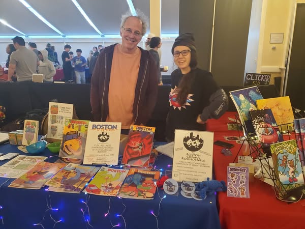
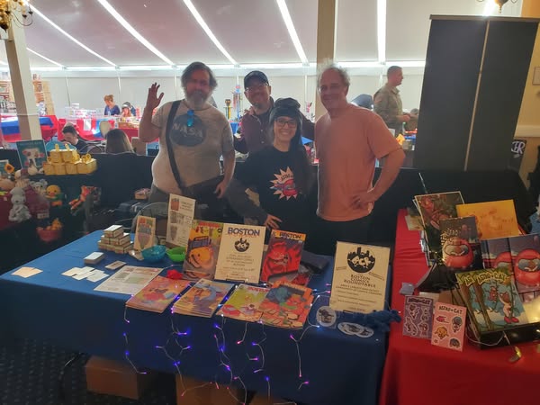
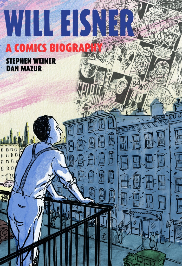
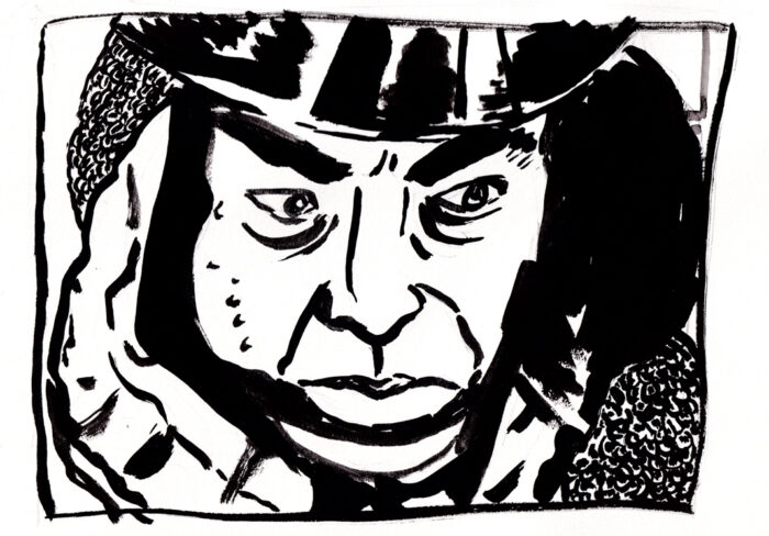

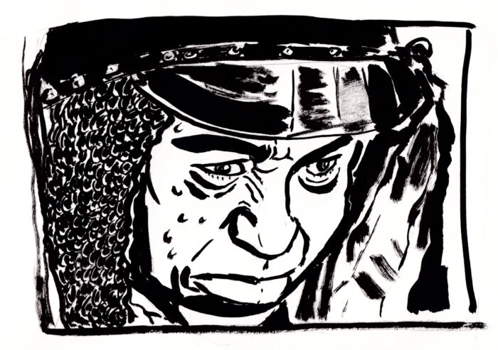

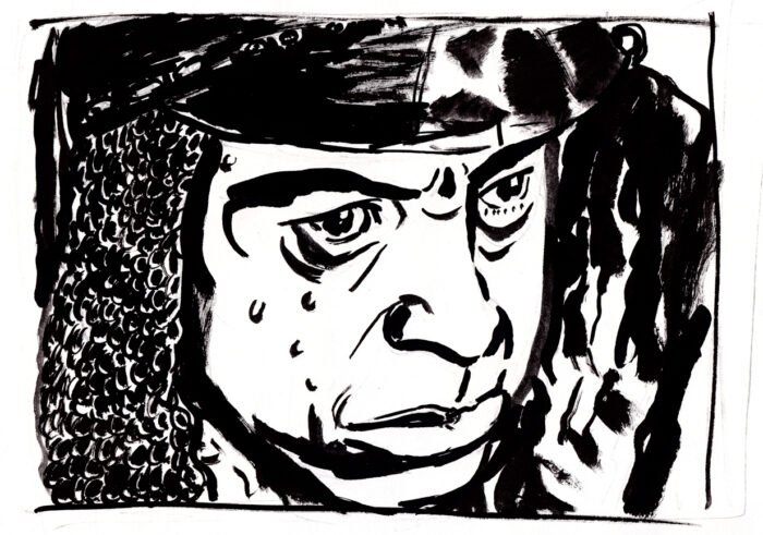
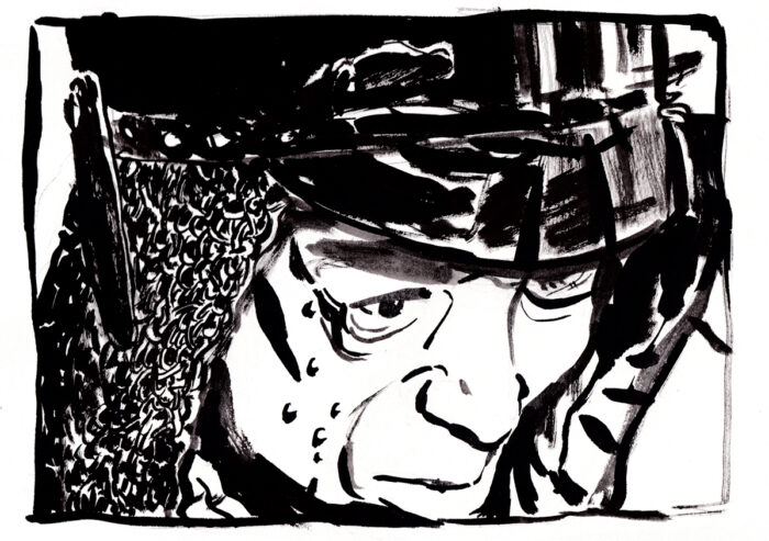
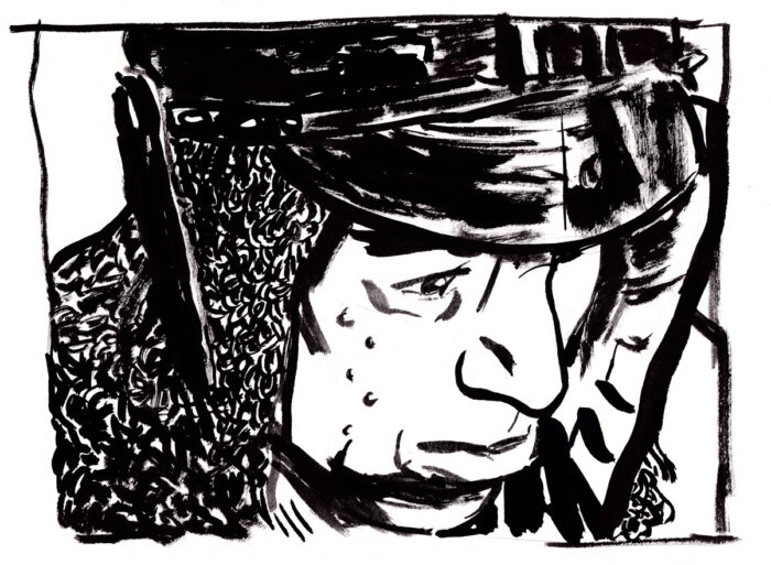
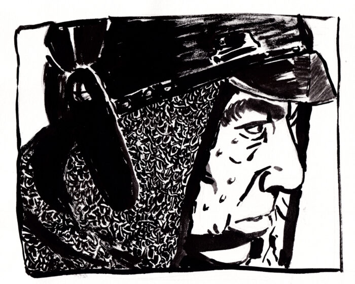
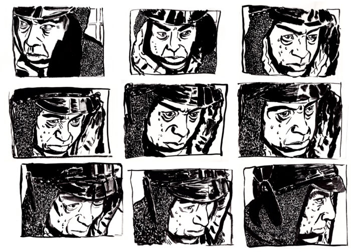
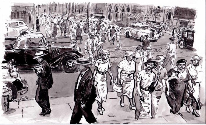
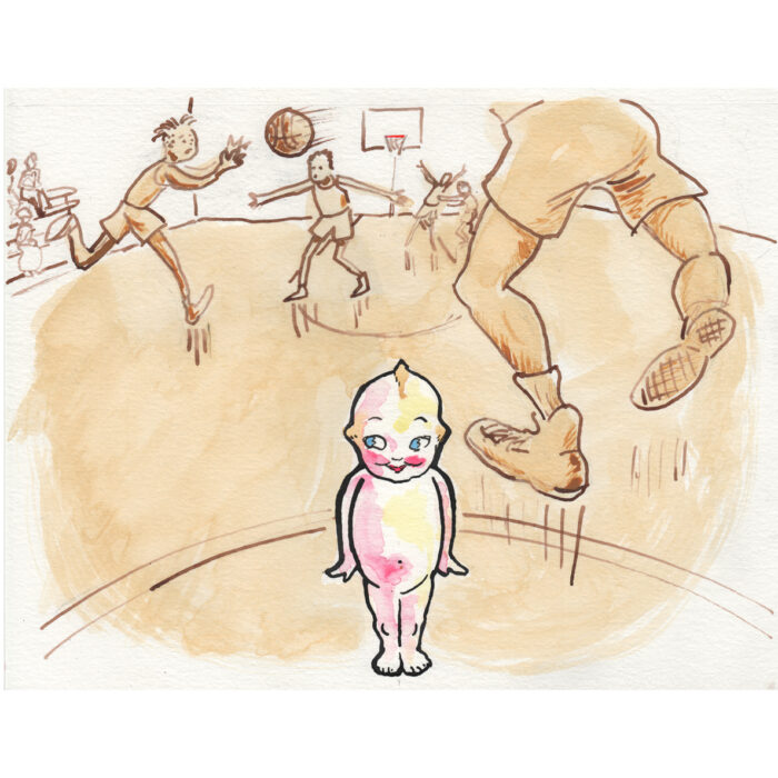
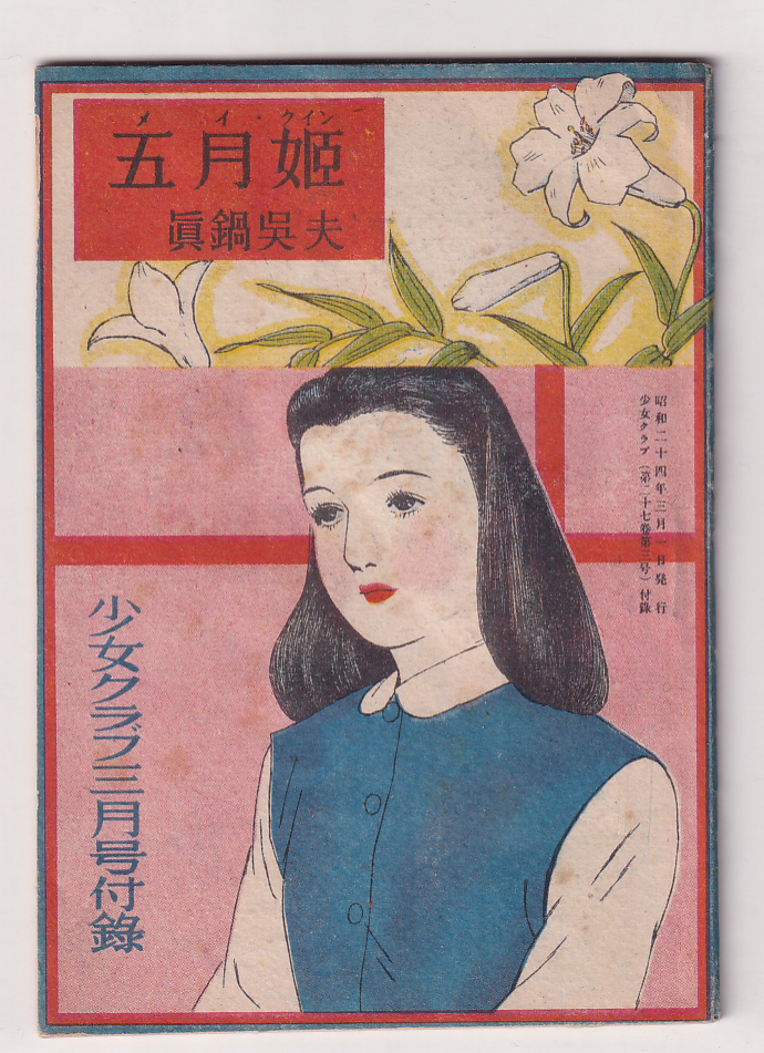
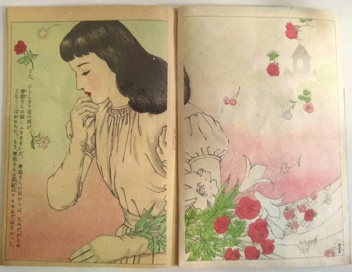
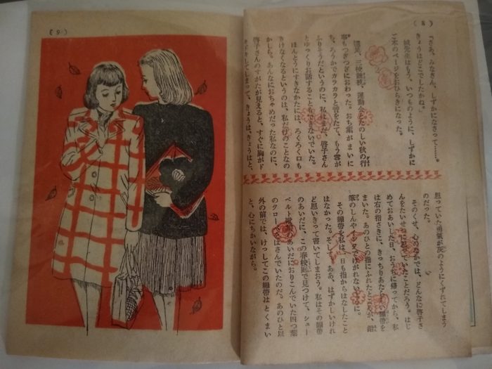
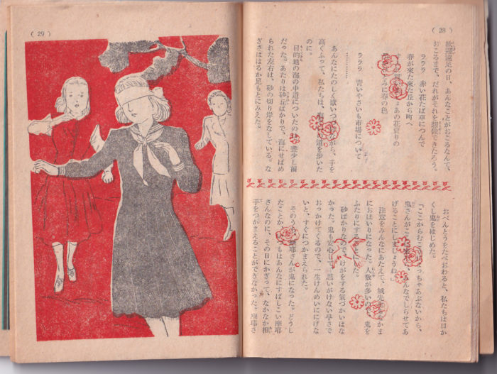
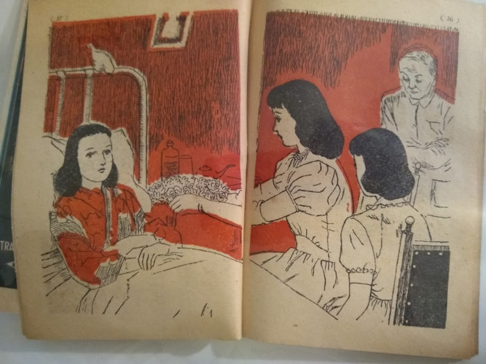
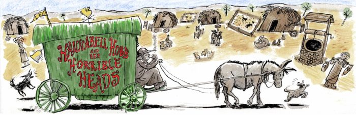
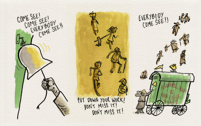
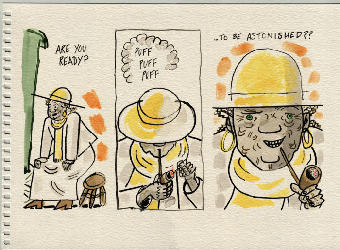
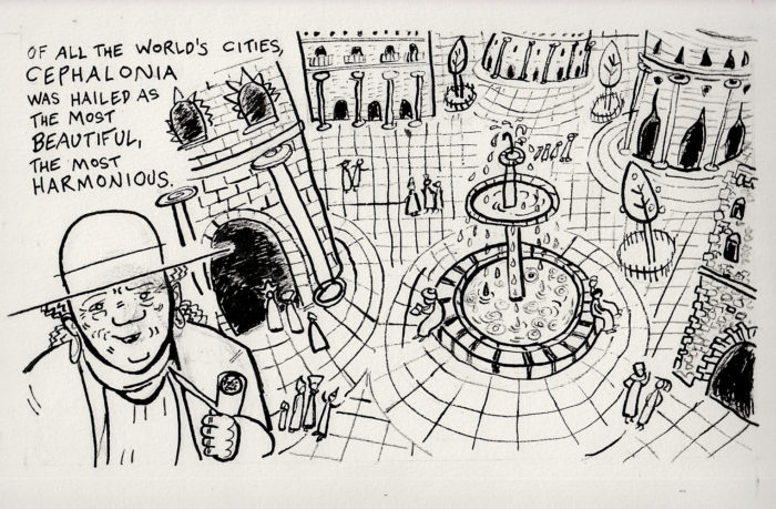
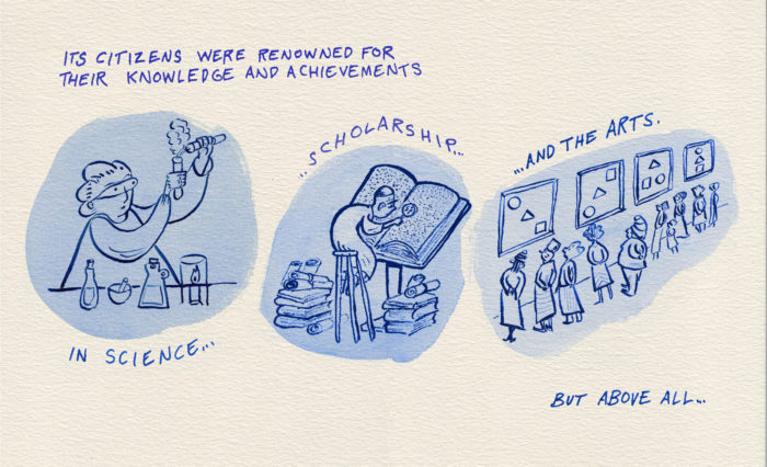
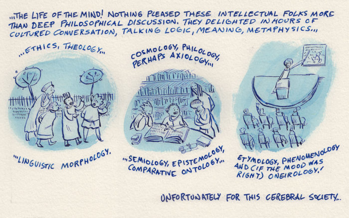
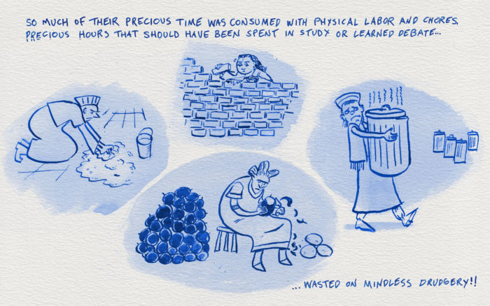
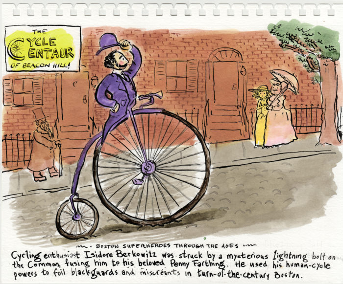
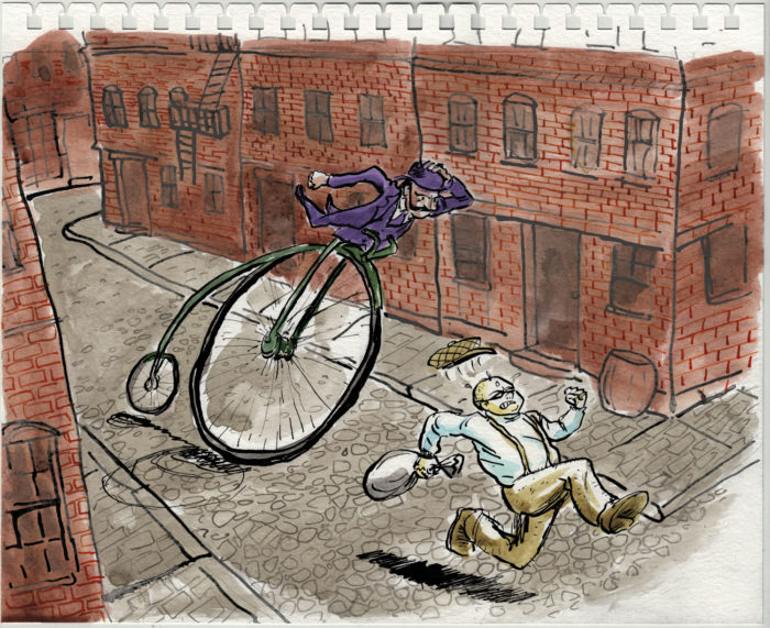
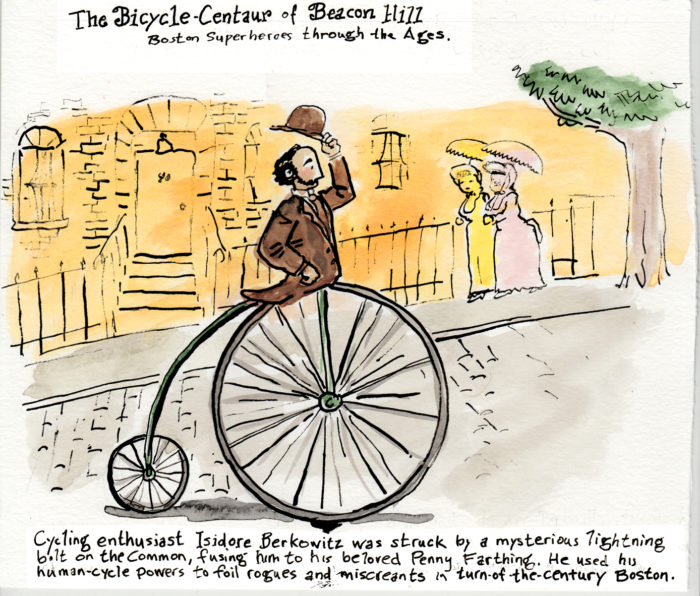
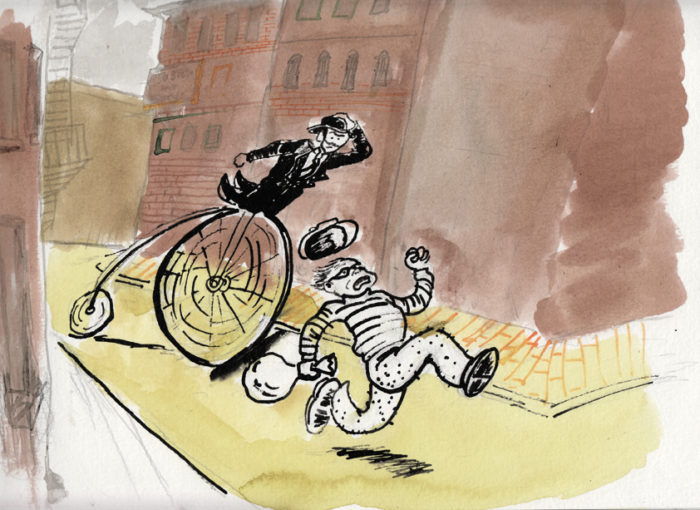
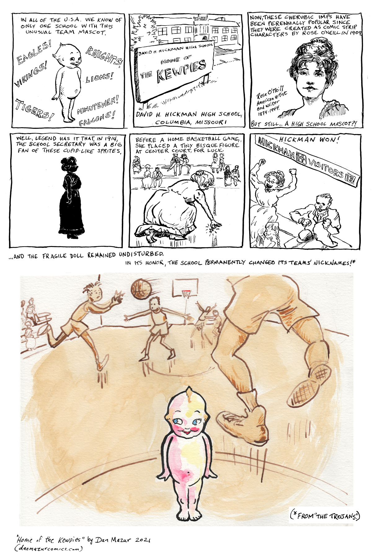
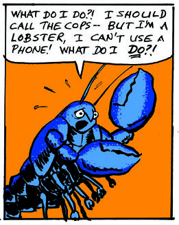
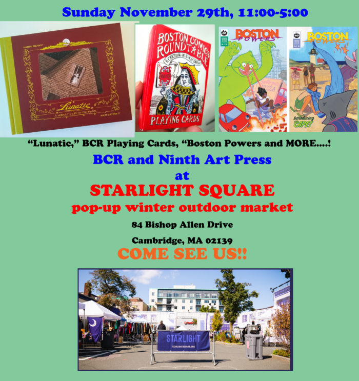
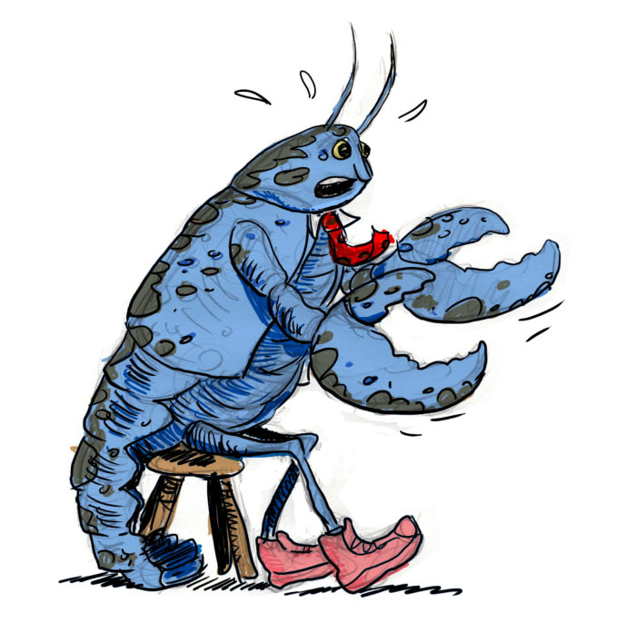
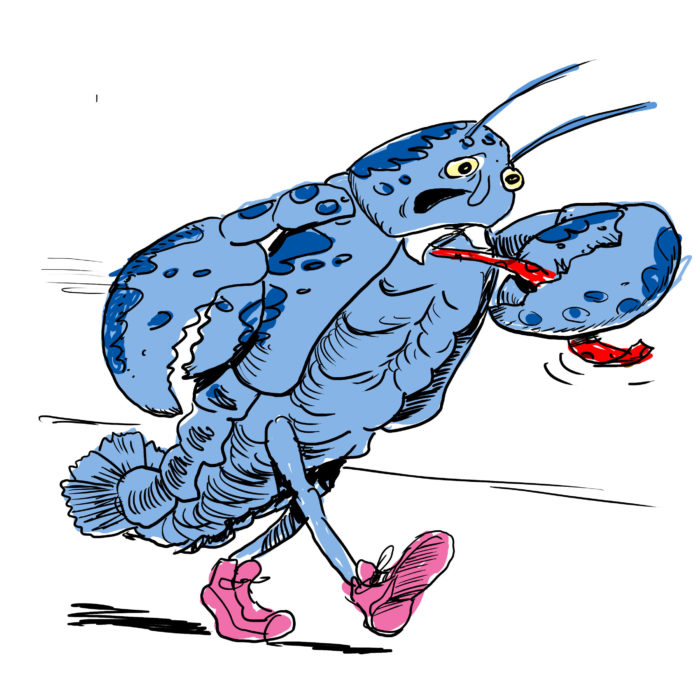
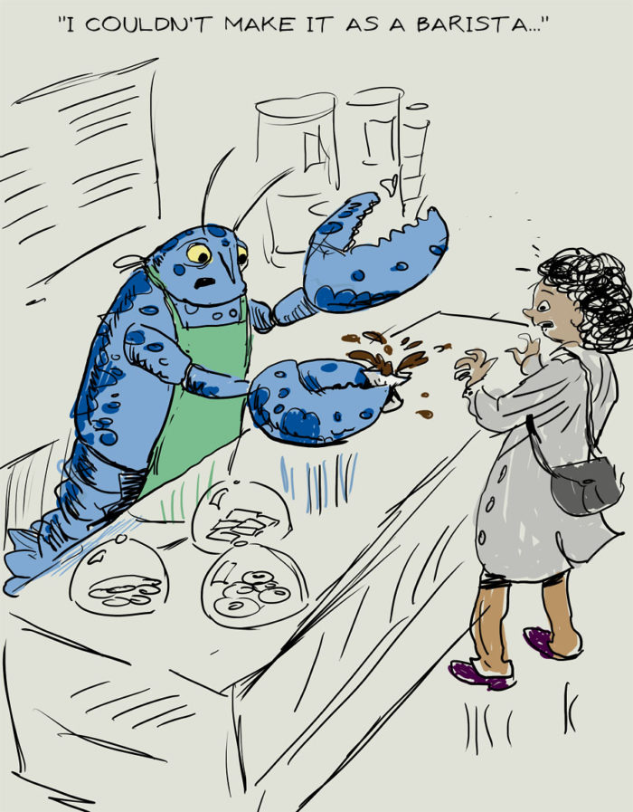

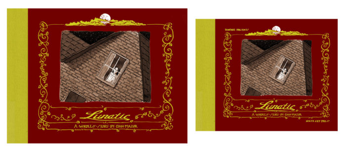
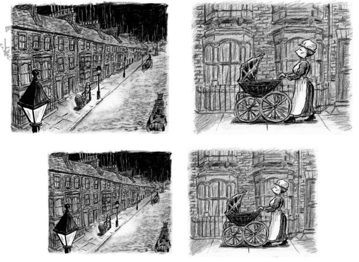
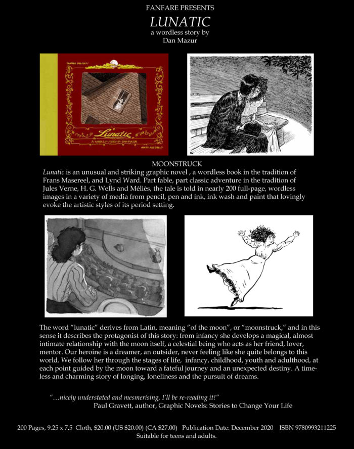
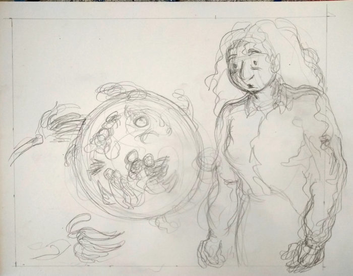
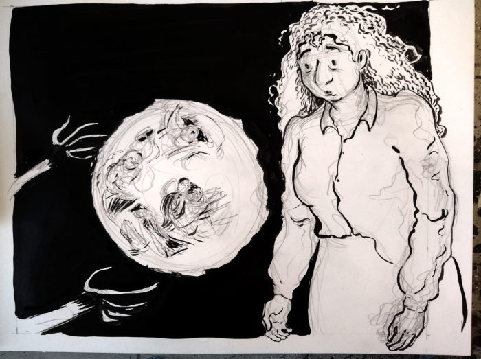
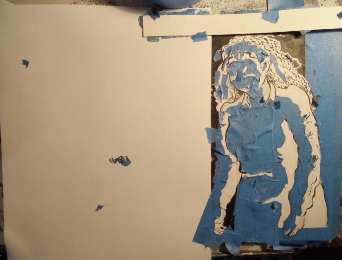
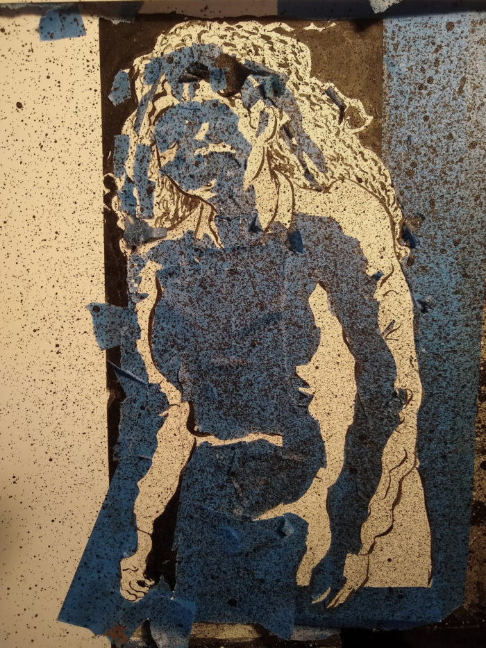
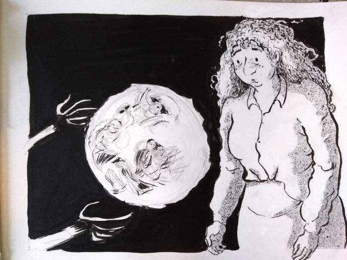
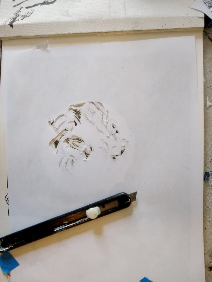
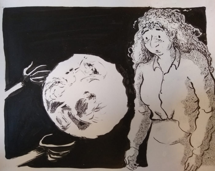
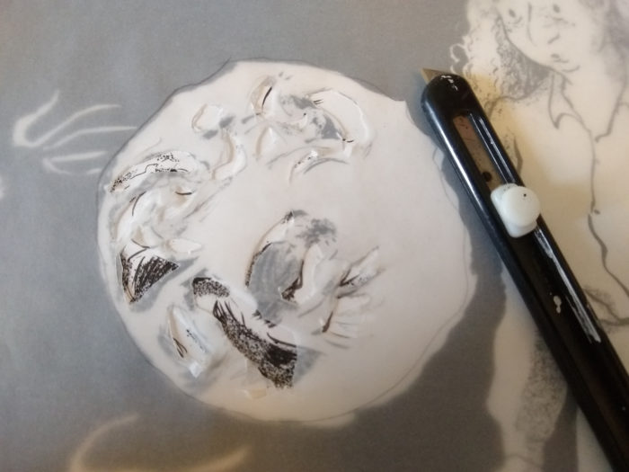
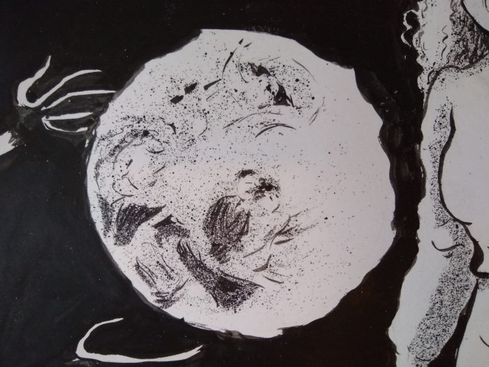

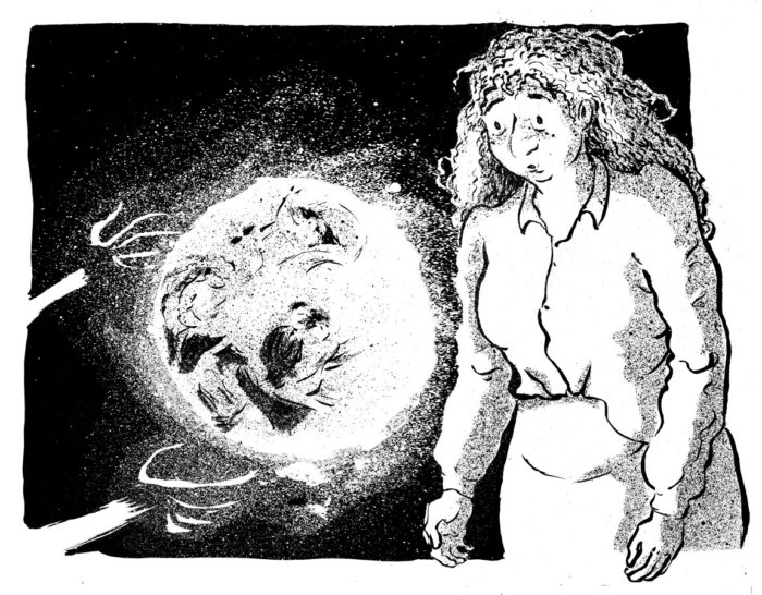
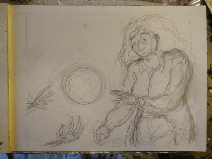
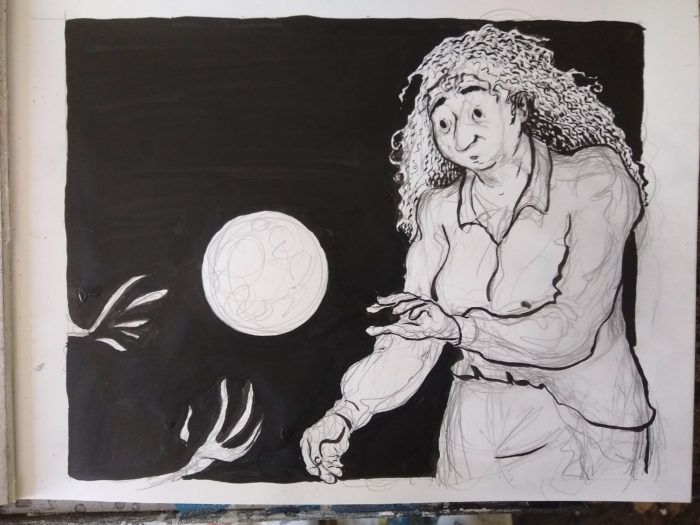


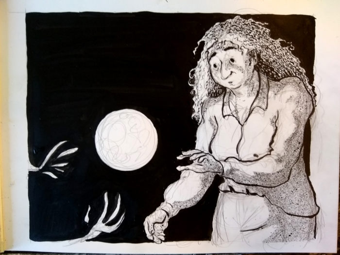
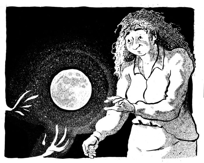
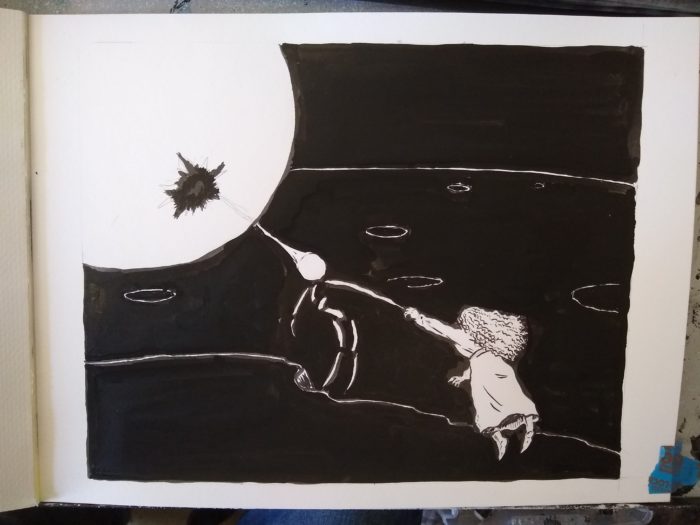


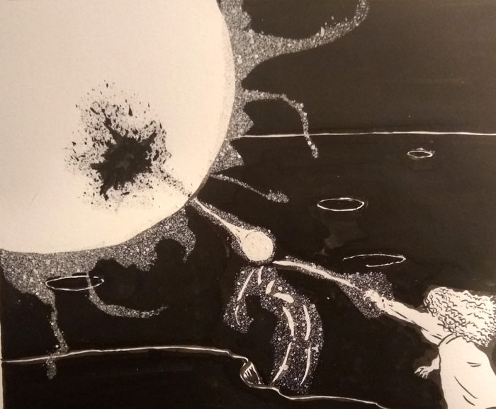


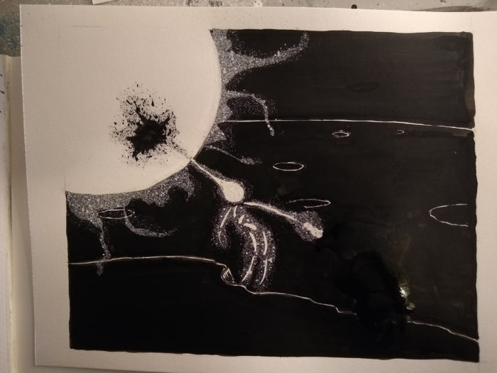

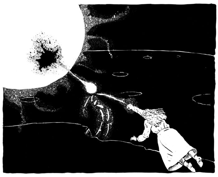
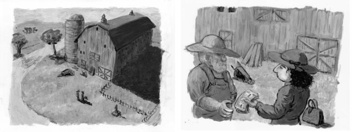


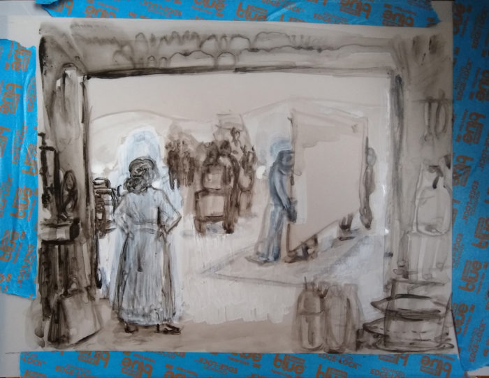
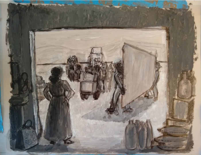
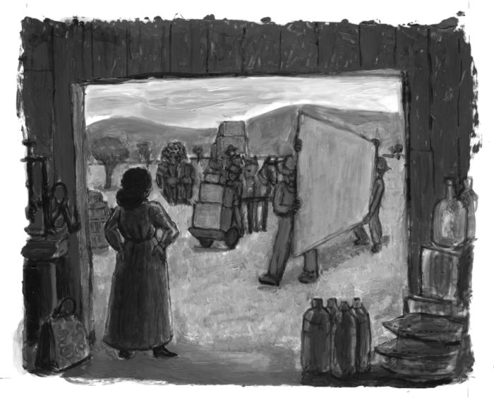
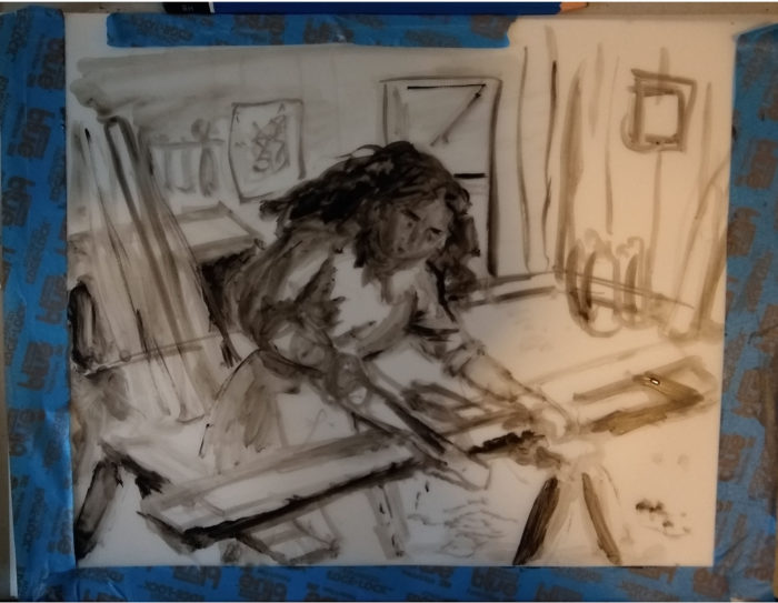
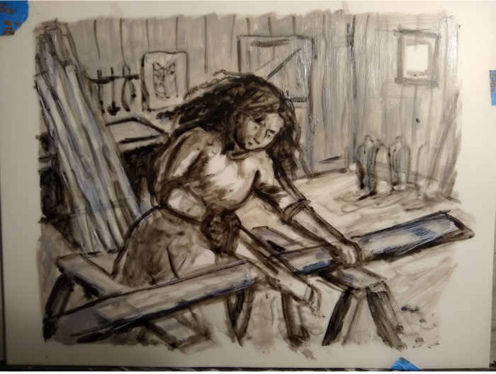
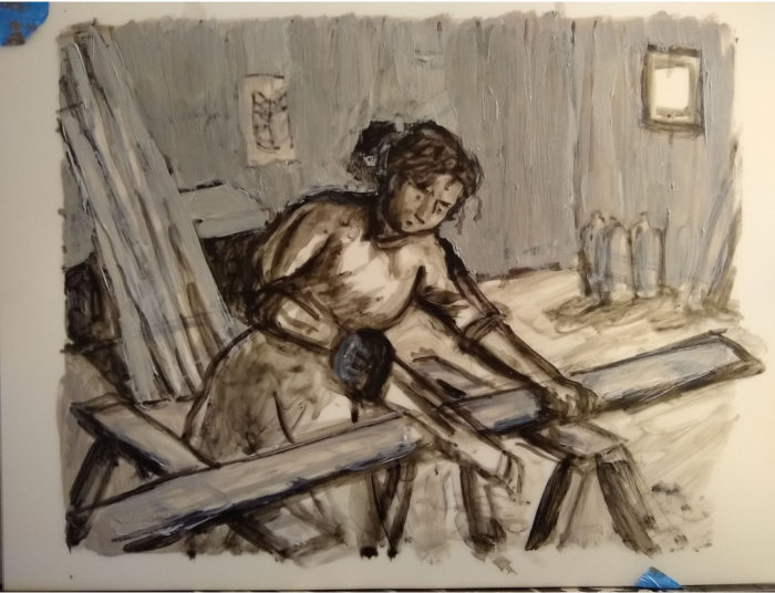
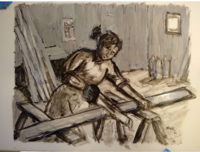
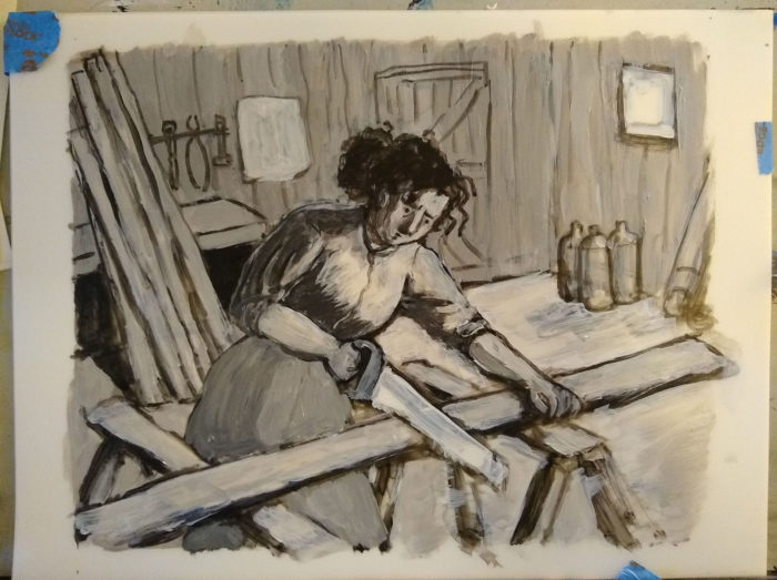
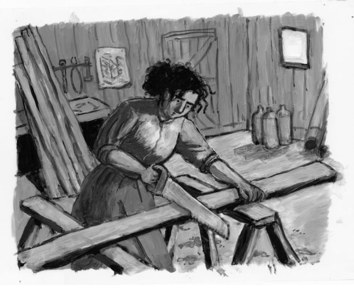
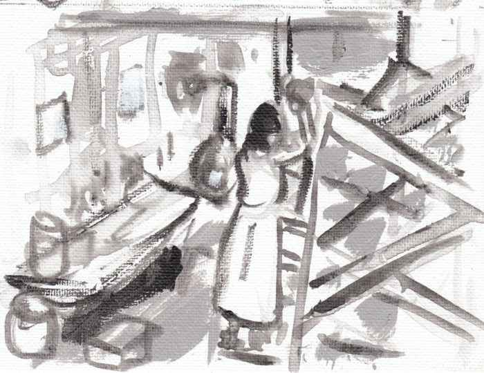
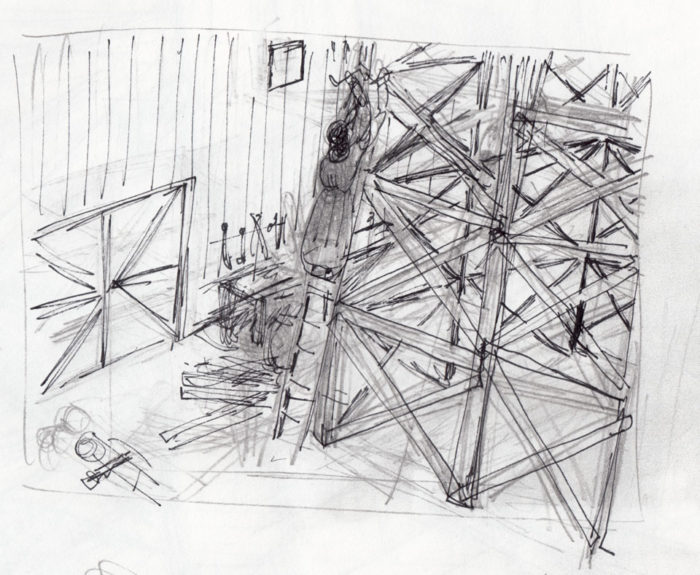
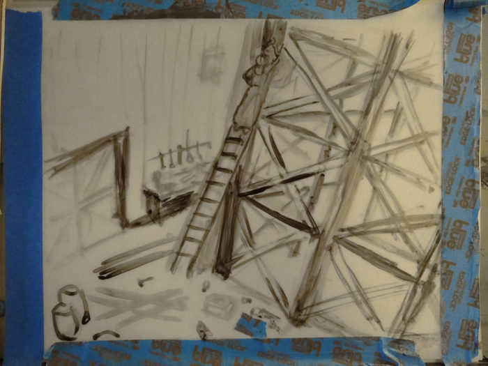
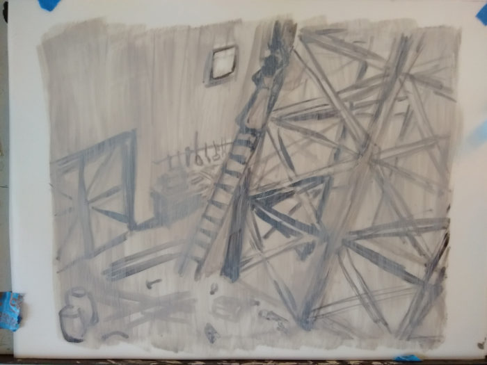
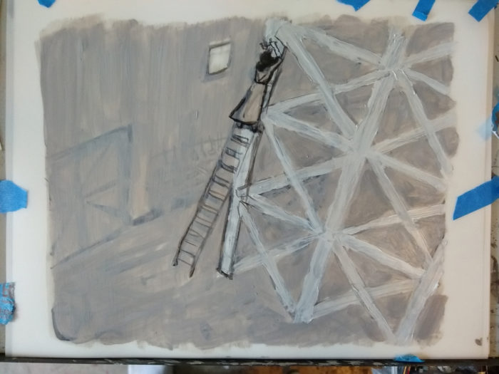
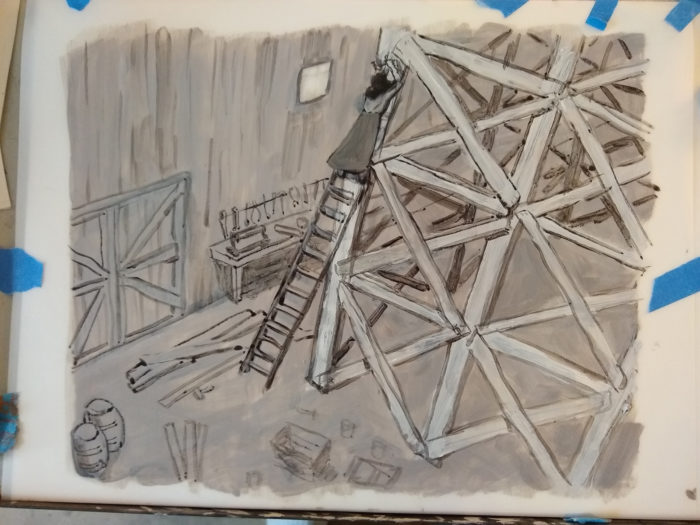
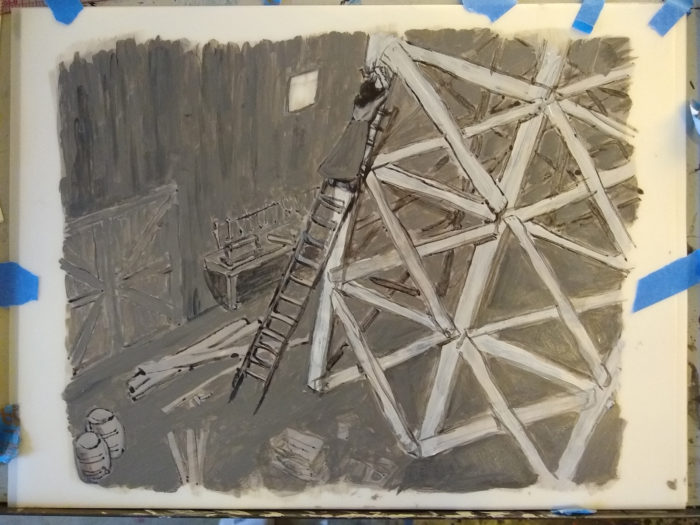
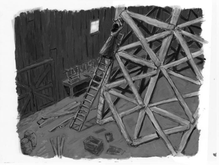

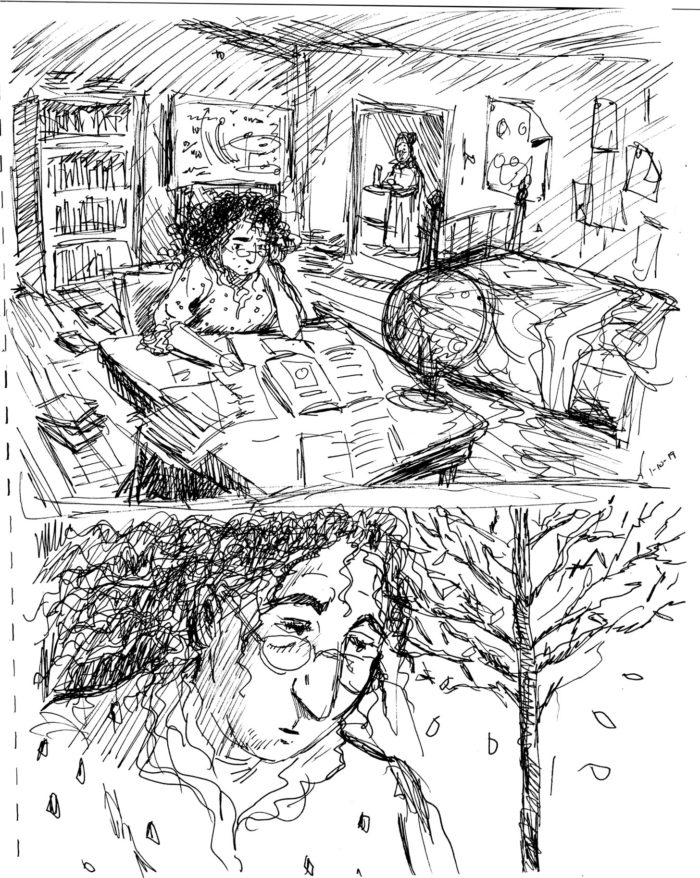
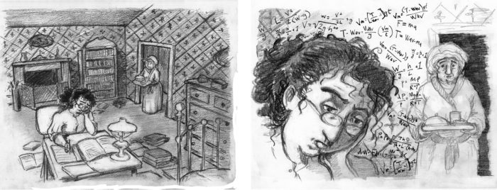
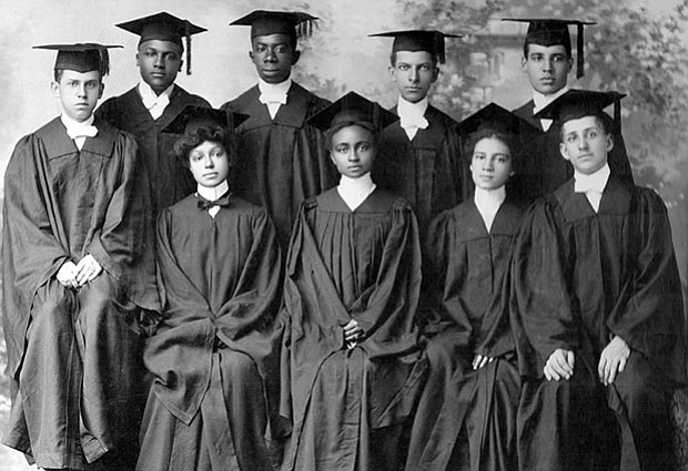
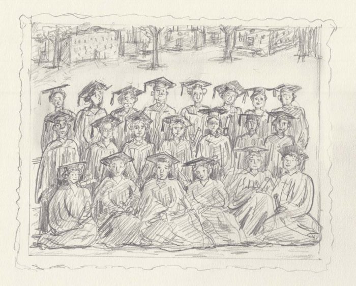
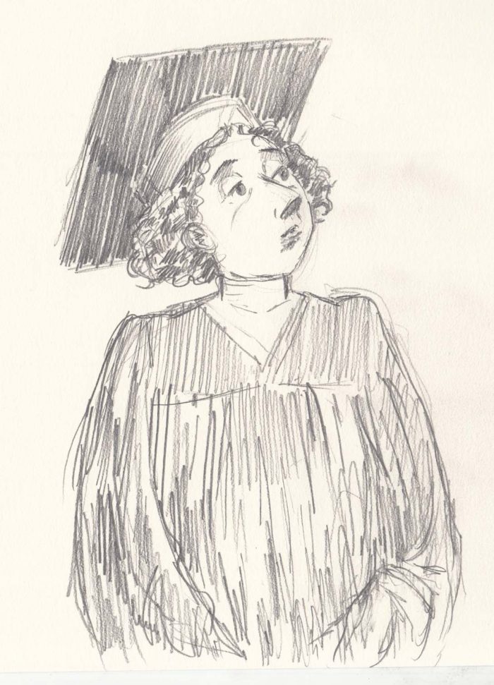
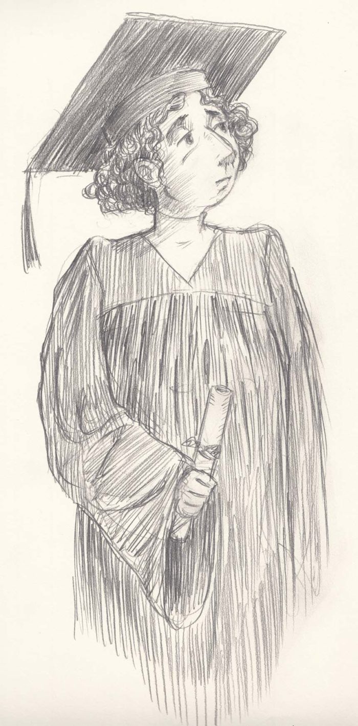
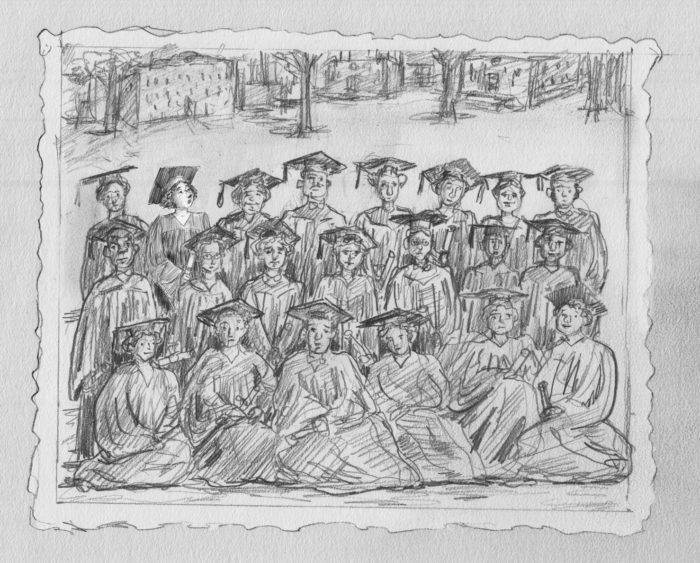
 After the last chapter ballooned to 34 pages, I decided to compress my story-telling for a while. The next section is transitional, showing the character’s college career, as she knuckles down and studies hard. I knew that it would be showing her studying long and hard in the library, and I decided it to do it in only 3 images, a progression taking place over a few hours.  I chose to draw the same scene 3 times, from the same vantage point, a bird’s eye view of the library, with the character far below, close to the center of the image.  The changing positions of the characters, and the changing light, tells the story. I have some ideas how I will add tones/shading, sticking to my principle of changing techniques or materials in each chapter.
Some pencil sketches:
After the last chapter ballooned to 34 pages, I decided to compress my story-telling for a while. The next section is transitional, showing the character’s college career, as she knuckles down and studies hard. I knew that it would be showing her studying long and hard in the library, and I decided it to do it in only 3 images, a progression taking place over a few hours.  I chose to draw the same scene 3 times, from the same vantage point, a bird’s eye view of the library, with the character far below, close to the center of the image.  The changing positions of the characters, and the changing light, tells the story. I have some ideas how I will add tones/shading, sticking to my principle of changing techniques or materials in each chapter.
Some pencil sketches:
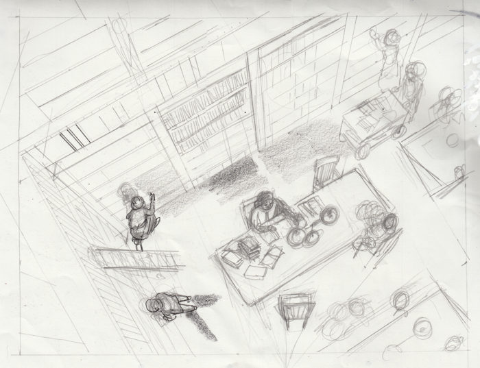
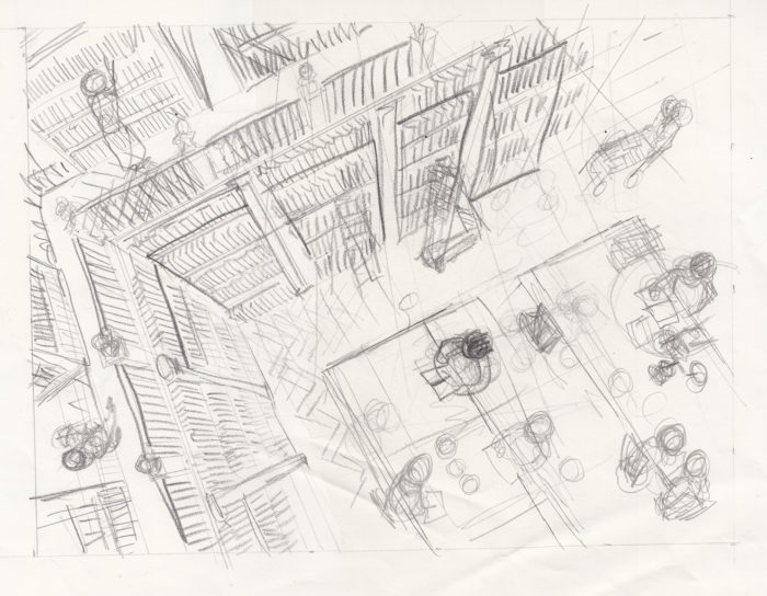 I want the drawing to be precise, the line clean. An ink test:
 The laborious, one-point perspective this required me to draw, seemed to me to mirror the dull hours of scientific study required for the character to achieve her goal. At least, that’s what I told myself as I found myself burdened with endless ruler-drawing.
Drawing the high-angle “shot” in one-point perspective isn’t really that difficult — just
The laborious, one-point perspective this required me to draw, seemed to me to mirror the dull hours of scientific study required for the character to achieve her goal. At least, that’s what I told myself as I found myself burdened with endless ruler-drawing.
Drawing the high-angle “shot” in one-point perspective isn’t really that difficult — just 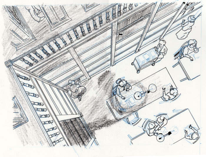 final blue pencils for page 1:
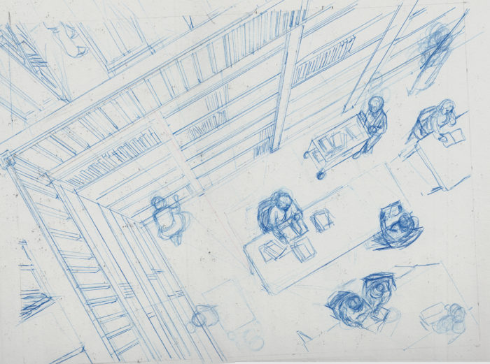 The inking process turned into a battle between me and a succession of pens. I’ve generally avoided using brush pens, fountain pens or technical pens in my comics, in favor of more traditional brushes or nib pens. But because I needed to use a ruler (and nib pens and rulers don’t work well together, the ink OFTEN runs under the ruler edge and blobs up), I decided to use a Rotring art pen, VF point. This worked well at first, but there’s one problem: if I do make a mistake, the non-waterproof ink cannot be corrected with any form of white-out that I know of… they’re all water-based, and the ink just smears. See the column in the lower left of the page:
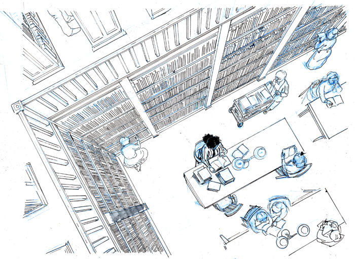 At this point, I still had a goal of nice clean originals, so rather than just correct in photoshop, I decided to fill Rotring cartridges with my usual, waterproof India ink. I was able to do this, but I quickly found that it’s the thick ink itself that causes the blotching under the rulers — it was no cleaner than using a nib pen. I went back to the Rotring regular cartridge, resigned to correcting blotches (and other errors) in photoshop.
Page 1’s final line-art. It turned out pretty clean anyway:
At this point, I still had a goal of nice clean originals, so rather than just correct in photoshop, I decided to fill Rotring cartridges with my usual, waterproof India ink. I was able to do this, but I quickly found that it’s the thick ink itself that causes the blotching under the rulers — it was no cleaner than using a nib pen. I went back to the Rotring regular cartridge, resigned to correcting blotches (and other errors) in photoshop.
Page 1’s final line-art. It turned out pretty clean anyway:
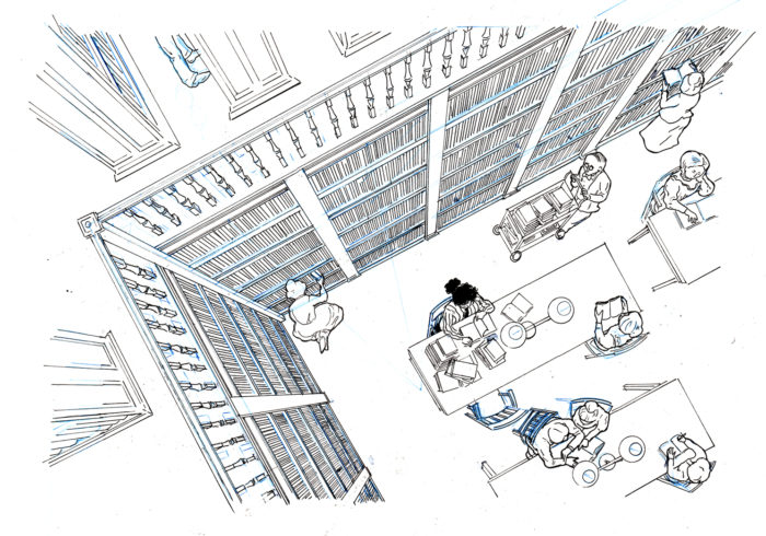 Moving on to page 2, and things got messy. Maybe it was because the Rotring’s nib had loosened up, but it was bleeding and blotching all over the place:
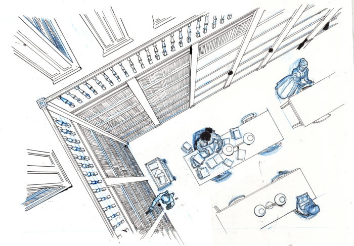 So I really sold out all my artistic principles and switched to a Micron to finish the page! I cut out a new piece of paper to completely re-draw/paste on, the shelves on the right side of the page:
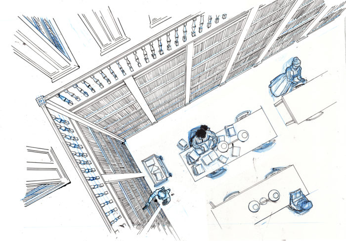 But I have to say, I really don’t like the line quality of Microns. Plus, the Micron ink is non-waterproof ink still can’t be whited out on the paper. I went to Artist & Craftsman Supply in Central Square and bought a few different technical pens with pigment (ie. permanent, ie. waterproof) ink. I don’t think they had these a few years ago! The one I ended up using was the  (I used the .08 and the .05 tips). Good pen!
Line work for page 3. By this time I knew what I was doing well enough to only need one version:
But I have to say, I really don’t like the line quality of Microns. Plus, the Micron ink is non-waterproof ink still can’t be whited out on the paper. I went to Artist & Craftsman Supply in Central Square and bought a few different technical pens with pigment (ie. permanent, ie. waterproof) ink. I don’t think they had these a few years ago! The one I ended up using was the  (I used the .08 and the .05 tips). Good pen!
Line work for page 3. By this time I knew what I was doing well enough to only need one version:
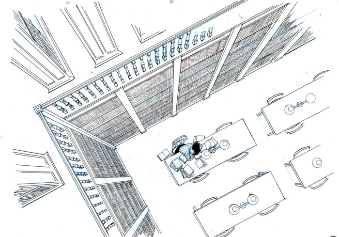 Now I moved onto the shading. The shading was going to be very important, because it tells of the passage of time, and creates the mood. Since my philosophy (or creative restraint) on the project is to change up the style or methods or materials in each chapter, I didnt want to repeat ink wash shading which I’d used before, and I had an idea of using litho crayon, because I love the look of lithographs, especially old French ones by Lautrec et al, or lithographs by Kathe Kollwitz.
I have to admit, that I think this decision was a little arbitrary: at least in my own mind, each of the change-ups of style/technique in previous chapters seemed motivated by the point of the chapter. Now I feel a little that I am reaching for difference for difference’s sake. This may become a real problem in ensuing chapters, but I’ll cross the bridge when I get there.
Also, lithography crayon is designed for, well, lithography, so using it on Bristol paper might not be the best fit. Anyway, I didn’t have the confidence to start crayoning over the line work, so I decided to do it on separate paper (using a light box with the line work under), and combine it on photoshop, so I drew things like this:
Now I moved onto the shading. The shading was going to be very important, because it tells of the passage of time, and creates the mood. Since my philosophy (or creative restraint) on the project is to change up the style or methods or materials in each chapter, I didnt want to repeat ink wash shading which I’d used before, and I had an idea of using litho crayon, because I love the look of lithographs, especially old French ones by Lautrec et al, or lithographs by Kathe Kollwitz.
I have to admit, that I think this decision was a little arbitrary: at least in my own mind, each of the change-ups of style/technique in previous chapters seemed motivated by the point of the chapter. Now I feel a little that I am reaching for difference for difference’s sake. This may become a real problem in ensuing chapters, but I’ll cross the bridge when I get there.
Also, lithography crayon is designed for, well, lithography, so using it on Bristol paper might not be the best fit. Anyway, I didn’t have the confidence to start crayoning over the line work, so I decided to do it on separate paper (using a light box with the line work under), and combine it on photoshop, so I drew things like this: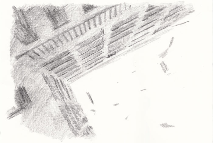
 My initial idea was not to shade the first page at all, since it’s set during the daytime. So I started with page 2. Here are some attempts at the traditionally-drawn-but-photoshopped-on shading:
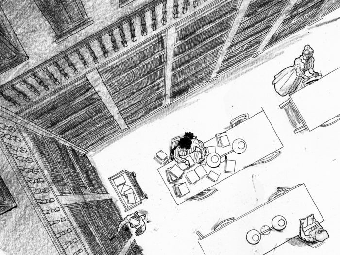
 (Here you can see that I had I decided that the effect of the “nearly empty” library was diminished by the character at the other table, so I took her out, digitally).
Not satisfied with the texture of the shading, and uncertain how to handle the light on the floor area. After some input at the BCR meeting, I tried combining wash and litho crayon:
(Here you can see that I had I decided that the effect of the “nearly empty” library was diminished by the character at the other table, so I took her out, digitally).
Not satisfied with the texture of the shading, and uncertain how to handle the light on the floor area. After some input at the BCR meeting, I tried combining wash and litho crayon:
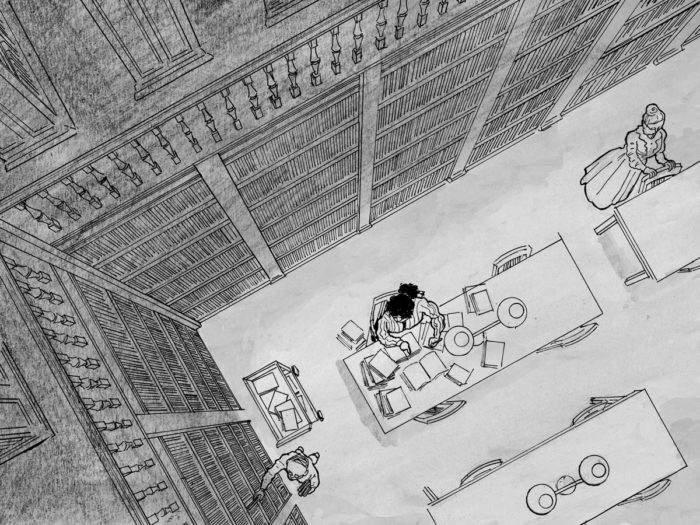 I was now realizing that the shading is actually where the real story-telling takes place, and was at least as challenging as the line-drawing. Even more than the other developments in the drawing (going from crowded library, to nearly-empty library, to empty library and she’s asleep), the shading immediately communicates the progress of time and the changing mood.
My plan had been to keep page 1 just to the line drawing, no shading at all. But as I looked at the progression of page 1 to page 2, I felt the contrast was too stark:
I was now realizing that the shading is actually where the real story-telling takes place, and was at least as challenging as the line-drawing. Even more than the other developments in the drawing (going from crowded library, to nearly-empty library, to empty library and she’s asleep), the shading immediately communicates the progress of time and the changing mood.
My plan had been to keep page 1 just to the line drawing, no shading at all. But as I looked at the progression of page 1 to page 2, I felt the contrast was too stark:
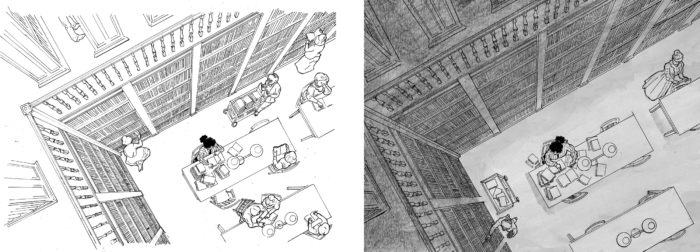 Also, I wanted to make the room feel as crowded and lively as possible so I added two new figures in the lower left:
 Added shadows, especially darkening in the bookshelves, which overall improved the definition and drama of the space, I think.
 But my main probems were with page 2. I obsessively kept re-doing the shading, and made other changes as well. I decided the character’s gesture in page 2 wasn’t doing anything for me, and that the figure of the man re-shelving books was detracting from the emptying-out quality of the room.
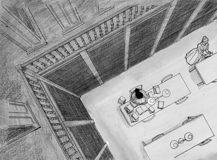
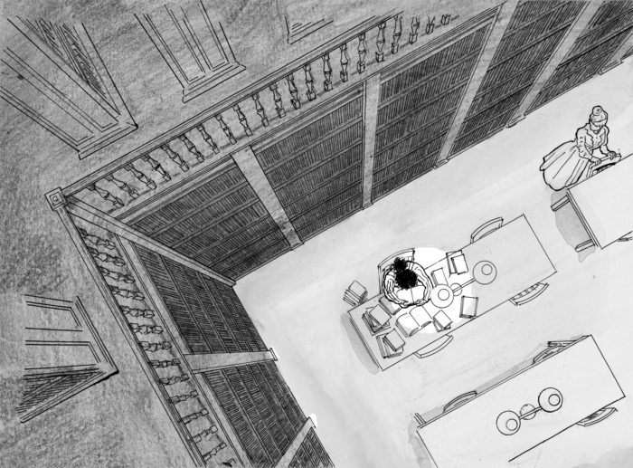 Reaching the stage where I can no longer discern which versions are better. I re-did the wash over the “floor” section of the drawing several times. I had been drawing on bristol. Wash on bristol sucks. My final (I think) version I re-drew just the “floor” section on watercolor paper.
At this point, I started to question whether this was the best way to draw the chapter, repeating the same view each time. I became convinced that, ultimately, it would be better to “zoom in” gradually so that the sleeping character would fill the page on page 3. I felt like I had to go on and finish the original plan though, and try not to feel stupid laboriously drawing the library in perspective over again, despite my suspicion that it wouldn’t work.
Page 3 was actually much simpler, just a dark room with a circle of light where the figure will be, drawn in litho crayon over a light wash:
Reaching the stage where I can no longer discern which versions are better. I re-did the wash over the “floor” section of the drawing several times. I had been drawing on bristol. Wash on bristol sucks. My final (I think) version I re-drew just the “floor” section on watercolor paper.
At this point, I started to question whether this was the best way to draw the chapter, repeating the same view each time. I became convinced that, ultimately, it would be better to “zoom in” gradually so that the sleeping character would fill the page on page 3. I felt like I had to go on and finish the original plan though, and try not to feel stupid laboriously drawing the library in perspective over again, despite my suspicion that it wouldn’t work.
Page 3 was actually much simpler, just a dark room with a circle of light where the figure will be, drawn in litho crayon over a light wash:
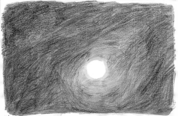 And photo-shopped over the line art:
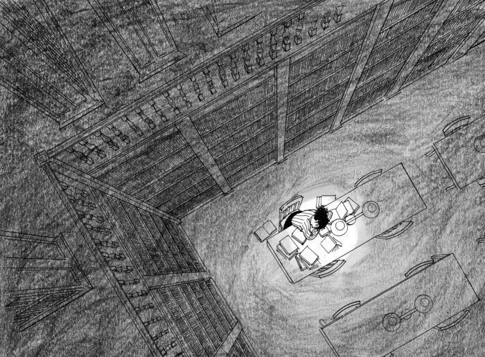 (NOTE: unlike the earlier chapters, I’m planning to have a bleed on these pages).
So, the three-page chapter goes something like this. One:
(NOTE: unlike the earlier chapters, I’m planning to have a bleed on these pages).
So, the three-page chapter goes something like this. One:
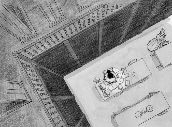 Three:
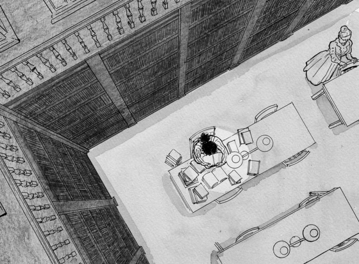
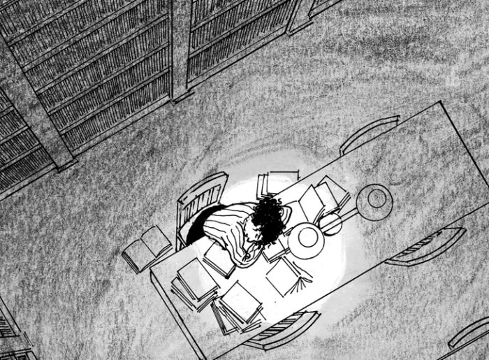 Nope, I think it works better the original way. What do you think?
 Here’s the new BCR logo, designed by yours truly.
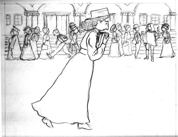 Inks (still just inkwashes, the line work remains pencil):
 Page 3. I went through several versions of this, over the last couple weeks of October (MICE season. A pencil version that I abandoned. I don’t really remember what I didnt like about this. The placement of the figure, maybe? Â
Page 3. I went through several versions of this, over the last couple weeks of October (MICE season. A pencil version that I abandoned. I don’t really remember what I didnt like about this. The placement of the figure, maybe?   More pencils:
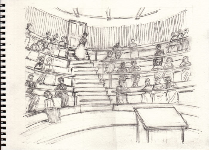 And the ink washes added to that version:
 Again, five months later and I’m not sure why I wasn’t satisfied with this. But, apparently, I wasn’t. The shape of the skirt is a little blobby, maybe that was it. Anyway, here’s the final version. Maybe I’ll end up using the previous one, I don’t know. I got options!
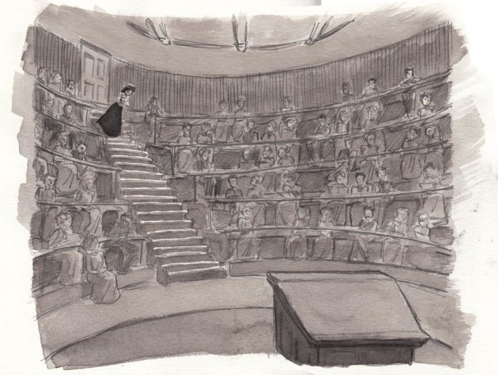 Onto page 4, which was pretty simple, just one try (11/2/17):
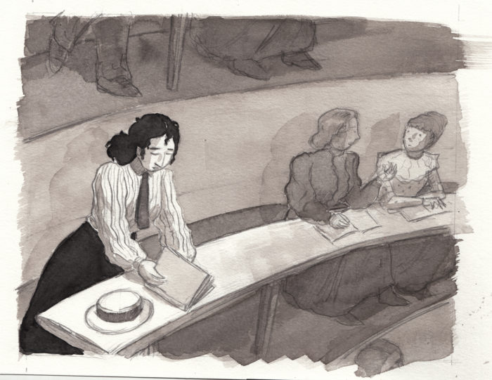 September 20: Page one, at last!
After the slow process of the last few chapters, I’ve resolved to be more spontaneous, and allow myself fewer “re-do’s.” Here’s the first page, drawn in one try, without any additional rough versions. I changed the composition from the rough I’d done for the mockup, from this:Â
September 20: Page one, at last!
After the slow process of the last few chapters, I’ve resolved to be more spontaneous, and allow myself fewer “re-do’s.” Here’s the first page, drawn in one try, without any additional rough versions. I changed the composition from the rough I’d done for the mockup, from this: 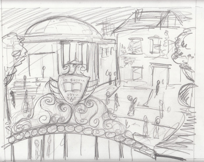 To this, the pencils for the final page:
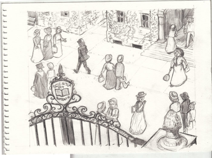 Before diving straight into the washes, I did a little digital experiment with tones, just to see how it might look, leaving the ground white and darkening the gate in the FG almost to black:
 Good enough, so I did the same thing with washes. I made some other changes first. I added the professorial figure with the cane, on the right, to reinforce the academic setting. Then, digitally, I adjusted the lettering on the gate a little, because it felt out of perspective to me (by the way, that’s Latin for “knowledge is power.”) Final page:
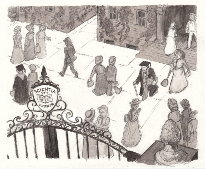 Looking at it now, I think I might digitally darken the washes, and erase the pavement lines, to leave the ground a solid white shape with darker figures against it — more like the digital-tone version above. That’s more of the graphic look I’d like for this.
September 11-14: testing the media
While working out the rough dummy, see below, I took a few moments to test the media I plan to use in this chapter. Basically, pencil with ink washes. I experimented with trying to get a slightly grungy texture in the washes (trying to look more like a printmaking look). I tried using litho crayon and then smearing it around with the wash. Eh, I don’t think it’s the way to go.
Looking at it now, I think I might digitally darken the washes, and erase the pavement lines, to leave the ground a solid white shape with darker figures against it — more like the digital-tone version above. That’s more of the graphic look I’d like for this.
September 11-14: testing the media
While working out the rough dummy, see below, I took a few moments to test the media I plan to use in this chapter. Basically, pencil with ink washes. I experimented with trying to get a slightly grungy texture in the washes (trying to look more like a printmaking look). I tried using litho crayon and then smearing it around with the wash. Eh, I don’t think it’s the way to go.
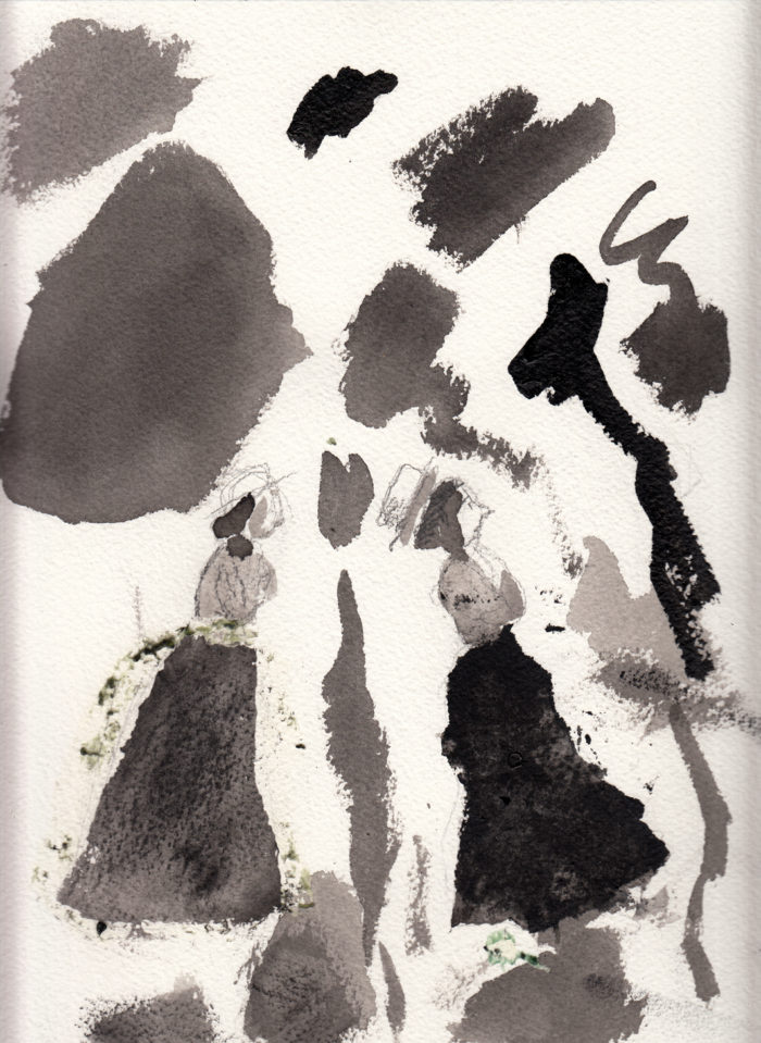
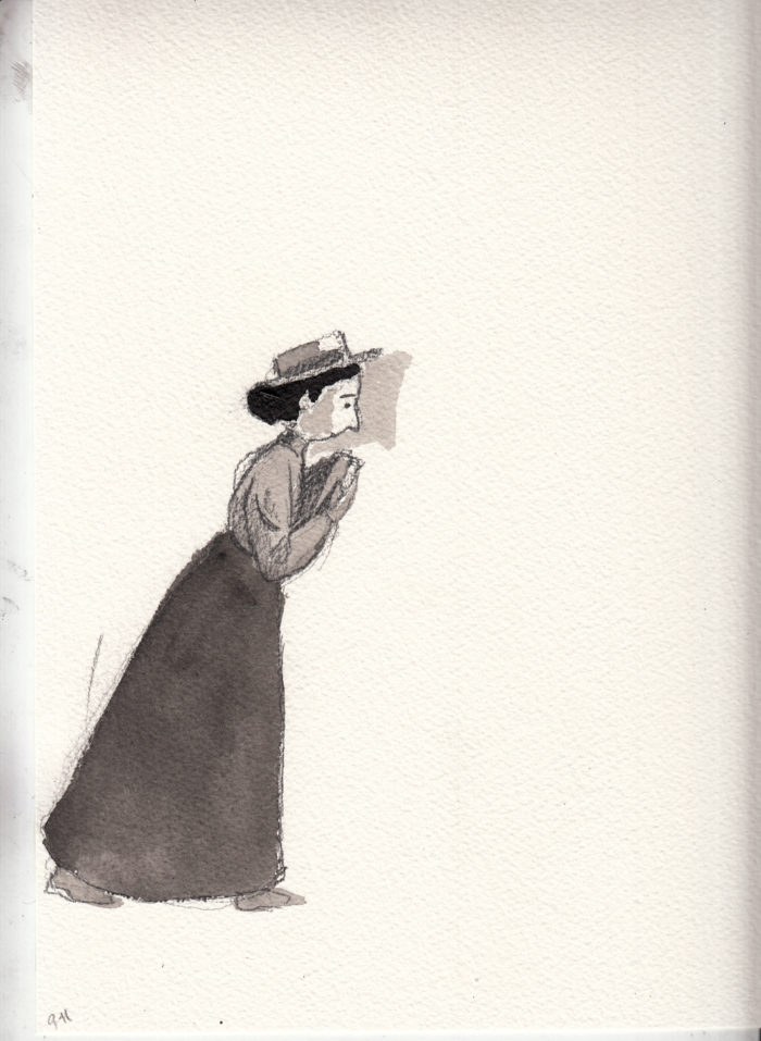 August 9-September 13. Interruptions & progress
This was a little over a month during which “one thing or another” kept me from getting much work done on this project. I tried when possible to do a little bit here and there on it, just to keep my hand in and my mind on it. As of today, I’ve gotten somewhere & hopefully back on track.
First, a few scribbled thumbnails:
August 9-September 13. Interruptions & progress
This was a little over a month during which “one thing or another” kept me from getting much work done on this project. I tried when possible to do a little bit here and there on it, just to keep my hand in and my mind on it. As of today, I’ve gotten somewhere & hopefully back on track.
First, a few scribbled thumbnails:
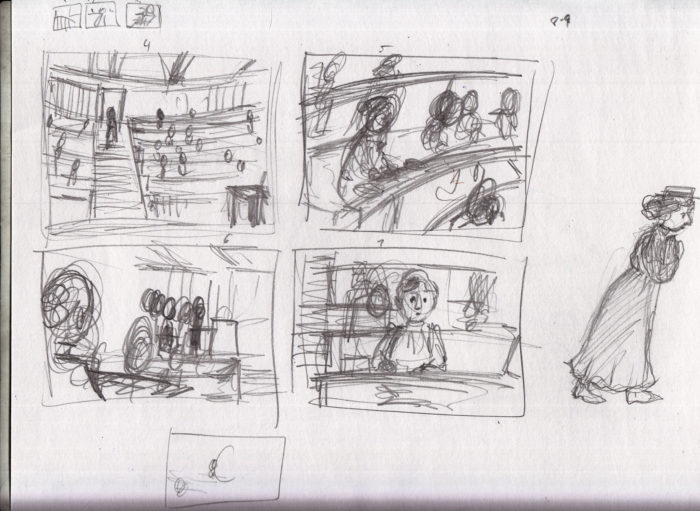
 Then I spent a few days sitting at a table at Boston Comic Con. Didn’t exactly work on this comic there, but I drew studies from old photographs as background:
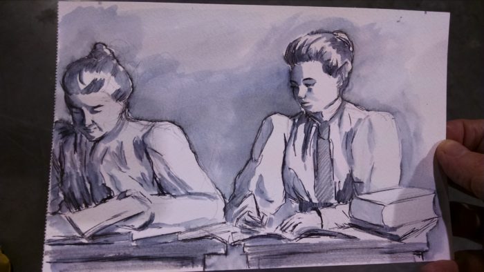
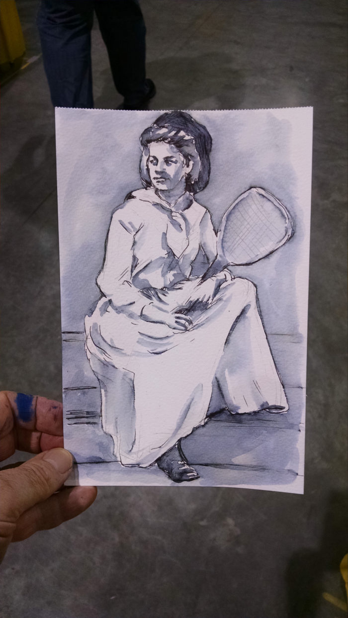
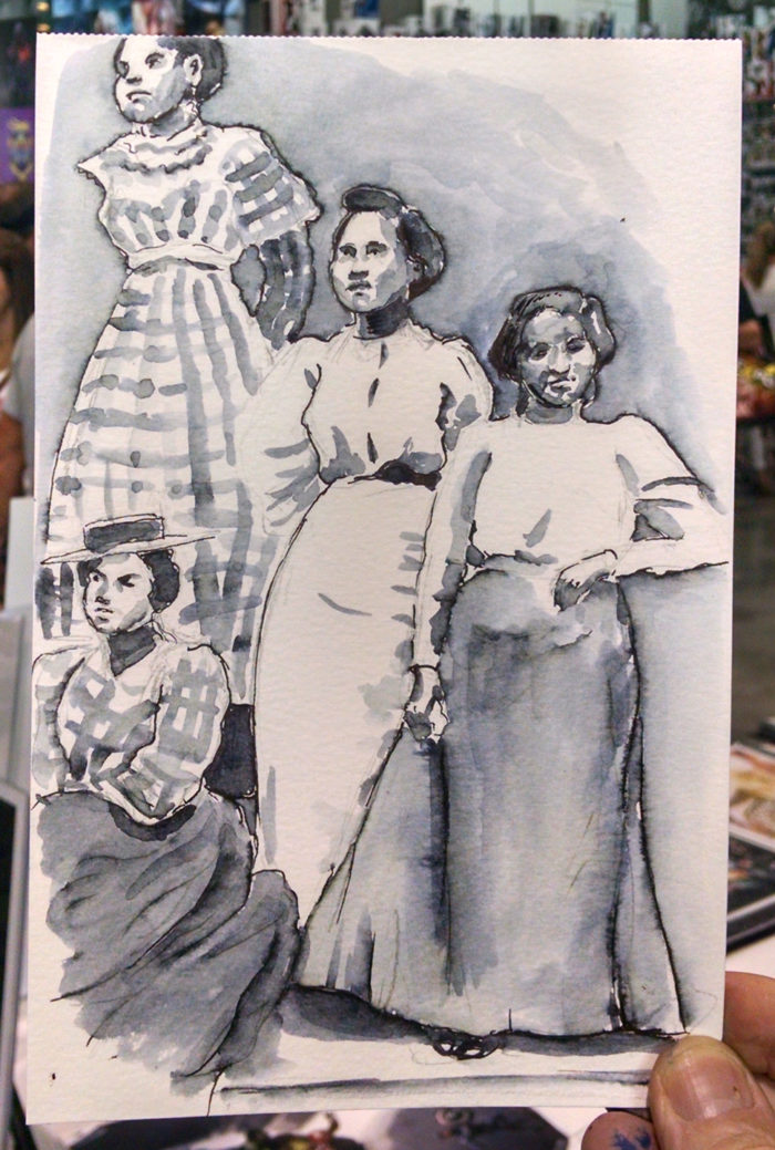
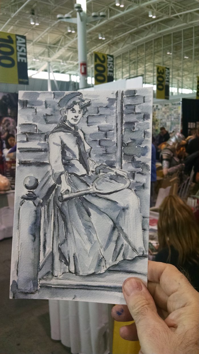
 This was fun, made me feel like I was working on the project in some way, and that last one I actually sold at the show.
There followed another couple weeks where I couldn’t get to work on this at all, then I found a little time to finish up the set of scribbly thumbnails I’d started before the Con:
This was fun, made me feel like I was working on the project in some way, and that last one I actually sold at the show.
There followed another couple weeks where I couldn’t get to work on this at all, then I found a little time to finish up the set of scribbly thumbnails I’d started before the Con:

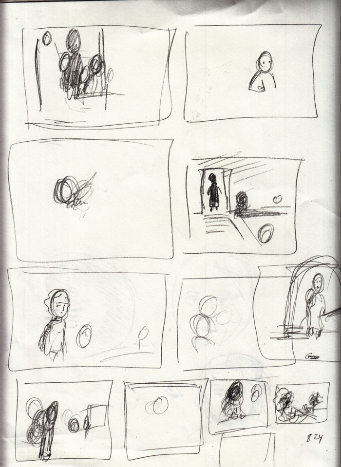 (somewhere in there I also did this rough sketch test of wash over conte crayon:
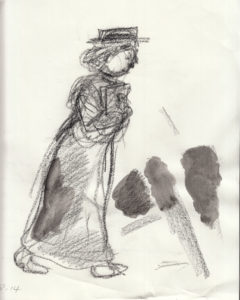 )
At this point I felt like I had a decent thumbnail sense of the story, but as I’ve learned in the previous 3 chapters, this “one image per page” style of storytelling is very exacting as far as the page turns and the pace/clarity of the story, so I set about to draw full-sized roughs of each page, from which I would then create a mock-up/dummy of the chapter.
I did a set of roughs, here they are laid out in 2-page spreads:
Here they are in a pile on the floor:
)
At this point I felt like I had a decent thumbnail sense of the story, but as I’ve learned in the previous 3 chapters, this “one image per page” style of storytelling is very exacting as far as the page turns and the pace/clarity of the story, so I set about to draw full-sized roughs of each page, from which I would then create a mock-up/dummy of the chapter.
I did a set of roughs, here they are laid out in 2-page spreads:
Here they are in a pile on the floor:

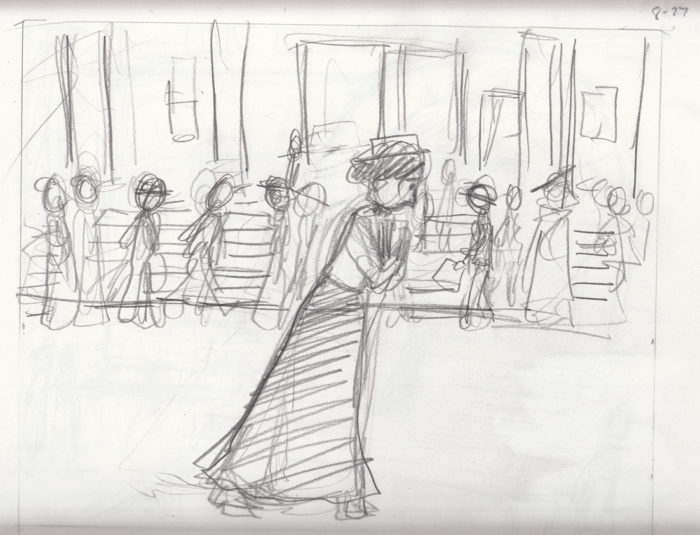
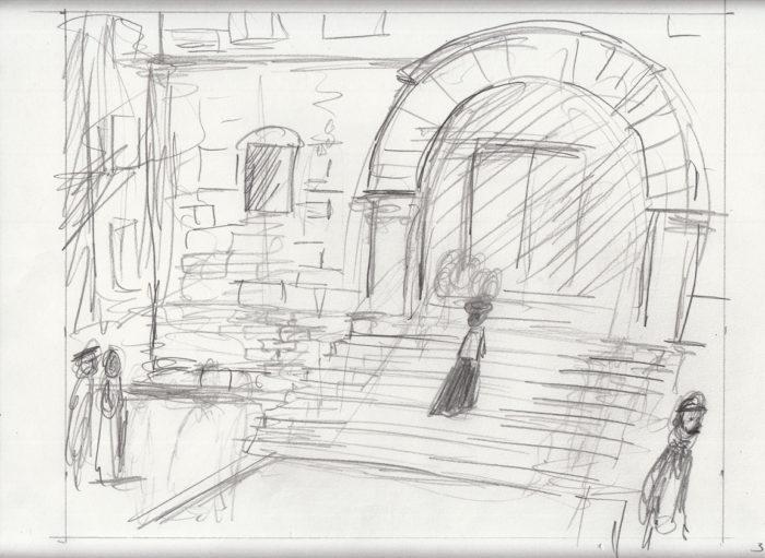
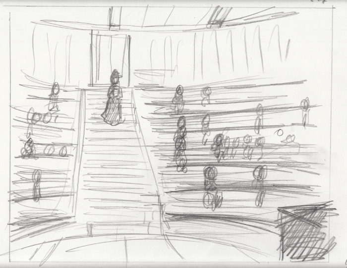
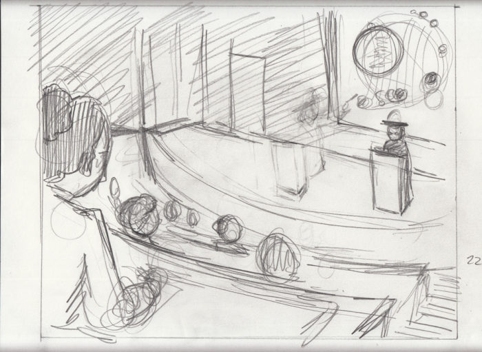

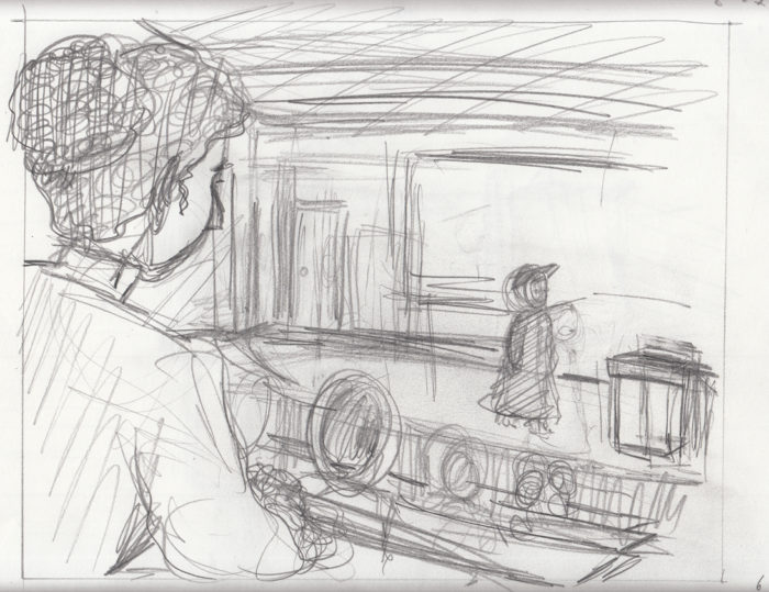
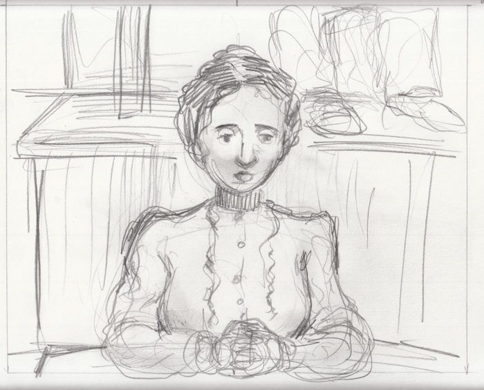

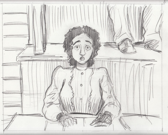
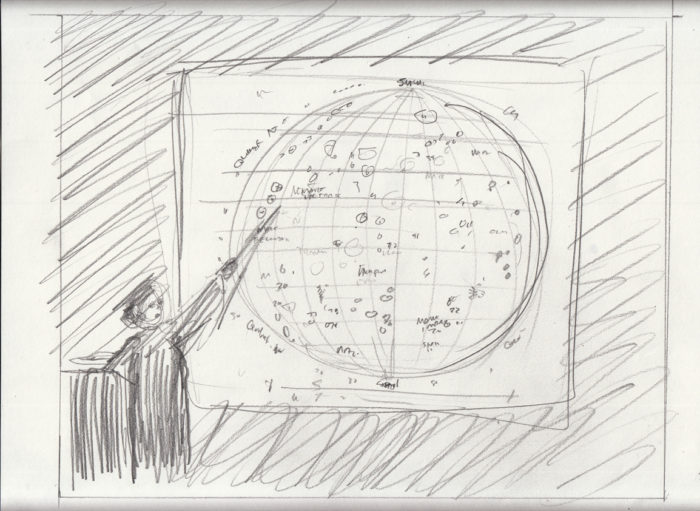
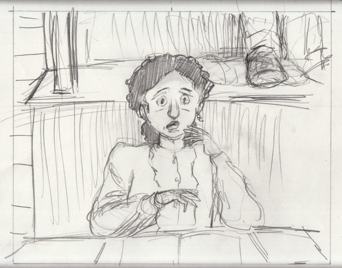
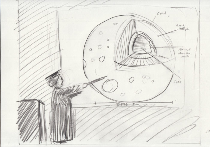
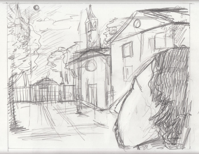
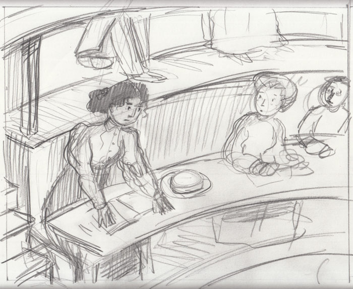
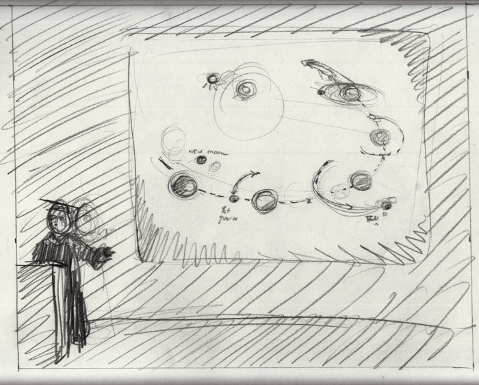
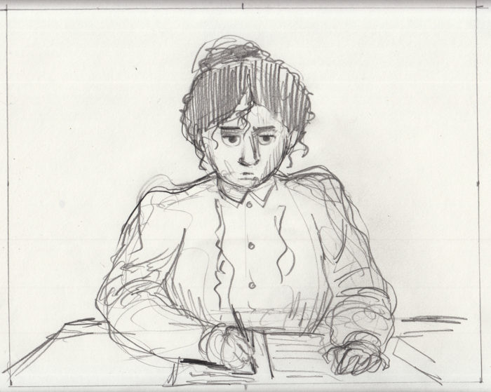
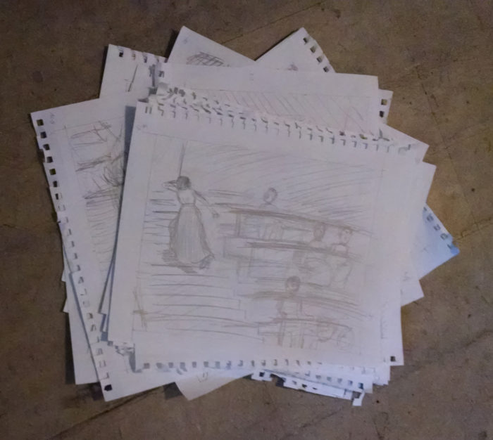 I laid these out and printed them out as a little booklet…
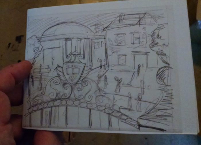
 I took it to the BCR meeting, got some valuable input from Heide Solbrig. The issue is, are her reactions to the classroom images clear, and then, is the communication between moon and protagonist clear? I don’t want to be OVERLY heavy-handed, if the reader has to do some work and piece the meaning together, even based on what happens in the next chapter, but at least give the reader a fighting chance of understanding what I mean. So some changes are needed.  But then… Another 9-10 days without being able to work. When things cleared up….
…I added some pages, to make the story clearer, and made a new dummy:
I took it to the BCR meeting, got some valuable input from Heide Solbrig. The issue is, are her reactions to the classroom images clear, and then, is the communication between moon and protagonist clear? I don’t want to be OVERLY heavy-handed, if the reader has to do some work and piece the meaning together, even based on what happens in the next chapter, but at least give the reader a fighting chance of understanding what I mean. So some changes are needed.  But then… Another 9-10 days without being able to work. When things cleared up….
…I added some pages, to make the story clearer, and made a new dummy:
 Here’s the revised layout. I fiddled with  the projected moon images & her reactions, and added 2 new beats to her “conversation” with the moon after she leaves the classroom. The page count increased from 23 to 27 pages.
Some of this works better, but some places are still not quite clear in meaning, I don’t think. It’s frustrating to me, also, because I would really like to get away from the shot-by-shot “storyboard” approach to narrative in this comic, but I don’t seem to be able to do it, and each new page that I add just increases that faux-cinematic feel. But, given a choice between less-cinematic-ness and clarity, I’m not confident enough to risk un-clarity. Anyway, I did some more revisions, still in the same two sections of the chapter: reactions to the projected images, and the interaction with the moon. Plus, not sure the conclusion of the chapter works, either. The point is that when she returns to the classroom it’s with a new determination to learn the scientific facts about the moon, so I’m going to add a “close-up” of her hand taking notes. Again, more “cinematic” storytelling, but… (see above paragraph). So, I added a few new beats, the page count ballooning to 31:
Here’s the revised layout. I fiddled with  the projected moon images & her reactions, and added 2 new beats to her “conversation” with the moon after she leaves the classroom. The page count increased from 23 to 27 pages.
Some of this works better, but some places are still not quite clear in meaning, I don’t think. It’s frustrating to me, also, because I would really like to get away from the shot-by-shot “storyboard” approach to narrative in this comic, but I don’t seem to be able to do it, and each new page that I add just increases that faux-cinematic feel. But, given a choice between less-cinematic-ness and clarity, I’m not confident enough to risk un-clarity. Anyway, I did some more revisions, still in the same two sections of the chapter: reactions to the projected images, and the interaction with the moon. Plus, not sure the conclusion of the chapter works, either. The point is that when she returns to the classroom it’s with a new determination to learn the scientific facts about the moon, so I’m going to add a “close-up” of her hand taking notes. Again, more “cinematic” storytelling, but… (see above paragraph). So, I added a few new beats, the page count ballooning to 31:
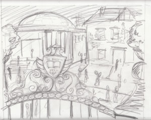
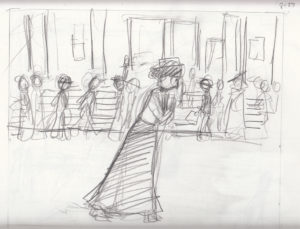

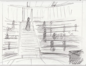
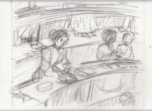
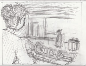
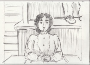
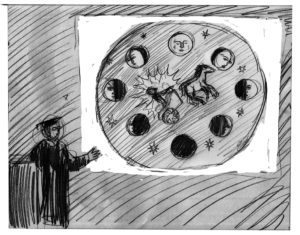
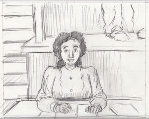
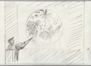
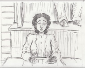
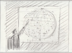
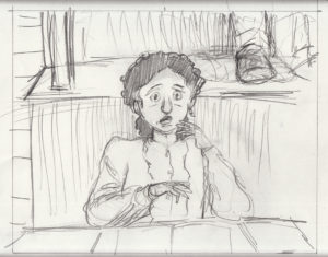
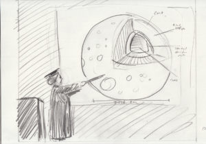
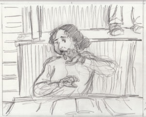
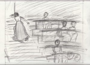
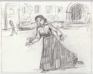
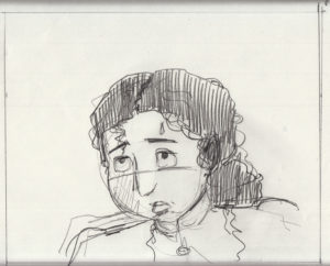
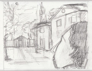
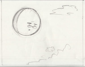
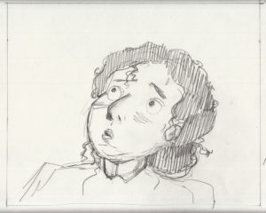
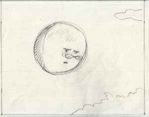
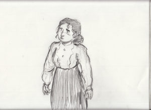


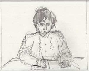 This is getting pretty insane, so I decided I’d better wrap up this phase and get to the final drawings. Plus, it seemed to be working better. BUT I did want to trim it down, eliminate unnecessary pages. It was getting kind of complicated, changing the layout of the book over and over, so, though I felt it was close, I decided to cut up the pages separately so I could move them around, and finalize the layout, now reduced back to 27 pages. Hopefully I can cut a few more out along the way.
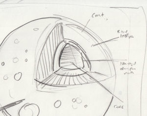
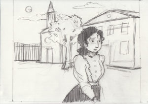
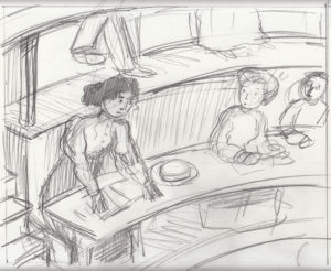
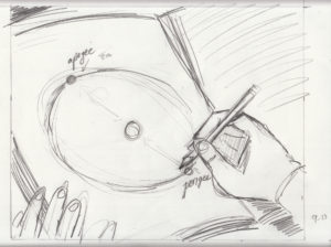
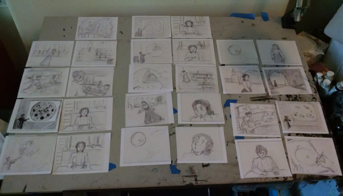 Finally I can start drawing the chapter.  I want to be able to work faster this time, for two reasons. Of course to be done sooner, duh. But also to keep the freshness of approach. I’m already worried that, for a few of these pages, I won’t like the final version as much as the rough!
August 8: little toe in the water
Still the same strategy of making sure i do some little bit of work related to Lunatic every day. Â More reference visuals, this time of a college lecture hall, as old fashioned as I can find.
Finally I can start drawing the chapter.  I want to be able to work faster this time, for two reasons. Of course to be done sooner, duh. But also to keep the freshness of approach. I’m already worried that, for a few of these pages, I won’t like the final version as much as the rough!
August 8: little toe in the water
Still the same strategy of making sure i do some little bit of work related to Lunatic every day. Â More reference visuals, this time of a college lecture hall, as old fashioned as I can find.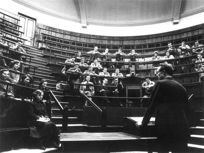
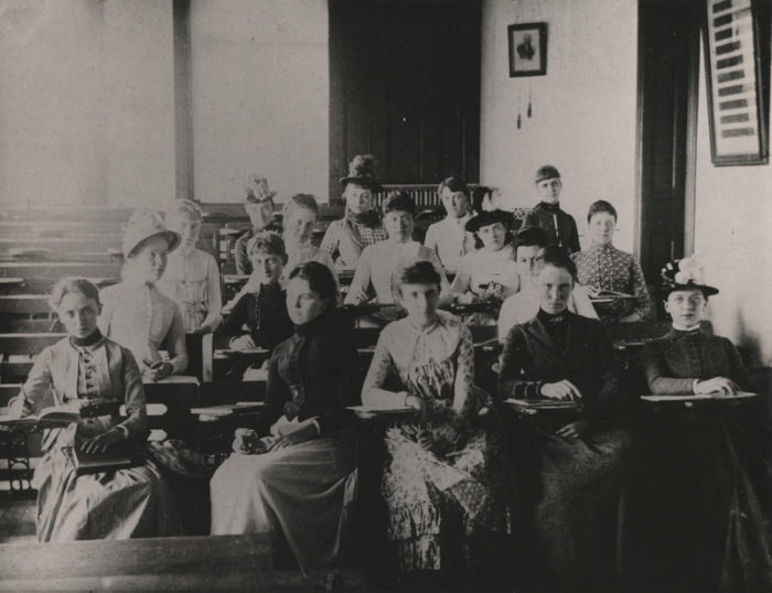 (spending a lot of time searching and saving images like these… obsessive, but valuable)
And a little thumbnail of one of the pages that will take place in this setting:
(spending a lot of time searching and saving images like these… obsessive, but valuable)
And a little thumbnail of one of the pages that will take place in this setting: (yes, that means something to me)
August 7: toe in the water
At this point, I have so many other tasks and projects keeping me from focusing on this (and on drawing in general), that my goal is just to keep my head and hand in the project just a little, by doing something every day, however small. Â I’ve been gathering up a lot of reference visuals of the college gates/seal which we’ll see in the first page::
(I have lots more) Then some scribbly studies:
(yes, that means something to me)
August 7: toe in the water
At this point, I have so many other tasks and projects keeping me from focusing on this (and on drawing in general), that my goal is just to keep my head and hand in the project just a little, by doing something every day, however small. Â I’ve been gathering up a lot of reference visuals of the college gates/seal which we’ll see in the first page::
(I have lots more) Then some scribbly studies:


 August 6: Testing the waters
I’m trying out a technique of pencil and ink wash only. Â I want a soft effect, like that achieved by Manuele Fior in Mademoiselle Else, which also seems inspired by the Nabis, Munch, the kind of art that I want to evoke:
August 6: Testing the waters
I’m trying out a technique of pencil and ink wash only. Â I want a soft effect, like that achieved by Manuele Fior in Mademoiselle Else, which also seems inspired by the Nabis, Munch, the kind of art that I want to evoke:
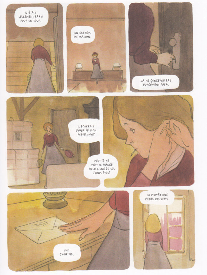
 Of course not working in color, as Fior was, will be challenging. Â Have to figure out how to get that softness without graying-out the whole page.
August 1: the baby’s getting smaller!!
I worked more on the thumbnails. Â I have a decision to eventually make about the story in this chapter. The woman goes to a class and sees a lecture on the moon which inspires her, that’s basically what happens. But I have another idea, in which she is at first horrified to see her beloved moon “dissected” by the images on the prof’s magic lantern slides. Â She runs out in horror, and sees the moon in the sky looking down at her; it’s look, this time, tells her no, you must learn about me, and so she goes back in. Â I go back and forth on whether this last complication in her “learning process” is too melodramatic, or will come across clearly. Â Anyway, on this day I scribbled out some more thumbnails, trying to figure it out. Â Again, so rough that by the time I’m posting this I can hardly decipher them myself. And yes, it’s about 20 minutes of work, at most:
Of course not working in color, as Fior was, will be challenging. Â Have to figure out how to get that softness without graying-out the whole page.
August 1: the baby’s getting smaller!!
I worked more on the thumbnails. Â I have a decision to eventually make about the story in this chapter. The woman goes to a class and sees a lecture on the moon which inspires her, that’s basically what happens. But I have another idea, in which she is at first horrified to see her beloved moon “dissected” by the images on the prof’s magic lantern slides. Â She runs out in horror, and sees the moon in the sky looking down at her; it’s look, this time, tells her no, you must learn about me, and so she goes back in. Â I go back and forth on whether this last complication in her “learning process” is too melodramatic, or will come across clearly. Â Anyway, on this day I scribbled out some more thumbnails, trying to figure it out. Â Again, so rough that by the time I’m posting this I can hardly decipher them myself. And yes, it’s about 20 minutes of work, at most:
 July 31: still baby steps
I’m not getting full days of work these days, because I’m doing some MICE planning. Â After those preliminary sketches that had to do with the first or second page, I decided I’d better thumbnail the chapter before getting too involved in any one page. Â These thumbnails are so scribbly that I doubt I’ll even be able to understand them in a few days.
July 31: still baby steps
I’m not getting full days of work these days, because I’m doing some MICE planning. Â After those preliminary sketches that had to do with the first or second page, I decided I’d better thumbnail the chapter before getting too involved in any one page. Â These thumbnails are so scribbly that I doubt I’ll even be able to understand them in a few days.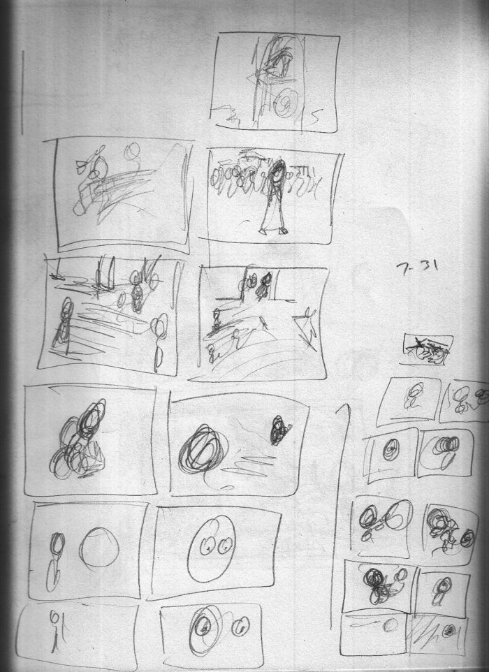 I’m also thinking about the first images, the “establishing” images of the college campus:
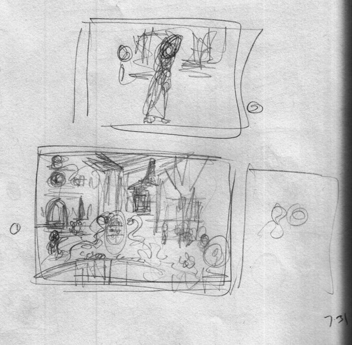 July 28: baby steps
I have the beats of this chapter in my head, but nothing on paper yet, not even thumbnails. Â The setting now is a university campus, in the period setting. Â This comic isn’t set in any particular place or time, just vaguely Victorian or Edwardian period, in a setting that looks like America or England. It’s not a realistic story, so I can take whatever liberties I like and considerate an alternate reality if need be.
But nothing jarring. Â I want it to feel like the past, in a recognizable reality.
Anyway, I have a lot of thoughts about the feel for this chapter. Â Once again I will change medium, and I think I want to get away from hard blacks, and go with a gauzier, grayscale feeling. Maybe drawn in pencil and washes. A visual style of early Modernism, such as the Nabis or Maurice Prendergast:
July 28: baby steps
I have the beats of this chapter in my head, but nothing on paper yet, not even thumbnails. Â The setting now is a university campus, in the period setting. Â This comic isn’t set in any particular place or time, just vaguely Victorian or Edwardian period, in a setting that looks like America or England. It’s not a realistic story, so I can take whatever liberties I like and considerate an alternate reality if need be.
But nothing jarring. Â I want it to feel like the past, in a recognizable reality.
Anyway, I have a lot of thoughts about the feel for this chapter. Â Once again I will change medium, and I think I want to get away from hard blacks, and go with a gauzier, grayscale feeling. Maybe drawn in pencil and washes. A visual style of early Modernism, such as the Nabis or Maurice Prendergast:
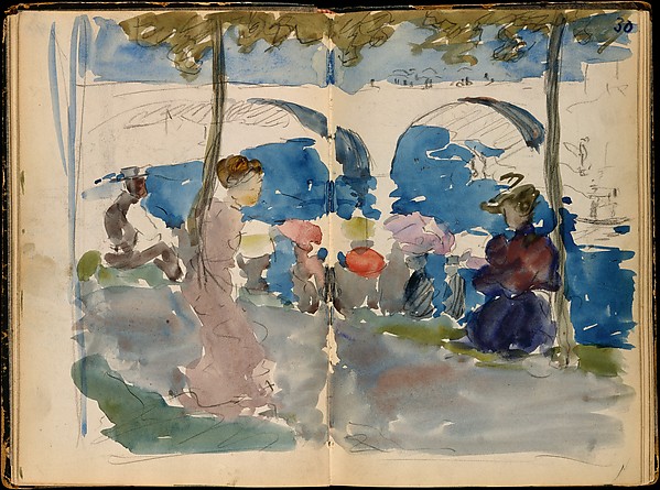 I can’t say that Prendergast is a favorite, but you always run into him in museums, and there’s one of the early images in this chapter, which I want to model a little on Prendergast, and the parade-like crowds he always featured.
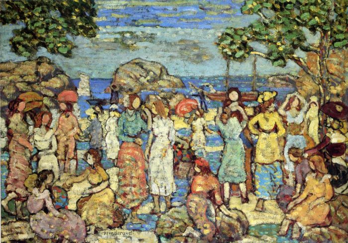 So, without giving much thought to it, I begin the work for this chapter by doing some sketches for what will be the background of one of the first few images (with our protagonist in the foreground, but I’m not drawing her yet).
I fiddle around. drawing from imagination, with different media: pencil, ink, inkwash.Â
So, without giving much thought to it, I begin the work for this chapter by doing some sketches for what will be the background of one of the first few images (with our protagonist in the foreground, but I’m not drawing her yet).
I fiddle around. drawing from imagination, with different media: pencil, ink, inkwash. 
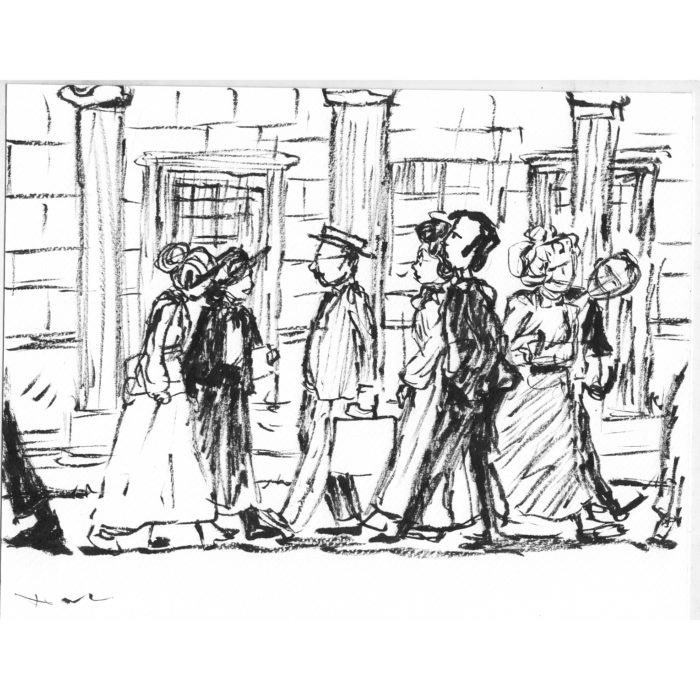
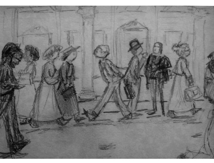 This is done by first drawing with a brush dipped only in water, then applying ink from a brush pen to the wet area:
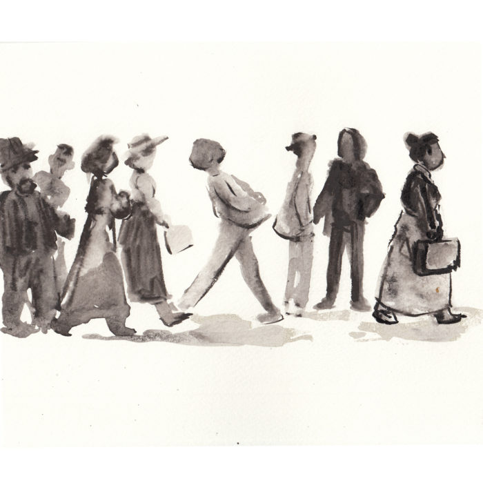

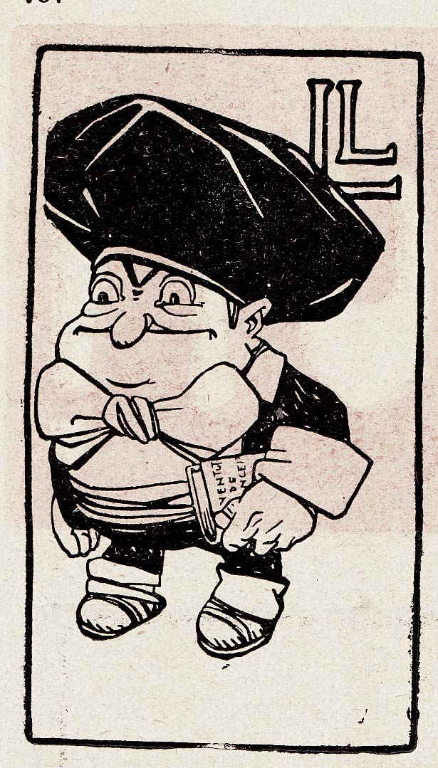

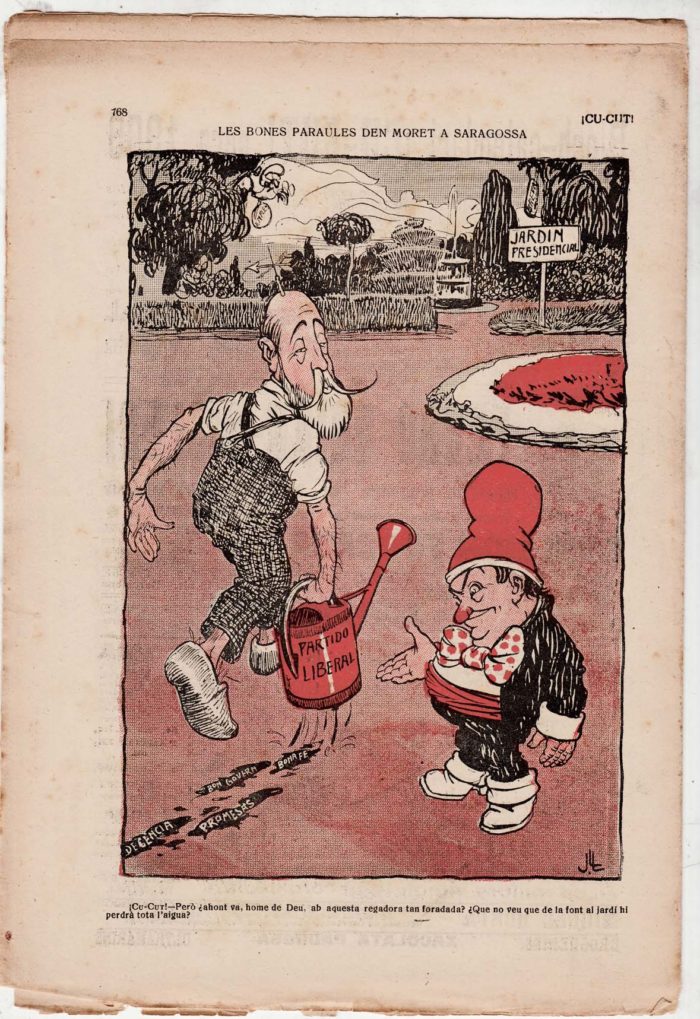 The back cover of the 26 November 1908 issue features a political cartoon showing Catalan Prime Minister Moret carrying a watering can leaking all his promises and good intentions as he hurries to the “Presidential garden.”
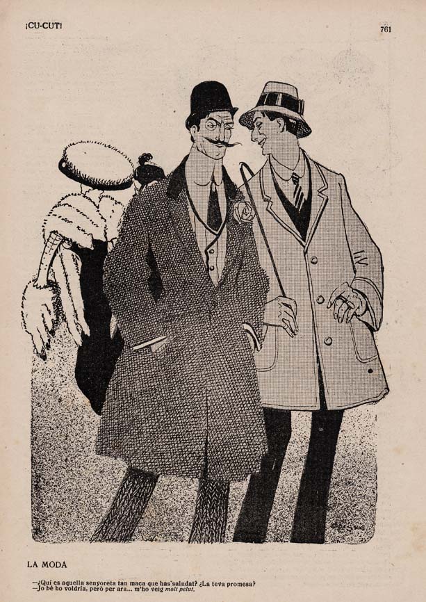 As well as political humor, the cartoons satirize contemporary society, as in this one, “la moda.” The one dandy asks the other if he’s attached to the attractive woman he just greeted. “I’d like to, but I would find it ‘very hairy,'” he responds, using an expression meaning difficult or complicated. No, I don’t get it either; maybe a sight gag based on the woman’s furs??
 In this cartoon, the Catalan and his interlocutor discuss Lerroux, a hated, anti-Catalan politician. “It’s good that Lerroux is going to Congress to learn how the other part of Catalonia thinks,” to which it’s retorted that Lerroux is from “the part of Catalonia that doesn’t think.”
 The advertisement page.
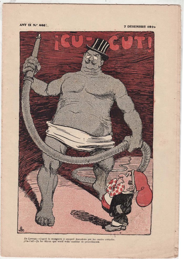
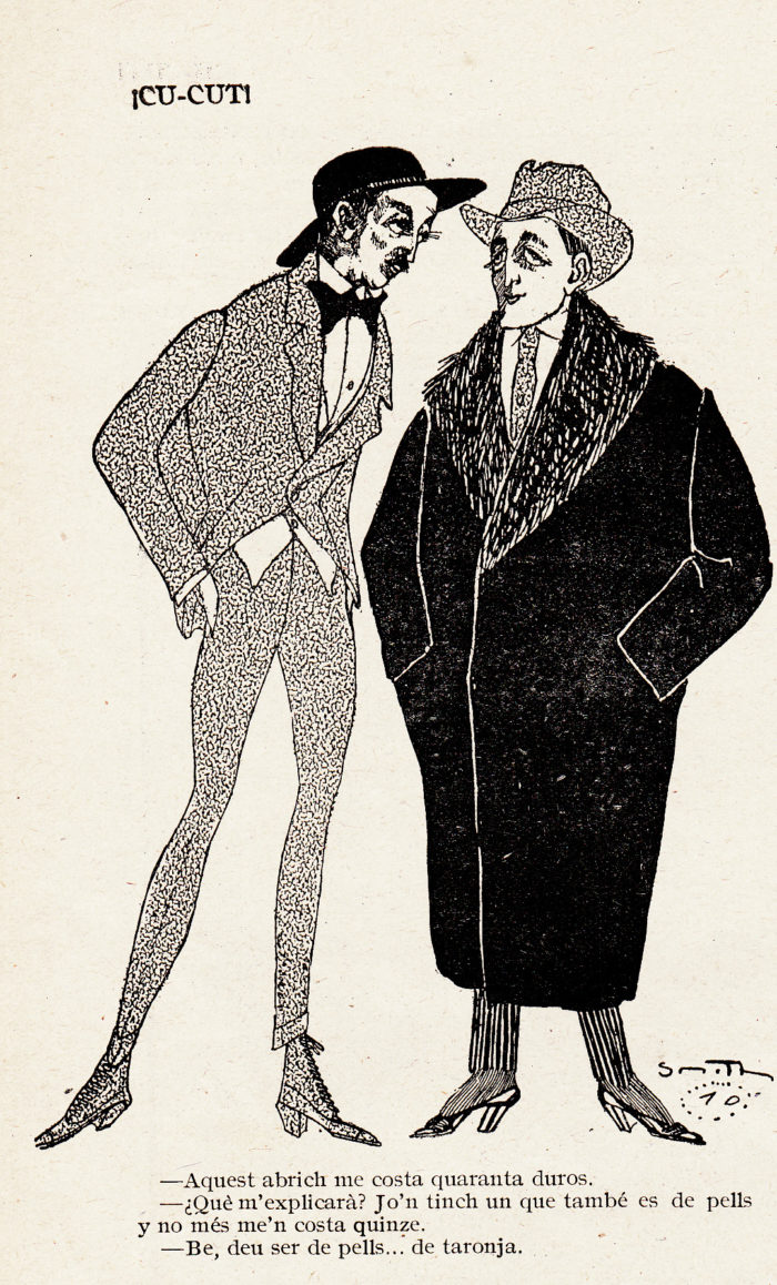

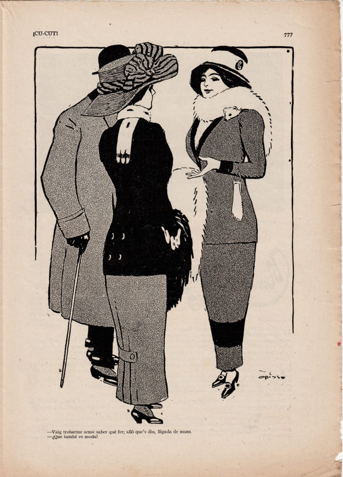
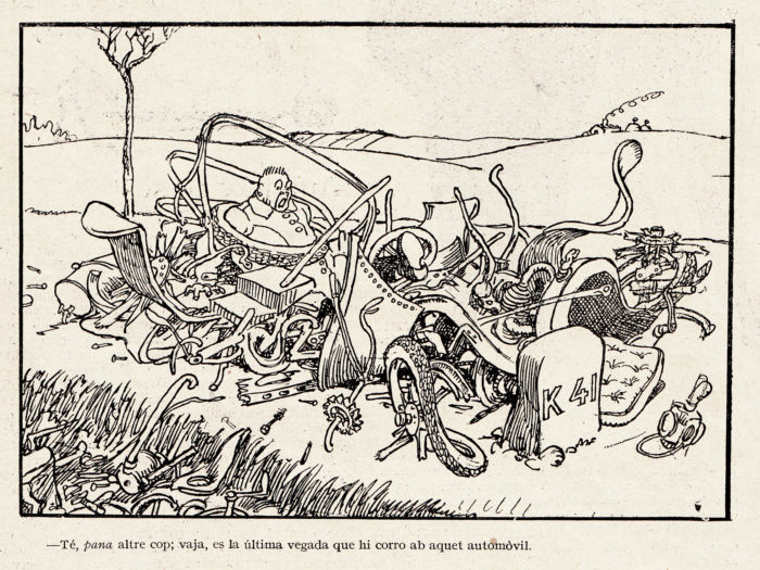

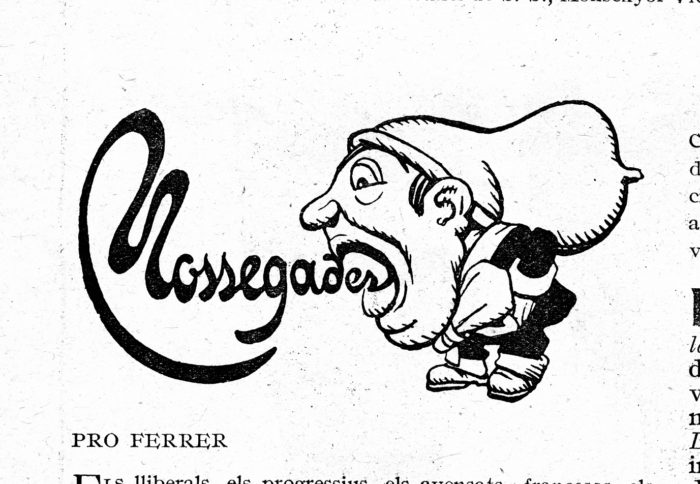
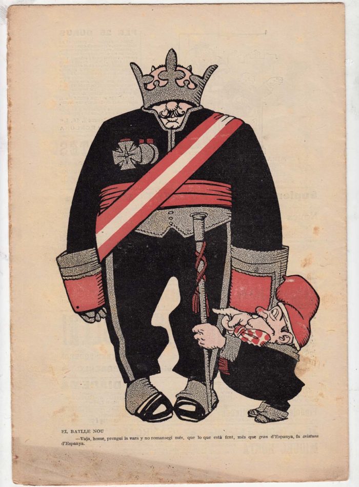
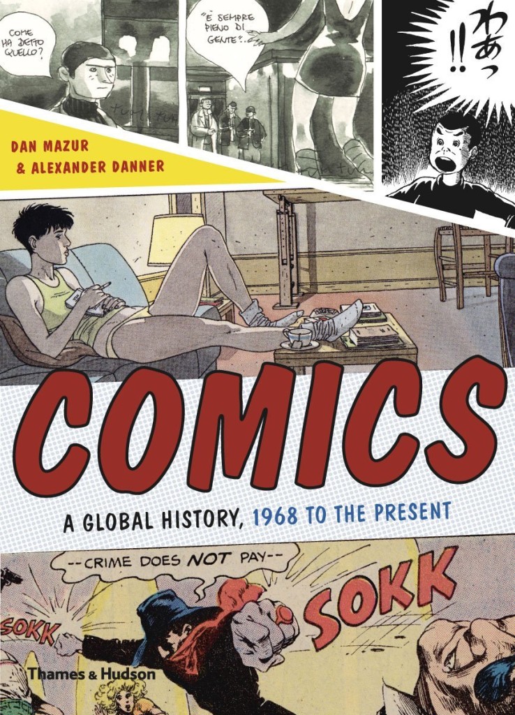
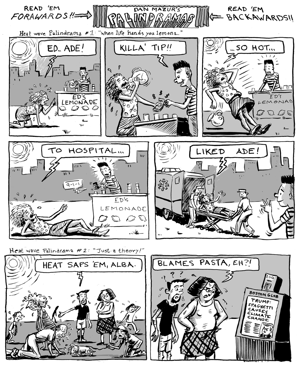
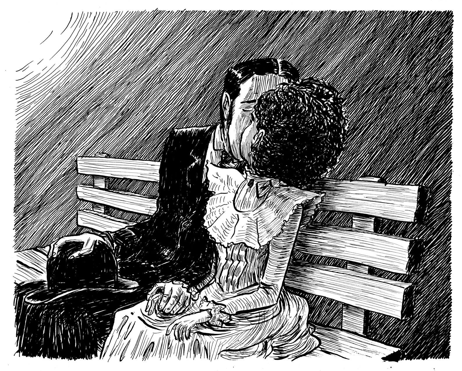 July 5-6 (and peeking ahead to July 23): page 6
This is relatively straightforward compared to what came before, because it’s a “closer-up” view of the couple, meaning less background (phew!). Â The boy leans in for a kiss, puckering up.
My last rough in the mock-up was extremely close, but I decided to move back to a medium view, so as not to lose the body language. Â Started with a couple of sketches/roughs:
July 5-6 (and peeking ahead to July 23): page 6
This is relatively straightforward compared to what came before, because it’s a “closer-up” view of the couple, meaning less background (phew!). Â The boy leans in for a kiss, puckering up.
My last rough in the mock-up was extremely close, but I decided to move back to a medium view, so as not to lose the body language. Â Started with a couple of sketches/roughs:
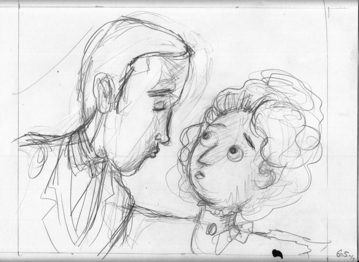
 Then launch into a final version…
 Not happy with this so I abandoned it. Â It felt to me a little like the direction of his “lunge” was wrong, like he was going to miss her. Â Also I had him too close, and I didn’t like the way his nose overlapped with her hair. Â So try again:
 I decided also to not make the background shading a uniform gradation (referencing the lamplight from above-right, and getting darker as it moves to the lower right corner), but left light between their faces, so as not to mess up their contours, and let the “light” between them work emotionally.
Basically I like this, though I wasn’t completely satisfied with the expressions. Â I like him closing his eyes and puckering up, but she looks more terrified than I had intended. Â I wanted her to be nervous, maybe ambivalent, but not obviously against letting him kiss her. Â For some time I intended to re-draw the face, but then (and this was a couple weeks later on 7/23), I tried the simple fix of just adding eyelids so that she’s not so bug-eyed:
I decided also to not make the background shading a uniform gradation (referencing the lamplight from above-right, and getting darker as it moves to the lower right corner), but left light between their faces, so as not to mess up their contours, and let the “light” between them work emotionally.
Basically I like this, though I wasn’t completely satisfied with the expressions. Â I like him closing his eyes and puckering up, but she looks more terrified than I had intended. Â I wanted her to be nervous, maybe ambivalent, but not obviously against letting him kiss her. Â For some time I intended to re-draw the face, but then (and this was a couple weeks later on 7/23), I tried the simple fix of just adding eyelids so that she’s not so bug-eyed:
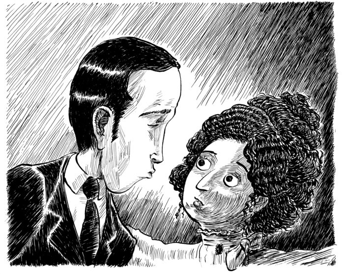 Voila! Â Two tiny lines change the mood completely!
June 28-July 5: tackling the background on pages 2 & 5.
Pages 2 & 5 are the same scene, a frontal, full-shot (I hate using cinematic terms for comics, but it is convenient), of the two on the bench. Â The only difference is that in page 5, he has taken her hand in his. Â There is a fair amount of background space above and around the image, and I struggled with it already in page 2, moving on from it in an unsatisfactory state. Â Now, I’ll try to solve the problem of the background, first by doing a new version of page 2:Â
Voila! Â Two tiny lines change the mood completely!
June 28-July 5: tackling the background on pages 2 & 5.
Pages 2 & 5 are the same scene, a frontal, full-shot (I hate using cinematic terms for comics, but it is convenient), of the two on the bench. Â The only difference is that in page 5, he has taken her hand in his. Â There is a fair amount of background space above and around the image, and I struggled with it already in page 2, moving on from it in an unsatisfactory state. Â Now, I’ll try to solve the problem of the background, first by doing a new version of page 2:Â 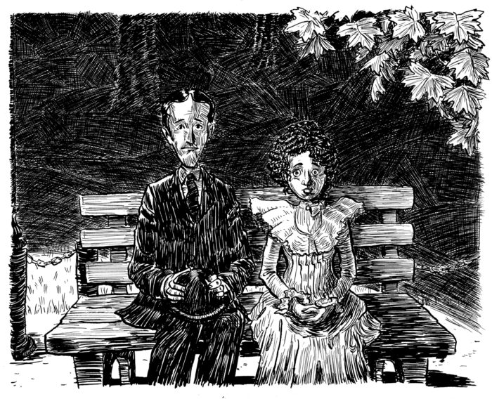 I tried a different approach to the cross-hatching, dividing the background up into irregularly-shaped sections. Â I got the idea from this Franklin Booth illustration:
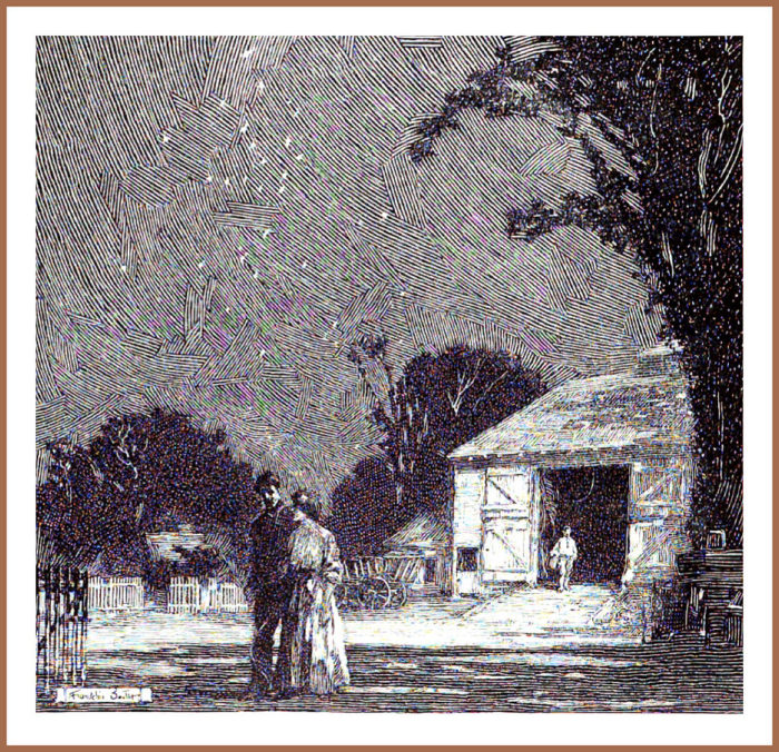 My version obviously looks very different, not as elegant, cross-hatched instead of just one-directional lines. Â I was also trying to gingerly suggest the receding space with the directionality of the cross-hatched sections, and having them get smaller toward the top of the image.
I then moved to page 5. Â I made the cross-hatched sections a little more neatly.
My version obviously looks very different, not as elegant, cross-hatched instead of just one-directional lines. Â I was also trying to gingerly suggest the receding space with the directionality of the cross-hatched sections, and having them get smaller toward the top of the image.
I then moved to page 5. Â I made the cross-hatched sections a little more neatly.
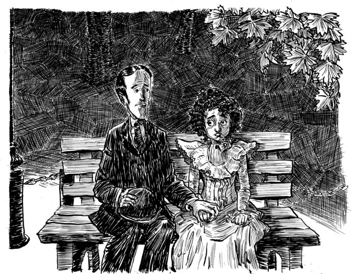 At this point I decided that there were too many extraneous elements in the picture, the whole “middle plane” behind the bench, but in front of the cross-hatched background, with the truncated view of the light pole, the chain and posts; just clogging up the composition.  I also decided that the vaguely-outlined trees in the background weren’t necessary, and were a tentative “splitting the difference” between a more representational and abstract background. I removed them in Photoshop:
 I made some other changes as well, darkening the suit, so that it stands out more from the background, and changing the eyes. moving the pupils so that they are looking more downward, at the awkwardly-held hands.  I didn’t bother to remove the chain from the right-hand side… because I knew I’d be drawing the whole thing over.
Now, I’ll do a new version of each of the two pages simultaneously and try to finally solve the background problem.
Pencils and line-art:
I made some other changes as well, darkening the suit, so that it stands out more from the background, and changing the eyes. moving the pupils so that they are looking more downward, at the awkwardly-held hands. Â I didn’t bother to remove the chain from the right-hand side… because I knew I’d be drawing the whole thing over.
Now, I’ll do a new version of each of the two pages simultaneously and try to finally solve the background problem.
Pencils and line-art:
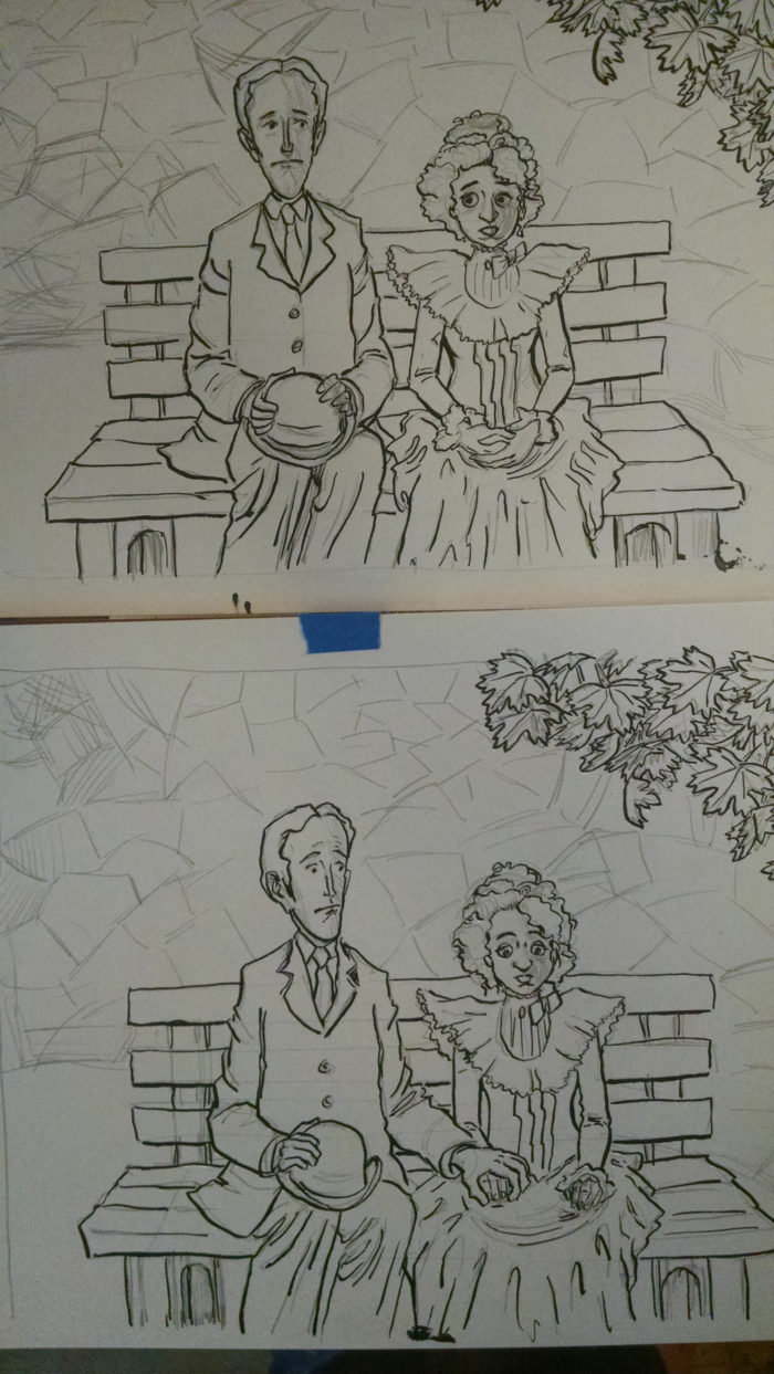 Foreground shading and blacks:
 For the backgrounds, I tried a more restrained approach, closer to Franklin Booth’s: not cross-hatched, but one direction of lines in each “tile”:
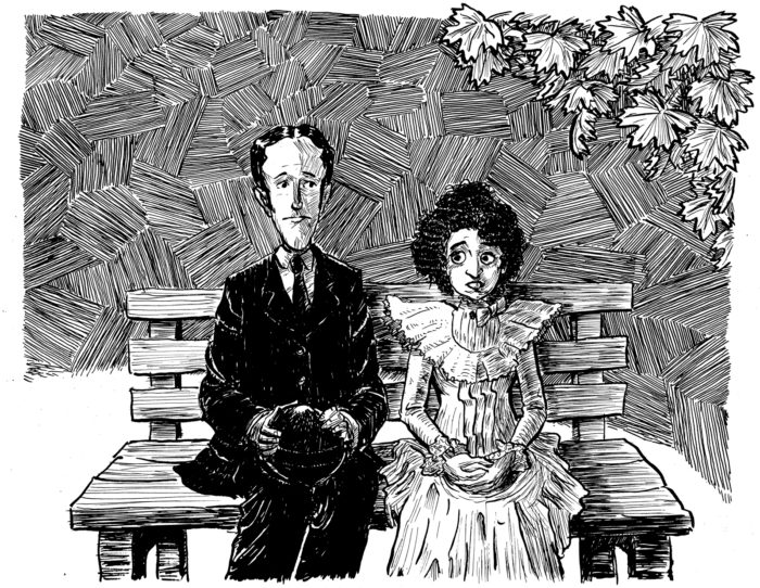
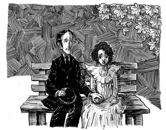 By this point, I’d kind of lost my ability to judge how well the background effect was working. But I got some feedback saying it looked too much like a “parquet floor.” Â I went back in to page 2 digitally (copied and pasted the background, moving pieces of it around so it created a sort of cross-hatching):
 Then added cross-hatching (with real ink) to the background of page 5:
 I took the originals in to the Boston Comics Roundtable meeting, looking for more feedback. Â People seemed to like both, and to think it actually worked to keep page 2 with the “parquet floor” look, and page 5 cross-hatched, since the change in background could actually work to reinforced the change in the characters’ emotions after the “hand-hold.” Â Perhaps just out of fatigue, I decided to believe the feedback, and leave them as they were.
Oh, but I wasn’t happy with the faces in the latest version of page 5, so digitally I pasted the faces from the previous versions in. Â I had hoped to have all my “final” pages for this project be complete on paper, but I wasn’t about to re-draw the whole page again in hopes of getting the faces right. Â And so:
I took the originals in to the Boston Comics Roundtable meeting, looking for more feedback. Â People seemed to like both, and to think it actually worked to keep page 2 with the “parquet floor” look, and page 5 cross-hatched, since the change in background could actually work to reinforced the change in the characters’ emotions after the “hand-hold.” Â Perhaps just out of fatigue, I decided to believe the feedback, and leave them as they were.
Oh, but I wasn’t happy with the faces in the latest version of page 5, so digitally I pasted the faces from the previous versions in. Â I had hoped to have all my “final” pages for this project be complete on paper, but I wasn’t about to re-draw the whole page again in hopes of getting the faces right. Â And so:
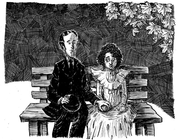 And I called it a day on pages 2 and 5!
June 23-24
This is a fairly simple page… EXCEPT for getting the hand gesture right. Â The rough version made it look a little too threatening:
And I called it a day on pages 2 and 5!
June 23-24
This is a fairly simple page… EXCEPT for getting the hand gesture right. Â The rough version made it look a little too threatening:
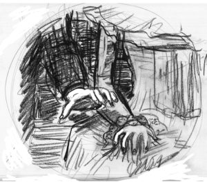 It’s supposed to be a hand tentatively but gently moving to take her hand. Â NOT this:
 From an early age, I thought I was good at drawing hands. Â As a result I’ve gotten a little lazy over the years as far as learning to draw hands really well. Â Time to remedy that.
Starting with some photos of my own hand in various positions:
From an early age, I thought I was good at drawing hands. Â As a result I’ve gotten a little lazy over the years as far as learning to draw hands really well. Â Time to remedy that.
Starting with some photos of my own hand in various positions:
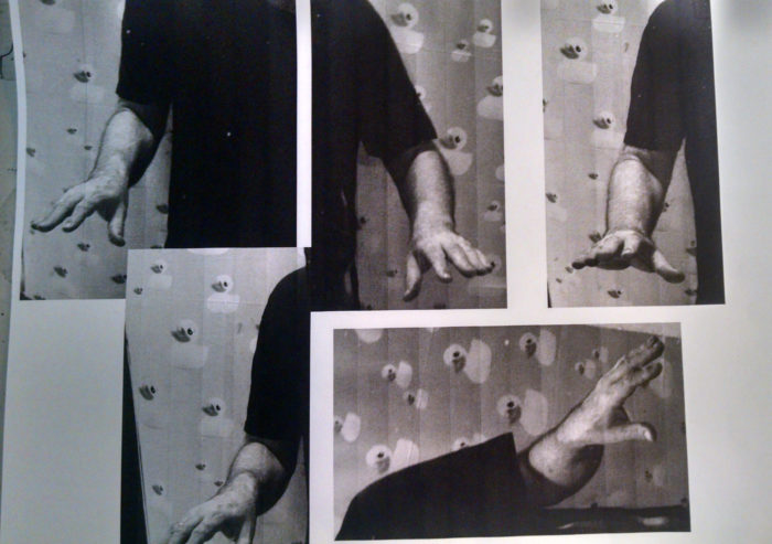 Then, sketches from same:
 Then, a lot of sketches of the page, trying to get it just right, with the hand clearly reaching for hers, but the fingers more relaxed, not too claw-like:
I liked the last one, and did some Photoshop touchups on it, for a final rough version:
Then, a lot of sketches of the page, trying to get it just right, with the hand clearly reaching for hers, but the fingers more relaxed, not too claw-like:
I liked the last one, and did some Photoshop touchups on it, for a final rough version: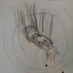
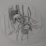
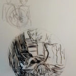
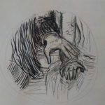
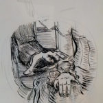
 Moving on to the final version. Â Or what I hope will be the final version:
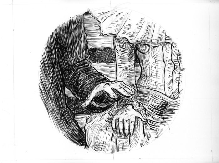 Not satisfied. Â Composition lacks drama. Â The hands are too small .
 Better but not quite good enough. Â The final version, more delicately inked:
 June 22: page 3
A different angle on the couple, as they furtively/nervously look at each other without daring to actually turn their heads. Â Pencils, and inks started:
June 22: page 3
A different angle on the couple, as they furtively/nervously look at each other without daring to actually turn their heads. Â Pencils, and inks started:
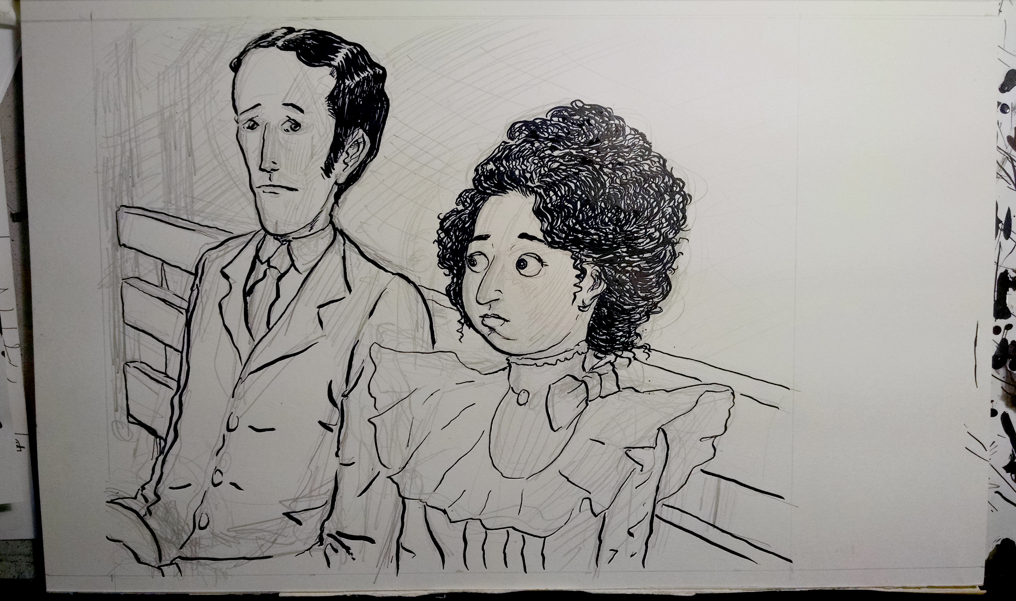 And, finished inks:
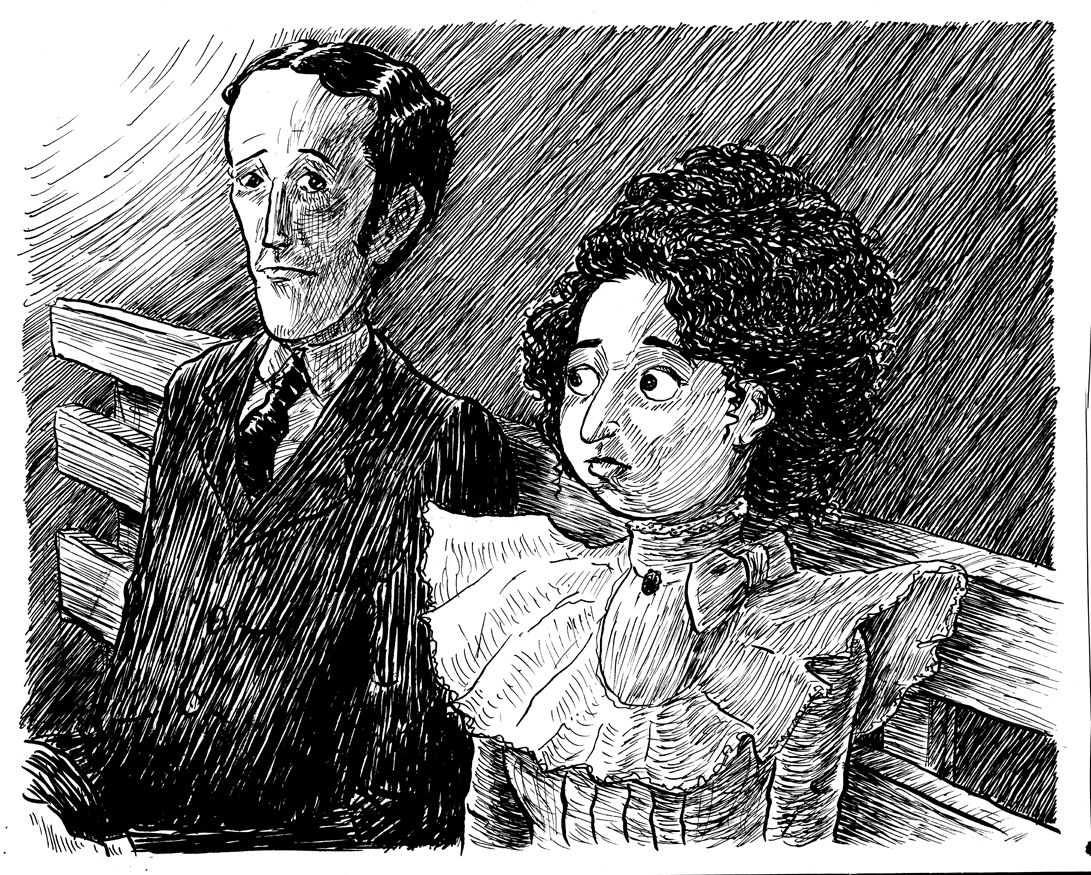 A different approach to the background shading, because I didn’t want to deal with all that cross-hatching. Â This is more abstract (though the light from the upper left places it in space with the lamp above them). Runs the risk of feeling like a gray wall behind them, I guess, but it has the virtue of simplicity.
I think the shading on the boy’s face is a little messy, under his eye and around his cheekbone. I may work on cleaning that up in Photoshop eventually.
One challenge is visual guidance for drawing a “Gibson Girl” type hairdo for my character, since Gibson hardly ever depicted women with very curly hair.  I guess that since he was presenting usually the ideal, fashionable young lady, and crinkly hair was not in.  The only examples I could find are these two (below), and both of them are Gibson drawing lower-class dames.  And still the hair isn’t as curly as what I want.So I had to develop my own approach to drawing the texture of her hair, as best I could in a “Gibson-esque” style.
A different approach to the background shading, because I didn’t want to deal with all that cross-hatching. Â This is more abstract (though the light from the upper left places it in space with the lamp above them). Runs the risk of feeling like a gray wall behind them, I guess, but it has the virtue of simplicity.
I think the shading on the boy’s face is a little messy, under his eye and around his cheekbone. I may work on cleaning that up in Photoshop eventually.
One challenge is visual guidance for drawing a “Gibson Girl” type hairdo for my character, since Gibson hardly ever depicted women with very curly hair.  I guess that since he was presenting usually the ideal, fashionable young lady, and crinkly hair was not in.  The only examples I could find are these two (below), and both of them are Gibson drawing lower-class dames.  And still the hair isn’t as curly as what I want.So I had to develop my own approach to drawing the texture of her hair, as best I could in a “Gibson-esque” style.
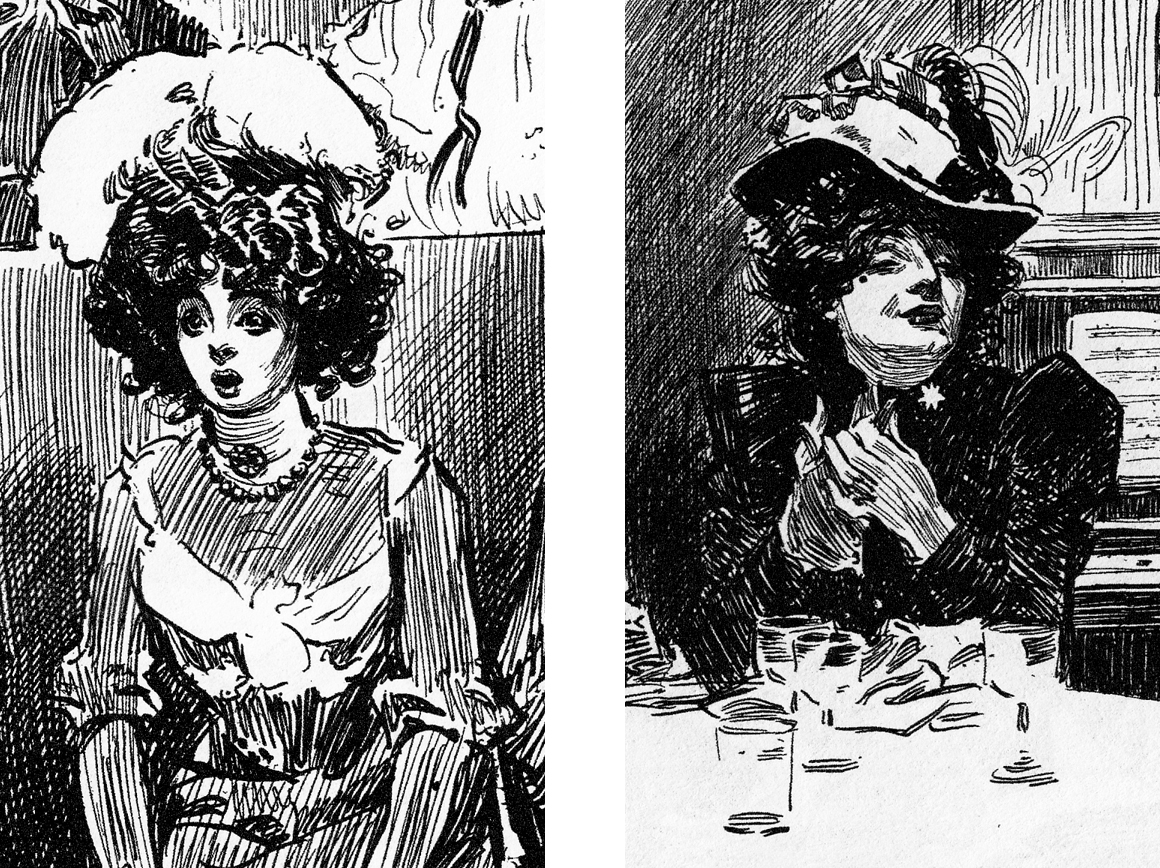 Jun 21: page 2
I started in, penciling and beginning to ink this page, which is a closer look at the two characters sitting on the bench in the park at night. Â The idea is that they are very young, on their first “date” unchaperoned, and both of them nervous to the point of near-paralysis.
Jun 21: page 2
I started in, penciling and beginning to ink this page, which is a closer look at the two characters sitting on the bench in the park at night. Â The idea is that they are very young, on their first “date” unchaperoned, and both of them nervous to the point of near-paralysis.
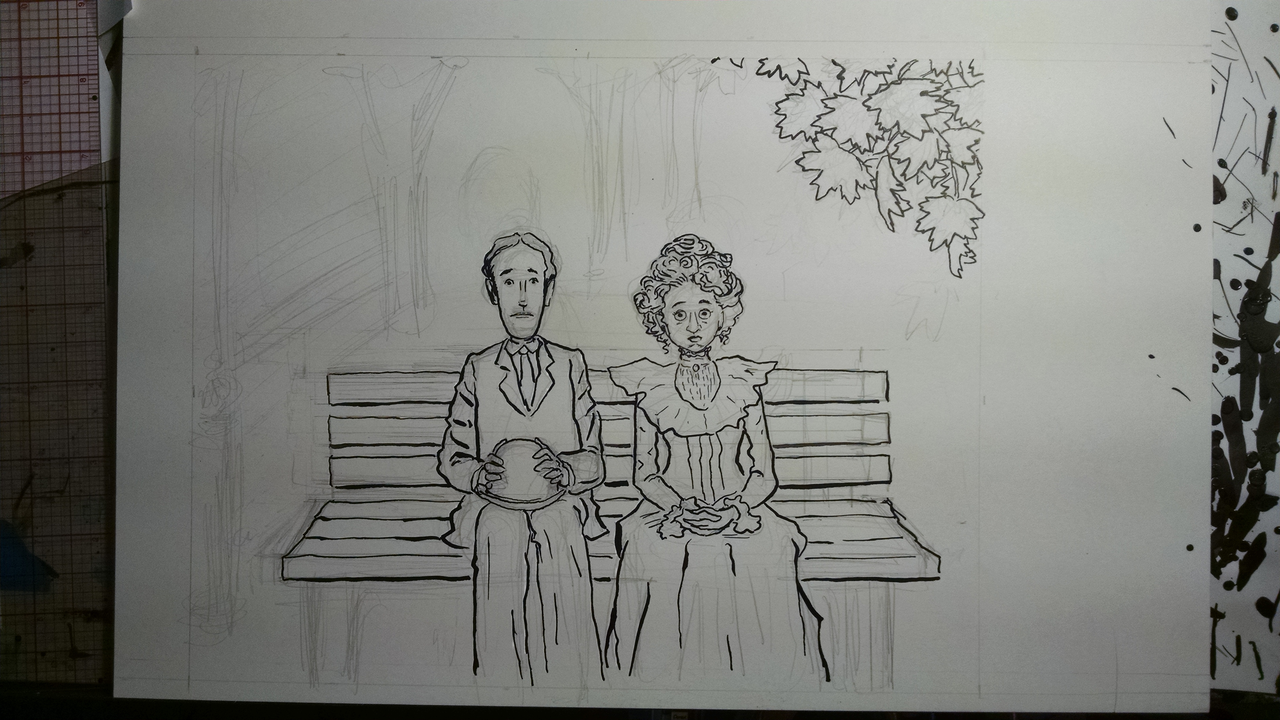 I was immediately dissatisfied with this, for one reason: the boy is supposed to be way taller than the girl, adding to the awkwardness, and I had drawn them arond the same height! Â So I abandoned this version. Â Here is the next version:
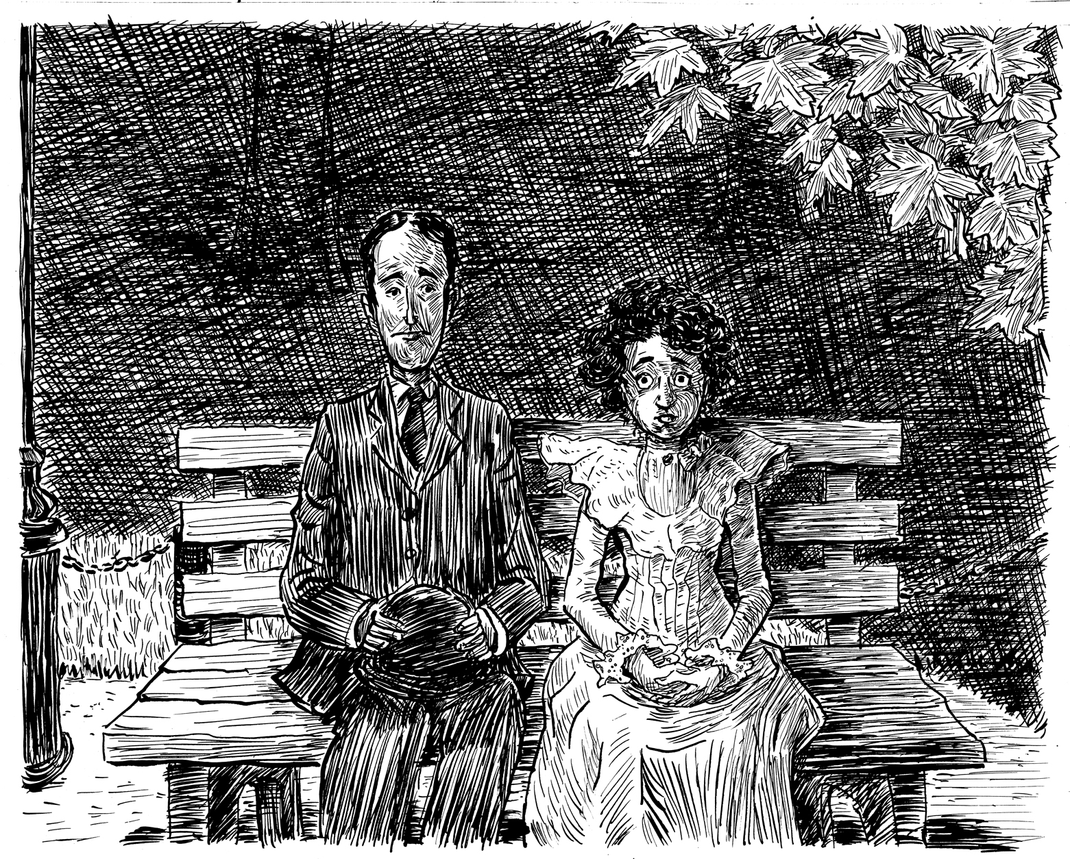 Now the big challenge here, as in most of the pages in this chapter, is how to handle the background. Â I wanted to emulate the loose, thick-lined cross-hatching of James Montgomery Flagg, as seen in the example below. Â But here, I am not sure it works, maybe because it’s not an abstract setting, as in Flagg’s, but meant to denote a darkened space, where you can see the darker shapes of a couple trees through the hatching. Â I know I am not done with this page!
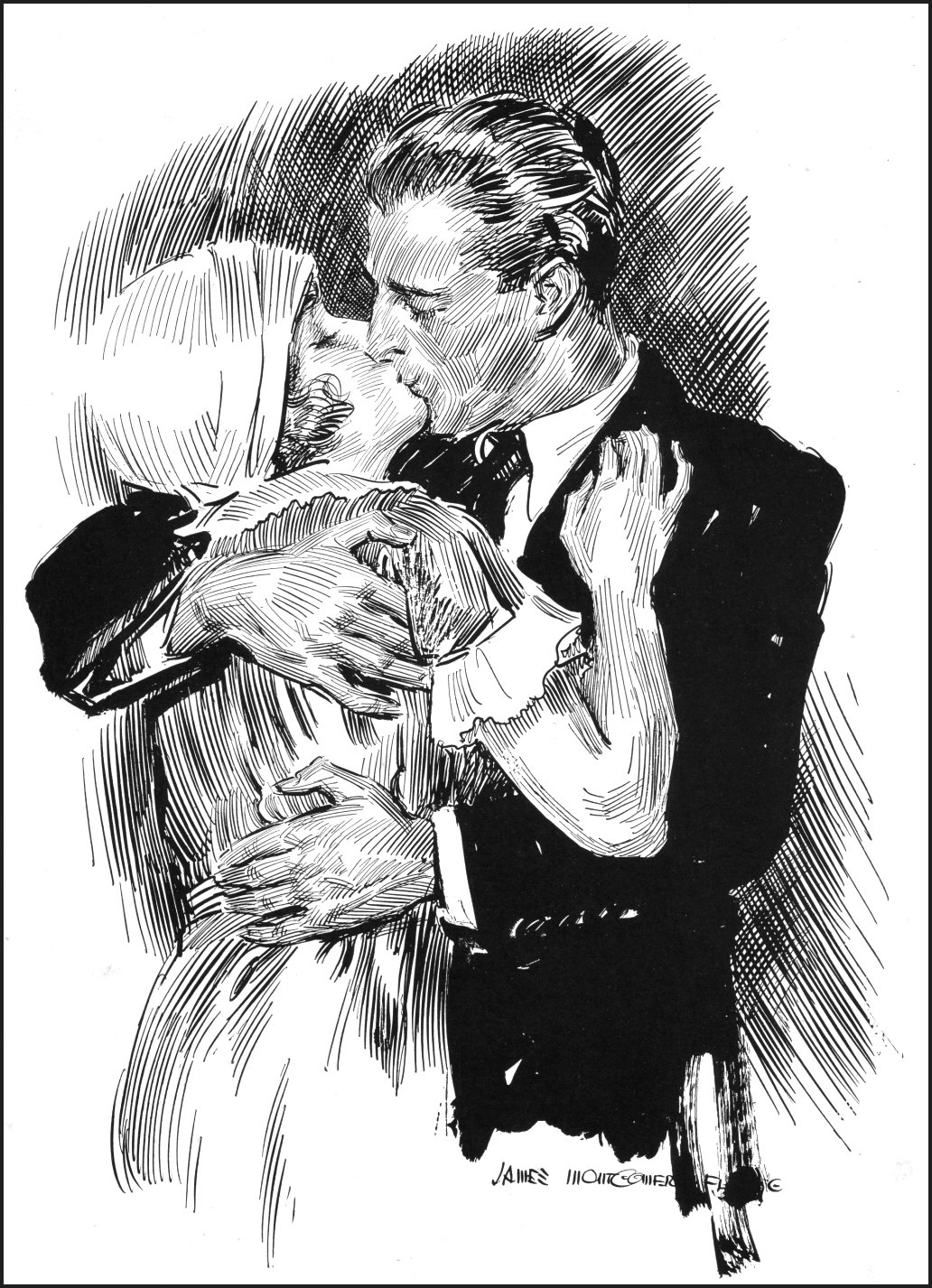 June 20, revisions to the mockup
Much like the normal “thumbnail” stage of a panel-page comic, this is where one can judge the pacing, compositions, etc., and make changes.
First off, I think there needs to be a more dramatic change in composition between pages 5 & 6. Â Both are frontal views of the couple, the second a little closer. Â I think it should be a lot closer, so from this:
June 20, revisions to the mockup
Much like the normal “thumbnail” stage of a panel-page comic, this is where one can judge the pacing, compositions, etc., and make changes.
First off, I think there needs to be a more dramatic change in composition between pages 5 & 6. Â Both are frontal views of the couple, the second a little closer. Â I think it should be a lot closer, so from this:
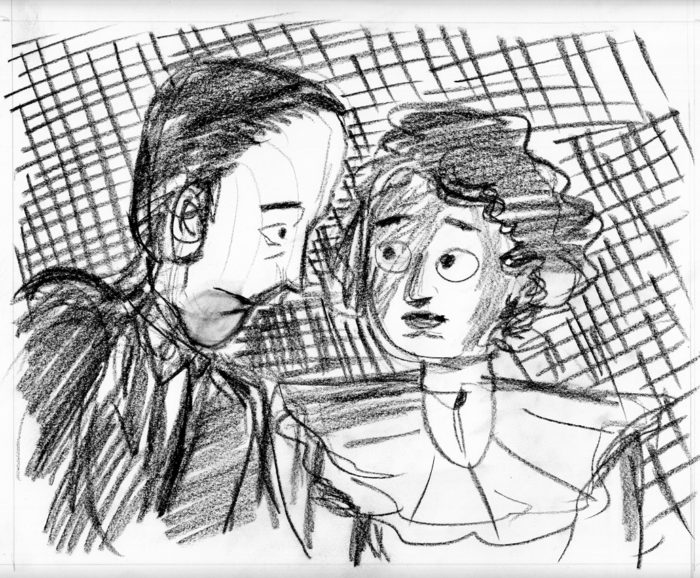 …to this:
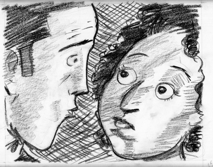 (also more emphasis on the “puckering up” expression on the boy’s face, to make sure we know a first kiss is imminent).
The other problem I had with the original mockup was that I felt the transition from page 9 to page 10 was a little abrupt, and didn’t make the girl’s obsession with the moon dramatic enough. Â So I decided to add another two pages, basically the same as 8 and 9, but “moving in” closer on the face of the girl, then the face of the moon:
(also more emphasis on the “puckering up” expression on the boy’s face, to make sure we know a first kiss is imminent).
The other problem I had with the original mockup was that I felt the transition from page 9 to page 10 was a little abrupt, and didn’t make the girl’s obsession with the moon dramatic enough. Â So I decided to add another two pages, basically the same as 8 and 9, but “moving in” closer on the face of the girl, then the face of the moon:
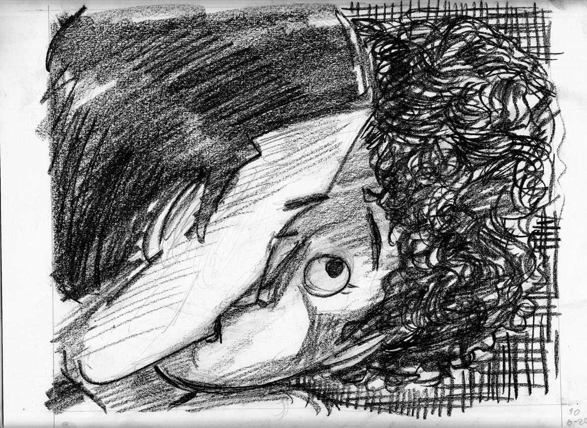
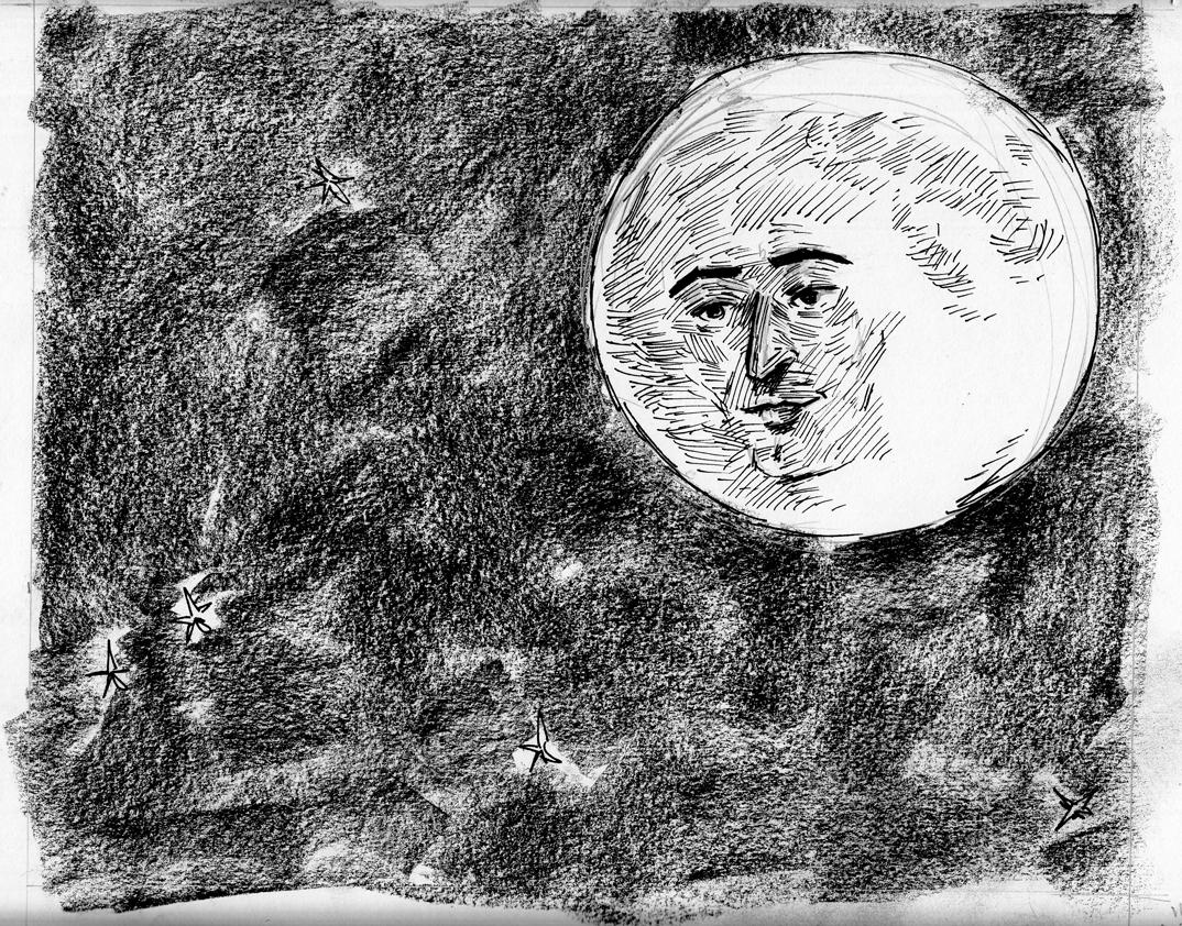 I added these in, re-printed the mockup, and was ready to move on.
June 13: Mockup time
As I did with the earlier chapters, I feel I can’t really get a handle on the flow of the narrative without creating a mockup, so that I can simulate the experience of actually reading this chapter.
Since I’m at an early phase of drawing the pages, I need to do quick, full-size roughs of each page to create the mockup.
I started with a chapter title page, since I think I’ll probably have them in the finished book.
I added these in, re-printed the mockup, and was ready to move on.
June 13: Mockup time
As I did with the earlier chapters, I feel I can’t really get a handle on the flow of the narrative without creating a mockup, so that I can simulate the experience of actually reading this chapter.
Since I’m at an early phase of drawing the pages, I need to do quick, full-size roughs of each page to create the mockup.
I started with a chapter title page, since I think I’ll probably have them in the finished book.
 Then, starting with page 2 (I can use the finished page 1 in the mockup):
2:
Then, starting with page 2 (I can use the finished page 1 in the mockup):
2: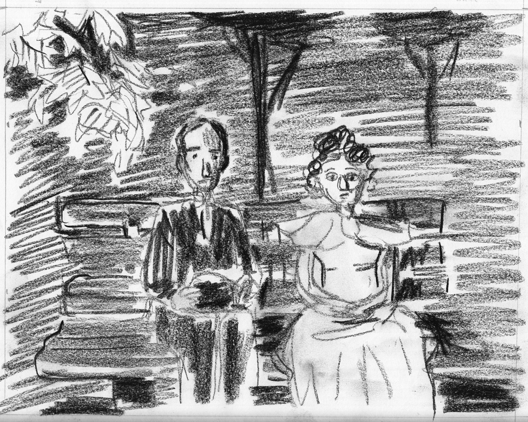 3:
3: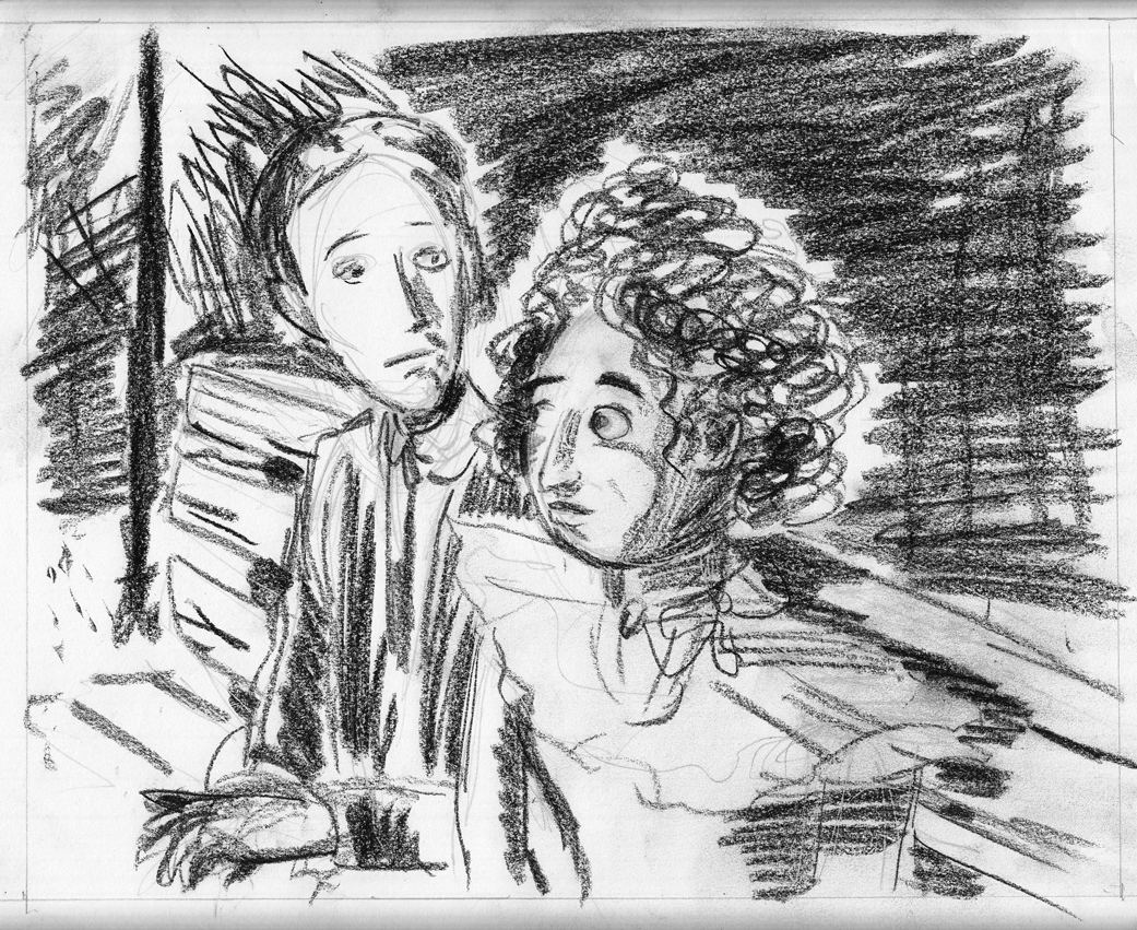 4:
4: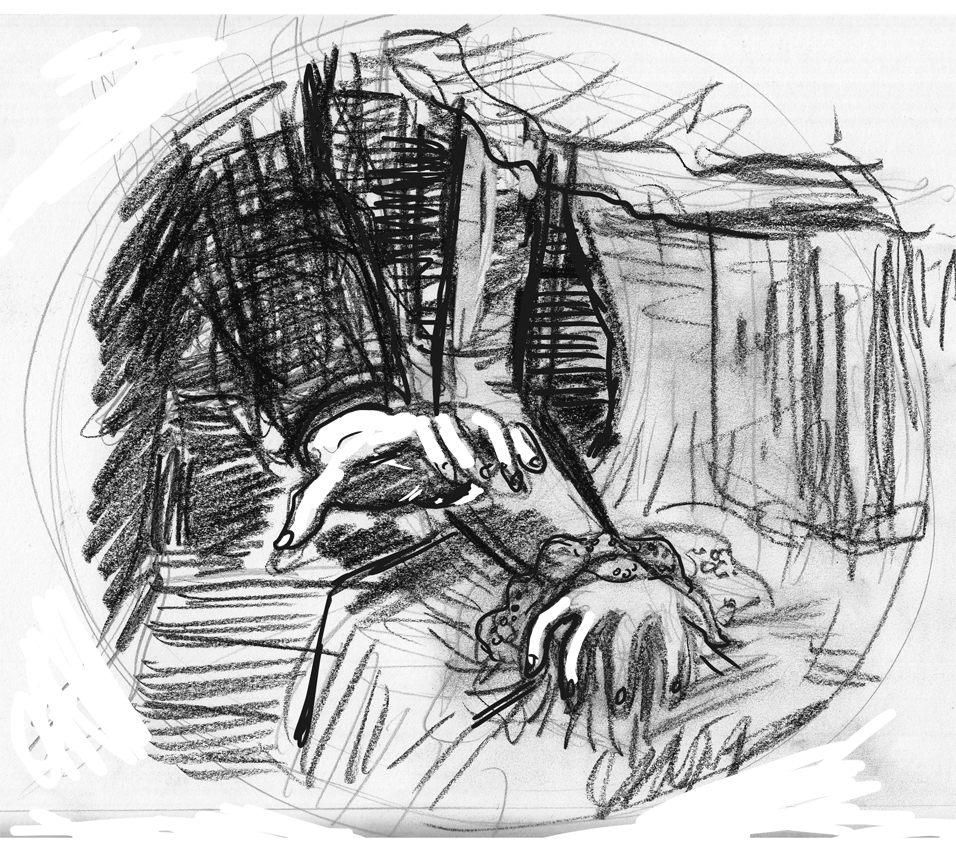 5:
5:
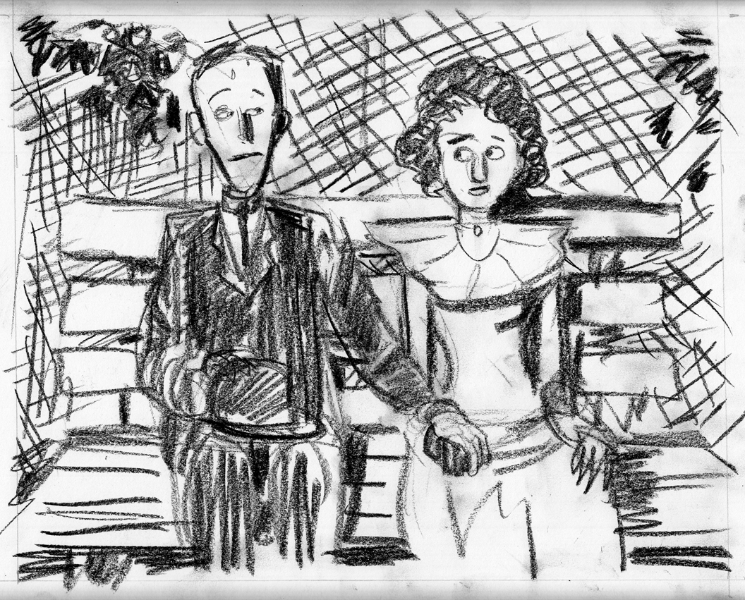 6:
6: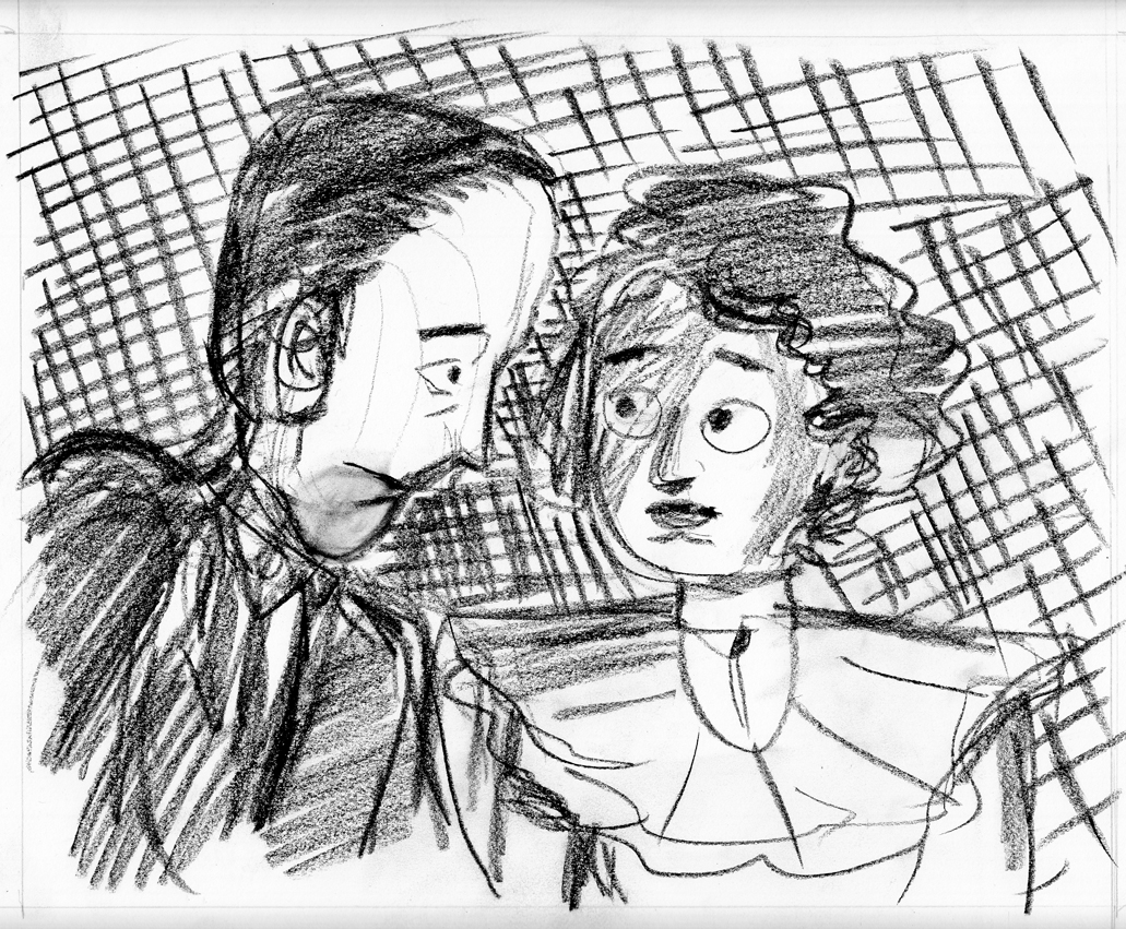 7:
7: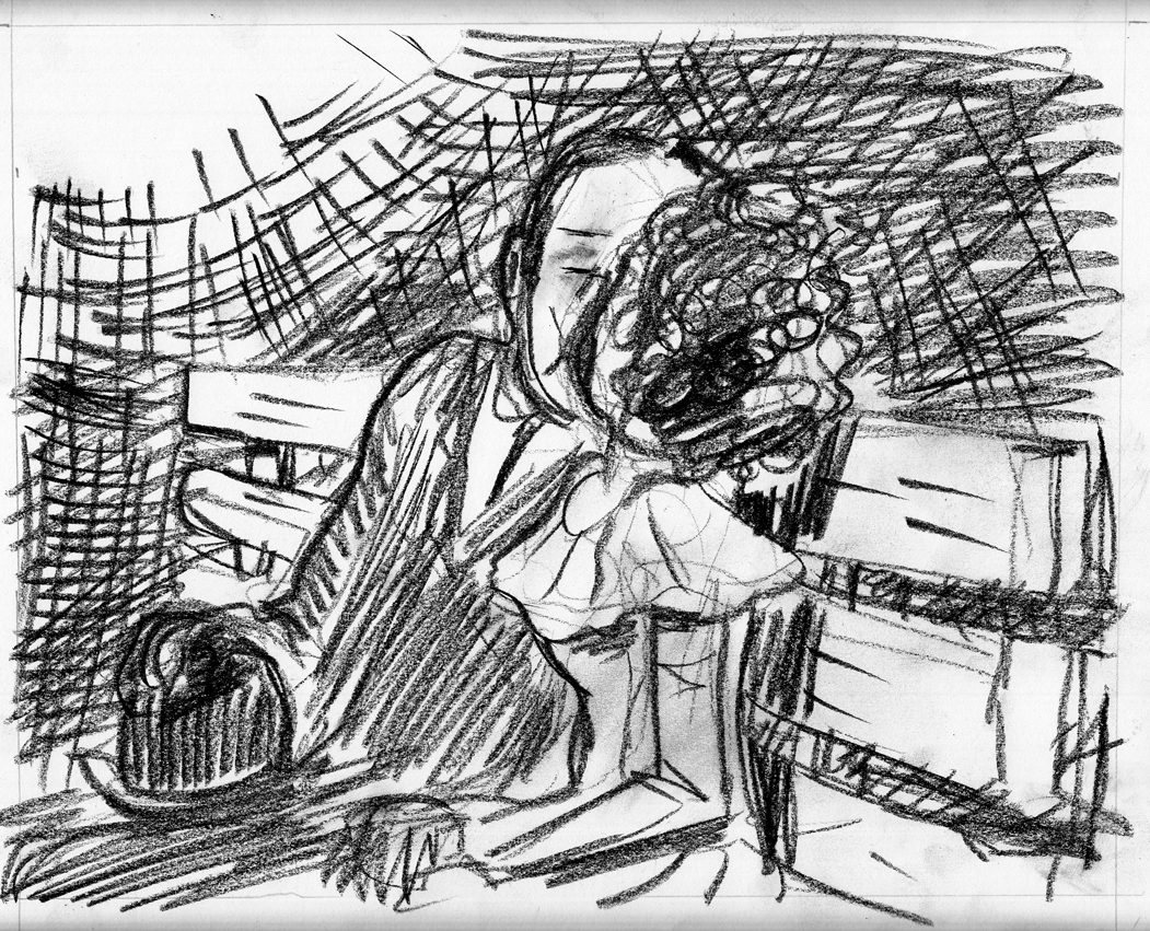 8:
8: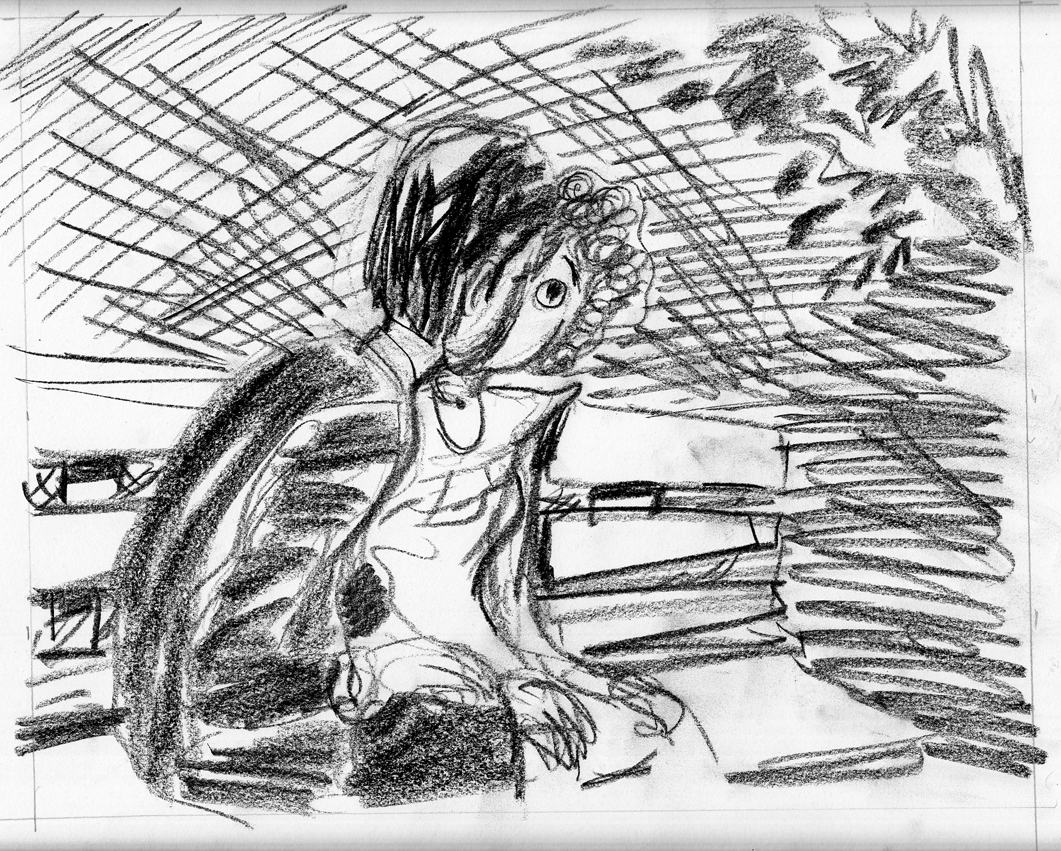 9:
9:
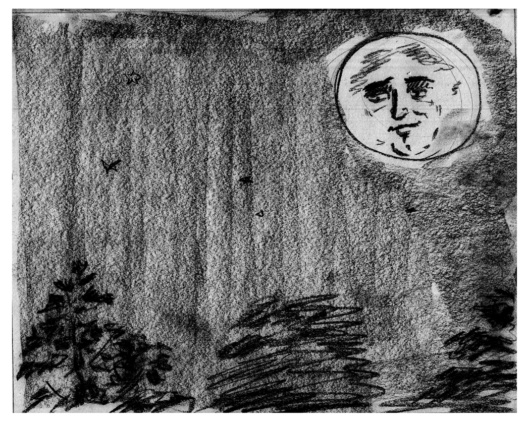 (I didn’t like the moon face in this one, so i re-drew it and pasted it in with Photoshop:)
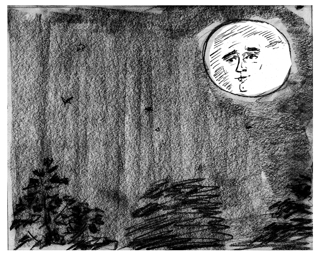 10:
10: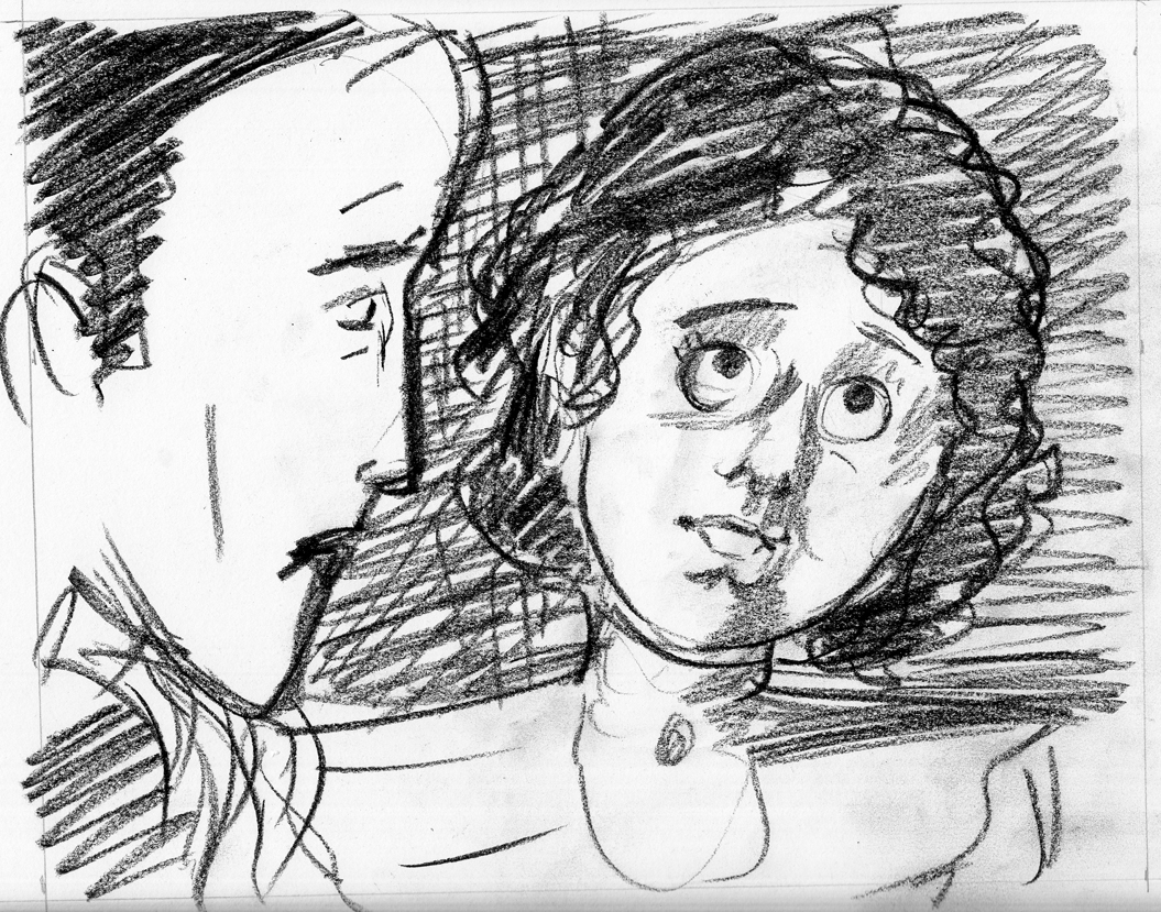 11:
11:
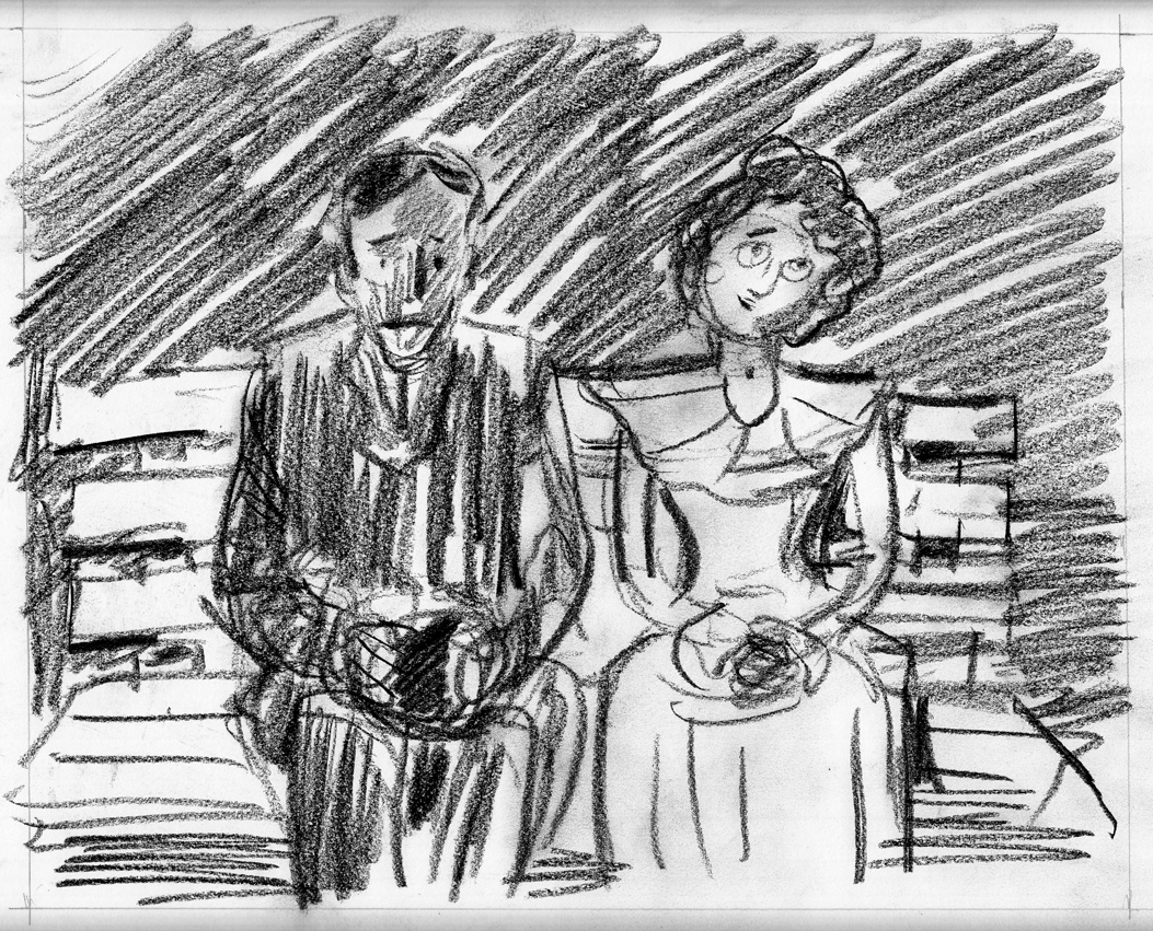 I laid the pages out for a booklet, then printed them out as large as I could (across the length of 11×8.5), flipping the pages over to print again, since I don’t have a duplex printer. Â Then stapled it, and voila:
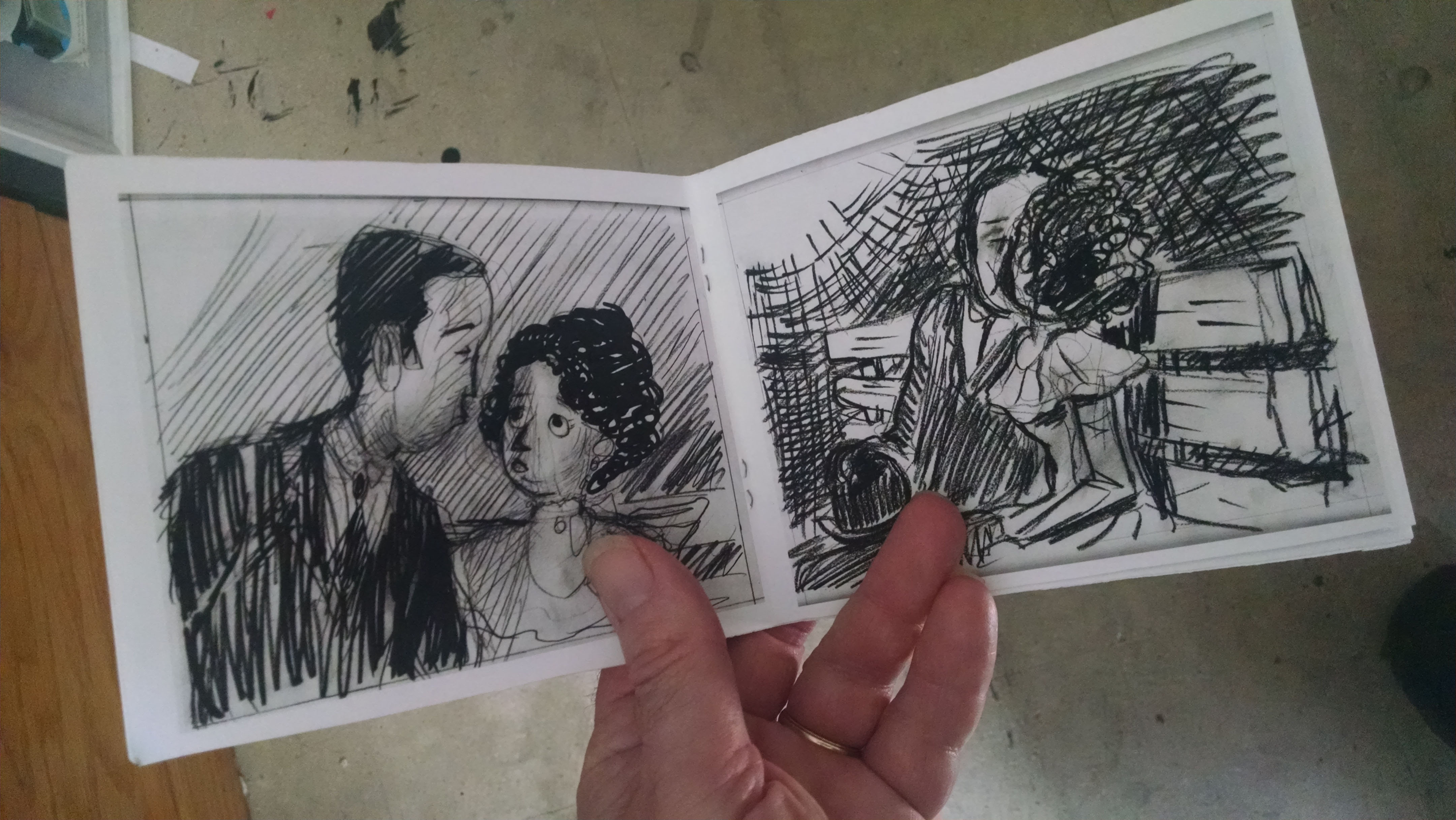
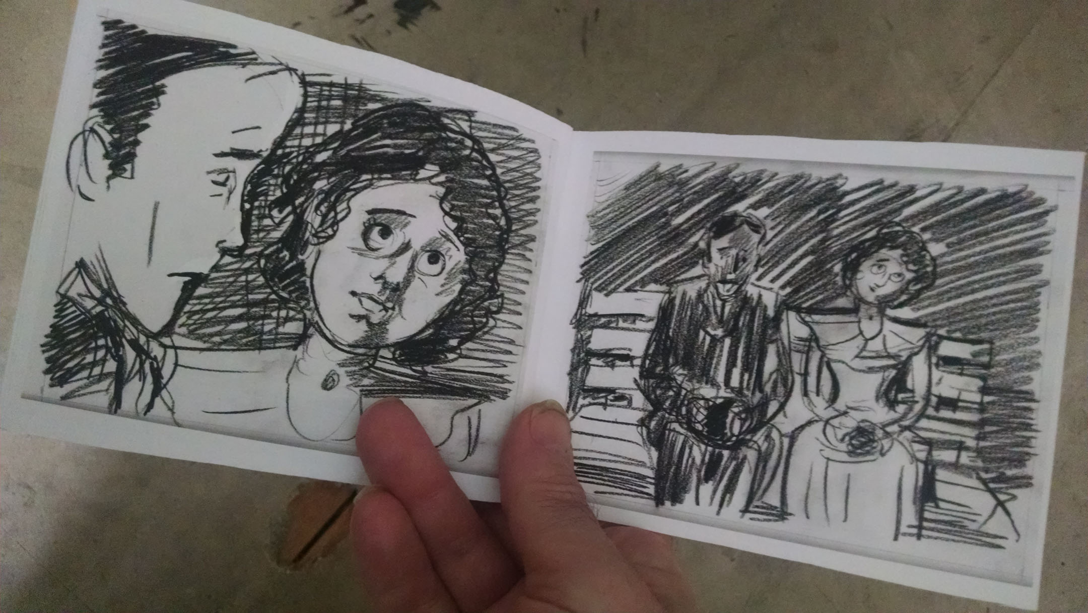 After looking at this mockup and mulling it over for a few days, I saw some things I definitely wanted to change. Â A very valuable step in the process.
June 1-6: Confronting the characters & planning the rest of the chapter
Page 2 of the chapter is a closer angle on the two characters on the bench, so I have to get serious about their physiognomies, costumes, gestures and expressions. Â So, sketches ‘n’ studies time:
After looking at this mockup and mulling it over for a few days, I saw some things I definitely wanted to change. Â A very valuable step in the process.
June 1-6: Confronting the characters & planning the rest of the chapter
Page 2 of the chapter is a closer angle on the two characters on the bench, so I have to get serious about their physiognomies, costumes, gestures and expressions. Â So, sketches ‘n’ studies time:
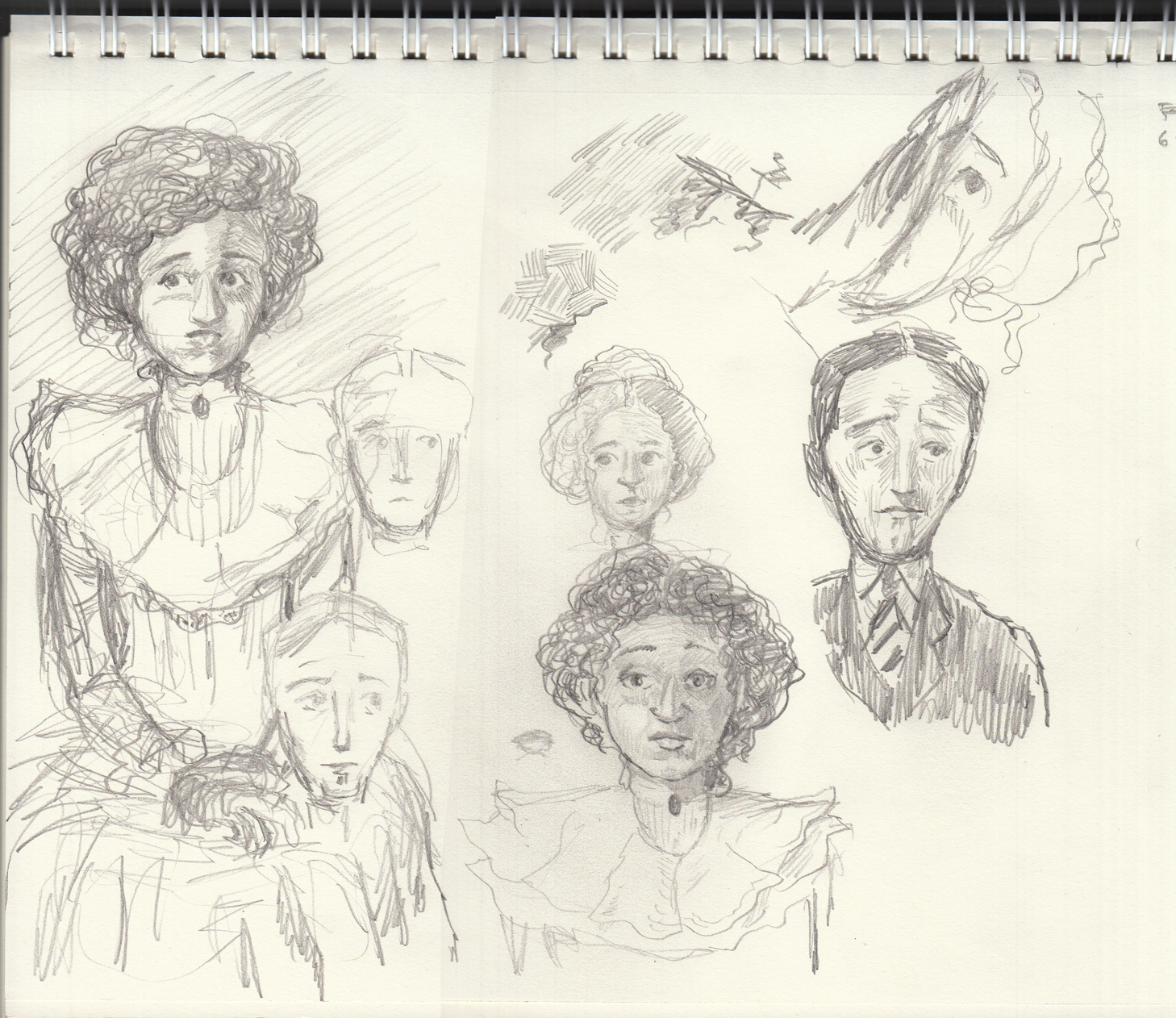 Spent a few days away, with only sketch pad and a few pens. Â A good opportunity for intense character studies. Â Trying to capture awkwardness of a “first date,” for a young couple from a Victorian-like culture:
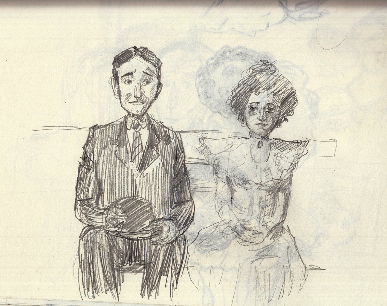 doing a little casual thumbnailing as well so i can anticipate the various gestures and expression. Â Using a brush-pen for hatching practice:
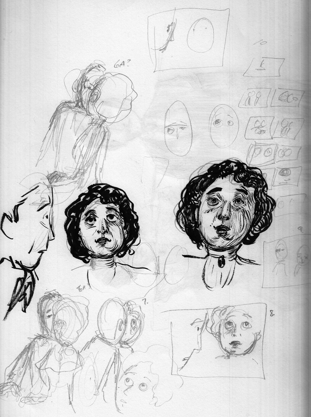
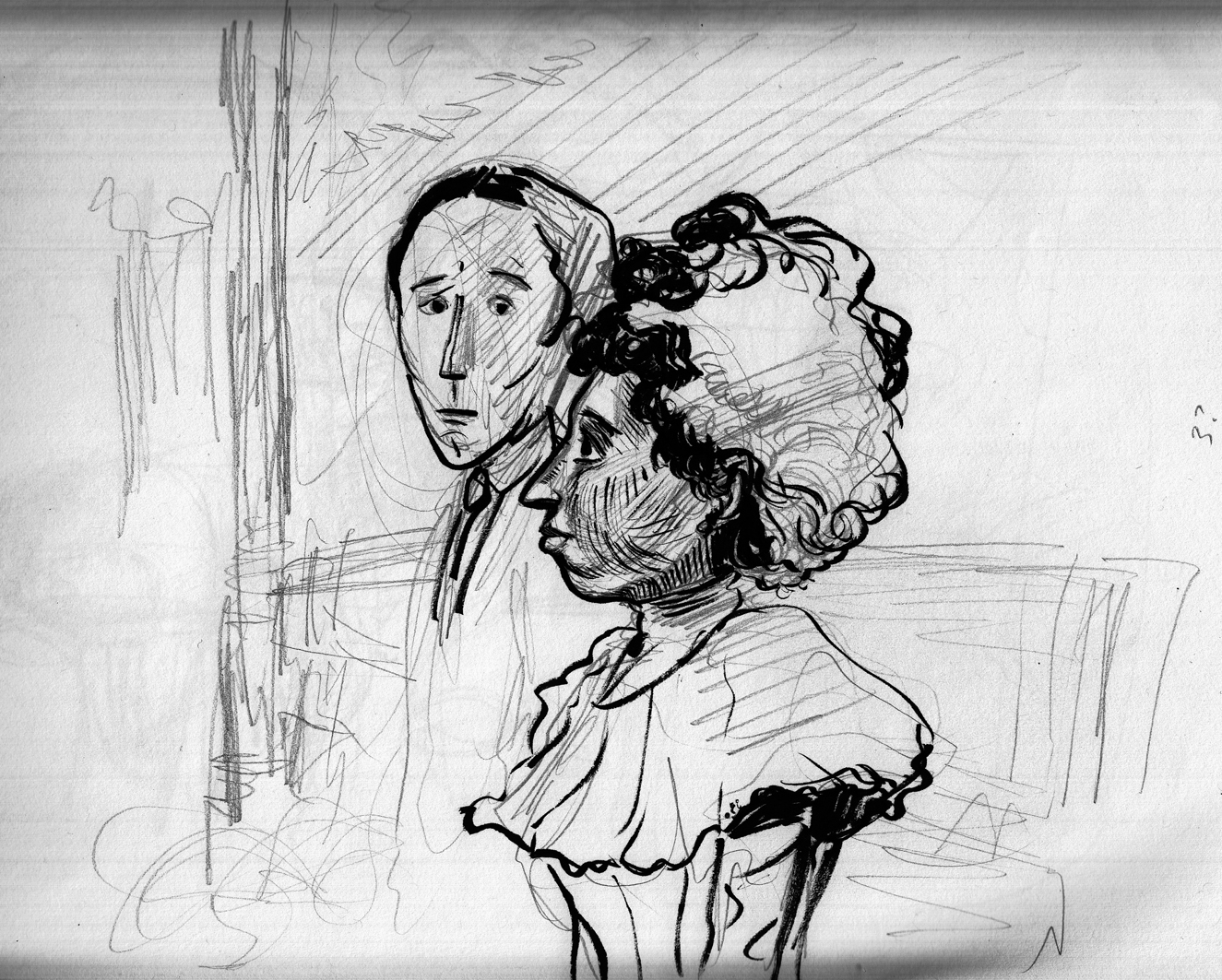
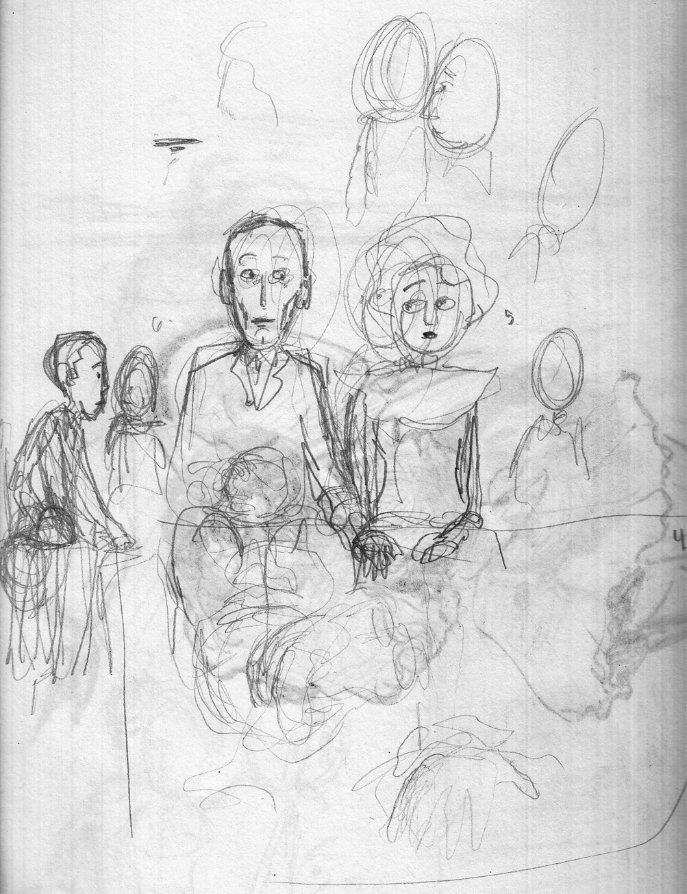
 Numbers to remind myself which page each sketch is meant for:
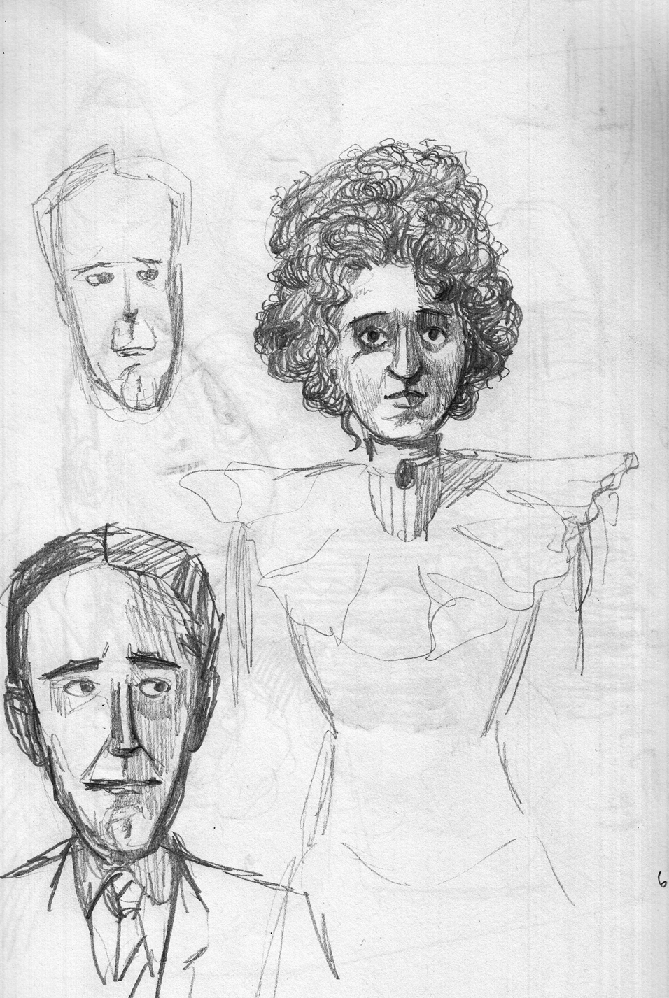
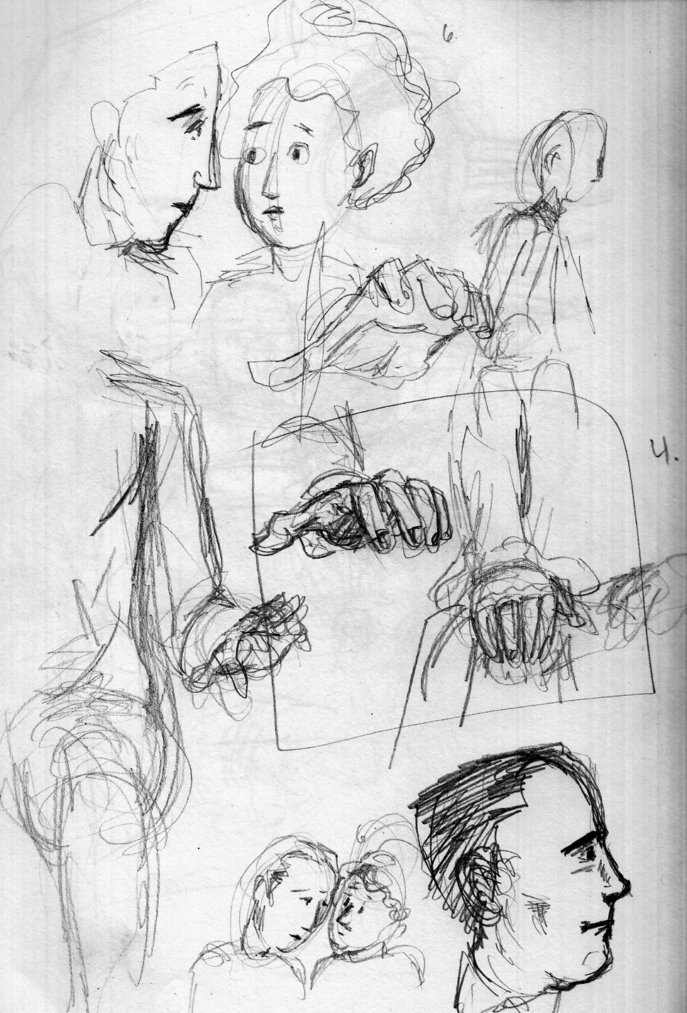
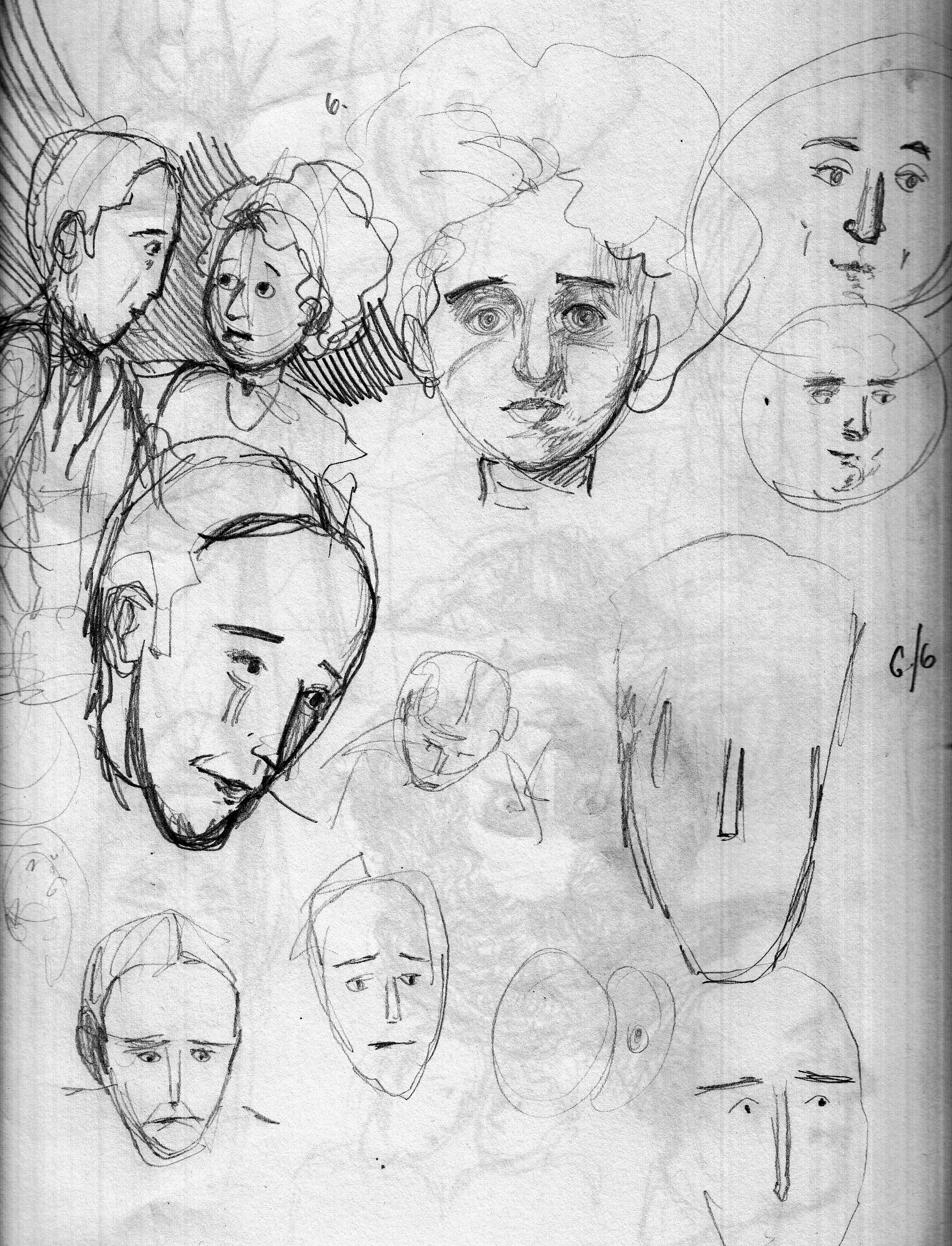
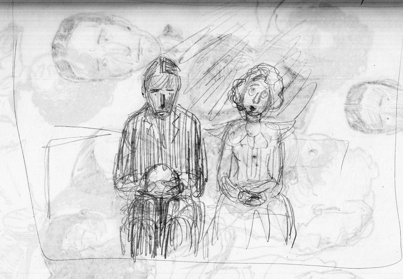
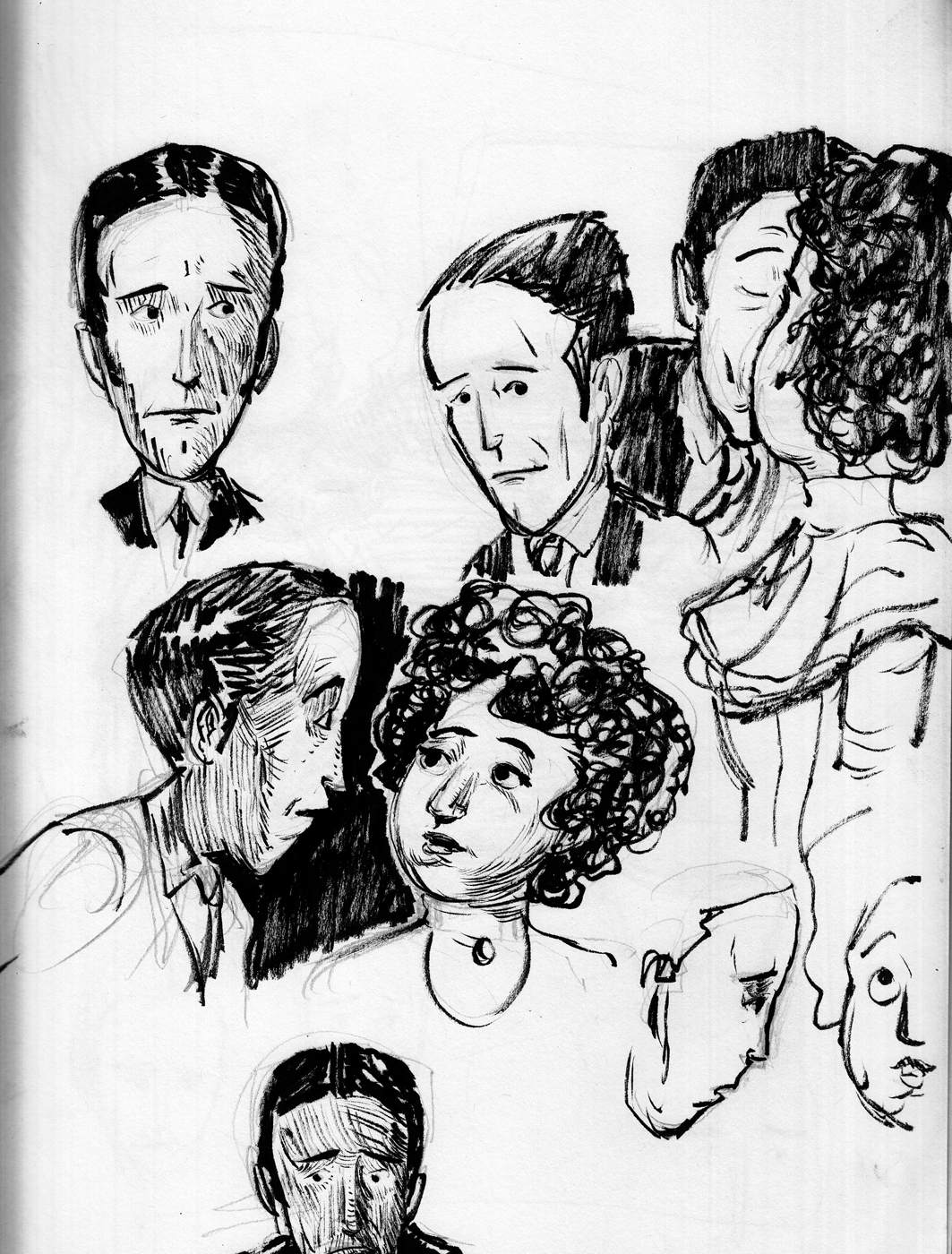
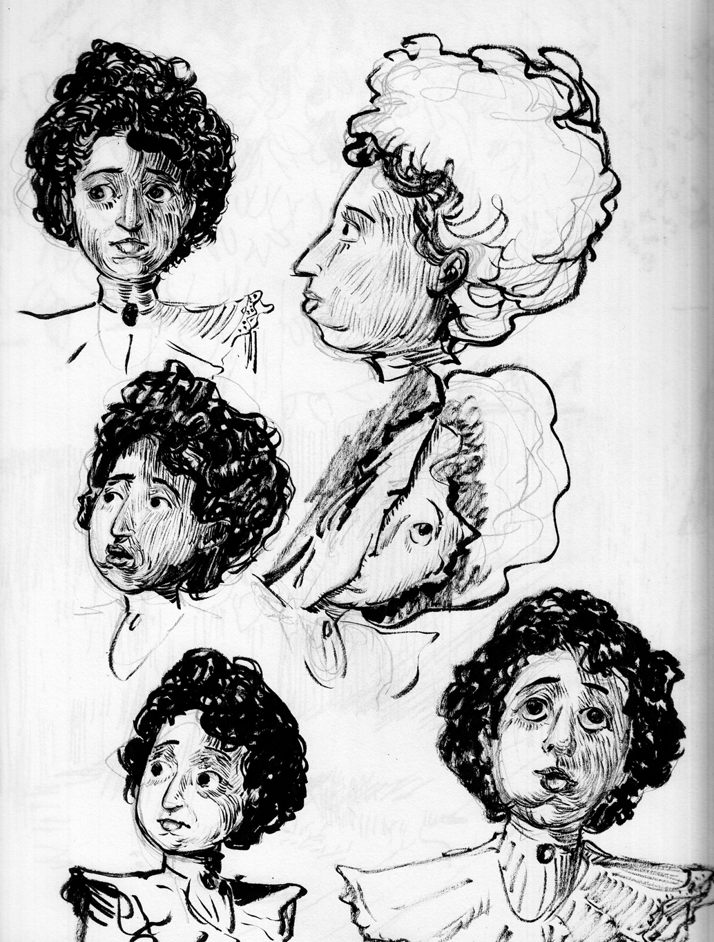 So I returned from a few days at the Cape with a nice set of sketches I can refer to for each page of the rest of the chapter.
May 25-29: Page 1 ink.Â
A real challenge for me in this first page (and for the entire chapter, actually), is that my style models — Gibson, Flagg, Booth, etc. — didn’t draw a lot of night exteriors, or a lot of landscapes with heavy foliage, so I’m on my own as far as what kind of shading and mark-making to use for all this dark foliage and sky backgrounds. Â The exception to this is Franklin Booth, with images like these:
So I returned from a few days at the Cape with a nice set of sketches I can refer to for each page of the rest of the chapter.
May 25-29: Page 1 ink.Â
A real challenge for me in this first page (and for the entire chapter, actually), is that my style models — Gibson, Flagg, Booth, etc. — didn’t draw a lot of night exteriors, or a lot of landscapes with heavy foliage, so I’m on my own as far as what kind of shading and mark-making to use for all this dark foliage and sky backgrounds. Â The exception to this is Franklin Booth, with images like these: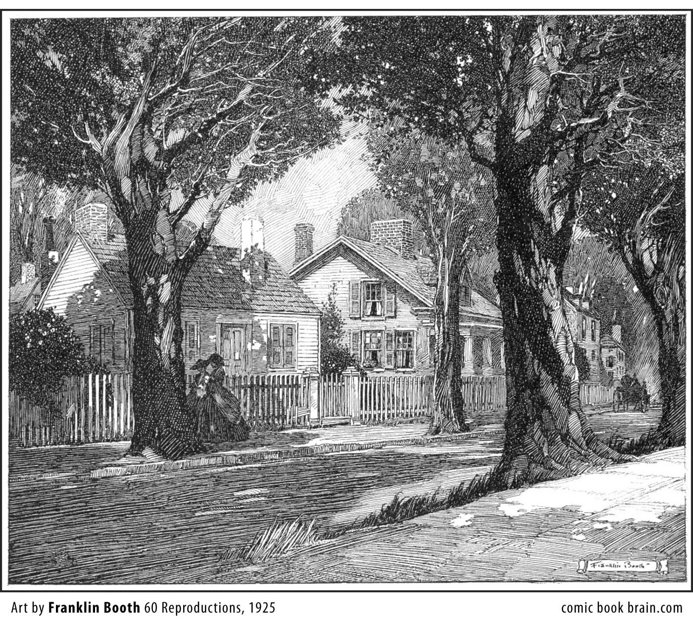
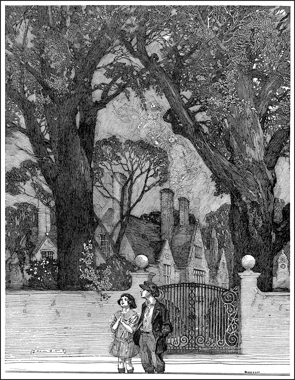 And especially this one:
 Since the real challenge is going to be how to handle the pen-and-ink shading in this complicated night scene, I start doing studies for the page in ink:
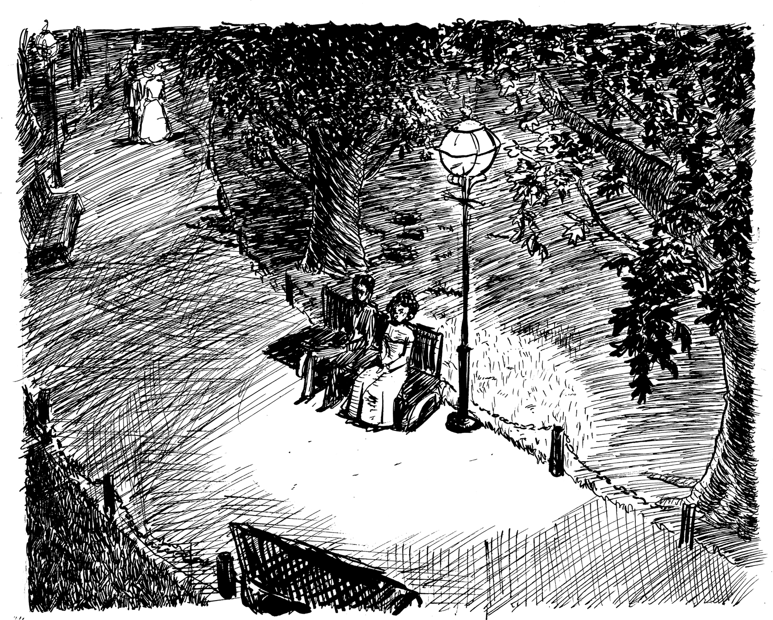
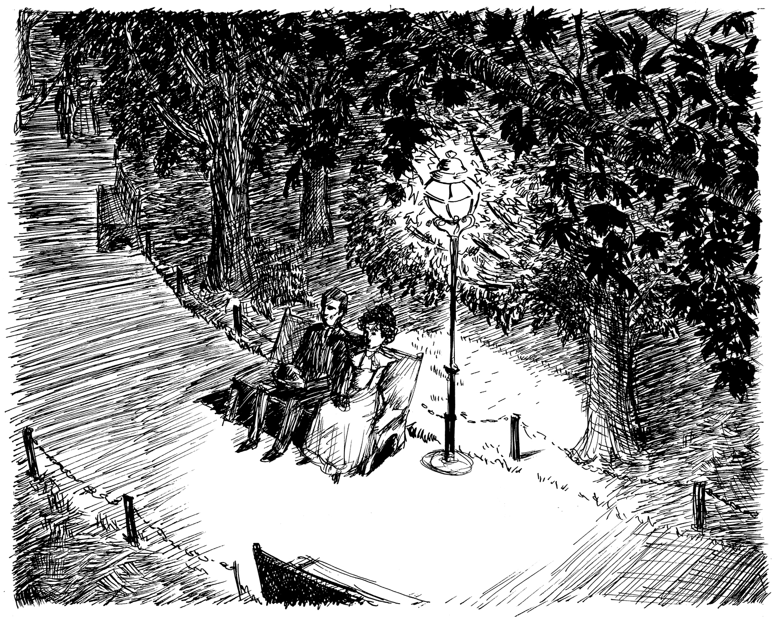 There’s just a lot of different things to shade/describe here using the ink: pavement, grass, leaves, trees… a lot of page to fill. Â Finally I decided to simplify the composition, make it more centered and head-on. Â I want it to be more like that third Franklin Booth, with the couple at eye level, the trees against the night sky. Â It’s not really that much less complicated, but at least, for instance, I’m not drawing grass from above, or trying to contrast the leaves against the grass. Â Everything is sort of on its own plane, which makes it easier to be methodical about assigning different types of marks to different elements. Â This is the final rough:
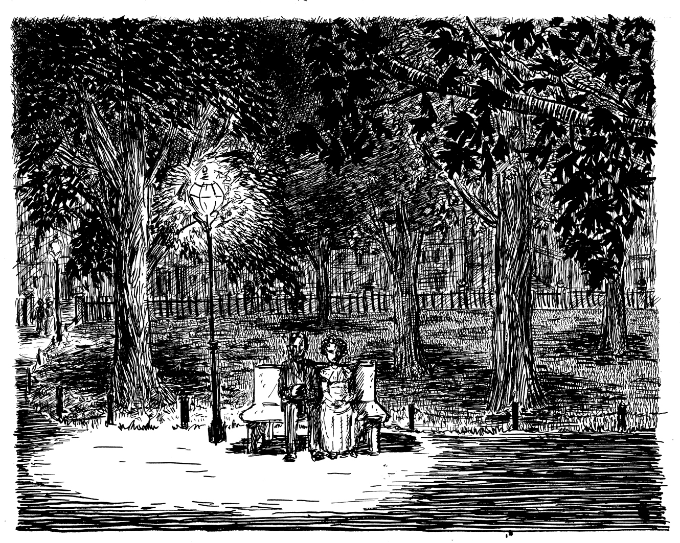 The horizontal stripes for the ground is a direct swipe from Booth, as is the approach to the tree-trunks. I still have made something of a jumble of the leaves against further-back leaves and an unclear delineation between leaves and night sky. Â But it’s close enough…. One more nervous energy sketch. mostly to figure out how to do the sky:
 …and I move on to the final version….
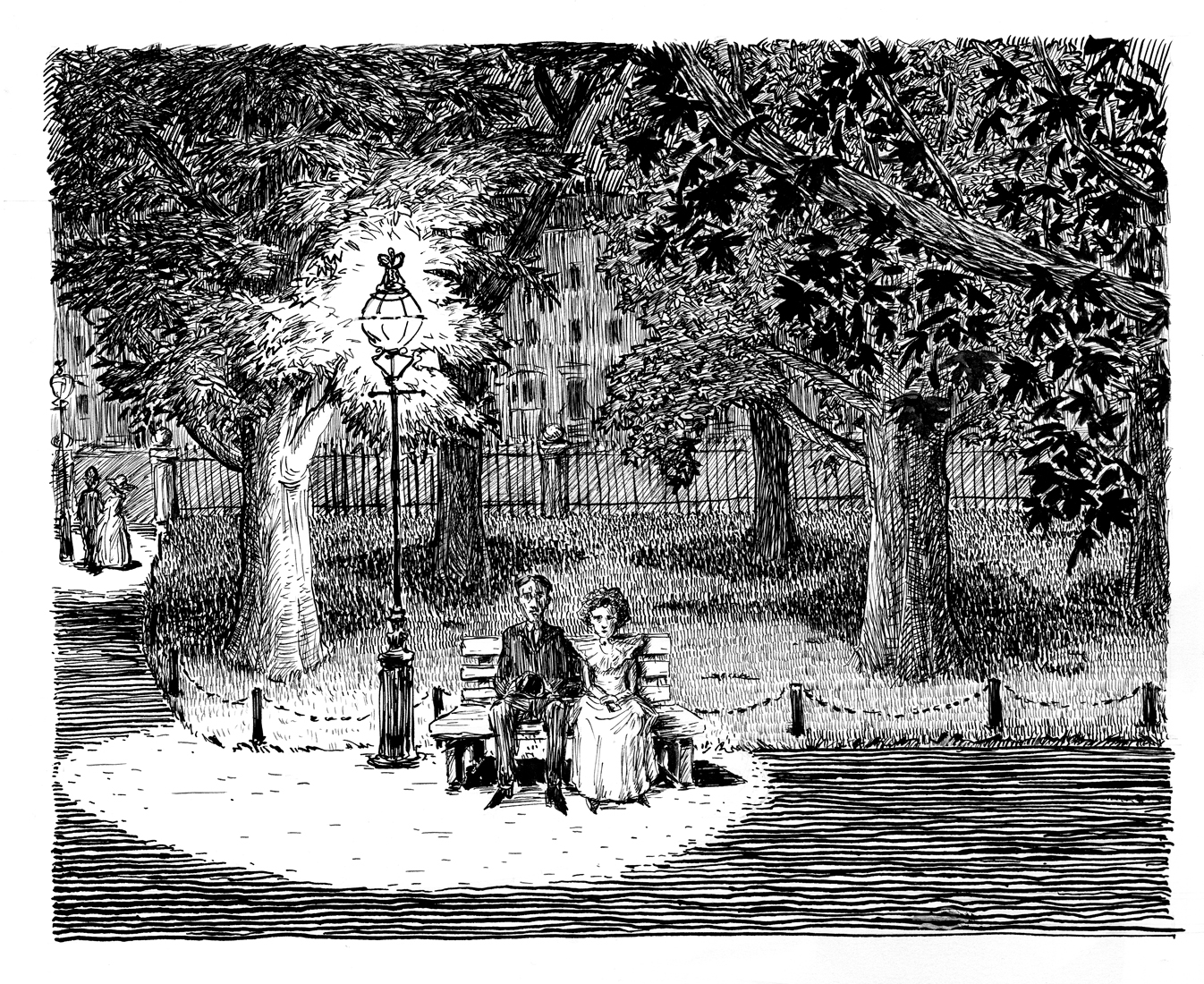 May 25-28 Page 1 pencil sketches
Not actually drawing the final page 1, yet. But at least getting serious about the sketches, and trying to nail the composition:
May 25-28 Page 1 pencil sketches
Not actually drawing the final page 1, yet. But at least getting serious about the sketches, and trying to nail the composition:
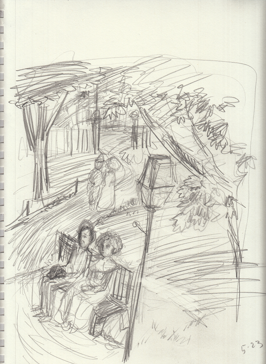
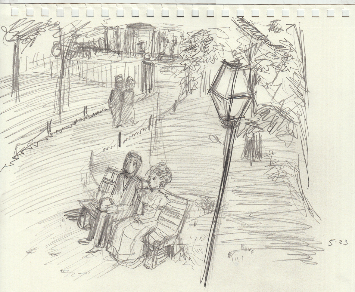
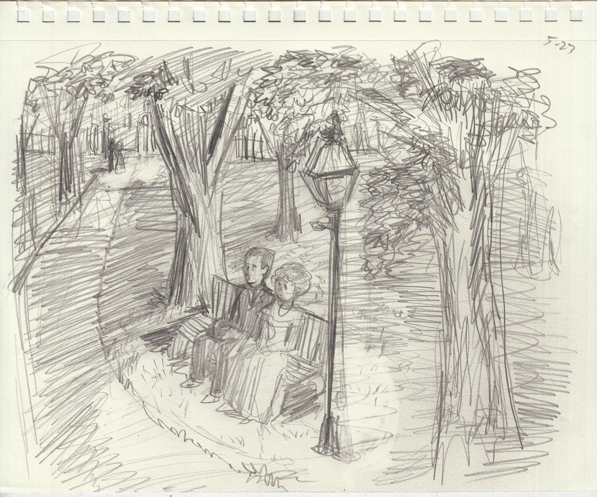

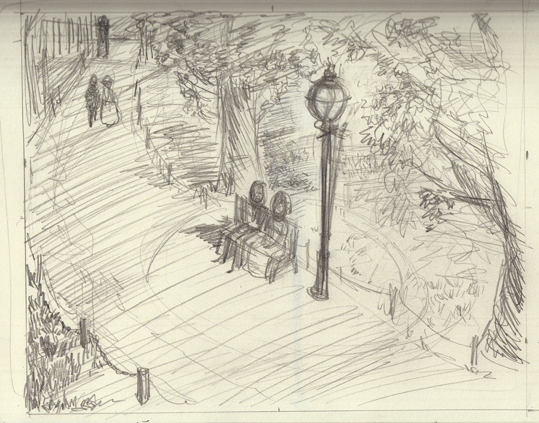
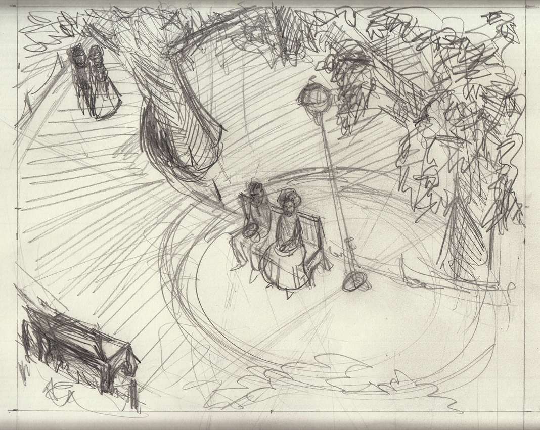
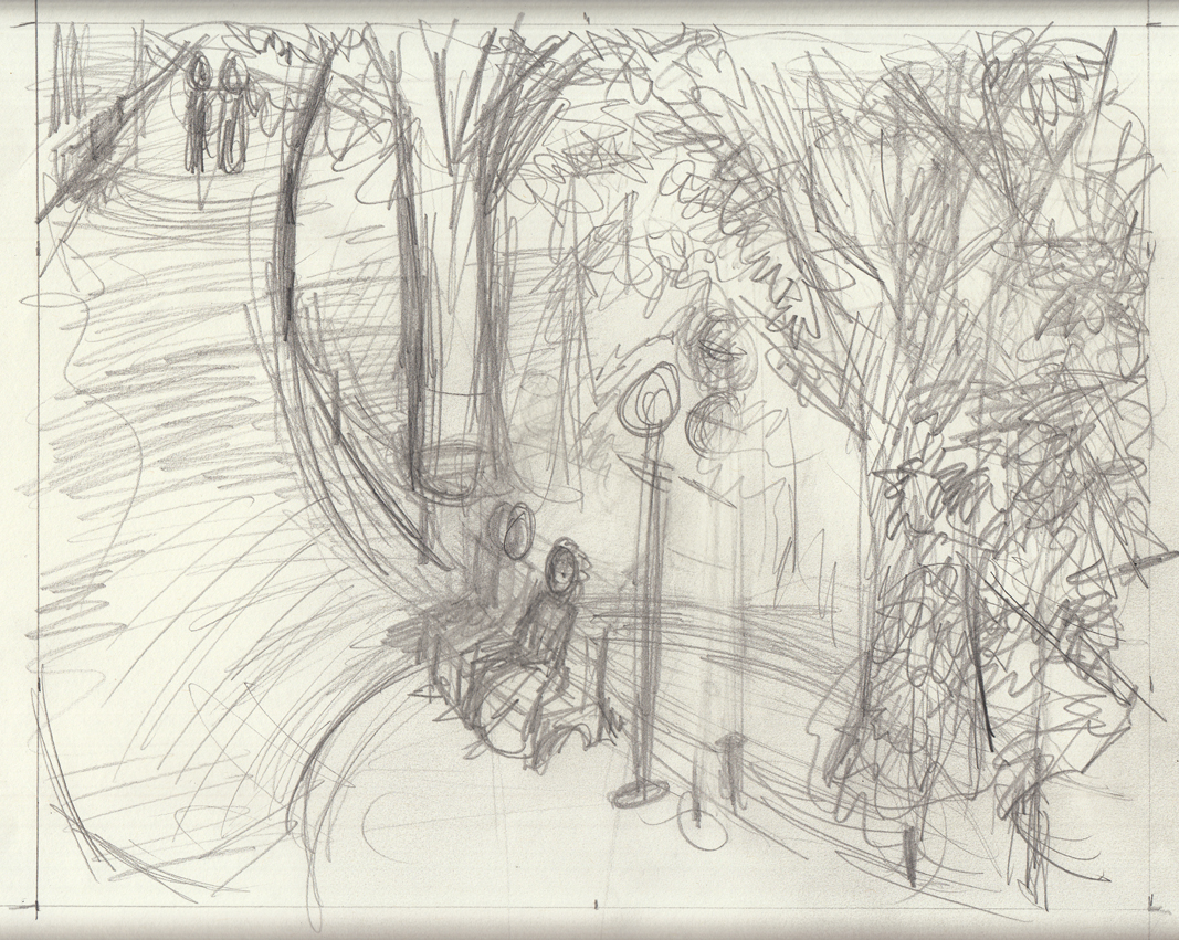 To be honest, I’m posting these studies quite a while after drawing them, and I can’t remember what it was that made me keep going over and over the composition with slight variations. It seems obsessive to me, but I know there was something I was trying to get!
May 23-25: Still sketching!
Tree studies (from life), lamp studies (from reference), character studies (from imagination), as I dance around actually starting to draw the first page:
To be honest, I’m posting these studies quite a while after drawing them, and I can’t remember what it was that made me keep going over and over the composition with slight variations. It seems obsessive to me, but I know there was something I was trying to get!
May 23-25: Still sketching!
Tree studies (from life), lamp studies (from reference), character studies (from imagination), as I dance around actually starting to draw the first page:
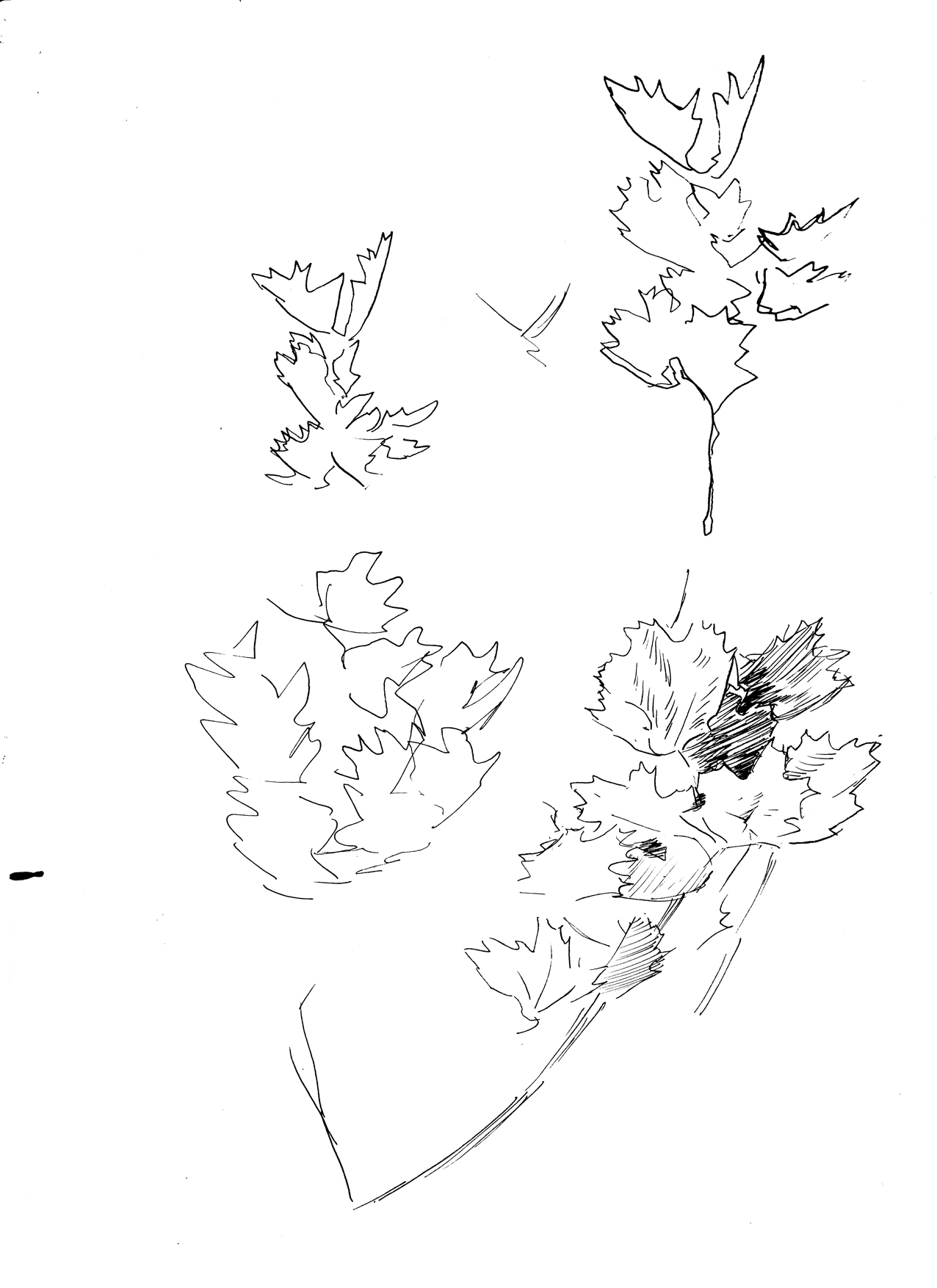
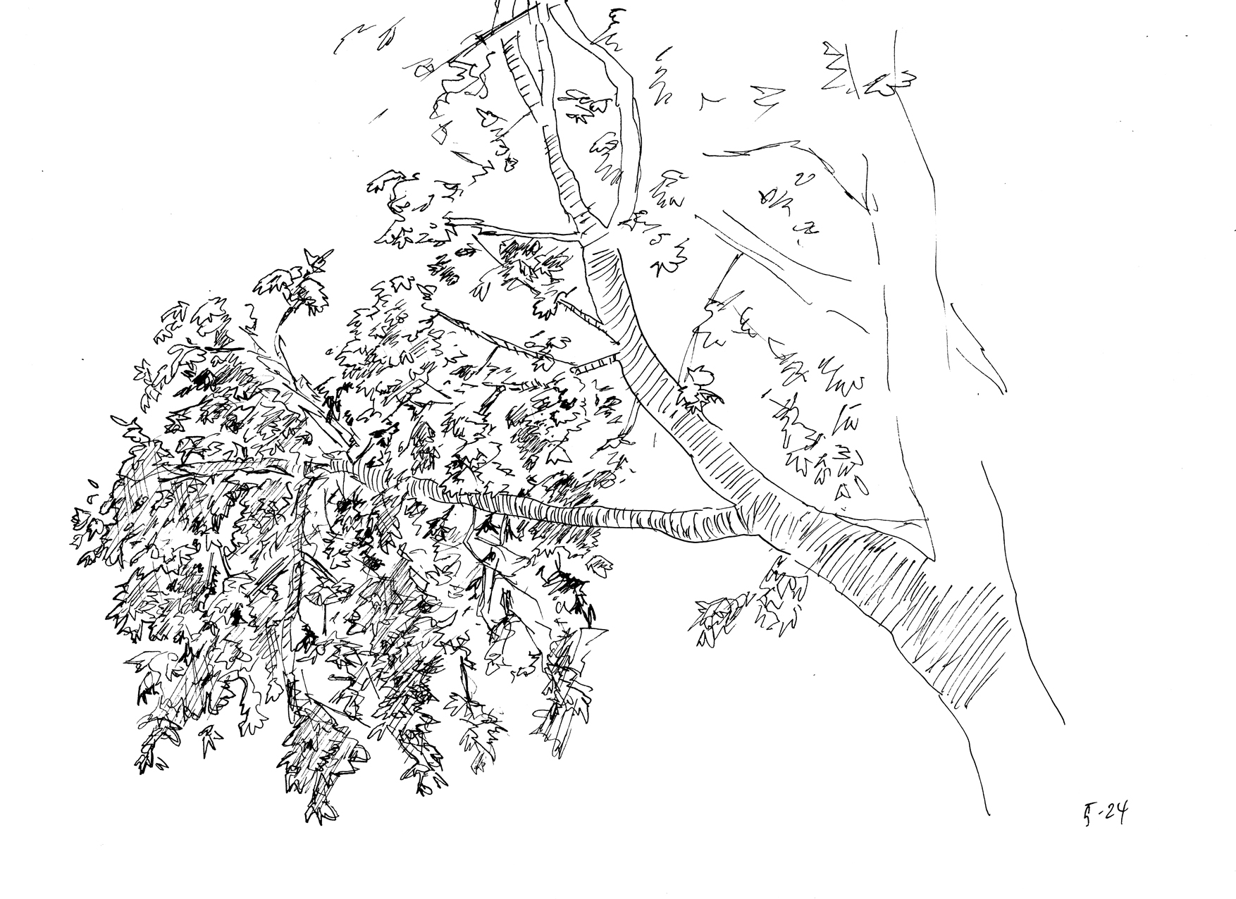
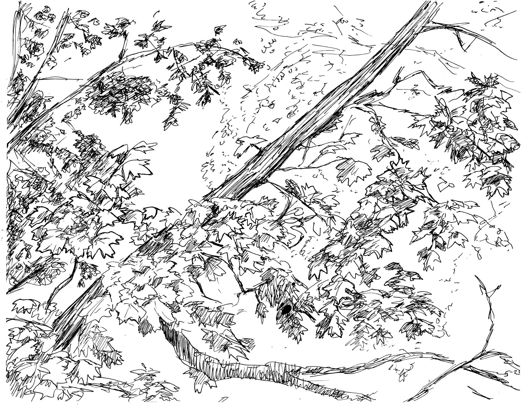 Foliage studies drawn from life with a Rotring art pen (EF tip).

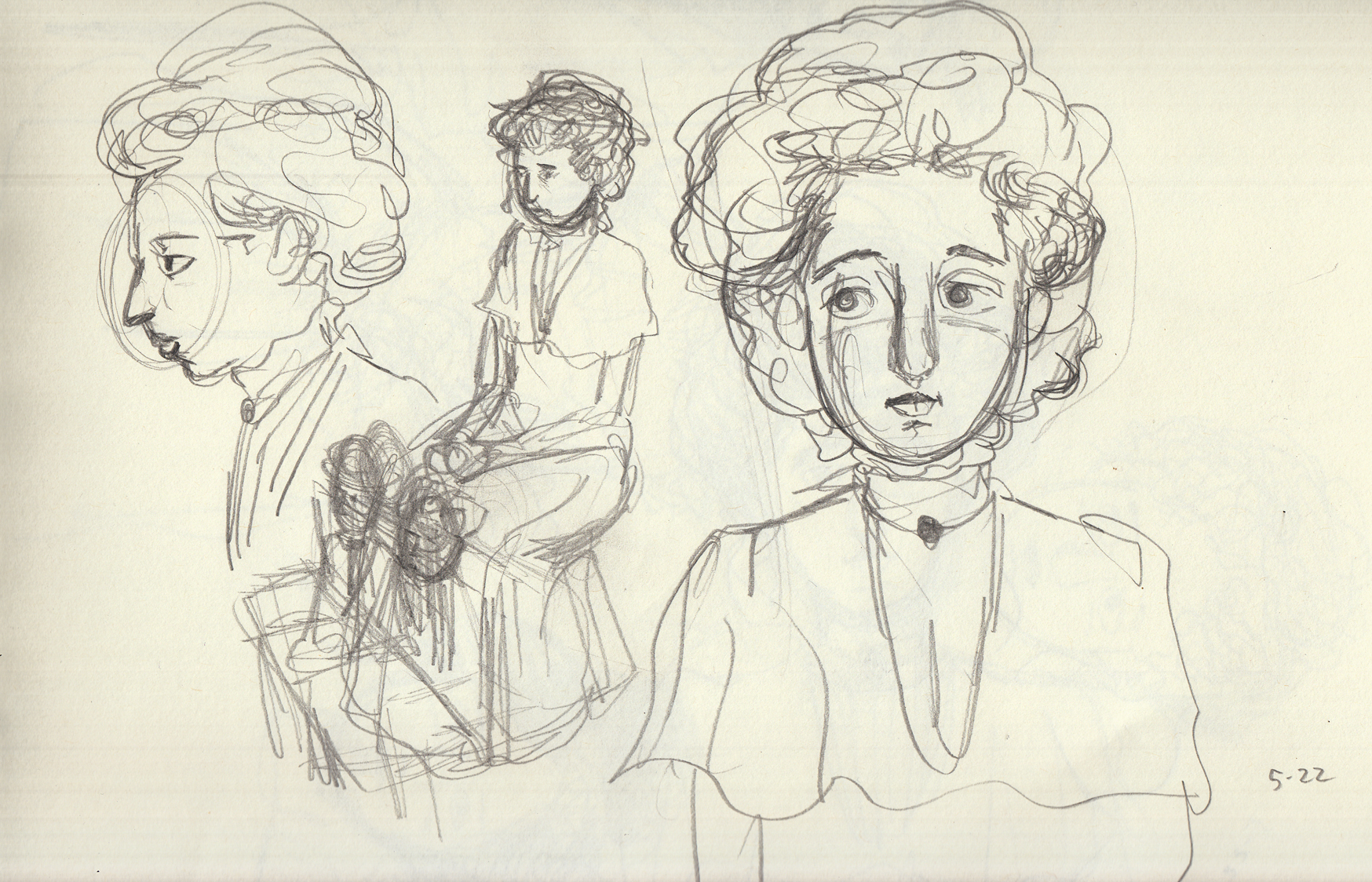
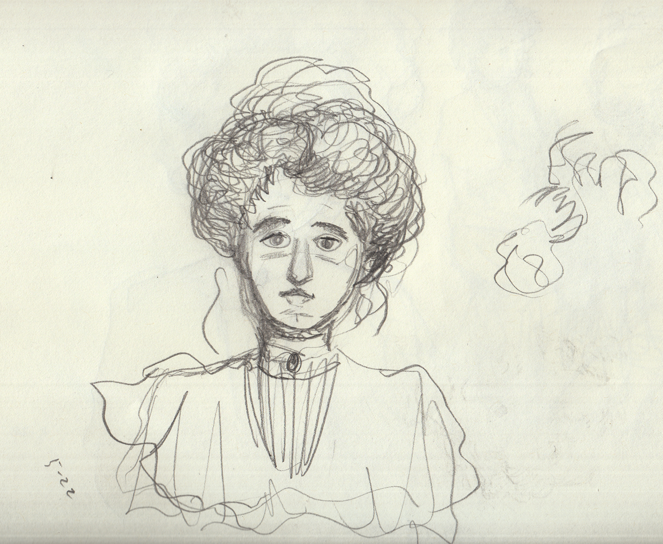
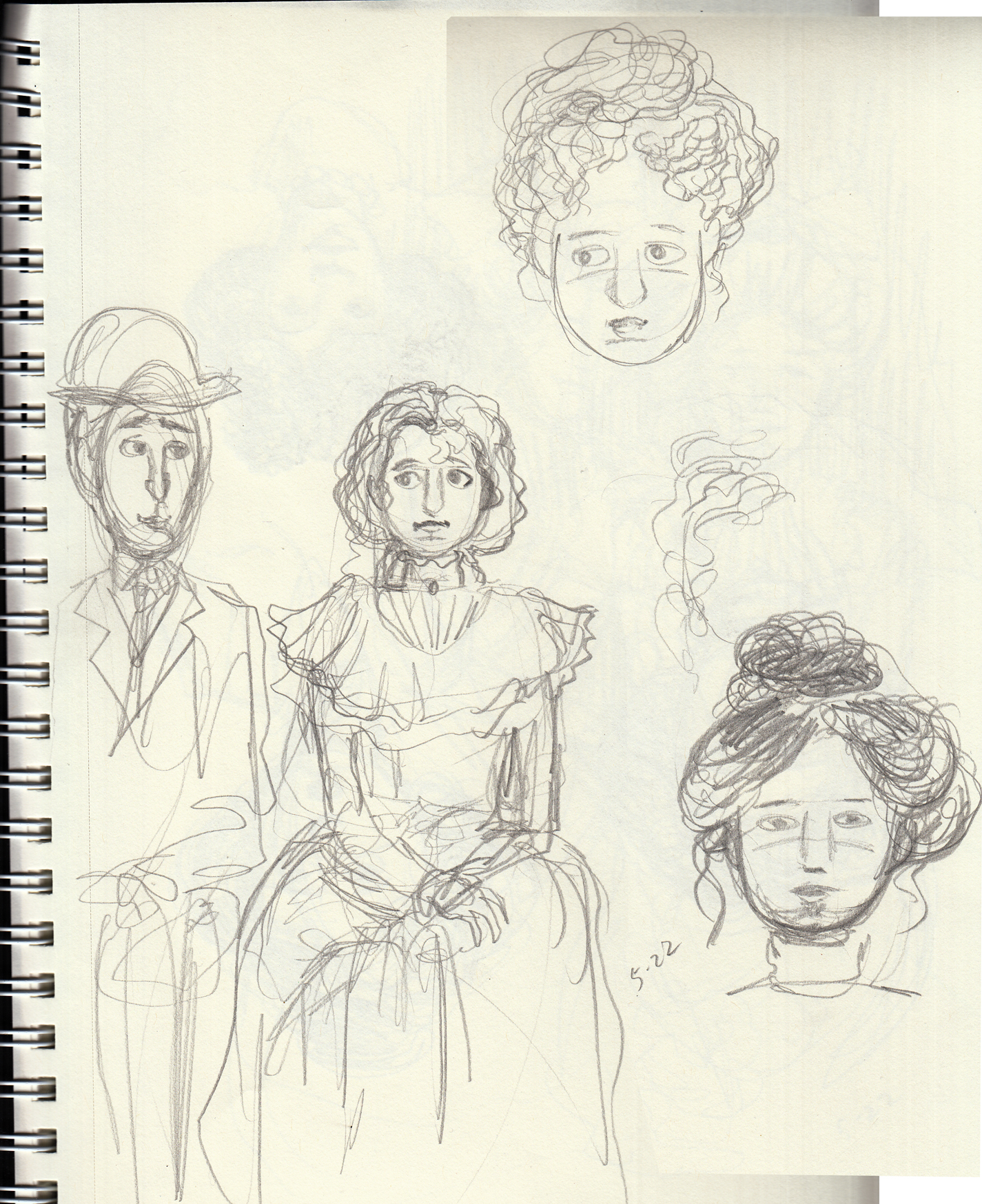
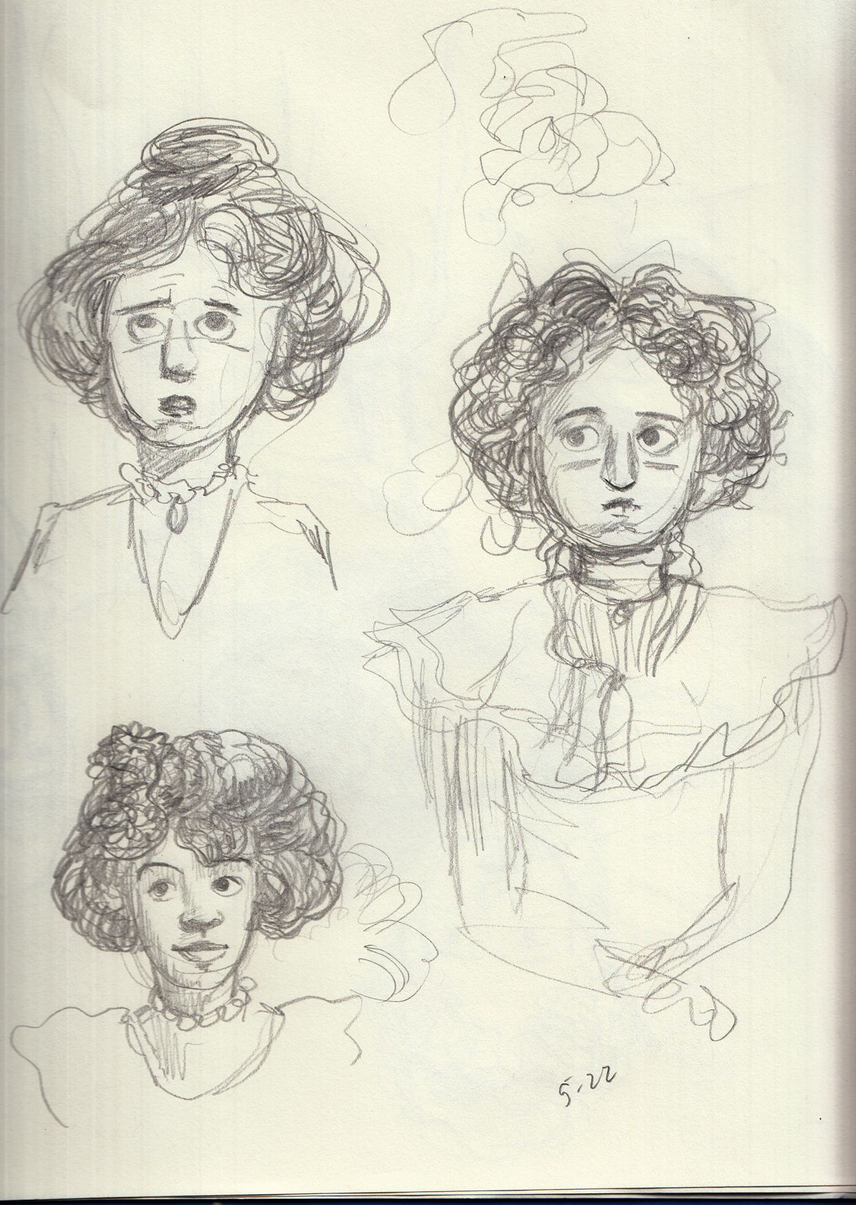
 (this last one is from an old photo)
May 17 – 22 Meanwhile….
While copying from Gibson and Flagg, and drawing from old photos, I also did a few sketches, getting ready for whenever I actually get started drawing this chapter. Â Character sketches and studies for the first (and most challenging (I think) page). which will be an “establishing shot” of the young couple sitting under a gas lamp in a park at night.
(this last one is from an old photo)
May 17 – 22 Meanwhile….
While copying from Gibson and Flagg, and drawing from old photos, I also did a few sketches, getting ready for whenever I actually get started drawing this chapter. Â Character sketches and studies for the first (and most challenging (I think) page). which will be an “establishing shot” of the young couple sitting under a gas lamp in a park at night.
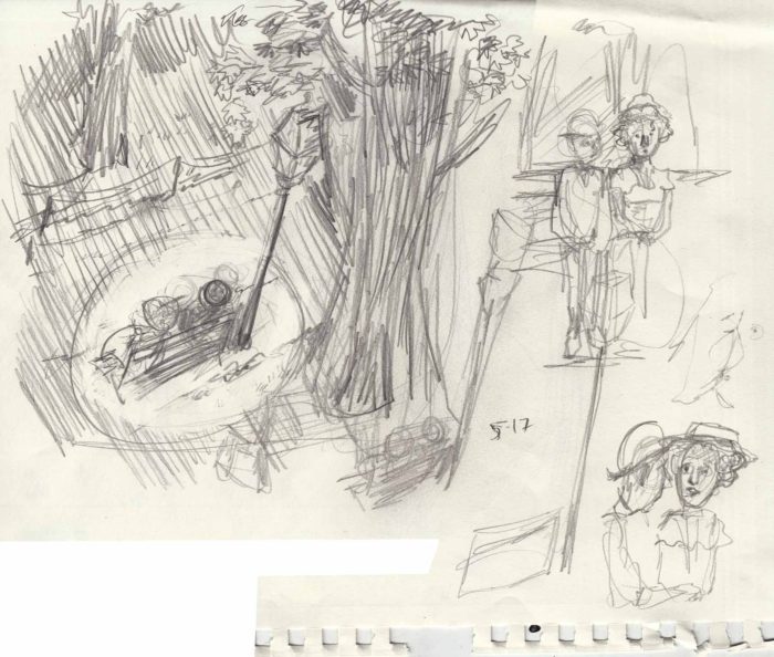
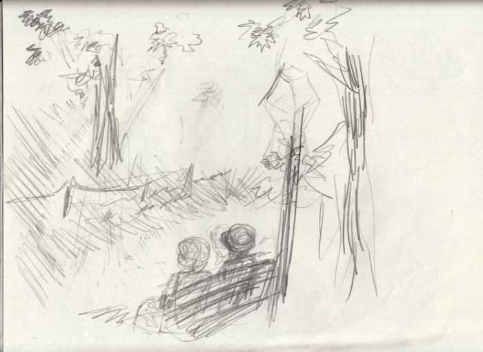
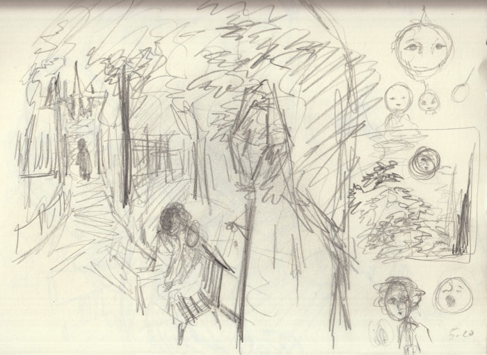
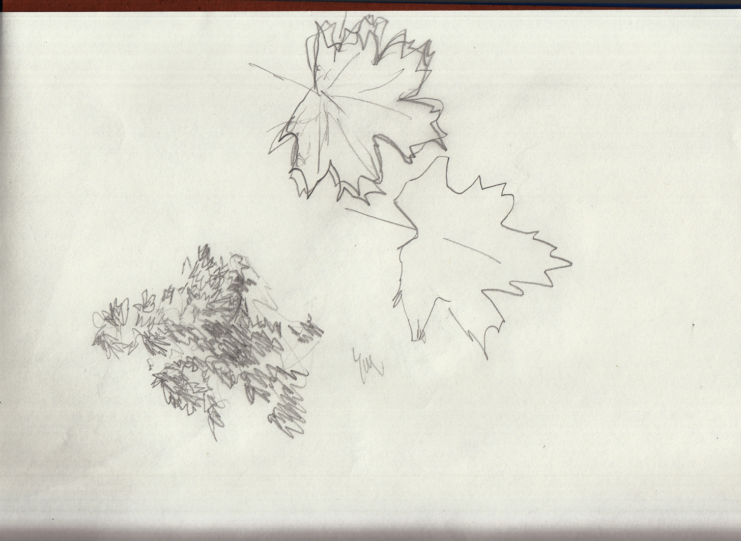
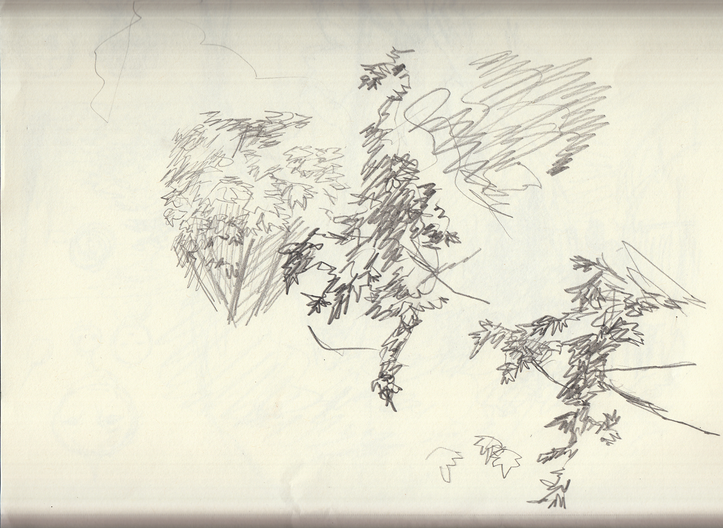 And also a sketch for page 7 (I think it’s going to be page 7), as I nervously or wisely make sure I have a handle on the gestures and actions upcoming. Â I like this sketch! Â Now I just have to worry about capturing it as well in the final version!
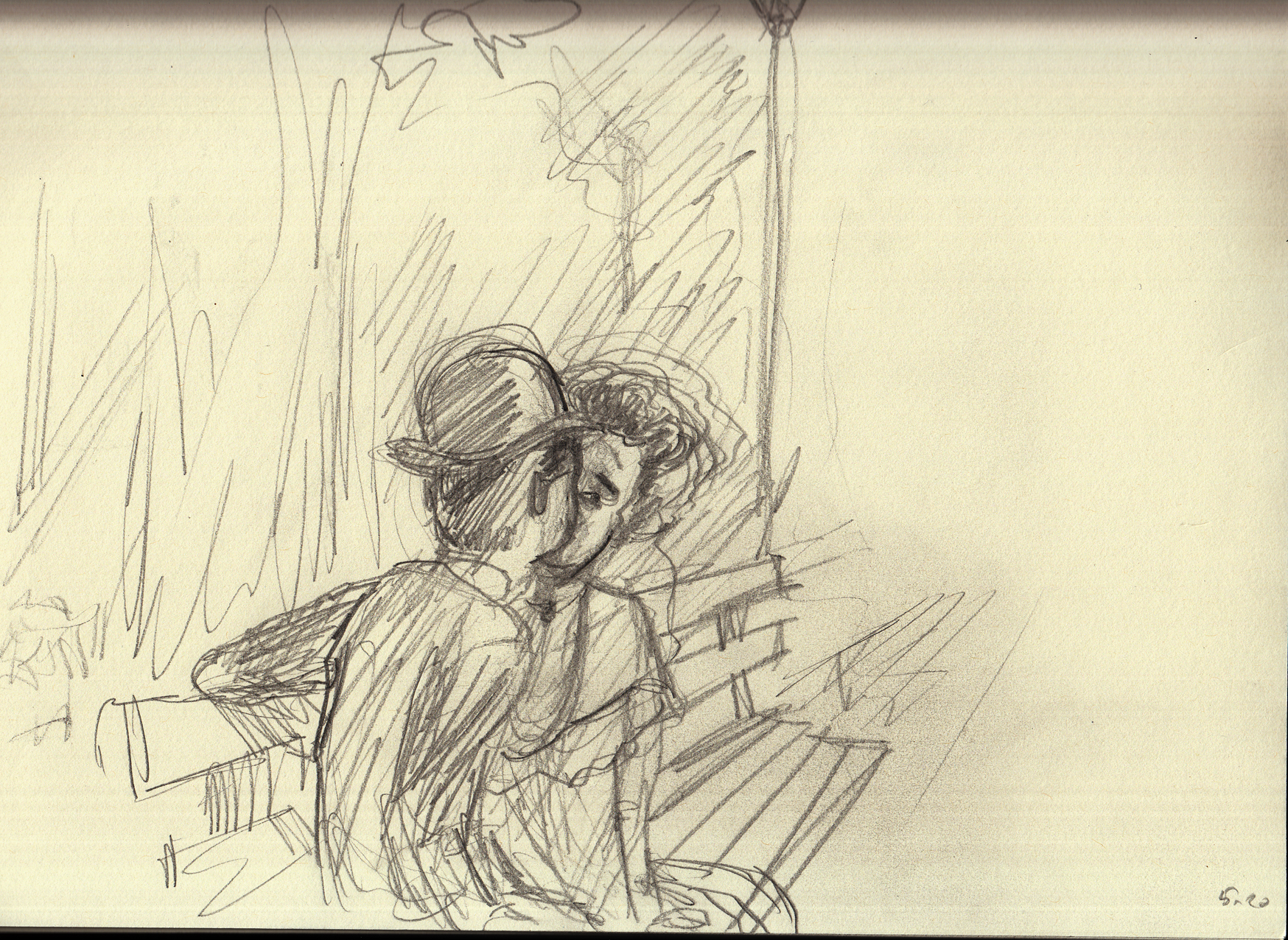 May 15-22: Learning from the masters (and trying to apply the lesson).
Now I went through about a week of drawing studies from Charles Dana Gibson, James Montgomery Flagg.
May 15-22: Learning from the masters (and trying to apply the lesson).
Now I went through about a week of drawing studies from Charles Dana Gibson, James Montgomery Flagg.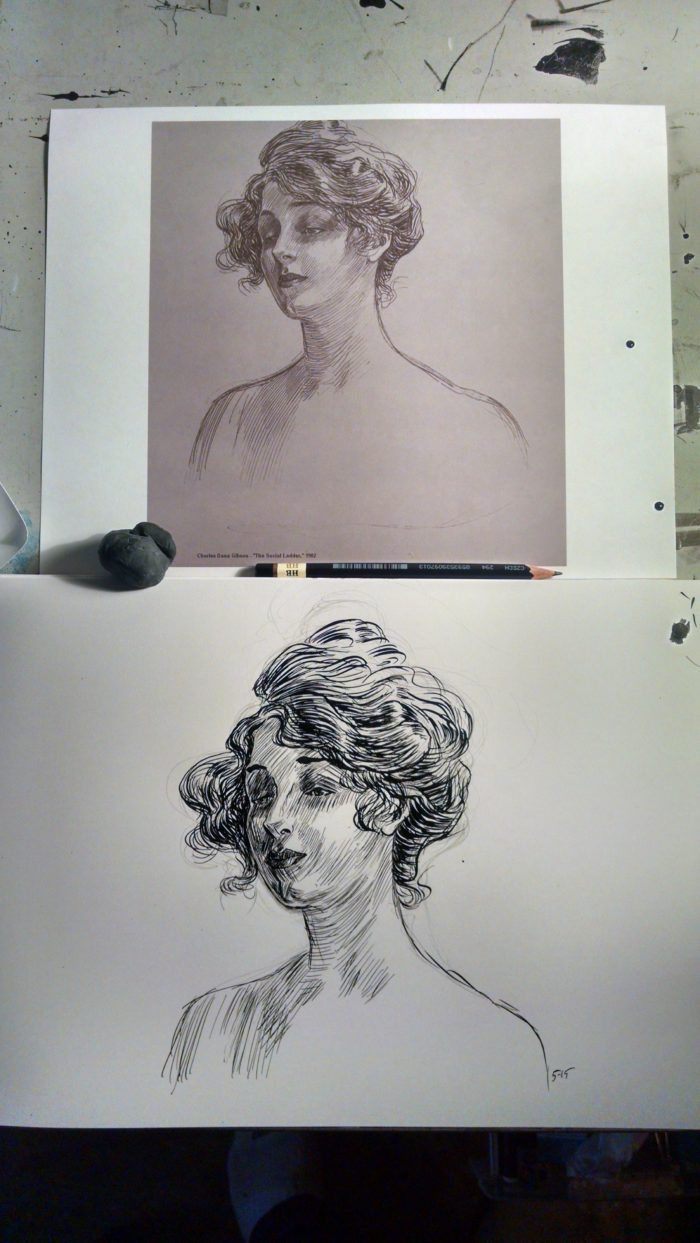 Copying like this, I realized how good they are, especially Gibson. Â The line work in his faces is so delicate and precise, never simply shading, they also describe the curves and planes of the face. Â It’s hard to use that many lines in a face, and not “age” the face, keep it glamorous and pretty.
I felt pretty good about the line-work in my copy, but I really wanted to capture that period feel of the Gibson original. Â I didn’t think I had it. Â She looked more like Jane Fonda in the early 70s, than, say Mary Astor, who the orginal looks like to me. Â And so… obsession:Â
Copying like this, I realized how good they are, especially Gibson. Â The line work in his faces is so delicate and precise, never simply shading, they also describe the curves and planes of the face. Â It’s hard to use that many lines in a face, and not “age” the face, keep it glamorous and pretty.
I felt pretty good about the line-work in my copy, but I really wanted to capture that period feel of the Gibson original. Â I didn’t think I had it. Â She looked more like Jane Fonda in the early 70s, than, say Mary Astor, who the orginal looks like to me. Â And so… obsession:Â 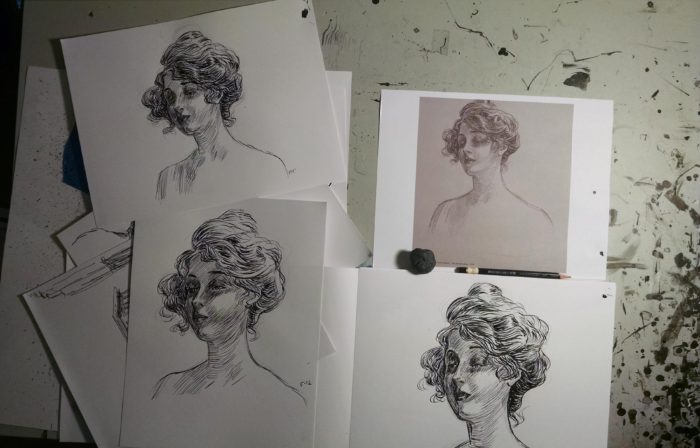 To be honest, I never felt like I really got the “look” of the character in the original. Â But, that’s not REALLY the purpose of this style exercise. Â I moved on to other studies:
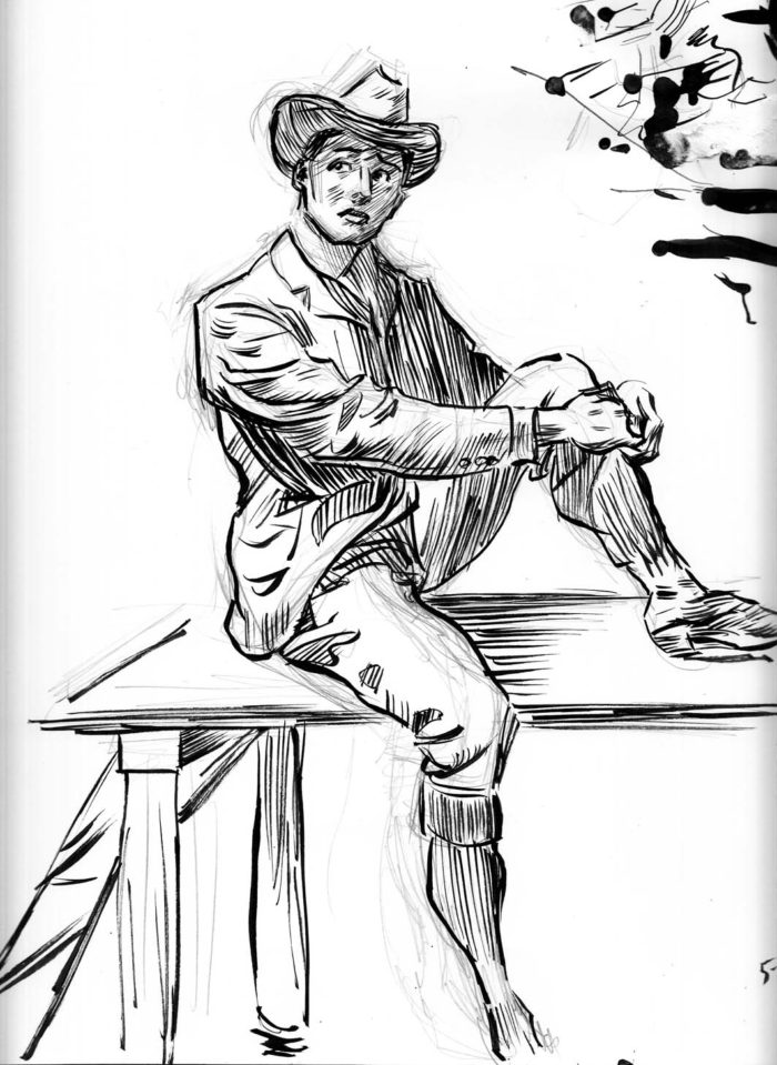
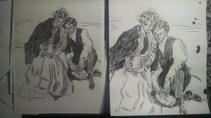 I love this one by Gibson, it’s called, “The Last Day of Summer,” (the original is on the left) and the expressions and poses of the two characters are wonderful. Â I definitely didn’t quite capture it: the haunted look on the faces… the way you can feel them pressing against each other, his cheek on her shoulder, her head leaning on his, as they contemplate the end of their summer tryst. Â But… still… i learned something in the effort.
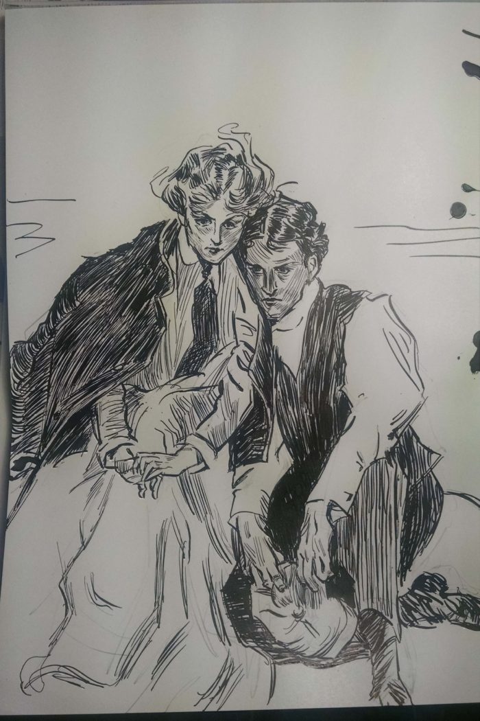
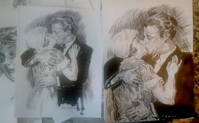 And I was equally obsessed with “getting it right”:
 I then decided to apply whatever I had absorbed from Gibson & Flagg, to more work from old photos. Â I chose this one:
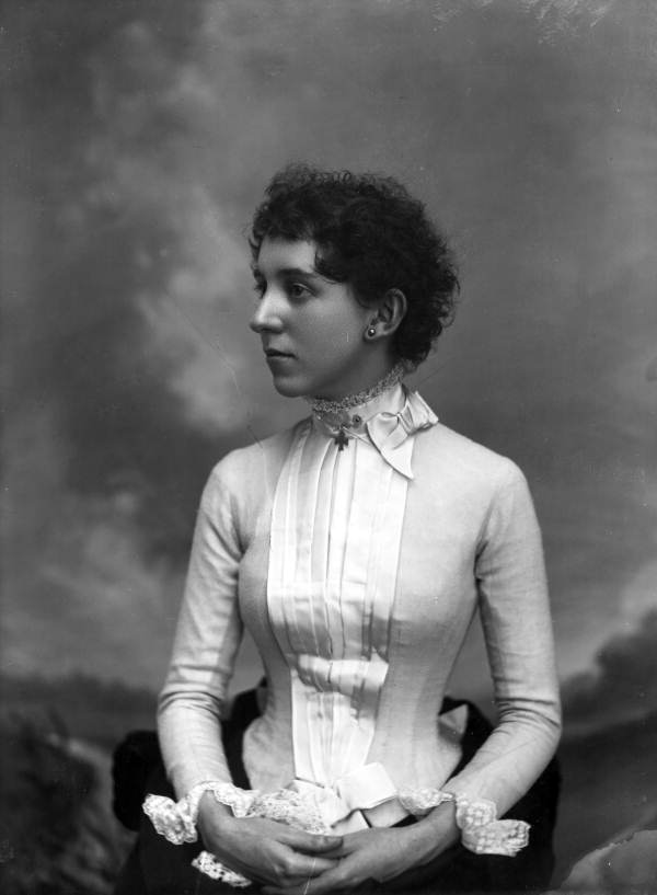 She doesn’t really look like how I picture the character in “Lunatic,” but she has an interesting face, and also curly hair — and short hair, which is pretty unusual for the period. Â Anyway… I spent a long time drawing from this photo, trying over and over again to get a likeness, capture the expression:
First try. Â
She doesn’t really look like how I picture the character in “Lunatic,” but she has an interesting face, and also curly hair — and short hair, which is pretty unusual for the period. Â Anyway… I spent a long time drawing from this photo, trying over and over again to get a likeness, capture the expression:
First try.  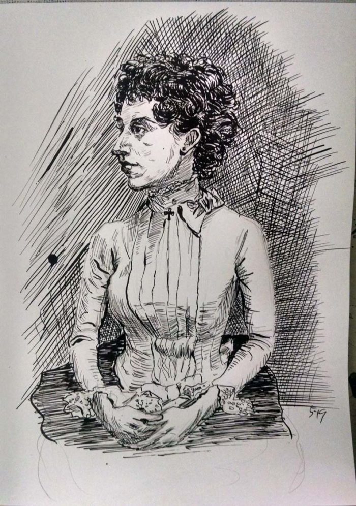 Awful.  Head is out of proportion to body and bad likeness.  I’m happy enough with the figure/costume, and the background cross-hatching… but definitely more work needed!
Second try. Â I was making an effort to shade the face with lots of lines, like Gibson/Flagg do. Â Better, but I still don’t like the head/face:
Awful.  Head is out of proportion to body and bad likeness.  I’m happy enough with the figure/costume, and the background cross-hatching… but definitely more work needed!
Second try. Â I was making an effort to shade the face with lots of lines, like Gibson/Flagg do. Â Better, but I still don’t like the head/face: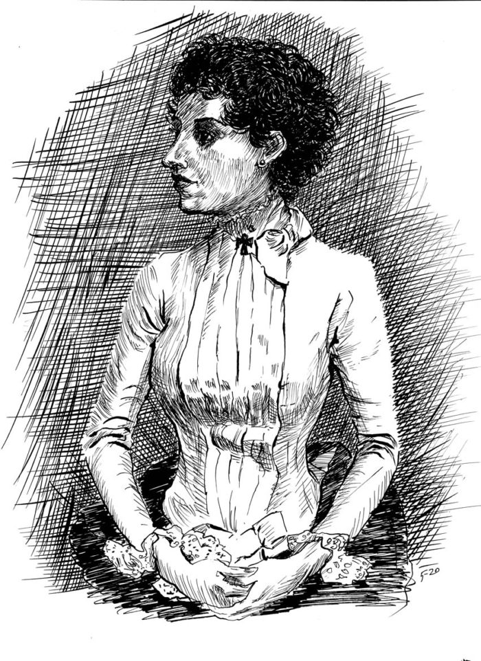 I decided to try a “close-up.” Â First an abortive attempt:
 Then one I was finally happy with.
 Still not much of a likeness, but my favorite drawing so far in this effort. Â Now, to “put it all together:”
 Still not the likeness I had hoped for. Â But I think I’ve probably done enough from this picture.
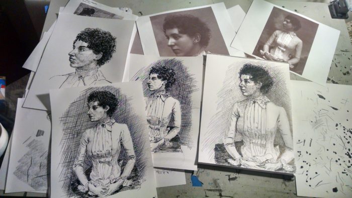 May 10-12. Â Still warming up, drawings from old photos.
I’m not sure why I was working so slowly (it’s a couple weeks later, now). Â I might have had some good reason, but I was probably just procrastinating.
Anyway, I worked from this photo:
May 10-12. Â Still warming up, drawings from old photos.
I’m not sure why I was working so slowly (it’s a couple weeks later, now). Â I might have had some good reason, but I was probably just procrastinating.
Anyway, I worked from this photo: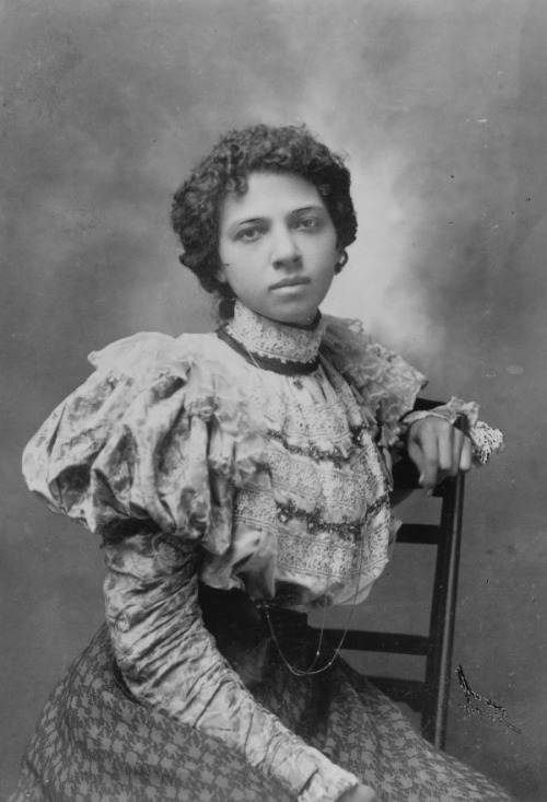 This one was so-so:
 This one I liked:
 Then:
Then:
 May 8. Getting started: thumbnails and some old photo studies
Getting down to work on the actual chapter. Starting with thumbnails. Â This is a shorter chapter, with a quicker pace than the last one. It takes place on a park bench, on a summer’s evening…
May 8. Getting started: thumbnails and some old photo studies
Getting down to work on the actual chapter. Starting with thumbnails. Â This is a shorter chapter, with a quicker pace than the last one. It takes place on a park bench, on a summer’s evening…
 Very rough thumbnails, but they will do.
Next, I will grapple with the stylistic challenge of trying to emulate Gibson, Booth, et al. Â And also, start to figure out the character’s appearance as a young woman, hair style and costume, as well as her face. Â To get into this, I start doing some sketches from old photos of Victorian young women. Â Not looking for specific models for her appearance, just general period style and look:
Very rough thumbnails, but they will do.
Next, I will grapple with the stylistic challenge of trying to emulate Gibson, Booth, et al. Â And also, start to figure out the character’s appearance as a young woman, hair style and costume, as well as her face. Â To get into this, I start doing some sketches from old photos of Victorian young women. Â Not looking for specific models for her appearance, just general period style and look: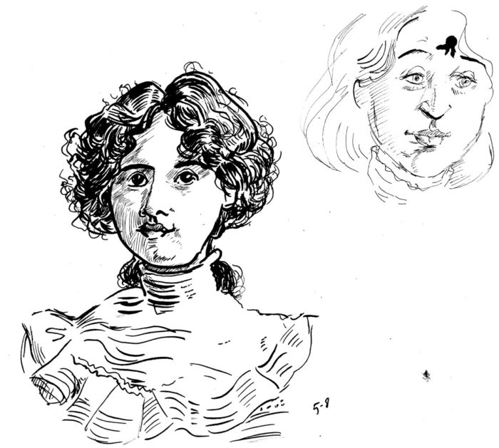
 Here are the photos I was working from:
Prelude: inspiration and stylistic research. I’m changing styles and/or media for each chapter of the book. Each chapter of the book corresponds to a different period in the character’s life, so hopefully the technique and style employed will resonate with the mood I want for that period. For chapter 3, I decided to switch to pen and ink, and to let inspiration come from the classic illustrators of the turn-of-the-century, or early 20th century, especially Charles Dana Gibson and James Montgomery Flagg. The heroine of the story is a young woman now, probably late teens, and the chapter depicts a romantic encounter, so it seems that Gibson, whose cartoons and illustrations were largely about romantic relations among young couples in that period, would be appropriate. Taking into account that Gibson depicted an idealized version of young late-Victorians, I don’t mind that, because it has an ironic application here. Of course it’s no easy target to try to emulate Gibson, Flagg and others of that ilk. I don’t intend to copy any style, exactly, but to have the “feel” of the illustrations of the period, as shorthand for the feel of the period itself. Anyway, I began to collect images from the internet by the artists I wanted to look at. I pulled hundreds of images, here are a few:
Here are the photos I was working from:
Prelude: inspiration and stylistic research. I’m changing styles and/or media for each chapter of the book. Each chapter of the book corresponds to a different period in the character’s life, so hopefully the technique and style employed will resonate with the mood I want for that period. For chapter 3, I decided to switch to pen and ink, and to let inspiration come from the classic illustrators of the turn-of-the-century, or early 20th century, especially Charles Dana Gibson and James Montgomery Flagg. The heroine of the story is a young woman now, probably late teens, and the chapter depicts a romantic encounter, so it seems that Gibson, whose cartoons and illustrations were largely about romantic relations among young couples in that period, would be appropriate. Taking into account that Gibson depicted an idealized version of young late-Victorians, I don’t mind that, because it has an ironic application here. Of course it’s no easy target to try to emulate Gibson, Flagg and others of that ilk. I don’t intend to copy any style, exactly, but to have the “feel” of the illustrations of the period, as shorthand for the feel of the period itself. Anyway, I began to collect images from the internet by the artists I wanted to look at. I pulled hundreds of images, here are a few:


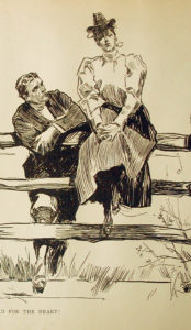
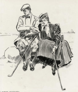
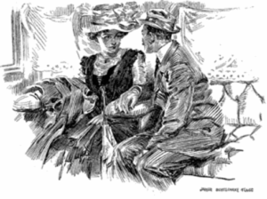
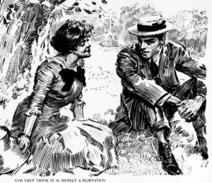


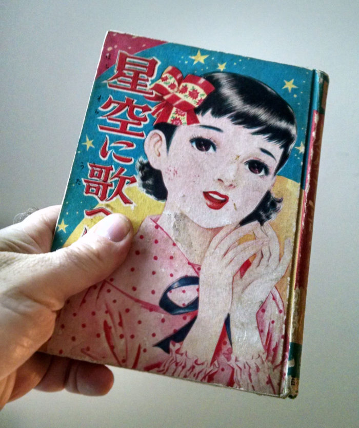 The cover appears to be by a different artist than the interior.  Perhaps å‹å±±ã²ã‚ã— – KATSUYAMA Hiroshi?
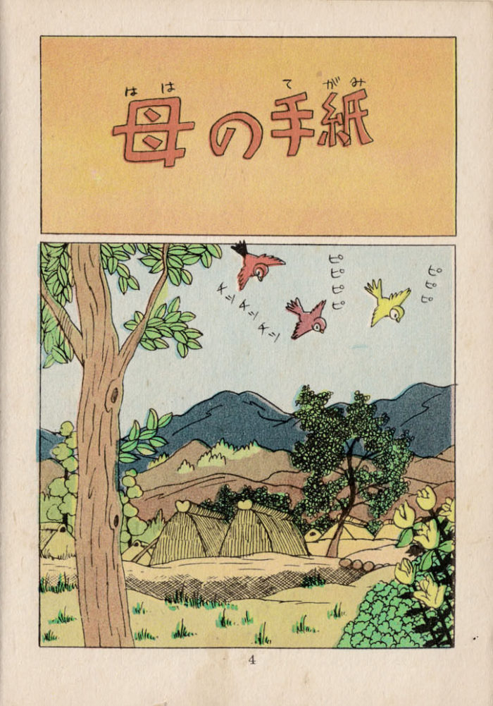 This is page 5, bit the first page after the title page. I love that even in the 1950s, even in an unpretentious kids’ manga, we start with this lovely “setting the scene” page (aspect to aspect in McCloud-ese), with the musical notes leading us into the start of the action on the next page (remember, read right-left):
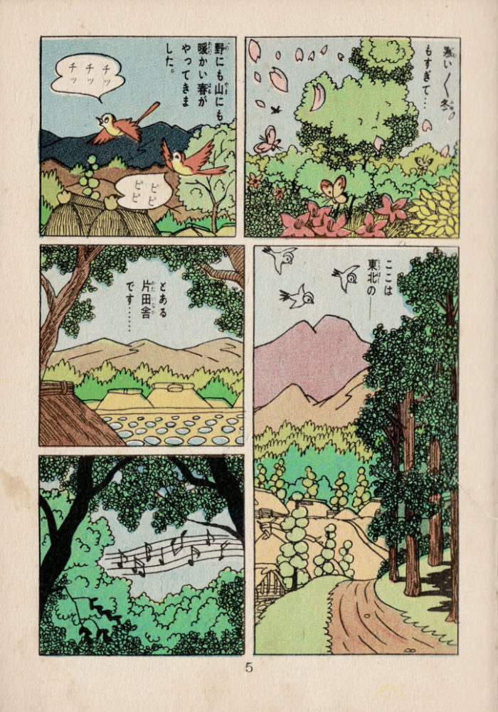 This is page 8. Â More beautiful landscapes, as the story proper gets underway. I can only offer a guess as to what is going on, but I’ll try: on this page we meet the protagonist, a girl (whose name maybe a Japanese reader could figure out?), watching the sunset with her friend… They head home to (I am guessing her uncle). He has some news for her:
 Page 9. Our heroine has received a letter! I think the man giving it to her is her uncle… and I’m pretty sure it’s some news about her mother! (help me out, Japanese-reading friends). There’s clearly a big emotional reaction in panel 2, and some pensive-ness in panel 3. Then more of Akiyoshi’s beautiful landscape work, as the cock crows, the sun rises, and… (to be continued!) (I’m not going to post EVERY page…i’ll jump through the story via selected scenes, for those who are interested).
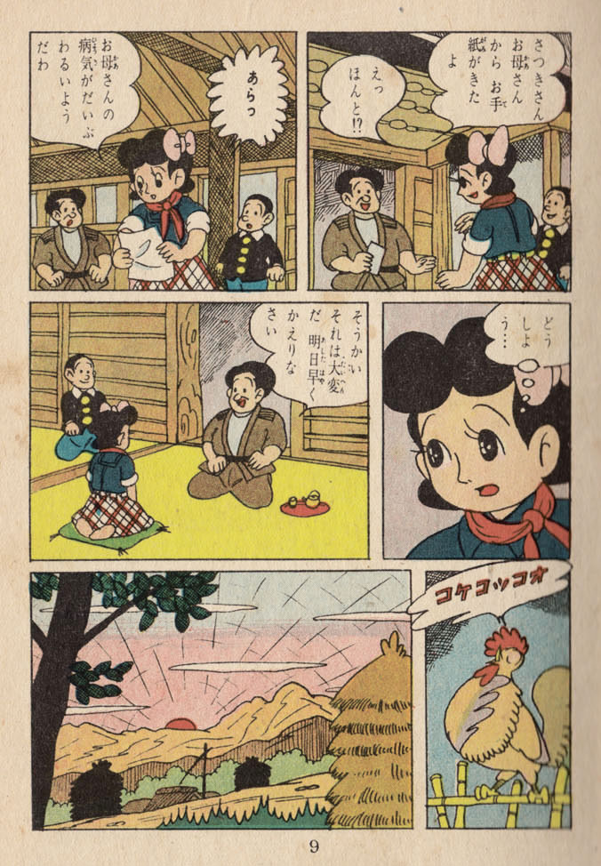 Page 12: the next morning, Satsuki sets off by train, on the way to the city to see her sick mother. She meets a nice man on the train — doesn’t he look nice? I think there’s something important in Satsuki’s green suitcase ….
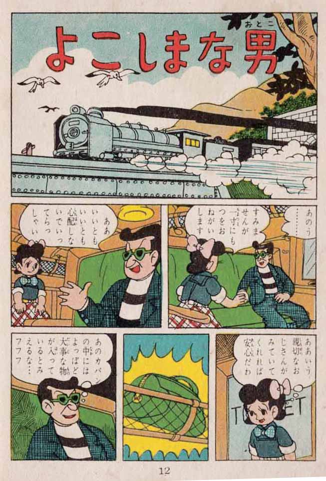 Page 13. As the train rolls through the countryside, Satsuki returns to her seat: the Nice Man (henceforth referred to as the Bad Man) is gone! And her green suitcase is missing too!!
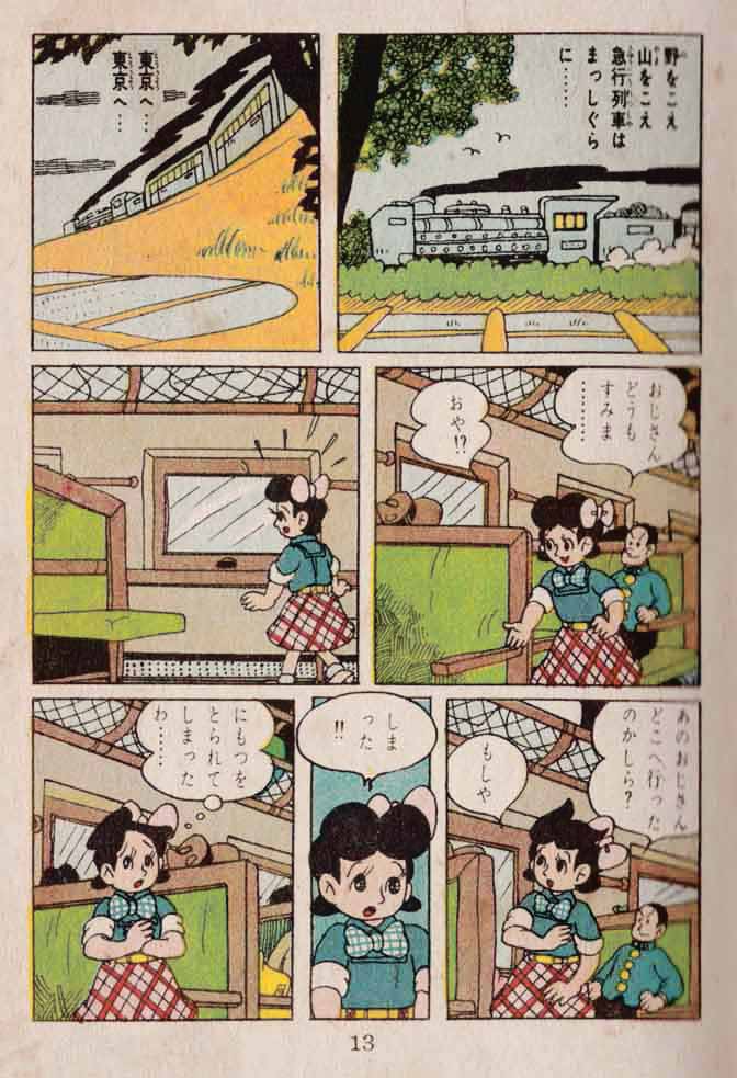 As you remember, Satsuki is on her way to Tokyo to see her sick mother… when the “nice man” she meets on the train steals her very important Green Suitcase!! Here, on page 20, she confronts him in the station. She pleads, he snarls.. he raises his hand — to strike poor Satsuki? But then… his raised fist grabbed …. a hero! He looks like a detective maybe, from his hat…? To be continued.
As you can see, the story is now printed in a single color. Common practice in manga — in the 50s and maybe still?– to print the opening of a story in full color, but continue in monochrome (there are a few more full color pages later on though). Also check out the little emotion graphics — the little anger blobs (?) surrounding Bad Man’s face in panel 2. The surprise-cloud surrounding him as his fist is grabbed… and the heavenly glow around the detective (if that’s what he is) in panel 7:Now here we are on page 21. As Satsuki explains something to the detective, the Bad Man gets away, slightly busting out of the panel border, even. They run after him. Some very exciting angles in those last three panels! Speed lines and blobby shadows. And panel 3 is interesting: that peculiar high angle, with the back of Satsuki’s head in the lower foreground, the detective’s feet in the upper background… with their word balloons in opposite corners, balancing the composition. Huh!
As you remember, Satsuki is on her way to Tokyo to see her sick mother… when the “nice man” she meets on the train steals her very important Green Suitcase!! Here, on page 20, she confronts him in the station. She pleads, he snarls.. he raises his hand — to strike poor Satsuki? But then… his raised fist grabbed …. a hero! He looks like a detective maybe, from his hat…? To be continued.
As you can see, the story is now printed in a single color. Common practice in manga — in the 50s and maybe still?– to print the opening of a story in full color, but continue in monochrome (there are a few more full color pages later on though). Also check out the little emotion graphics — the little anger blobs (?) surrounding Bad Man’s face in panel 2. The surprise-cloud surrounding him as his fist is grabbed… and the heavenly glow around the detective (if that’s what he is) in panel 7:Now here we are on page 21. As Satsuki explains something to the detective, the Bad Man gets away, slightly busting out of the panel border, even. They run after him. Some very exciting angles in those last three panels! Speed lines and blobby shadows. And panel 3 is interesting: that peculiar high angle, with the back of Satsuki’s head in the lower foreground, the detective’s feet in the upper background… with their word balloons in opposite corners, balancing the composition. Huh!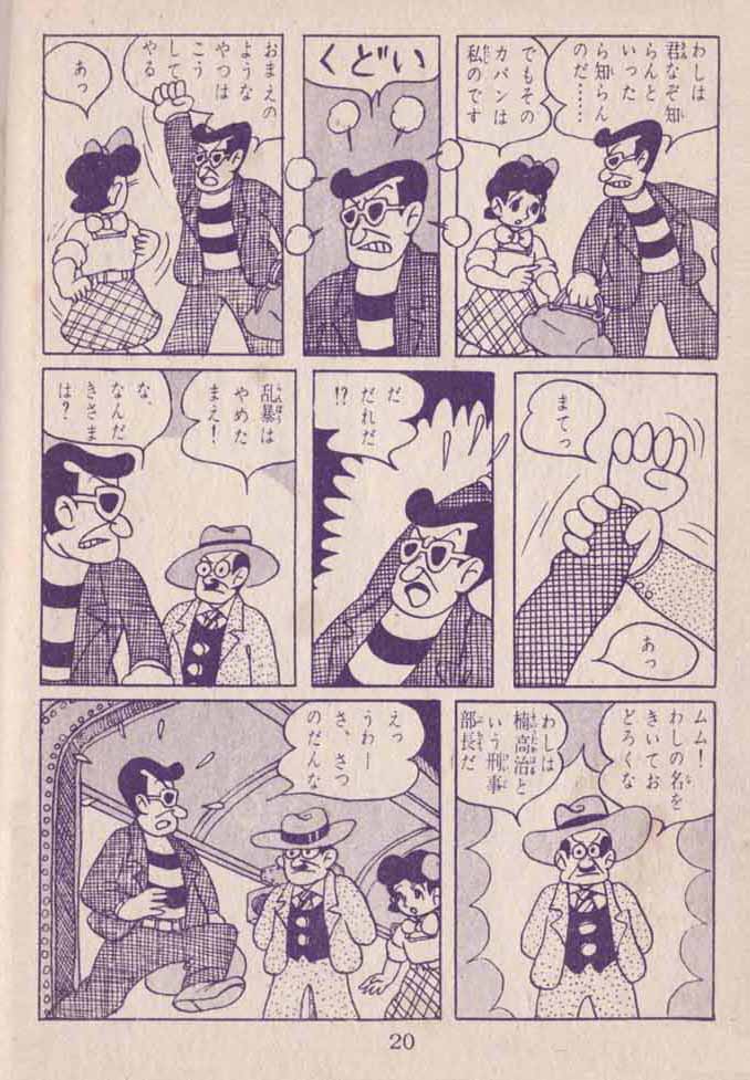
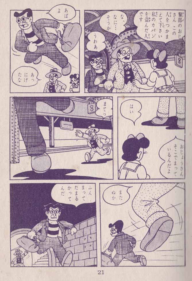 Page 30. Â Still missing her all-important-for-some-reason green suitcase, Satsuki finally reaches her sick mother. There is worry, but also happiness to be together. I have no idea what they are saying…
(Thanks to a helpful Tumblr friend: Â “this page basically explaining the monetary situation of the family. She’s asking her mom if the gas stove is broken, and her mom explains they don’t have enough money to pay for the gas. Then she says she has been thinking about selling the house and renting a smaller one. She asks if that would be okay with Satsuki, and Satsuki responds she doesn’t care where she lives as long as it’s with mom.”)
Page 30. Â Still missing her all-important-for-some-reason green suitcase, Satsuki finally reaches her sick mother. There is worry, but also happiness to be together. I have no idea what they are saying…
(Thanks to a helpful Tumblr friend: Â “this page basically explaining the monetary situation of the family. She’s asking her mom if the gas stove is broken, and her mom explains they don’t have enough money to pay for the gas. Then she says she has been thinking about selling the house and renting a smaller one. She asks if that would be okay with Satsuki, and Satsuki responds she doesn’t care where she lives as long as it’s with mom.”)
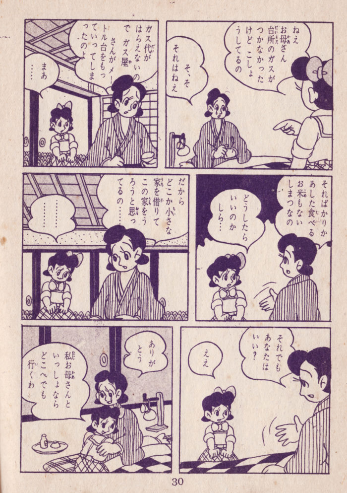 My abridged version continues, with page 31. Satsuki is clearly saddened by what her mom as told her about their financial worries…looking over the rooftops over the full moon as she contemplates (is she talking to her mom or to herself? I’m not sure). But she gets an idea? She turns to her mom and seems to be gesturing optimistically…ÂA pretty page, with all those stylized clouds, the near-wordless panel 3…. and I like the abstract background behind S’s wordless emotional expression in panel 2.Jumping ahead to pages 36 and 37. Â The ink color has changed from purple to green… nice! Â Leaving her mother’s house, worried, Satsuki walks through the rain, then gets an idea… I’m pretty sure she’s going to consult a distinguished doctor, arriving at his house in this nice page of 3-tier, full-width panels. Â I really like space that this layout gives Akiyosha for background and architecture. Â (NOTE: you can click this spread to see it a lot bigger):
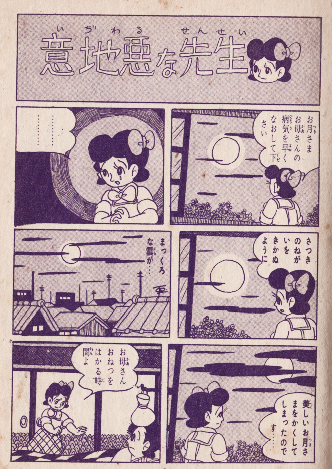
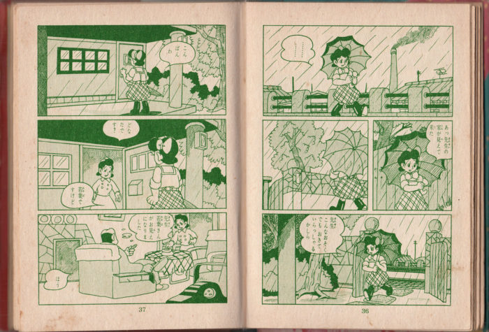 Page 41-40: Satsuki has the money that the nice detective gave to her (as she recalls in p40 panel 1). But the doctor says no! Why? I’m not sure… not enough money, perhaps? Satsuki leaves, downhearted.ÂThe doctor is drawn in a sympathetic way (despite an oddly shaped cranium), but I guess he’s not kind enough to reduce his fee for Satsuki (any Japanese readers who want to help clarify — appreciated as always)! My favorite panel on p 40 Â is #3, where the doc’s hand, in extreme foreground, delivers/embodies the “no.”On the next page (with the ink color reverting to purple again), the doctor and the nurse discuss… something. Â Again, the doc seems concerned, even optimistic in the last panel. Â I wish I knew what he was saying!!
Page 41-40: Satsuki has the money that the nice detective gave to her (as she recalls in p40 panel 1). But the doctor says no! Why? I’m not sure… not enough money, perhaps? Satsuki leaves, downhearted.ÂThe doctor is drawn in a sympathetic way (despite an oddly shaped cranium), but I guess he’s not kind enough to reduce his fee for Satsuki (any Japanese readers who want to help clarify — appreciated as always)! My favorite panel on p 40  is #3, where the doc’s hand, in extreme foreground, delivers/embodies the “no.”On the next page (with the ink color reverting to purple again), the doctor and the nurse discuss… something.  Again, the doc seems concerned, even optimistic in the last panel.  I wish I knew what he was saying!!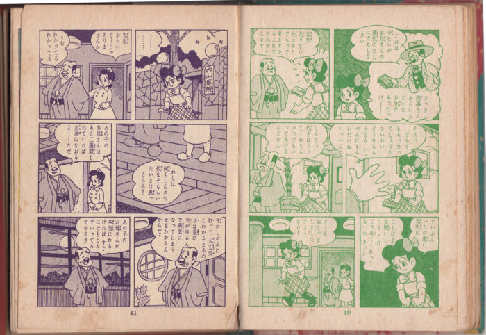 Pages 43-42, a full-color double-page spread! Satsuki, having left the doctor’s, ponders her situation (any kanji readers who can tell us what she’s actually thinking/saying to herself, most appreciated).ÂA sweet, if not spectacular spread. I find the architectural background kind of interesting: that light-blue, wedge-shaped housing development on the left, with more traditional-looking roofs on the right; telephone poles against the evening sky (though Akiyosha has chosen not to draw the wires): and a lone TV aerial on the right. As I understand it, TV was just becoming widespread in Japan as the economy improved in the late ’50s/early ’60s, so that’s a nice period detail. And of course, those cute little stars!
 Page 48: Satsuki struggles with a moral dilemma, tempted by what seems to be the “devil” of her conscience. What is it he wants her to do? Something involving paper fluttering about. Satsuki then acts as her own “angel” in the final panel… looks like “angel” is going to win? Anyone who can read Japanese and tell us what is going on here? I like the little anger-puffs Sastuki/conscience is giving off in the last panel, and that nice abstract emotion-shape framing real Satsuki  — Akiyosha has used that before (see page 31). How would you describe that shape, and its effect?
 Following page 48, which took place in the subjective realm of Satsuki’s conscience, Akiyoshi returns to reality and really goes to town with the backgrounds.  Having successfully wrestled with her demons, she plots the next steps in her mission to save her mother.  In panel one, Satsuki is the only animate being in view, against a drab and unpromising backdrop of walls and fences. She looks serious, but determined, coming off her victorious struggle with temptation.  Nice details: the wood pattern of the wall behind her is broken up with what appear to some corners of torn-down posters. What is that object in the lower right, under the awning, that resembles a giant tea-pot?  Also, the judicious use of white in a mostly screened-over panel: the white of the house on the far left balancing the white of Satsuki and the word balloon. ÂPanel 2 has a lot going on: again, Satsuki framed in the center (though closer in this time).  She looks more optimistic and has entered a more lively part of town, passing a movie theater (playing “Hot Guns!”), and there is another pedestrian in the background as well. This panel visually sums up Satsuki’s journey and challenges: “behind” her to the right (keeping with the R-L manga direction), all is tranquil, domestic: trees, a home, the bright moon starry sky; ahead of her, the excitement and danger of the cinema, complete with the villain on the poster aiming his gun at her! ÂPanel 3 is reassuring: the moon, a mute witness in the previous panel, now expresses a cheery outlook. Satsuki appears to have paused, and gazes upward, looking entirely hopeful.  In panel 4, she marches forward, positioned on the right side of the frame, with the future ahead.  The regularity of the architecture, foreground and back, adds to the impression of a confident cadence to her stride; the encouraging moon, however, has been replaced by the characterless round object (sign? mirror) on the pole, which leans in slightly left-to-right, offering some foreshadowing resistance to Satsuki’s progress.Â
Following page 48, which took place in the subjective realm of Satsuki’s conscience, Akiyoshi returns to reality and really goes to town with the backgrounds. Â Having successfully wrestled with her demons, she plots the next steps in her mission to save her mother. Â In panel one, Satsuki is the only animate being in view, against a drab and unpromising backdrop of walls and fences. She looks serious, but determined, coming off her victorious struggle with temptation. Â Nice details: the wood pattern of the wall behind her is broken up with what appear to some corners of torn-down posters. What is that object in the lower right, under the awning, that resembles a giant tea-pot? Â Also, the judicious use of white in a mostly screened-over panel: the white of the house on the far left balancing the white of Satsuki and the word balloon. ÂPanel 2 has a lot going on: again, Satsuki framed in the center (though closer in this time). Â She looks more optimistic and has entered a more lively part of town, passing a movie theater (playing “Hot Guns!”), and there is another pedestrian in the background as well. This panel visually sums up Satsuki’s journey and challenges: “behind” her to the right (keeping with the R-L manga direction), all is tranquil, domestic: trees, a home, the bright moon starry sky; ahead of her, the excitement and danger of the cinema, complete with the villain on the poster aiming his gun at her! ÂPanel 3 is reassuring: the moon, a mute witness in the previous panel, now expresses a cheery outlook. Satsuki appears to have paused, and gazes upward, looking entirely hopeful. Â In panel 4, she marches forward, positioned on the right side of the frame, with the future ahead. Â The regularity of the architecture, foreground and back, adds to the impression of a confident cadence to her stride; the encouraging moon, however, has been replaced by the characterless round object (sign? mirror) on the pole, which leans in slightly left-to-right, offering some foreshadowing resistance to Satsuki’s progress.Â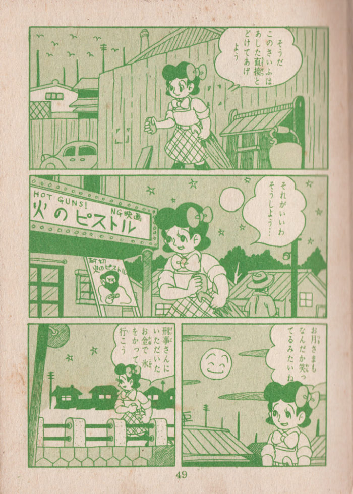 Pages 55-54: another full color 2-page spread!! Â A few pages later, having returned home for a brief conversation with mom, Satsuki sets out on her own again, and who should she run into… but the Bad Man who stole her suitcase at the train station! Â He’s looking as menacing as ever, too, and Satsuki is taken aback. Â The composition mirrors the last 2-page spread (p. 43-42). Â A lot of wood in this image… again with the torn-off flyer detail… and I see that what I took for an awning in the last page (lowe right corner, here) appears instead to be some sort of bin, for trash, ashes, firewood?ÂBut for me, this page is all about patterns — the wood-grain, the checker patterns of his jacket and her skirt (and bow). Against all those fine lines, the big shapes of the two character’s black hair and faces really “pop.” Â Each character has their emotive “emanation” as well: for Satsuki, the classic upset-sweat-drops; for Bad Man, the slinky cigarette smoke puffs in front of his face that accentuate his shadiness.
 Page 56. Â I’m amused by the way Akiyosha draws the Bad Man from head-on in the first panel: that long, hipster hair? But I like that almost floral “explosion” shape he draws around the figure. Â The dynamic between Satsuki and the Bad Man is definitely changing here: she’s trembling in panel 2, but he surprises her with his remarks in panel 3, and by the last panel she’s striding off with a smile on her face. Â What are they saying?? Â Anyone?? Â As usual, Akiyosha keeps the dialogue scenes lively with strong diagonals, expressive faces and gestures. Â Interestingly, Satsuki’s decisive exit in the last panel goes against the right-left reading flow (this is the right-hand, “recto” page of the spread). Â This perhaps makes sense when we realize that her reunion with the Bad Man is, in fact, a major turning point in the story… so she is running “away” from where the narrative is going to take her. Â
Page 56.  I’m amused by the way Akiyosha draws the Bad Man from head-on in the first panel: that long, hipster hair? But I like that almost floral “explosion” shape he draws around the figure.  The dynamic between Satsuki and the Bad Man is definitely changing here: she’s trembling in panel 2, but he surprises her with his remarks in panel 3, and by the last panel she’s striding off with a smile on her face.  What are they saying??  Anyone??  As usual, Akiyosha keeps the dialogue scenes lively with strong diagonals, expressive faces and gestures.  Interestingly, Satsuki’s decisive exit in the last panel goes against the right-left reading flow (this is the right-hand, “recto” page of the spread).  This perhaps makes sense when we realize that her reunion with the Bad Man is, in fact, a major turning point in the story… so she is running “away” from where the narrative is going to take her. Â  Page 57: The Bad Man (I wonder if I’ll have to change his designation soon?) pursues Satsuki back and forth across the top two tiers, losing her in the bottom panel. I really don’t know what has transpired between them, but the relationship has definitely changed.  Bad Man seems anxious, and doesn’t appear to have malicious intent.  Satsuki seems unconcerned by it all — she is either ignoring him or isn’t aware of his pursuit, though he’s clearly calling out to her (calling what, though?  Translations welcome!)  I see that Akiyosha has trouble drawing the proper angle of Satsuki’s forward foot in panel two: I have that same problem.  A fun, zig-zaggy page, with lots of background detail as they proceed from the residential neighborhood through a more industrial-looking setting, ending up at the docks (thanks for the English-language “boat” sign in panel 3 — I wonder if such signs were often in English during the 50s, soon after the end of the U.S. occupation?).  I especially like that weird, sorta art-deco-building on the right in panel 3.  Also, notice that the ink color has changed again, from purple to blue.Â
  Page 60.  Intriguing new elements are introduced: Morally-Ambiguous Man has now pursued Satsuki into a carnival, but she has lost him in the crowd. Another “explosion-reaction,” as he sees…. a poster of a wrestling attraction. The Man stands in a crowd of other men (check out the clashing fabric patterns!), considering the poster’s contents.  From another angle, Satsuki spots the Man. She rushes into the tent, past the surprised ticket-taker.  The vertical diagonals of the poster and tent-lines create a downward-outward sweeping triangle, emphasizing Satsuki’s reaction/action in the bottom two panels.Â
Page 60. Â Intriguing new elements are introduced: Morally-Ambiguous Man has now pursued Satsuki into a carnival, but she has lost him in the crowd. Another “explosion-reaction,” as he sees…. a poster of a wrestling attraction. The Man stands in a crowd of other men (check out the clashing fabric patterns!), considering the poster’s contents. Â From another angle, Satsuki spots the Man. She rushes into the tent, past the surprised ticket-taker. Â The vertical diagonals of the poster and tent-lines create a downward-outward sweeping triangle, emphasizing Satsuki’s reaction/action in the bottom two panels.Â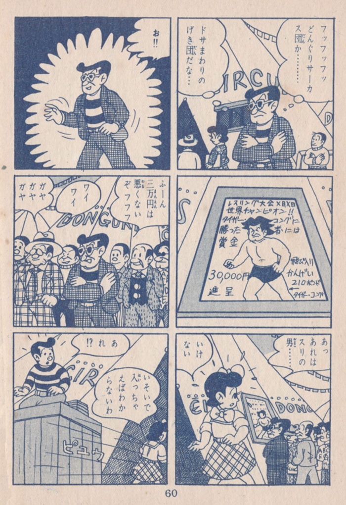 Page 61, and now we’re in the wrestling tent. Â Satsuki watches from an excellent seat. Â By my count, there are 18 spectators whose genders are identifiable, three are female, which leads me to conclude that the audience for wrestling in 1950s Japan was 16 2/3% women (or girls). Â But I digress. Â The Wrestler has weird hair and a very tough expression on his face. Â My favorite panel is panel 2, with all that cross-hatching, though panel 5, with the hands/backs of heads in the foreground and wrestler glowering in the background, is also kind of cool. Â But where is this thing headed? Â I’m pretty sure the announcer is calling for volunteers to take on the Wrestler… is Satsuki about to jump into the ring??!
Page 61, and now we’re in the wrestling tent.  Satsuki watches from an excellent seat.  By my count, there are 18 spectators whose genders are identifiable, three are female, which leads me to conclude that the audience for wrestling in 1950s Japan was 16 2/3% women (or girls).  But I digress.  The Wrestler has weird hair and a very tough expression on his face.  My favorite panel is panel 2, with all that cross-hatching, though panel 5, with the hands/backs of heads in the foreground and wrestler glowering in the background, is also kind of cool.  But where is this thing headed?  I’m pretty sure the announcer is calling for volunteers to take on the Wrestler… is Satsuki about to jump into the ring??!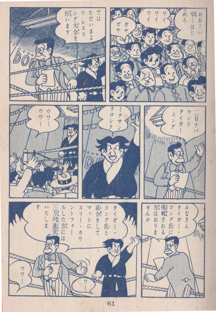 Page 62.  OMG, the Bad Man is volunteering to get in the ring with the wrestler!! I am beginning to think that he is doing this to win the prize money to help Satsuki.  For now, I propose we change his name to the Morally Ambiguous Man.  I’m a little confused what’s going on with Satsuki at the bottom of the page: she’s clearly in the crowd watching the Morally Ambiguous Man volunteer (I like the way Akiyosha uses the half-tones to highlight her in panel 5), but then she leaves, but then she is approaching another tent with a big crowd in front of it? Anyway, this is getting pretty interesting!
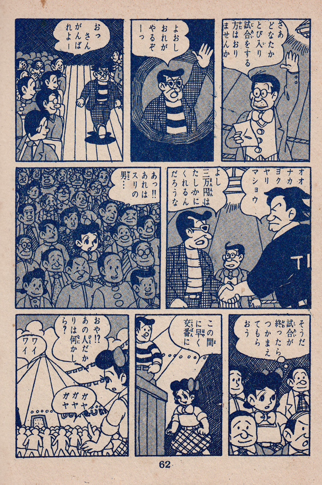 Page 68… Yes, it’s true!  The Morally Ambiguous man is in the ring with the wrestler!  I am pretty sure he’s doing this to win the prize money to give to Satsuki — for her mother’s operation?  If we can confirm this, he will go back to being the Nice Man!  I like how this book defies the stereotype of 50s shoujo… now it’s a wrestling comic!  The wrestler’s steely gaze in panel 1… M.A. Man does not look confiden, perhaps, in the next panel?  One thing to grap suitcases from little girls at the train station, quite another to grapple with this dude!  Nice sequence in panel 4-5, with the lift, and slam to the canvas (M.A. Man’s feet breaking the panel borders at the top of panel 4 to fit the whole figure in).  Also great hair in this wrestling match.  Also back to purple ink.  But it doesn’t look like Morally Ambiguous Man is off to a good start. Maybe he’ll turn it around in the next page?  Stay tuned!
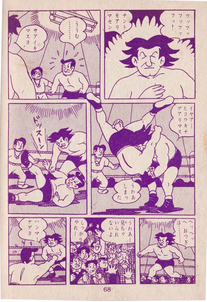 From page 68’s description: “Maybe [Morally Ambiguous Man] will] turn it around in the next page?” Page 69: Nope. The two men threaten to bulge off this beefcake-laden page, culminating in the hilarious (even though we’re probably rooting for M.A. Man) panel 5.  Wherever this story is headed, it doesn’t look like things will be resolved by M.A. Man winning the wrestling purse for Satsuki, but the action-packed interlude has been enjoyable.
From page 68’s description: “Maybe [Morally Ambiguous Man] will] turn it around in the next page?” Page 69: Nope. The two men threaten to bulge off this beefcake-laden page, culminating in the hilarious (even though we’re probably rooting for M.A. Man) panel 5. Â Wherever this story is headed, it doesn’t look like things will be resolved by M.A. Man winning the wrestling purse for Satsuki, but the action-packed interlude has been enjoyable.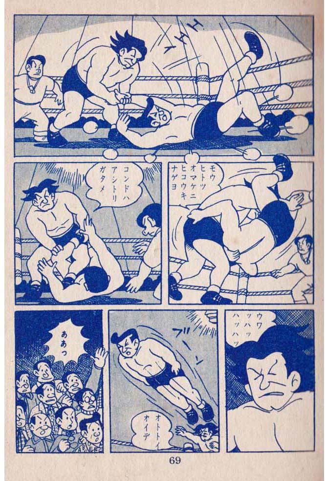 PAGE 76: The Not-so-Bad Man’s Dark Night of the Soul. From rollicking action to moody introspection: recovering from his wrestling injuries, he lies in his hospital bed, overcome with remorse over how he’s treated Satsumi, remembering how he stole her suitcase (& the money she needed for her sick mother). Â And yet, she forgave him. Â A tear rolls down his cheek. ÂAn atmospheric page, emotional page. Â I especially like the view in through the window in panel 4, seeing the Not-so-Bad Man from outside, Â as though we were his conscience, realizing how he looks to the decent folk of the world… the bars of the window mirroring the 6-panel grid of the page, with the man’s head isolated in one of the squares, as he ponders his evil ways, trapped inside his own head.ÂThe Not-so-Bad Man’s sunglasses (he even wears them his bed) are like a mask, their blackness indicates the inky darkness of his soul. In the final panel, his perpetual sneer is directed at himself at last, betrayed by the tear rolling down his cheek.Â
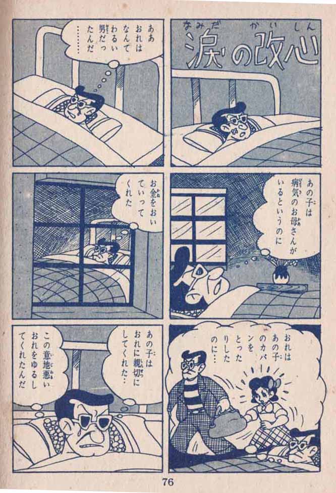 ÂPage 77. Â Who are these guys lurking in wait for Satsumi? Â Now these are some really Bad Men! Â What do they want from her? Don’t let anyone tell you 50s shojo manga was all sweetness and light: the guy with the bandanna actually punches Satsuki in the face in the last panel! Â That said, Â that alphabet shirt is pretty cool, and Akiyosha comes up with another great, wild hairdo for that character as well (plus a spotty noise). Â Outside of the nice setting for the first panel, all the backgrounds on this page are abstract, with heavy usage of the “explosion” effect for emotional emphasis in panels 3, 4 and 7, textured patterning in panels 5&6. Â But, we’ve got to be worried for Satsumi!
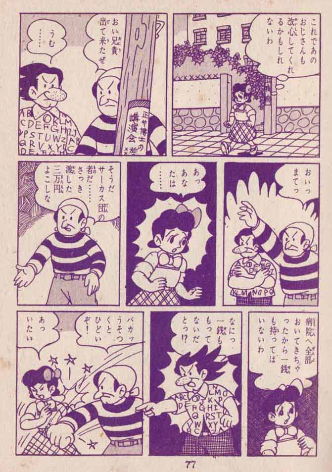 Page 78-79, another 2-page color spread blow-out! Â The new Bad Men confronting Satsuki across the fold. The pavement squares’ forced perspective add to the vertiginous menace of the scene, while the mute, identical houses and chimneys in the background offer no hope of rescue. Â Â The cute animal of some kind (dog? fox? — it appears to have been interrupted while pooping) Â looking on in alarm that duplicates and magnifies Satsuki’s helpless fear.All of which begs the question: what is going on here? Â What are these Bad Men after? Â Will Google Translate provide the answer? Â Let’s see… it tells me that the bad guy in the pink stripes is saying: ” “3/6/201 Sotsu…. Even if it is not a department, even if you do not have 1111 copies, you only need to have 1 1111, so please come quickly…” Â To which Satsuki replies: Â “?’4 I do not really have it —“. Â Well that’s not much help, but common sense would make us assume that they want something from Satsuki and it’s probably money. Â If you can read Japanese, let me know!!
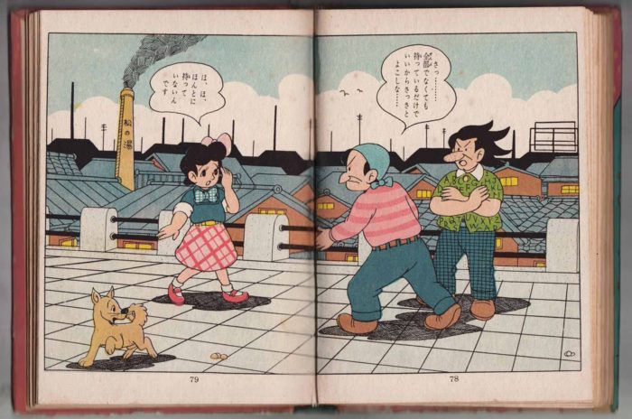 Page 82. Â Another color switch, to pink. Â Satsuki flees from the two Bad Men, but it isn’t force that keeps her from getting away, it’s whatever the bandana guy shouts in panel 3. Â This is probably the boldest and most playful panel of the whole book… Â the foreshortening as Bandanna man reaches for her as Akiyosha transforms his panel into a “Cinerama” screen, created by the curving letterbox-like black areas above and below. Â The character seems to be reaching out of the screen, his hand breaking the panel border. Â I am not quite sure of the exact meaning of the empty word-balloon-like shapes puffing out of Bandanna Man’s head … a manga convention indicating some sort of strong emotion (repeated in the next panel as well) and apparently distinct from the “sweat drops” that are common to Western comics as well (since they are used for alphabet-shirt man in that panel, as well as Satsuki in the next.. Â (Speaking of manga “emanata,” note the speed lines/puffs as Satsuki runs in panel 2). Â The two men seem both desperate and menacing, but instead of running away, Satsuki seems to be pulled up short by whatever they’re saying….
Page 82.  Another color switch, to pink.  Satsuki flees from the two Bad Men, but it isn’t force that keeps her from getting away, it’s whatever the bandana guy shouts in panel 3.  This is probably the boldest and most playful panel of the whole book…  the foreshortening as Bandanna man reaches for her as Akiyosha transforms his panel into a “Cinerama” screen, created by the curving letterbox-like black areas above and below.  The character seems to be reaching out of the screen, his hand breaking the panel border.  I am not quite sure of the exact meaning of the empty word-balloon-like shapes puffing out of Bandanna Man’s head … a manga convention indicating some sort of strong emotion (repeated in the next panel as well) and apparently distinct from the “sweat drops” that are common to Western comics as well (since they are used for alphabet-shirt man in that panel, as well as Satsuki in the next..  (Speaking of manga “emanata,” note the speed lines/puffs as Satsuki runs in panel 2).  The two men seem both desperate and menacing, but instead of running away, Satsuki seems to be pulled up short by whatever they’re saying….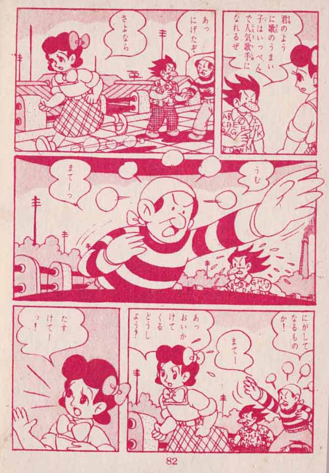 Page 83, another excellent page as the story and action really heat up.  The Nice (really he is, now) Man, obviously hears he commotion from down below (or does he have a psychic sense for Satsuki’s distress, as indicated by the light-burst effect around his head?). A lot of good dynamic composing, especially in the lower two tiers of the page: the Bad Men pursue Satsuki in a single-file. northeast-to-southwest procession in panel 3, with a poly-rhythmic visual relation to the roofs, foliage and utility poles in the background.  Panel 4 features complementary diagonals to the previous panel (I like this high angle view of Nice Man through the window, showing the surrounding buildings in the background).  Then, the Nice Man jumps out of the hospital window (!!) (despite his injuries and the fact that it appears to be at least 6 stories up in the previous panel), more or less straight toward the picture plane.  Finally, the Bad Men catch Satsuki in panel 6, pictured from a slight low angle, creating an interesting receding diagonal with the three figures:
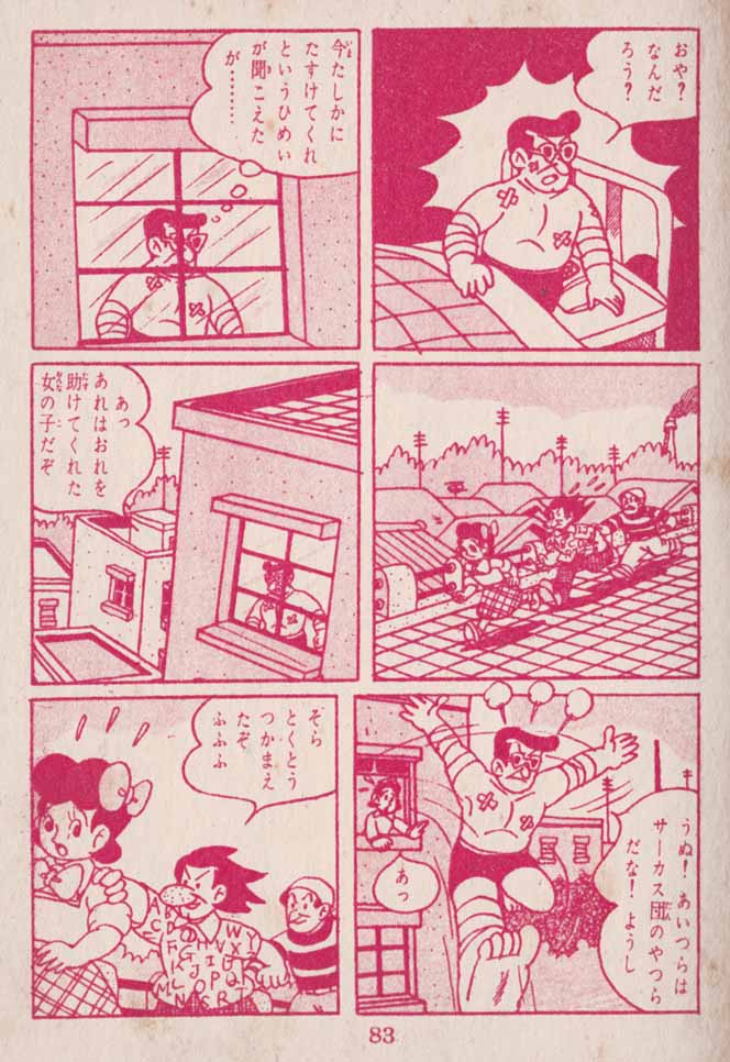 Page 91-90: The Nice Man survives his leap from the hospital window, and comes to Satsuki’s aid; there follow about 7 pages of fighting, the Nice Man vs. the Bad Men. He puts up a good fight, but this is how it ends:
 Page 92.  As the Nice Man is about to beaten with a club, Satsuki comes up with a diversion.  The top tier’s three panels use graphic elements as well as facial expression (and text, which I can’t read, so never mind about that), to indicate Satsuki’s emotions/thoughts: the alarm explosion around her in panel 1… the dense cross-hatching indicating deep (if hurried) thought, and then the universal symbol for an idea in panel 3, the lightbulb (interestingly, the lightbulb is on its horizontal, not vertical, is this a difference between manga and western comics?)The lower two tiers comprise a rhythmic back and forth between two similiar (though not identical) compositions: the bad guys prepare to beat the Nice Man; Satsuki calls something out; alarmed, they stop before bringing the club down; Satsuki points something out in the sky (or high on the building), which causes Alphabet-Shirt-Guy even more alarm.  Sweat drops are used rather promiscuously in these panels: when Satsuki cries out they indicate excitement, and in the Bad Guys’ panels they’re used for alarm or fear.Whatever Satsuki’s ploy is, it must be quite clever.  Does it have anything to do with the torn leaflet corners that are so prominent in the wall in front of her??After the full color spread on the previous pages, the monochrome ink has changed to purple again:Â
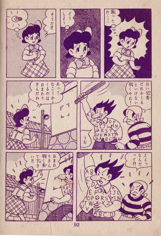 Page 93.  Whatever Satsuki said to the Bad Men, it worked, as they flee the scene, and the Nice Man’s hide is spared.  What are Satsuki and the Nice Man talking about in the aftermath? Picking through the gobbledy-gook that Google Translate provides, I glean that the Nice Man is contrite and apologetic and perhaps asking Satsuki to turn him over to the cops.Whatever the text may contain, Akiyosha composes the page in an overall “pyramid” with a full-width tier on the top, two panels in the middle tier and three on bottom. Dynamism is created by juxtaposing and balancing moderate diagonals (the receding line of the wall in panels 1, 2, 6, the eye-line angle between Satsuki and Nice Man in panel 3, and the pavement tiles seen from above in panel 5.ÂAlso, we’d changed ink colors again to red/pink, presumably a random choice, but who knows?
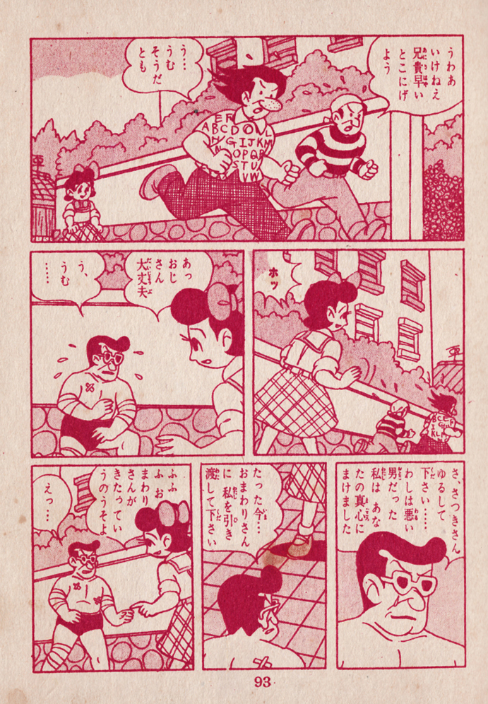 Page 94. This page seems to be portraying the climax of Nice Man’s moral crisis. Though it seems he’s already turned the corner, he is still struggling with what sort of person he should be, confronted with Satsuki’s unexingtuishable Goodness. In the last two panels he thanks Satsuki and promises her that he will be come a good man (if I’m interpreting the fragments of meaning in Google Translate correctly).ÂAkiyoshi uses abstract background patterning to underscore Nice Man’s inner process: the crosshatching in panel 2, the squiggle pattern in panel 3, and the resolving burst around the characters in panel 5, as Nice Man thanks Satsuki.  I also like the way Nice Man musses up his hair in anguish in panel 3.Â
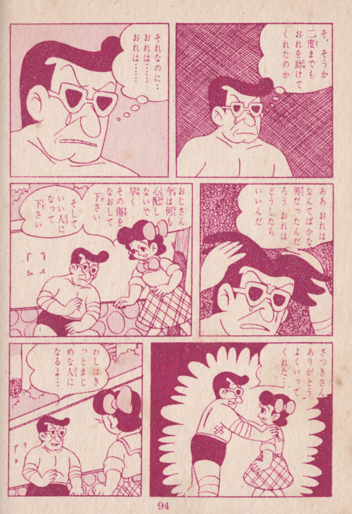 Page 95.  Too weak to walk on his own, the Nice Man lets Satsuki help him back into the hospital, where a nurse lends support as well. The Nice Man has completed the character arc from selfish scoundrel, to vulnerable friend.  I note a minor detail: the treatment of foliage in panel 3, perhaps ivy growing along the wall, which I don’t think I’ve seen before in this book (and reminiscent of the abstract background in panel 3 of the previous page).
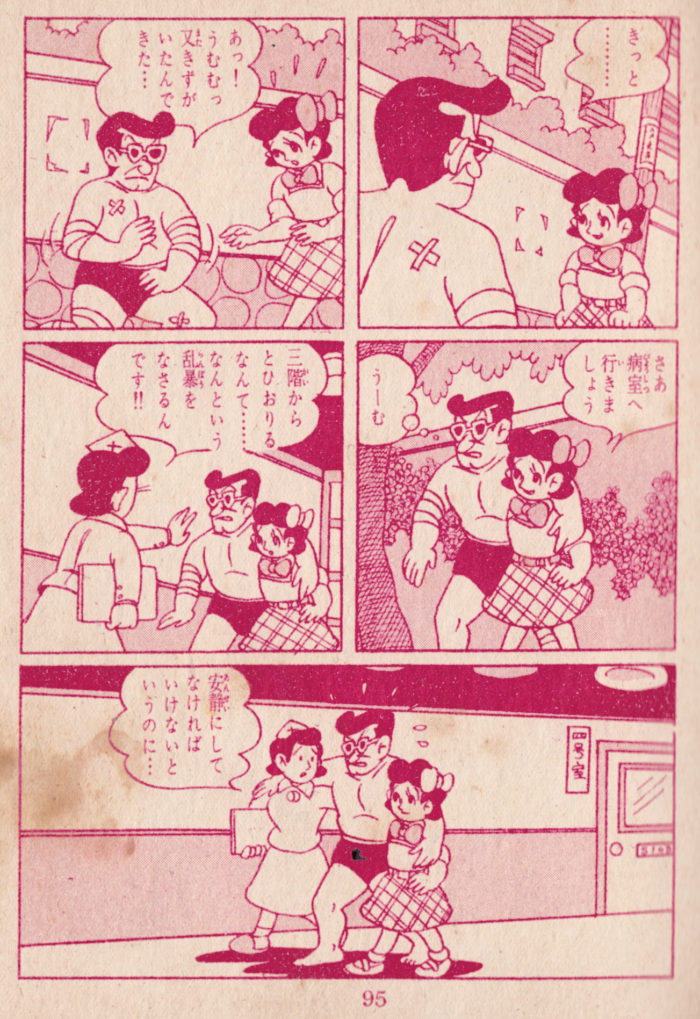  Page 100. Satsuki goes looking for the doctor, she has money to pay him to help her sick mother now.  The doctor is encouraging, and says the mother will recover on her own, and he doesn’t need to be paid. ÂThis page is mostly notable for prefiguring The Exorcist, with Satsuki’s 180 degree head turn in panel one (which distracts from a nicely-composed panel: Satsuki’s face framed between the diagonally-receding gate posts, her surprise drops-burst seconded (and thirded) by the foliage and clouds above them).  Also the elegant geometric background provided by the stone wall in panels one, six and seven. Â
 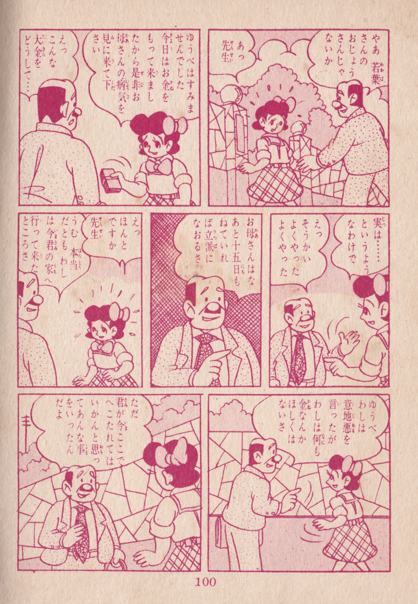 Page 101.  Another ink-color change.  I like the chapter-heading, lettered against a “starry sky,”  (don’t forget the title of this book!), and the scroll-like text box in panel 2, announcing (I think) a passage of time. The Nice Man has another moment of dramatic internal monologue.  I think he’s still figuring out how to be a good person and help Satsuki.  He makes a decision in panel 4, and reverses direction, striding off with purpose in the final panel.  I don’t know what that is he has in his hand in panel 4, it looks like a rock.  A wallet?  The case for his ever-present shades?A nice page, with a lot of different background details and textures and diverging diagonals giving the composition a lot of energy. In the last panel, the rising and falling of the cloud-line slyly echoes the shapes of the figures and objects below (like the foliage and clouds reinforced Satsuki’s drop-burst in the previous page).Â
Page 101. Â Another ink-color change. Â I like the chapter-heading, lettered against a “starry sky,” Â (don’t forget the title of this book!), and the scroll-like text box in panel 2, announcing (I think) a passage of time. The Nice Man has another moment of dramatic internal monologue. Â I think he’s still figuring out how to be a good person and help Satsuki. Â He makes a decision in panel 4, and reverses direction, striding off with purpose in the final panel. Â I don’t know what that is he has in his hand in panel 4, it looks like a rock. Â A wallet? Â The case for his ever-present shades?A nice page, with a lot of different background details and textures and diverging diagonals giving the composition a lot of energy. In the last panel, the rising and falling of the cloud-line slyly echoes the shapes of the figures and objects below (like the foliage and clouds reinforced Satsuki’s drop-burst in the previous page).Â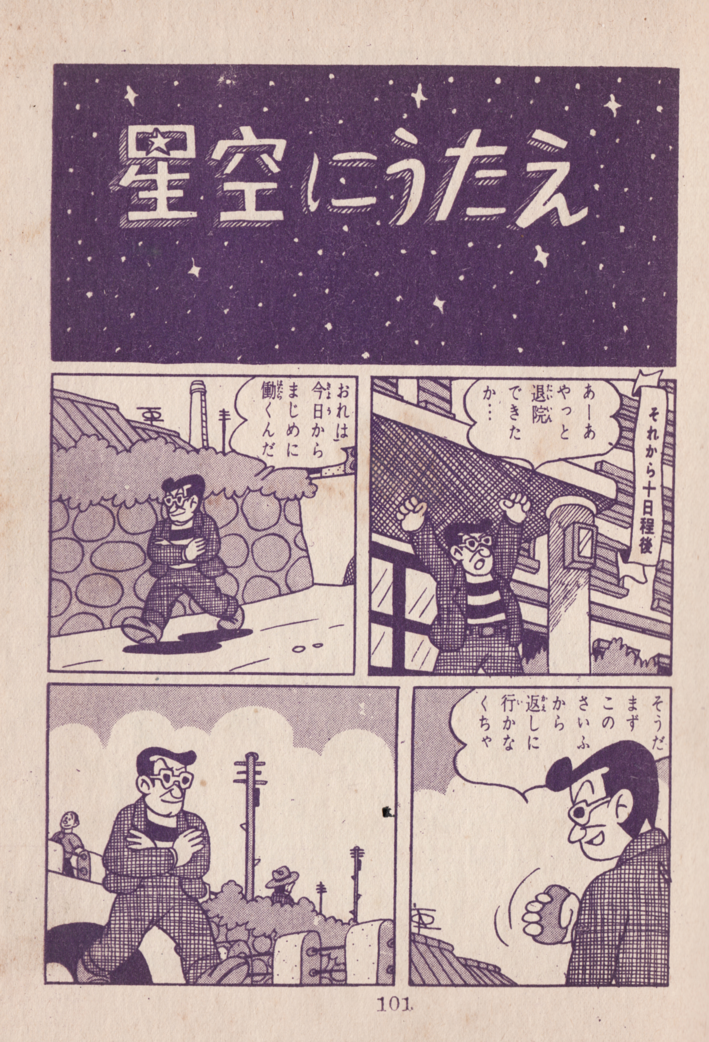
 Then, 10 DAYS LATER (!) (Really, I had other things to do. Â Or was it the boringness of the page that kept me from getting to it)…. a couple more sketches:Â
 Thinking of ways to make it interesting, I think of using masking fluid to define the clouds, with a light wash for the sky, shading the clouds to show the dramatic light of the sunrise. Â A bunch of wash studies:
 Letting the ink wash pool up at the bottom (on the tilted drawing table) accidentally makes that “burst” effect happen when it dries. Â I decide to try and make use of that for the sunrise itself.
 On to the final version. Â The masking fluid is gooey stuff and hard to apply with precision. Â I don’t really want to muck up a brush with it, so I used a pencil eraser to draw the cloud shapes with it:

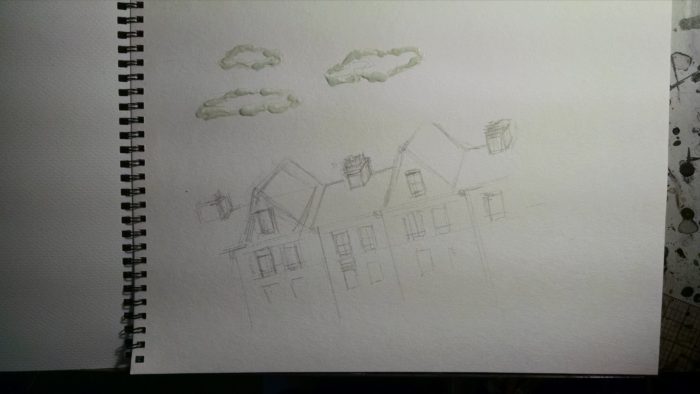 Brush on the washes, sloppily so that it pools up just above the roofline.
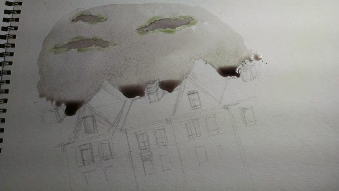 Et voila!
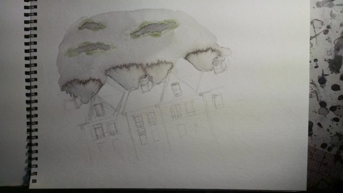 Once this is all dry, I peel off the masking fluid, so that there is a white edge to the clouds, with the darker shading in the middle.
Washes added to the building:
Once this is all dry, I peel off the masking fluid, so that there is a white edge to the clouds, with the darker shading in the middle.
Washes added to the building: Ilm not sure if the wash effect feels like a sunrise… or is the building on fire?  But I’ll go with it for now.  It doesn’t have the dramatic lighting that I want, though… so I add more gray wash to the front of the building, and some cast shadows on the roof:
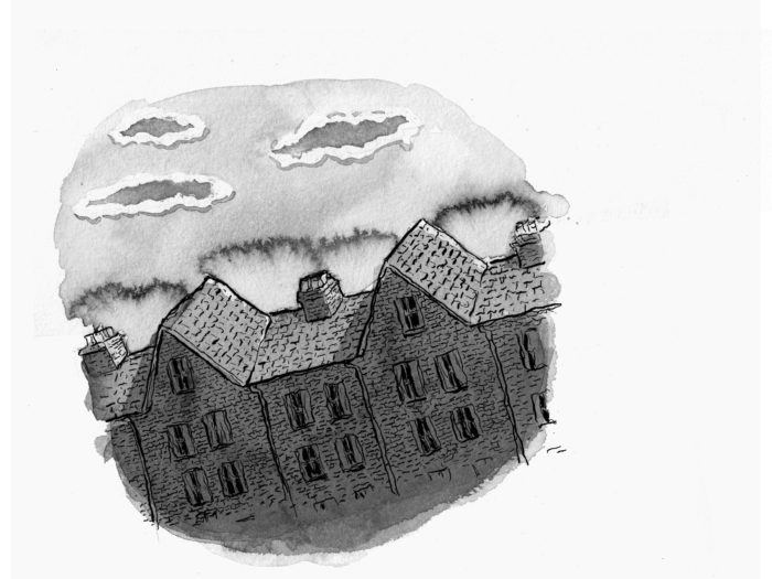 Good morning, right?
That’s it for chapter 2, but there is one thing that bugs me (there are actually probably lots of things that will bug me, but this one is bugging me now). The face of the girl on page 16.
Good morning, right?
That’s it for chapter 2, but there is one thing that bugs me (there are actually probably lots of things that will bug me, but this one is bugging me now). The face of the girl on page 16.
 Â Looking at it, I realize the problem is that I drew the mouth too far to the left, and it looks funny. Â Though I’m trying to avoid digital corrections as much as possible, I sure don’t want to redraw the whole page, so I just nudge the mouth over in Photoshop. From:
 Looking at it, I realize the problem is that I drew the mouth too far to the left, and it looks funny.  Though I’m trying to avoid digital corrections as much as possible, I sure don’t want to redraw the whole page, so I just nudge the mouth over in Photoshop. From:
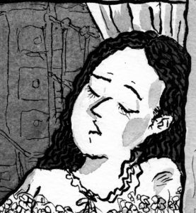 To:
To:
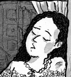 I think that’s much nicer. Â Or if I want to really cheat I could try to use the mouth (or the whole face) from the earlier version of the page:
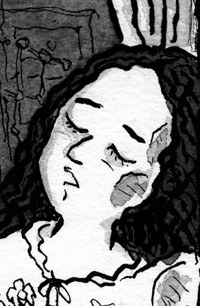 Something tells me there is a lot of fussing yet to come in the future of the “finished” chapter two!!
April 14: Mock-up time
As soon as I had linework done on (the first version of) page 16, I wanted to put together a little mockup of the chapter, to see how it flowed. Â As I did with chapter one, I printed them along the 11″ of 8.5 x 11 sheets and folded them. Â The small size is kind of fun, and it’ll be tempting to print it up at this size, though I’ve been planning to print it larger.
Generally, I think it read well. Â I am not sure if framing the moon in the little circles of black on pages 8 & 10 is going to work, but that’s an easy fix.
Something tells me there is a lot of fussing yet to come in the future of the “finished” chapter two!!
April 14: Mock-up time
As soon as I had linework done on (the first version of) page 16, I wanted to put together a little mockup of the chapter, to see how it flowed. Â As I did with chapter one, I printed them along the 11″ of 8.5 x 11 sheets and folded them. Â The small size is kind of fun, and it’ll be tempting to print it up at this size, though I’ve been planning to print it larger.
Generally, I think it read well. Â I am not sure if framing the moon in the little circles of black on pages 8 & 10 is going to work, but that’s an easy fix.
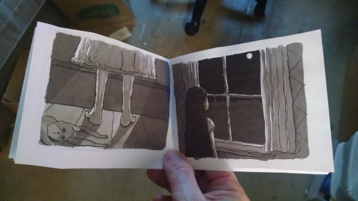
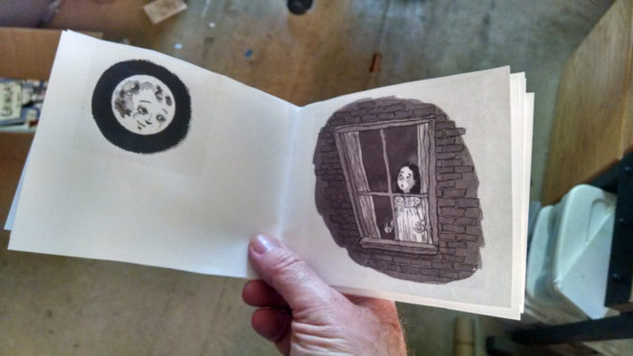
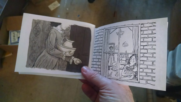 April 12-20 Slowing down toward the (chapter) finish line
My pace / discipline really starting to sag in April, due to a combination of external and internal factors. Â It happens.
Anyway, I sketch out the last page of the chapter (there were some previous sketches of this, if you scroll down, as well. but this one is more precise as far as composition):
April 12-20 Slowing down toward the (chapter) finish line
My pace / discipline really starting to sag in April, due to a combination of external and internal factors. Â It happens.
Anyway, I sketch out the last page of the chapter (there were some previous sketches of this, if you scroll down, as well. but this one is more precise as far as composition):
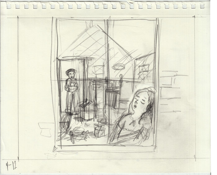 And onto the inked line art (I didnt document the pencils):
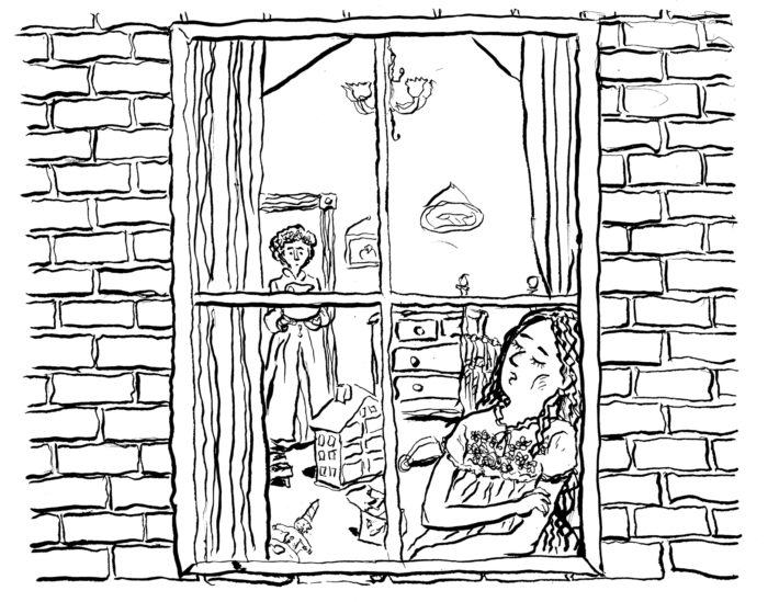 Not thrilled with this, mainly because of the face. Â Also, I didn’t take enough care with the background of furniture, toys etc in the room, and I think it messes up the composition, drawing attention away from the characters.
I did one more little sketch, just of her face:
Not thrilled with this, mainly because of the face. Â Also, I didn’t take enough care with the background of furniture, toys etc in the room, and I think it messes up the composition, drawing attention away from the characters.
I did one more little sketch, just of her face:
 Look closer? Â Okay…
 And re-drew the page. Line art:
 I felt I improved the two problems mentioned above. So I went on to washes:
 That’s all well and good. Â But as I looked at it, dissatisfaction returned. Not with the drawing, but with the composition. Â The characters are too small in the frame… a lot of wasted space, and it dilutes the impact/”reveal” of the sleeping girl.
To test my hypothesis, I simply cropped the image differently:
That’s all well and good. Â But as I looked at it, dissatisfaction returned. Not with the drawing, but with the composition. Â The characters are too small in the frame… a lot of wasted space, and it dilutes the impact/”reveal” of the sleeping girl.
To test my hypothesis, I simply cropped the image differently:
 Quite a change, no? Â In some circumstances, I might just go with the digital crop. Â But not today… I really want everything to work on paper, not just digitally. And besides, I’d lose the “rough edges: of the lines and washes.
So back to the drawing board, with the new composition. Â Line art:
Quite a change, no? Â In some circumstances, I might just go with the digital crop. Â But not today… I really want everything to work on paper, not just digitally. And besides, I’d lose the “rough edges: of the lines and washes.
So back to the drawing board, with the new composition. Â Line art:
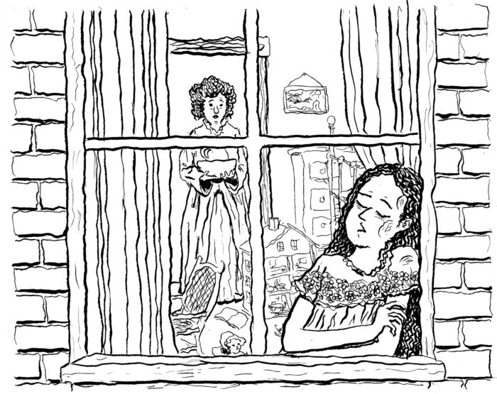 Washes:
 How is the house laid out? Â Where would the stairs be? Â What would the proportions feel like? Â I know, I know… probably best to figure this stuff out before I start drawing the scene, but who can be bothered right? Â So I’m retroactively trying to make sense of it, not my strong suit:
 Of course maybe no one will pay attention to such things. Â Or maybe they will… and LAUGH at me!! Â Obsessive now:
Do I really solve the architectural question? Â I don’t know, maybe I just gave up. Â Anyway, it pretty much ended up looking like my earliest sketch. Here are the final pencils:
Of course maybe no one will pay attention to such things. Â Or maybe they will… and LAUGH at me!! Â Obsessive now:
Do I really solve the architectural question? Â I don’t know, maybe I just gave up. Â Anyway, it pretty much ended up looking like my earliest sketch. Here are the final pencils:
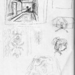
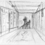

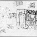

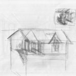
 The inked line work:
 In this case, it’s really all about the washes. Â The rug, the wallpaper. Â A little reference, and some quick studies:
 And voila! Â Here it is on the drawing board:
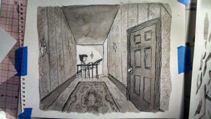 And scanned, with hopefully the levels adjusted well:
 And after all that… My rational brain failed me around the drawing of that rail at the top of the stairs: is there room for a person to get through there? Â Does the sloping-down ceiling of the roof read as perspective, making the figure look way too large?
Y’know what? I think this time I’m going to have to live with it, plus whatever little tweaks I can manage on Photoshop.
March 29-30: spreads
The next four pages are two sets of spreads. In each, the moon is on the left of the fold, girl on the right, looking at/reacting to the moon.
I didn’t grab many process moments along the way, so here are finished inks/washes for these four pages (plus a couple rejected versions):
The first moon:
And after all that… My rational brain failed me around the drawing of that rail at the top of the stairs: is there room for a person to get through there? Â Does the sloping-down ceiling of the roof read as perspective, making the figure look way too large?
Y’know what? I think this time I’m going to have to live with it, plus whatever little tweaks I can manage on Photoshop.
March 29-30: spreads
The next four pages are two sets of spreads. In each, the moon is on the left of the fold, girl on the right, looking at/reacting to the moon.
I didn’t grab many process moments along the way, so here are finished inks/washes for these four pages (plus a couple rejected versions):
The first moon: Let’s look a little closer:
 I didn’t like the expression — kind of a banal, friendly look, and I wanted something a little more mysterious: compelling but aloof. Â So, drew it over:
 Okay. Â Then, the girl looking up at the moon from her bedroom window:
 Then the moon does THIS:
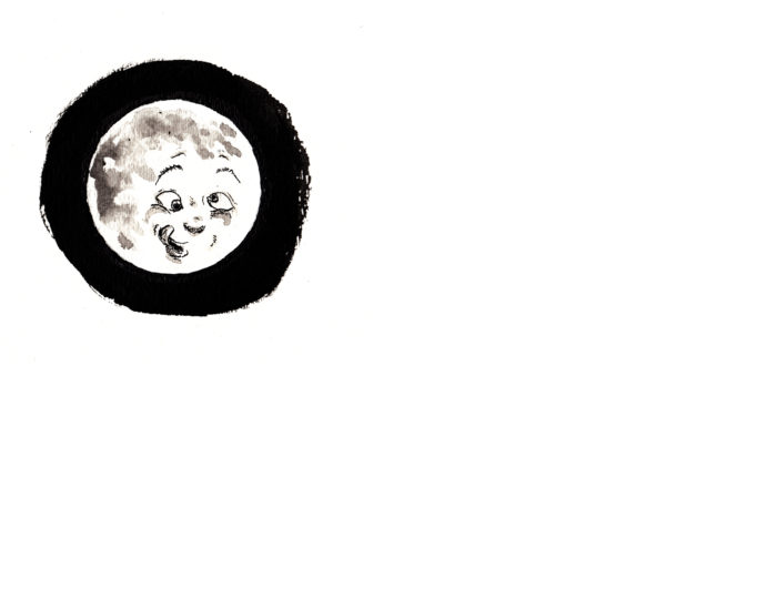 And the girl:
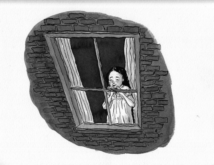 I didn’t completely love the expression on HER face this time, so I tried it again:
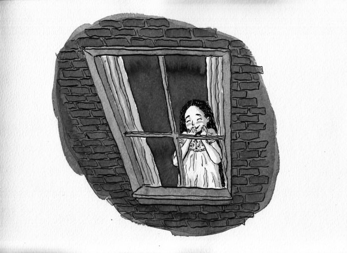 Better, and good enough!
Here they are as spreads. Â As you can see, my idea is to break up the repetitive rectangle format that the images have followed so far:
Better, and good enough!
Here they are as spreads. Â As you can see, my idea is to break up the repetitive rectangle format that the images have followed so far:
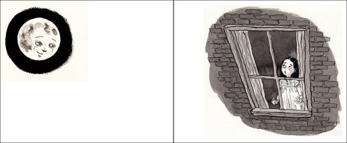
 March 24-28, sketches for the rest of the chapter.
My main concern for the next few pages is facial expressions, as it’s a back-and-forth of reactions between the Moon and the Girl.
March 24-28, sketches for the rest of the chapter.
My main concern for the next few pages is facial expressions, as it’s a back-and-forth of reactions between the Moon and the Girl.
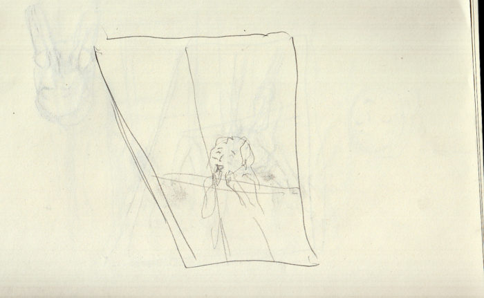
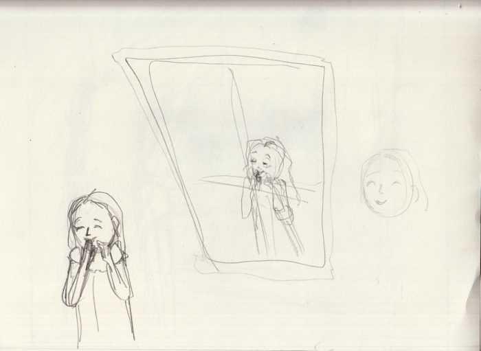
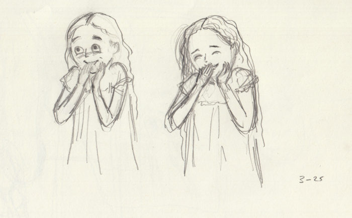
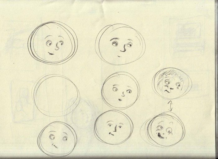
 Then, I also started to look past these pages to the next sequence, and sketched some for it. Sketches of the girl’s mother, who will enter the room (which morphed into sketches of the girl, older):
 And of the final page, in which the girl has fallen asleep against the window, as her mother enters in the background:
 Happy with that last one.
March 21-22, re-drawing page 8.
Line art, ink over pencils:
Happy with that last one.
March 21-22, re-drawing page 8.
Line art, ink over pencils:
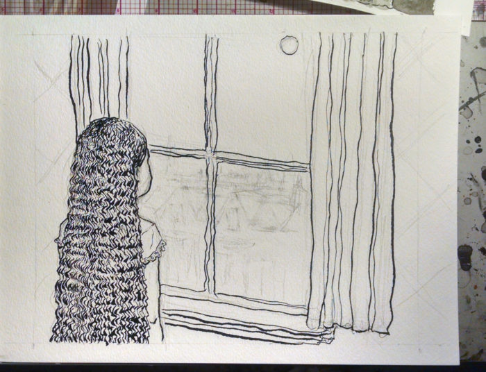
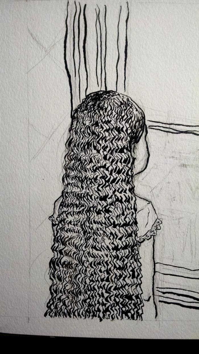
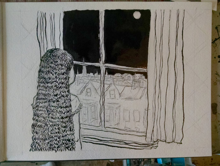 Adding washes:
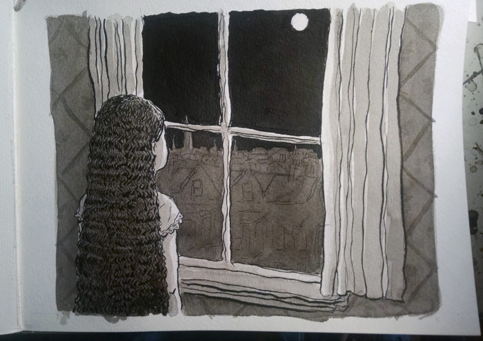 Scanned:
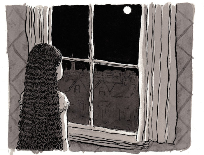 That was a color scan, here it is in grayscale:
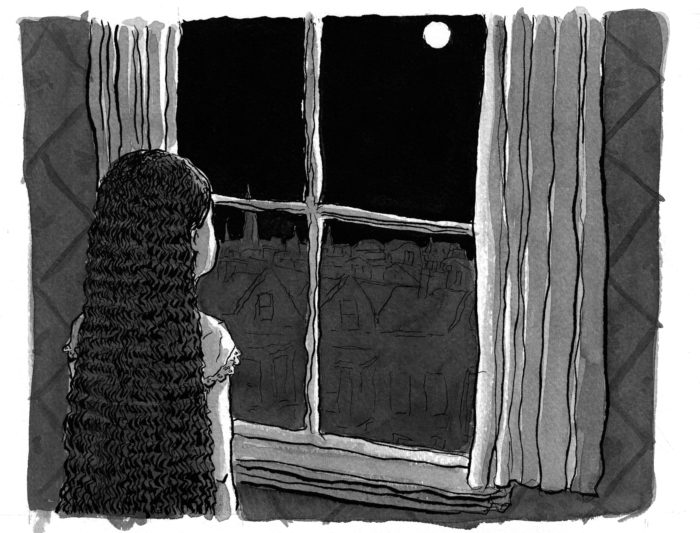 The color adds a warmth to it, though, for sure.  Though, as  I said before, not sure I’ll be able to print in color.
March 20, after, a long hiatus:
I took a break from this project for a few weeks, during which I drew a short comic for the upcoming BCR anthology (so I don’t feel guilty about it).
During this time, looking at page 8, I decided it looked a little too squared-off and I wanted to spice up the composition a little, change the angle.
First, I got back into it with a few sketches of upcoming pages. Â Character studies and thumbnails of a new composition for page 8:Â
The color adds a warmth to it, though, for sure.  Though, as  I said before, not sure I’ll be able to print in color.
March 20, after, a long hiatus:
I took a break from this project for a few weeks, during which I drew a short comic for the upcoming BCR anthology (so I don’t feel guilty about it).
During this time, looking at page 8, I decided it looked a little too squared-off and I wanted to spice up the composition a little, change the angle.
First, I got back into it with a few sketches of upcoming pages. Â Character studies and thumbnails of a new composition for page 8:Â 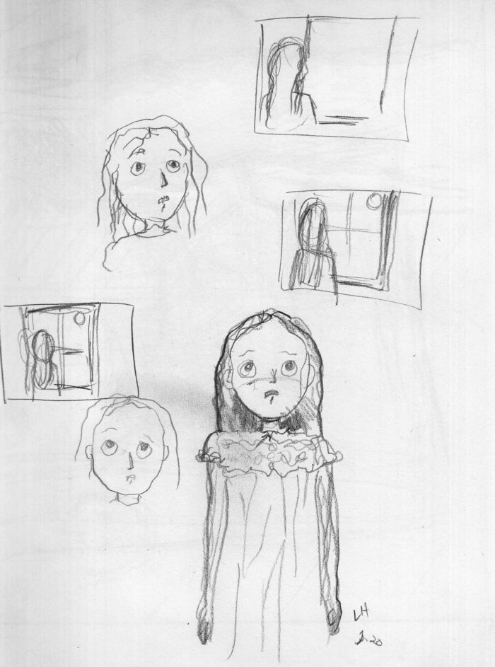 Moon face studies, and thumbnails for page 10:
 A sketch for page 10:
 A roughed new version of page 8:
 February 25-26, page 8:
Basically the “reverse shot” of page 7 (ohhh I hate using cinematic terms, but I don’t know how else to describe it). Â Here is line art:
February 25-26, page 8:
Basically the “reverse shot” of page 7 (ohhh I hate using cinematic terms, but I don’t know how else to describe it). Â Here is line art:
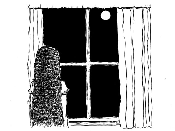 And, with washes:
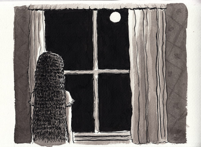 February 23, page 7:
Line art:
February 23, page 7:
Line art:
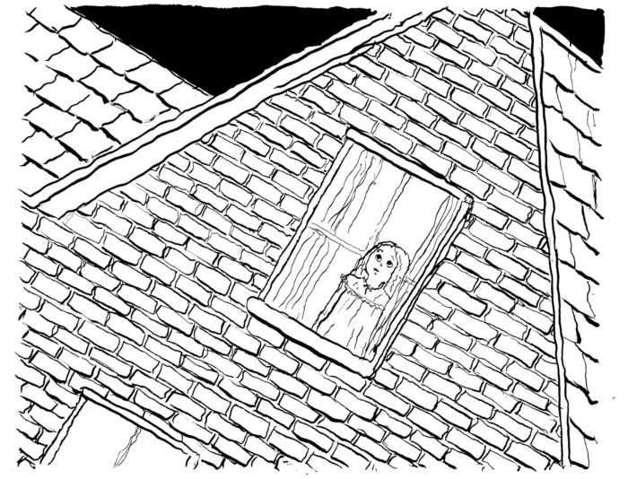 Washes added, first scan:
 Touchups to the washes, in 2 stages (warning: subtle differences); I used white ink to put in the cross-bars of the window frame. Â I wanted to be able to draw her face as a whole, then obstruct it afterward:
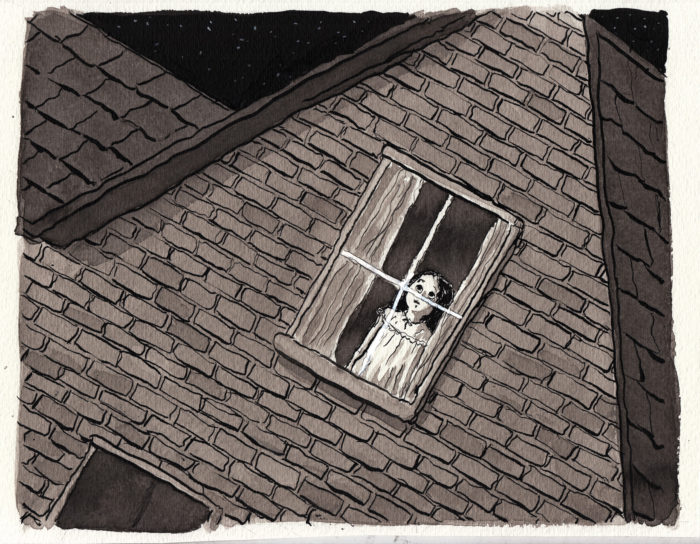
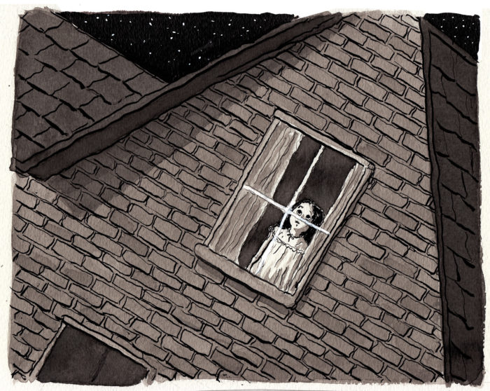 Final (except nothing’s final, ’til the book is printed. Â And even then…?).
February 22-23: page 6
Finally, we meet our heroine as a young girl… sort of. Â Feet only:
Final (except nothing’s final, ’til the book is printed. Â And even then…?).
February 22-23: page 6
Finally, we meet our heroine as a young girl… sort of. Â Feet only:
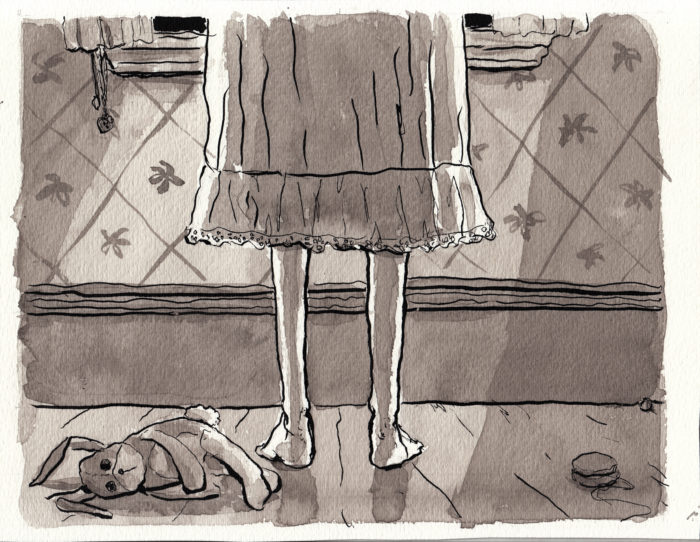 This is a black-and-white image of course, but this is a color scan, so it adds a tint. Which I like. Â It makes me think about printing it in color, though that would be very expenseive. Â Anyway, here it is converted to grayscale, as it will probably end up:
 I really like this image, but I decided to try it another way, with the feet closer to the picture plane. Â I scanned it once before finishing the shading (“state one”):
 Here’s the color scan of it with added shading, for a more dramatic composition, and to indicate the light from the window above (even though it’s kind of nonsensical, probably, as far as how the light would really go):
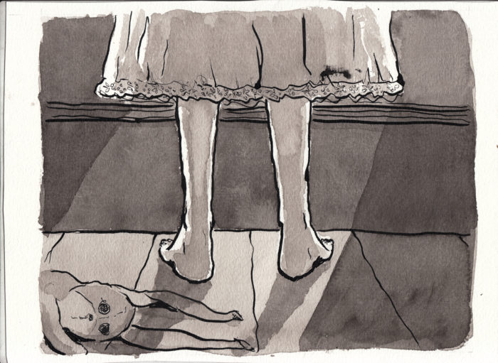 As you can see, between the first scan and the second I smudged ink on the picture (above the hem of the nightgown on the right). Here’s the image with some touchups, and converted to grayscale:
 I think this second version of the drawing is more dramatic for being a “close-up.” Â But I don’t have to make a final decision until I’m actually assembling the book.
February 21st
More sketching/studying for the next 2-3 pages:
I think this second version of the drawing is more dramatic for being a “close-up.” Â But I don’t have to make a final decision until I’m actually assembling the book.
February 21st
More sketching/studying for the next 2-3 pages:
 My idea for the moon, is that, as the girl ages, the moon’s face will change to reflect the image that a child of her age would have of a friendly or beautiful or funny face:

 February 19-20.
At long last, after moving around the room looking at toys and bedclothes, the next pages will introduce the character (re-introduce, since we met her as a baby in the last chapter). Â Gearing up for this with sketches and studies.
February 19-20.
At long last, after moving around the room looking at toys and bedclothes, the next pages will introduce the character (re-introduce, since we met her as a baby in the last chapter). Â Gearing up for this with sketches and studies.

 Still trying to find her face as depicted at the age of 8 years old or so. Â Curly hair seems to be winning the day (resisting the easy fallback of a little blonde girl, which would probably be the stereotype Victorian child, I’ll make her hair black and curly, so that her ethnicity is a little more open to interpretation).
But at first, we don’t even see her face. Â We see:
Still trying to find her face as depicted at the age of 8 years old or so. Â Curly hair seems to be winning the day (resisting the easy fallback of a little blonde girl, which would probably be the stereotype Victorian child, I’ll make her hair black and curly, so that her ethnicity is a little more open to interpretation).
But at first, we don’t even see her face. Â We see:
 …feet. Â Which ain’t so easy to draw, for me. Â Especially from behind!
So more studies:Â
…feet. Â Which ain’t so easy to draw, for me. Â Especially from behind!
So more studies:Â  And working toward the actual composition of the page, including a stuffed animal bearing mute witness:
 And an actual rough of the page:
 February 15-19: Do-overs.
I felt that page 2 (the “wide shot” of the bedroom), didn’t capture the shadowy, night-time feel. Â I wanted to beef up the blacks, and rather than go back into the page with more ink, I bit the bullet, put a print-out of the line art onto the light-table, and re-inked the page, with heavier blacks:
February 15-19: Do-overs.
I felt that page 2 (the “wide shot” of the bedroom), didn’t capture the shadowy, night-time feel. Â I wanted to beef up the blacks, and rather than go back into the page with more ink, I bit the bullet, put a print-out of the line art onto the light-table, and re-inked the page, with heavier blacks:
 I think it’s stronger than the earlier version. Â I added washes. Â Again, I kept putting more layers of gray wash down to get it as dark as I wanted. Â But I don’t think I really know how to handle this yet: you can damage the paper and lose the ability to control the tone, and I think that’s what happened in that lighter patch above and to the right of the door. Â But… working this way, I’ve got to be willing to live with accidents and imperfections.
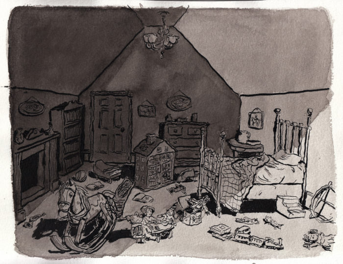 One more step, to add in the wallpaper pattern:
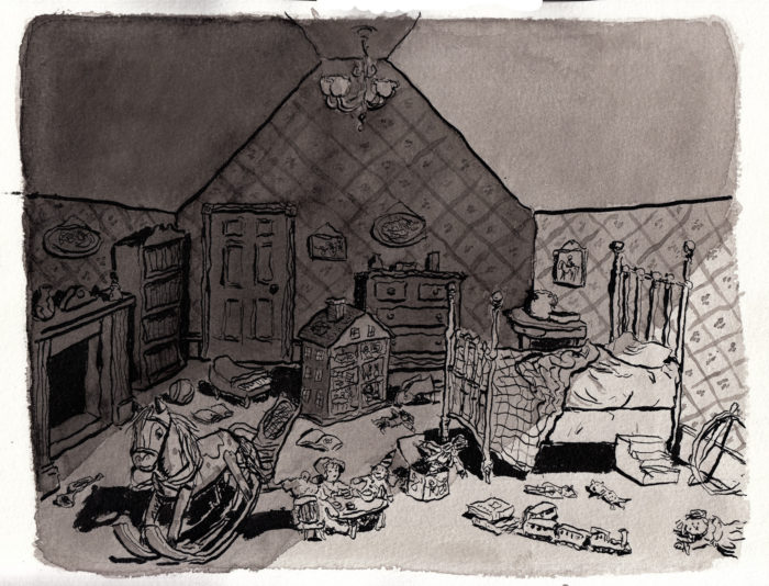 Okay! Â But now that I was into all those heavier blacks, I started to feel disatisfied with some of the other pages in this sequence… so I used the same process and redrew two of them!
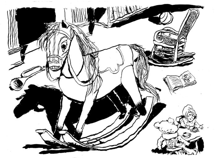 I had a good time being a little more reckless drawing this page, and I like the crazier linework. Â Washes:
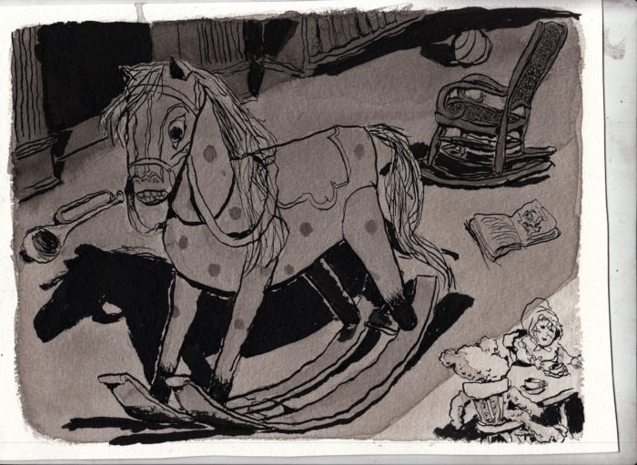 Needed a little more tones, to make the horse stand out a little better, etc:
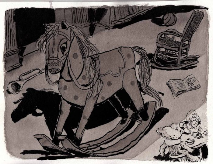 Alright! Â On to the Jack in the Box. Â
 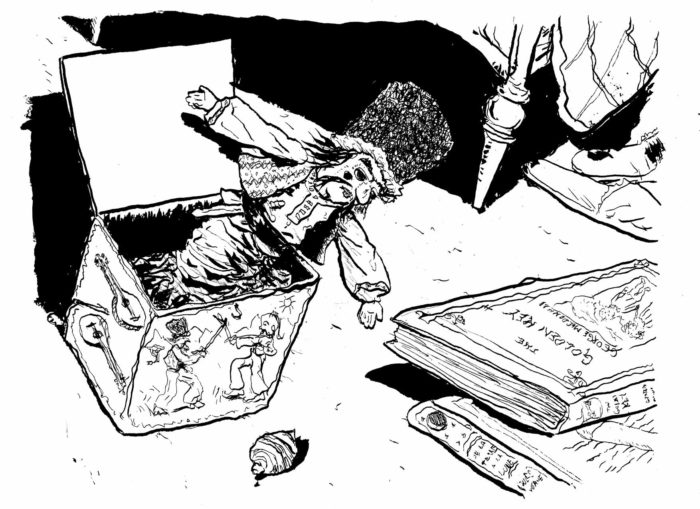 All of this is still being inked lefty, by the way, because I am digging the unrulier line I get with that hand. Washes:
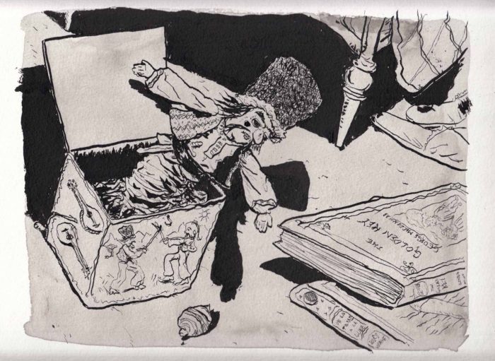 And a little shadier:
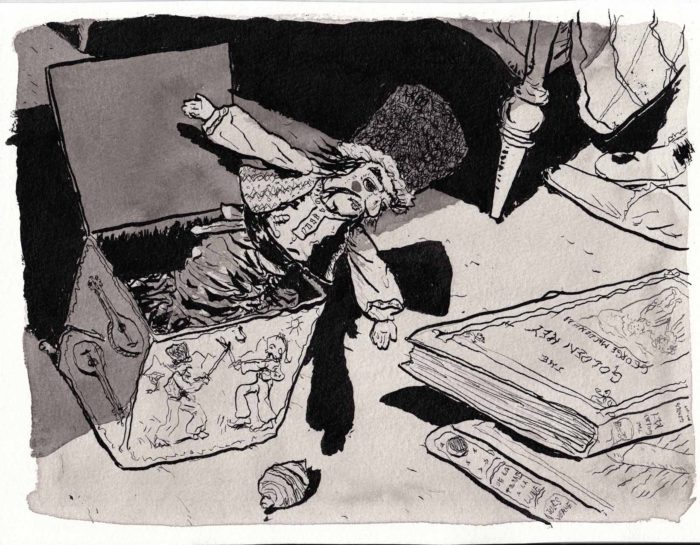 Yeah! Â I didn’t redraw page 5, but added some black:
 This was all fun to do, and I like the way they turned out.
But then.
It suddenly came back to me that the reason I wanted to use gray ink washes for this sequence was to get a delicate quality, appropriate for a child’s bedroom & toys bathed in moonlight. Â Now, I feel like what I’ve done has added a little bit of the “scary toy” feeling to things. Â Is that just as good? Â I’m not sure. Â Luckily, I’ve got everything scanned (and backed up on another disc and in the cloud) at lots of different stages, so when it comes down to it, I have a lot to choose from. Â That’ll be tough.
February 11-13: pages 4 and 5
Moving on to page 4, the Jack-in-the-Box detail of the room. Â A rough sketch:
This was all fun to do, and I like the way they turned out.
But then.
It suddenly came back to me that the reason I wanted to use gray ink washes for this sequence was to get a delicate quality, appropriate for a child’s bedroom & toys bathed in moonlight. Â Now, I feel like what I’ve done has added a little bit of the “scary toy” feeling to things. Â Is that just as good? Â I’m not sure. Â Luckily, I’ve got everything scanned (and backed up on another disc and in the cloud) at lots of different stages, so when it comes down to it, I have a lot to choose from. Â That’ll be tough.
February 11-13: pages 4 and 5
Moving on to page 4, the Jack-in-the-Box detail of the room. Â A rough sketch:
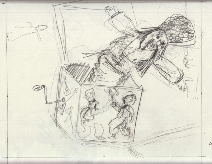 Then another, to adjust the composition, moving the jack-in-the-box left so that the head is closer to the center of the page and you can see more of the books:
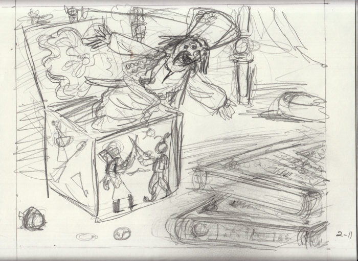 Work in progress on the drawing table, penciled and inked. With one nice ink drop on the bed-post, oh, well.
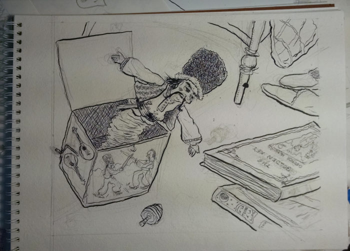 Here is the line-art with pencils erased:
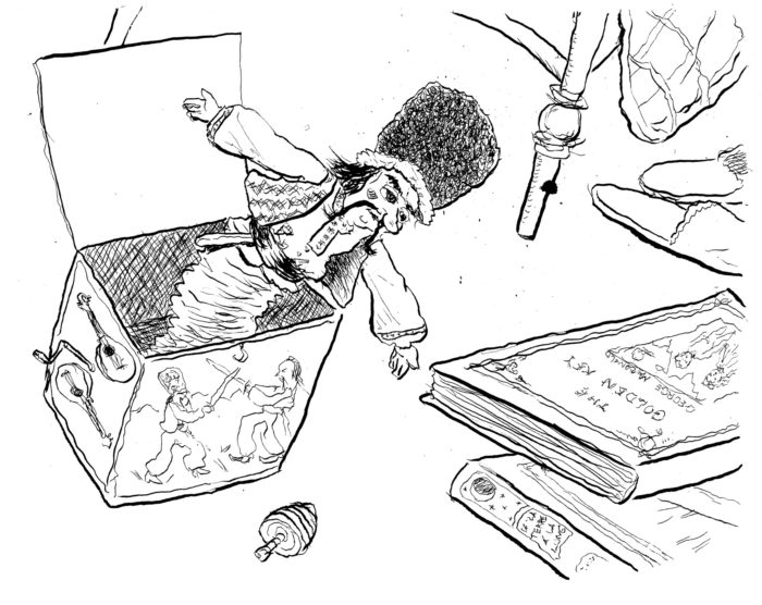 The ink washes go on in layers, from light to dark. Â Here’s the first layer, an overall light gray:
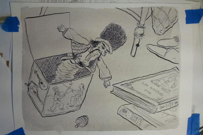 Moving faster now, I didn’t resort to doing ink washes on separate pages via light-box (because I was satisfied with the way they turned out applied directly to the original.) I moved back and forth between pages 4 & 5, as I waited for the layers of ink wash to dry. Â Here’s page 4 on the drawing table:
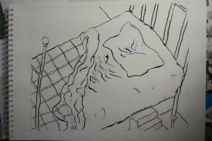 Page 5 line art scanned:
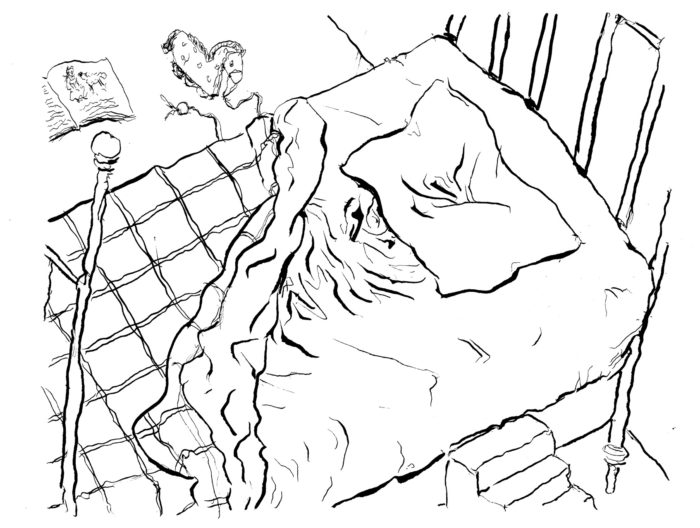 And here is page 5 with all the ink washes applied:
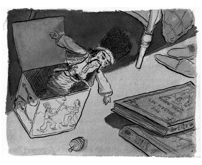 And pag4 Â with final ink washes:
 February 10-13: Â Page 3
After the wide shot of the room, three pages of details, moving around the room. Bear with me for all these versions. Â It’s f***ing endless. Â Here’s a photo of the line art, inked, on the drawing table:
February 10-13: Â Page 3
After the wide shot of the room, three pages of details, moving around the room. Bear with me for all these versions. Â It’s f***ing endless. Â Here’s a photo of the line art, inked, on the drawing table:
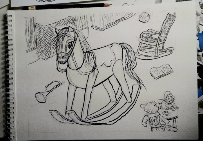 Scan of the line art:
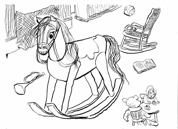 Gray wash process. Â First an overall light gray (which will serve as the “white” of the page once other wash layers are applied) (i premixed 3 different tones of ink wash in separate jars):
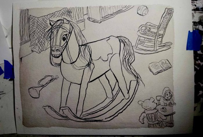 Next, added another layer to darken in the figure of the horse. Â I also wanted the horse to have spots that are lighter than its overall tone, so I used masking fluid to create those. Â Actually I didn’t particularly care if the spots were lighter, I just liked using the masking fluid:
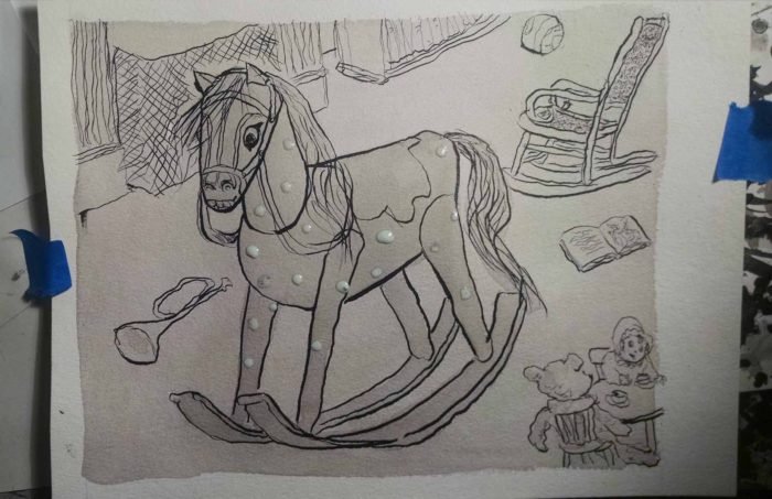 Finally, more wash to darken everything, and peeled off the dried masking fluid:
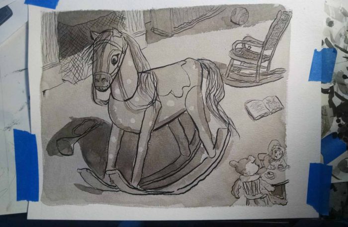 Here it is, scanned:
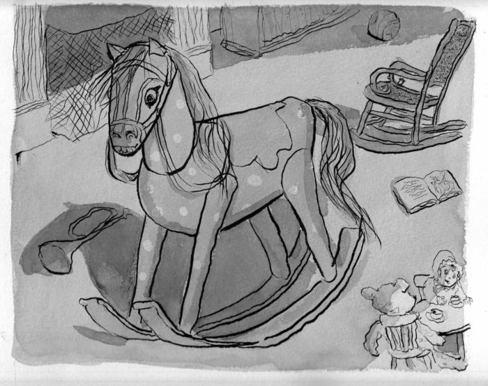 To be honest, I can’t even remember what it was that disatisfied me about the above version. Â Probably again, that it’s a little too pale and doesn’t feel like a dark room at night time. Â At any rate, I went through the same process I did on the previous page, using a light box to create new wash layers on separate pages:
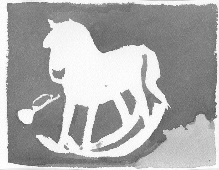
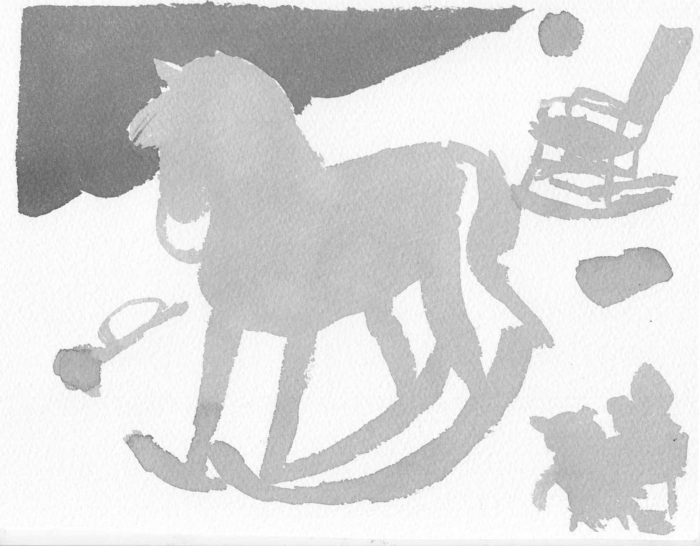
 Stack ’em in transparent layers over the scan of the line art, and voila:
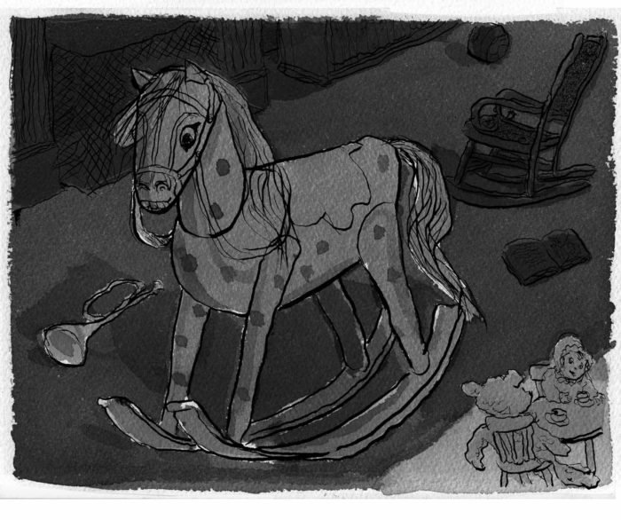 Well, I do find this richer and stronger. Â I even the white gaps in the washes on the horse, resulting from imprecisions in my light-boxed layers. Â So I’m done with the page. Â Or am I? Â Don’t kid yourself.
February 6-9: Page 2, many stages.
Rough pencils:
Well, I do find this richer and stronger. Â I even the white gaps in the washes on the horse, resulting from imprecisions in my light-boxed layers. Â So I’m done with the page. Â Or am I? Â Don’t kid yourself.
February 6-9: Page 2, many stages.
Rough pencils:
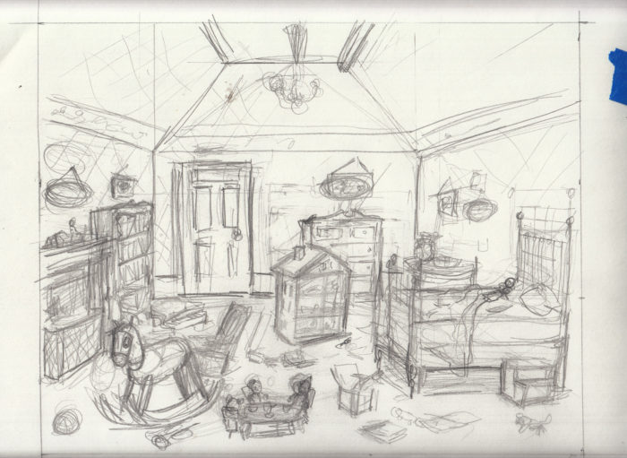 Final pencils:
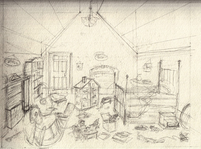 Pencils inked:
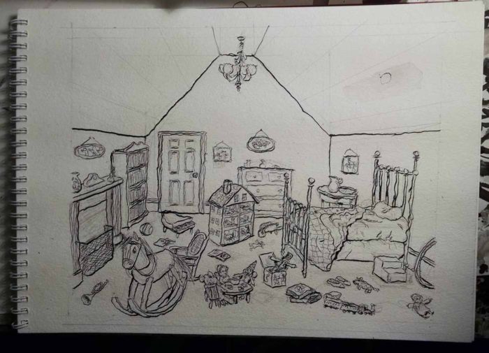 Line art inks:
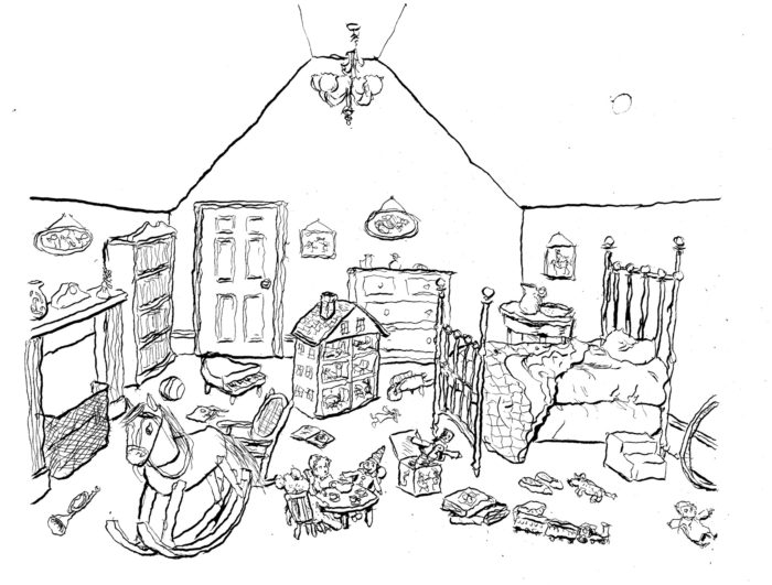 With ink washes (applied directly to page):
 (note on above: I wasn’t satisfied with the washes, because I think there’s too much light. This is supposed to be a room at night, dark, with a diagonal section lit by moonlight thru the window).
So I went back in to add more atmosphere with washes:
(note on above: I wasn’t satisfied with the washes, because I think there’s too much light. This is supposed to be a room at night, dark, with a diagonal section lit by moonlight thru the window).
So I went back in to add more atmosphere with washes:
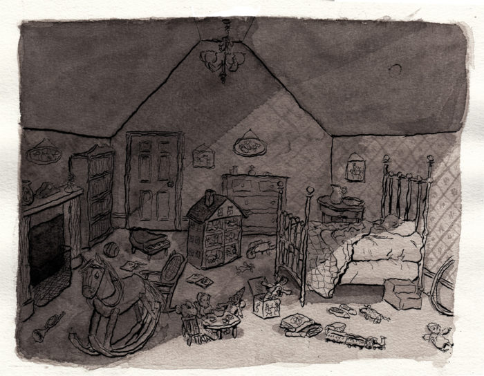 …but I felt I’d only muddied things up. Â Irretrievably. Â Luckily, I’d scanned the line art, so I tried a different method, applying ink washes to separate pages, using a light table over a print out of the line art.
Here is the ink wash for the overall lighting of the room:
…but I felt I’d only muddied things up. Â Irretrievably. Â Luckily, I’d scanned the line art, so I tried a different method, applying ink washes to separate pages, using a light table over a print out of the line art.
Here is the ink wash for the overall lighting of the room:
 Then, digitally combined with the line art:
 Another layer of ink washes, for specific shadows:
 Added digitally:
 And finally, a separate layer for the wallpaper pattern:
 Here is the line art combined in Photoshop with the three layers of inkwash:
 This method gives me a lot of flexibility. Â Too much flexibility, in fact, as I can try so many combinations. Â Here, for instance, is the scan with the first layer of inkwash applied to the page (that is, the fifth image from the top for this date’s entry), combined with just the darkened ceiling from that separate layer of inkwash, four images up from here.
 If you’re confused, you see why I may be overdoing the “flexibility.” Â But I push on… Â Stay tuned.
February 3: Page 1, finally.
The exciting moment. Â Pre-season is over. Â Now, it counts. Pencil to paper, then ink… the final page.
Oh, I lied. Â First there was a false start: I penciled, but realized I hadn’t gotten the composition exactly right. Â Not a dramatic-enough angle.
If you’re confused, you see why I may be overdoing the “flexibility.” Â But I push on… Â Stay tuned.
February 3: Page 1, finally.
The exciting moment. Â Pre-season is over. Â Now, it counts. Pencil to paper, then ink… the final page.
Oh, I lied. Â First there was a false start: I penciled, but realized I hadn’t gotten the composition exactly right. Â Not a dramatic-enough angle.
 Rather than erase, Â I started over. Â Got the composition right. Â Here is an in-progress shot with just the line art. Â Again, penciled by right hand, inked with left:
 And the finished page:
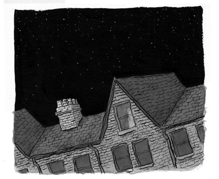 I was painstaking with applying the ink washes, using several “coats, ” like glazing in painting, letting each coat dry, then applying another, to get the tonalities where I wanted them.
February 2: ink sketch for page 1
I did one final pencil sketch, then another version in ink and inkwash… since that’s the media I’ll be using for this chapter, and I want to get used to it:
I was painstaking with applying the ink washes, using several “coats, ” like glazing in painting, letting each coat dry, then applying another, to get the tonalities where I wanted them.
February 2: ink sketch for page 1
I did one final pencil sketch, then another version in ink and inkwash… since that’s the media I’ll be using for this chapter, and I want to get used to it:
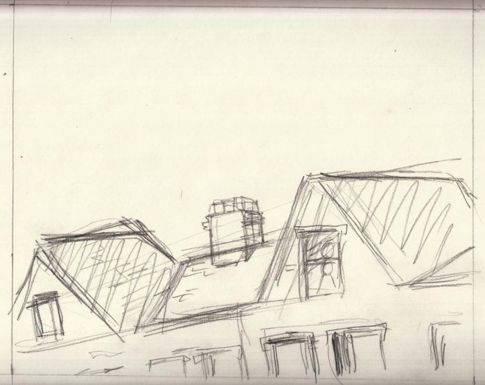
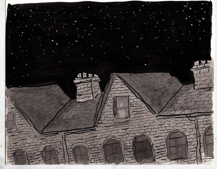 I penciled this with my right hand, and inked with my left. I kind of like the wiggly lines my left hand makes. Â Overall I’m happy with the quality of the drawing, but I screwed up the composition… didn’t get enough of a dramatic angle.
January 31-Feb 1: page sketches
I started doing more refined pencil sketches for the first two pages of the chapter. Â Page 1 is the “establishing shot” of the building in which the scene takes place:Â
I penciled this with my right hand, and inked with my left. I kind of like the wiggly lines my left hand makes. Â Overall I’m happy with the quality of the drawing, but I screwed up the composition… didn’t get enough of a dramatic angle.
January 31-Feb 1: page sketches
I started doing more refined pencil sketches for the first two pages of the chapter. Â Page 1 is the “establishing shot” of the building in which the scene takes place:Â 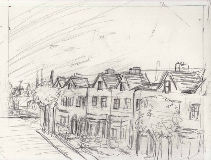 What bothers me about this is that it’s too similiar to the first page of the previous chapter, another look down a block of rowhouses. Â I tried to vary the architecture, but still.
Re-thumbnailed the page, changing the angle and making it closer to the window of the girl’s room (plus a few more rocking-horse doodles):
What bothers me about this is that it’s too similiar to the first page of the previous chapter, another look down a block of rowhouses. Â I tried to vary the architecture, but still.
Re-thumbnailed the page, changing the angle and making it closer to the window of the girl’s room (plus a few more rocking-horse doodles): Okay, that looks better. Then, on to page 2, A thumbnail:
 And a full-sized rough sketch:
 January 30-31: Â Jacks-in-the-box
Another toy to be featured in the first pages of the chapter (as we “move in” on details of the bedroom). Â Here’s some reference:
January 30-31: Â Jacks-in-the-box
Another toy to be featured in the first pages of the chapter (as we “move in” on details of the bedroom). Â Here’s some reference: Some scribbly sketches:
 Thinking that I want to do something different: still with a classic Jack-in-the-Box feel, but with a little variation. Â It popped into my head to do a Cossack Jack-in-the-Box:
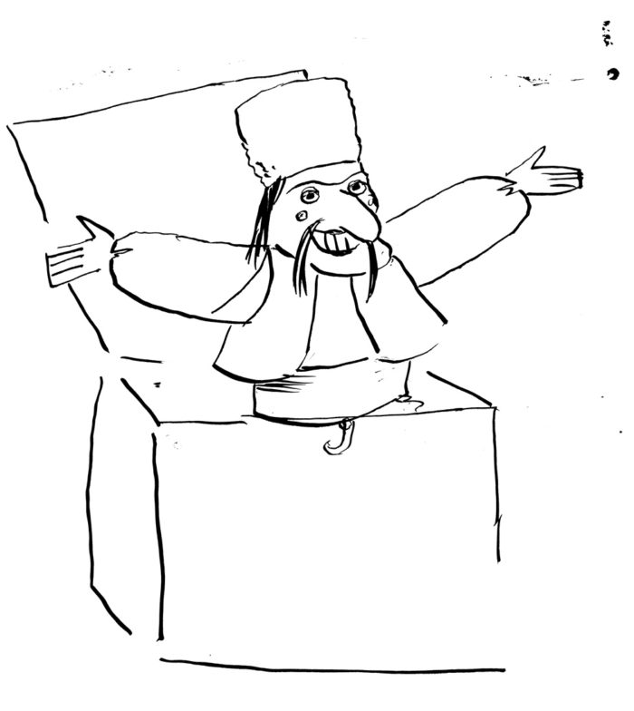
 Again, I don’t need to nail it down at this point, just get a basic idea of what it would look like, and go back to it fresh when I reach that page. Â (afterwards I googled “Cossack Jack in the box” and there aren’t any images of one, so maybe I’m being original!)
January 27-28, 2017: Toy-time
Studies for the rocking horse in the bedroom scene. Here are some of my reference photos (there are lots more, I’m kind of obsessive about gathering reference):
Again, I don’t need to nail it down at this point, just get a basic idea of what it would look like, and go back to it fresh when I reach that page. Â (afterwards I googled “Cossack Jack in the box” and there aren’t any images of one, so maybe I’m being original!)
January 27-28, 2017: Toy-time
Studies for the rocking horse in the bedroom scene. Here are some of my reference photos (there are lots more, I’m kind of obsessive about gathering reference):

 The thing is, a lot of those Victorian rocking horses are very naturalistic — but if I draw a naturalistic rocking horse, it won’t look any different than if I was just drawing a horse. Â So I will go for a more stylized design:

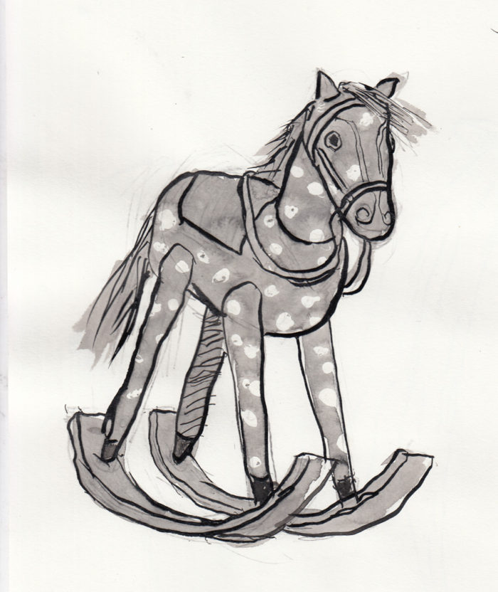 I like this last one (inked with left hand). Â I’ll stop now, so I don’t get stale on rocking horses before it’s time to draw the actual page.
January 26, 2017: sketches, ink wash
Now that the sequence is thumbnailed, I went to work on more refined sketches of the characters. Â Since I plan to draw this chapter using ink and wash, I started working with that medium.
I like this last one (inked with left hand). Â I’ll stop now, so I don’t get stale on rocking horses before it’s time to draw the actual page.
January 26, 2017: sketches, ink wash
Now that the sequence is thumbnailed, I went to work on more refined sketches of the characters. Â Since I plan to draw this chapter using ink and wash, I started working with that medium.
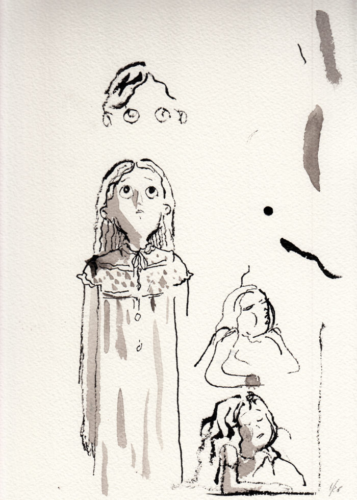
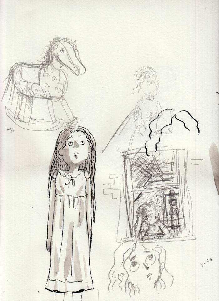
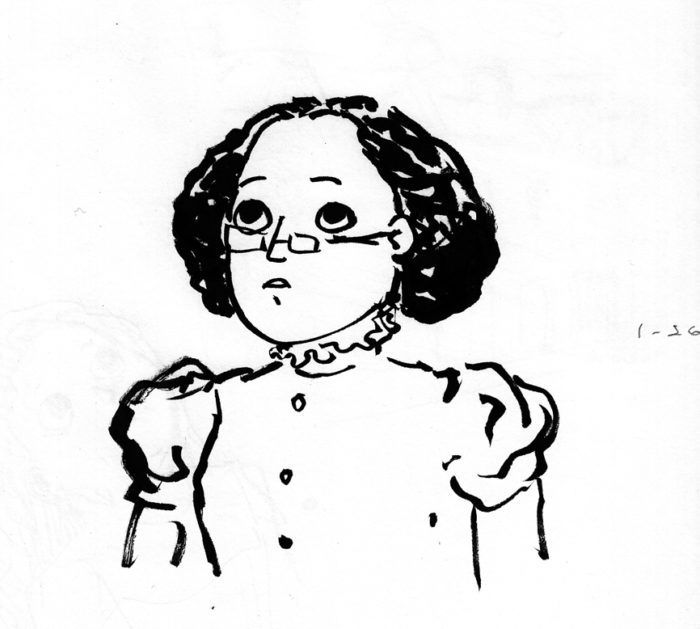 ‘(Note: the above is just a doodle of the character when she’s older, though the hair is wrong, not a sketch for ch. 2)
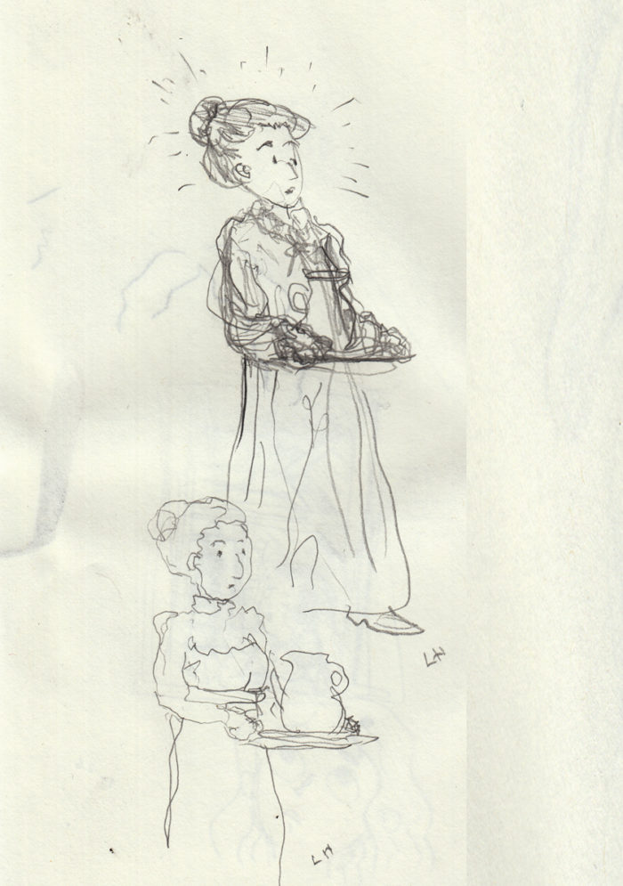 Drawn with left hand; the reaction of the mother on entering on the final page of the chapter.  This was going to be a maid, but I decided to make it her mother, again to play down the idea that she’s wealthy.  There’s no reason she shouldn’t be a wealthy character, but there’s no reason she should either.  So even though it might be more fun to draw a big mansion (and easier to draw a maid’s uniform than figure out what a Victorian-era mother would be wearing in the early morning), I don’t want this story to be about the fantasy of wealth. So mom gets the part.
 January 25, 2017: more detailed thumbnails; architectural decision sketches
I drew larger thumbnails, so that I could see more detail and get a better idea of the flow from image to image:
January 25, 2017: more detailed thumbnails; architectural decision sketches
I drew larger thumbnails, so that I could see more detail and get a better idea of the flow from image to image:


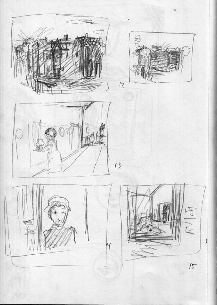 One question I’m having is the depiction of the house. Â I started drawing a rather large Victorian stand-alone house. I wanted to differentiate this location from the row-houses in chapter one. Â But I don’t really like the way that defines the character as wealthy. Â I’d rather have her be middle-class, which would suggest that she and her family live in a more modest row house (since they’re urban). So I sketched a block of row houses with hopefully enough architectural differences from the opening scene to make clear we’re not in the same exact location:
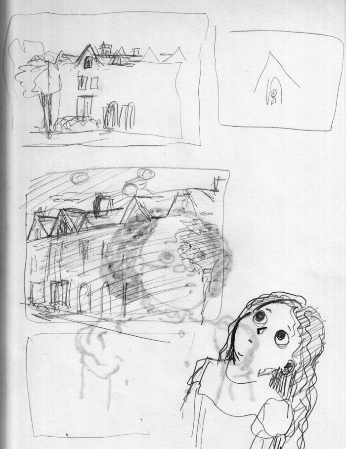 Sorry about the bleed-through from another sketch (which I drew with brush pen, the following day).
January 24, 2017: Rough thumbnails, reference material and sketch for bedroom interior.
Thumbnails:
Sorry about the bleed-through from another sketch (which I drew with brush pen, the following day).
January 24, 2017: Rough thumbnails, reference material and sketch for bedroom interior.
Thumbnails:
 Scribbly, yes, but I understand them. Â At this point, I am laying the chapter out at 15 pages. Â For comparison, here’s the thumbnails for this sequence from way back when i first “wrote” the story, a couple of years ago (the character was a boy, then):
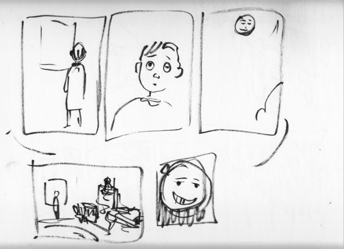 Back to the present-day, and here’s some sketching of the location (interior) for this scene, the girl’s bedroom:
 Here is some of the reference images I downloaded for this setting:
Undated (2016) Here’s a  couple pages of doodles from some time back, not sure when.  On the top page, I’ve circled the ones that relate to Lunatic. I found the bottom page in a pile of papers, I’d forgotten about those drawings.  It was kind of an important find, because in the intervening months, without realizing it, I’d changed the character’s hair from dark to blonde.  And I think I’m changing it back to dark thanks to finding those sketches.
Here is some of the reference images I downloaded for this setting:
Undated (2016) Here’s a  couple pages of doodles from some time back, not sure when.  On the top page, I’ve circled the ones that relate to Lunatic. I found the bottom page in a pile of papers, I’d forgotten about those drawings.  It was kind of an important find, because in the intervening months, without realizing it, I’d changed the character’s hair from dark to blonde.  And I think I’m changing it back to dark thanks to finding those sketches.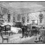

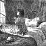
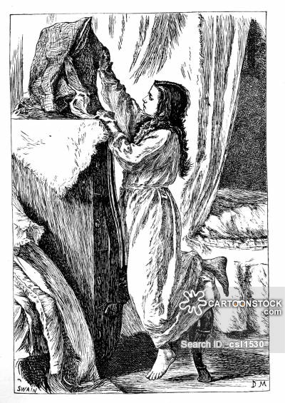
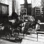
 Juliette: les fantômes reviennent au printemps (Juliette: the ghosts return in spring) is a 240-page French graphic novel, published by Actes Sud in 2016. I don’t know much about Camille Jourdy : she’s done a lot of children’s books, and had a previous series of bd albums, Rosalie Blum, which I guess was successful, since it was adapted as a film as well.
 While the visuals are almost sugary in their prettiness and the tone is gentle, Jourdy’s  approach to characters and story has dark depths as well. Most of the characters are depressed or frustrated with their lives and choices, though over the course of the story they manage to connect and communicate, creating an overall mood of optimistic humanism. Within this gentle atmosphere, there is a good amount of variety: quiet, reflective sequences, slapstick comedy, witty dialogue,  romance and sex,  and a bit of tragedy as well.
   Jourdy particularly excels at large group scenes with competing and overlapping voices: Juliette’s extended family dinner party, her mother’s art gallery opening, and several scenes at the local bar where her slacker love-interest is a regular. A pleasant and affecting read, with an easy pace, but full of incident and never dull.  Hopefully this comic will be published in English someday, but in the meantime if you can struggle through the French, it’s worth the effort.  Â
 Jourdy particularly excels at large group scenes with competing and overlapping voices: Juliette’s extended family dinner party, her mother’s art gallery opening, and several scenes at the local bar where her slacker love-interest is a regular. A pleasant and affecting read, with an easy pace, but full of incident and never dull.  Hopefully this comic will be published in English someday, but in the meantime if you can struggle through the French, it’s worth the effort.   
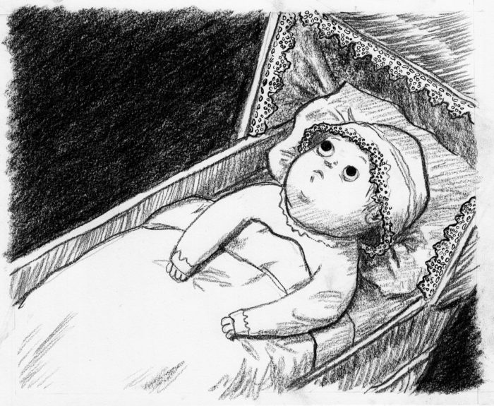 As I said, I wasn’t satisfied with the baby’s expression on page 8, so I drew it over. Â I could have just redrawn the face and paste it in on Photoshop, but I really want the pages to be presentable as originals as well.
Anyway, this marks the end of the first chapter of “Lunatic,” in which the main character is an infant. I’ll now move on to Chapter 2, which will start with a lot of thumbnails and studies…
As I said, I wasn’t satisfied with the baby’s expression on page 8, so I drew it over. Â I could have just redrawn the face and paste it in on Photoshop, but I really want the pages to be presentable as originals as well.
Anyway, this marks the end of the first chapter of “Lunatic,” in which the main character is an infant. I’ll now move on to Chapter 2, which will start with a lot of thumbnails and studies… …and NOW ready to go. Â I will do the two-page sequence, of baby seeing the moon / baby reaching for it. Pencil, conte crayon and India ink, with white acrylic for corrections: Drew the second page first (page 9, in the current layout), because it was the one I was more nervous about getting right:
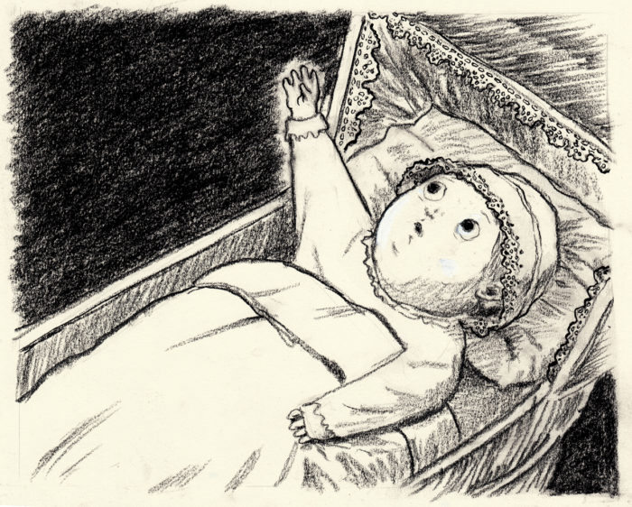 …and I think I did get it right. Â I wanted them to be exactly alike in terms of composition, so I used the light table to lightly outline, then took it off the light box and went ahead with conte crayon and ink on page 8:
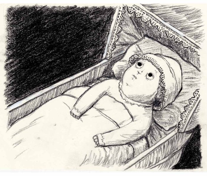 I like the picture, in and of itself… but I don’t think I got the expression right. Â The transition from 8 to 9 is to much. Â The first page should show her beginning to react to what she’s seeing, leading in to the gesture on the next page.
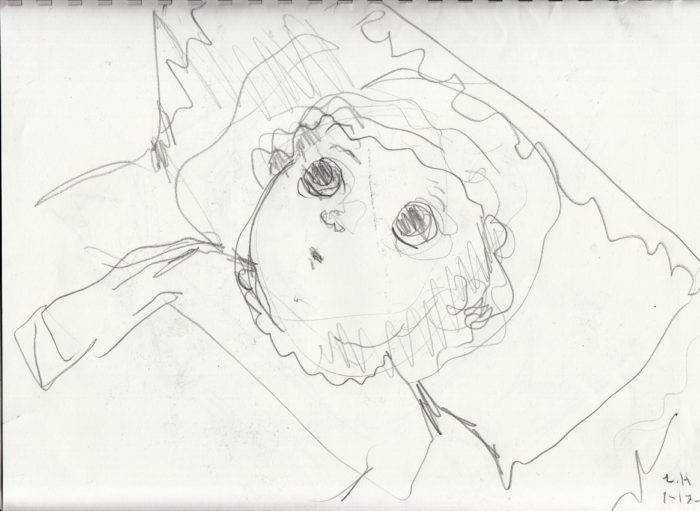
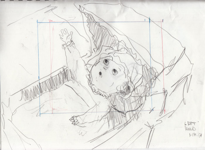
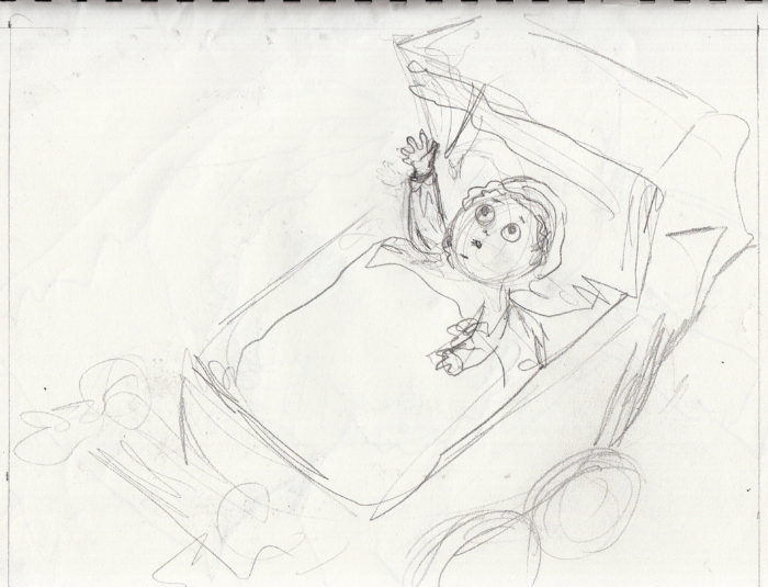
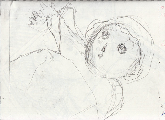
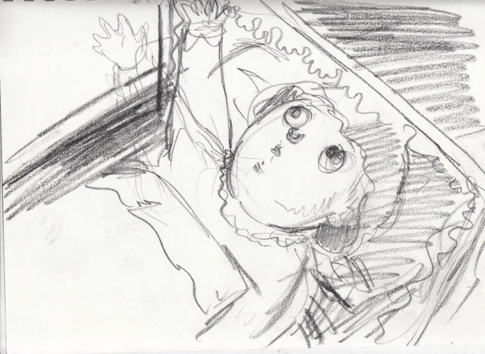
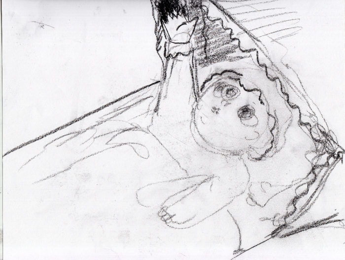
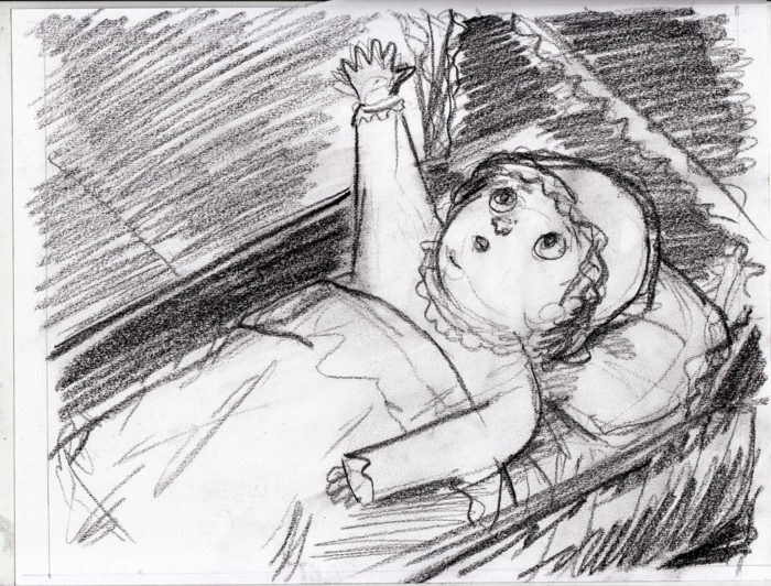
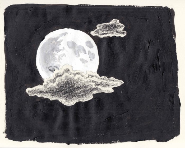 I decided to reject this, because I wanted more clouds in the frame. Â Next try:
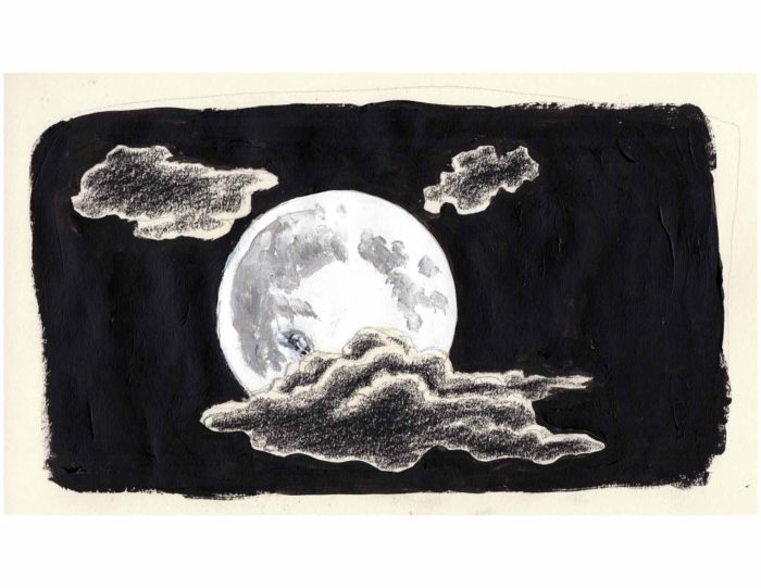 This (above) is after touch-ups in Photoshop, to darken the black and flatten out the texture of the black acrylic, as well as the warps in the page, which showed up clearly in the scan (as you can see in the top image).
Here’s the next in the sequence, page 6:
This (above) is after touch-ups in Photoshop, to darken the black and flatten out the texture of the black acrylic, as well as the warps in the page, which showed up clearly in the scan (as you can see in the top image).
Here’s the next in the sequence, page 6:
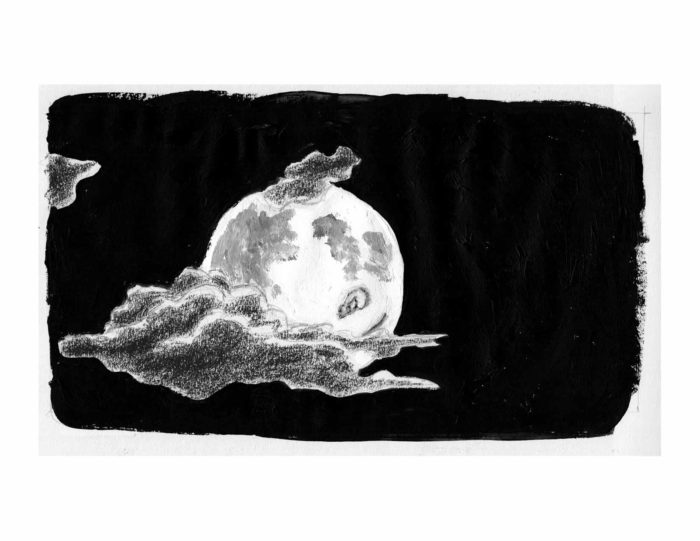 I decided that the eye and smile were too pronounced here (spoiling the impact of the “reveal” on the next page. Â So I went back in with white acrylic and obscured them a bit:
 With these done, I went back to ink the final image of the sequence:
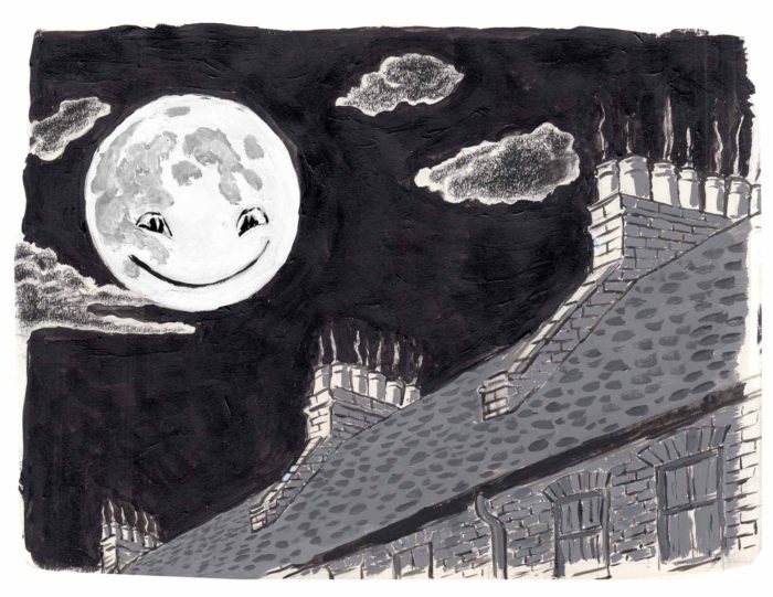 Over the next few days (the holiday weekend), I only managed a couple scribbled sketches. Â Since I decided to draw the baby reaching for the moon (literally), after the face appears, I had a new idea for a final page of the sequence, baby’s point-of-view with her hand in the foreground. Â Here is scribble of it, with some scribbled thumbnails next to it as a bonus:
 I’m thinking that image might work better without the architecture between hand and moon, just black.
Then, unable to sleep one night, I did a few more sketches, some in preparation for finishing up this baby/moon scene, others in anticipation of the next scene to come. Â This is all quick and dirty, but I’m being a stickler for completism — and also, these little scribbly sketches are an important part of the process. Â So:
I’m thinking that image might work better without the architecture between hand and moon, just black.
Then, unable to sleep one night, I did a few more sketches, some in preparation for finishing up this baby/moon scene, others in anticipation of the next scene to come. Â This is all quick and dirty, but I’m being a stickler for completism — and also, these little scribbly sketches are an important part of the process. Â So:
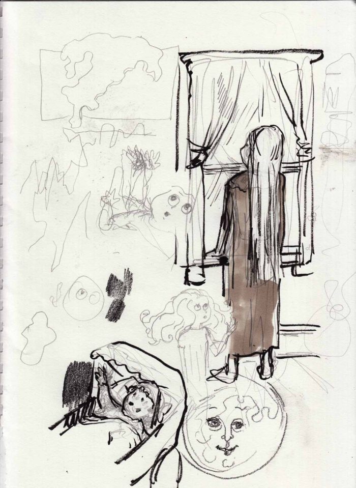
 The part I’m finding tricky for some reason are those brick things that slant down the roof from each chimney. Â But I think I have it, more or less, so here is the penciled drawing for page 7:
 That’s all, folks (for today)!
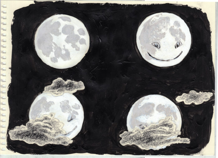 Here they are rearranged into a rough sequence (and I copied and pasted the clouds in, where necessary for the flow of it:)
 It won’t be a strip like that in the final — though looking at it makes me consider whether it should be. Â I’ll draw the final versions now, taking a little more care with the placement of the clouds, and making their shapes more consistent. Â And lighten up those craters a bit, next pass. Â Of
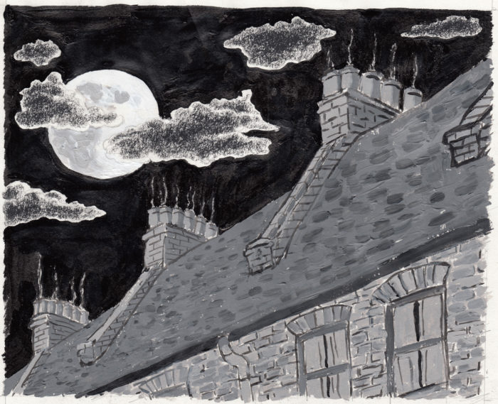 In Photoshop I darkened the black of the sky, then added more contrast in the roof, and lightened up the craters in the moon a bit. Â It ended up looking like this:
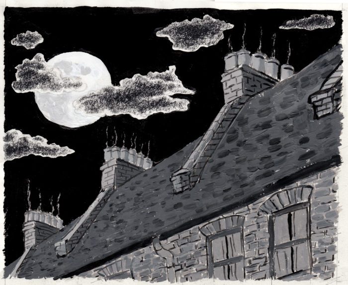 Here, by the way (below), is the earlier version of the page, for compare and contrast. An improvement, I’m pretty sure (though I kind of like the big cloud in the older version better than in the new. Â Oh well.)
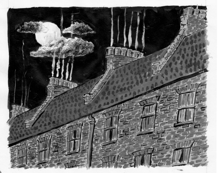
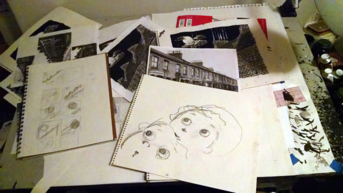
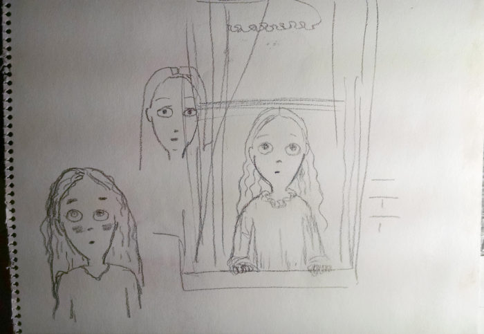
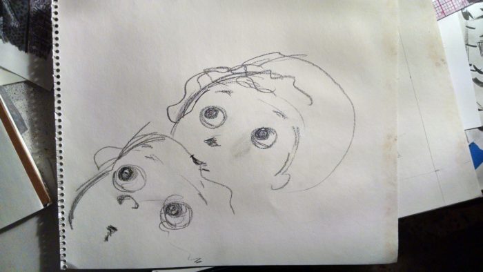
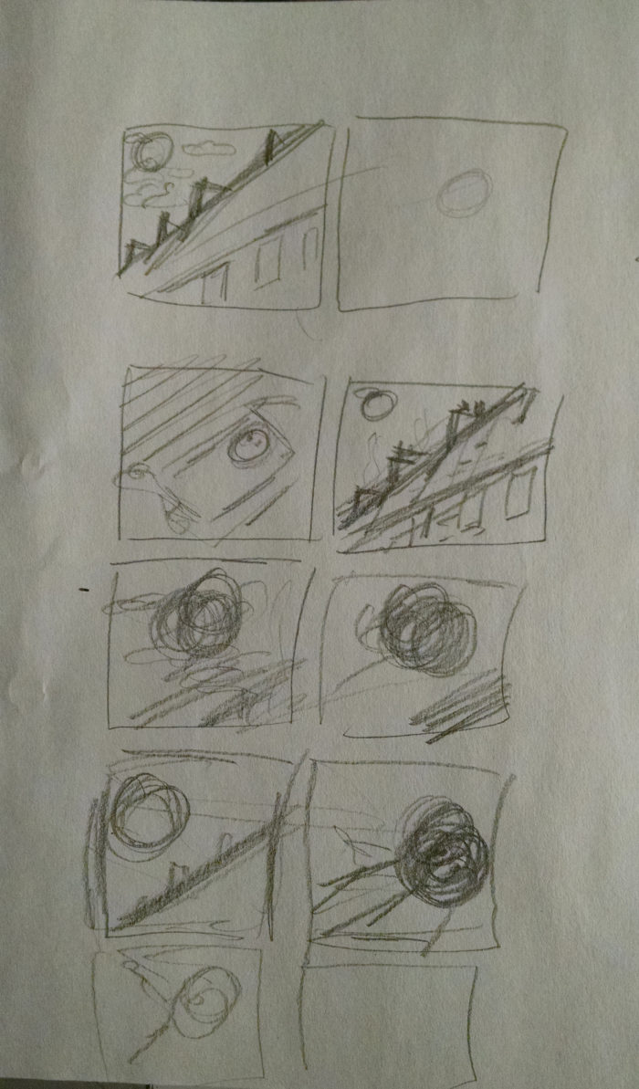
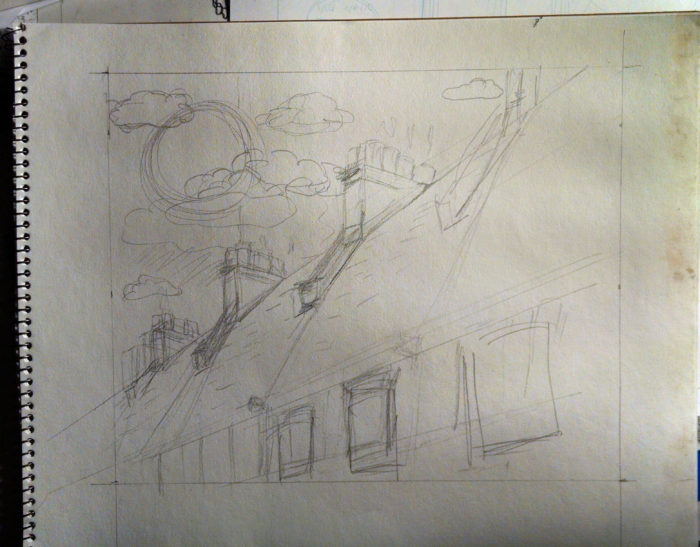

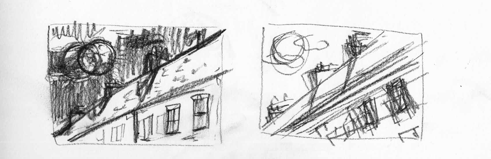 But I really get a better idea by messing around with the actual image in photoshop, skewing the buildings and enlarging the moon. Â Here;s a comparison of the two versions:

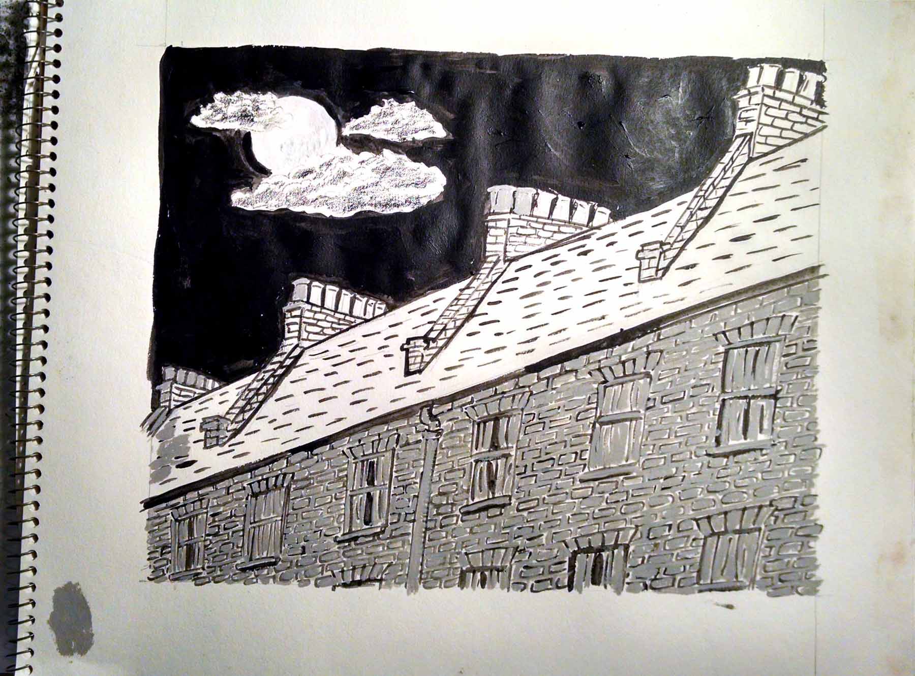 A little white goache for the smoke… and done!
 Well, I worry that I may have overworked the bricks and roof… so much patterning it looks like it has some kind of pox. Â Not sure about that. Â But I do start to feel like it, while the picture is fine on its own, it doesn’t have the impact I want. Â I want to try it with a more forced angle and make the moon bigger, so you really feel it LOOMING over you (from the baby’s POV).
So… final version? Â I don’t think so!!
It’s going to take me a while to make any progress though… other deadlines are really starting to get gnarly.
Well, I worry that I may have overworked the bricks and roof… so much patterning it looks like it has some kind of pox. Â Not sure about that. Â But I do start to feel like it, while the picture is fine on its own, it doesn’t have the impact I want. Â I want to try it with a more forced angle and make the moon bigger, so you really feel it LOOMING over you (from the baby’s POV).
So… final version? Â I don’t think so!!
It’s going to take me a while to make any progress though… other deadlines are really starting to get gnarly.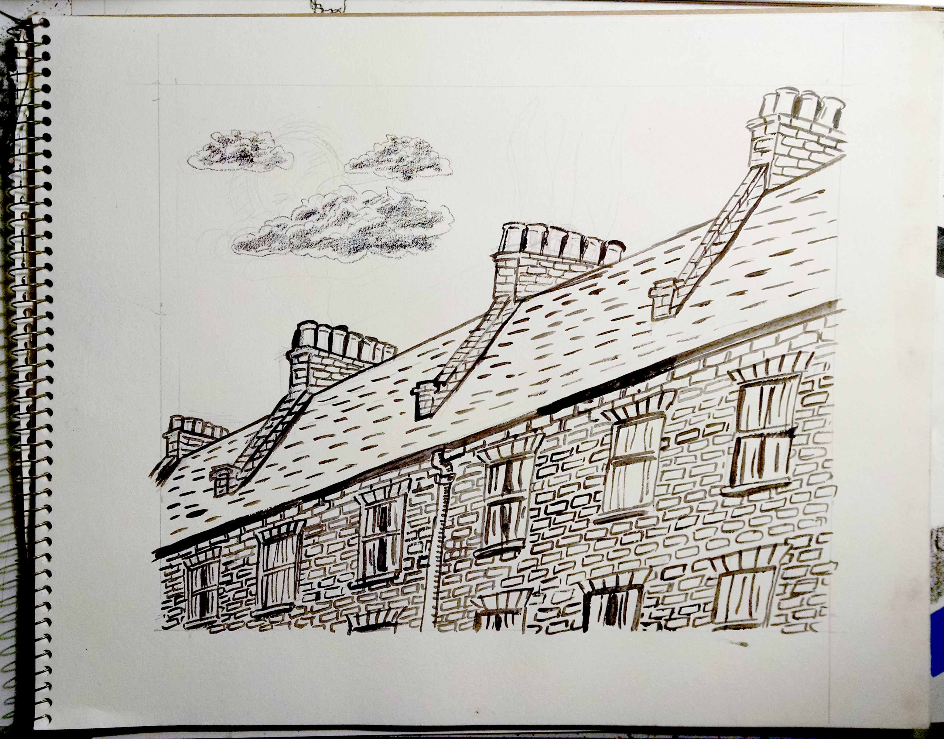
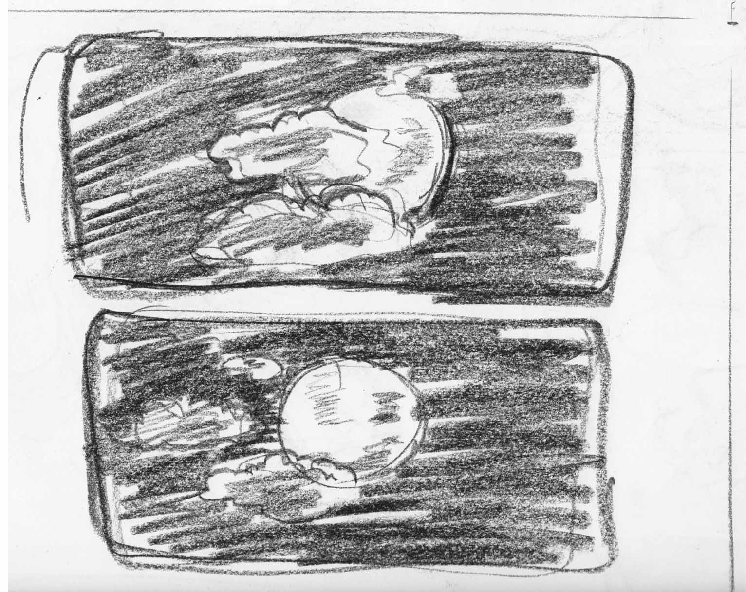 Maybe.
But that’s jumping ahead. Â I did a rough version of the fourth page:
Maybe.
But that’s jumping ahead. Â I did a rough version of the fourth page:
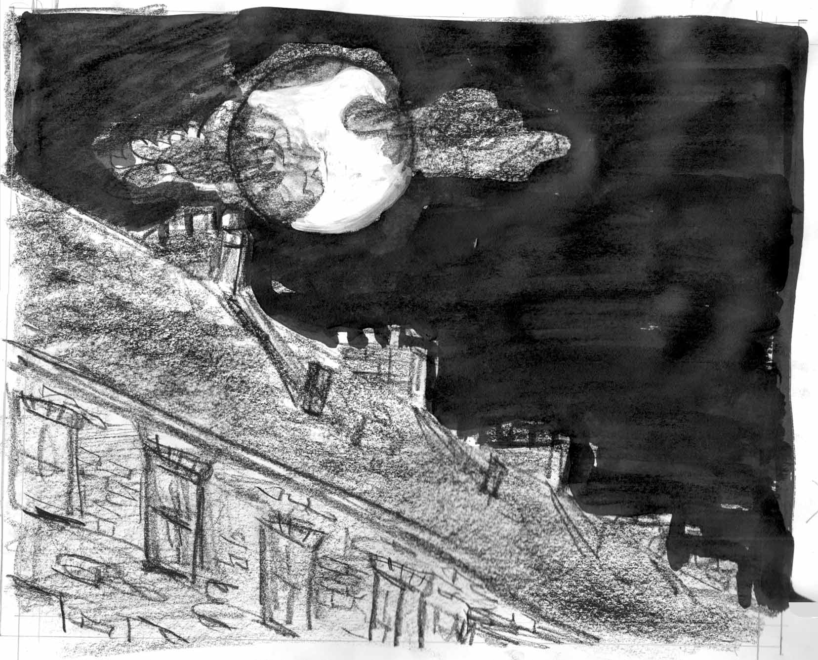 Or is it better this way (digitally altered for now):
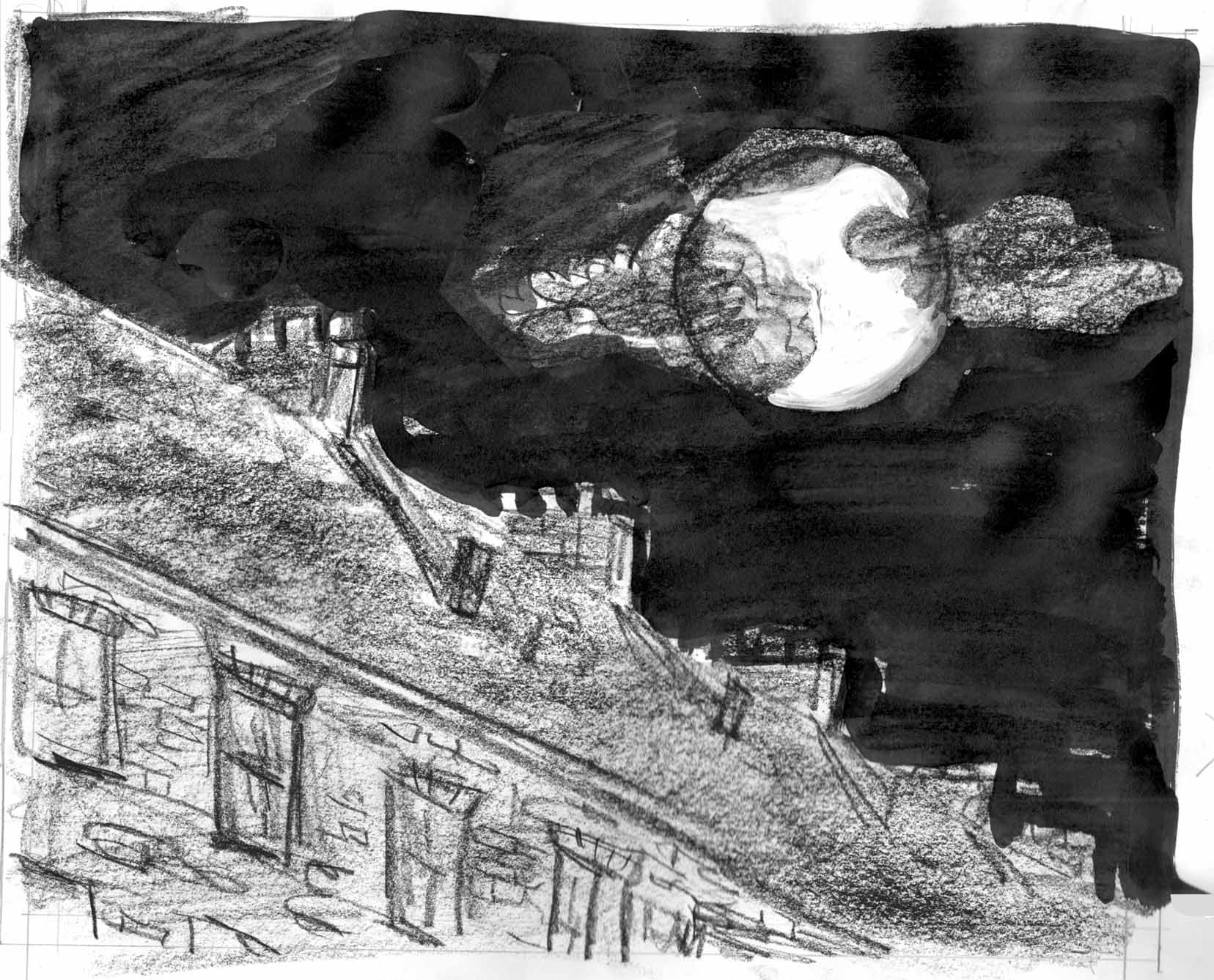 I think that composition gives a better feeling of the moon “looking down” at us.
(work interrupted for a few days by going to Small Press Expo in Bethesda. Â When I come back and asses….)
Now I begin to question my composition of this spread. Â Thinking in terms of the sort of “eye flow” that I usually take into account when laying out a panel page, I’ve been pretty convinced that the complementary angles between the 2 facing pages was crucial :Â
I think that composition gives a better feeling of the moon “looking down” at us.
(work interrupted for a few days by going to Small Press Expo in Bethesda. Â When I come back and asses….)
Now I begin to question my composition of this spread. Â Thinking in terms of the sort of “eye flow” that I usually take into account when laying out a panel page, I’ve been pretty convinced that the complementary angles between the 2 facing pages was crucial :Â 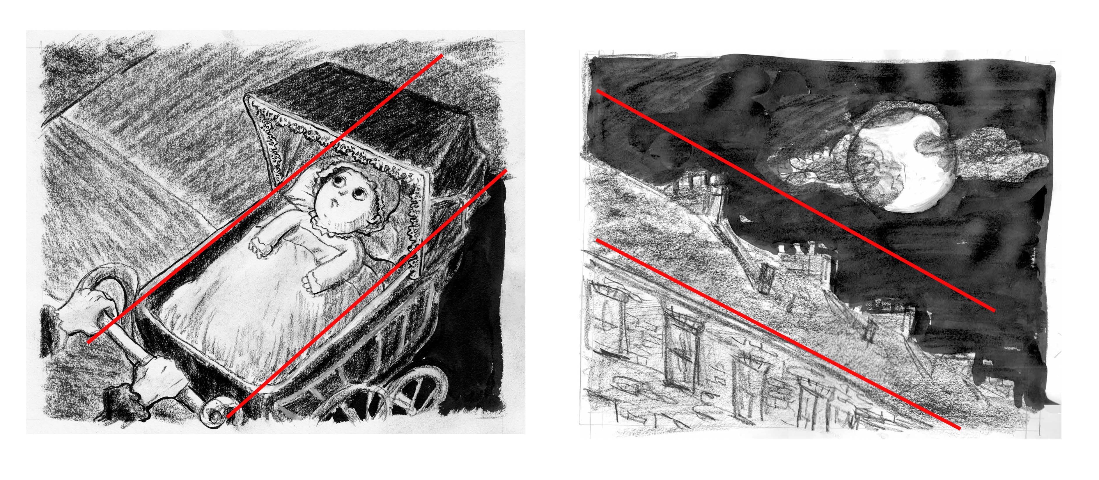 But looking at it, I feel like this composition doesn’t actually work as well, in terms of feeling the 2nd page as the point-of-view of the baby on the first page. Â Going back to an earlier sketch (but using the moon/clouds from this one), I think this works better:
 I definitely think that in the bottom spread you feel much more that you are the baby looking up at that moon in the second page. The angle of the rooftops is how the baby would see it (unless she’s looking across the street).
 And if that’s not enough, you will also find on the Dan Mazur/Ninth Art Press table, my two most recent comics:Â The Jernegan Solution and Hooves of Death!
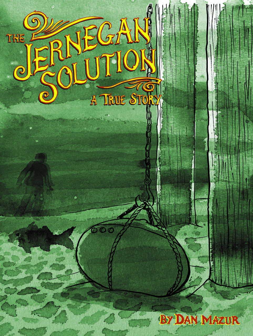
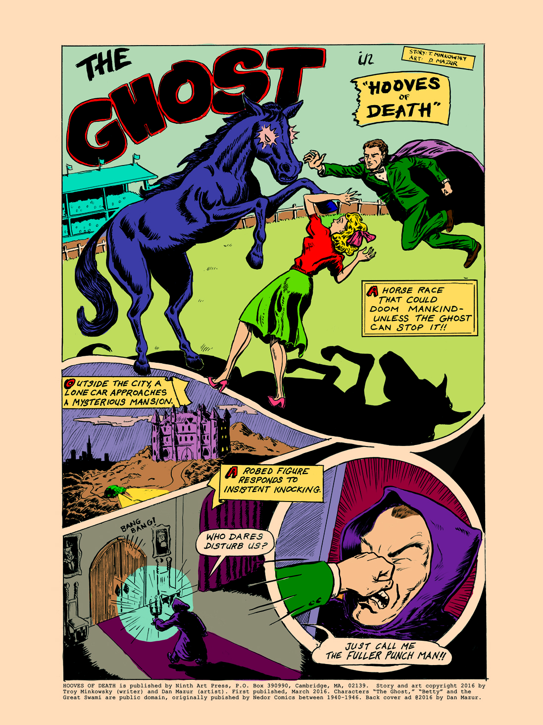
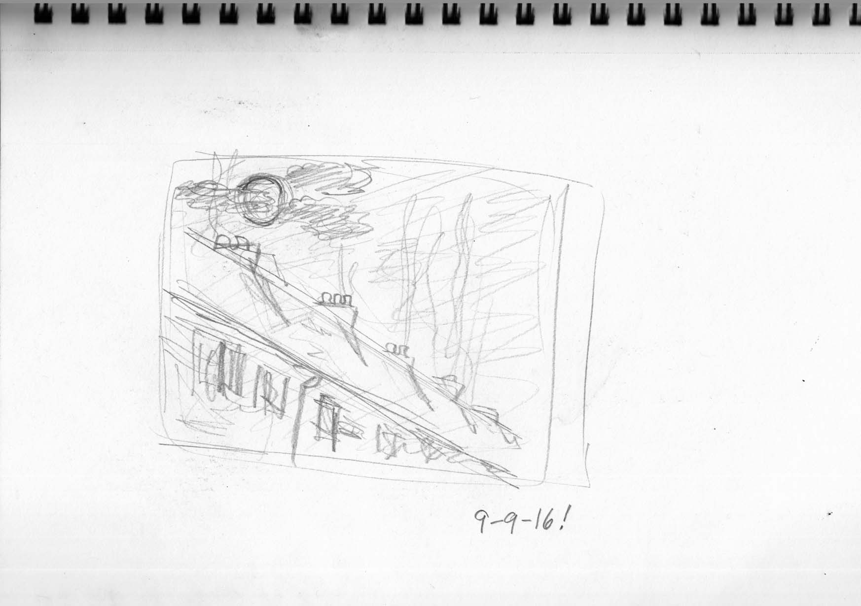 If I hadn’t felt guilty about not posting, I might have done nothing that day! Â So that’s something.
The next two days, I did nothing.
If I hadn’t felt guilty about not posting, I might have done nothing that day! Â So that’s something.
The next two days, I did nothing.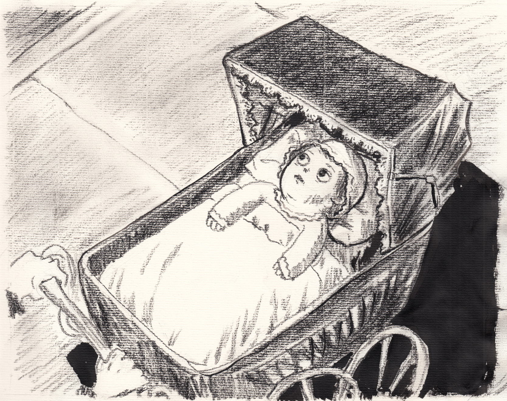 I’m okay with the expression. Â Trying to make it a little more neutral, less scared or worried. Â In fact, what was wrong with this version? Â There was something I didn’t like about it, because I did it again, this time switching from the woven-textured charcoal paper back to regular drawing paper.
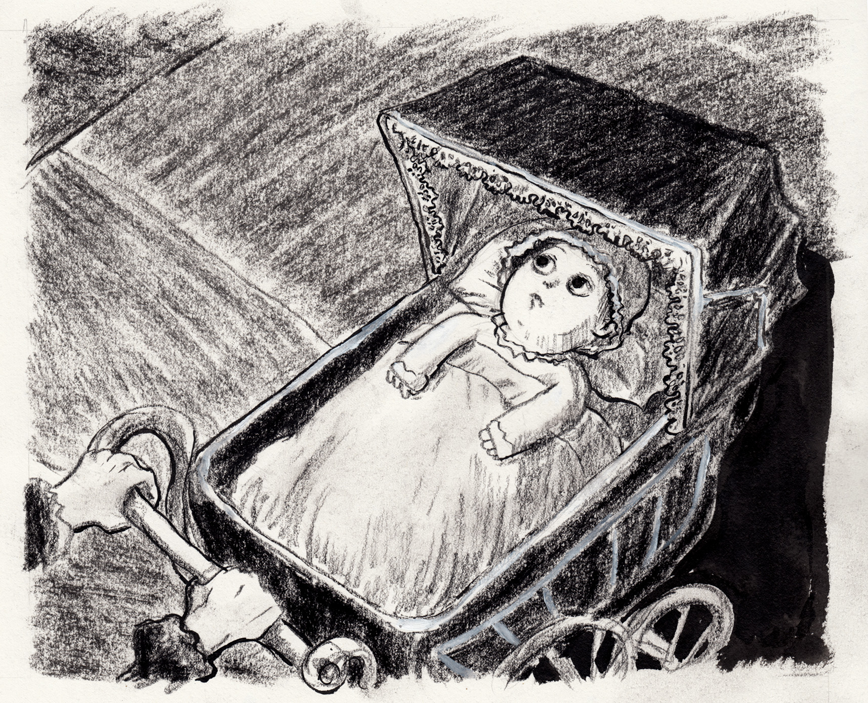 I finished this and I wasn’t satisfied… overdoing the textures? Â Getting fussy with the details? Â Muddy? Â Airless? Â Without even time to scan it, I brought it with me to the BCR meeting and put it up on the board. Â By the end of the meeting I was feeling actually pretty okay with it. Â Time to move on. Â When the time comes, I’m not even sure which version of this page I will like best. Â But this last one seems the most polished.
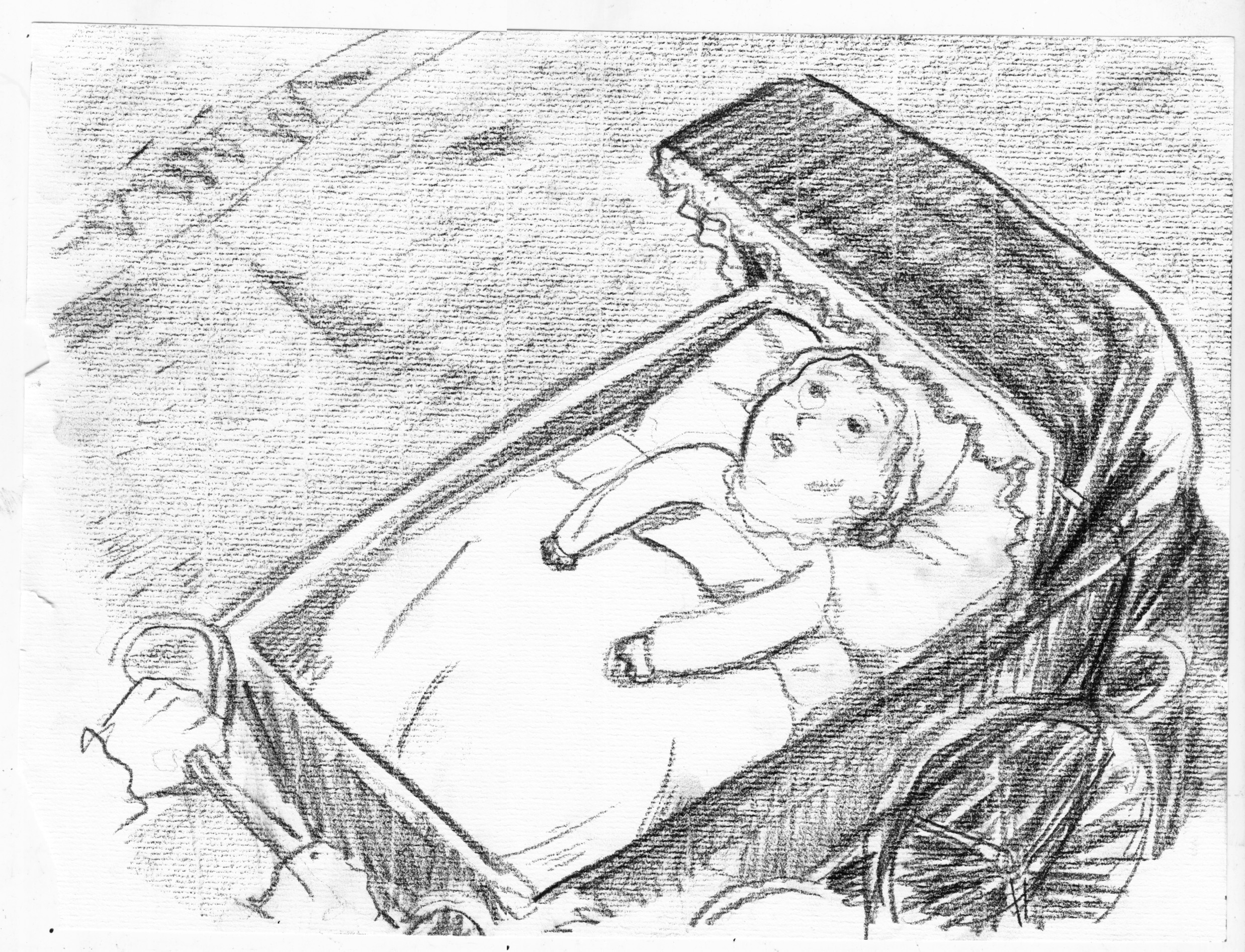 Terrible expression. Â Terrible carriage wheel
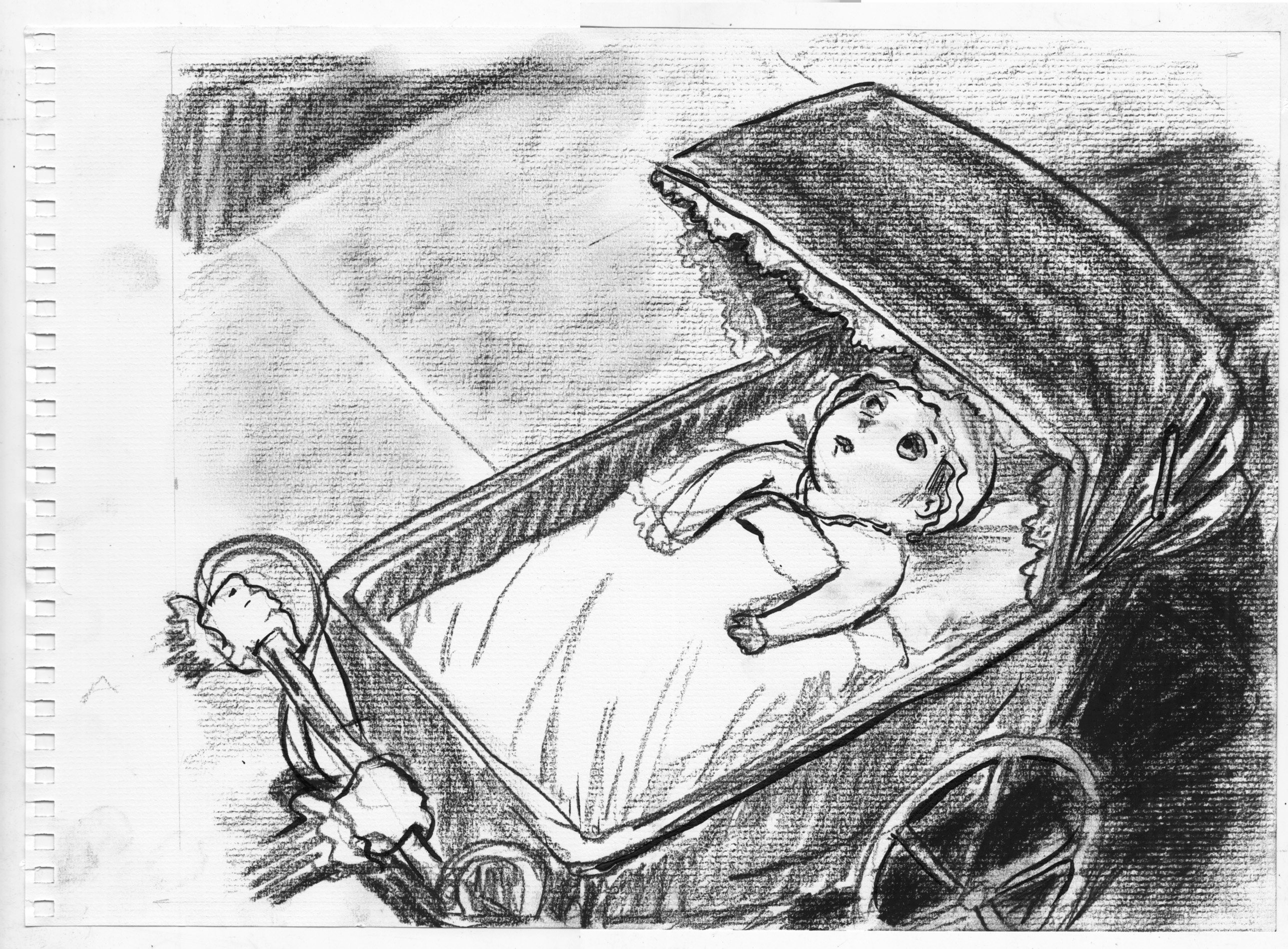 Working on getting the tonalities better here. I have also decided to switch to charcoal paper, with that woven texture, because I liked it in earlier sketches, has a real “fine-art” look! Â But, makes it harder to work on fine details. Â The expression is here is better, but the drawing is muddy.
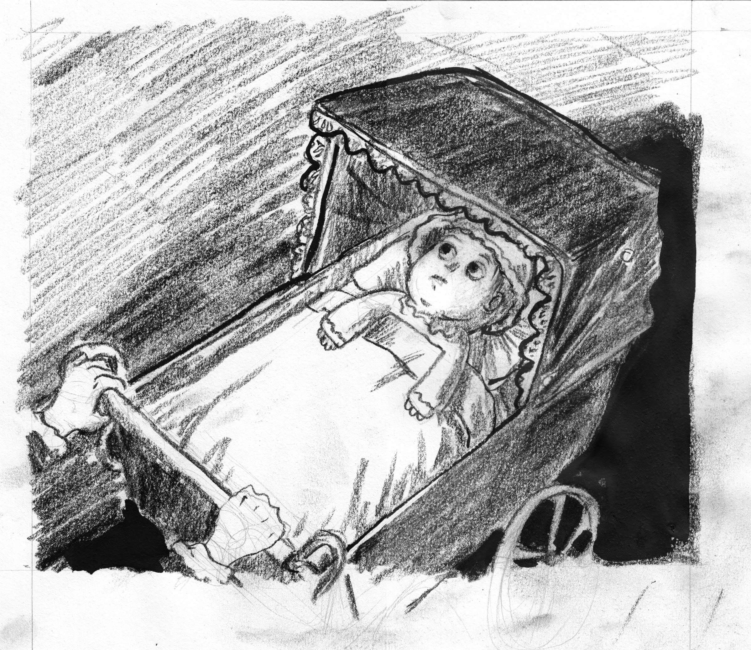 I actually like this expression pretty well. Â I switched back to regular drawing paper, but looking at it here on the screen I liked the way the texture worked in the middle pictures, especially in the sidewalk on the upper right, where I smudged it up a bit. Â Better than the scribbly lines in the bottom image.
Oh well, at least I did something today. Â Hopefully I can nail this tomorrow.
I actually like this expression pretty well. Â I switched back to regular drawing paper, but looking at it here on the screen I liked the way the texture worked in the middle pictures, especially in the sidewalk on the upper right, where I smudged it up a bit. Â Better than the scribbly lines in the bottom image.
Oh well, at least I did something today. Â Hopefully I can nail this tomorrow. My one sorrow: I actually measured to try and get the two window-things to be the same size.. yknow, like they would be on an actual building. Â But in the frantic heat of drawing, I somehow ended up with the one on the right much narrower.
I guess I could cheat, and squeeze the left side oft he picture in photoshop. Â It goes against all my principles, but I’ll do it. Â First I use the marquee tool to isolate different parts of the picture as separate layers:
My one sorrow: I actually measured to try and get the two window-things to be the same size.. yknow, like they would be on an actual building. Â But in the frantic heat of drawing, I somehow ended up with the one on the right much narrower.
I guess I could cheat, and squeeze the left side oft he picture in photoshop. Â It goes against all my principles, but I’ll do it. Â First I use the marquee tool to isolate different parts of the picture as separate layers:

 Then, I stretch the right window layer out slightly… and squeeze the left window to be a little smaller, and combine all ingredients:
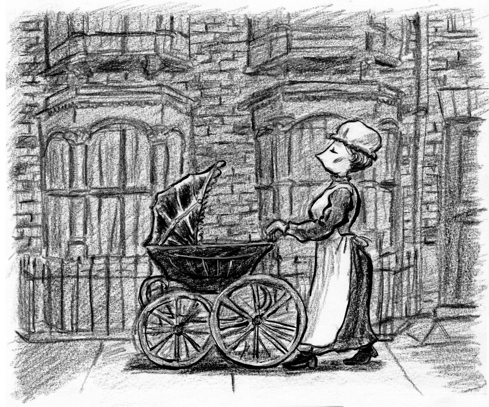 Barely noticeable, but it makes me happier, and took less than an hour. Â And I even had some time to start sketching/planning next moves. Â Back to thumbnails.
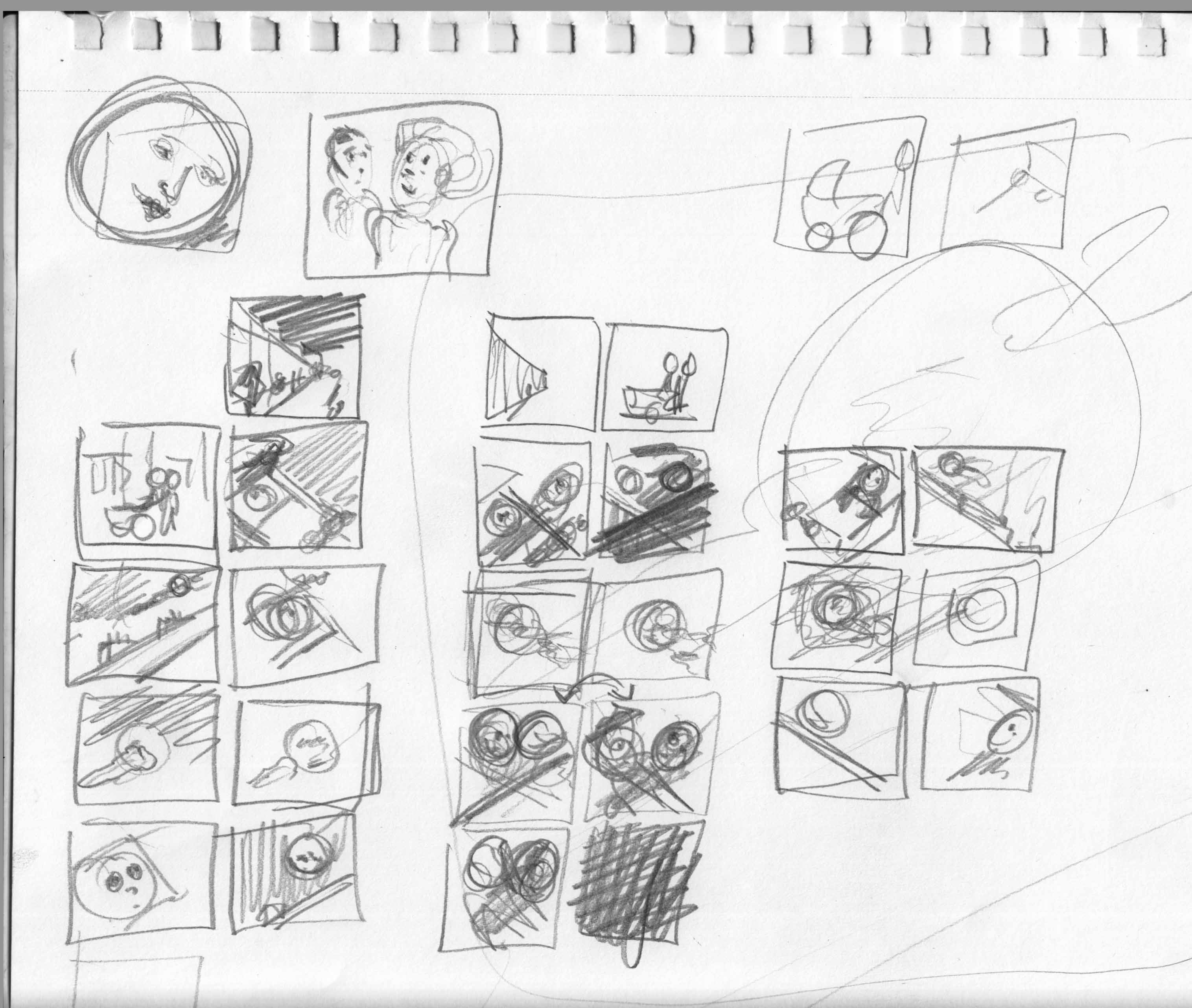
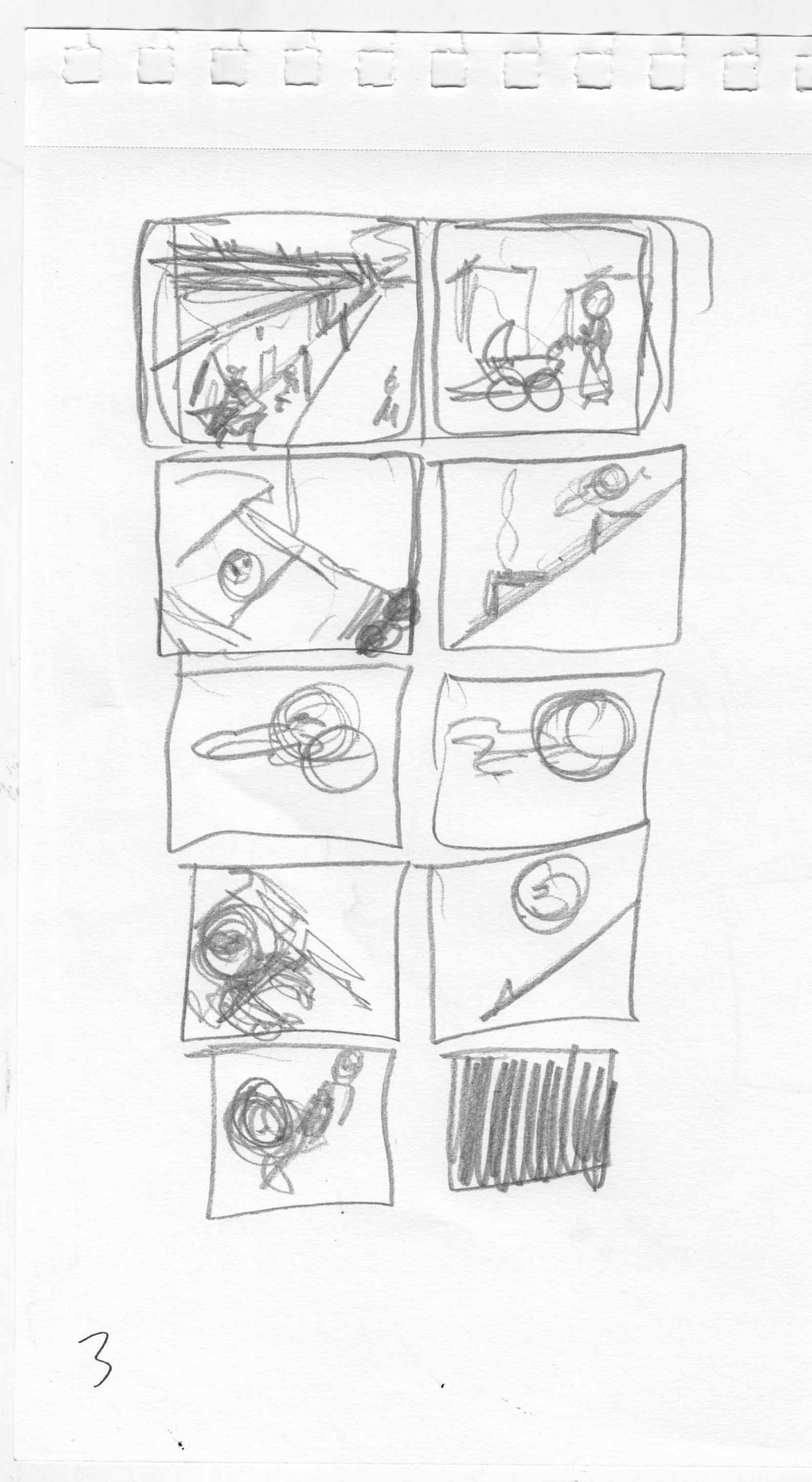 Grappling with some basic questions for the spreads, and at this point I have to nail it down: the baby is looking up at the moon. The moon is looking down at the baby. Â Does it work better to have them “facing” each other across the fold?
 That seems the more obvious, reinforcing the left-right reading direction.
Or is it better to have them facing opposite directions.. baby on the left page, looking up and to the left / moon on the right-hand page (i think they’re called recto and verso), looking down to the right.
That seems the more obvious, reinforcing the left-right reading direction.
Or is it better to have them facing opposite directions.. baby on the left page, looking up and to the left / moon on the right-hand page (i think they’re called recto and verso), looking down to the right.
 I feel like that could help the reader take in each image on its own, slow down the flow from image to image.
I fiddled with the layout a bit, and made another decision: have the baby reach for the moon, perhaps smiling, in the last page of the chapter. Â Well, no, the LAST page would be black. Â Which has some meaning: the baby reaches but grasps nothing of course.
I feel like that could help the reader take in each image on its own, slow down the flow from image to image.
I fiddled with the layout a bit, and made another decision: have the baby reach for the moon, perhaps smiling, in the last page of the chapter. Â Well, no, the LAST page would be black. Â Which has some meaning: the baby reaches but grasps nothing of course.
 Sketches of page 2. Â Working out the perspective. Â If the baby’s going to reach in the last image, then her arms should be on top of the blanket (at least one arm should, and it has to be the left arm because when she reaches I don’t want it to block her face).
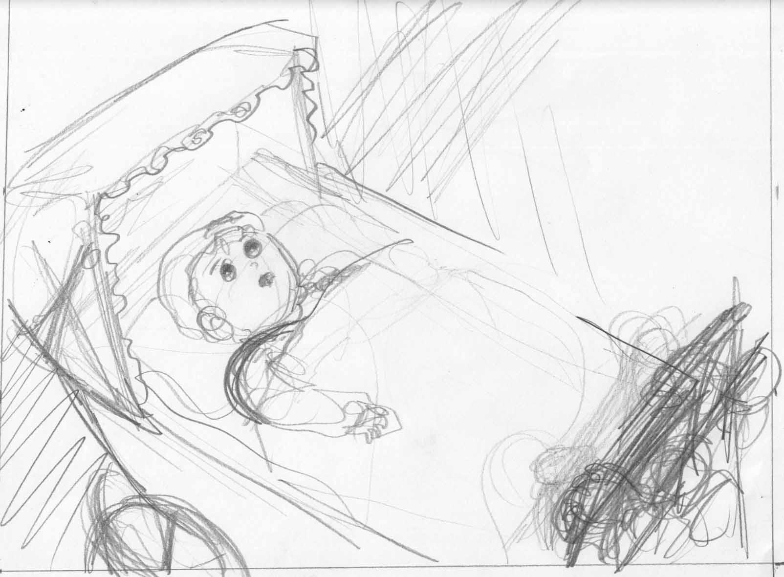
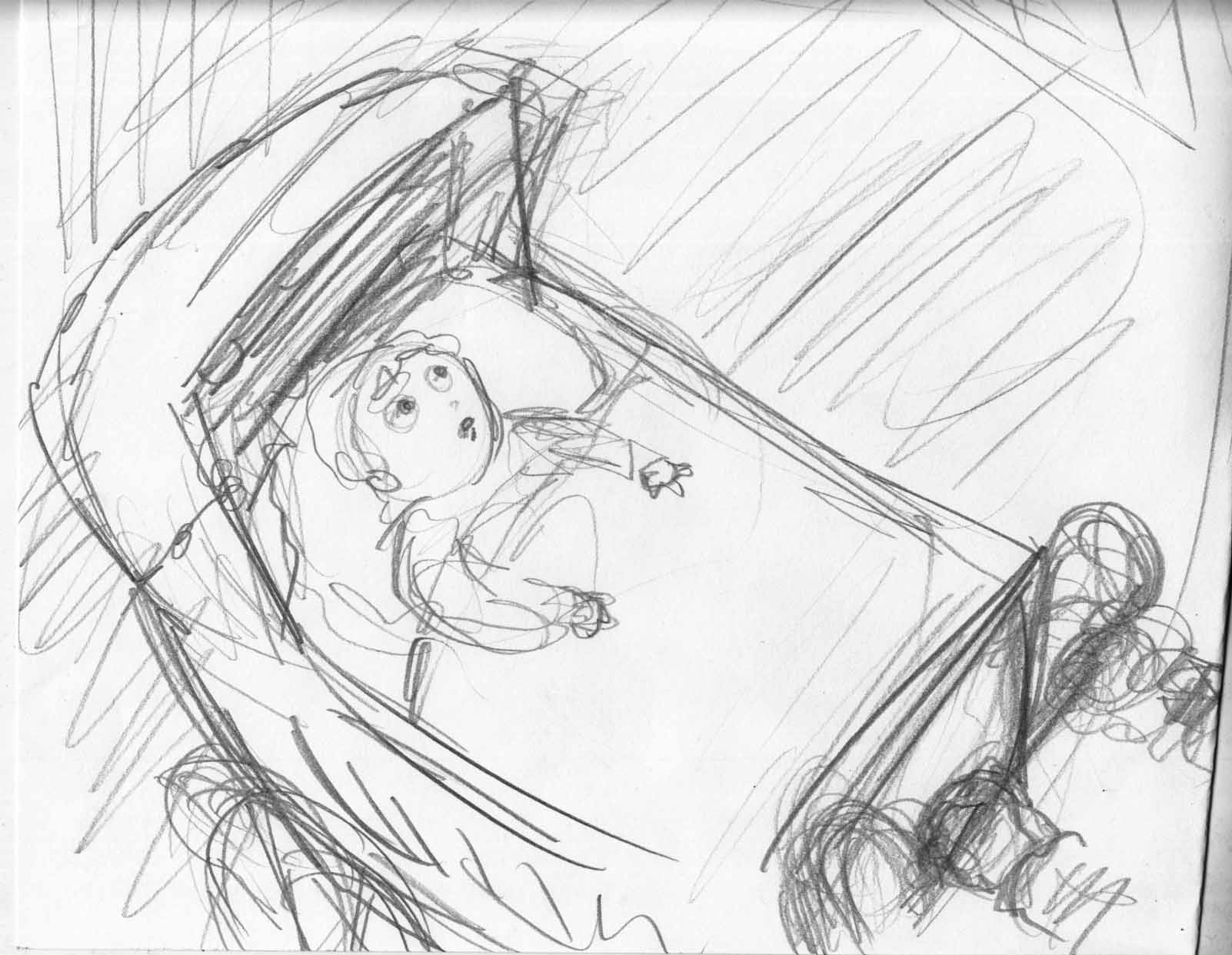
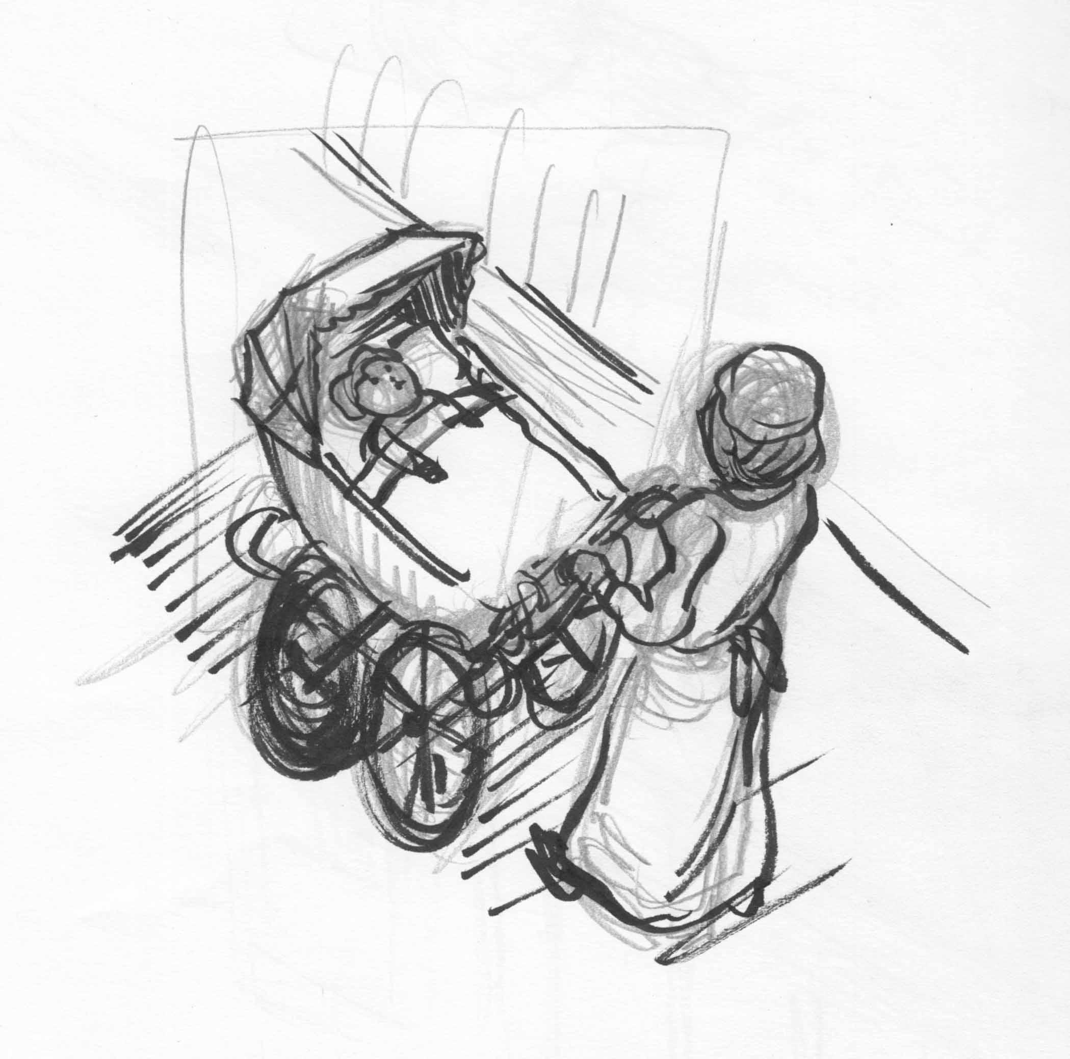
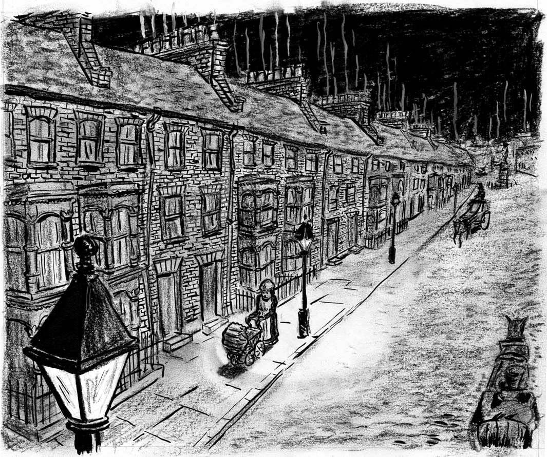 I wasn’t feeling so happy after finishing this page. Â Didn’t really feel in control of the shading with conte and charcoal… felt muddy. Â Even though it’s a fairly elaborate drawing, I still felt I rushed in places. Â Not happy with the figure and the vehicles, after all those sketches.
But… better not to pay attention to those negative thoughts and move on. Â Progress, not perfection!
(Still I might re-draw it at some point… MWAHAHAHAHAHHAHAHHHHAAAAHAHAAA!!!)
And I even had time to do some sketches of the next page.
I wasn’t feeling so happy after finishing this page. Â Didn’t really feel in control of the shading with conte and charcoal… felt muddy. Â Even though it’s a fairly elaborate drawing, I still felt I rushed in places. Â Not happy with the figure and the vehicles, after all those sketches.
But… better not to pay attention to those negative thoughts and move on. Â Progress, not perfection!
(Still I might re-draw it at some point… MWAHAHAHAHAHHAHAHHHHAAAAHAHAAA!!!)
And I even had time to do some sketches of the next page.
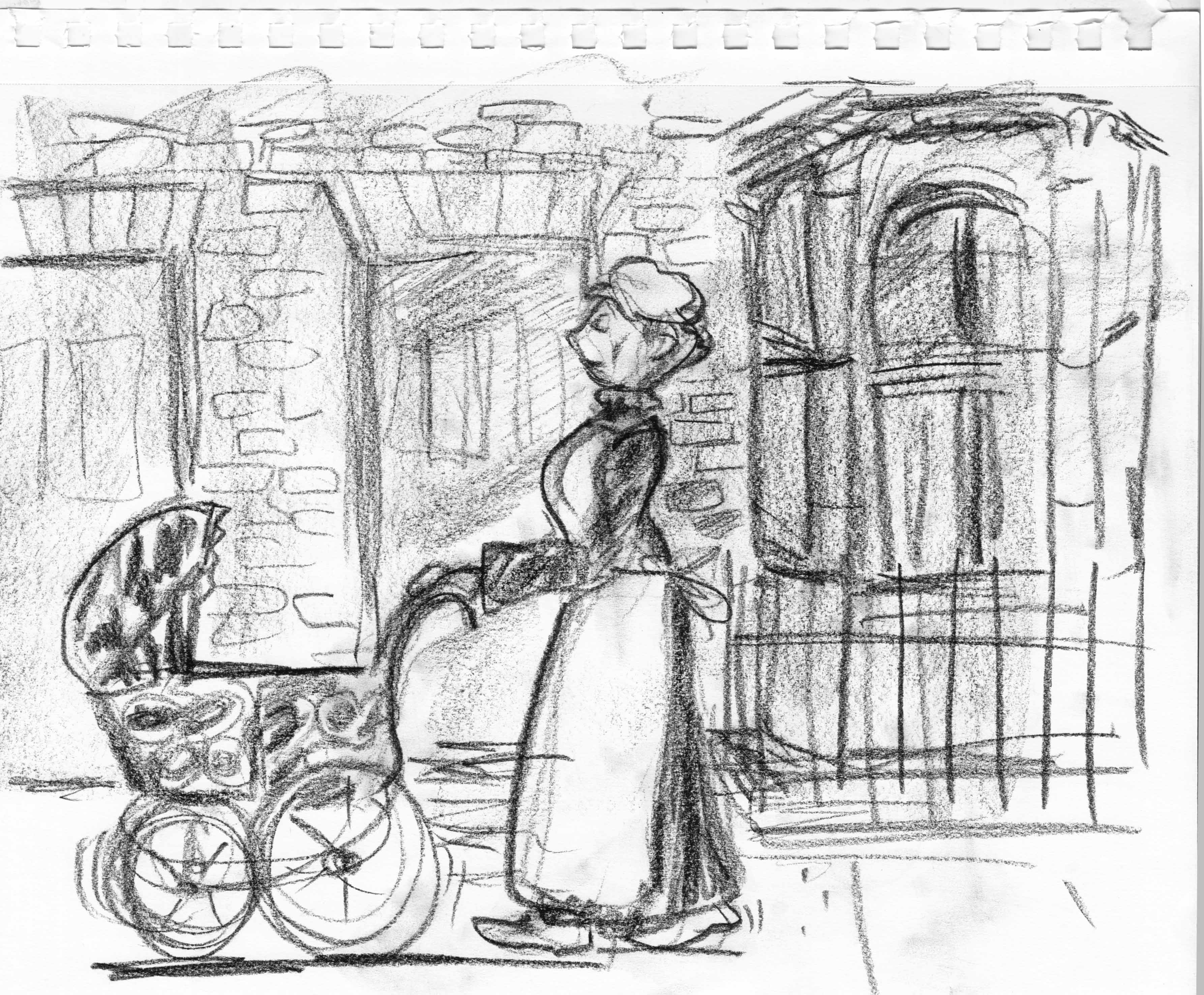
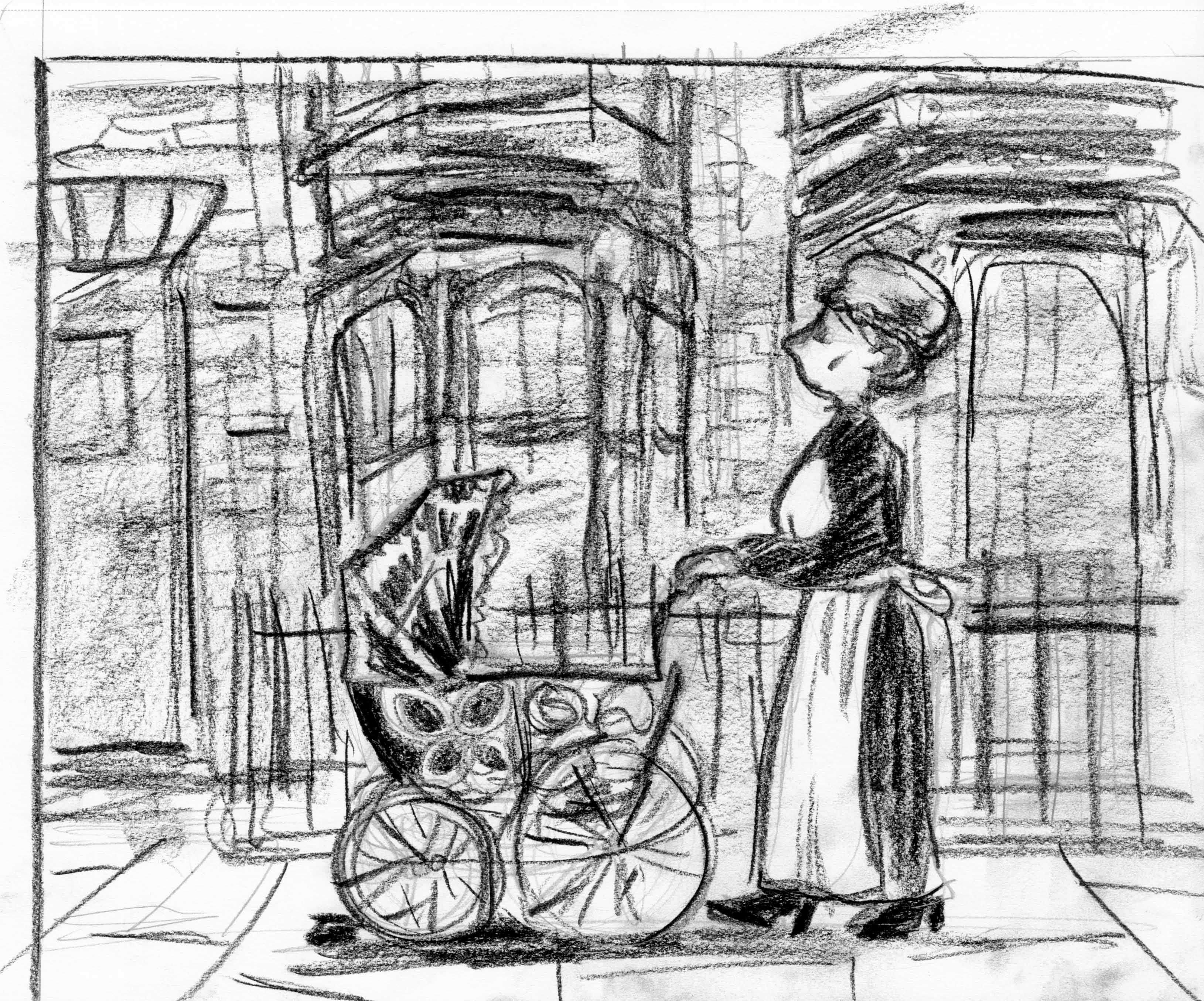 just fine-tuning the composition/placement of architecture in the background:
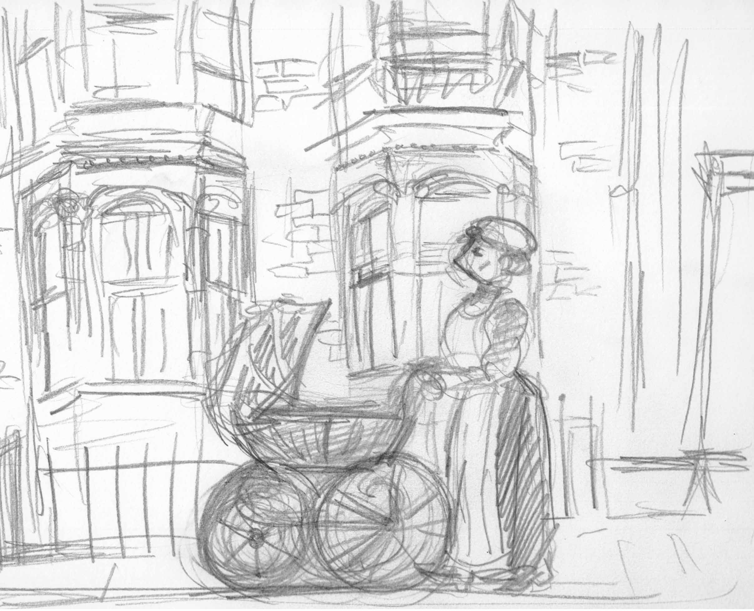 Okay.
Although I used ink-spatter technique in the bg of my first sketch of this page, and had ideas of trying different techniques from page to page, I think that’ll be too much, it’ll be cacaphonous. Â I’m going to stick with conte and ink again for this page. Â There will still be a variety of media, as I’m going to use acrylics for the images of the moon, but that should be enough. Â I’ll try the spattering again later, probably for chapter 3.
Okay.
Although I used ink-spatter technique in the bg of my first sketch of this page, and had ideas of trying different techniques from page to page, I think that’ll be too much, it’ll be cacaphonous. Â I’m going to stick with conte and ink again for this page. Â There will still be a variety of media, as I’m going to use acrylics for the images of the moon, but that should be enough. Â I’ll try the spattering again later, probably for chapter 3.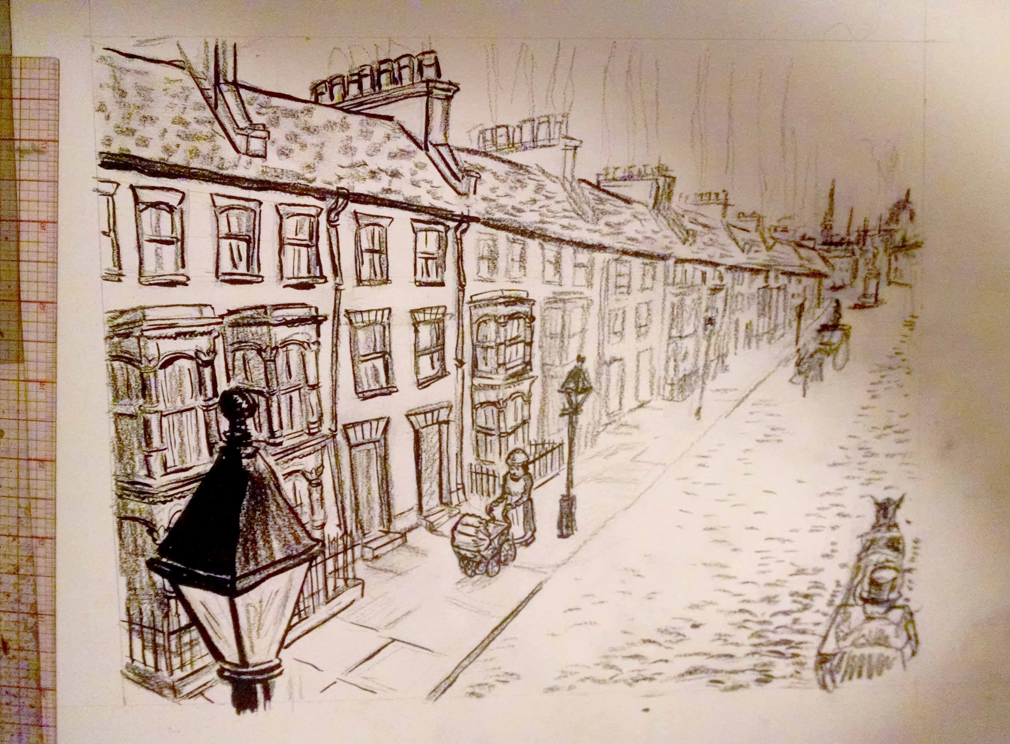
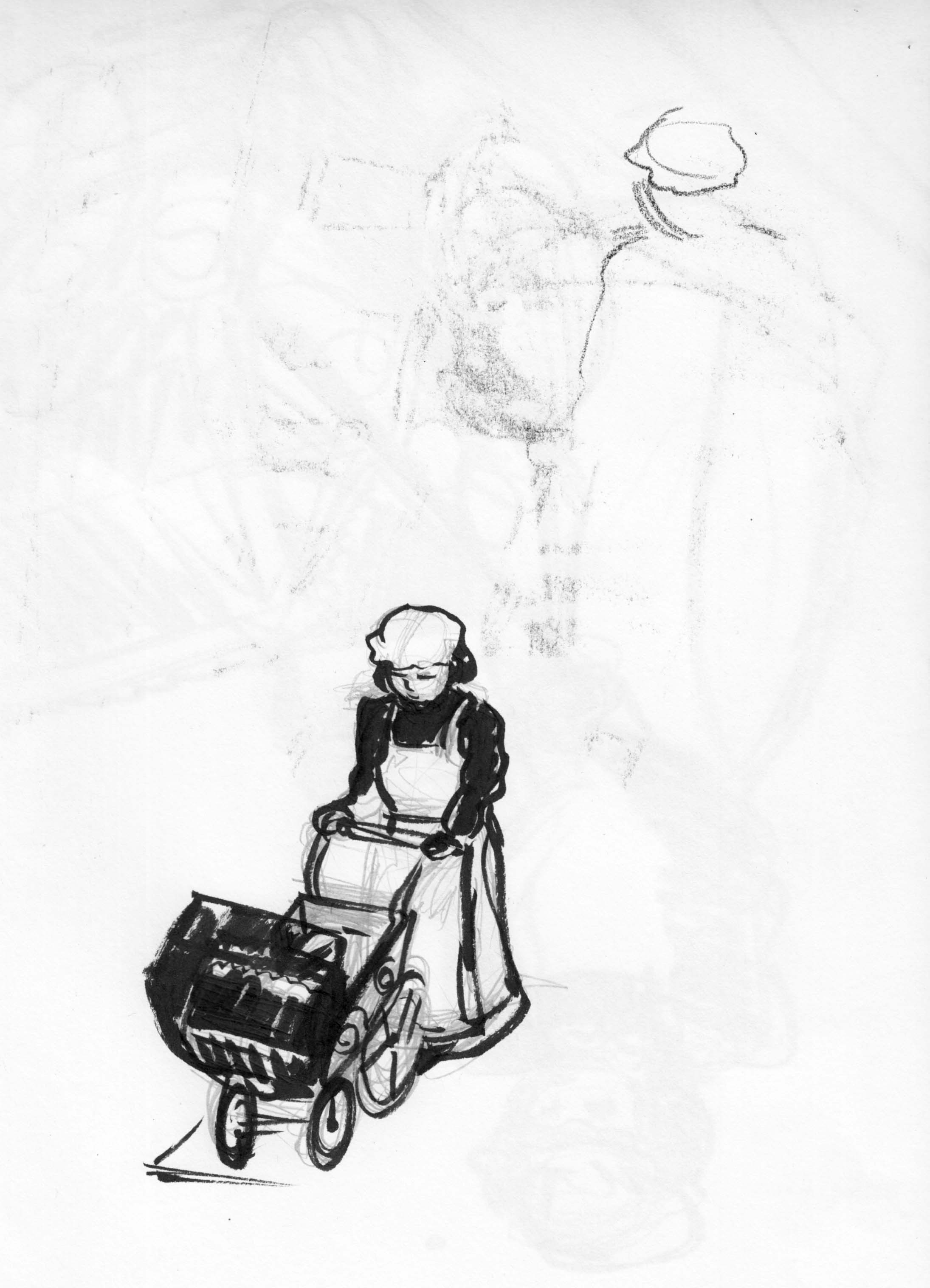
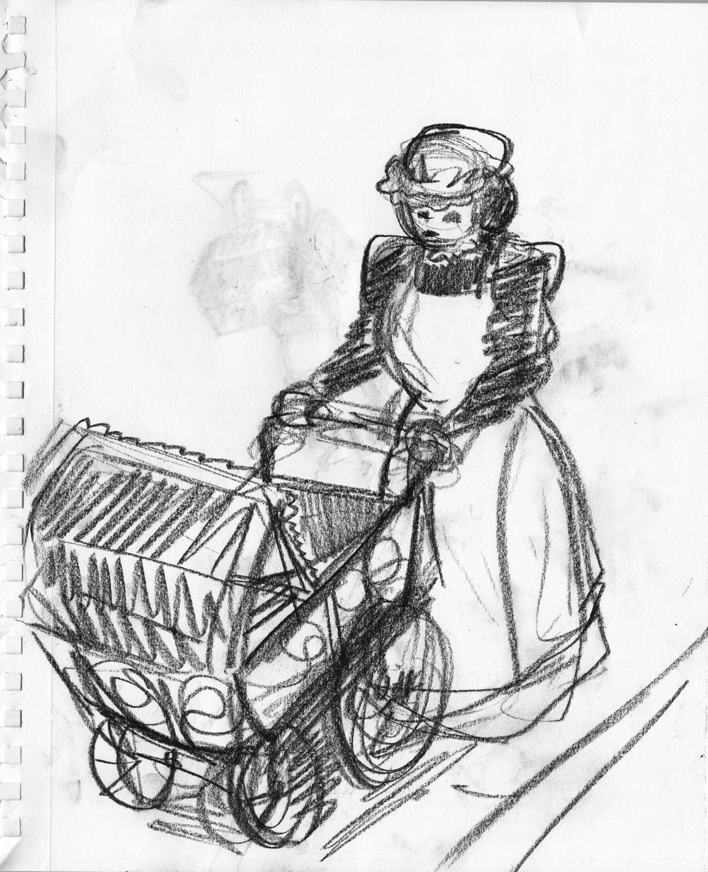 Then a little more fussing with the composition.
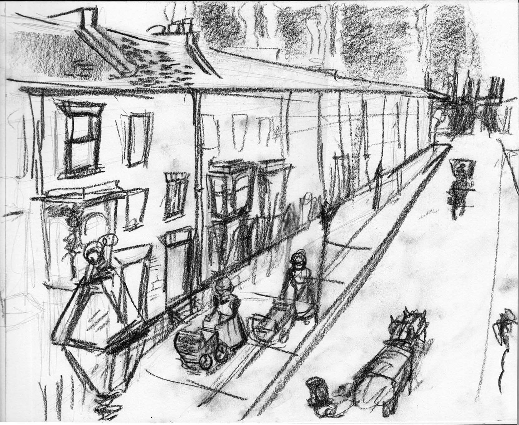 In the last post I said I was thinking about the personality of the picture, and I think what I mean by that is something of a playful quality, like children’s illustration.  Is this a book for children?  Not exactly… it will be acceptable for children, but I;m not really reaching out to children the way you have to in a kids’ book. I  think of it more as having the mood and aesthetic qualities of a fairly serious children’s story, but probably more for an older reader.
Anyway, even though it’s not a humorous story, I want some sense of whimsy in the style. Â Looking for inspiration on my comics shelf, I chose one of my favorite comics, Gare Centrale, by Lewis Trondheim (writer) and Jean-Pierre Duffour (art).
In the last post I said I was thinking about the personality of the picture, and I think what I mean by that is something of a playful quality, like children’s illustration.  Is this a book for children?  Not exactly… it will be acceptable for children, but I;m not really reaching out to children the way you have to in a kids’ book. I  think of it more as having the mood and aesthetic qualities of a fairly serious children’s story, but probably more for an older reader.
Anyway, even though it’s not a humorous story, I want some sense of whimsy in the style. Â Looking for inspiration on my comics shelf, I chose one of my favorite comics, Gare Centrale, by Lewis Trondheim (writer) and Jean-Pierre Duffour (art).
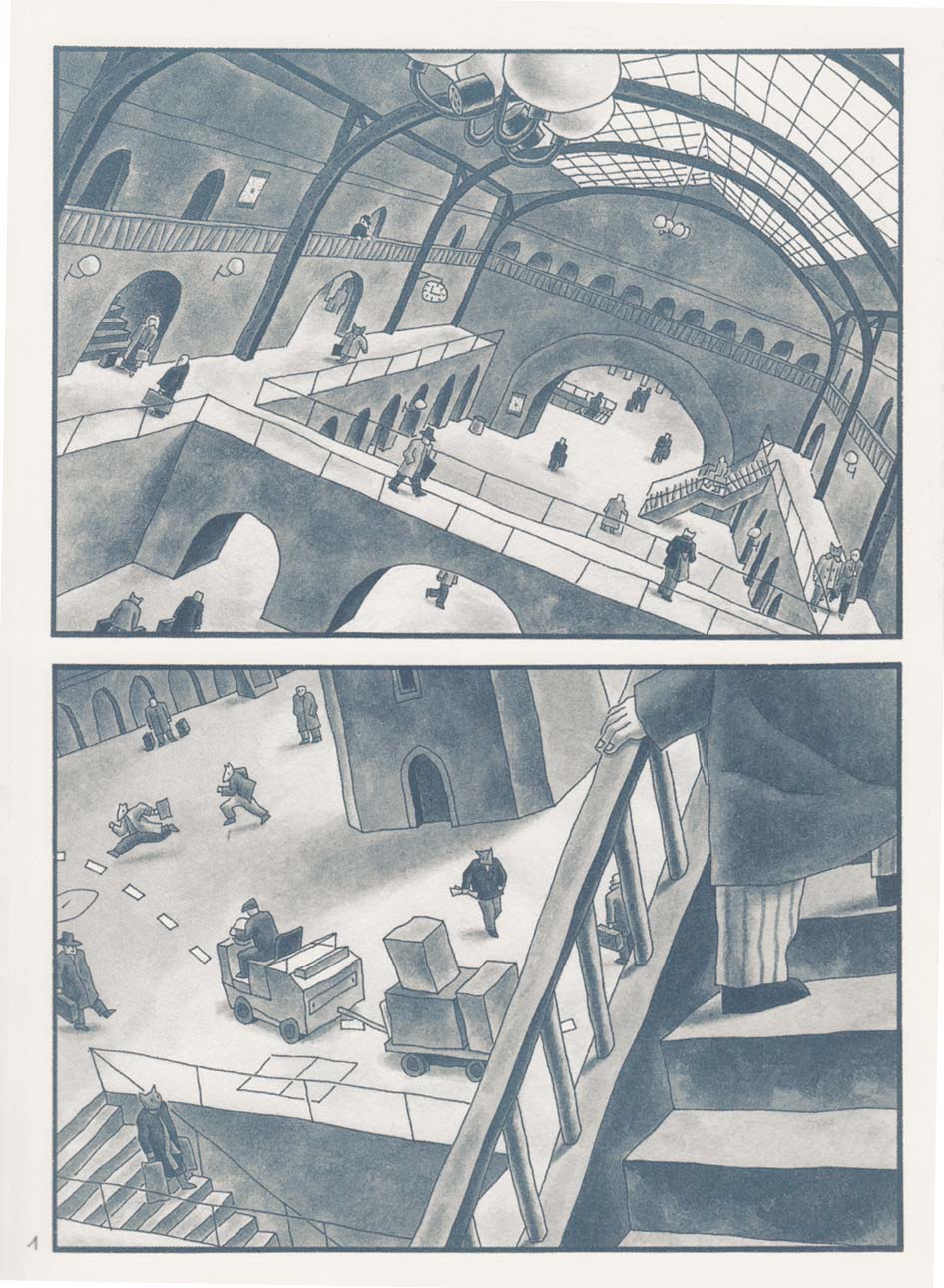
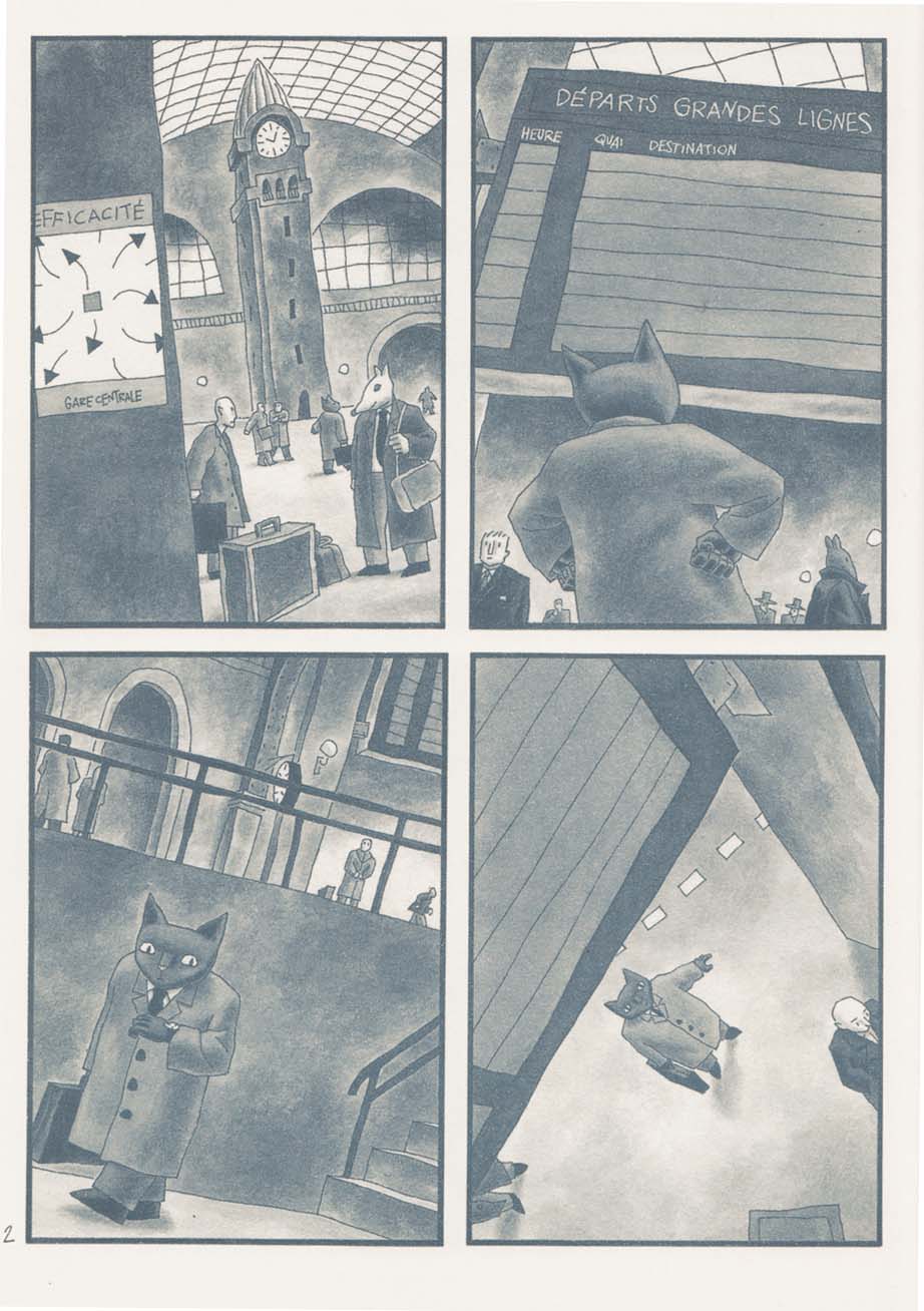
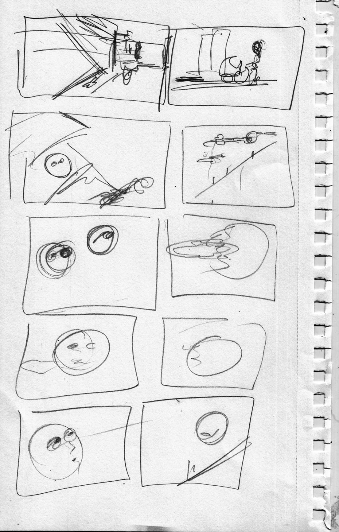 So now I circle back to the first page, the “establishing shot.” Â Since I first drew a rough version, I seem to have changed the dimensions that I’ll be working in… horizontal rectangle now, instead of a square. Â I did a few sketches, getting all hung up on the perspective:
Day two: Getting closer.
So now I circle back to the first page, the “establishing shot.” Â Since I first drew a rough version, I seem to have changed the dimensions that I’ll be working in… horizontal rectangle now, instead of a square. Â I did a few sketches, getting all hung up on the perspective:
Day two: Getting closer.


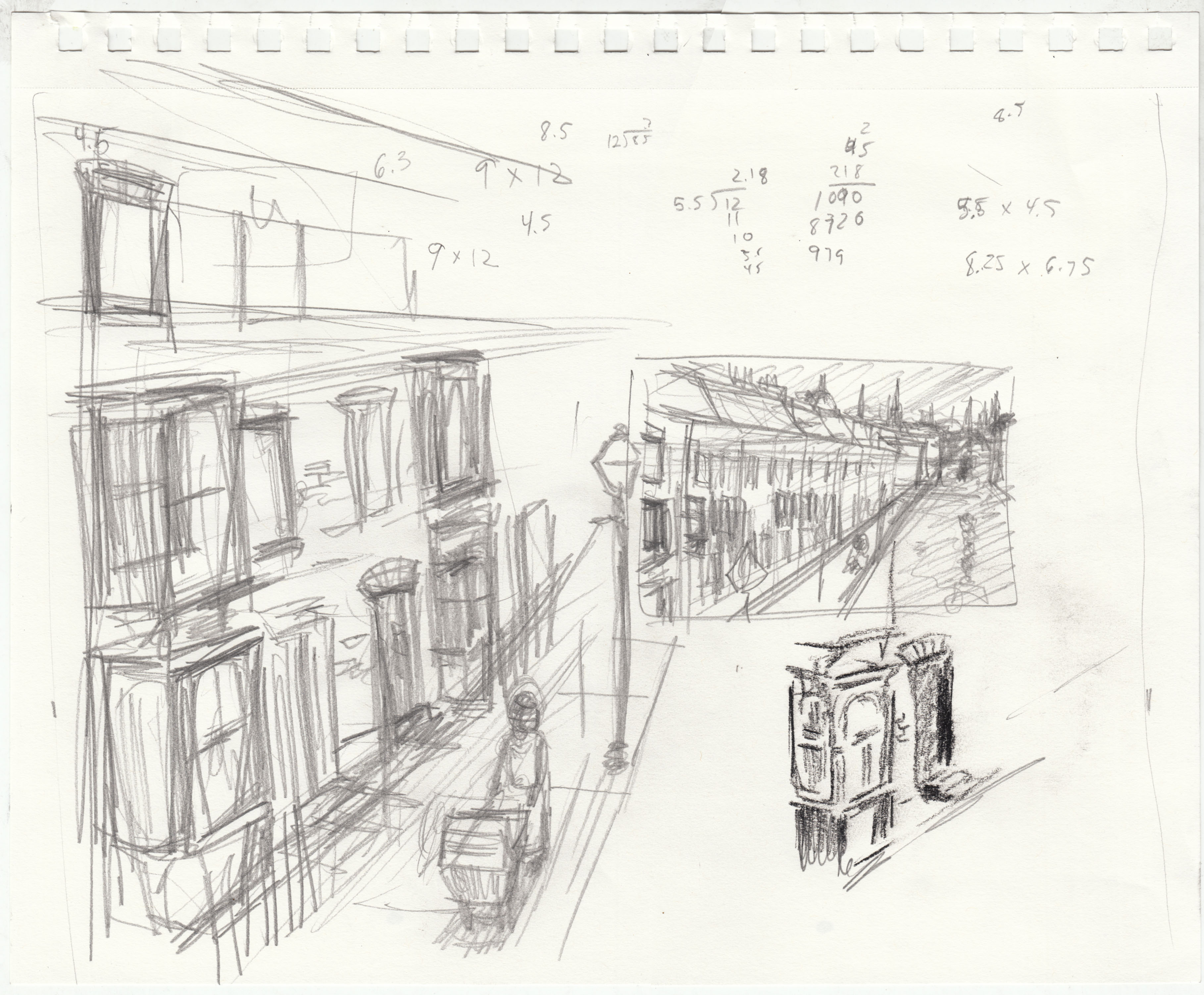 (those numbers are me trying to work out the dimensions of the final… based a little more on the way the mock-up worked. Â I am now thinking 5.5 x 4.5)
Then I tried a “final” version, on this fancy drawing paper I bought. Â Using pencil, conte crayon, brush and ink:
(those numbers are me trying to work out the dimensions of the final… based a little more on the way the mock-up worked. Â I am now thinking 5.5 x 4.5)
Then I tried a “final” version, on this fancy drawing paper I bought. Â Using pencil, conte crayon, brush and ink:
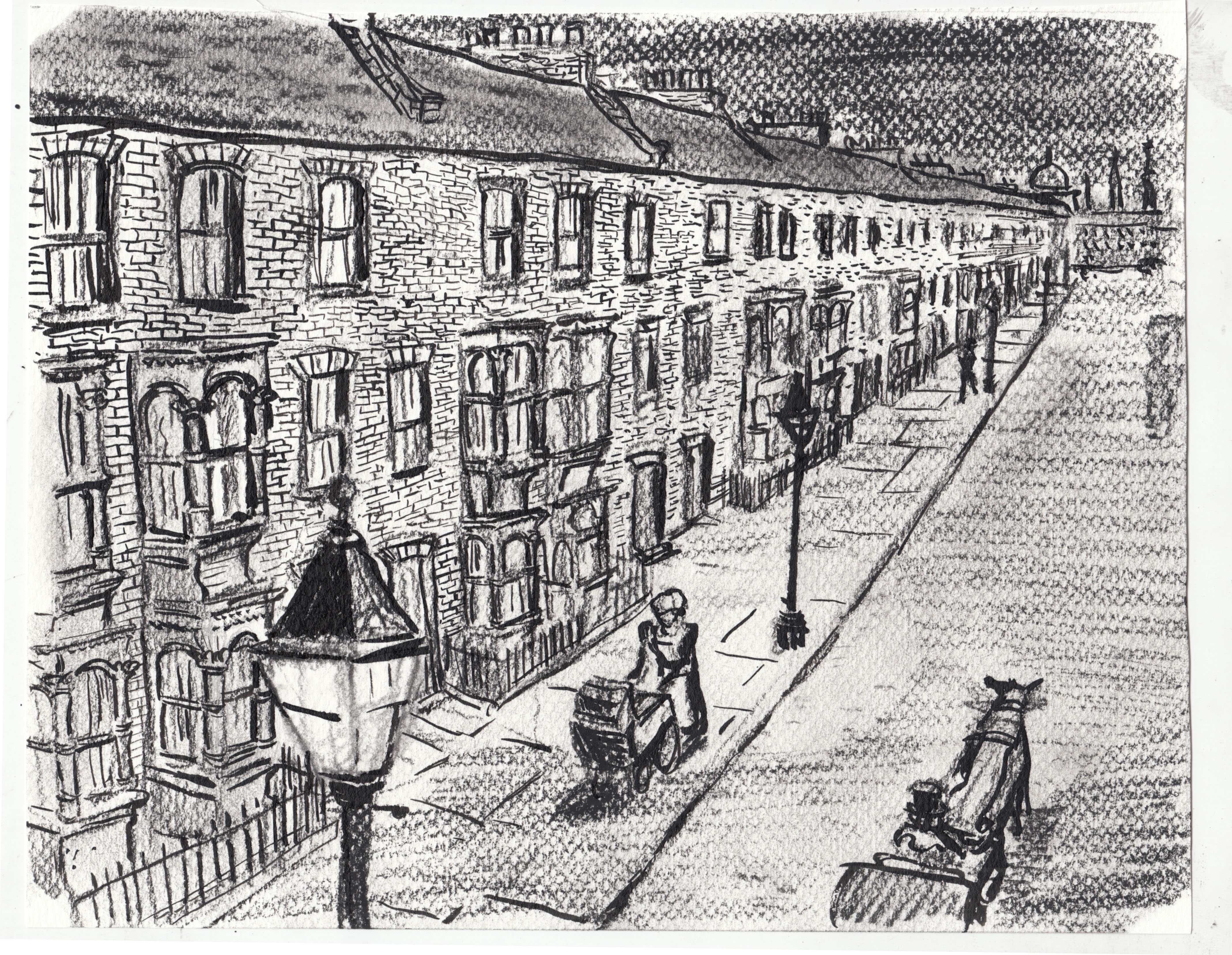 I don’t really get this paper… the texture is too intrusive. Â Maybe it’s just not to be used for this level of detail.
Otherwise, while I like this picture okay, I feel it’s lacking personality. Â A little too “straight” of a drawing for this project. Â I will try another approach tomorrow.
I don’t really get this paper… the texture is too intrusive. Â Maybe it’s just not to be used for this level of detail.
Otherwise, while I like this picture okay, I feel it’s lacking personality. Â A little too “straight” of a drawing for this project. Â I will try another approach tomorrow.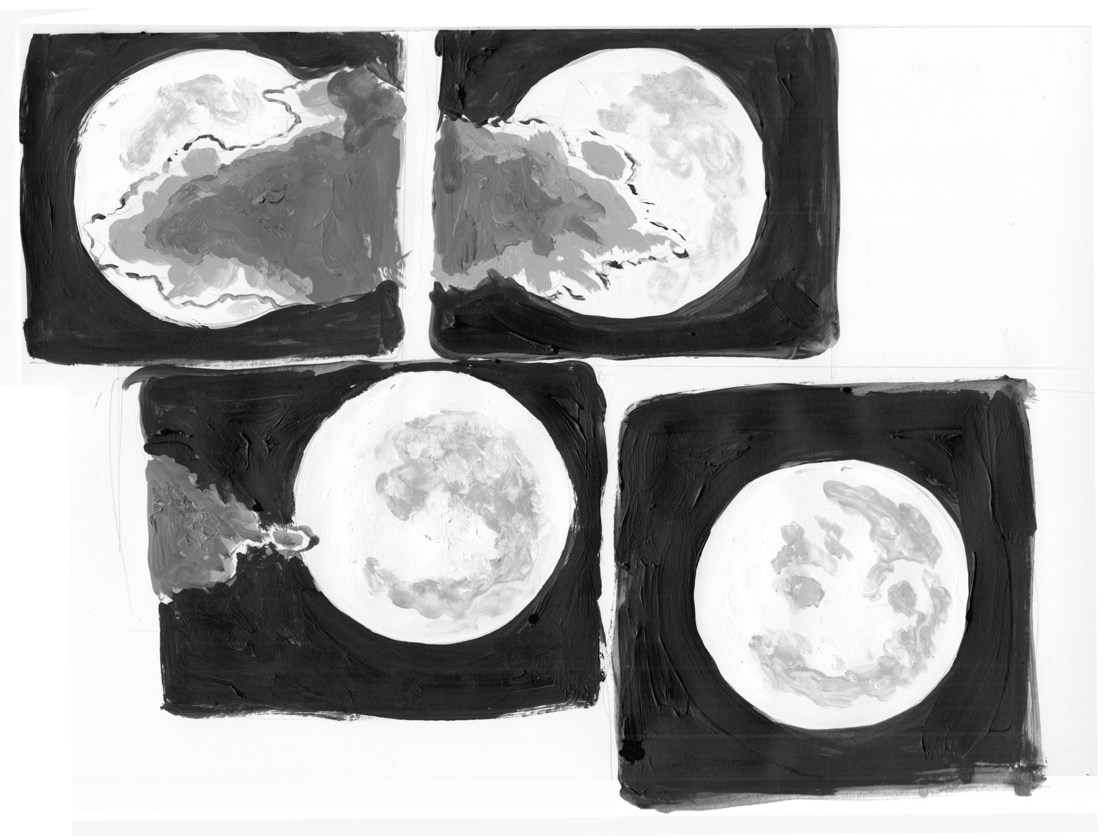 Not sure of the composition yet…. Â maybe a more conventional grid. Â Also, I had to flip the second panel because the direction of the cloud movement was wrong:
 I am finding that thumbnailing is inadequate for this project. Â In order to sense if I am telling the story with the right rhythm, I feel like I need to see how the page turns will really work.
I do a rough thumbnail of the page spreads….
I am finding that thumbnailing is inadequate for this project. Â In order to sense if I am telling the story with the right rhythm, I feel like I need to see how the page turns will really work.
I do a rough thumbnail of the page spreads….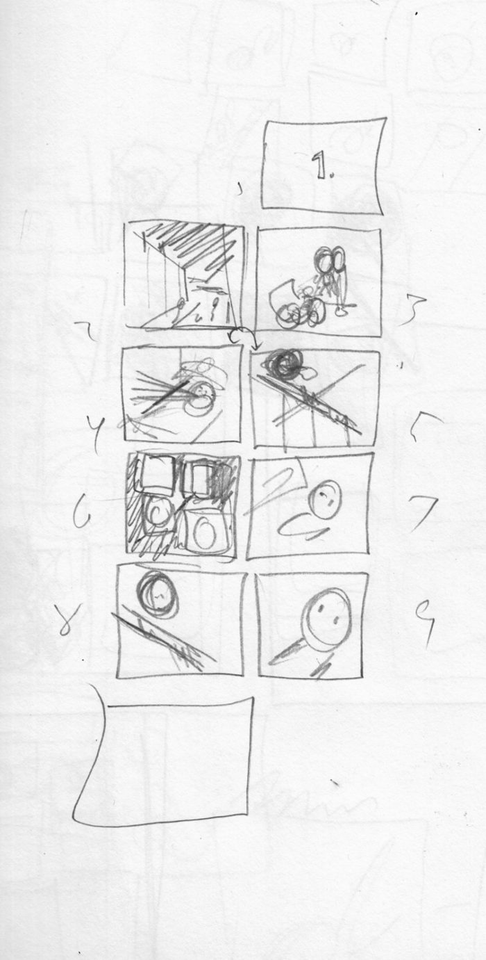 Then I print up the pages with the right layout… trim and tape them together to create a little mock-up of the first “chapter” of the story:
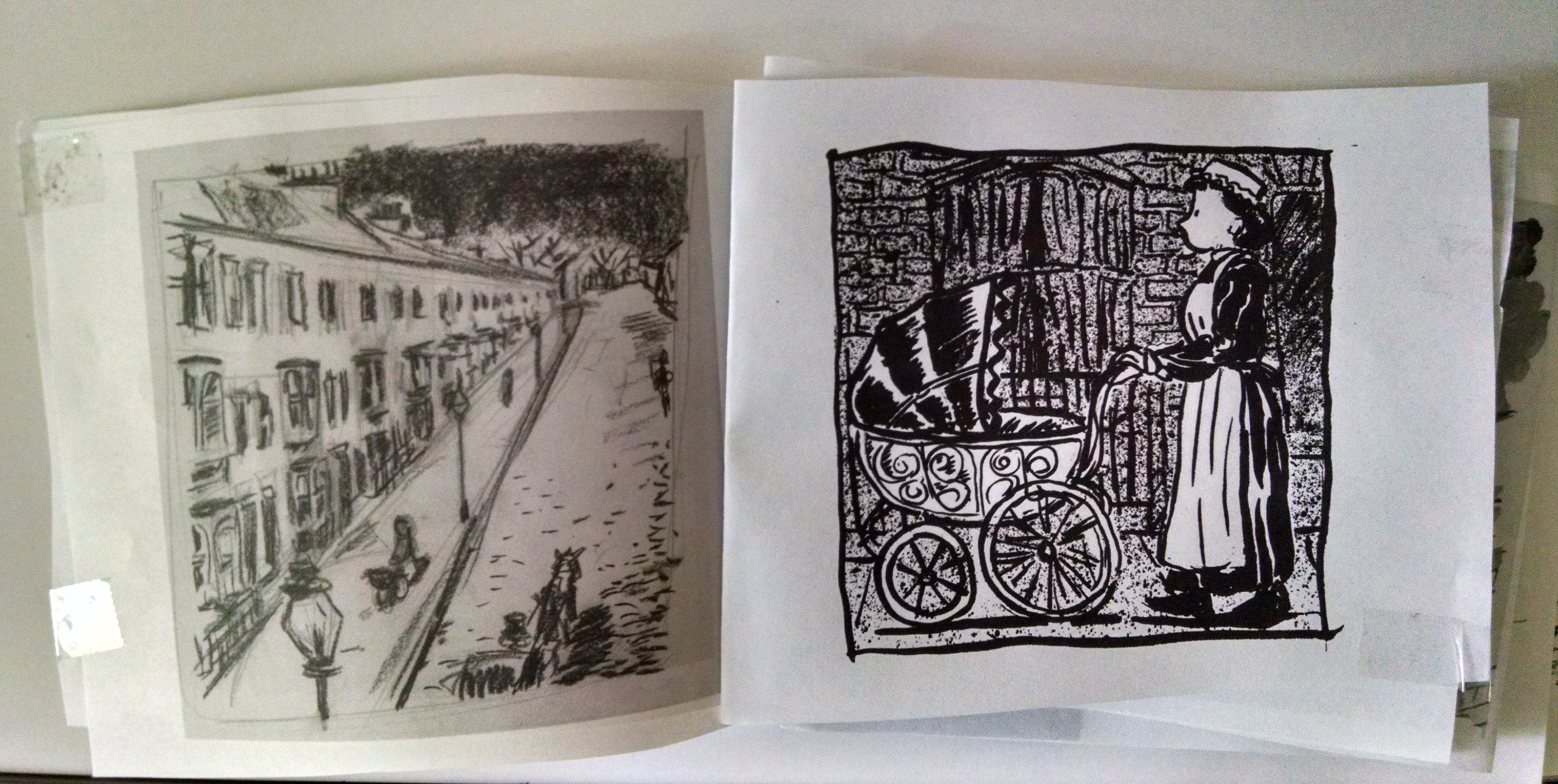
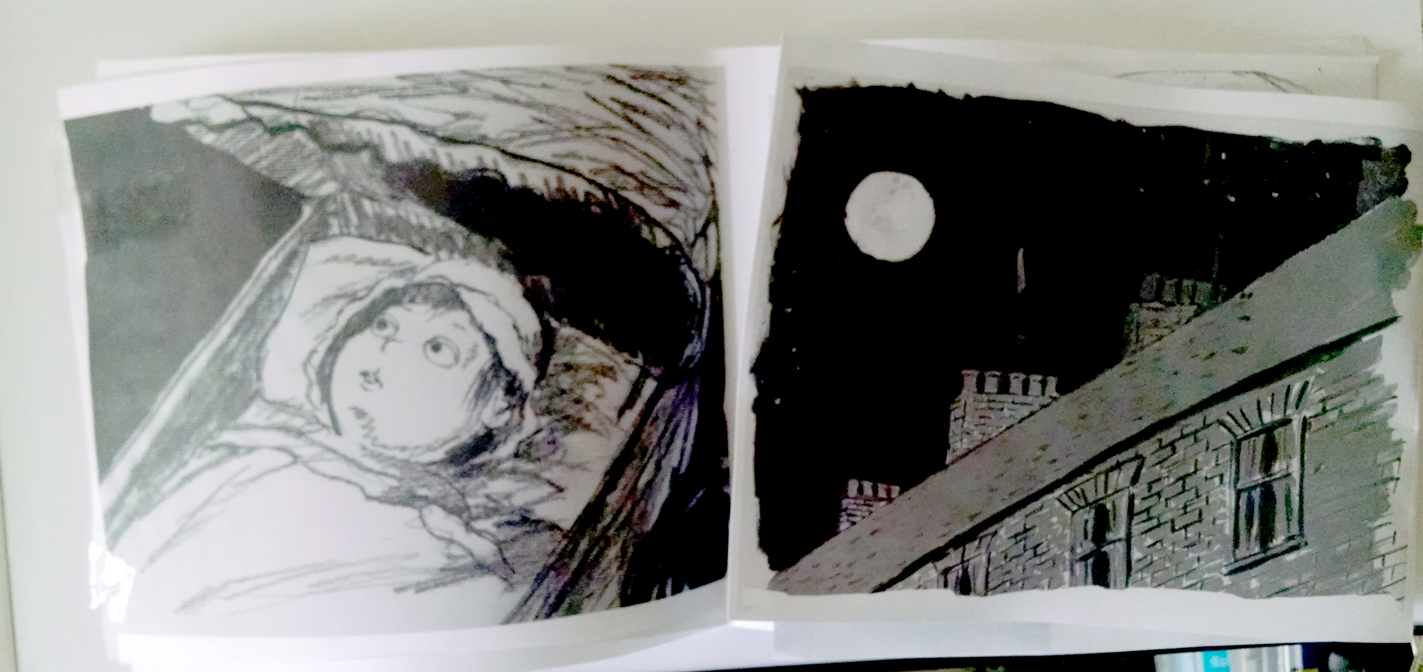
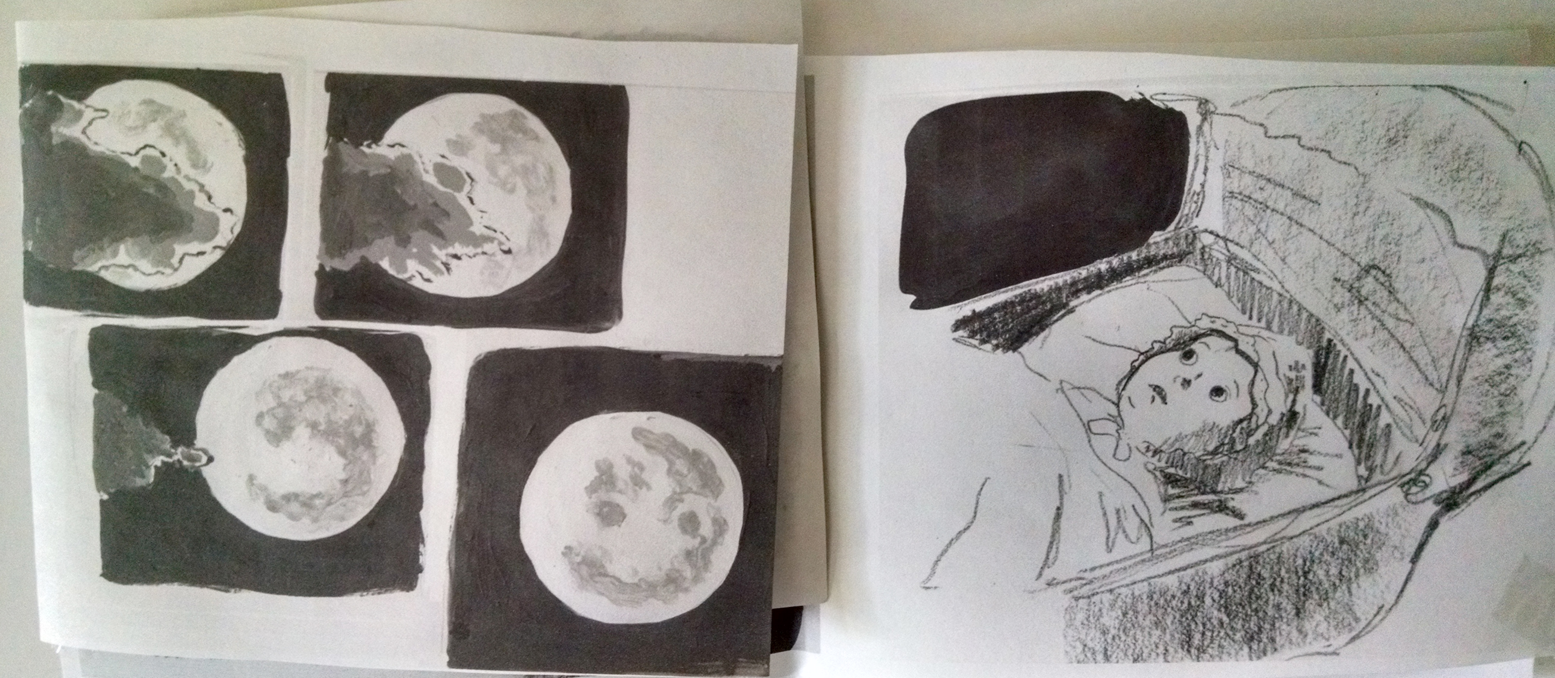
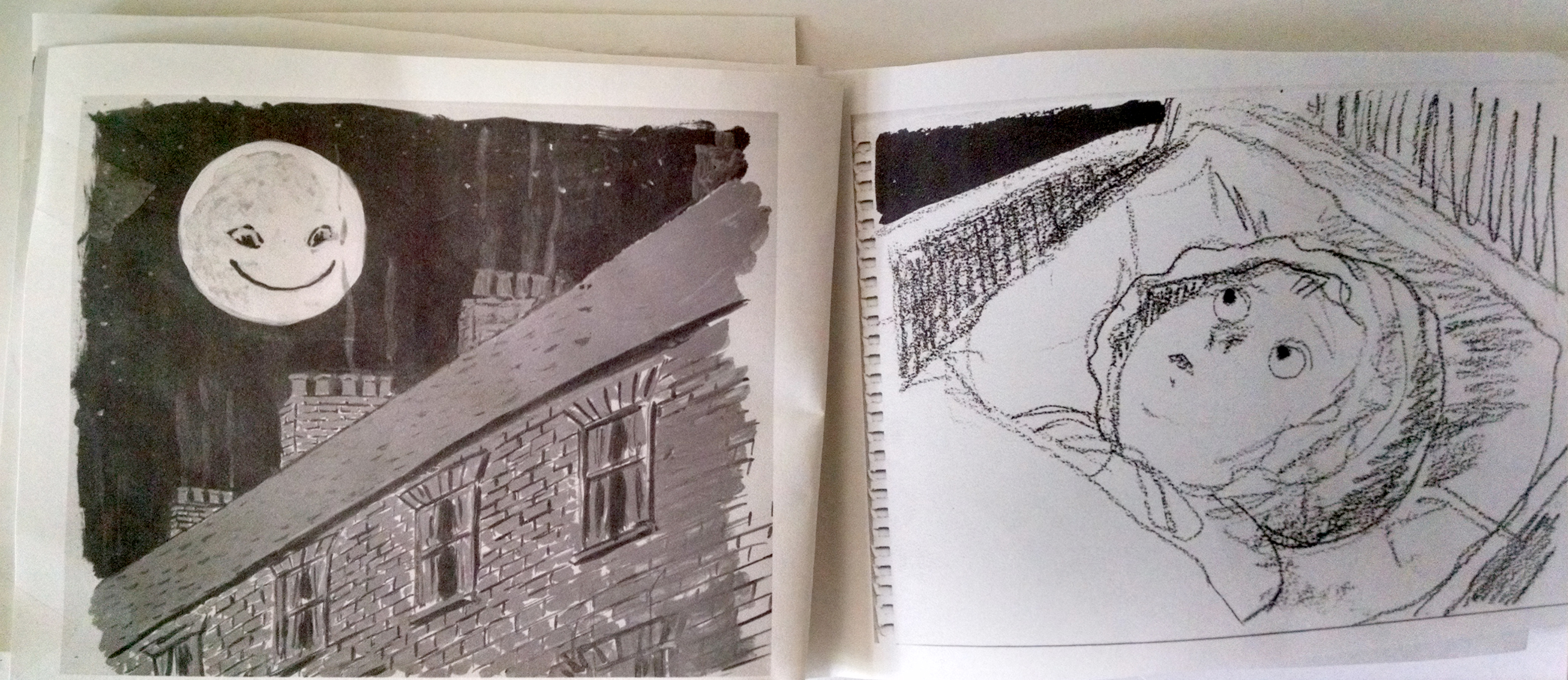 Better to work this out in advance than after I have drawn “final” pages… some of the sight-line angles of the shot-reverse shot-type pages between the baby and the moon/roofline would be affected if I have to move things around (and I want to avoid the same direction diagonals on facing pages).
Reading the mock-up, I make some adjustments, thumbnailing a new set of spreads”
Better to work this out in advance than after I have drawn “final” pages… some of the sight-line angles of the shot-reverse shot-type pages between the baby and the moon/roofline would be affected if I have to move things around (and I want to avoid the same direction diagonals on facing pages).
Reading the mock-up, I make some adjustments, thumbnailing a new set of spreads” Next, I’ll start roughing out these changed pages and see how it works….
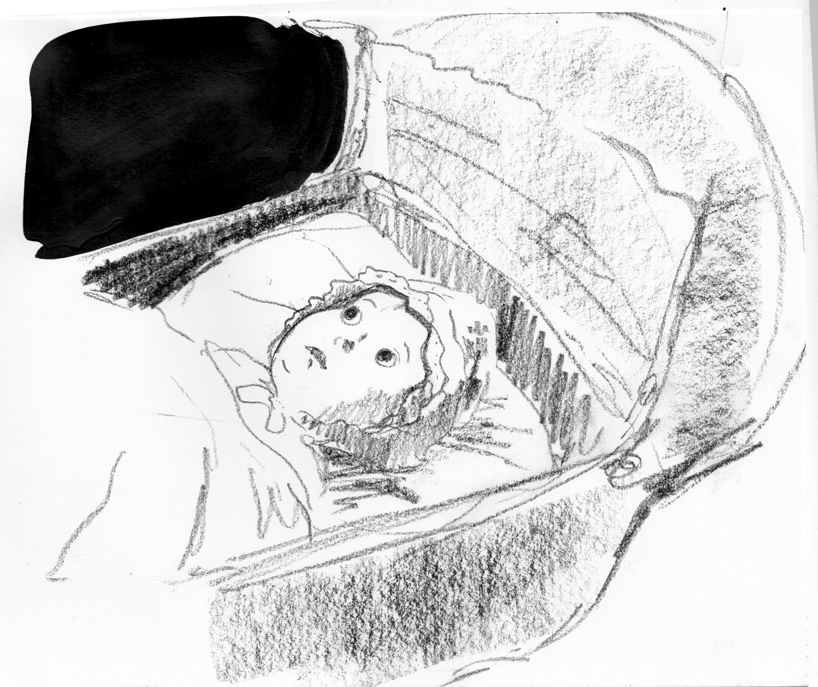
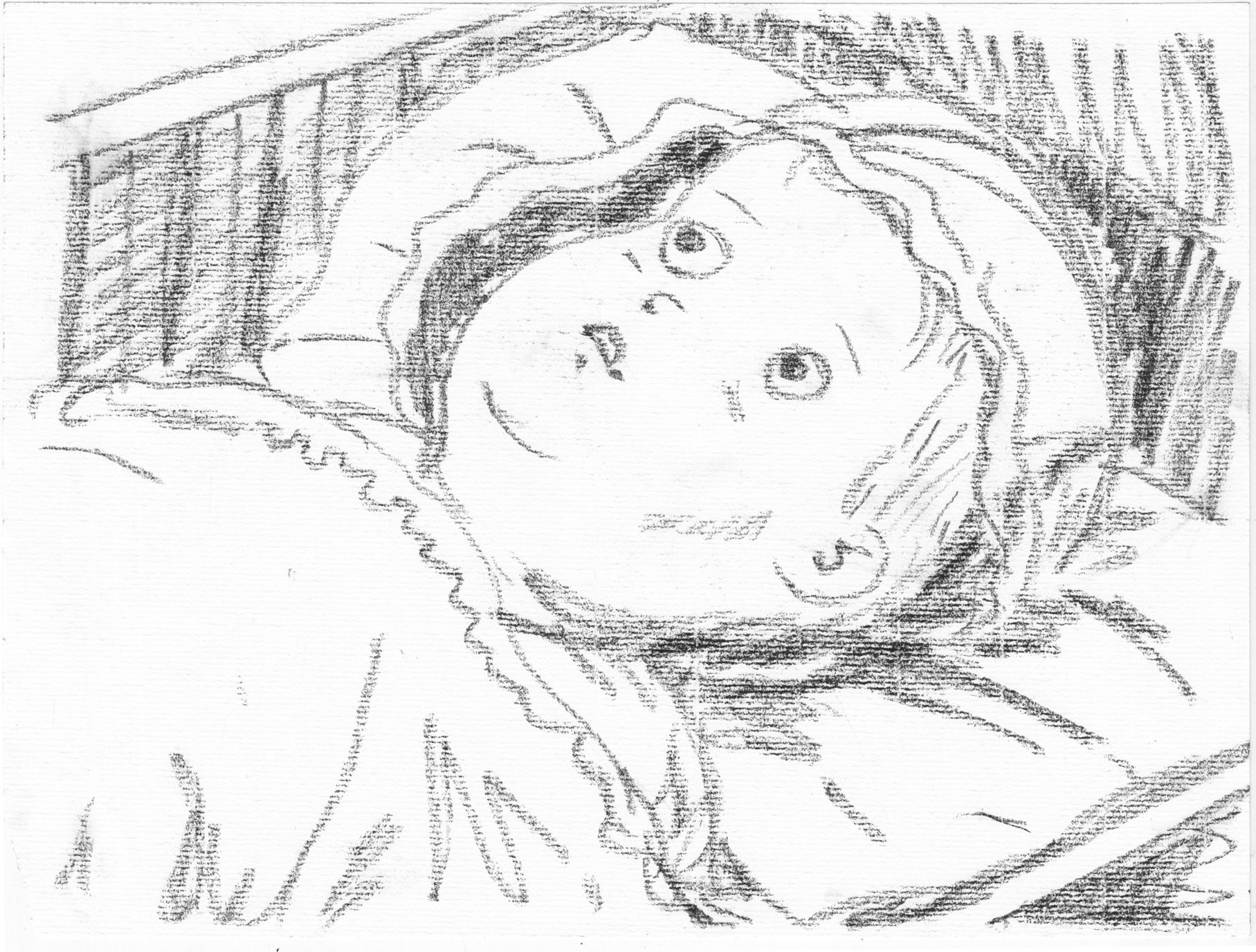
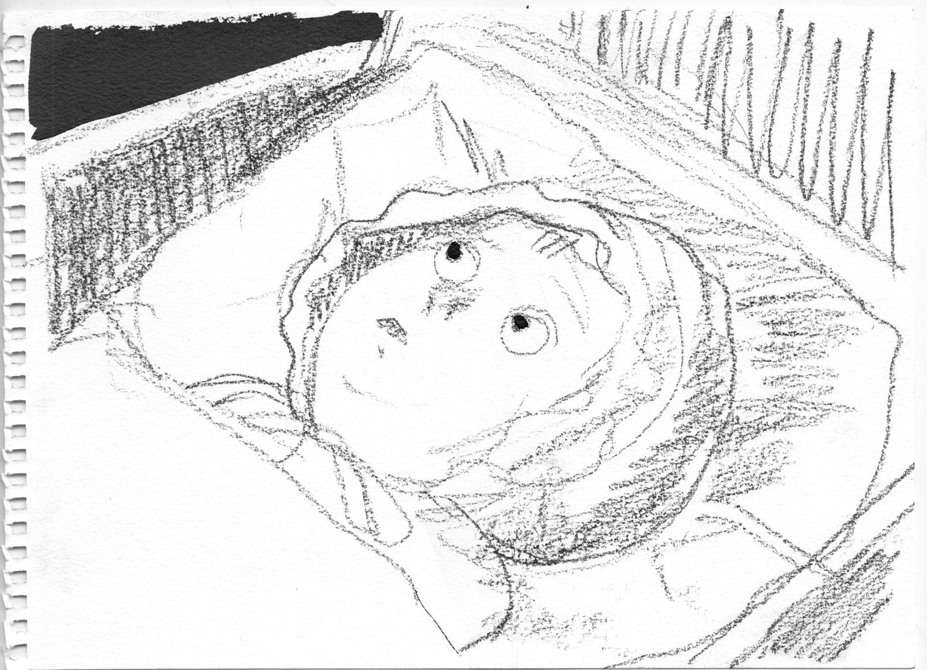
 Had to remember how I am going to draw my protagonist, at various ages…. Fiddling around with her intense expression when she’s at work on her invention. Â And (earlier) the scene where she is kissed on a park bench. Â Plus more baby and young-girl looking at the moon faces, and playing around with moon expressions.
 And thumbnailing out the first chapter. Â I actually find thumbnailing this one-image-per-page layout very challenging, trying to envision the spreads. Â Also, thinking now that maybe I will actually break my one-image-per-page rule when needed. Â For instance in the sequence where the face gradually appears on the moon.
 Seventeen acclaimed alternative cartoonists explore and celebrate the work of the legendary mid-20th century author Shirley Jackson (“The Lottery,” The Haunting of Hill House, We Have Always Lived in the Castle), including Colleen Frakes, Katie Fricas, Annie Murphy, Josh Simmons, and Maggie Umber. Edited by Ignatz Award-winner Robert Kirby and published by Dan Mazur’s Ninth Art Press.
I published this book (in my Ninth Art Press costume), and I’m also a contributor (gee, they accepted my story!). Â Here’s the first page of my piece:
Seventeen acclaimed alternative cartoonists explore and celebrate the work of the legendary mid-20th century author Shirley Jackson (“The Lottery,” The Haunting of Hill House, We Have Always Lived in the Castle), including Colleen Frakes, Katie Fricas, Annie Murphy, Josh Simmons, and Maggie Umber. Edited by Ignatz Award-winner Robert Kirby and published by Dan Mazur’s Ninth Art Press.
I published this book (in my Ninth Art Press costume), and I’m also a contributor (gee, they accepted my story!). Â Here’s the first page of my piece:
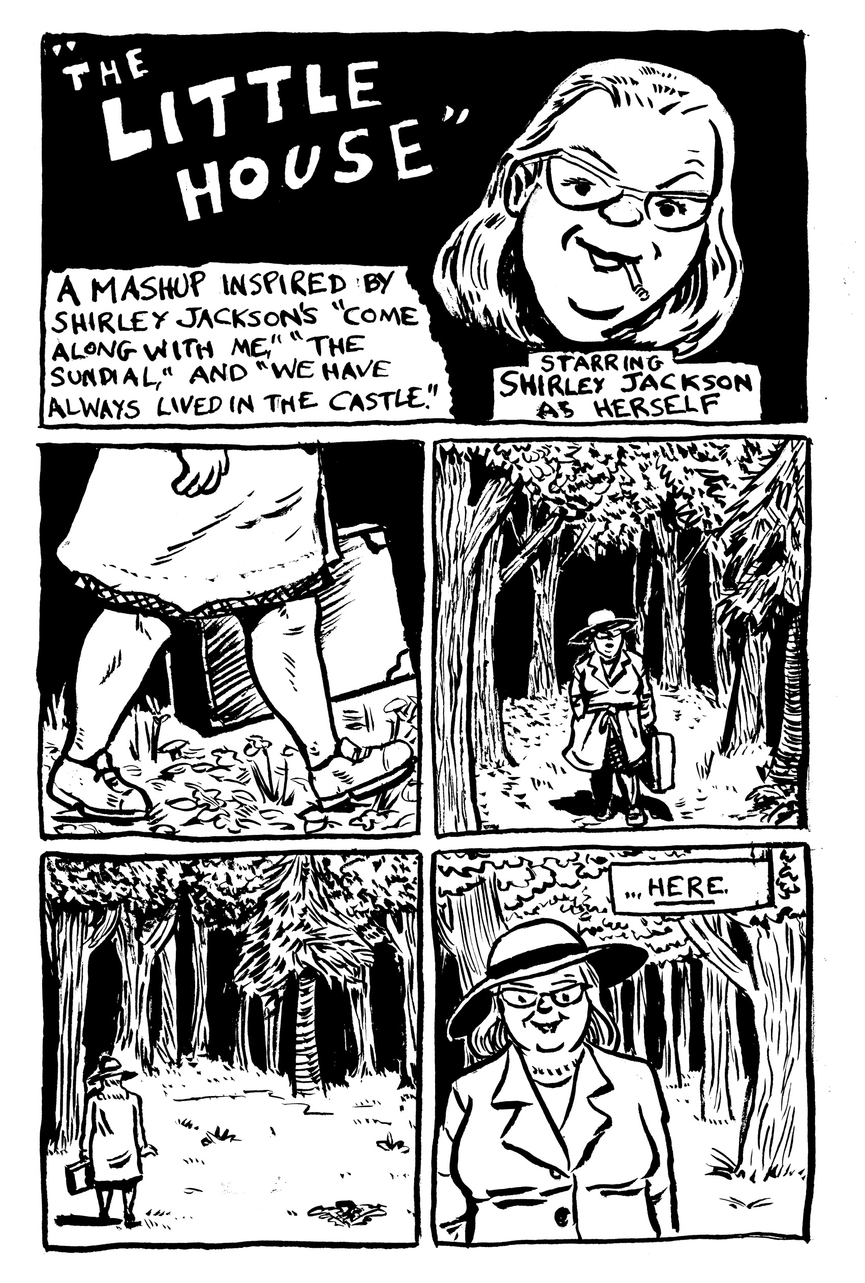 Sharing the table with me will be my amiable and talented friends, Jesse Lonergan (who will bring his newsprint epic Hedra)….
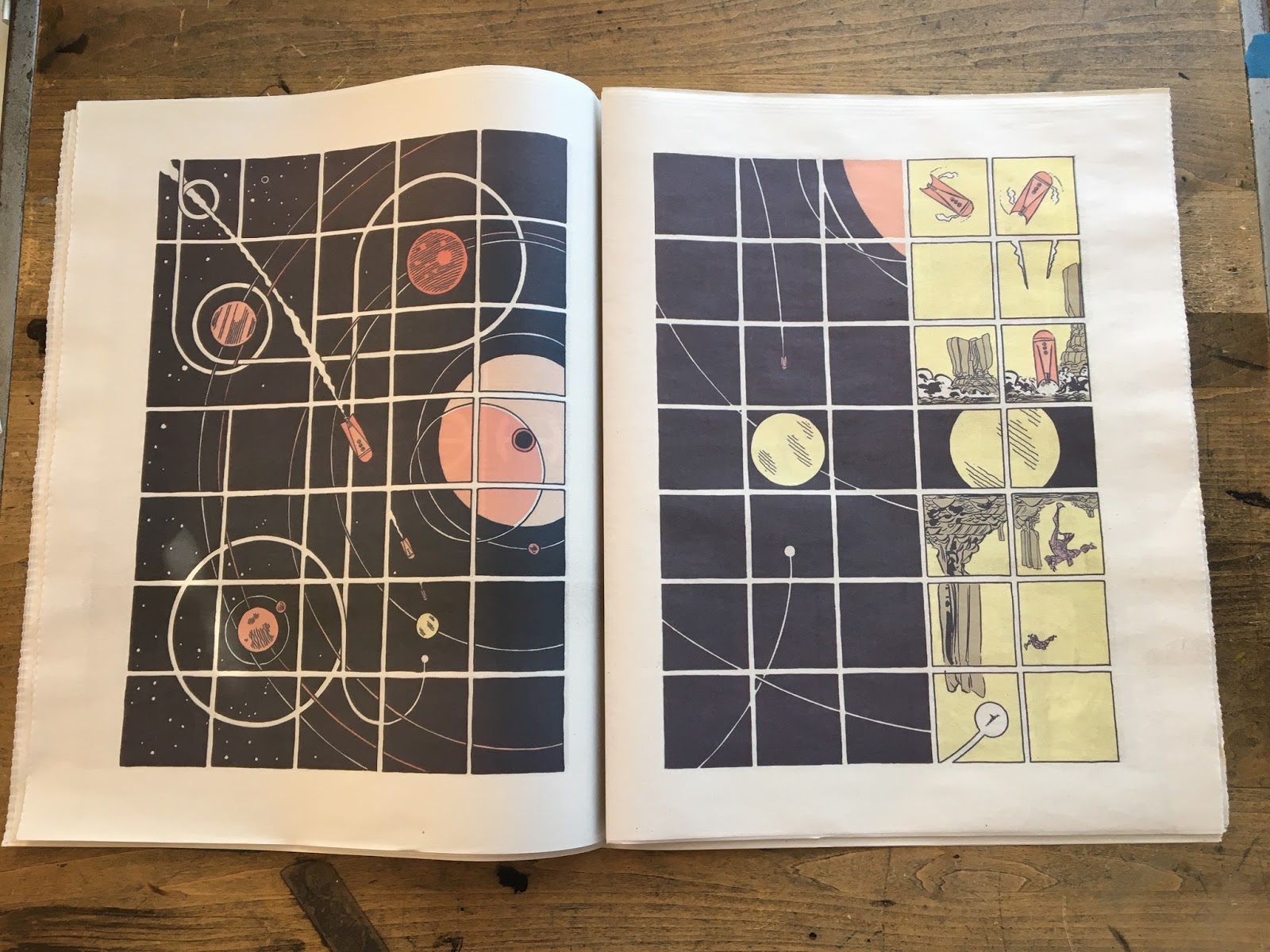 …and Whit Taylor!  Whit will have a top-secret new project on the table.  No preview available yet, but here’s a peek at her recent piece for the Nib, Finding Your Roots.
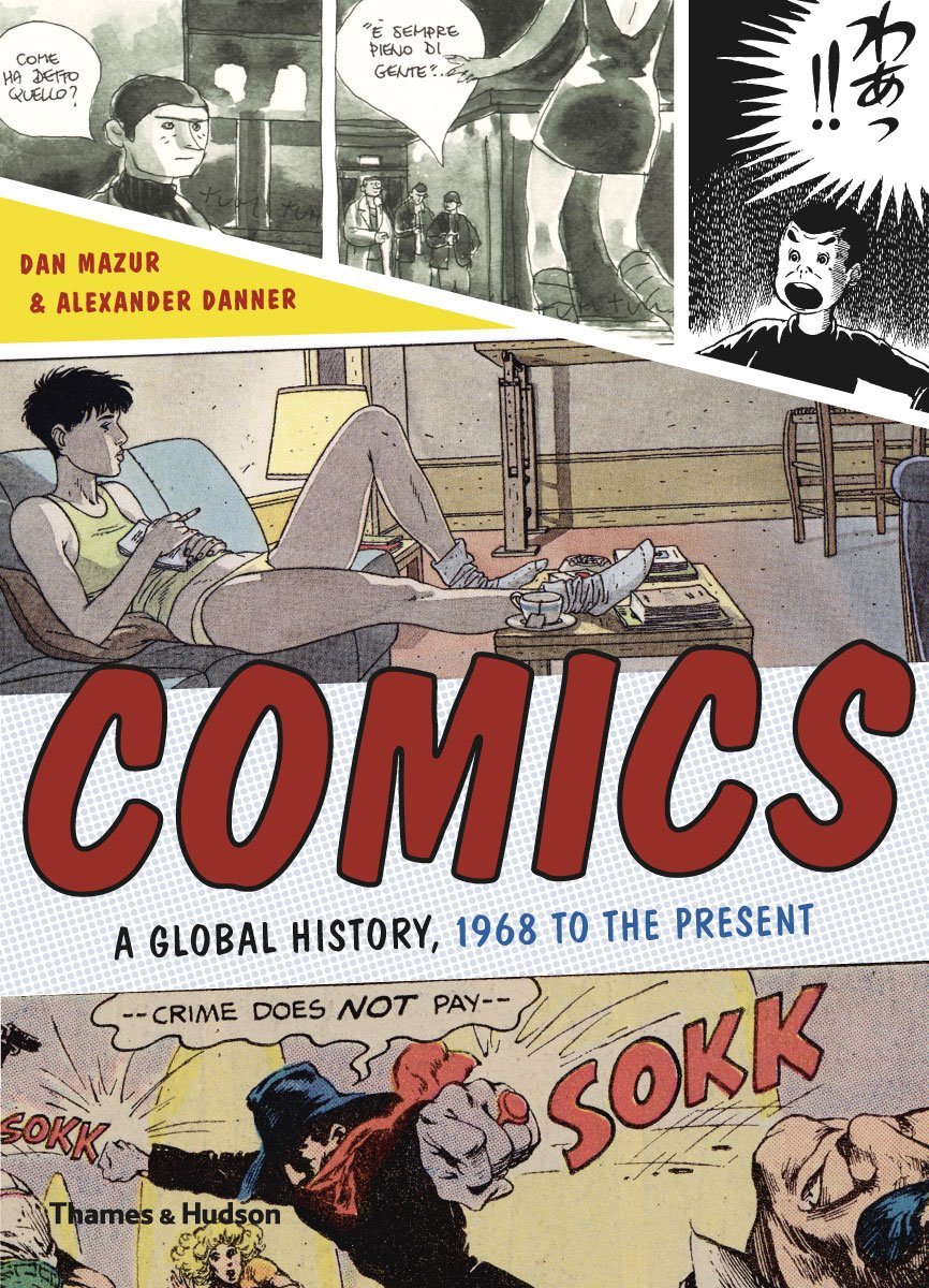


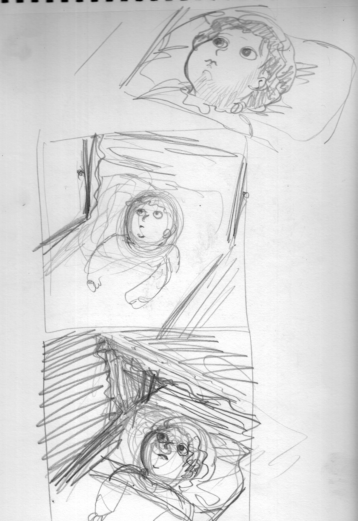 I decided I don’t want to do more detailed sketches. Â Getting a little burnt out on that, and also worrying about losing the spontanaeity if I expend too much effort drawing non-final images. Â For this chapter, I think the next image I draw will be intended as final, not rough. Even though I’m still a little undecided on certain things, I think it’s better to work it out when I know it’s gonna count. Â Just to avoid that feeling of not being able to capture what I liked about the rough version!
As far as the different media/effects I’ve been bouncing around with: Charcoal or conte crayon, acrylics, ink-splatter…. For now, I think my system is no system, just find the best medium or combination of media for each image/page.
Also, might be a bit of an interruption in this process… next week I need to spend time laying out the Shirley Jackson book, drawing an illustration, then Monday going away for a week.  So, probably not much progress on “Lunatic” until August….
I decided I don’t want to do more detailed sketches. Â Getting a little burnt out on that, and also worrying about losing the spontanaeity if I expend too much effort drawing non-final images. Â For this chapter, I think the next image I draw will be intended as final, not rough. Even though I’m still a little undecided on certain things, I think it’s better to work it out when I know it’s gonna count. Â Just to avoid that feeling of not being able to capture what I liked about the rough version!
As far as the different media/effects I’ve been bouncing around with: Charcoal or conte crayon, acrylics, ink-splatter…. For now, I think my system is no system, just find the best medium or combination of media for each image/page.
Also, might be a bit of an interruption in this process… next week I need to spend time laying out the Shirley Jackson book, drawing an illustration, then Monday going away for a week.  So, probably not much progress on “Lunatic” until August….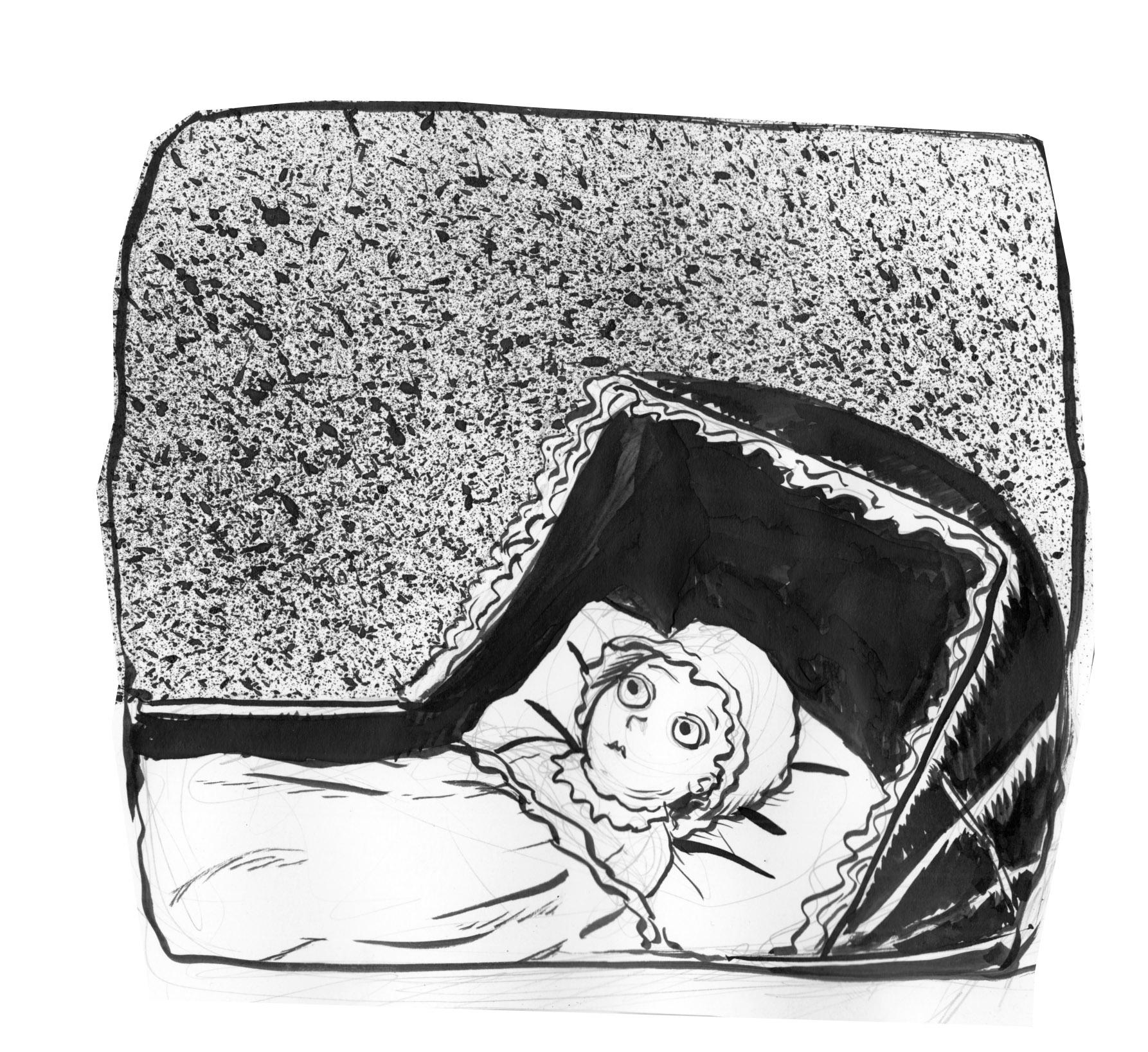 Well… no.  The spattering doesnt really make sense here.  And I don’t think I got the composition of this page right, either.
I switch to charcoal pencil:
Well… no. Â The spattering doesnt really make sense here. Â And I don’t think I got the composition of this page right, either.
I switch to charcoal pencil:
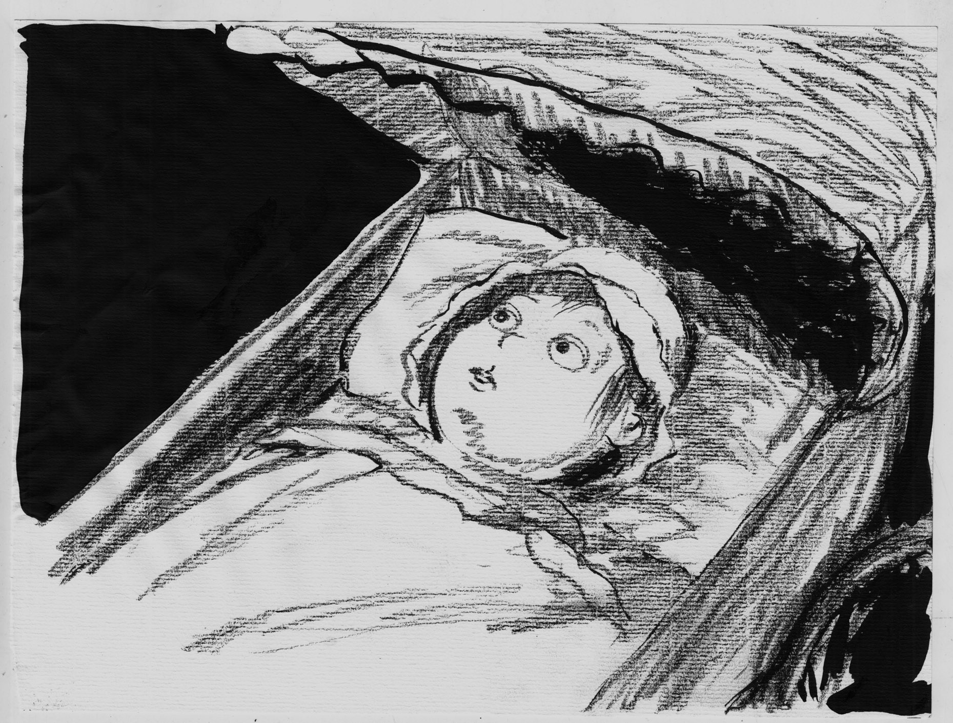 Ah,. yes.  this has the feel i want, and i like the expression.  Not right in all the details, but  it has the feel….  Let’s try that again:
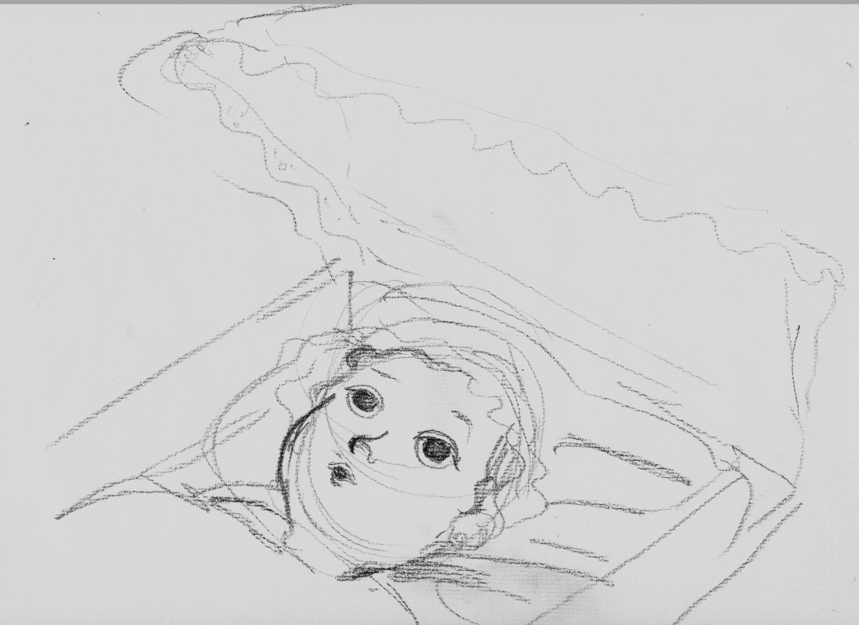 Nope. Â Sometimes it’s so hard to reproduce what works well in a sketch. Â This one just didn’t have it, so I abandoned it. Â Maybe the angle on the pram was going to work a little better. Â I call it a day. Â I’ll be back.
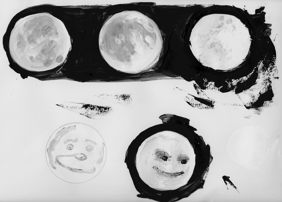
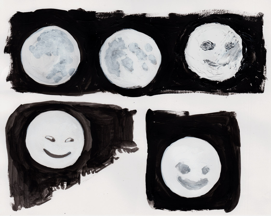
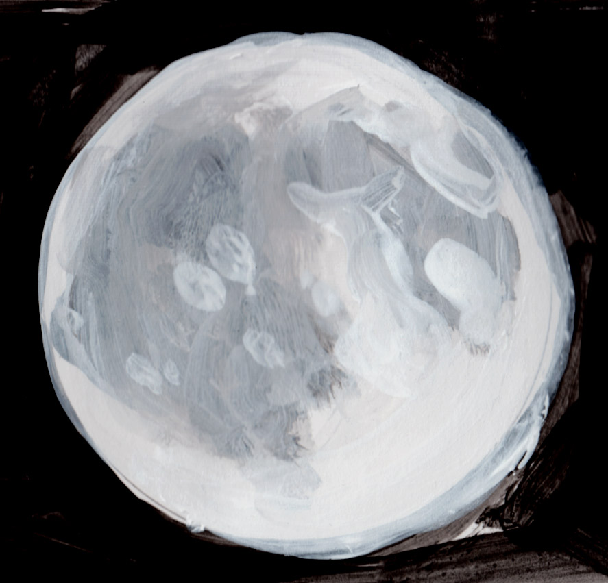
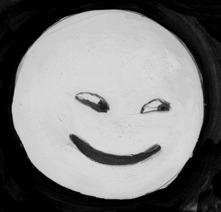 This is a study for what will be page 4.
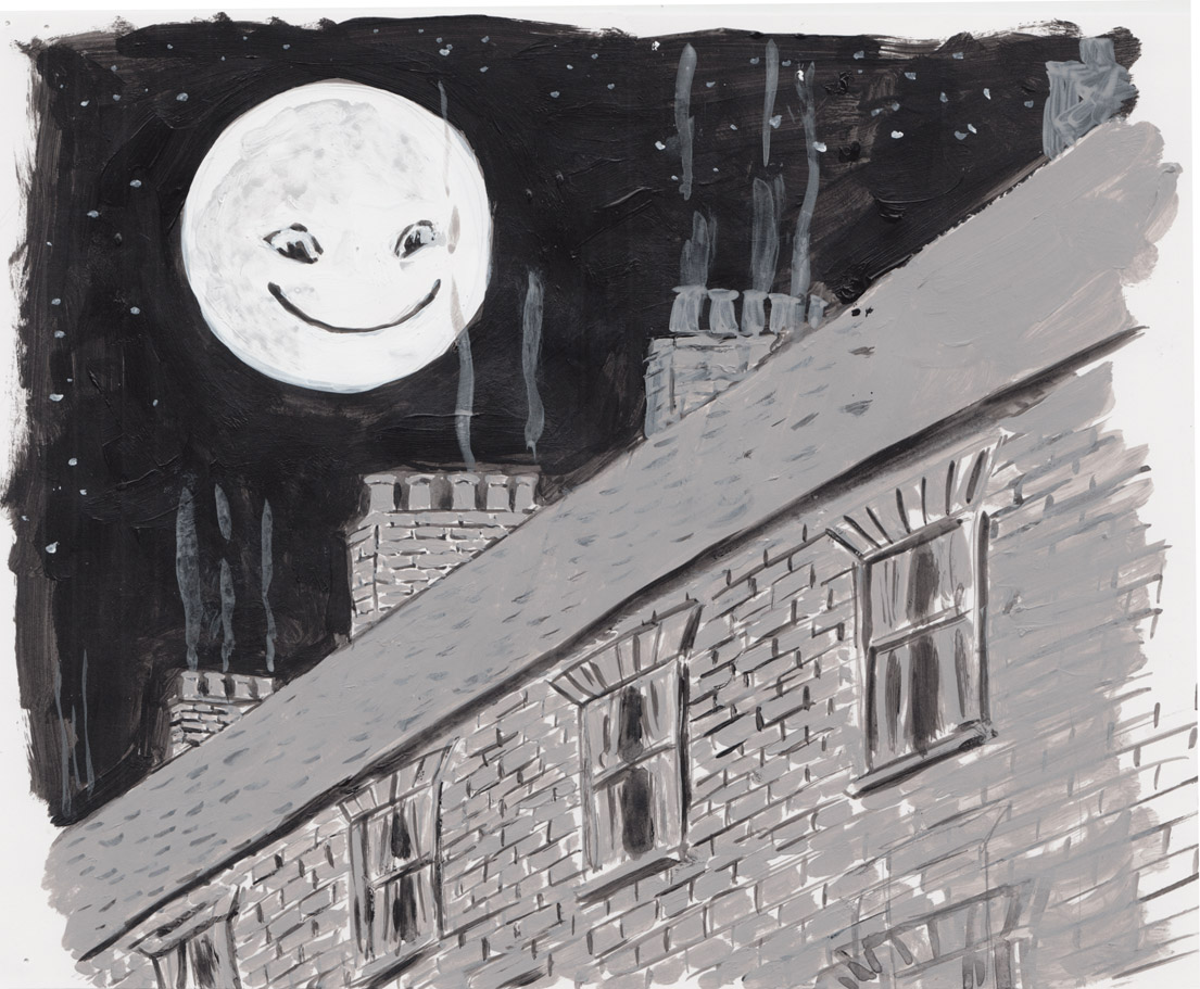 I like it.
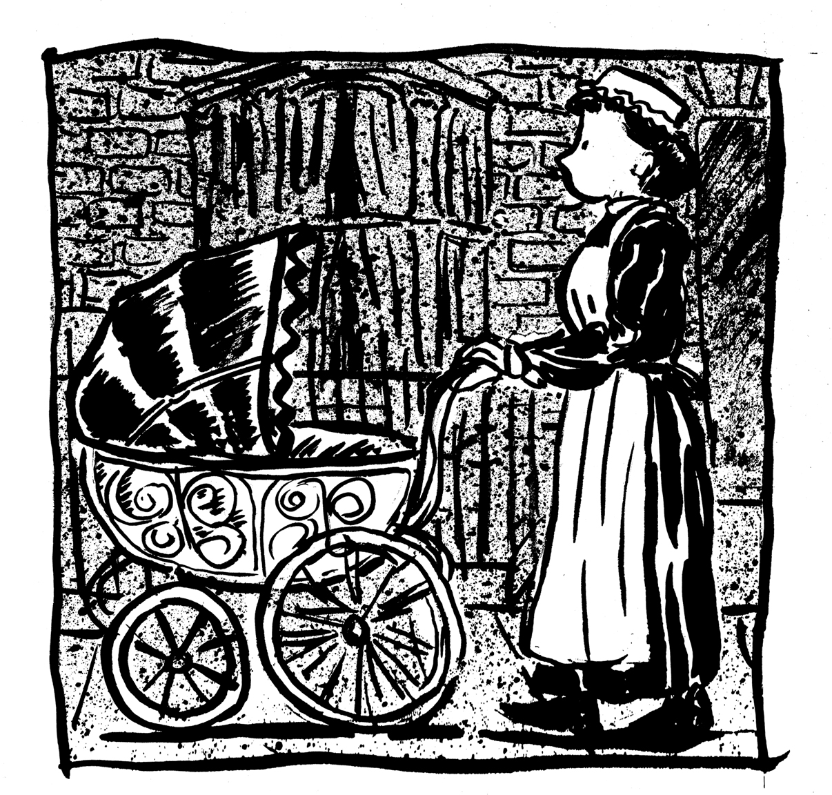 I need to work on my toothbrush-flicking control.

 The chapters are mostly short like that, but longer toward the end. Â If I was doing this as a standard comic, it might be about… 9-10 pages? Â But in this format, maybe about 45-50 pages.
Besides that, I worked exclusively on sketches for page 2 today:
The chapters are mostly short like that, but longer toward the end. Â If I was doing this as a standard comic, it might be about… 9-10 pages? Â But in this format, maybe about 45-50 pages.
Besides that, I worked exclusively on sketches for page 2 today:
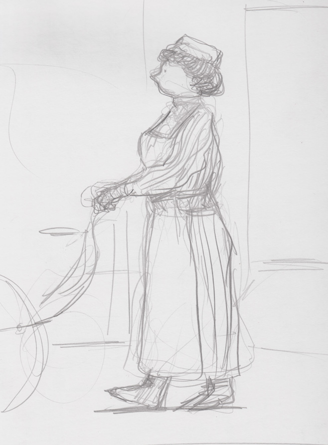
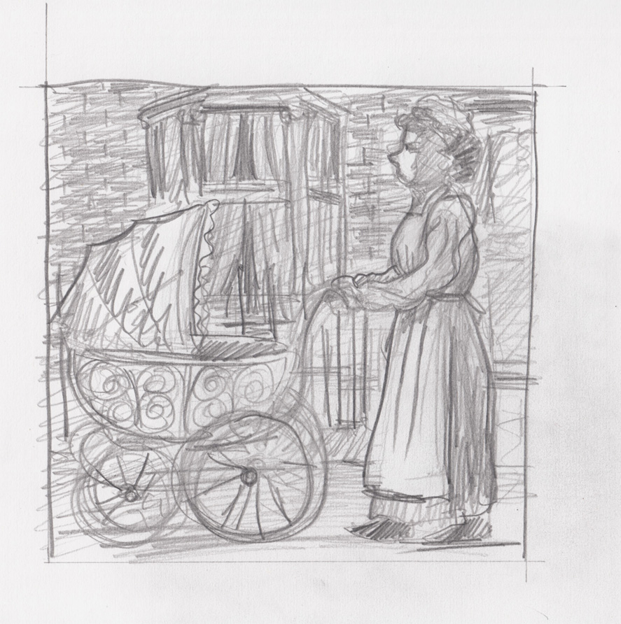 The composition probably more like that last one, though now that I see it, it looks a little cramped. Â Maybe the one above is better.
Not sure yet about the style this will be drawn in. Â For this page, I want the background to be looser, not to command too much attention away from the figures, and hopefully emphasize the pram over the nursemaid….
The composition probably more like that last one, though now that I see it, it looks a little cramped. Â Maybe the one above is better.
Not sure yet about the style this will be drawn in. Â For this page, I want the background to be looser, not to command too much attention away from the figures, and hopefully emphasize the pram over the nursemaid….
 Switching to watercolors. Â Not very happy with the result. Â I wanted to draw the grasses, but somehow got hung up on the “background,” the walkway with its flat stones. Â The only part of this I really like is the yellow-ish grass running down the right-center of the picture.
 I decided that if what I wanted to draw was the tall grasses, I wasn’t obligated to draw any background, I could just leave the white page. Â Better:
 And then decided to use pencil a bit, I guess it freed me up from drawing as much with the brush, and I could just use the watercolors to color:
 Not sure if this one was finished, but it’ll have to be:

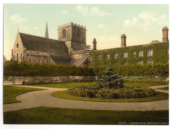
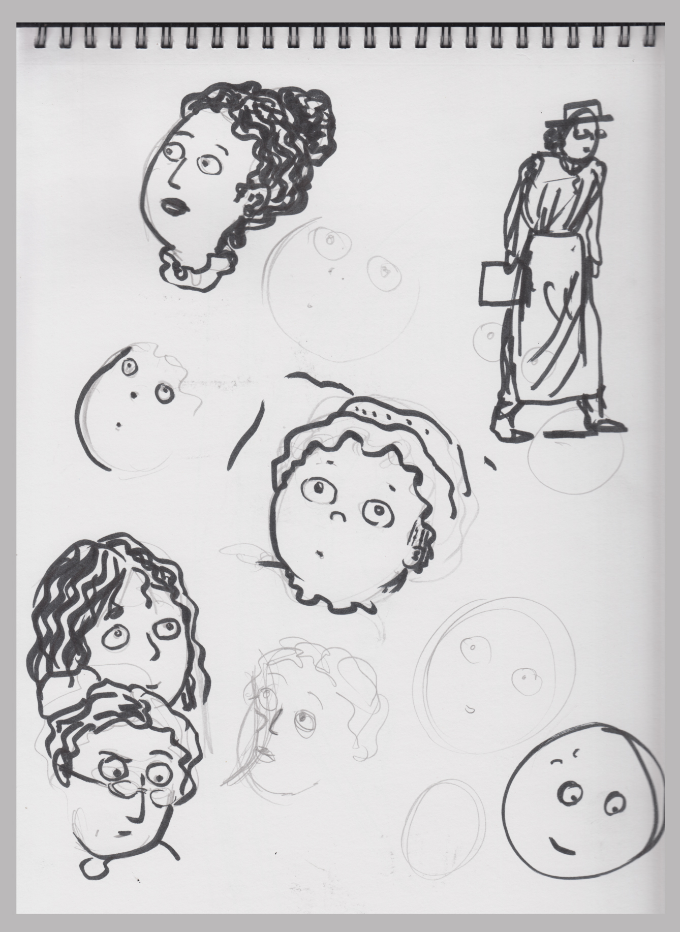 Thinking about style: how should I draw her eyes? Â I’ve tended toward dots lately, but I think maybe i’ll draw full eyes this time.
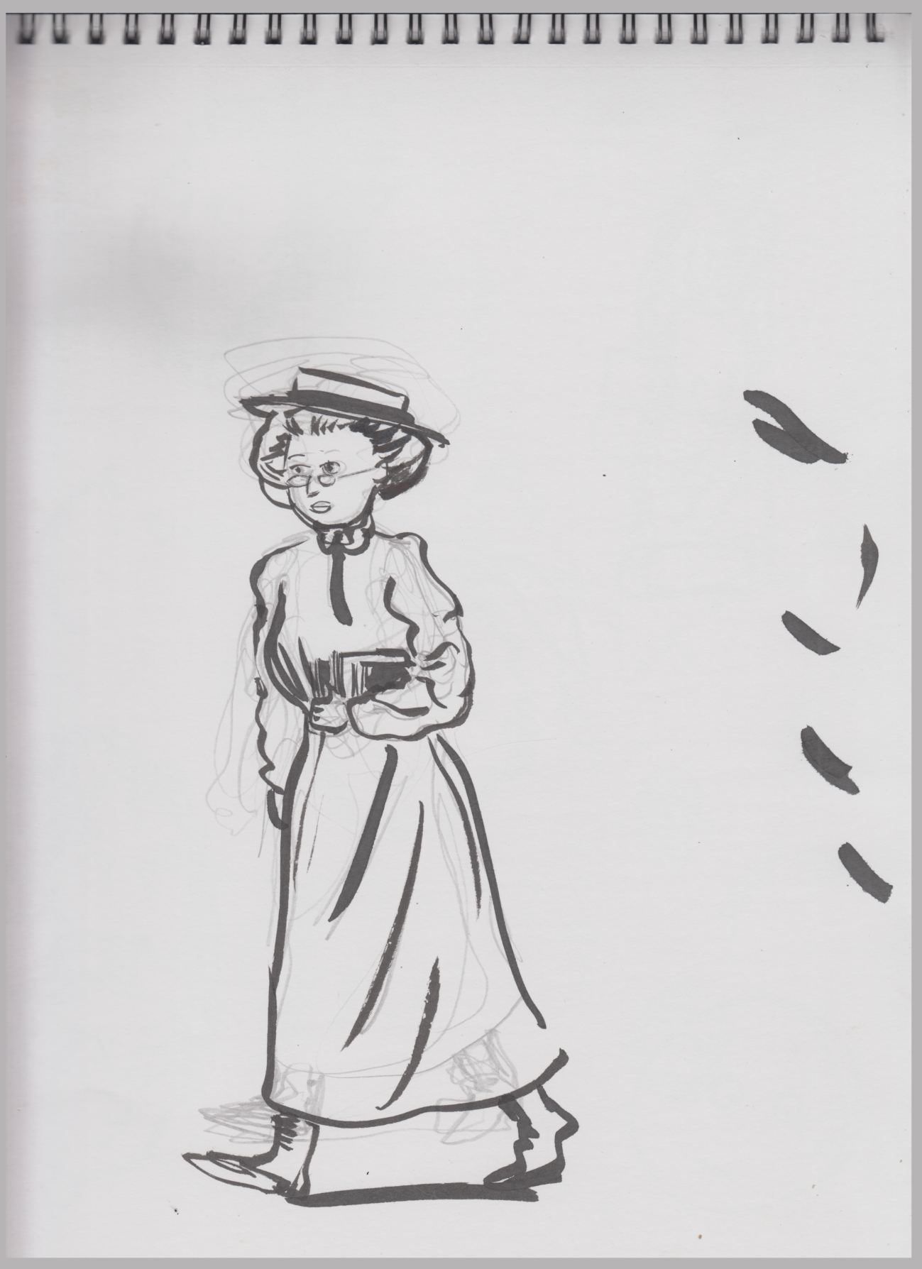 I went back to studies for the first page/first scene.
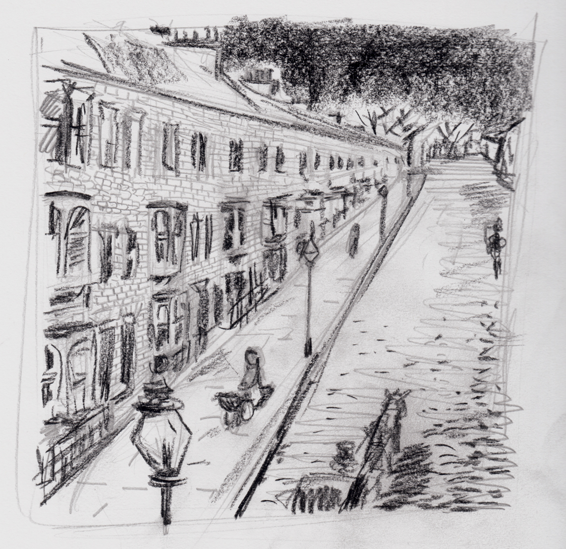
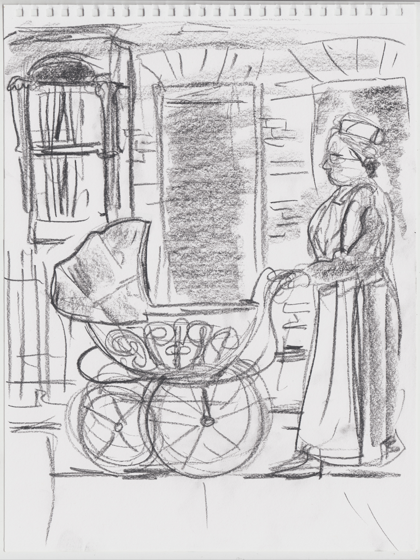 Second page study. Â Not a bad sketch, but I don’t think it has anything to do with the style I’ll be drawing in, that’s my guess. Well, not much to do with it. Â I’m intrigued by the idea of using conte or something like it for shading.
I’ve decided that this story is divided into 7 chapters, all fairly short, single scenes, though they gradually get longer.
Second page study. Â Not a bad sketch, but I don’t think it has anything to do with the style I’ll be drawing in, that’s my guess. Well, not much to do with it. Â I’m intrigued by the idea of using conte or something like it for shading.
I’ve decided that this story is divided into 7 chapters, all fairly short, single scenes, though they gradually get longer.
 Not terribly thrilled with my productivity today, but better than yesterday. Â As long as I’m working on it, it’ll get done eventually…
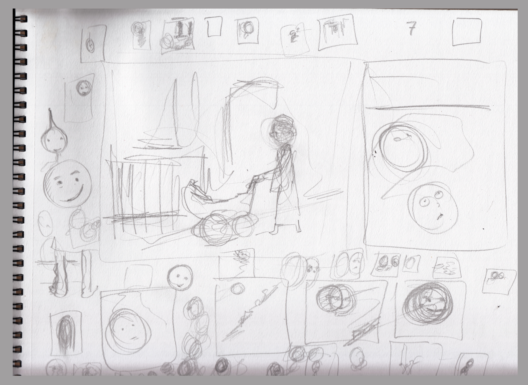 I meant to do character sketches, but that’ll have to be tomorrow.
I can make myself look a little better by also posting these studiesI did when I was messing around with acrylics last week:
I meant to do character sketches, but that’ll have to be tomorrow.
I can make myself look a little better by also posting these studiesI did when I was messing around with acrylics last week:
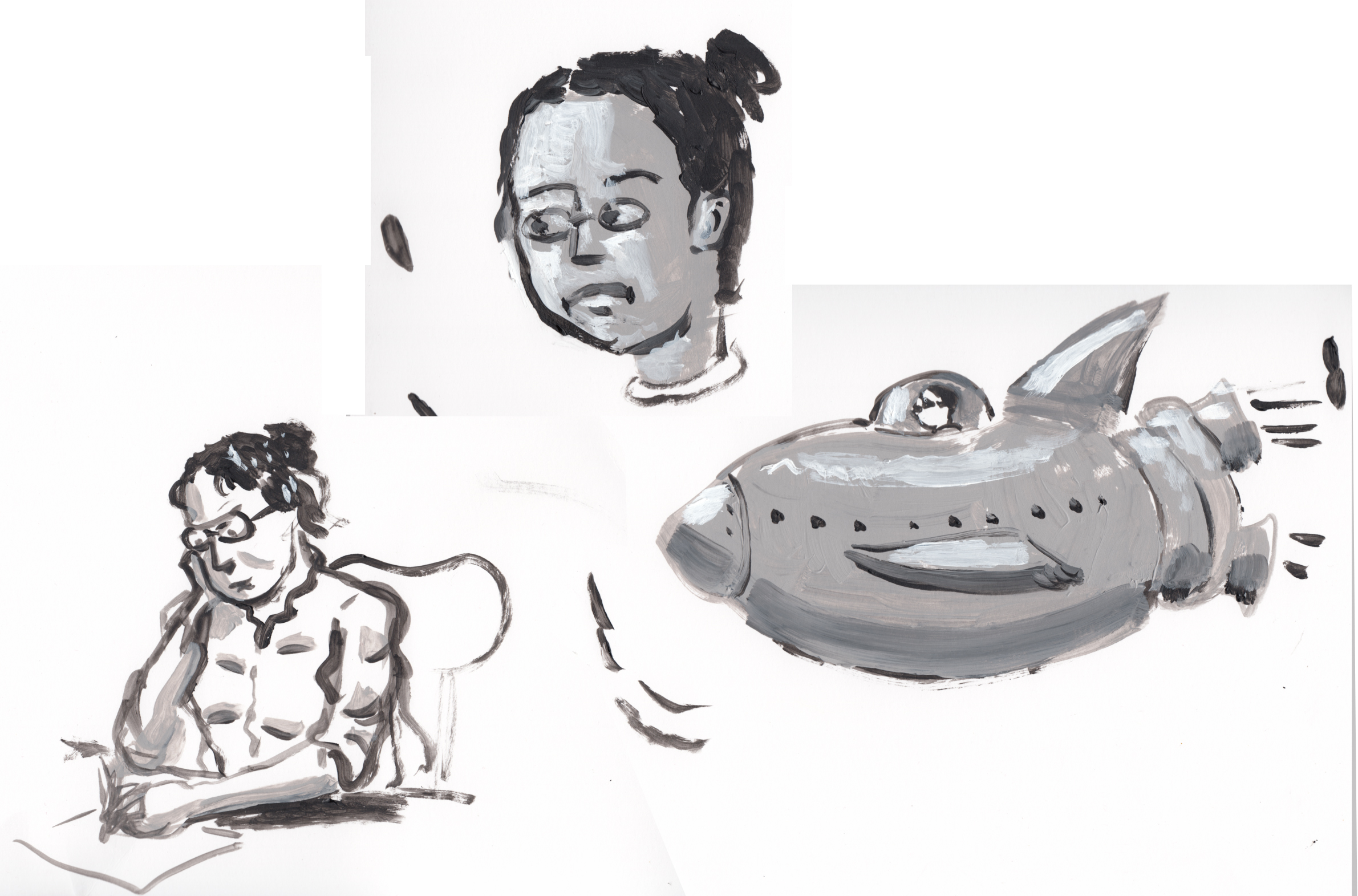 See you tomorrow.
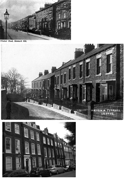
 A rough sketch, with some other doodles to do with the story (full disclosure, I think I actually drew this yesterday):
 Then another,Â
Then another,  Right now, I’m not sure yet what the dimensions or even the shape of this book will be.  I was thinking square, and I drew this at 6″ by 6″.  It seemed a little small, hence the bigger square around it to try and get a feel for the right size.  7.25″ square?  Or maybe it should be horizontal rectangle?
I didn’t even know how to start thinking about that, so I decided to just draw some studies based on the photo reference, for the hell of it.
Right now, I’m not sure yet what the dimensions or even the shape of this book will be. Â I was thinking square, and I drew this at 6″ by 6″. Â It seemed a little small, hence the bigger square around it to try and get a feel for the right size. Â 7.25″ square? Â Or maybe it should be horizontal rectangle?
I didn’t even know how to start thinking about that, so I decided to just draw some studies based on the photo reference, for the hell of it.
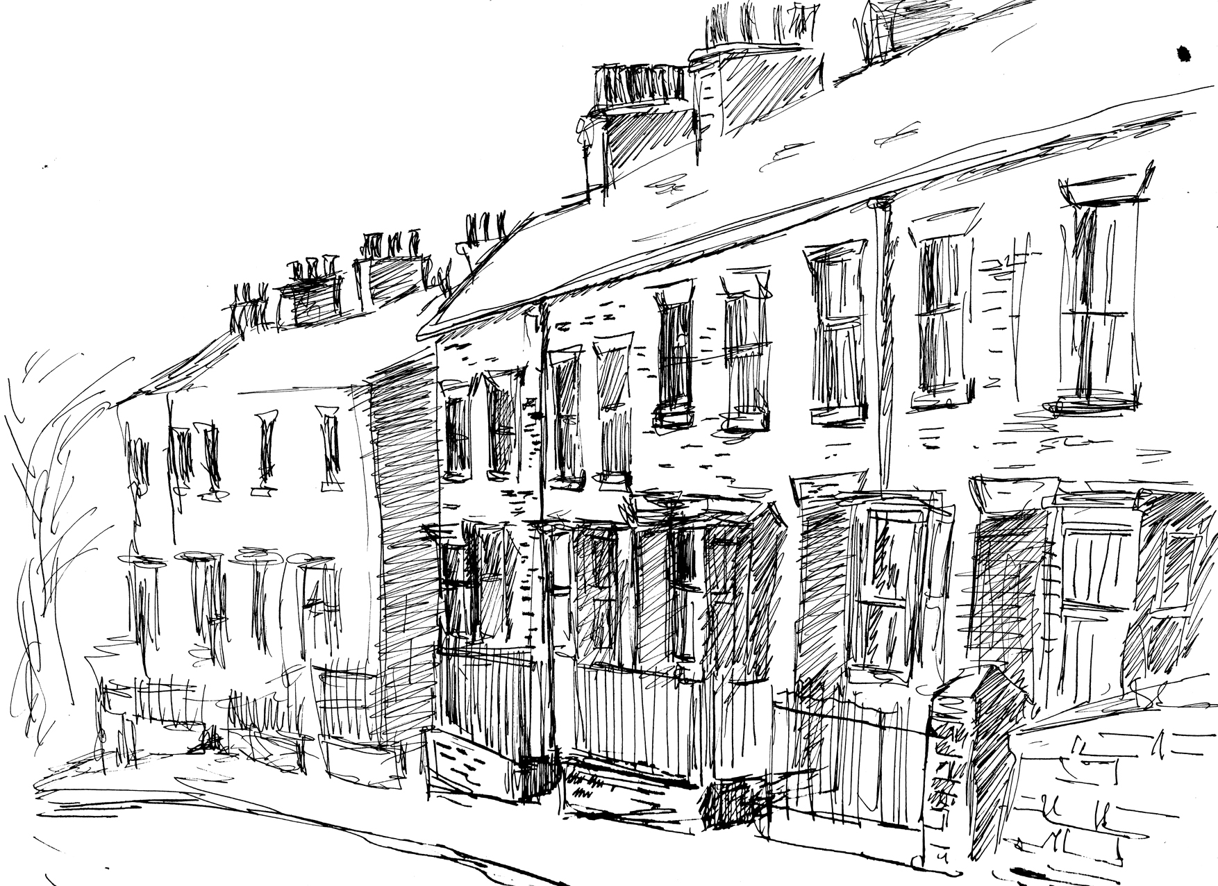
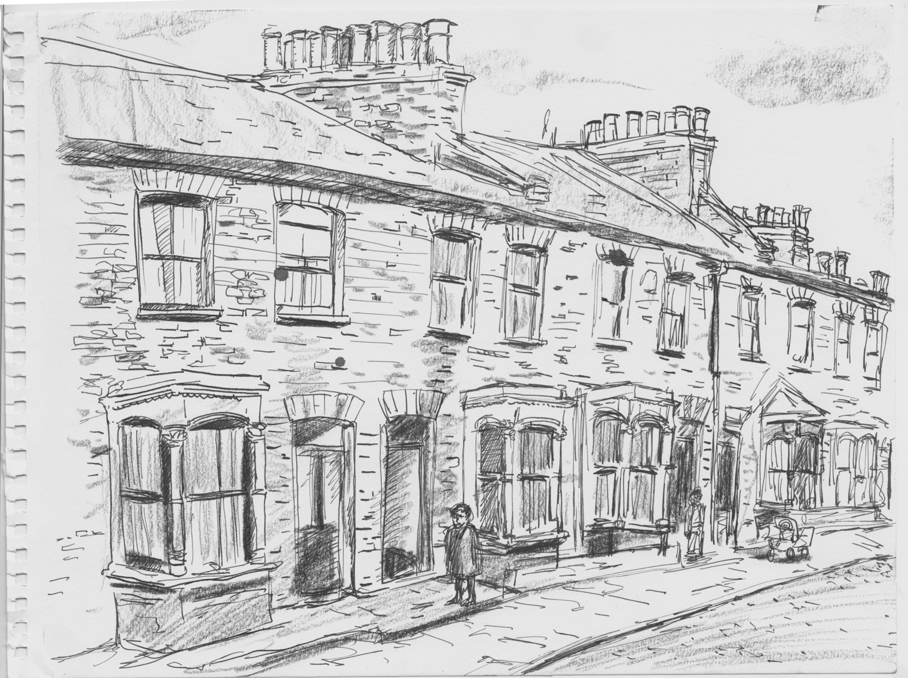 I’d been picturing less of a working-class street than this, but it was a good photo to work from. Â Maybe I’ll go a little more downscale after all.
Anyway, not much progress today, but at least I drew something. Â Besides dimensions of the pages, I don’t know what media I’ll use either. Â On that last sketch I drew in ink, then shaded/textured with conte crayon.
I’d been picturing less of a working-class street than this, but it was a good photo to work from. Â Maybe I’ll go a little more downscale after all.
Anyway, not much progress today, but at least I drew something. Â Besides dimensions of the pages, I don’t know what media I’ll use either. Â On that last sketch I drew in ink, then shaded/textured with conte crayon.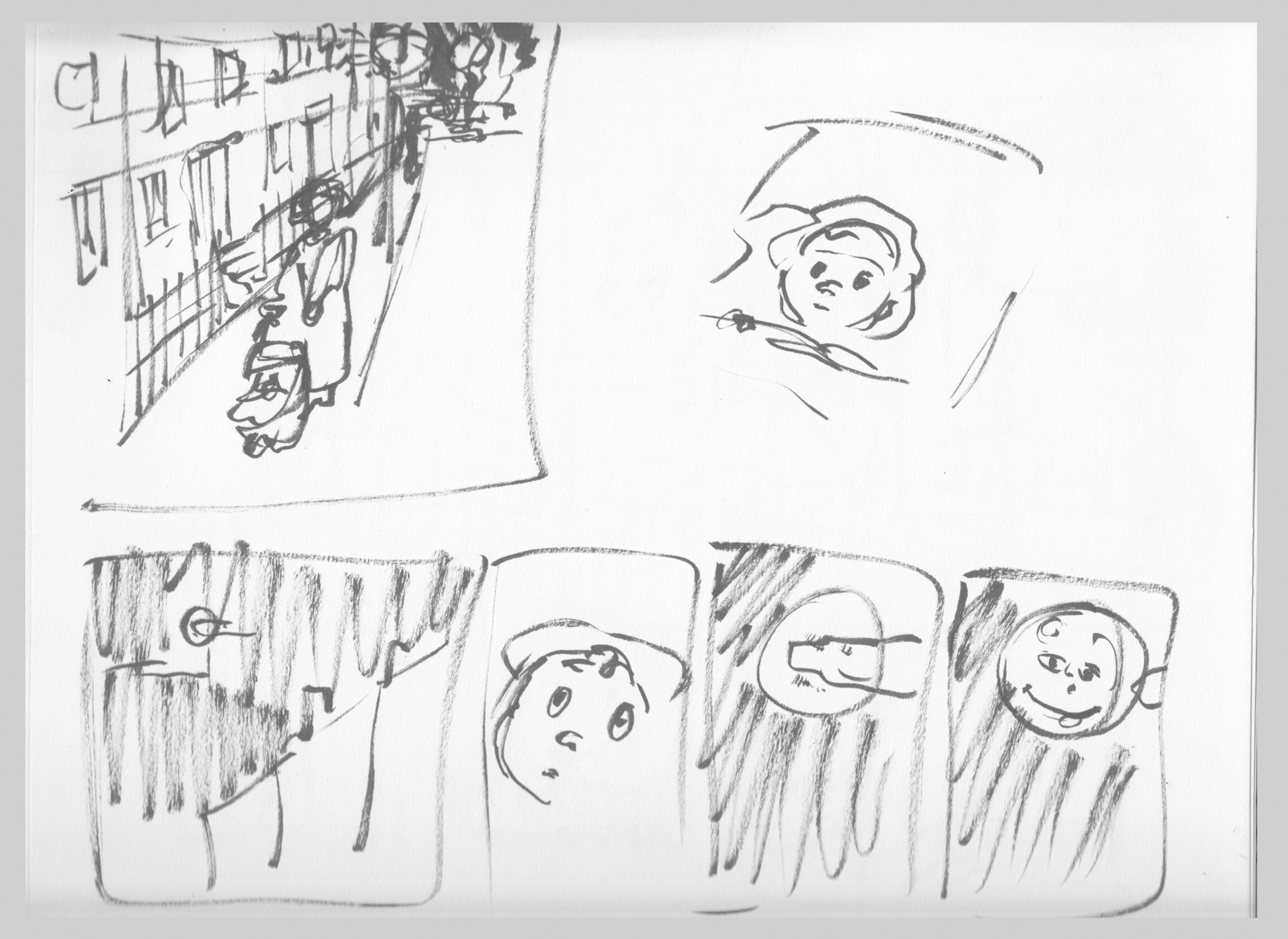
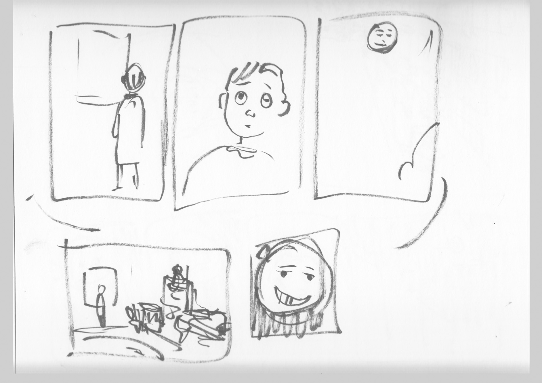
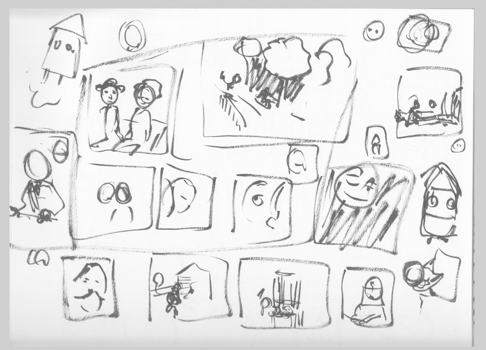
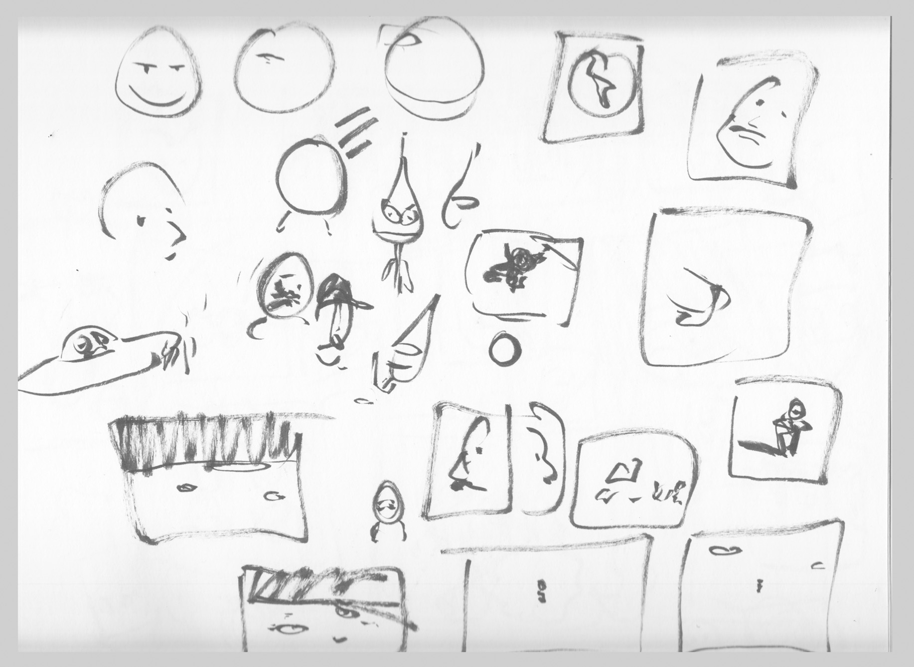 The story’s sort of rattled around in my head since then, and it seems now to have reached the front of the queue. Â As I’ve re-told the story to myself I’ve made some conscious changes (like the gender of the protagonist, for instance). Â But now, looking at these old thumbnails for the first time in a couple years, I can see that I’ve changed some things about the story in my mind without realizing. Â Now I have to assess if I like the changes, or want to go back to the original ideas. Â Â The face in the moon was something that I had forgotten – was that a good idea or not? Â It has its charm, and I’m tempted to go back to it.
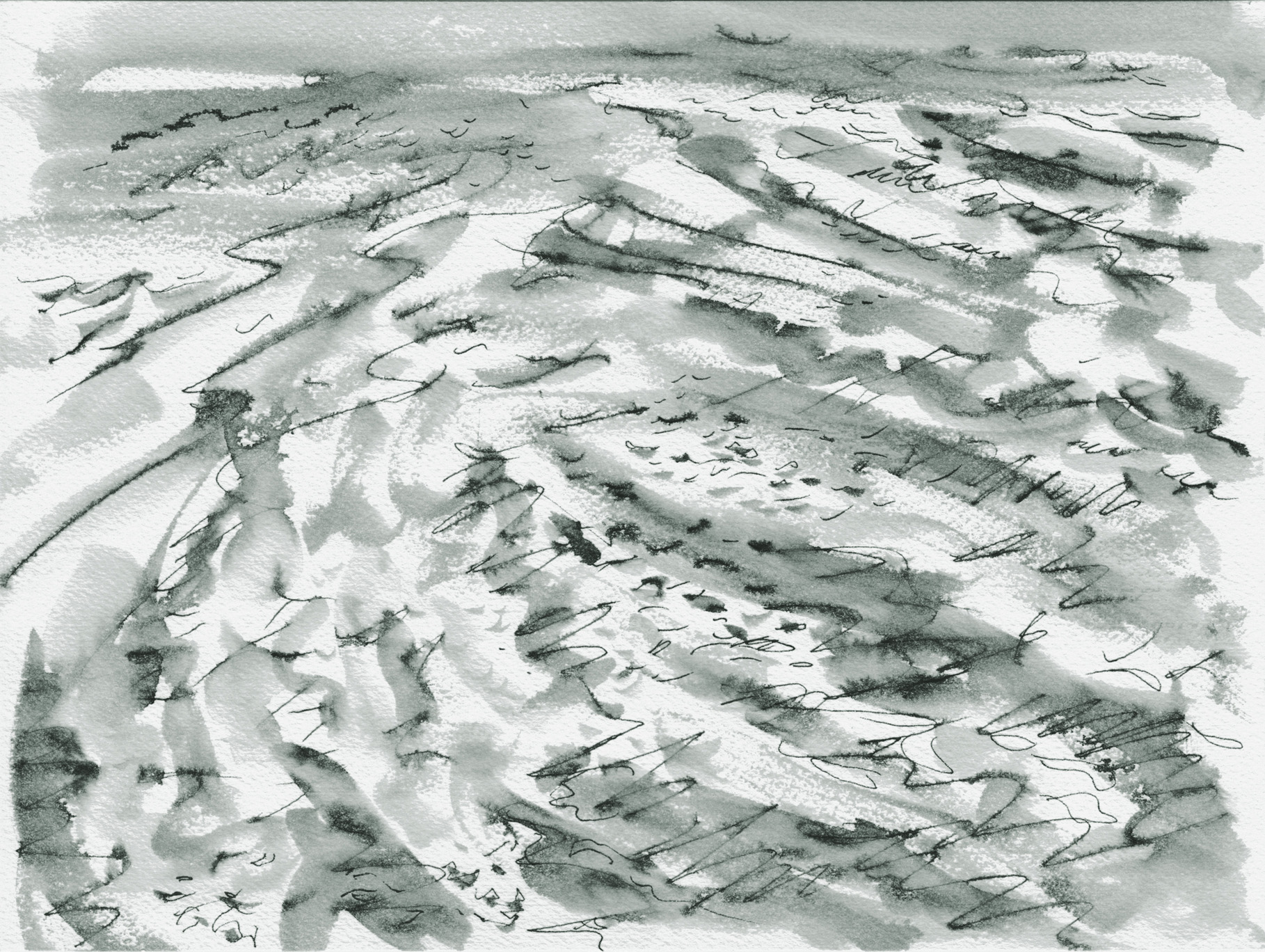
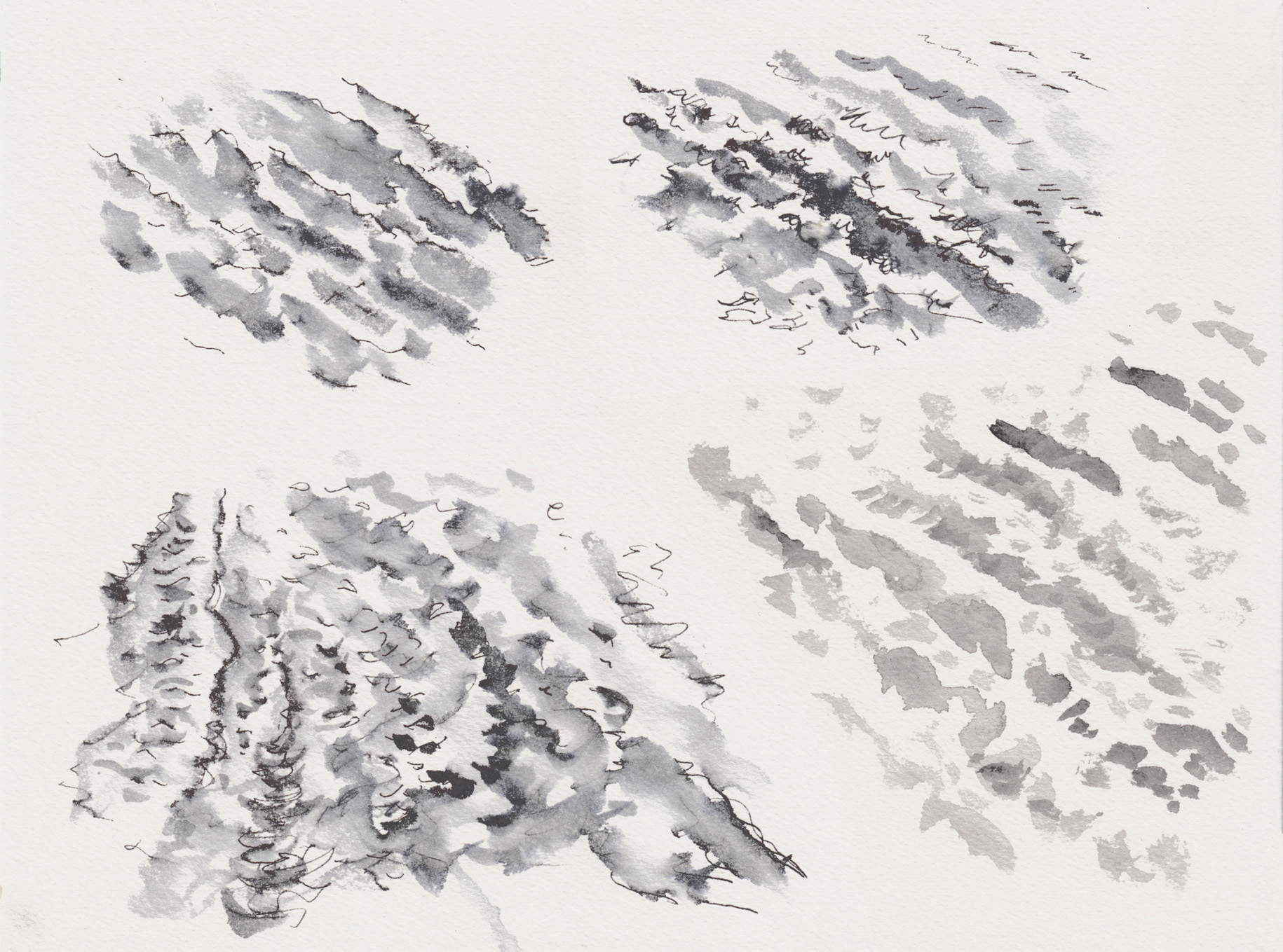
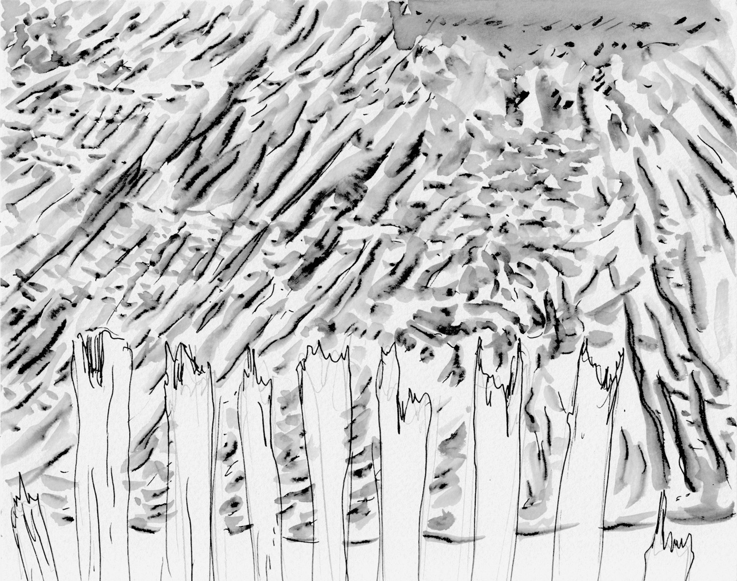
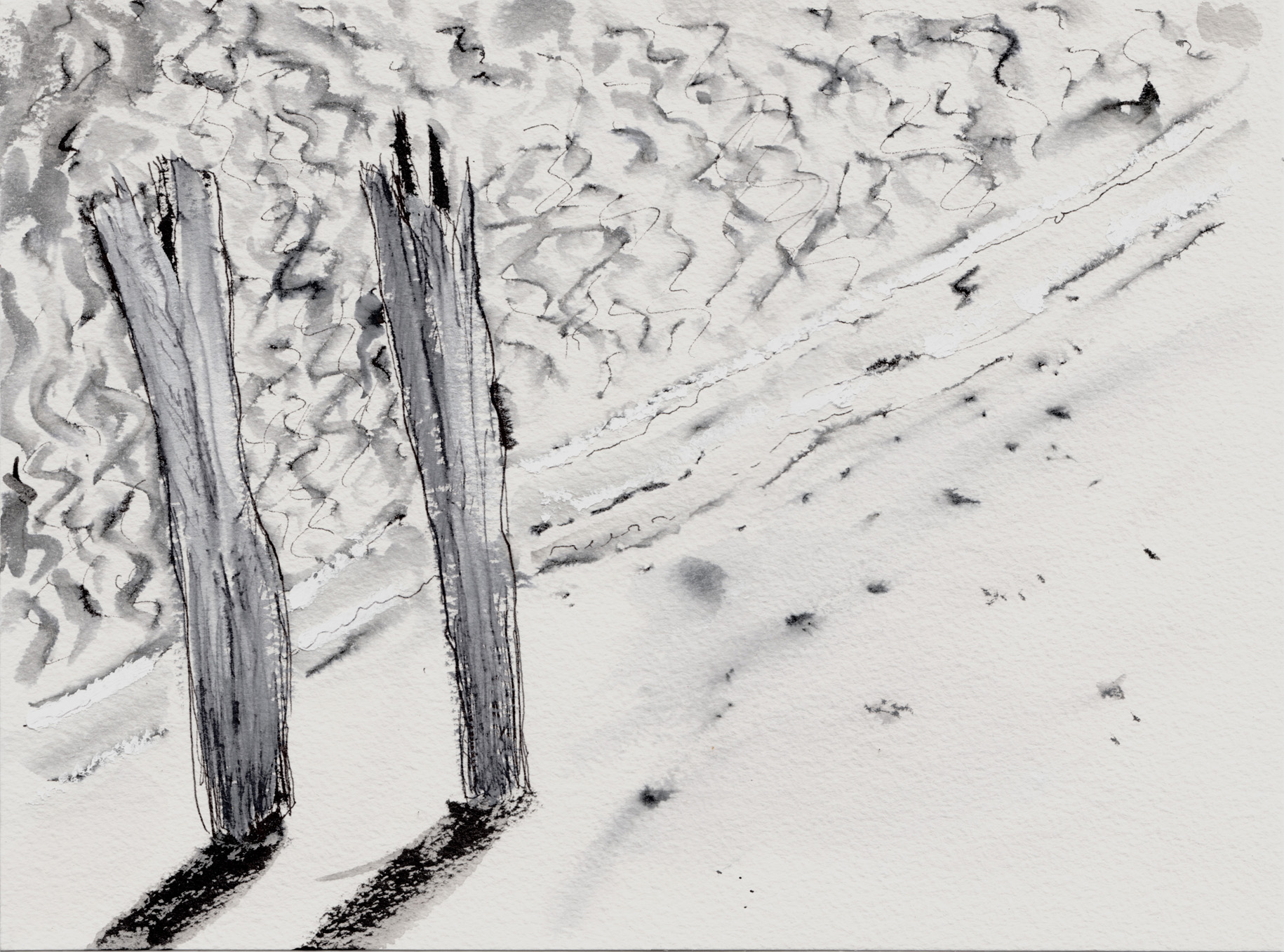
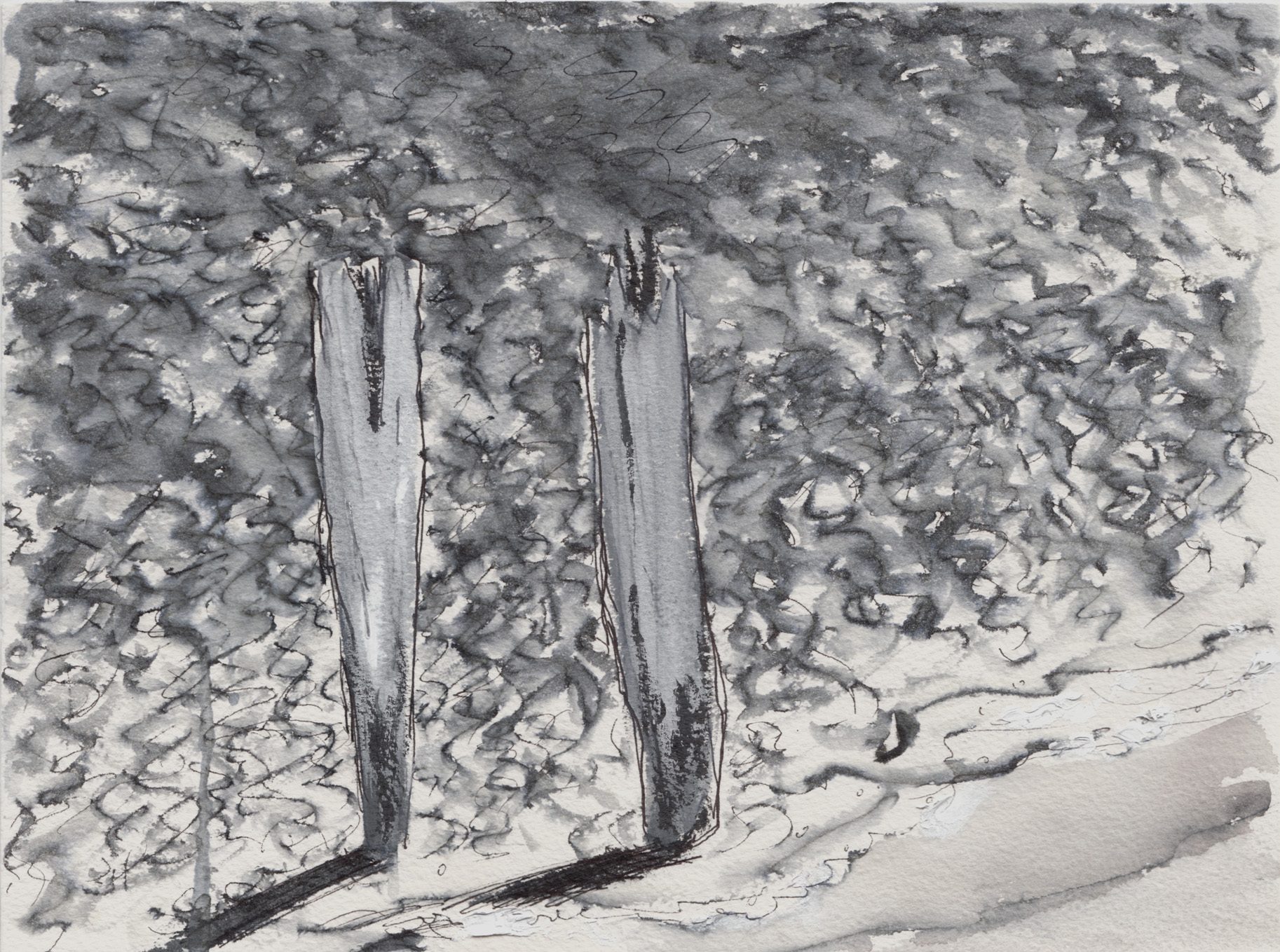
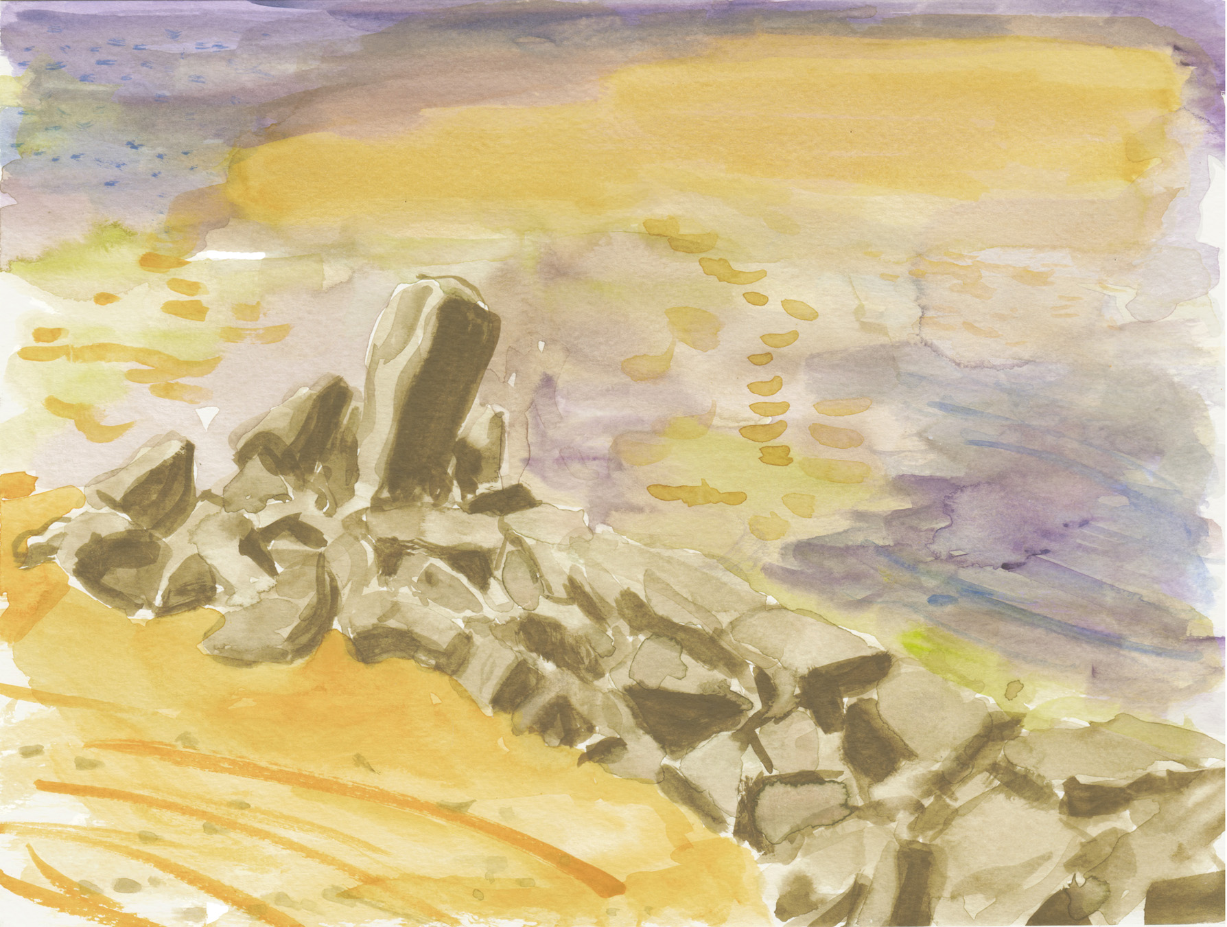
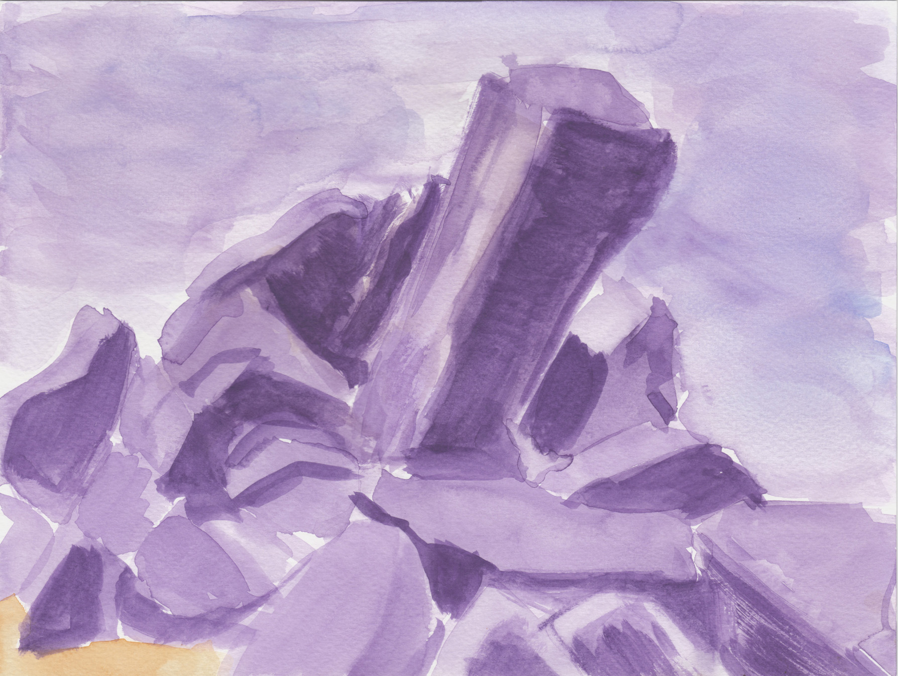
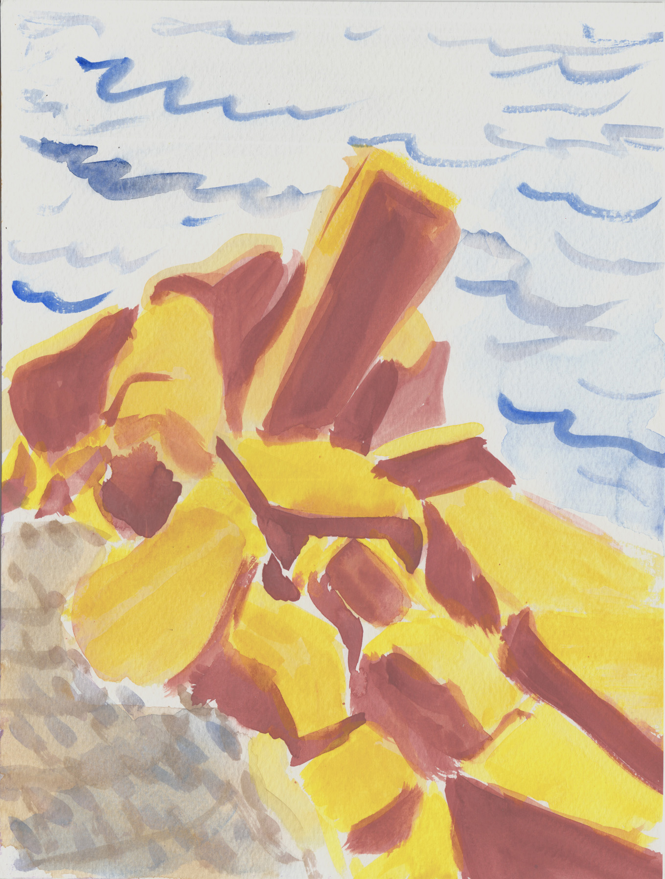
 They’re hard to scan, trying to get the luminosity of the watercolors without washing out the subtleties. Â I scan at low contrast and try to punch things up in Photoshop to get as close as possible to what they really look like.
 Okay, I started cheating and putting stuff beside the surface of the water in the frame:
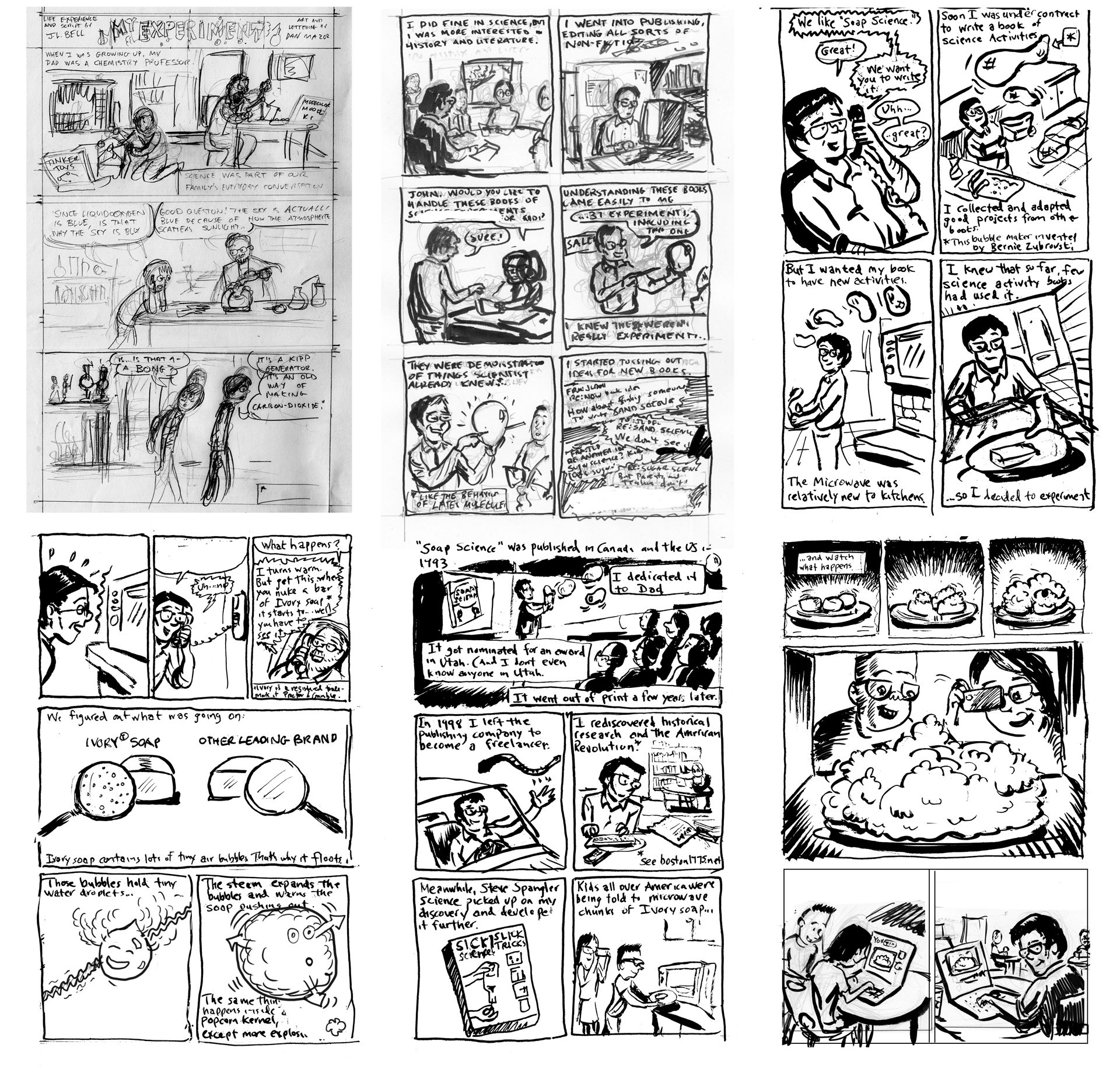 …and I’m ready for final pencils. Â (Just as a side note, this comic is drawn at actual print size, unlike the usual 1.5-to-2-times larger, so each drawn page has an image area of about 4.25 x 8 inches, which is kind of challenging.)
My problems started when I pencilled the first page in blue pencil, and just “experimentally” I inked it digitally in Photoshop:
…and I’m ready for final pencils. Â (Just as a side note, this comic is drawn at actual print size, unlike the usual 1.5-to-2-times larger, so each drawn page has an image area of about 4.25 x 8 inches, which is kind of challenging.)
My problems started when I pencilled the first page in blue pencil, and just “experimentally” I inked it digitally in Photoshop:
 Hmmm… I liked the slickness of the digital inks, but on the whole I wasn’t satisfied. Â I found the effect overall to be clean, yes, but also somewhat tight and finicky. So I resolved to ink the whole thing with a real brush and real ink. Â Here’s page one:
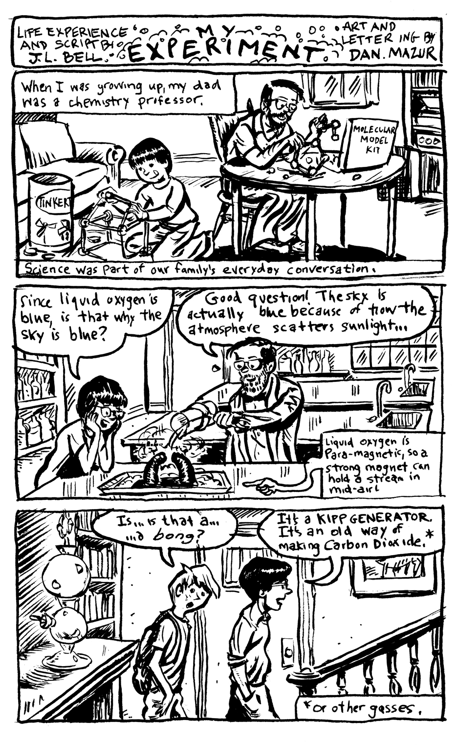 …and I proceeded to pencil and ink the entire story that way. Â Done, right?
Nooo… all the while it kept nagging at me, that the slick, clean digital look was somehow better suited for this story. Â Maybe because it was about science and labs and stuff? Â There were places where I wasn’t happy with my abiity to draw at this scale with a brush. Â I just wasn’t sure, and I felt like the ONLY way to feel confident was, well, to re-ink the entire story digitally.
Which I did by taking each inked page, scanning, and converting to blue…
…and I proceeded to pencil and ink the entire story that way. Â Done, right?
Nooo… all the while it kept nagging at me, that the slick, clean digital look was somehow better suited for this story. Â Maybe because it was about science and labs and stuff? Â There were places where I wasn’t happy with my abiity to draw at this scale with a brush. Â I just wasn’t sure, and I felt like the ONLY way to feel confident was, well, to re-ink the entire story digitally.
Which I did by taking each inked page, scanning, and converting to blue…
 …then adding another layer and digitally inking over the “blue pencils” created from my REAL inks:
 Gimmicky gifs aside, I ended up with two versions of each page, a traditional ink and a digital ink, and I could make a side-by-side comparison:
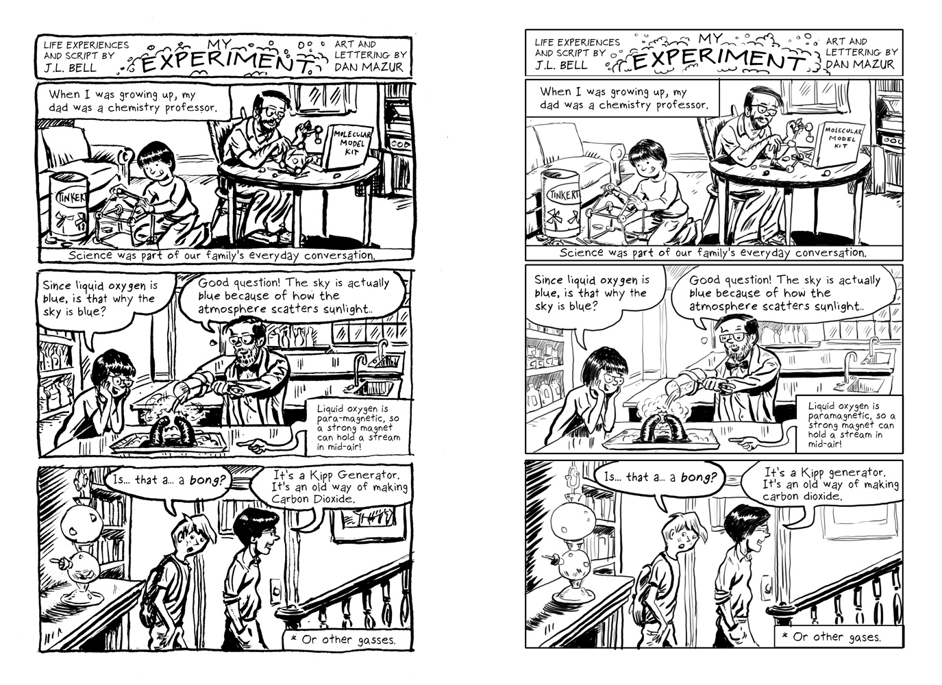 Click on it to look close, and ask yourself: which did I choose?  Which would you choose?
….
…I couldn’t just choose, though, that would be far too simple.  I decided I overall liked the quality of the real-brush-and-ink lines, but there were some details I was much happier with in the digital. So, since the pages were identically composed (the digital being inked over the traditional) I could just go through and grab details I wanted from the digital and paste them in over the inks.  I hoped that I was being careful enough that the different styles (no, the different media wouldn’t clash.  The final result:
Click on it to look close, and ask yourself: which did I choose?  Which would you choose?
….
…I couldn’t just choose, though, that would be far too simple.  I decided I overall liked the quality of the real-brush-and-ink lines, but there were some details I was much happier with in the digital. So, since the pages were identically composed (the digital being inked over the traditional) I could just go through and grab details I wanted from the digital and paste them in over the inks.  I hoped that I was being careful enough that the different styles (no, the different media wouldn’t clash.  The final result:
 Can you spot the digital paste-ins (hint: mostly faces). Â Anyway, I repeated this ridiculously complicated process for all 6 pages — for some pages I liked the digital overall better, and pasted in some details from the real-inks!
And that, friends, is how we fly across the ocean!
Can you spot the digital paste-ins (hint: mostly faces). Â Anyway, I repeated this ridiculously complicated process for all 6 pages — for some pages I liked the digital overall better, and pasted in some details from the real-inks!
And that, friends, is how we fly across the ocean! I’ll be in Portland for the Maine Comic Arts Festival on June 4 (along with the BCR of course).  I’ll have “Hooves of Death,” the Maine-set historical romp, “The Jernegan Solution,” plus anthologies galore… Muqtatafat, What’s Your Sign, Girl?, SubCultures, plus who knows what other surprises?  And the BCR will be there too, so save the date, and save your pennies… and no matter where you are, it’s worth a drive to Portland, too!  Look for us in the Fiction/Music area on the main floor, Portland Public Library, 10 AM – 5 PM.
 I’m heading to Toronto this weekend to exhibit with Boston Comics Roundtable at TCAF.  I’ll have Jernegan Solution, Hooves of Death and Muqtatafat on the table — and there’ll be lots more from Jesse Lonergan, Ben Doane, Oliva Li and the rest of BCR!  Find us at table 316!
 Latest illustration for Sage Knight’s Living Well column in the Topanga Messenger.
 I recently wrote an article about French cartoonist Chantal Montellier, for Comics Workbook Magazine #10, edited by Whit Taylor.
 Comics Workbook is probably the smartest and most interesting journal about independent comics, and appears only in print! I highly recommend ordering a copy from Copacetic Comics. besides my article, there’s comics by Aatmaja Pandya, Hannah Kaplan, and Nicholas Offerman, an interview with Rob Kirby, Keiler Roberts and Scott Roberts, and a converbetween Sara Lautman and Scott Longo.
Since there’s no online edition, here’s a look at the article. (And I will point out that this actually came out BEFORE the Angoulême Festival’s problems with women cartoonists… so don’t think I was just jumping on the bandwagon!)
Comics Workbook is probably the smartest and most interesting journal about independent comics, and appears only in print! I highly recommend ordering a copy from Copacetic Comics. besides my article, there’s comics by Aatmaja Pandya, Hannah Kaplan, and Nicholas Offerman, an interview with Rob Kirby, Keiler Roberts and Scott Roberts, and a converbetween Sara Lautman and Scott Longo.
Since there’s no online edition, here’s a look at the article. (And I will point out that this actually came out BEFORE the Angoulême Festival’s problems with women cartoonists… so don’t think I was just jumping on the bandwagon!)
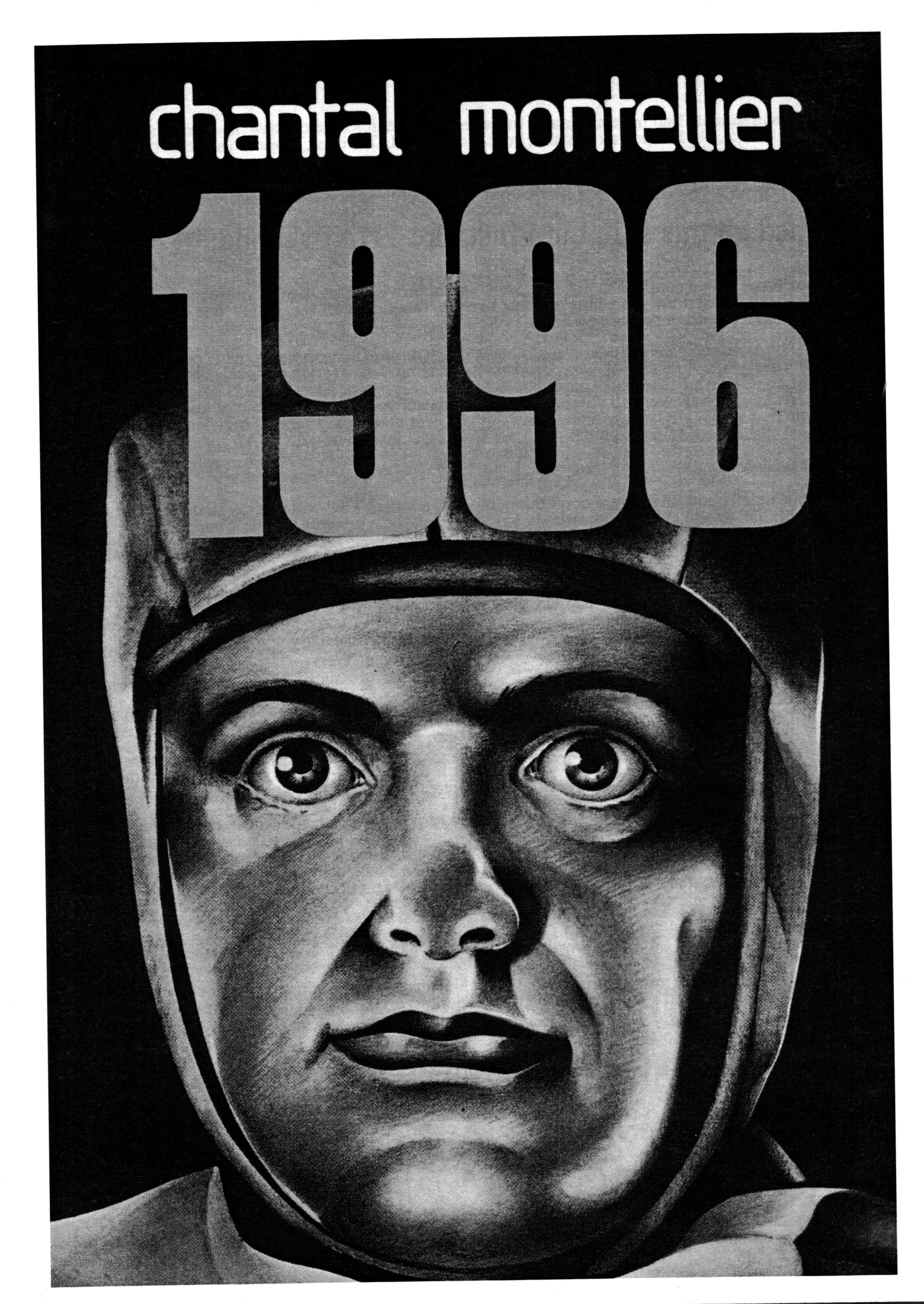
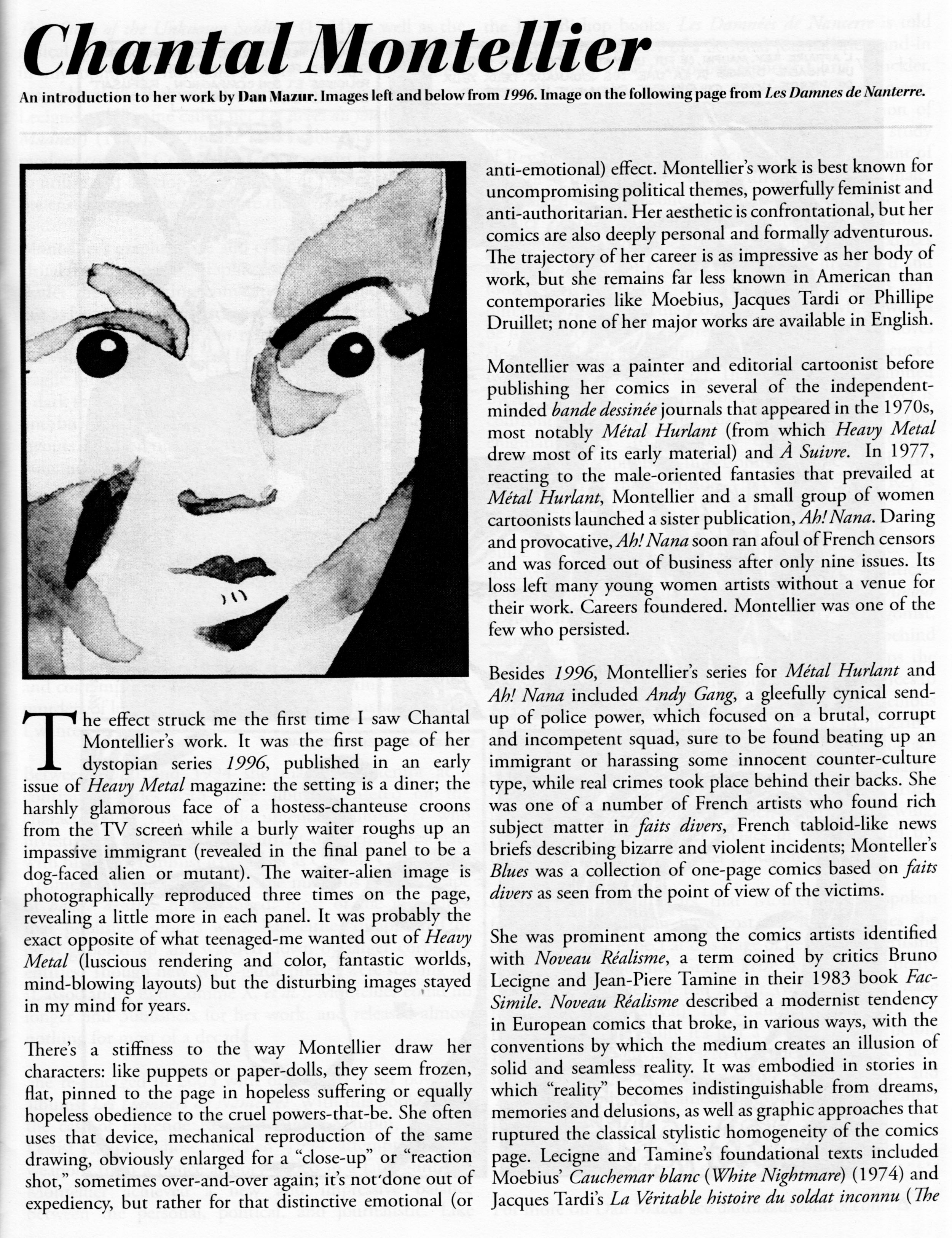
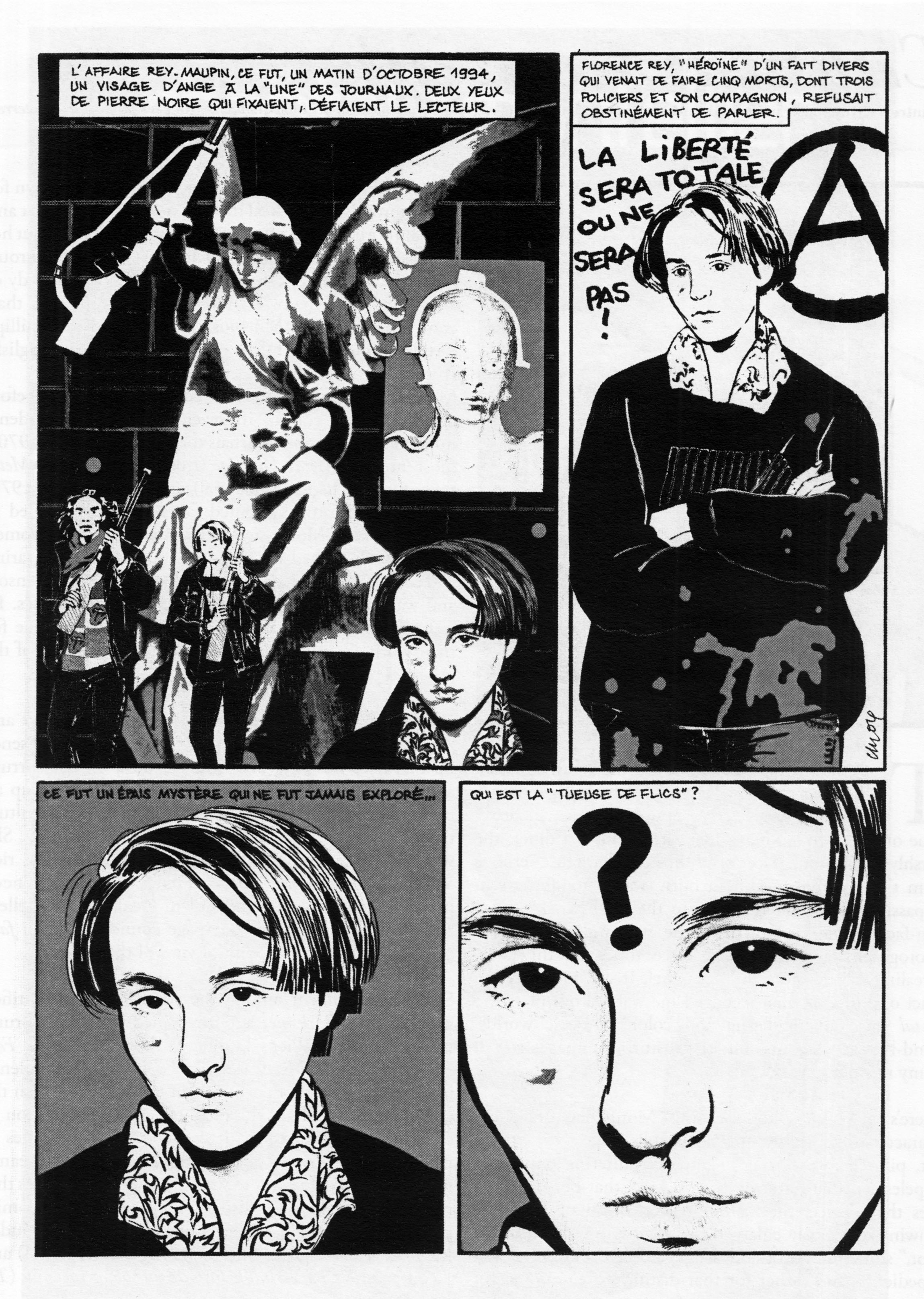
 And here’s how that page from Damnes des Nanterre looks in color:
 If you’re old enough to remember the American Seed Company ads, this will all mean more to you, of course.
Here are some of the real ads that inspired me (and from which I pilfered elements):
If you’re old enough to remember the American Seed Company ads, this will all mean more to you, of course.
Here are some of the real ads that inspired me (and from which I pilfered elements):
 And then especially these Cloverine Salve ads, which featured little comic strips like the one I drew for mine (you can click on these to make them more readable):
 Some showed how valuable the prizes could really be.  You might even use them to stop a rampaging gorilla:
 The ads could get pretty bizarre. Â This one has a strangely apocalyptic tone: the “FUNman” lets the kiddies know that the World is on Fire!
 Here is a get-rich-quick scheme for the young folks, basically encouraging Jimmy to become a small-time crooked casino operator:
 One of my favorites is this Charles Atlas-type pitch, with art by Captain Marvel artist, C.C. Beck, which suggests an unusual use for your new he-man body: advancing at work by punching out your fellow workers!
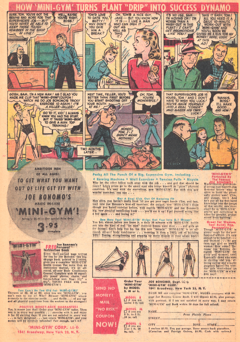
 Problems: the horse is too pudgy, and looks more like a stuffed donkey to me. Â Also not happy with the way I drew the skirt. Â I’ve done a lot more drawing of horses and clothing in the past couple months, so I thought it was worth updating. And take another crack at the Ghost flying in, why not?
I used a lightbox, so I could just re-draw the figures, and have them in correct positions to insert digitally into the page, without having to re-letter, etc. Other than perhaps the tail, I think everything is better:
Problems: the horse is too pudgy, and looks more like a stuffed donkey to me. Â Also not happy with the way I drew the skirt. Â I’ve done a lot more drawing of horses and clothing in the past couple months, so I thought it was worth updating. And take another crack at the Ghost flying in, why not?
I used a lightbox, so I could just re-draw the figures, and have them in correct positions to insert digitally into the page, without having to re-letter, etc. Other than perhaps the tail, I think everything is better:
 Or, if you prefer to compare via an animated gif:
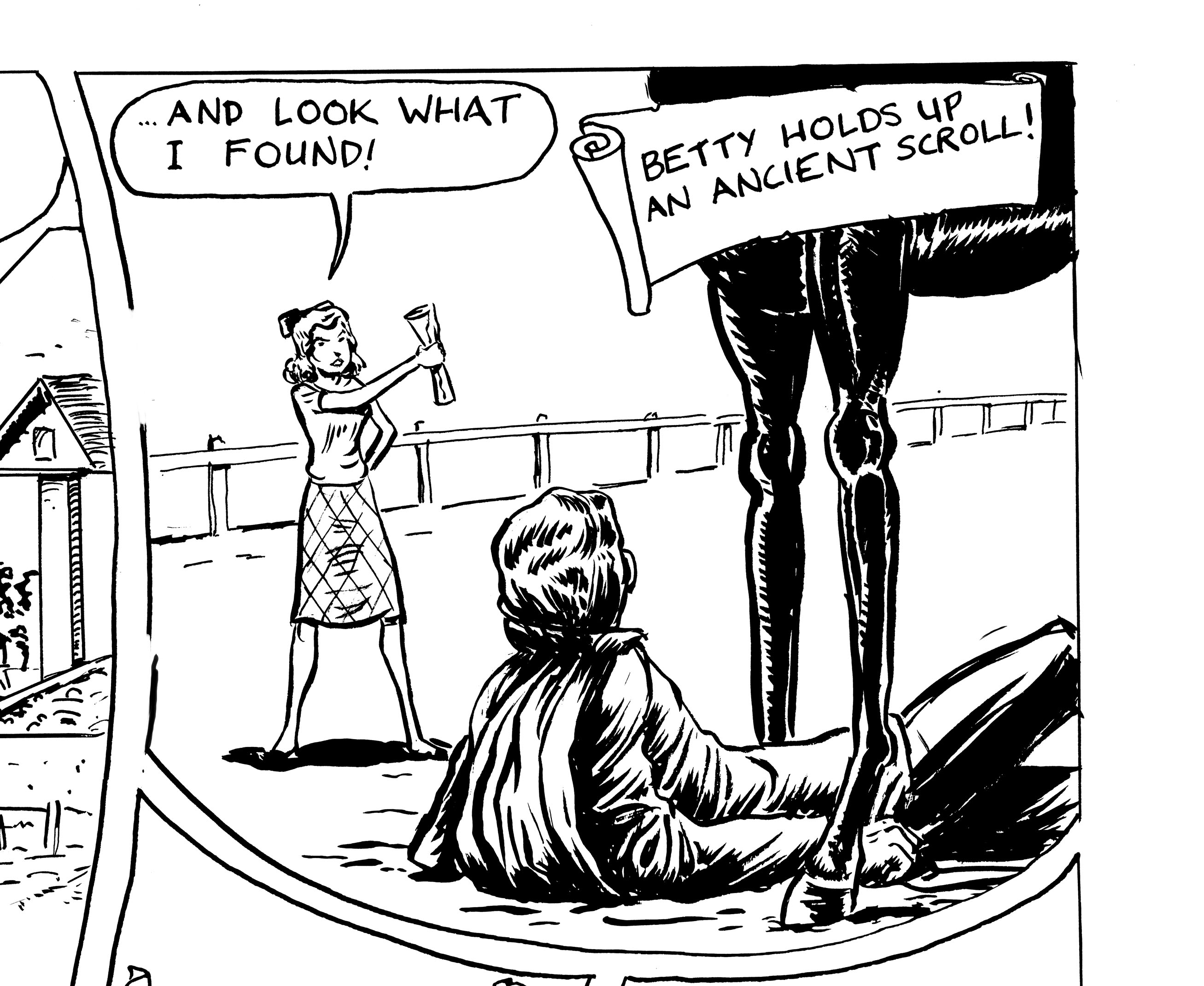
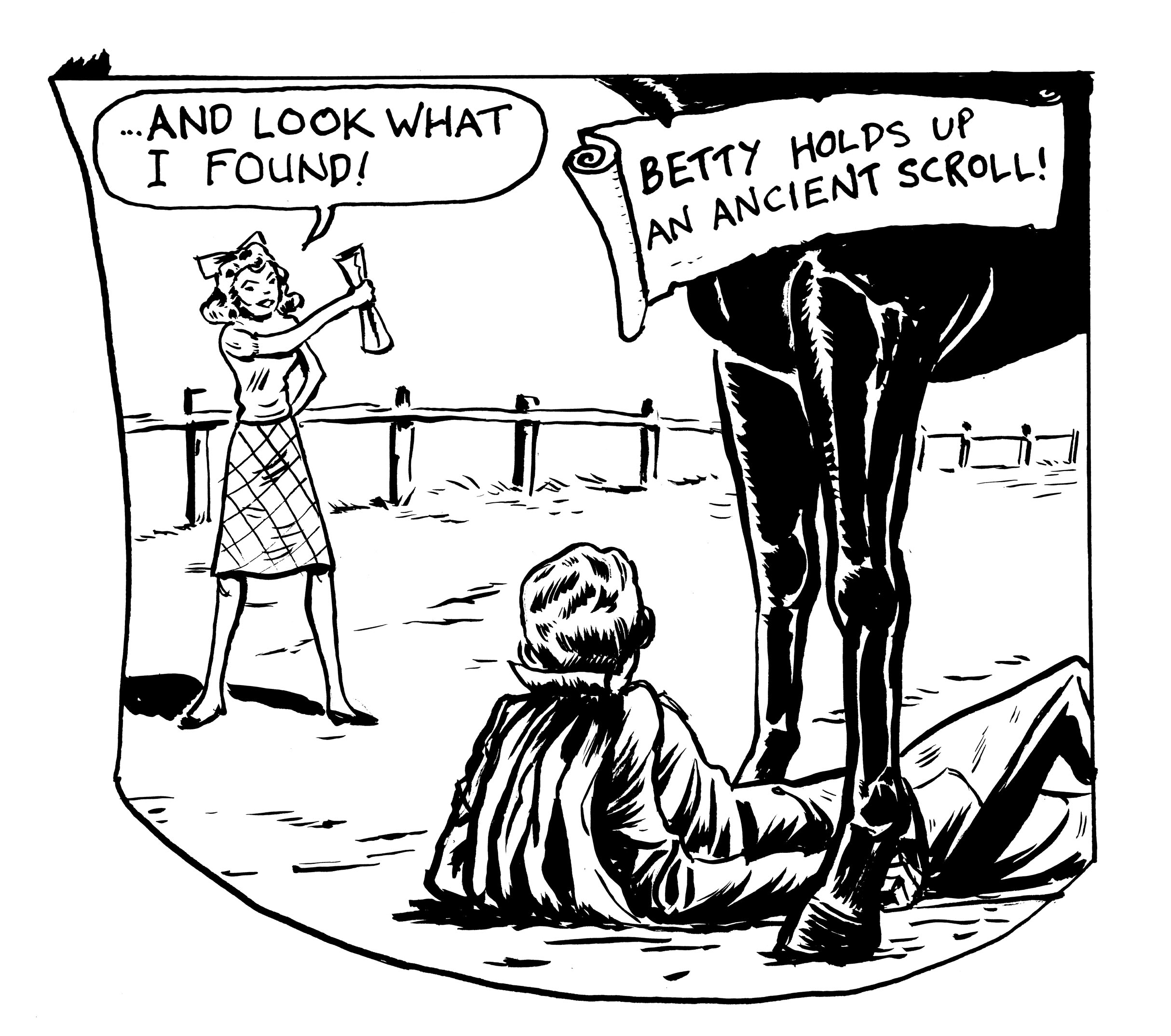
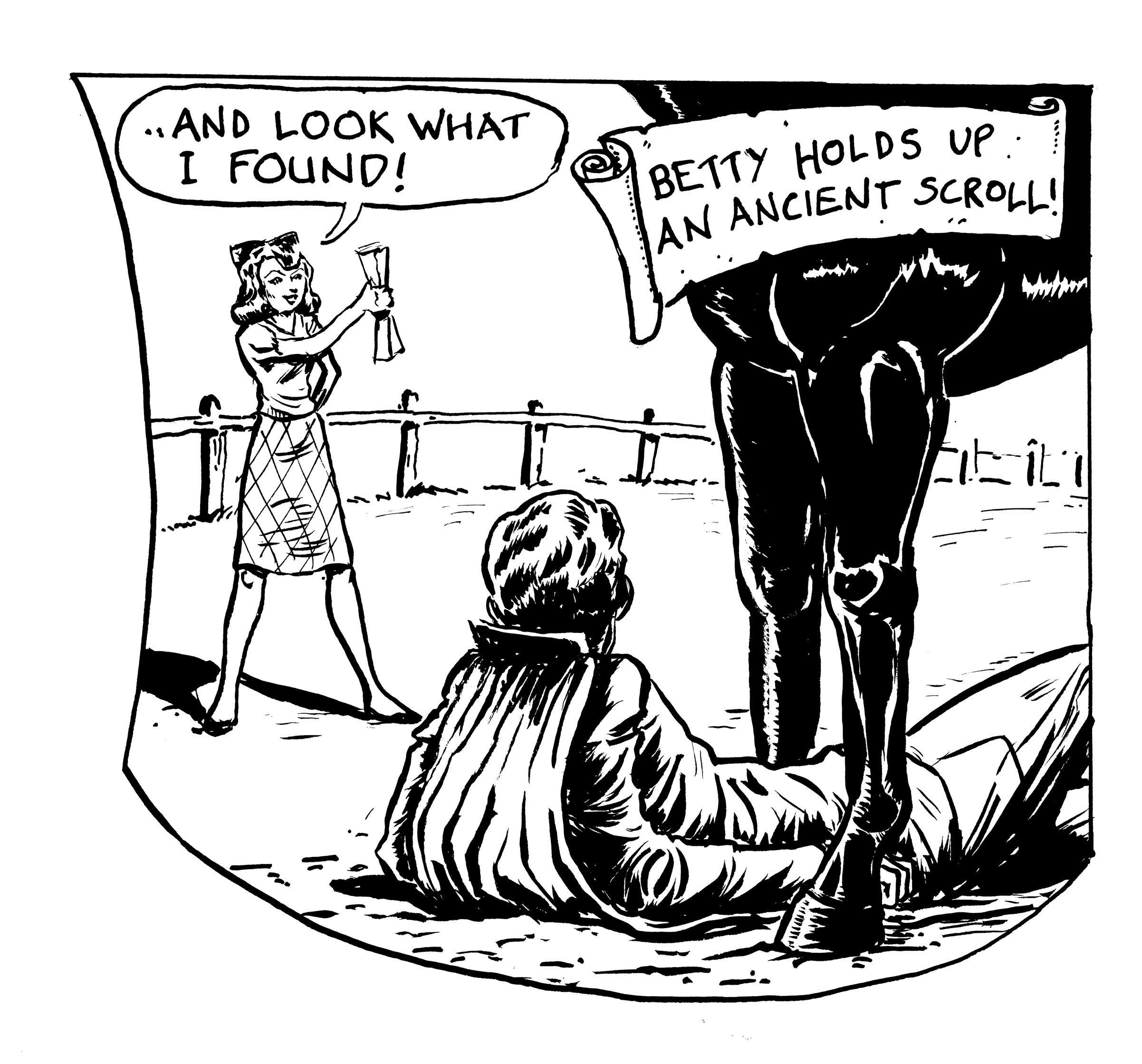
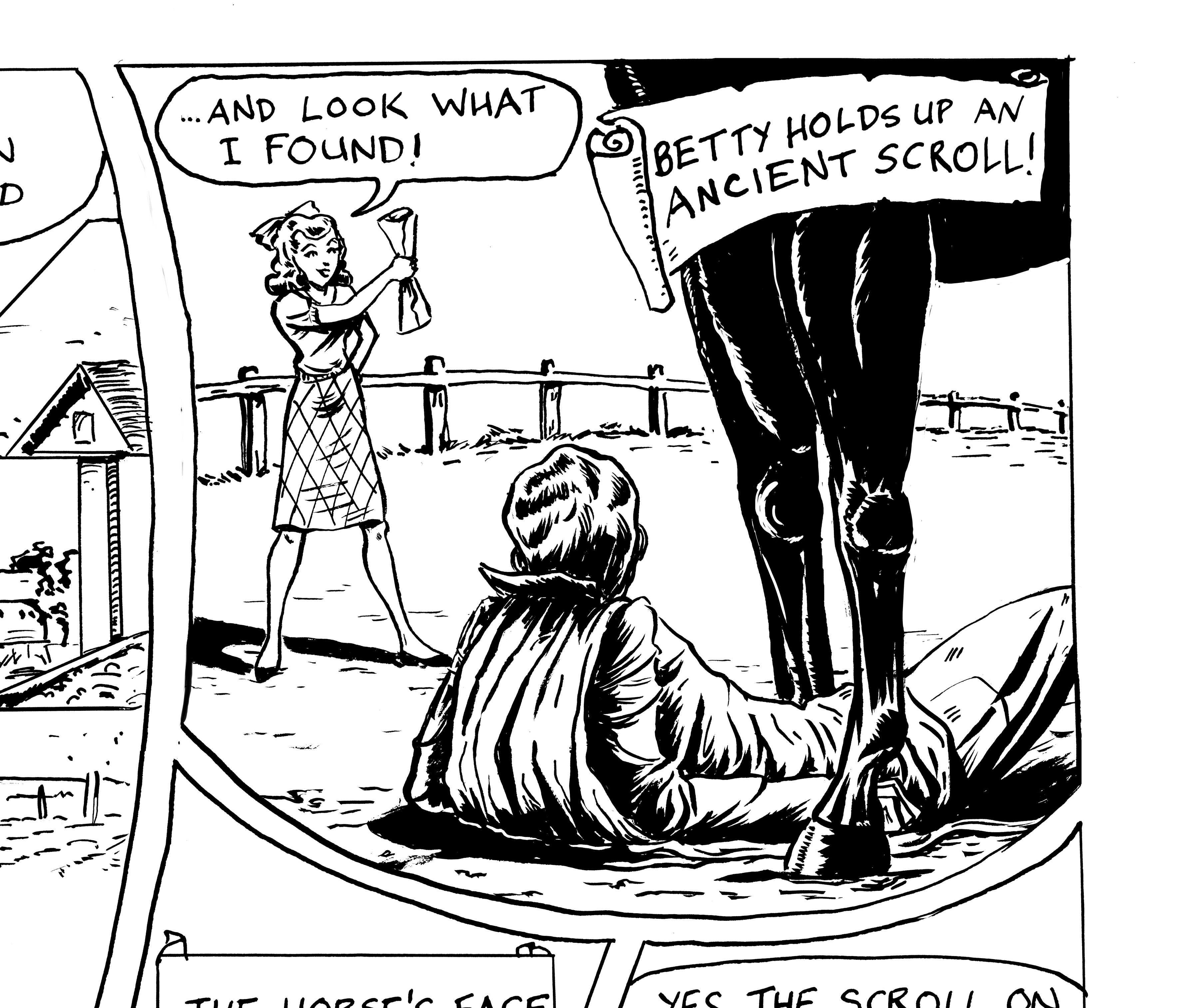
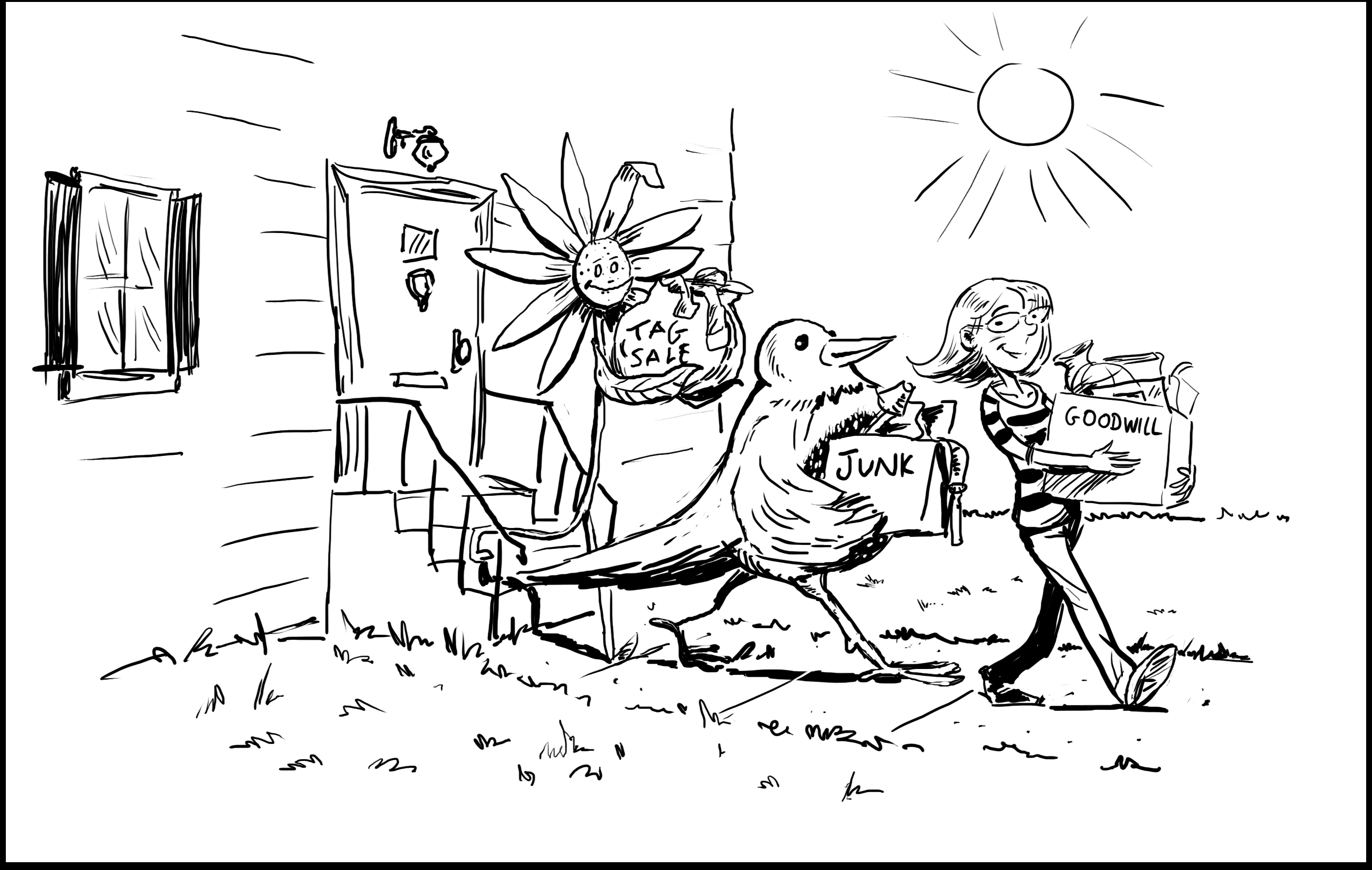
 So this was my first “final,” finished version:
 I felt that this panel was the weakest on the page for a couple of reasons.  I had totally overdone the shading with all those lines… muddied up the panel and the page. It doesn’t look too bad out of context, but when reduced, it really just turns into a gray mess (I’m drawing this story Golden Age-style, “twice-up.”  In other words, it will be reduced by 50% when printed.
Also, the pose of the central figure was not satisfactory. Â So…
I felt that this panel was the weakest on the page for a couple of reasons.  I had totally overdone the shading with all those lines… muddied up the panel and the page. It doesn’t look too bad out of context, but when reduced, it really just turns into a gray mess (I’m drawing this story Golden Age-style, “twice-up.”  In other words, it will be reduced by 50% when printed.
Also, the pose of the central figure was not satisfactory. Â So…
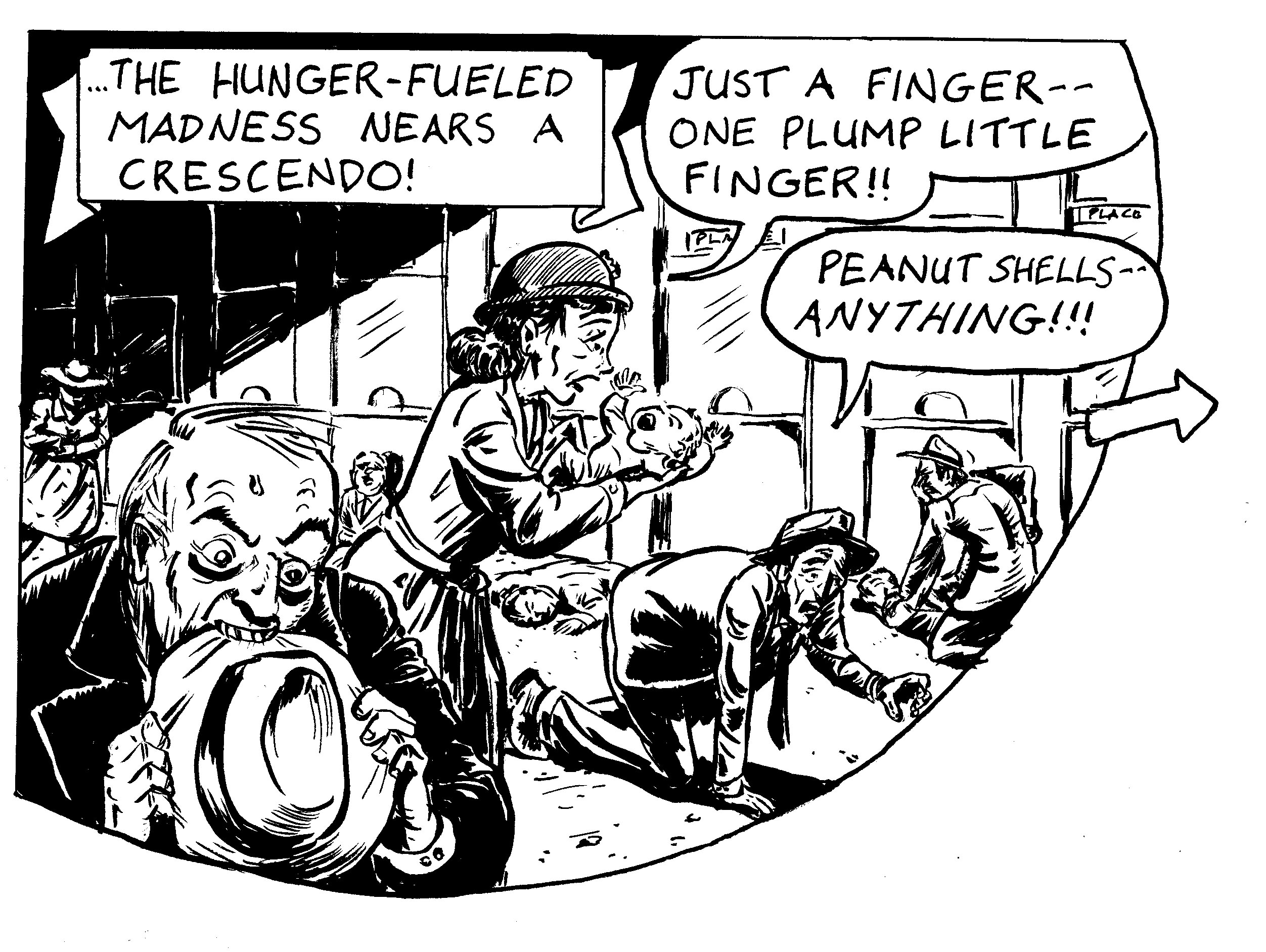 Altogether cleaner with simple black and white shading, and by moving the woman to a side view I could call better attention to the baby in her arms.  I made the guy eating his hat larger, and placed the crawling better so I didn’t have to crop him.  I  had to lose some of the background figures… but a stronger read, I HOPE, especially when it’s reduced.
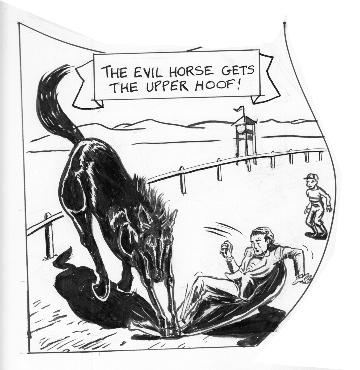 Version 1, in the original page. Â I got feedback that it looked like the horse was crushing his feet, and I didn’t like the falling figure much, and I thought I could do better on the horse.
Version 1, in the original page.  I got feedback that it looked like the horse was crushing his feet, and I didn’t like the falling figure much, and I thought I could do better on the horse. 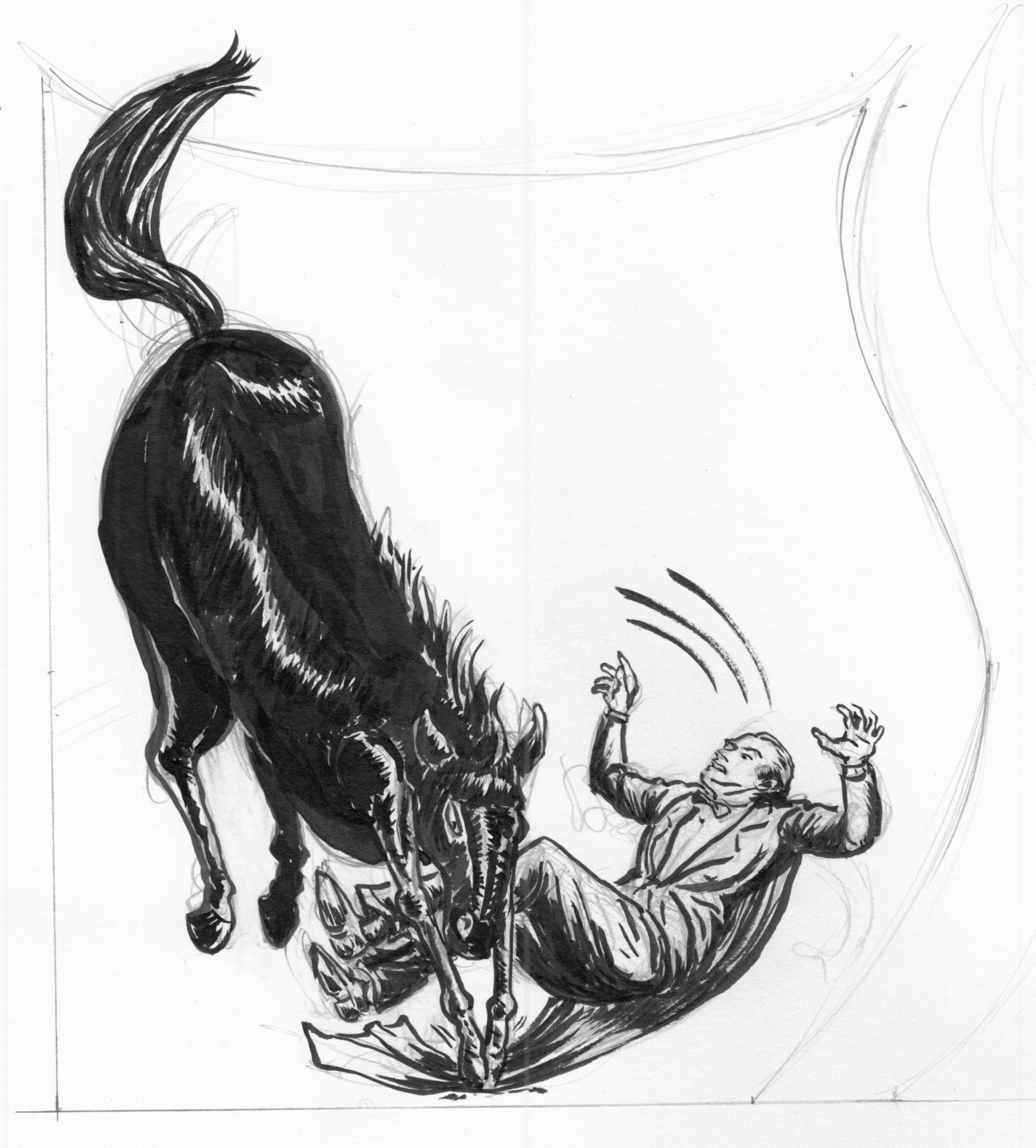 Version 2 (aborted). I can’t remember what I didn’t like about this one, actually.  Maybe the fact that the horse looks like a large sausage,  not enough detail in the reflections off the fur.  Oh also I think the guy is too big relative to the horse?
 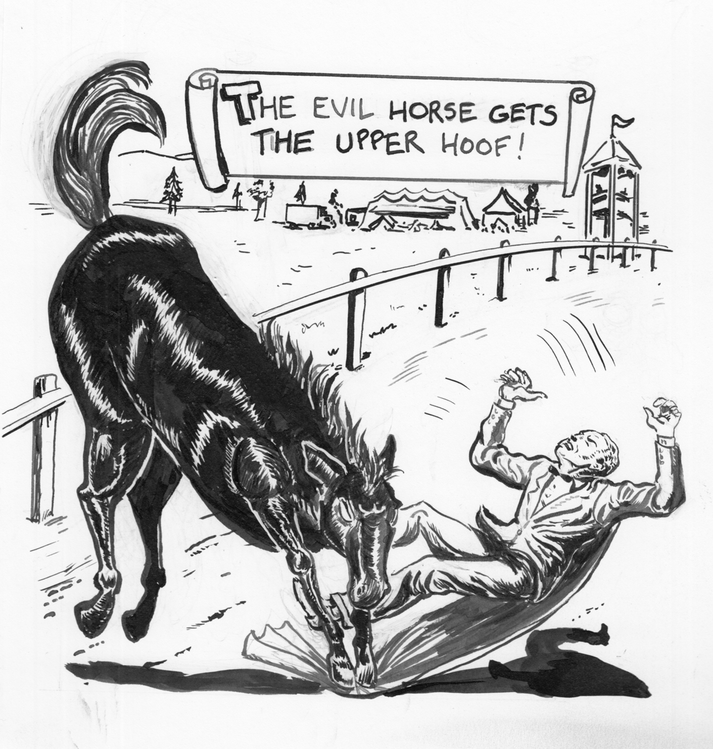 Version 3… Everything better, except the way I changed the position of the horse (in order to make it bigger), making the panel less dynamic. Now the horse looks stiff and even more sausage-y.  Also, still relative size problems.  Either a very large man or a pony, not a horse.
Version 3… Everything better, except the way I changed the position of the horse (in order to make it bigger), making the panel less dynamic. Now the horse looks stiff and even more sausage-y. Â Also, still relative size problems. Â Either a very large man or a pony, not a horse.
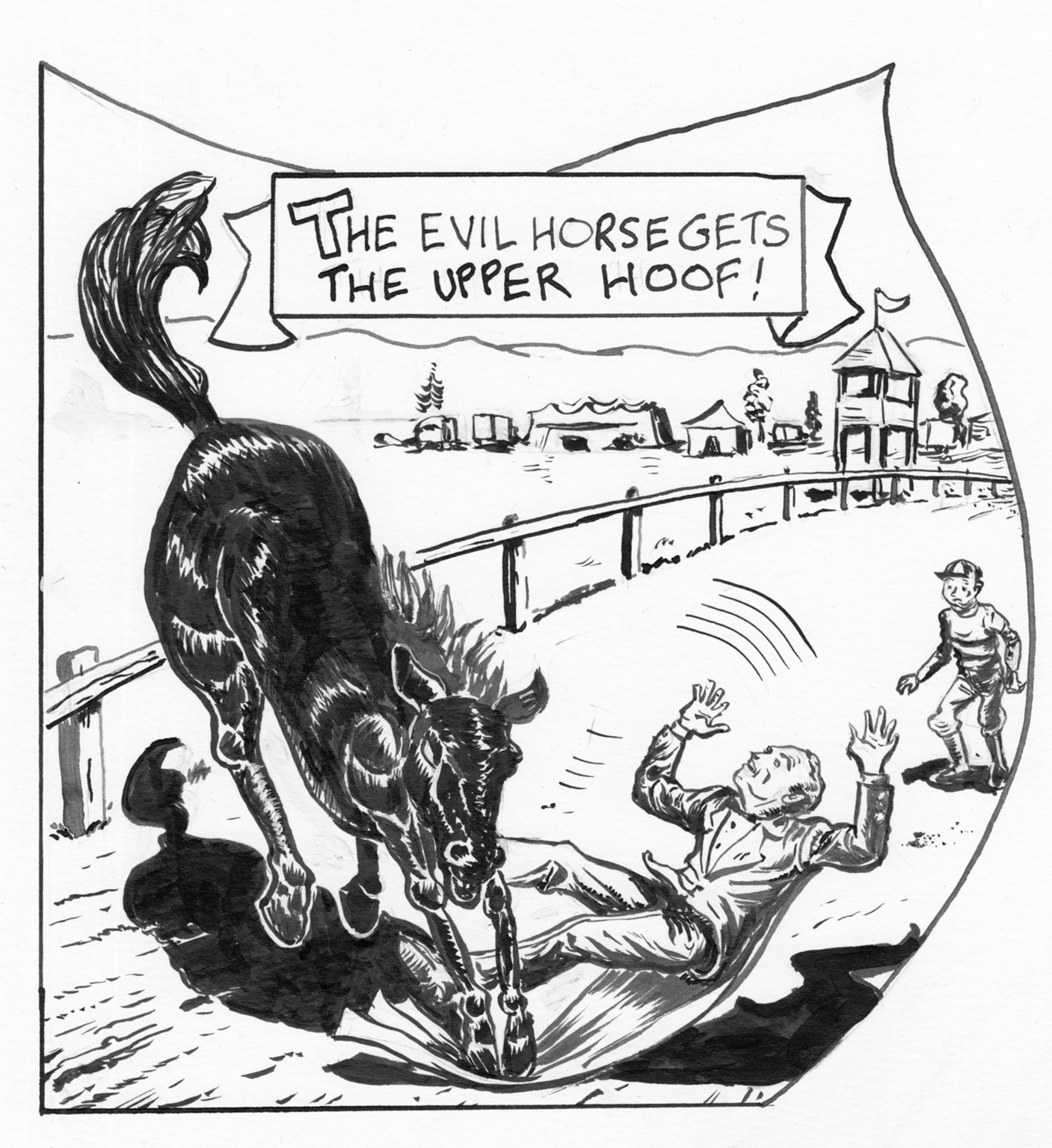 OK.  The figure was probably better in 2 and 3, but overall the best, I think. Composition works… I think my best horse, and put more care into the background details as well. Oh, well, time to move on…  wait, actually… I think there should be heavier shadows on the guy’s right leg…
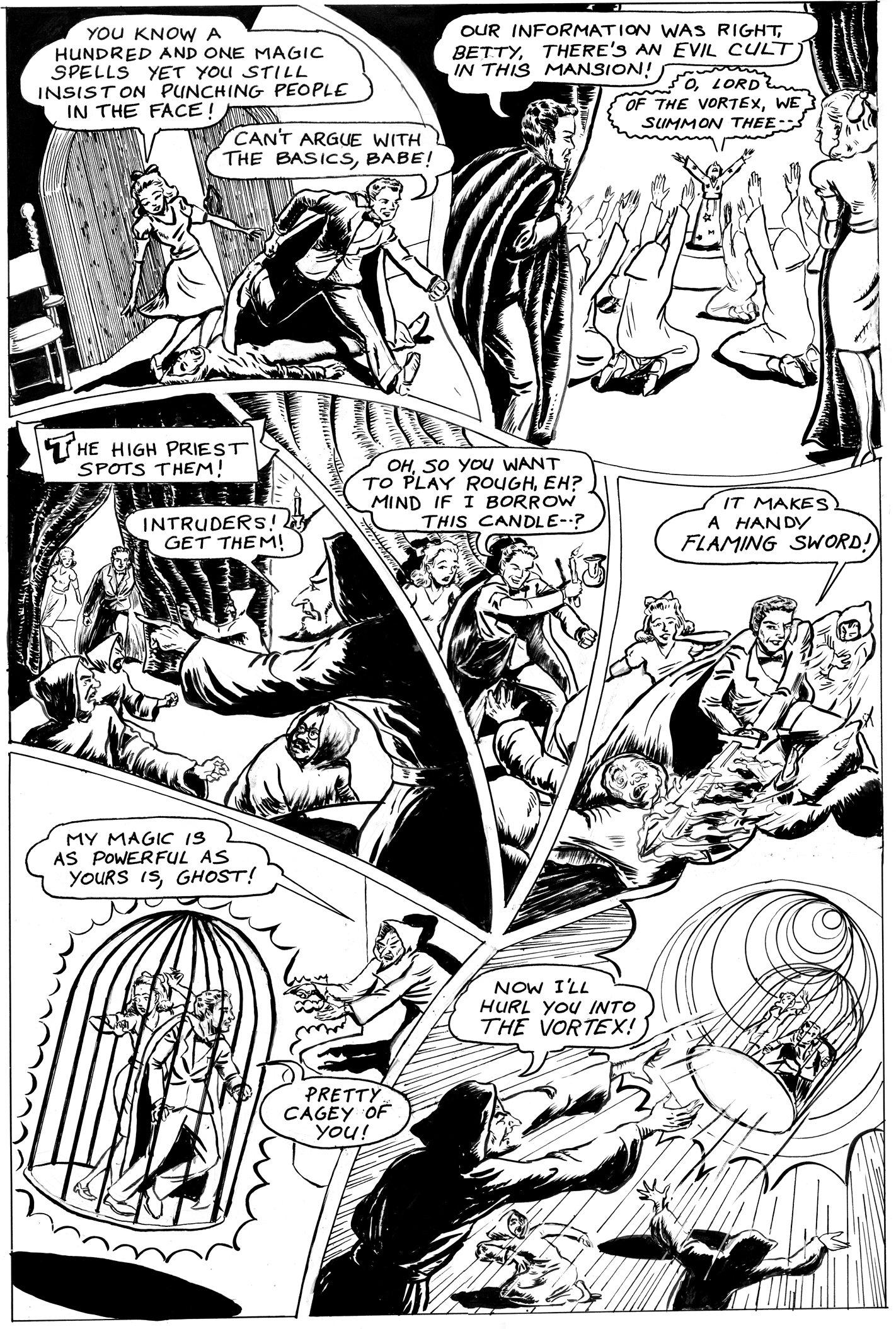
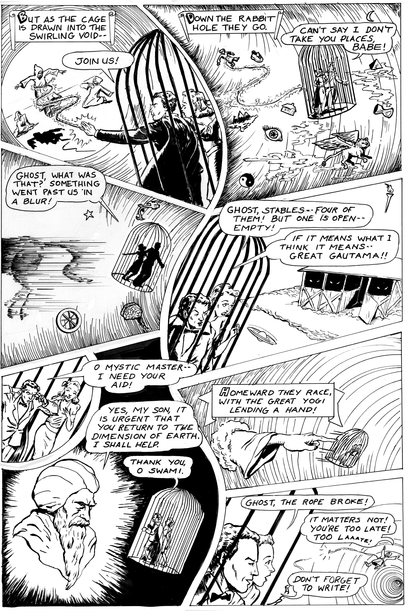
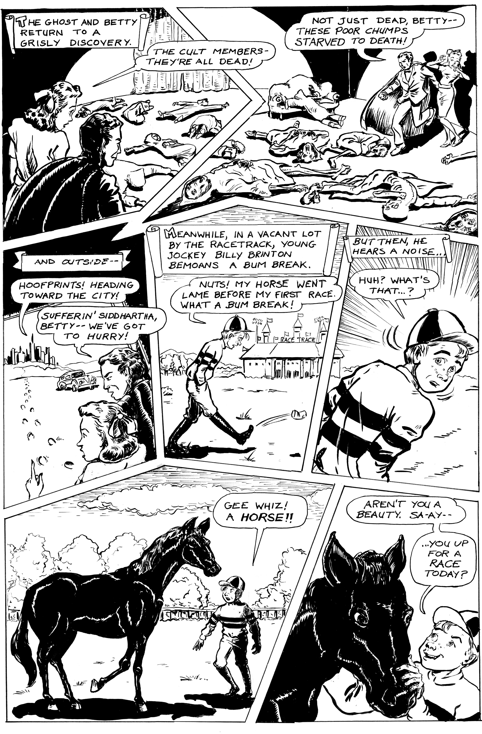
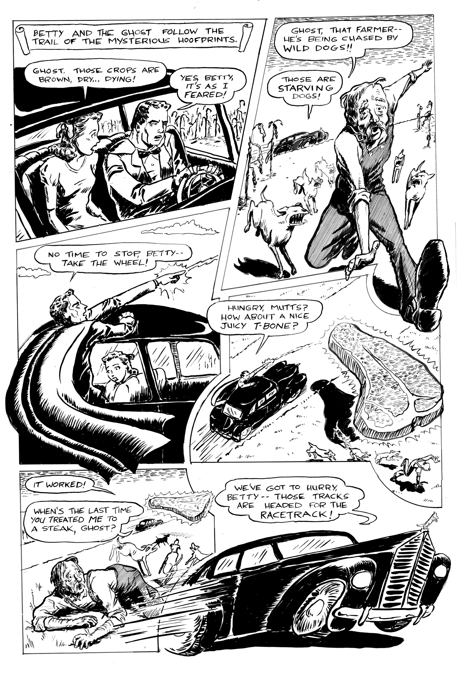
 Lots of great comic art in this show at the MICE space at Lesley. Including the originals for the first three pages of my Sagittarius story from What’s Your Sign, Girl?:

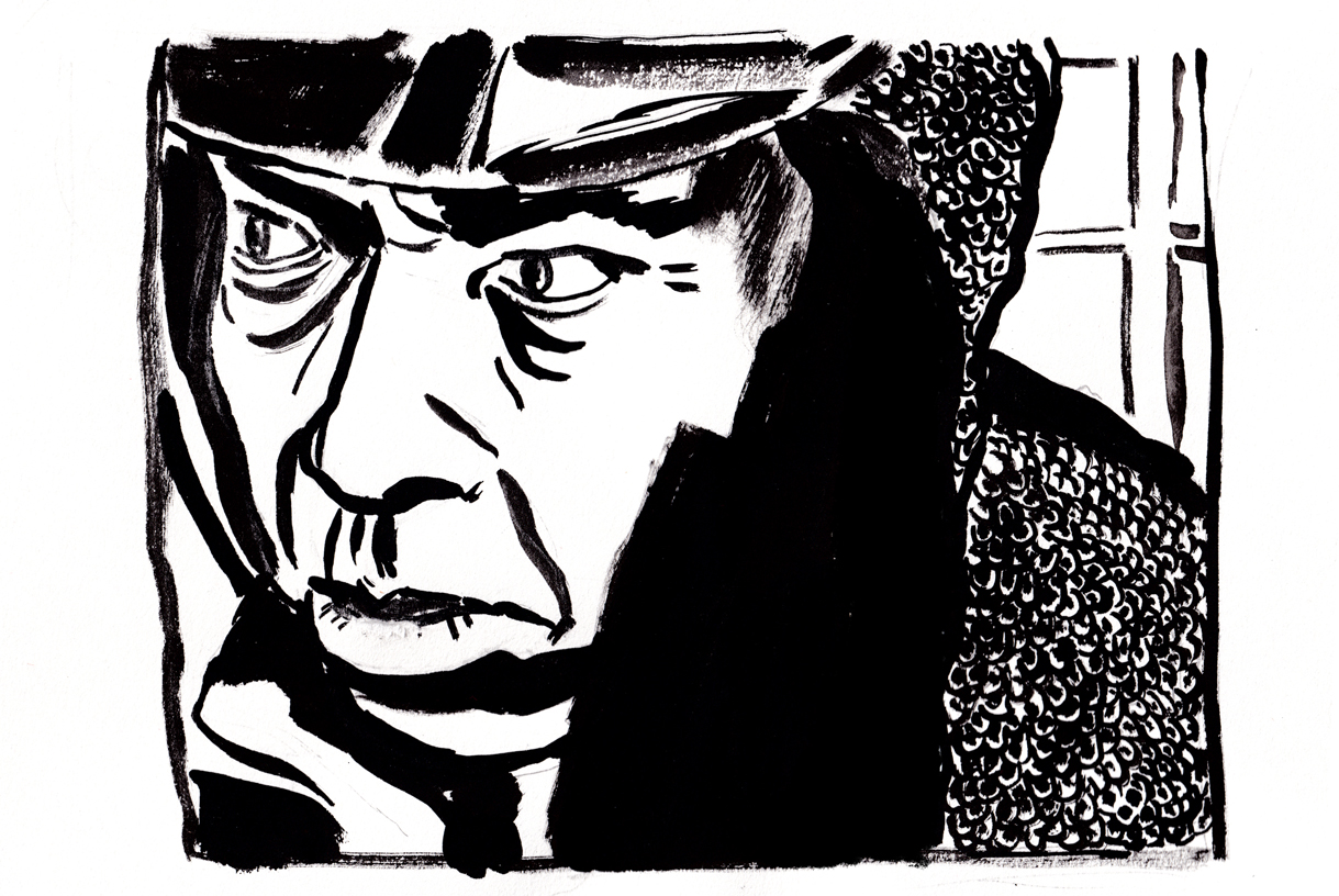
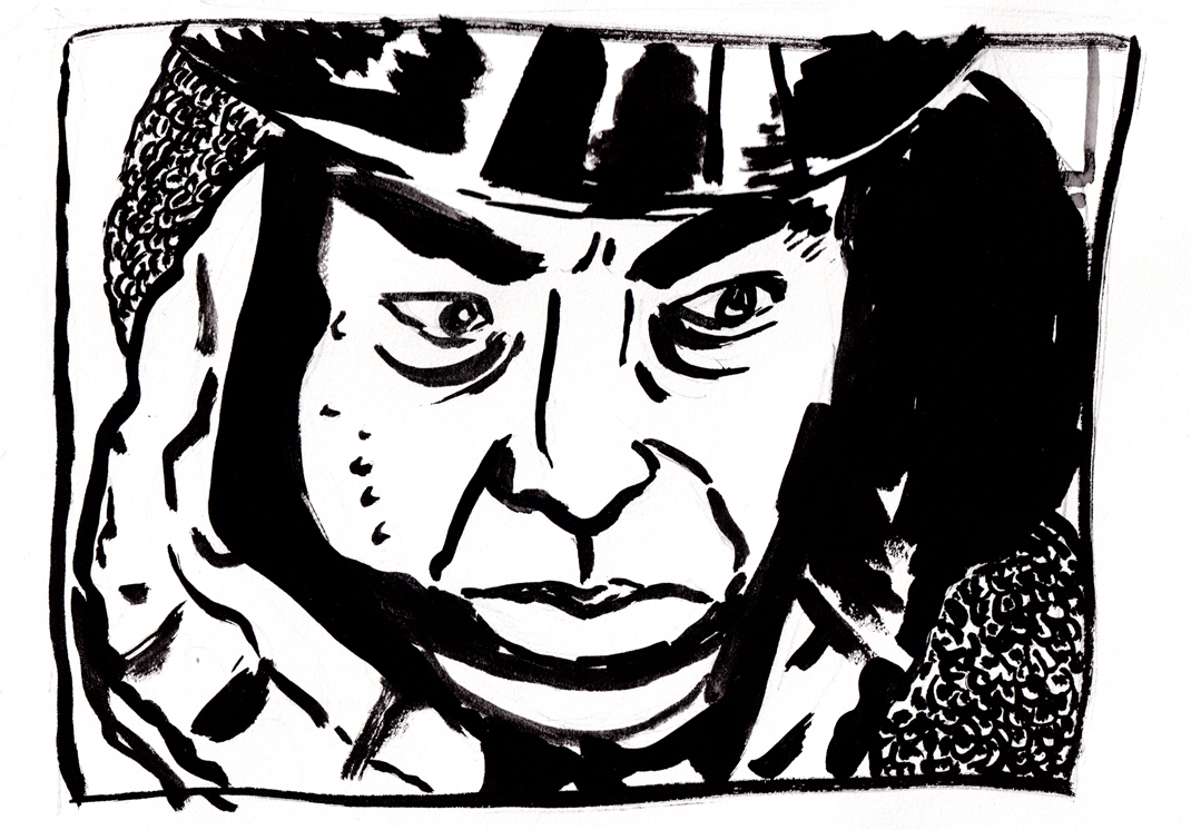
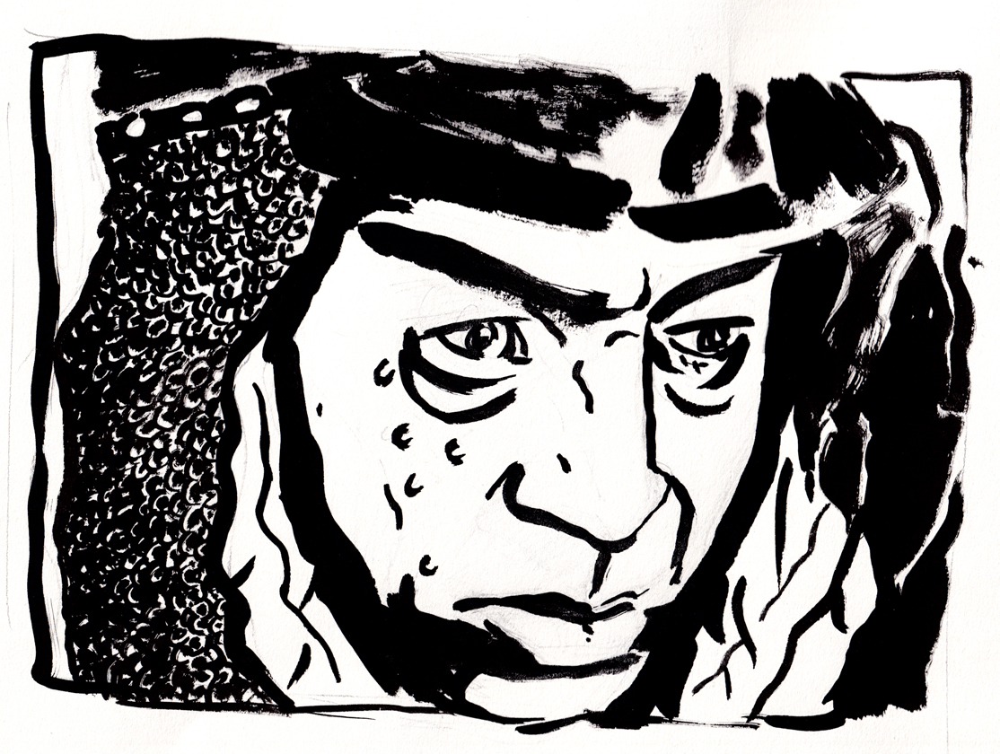
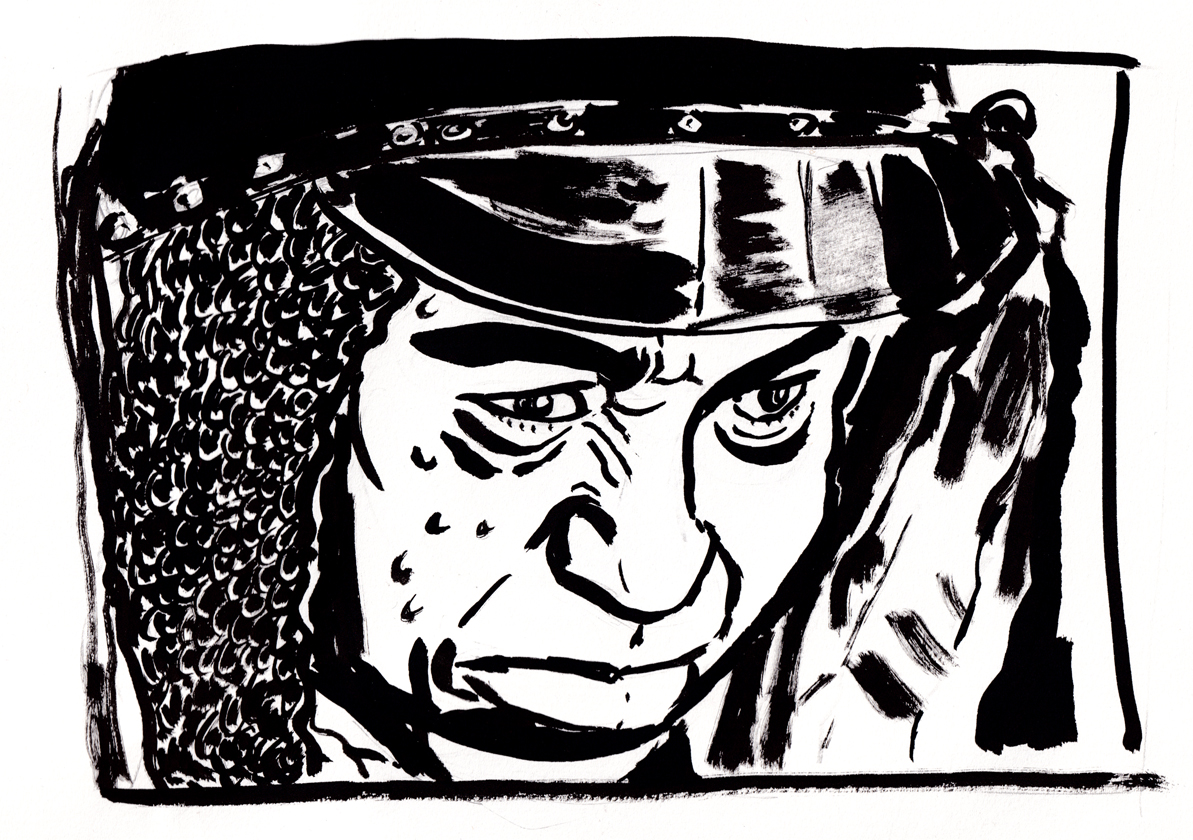

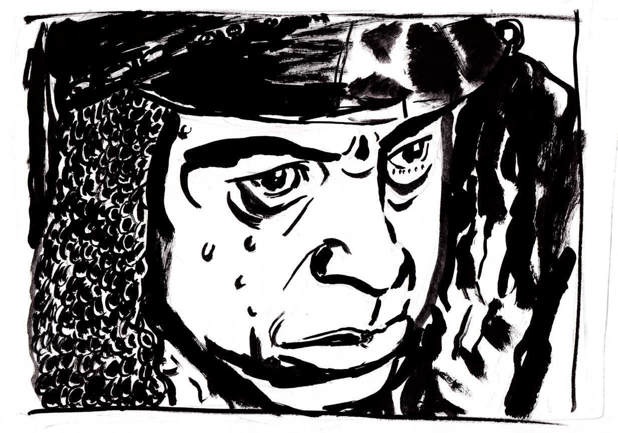
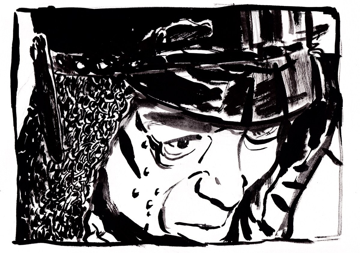
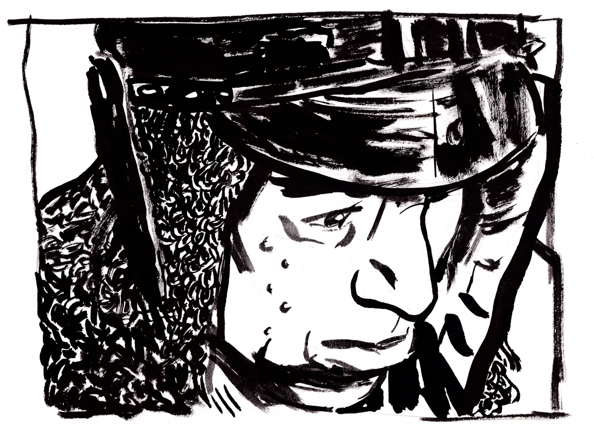
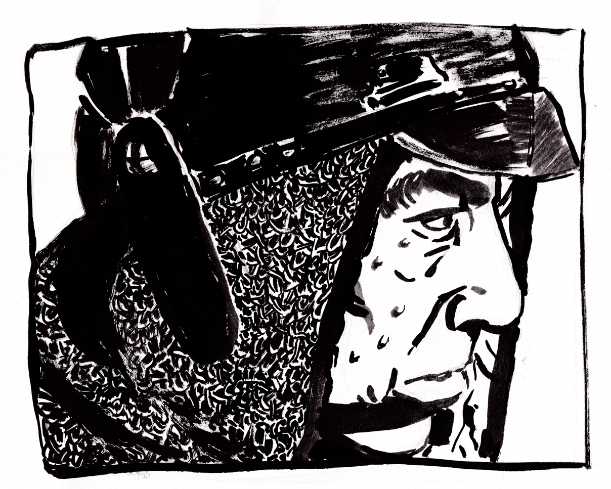

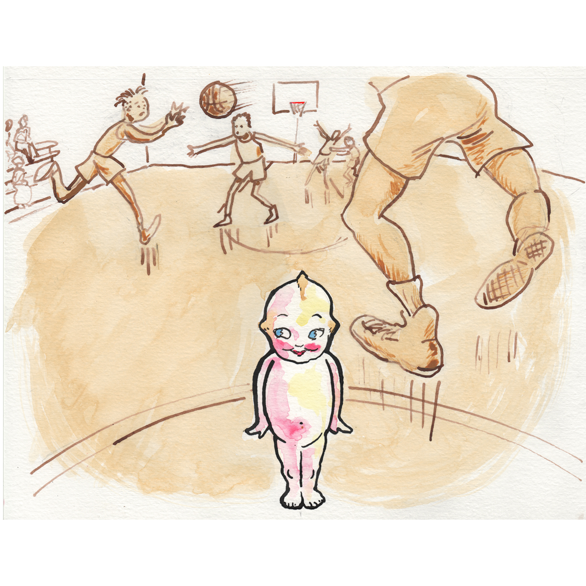
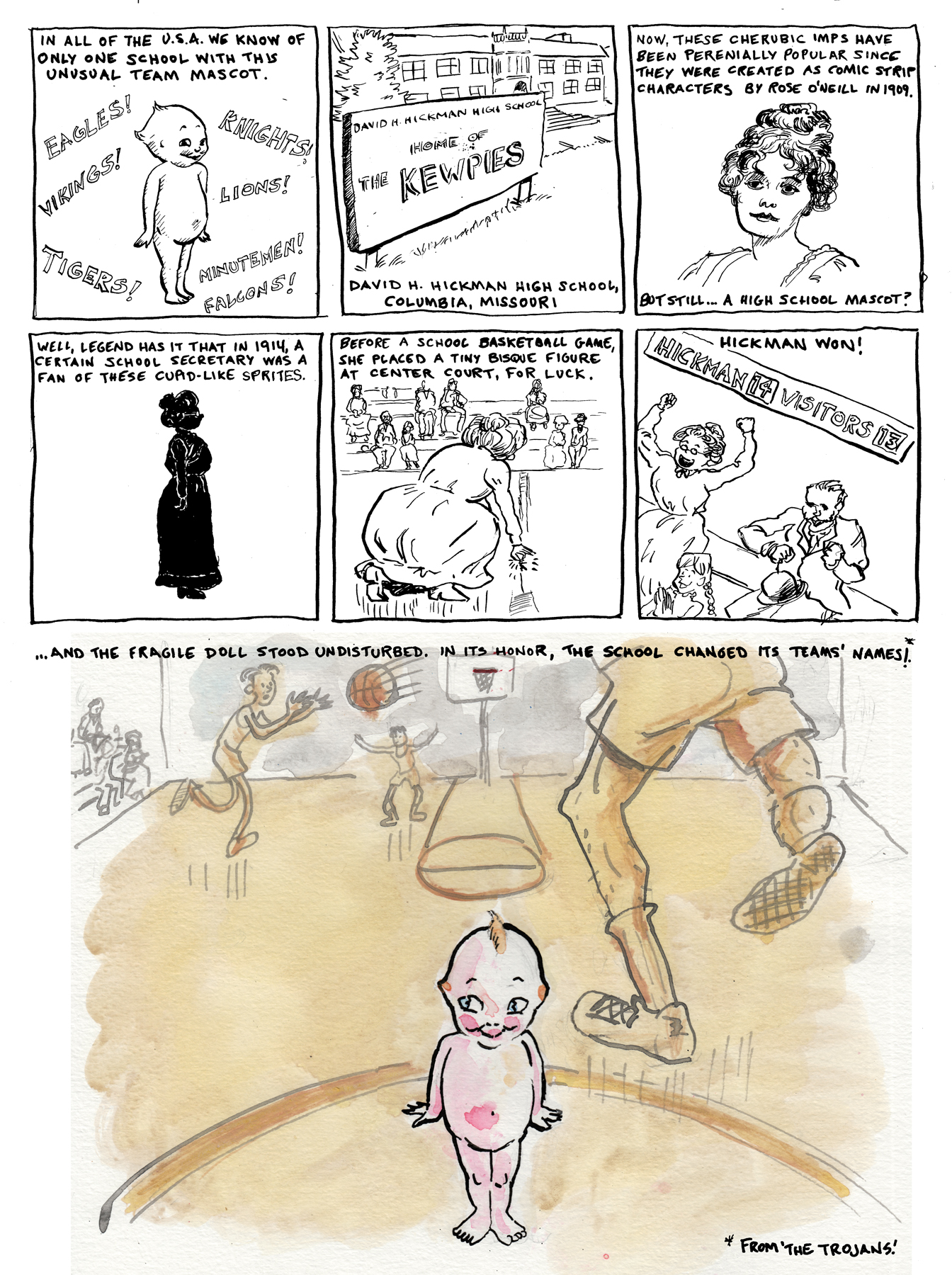

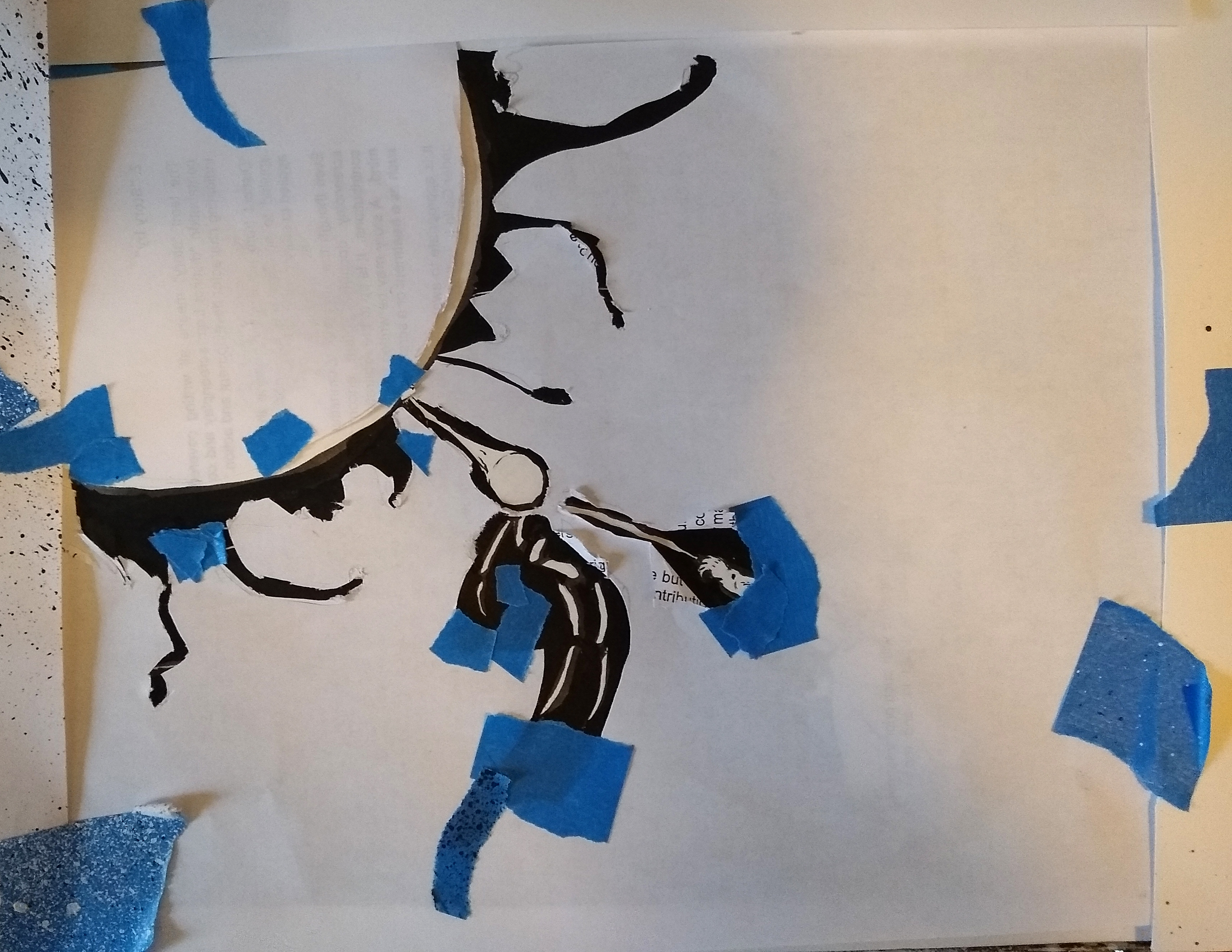
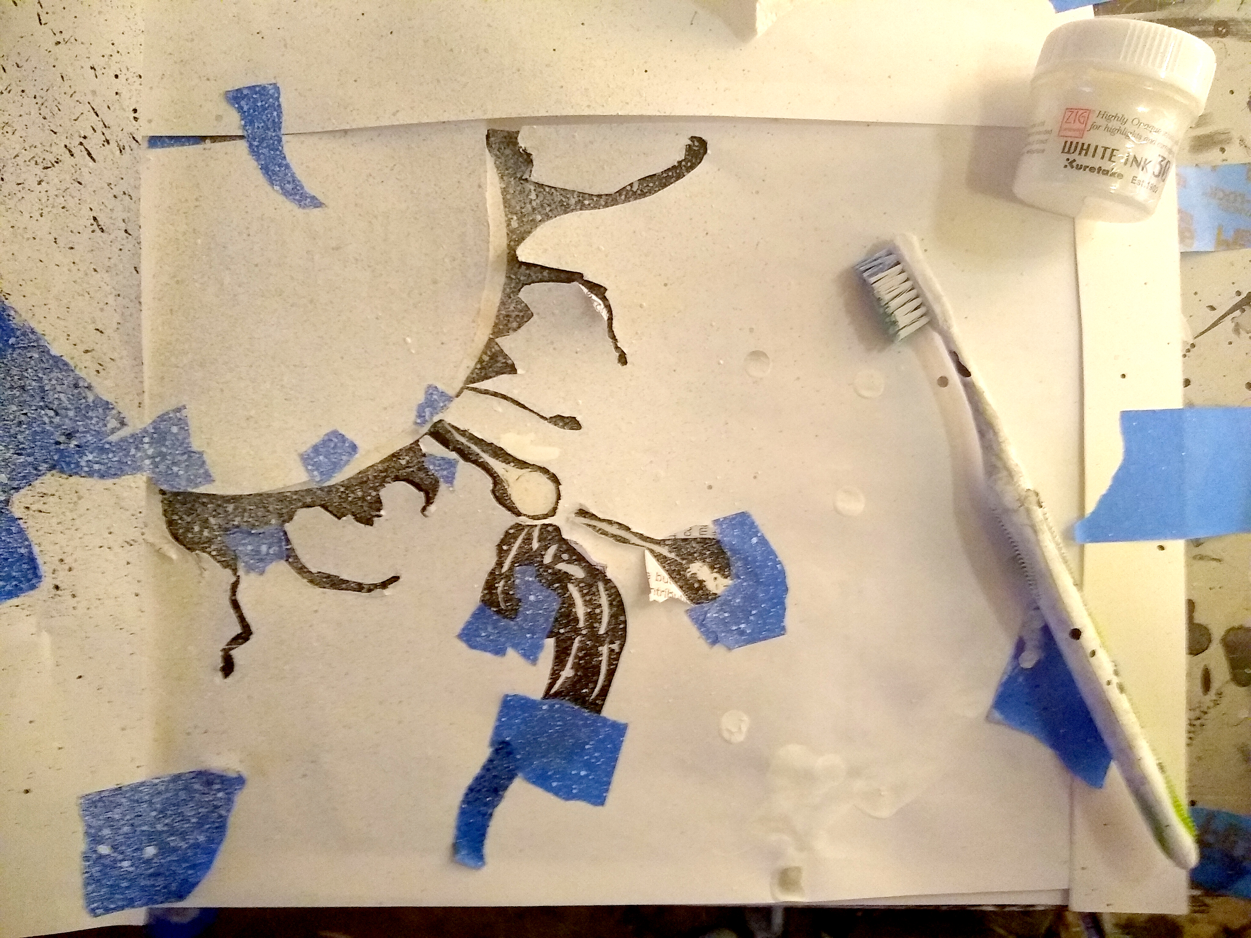
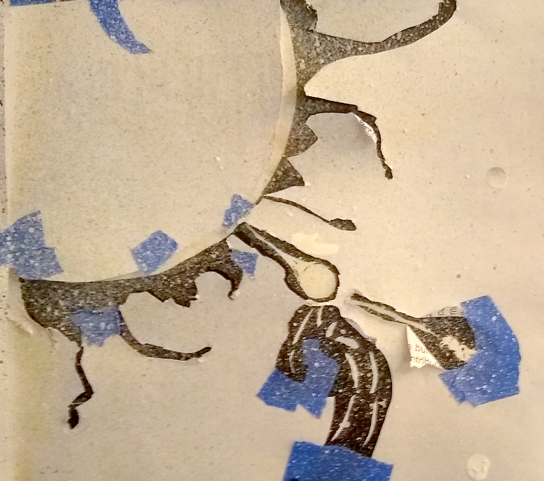
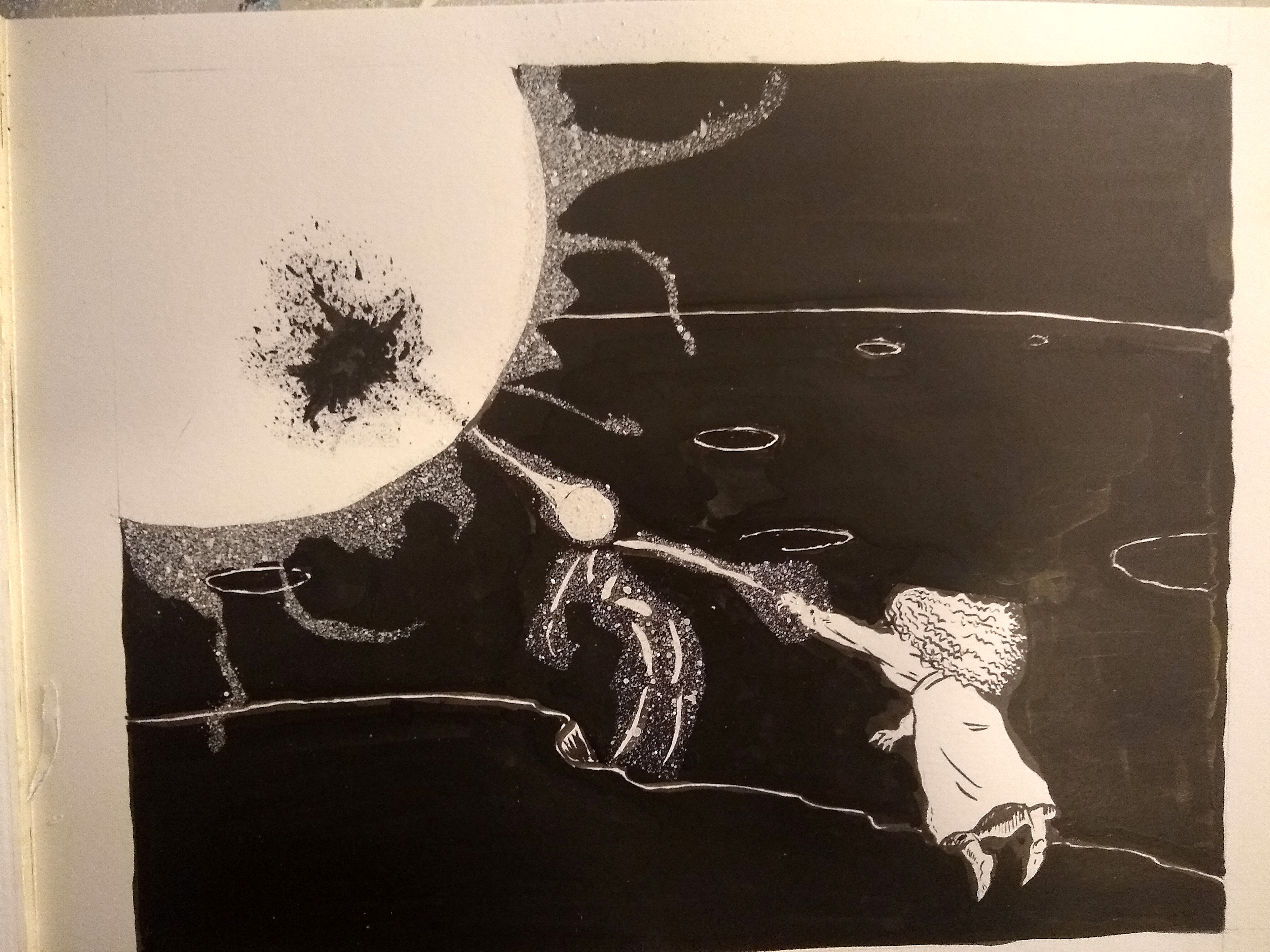
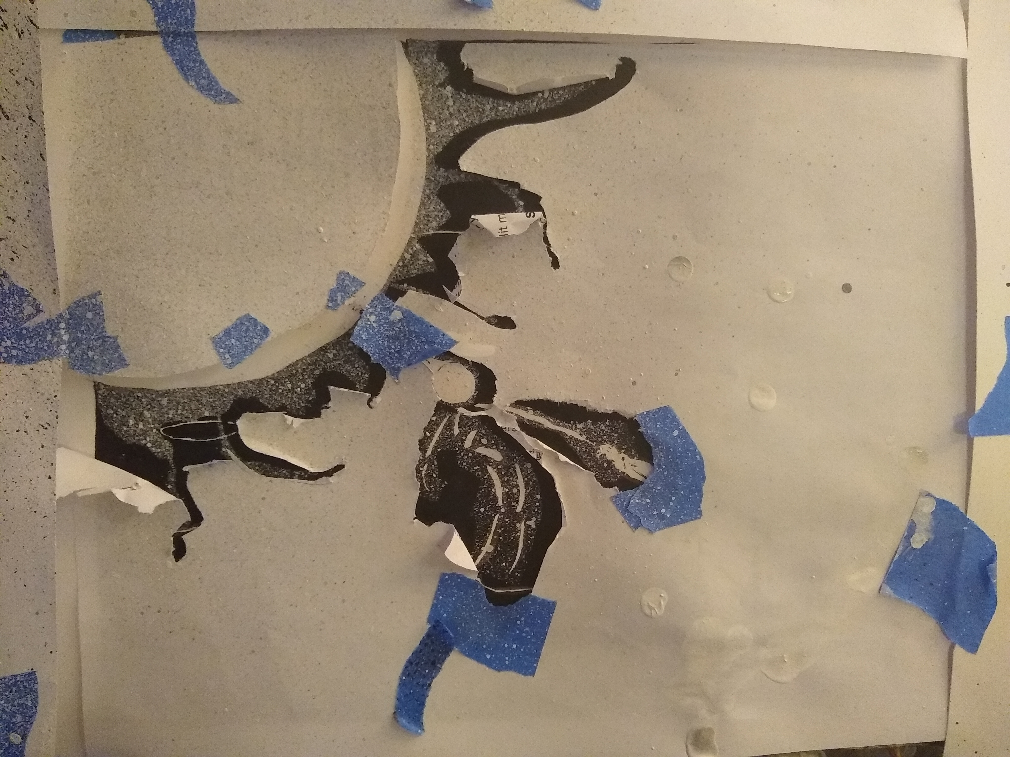
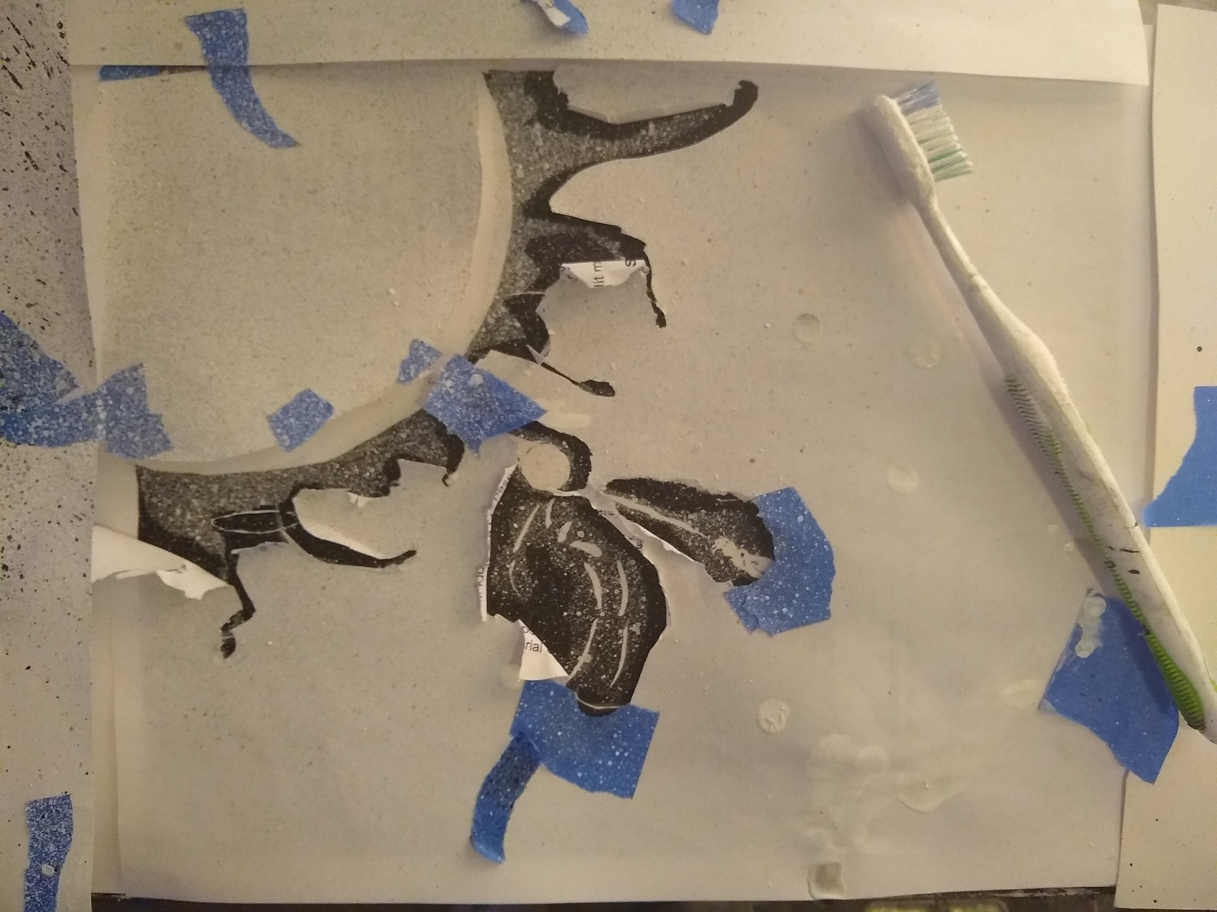
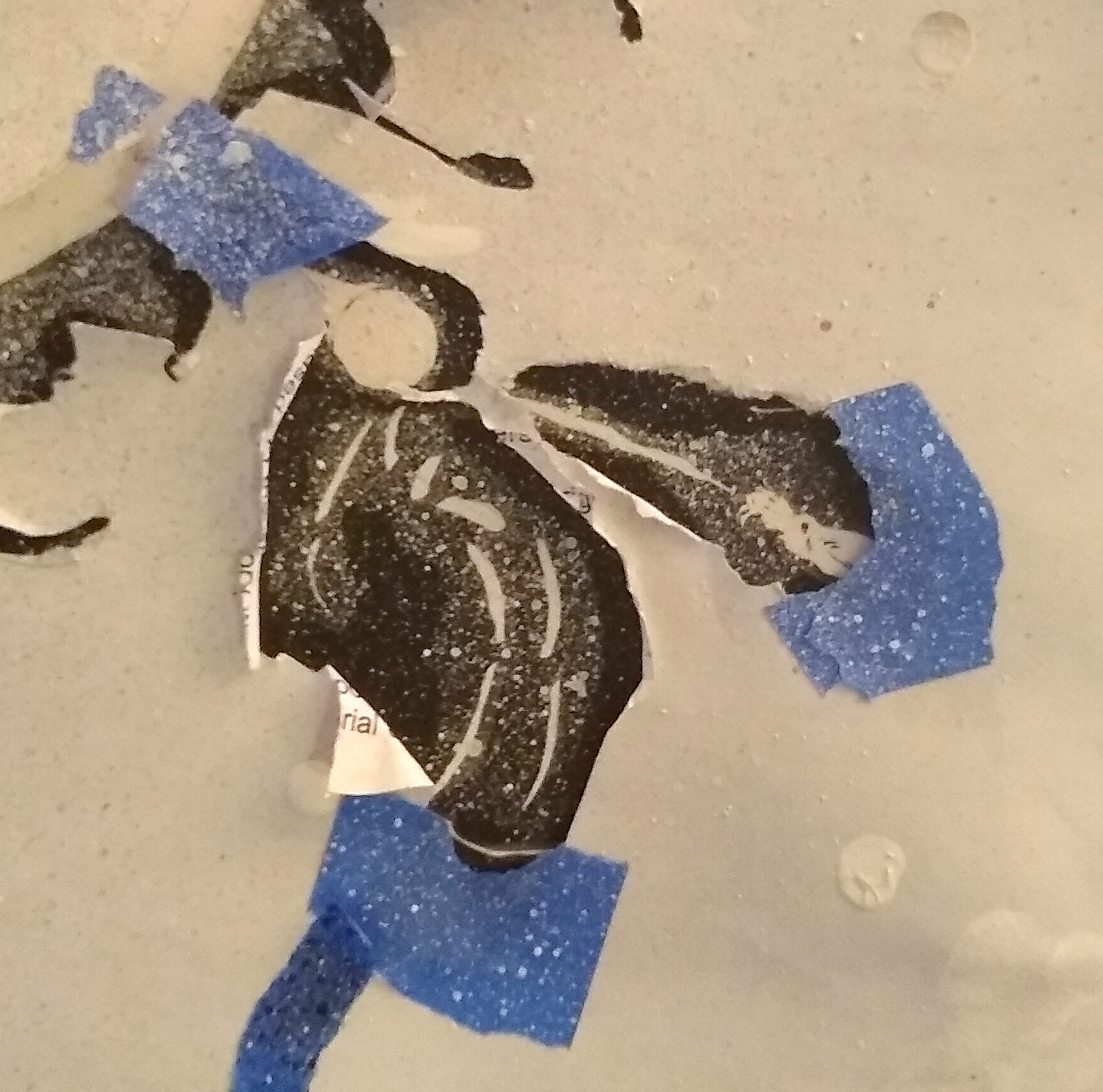
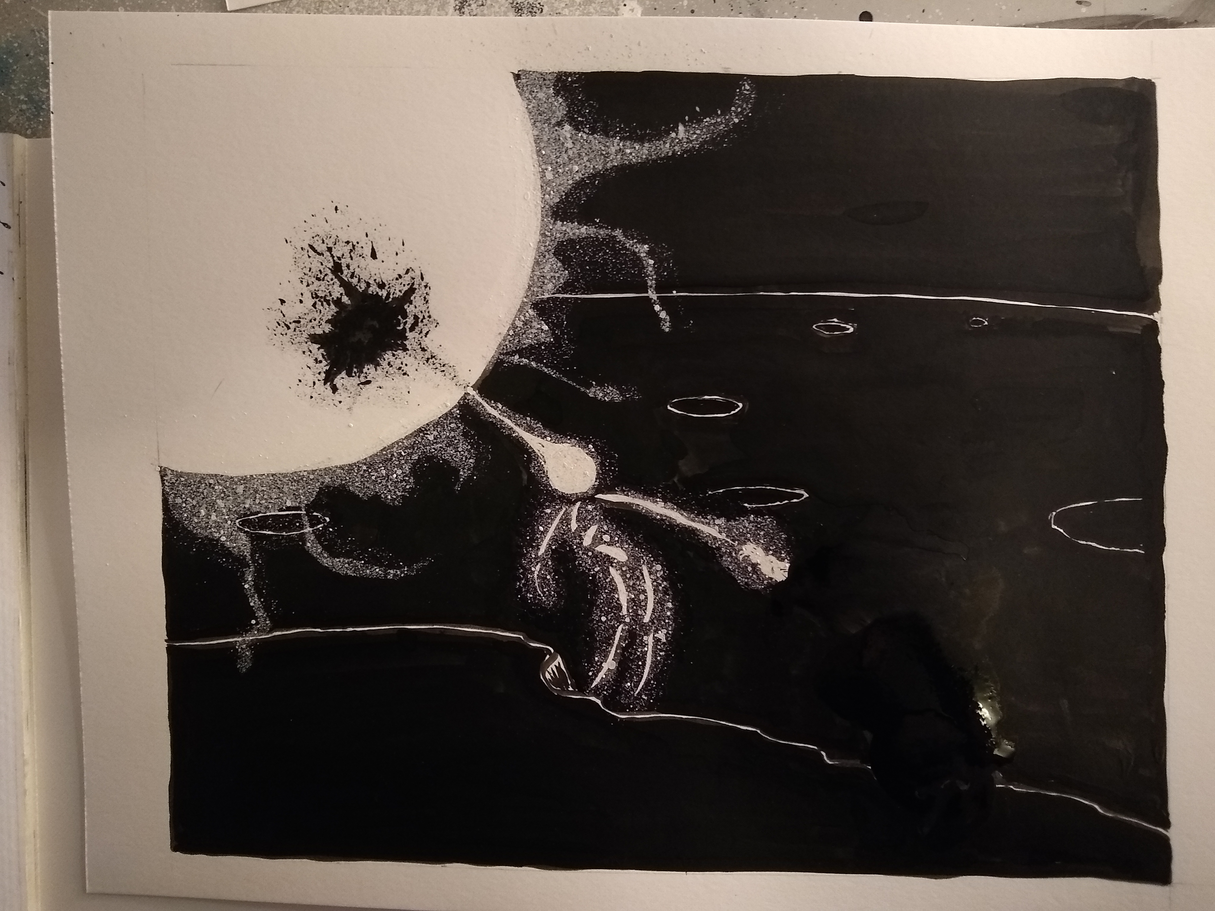
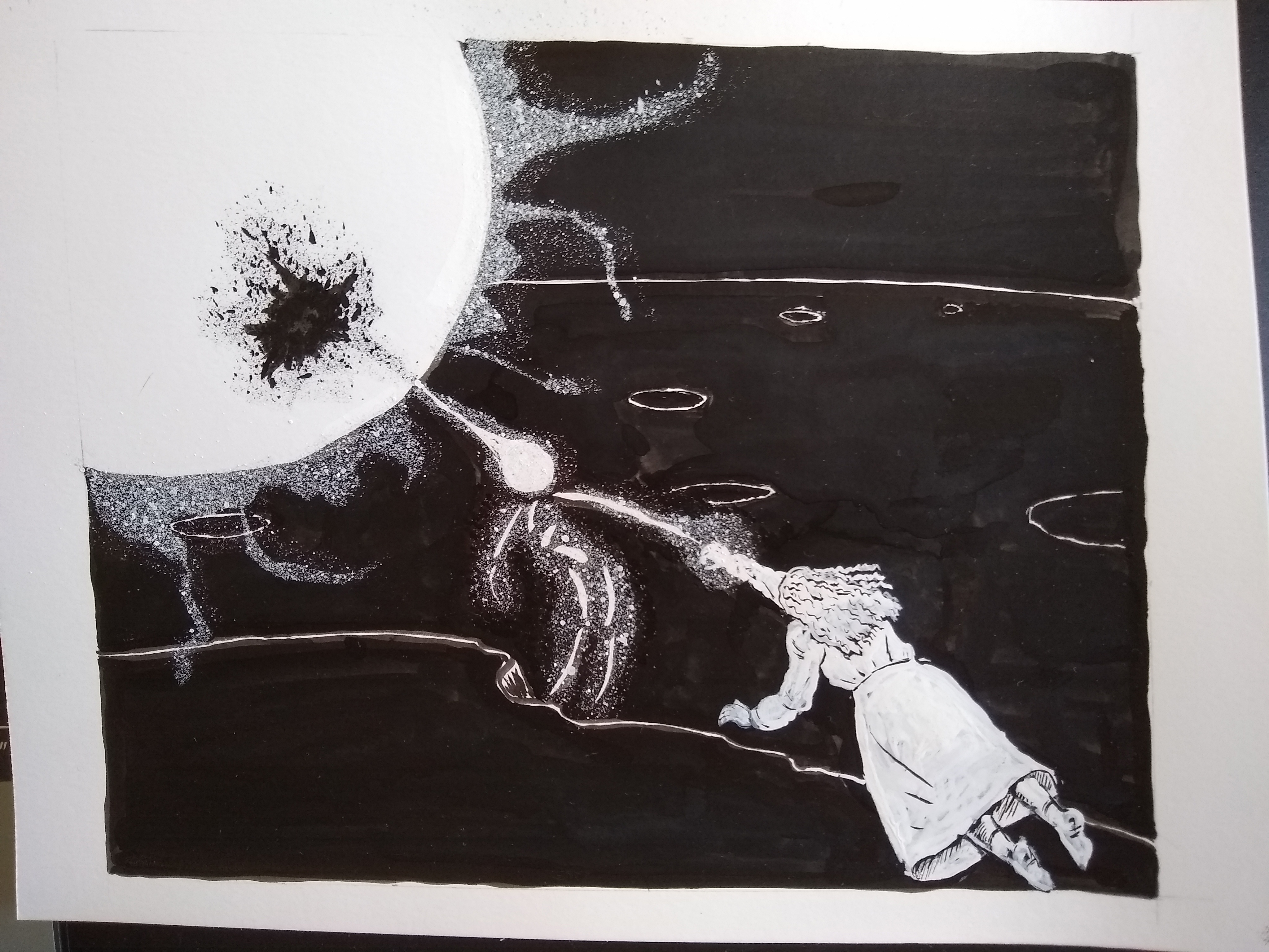
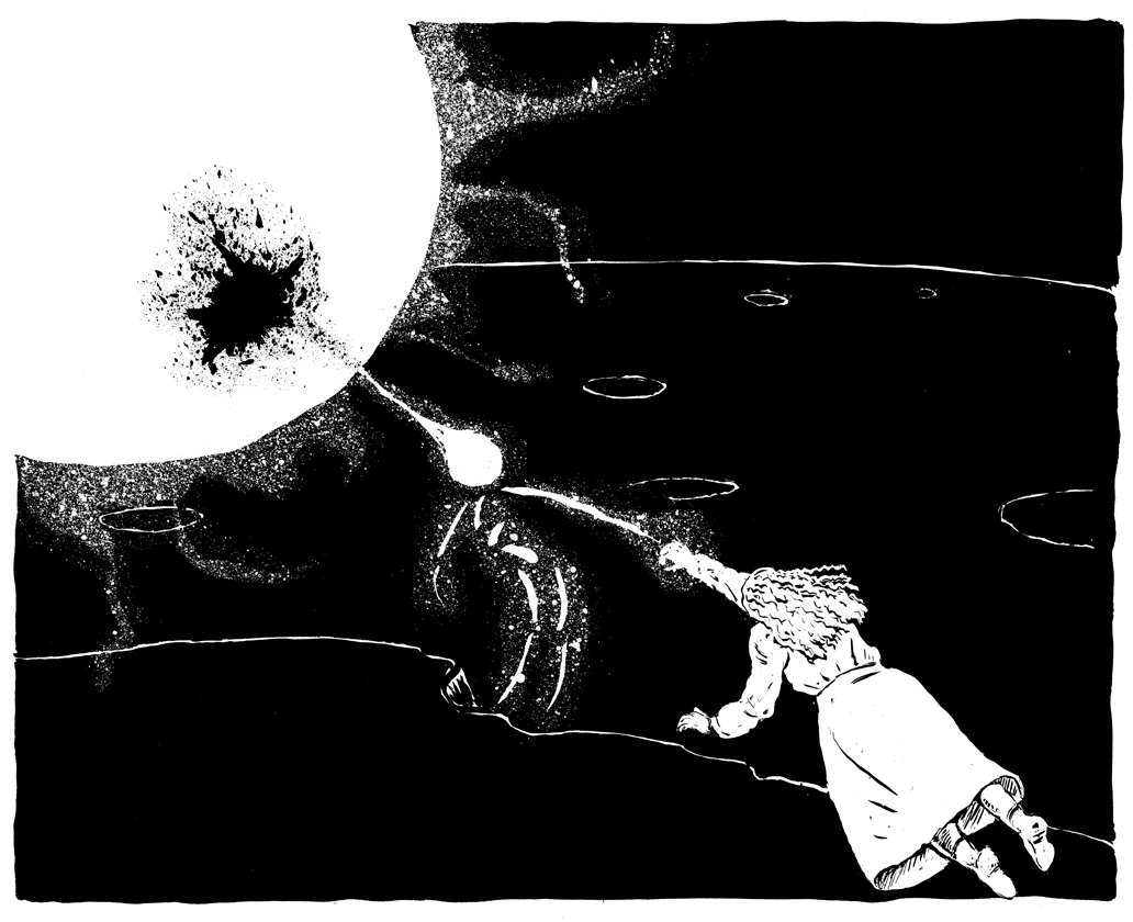

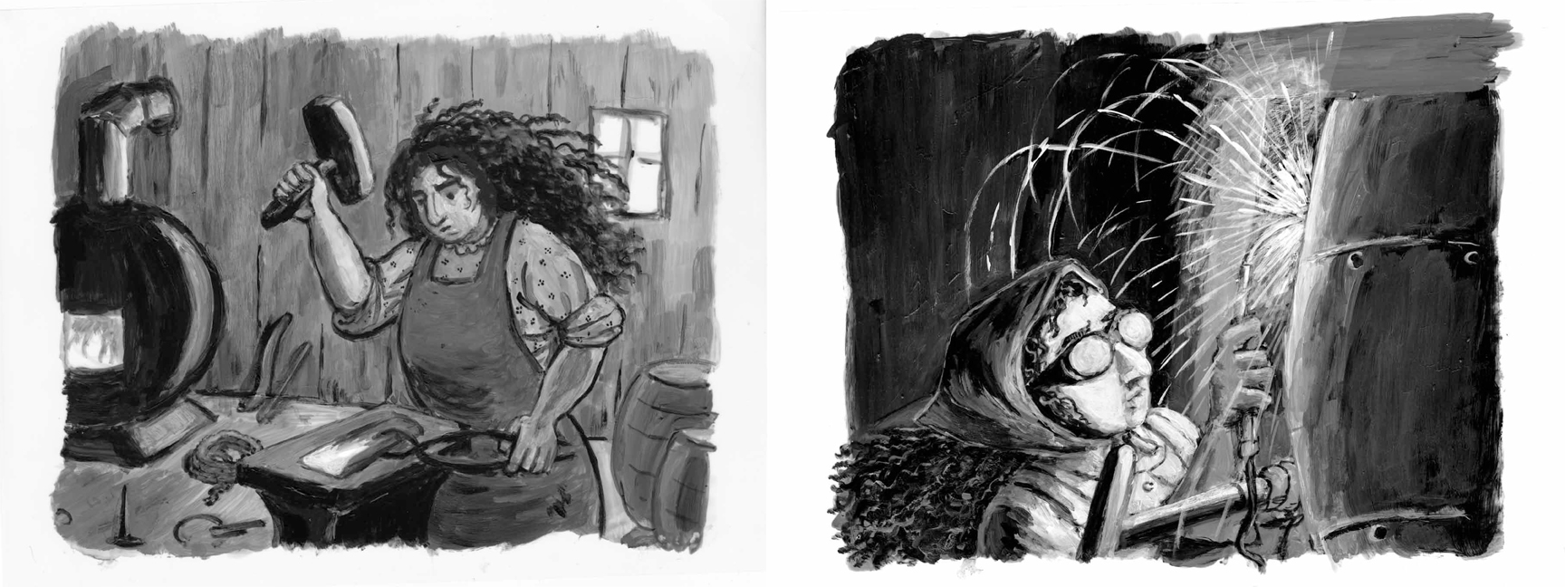


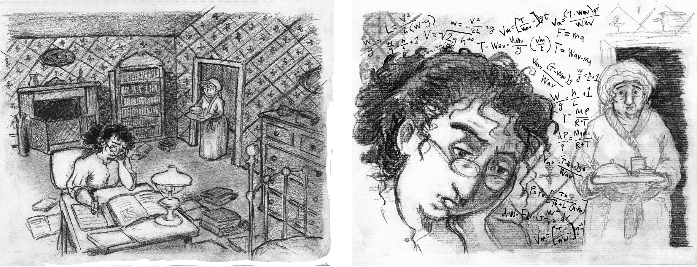
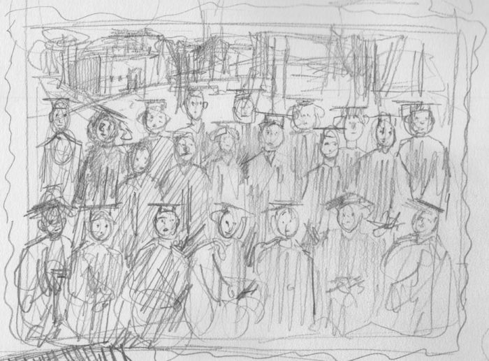
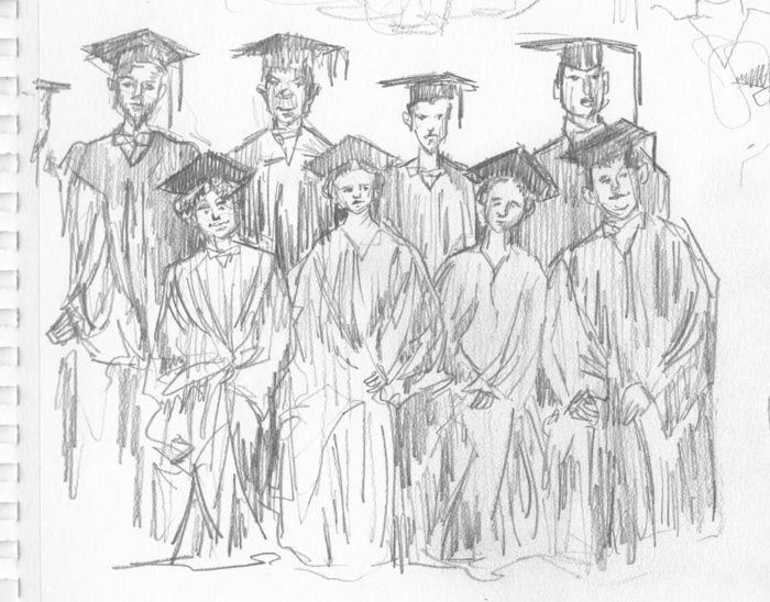
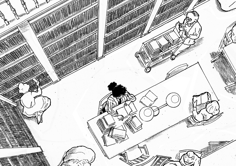

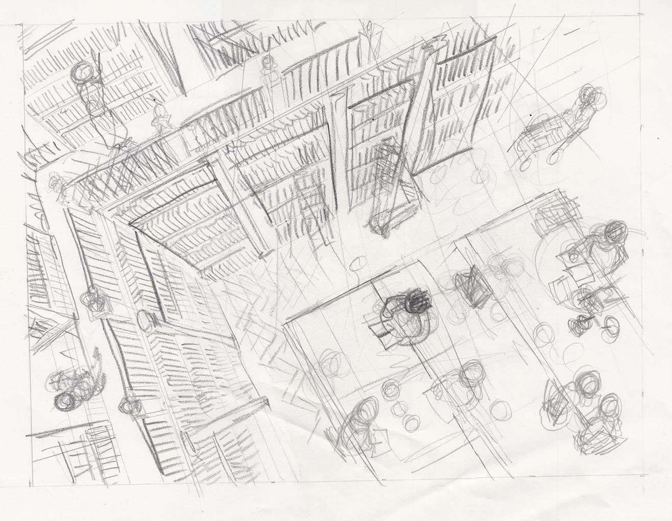
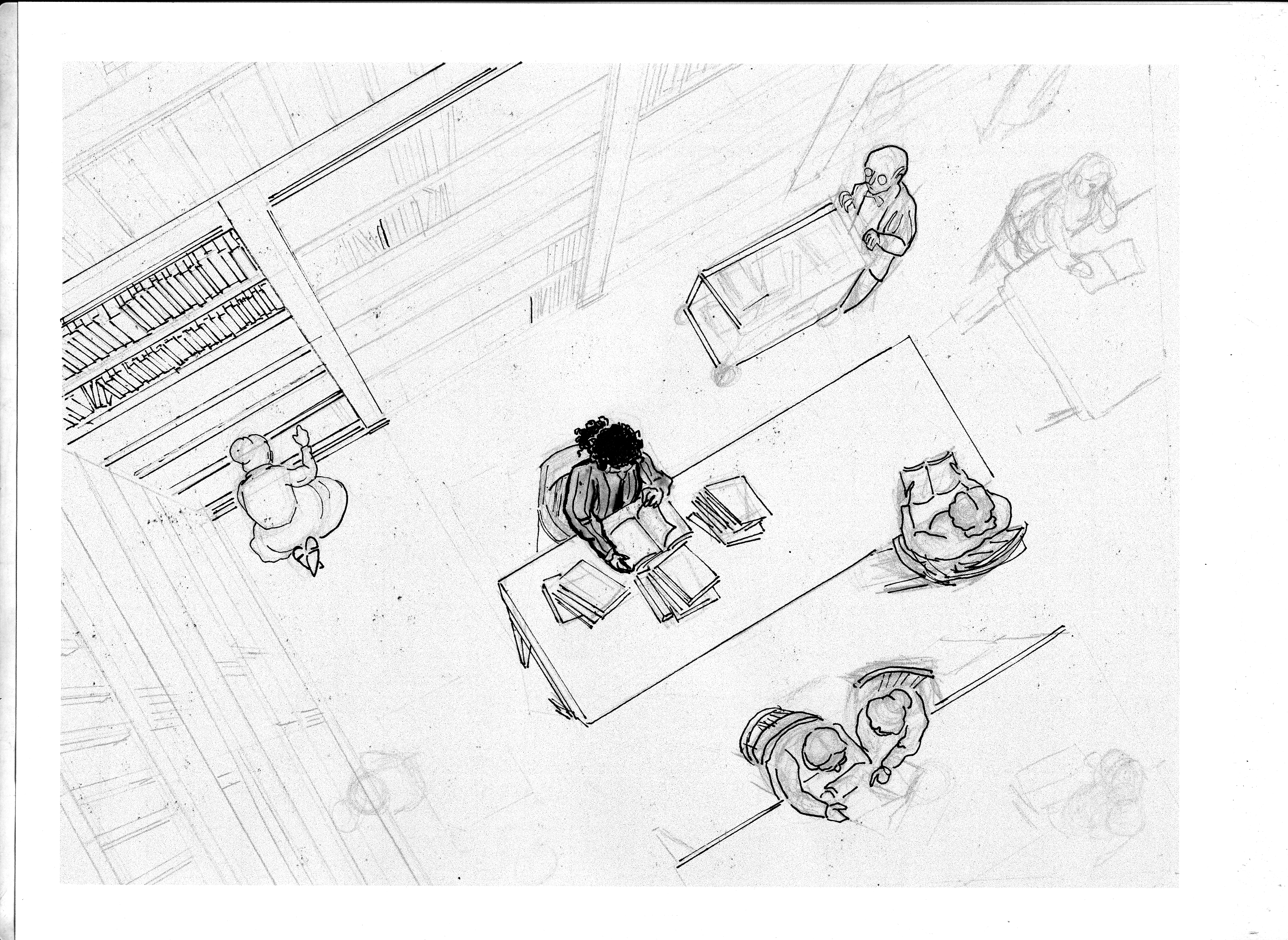
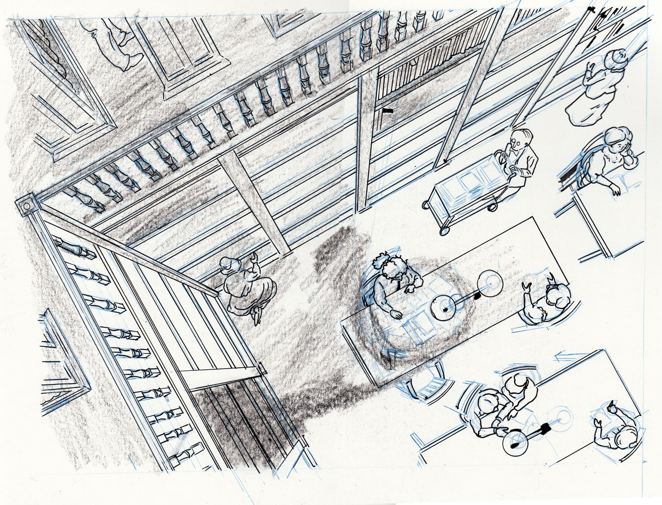
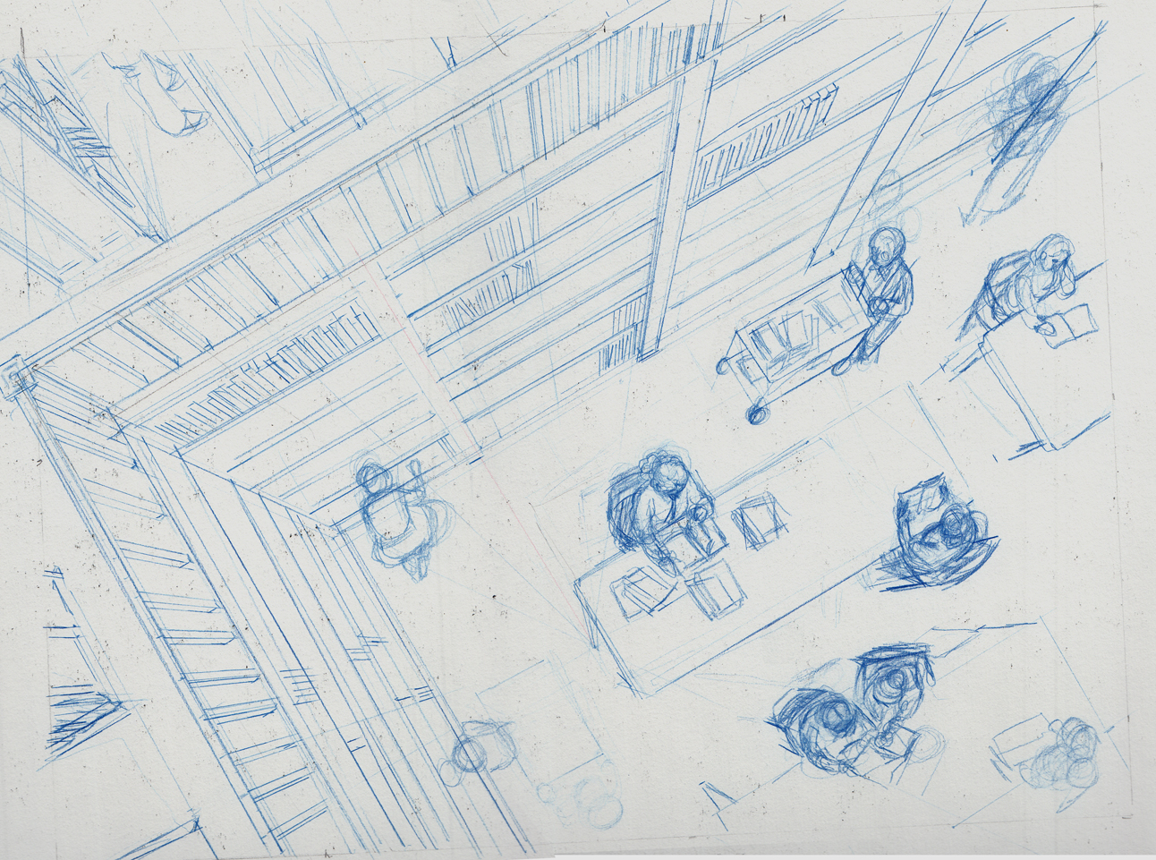

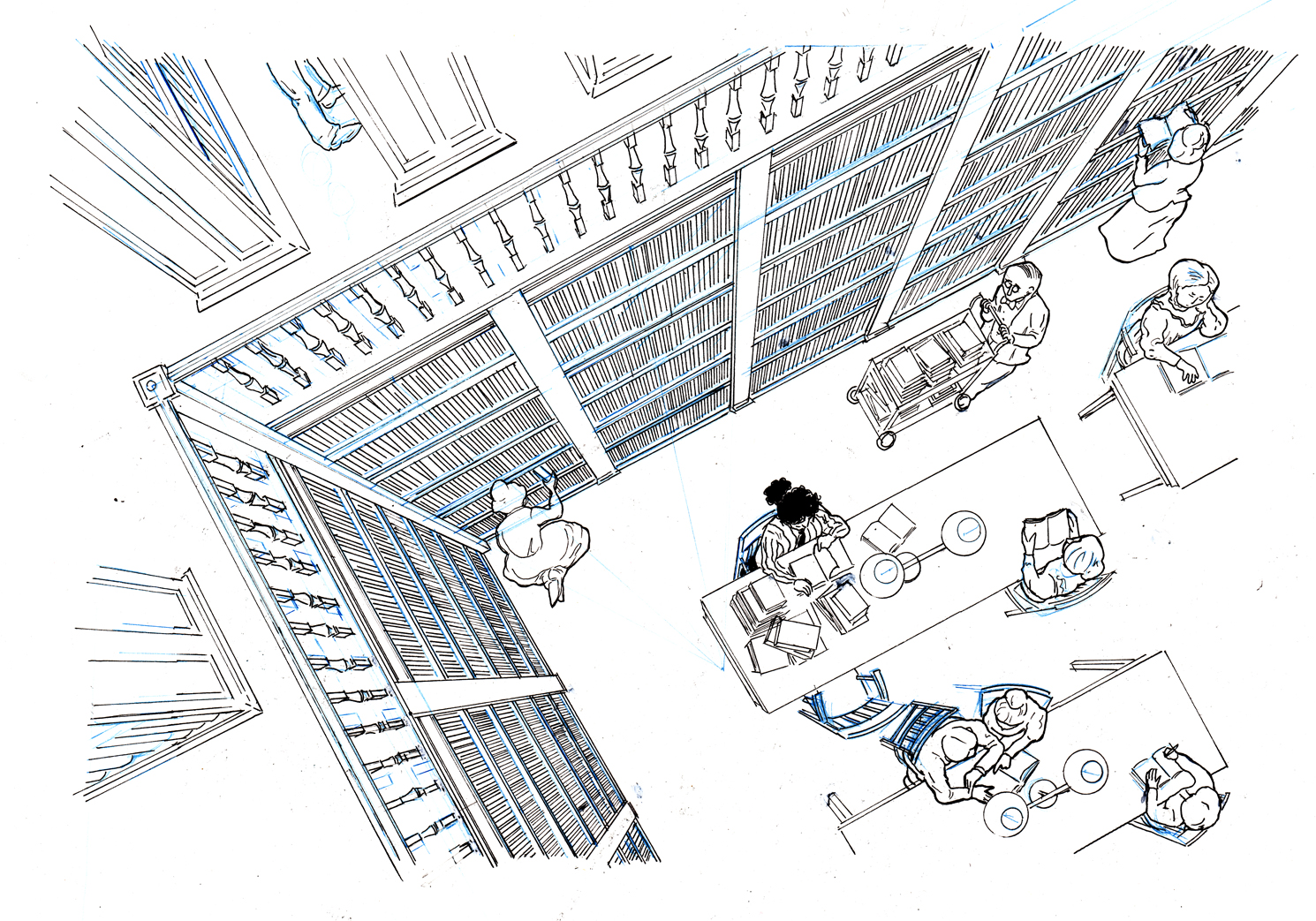
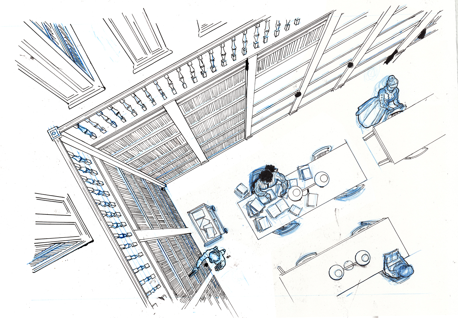
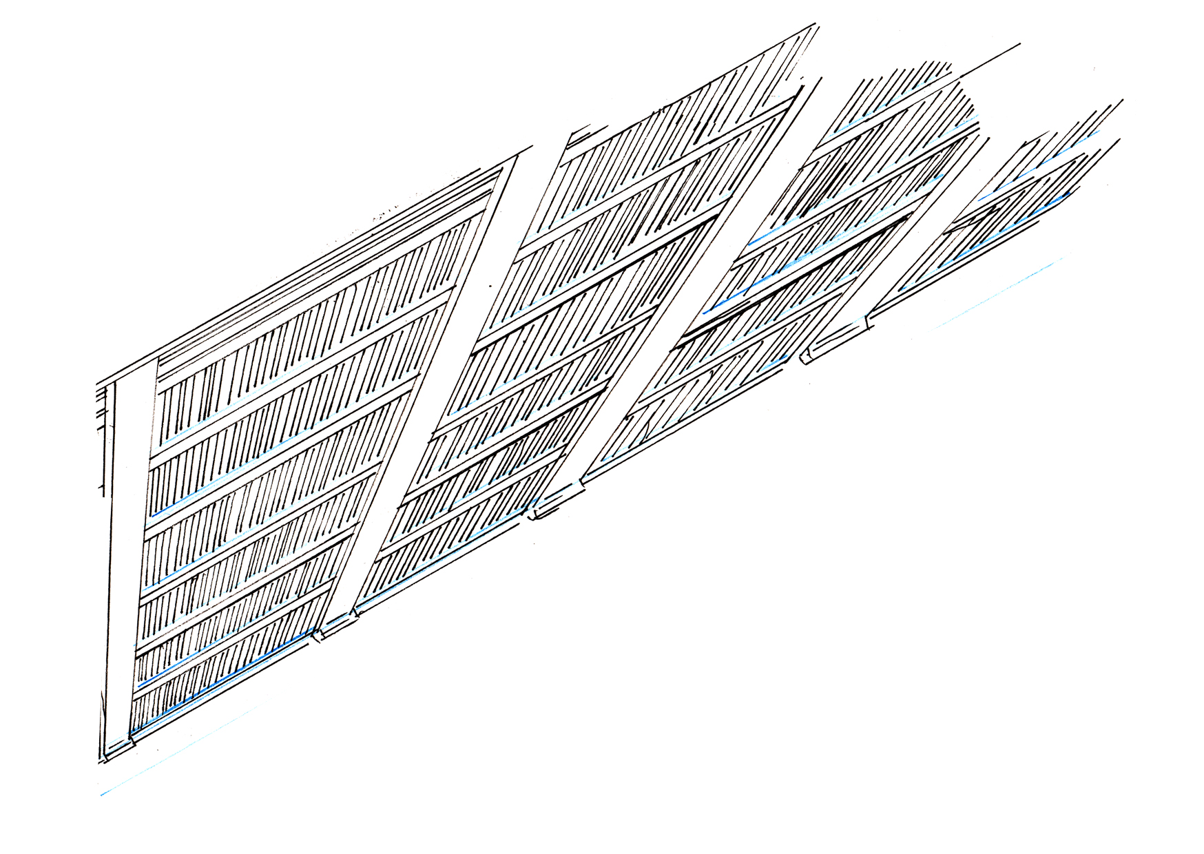
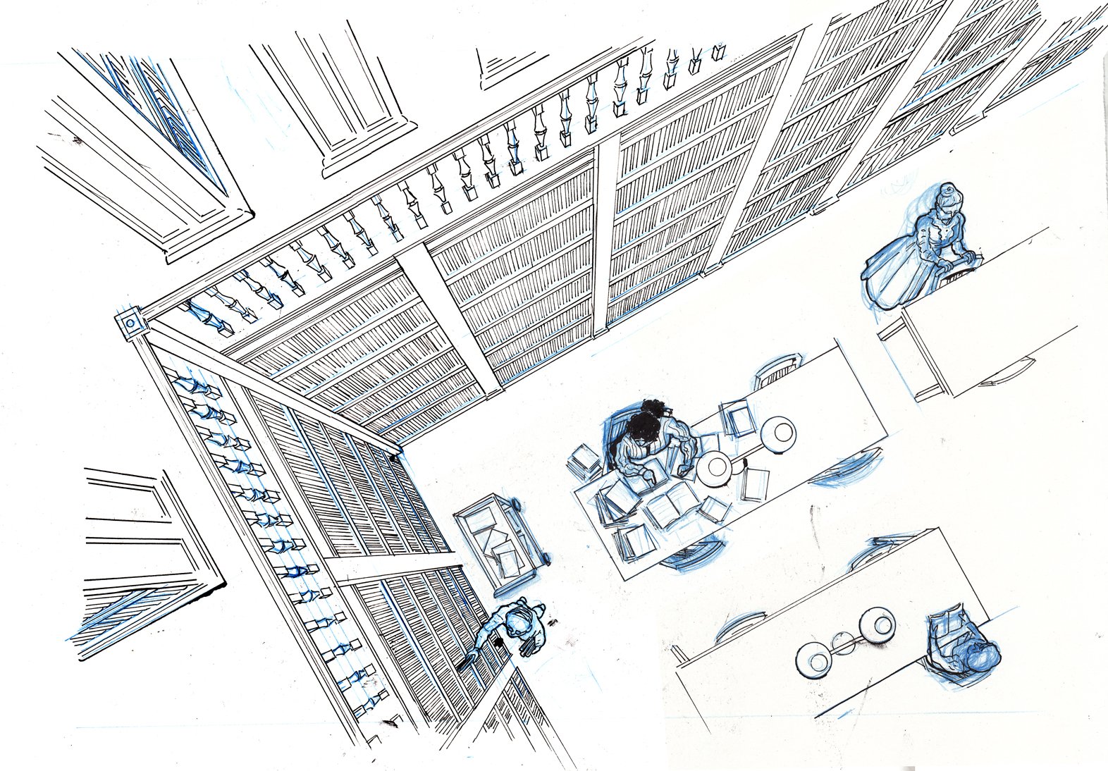
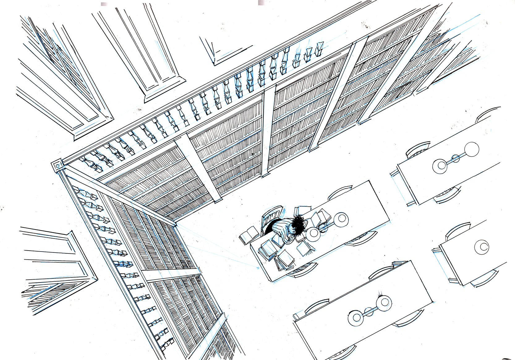
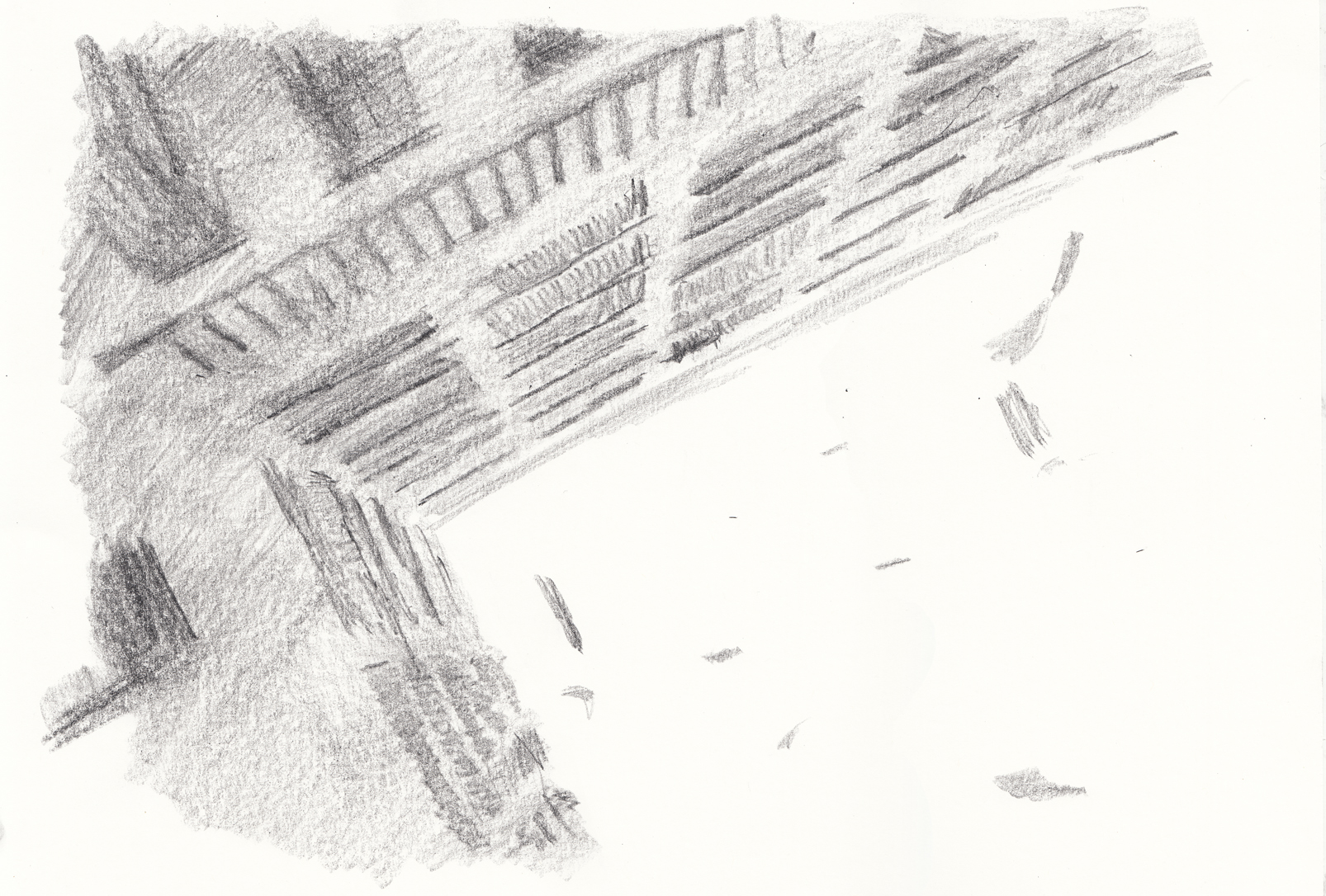
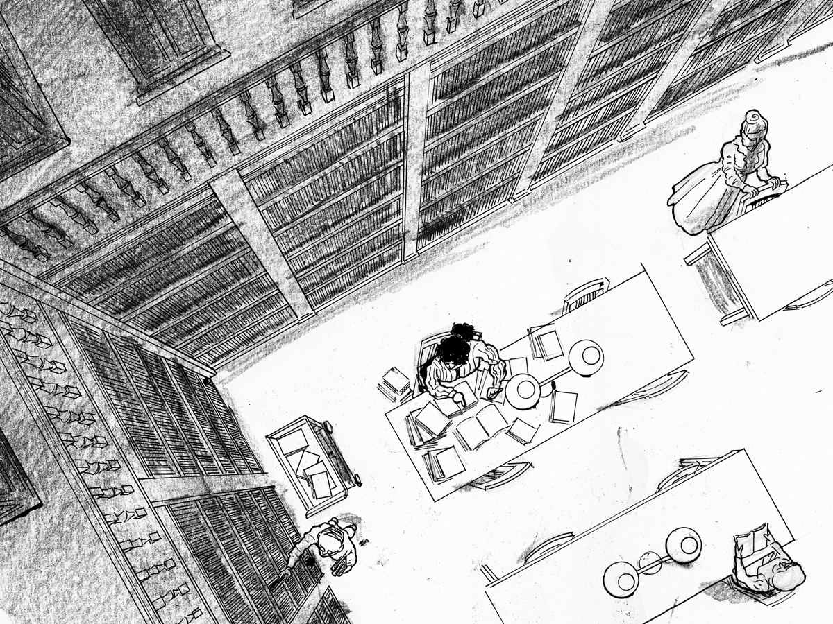
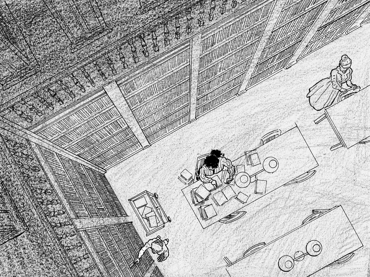
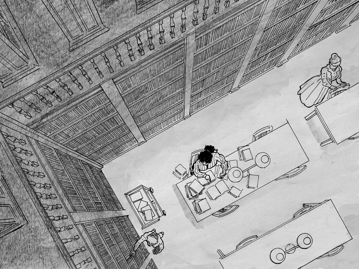
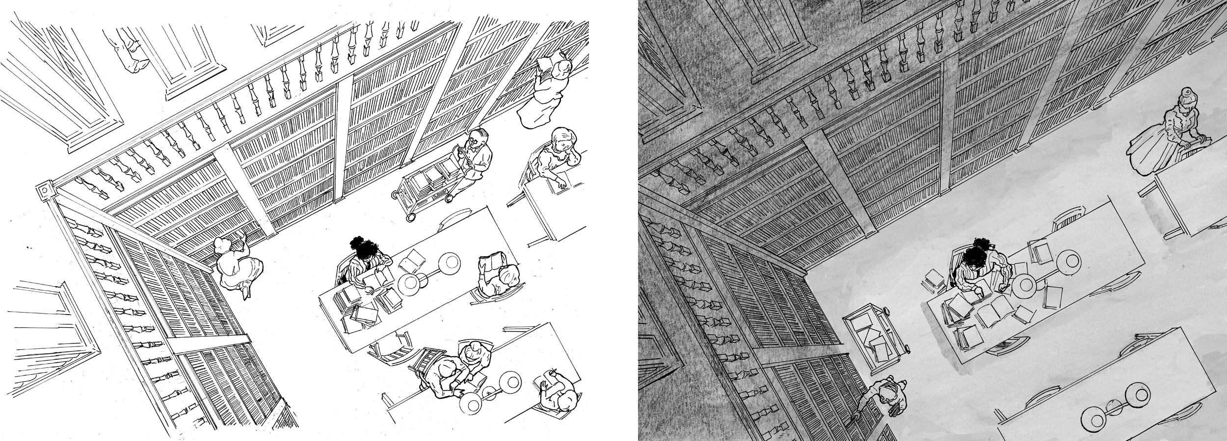
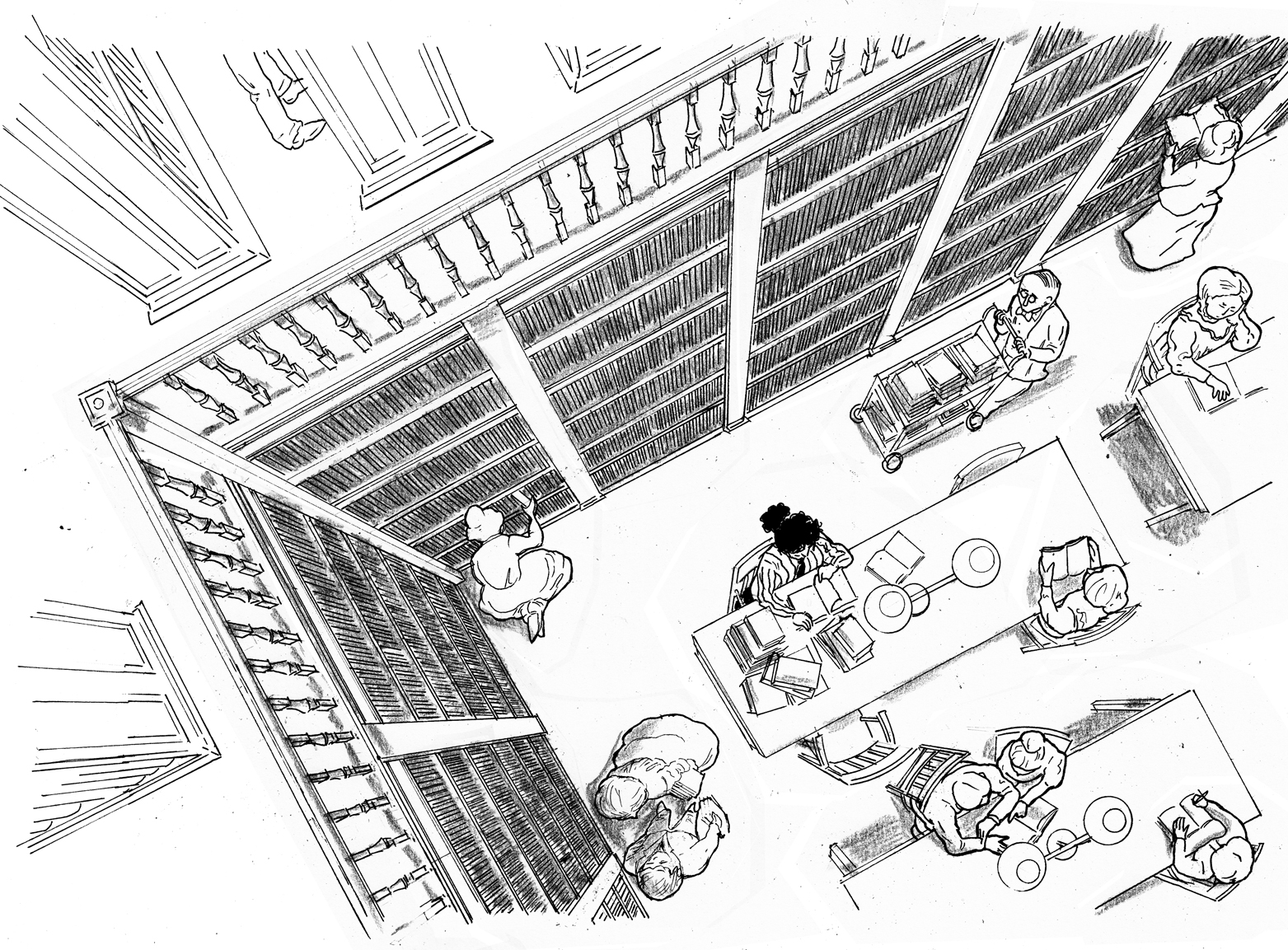
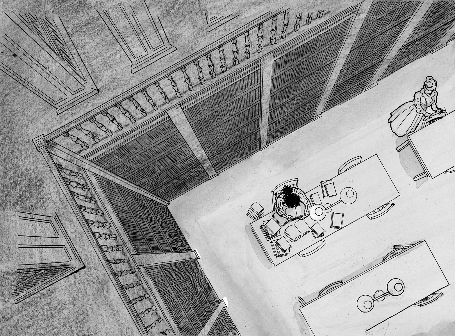


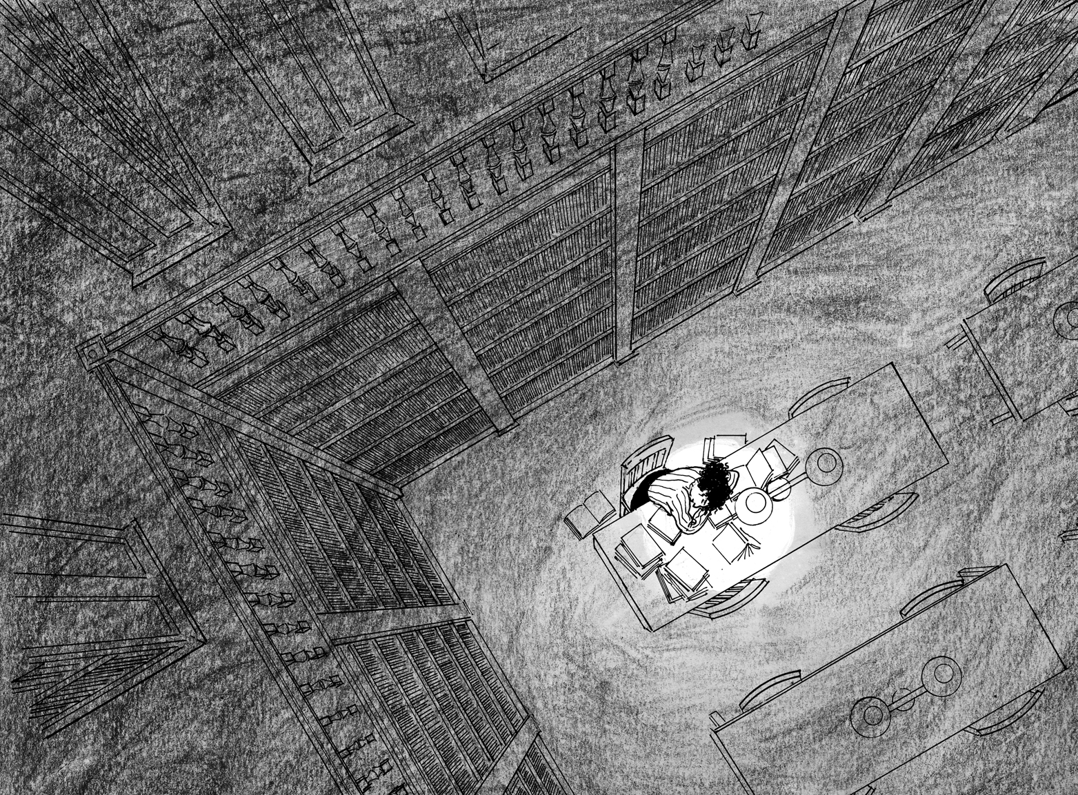
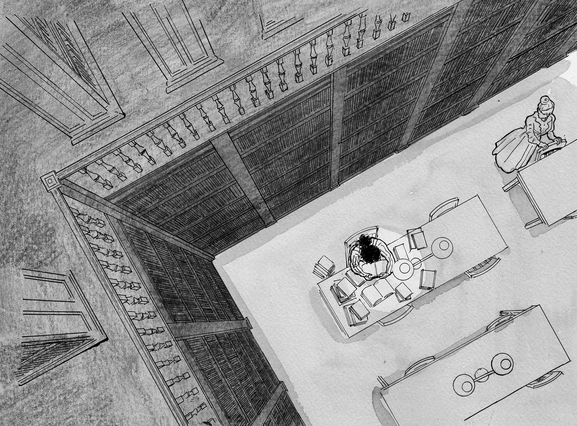

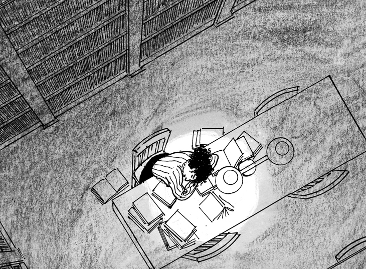


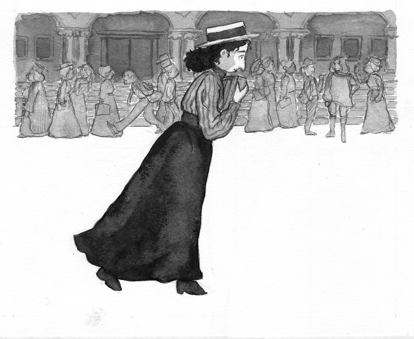
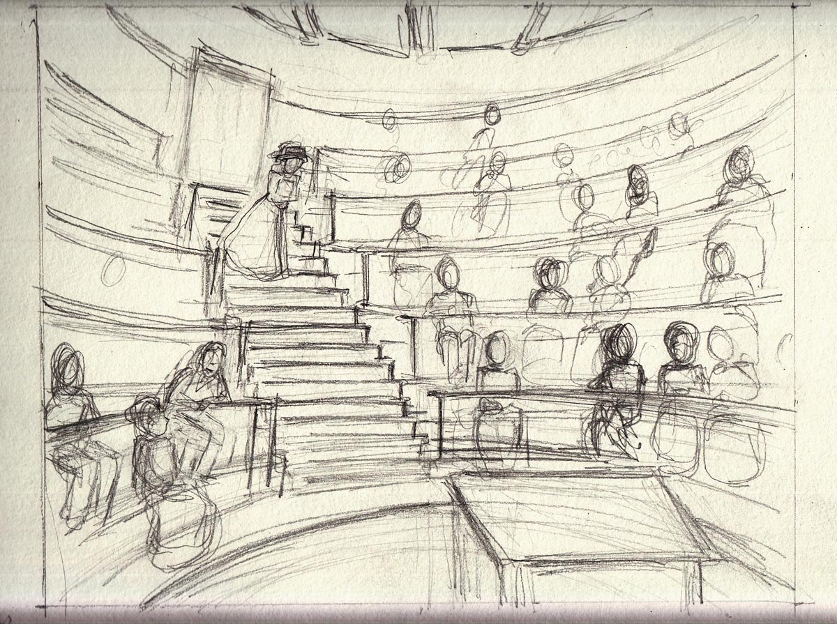
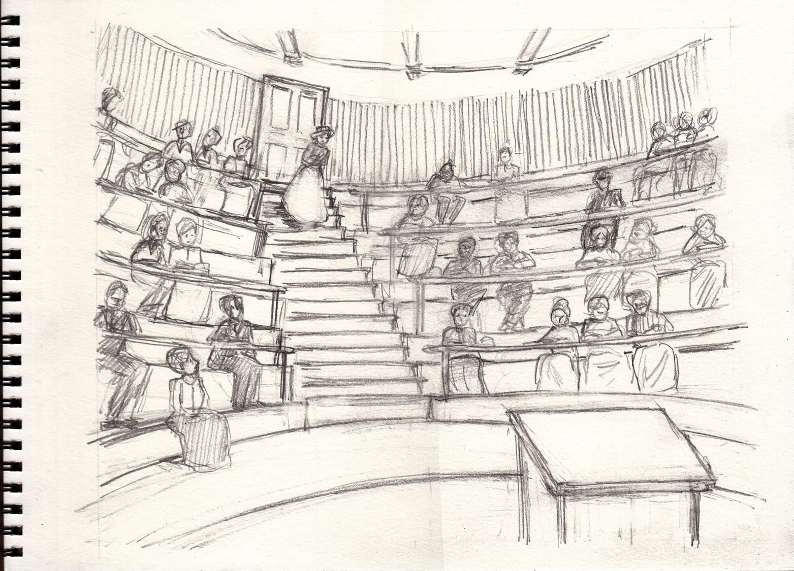
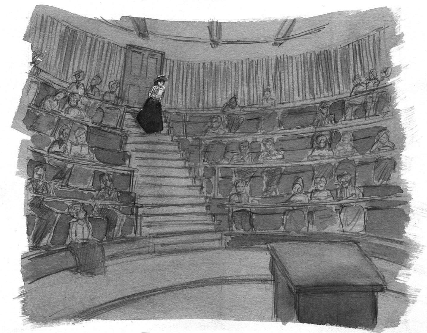

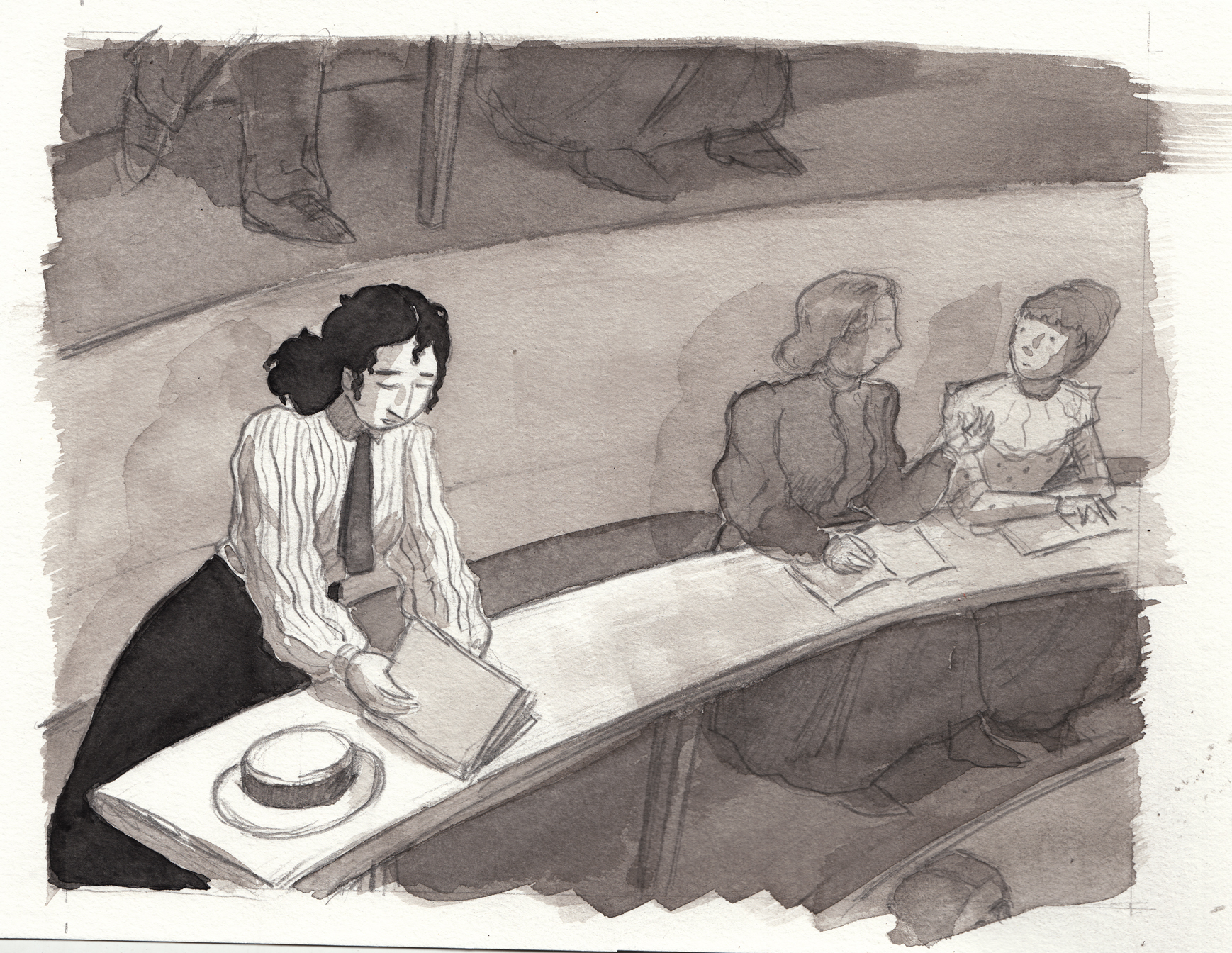
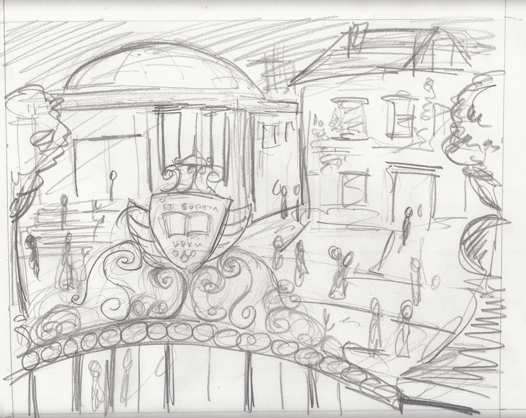
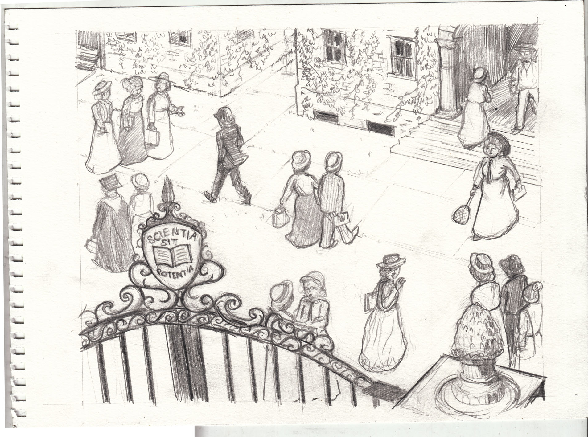
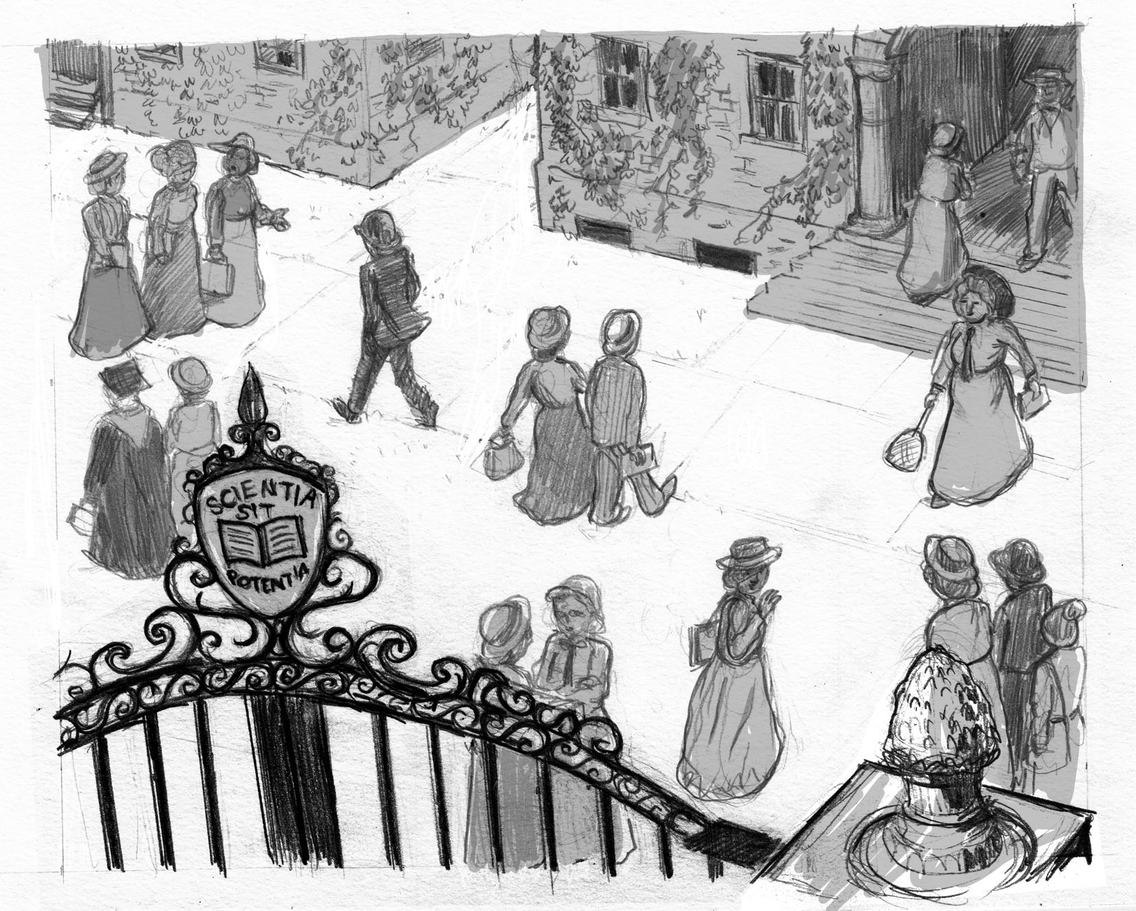


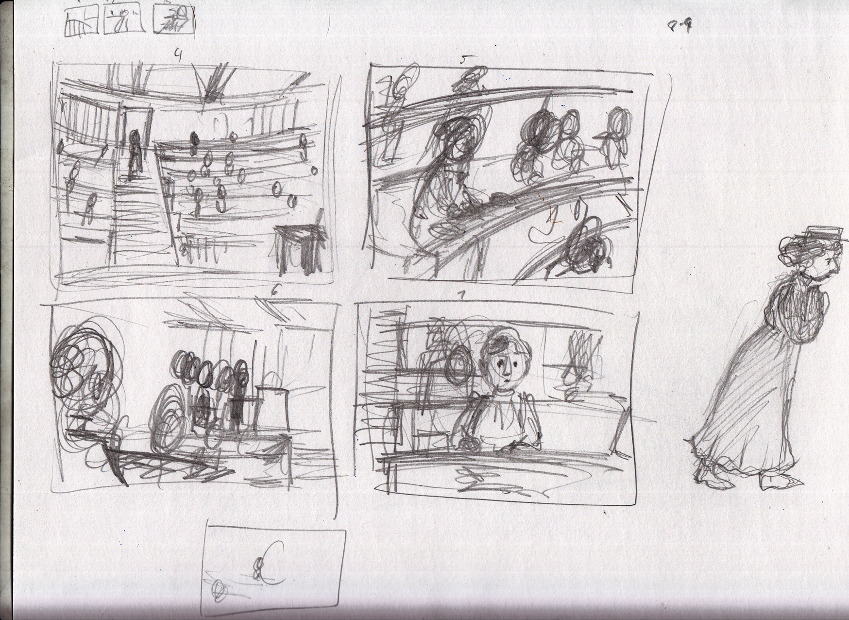
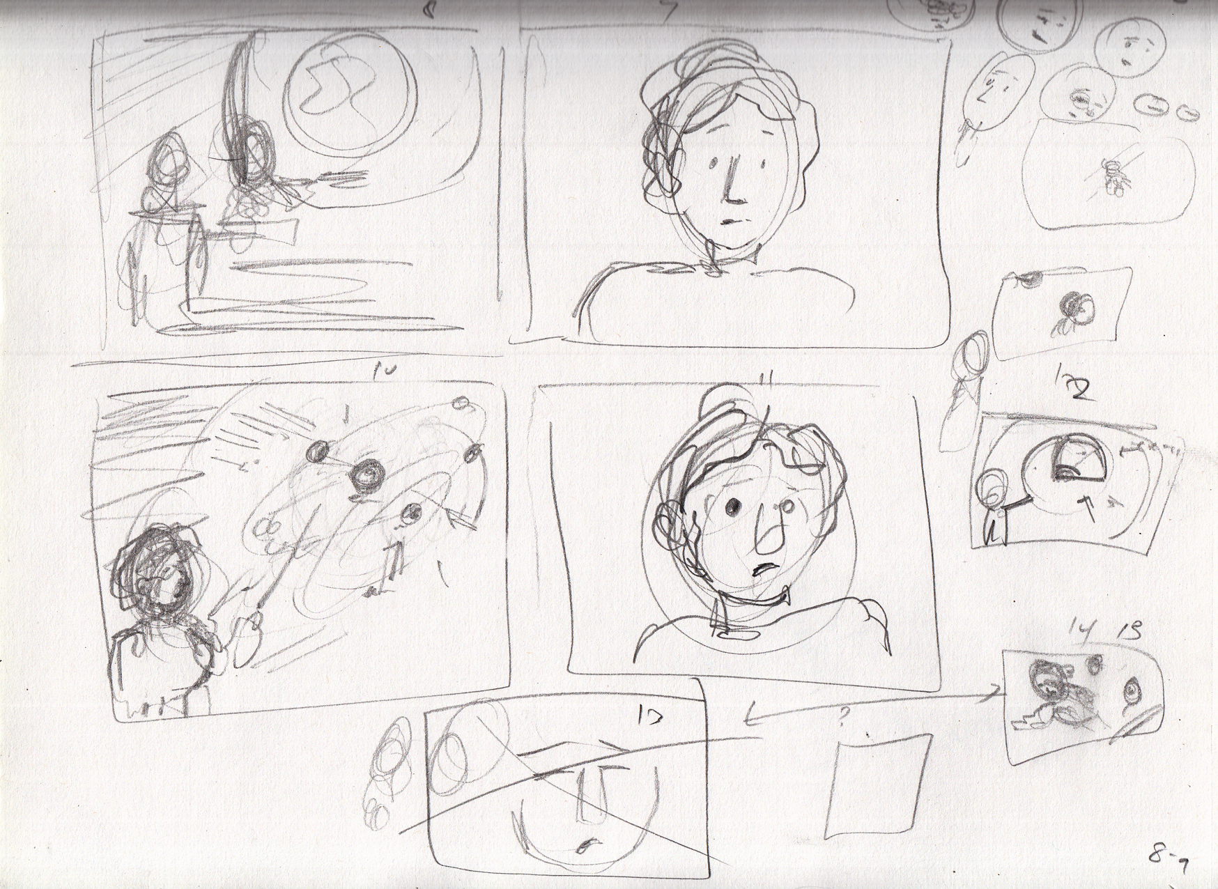


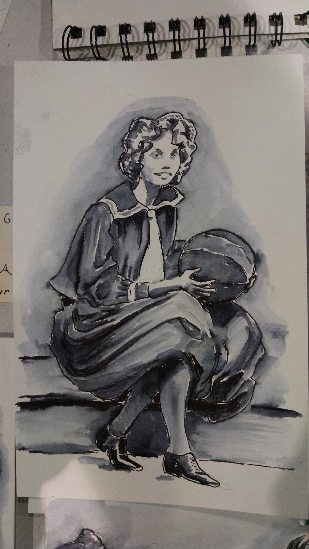
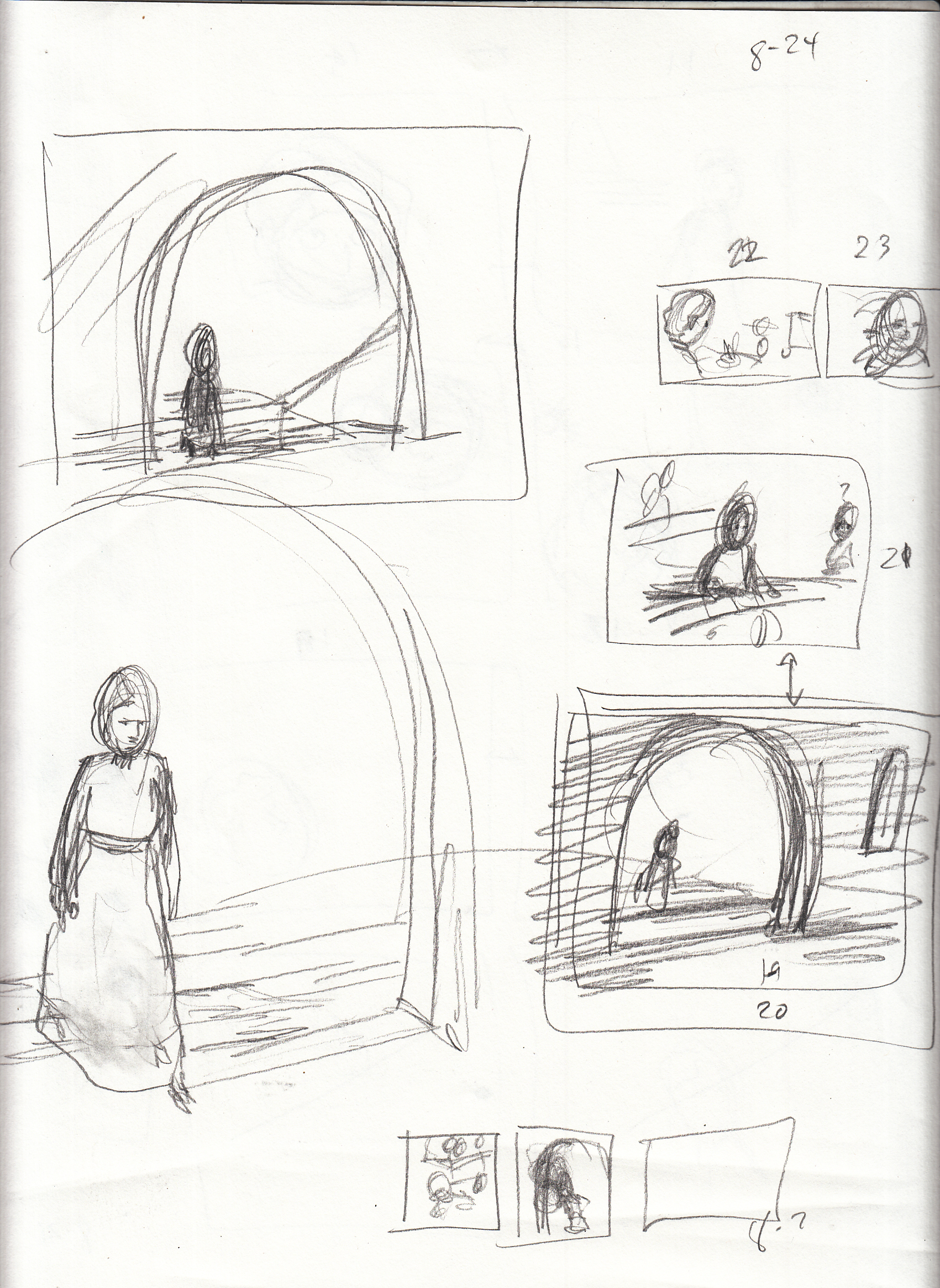
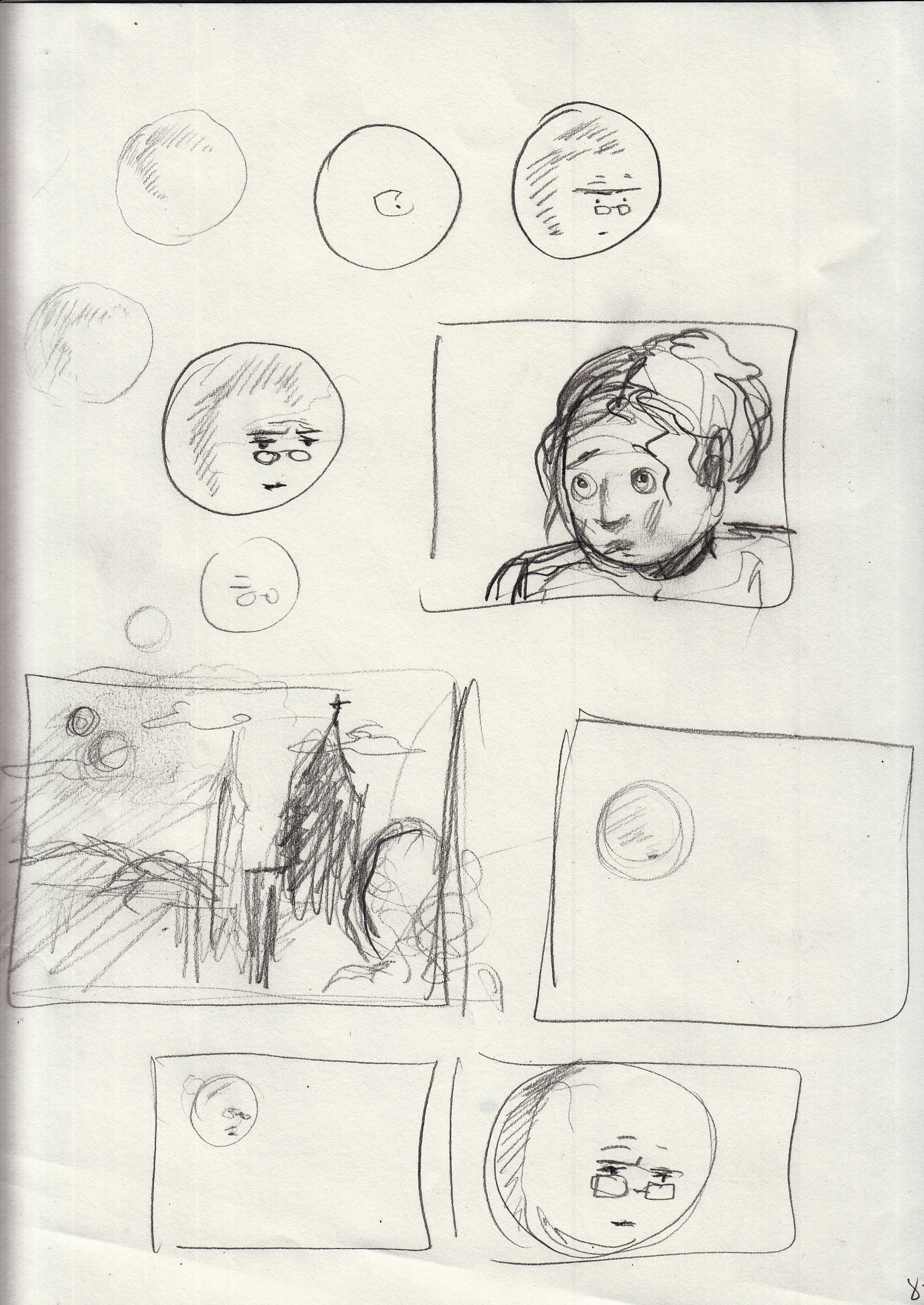
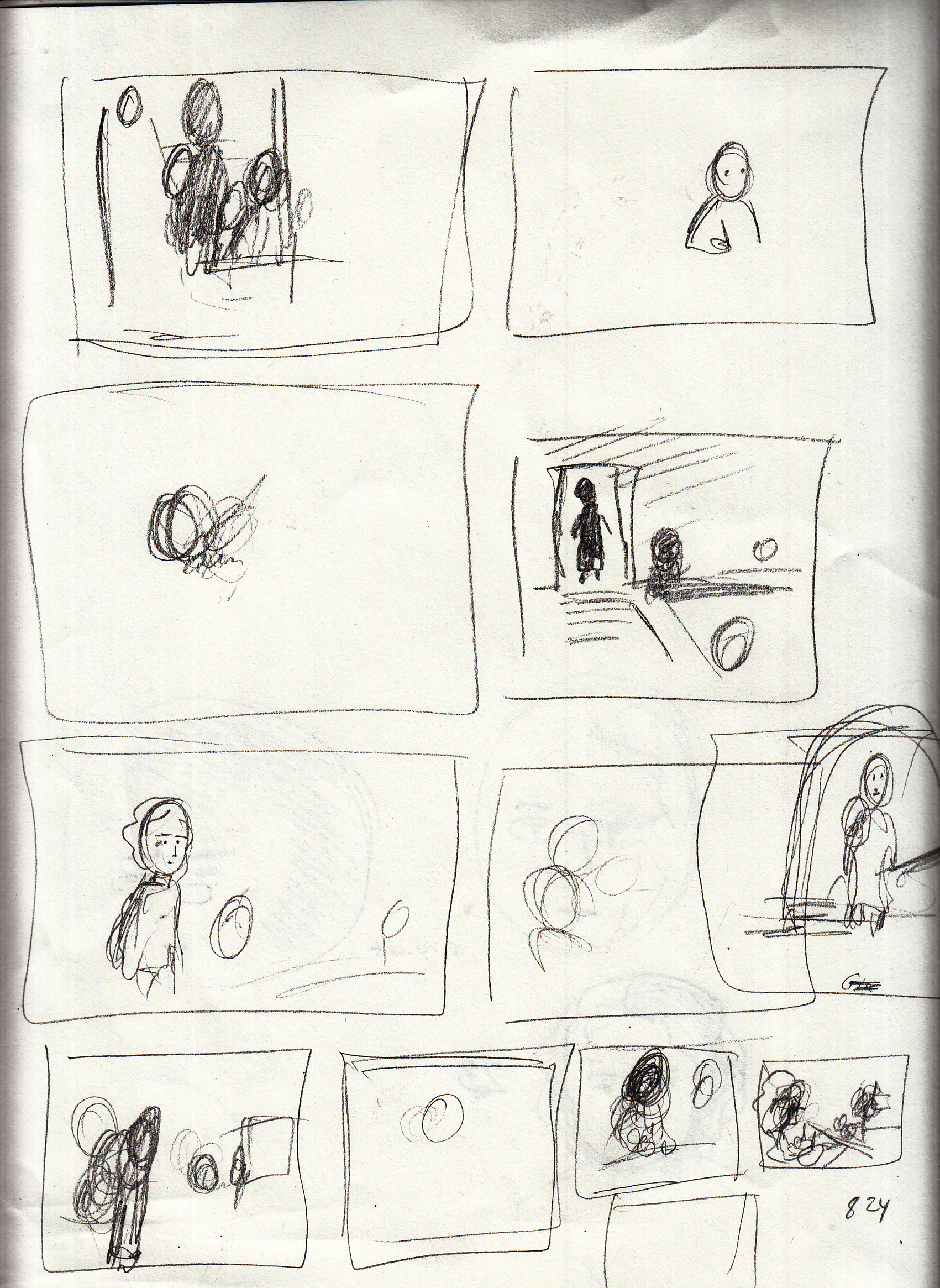


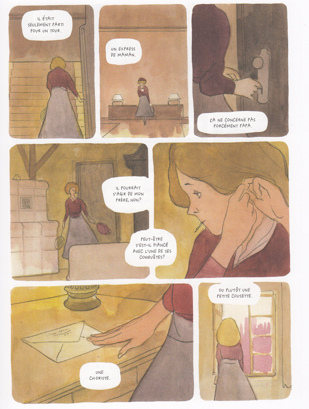

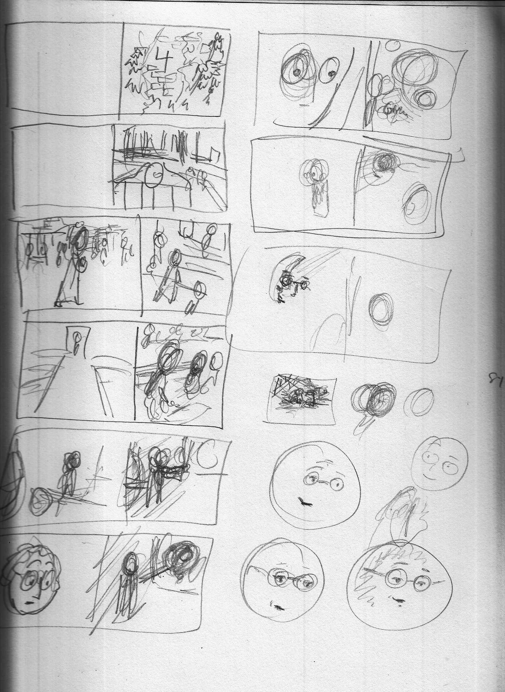


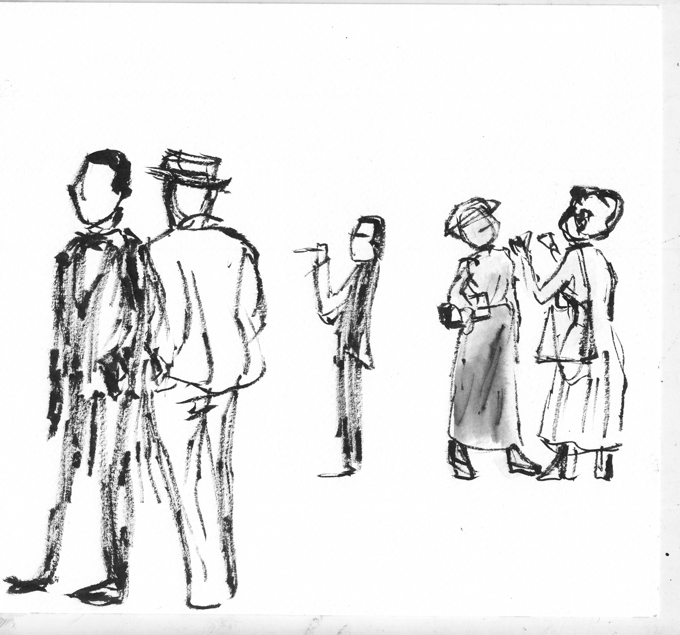


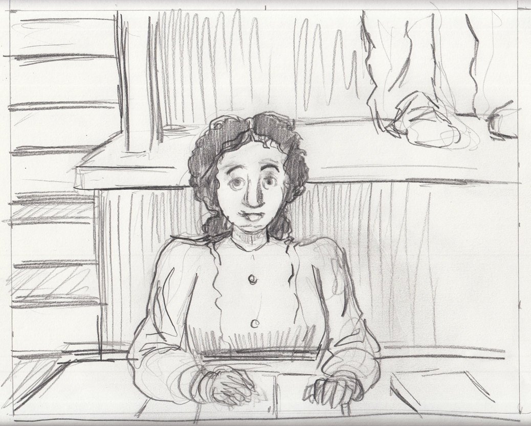
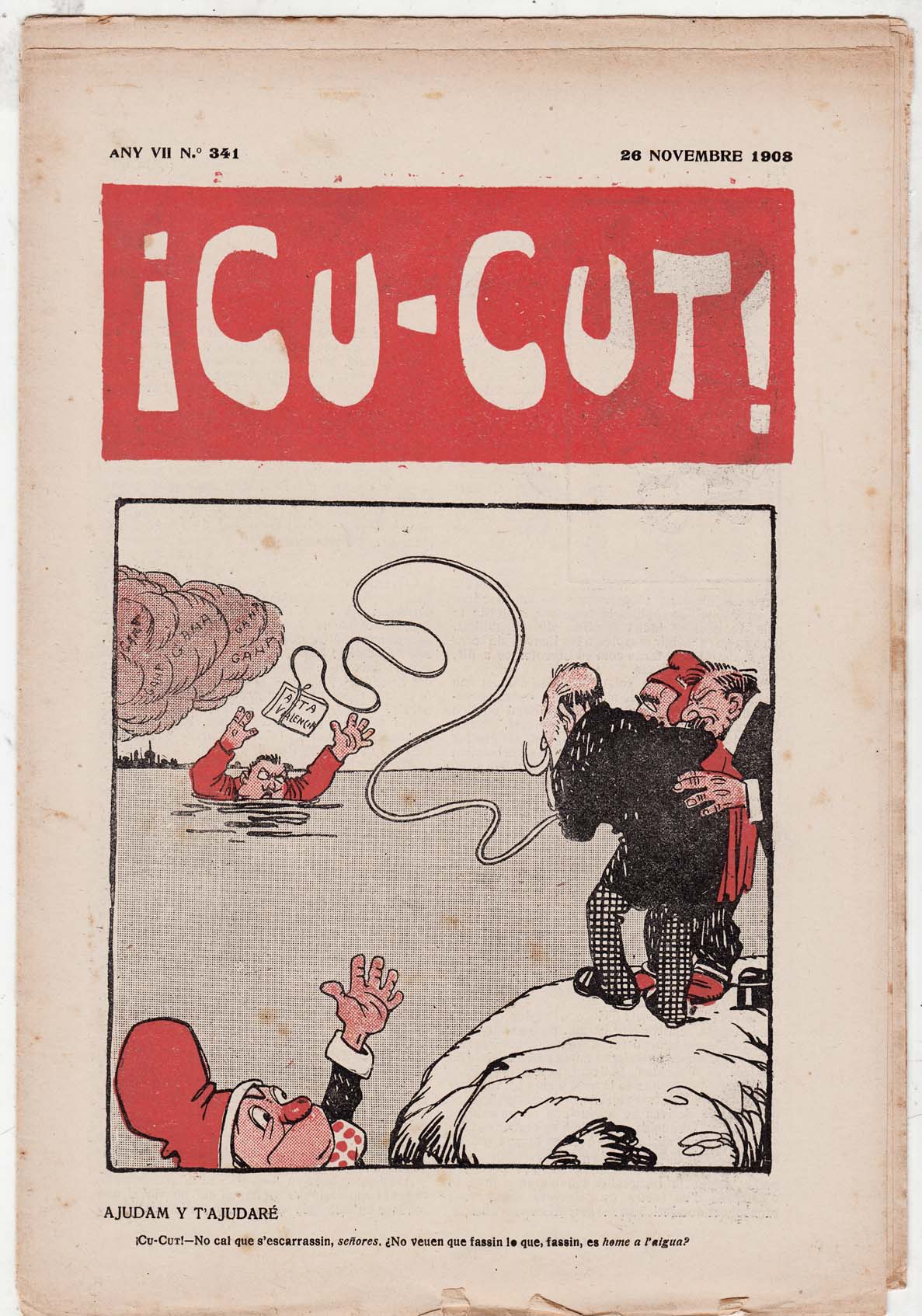
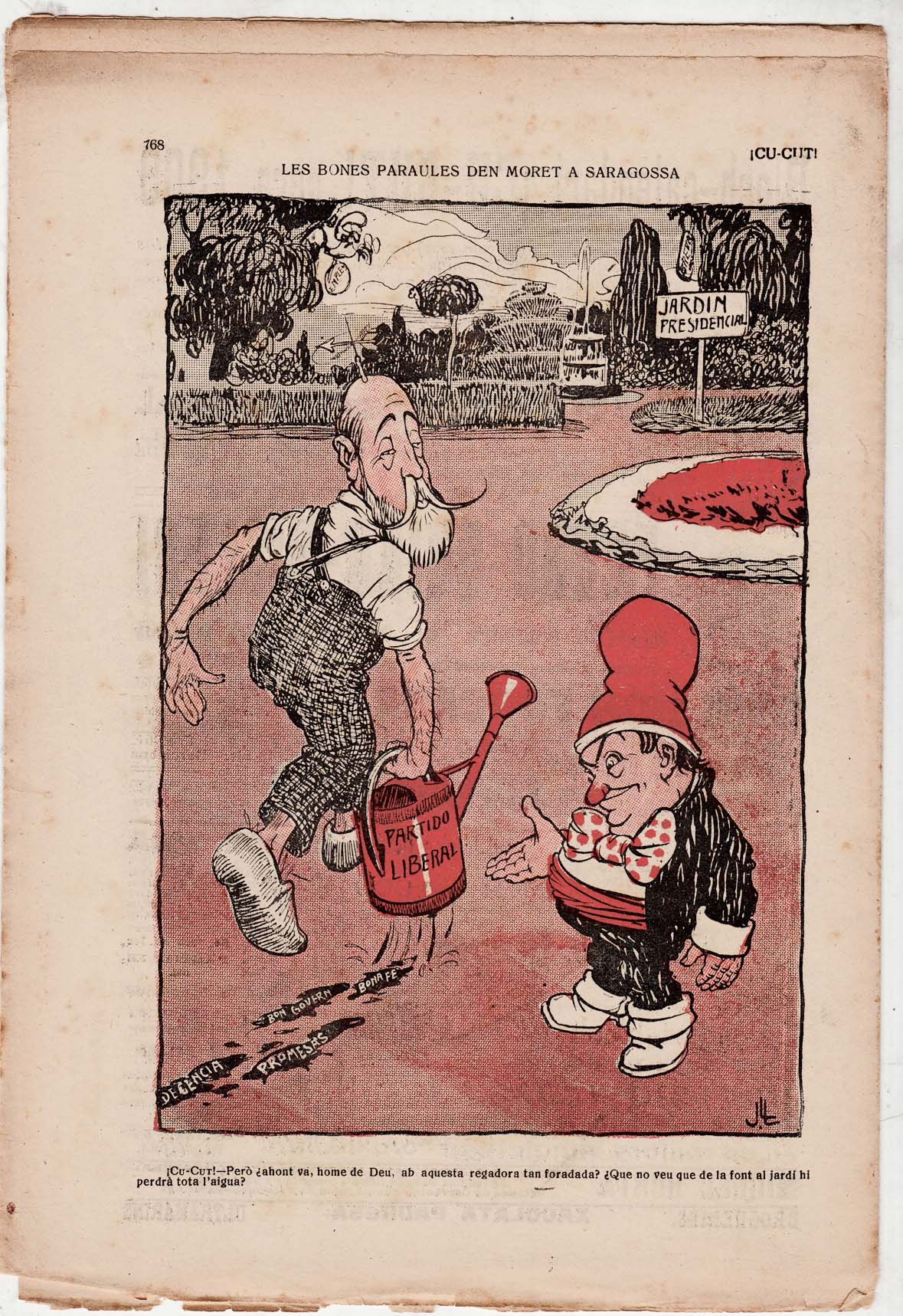

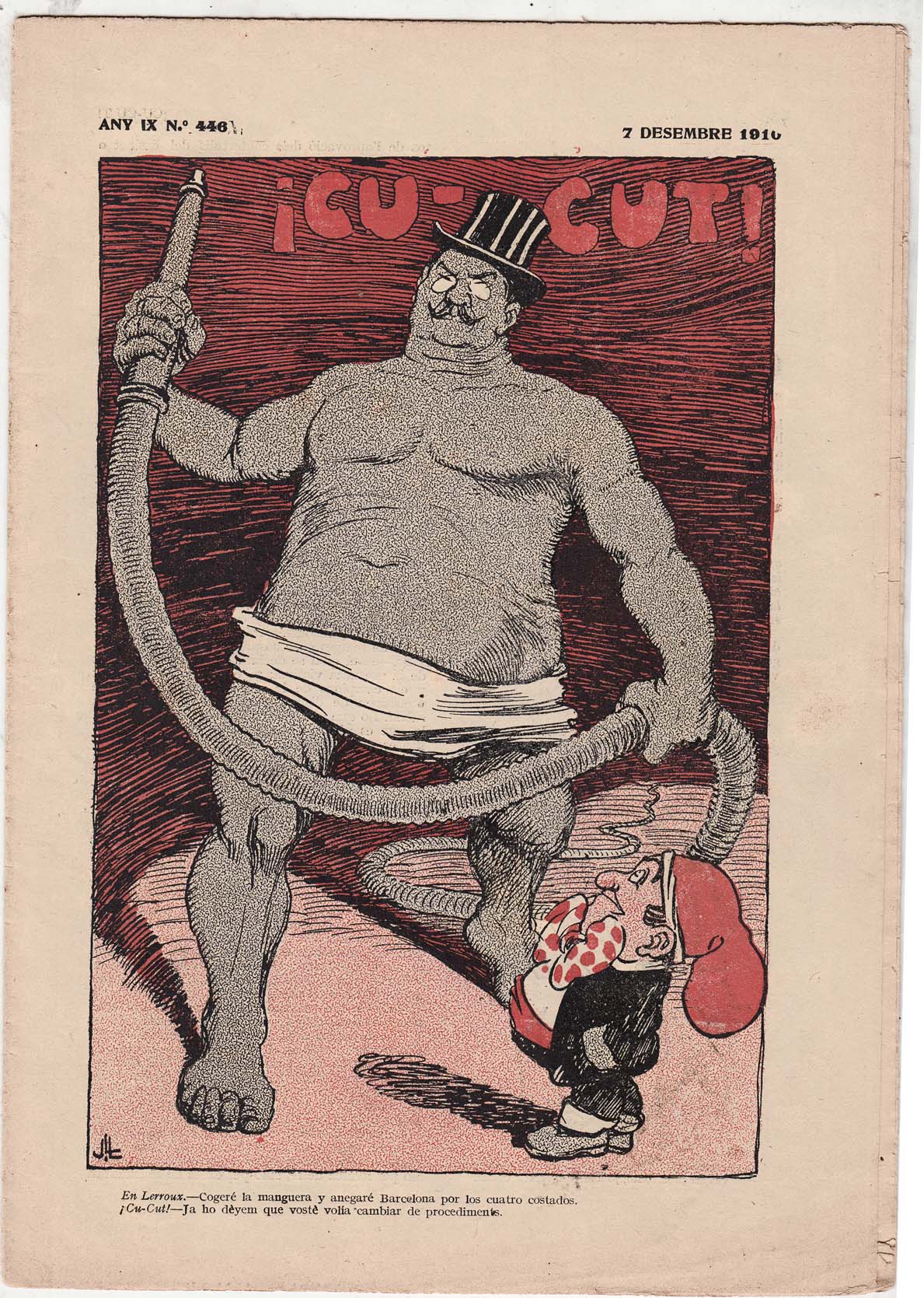


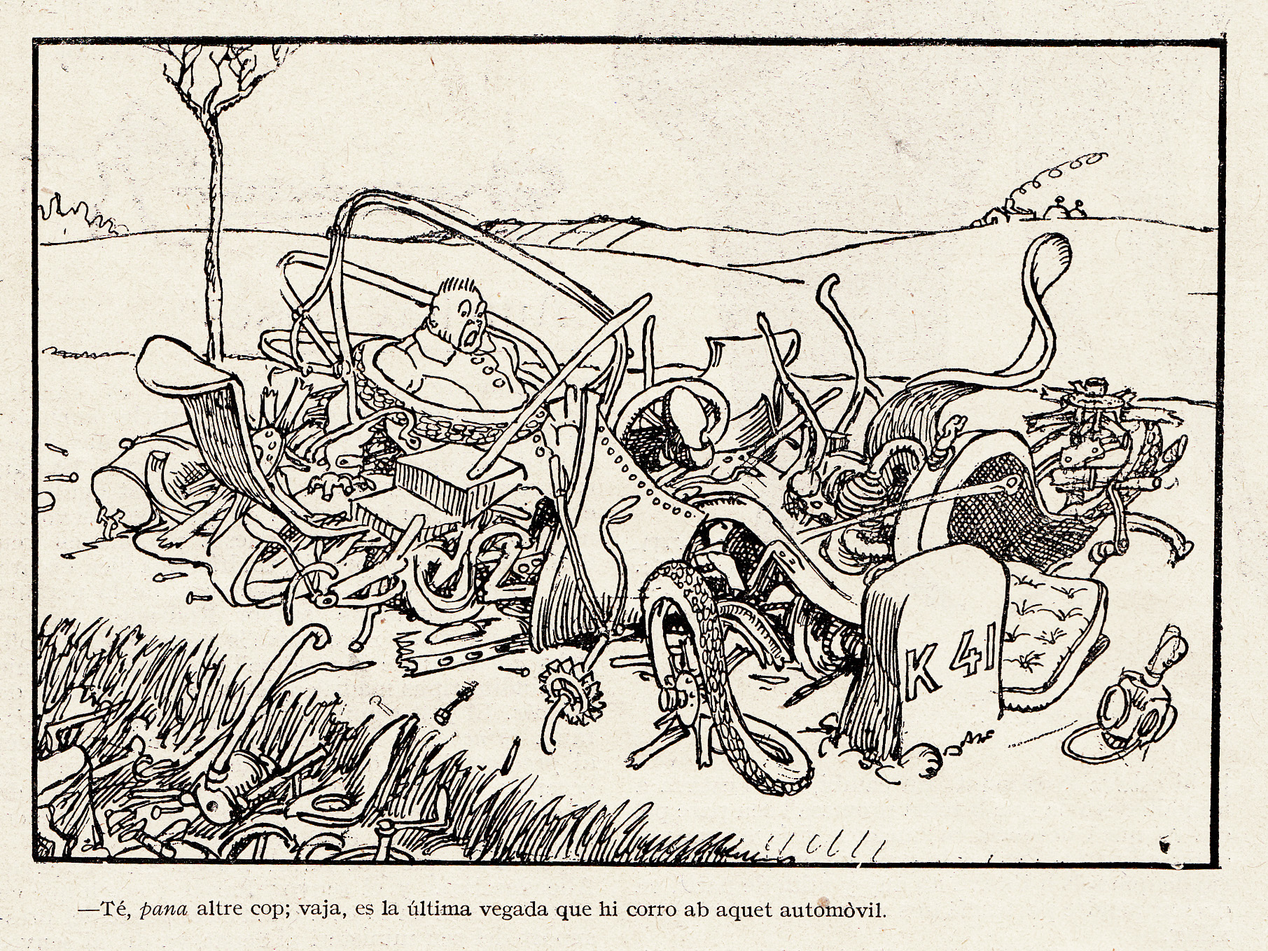
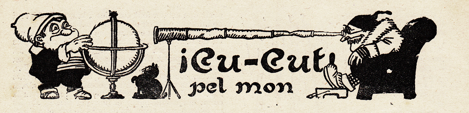


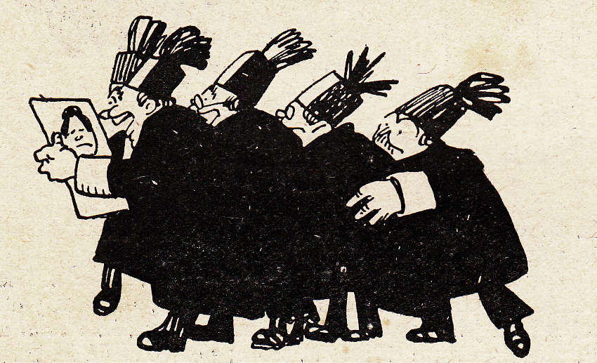
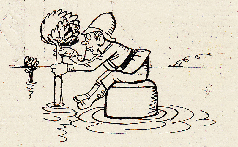

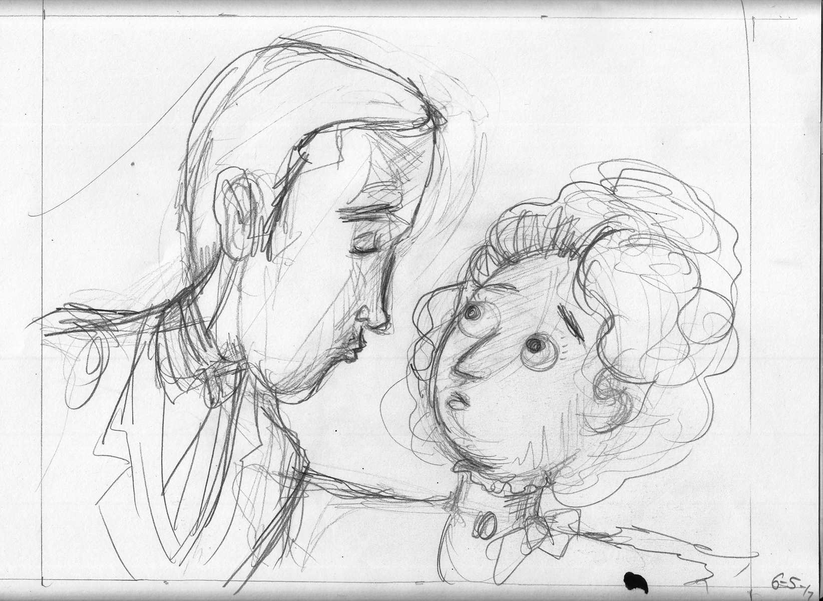
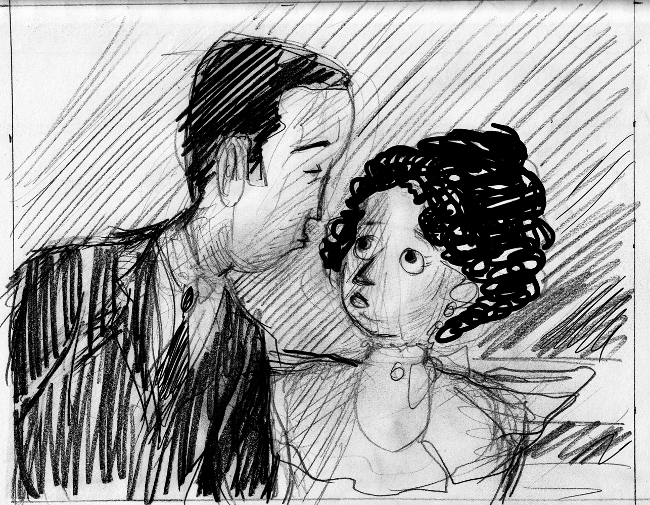
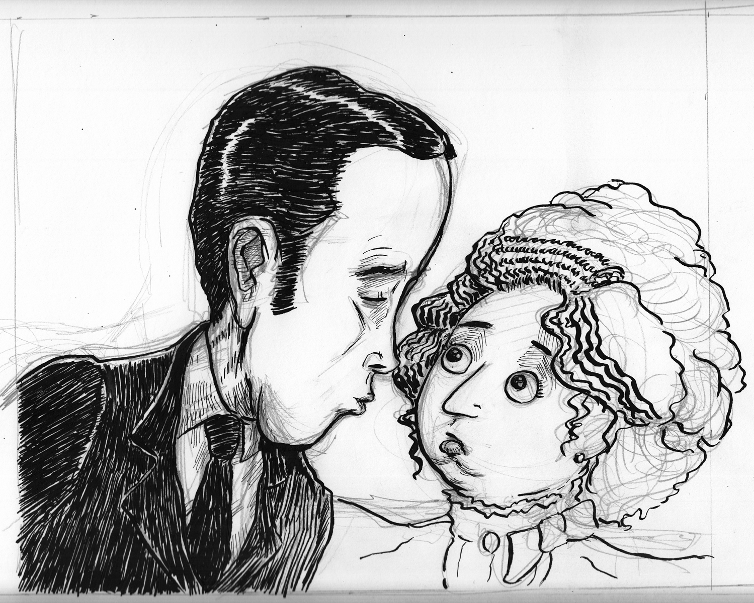

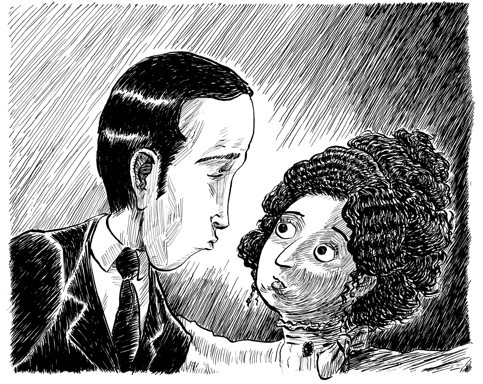
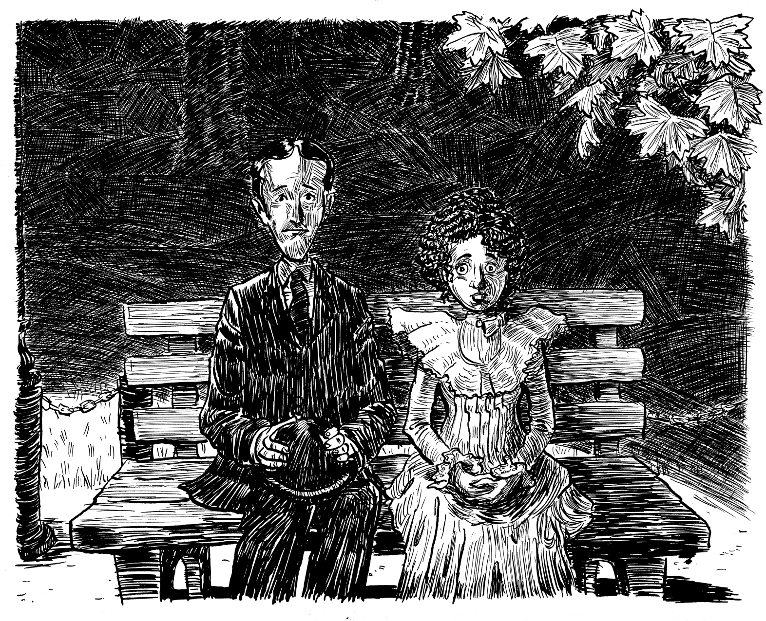
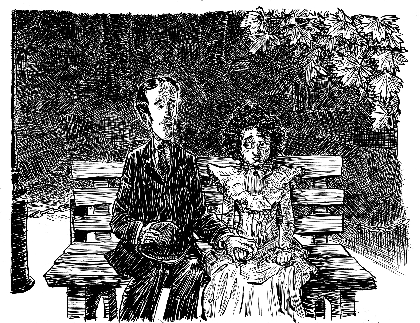
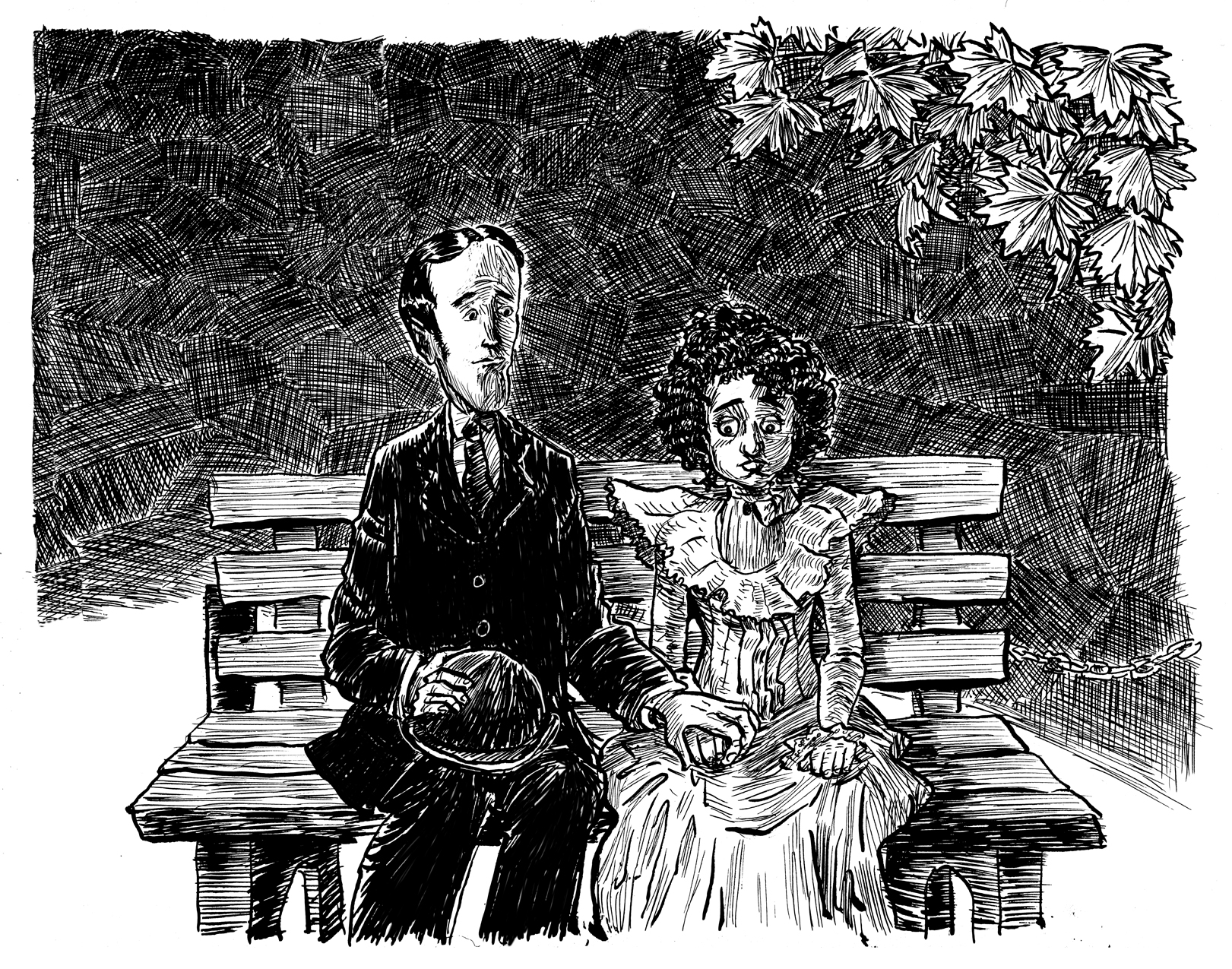
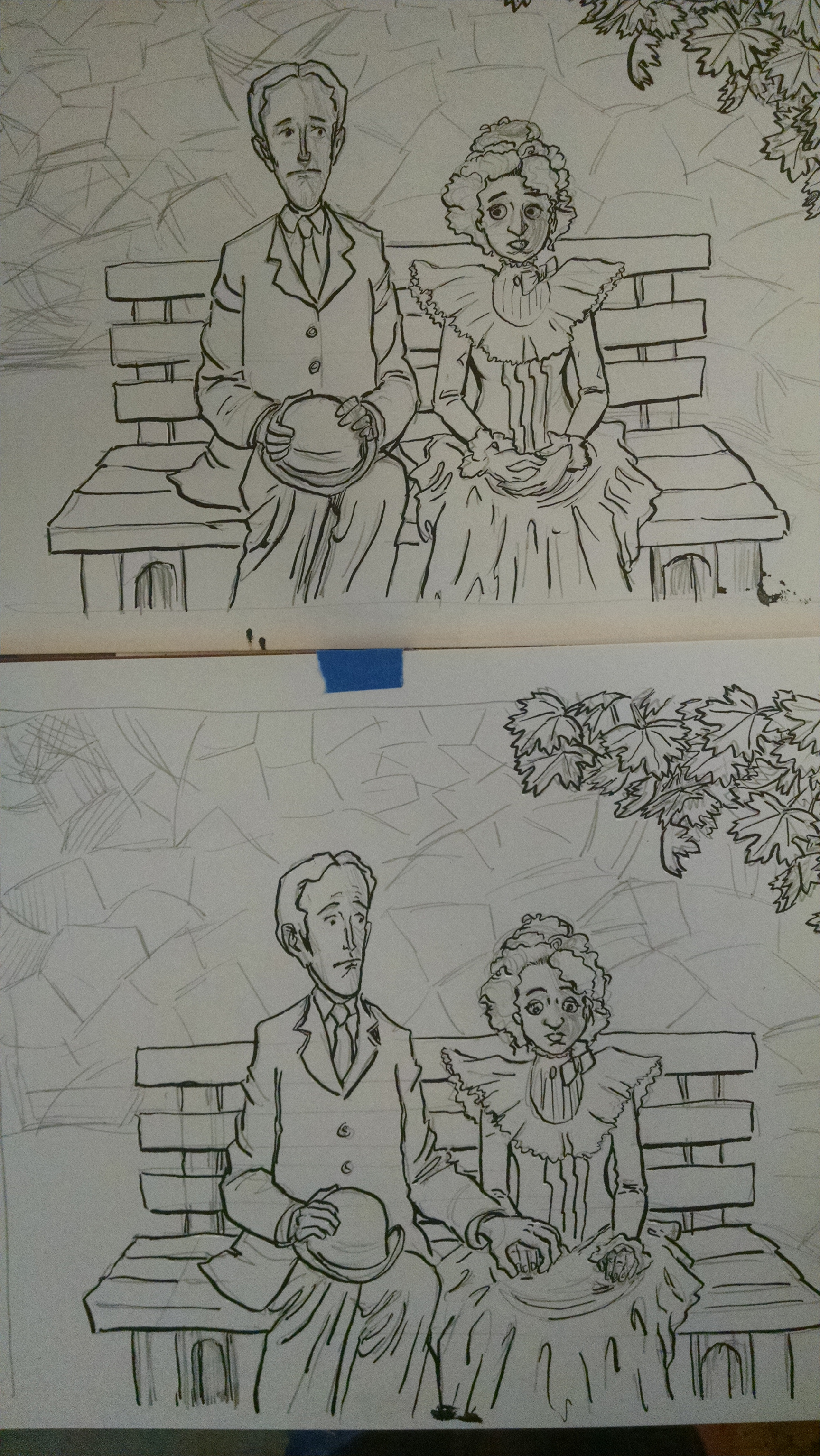
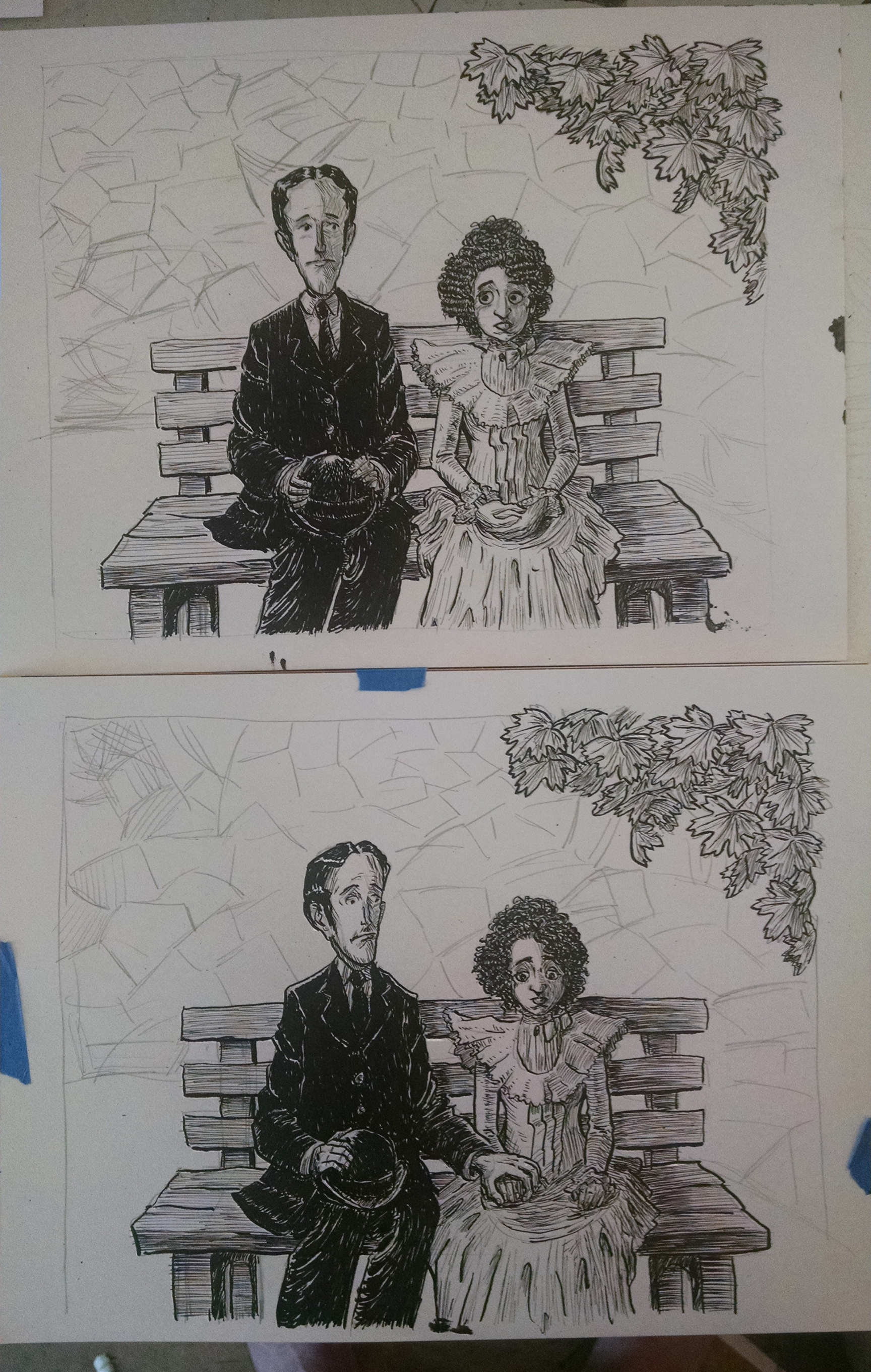

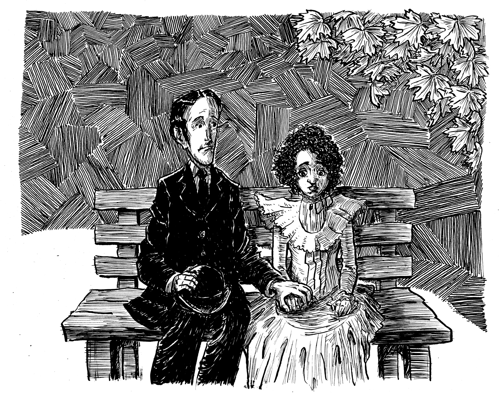
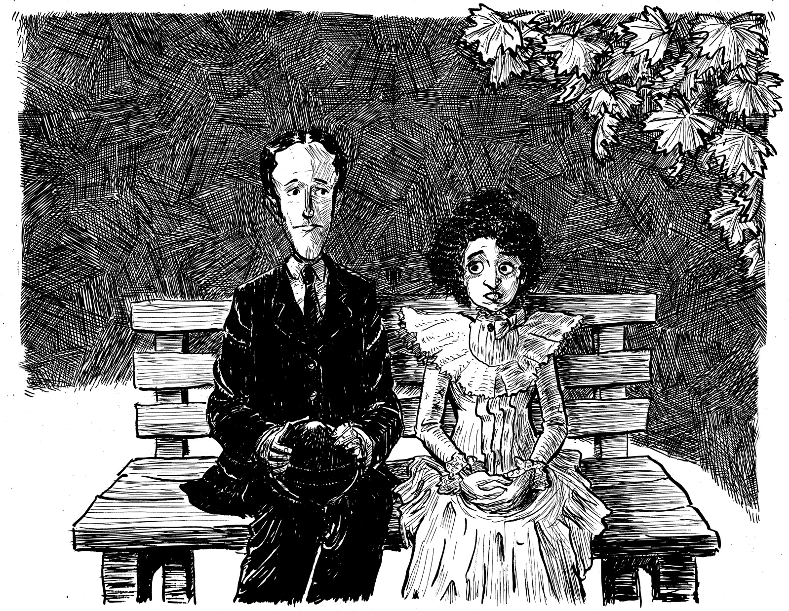
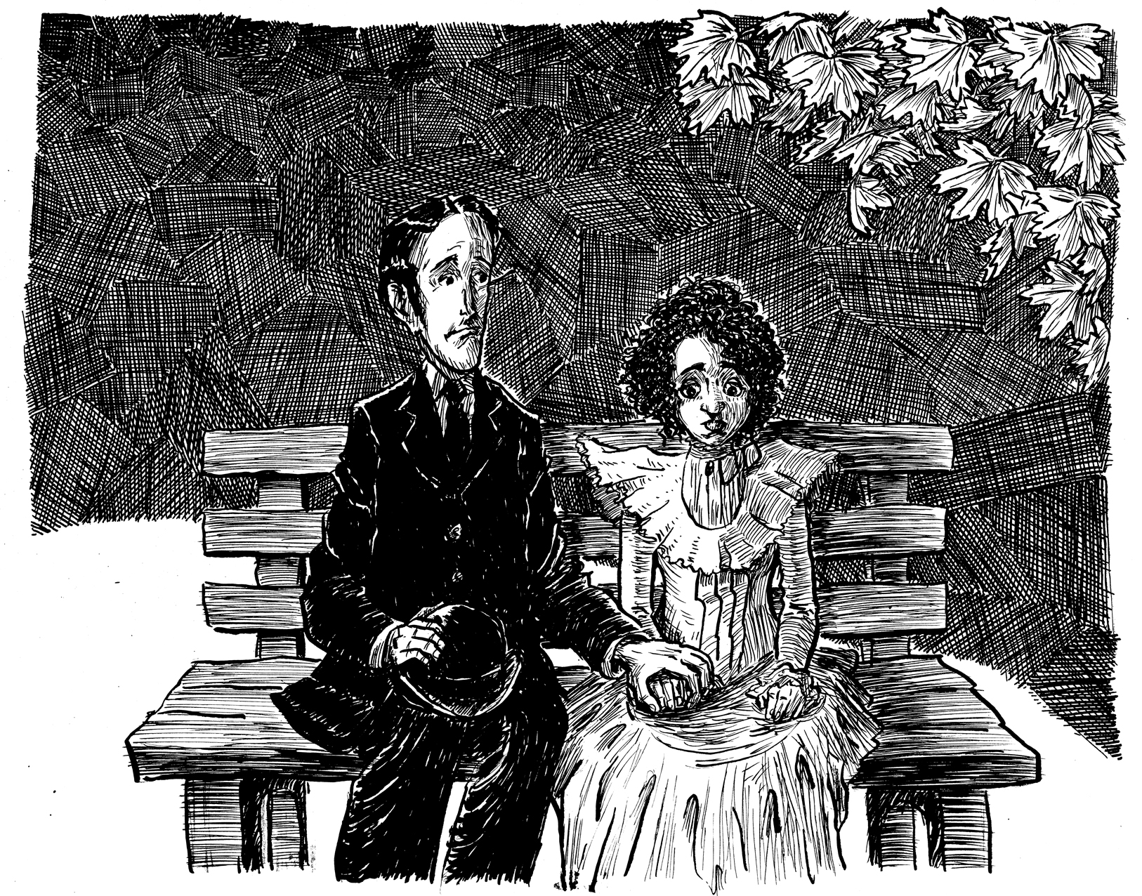
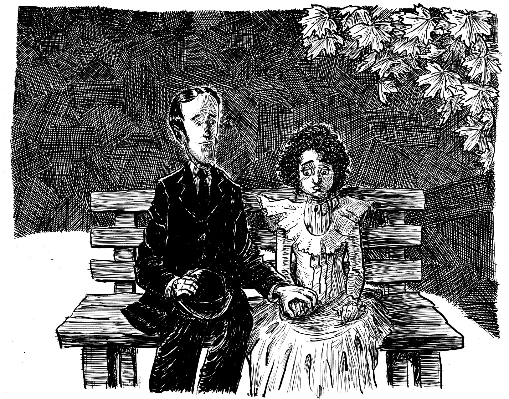

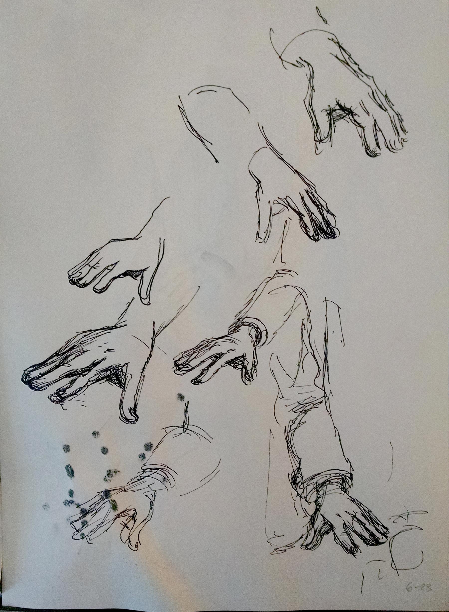
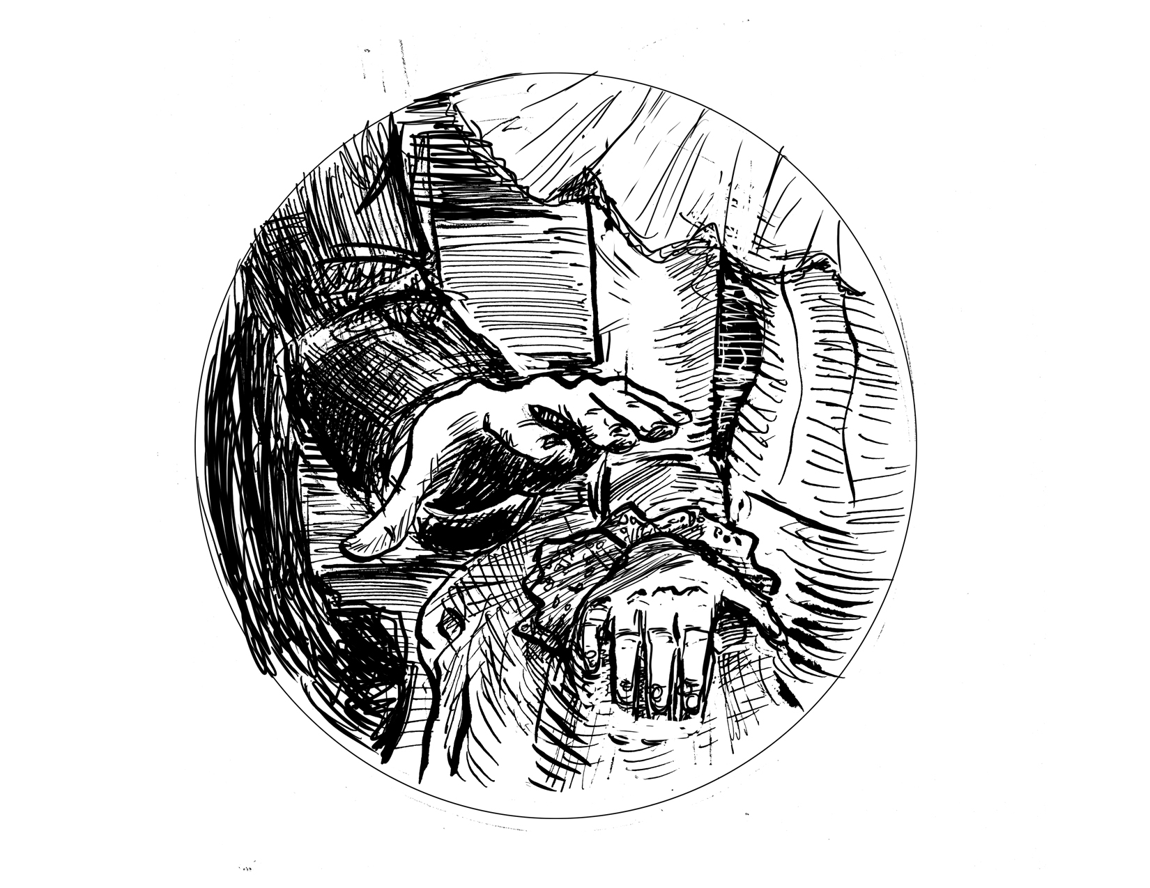

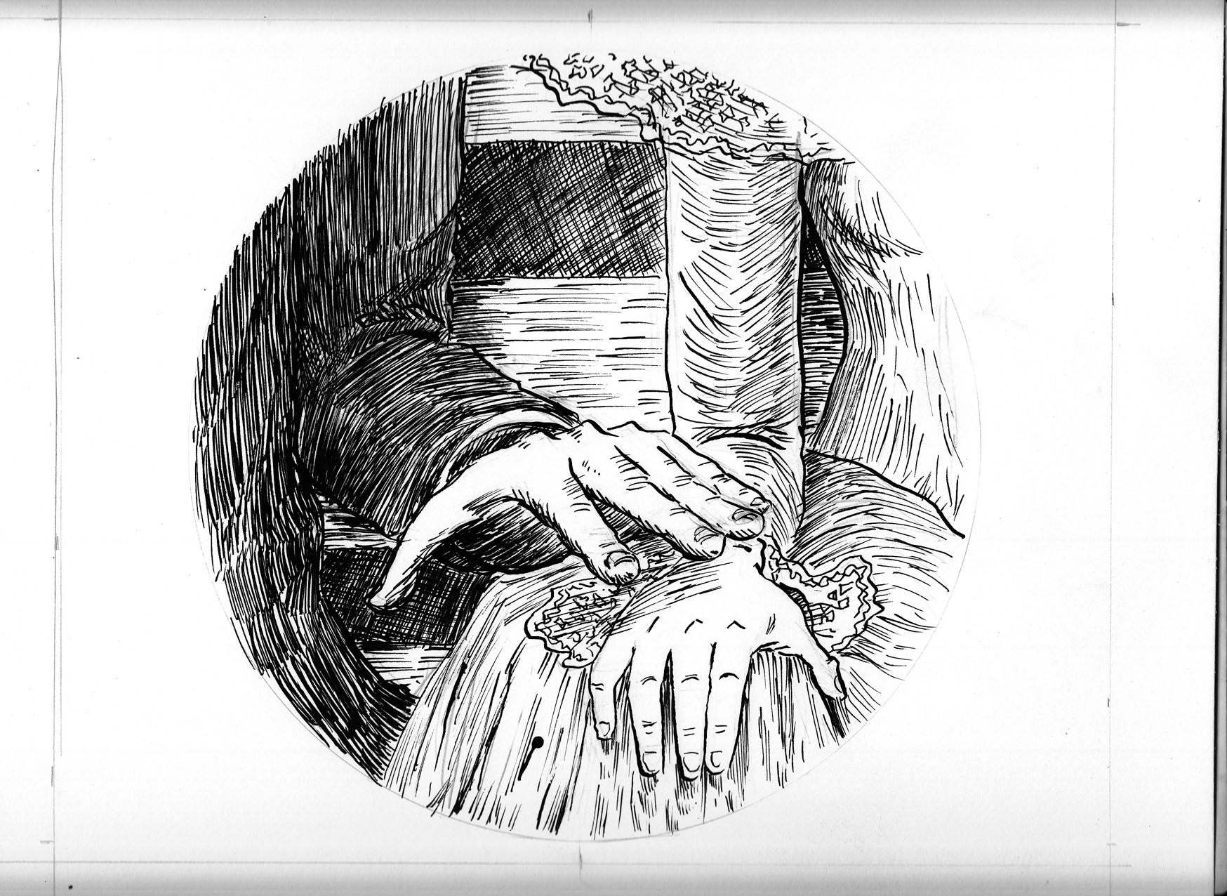
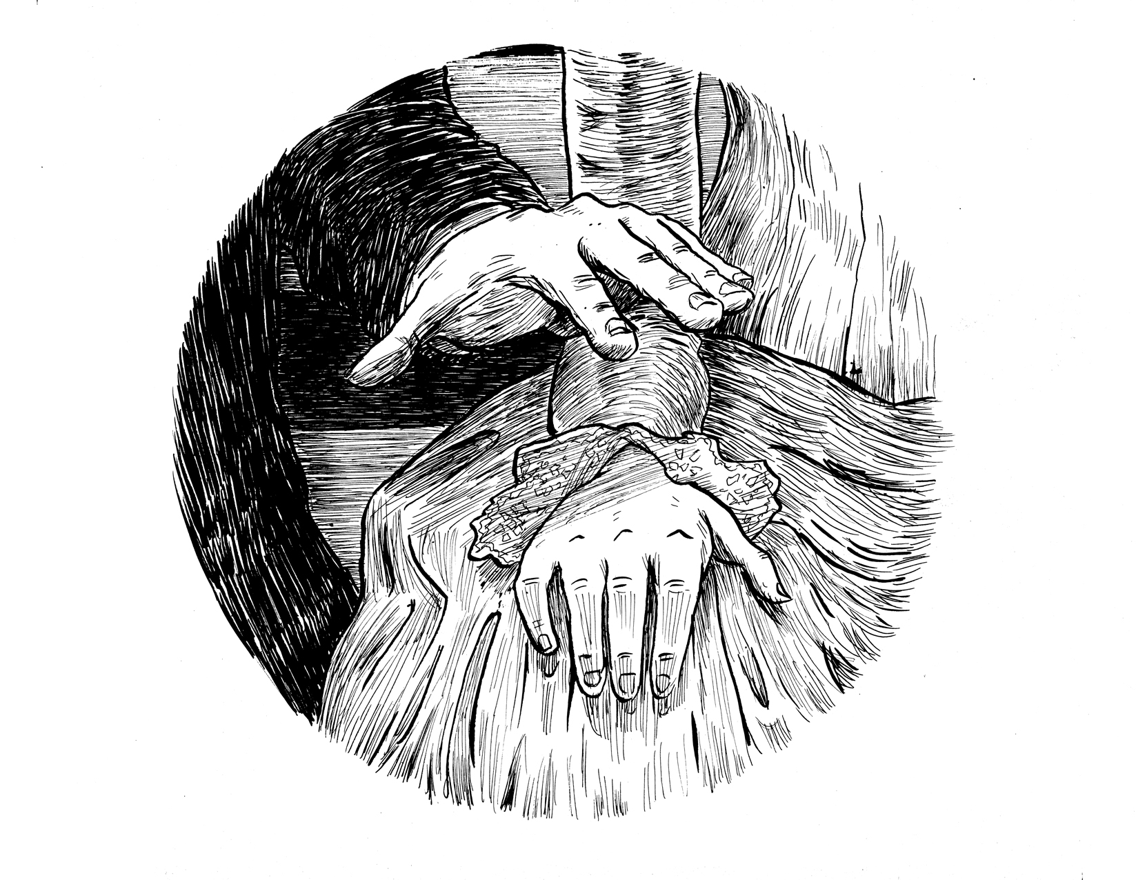


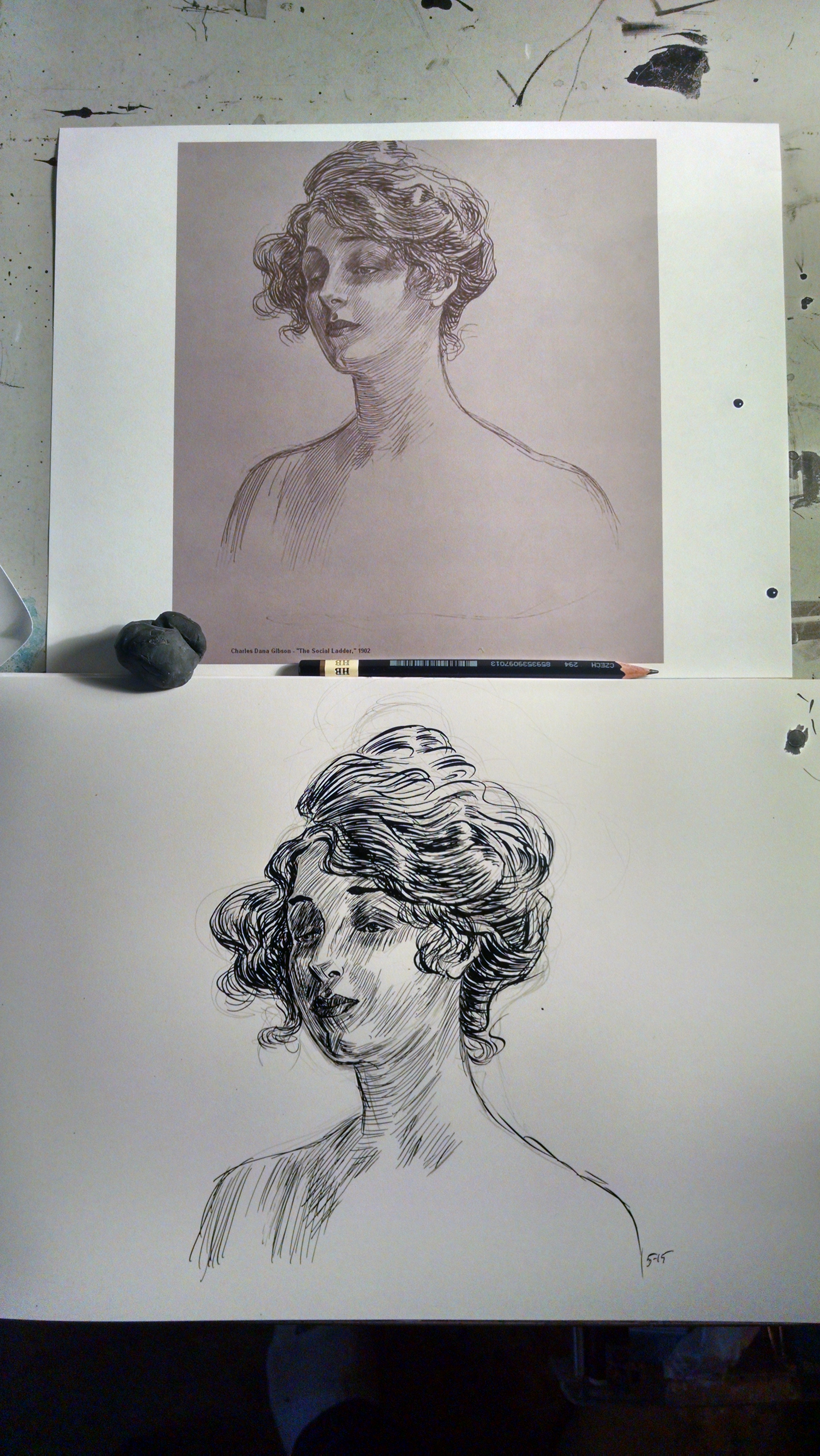
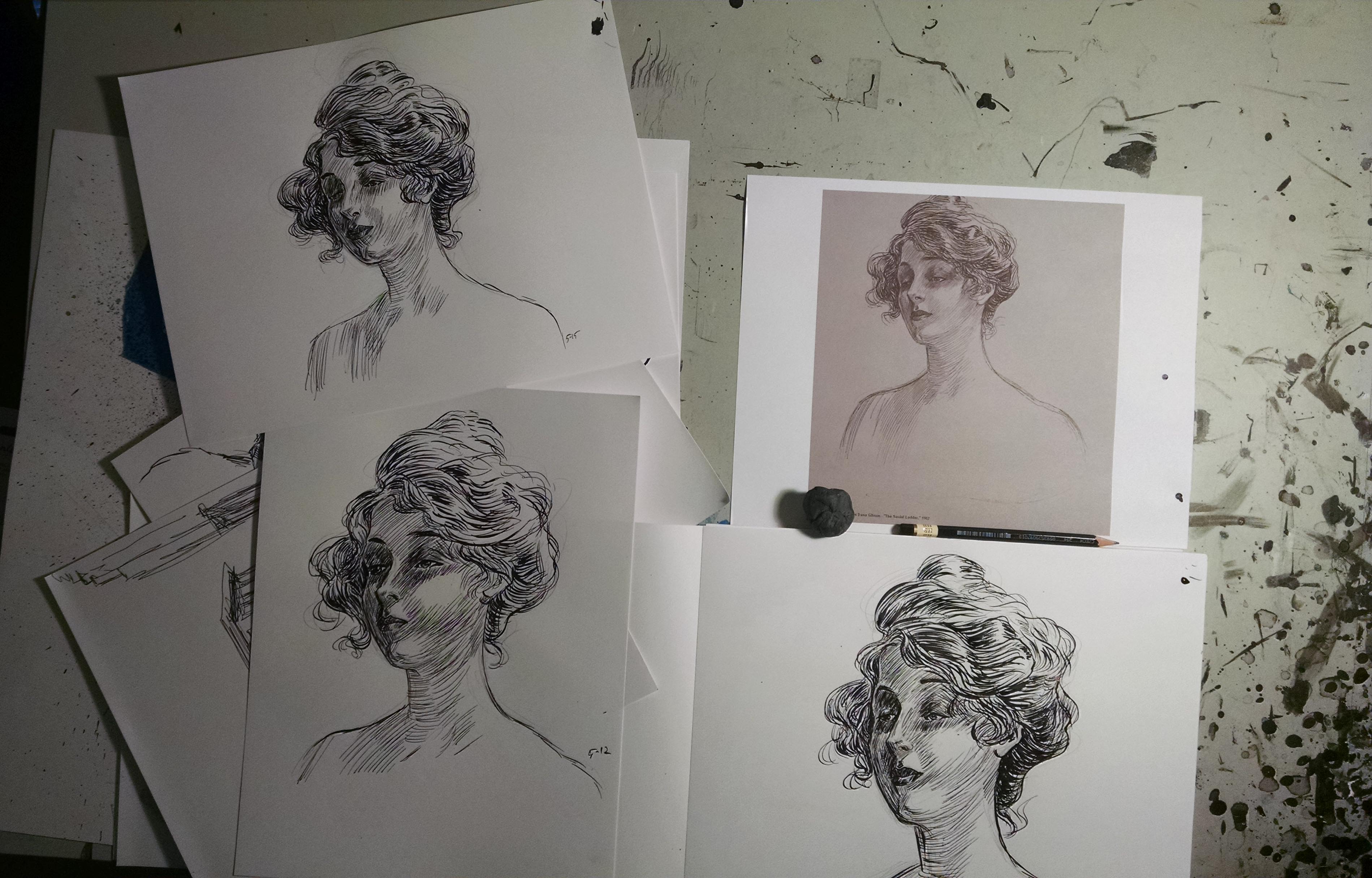

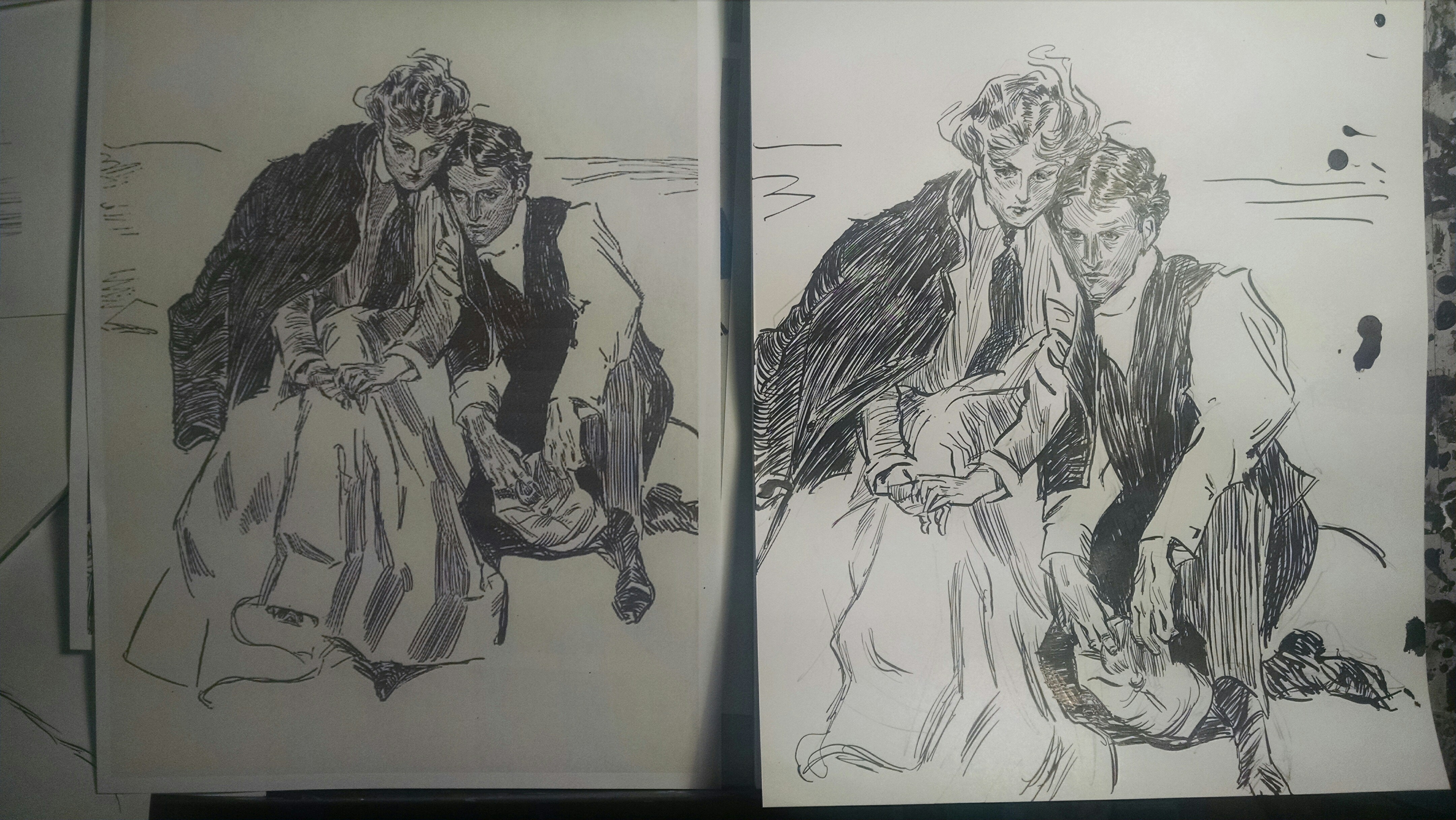

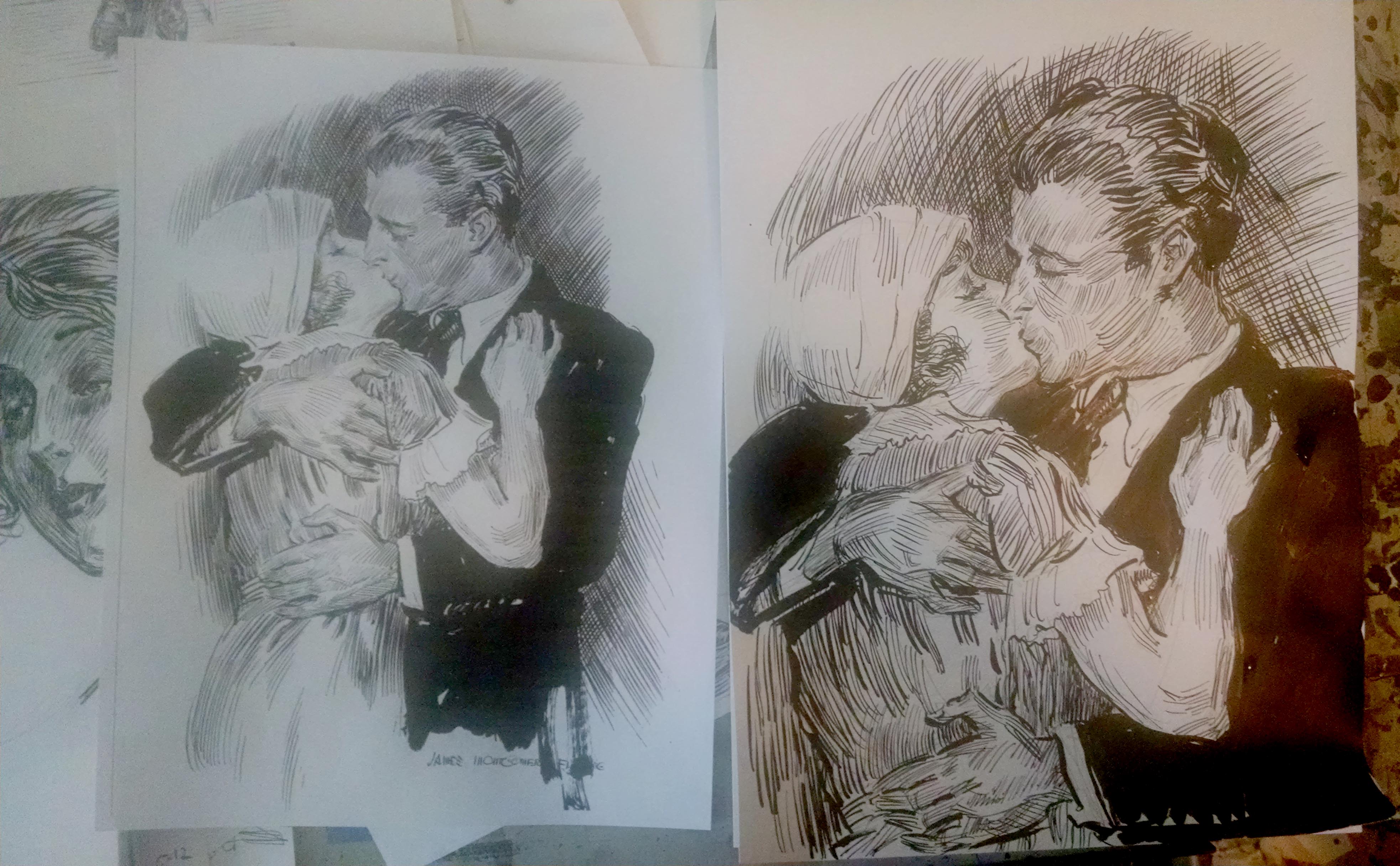
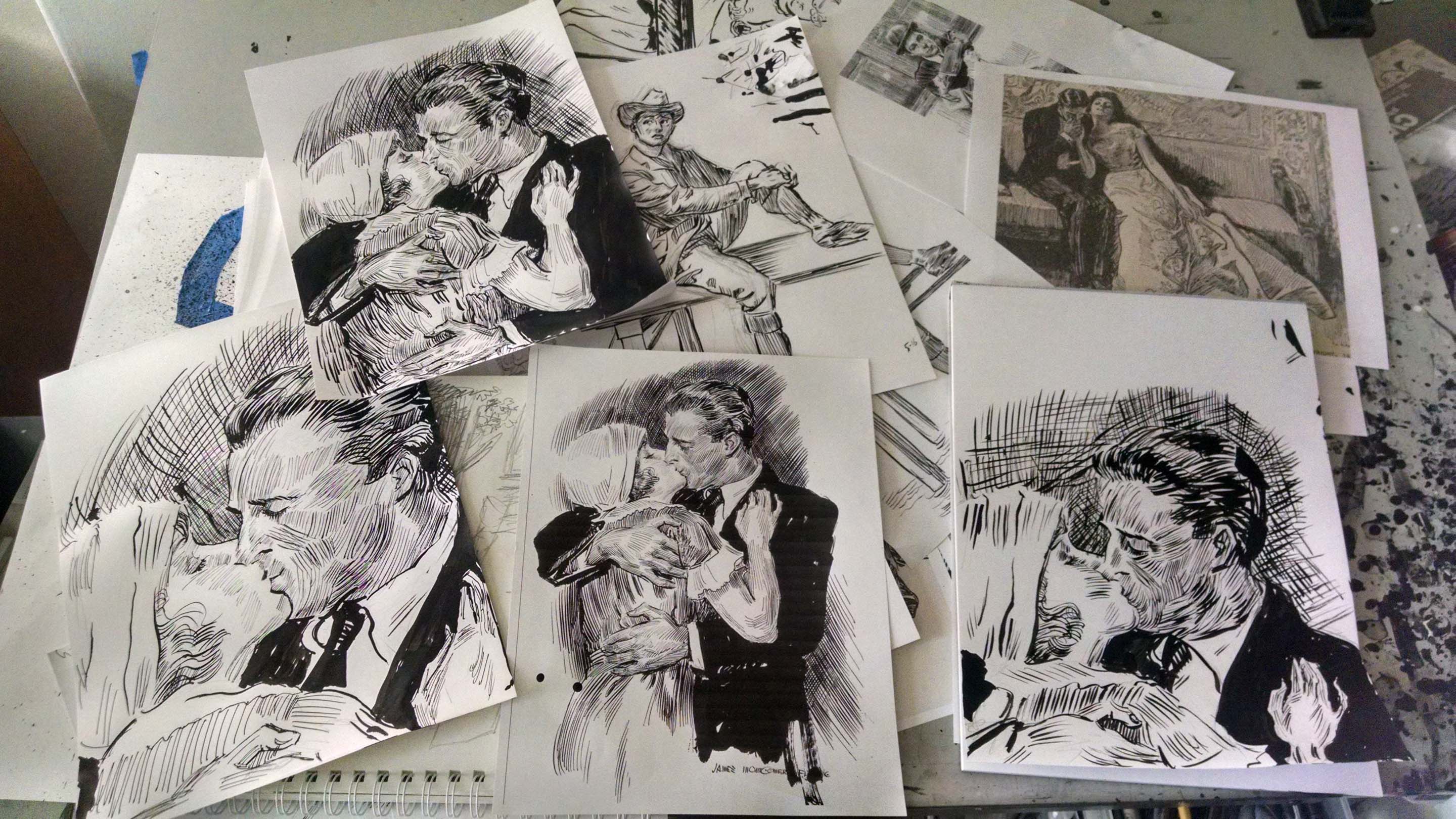
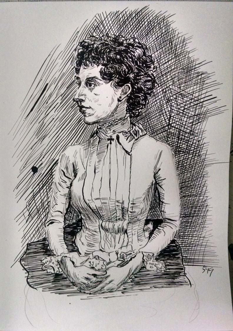


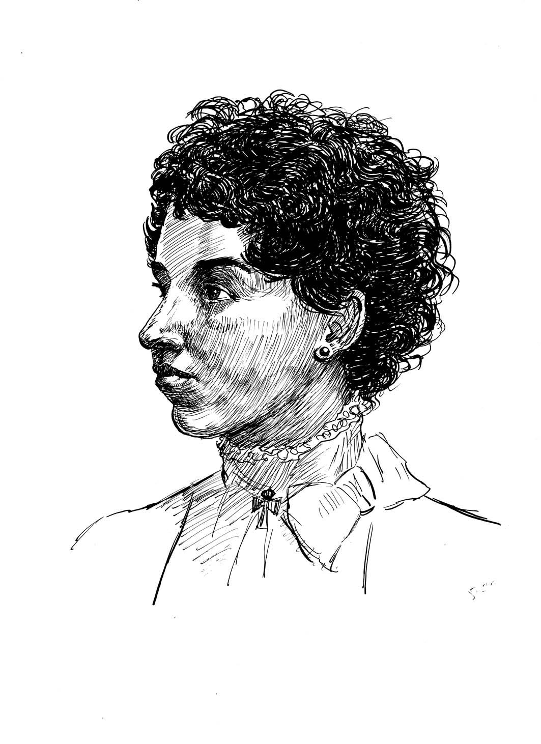
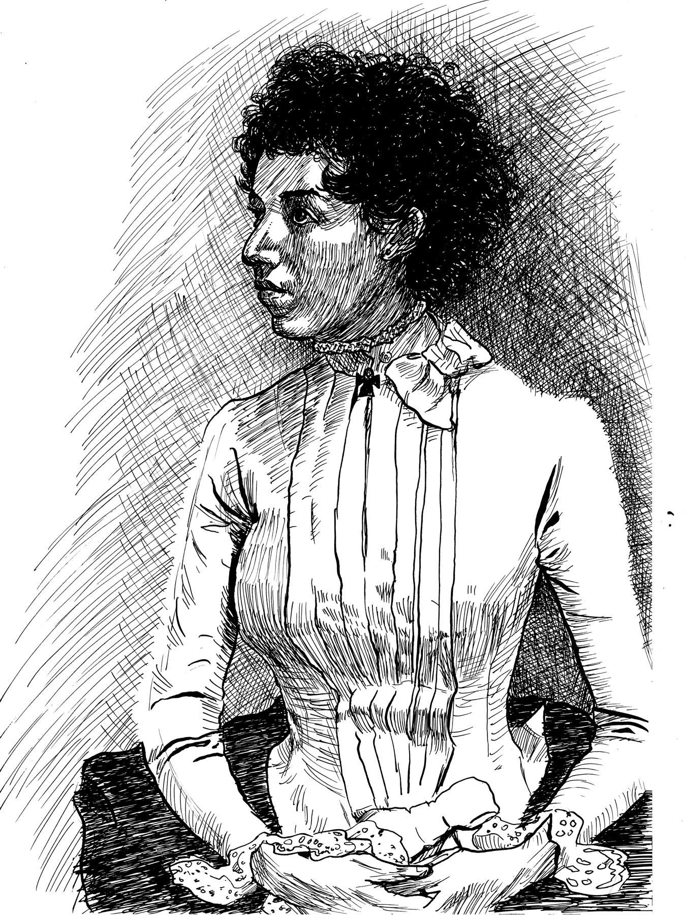
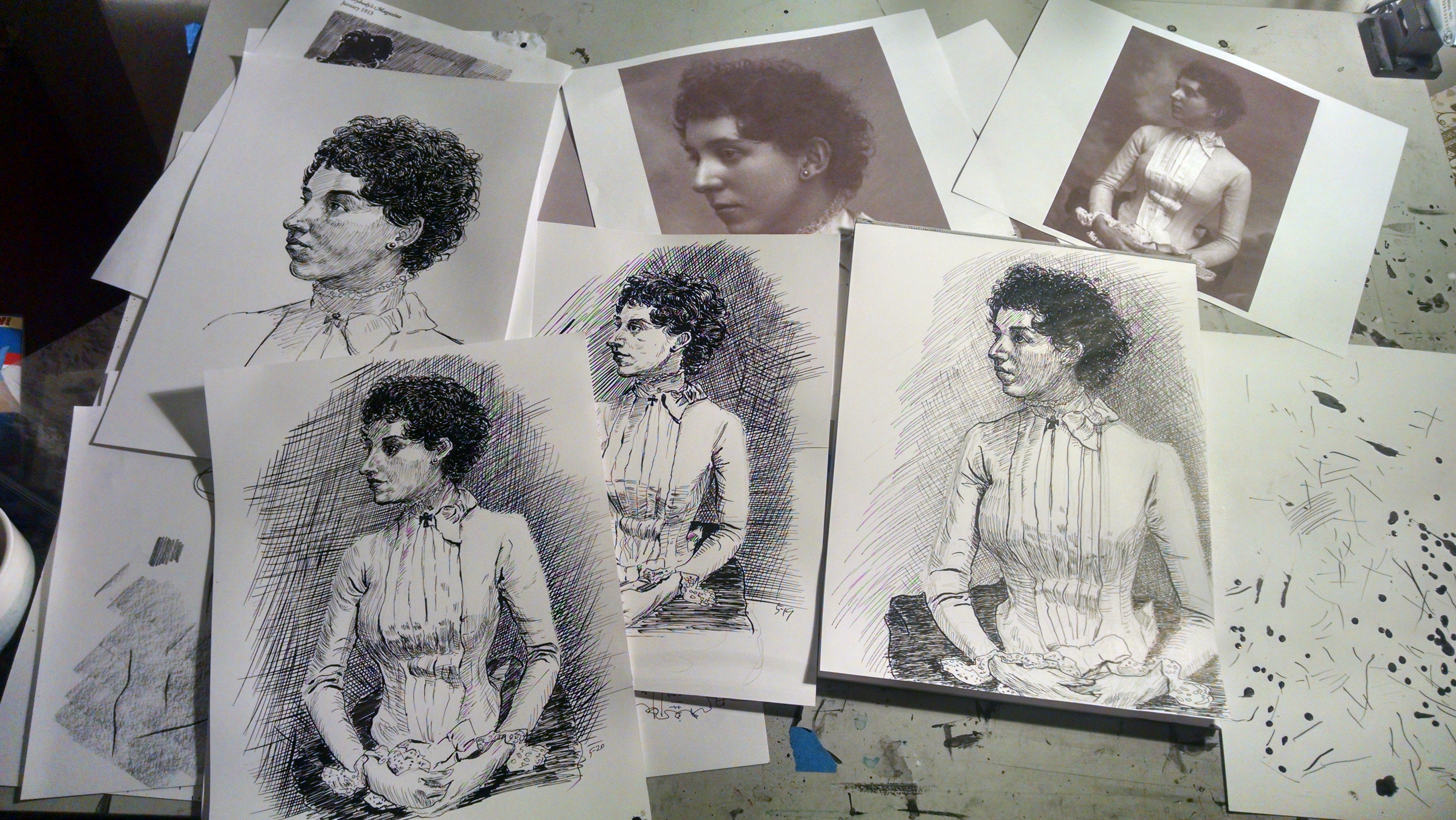
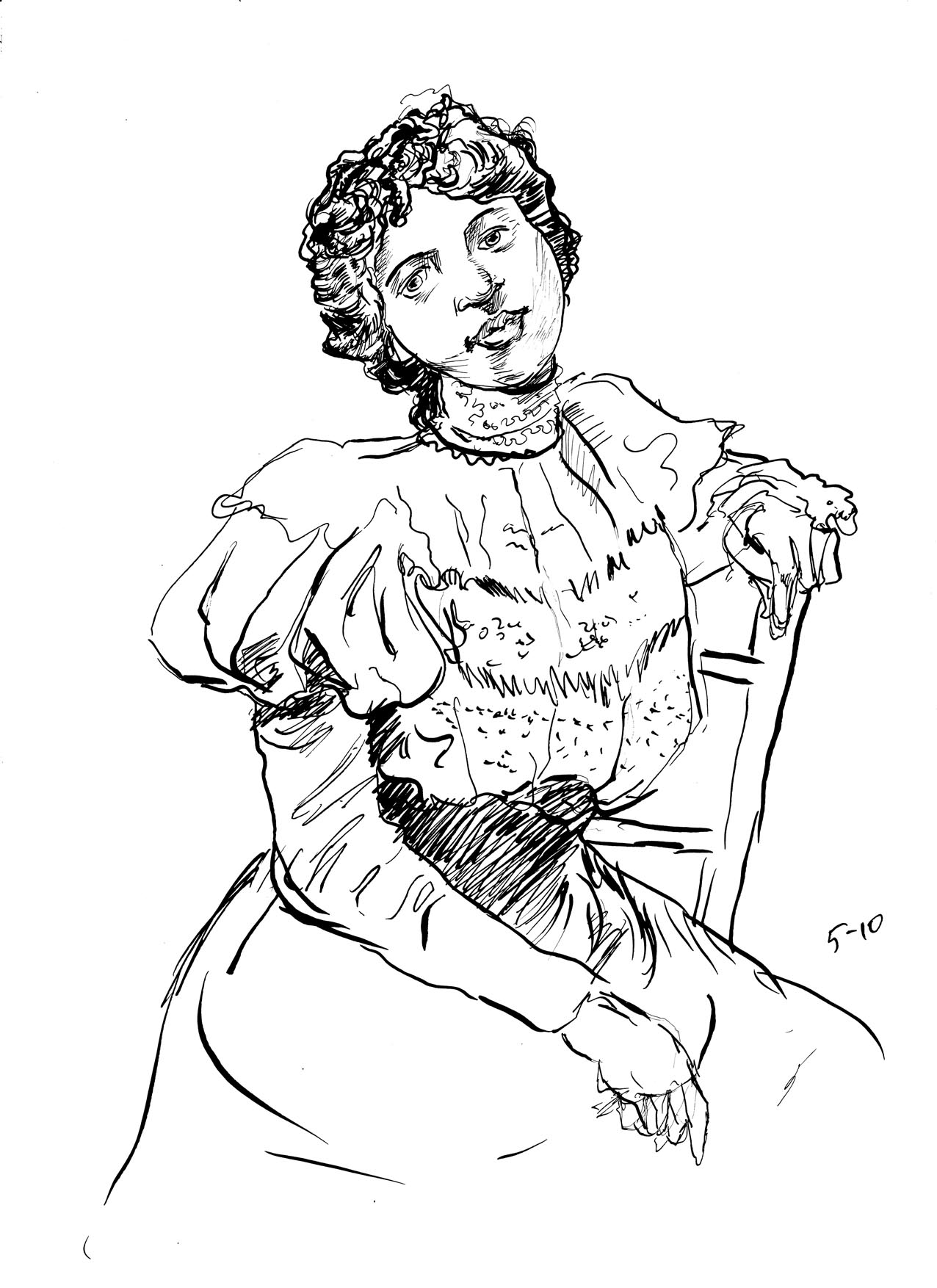
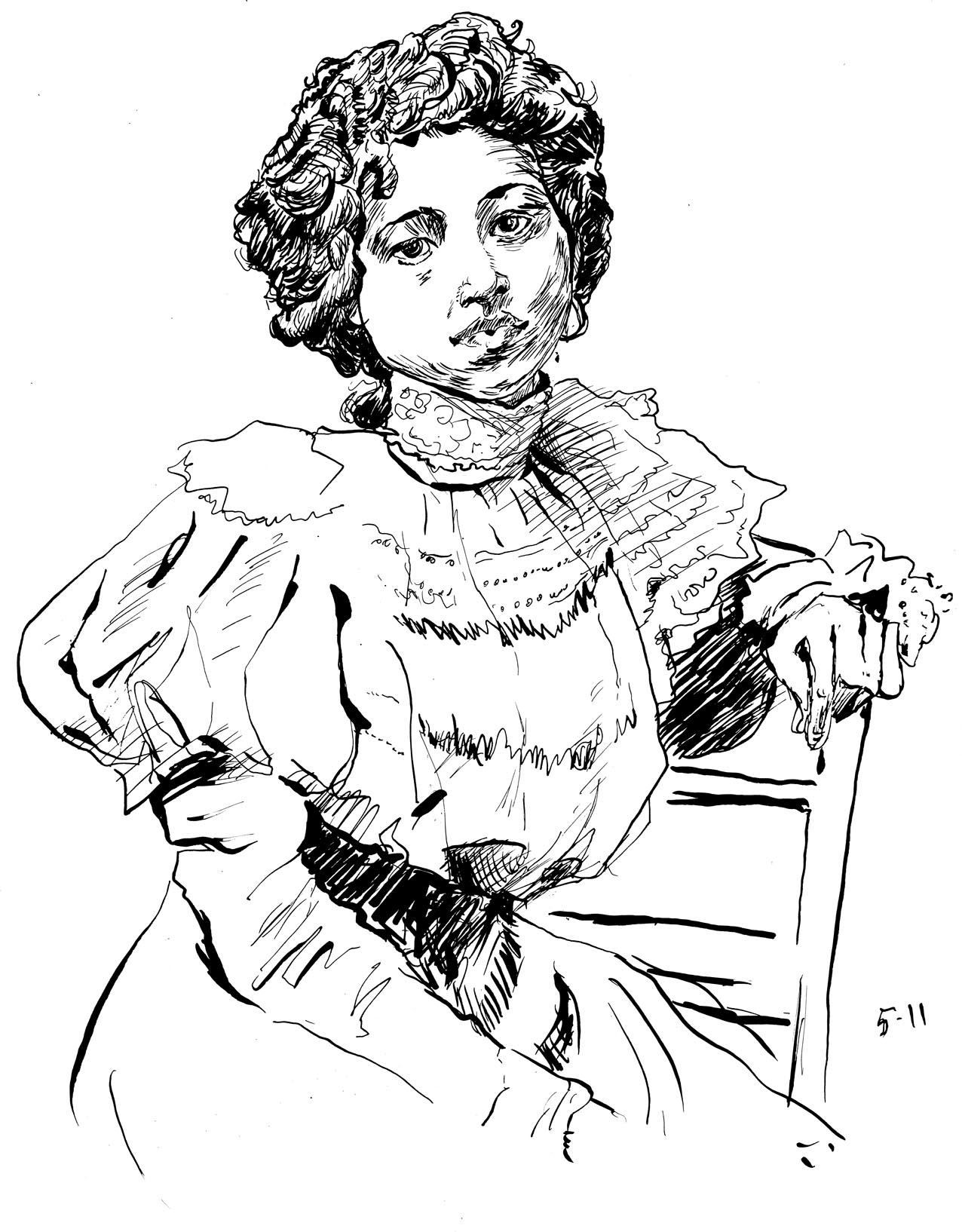
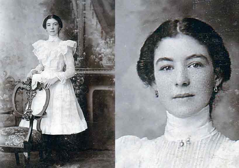


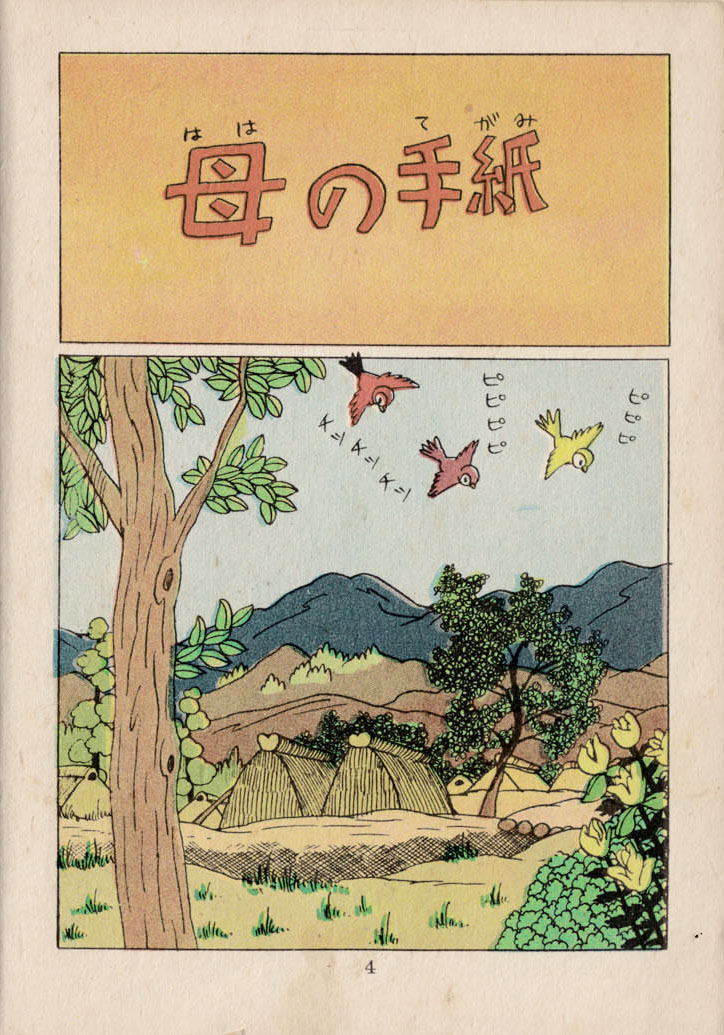
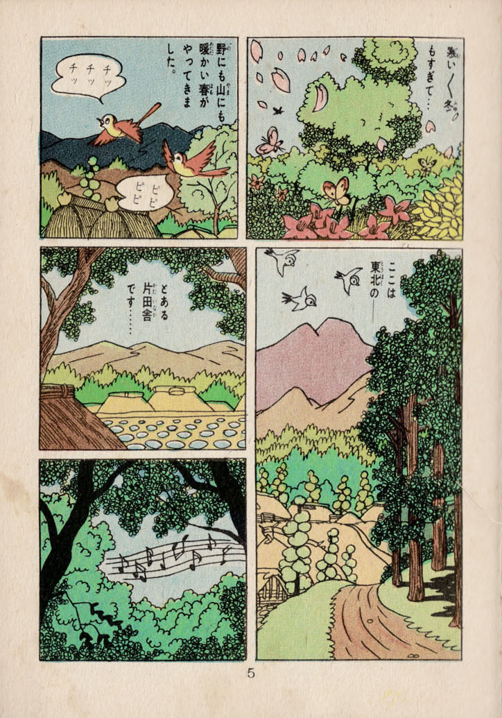
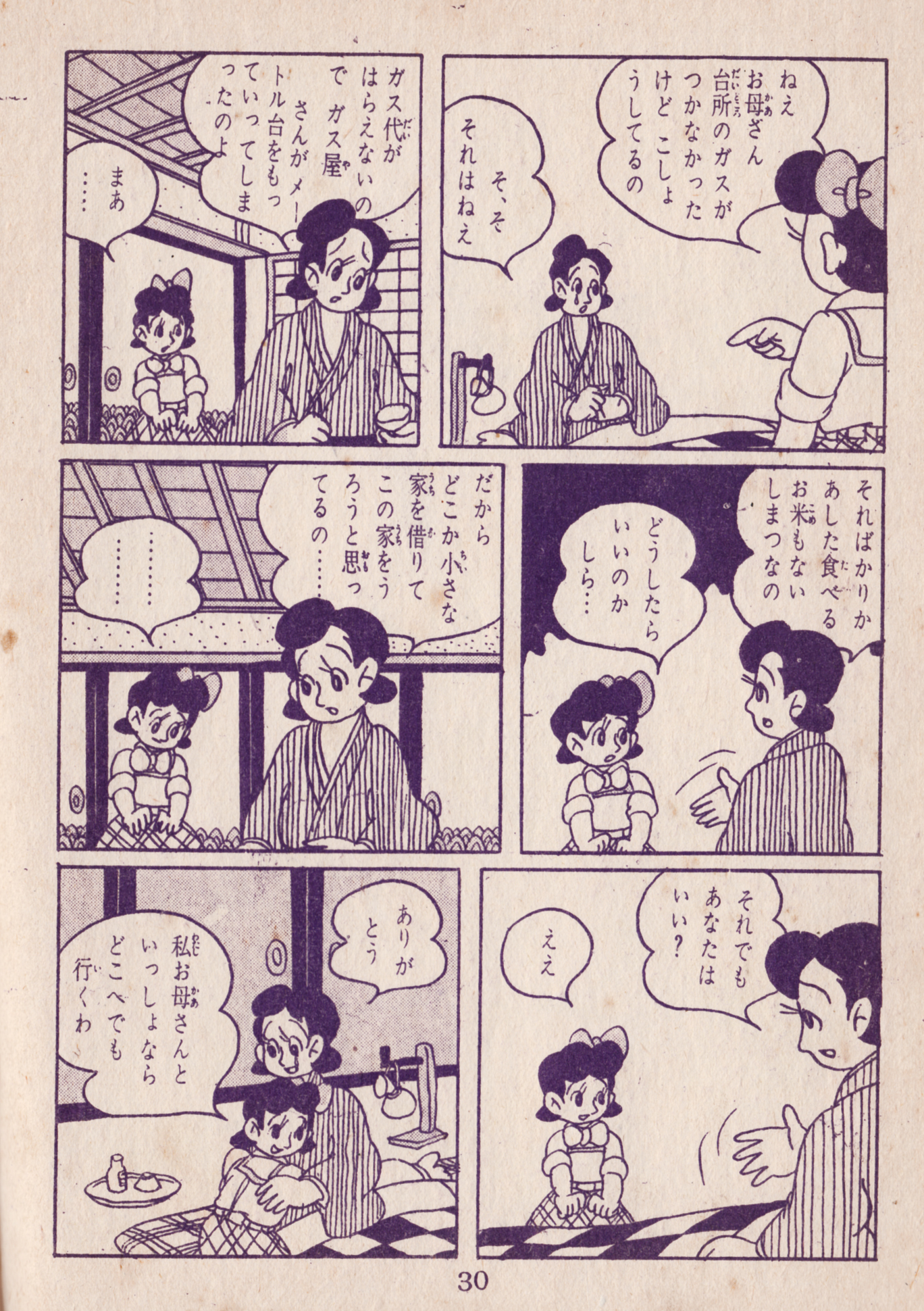

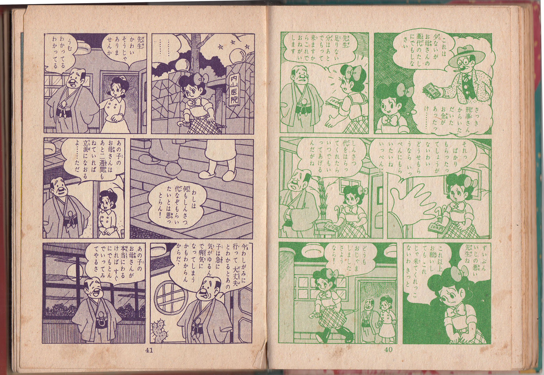
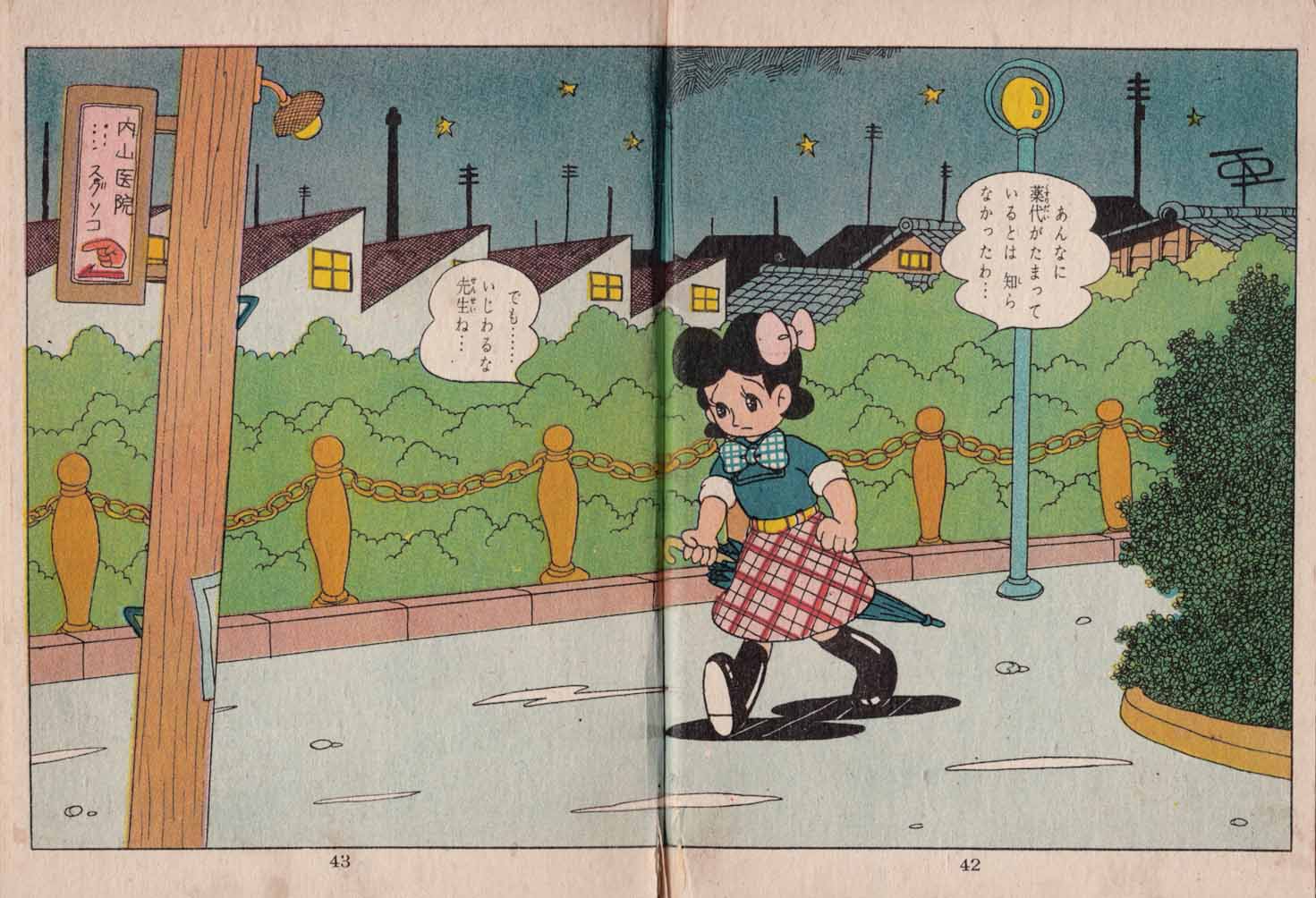
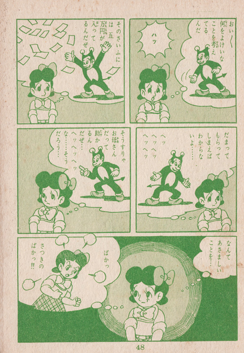
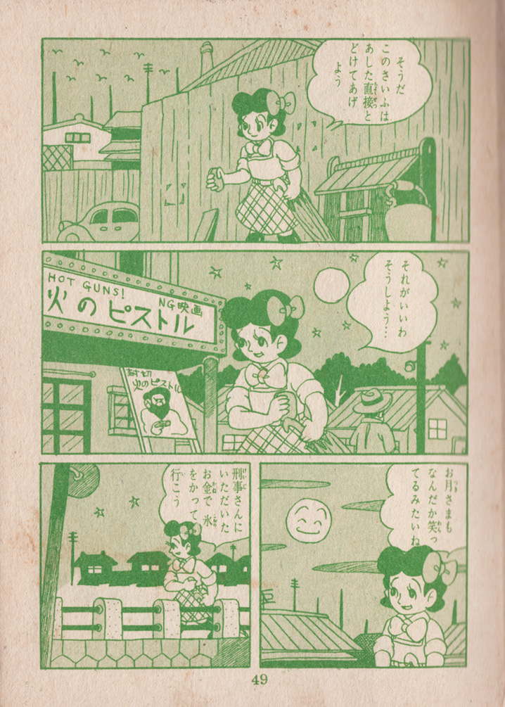
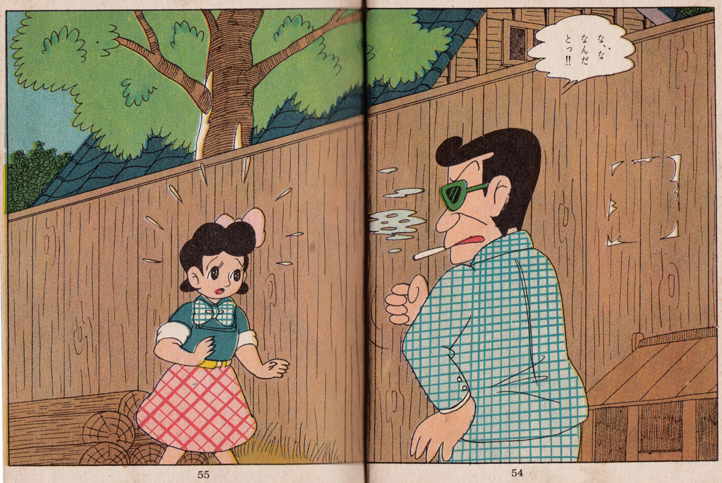
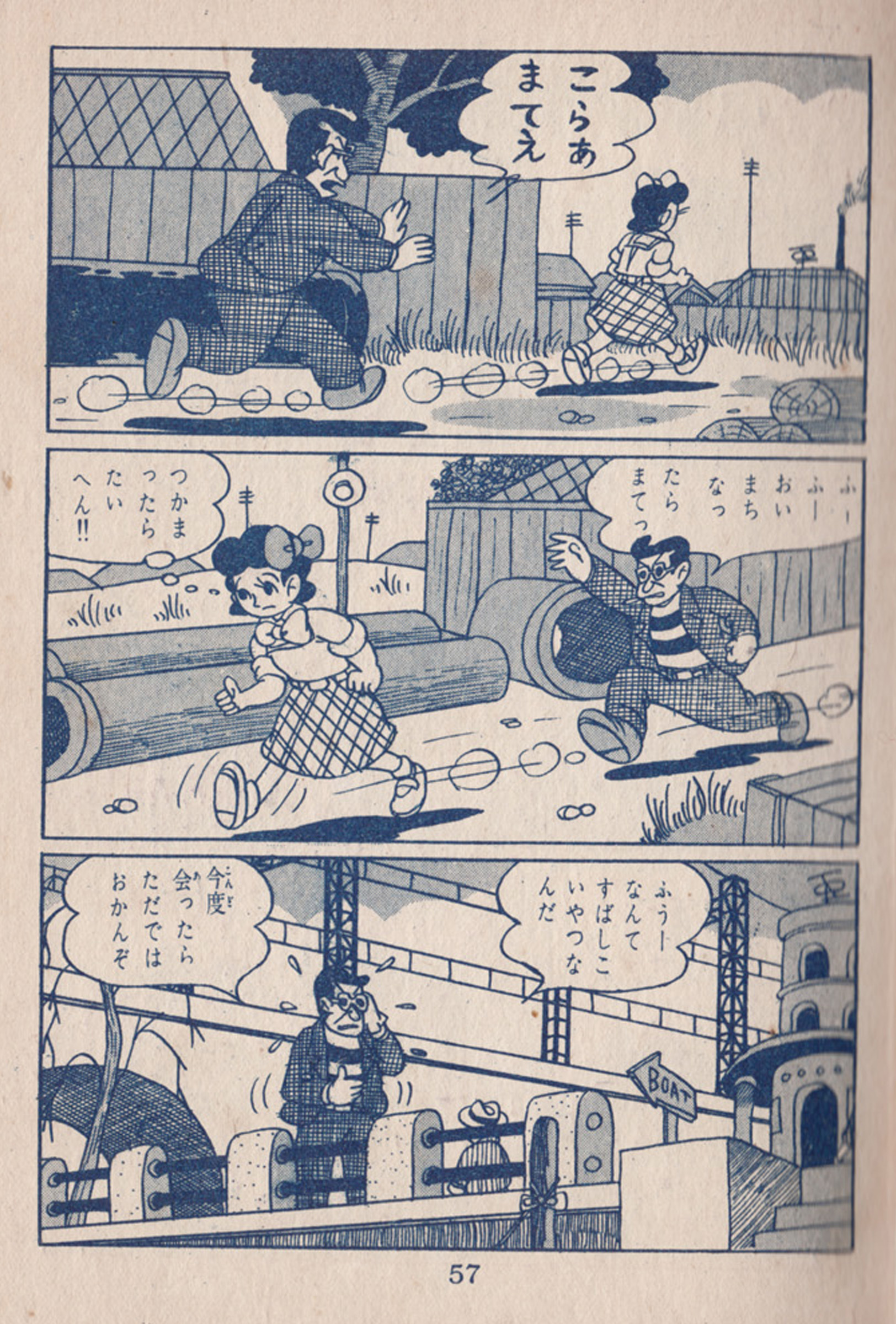


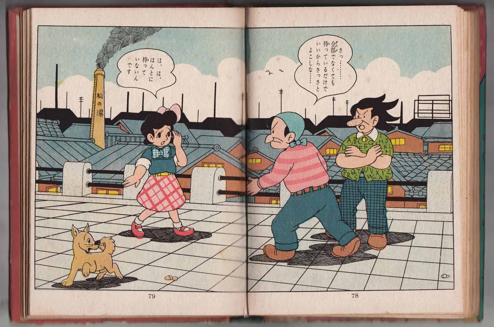
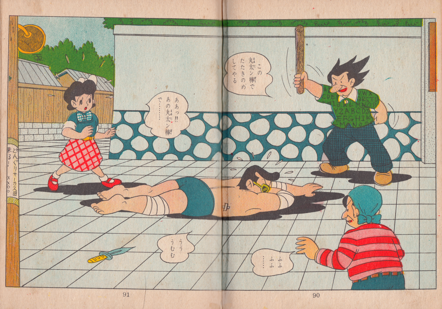

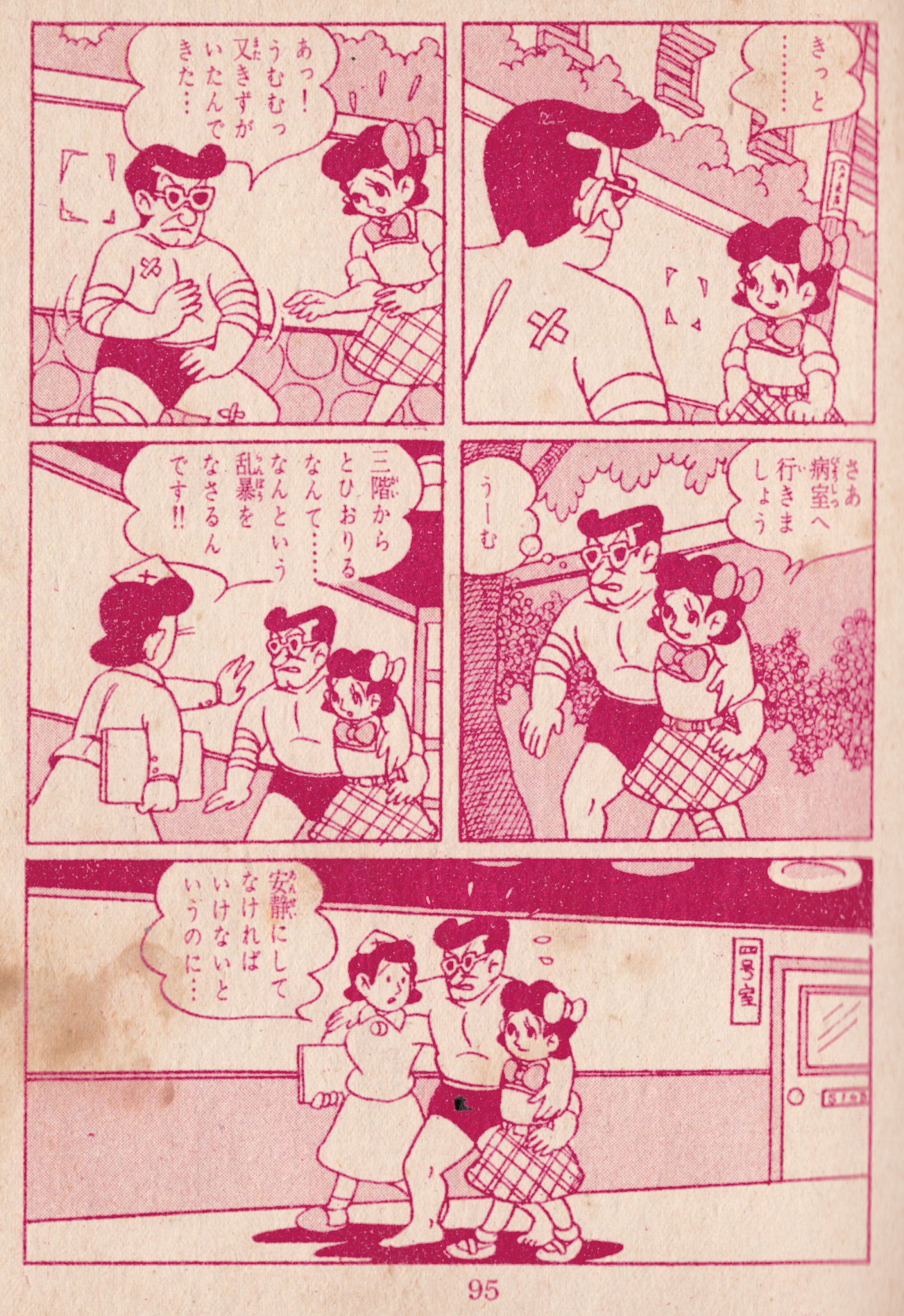


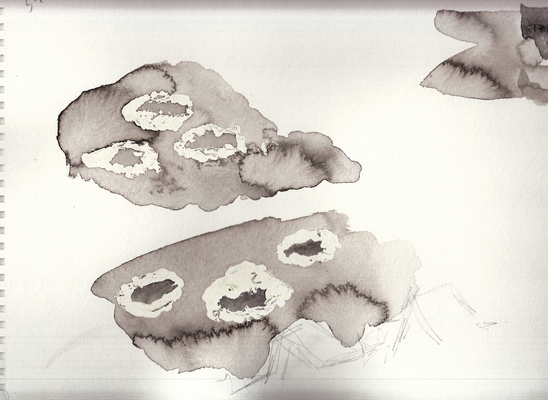
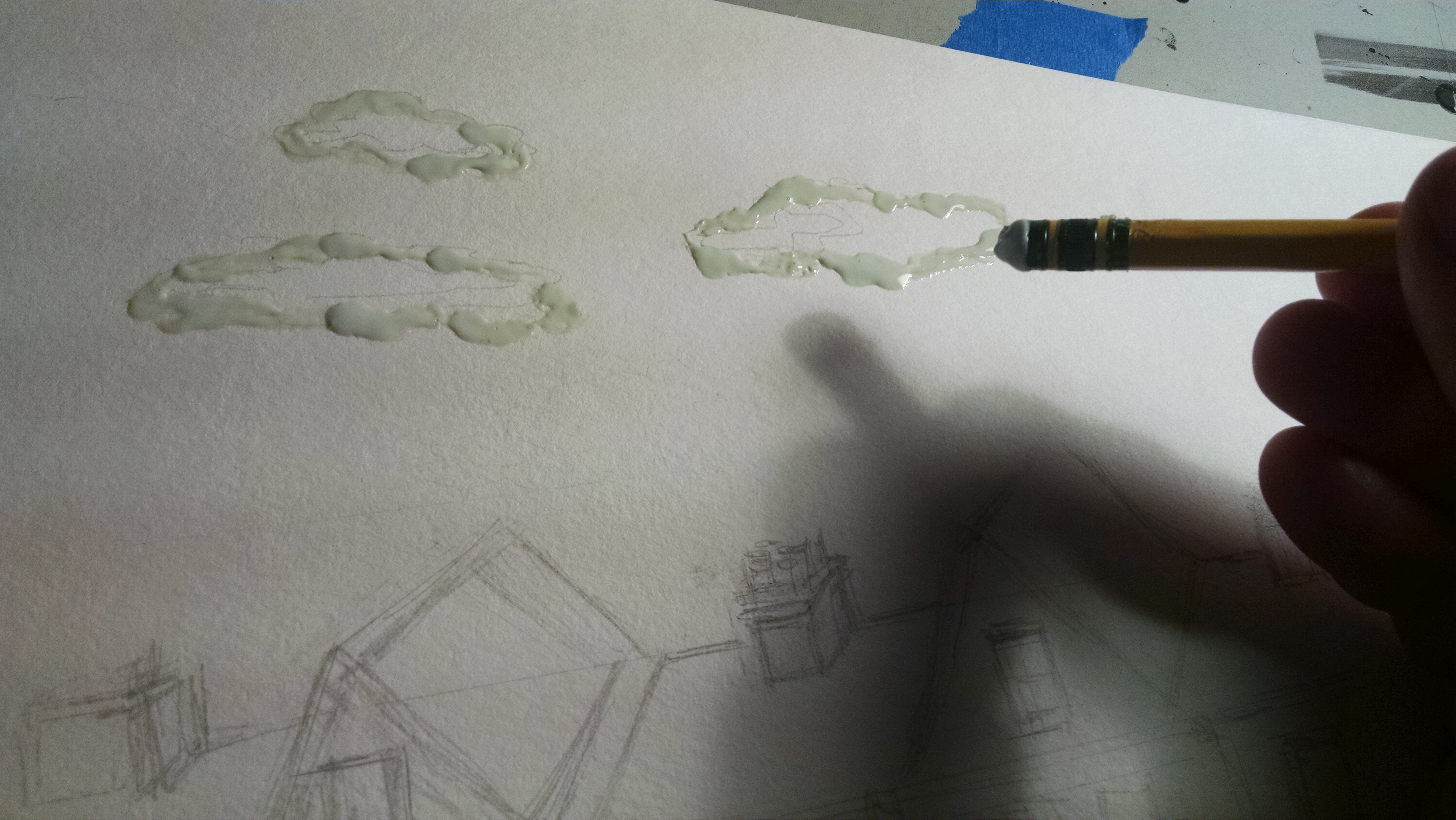
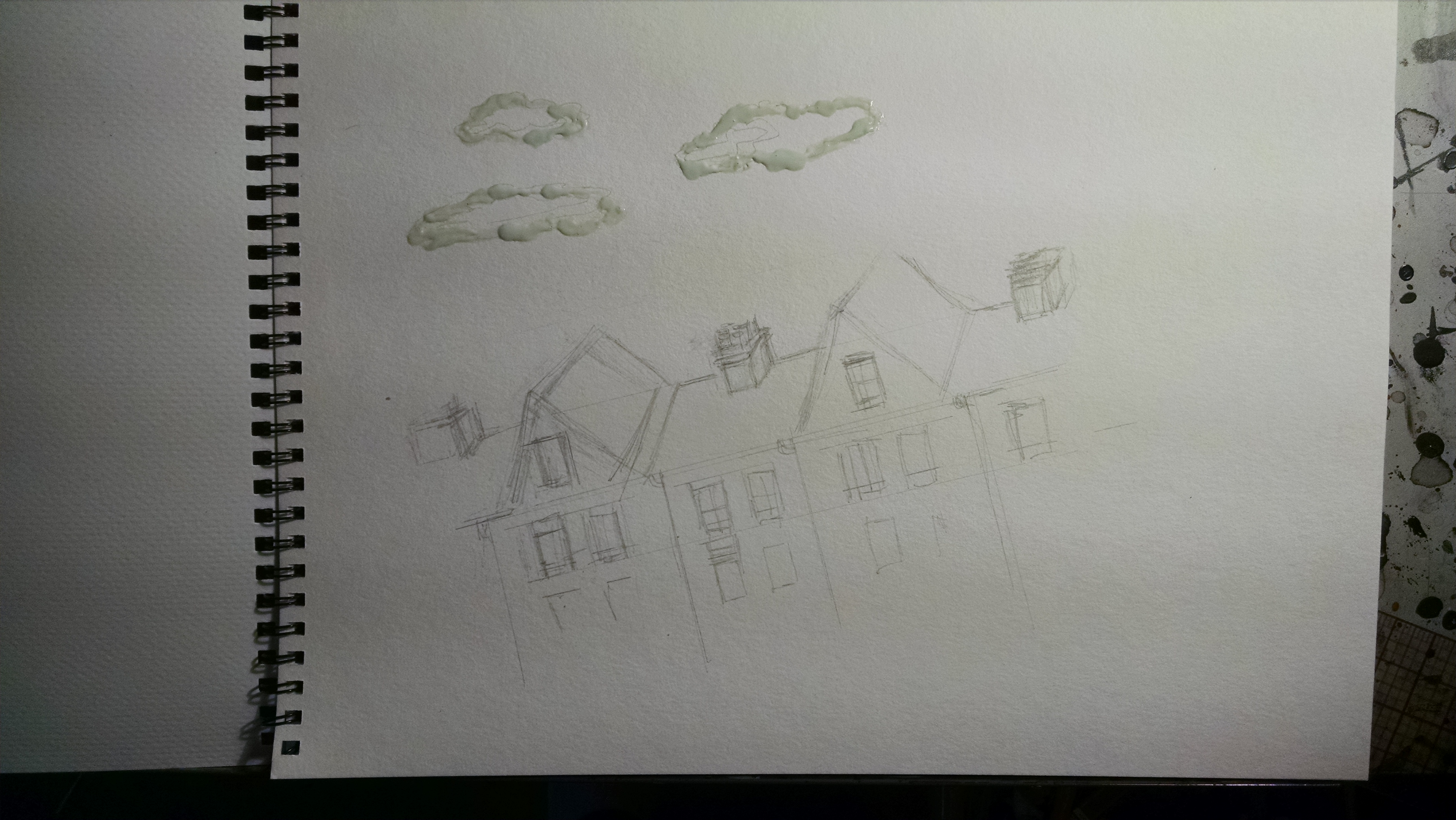
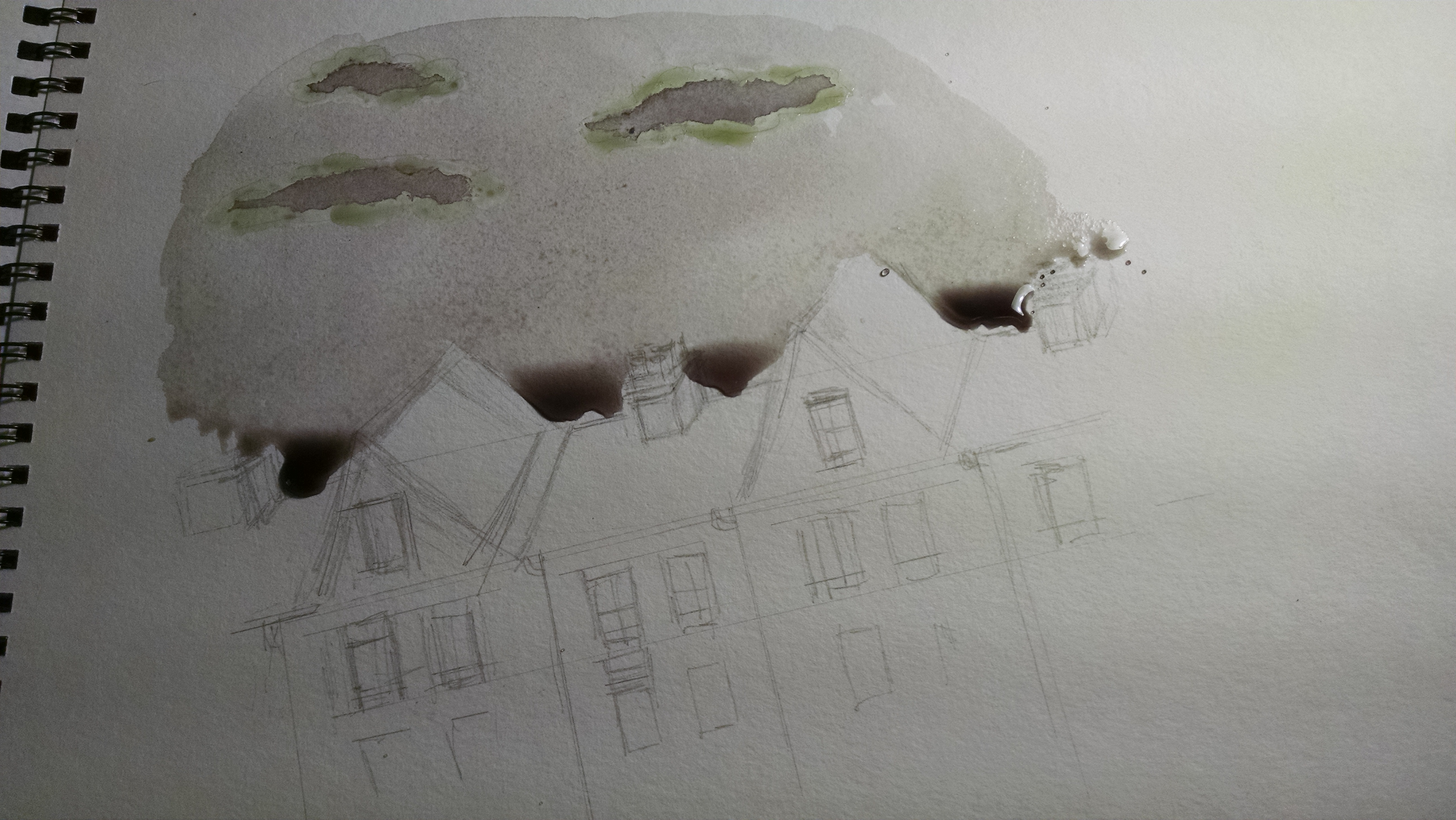
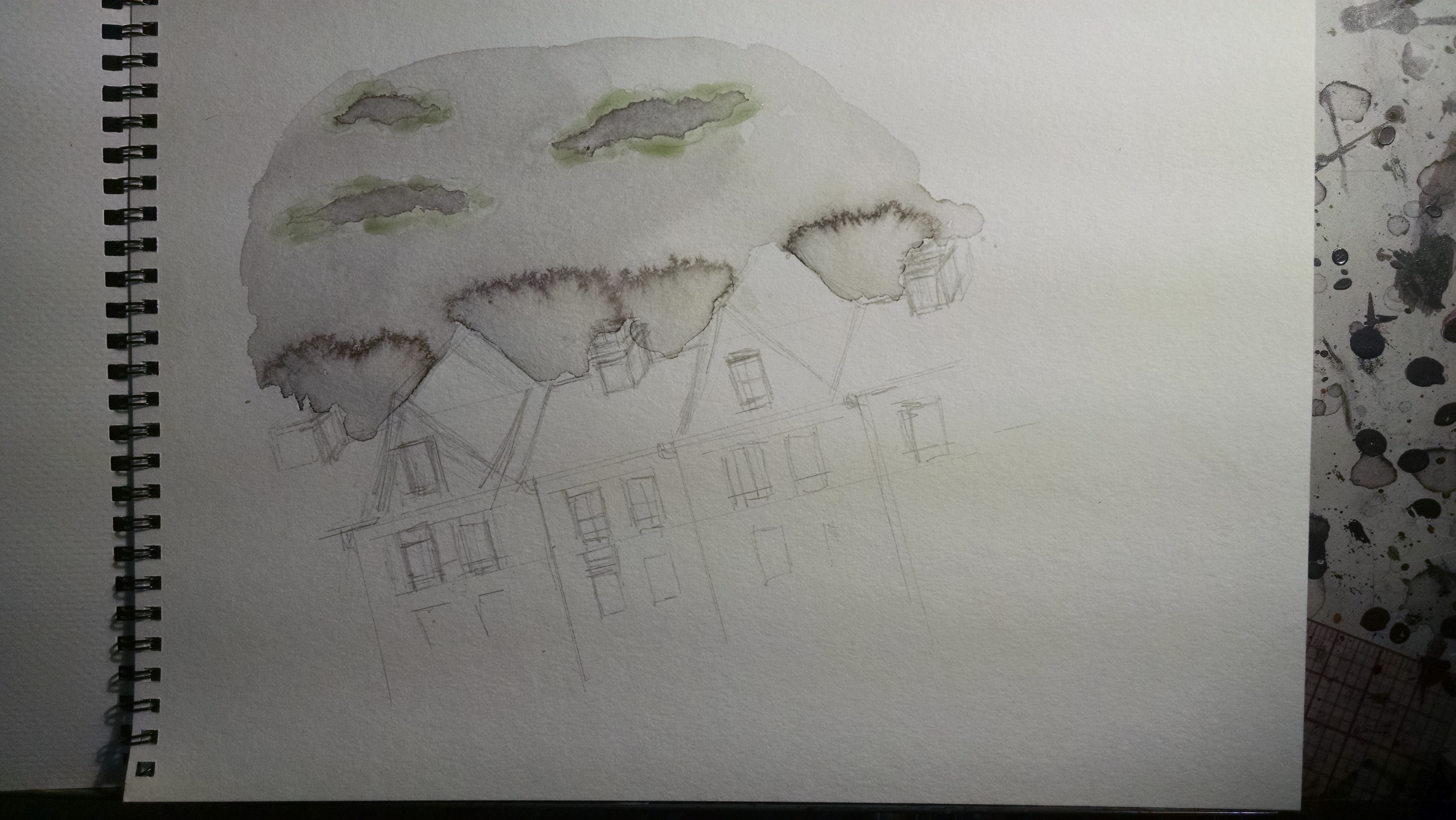
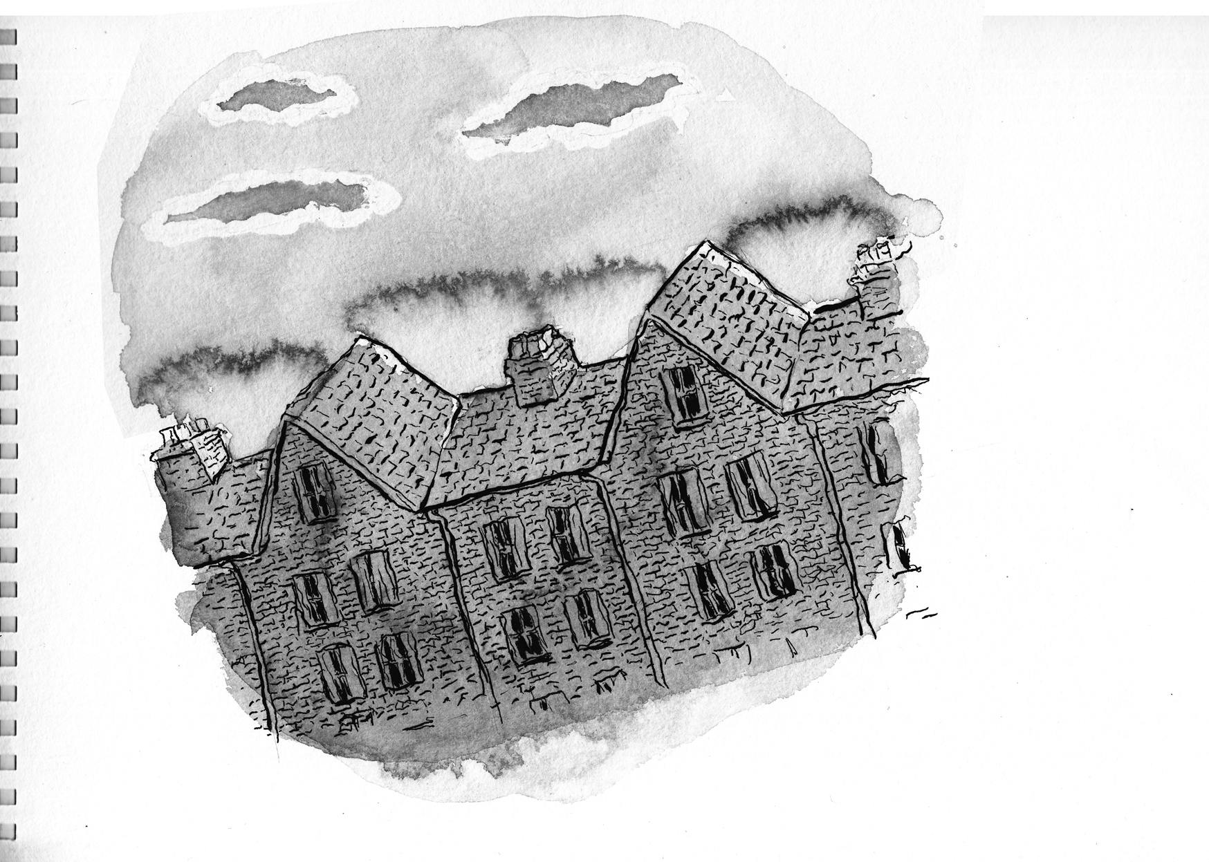

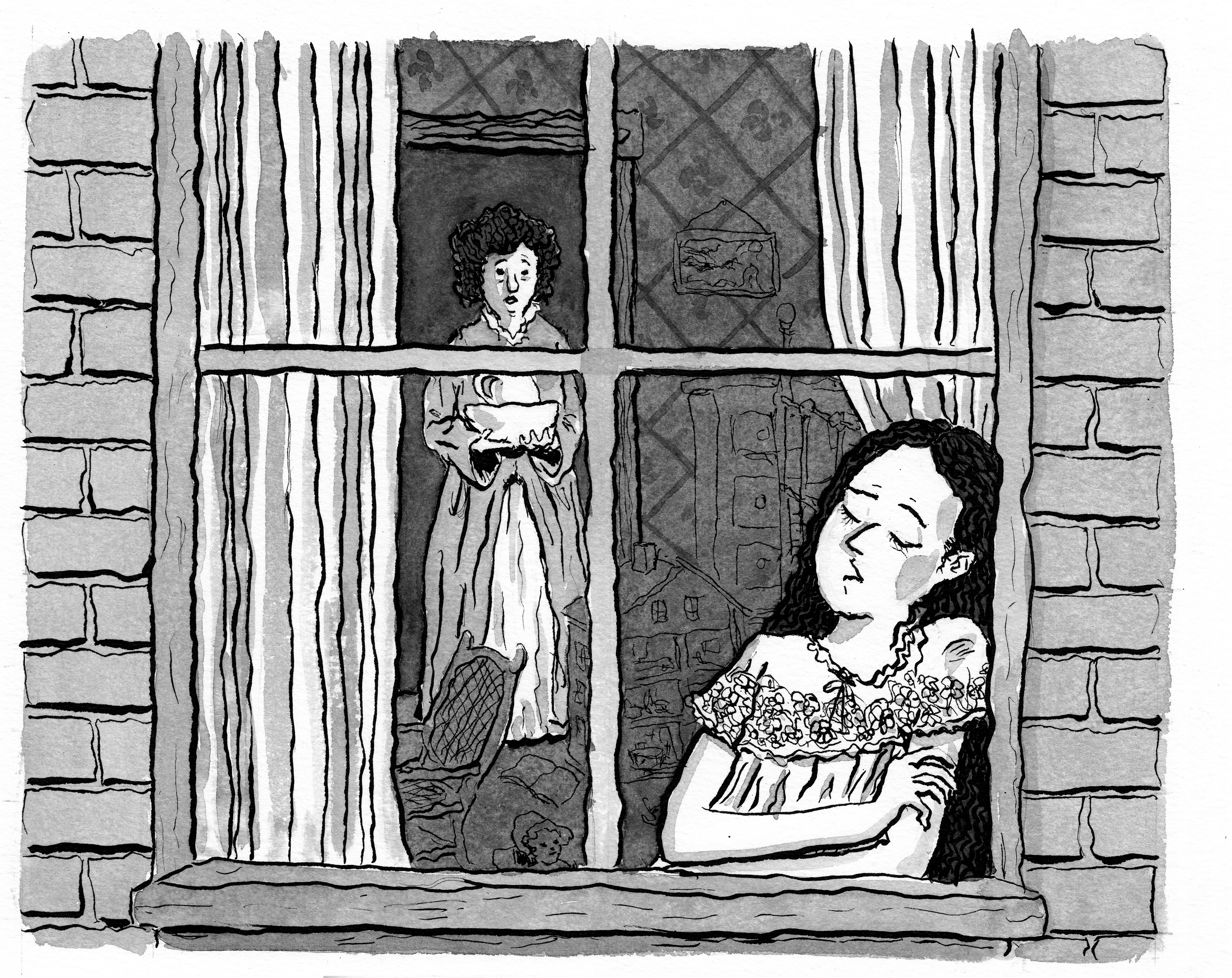


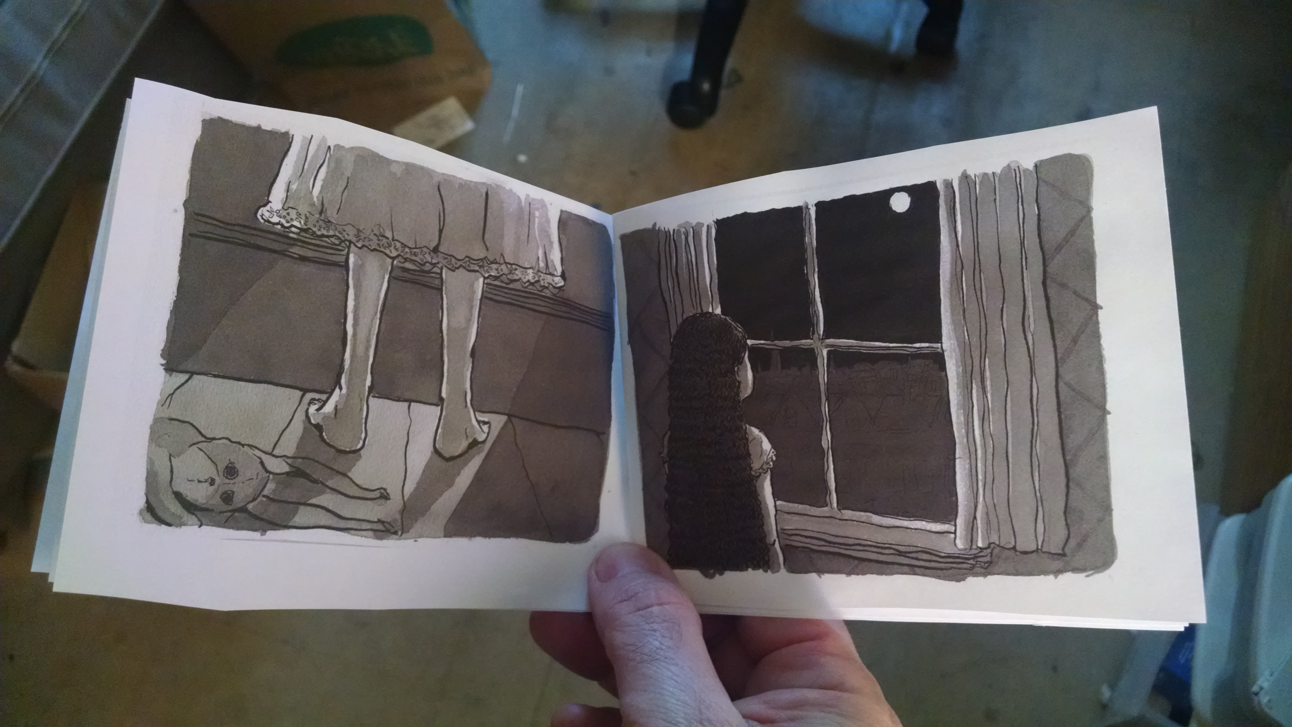

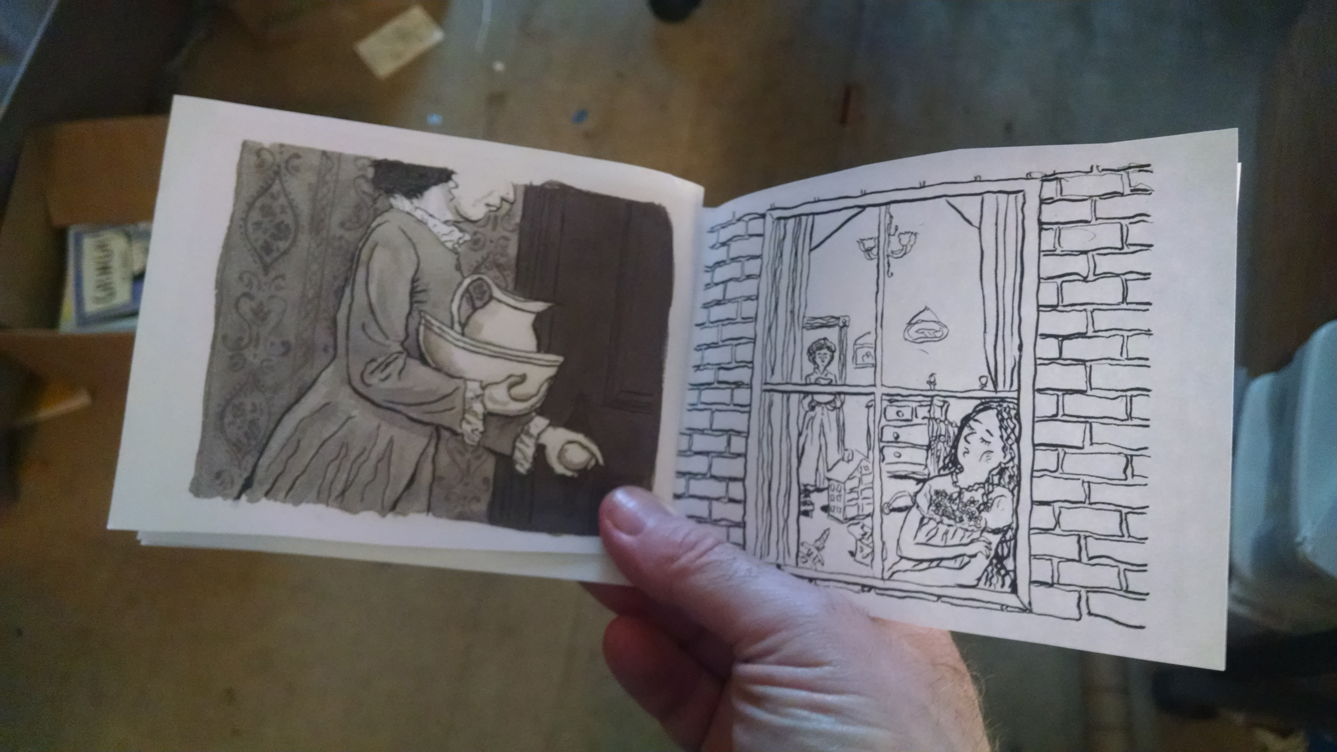


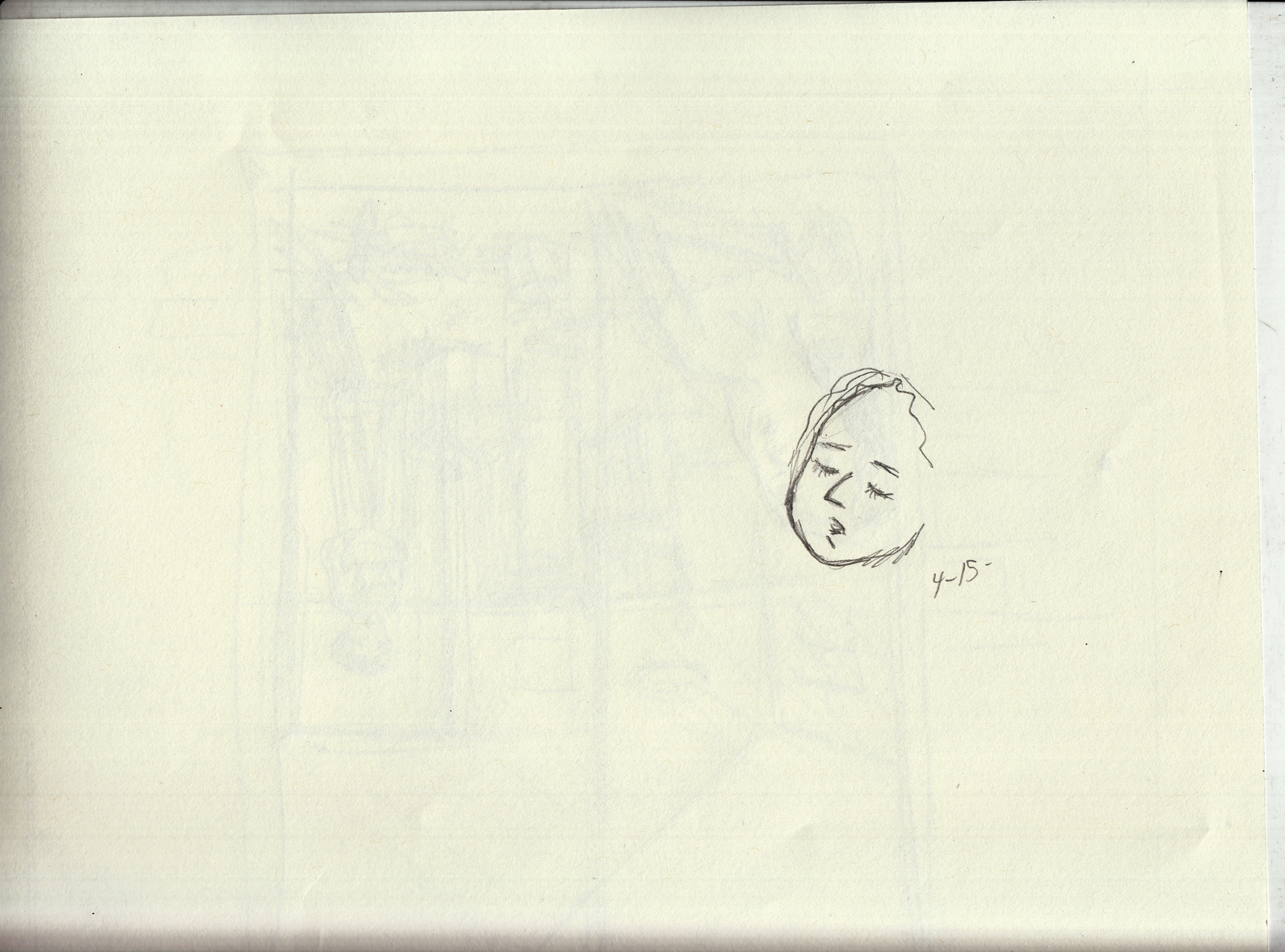

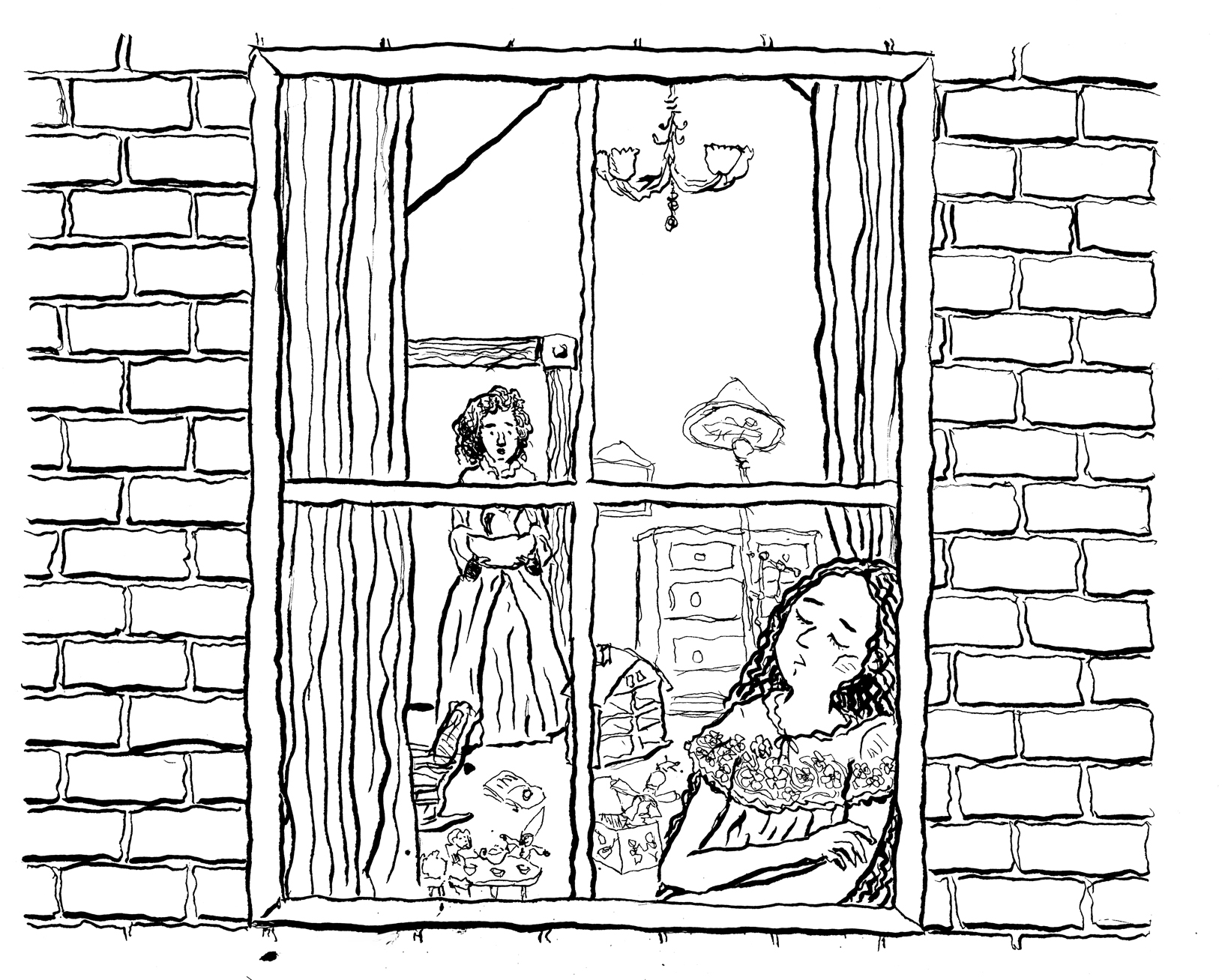
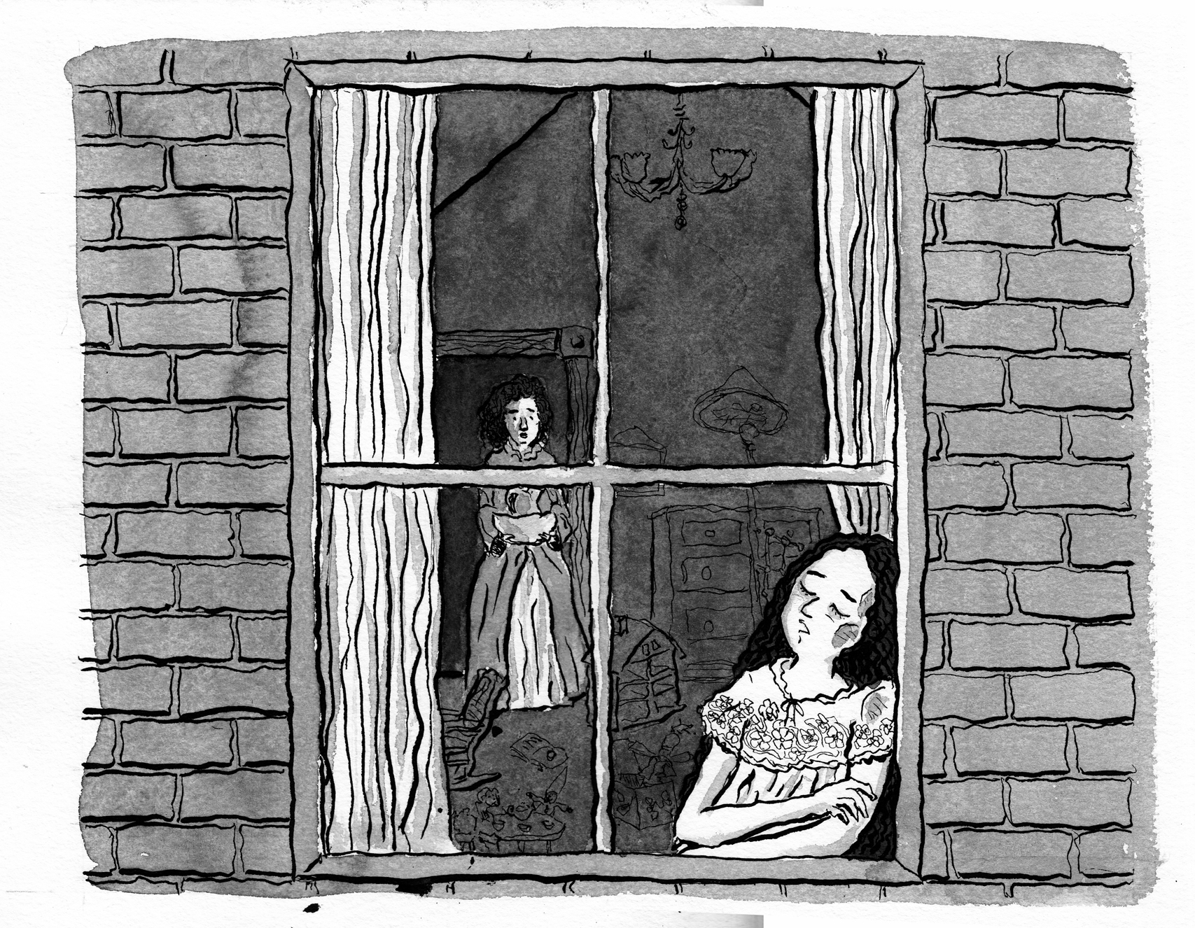
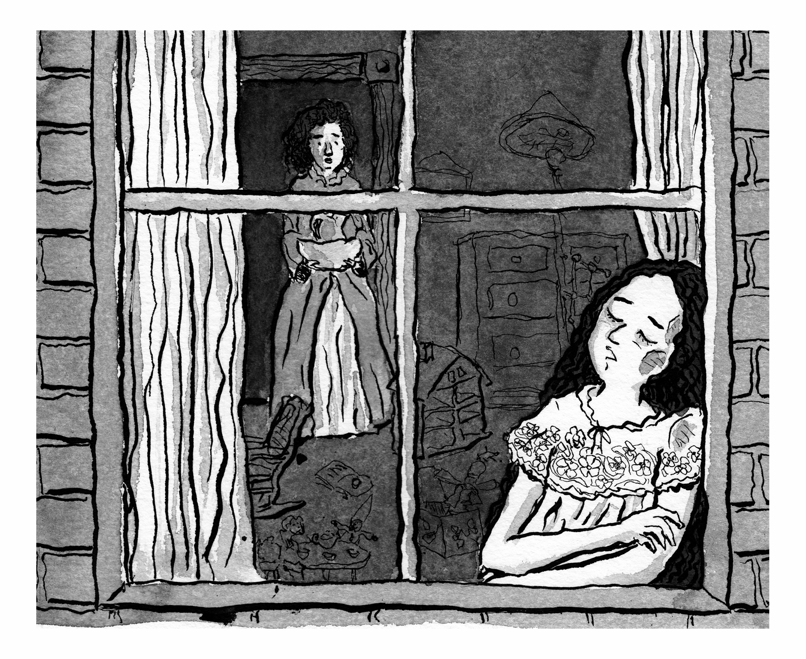

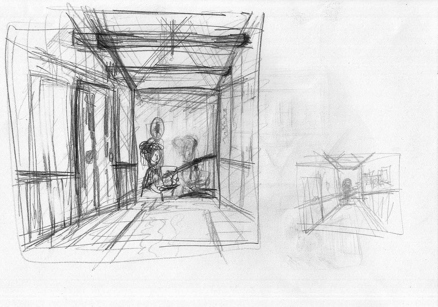

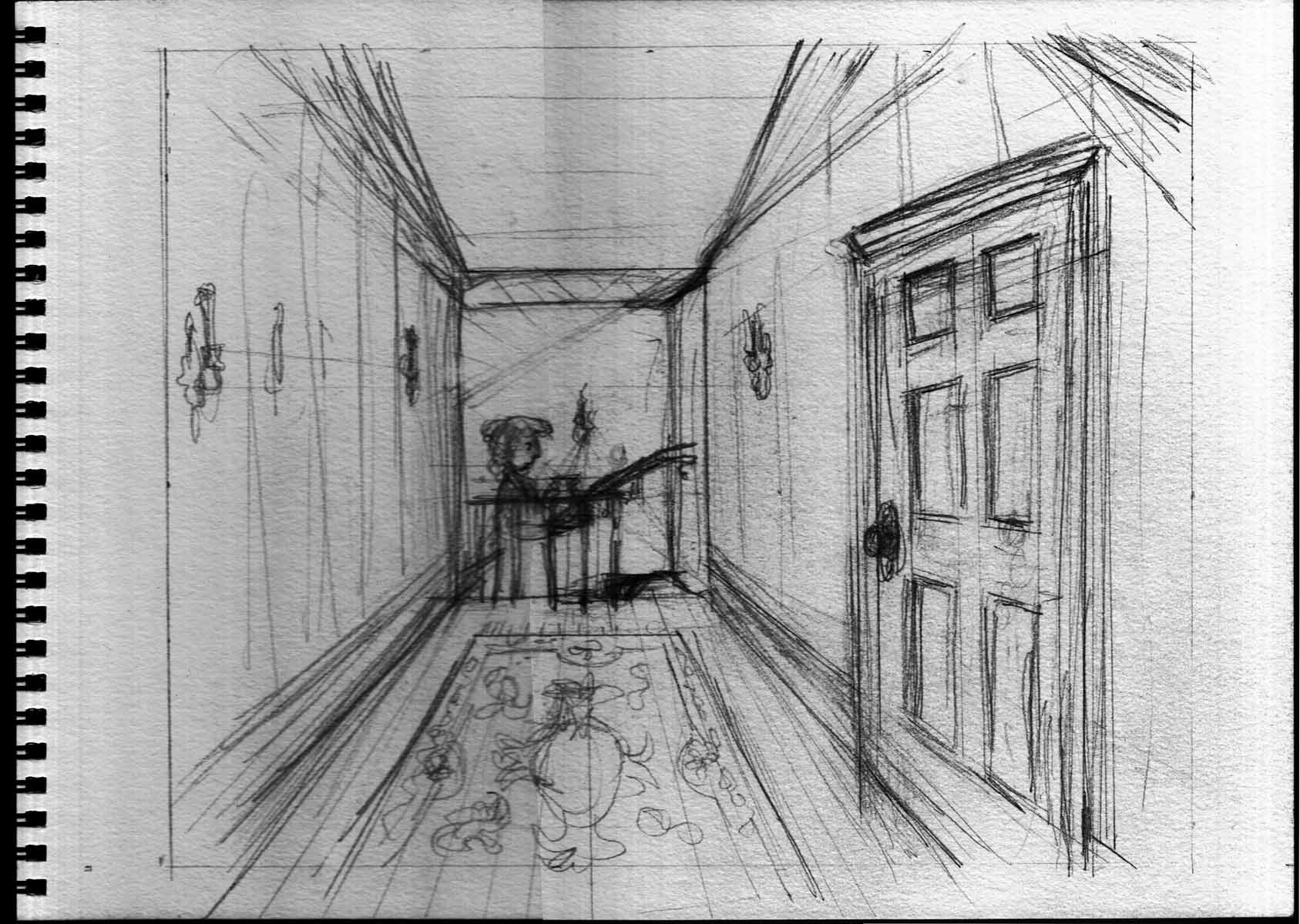
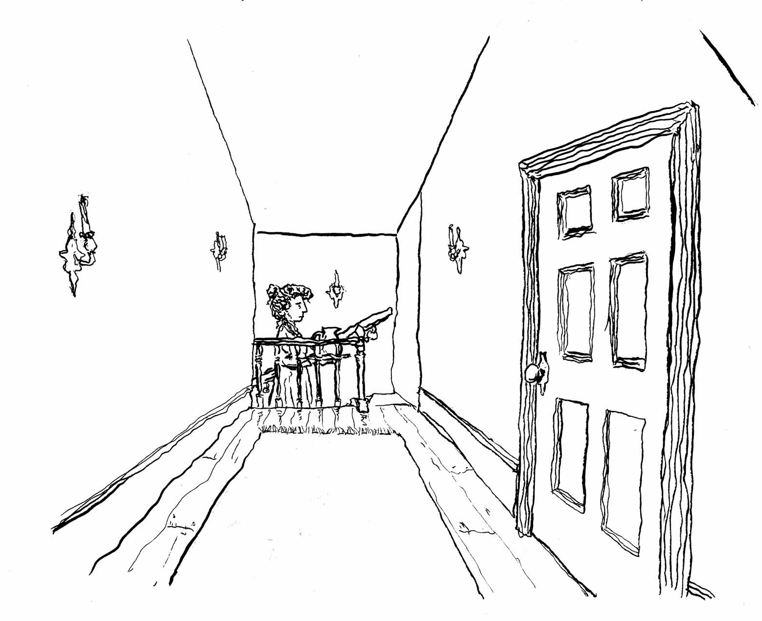

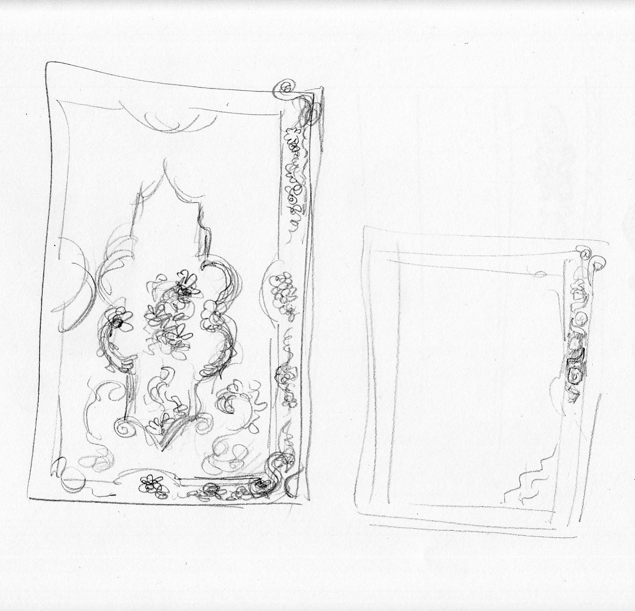

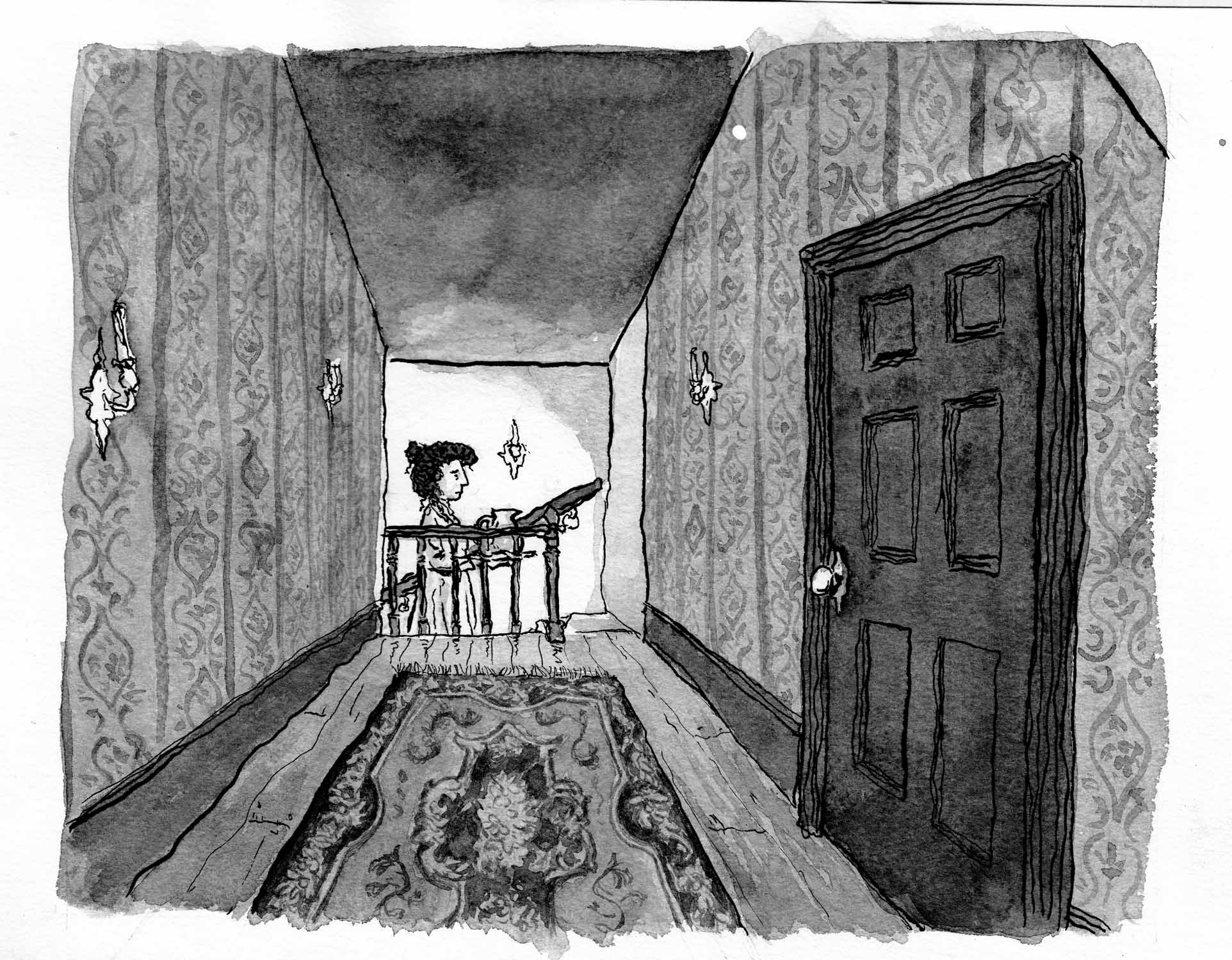
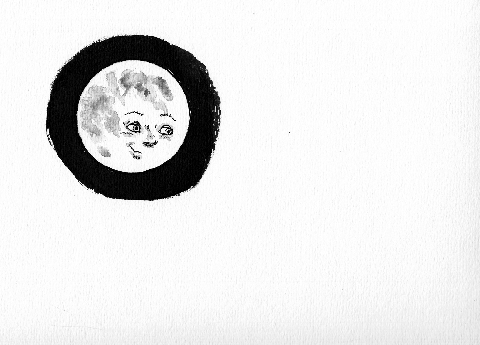
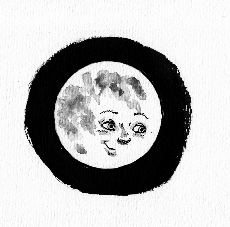
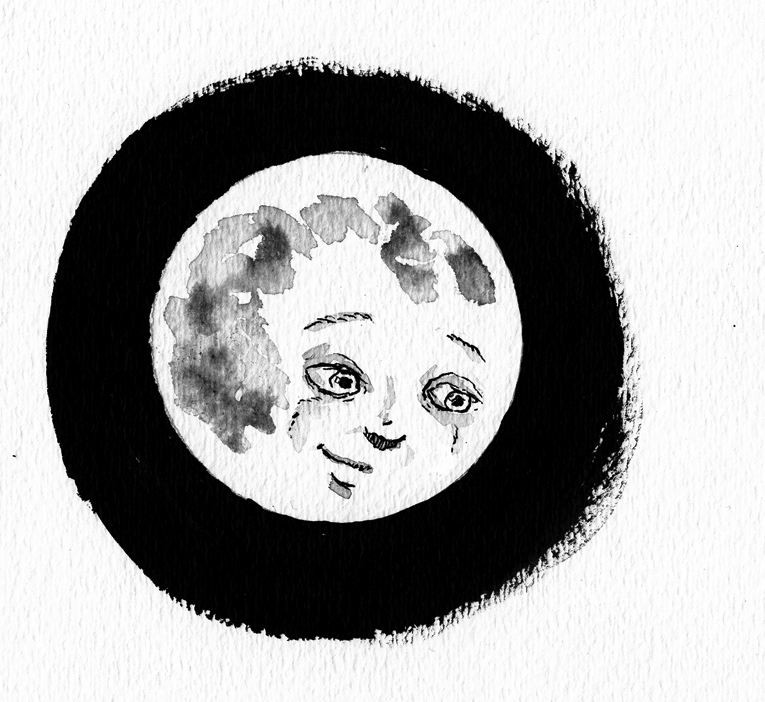
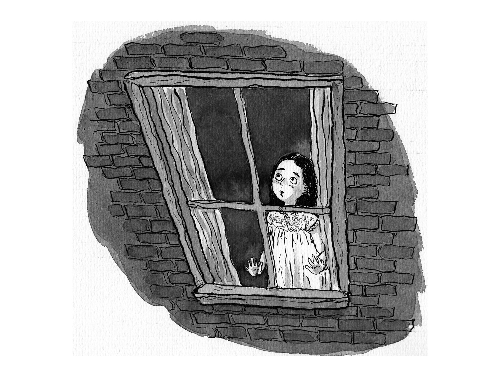


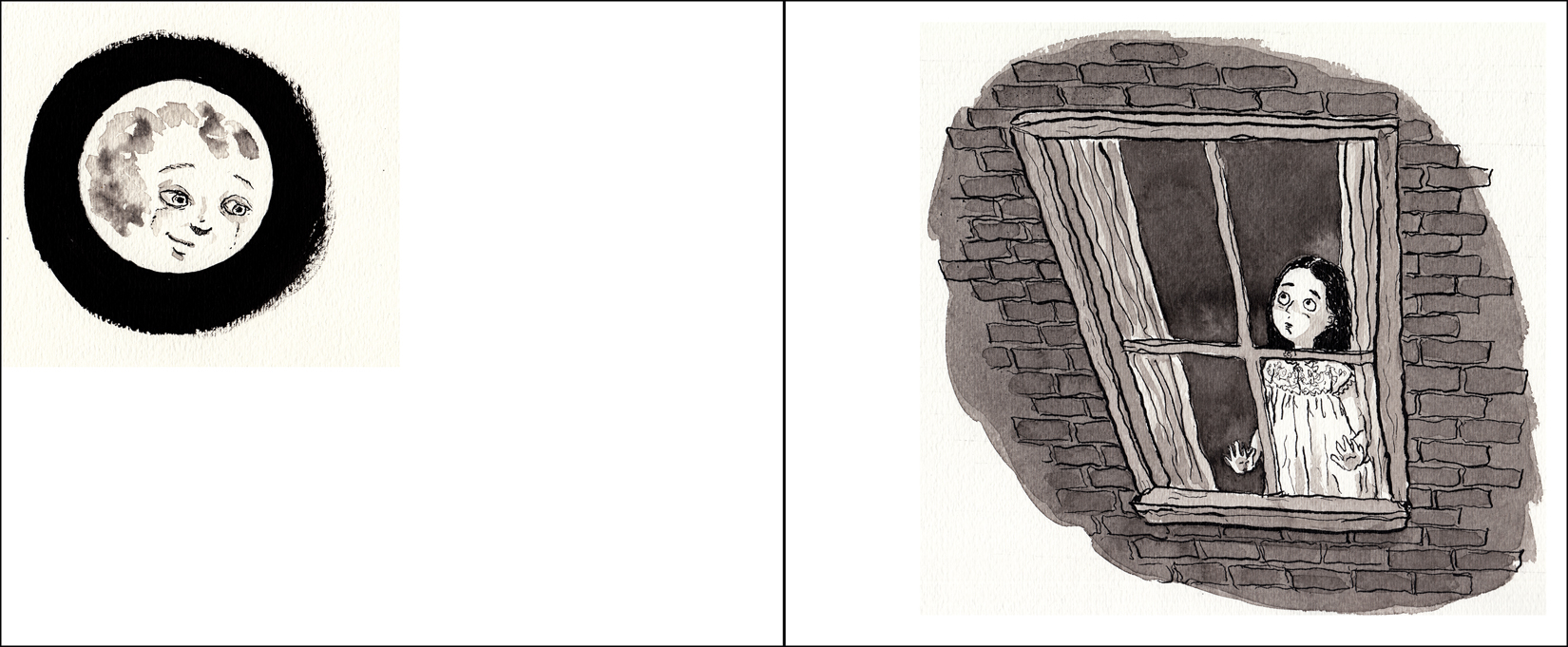
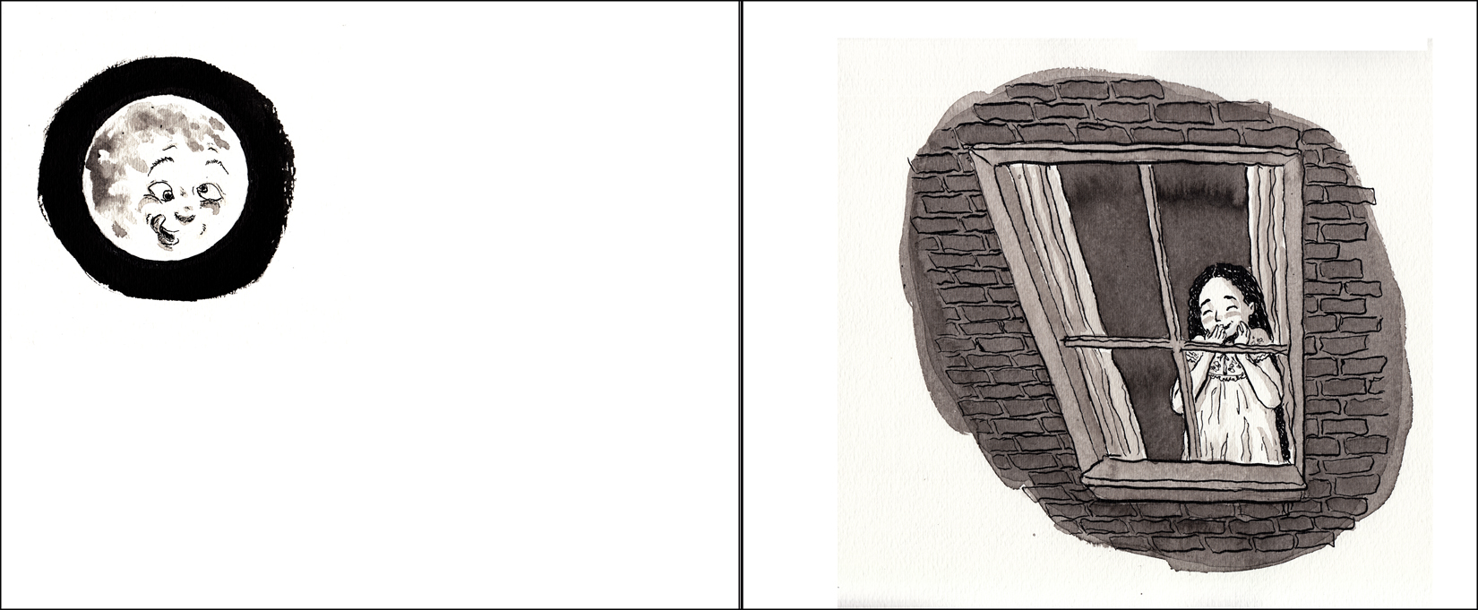
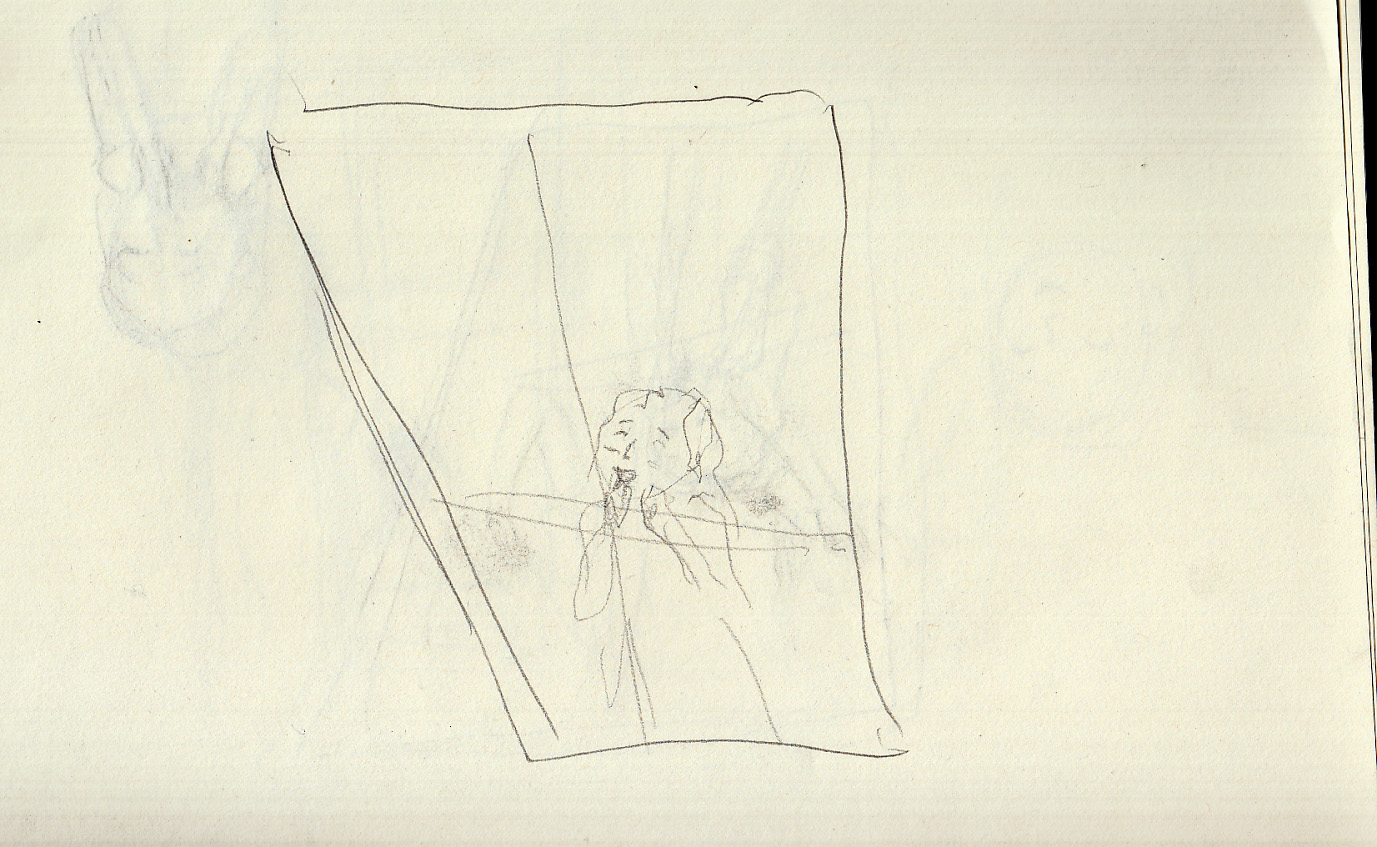

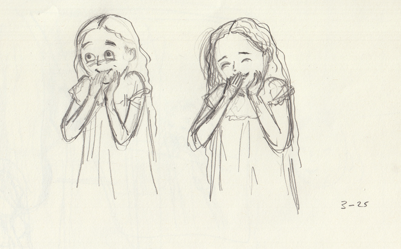
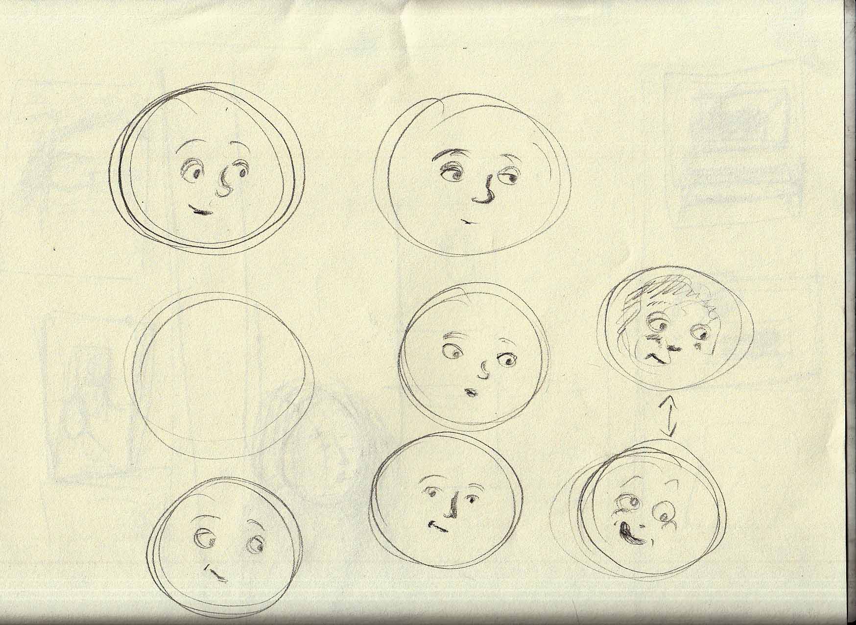

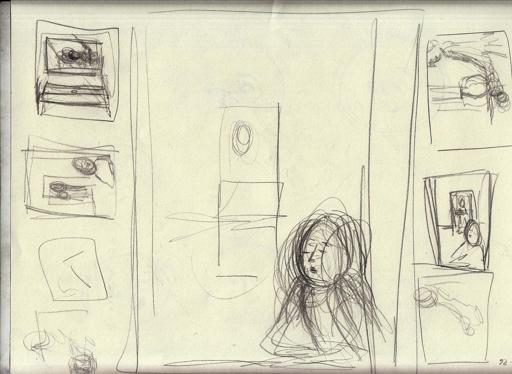
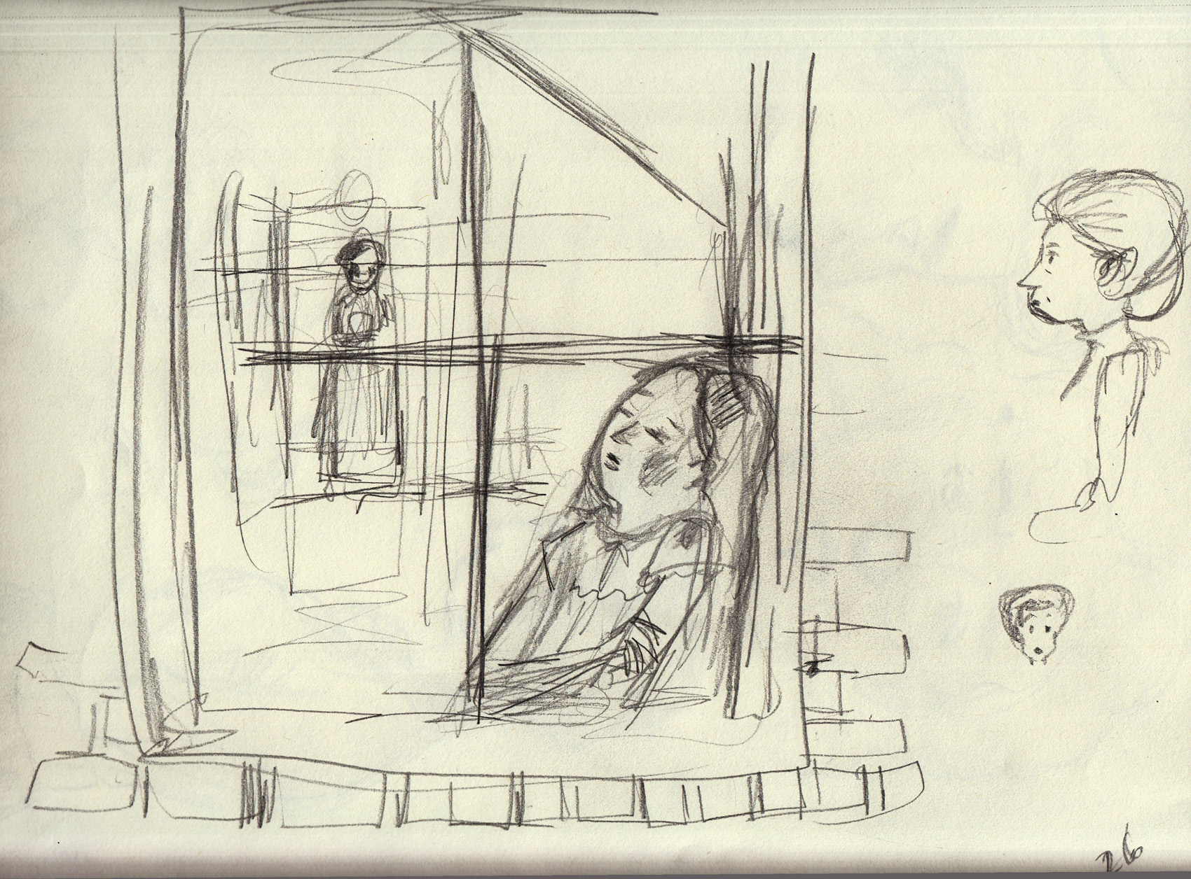
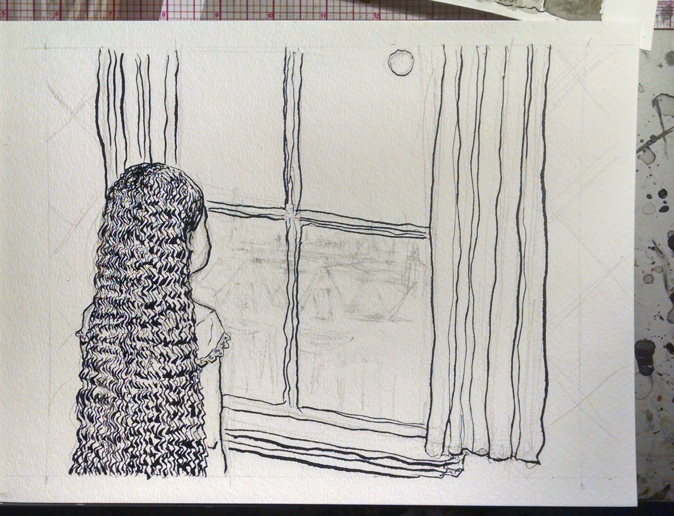
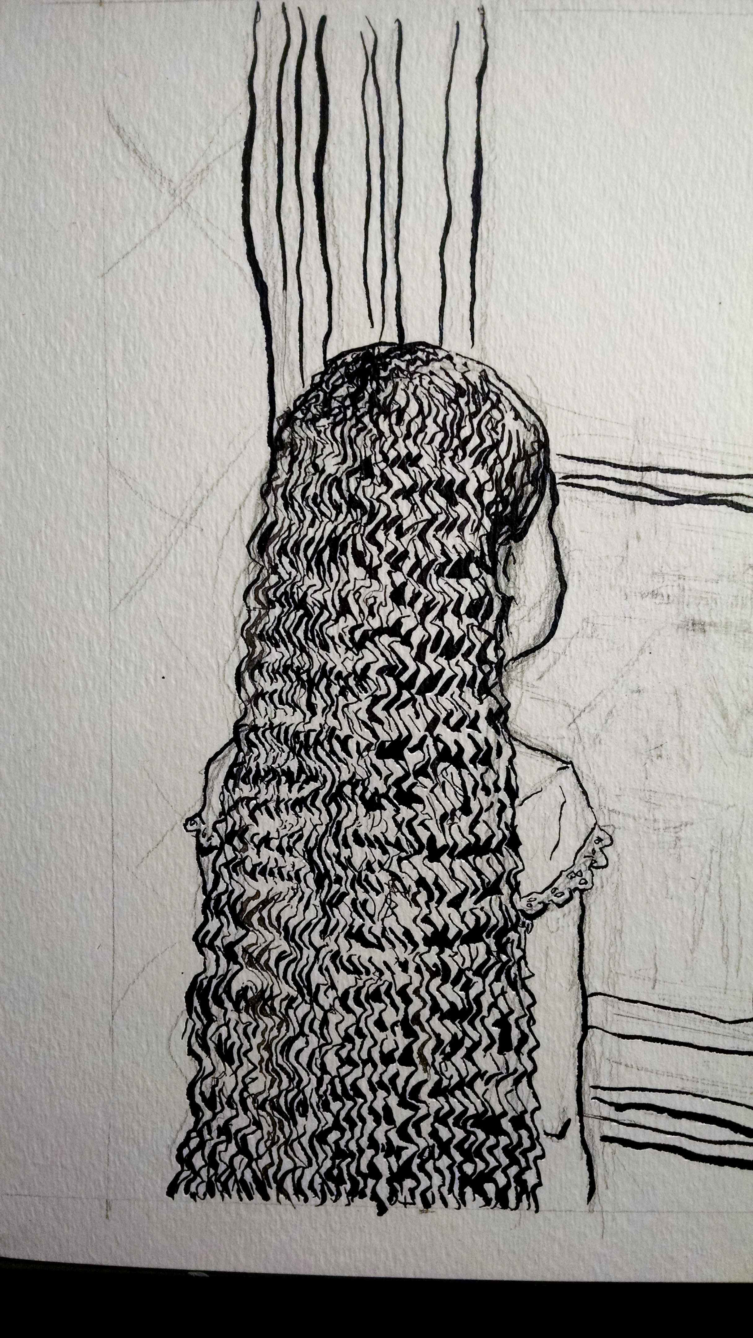

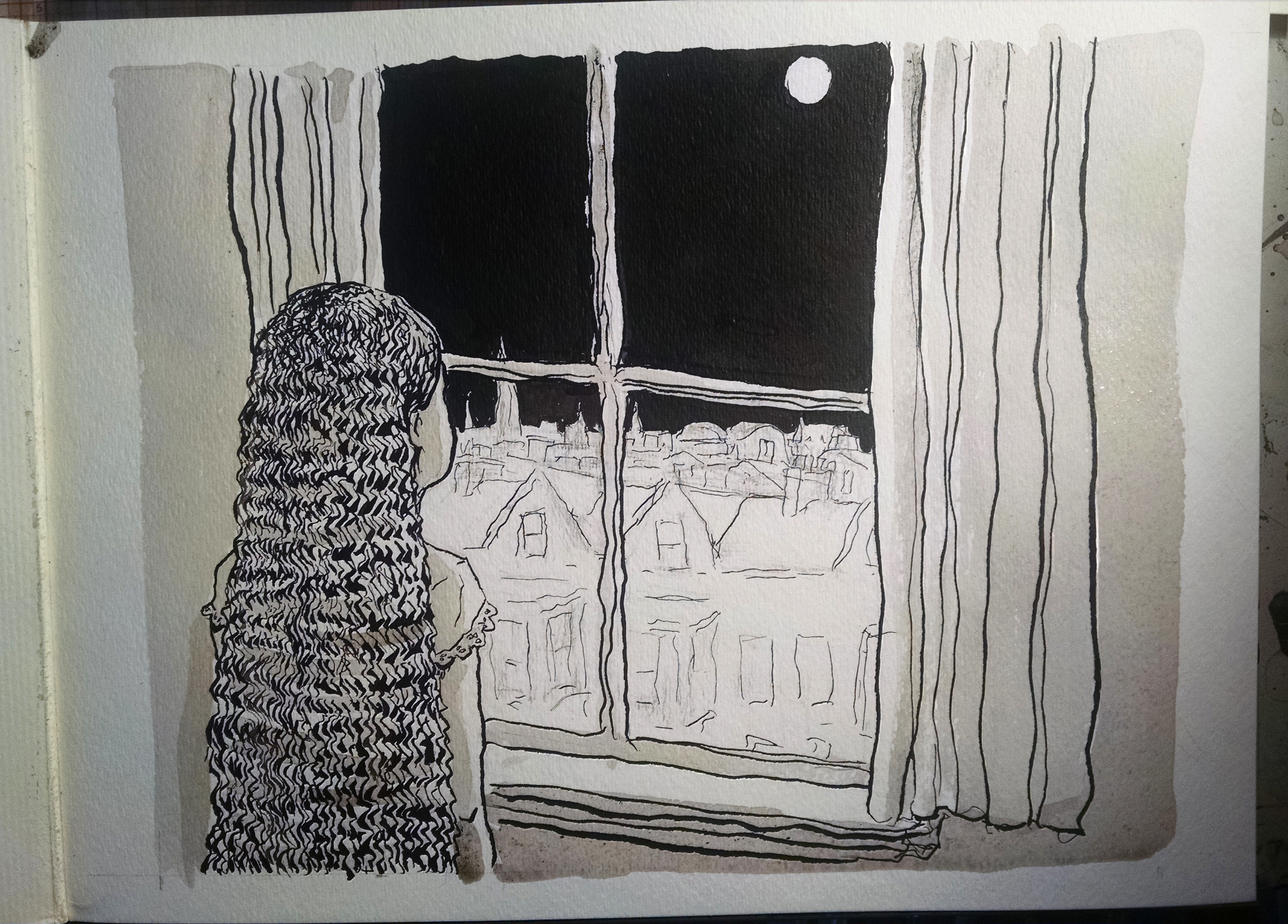
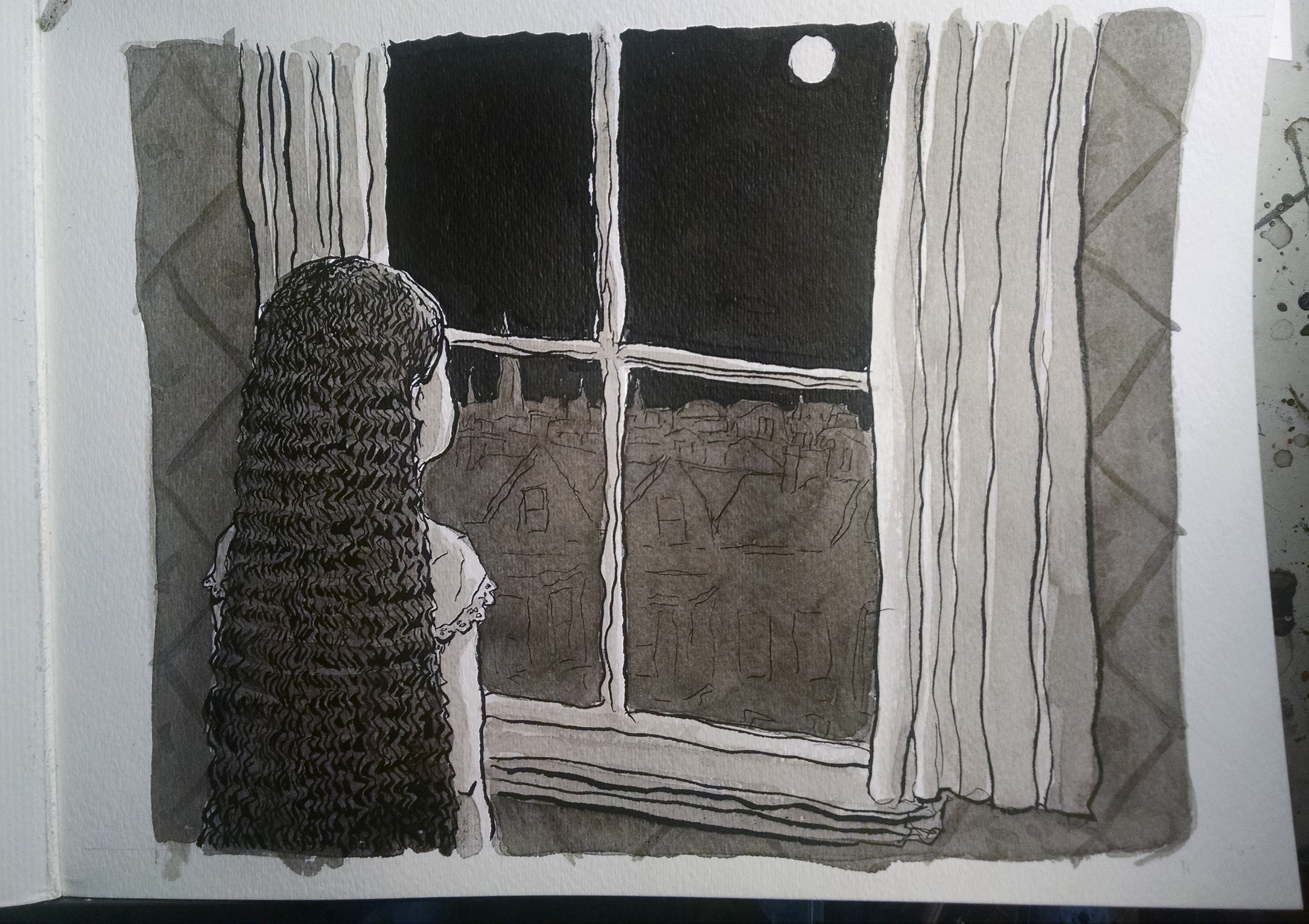
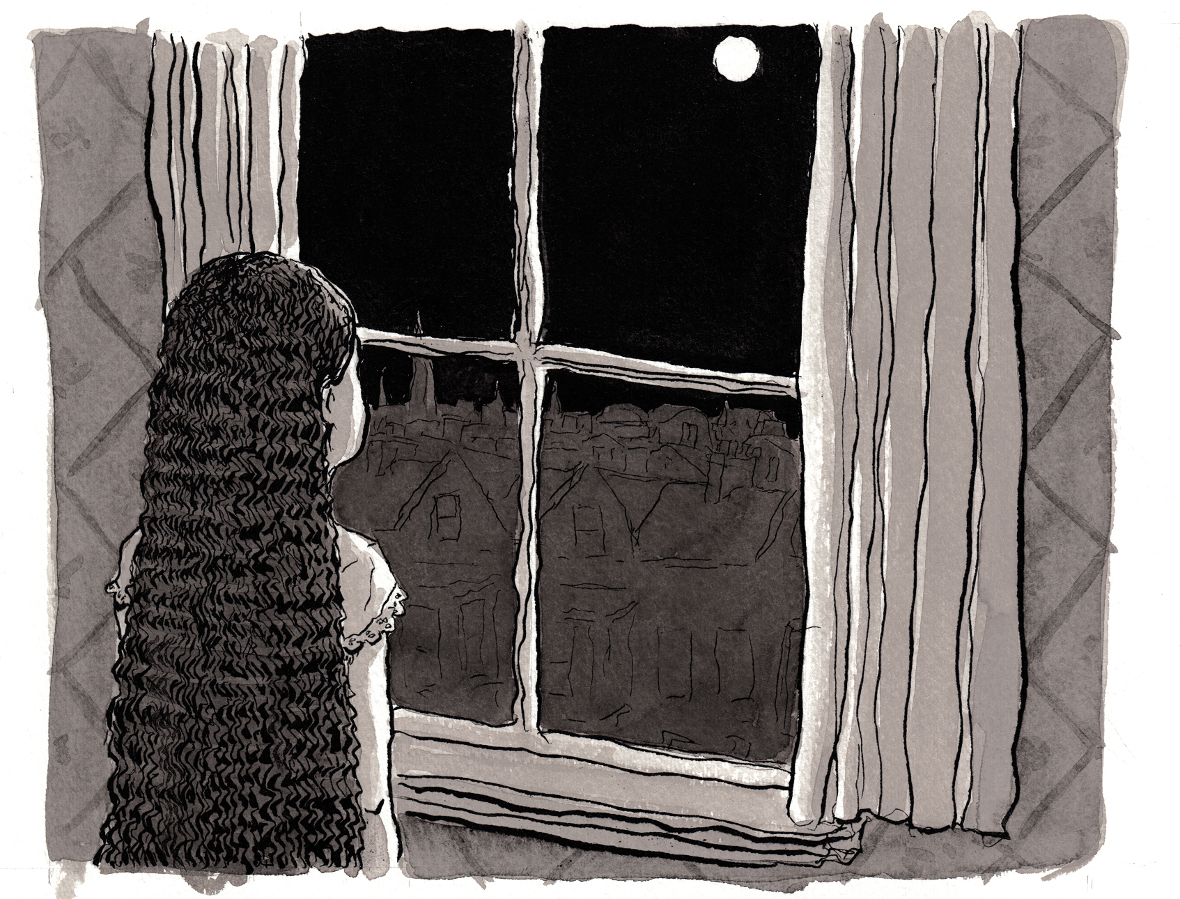


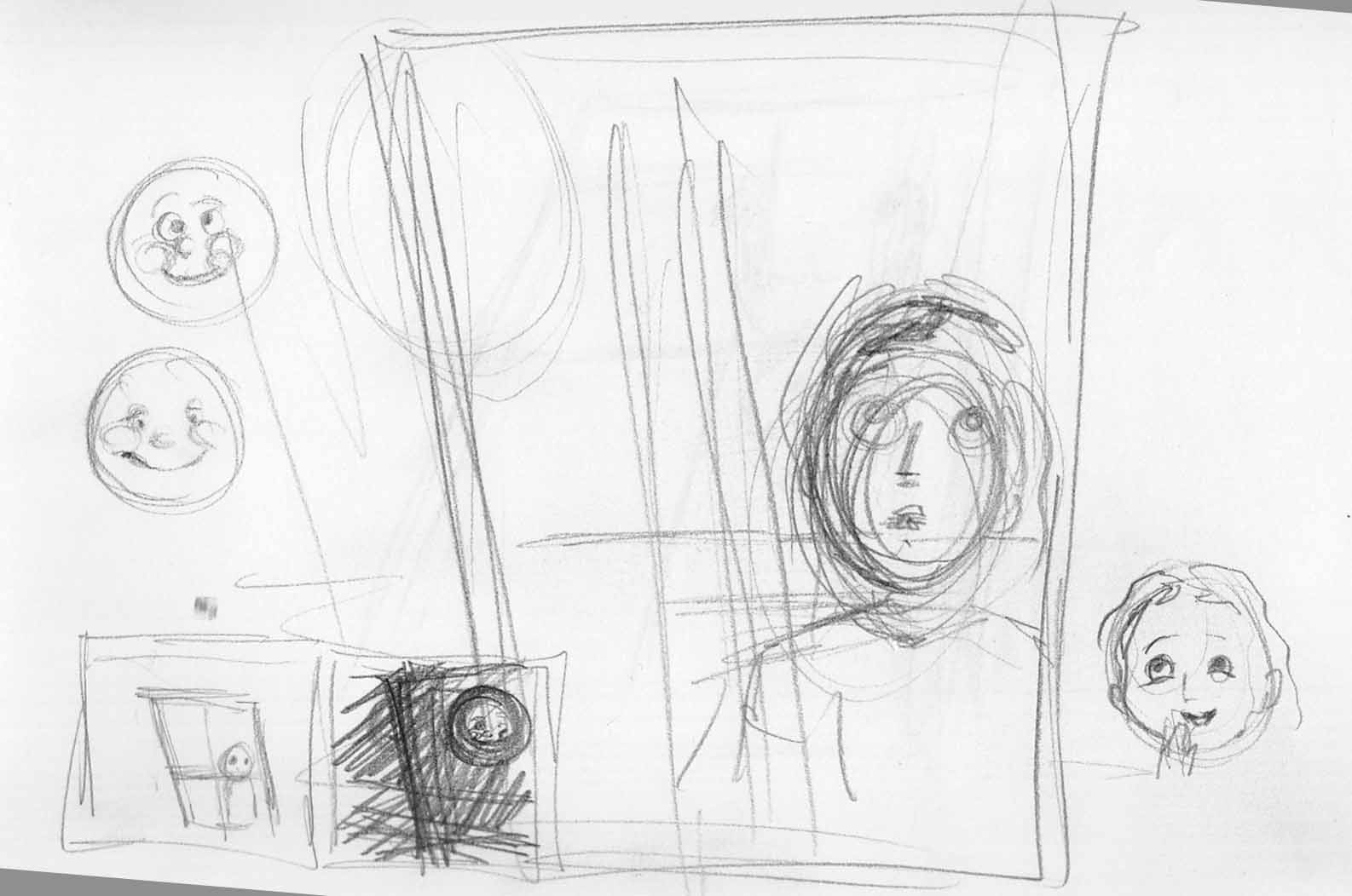
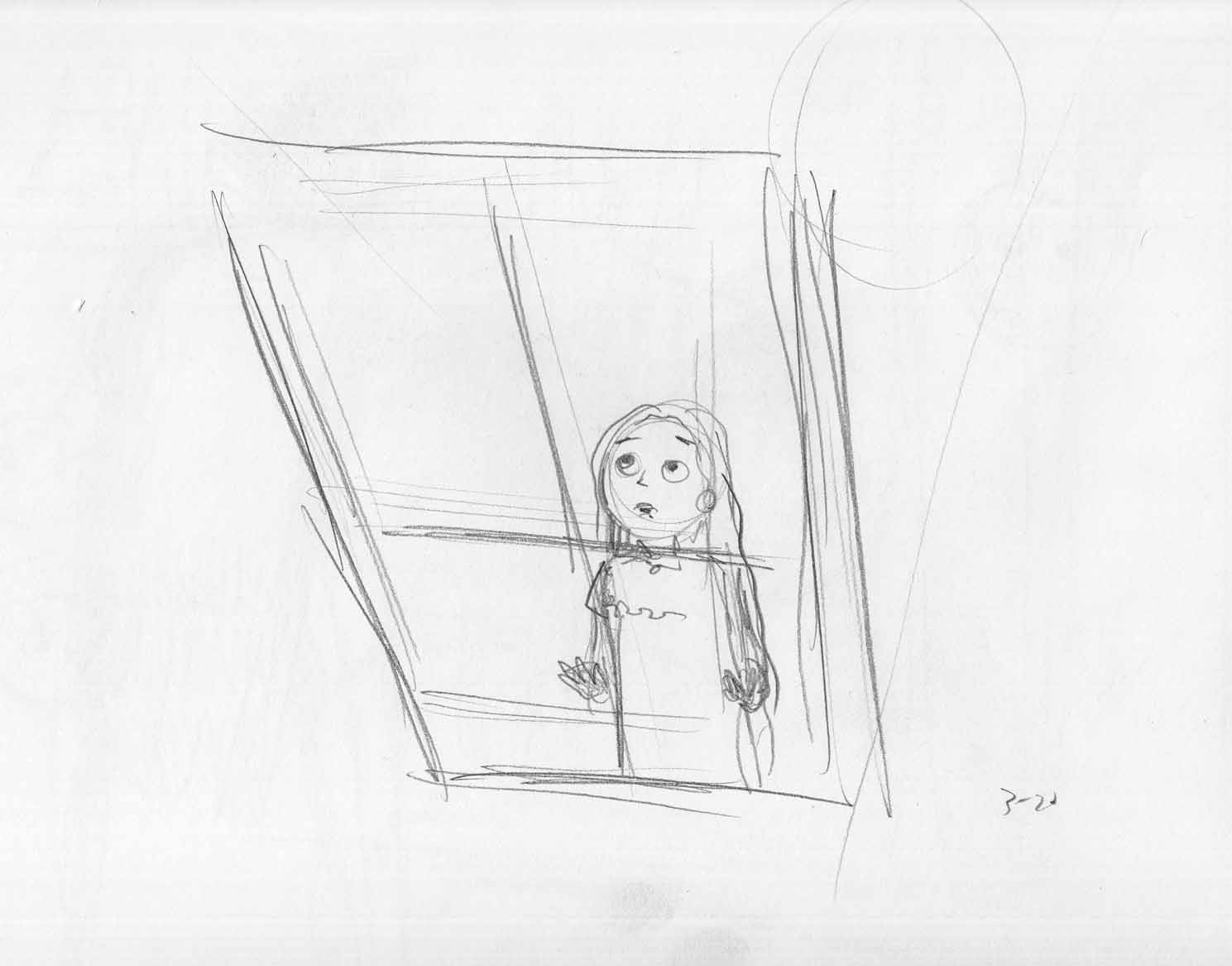
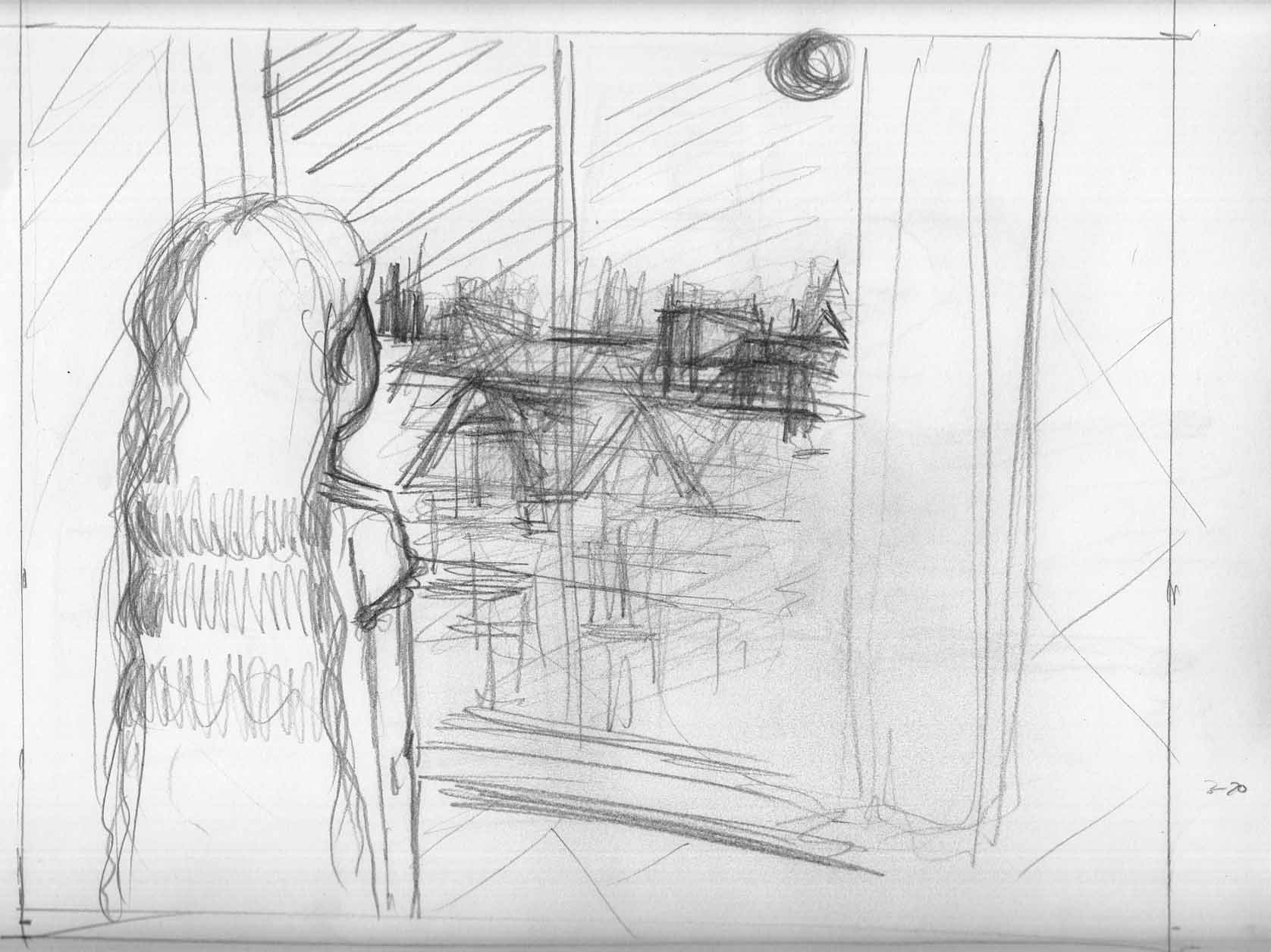


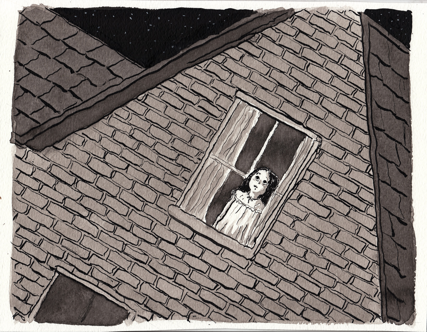
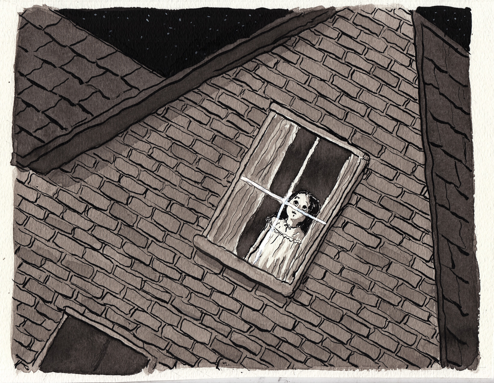
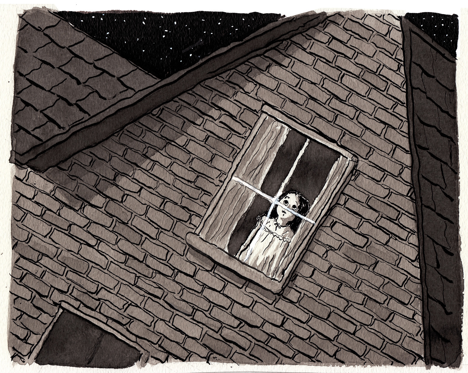

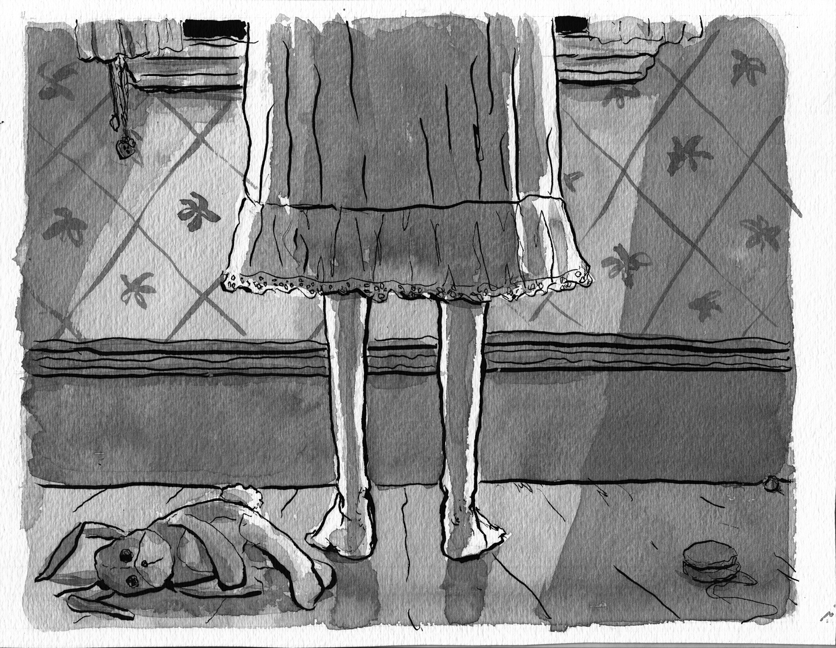
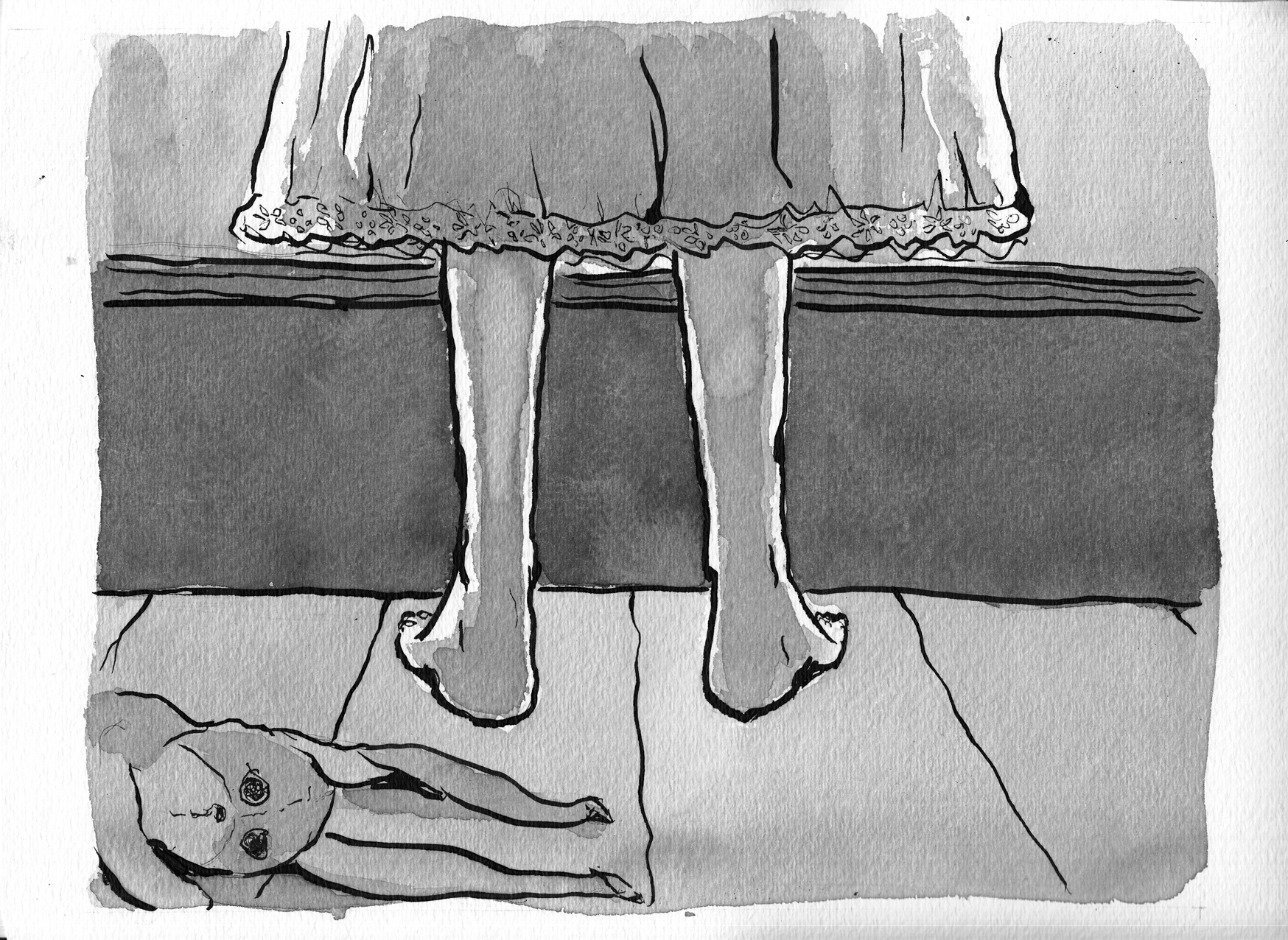
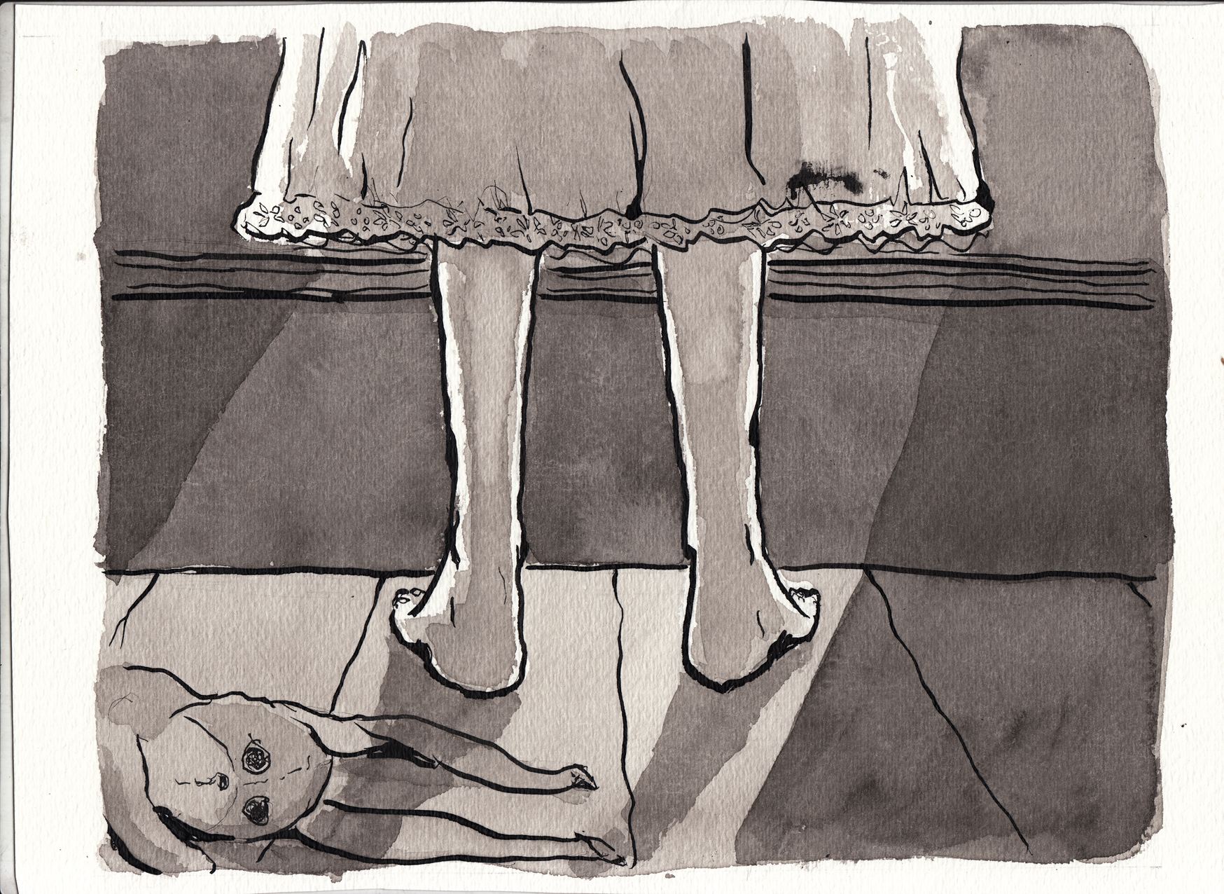
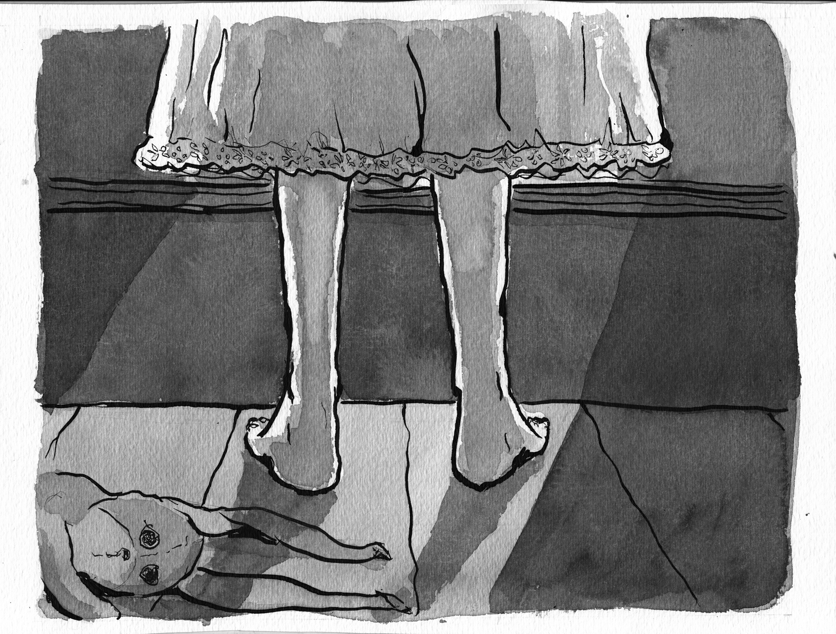
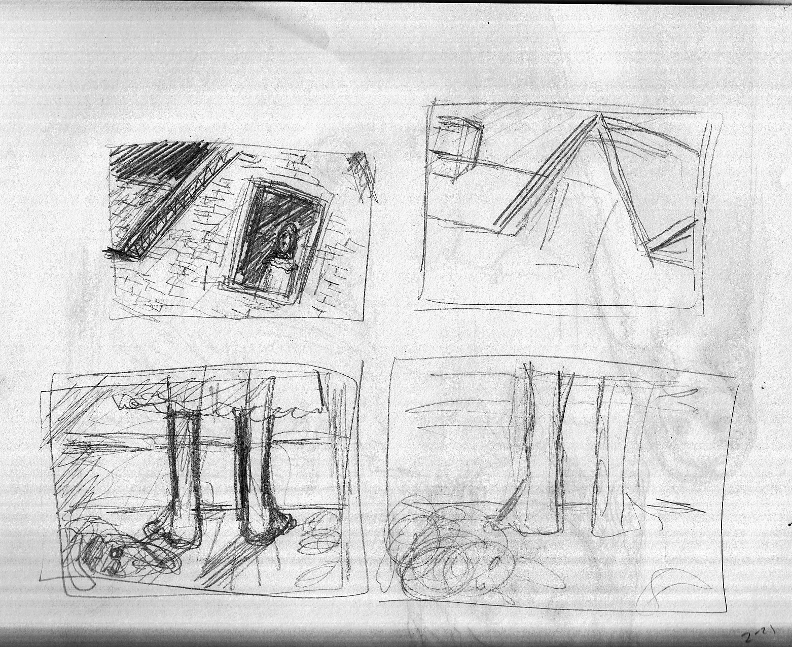
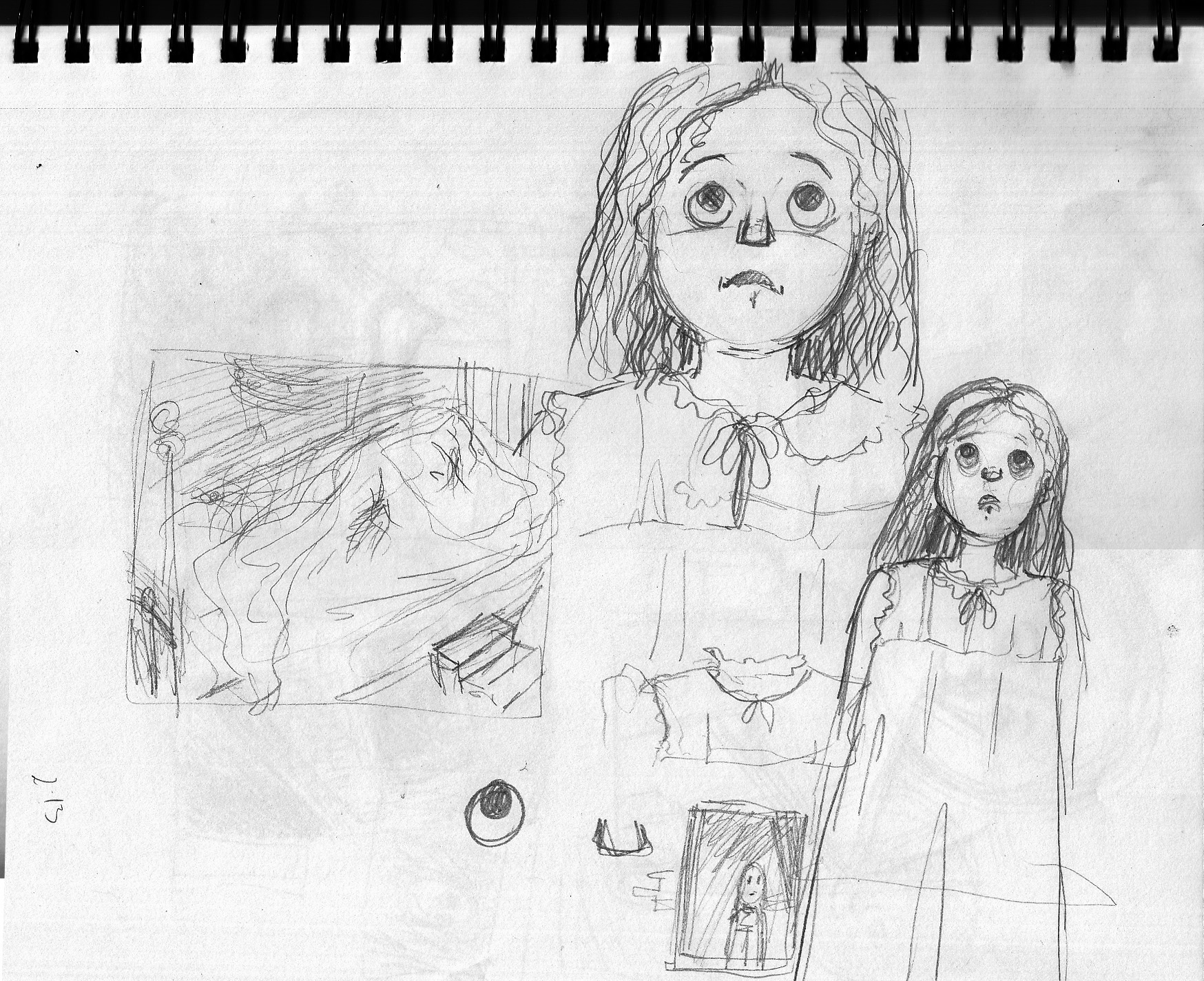
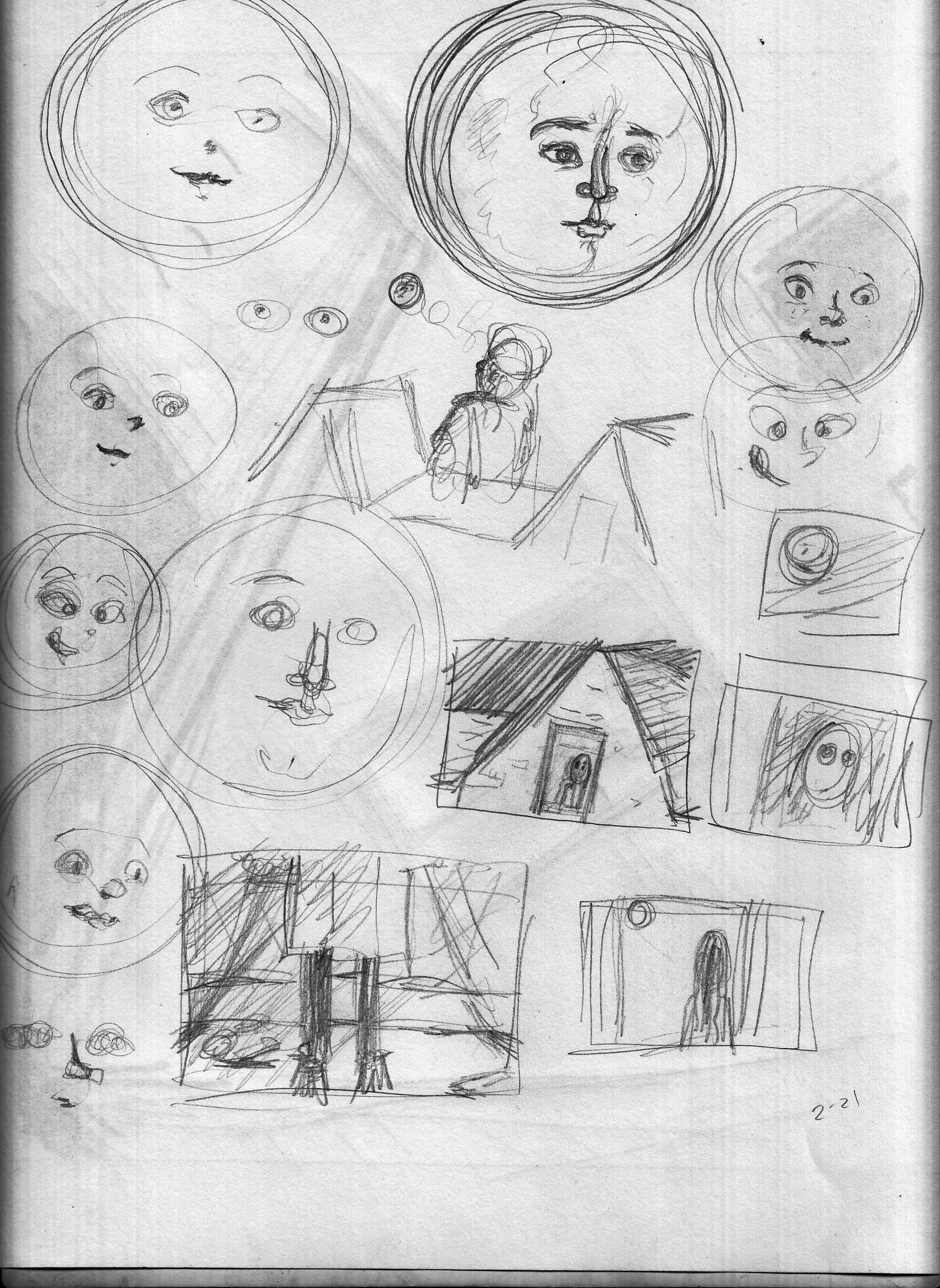

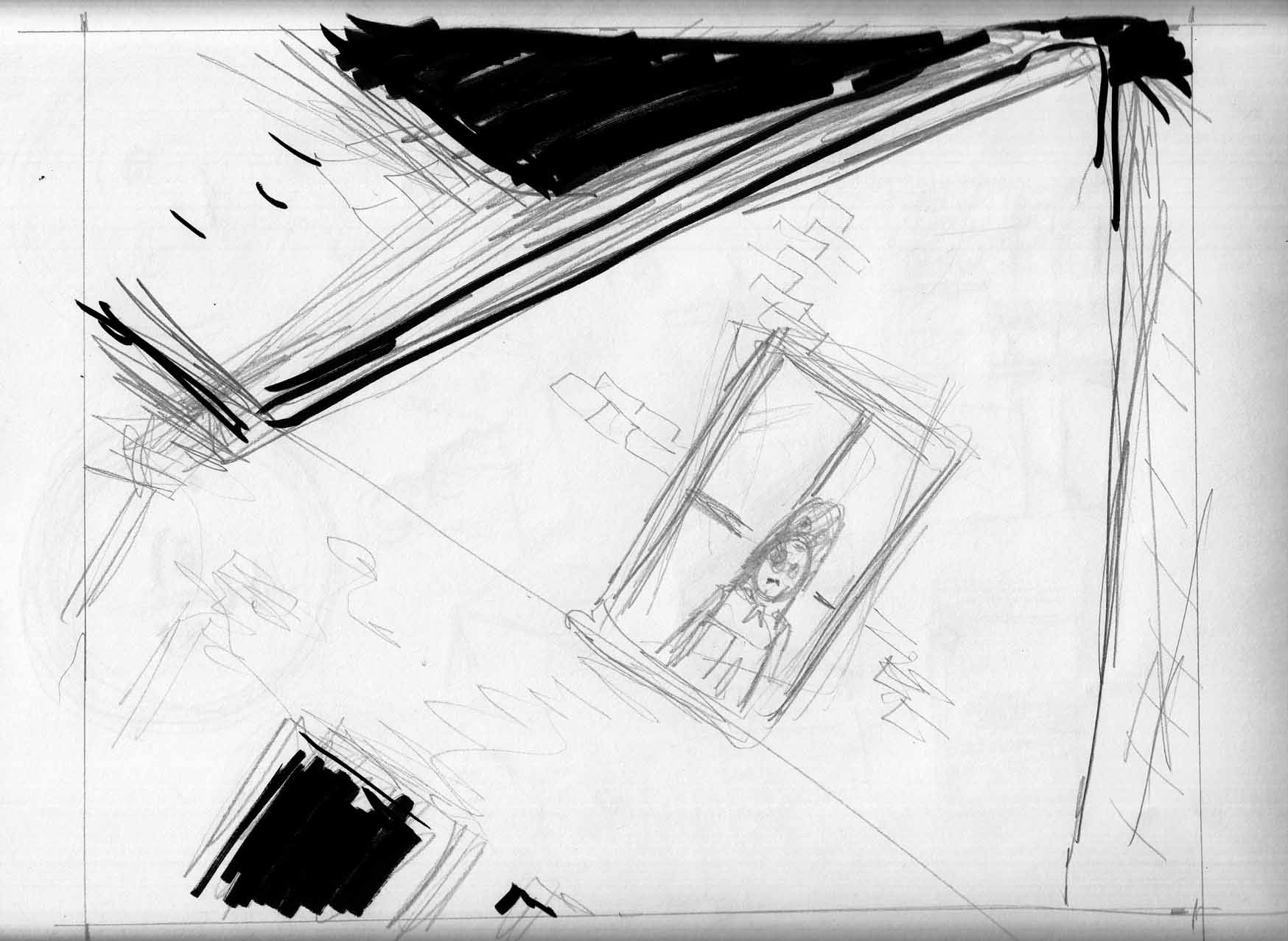
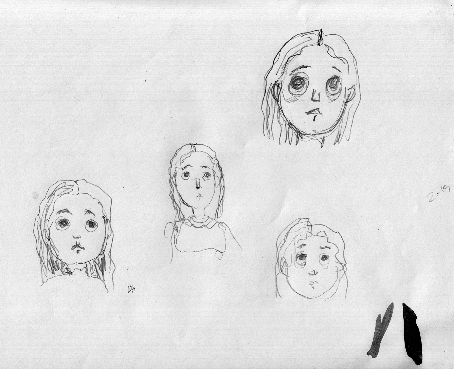


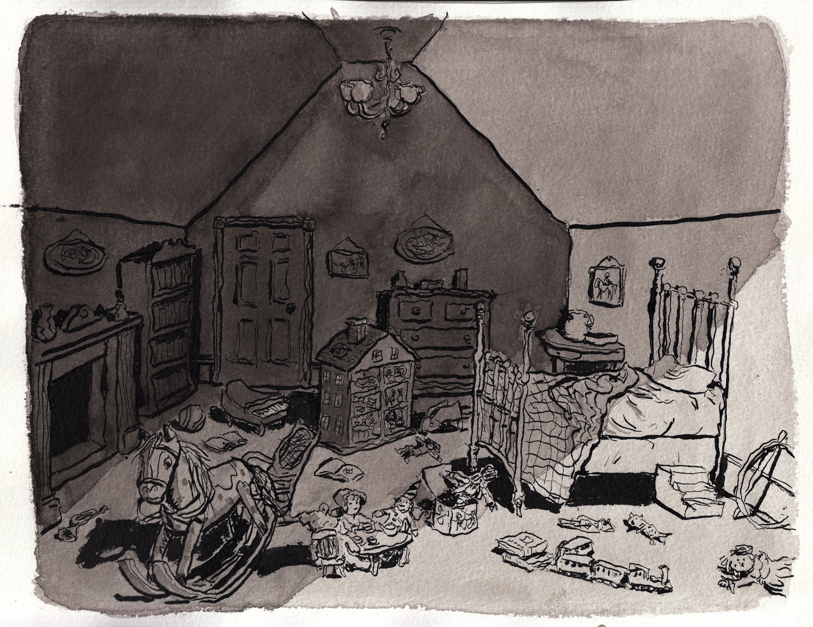
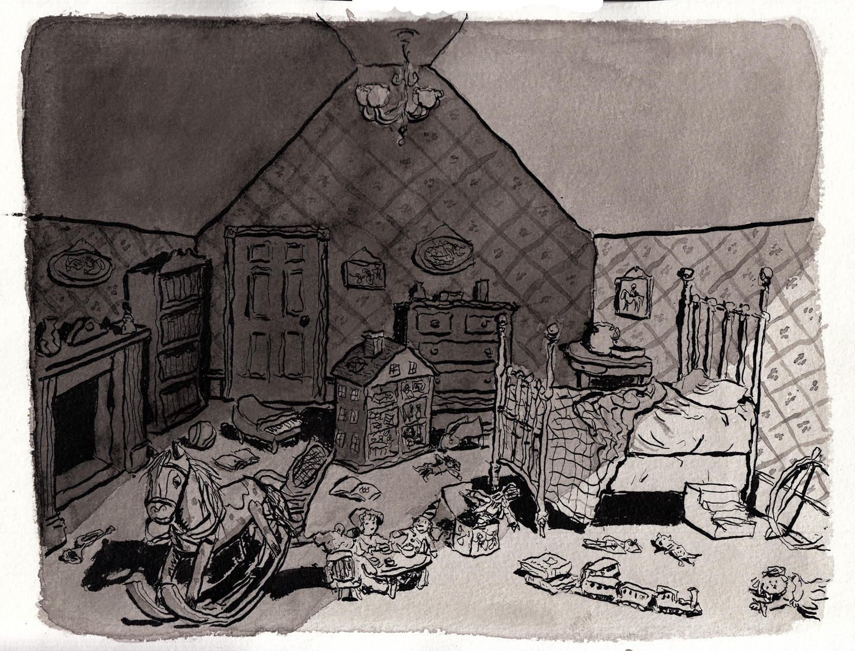


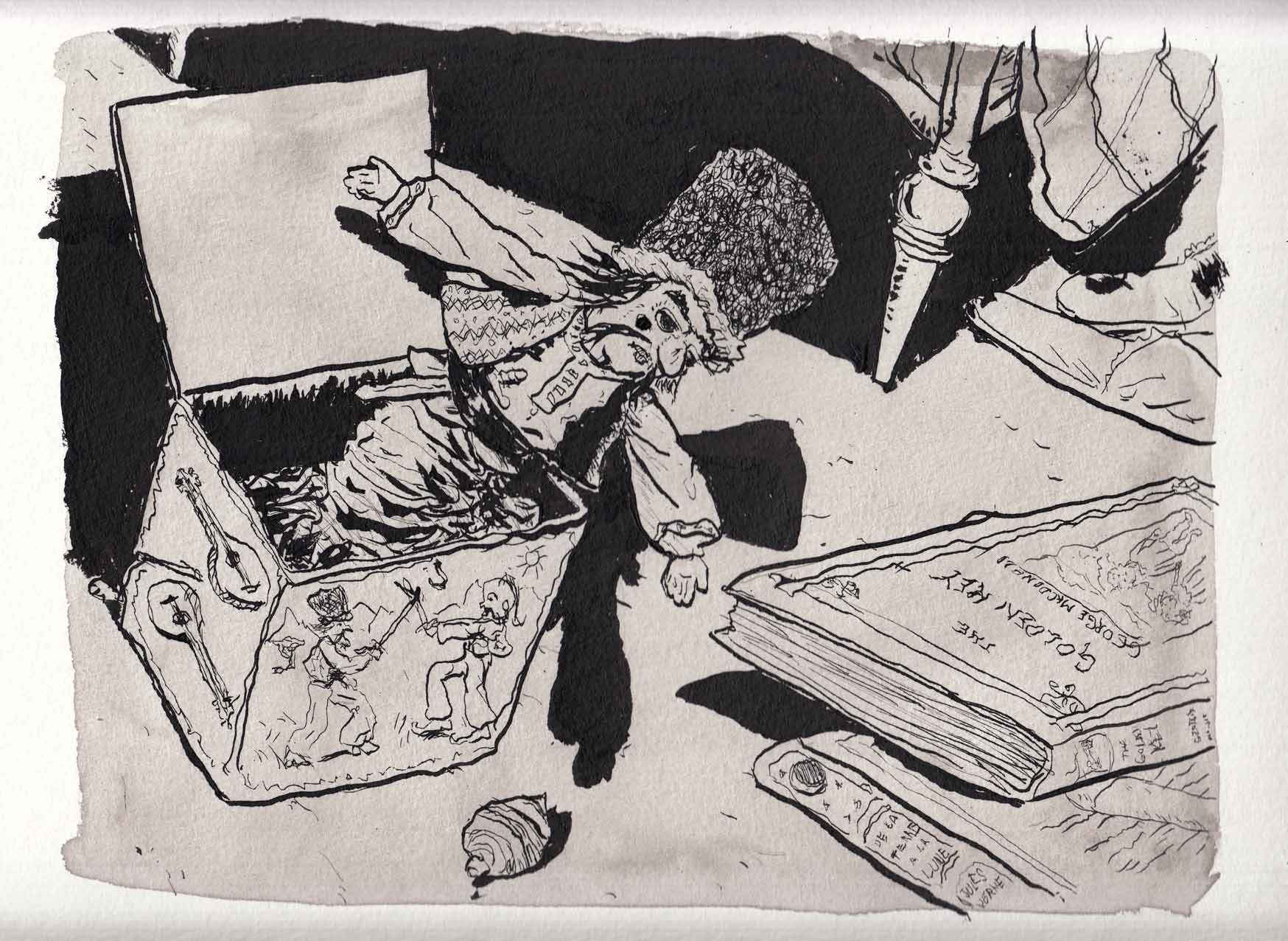
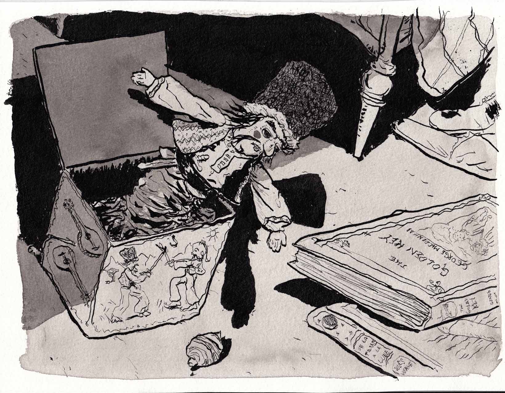
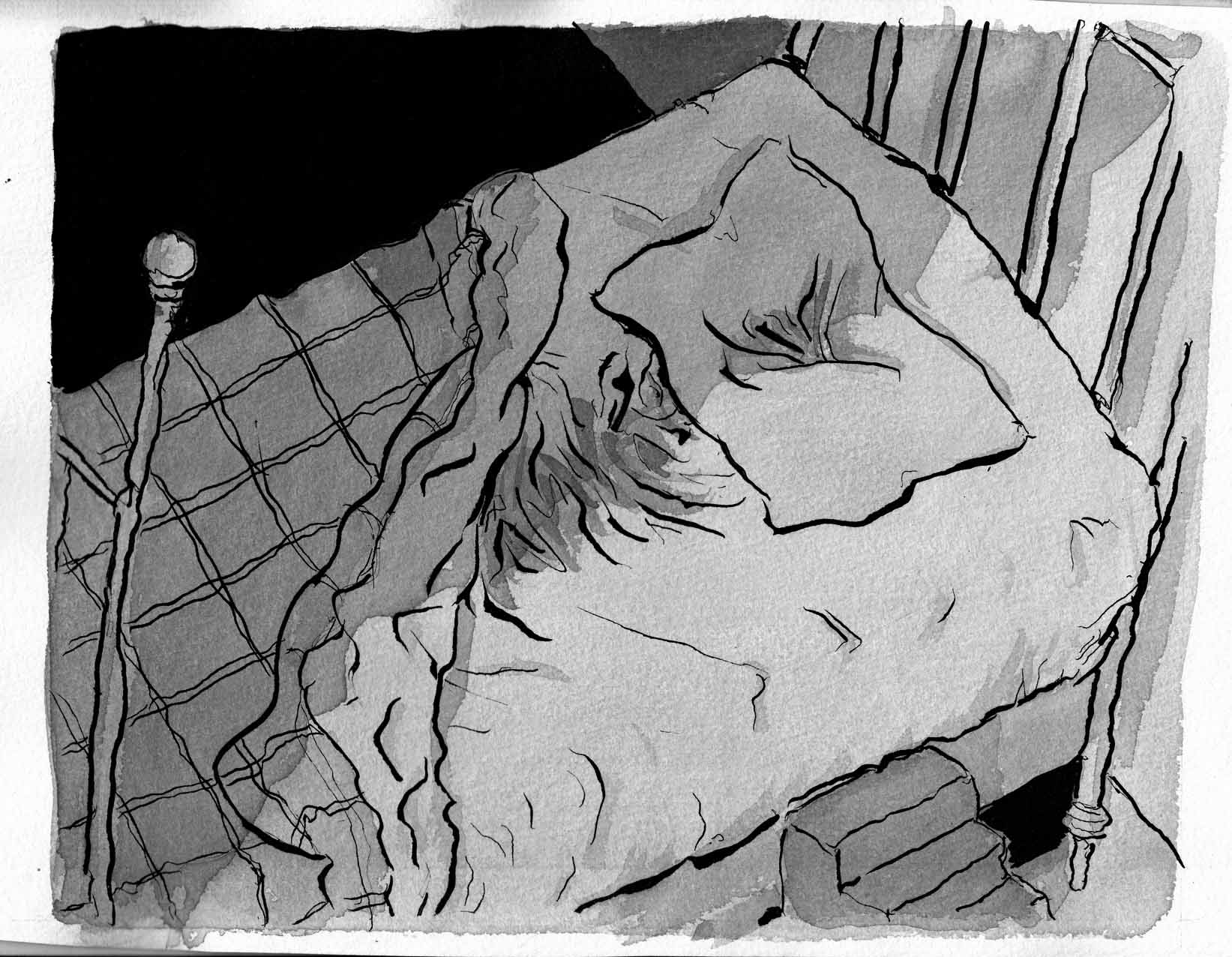
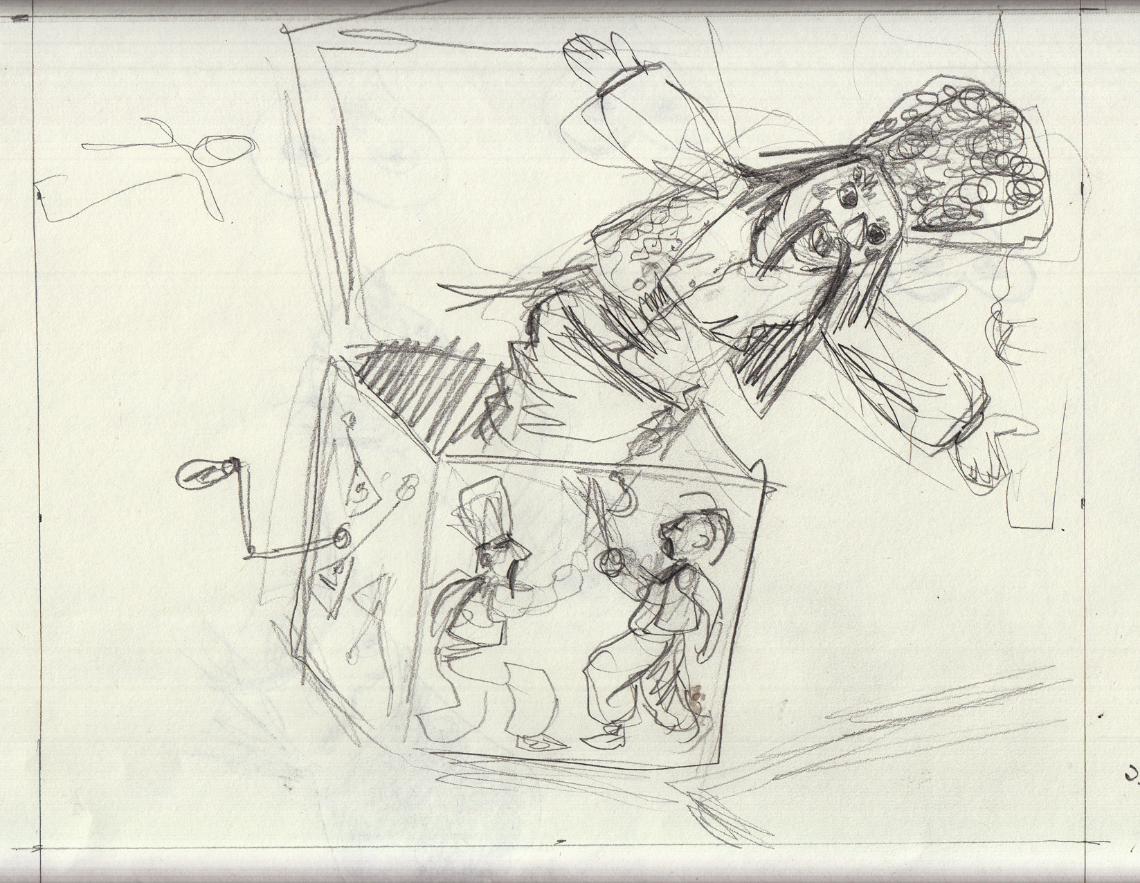
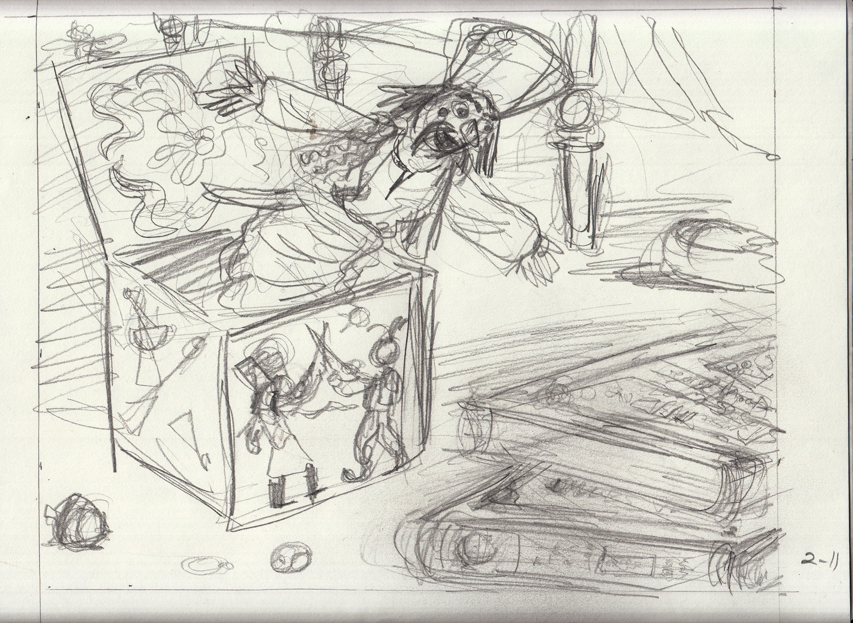
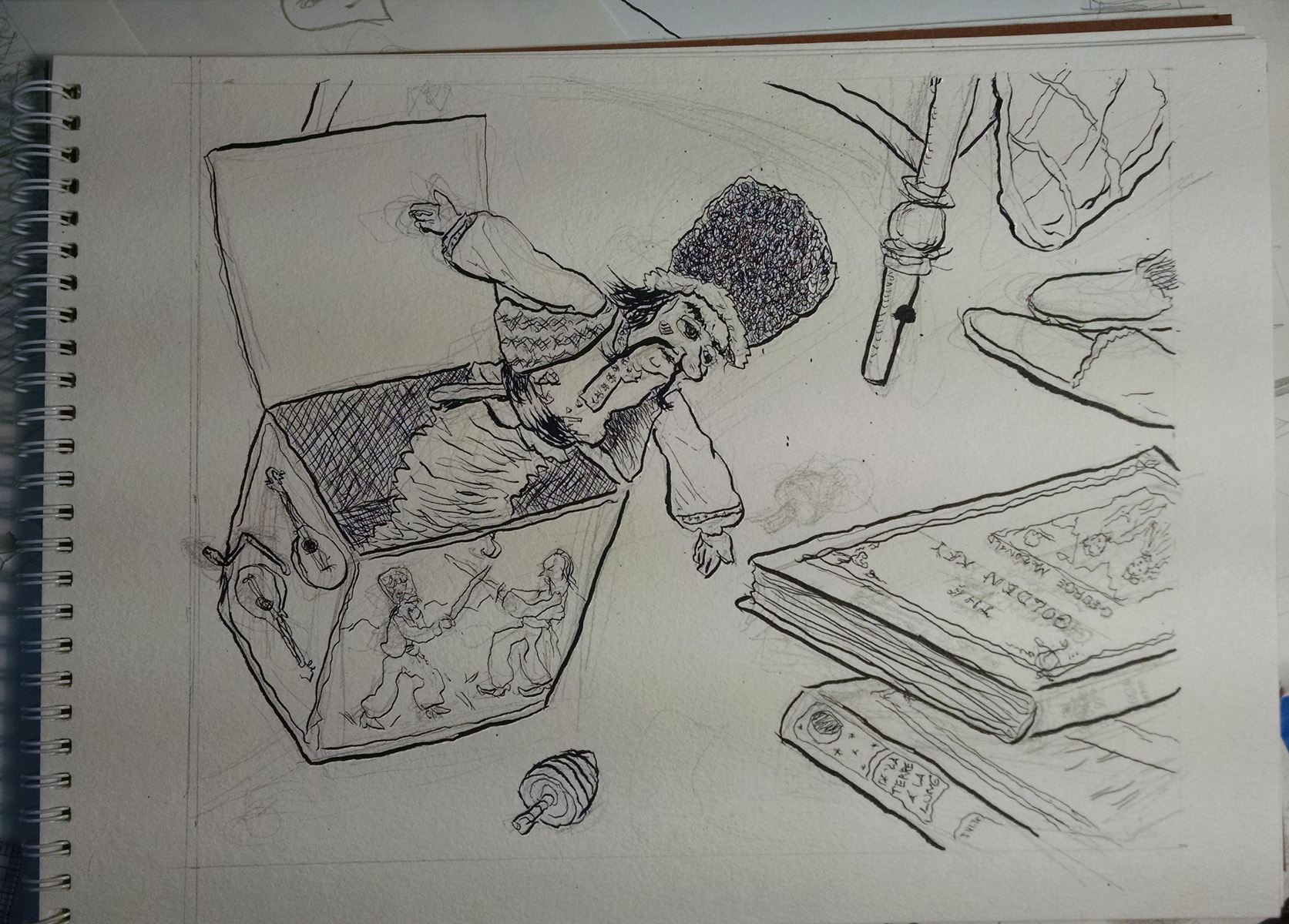

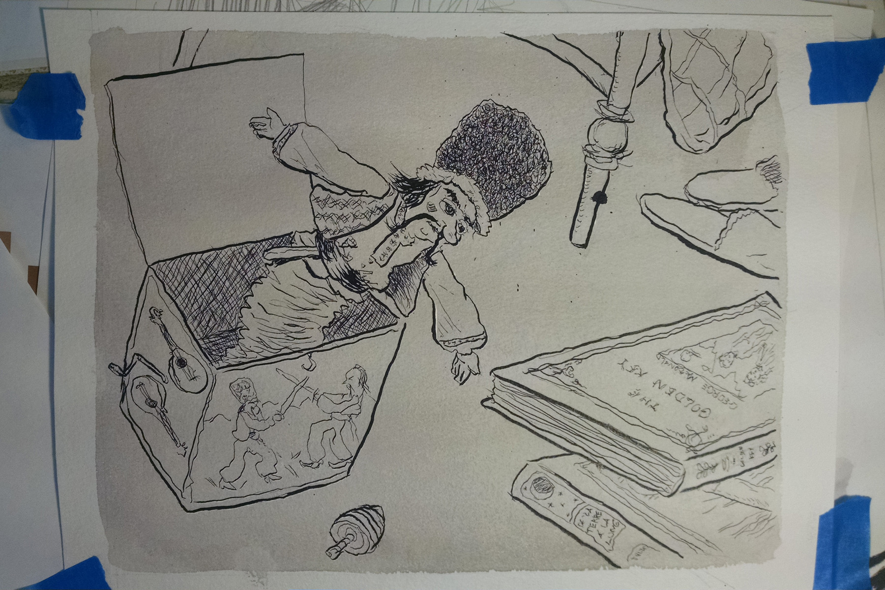
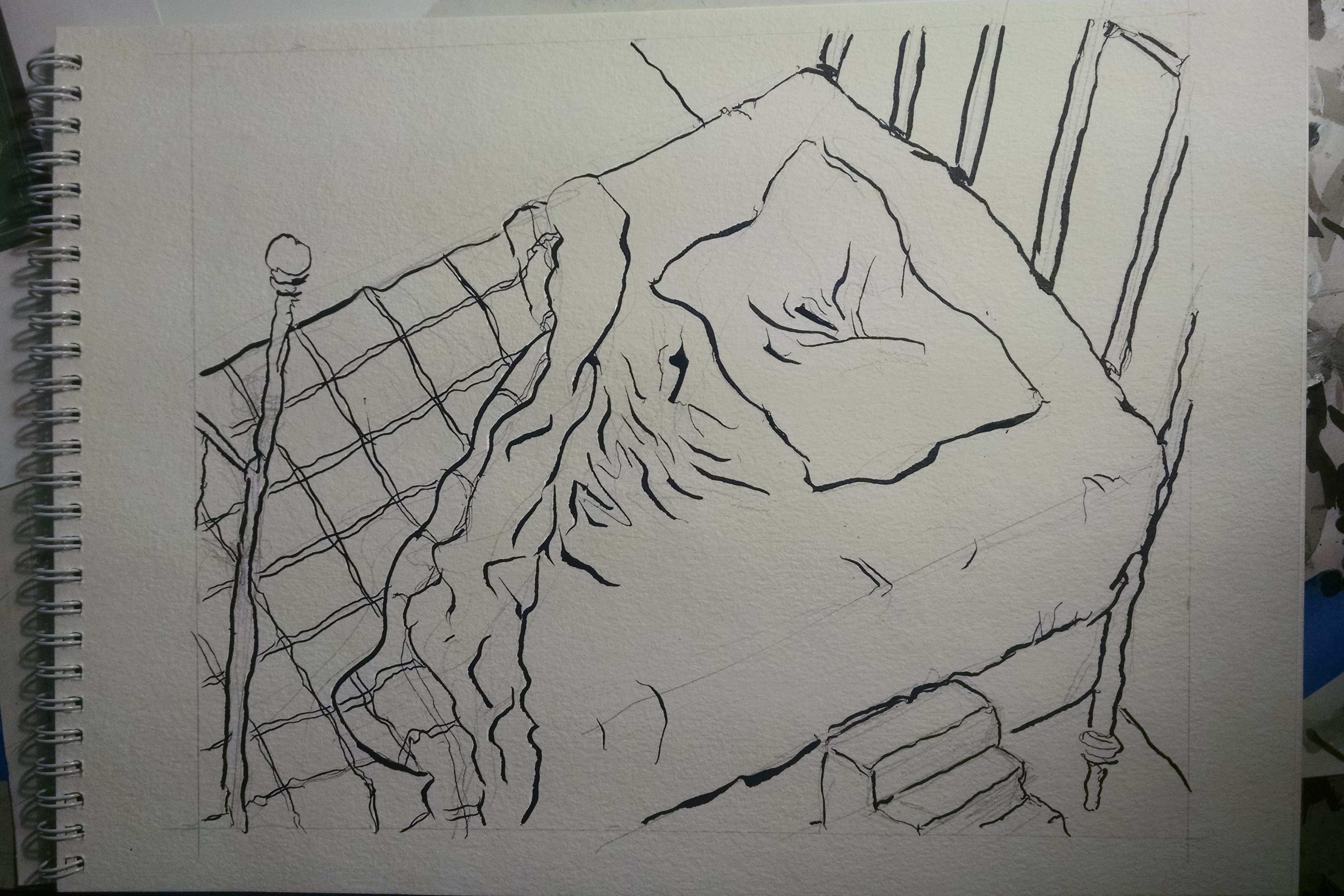


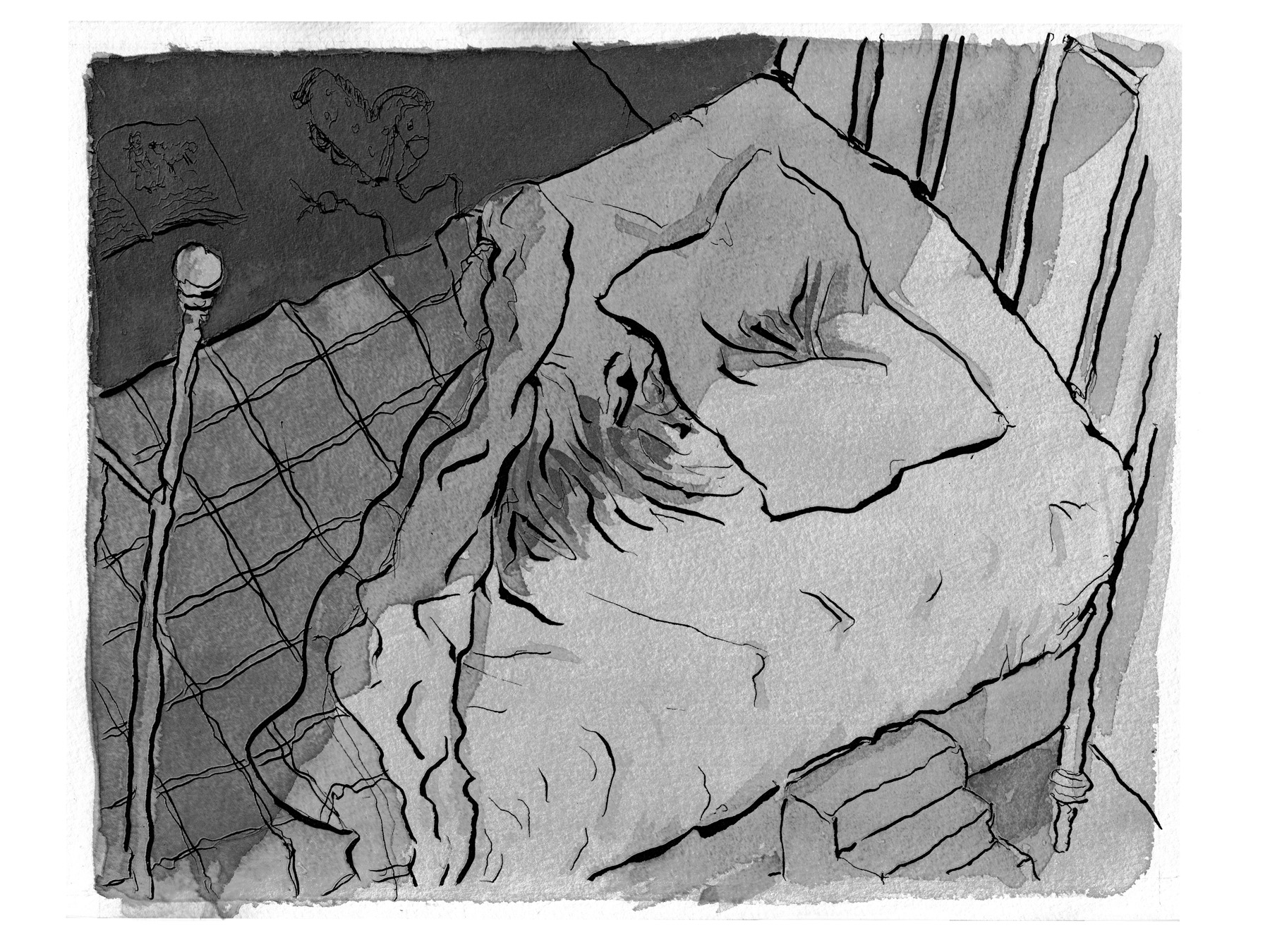


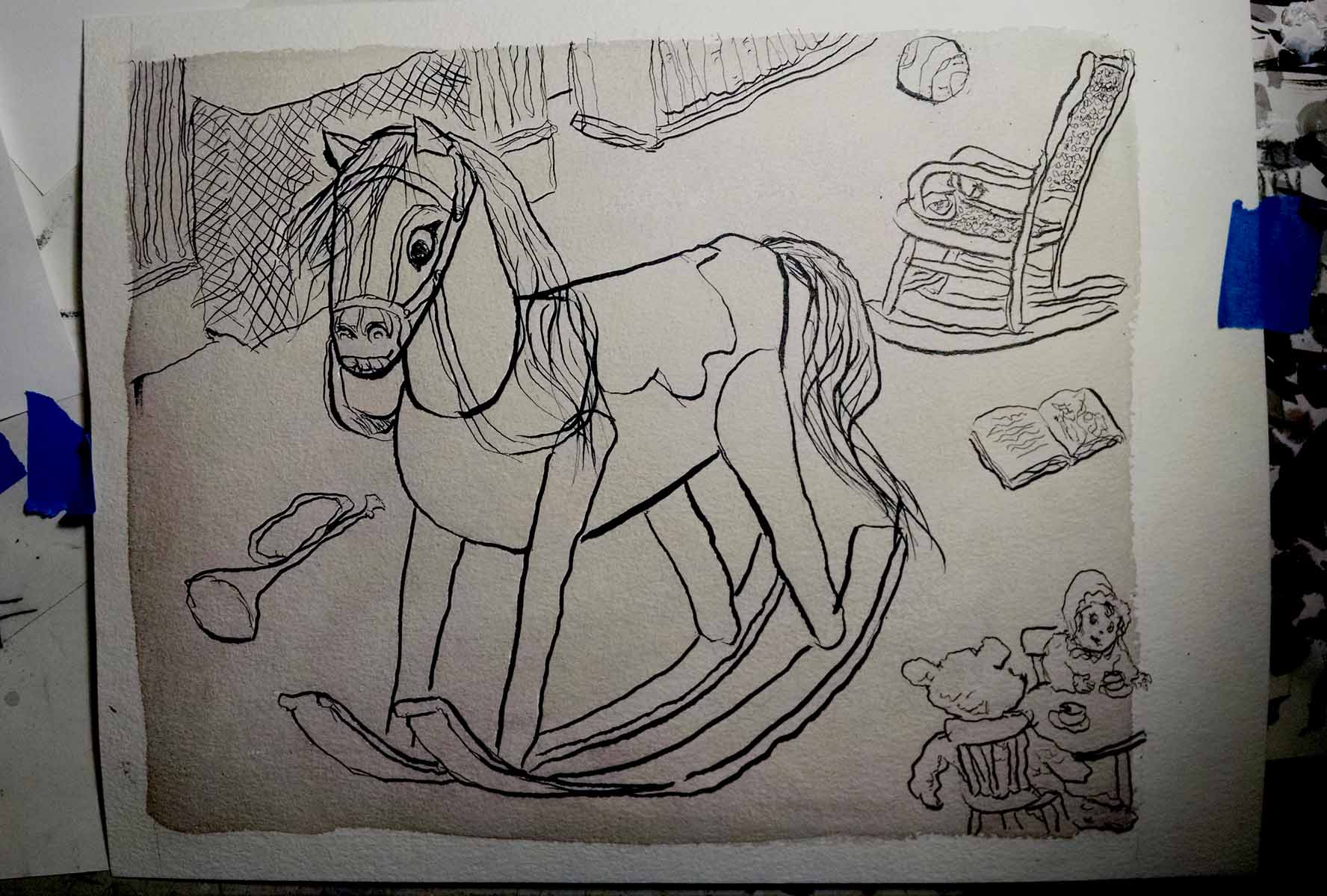
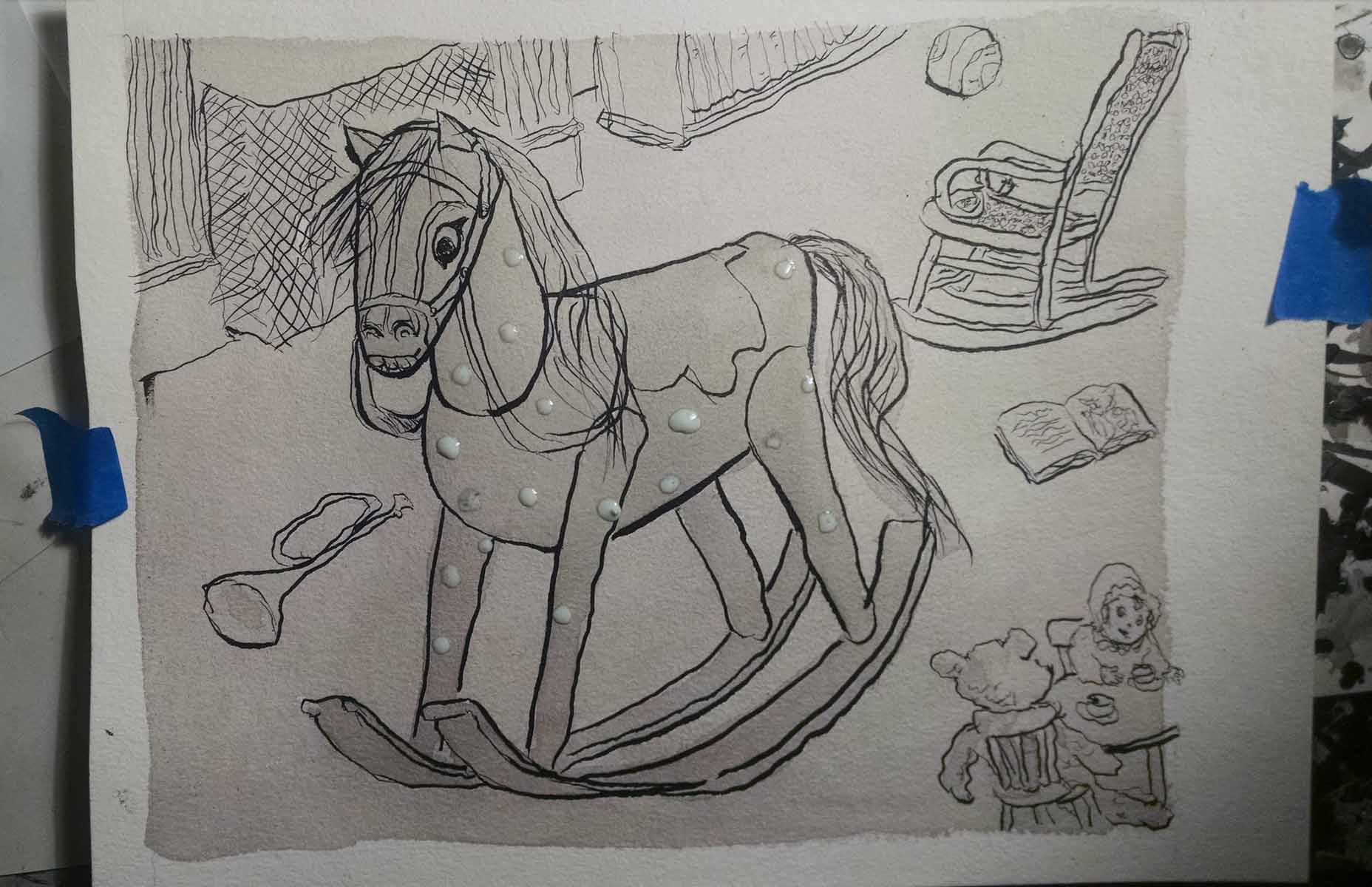


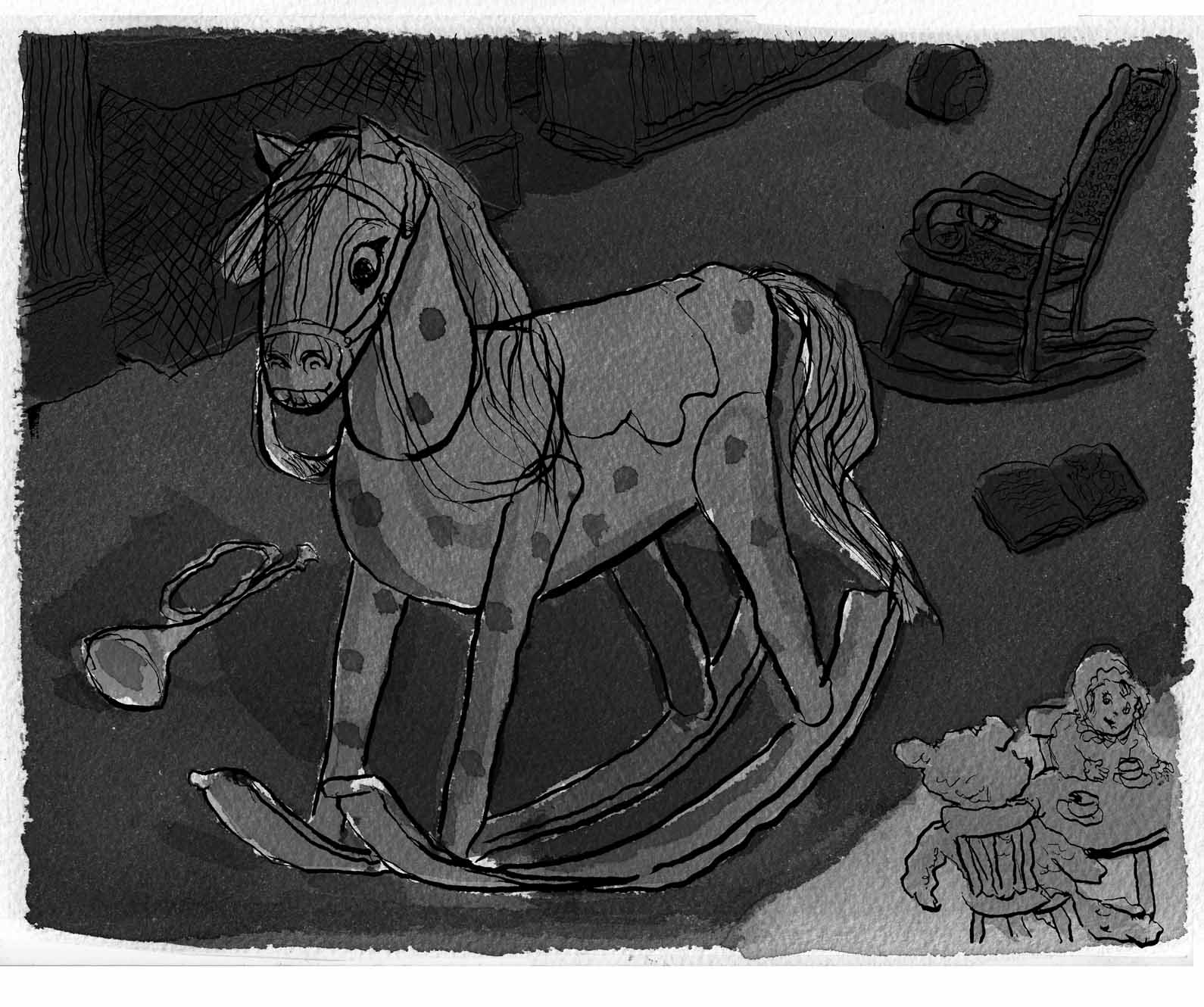
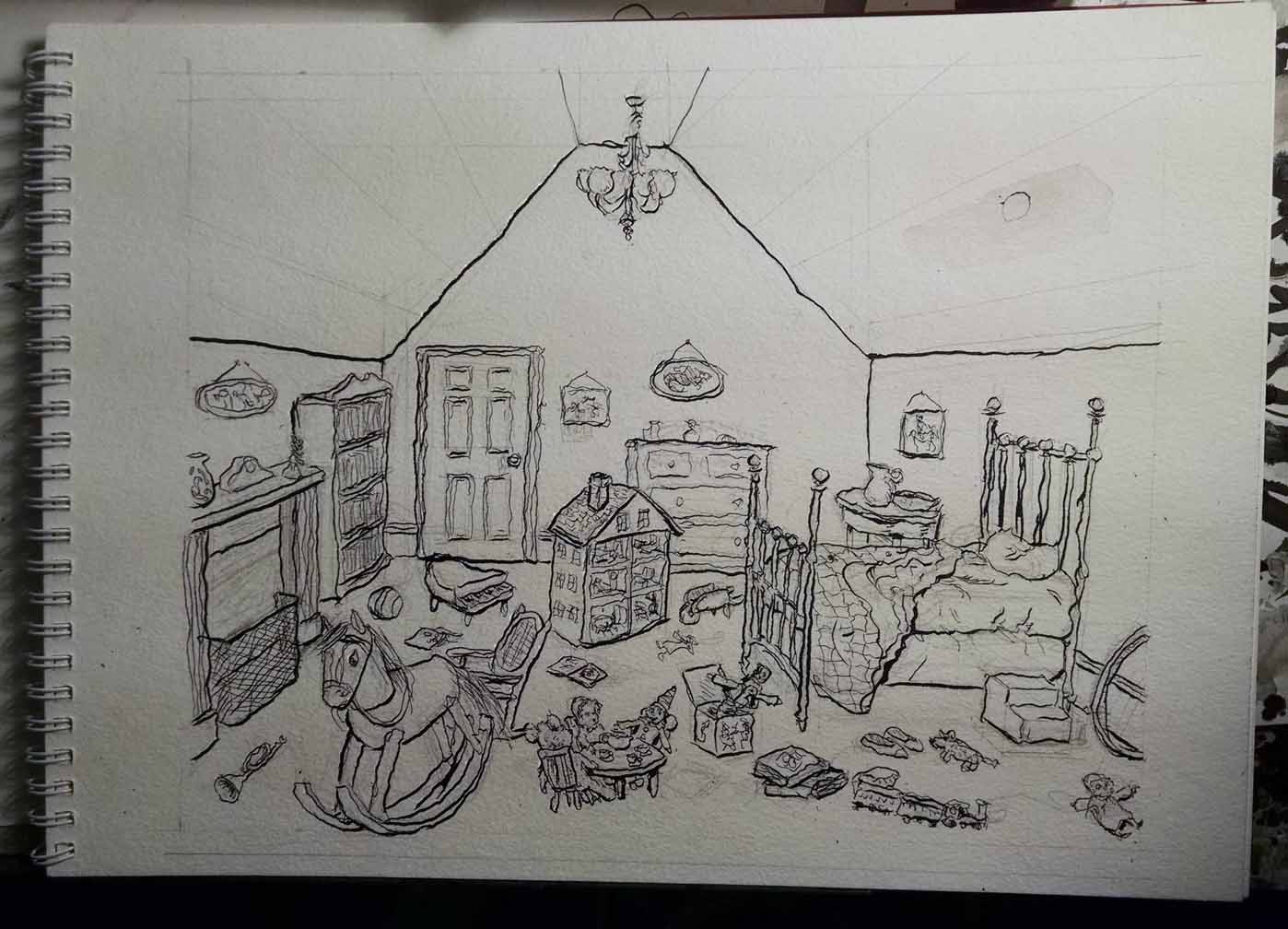

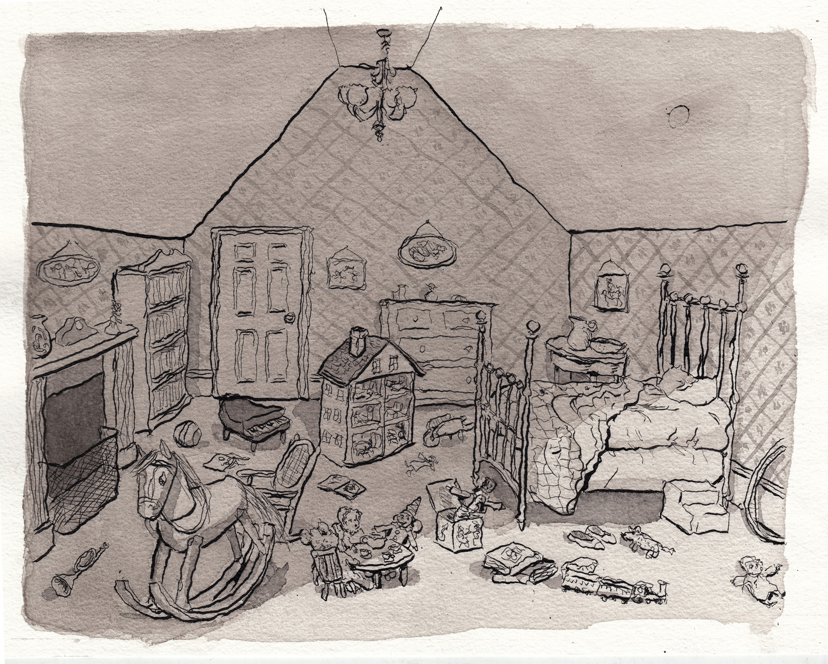


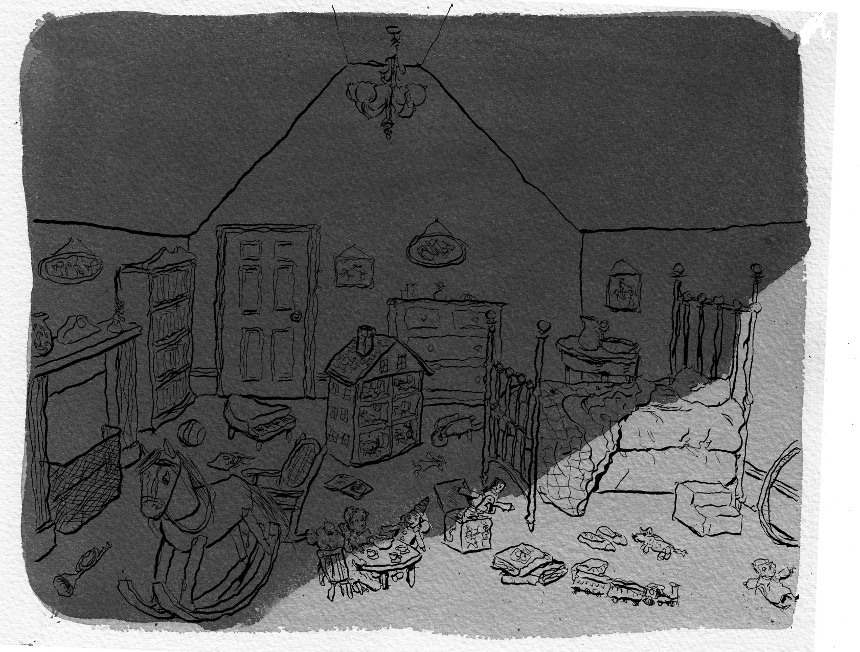

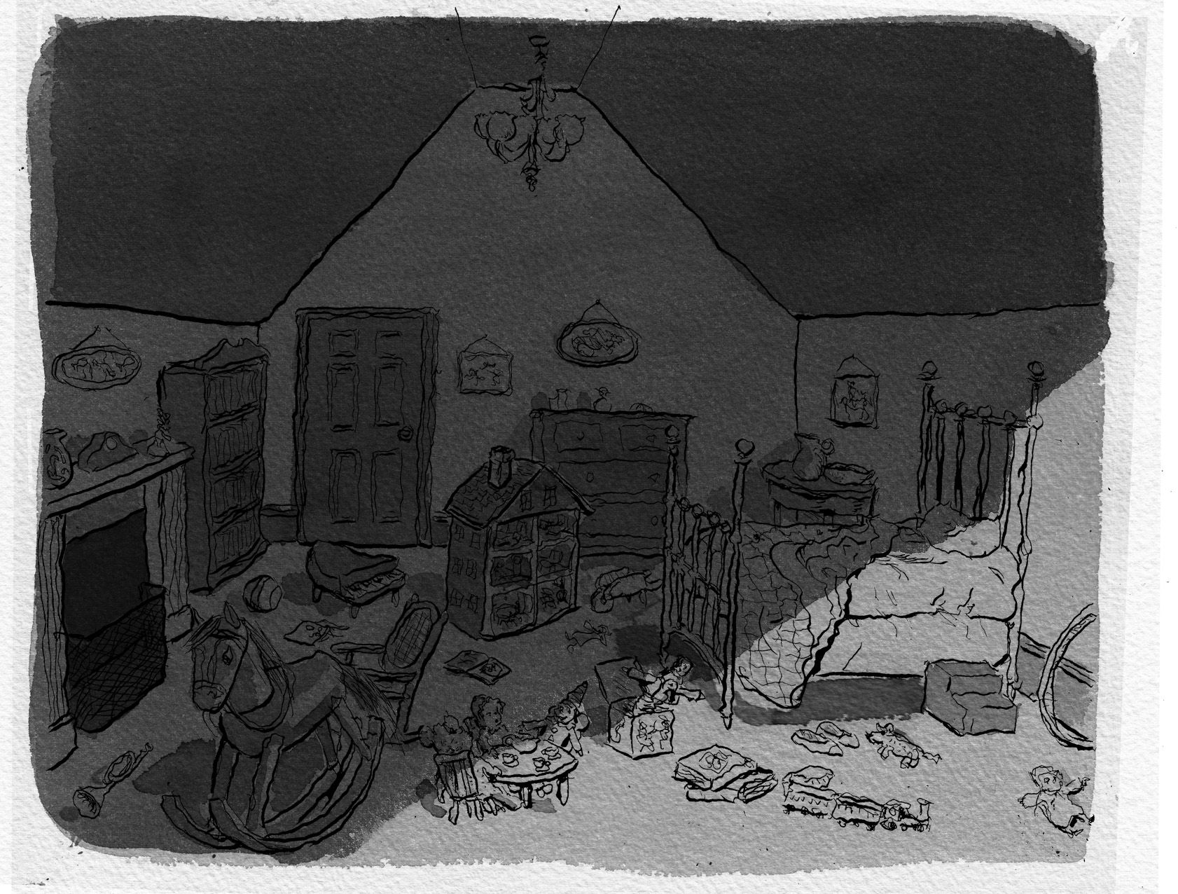
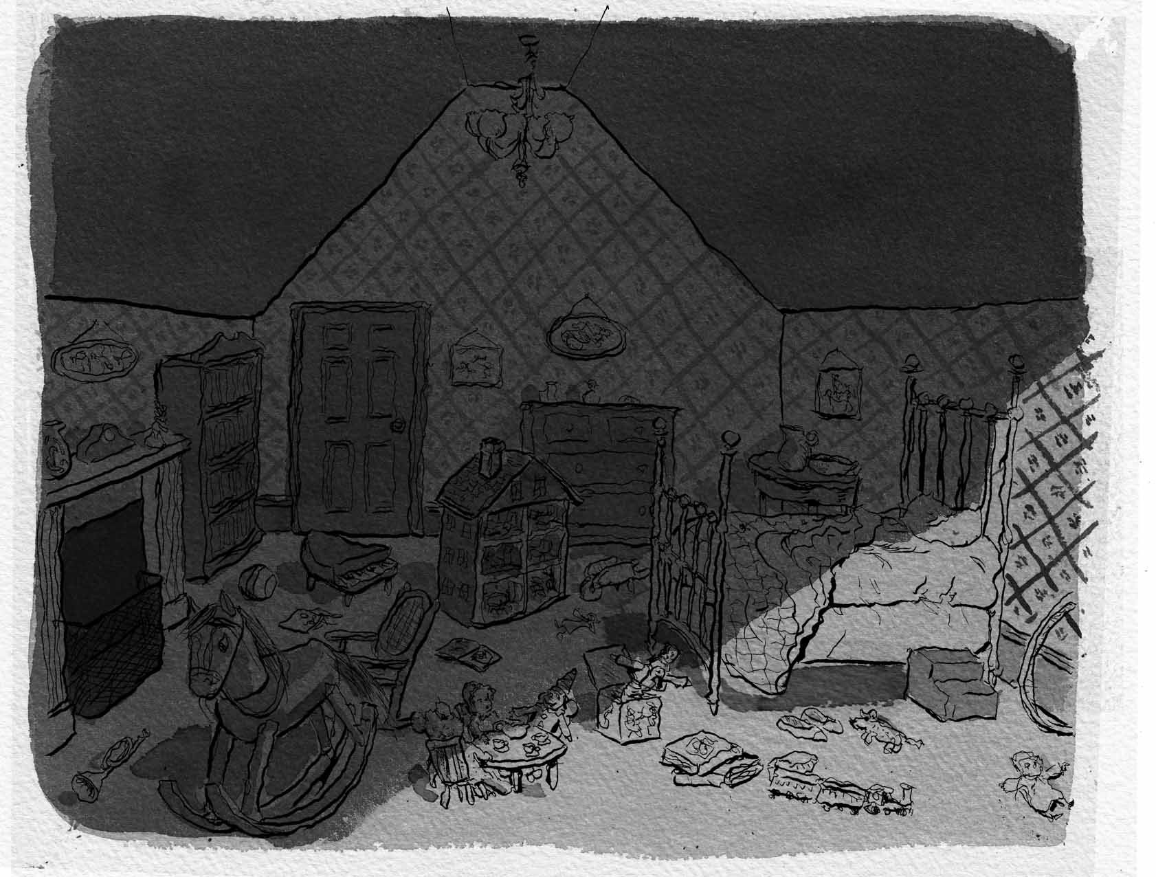


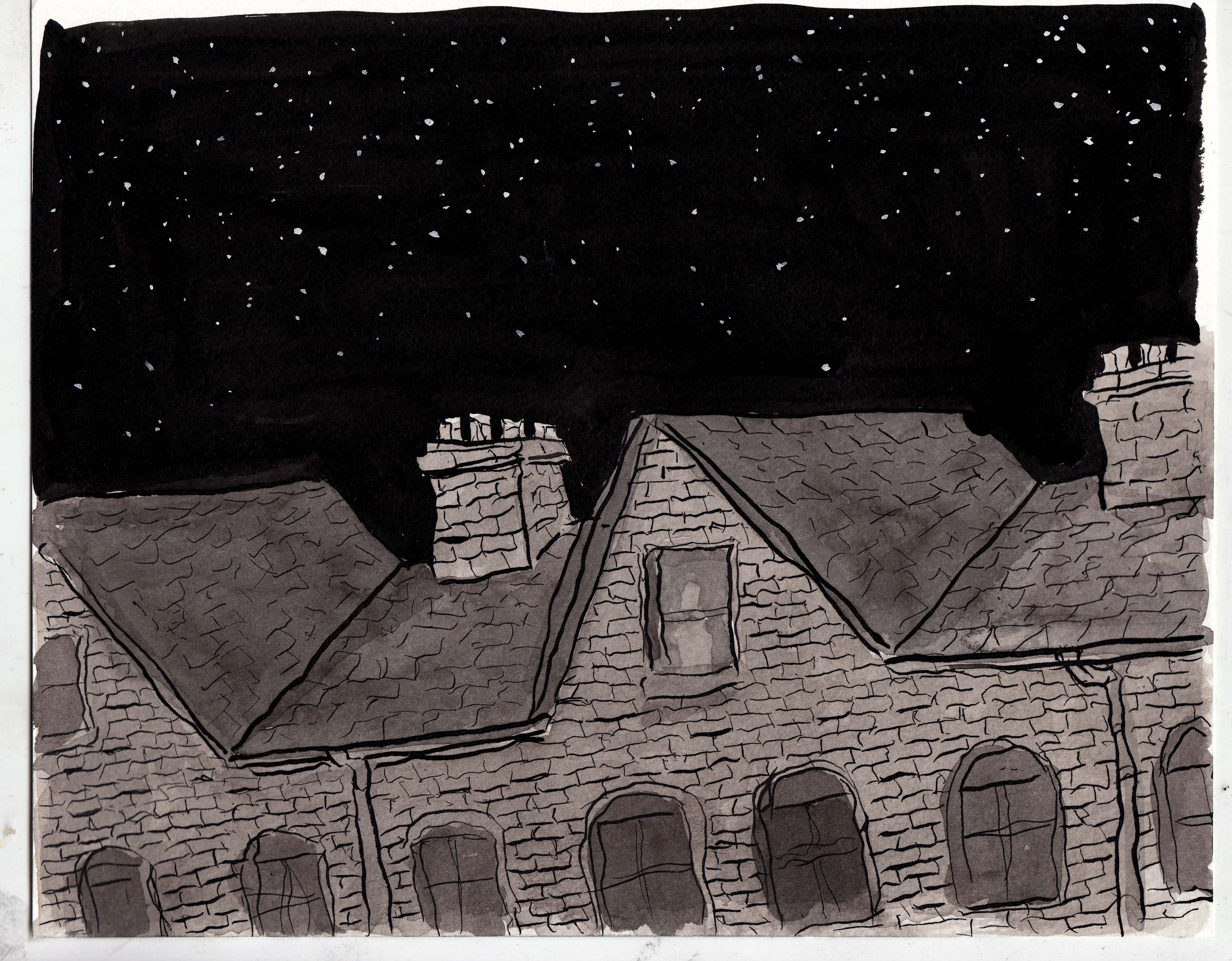

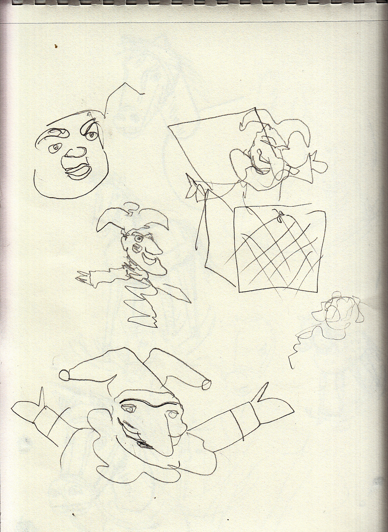

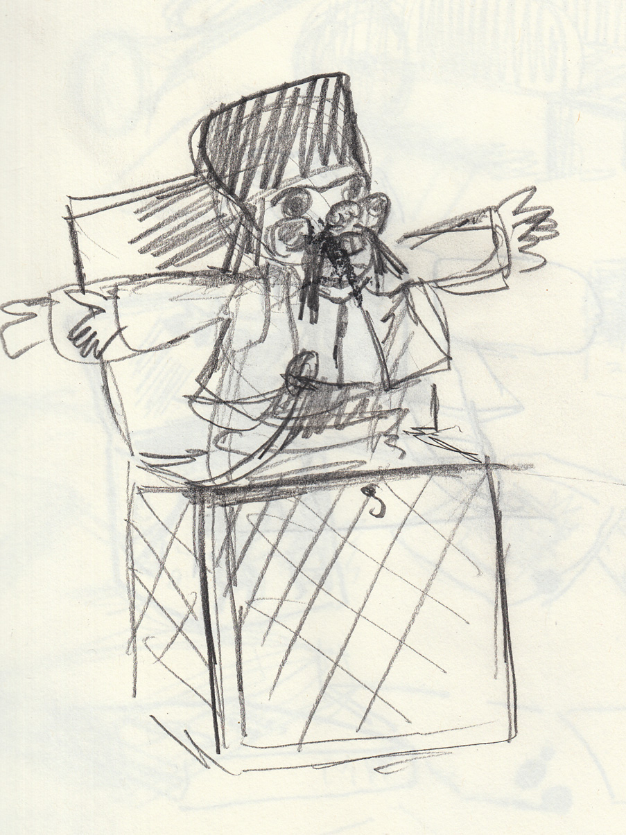


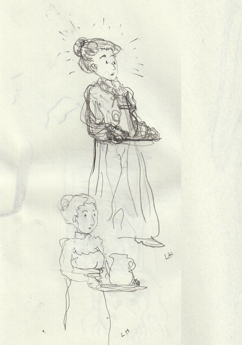
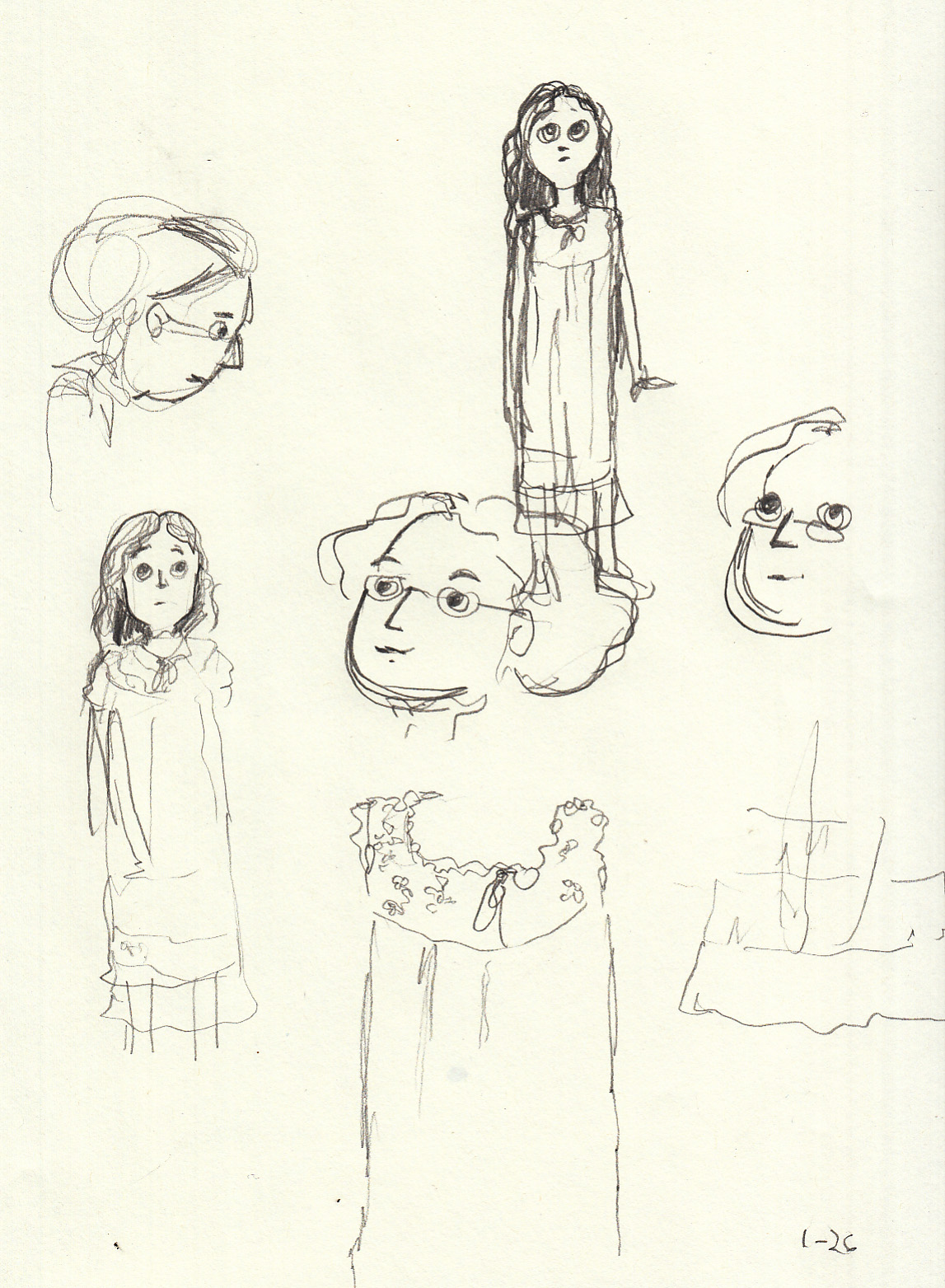
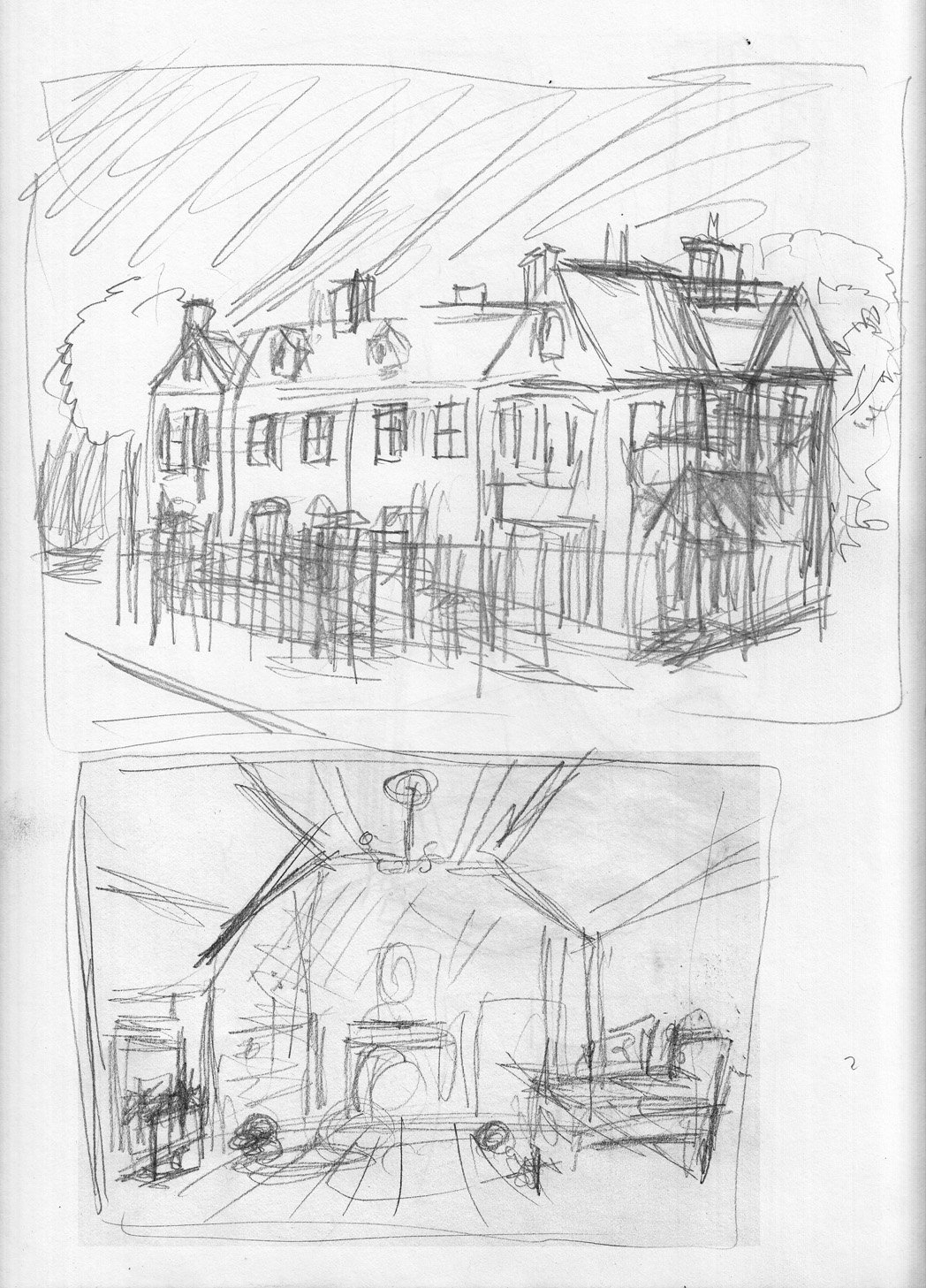

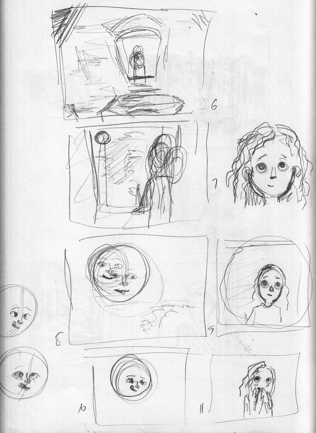


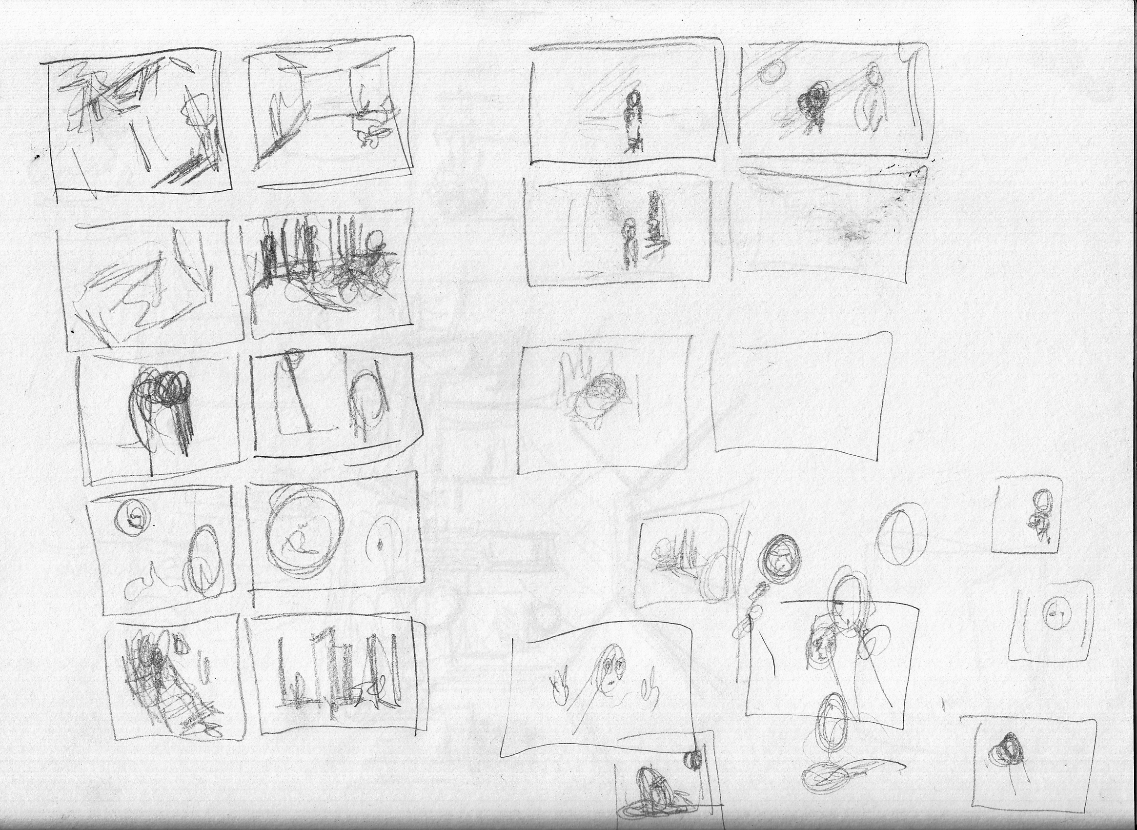


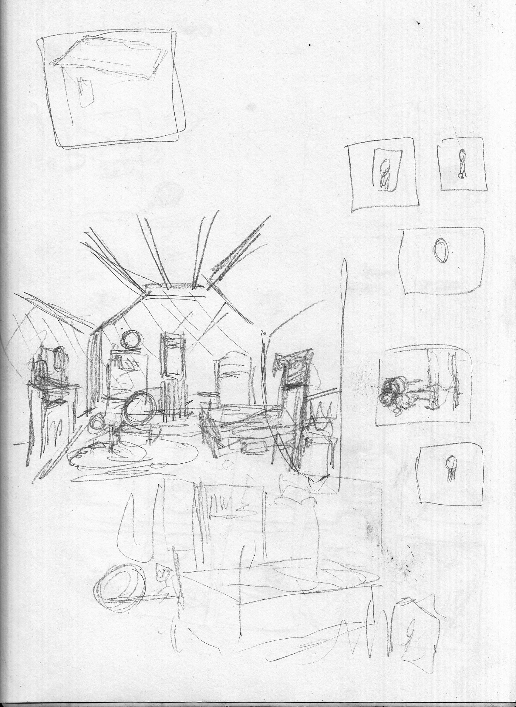
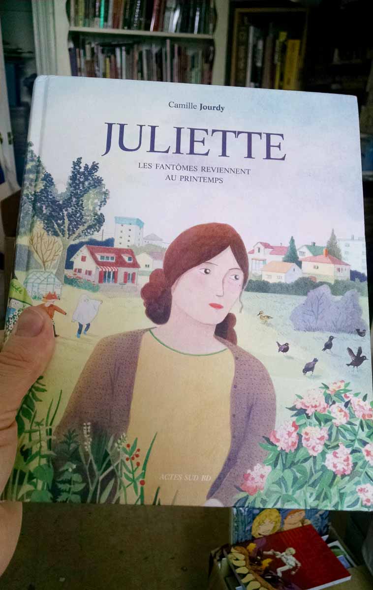

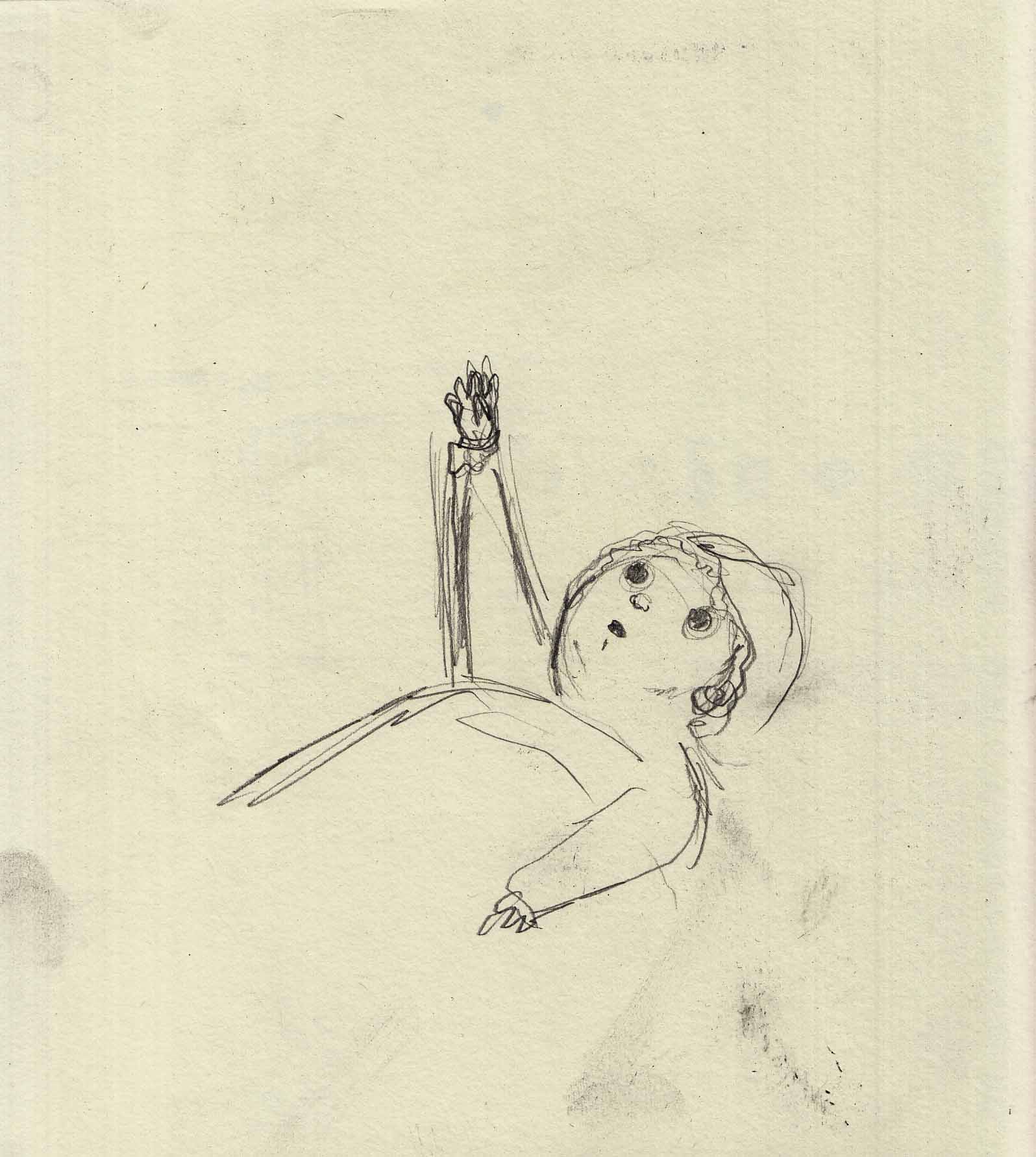
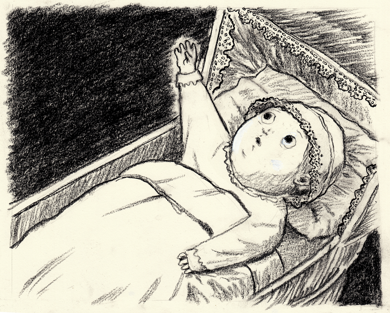
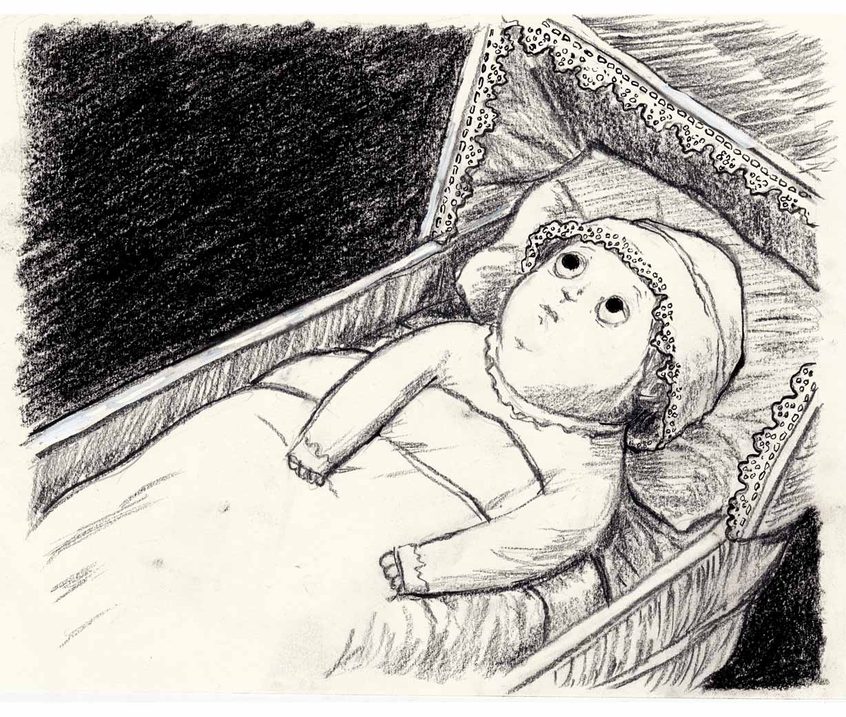
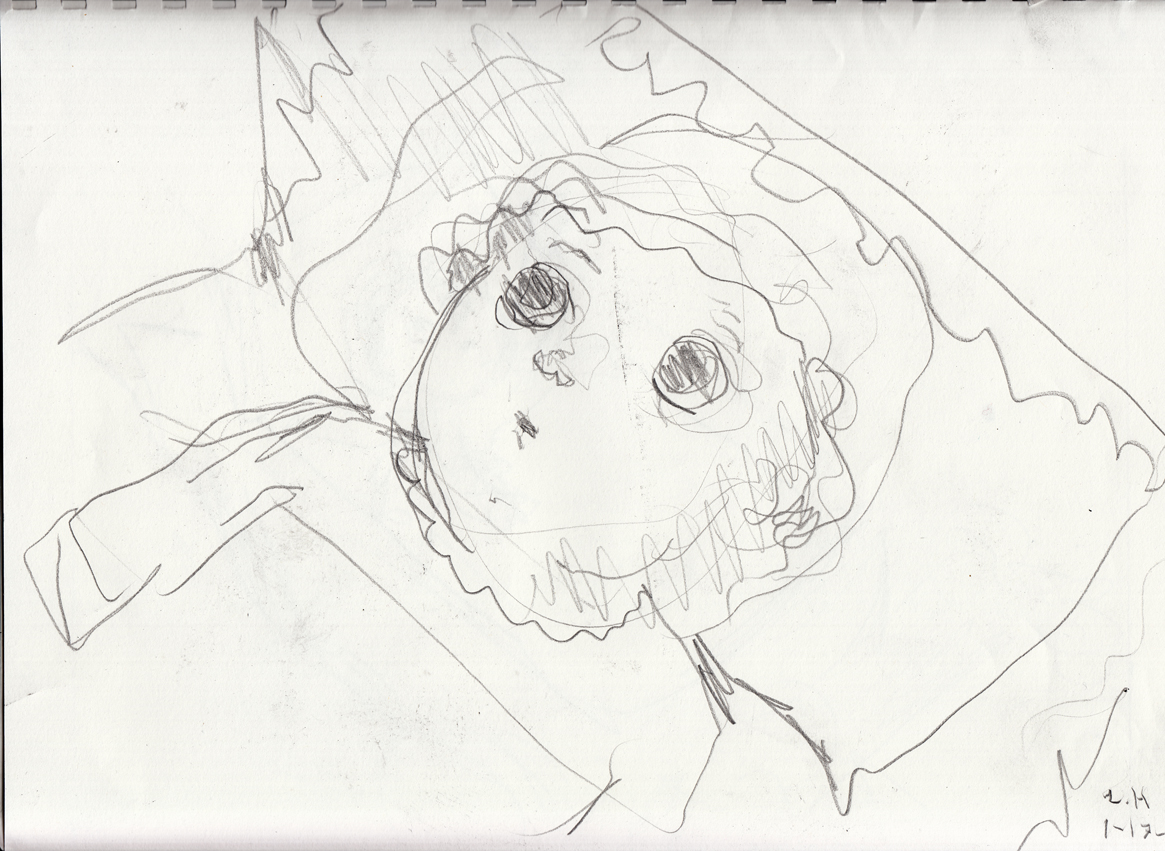
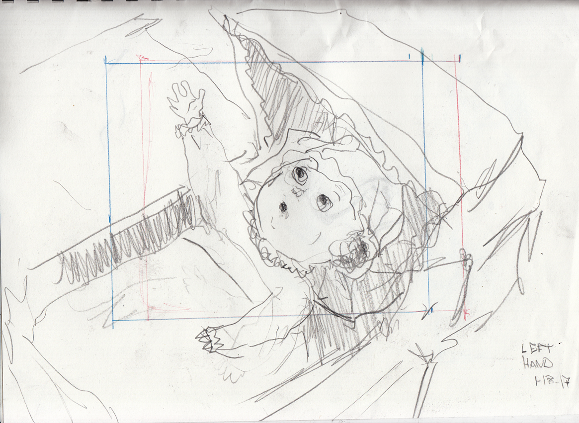
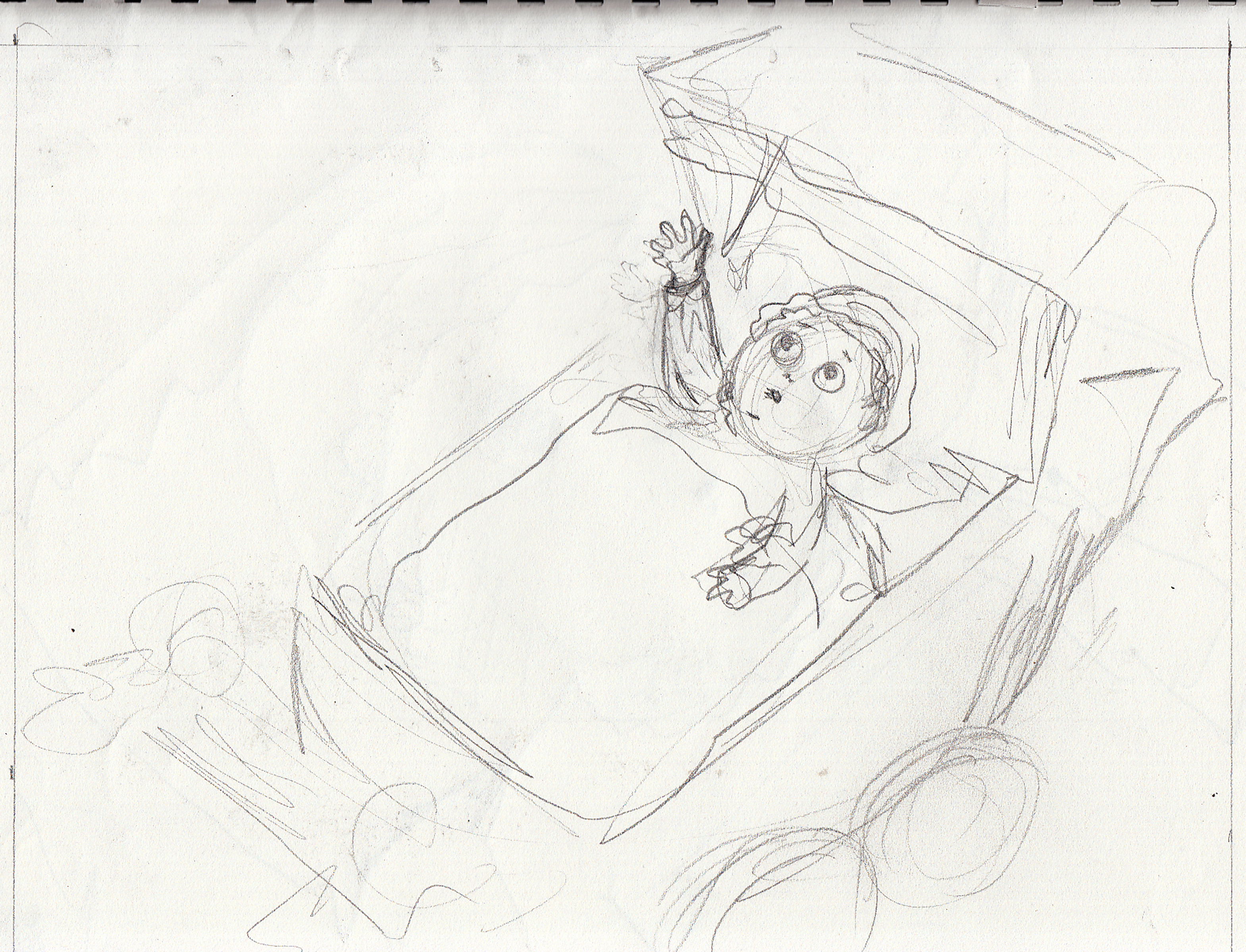
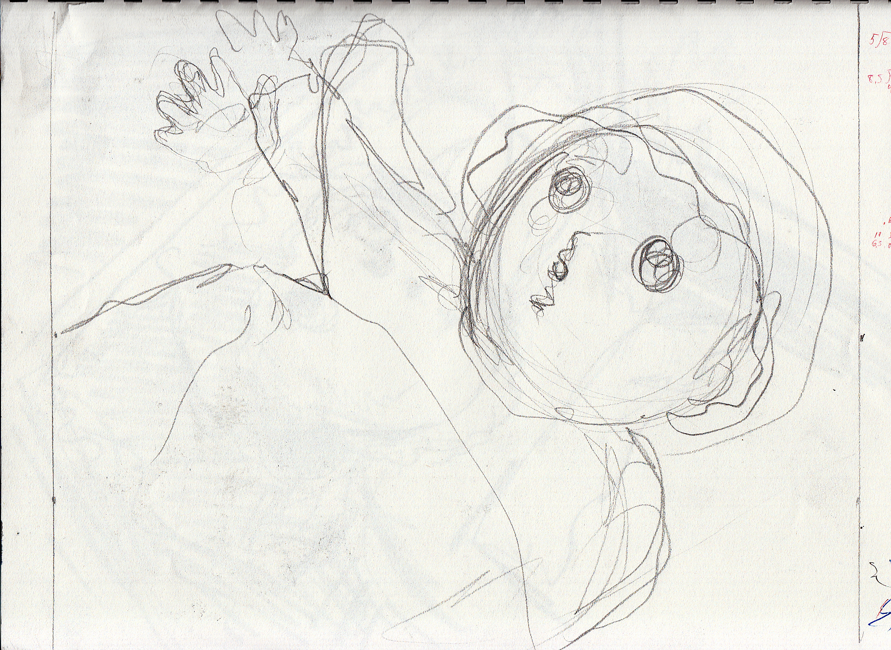
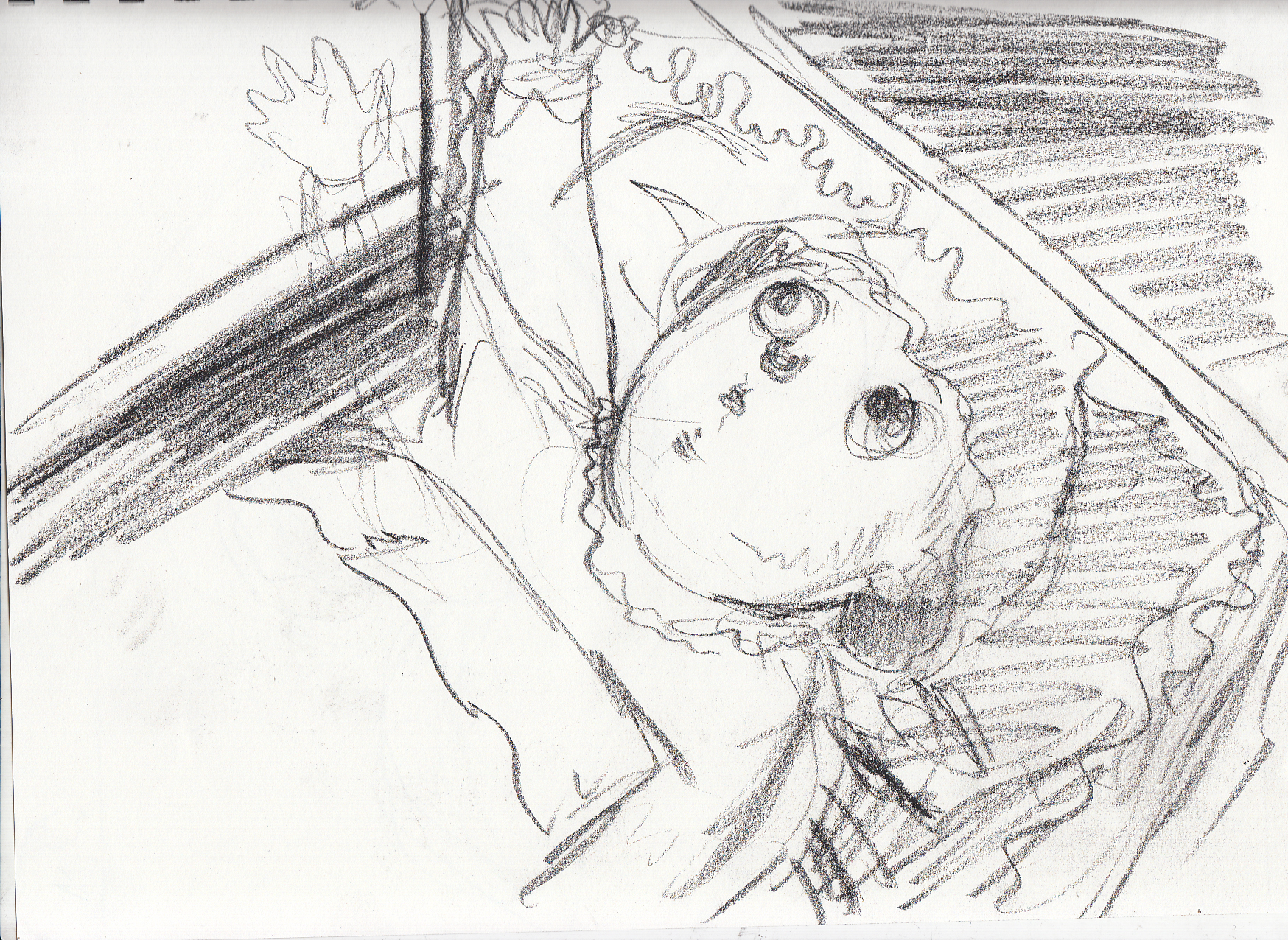
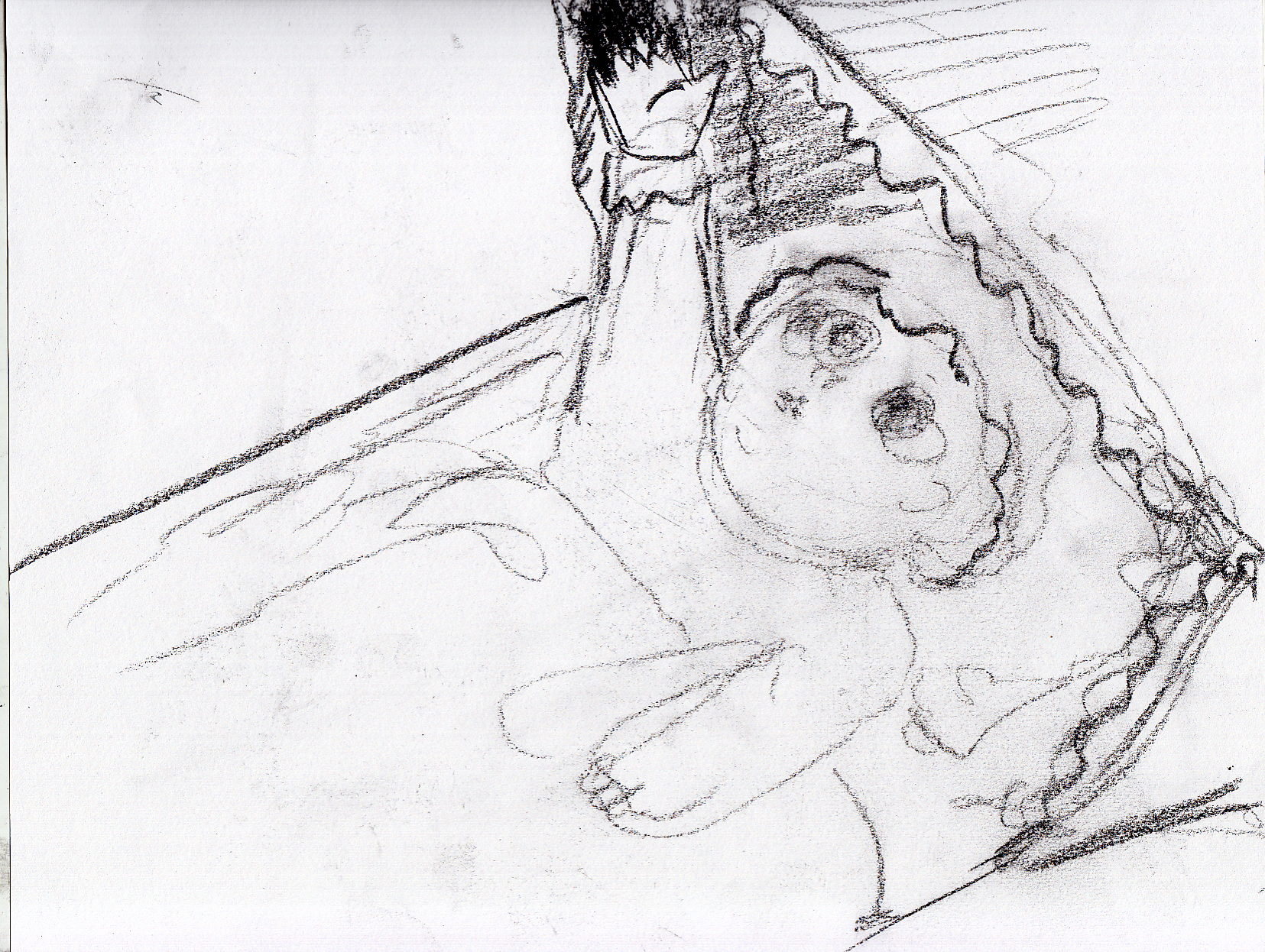
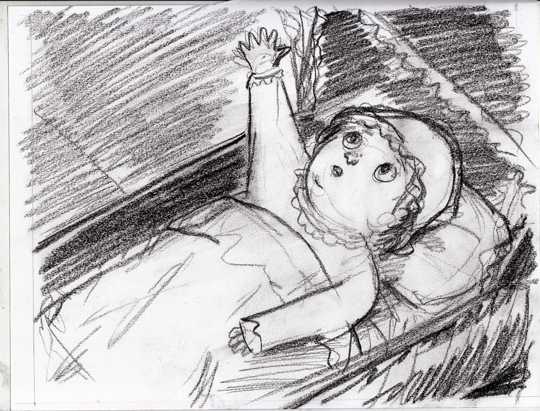


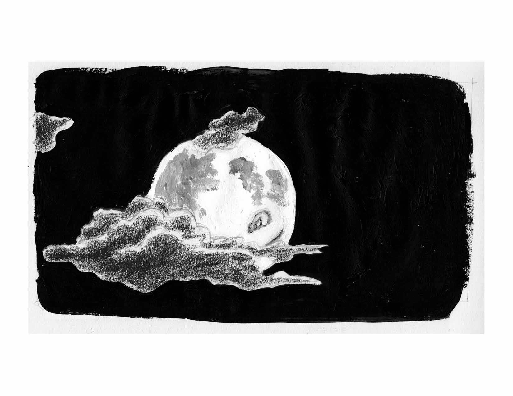
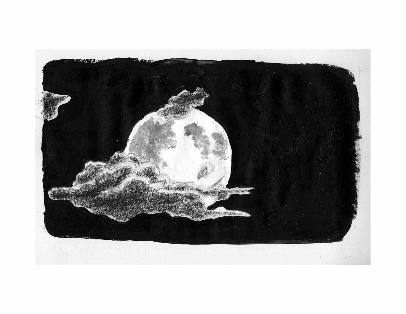
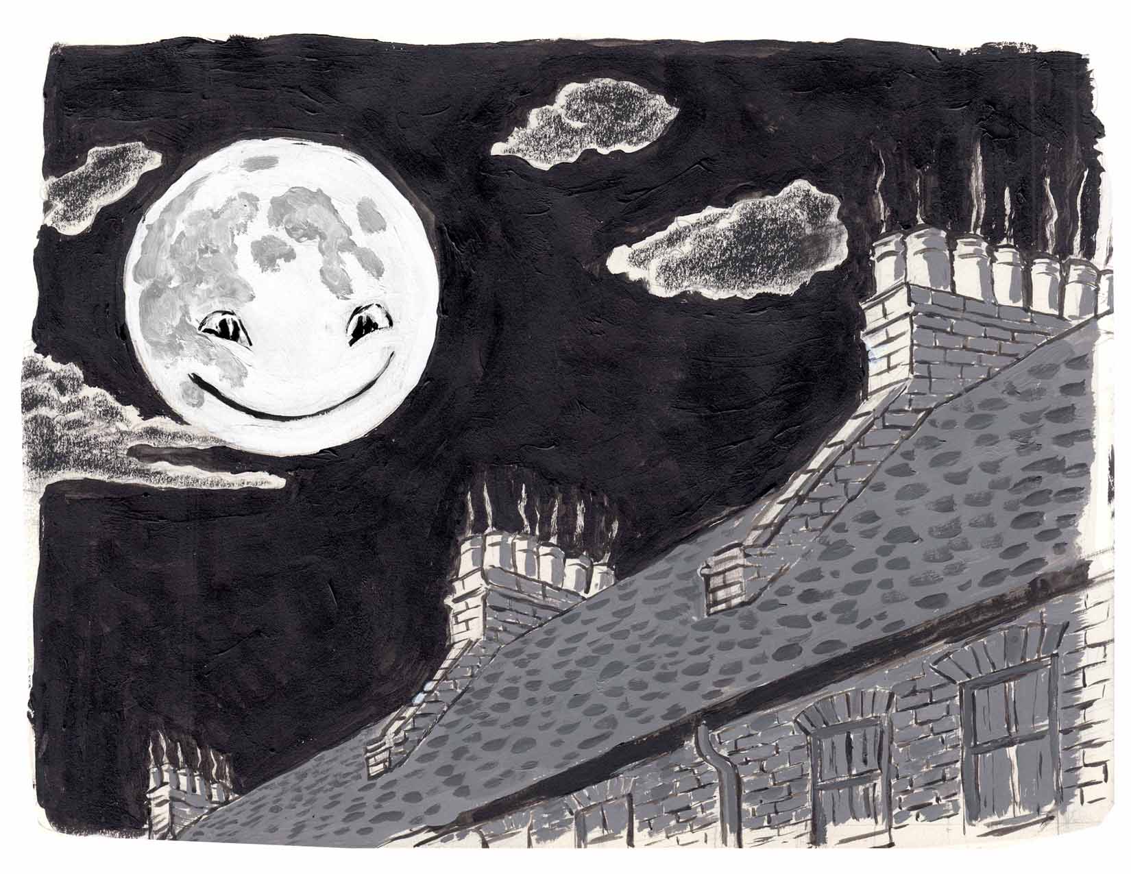

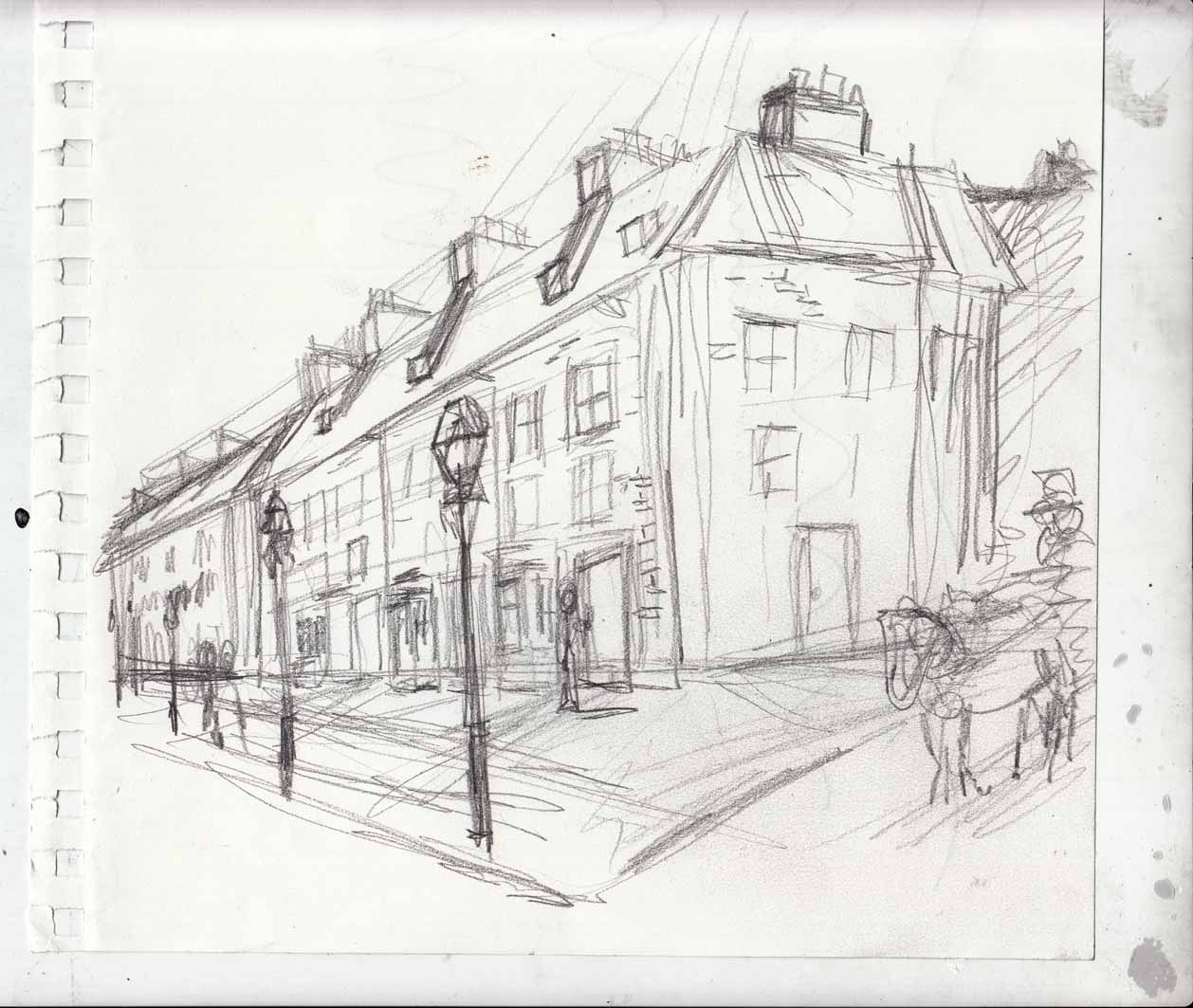


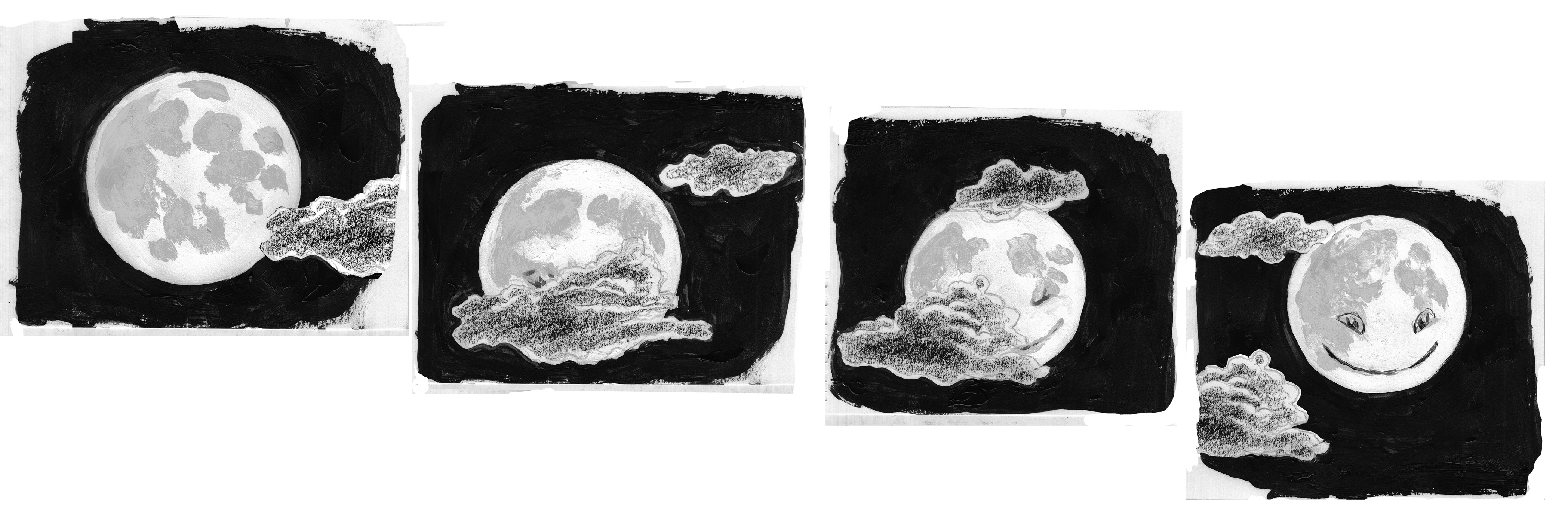
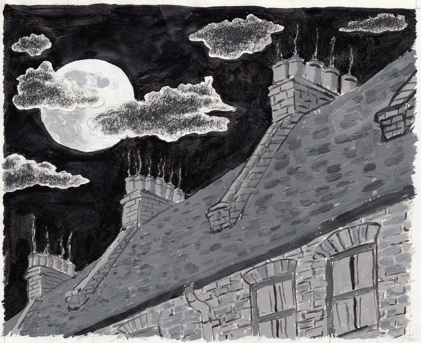
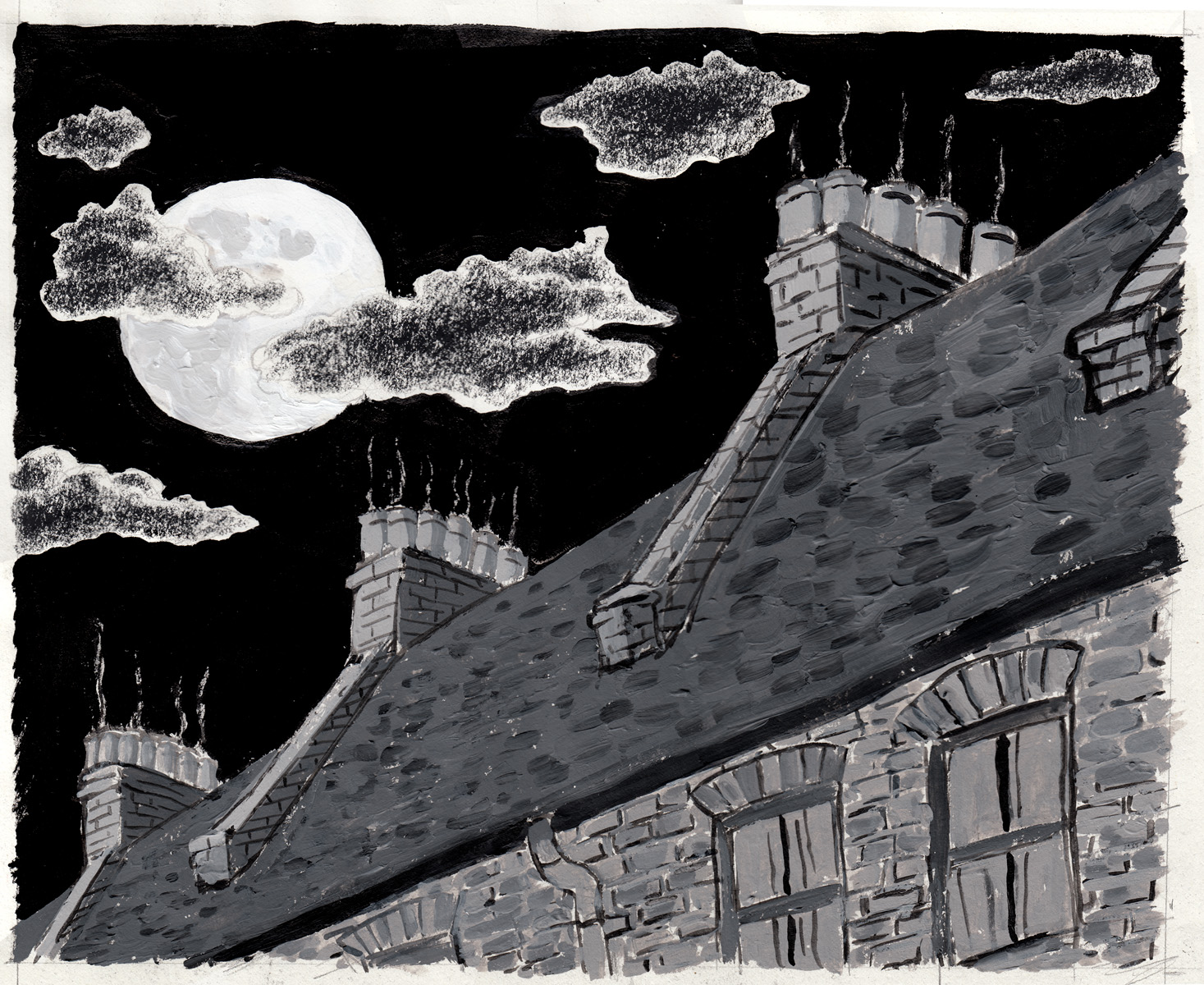
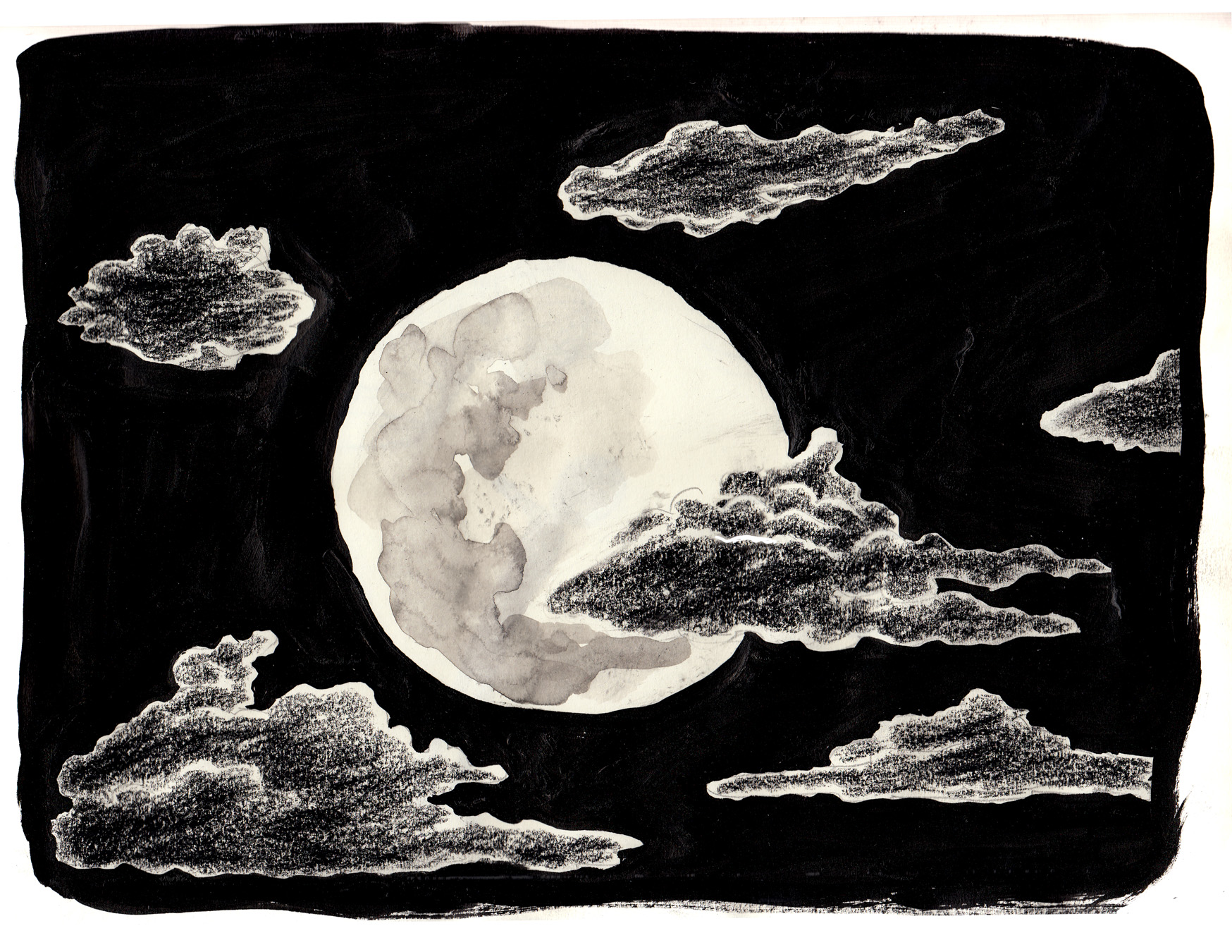
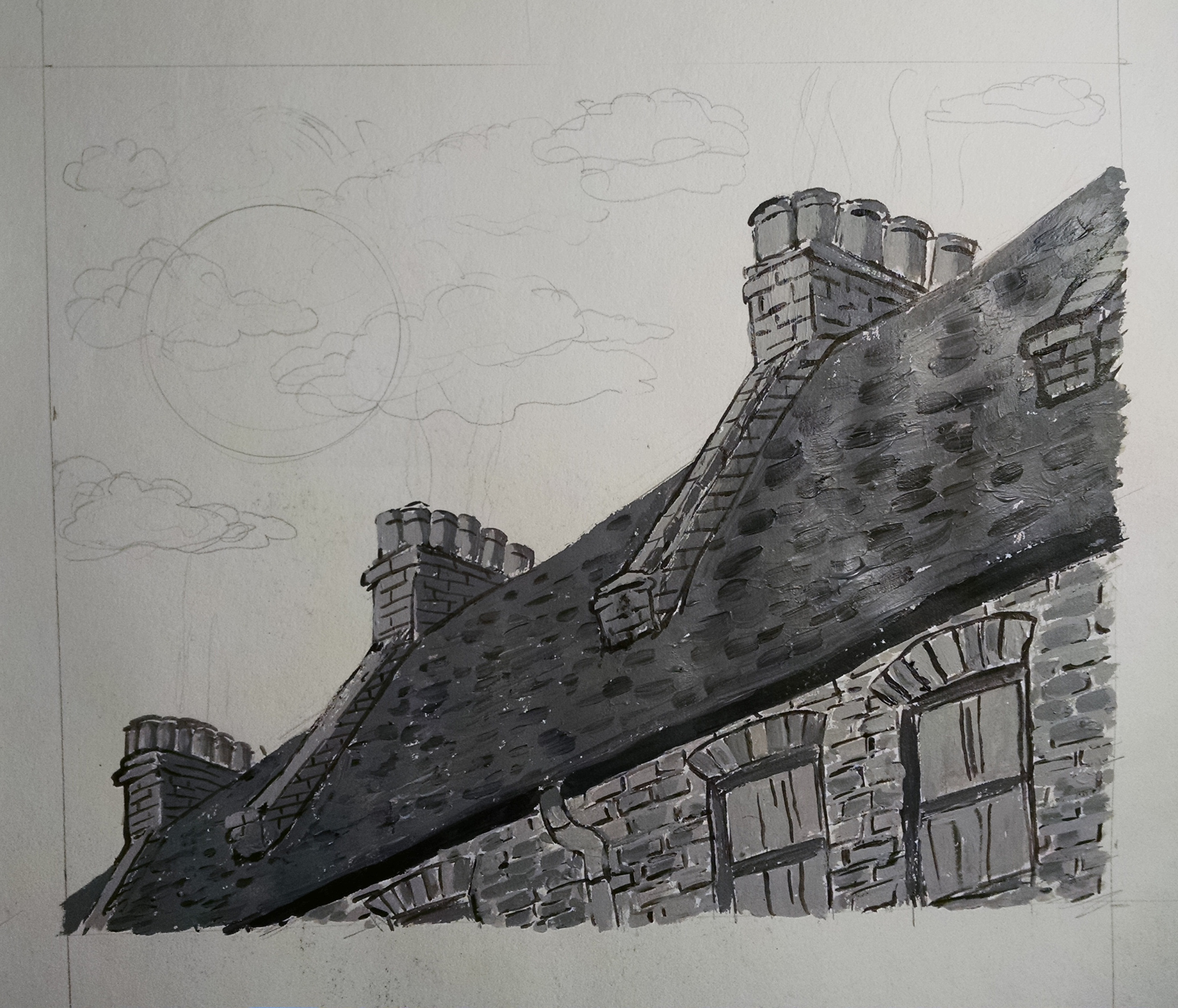

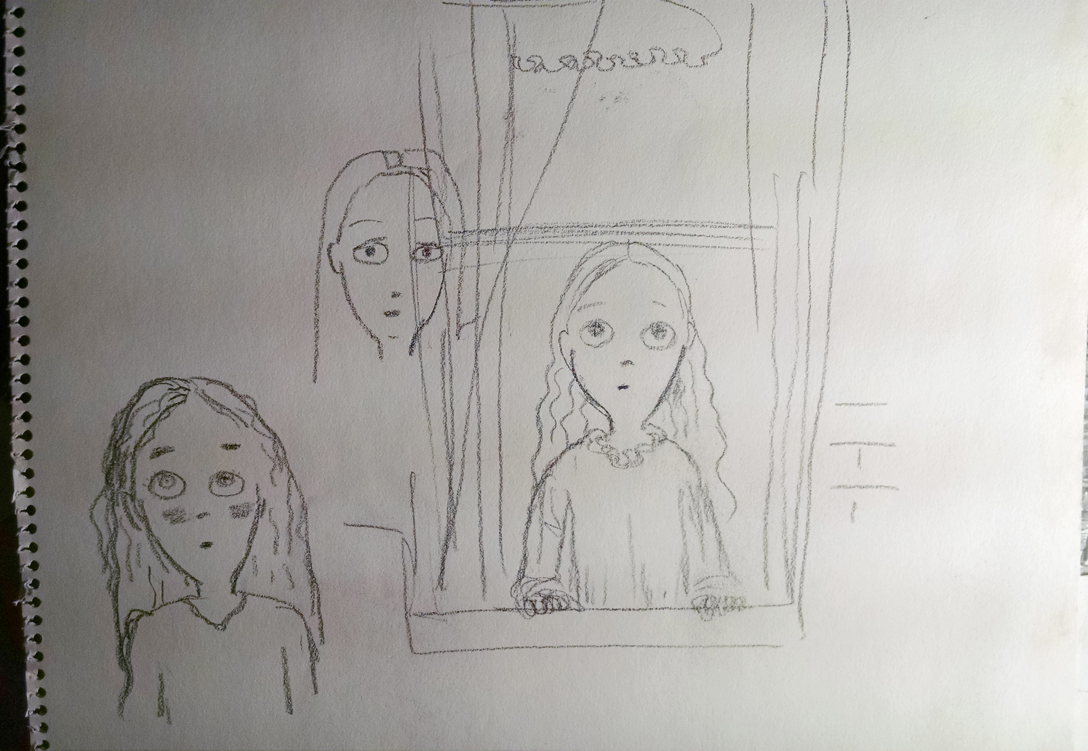
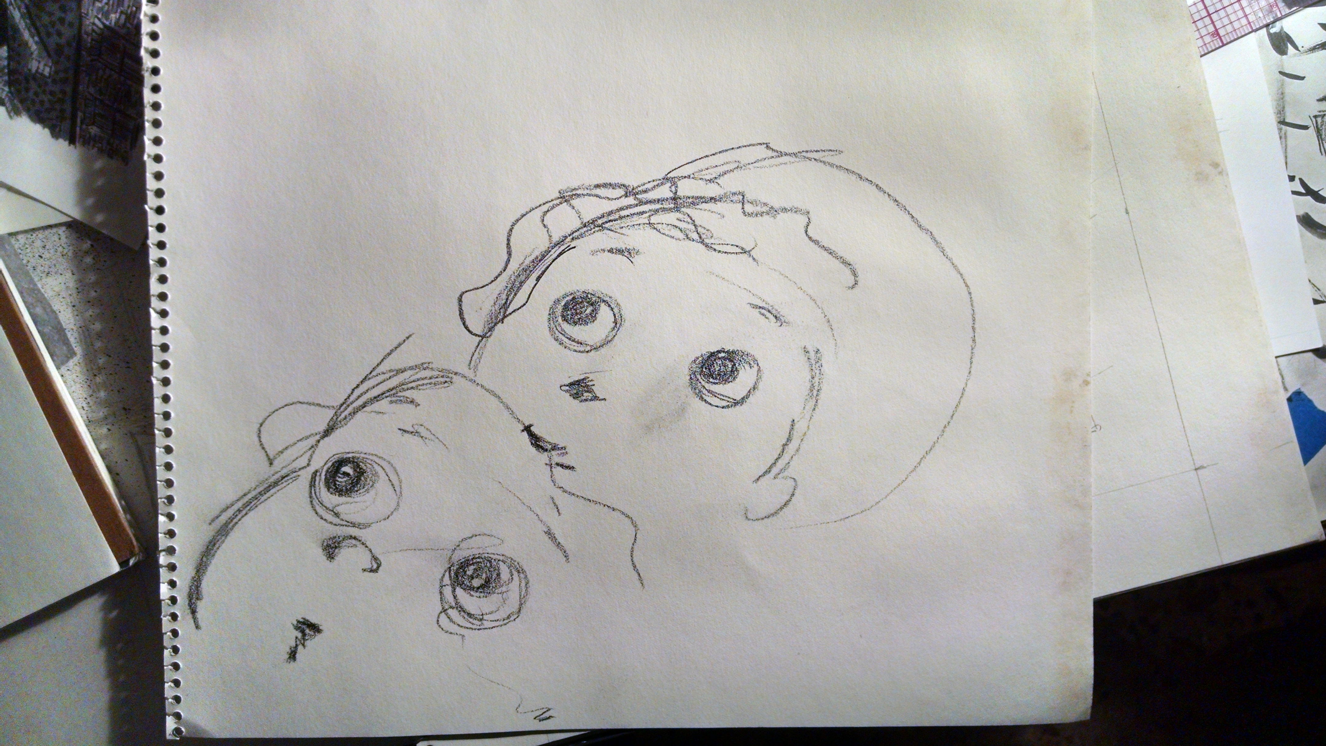
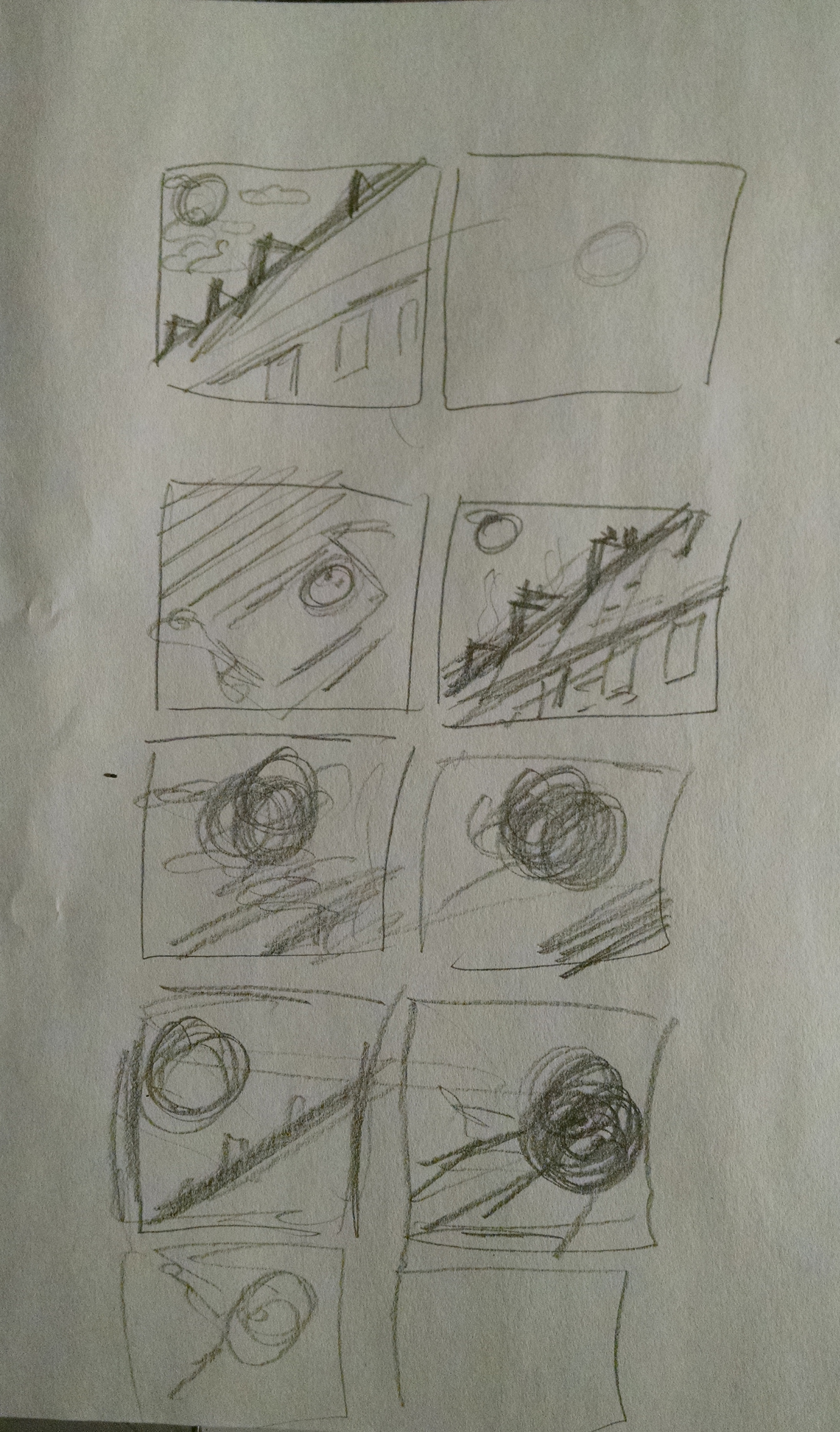
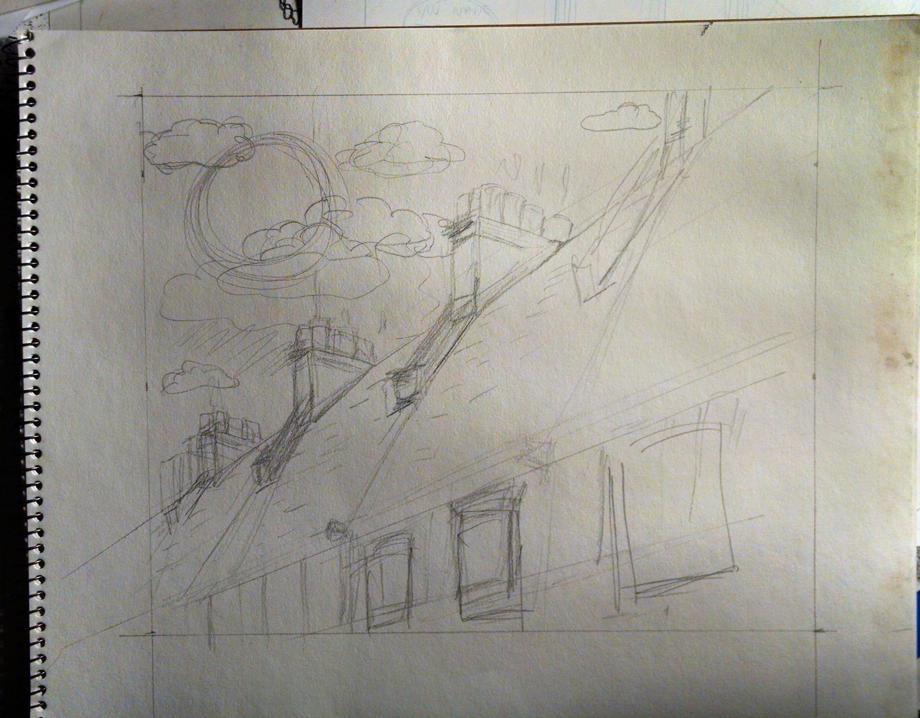
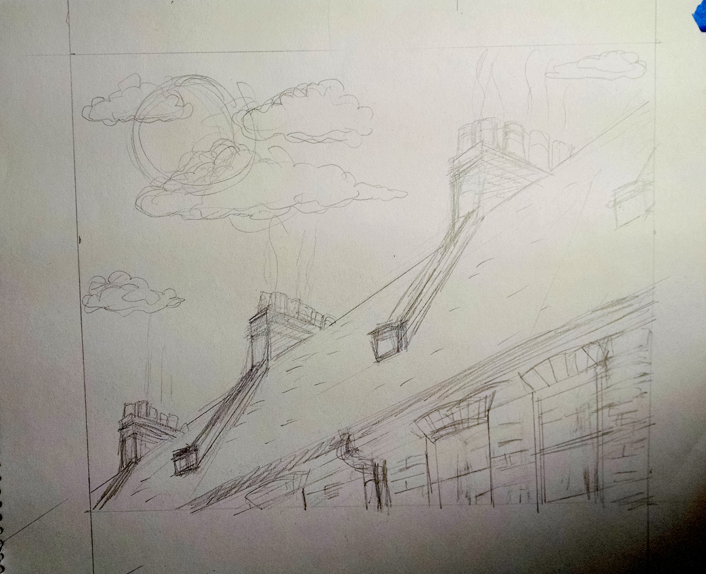
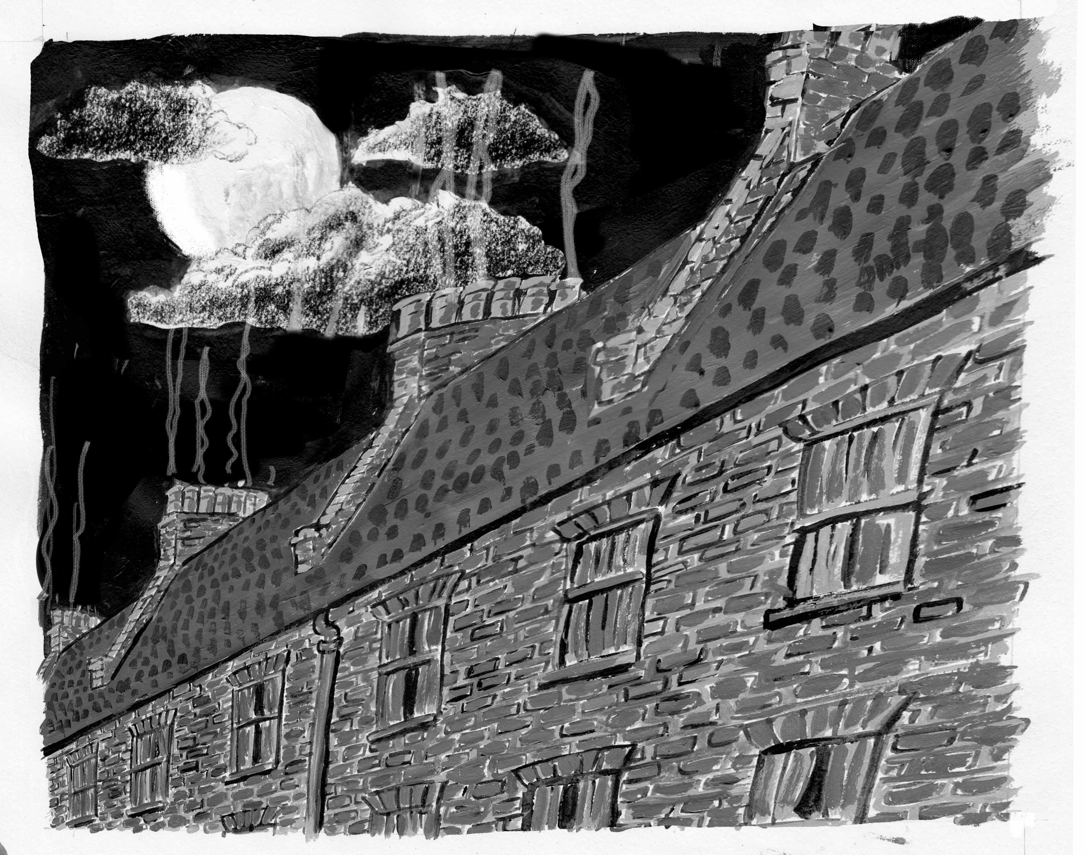


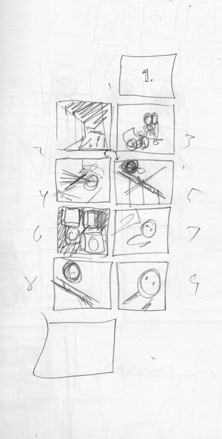

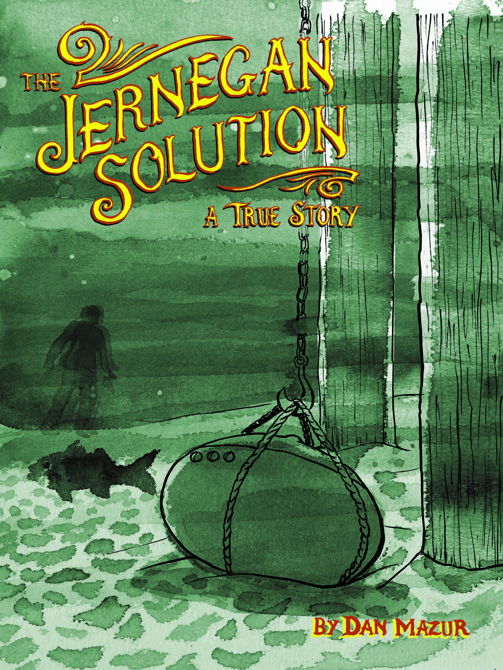

 The to-read pile looms – graphic novels, anthologies, mini-comics, floppies, journals  — there’s a couch under it somewhere, if I remember correctly.  I must climb this mountain one comic at a time…
Last month, I read comics by Marnie Galloway, Adrian Tomine, Heide Solbrig, Ben Doane/Olivia Li/ Jamie Koh, Catalina Rufin, M.R. Trower, Kelly Froh and Max Clotfelter, Max de Radigues, Keiler Roberts, and the Kimball Anderson-edited anthology “Inaction Comics.”
The to-read pile looms – graphic novels, anthologies, mini-comics, floppies, journals  — there’s a couch under it somewhere, if I remember correctly.  I must climb this mountain one comic at a time…
Last month, I read comics by Marnie Galloway, Adrian Tomine, Heide Solbrig, Ben Doane/Olivia Li/ Jamie Koh, Catalina Rufin, M.R. Trower, Kelly Froh and Max Clotfelter, Max de Radigues, Keiler Roberts, and the Kimball Anderson-edited anthology “Inaction Comics.”
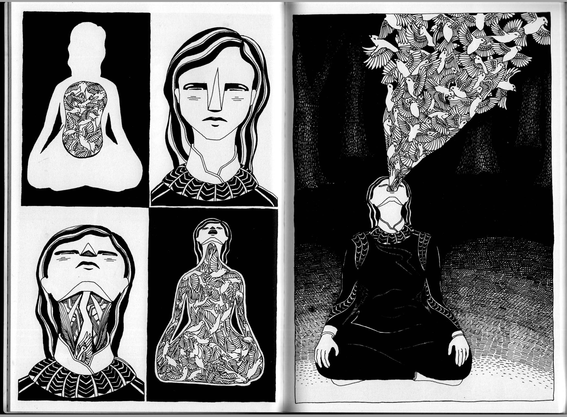
 REM Pt.1 by M.R. Trower. A coming-of-age, misfit-finds-others-like-self-themed dystopia sci-fi mini. The story works and nice black and white page designs with a decorative bent.

 Creativity and productivity are themes that run through it all. She has an excellent sense of timing and dry storytelling (quite reminiscent of Gabrielle Bell, whom Roberts rivals for humor and perceptiveness, though Roberts’ drawing is cruder). A very affecting book.
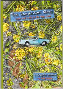 The long-awaited debut graphic novel by my friend Heide Solbrig, and it does not disappoint. It’s the first chapters of what will be a serialized, trans-media project, combining illustrated text, collage elements and traditional comics, along with a companion app that includes supplementary video footage and other snazzies. All well and good, but it’s the content of the book that really grabbed me: combining the personal and political, it’s a memoir of growing up with divorce and cross-continental relocations in early 70s California and Boston, that also delves into the quite interesting lives of her illustrious and international grandparents. That might be enough, but add in Heide’s broad and highly analytical perspective on cultural trends and shifts in the period that went from 60s radicalism to 70s self-help movements to 80s Reaganism — en passant par sociobiology, Jesus Freaks and Hobbes-ian/Locke-ian philosophies — that make this an especially engrossing and resonant read.
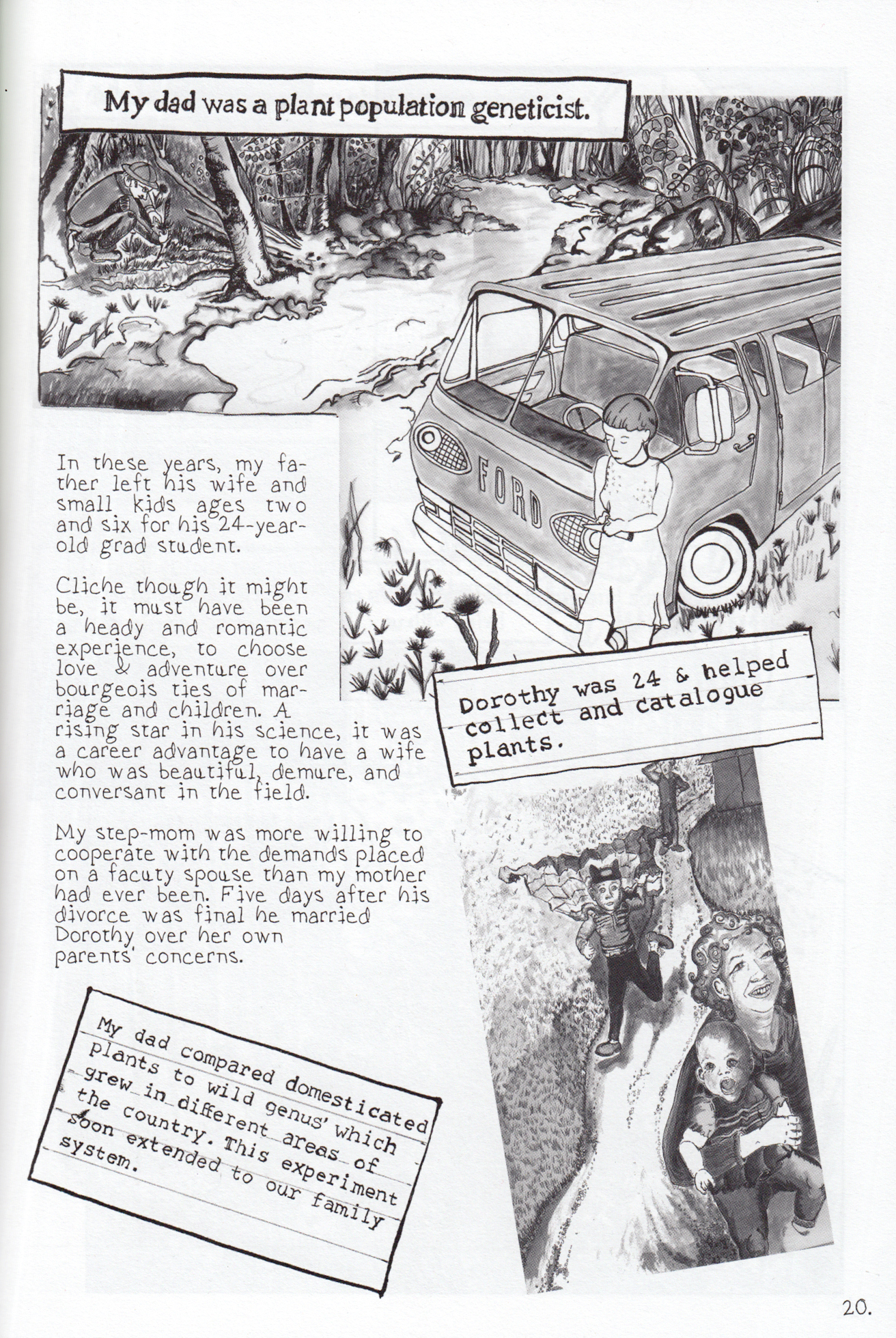 Good Morning Gorgon. Â Ben Doane, story and layouts; Olivia Li, drawing; Jamie Koh, tones. Â
Good Morning Gorgon.  Ben Doane, story and layouts; Olivia Li, drawing; Jamie Koh, tones.   Okay, I didn’t read this in June, probably more like March, but I neglected to list it earlier, so here it is. Ben Doane’s comics have a  dreamy, loopy stream-of-conciousness charm. Good Morning Gorgon may be his most sustained effort that I’ve read, but that charm has not been sacrificed, with Olivia Li’s fluid juicy brushwork and lettering making the ride a visually smooth one. The Gorgon’s snakes are like mischievous, squabbling children. This turns a simple task like grocery shopping into a slapstick adventure, with a bickering brood slithering from her head, and the ever-present danger of turning her fellow shoppers to stone — and as for shampooing, you can imagine! Off-the-wall and loveable.
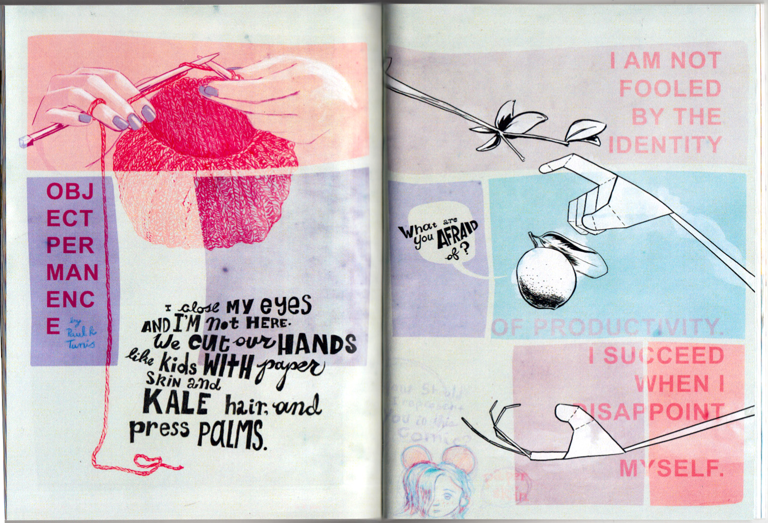
 The long-awaited debut graphic novel by my friend Heide Solbrig, and it does not disappoint. It’s the first chapters of what will be a serialized, trans-media project, combining illustrated text, collage elements and traditional comics, along with a companion app that includes supplementary video footage and other snazzies. All well and good, but it’s the content of the book that really grabbed me: combining the personal and political, it’s a memoir of growing up with divorce and cross-continental relocations in early 70s California and Boston, that also delves into the quite interesting lives of her illustrious and international grandparents. That might be enough, but add in Heide’s broad and highly analytical perspective on cultural trends and shifts in the period that went from 60s radicalism to 70s self-help movements to 80s Reaganism — en passant par sociobiology, Jesus Freaks and Hobbes-ian/Locke-ian philosophies — that make this an especially engrossing and resonant read.
 Okay, I didn’t read this in June, probably more like March, but I neglected to list it earlier, so here it is. Ben Doane’s comics have a  dreamy, loopy stream-of-conciousness charm. Good Morning Gorgon may be his most sustained effort that I’ve read, but that charm has not been sacrificed, with Olivia Li’s fluid juicy brushwork and lettering making the ride a visually smooth one. The Gorgon’s snakes are like mischievous, squabbling children. This turns a simple task like grocery shopping into a slapstick adventure, with a bickering brood slithering from her head, and the ever-present danger of turning her fellow shoppers to stone — and as for shampooing, you can imagine! Off-the-wall and loveable.
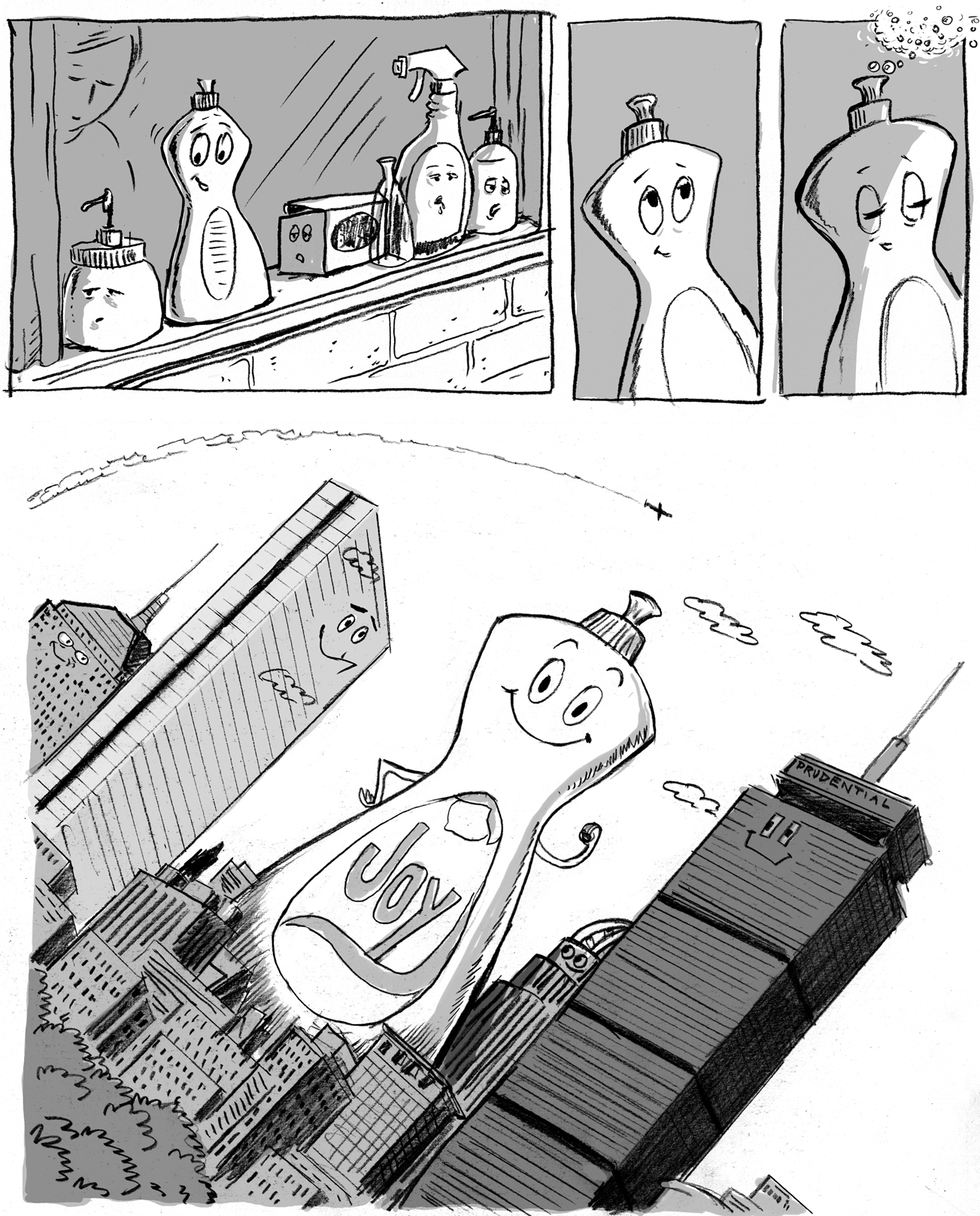 My entry in the upcoming Boston Comics Roundtable urban-fantasy-in-Boston anthology SPELLBOUND (available for preorder now). The book will debut at Boston Comic Con.
 Whitey at Optical Sloth nimbly dances around the looming spoilers in The Jernegan Solution, concluding that:
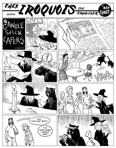
 Transfatal Express by Nik James.  Even in the universe of alt-indie comics, this is a very eccentric book.  It’s done as a series of 1930s style “Sundays,” full pages, telling a pulpy tale of gangsters and molls, cursed jewels, hard-boiled cops, and … whatever.  What makes this so cool and weird is the way James stays true to the spirit of his main model (Roy Crane, as he helpfully points out in a clever “wanted poster” extra), while not slavishly copying a graphic style… the black and white art evokes Crane and other 30s strip artists — but also Ditko — and the “hero” of the comic, Jack Iroquois the smuggler, looks more like he wandered in out of a Leiji Matsumoto western.  Anyway, the whole thing is strange, fun and beautiful to look at.
Future Ghost by Aaron Whitaker.  A 36 page mini from 2009; I don’t know how it ended up in my pile, being out of print, but glad it did.  A sad and funny story, very cleverly structured, about a young woman who house-sits a home with a ghostly presence. The way this comic works is very “medium-specific,” in its handling of time, of an invisible, inauduble character, and simultaneous dialogue.  Read it (if you can find a copy — its sold out, but i’ll lend you mine if you promise to give it back) and try to imagine it in cinematic or prose terms — wouldn’t work anywhere near the same.  The artist had some thoughts on this matter as well.
Transfatal Express by Nik James.  Even in the universe of alt-indie comics, this is a very eccentric book.  It’s done as a series of 1930s style “Sundays,” full pages, telling a pulpy tale of gangsters and molls, cursed jewels, hard-boiled cops, and … whatever.  What makes this so cool and weird is the way James stays true to the spirit of his main model (Roy Crane, as he helpfully points out in a clever “wanted poster” extra), while not slavishly copying a graphic style… the black and white art evokes Crane and other 30s strip artists — but also Ditko — and the “hero” of the comic, Jack Iroquois the smuggler, looks more like he wandered in out of a Leiji Matsumoto western.  Anyway, the whole thing is strange, fun and beautiful to look at.
Future Ghost by Aaron Whitaker.  A 36 page mini from 2009; I don’t know how it ended up in my pile, being out of print, but glad it did.  A sad and funny story, very cleverly structured, about a young woman who house-sits a home with a ghostly presence. The way this comic works is very “medium-specific,” in its handling of time, of an invisible, inauduble character, and simultaneous dialogue.  Read it (if you can find a copy — its sold out, but i’ll lend you mine if you promise to give it back) and try to imagine it in cinematic or prose terms — wouldn’t work anywhere near the same.  The artist had some thoughts on this matter as well.
 Hotblood! by Toril Orlesky. A pick-up from MICE 2014 (yes, that’s how behind I am in my reading), and a nice surprise. A western set in a slightly alternate reality in which centaurs and humans live side-by-side. This is a print version of a webcomic, and not being much in that world I don’t know how widely read it is. But as a book it’s quite good. The drawing has a loose rendering style but solid underpinnings, and Orlesky’s feel for the genre, characters and dialogue seems strong as well. She also lays out a well-conceived fantasy world, describing the culture and geographic distribution of the centaur minority.
Diamond Shifting by Murray Huber III. A short first chapter of a science fiction story. Disaffected youth of the future, hanging around in the ruins of a 20th century city for laughs, then heading back to the gleaming towers far above. I really like the super-fine line drawing and unusual color sense; no clue where the story is headed, but it has a nice sci-fi slice-of-life feel. Acquired at MECAF 2015, where it made its debut.
Hotblood! by Toril Orlesky. A pick-up from MICE 2014 (yes, that’s how behind I am in my reading), and a nice surprise. A western set in a slightly alternate reality in which centaurs and humans live side-by-side. This is a print version of a webcomic, and not being much in that world I don’t know how widely read it is. But as a book it’s quite good. The drawing has a loose rendering style but solid underpinnings, and Orlesky’s feel for the genre, characters and dialogue seems strong as well. She also lays out a well-conceived fantasy world, describing the culture and geographic distribution of the centaur minority.
Diamond Shifting by Murray Huber III. A short first chapter of a science fiction story. Disaffected youth of the future, hanging around in the ruins of a 20th century city for laughs, then heading back to the gleaming towers far above. I really like the super-fine line drawing and unusual color sense; no clue where the story is headed, but it has a nice sci-fi slice-of-life feel. Acquired at MECAF 2015, where it made its debut.


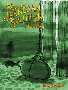