My current comic, “The Jernegan Solution” is a true historical story set in 1898 in Lubec, Maine, the eastern-most town in the United States. I’ve only been able to visit Lubec once, so I have otherwise worked from historical photos for location reference, as well as for period props. Some examples are below. The comic will be ready for MECAF in Portland, on May 17th.
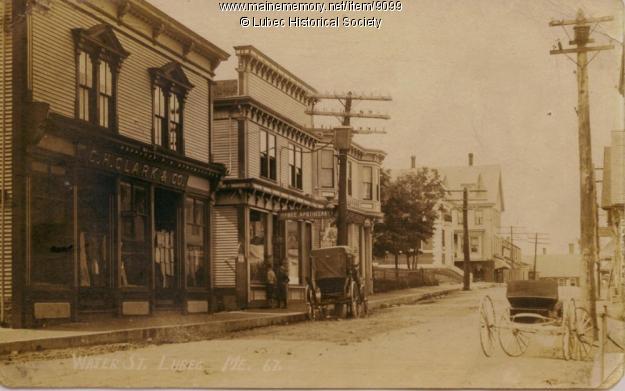
WATER STREET, LUBEC
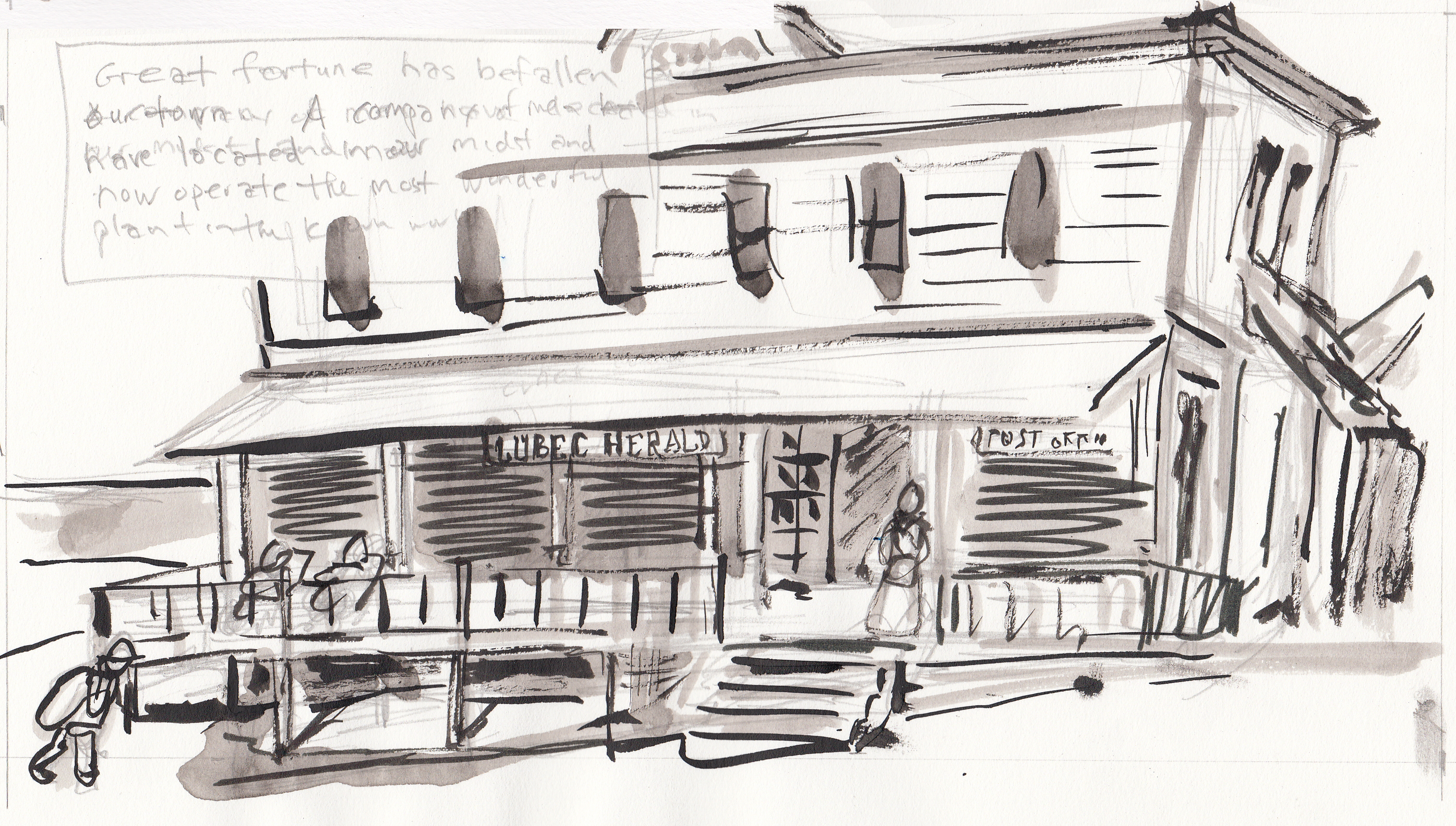
The main commercial street of the town:
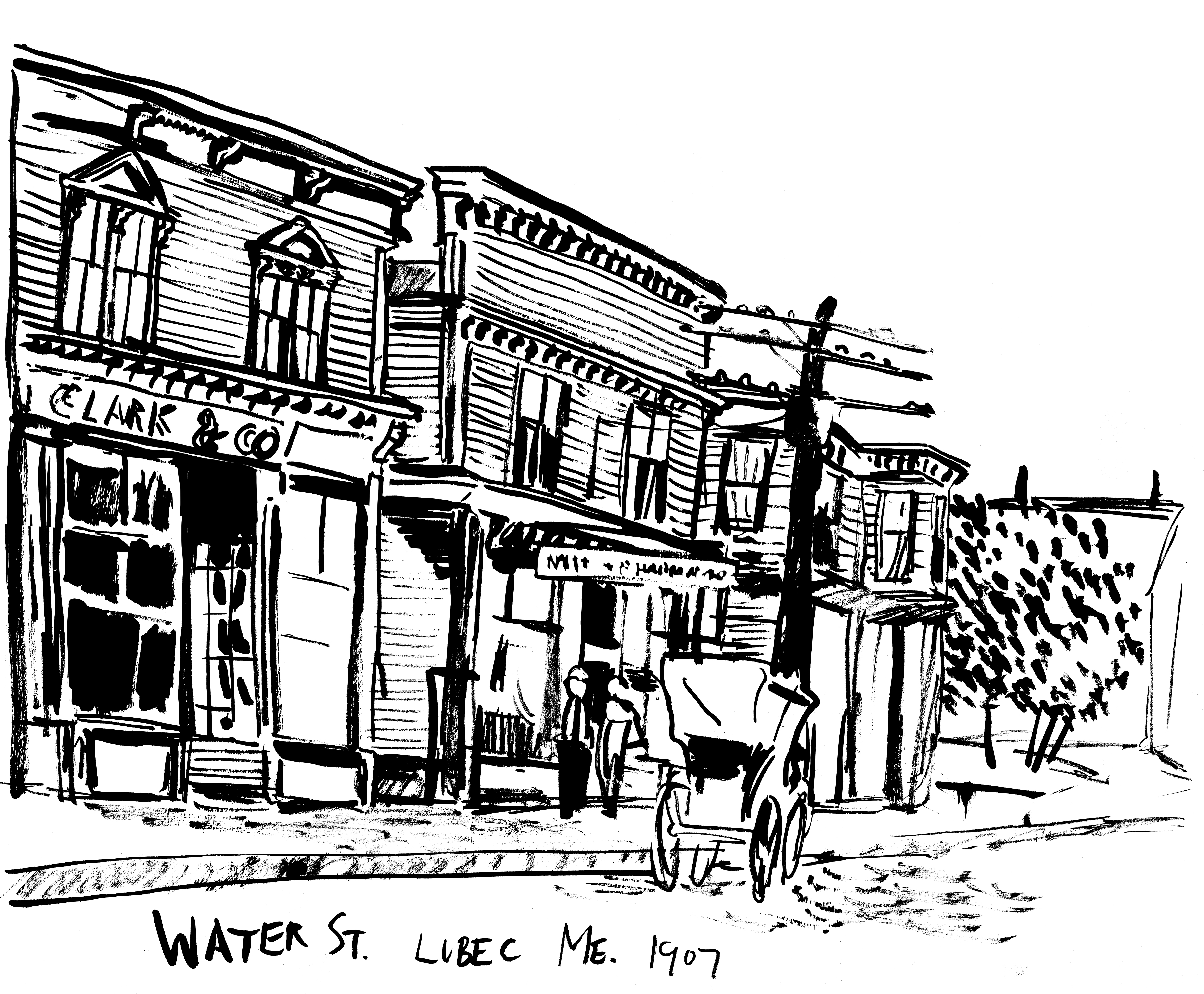
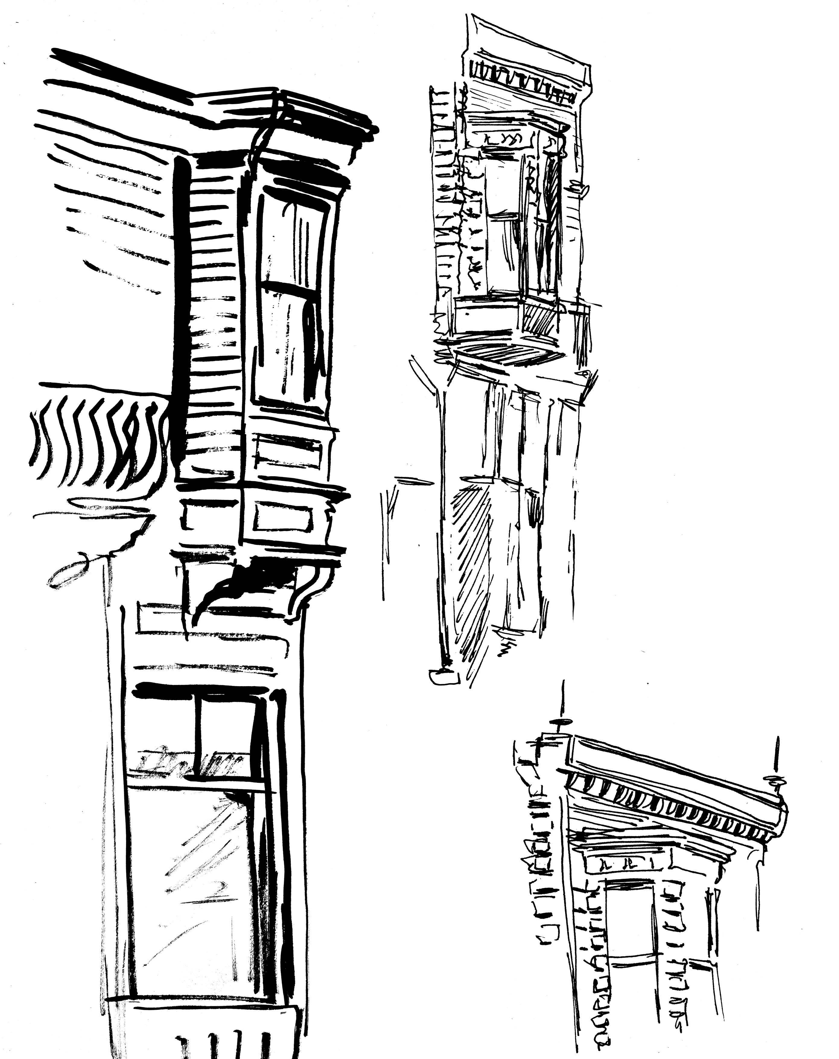
My sketch of it, and some architectural details:
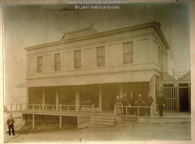
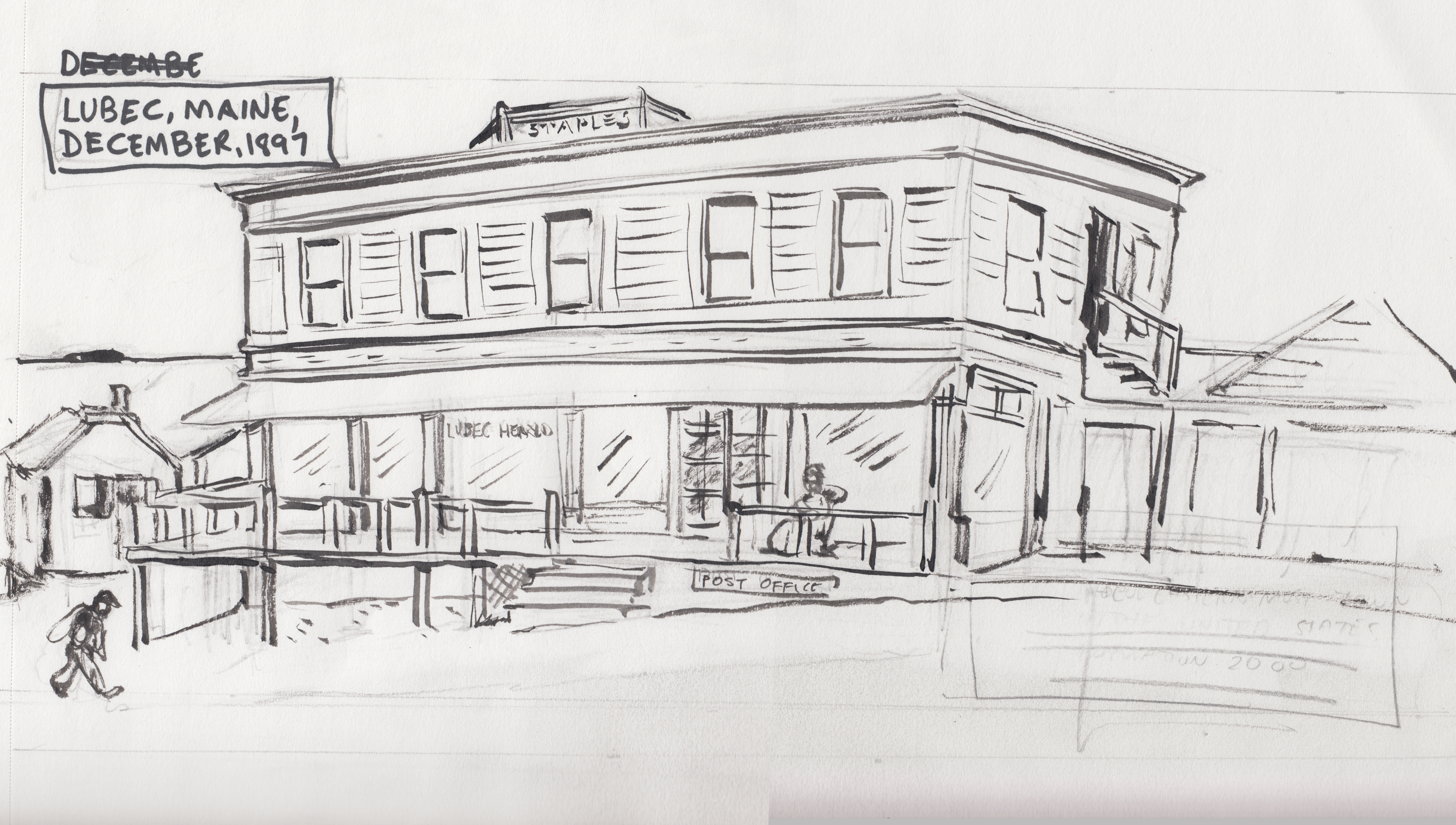
THE STAPLES BUILDING
AÂ new office building at the time, home of the Lubec Herald newspaper office, where my journalist character works. It was located on Water Street.
The first “adjustment” I made from the photo was to have painted “Lubec Herald” letters on the window, instead of the sign leaning against the baseboard. Â I assume that sign was later put over the door, anyway :
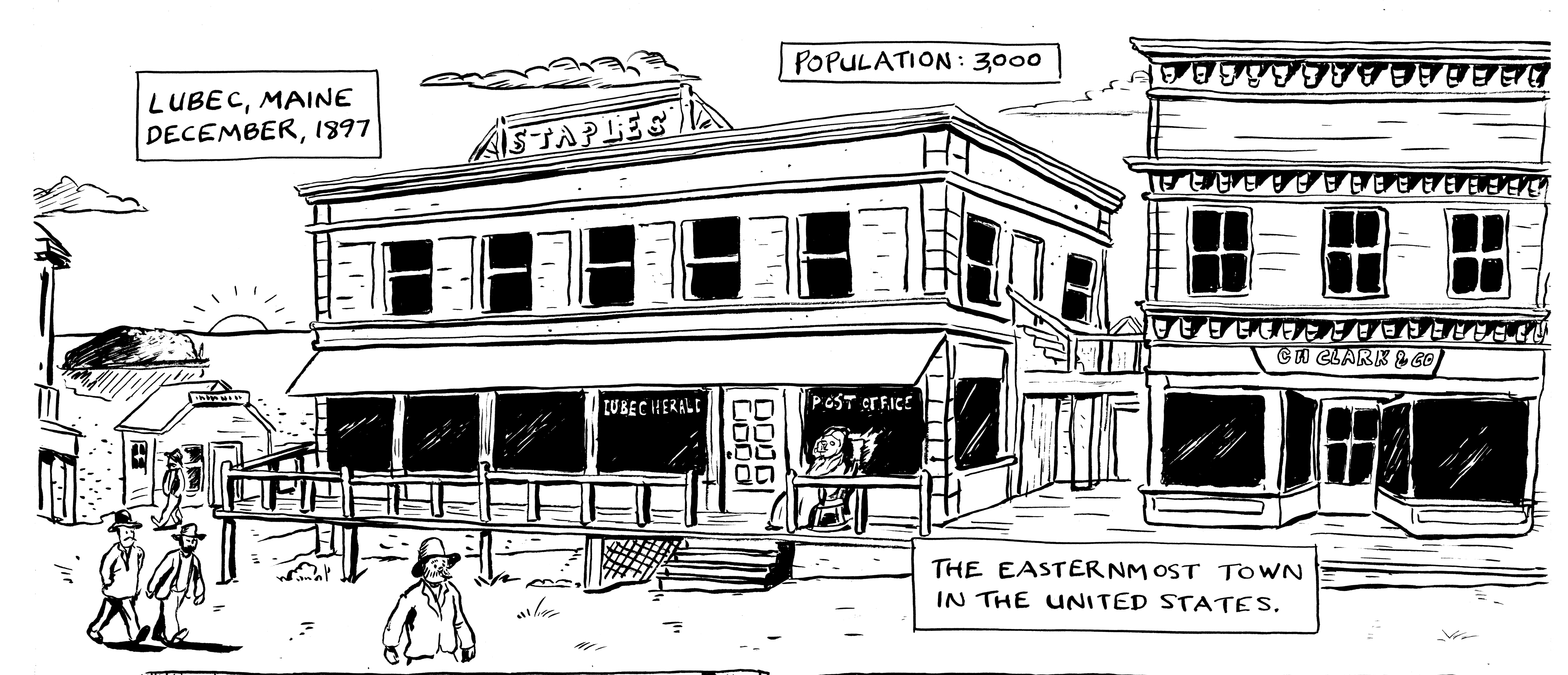
Here’s how it looks in the final inks. I also added in another, more “picturesque” building to the right, based on one of the buildings in the other Water Street pictures (I think that the Staples Building was at the end of Water Street, not in the middle of the commercial district).
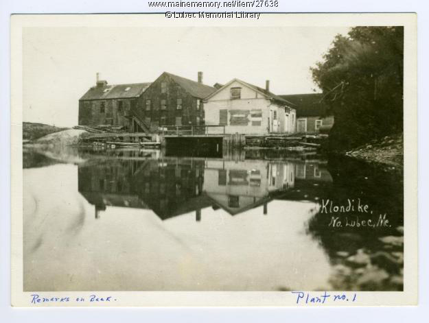
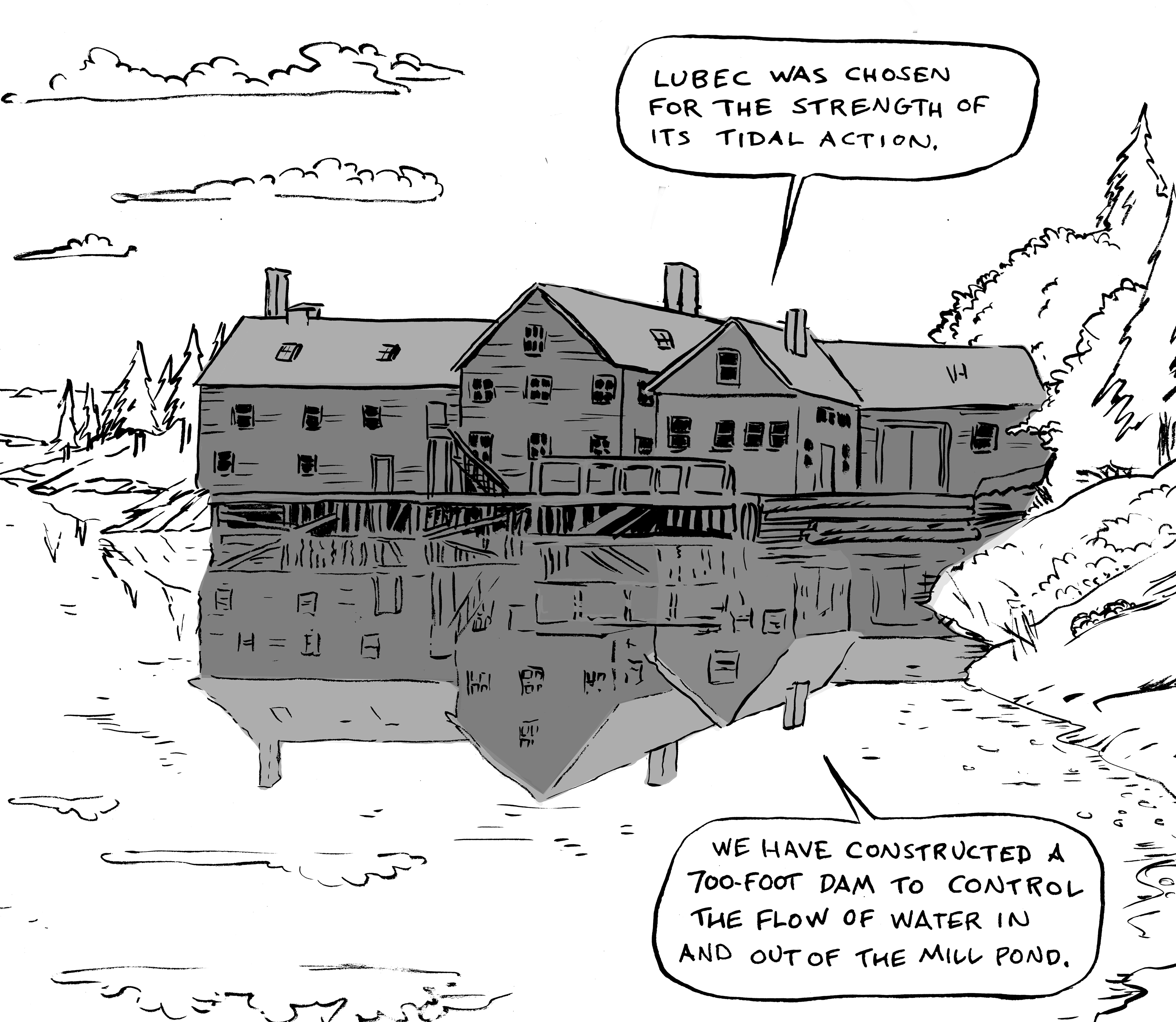
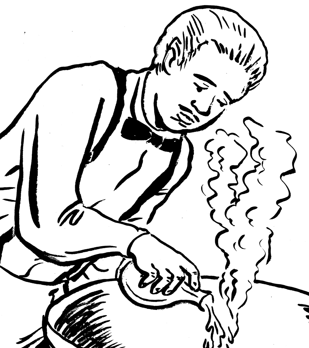
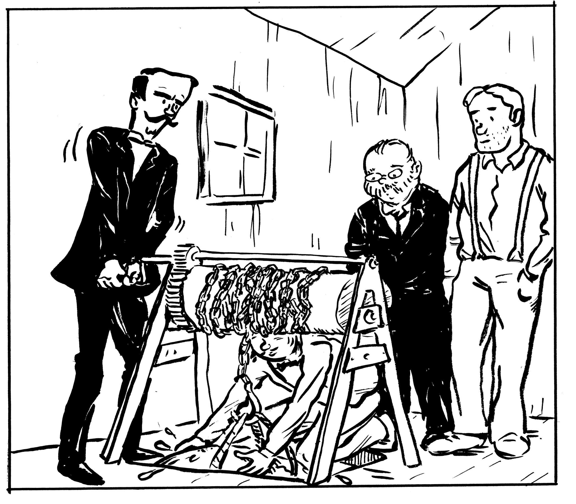
THE COMSTOCK MILL/”THE KLONDIKE PLANT”
An old grist mill, which was purchased and transformed into… well, you’ll have to read the comic to find out!
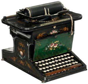
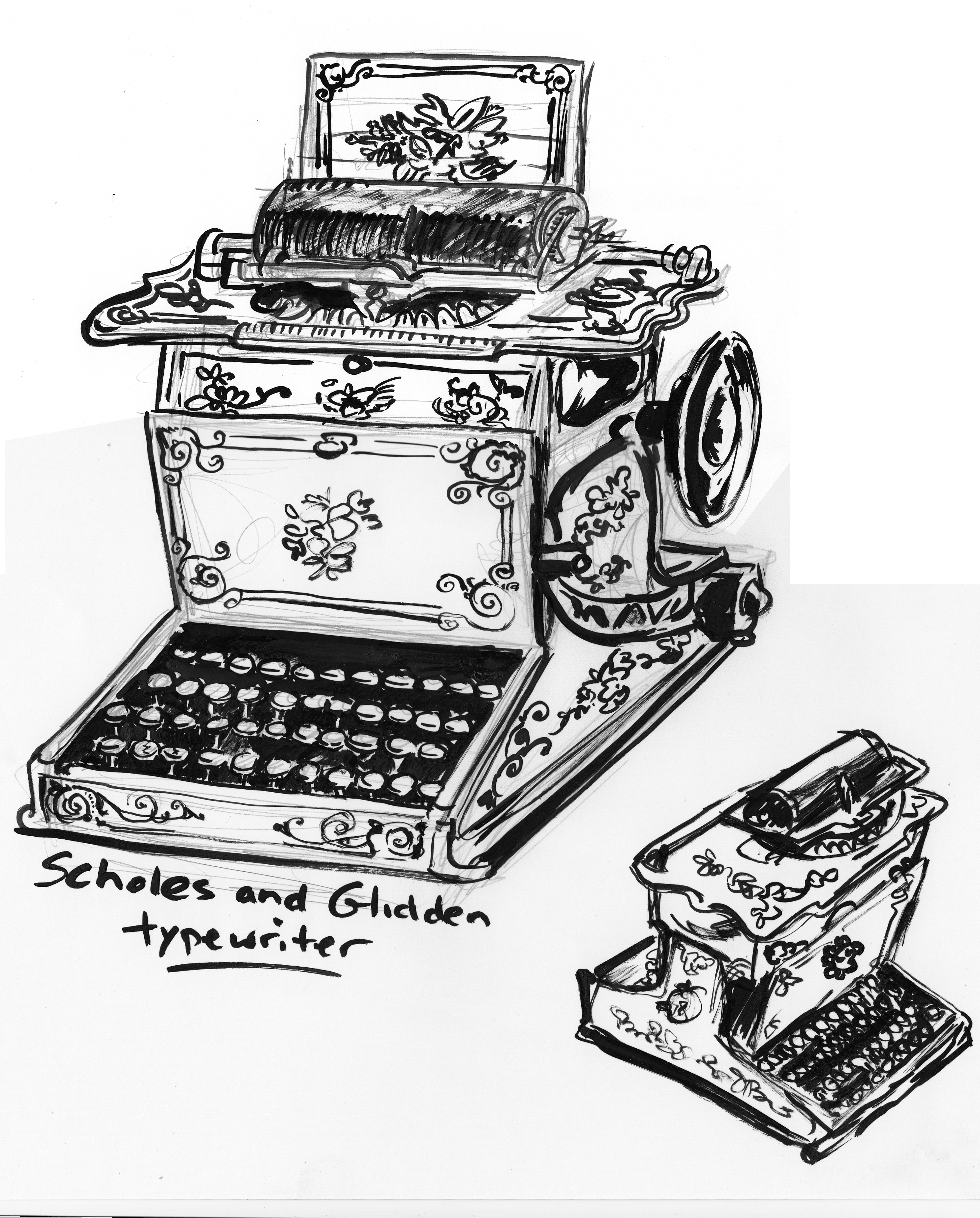
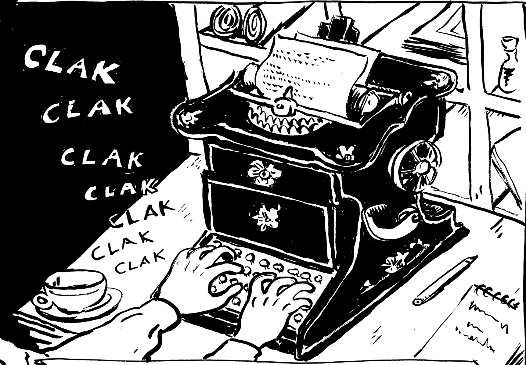
SCHOLES AND GLIDDEN TYPEWRITER
A key prop (journalist character). Â This machine was available at the time. Â Would a small-town newspaperman have been likely to have used one? Â I don’t know for sure. But I couldn’t resist using this beautiful typewriter, with the amazing painted decoration. Â I wish my PC looked like this.
In the end, though, I felt I had to simplify the decorations somewhat, to be readable at the size of the image:
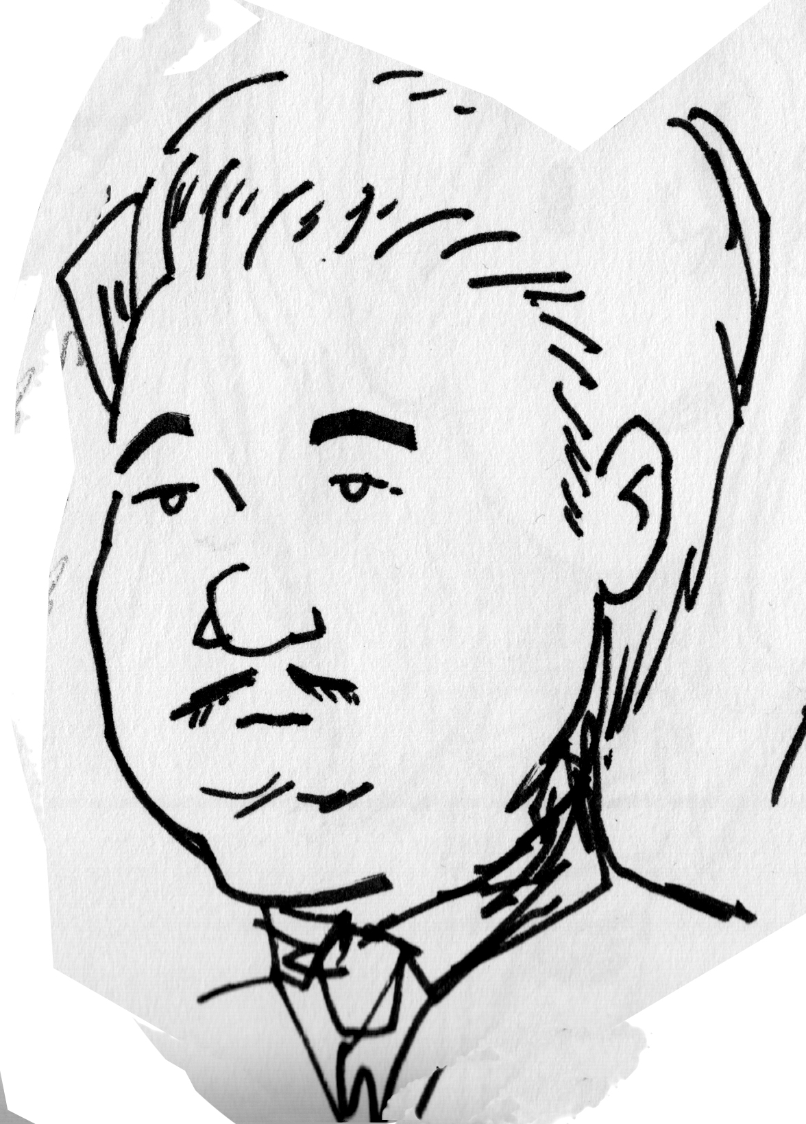
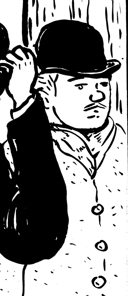
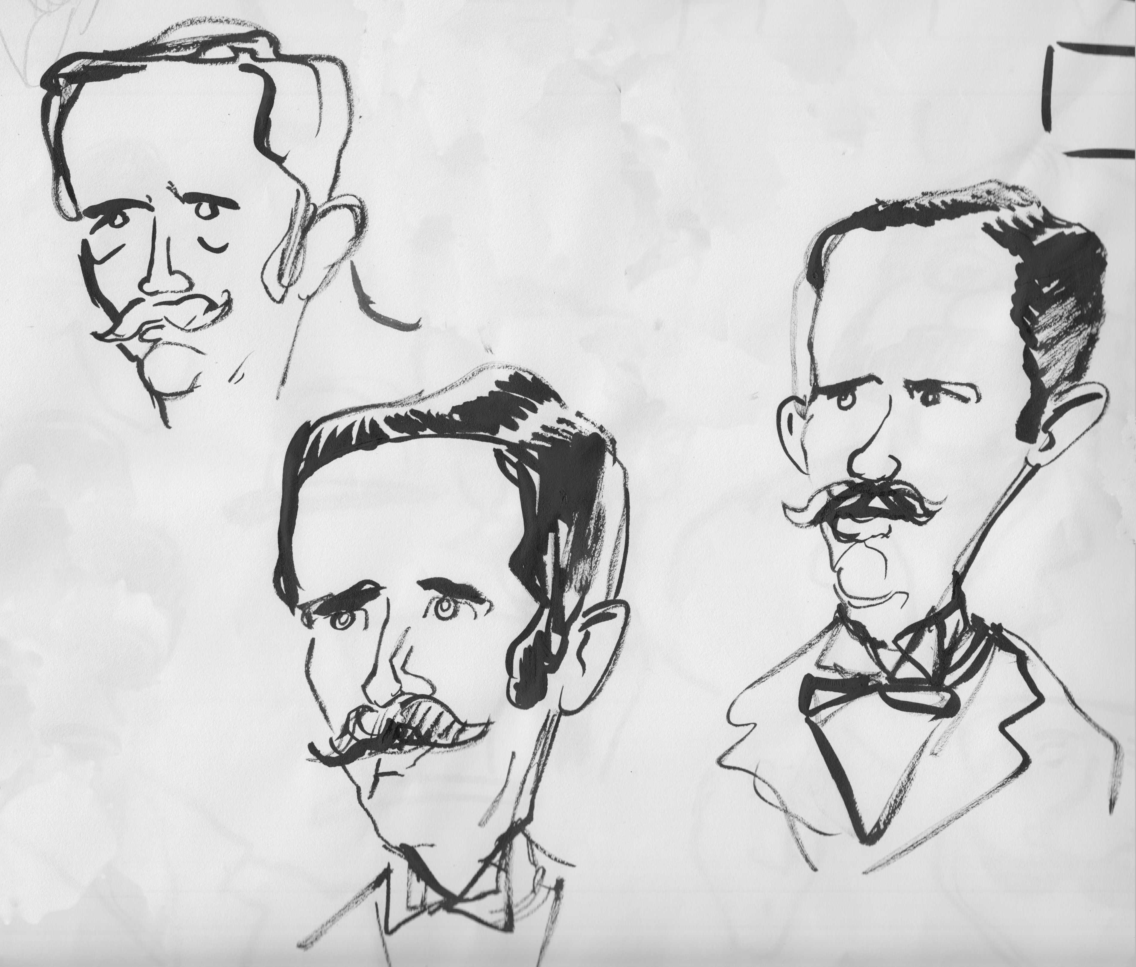
This is the only photo I could find of Charles Fisher, another principle character in the story. I liked the vain, dandy-ish look of it, which subtly fits with the character’s role in the story. Like his partne, Prescott Jernegan, he remains pretty mysterious in the historical record, and in the comic as well: he doesn’t actually say a word in the story, though he plays an important part. Here are some sketches I did. Some are stand-alone character doodles, others are taken from the rough versions of the pages, in which I was also developing the look of the characters.  In both this case and that of Jernegan, while I start from the photograph, I know that my visual development of the character is going through the prism of his role in the story, so that representing that personality in the drawing takes precedence over capturing a likeness — especially with such limited reference material.  In my drawings of Fisher, I went for a sort of “hooded” quality to the eyes, and a funny thing in the mouth — some combination of self-satisfaction and petulance that might be mistaken for humility.  I think this depiction combines what I think I see in the photo, with a pure imagining of the character based on what we know of his actions.
Â
Some images of Fisher from the finished inks:
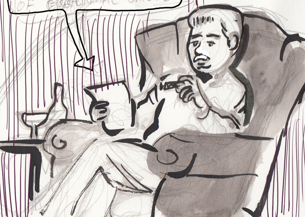
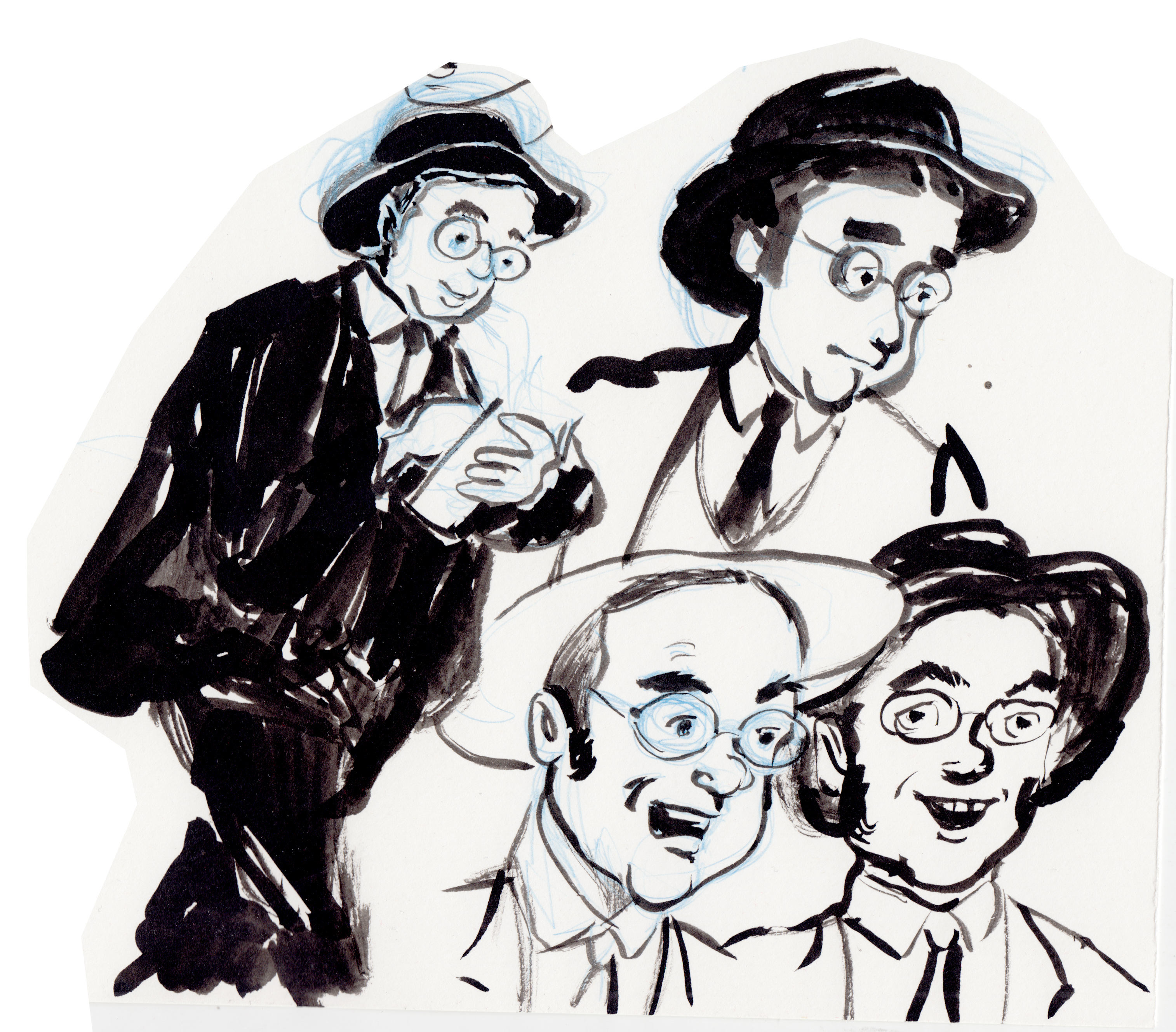
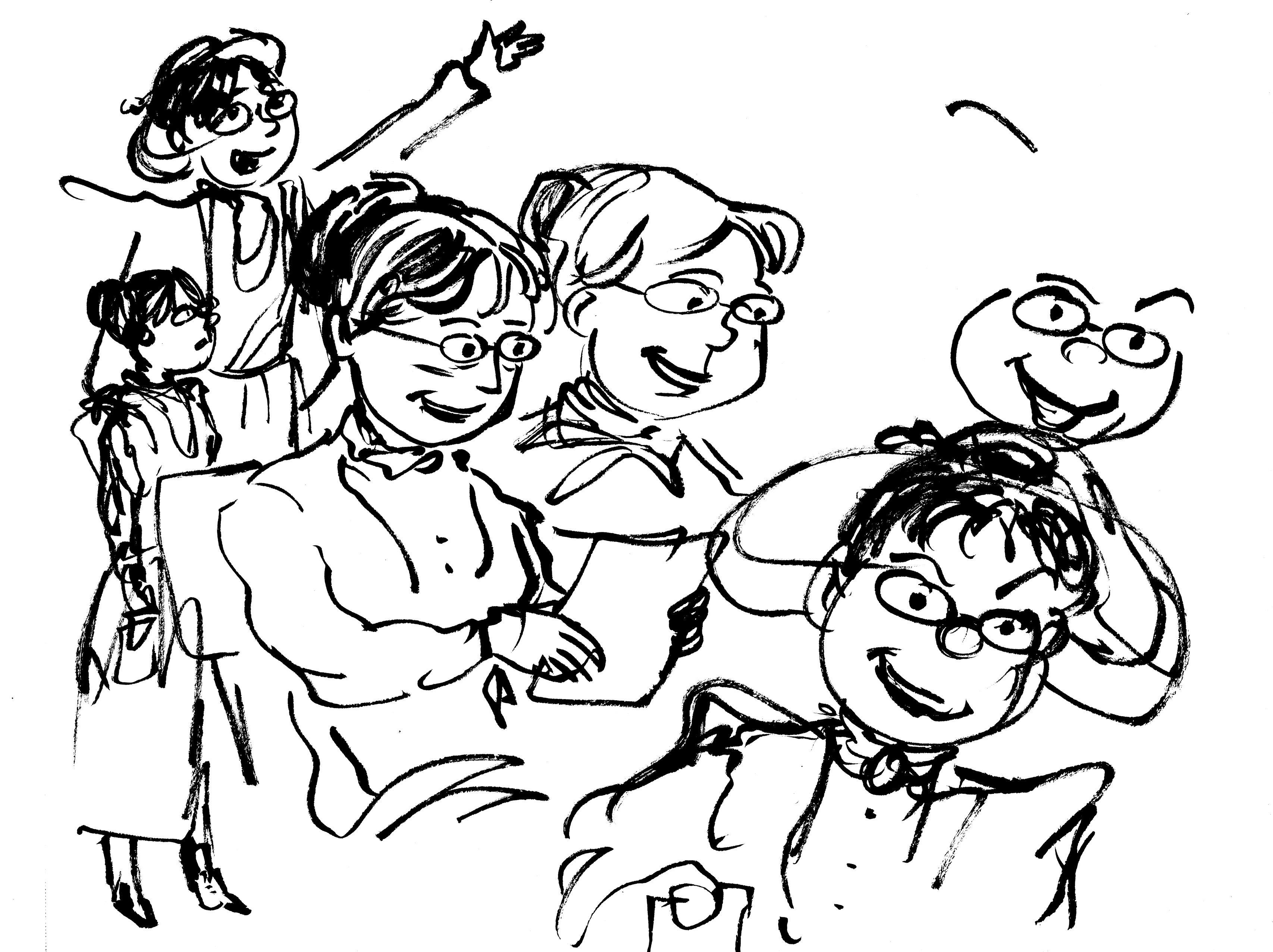
The third major character in the story is almost entirely fictionalized, the journalist Rob Getchell. The Lubec Herald in 1897-1898, from which we have most of what we know of the Jernegan story, was owned by “R. G. & F. L. Getchell Editors and Propietors.” I decided to combine them into one, and call him Rob. Â I know absolutely nothing about the real Getchells, beyond what can be gleaned from the tone of the writing in the old papers; from this I imagine a young, enthusiastic reporter, full of optimism about the modern era and its potentialities.
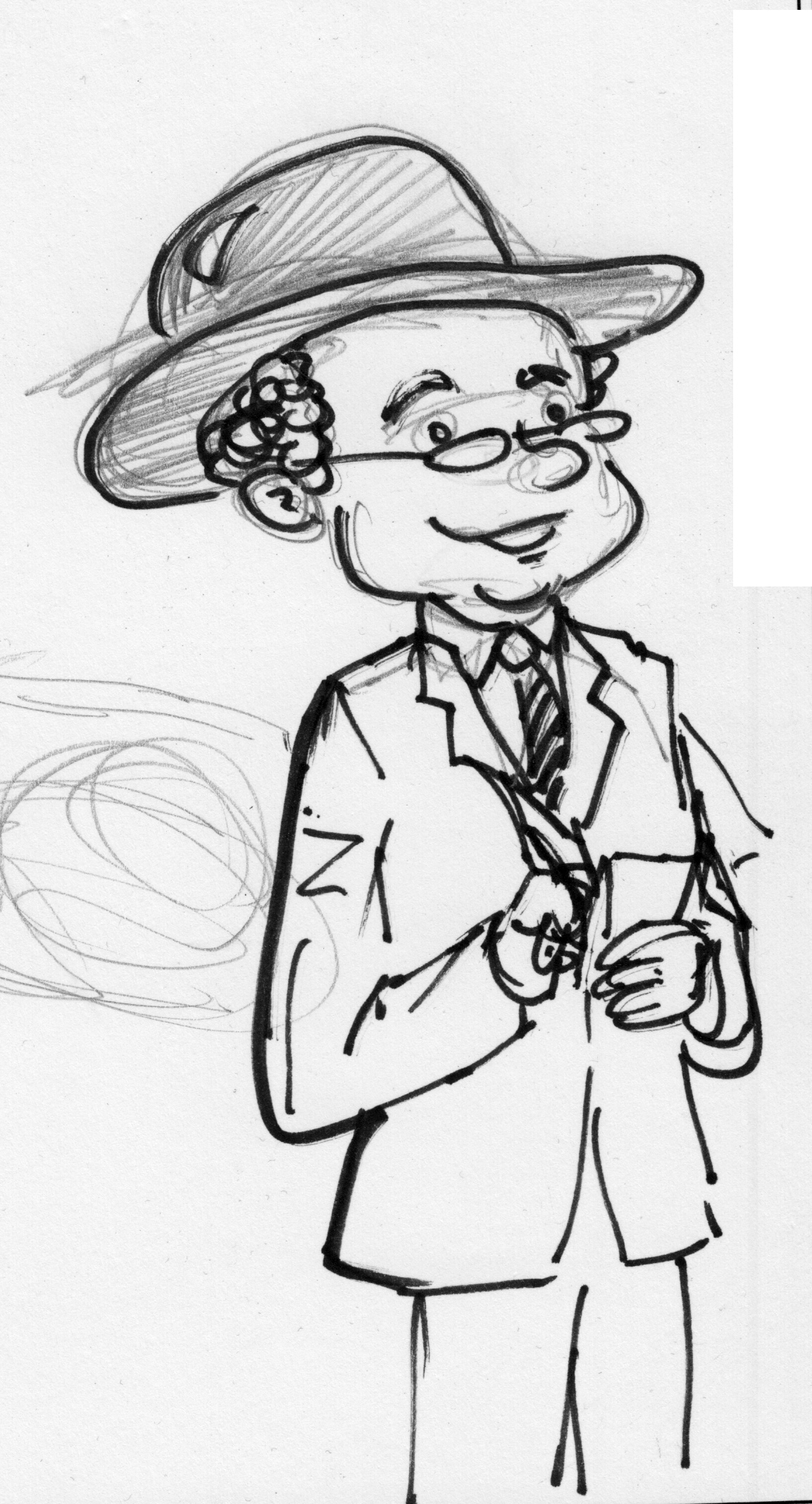
Getchell is the “stand-in” for the reader, the point-of-view character.  As such, I pushed the character in a simpler, more cartoony direction:
Then pulled back on the goofiness a bit:
At one point, since this story is low on female characters, I considered changing Getchell’s gender. There were female reporters in those days, though it was rare.
I decided not to in the end; the character turns out to be sort of a dupe, and it didn’t feel right to create a “glass-ceiling” shattering character then make a fool of her.
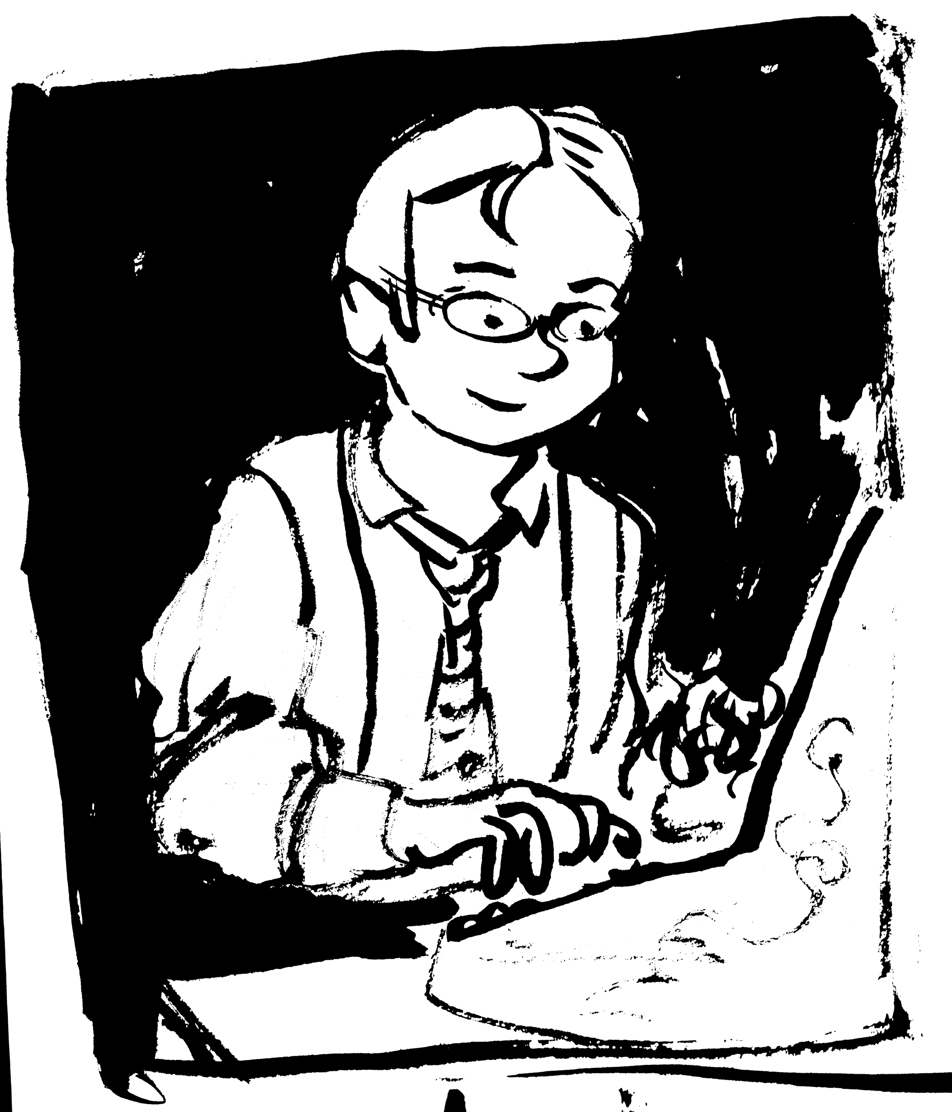
Here are some panels of Getchell from the final inks.
In terms of costume, since Getchell is a young man of the coming generation (in 1898), I thought the Panama Hat, a relatively new fashion, and round, tortoise shell glasses would be a good fit.
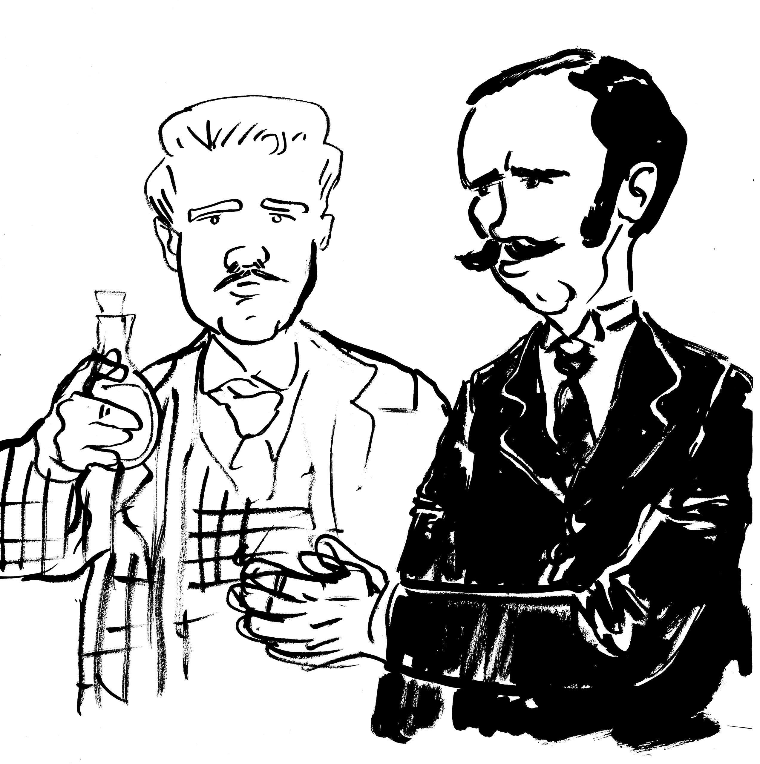
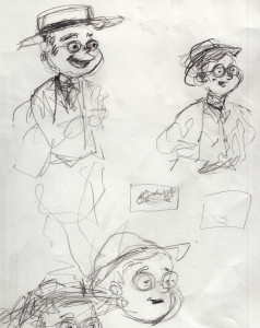
Here are some more character studies/sketches, developing some of the supporting characters:
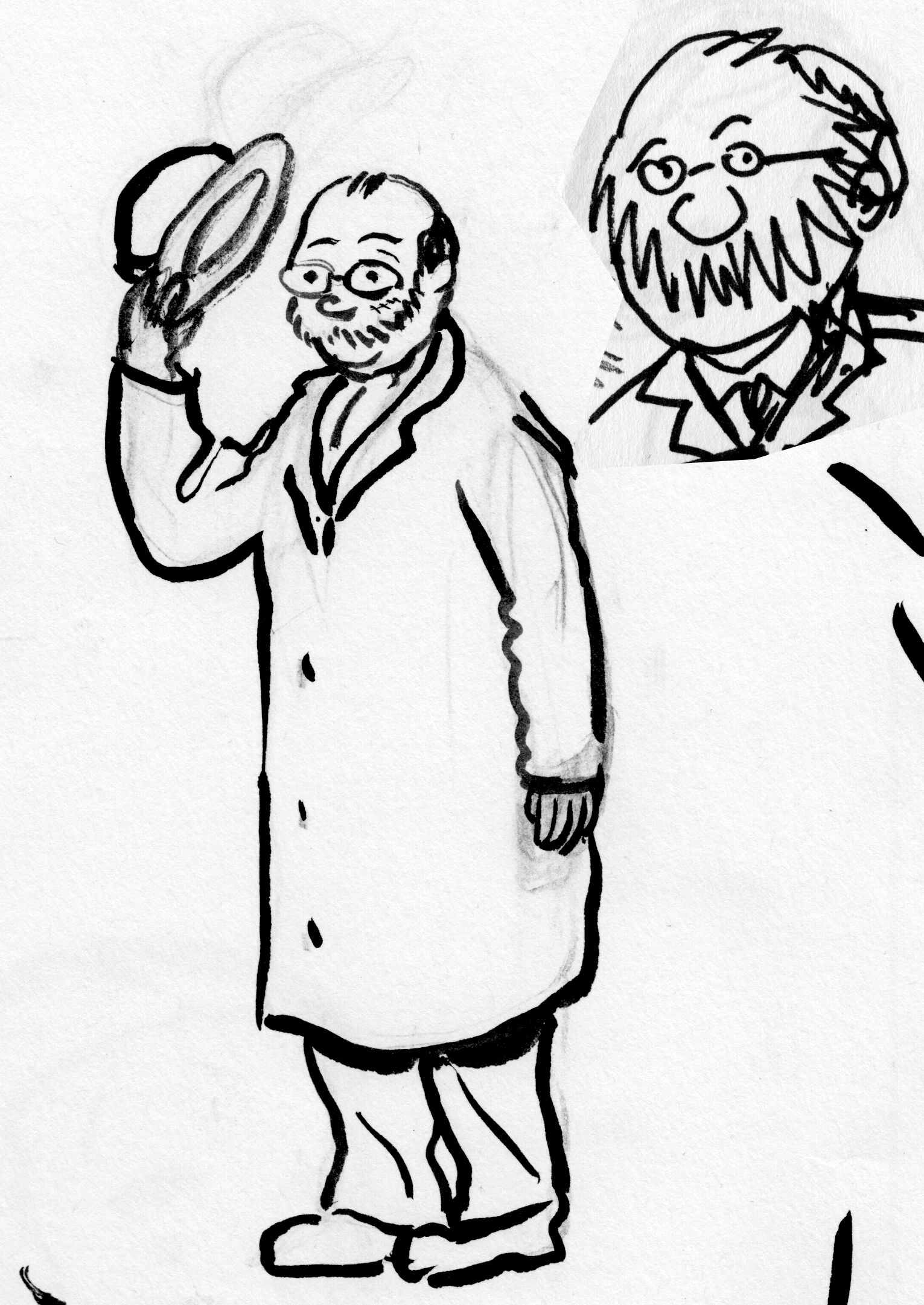
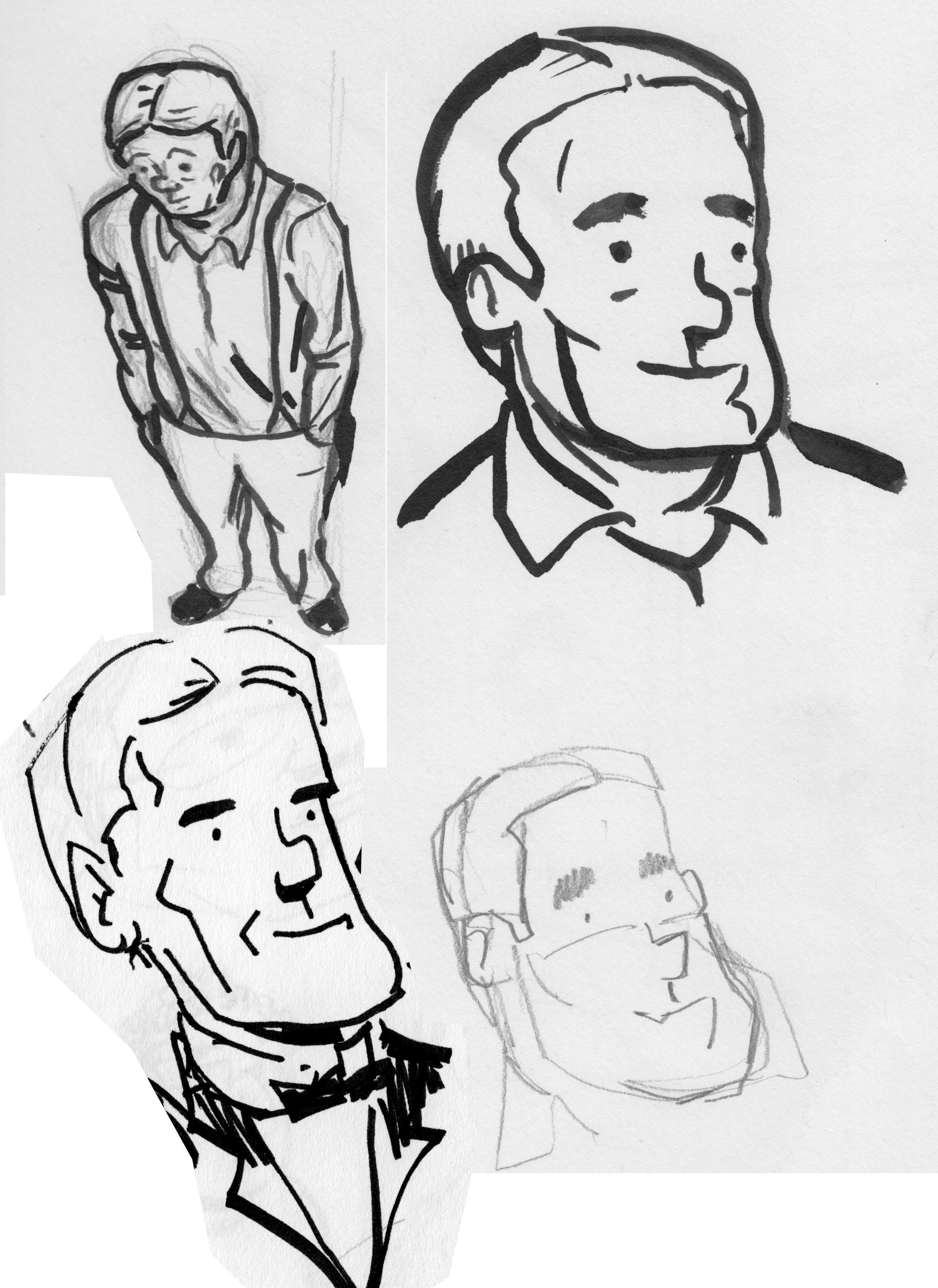
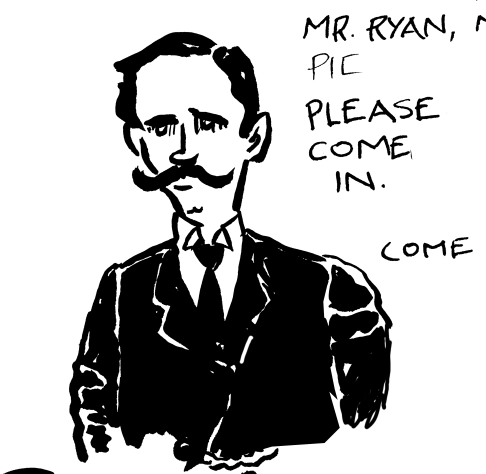
Arthur Ryan, a jeweler from Middletwon, CT., one of the first investors in the Jernegan scheme, and an officer in the company. No photo reference, so I just imagined…
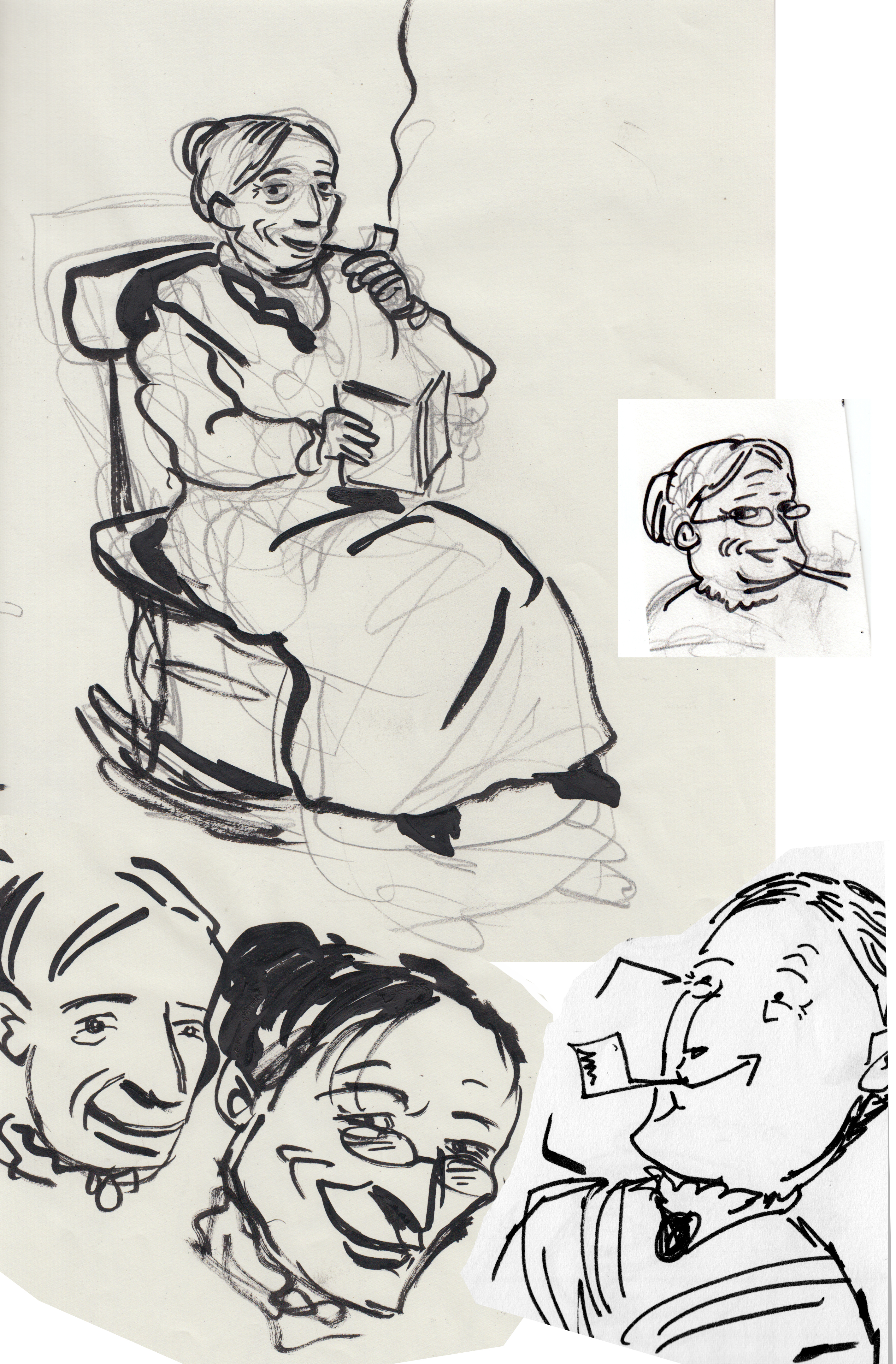
Pierson, the other early investor in Jernegan’s company; a florist from Middletown. no photos that I could find, but he’s described as a likeable, sociable and energetic fellow; and a “big swede.”Mary, an old woman who sits on the porch of the newspaper office, handing out gossip and wise advice. Totally made-up character.
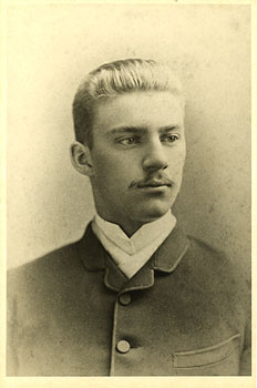
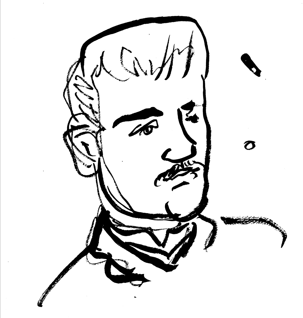
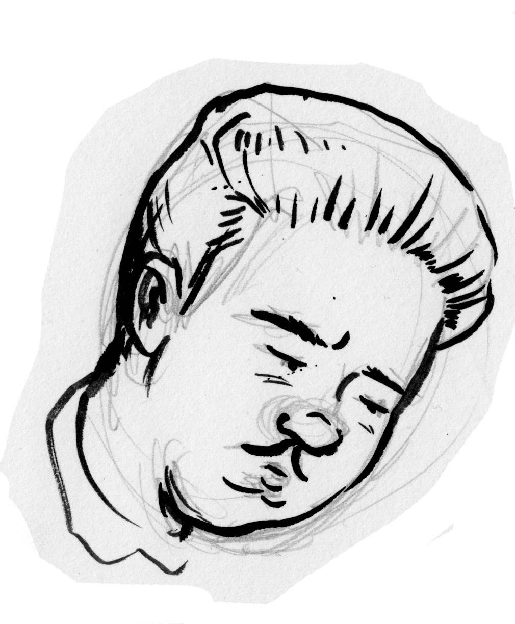
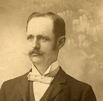
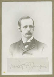
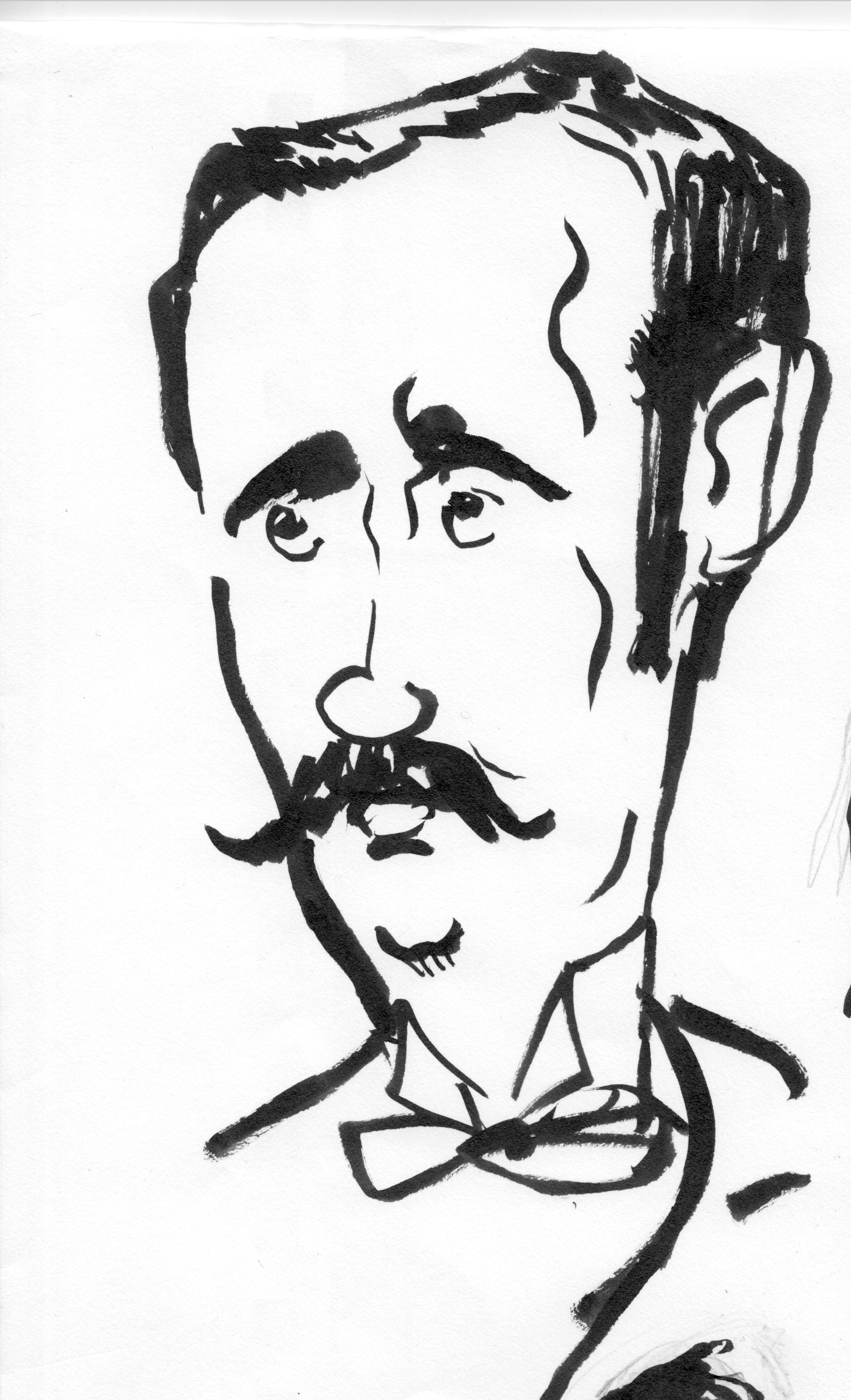
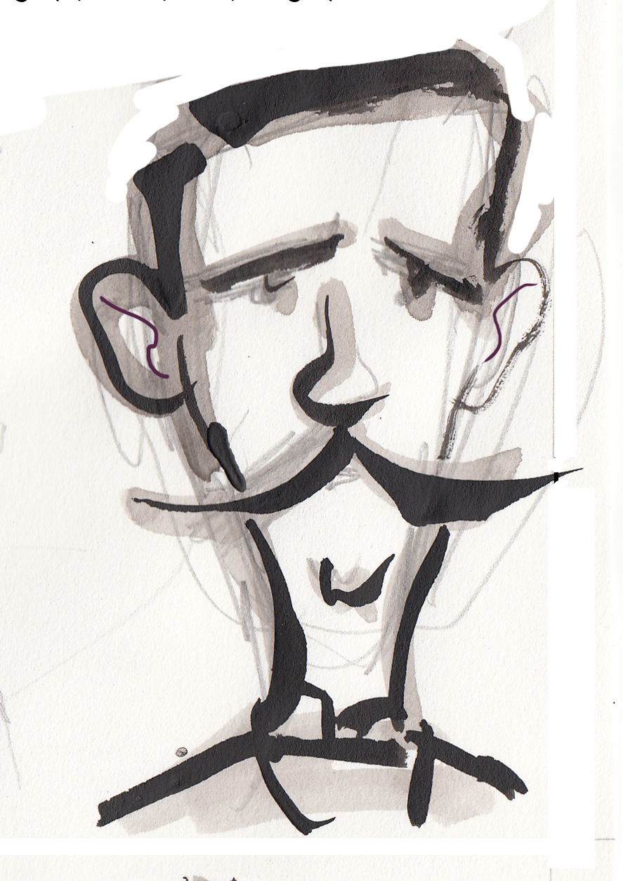
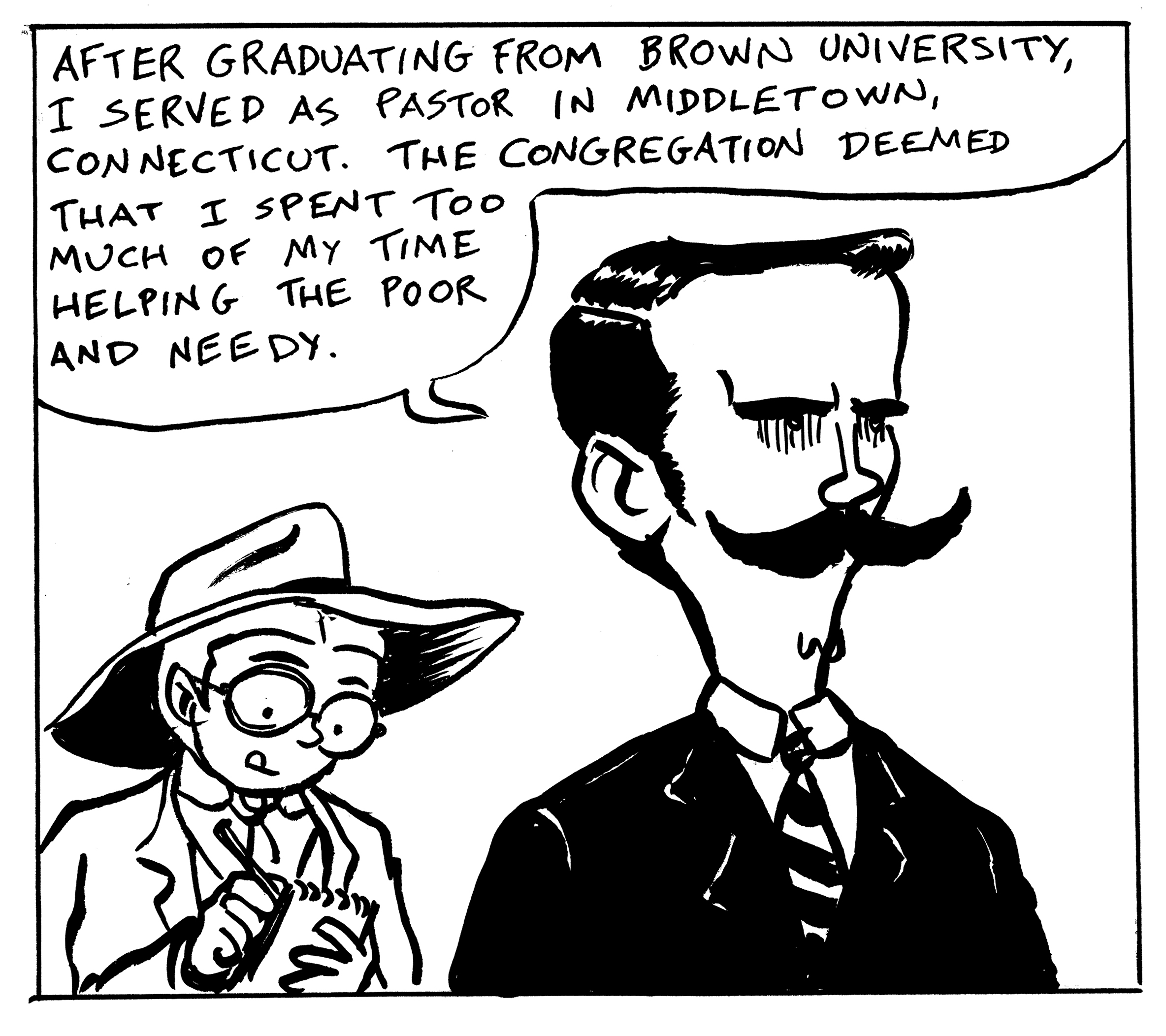
My principle characters in this comic are based on real historical figures. As far as I know there are only two photographs of my lead personage, Reverend Prescott Jernegan.  Starting from the photos, this is the look of the character evolved:
Photograph of Prescott Jernegan
Photograph of Prescott Jernegan
I especially like the one on the left, capturing the visionary quality I wanted for the character. Â Some early sketches:
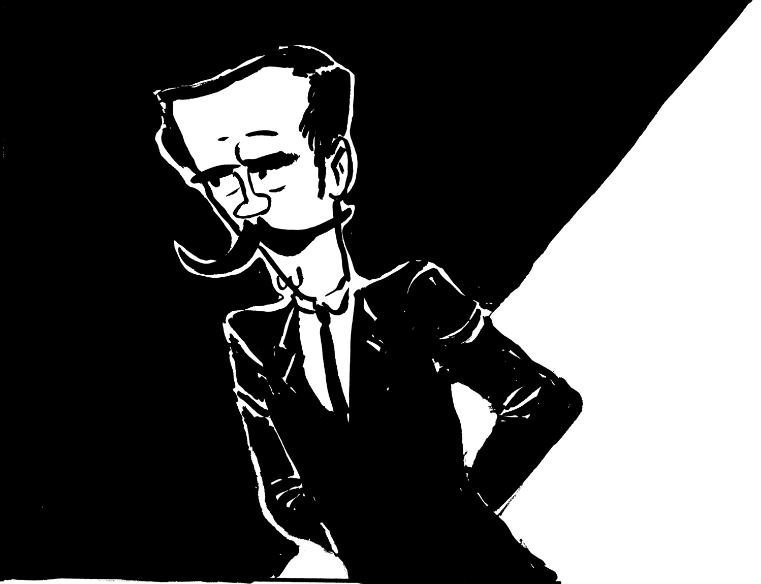
Gradually I moved toward a more stylized version of the character, and I wanted to give him a mysterious, impenetrable quality, and make his body angular and elongated:
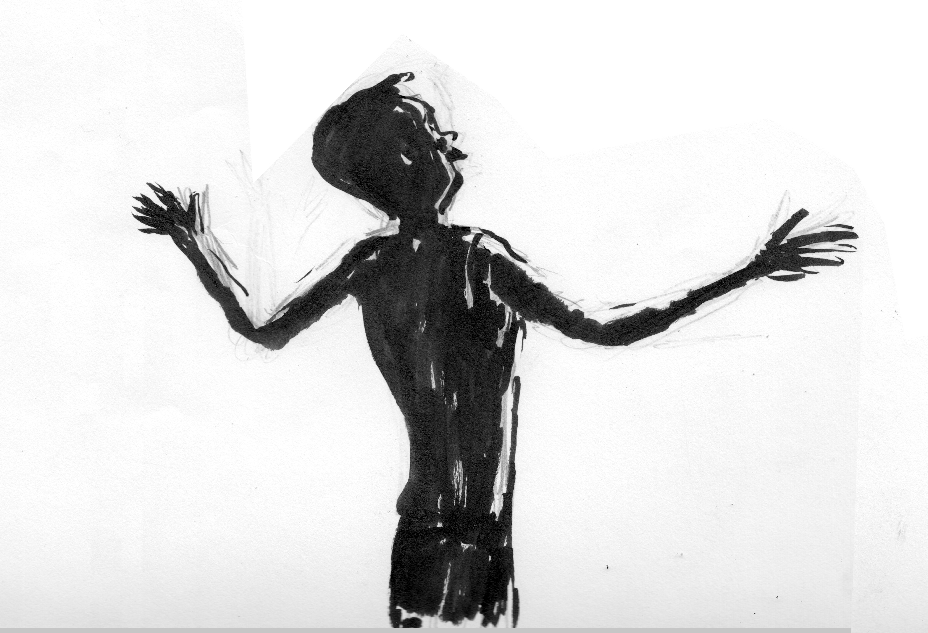
A sketch of Jernegan in the throes of ecstatic vision.
Here are some panels featuring the character from the final inked version of the comic:
My new comic, “The Jernegan Solution” will make its debut at MECAF, the Maine Comic Arts Fest, in Portland, on May 17. Based on an historical incident that took place in Maine in the late 1890s, it will be 24 pages, black-and-white, and printed at about 8.5 x 11.  I originally began the project back in 2012, intending it for the Greatest of All Time Comics Anthology, but other work interfered, and I returned to work on it late last year.  Here’s the title/logo I’m working on:
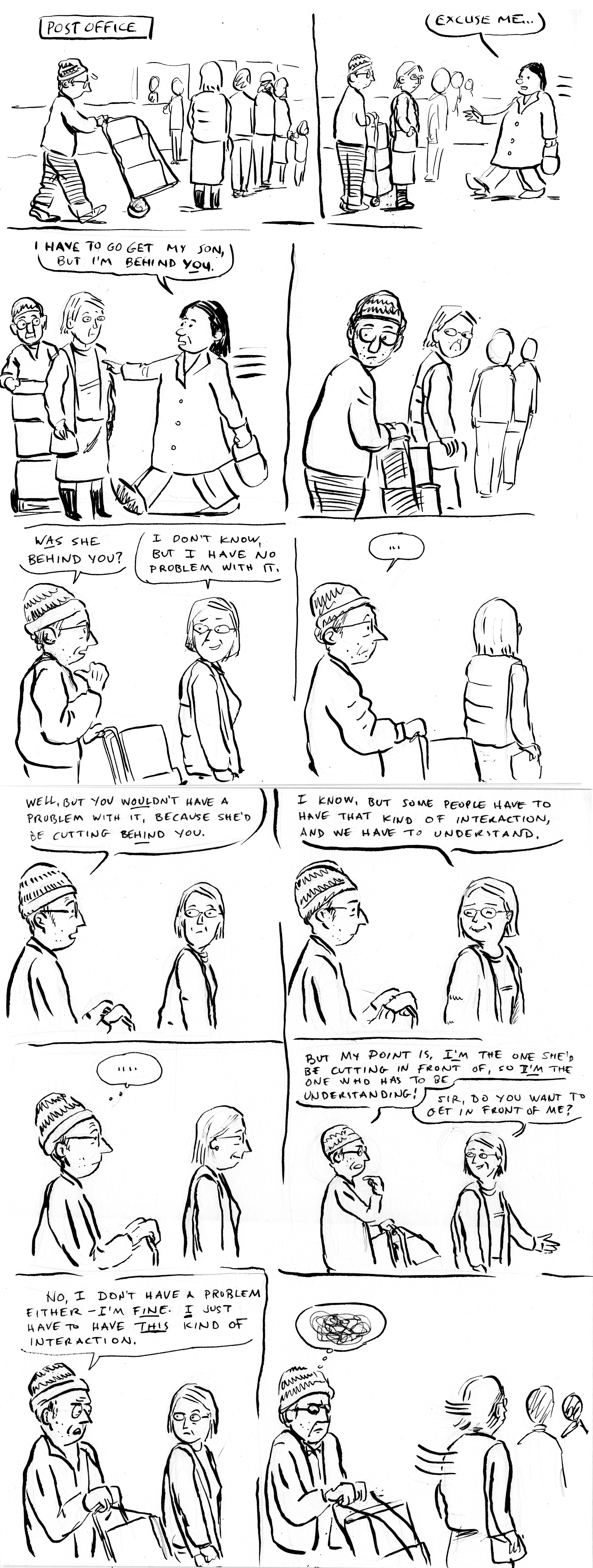
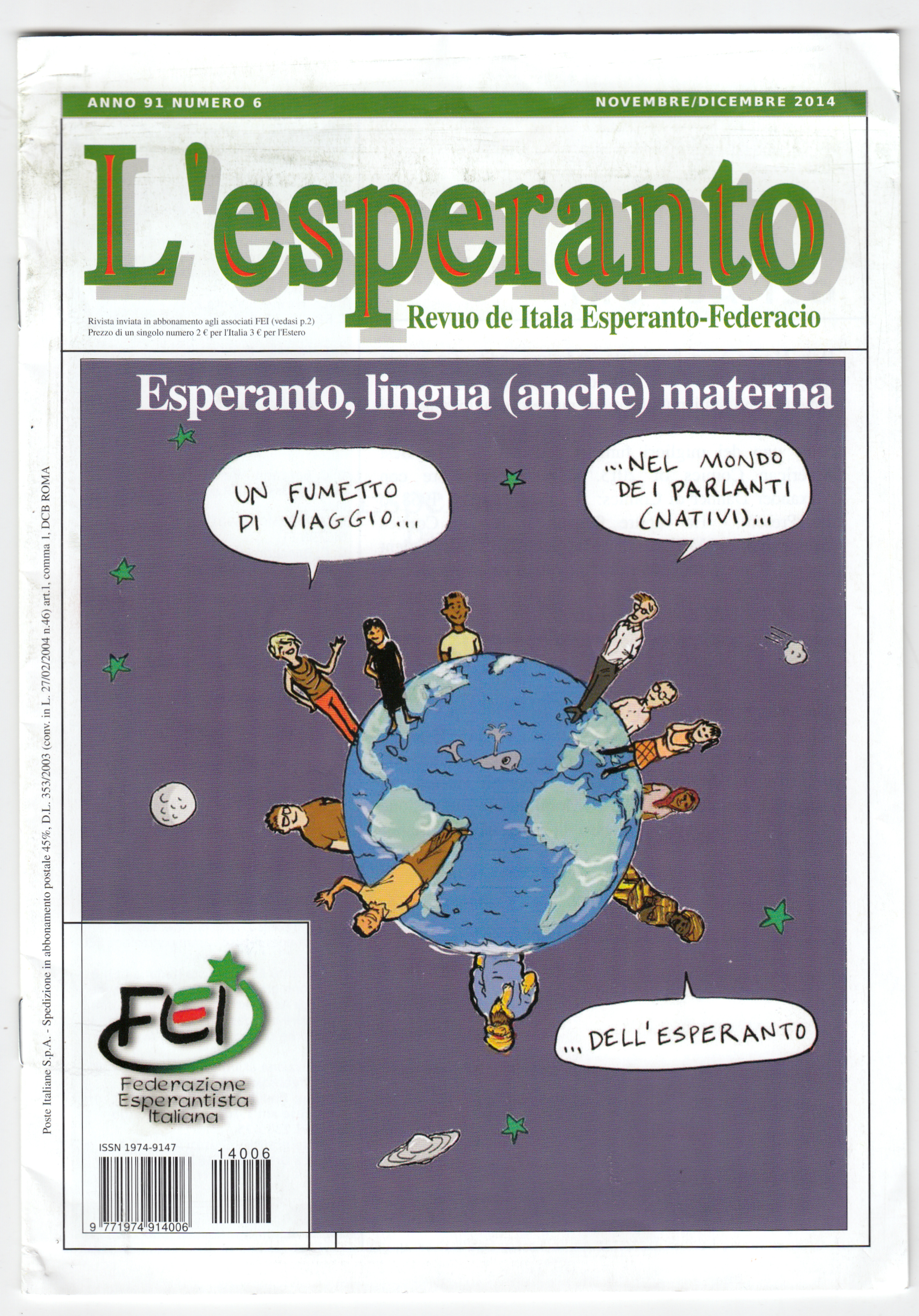
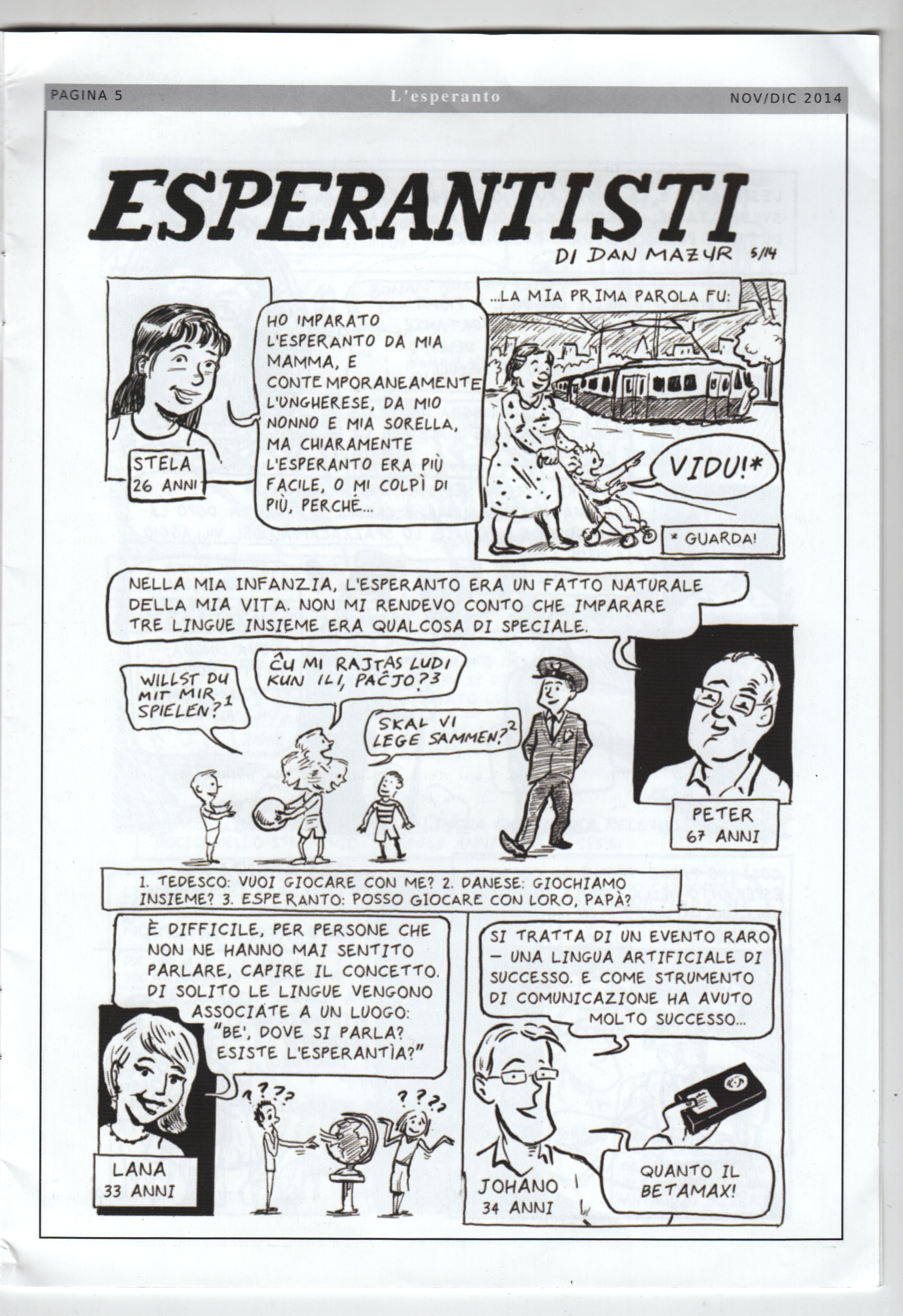
The current issue of L’esperanto, the journal of the Italian Esperanto Federation, is devoted to the comic “The Esperantists” that I did for the SubCultures anthology. Â It’s accompanied by an essay (which I can’t read because it’s in Italian), by Federico Gobbo, who also translated the comic. Â I am thrilled about this!
Too often people ask me, “what have you been reading lately?” and I don’t even remember. So here’s a way to keep track of/share at least some what I’m reading, especially the good stuff. I’m going to see if I can do it on a monthly basis:
Not the sort of reading month I had planned — little progress in my huge pile of minis and graphic novels I’ve acquired over the last… oh, year, year and a half. Alexander Danner and I were asked to contribute a chapter on “The International Graphic Novel,” for a collection, so I re-read some stuff for that — which is great. Hard to find time to re-read things, but it’s always worthwhile. But I did squeeze in some “first reads” as well…. (read more)
These are both well written and perceptive pieces, and follow the general pattern of most of the book’s reviews, in terms of both positives and negatives:
Gratifyingly, the critics express admiration for the scope of the task and our success at achieving it. Lefevre says,
“Even with these limitations [that is, narrowing the “global” scope down to Europe, Japan and North America, for the most part], it remains an impressive achievement to tackle the three major comics-producing cultures, North America, Francophone Europe and Japan. Not only the most popular or acclaimed titles of the three regions are succinctly presented, but also lesser-known but historically important works. So, I guess that every reader from every part of the world will learn about several new interesting titles or artists.”
And Ridout: “Where the authors undeniably succeed is in distilling their extensive research into a single volume that places the development of comics in five continents across five decades into a wider cultural context, revealing fascinating parallels, divergences and cross-pollination between the disparate histories.”
Both Lefevre and Ridout also mention specific points they agreed with.
Lefevre liked that “the authors rightly state that demographics played an important role: the postwar baby boom created a mass of children’s comics readers in the 1950s and one they became teenagers and young adults, in the 1960s, they were accustomed to reading graphic narratives and they were ready for graphic narratives with more adult aspirations.”
Ridout mentions a few “enjoyable discoveries” of previously unknown work, such as Pazienza, Oshima, Neaud. That, for me, is what it’s all about!
On the negative side, there’s been pretty much unanimous critical agreement, of course, that the ambitions of the project necessitate some omissions, and each critic will point out those that they feel are the most egregious. In almost all cases, these complaints are perfectly valid. For Lefevre, it’s the thin coverage of newspaper strips, and also the relatively small number of source citations.
Ridout points out that our acknowleged focus on artistic rather than commerical importance “creates a somewhat skewed, auteurist history that overlooks writer Stan Lee’s equally pivotal role alongside artist Jack Kirby in attracting college-aged readers to Marvel Comics in the 60s and the impact of mainstream publishers embracing non-anglophone artists and writers since the 70s.” Fair enough.
Ridout, with a sensitive ear for tone, also catches the uncharacteristically “sombre” mood of the final chapter, in which Alexander and I succumbed, perhaps, to a little bit of a “good old days” quality in musing on the decline of the fictional graphic novel in recent years. That’s a criticism that hits home, since I don’t think either of us really feels, or wishes to convey, a negative judgment on contemporary comics!
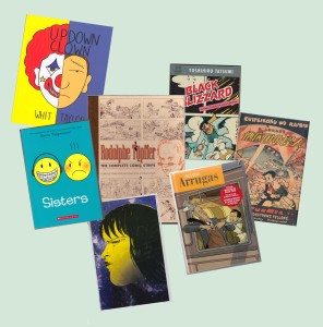
I Â didn’t read a whole lot of comics this month, compared to previous months. Especially not a lot of minicomics. I think the only minis I cleared from my huge “to-read” pile were:
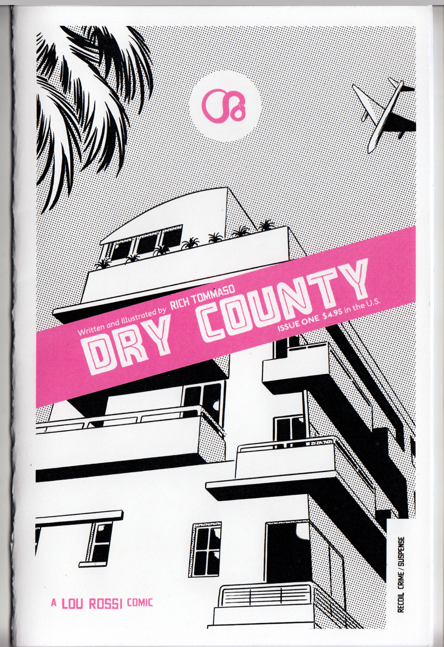
Dry County by Rich Tommaso. I’ve always liked Tommaso, who works in the alt-comics tradition of Dan Clowes, Charles Burns, David Mazzuchelli et al.; his work has a similiar style and themes to those guys but has never hit it big with a graphic novel (yet). This one is a Florida-set noir-ish mini about a down-at-the-mouth cartoonist (what a surprise) and a femme fatale with some fucked-up baggage (it’s chapter one, I think the series runs on Act-i-vate, but I’d rather find the next mini). (update: I ordered it from him online at http://recoilcomics.bigcartel.com/)
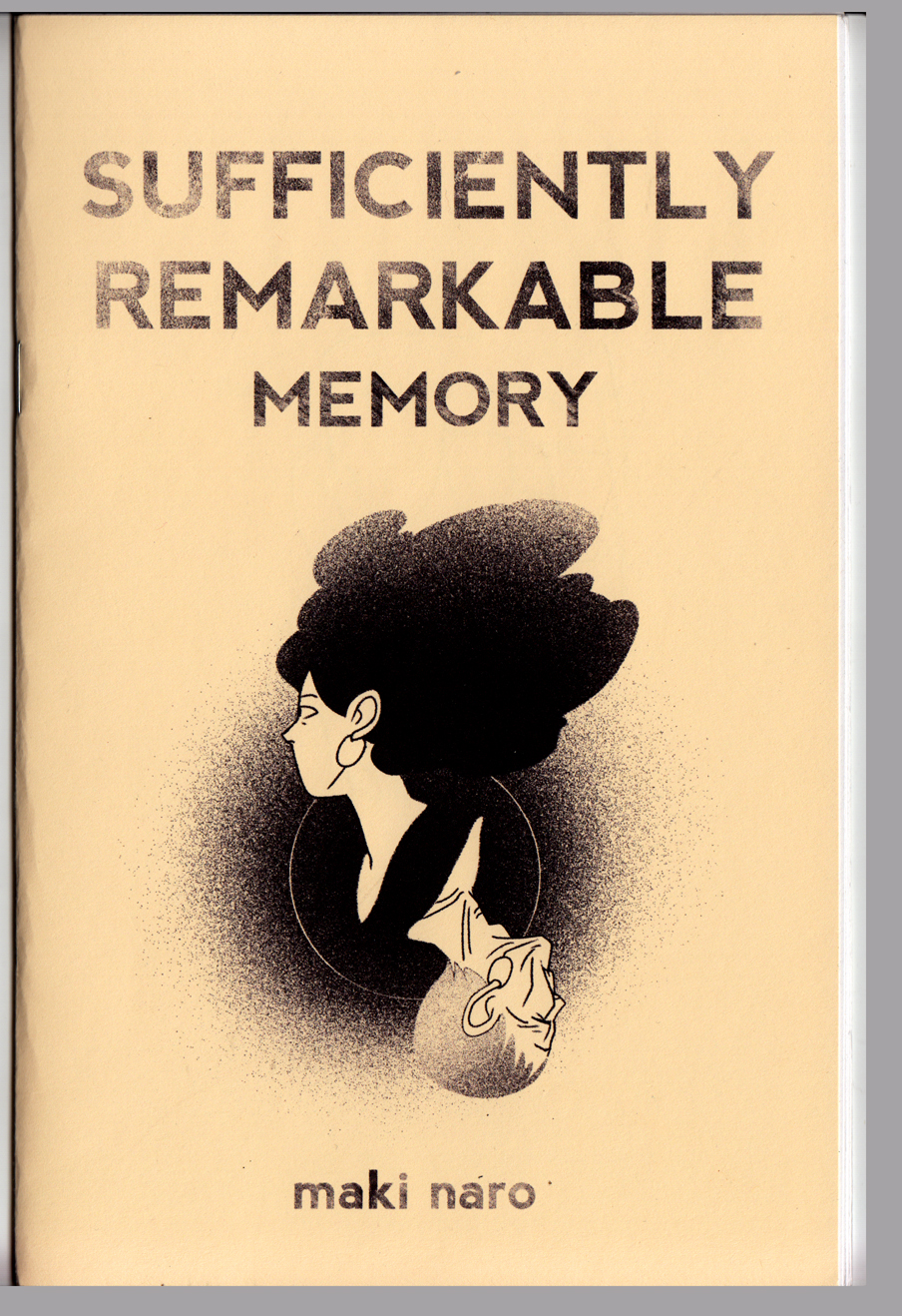
Sufficiently Remarkable: Memory by Maki Naro. A mini I got at MICE 2014. Another one that comes out of a webcomic, it’s a touching little comics poem about the protagonist’s grandfather’s failing memory.
I spent some time this month catching up on a few of the GNs that got a lot of attention this year, including a couple that made a lot of the “Best of the year” lists:
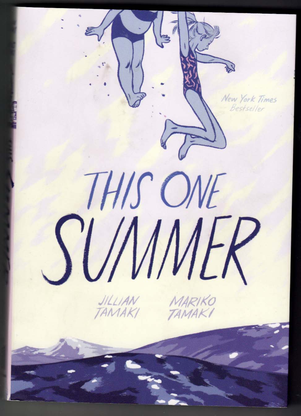
That One Summer by Jillian Tamaki and Mariko Tamaki. This made nearly all the top-ten comics and graphic novel lists I saw. I agree with the hype. It’s beautifully drawn: the dry-brush strokes she uses to draw hair, and the fluid curving brush lines that describe cheeks and jaw-lines linger in my mind. The story involves a series of relationships as seen through the eyes of a tween-age protagonist, and the themes of adults (or teens) grappling with responsibility/parenthood/sex is developed with subtlety and nuance; it doesn’t feel like “YA.”
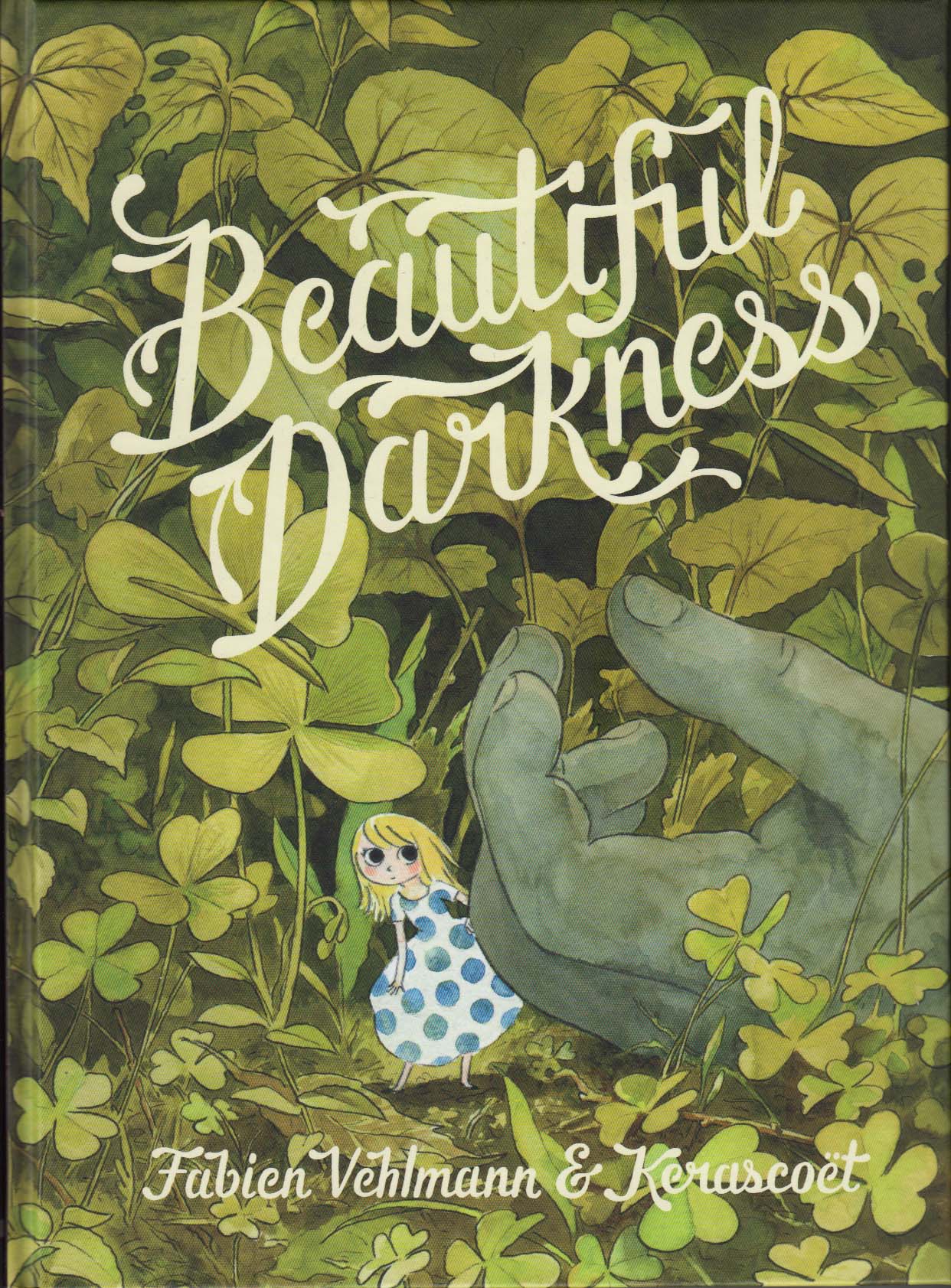
Beautiful Darkness by Fabien Vehlmann & Kerascoët. Another one that showed up on all the end of the year lists, I’m not quite as on board with the hype here. The book is gorgeous, drawn in watercolors; as pages, this is fantastic comics-making. And though the premise of the story is intriguing and original, I found it repetitive and ultimately mean-spirited and a little pointless, indulging in morbidity and cruelty without much nuance (note: I read it in the English translation). But I’ll open up the book with pleasure to look at any random page.
Â
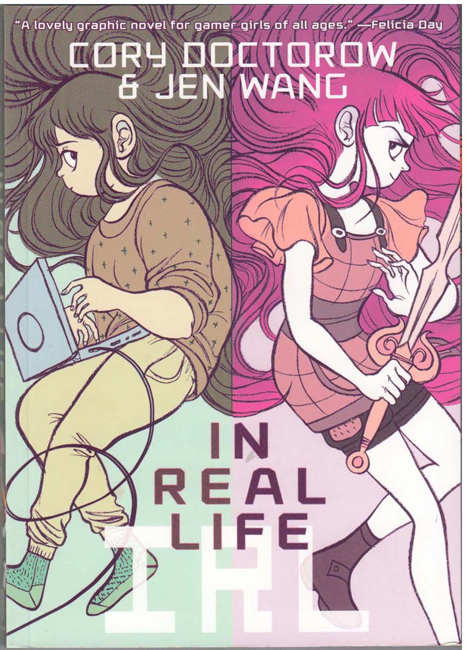
IRL (In Real Life) by Jen Wang and Cory Doctorow. One ends up reading a lot of YA material when you’re into comics these days, because there’s so much of it, and that’s where the paying work for good artists is, I guess. IRL makes a good compare/contrast with That One Summer; the art is equally wonderful (and similiar in style; the coloring is fun too), but this is YA that feels very much like YA. It’s a positive message for kids, but simplistic as well. So simplistic, in fact, that I wonder if its positivity is really meaningful at all, since it never questions the assumption that relating to other players/avatars in online gaming is as or more important as relating to people IRL.
Then, two great kids’ adventures in space comics, made on two different continents, 75 years apart, but seem to me to have a certain kinship:
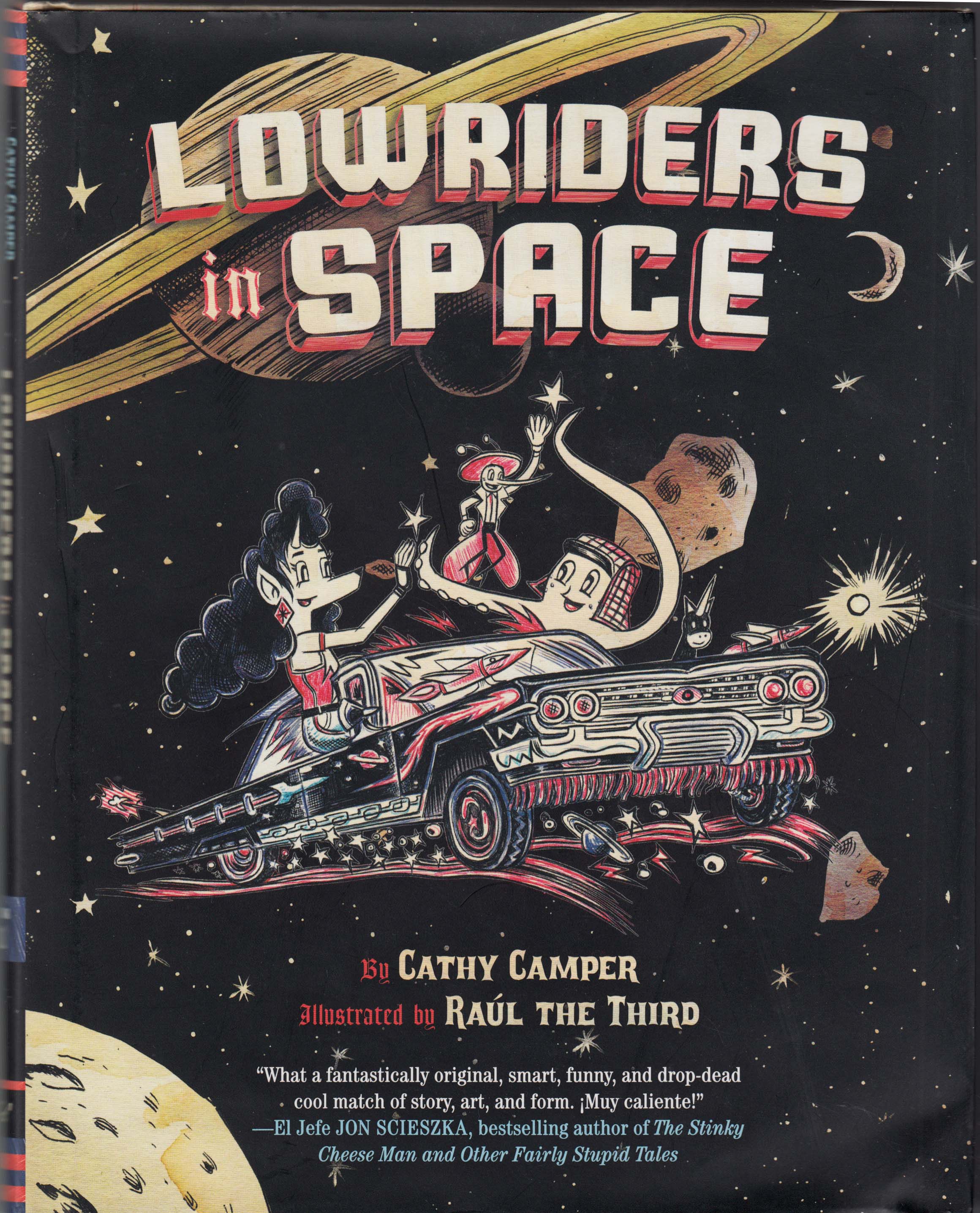
Low Riders in Space, by Cathy Camper and Raúl the Third (Somerville-via-El-Paso’s own Raúl Gonzalez). This has to be one of my most-anticipated comics ever, and I wasn’t disappointed. A crazy, goofy kids’ adventure, funnily written by Cathy Camper, with the added appeal of joyous multiculturalism (including lots of Spanish expressions and an appreciation for low rider culture). But what makes this book sooo great is Raúl’s art; there’s really nothing like it in comics, like a combination of Fleischer cartoons, Big Daddy Roth, grafitti art and psychadelic notebook doodles, with a beautiful/cheap aesthetic (all drawn with Bic ballpoint pens), on paper that looks like it’s been soaked in coffee. The characters are lively, cute, weird and rubbery, but at the same time he has a perfect sense of form and composition, color and movement that make every page a delight.
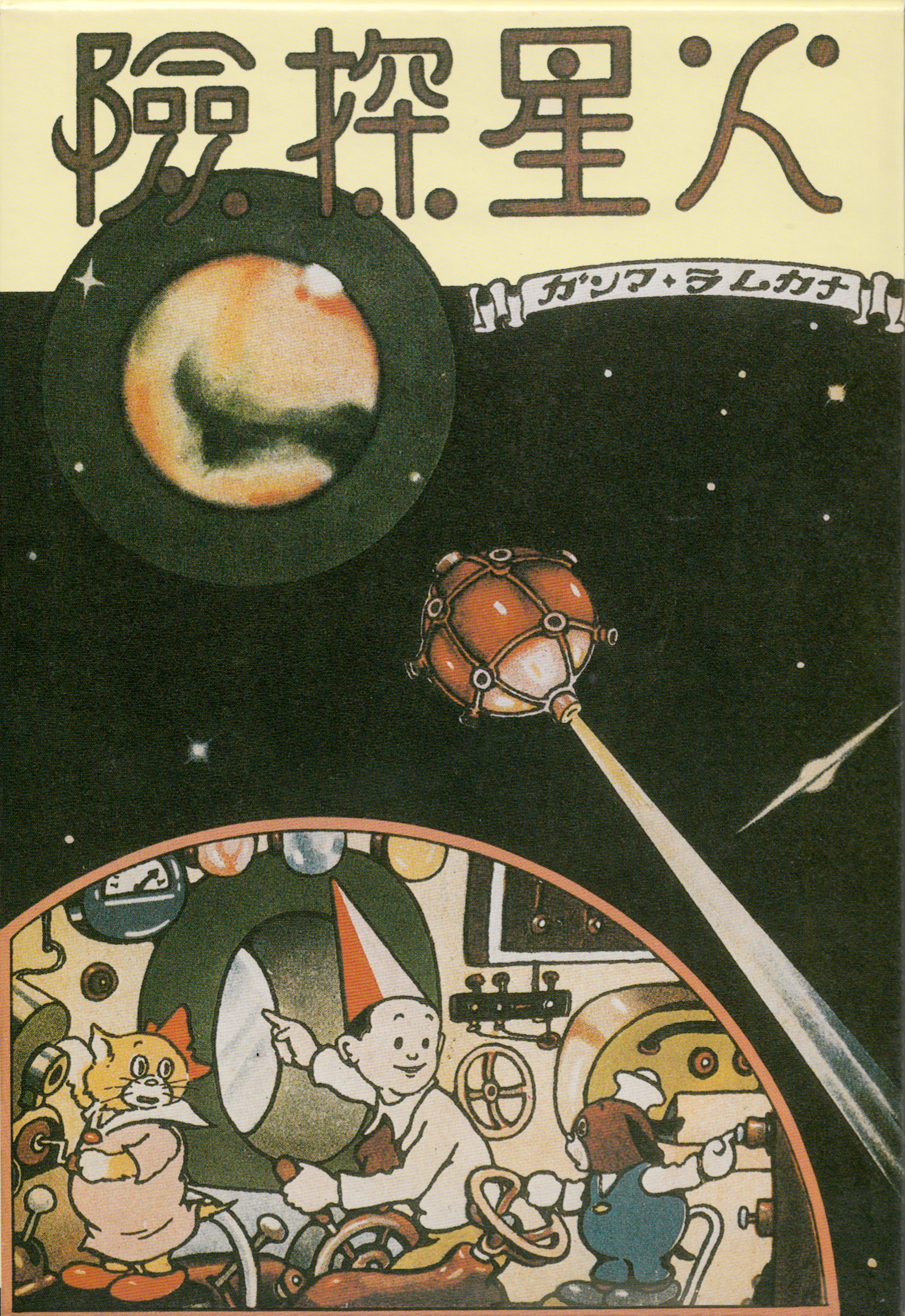
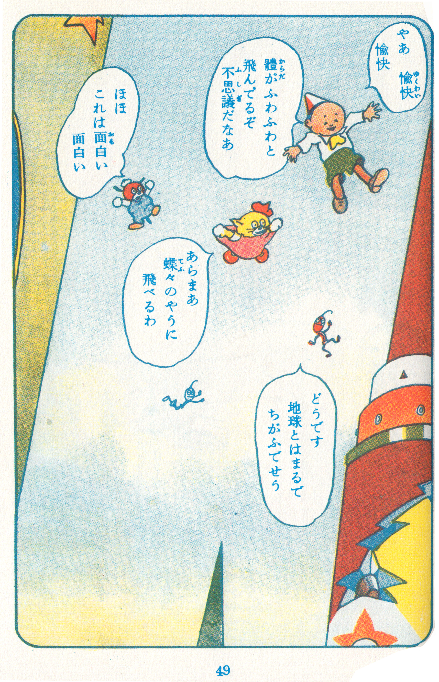
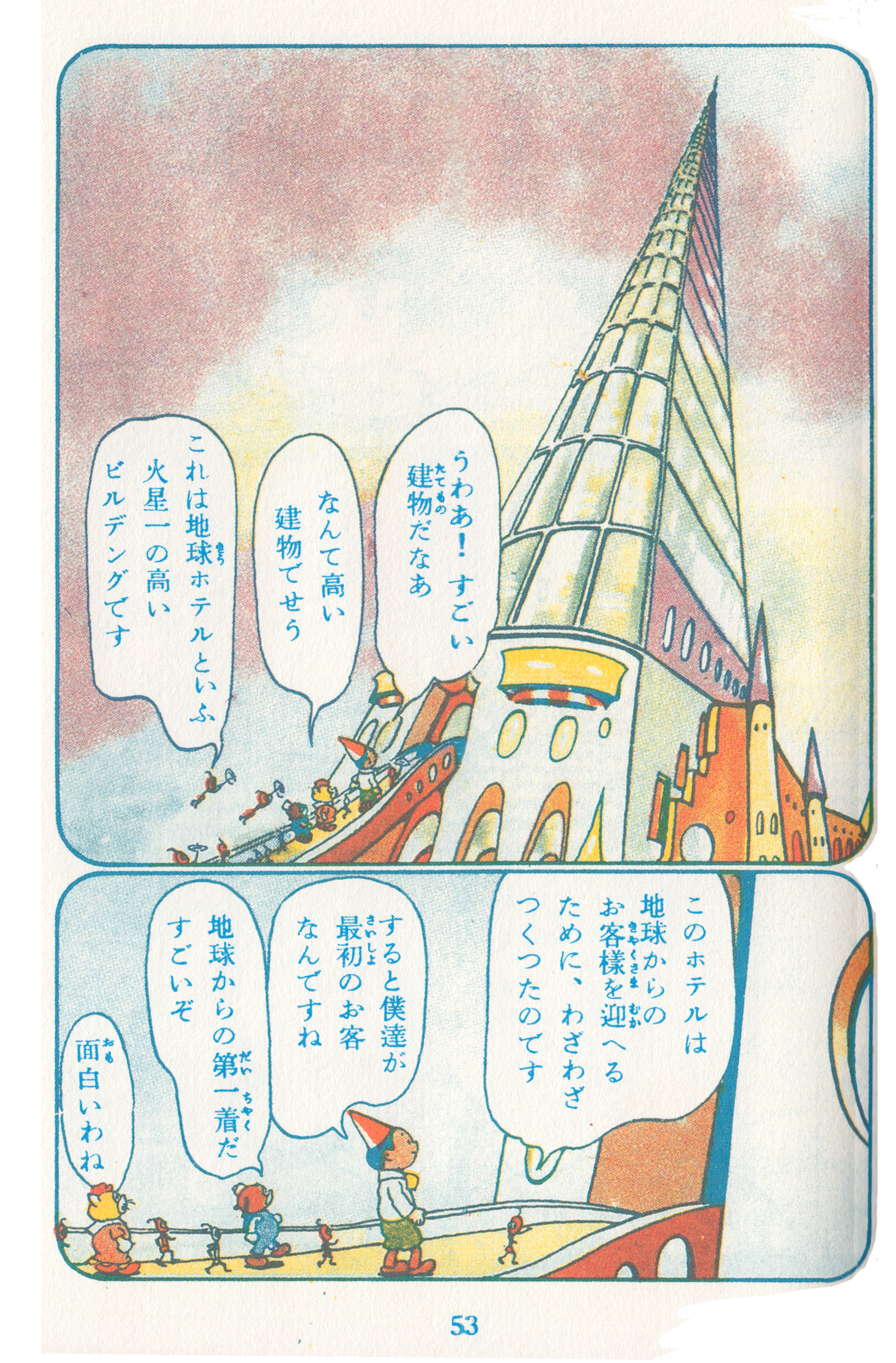
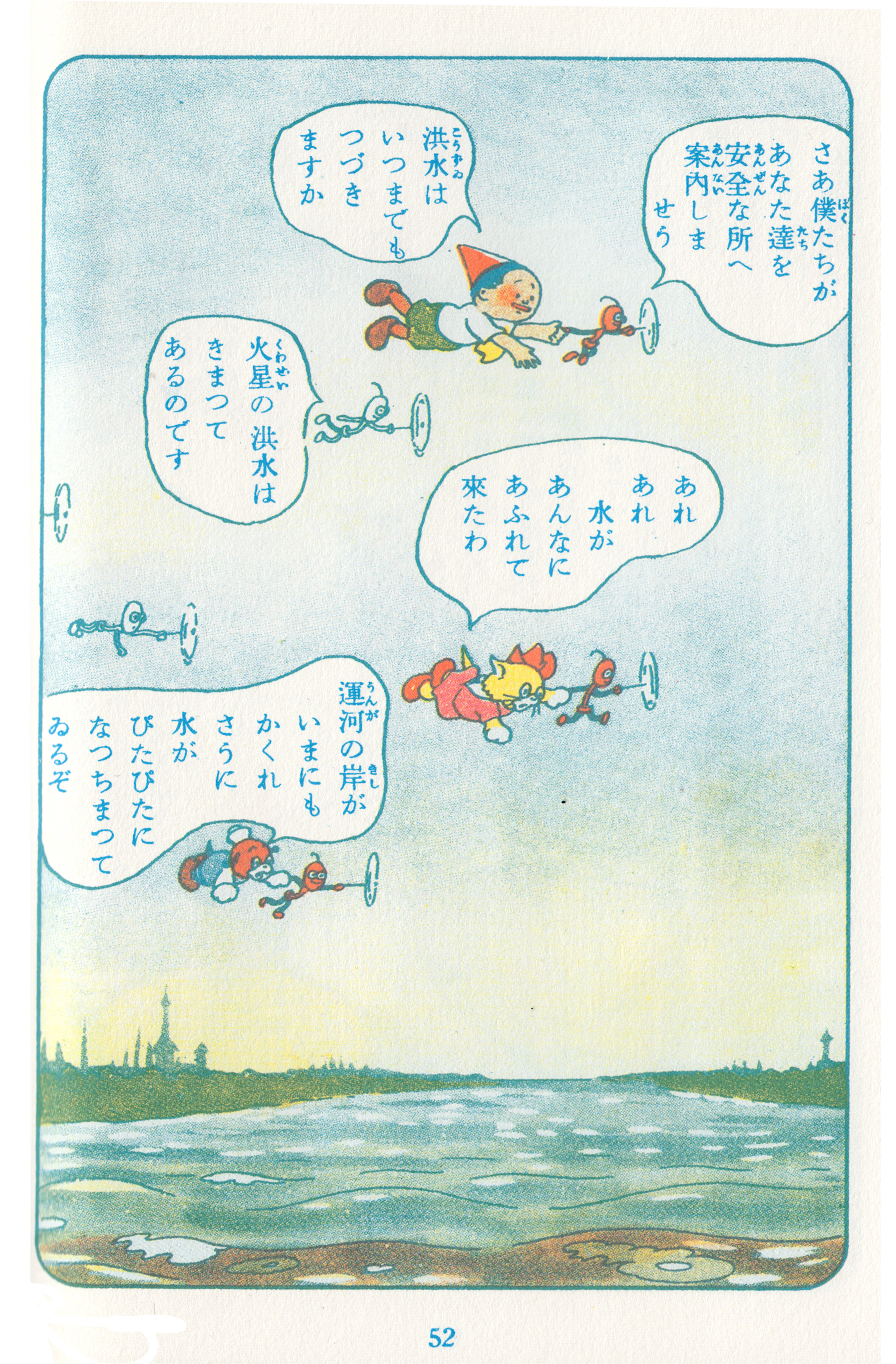
And if re-reading counts… (which it does, because I say so)…Kasei Tanken (Voyage to Mars), art by Noboru Oshiro, written by Taro Asahi. Beautiful 1940 manga, which I read in the facsimile reprint. A scientist’s son and his talking dog and cat have adventures on Mars (actually, it’s all a dream). I can’t read the Japanese, but it doesn’t really matter – I follow along with a synopsis, and mainly just read the pictures. There’s a very long sequence where the trio eats some tomatoes that make them sick, and then spend a long time in a Martian hospital.
Here are some great pages from Low Riders in Space (click to enlarge):
…and from Kasei Tanken:
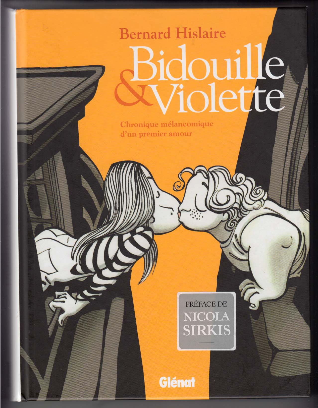
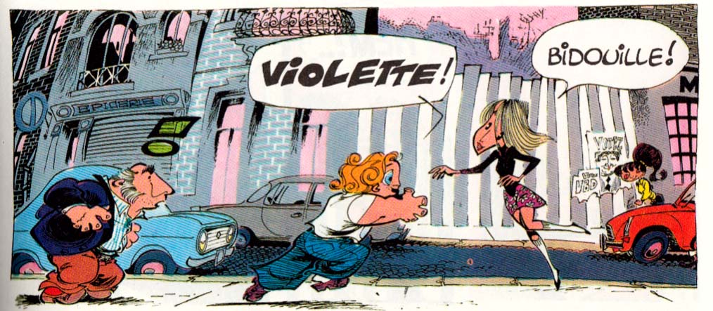
Finally, there was Bidouille & Violette by Bernard Hislaire…
Â
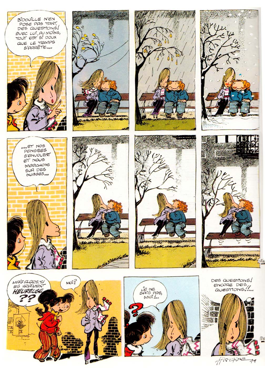
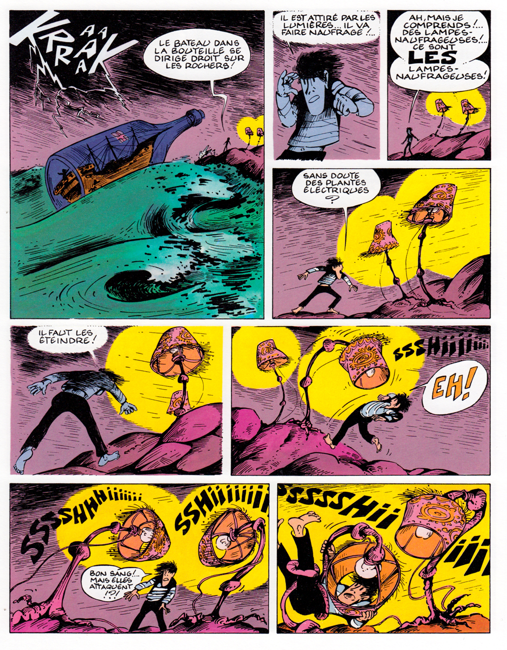
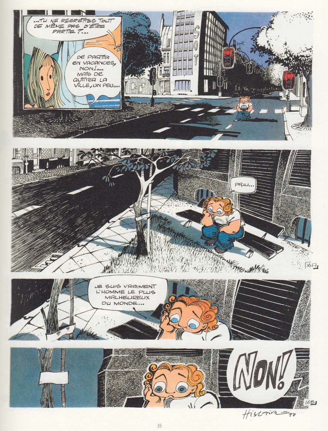
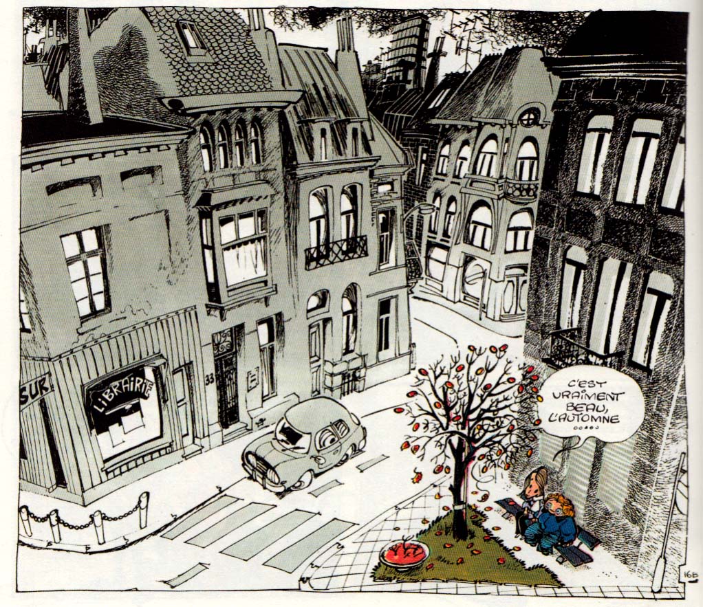
A complete collection of a relatively minor series that ran in the journal Spirou between 1978 and 1985. Though the strip appeared only sporadically during its brief life-span, it seems to have made an impact on readers of the time, in part for being the first strip in the venerable, juvenile Spirou, that broke from traditional genres of action and humor, and focused instead on a relationship: a “melancholy chronicle of first love,” as the sub-title describes it.
It doesn’t come up in any of the histories of Franco-Belgian comics that I’ve read, but I saw this page online while browsing original art sites. I was intrigued by the unusual line-work and atmosphere, the drama created by the page, the way he draws the hair and the weird eyes. Â The page stuck in my mind, and after some months of vacillating, I sprang for the collection from Amazon France.
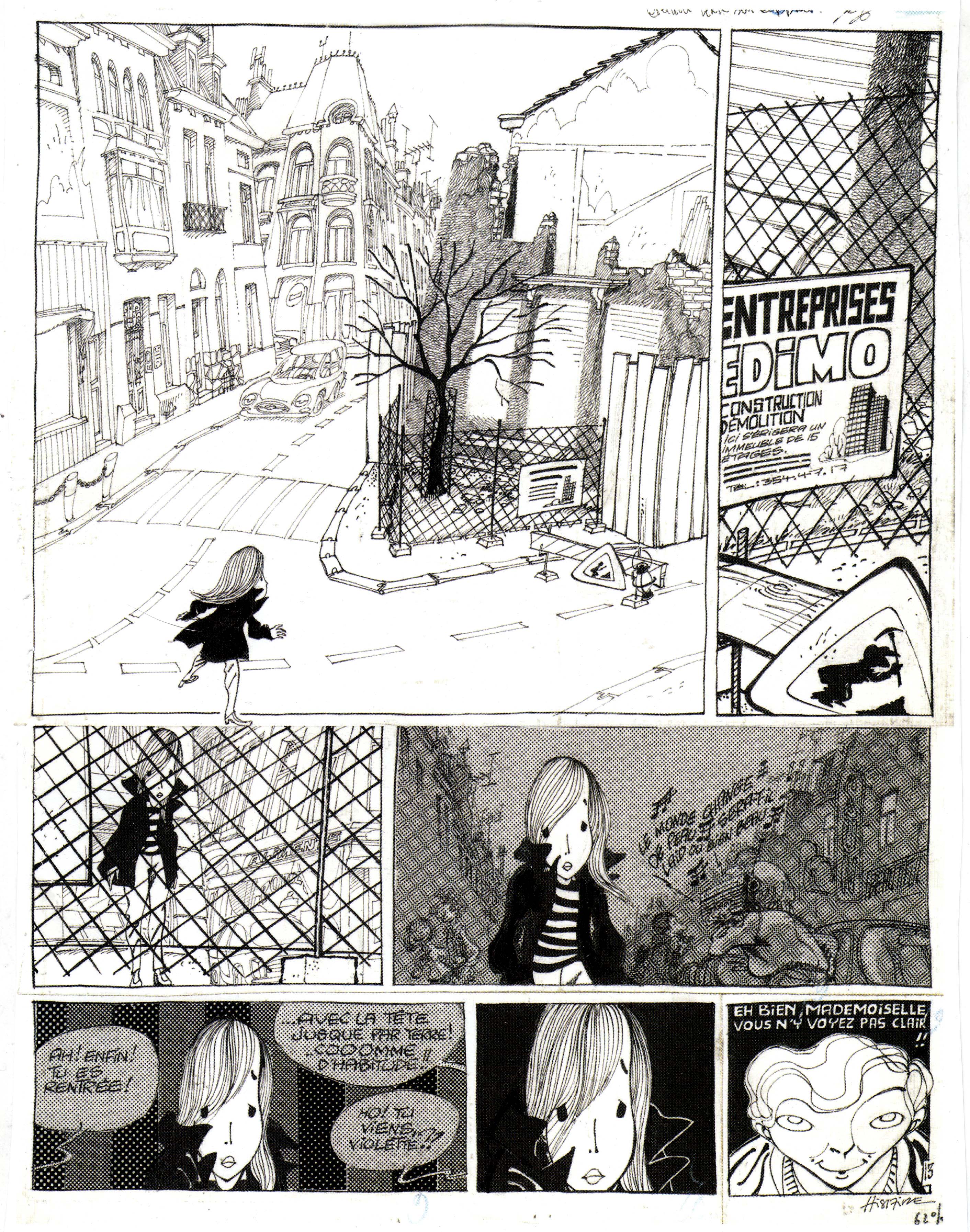
The love is between two shy teenagers in a provincial French-or-Belgian city (the fictional town of Mayon, so that the inhabitants can be referred to as Mayonnaise, *chuckle*), their innocent youthful passions somewhat inexplicably foiled by un-supportive parents. At first, I found the comic a little too twee, but by the end of the book, which comprises material that made up four albums, I felt positively about it; it’s rather uneven, perhaps reflecting the youth of its artist-writer Hislaire (just 21 years old when the series began). The early chapters do verge on twee-ness, as we meet the tender young proagonists and follow their halting progress toward young love. There’s a lot of graphic energy and inventiveness, though:
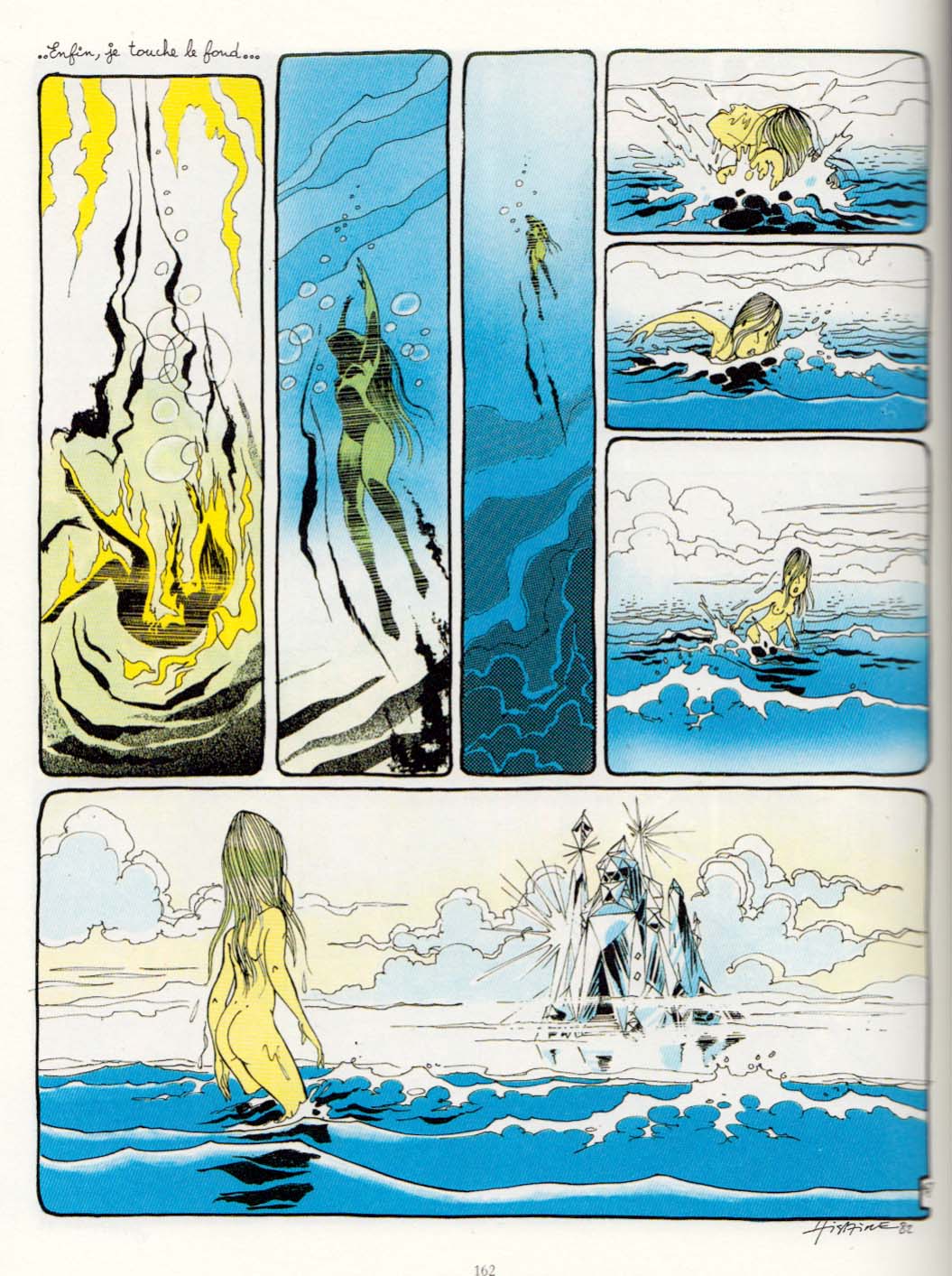
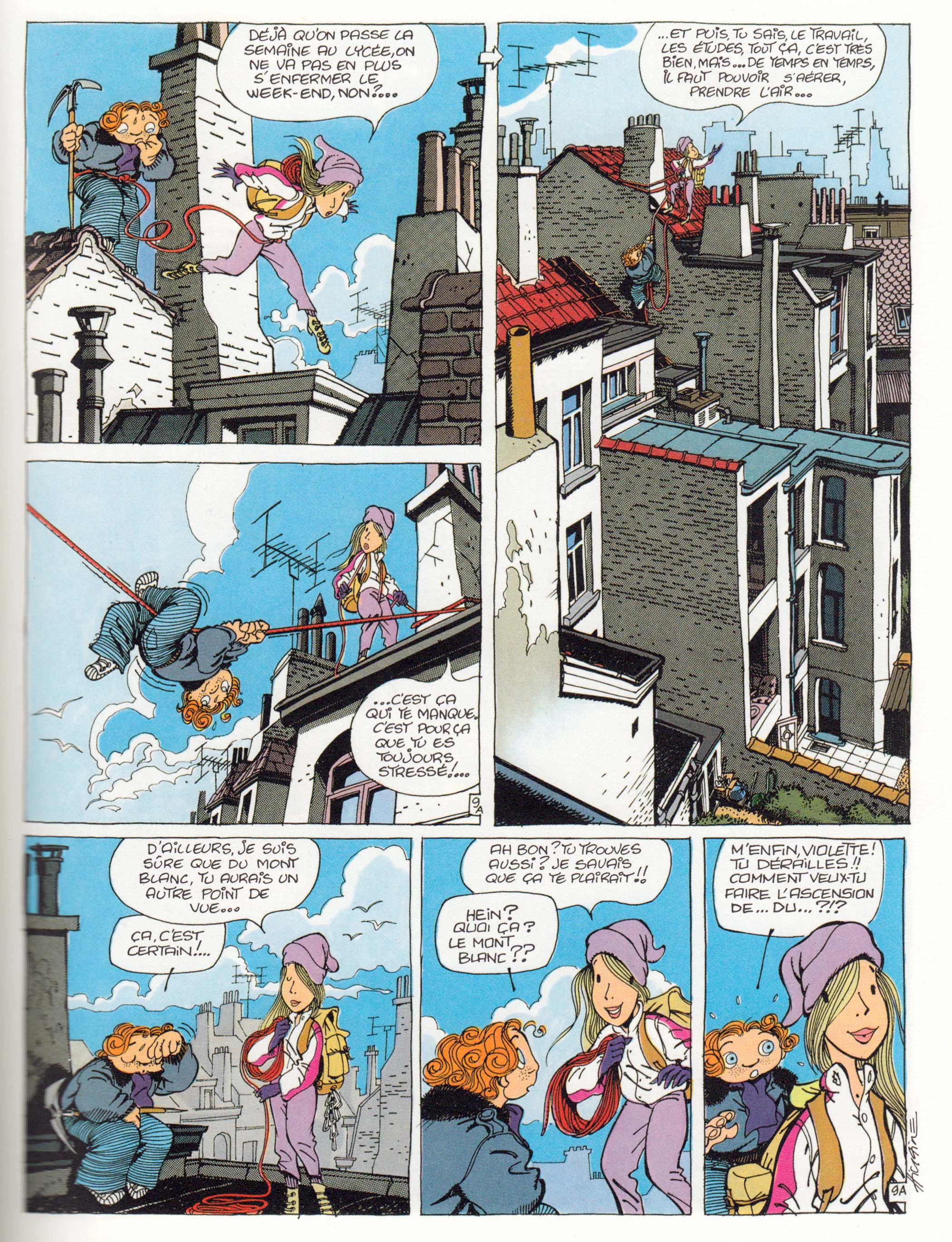
Then there are some episodes of misunderstandings and jealousy, from which we veer into a psychedelic dream sequence that takes up nearly a full album… …followed by a slightly absurbist episode of B & V going on an urban “mountain climbing” adventure over the roofs of the town.  Finally the story resolved by invoking Romeo and Juliet for a surprisingly dark conclusion.
Despite this somewhat flailing approach to story, there’s a sincerity and intensity of feeling that I bet accounts for the fond memories it inspires in those who read it as adolescents. Throughout it all, I remained fascinated by Hislaire’s style, which falls into neither of the two dominant Franco-Belgian “schools”: the precise, Hergean ligne claire style, or the rounded Andre Franquin-ish look that generally charactertized Spirou. Hislaire favors eccentric shapes for his characters’ heads and figures, a wide variety of types of line and texture marks, all contributing to the loose, askew world he creates.  His style (or his graphisme, as the French would say) reminds me a little bit of Fred, the artist of Philemon, though they work in very different modes, of course.(1)
Hislaire especially excels at drawing the settings his characters inhabit and move through, using them to create mood, especially the cityscapes.
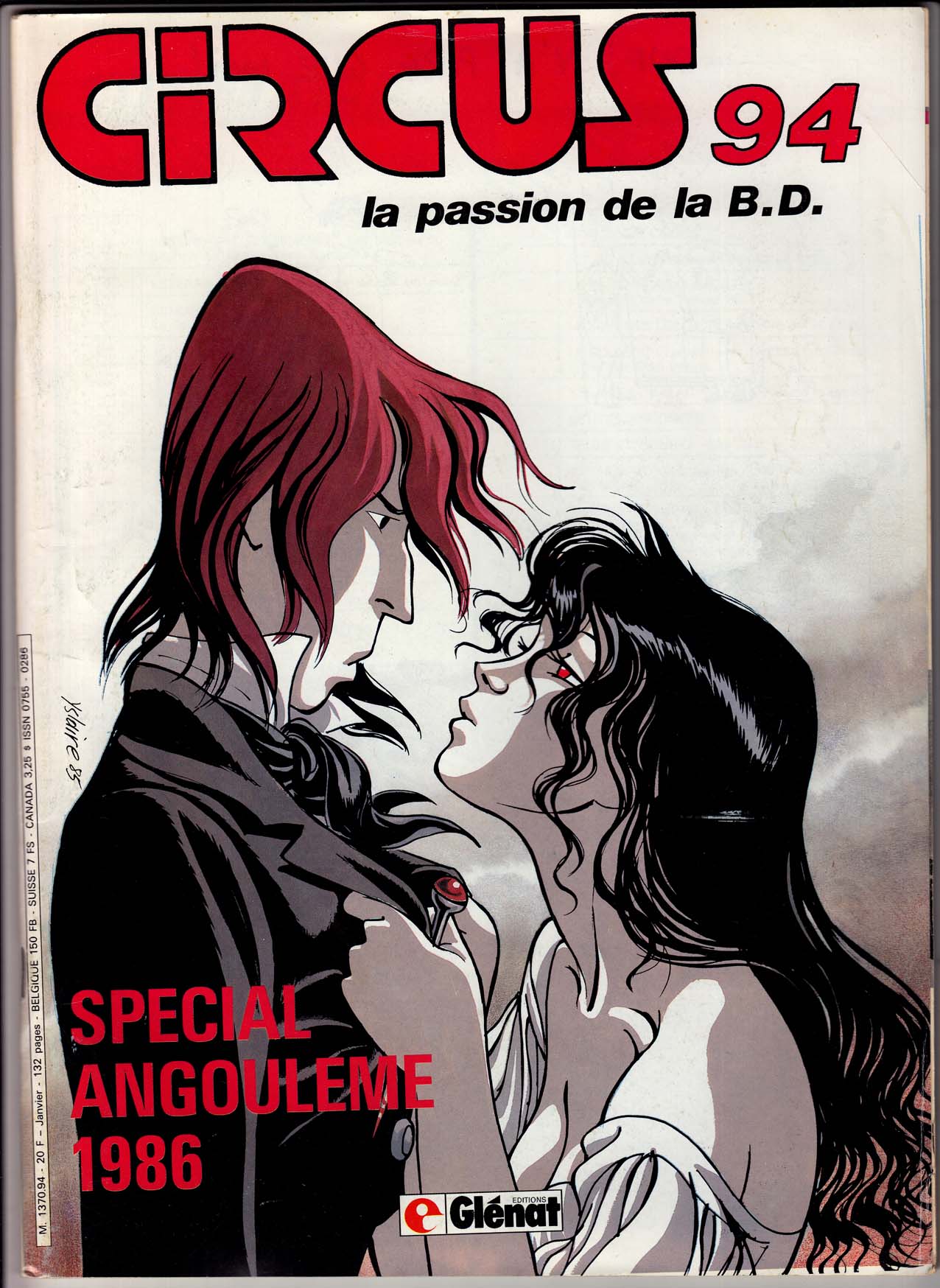
After Bidouille & Violette, Hislaire launched the series that really made him a bande dessinee star: Sambre, which ran in the new journal, Circus. Very very different from B&V, a more serious and adult romantic adventure, set against the French revolution of 1848, and drawn in a completely different, more “realistic” style. To punctuate this dramatic shift in style and tone, Hislaire even changed the spelling of his name to Yslaire. I haven’t read Sambre; I’d always lumped it in with what I consider a mediocre slate of historical comics in Circus, but, as with Bidouille & Violette, there’s something about the look of it that’s always intrigued me; I think I’ll give it a shot sometime soon.
(1)NOTE: I should point out that two of Fred’s fantastic Philemon adventures were finally released in English this past year by Toon books – with no fanfare whatsoever. I haven’t seen the English versions, but these are really wonderful imaginative French classics, for all ages.