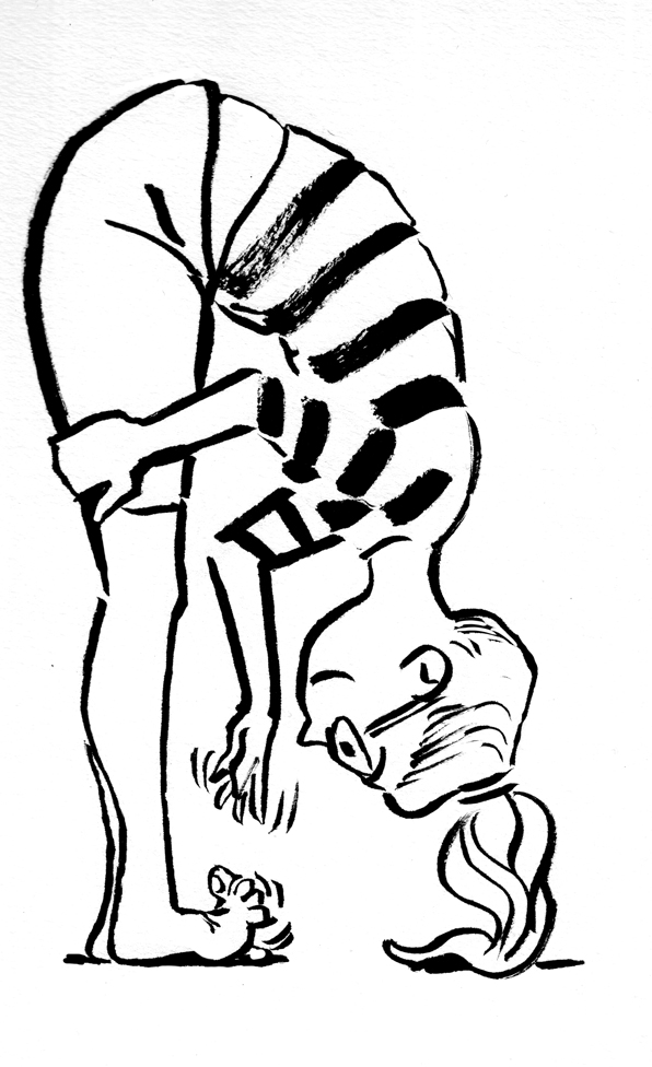
This is my submission for Hellbound 5: The End. Â No, it’s not really a history of the Hollywood musical. Â Or maybe, yes it is. Â Kind of. Â Here’s a preview of page one:
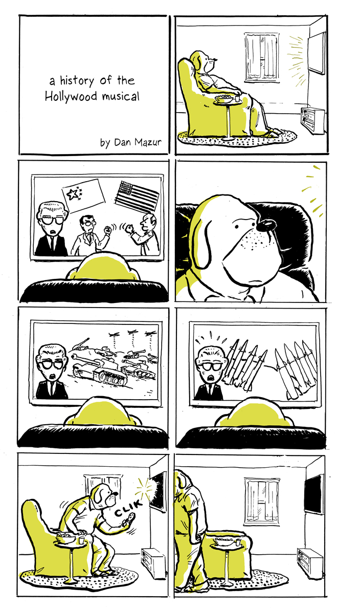
This is my submission for Hellbound 5: The End. Â No, it’s not really a history of the Hollywood musical. Â Or maybe, yes it is. Â Kind of. Â Here’s a preview of page one:
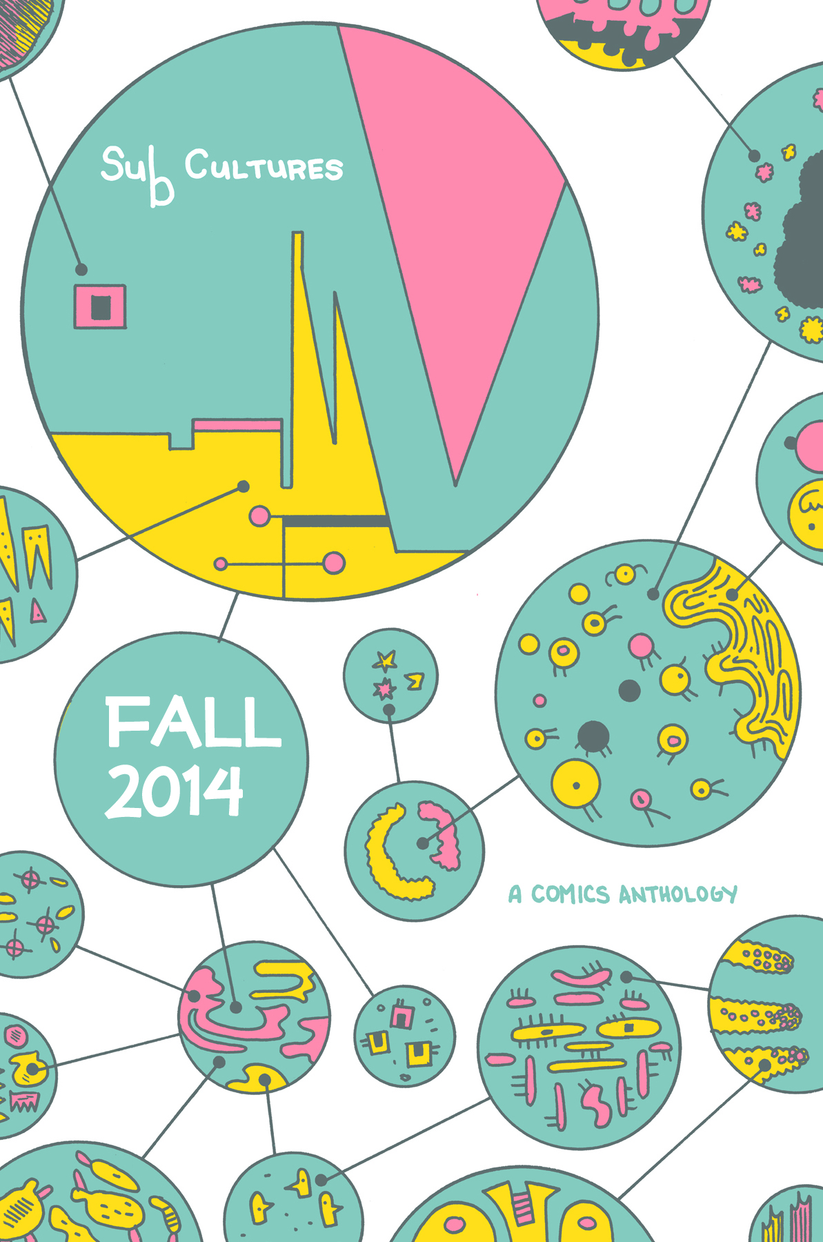
As a publisher (of Ninth Art Press), I’m very excited about this project: the SubCultures Anthology.
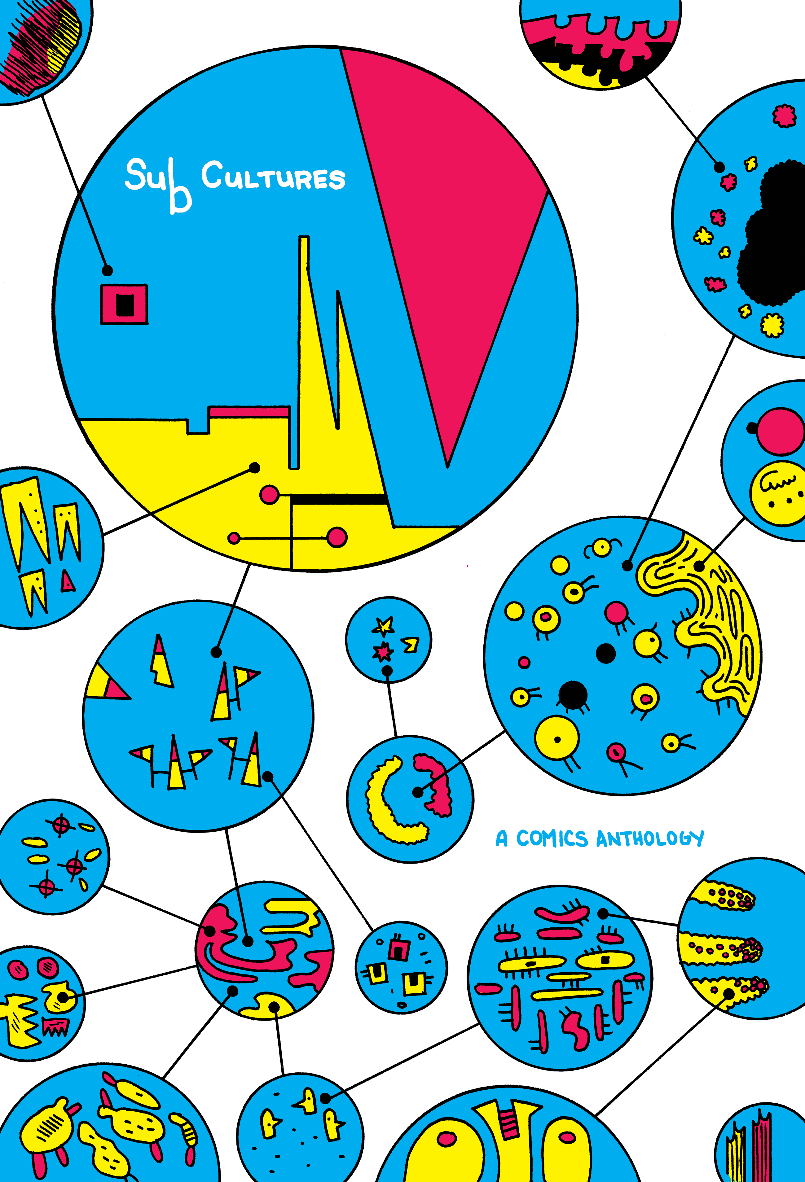
It was conceived and edited by Whit Taylor, and she has put together an outstanding collection of stories, by 36 different creators, about various subcultures.  I’m not only the publisher, I’m a contributor, with a story about Esperanto speakers (focusing on native Esperanto speakers); I’ll  post some more about my contribution soon. Meantime, to se lots of previews and to pre-order the book (it will be physically available in early September), go here.
The book is reviewed on The Comics Bulletin website:
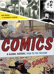
“in Comics: A Global History, 1968 to the Present, [Mazur and Danner] do an admirable job with a nearly impossible task: providing an encyclopedic overview of important comics throughout the world during that era – popular comics and alternative comics, comics from Japan, Europe and the United States, comics from different schools of thought and design, comics using diverse styles, comics presented sometimes in dramatically diverse ways – and Mazur and Danner do so with a smart focus.”
I continue my sporadic exploration of old shoujo manga through obscure (to me, anyway) books obtained through Yahoo Japan auctions.  I got my hands on this ShÅjo Club “supplement” from 1956.  It’s a tiny paperback (4′ by 6″), poorly stapled (I basically had to pull the thing apart to get usable scans, which I hate to do).  That contains a single long story, Yukimura izumi chan monogatari  (Yukimura Izumi’s Story).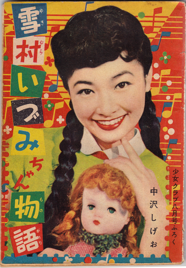
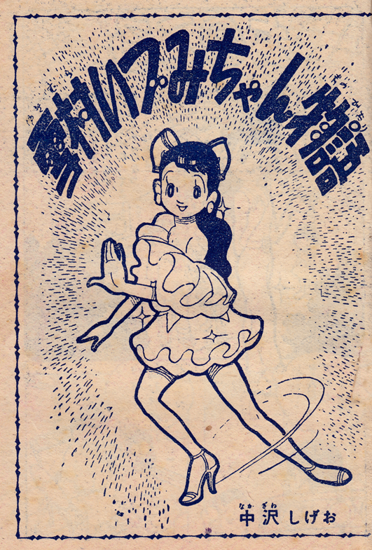
The artist is Nakazawa Shigeo (ä¸æ²¢ã—ã’ãŠ).  I assume artist-writer, since there’s only one name credited.  I don’t know anything about him, but there is some quite nice work here, with that introspective shÅjo mood (see my previous post).

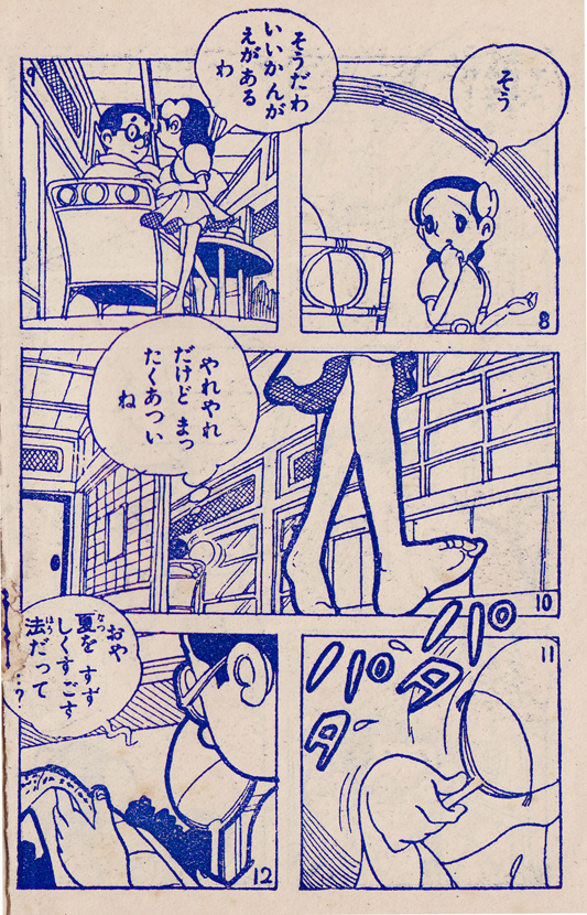
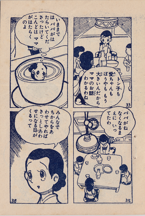
I like the heavy line around the characters, and the nicely detailed settings, with various textures. Â Also, I would say it’s a pretty sophisticated use of “camera angles,” for a kids’ comic from the mid-50s.
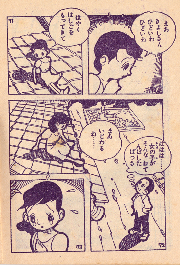
Also, notice that they were still numbering the individual panels at this point.
 And I love the panel with Izumi’s reflection in the teacup as she’s thinking!
 Coming in June from publisher Thames and Hudson, “Comics: A Global History, 1968 to the Present,” written by Alexander Danner and me.   Here are some excerpts and expanded material, including some great images that couldn’t fit in the book.Text in italics is directly from the book.
The decision to start the book in 1968, to define it as a sort of “comics come of age” narrative, sprung from the idea of “watershed” events like the appearance of Zap in the U.S., of Tsuge’s Nejishiki (Screw Style) in Japan, and, in Europe, and the changes seen in the pages of Pilote all taking place in that same year. In all these cases, of course, the breakthroughs of ’68 had been brewing throughout the earlier years of the decade. Â As it says in the introduction…
 In Europe, the maturing of the comics audience was accompanied by a rebalancing of the creative center from Belgium toward France. This began with the establishment in 1959 of the Paris-based Pilote magazine by writers René Goscinny and Jean-Michel Charlier, and artist Albert Uderzo. Like Tintin or Spirou, Pilote was initially aimed at schoolboy readers and had a distinctly wholesome and pedagogical tone. But Goscinny, who became editor-in-chief, envisioned a more adult tone for bande dessinée, and Pilote began to move in that direction, helped by the popularity of Uderzo and Goscinny’s Astérix le Gaulois (Astérix the Gaul, 1959) and Charlier and Jean Giraud’s Lieutenant Blueberry (1963). Astérix, which was set in France during the period of Roman occupation, offered sly, anachronistic satire of contemporary culture, while Blueberry was a western with revisionist, antiauthoritarian undertones.
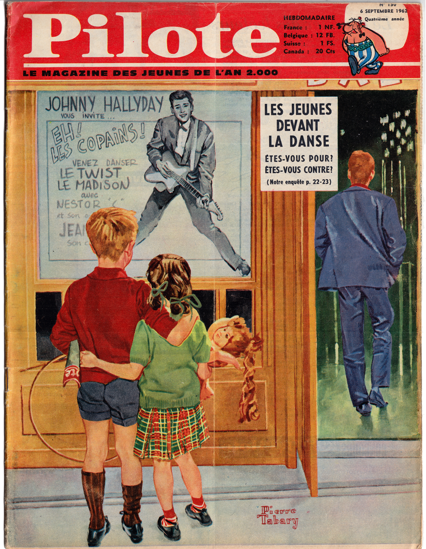
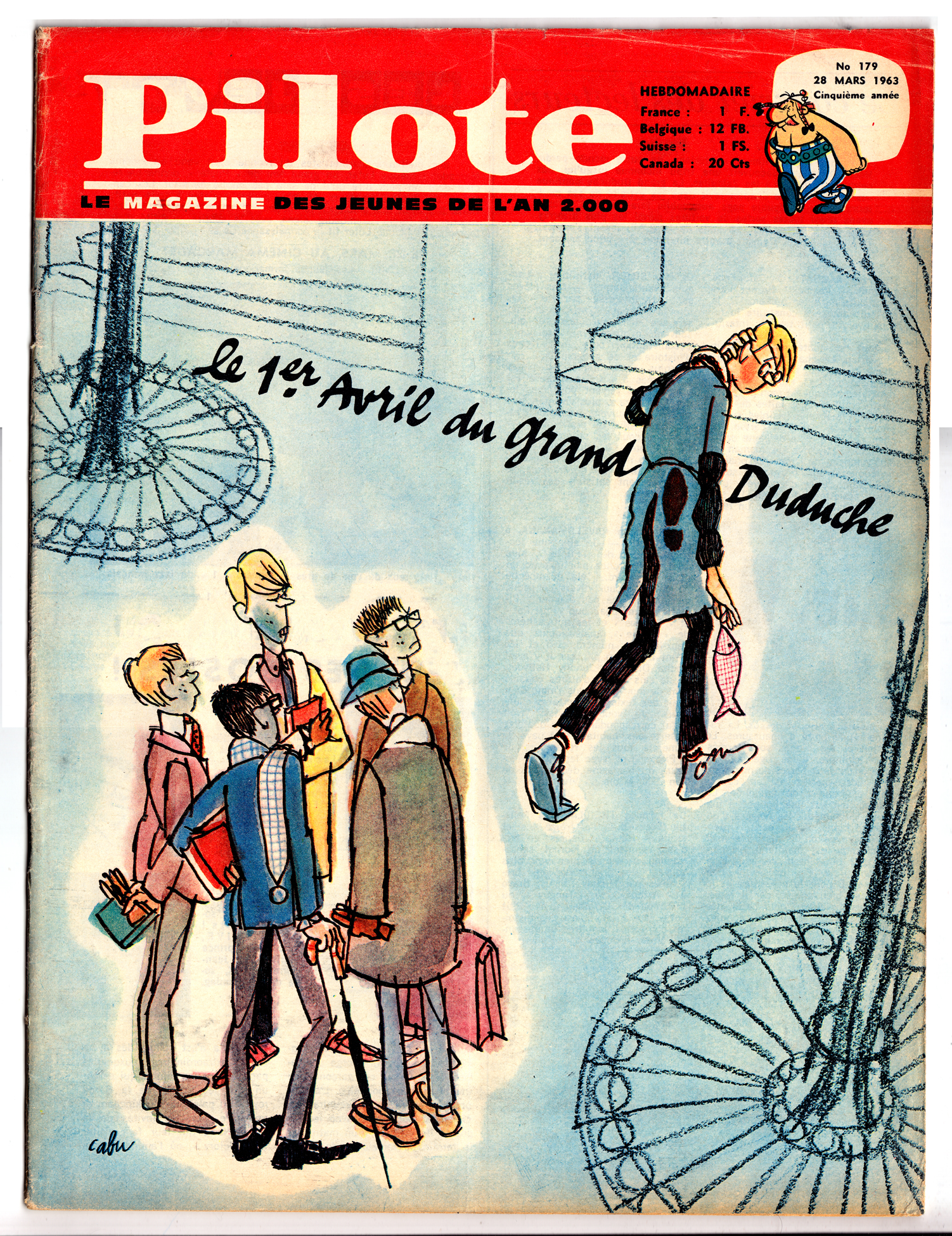
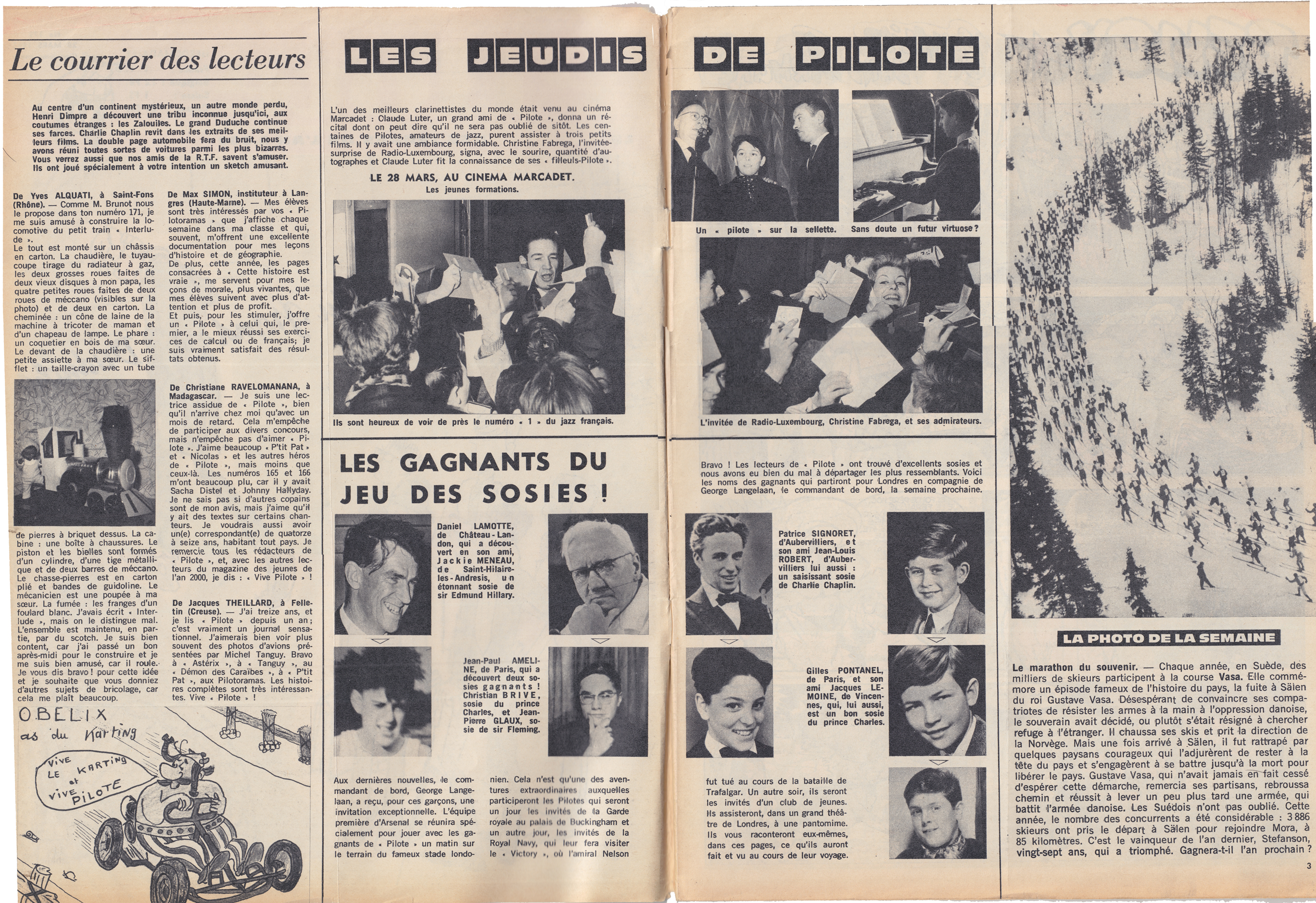
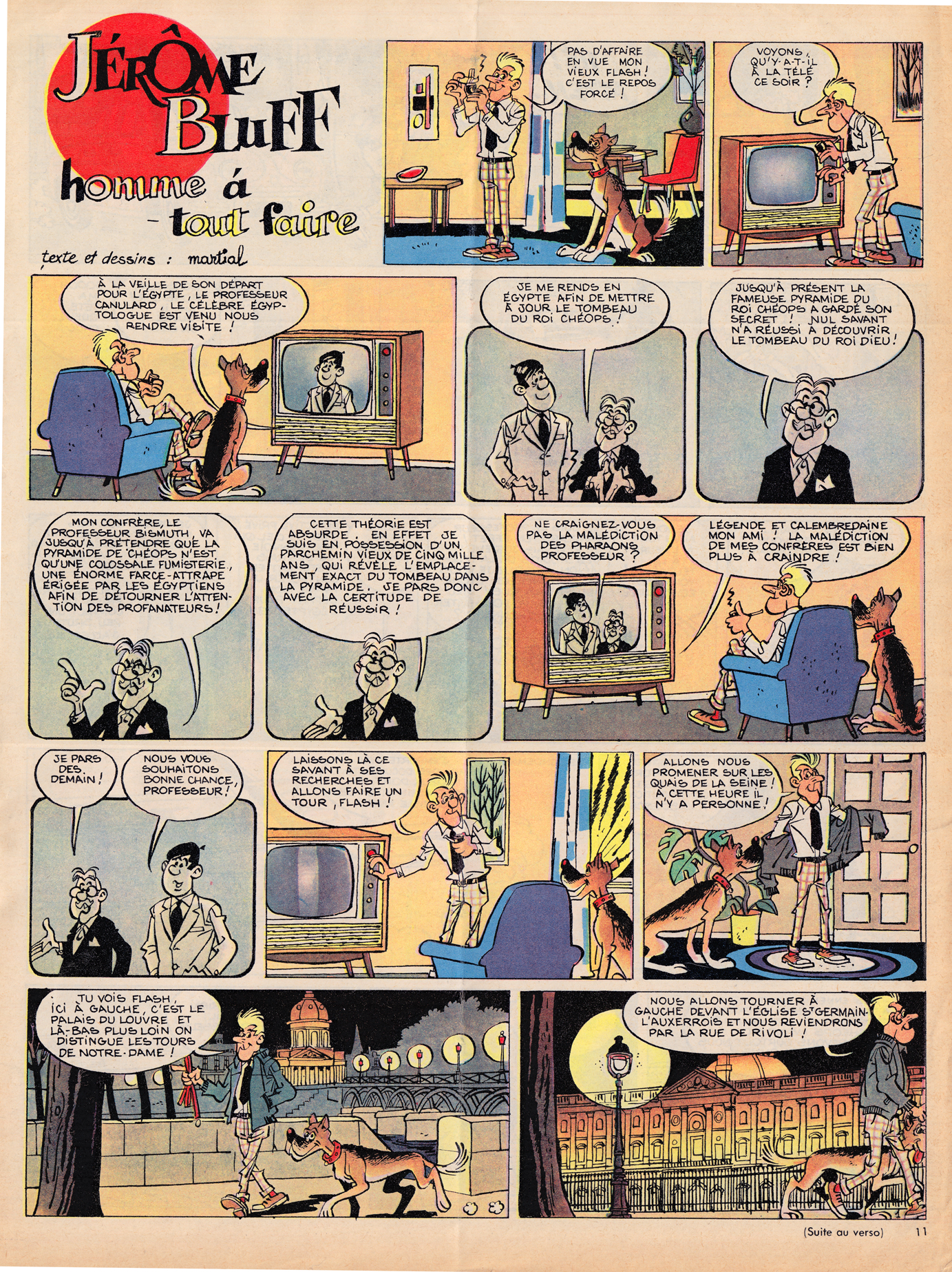
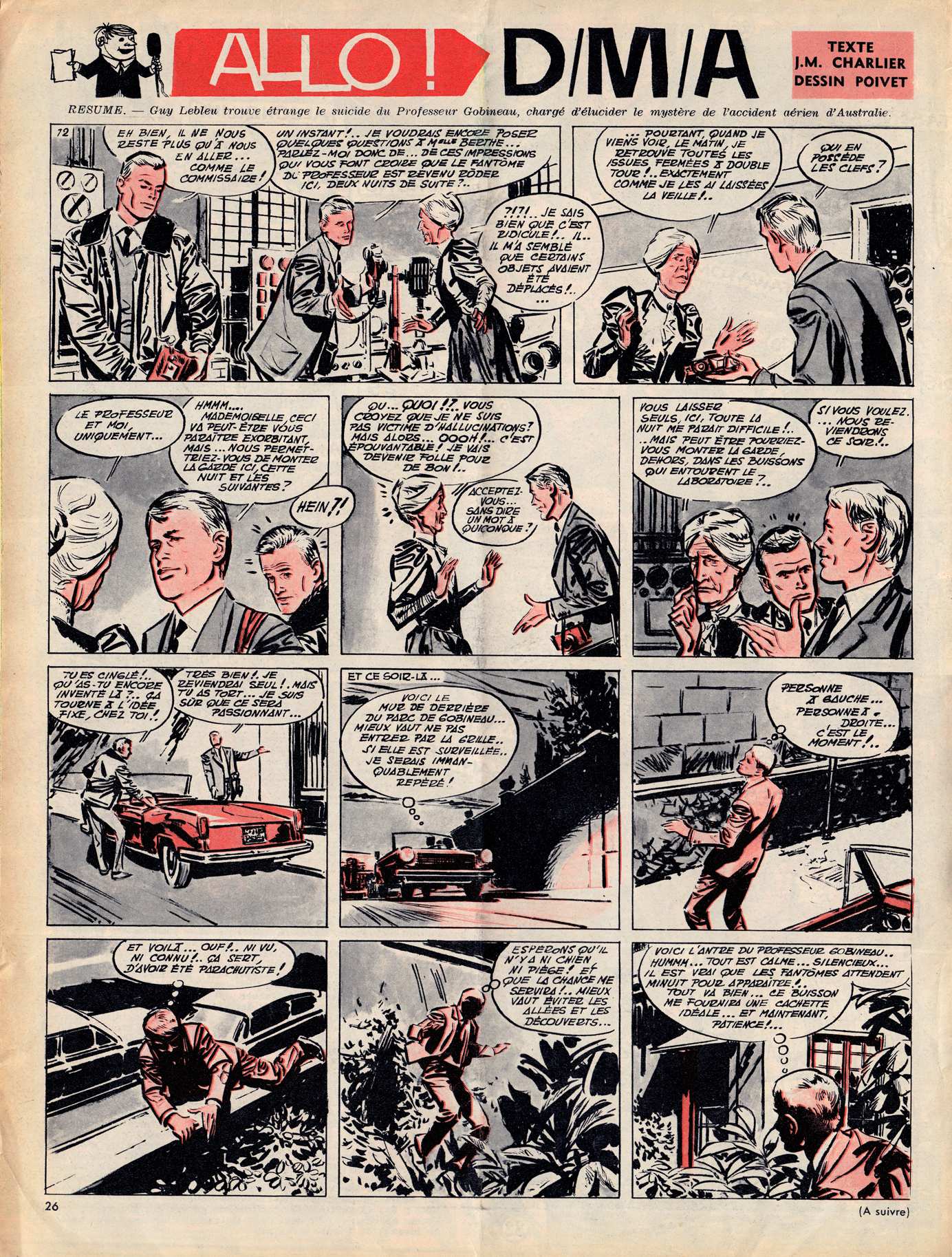
In its first few years, Pilote’s content was only subtly different from that of  Spirou and Tintin.  Though the tone was perhaps a bit breezier, Pilote, like its Belgian elders, featured articles on current events, sports, pop culture and exotic cultures.
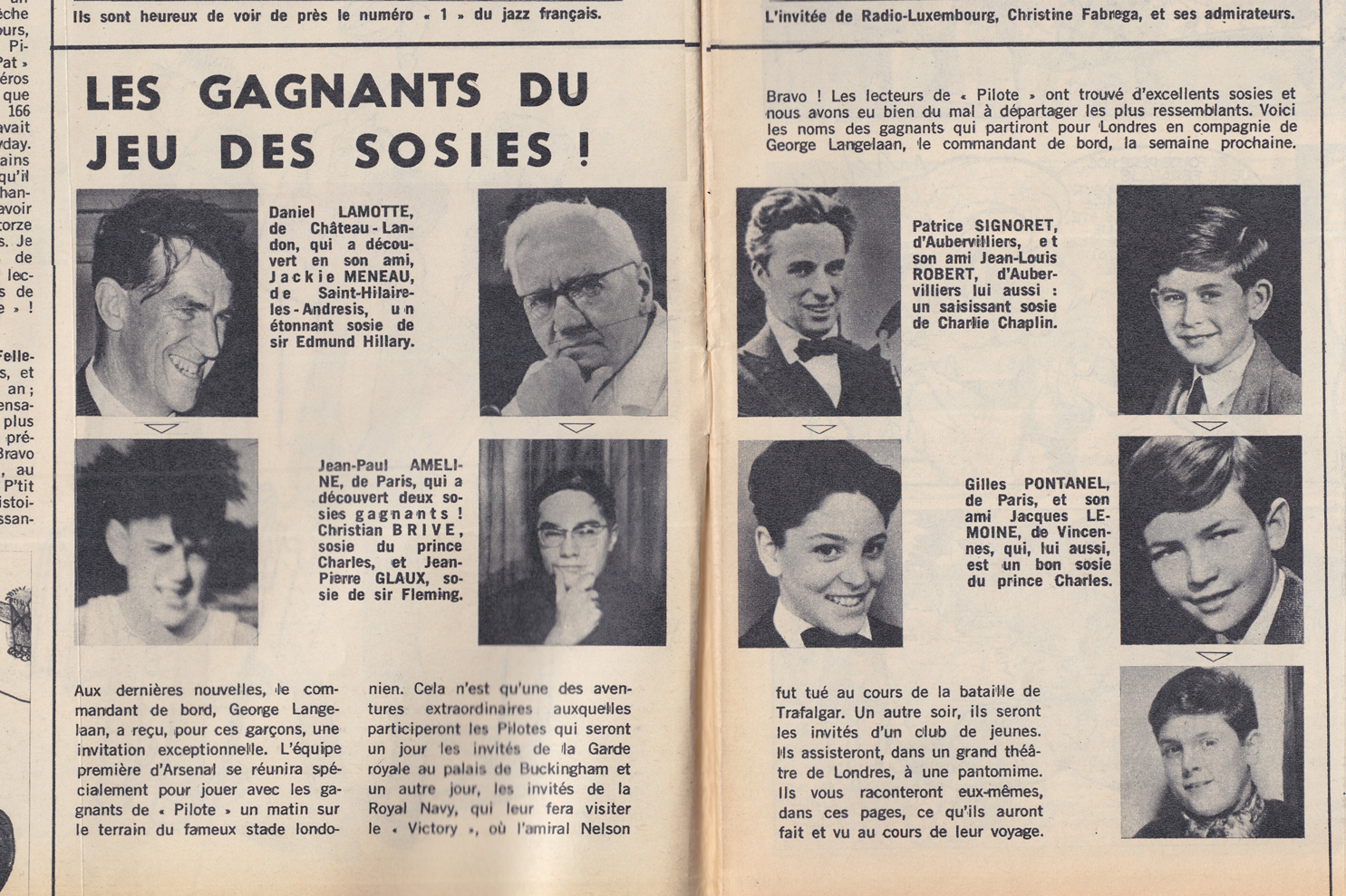
For the most part, the bandes dessinées found in early Pilotes are also in the Spirou/Tintin mold, with a mix of humor and action/drama:
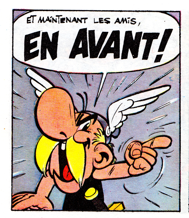
What soon set Pilote apart, and what set it on course to surpass its Belgian rivals, was the strip by founders Goscinny and Uderzo. Â Like any other strip in the journal, Asterix was serialized one page per week:
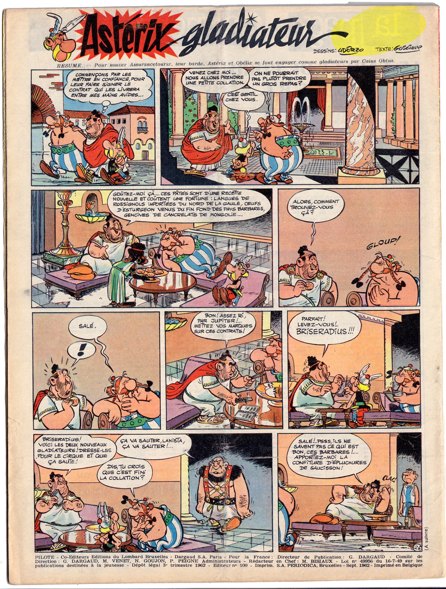
Asterix’ combination of slapstick comedy and anachronistic satire were two of the elements that made it a sensation:
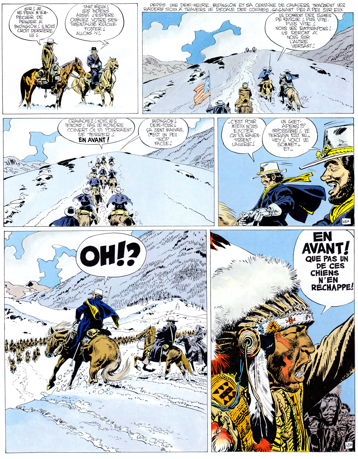
The second pillar of Pilote’s success came in 1965 with Lieutenant Blueberry, written by Charlier and drawn by newcomer Jean Giraud.  In its early years, Giraud’s art for Blueberry was often stiff and undistinguished when compared with other Franco-Belgian westerns:
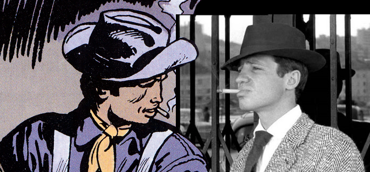
From the start however, Charlier and Giraud brought a refreshing, contemporary rebelliousness to the protagonist of their strip, a quality reinforced by Giraud’s depiction of Blueberry as a sosie for New Wave film star Jean-Paul Belmondo.
Within a few years, though, Giraud’s style would progress astonishingly, just one of the many major developments that Pilote would undergo during the eventful late ’60s-early ’70s period.
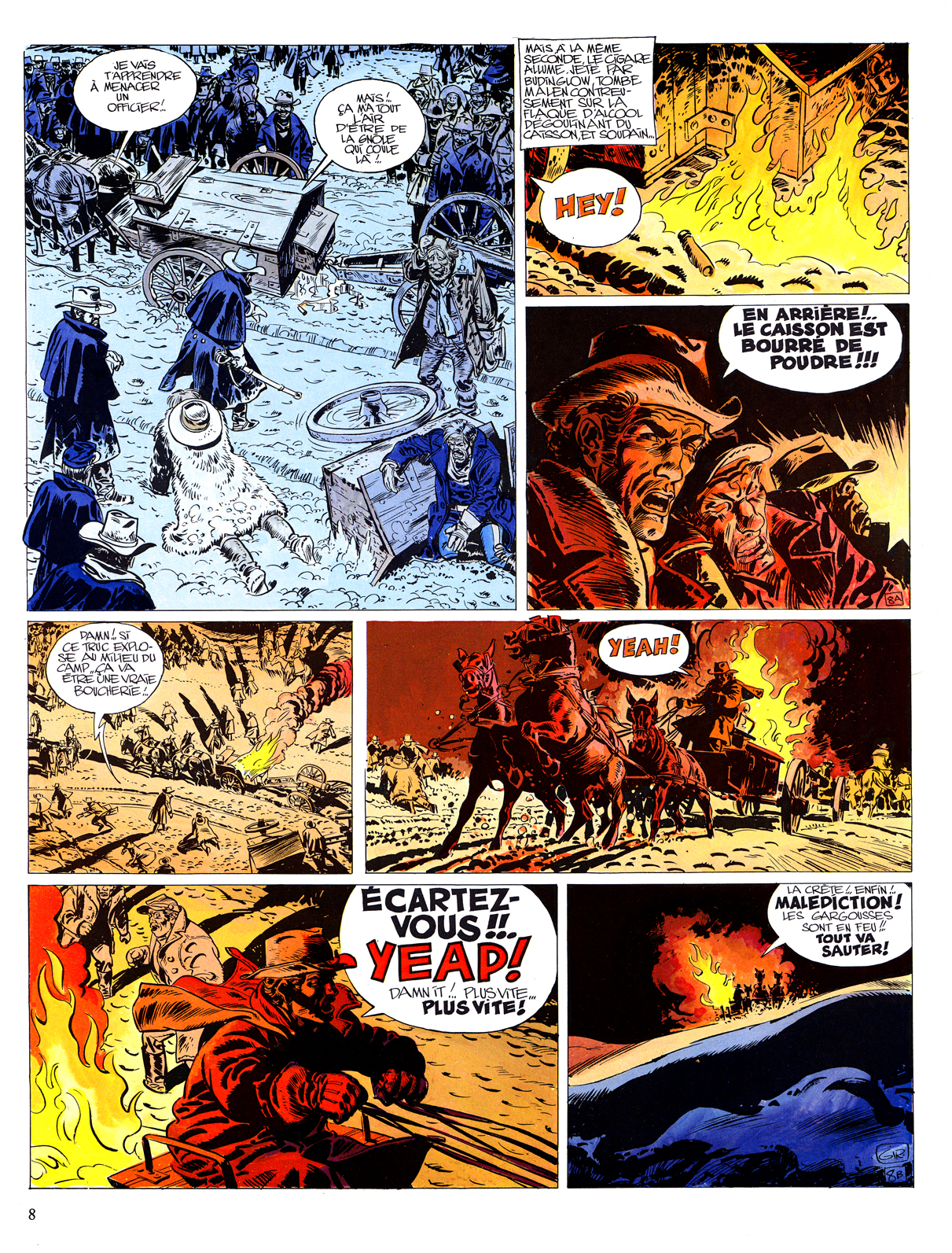
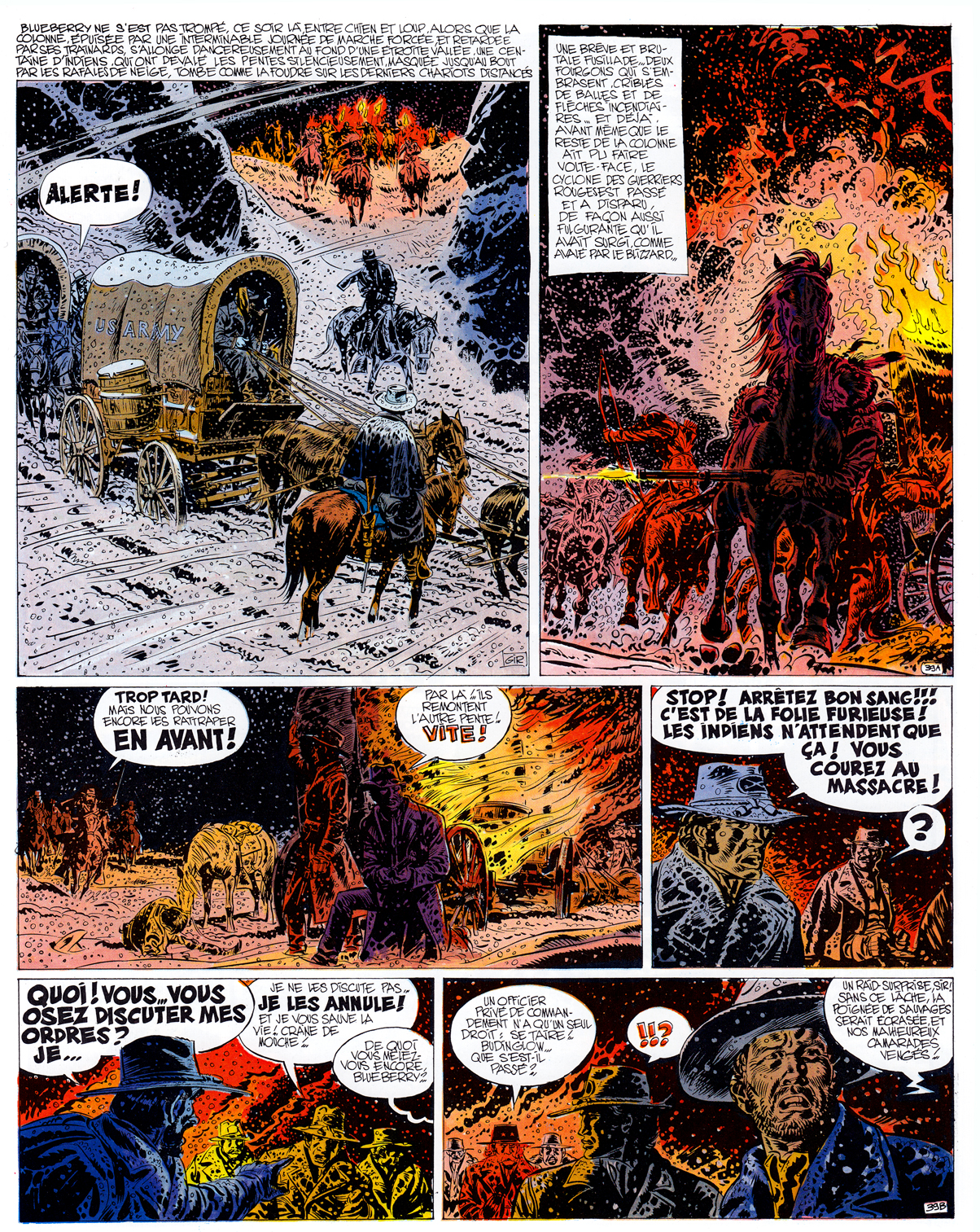
(Above: Giraud & Charlier, 3 pages from Le Général Tête Jaune, 1968)
COMING SOON: “Pilote ’68!”
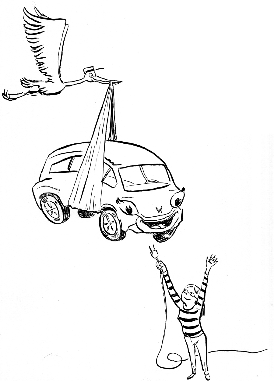
Currently coloring my story for the Jason Rodriguez’s Colonial Comics anthology. Â This is page 2, panel 6. Â Still working on it.
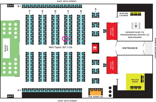
I’m going to be at the MoCCA Fest in New York, along with three of my all-time favorite collaborators: Alexander Danner, with whom I co-wrote Comics: A Global History (as well as other collaborations); and Whit Taylor, who is editing the SubCultures anthology for Ninth Art Press (which makes me the publisher), and Doug De Rocher, the cut-paper comics creator, whose work appeared in Show and Tell and The Greatest of All Time Comics Anthology. The MoCCA Fest can be found at the 69th Regiment Armory (Lexington Ave., between 25th and 26th — the very same place where the famous Armory Show of 1913 was held!)
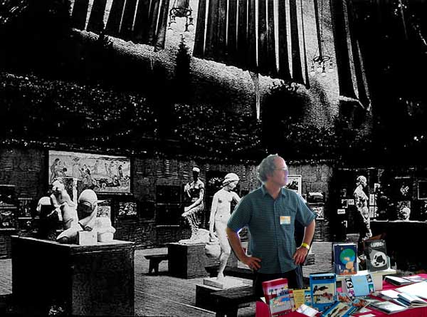
(For bonus points: how many cartoonists can you name who really exhibited in the 1913 Armory Show? Â There were at least 6!)
Amongst the exciting items on our tables:
:
Comics: a Global History, 1968-Present. Â We’ll have 2 display copies only, not for sale, but this will be the first time the book has been seen in public! Â There’ll be a postcard for the book as well!
*************************************
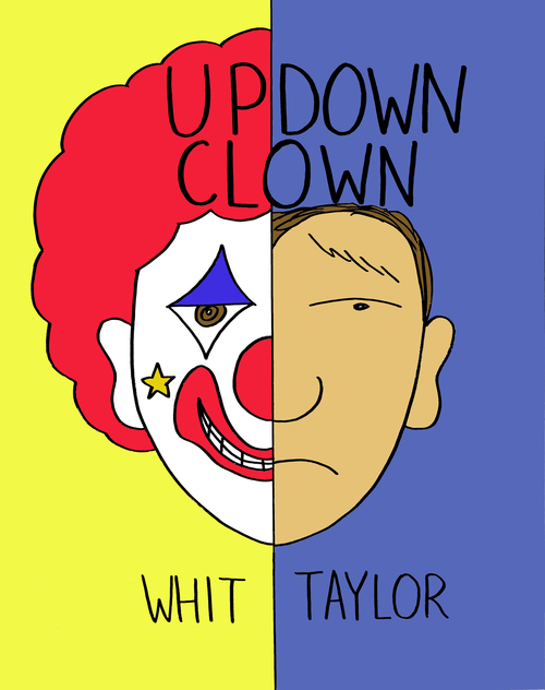
Up-Down Clown by Whit Taylor.  A MoCCA debut, Whit’s new graphic novel, a sweet, perceptive and moving, naturalistic fiction about a young professional clown dealing with emotional, relationship and career issues.
*************************************
The SubCultures anthology preview postcard!  The book is still a few months off, but MoCCA will witness the world premiere of this glossy, 4×6 postcard, revealing Box Brown’s delectable cover!  Yes, that makes two free postcards at the table!  Suitable for framing or for keeping in the big pile of stuff you got at MoCCA that sits in the corner until sometime next year!
*******************************
Monarch Monkey and Other Stories by Doug De Rocher: a collection of amazing cut-paper comics:
And of course you will find an assortment of Ninth Art Press excellence, including the anthologies Show and Tell, the Greatest of All Time Comics Anthology, In a Single Bound 1-3, plus Cold Wind and other one-shots. And for those who’ve been following my “Eunice Williams Story” process posts with baited breath, I’ll have the original art from the story! MoCCA is a great show, and you should not miss it!  Stop by and say hi.
![]()
For Sage Knight’s “Living Well” column in the Topanga Messenger.
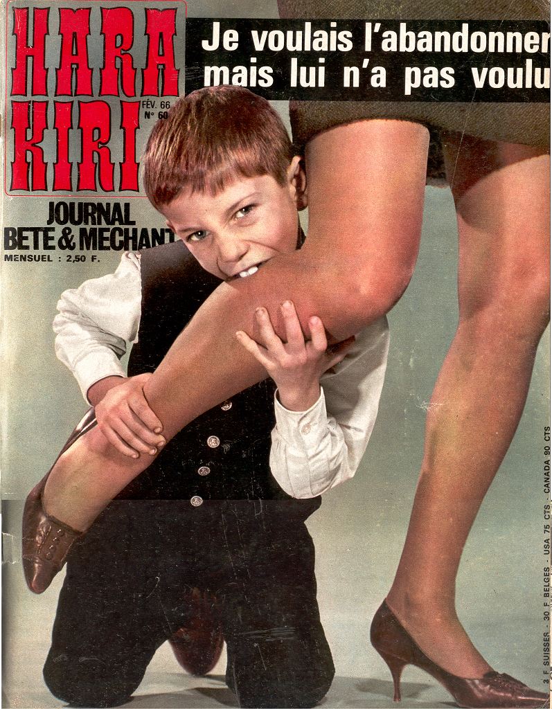
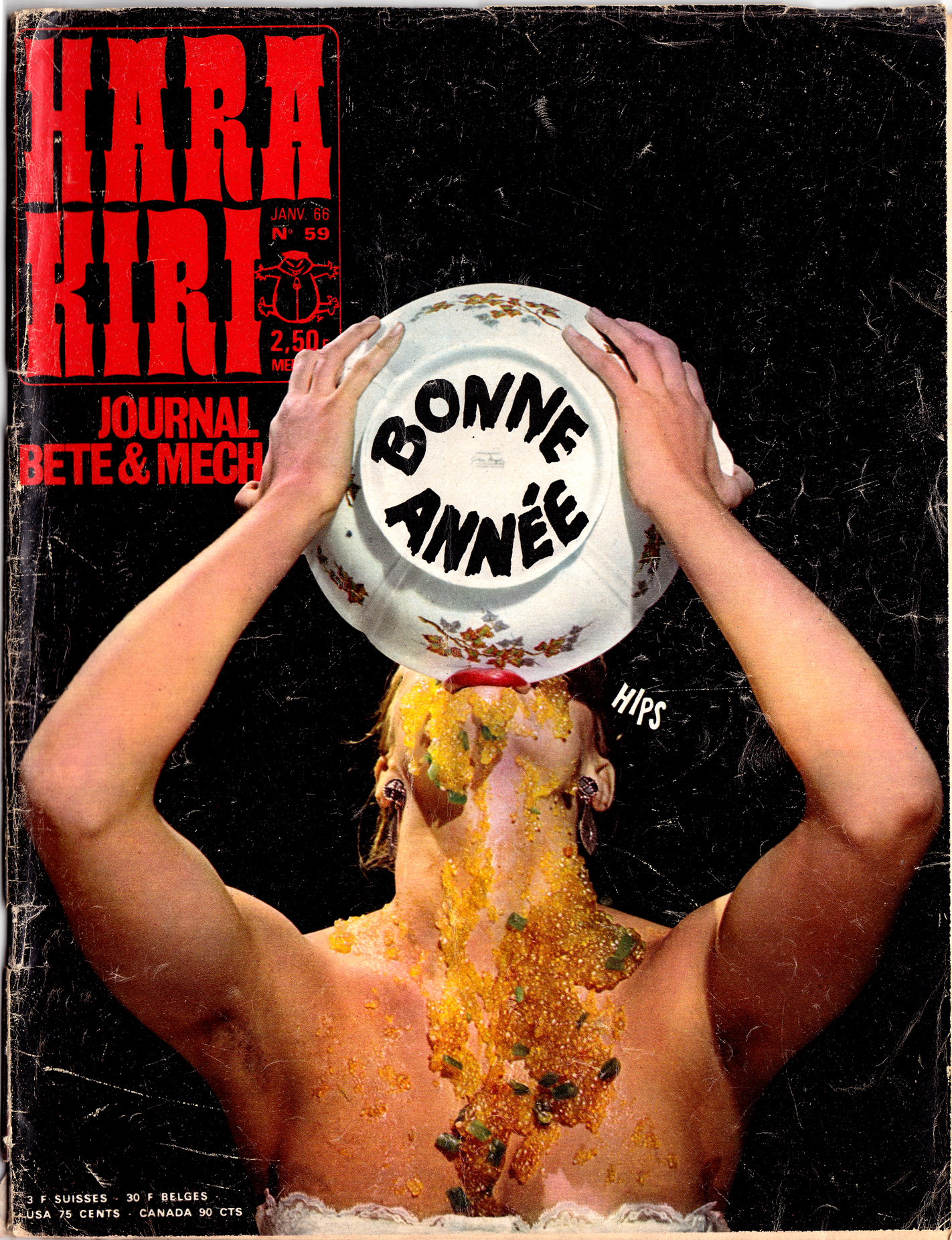
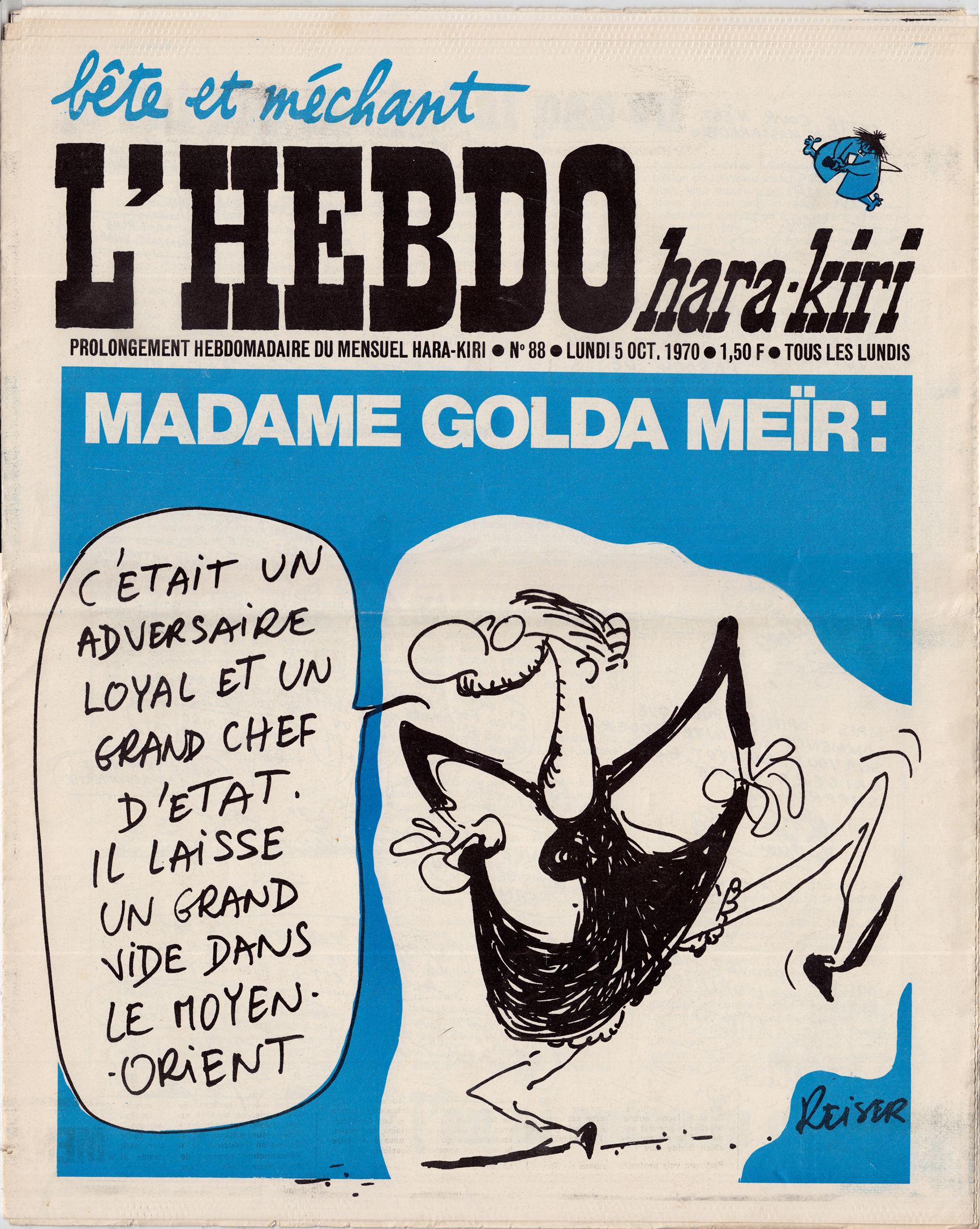
Though  not exclusively a comics magazine, the French satirical journal Hara Kiri was very important in the movement toward a bande dessinée adulte that gathered force during the 1960s.
Hara Kiri, which billed itself proudly as “le Journal Bête et Méchant’ (stupid and nasty)  was founded in 1960, originally hawked on the street corners of the Latin Quarter*. Founders Francois Cavanna and George Bernier soon demonstrated a propensity for sick, shocking humor, which resulted in the magazine being banned several times.
While MAD Magazine was certainly an influence on Hara Kiri, its brand of satire was far less innocent, and aimed at older readers (a better comparison in terms of format and content would be National Lampoon, which appeared in 1970).  The comics in Hara Kiri were raunchy, political, dark and decidedly adult.  In spirit, the magazine might be compared to the early underground newspapers in the U.S., like the “East Village Other” and “Berkeley Barb,” but France’s cultural climate was different — there wasn’t the same sort of burgeoning youth counter-culture economy that could generate a true underground press– so French mainstream culture had to absorb the full,  bête et méchant brunt.
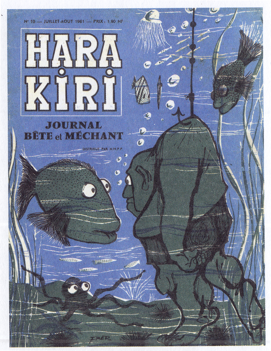
Early covers featured illustrations, but these were soon replaced by infamous staged photographs that demonstrated the magazine’s sensibility: gross-out humor and political/social satire, often completely sexist (you’ll have to google it yourself to see the worst ones).
Â
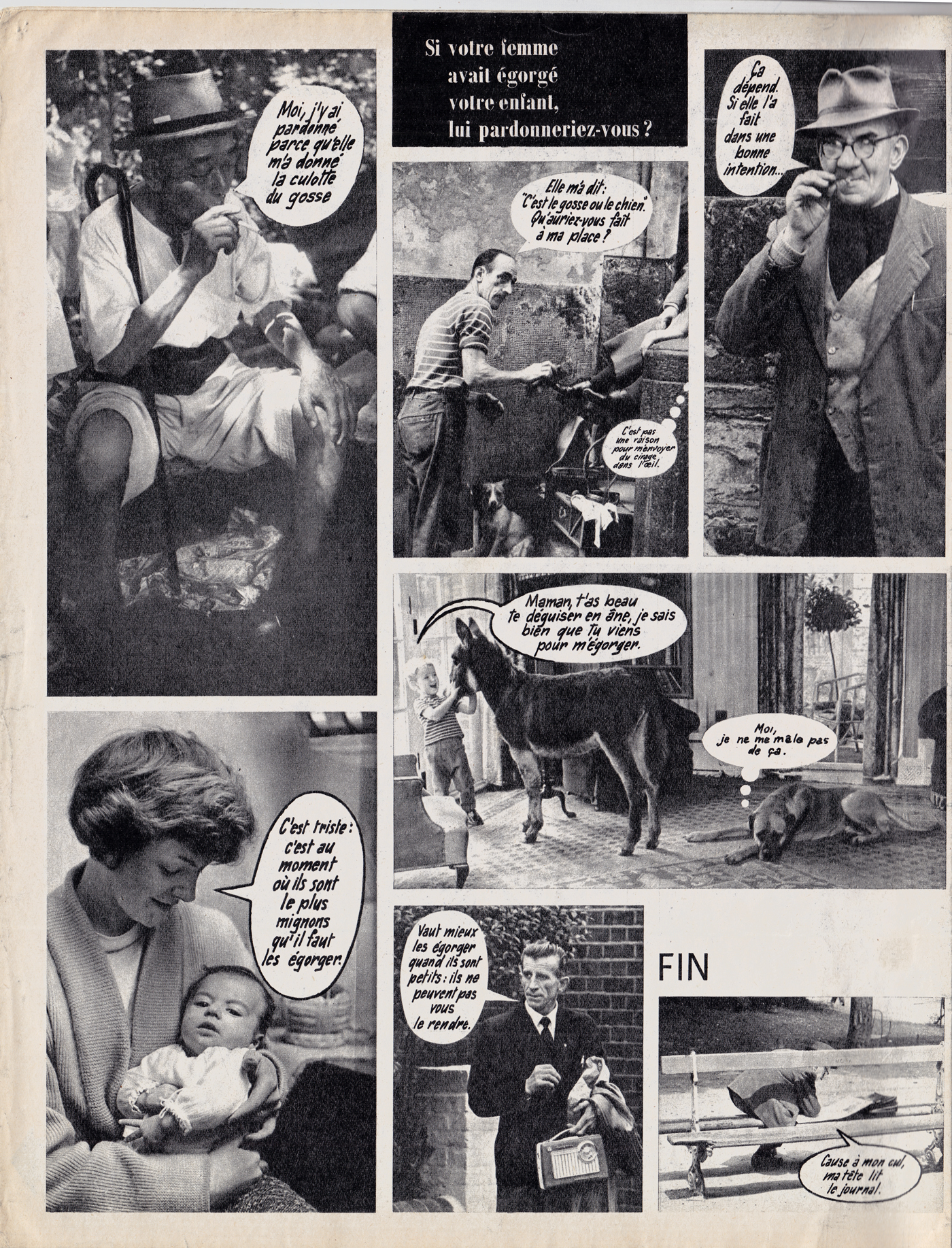
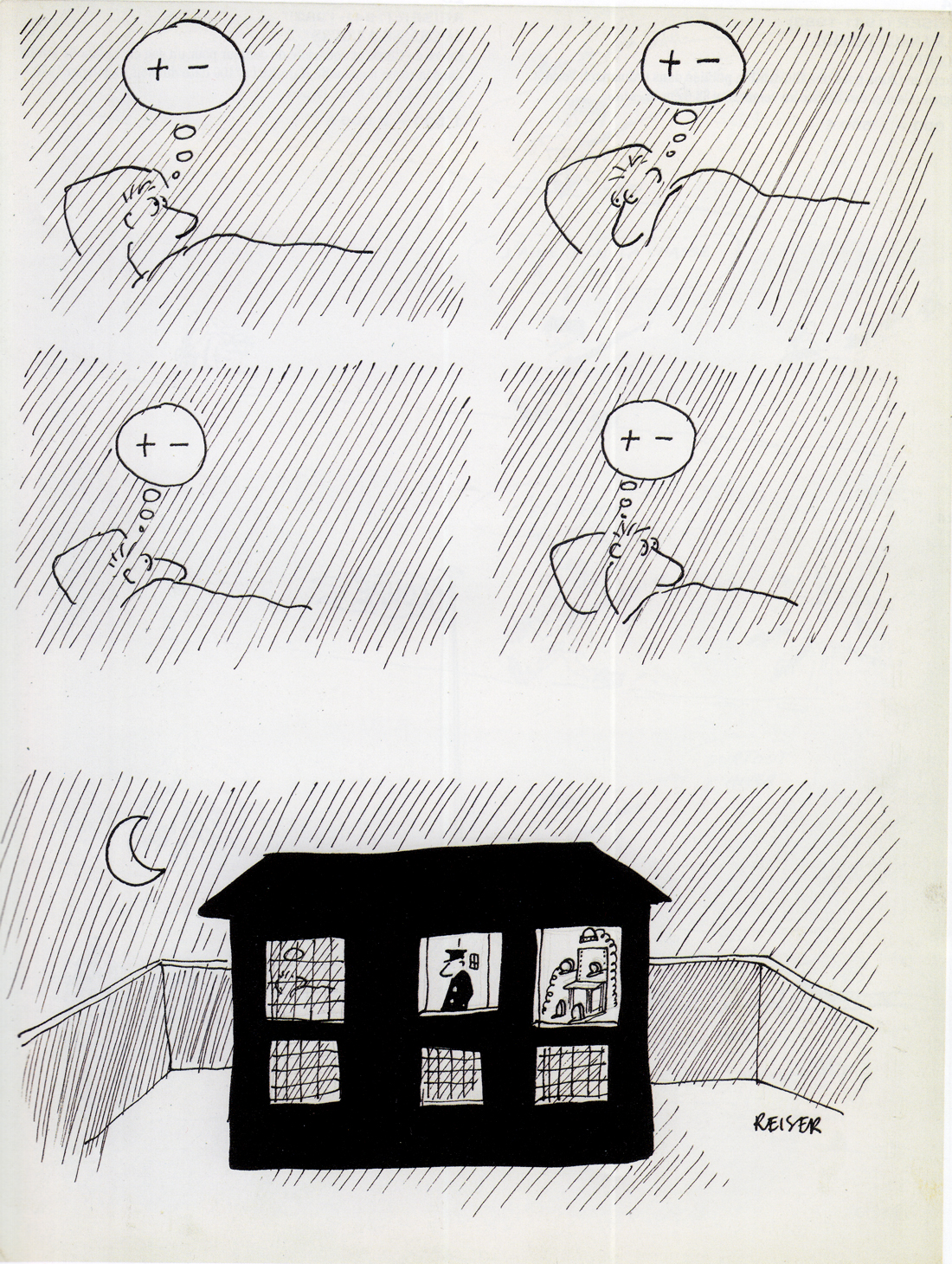
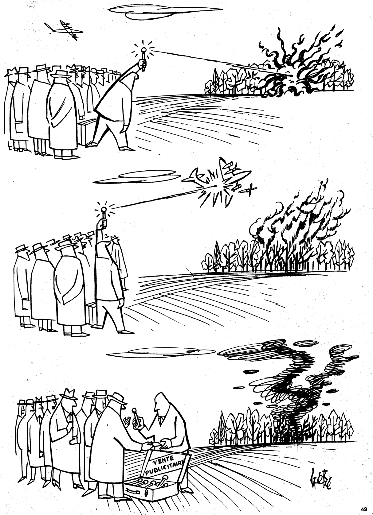
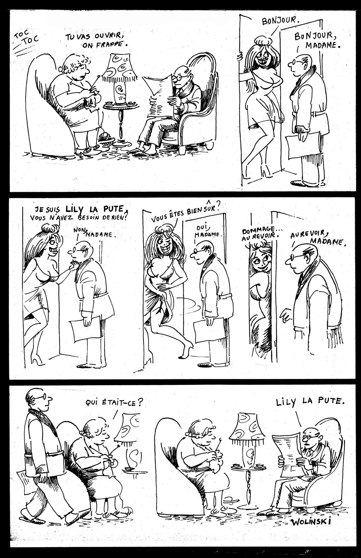
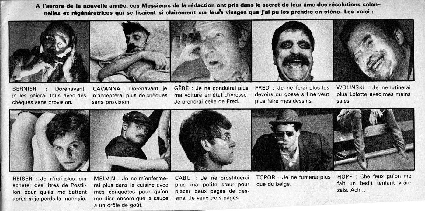
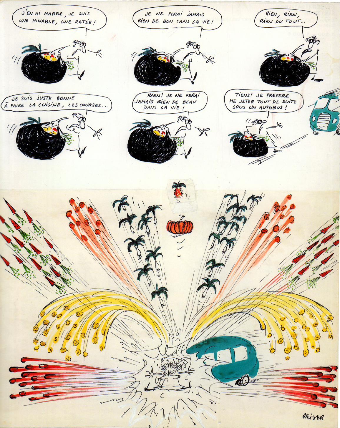
The magazine featured articles and photo-romans (photo-funnies), and  some brilliant cartooning, by a stable of artists that included Wolinski, Reiser, Gébé, Fred, Topor and Cabu (there was, I believe, a law that Francophone cartoonists were entitled to only one name apiece).
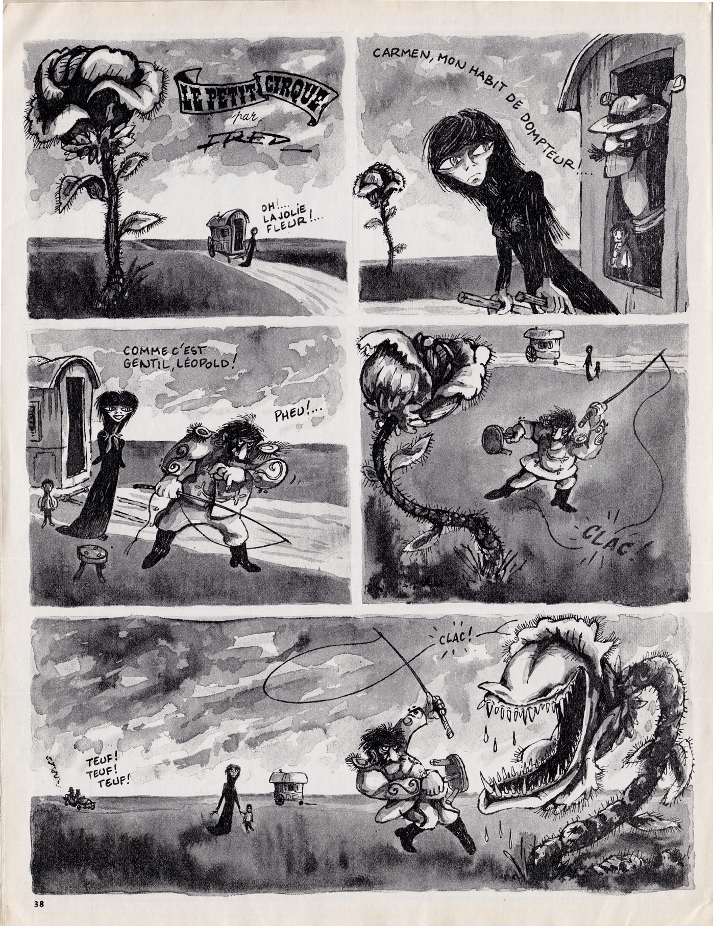
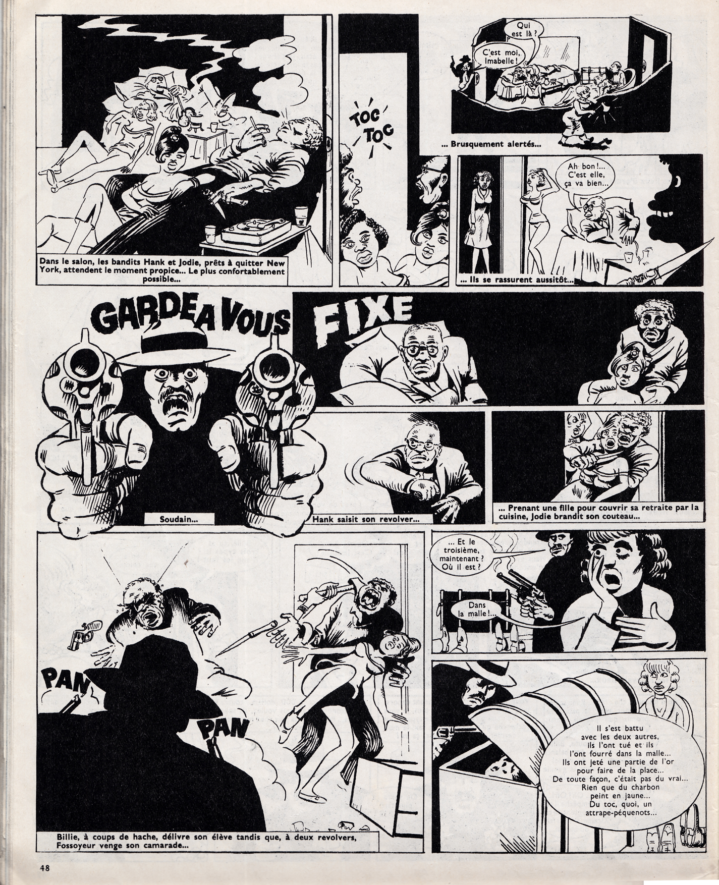
Most of the bd  in Hara Kiri were panel gags and short humor strips, but there were some important longer series as well, such as Fred’s Le Petit Cirque, Guy Peellaert’s Pravda, and a little-known but fascinating collaboration, in which American expatriate writer Melvin Van Peebles collaborated with cartoonist Wolinski to adapt the Chester Himes crime novel, “A Rage in Harlem” (known in French as La Reine des pommes)
By the early 70s, Hara Kiri had been shut down by censors often enough (most notoriously for a headline that mocked the death of Charles DeGaulle), that the magazine’s cartoonists sought greater security, first by a short-lived emigration to the pages of Pilote (only Fred became a mainstay there, with his glorious strip Philémon), and then by starting a new publication, Charlie Mensuel, devoted entirely to comics.  Charlie would represent another major support for grown-up bande dessinee for the next 20 years.
* Thierry Groensteen, La bande dessinée, son histoire et ses maitres, Skira Flammarion, 2009
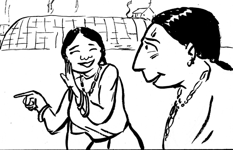 Page eleven of the story I’m working on for Fulcrum Press & Jason Rodriguez’s Colonial Comics anthology. Â Another scene at Kahnawake. Â THIS was all I had for a “script:”
Eunice, about 15 years old, working in the fields, when she sees a handsome young warrior coming back from the hunt. Zing!
This would be the meeting between Eunice and her future husband. Â Eunice did marry a Mohawk man named Arosen, but how or when they met is pure speculation, so I speculated. Â I did some sketches in between caricatures at an event (ignore the silly childrens caricature border and that woman with the glasses):
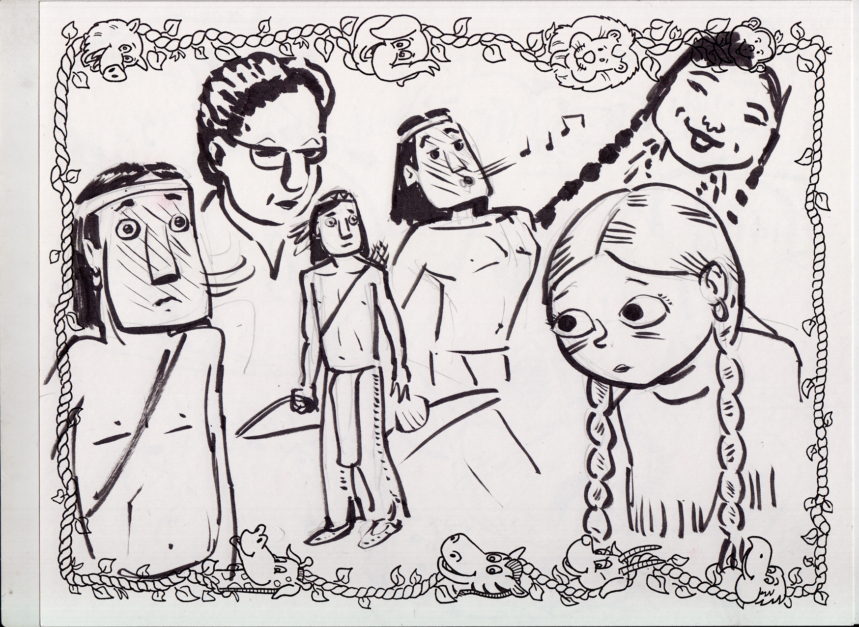
Then the thumbnail (with bonus silly sketch and some numbers in the margin!):
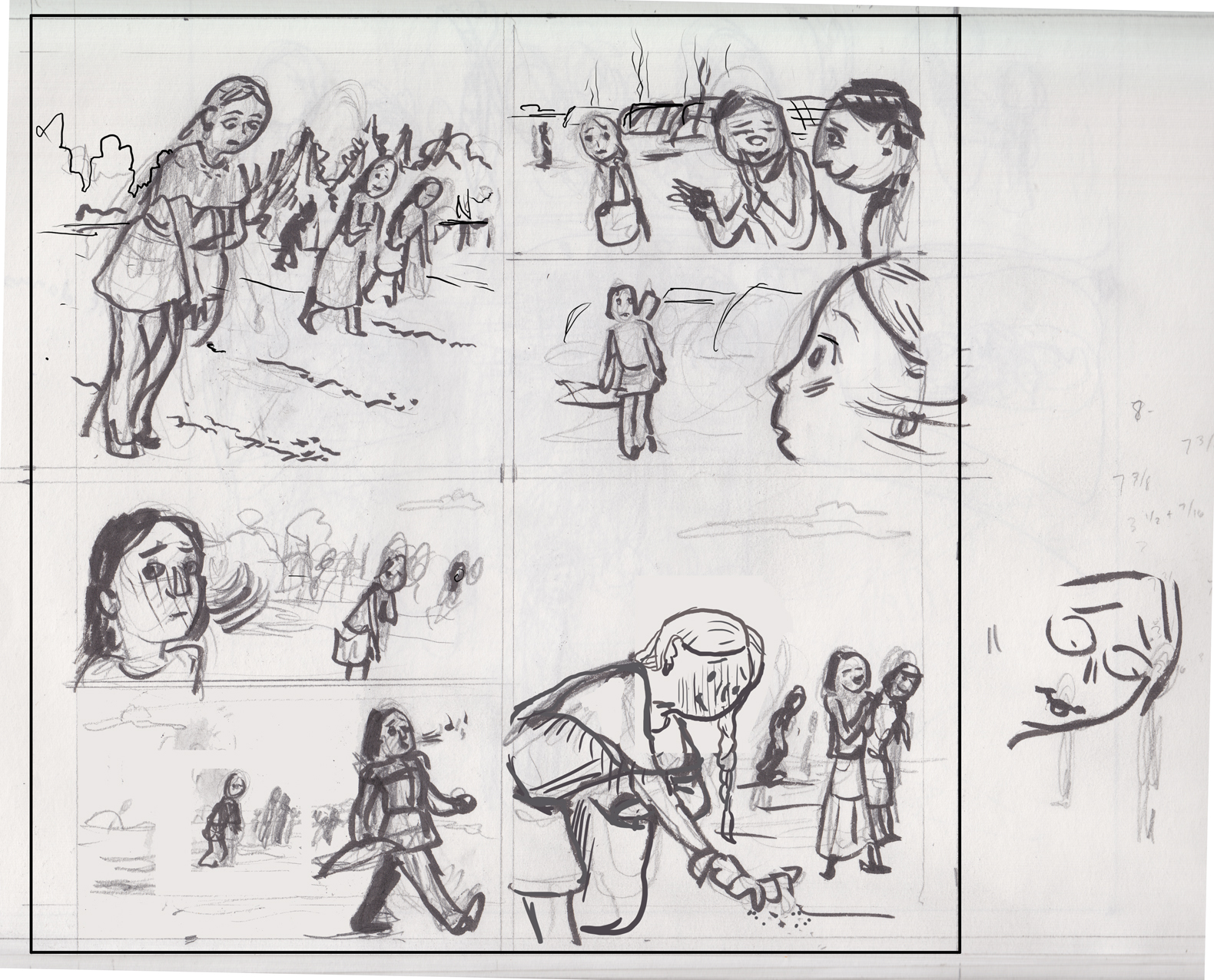
As you can see, I decided to make this page / scene a bookend for the one on page 8. Two key moments in Eunice’s integration into the community/coming-of-age. I used an almost identical panel layout, with the large panels at top-left and lower-right demonstrating the “arc” of the page via Eunice’s change in attitude; and then the story being pushed along by a series of looks and glances in the smaller panels that take up the top-right and lower-left quarters of the page.
Also I had some problems with the way I drew Eunice in the first panel. Â She looked like she was tipping over. Â I just “straightened” her up with photoshop…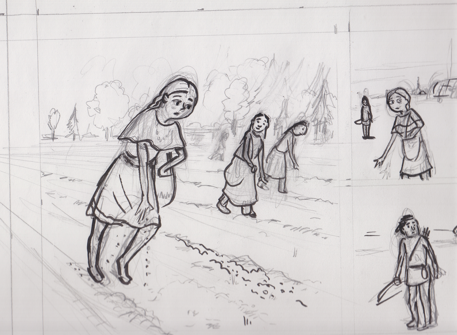
…see? Â (here’s the rough pencils/inks:) (with some of those sketches I did on the caricature sheet thrown in because I couldn’t do any better and why not?)
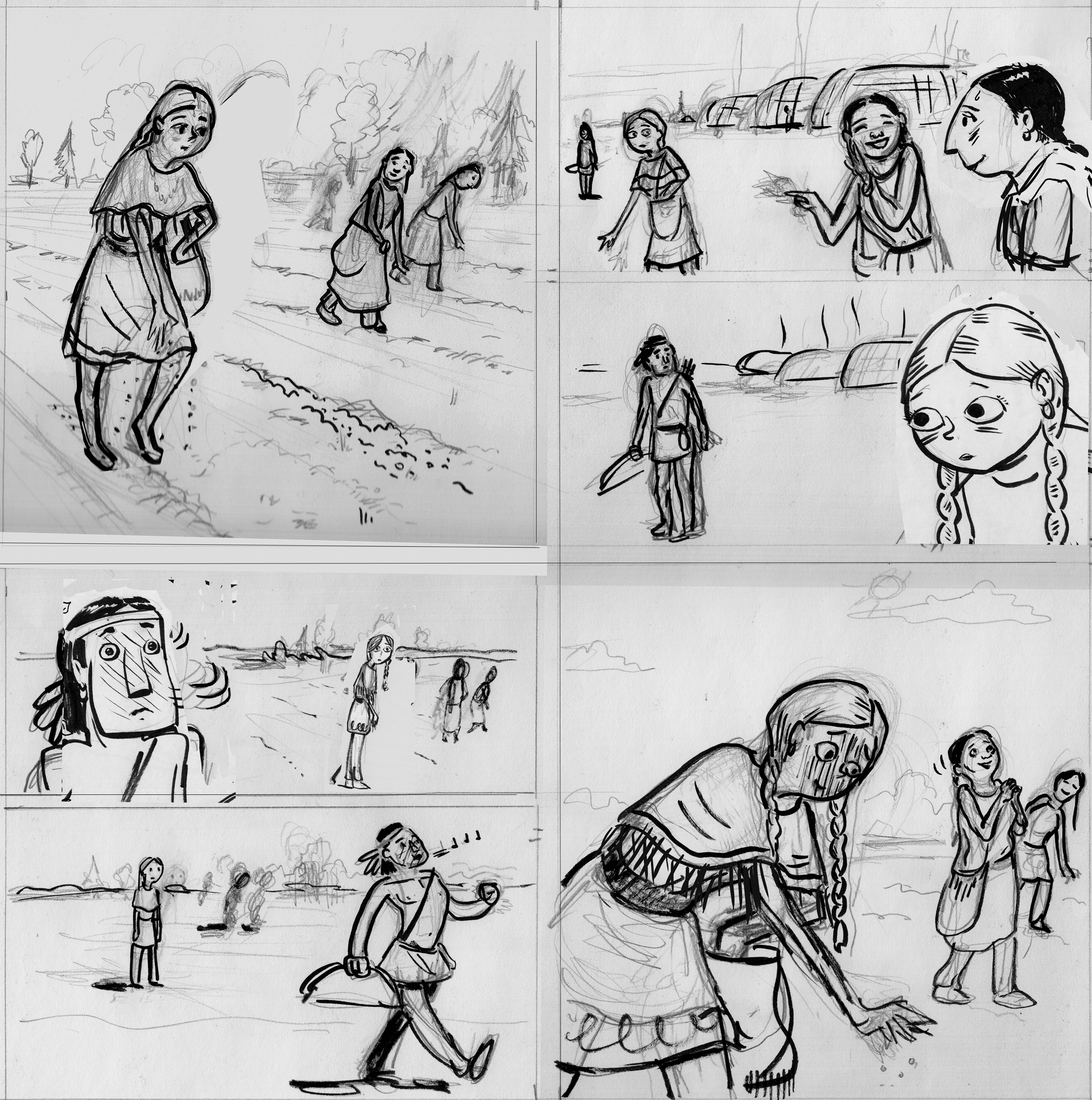
Oh, and I liked this little pencil sketch trying to get Eunice’s attitude in panel 4, so I just stuck it in the rough as well (before printing it out for light-boxing the final art).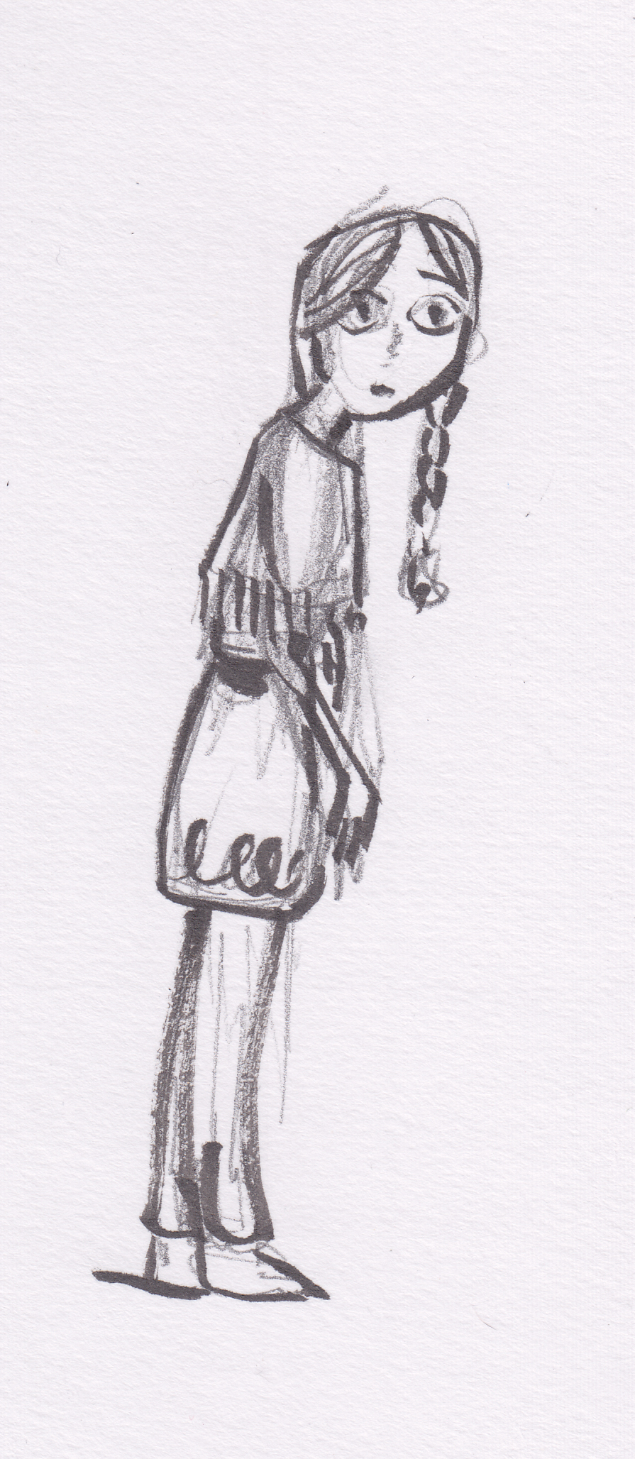
Final line-art:
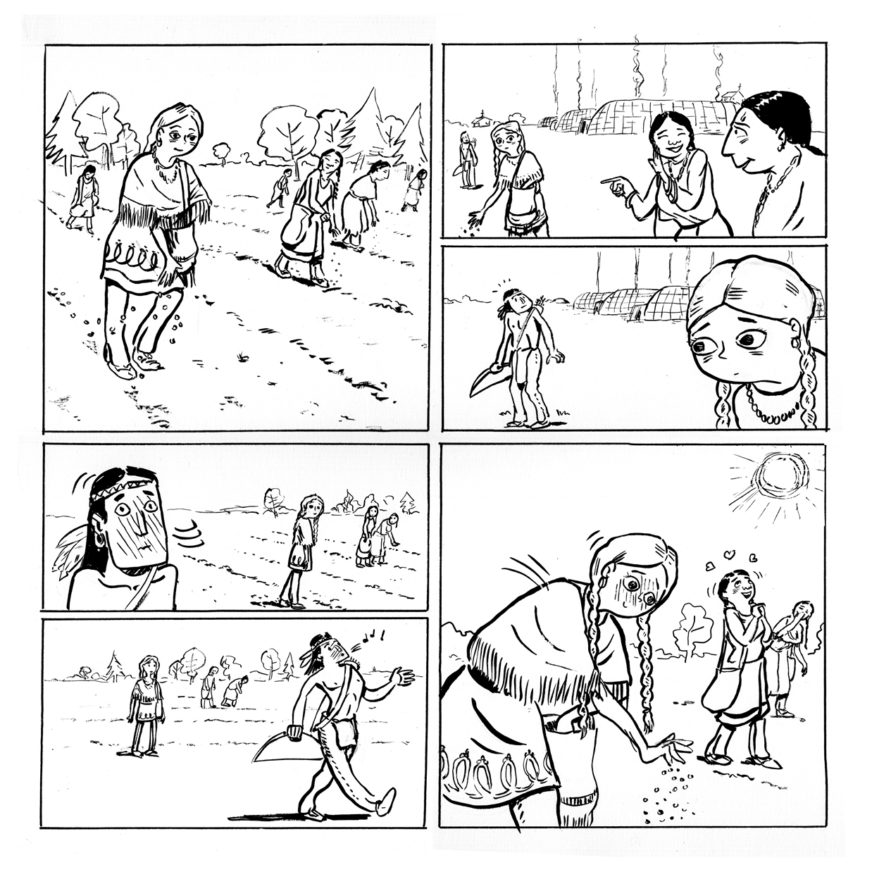 Final? Â Yeah, right! Â Seeing it now, I feel like Eunice’s head is too small in the last panel. Â I’m going to try and fix that digitally before I color it…