Boston Comic Con!!

I’ll be at the Ninth Art Press/Dan Mazur table (because, y’;know, I am Ninth Art Press) at Boston Comic Con this weekend: August 12-14, table D724. Sharing with me will be the great Jesse Lonergan, who’ll have a selection of prints, along with the magnificent HEDRA And we’re right next to the Boston Comics Roundtable table (D723), with its world premiere of BOUNDLESS (which I have a story in).  Here’s what’ll be on my table:

The Jernegan Solution
cover color 2f resizedjpg

Jesse Lonergan’s HEDRA
hedra 2


COLD WIND
art by Jesse Lonergan, story by Dan Mazur

Cold Wind cover

cover


“lunatic” process: 7-16-16

More photo reference and sketches, for the baby in the pram:

7-16 pram sketch4

I decided I don’t want to do more detailed sketches.  Getting a little burnt out on that, and also worrying about losing the spontanaeity if I expend too much effort drawing non-final images.  For this chapter, I think the next image I draw will be intended as final, not rough. Even though I’m still a little undecided on certain things, I think it’s better to work it out when I know it’s gonna count.  Just to avoid that feeling of not being able to capture what I liked about the rough version!

As far as the different media/effects I’ve been bouncing around with: Charcoal or conte crayon, acrylics, ink-splatter…. For now, I think my system is no system, just find the best medium or combination of media for each image/page.

Also, might be a bit of an interruption in this process… next week I need to spend time laying out the Shirley Jackson book, drawing an illustration, then Monday going away for a week.  So, probably not much progress on “Lunatic” until August….

“lunatic” process, 7-15-16

Sketches for page 3… actually more than just page 3.  There are 4-5 pages “cutting”  between the moon looking down, the baby in her pram looking up.

More messing around with different media and techniques… I liked the splattering, so maybe it’ll work in this image too:

pram 1

Well… no.  The spattering doesnt really make sense here.  And I don’t think I got the composition of this page right, either.

I switch to charcoal pencil:

pram 2

Ah,. yes.  this has the feel i want, and i like the expression.  Not right in all the details, but  it has the feel….  Let’s try that again:

pram 3

Nope.  Sometimes it’s so hard to reproduce what works well in a sketch.  This one just didn’t have it, so I abandoned it.  Maybe the angle on the pram was going to work a little better.  I call it a day.  I’ll be back.

“lunatic” Process 7-13-16

I’ve been trying to figure out how I want this book to look.  I’ve come to the “conclusion” that what I am after is images with rich and interesting textures.  Maybe from conte, maybe some kind of paint.  Maybe using ink-spattering?  I’ve never done that before (well not since i was 16 or so), so I played around with it today:

7-13-16 p2 spatter jpg

I need to work on my toothbrush-flicking control.

“lunatic” process , 7-11-16

More photo reference:

The first chapter is seven pages.  Each a single image, so if I was drawing this as a regular panel-page comic, it would probably be one page, or maybe two.  I don’t have to thumbnail page layouts, but I realize I do have to think more than usual about spreads and page turns.  I thumbnailed the 7 pages out with that in mind (spoiler alert: this is totally illegible): thumbnail chapter 1

The chapters are mostly short like that, but longer toward the end.  If I was doing this as a standard comic, it might be about… 9-10 pages?  But in this format, maybe about 45-50 pages.

Besides that, I worked exclusively on sketches for page 2 today:

7-11-16 p2nursemaid 7-11-167-11-16 p2 27-11-16 p2 3

The composition probably more like that last one, though now that I see it, it looks a little cramped.  Maybe the one above is better.

Not sure yet about the style this will be drawn in.  For this page, I want the background to be looser, not to command too much attention away from the figures, and hopefully emphasize the pram over the nursemaid….


Provincetown foliage drawings

This is the last batch of drawings from a trip to Provincetown last month.

After trying to draw moving water over and over, it was nice to switch to leaves and grasses, which hold relatively still.  This one was ink-wash (using the rotring pen and its non-waterproof ink, then a brush and water to create the wash):

foliage 1 6-16

Switching to watercolors.  Not very happy with the result.  I wanted to draw the grasses, but somehow got hung up on the “background,” the walkway with its flat stones.  The only part of this I really like is the yellow-ish grass running down the right-center of the picture.

foliage 2 6-16

I decided that if what I wanted to draw was the tall grasses, I wasn’t obligated to draw any background, I could just leave the white page.  Better:

foliage 3 6-16 foliage 4 6-16

And then decided to use pencil a bit, I guess it freed me up from drawing as much with the brush, and I could just use the watercolors to color:

foliage 5 6-16 foliage 6 6-16

Not sure if this one was finished, but it’ll have to be:

foliage 7 6-16


Posted in Art

“lunatic” process, 7-8-16

One problem with this “blog the process” experiment is that I’m thinking about the blog too much as I’m working on the comic!  Oh well…. on the other hand it’s a motivation, to make sure I’m getting some work done so I’ll have something to post.

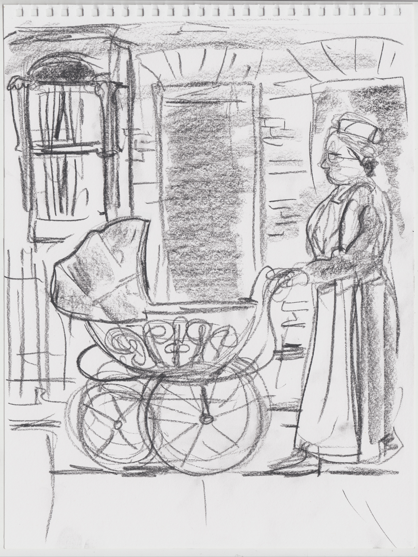
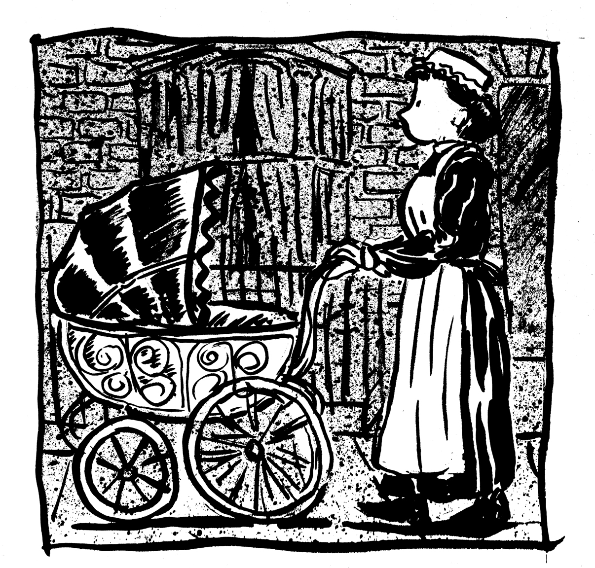
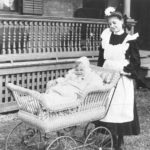
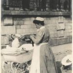
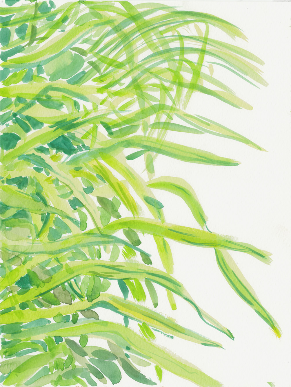
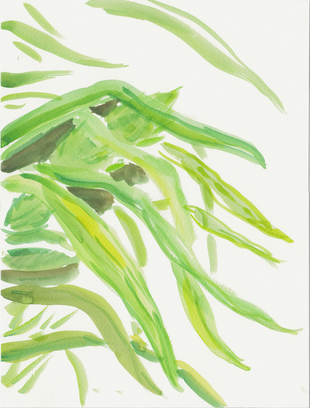
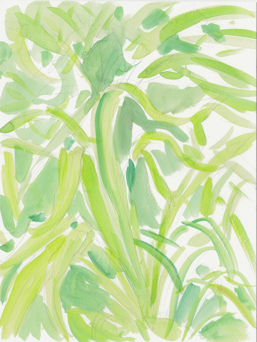
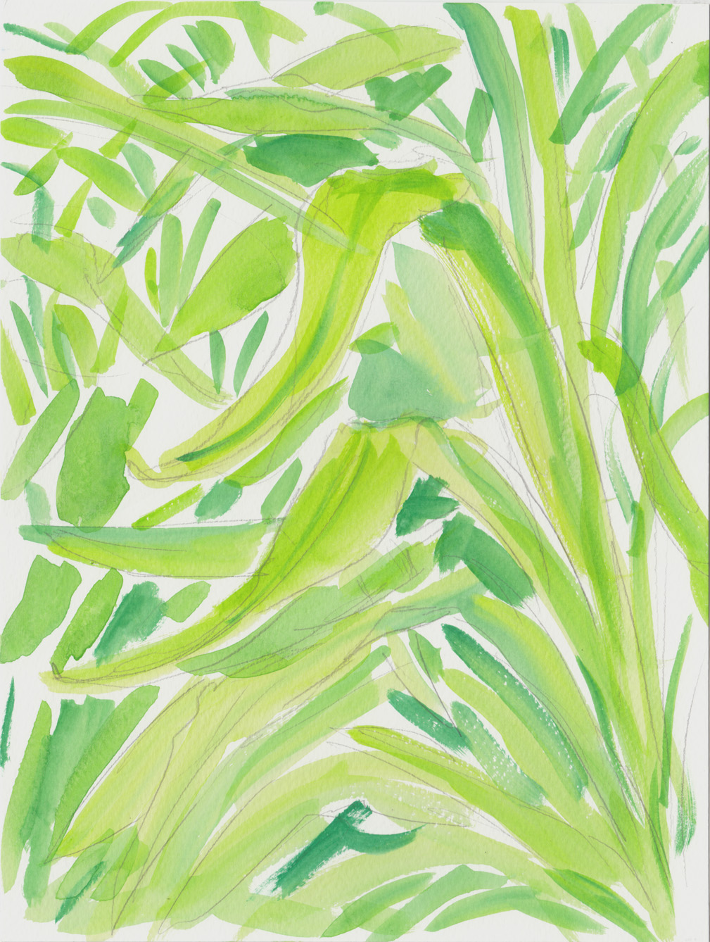
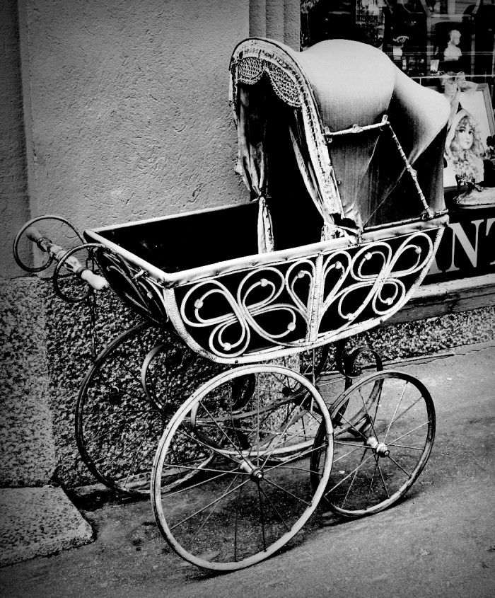
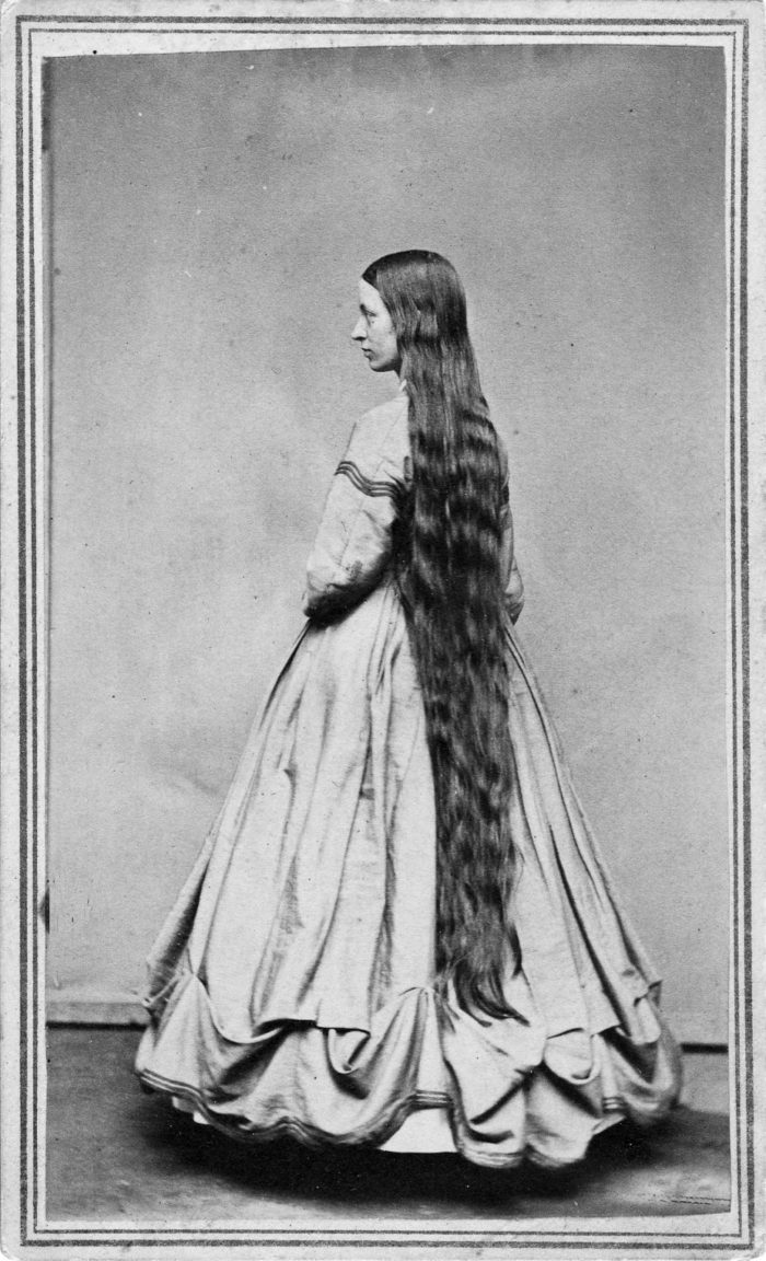
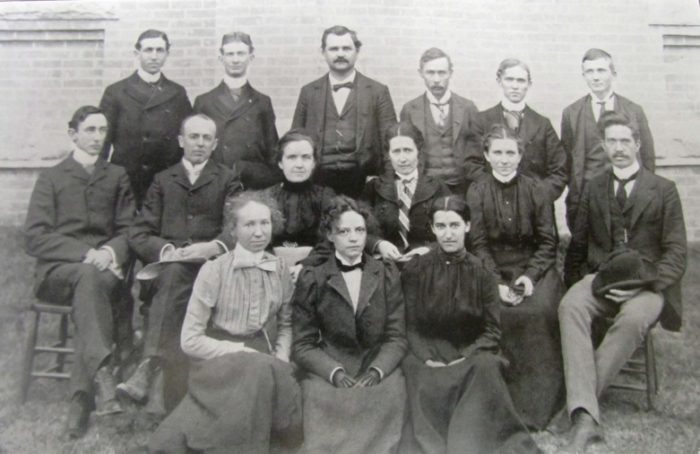
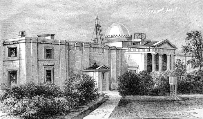
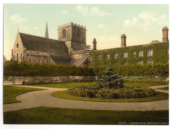
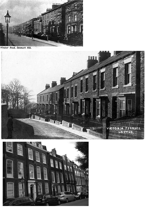
Today, gathering more photo research, like this:
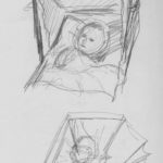
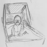
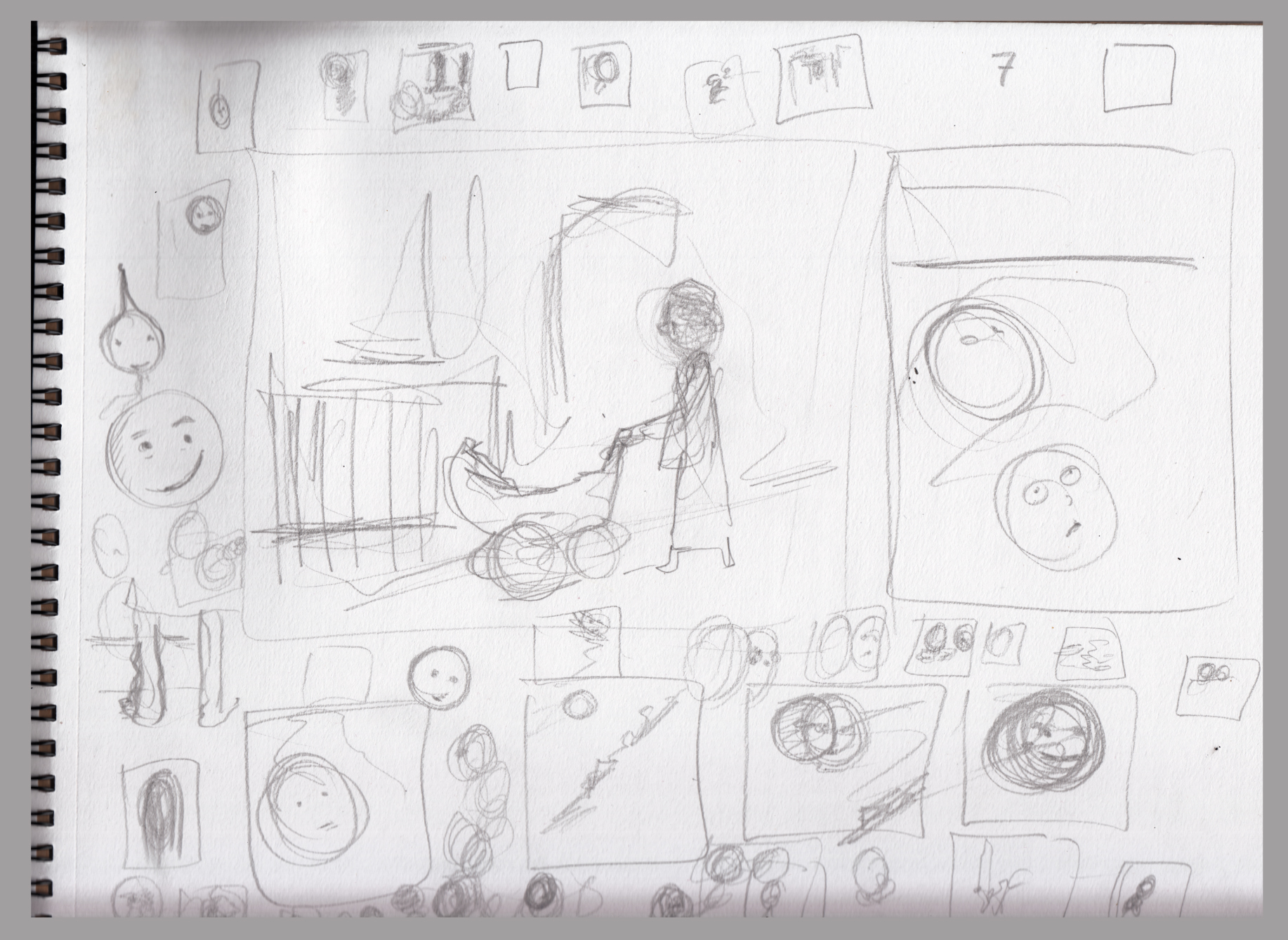
Then some character sketching.  In this story I depict the character as an infant, as a girl of about 10, as a teenager, as a university student, in her 30s & 40s, so how to maintain some kind of continuity, which features are most characteristic?.7-8-16 chararcter scribbles

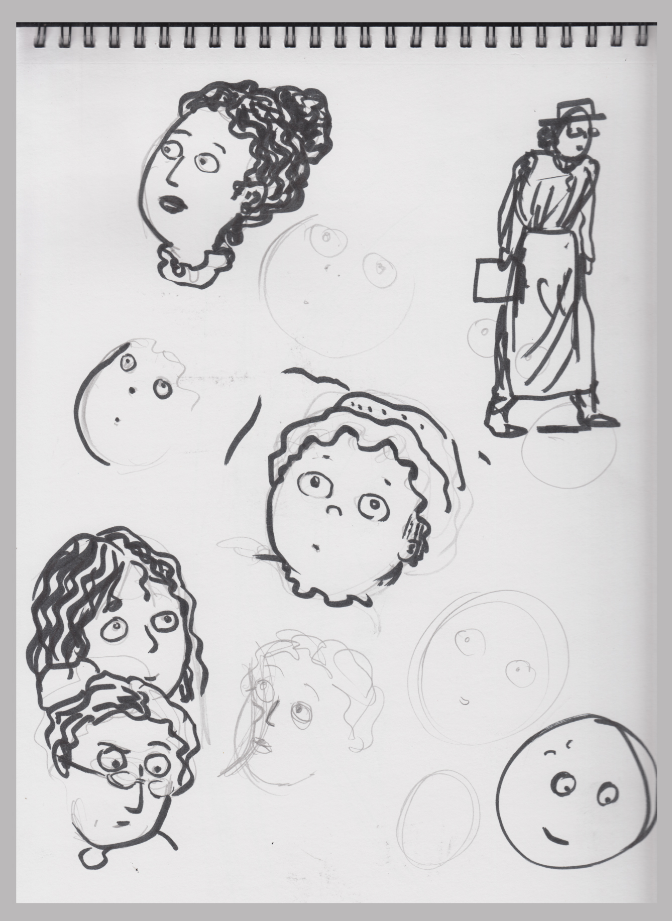
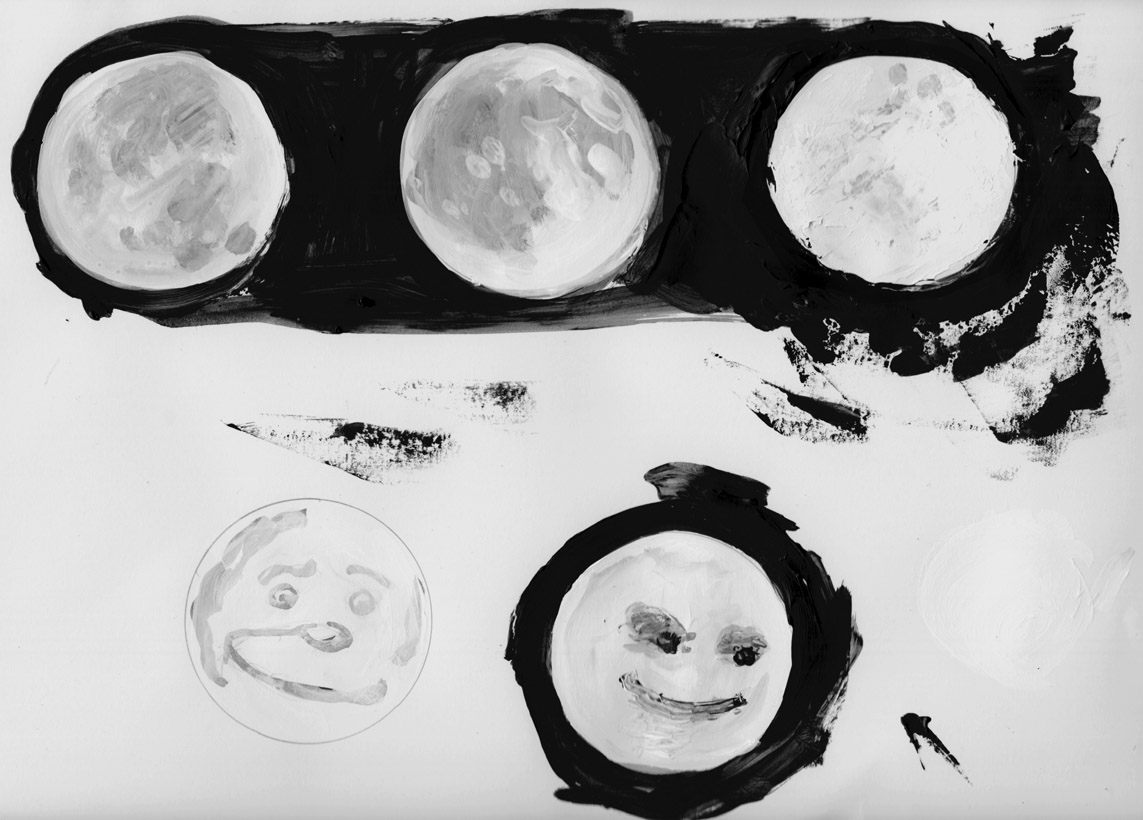
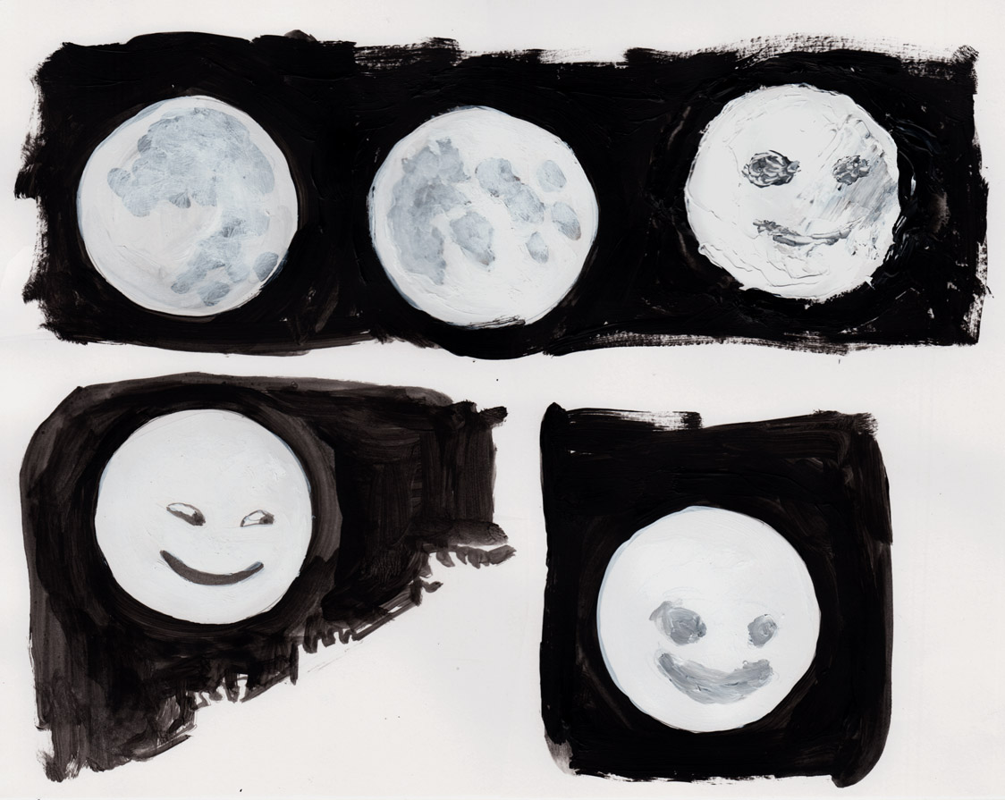
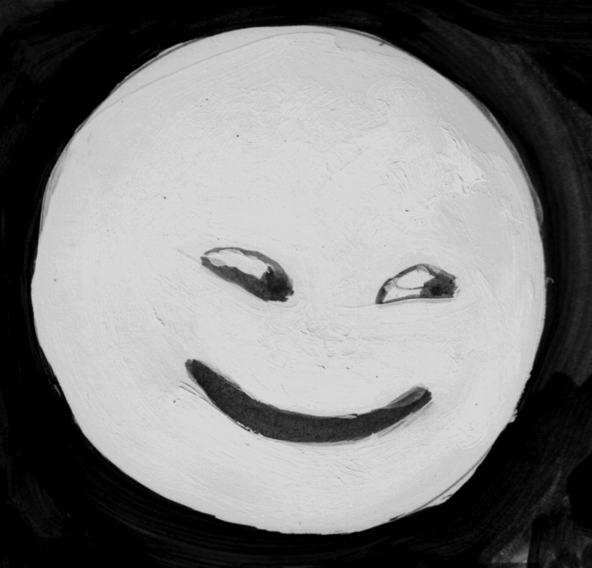
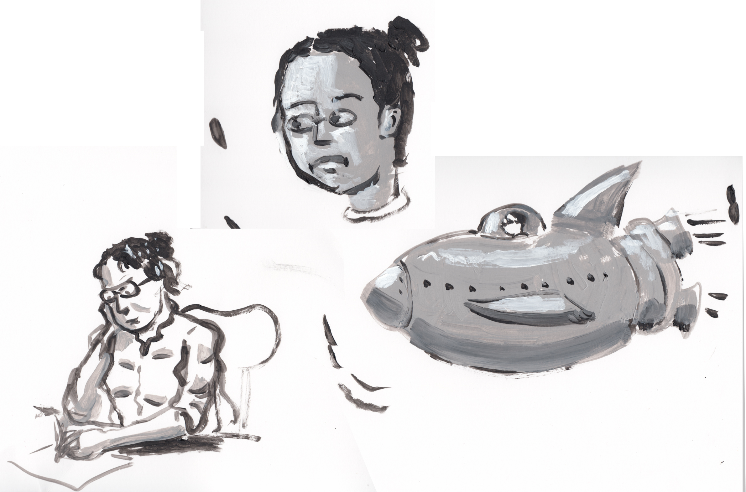
Thinking about style: how should I draw her eyes?  I’ve tended toward dots lately, but I think maybe i’ll draw full eyes this time.

7-7-16 character sketch


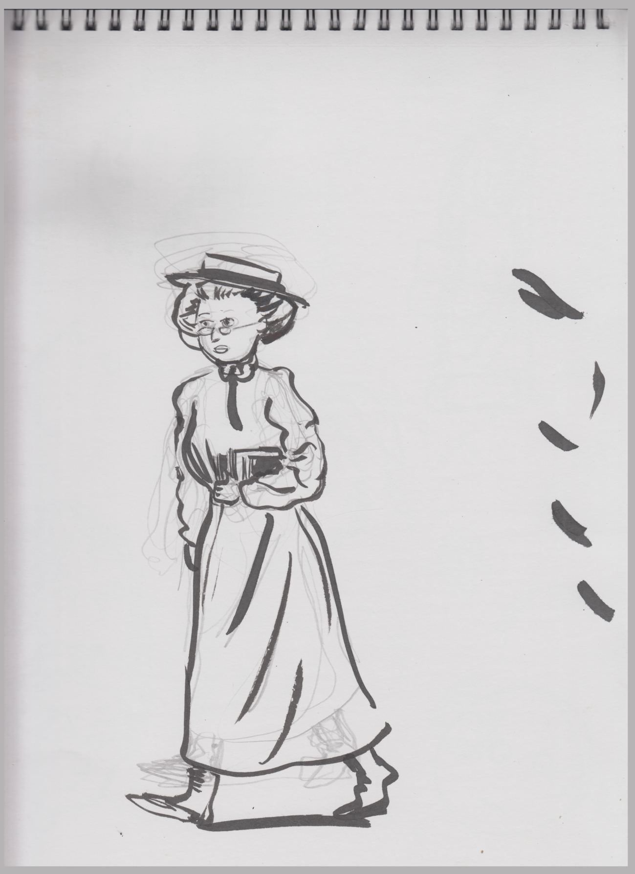
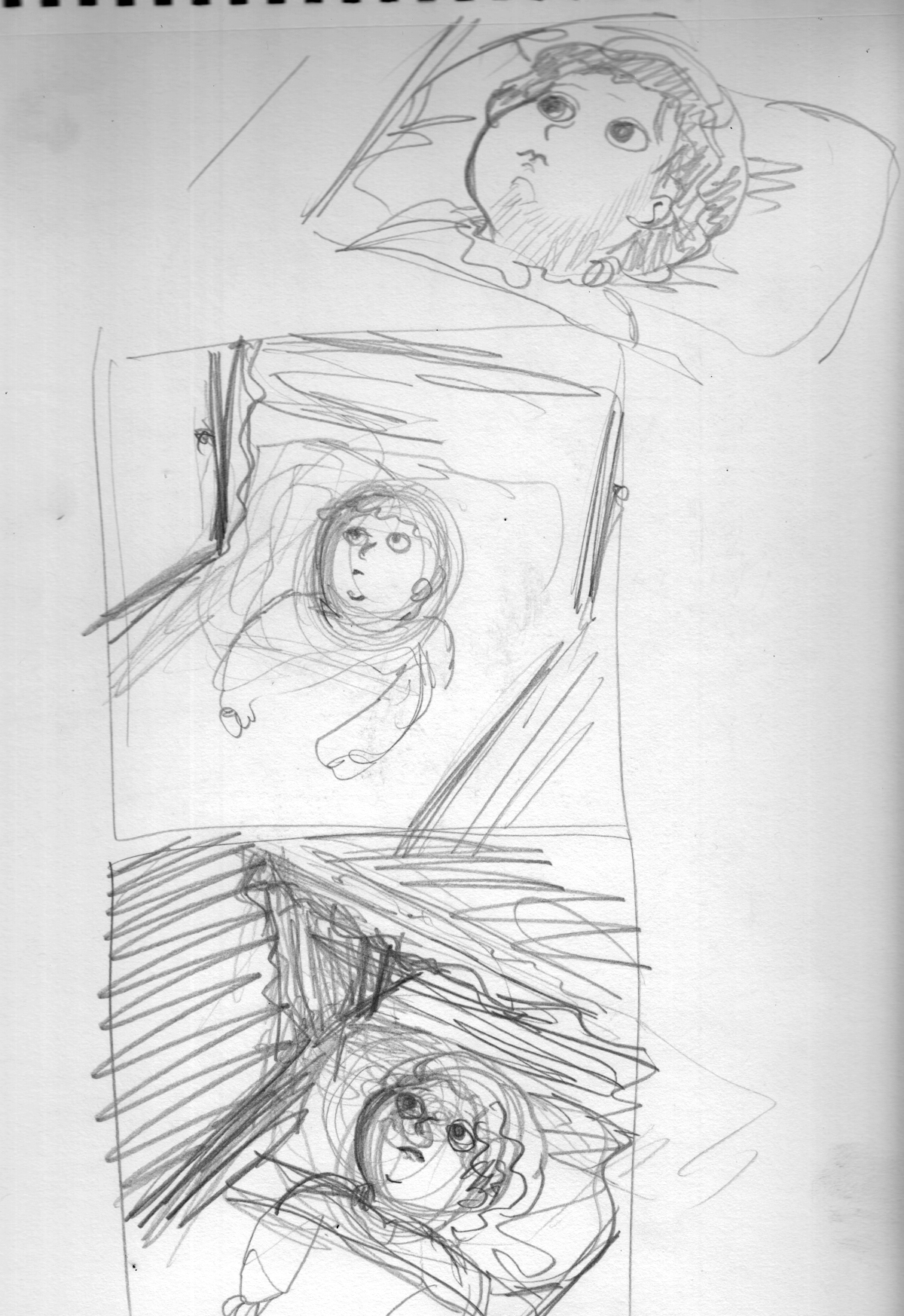
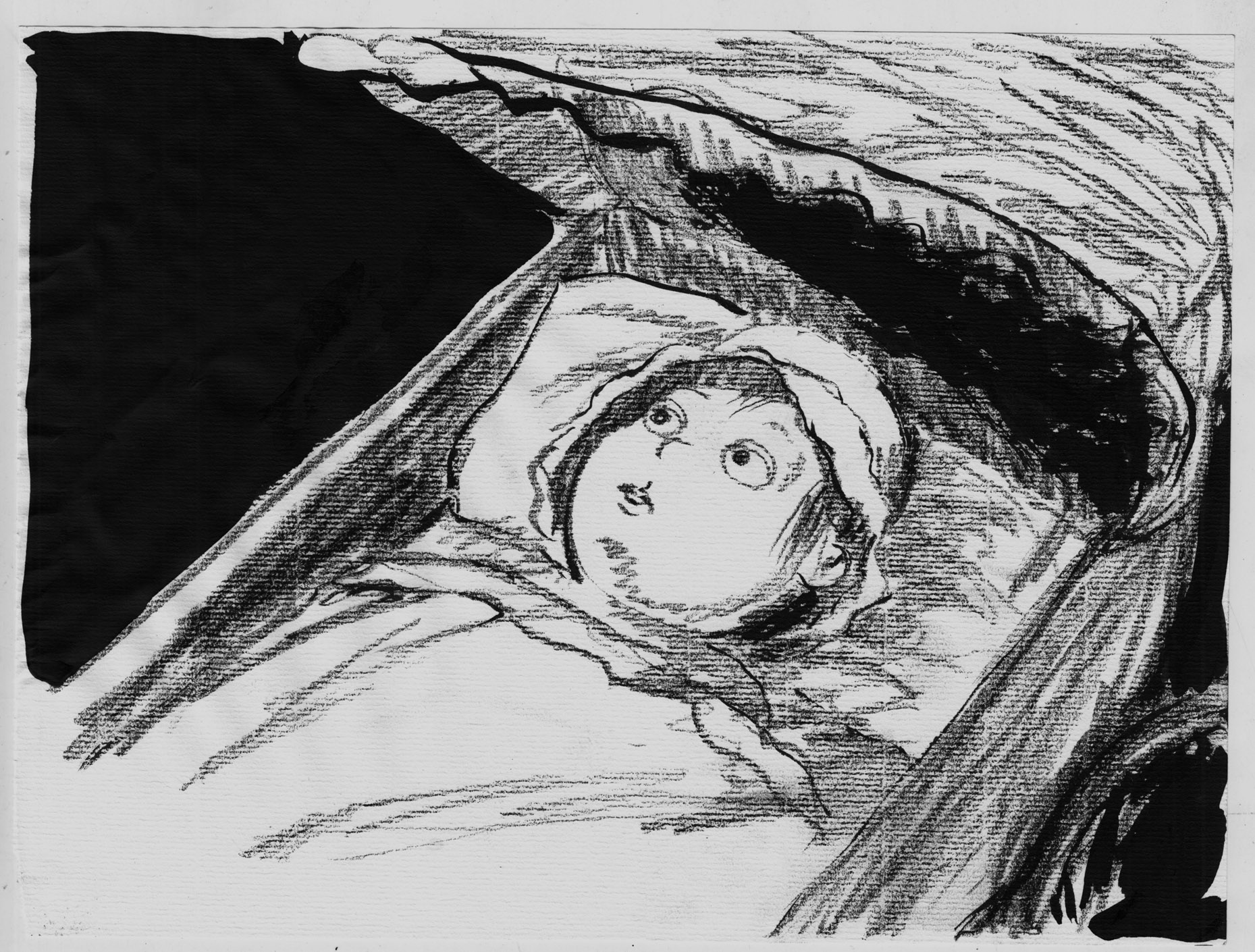
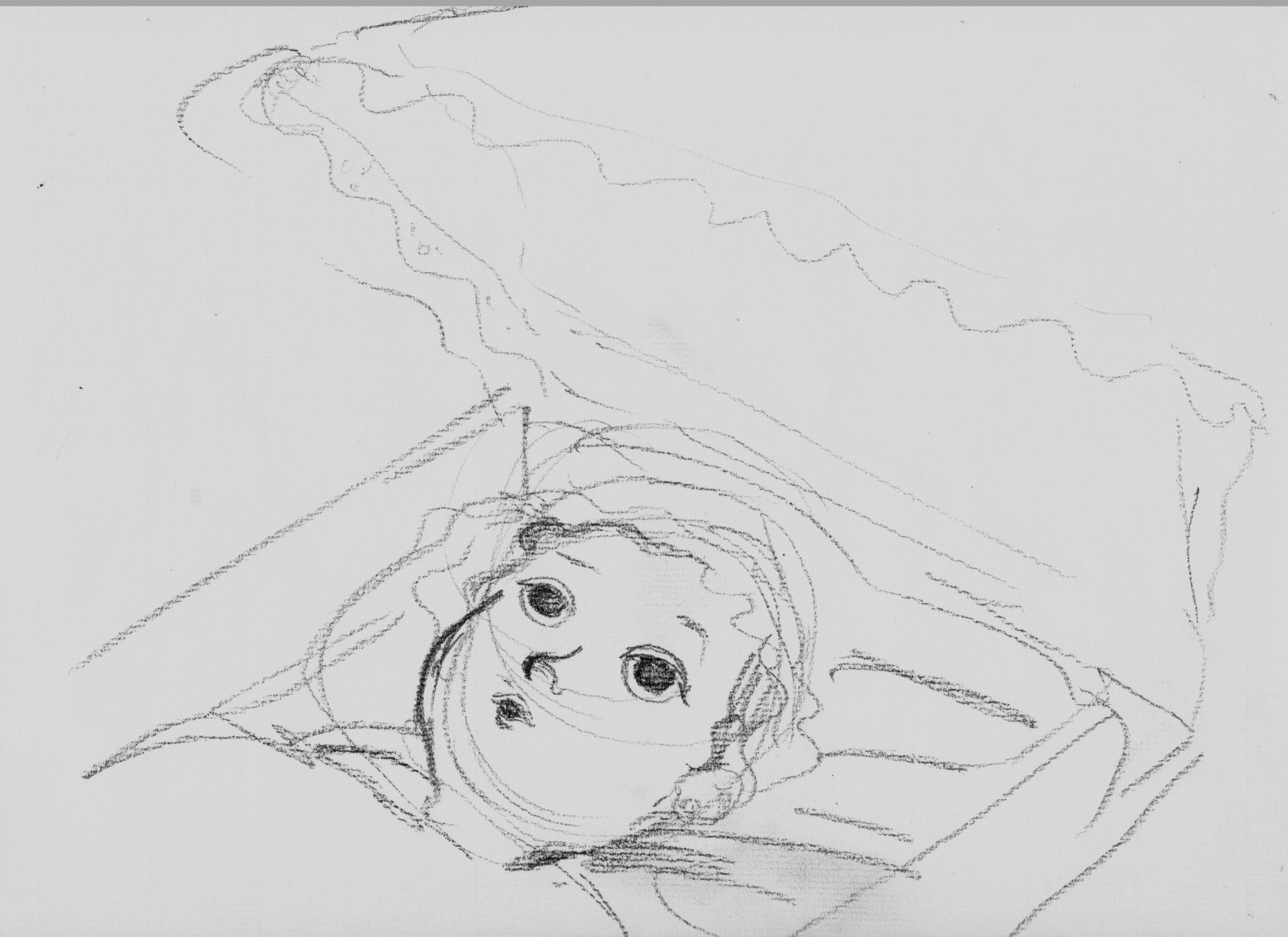
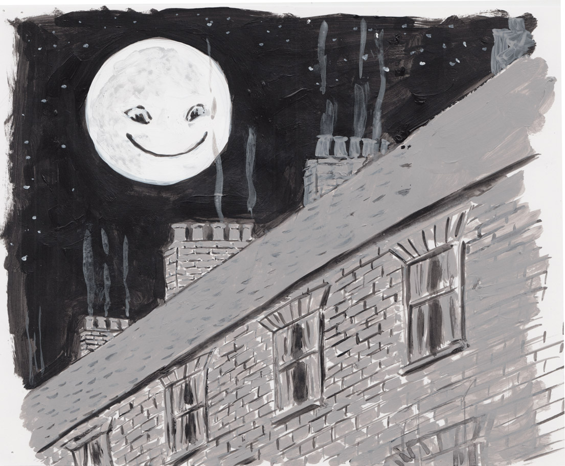
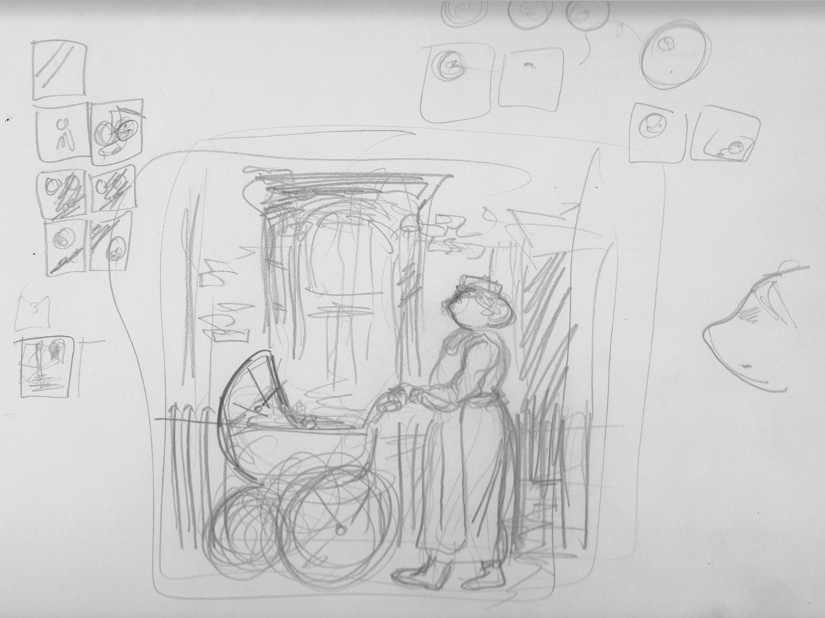
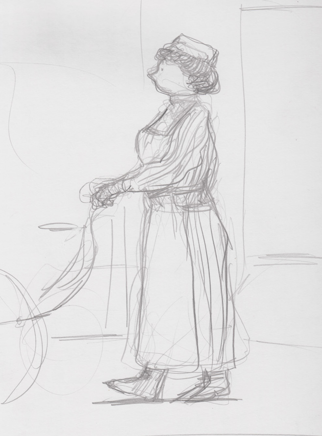
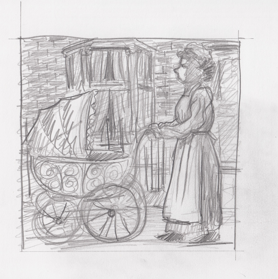
I went back to studies for the first page/first scene.
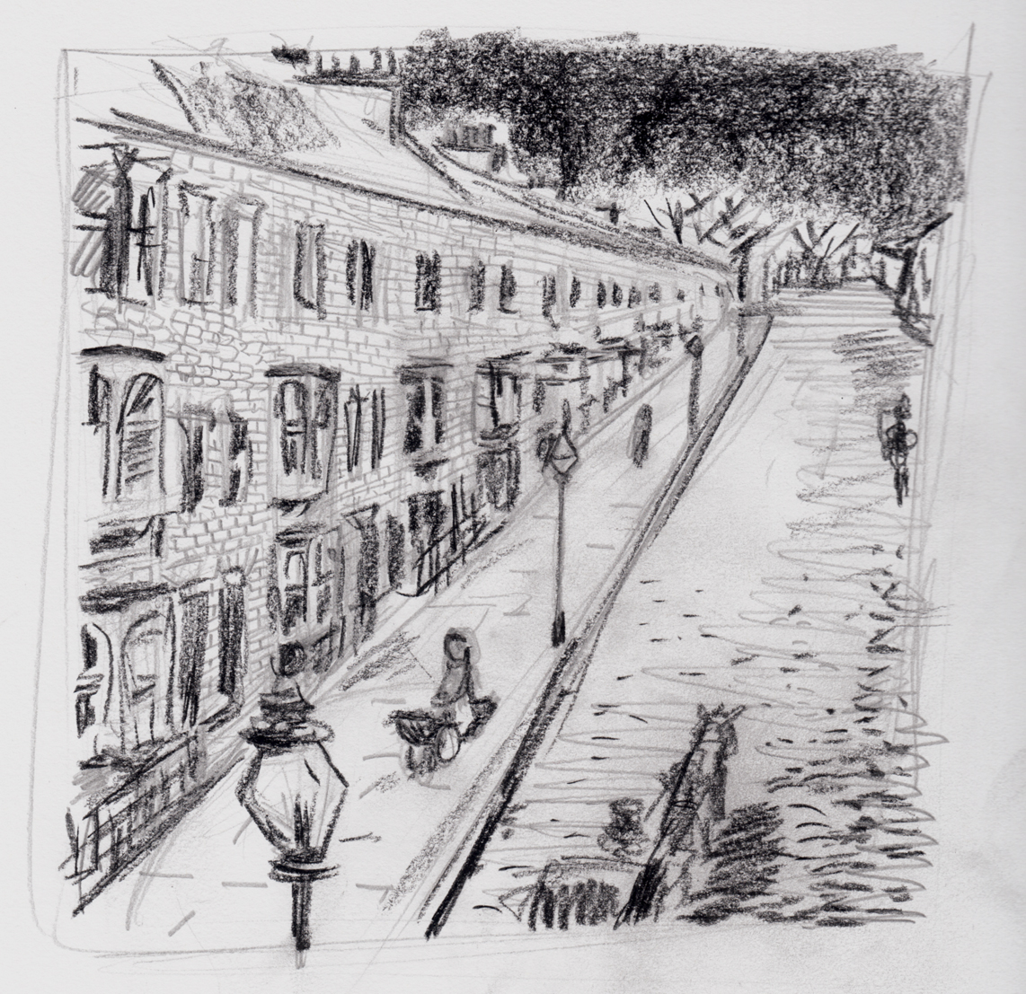
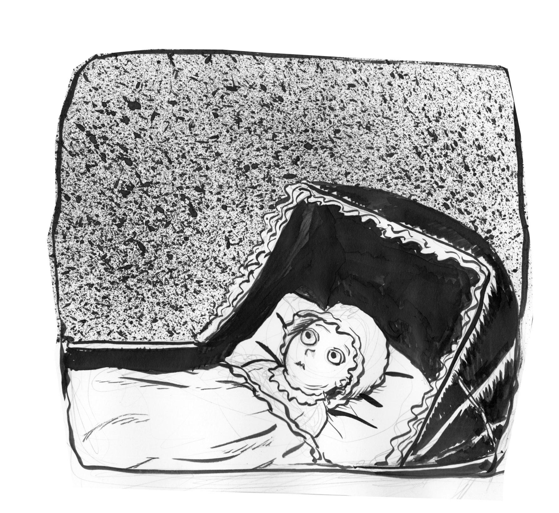
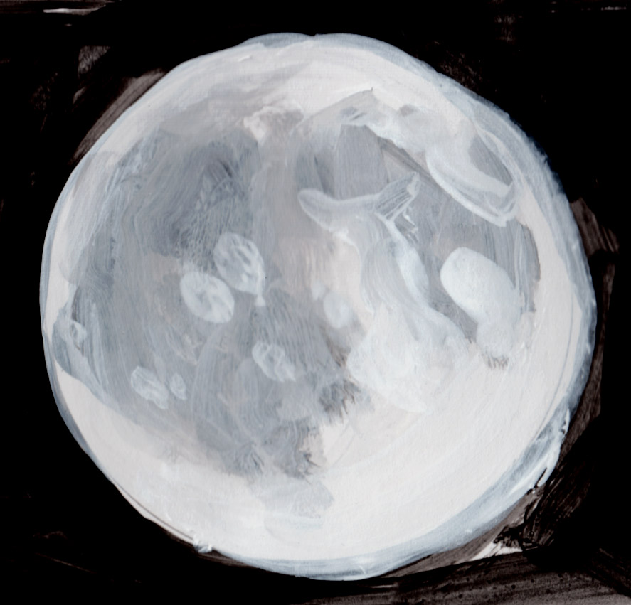
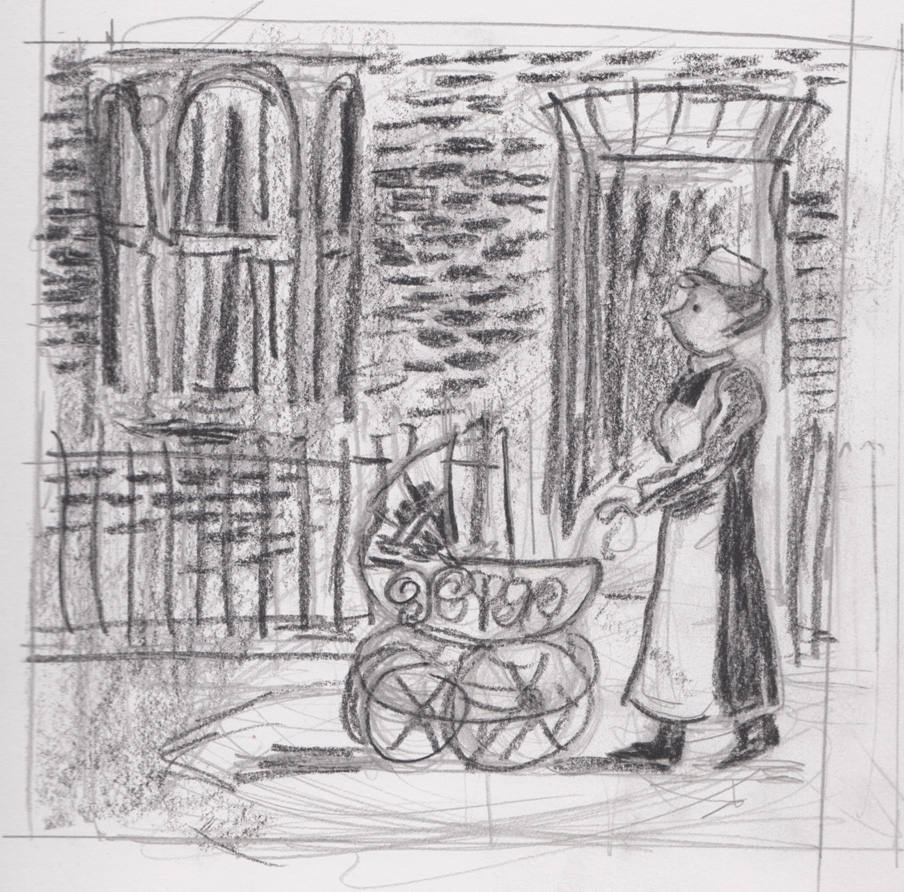
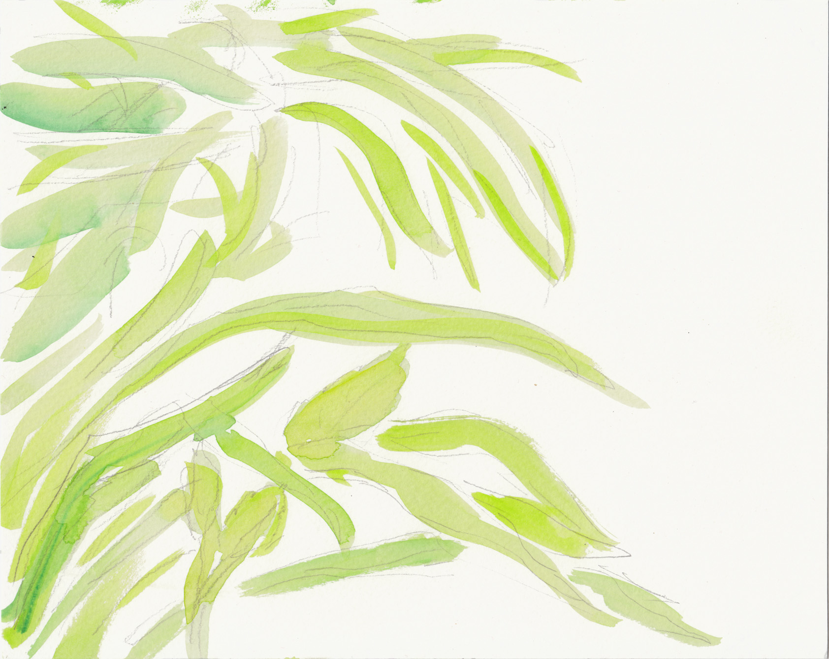
7-8-16 p1 rough


7-8-16

Second page study.  Not a bad sketch, but I don’t think it has anything to do with the style I’ll be drawing in, that’s my guess. Well, not much to do with it.  I’m intrigued by the idea of using conte or something like it for shading.

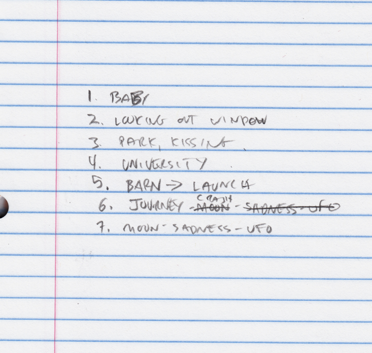
I’ve decided that this story is divided into 7 chapters, all fairly short, single scenes, though they gradually get longer.

chapters

Not terribly thrilled with my productivity today, but better than yesterday.  As long as I’m working on it, it’ll get done eventually…


“lunatic” process, 7-7-16

The thing about this experiment is, I have to post on the bad days as well as the good.  The bad days aren’t where I do bad work, it’s where other nonsense eats up my day and I do pathetically little.  So here we go.  One page of sketchbook scribbles, with a sketch of page 2 in the center and some very loose thumbnailing around it:

sketches 7-7-16

I meant to do character sketches, but that’ll have to be tomorrow.

I can make myself look a little better by also posting these studiesI did when I was messing around with acrylics last week:

acrylic sketches

See you tomorrow.

“lunatic” process: July 6 2016

Real-time blogging on the process of my new project, still at very early stages.  The plan is one image per page.  I want to take each image seriously so it can hold its own, not being part of a sequential page layout.  Which means in some cases that I will have to do as much reference and sketching for a single image as… well a lot.

Such is the case with my first image.  It’s an “establishing shot” of a Victorian or Edwardian street scene, residential.  I gathered plenty of photo reference, thanks to Google (“Victorian Street” mostly):

victorian street residential 2

Continue reading ““lunatic” process: July 6 2016″