New project: real-time process posts! (“Lunatic”)

In the past I’ve done process posts after-the-fact, when I was feeling good enough about how a particular project turned out, I’d go back and post the thumbnails, roughs, etc.

For my next project, I’ve decided to try and post the process as it goes along.  This is a little scary, since the project itself is somewhat experimental, and there may be frustrations along the way, which I’ll have to share as they come, with whoever may be reading the posts.  Still, I’m going to try.

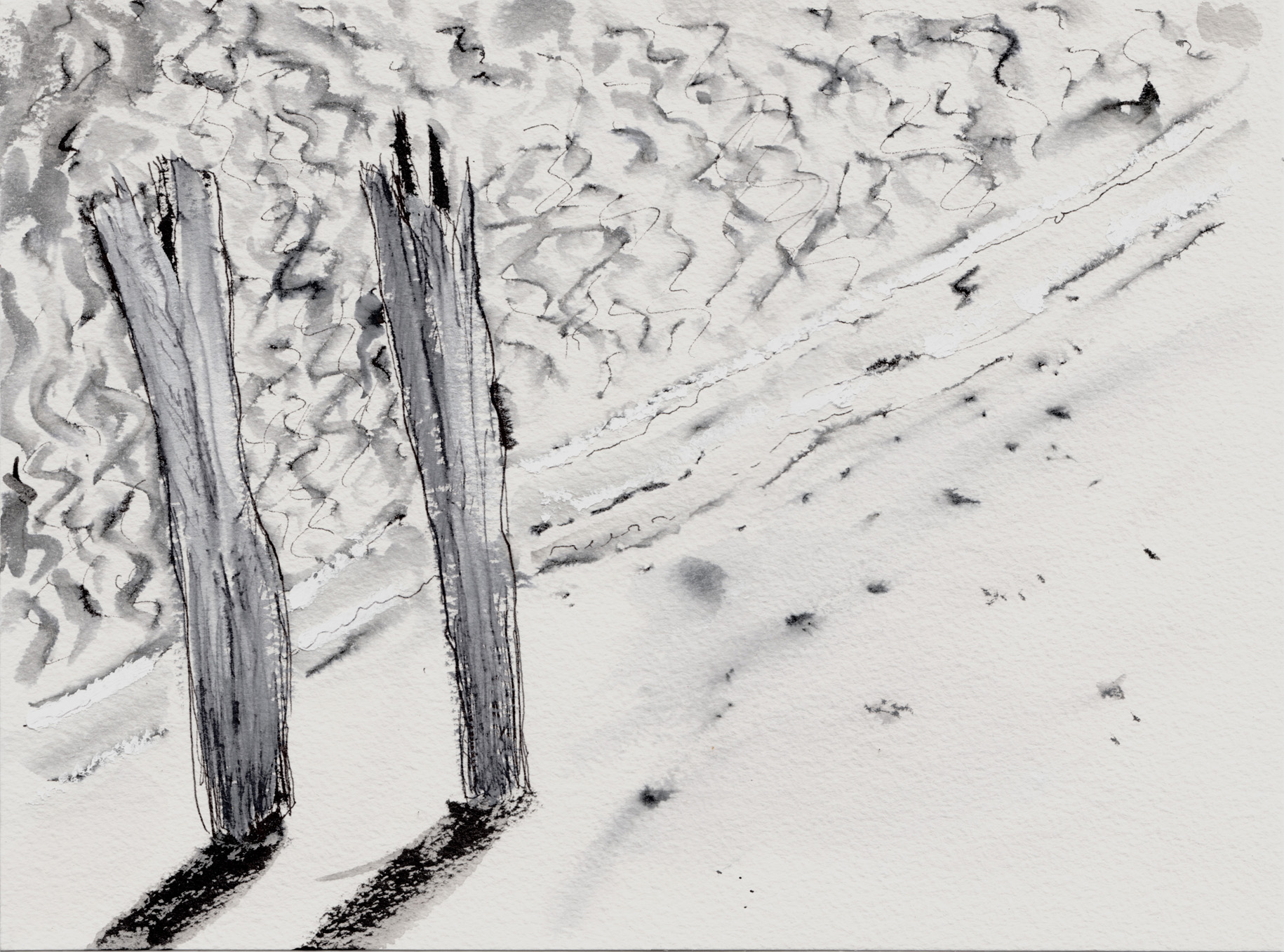
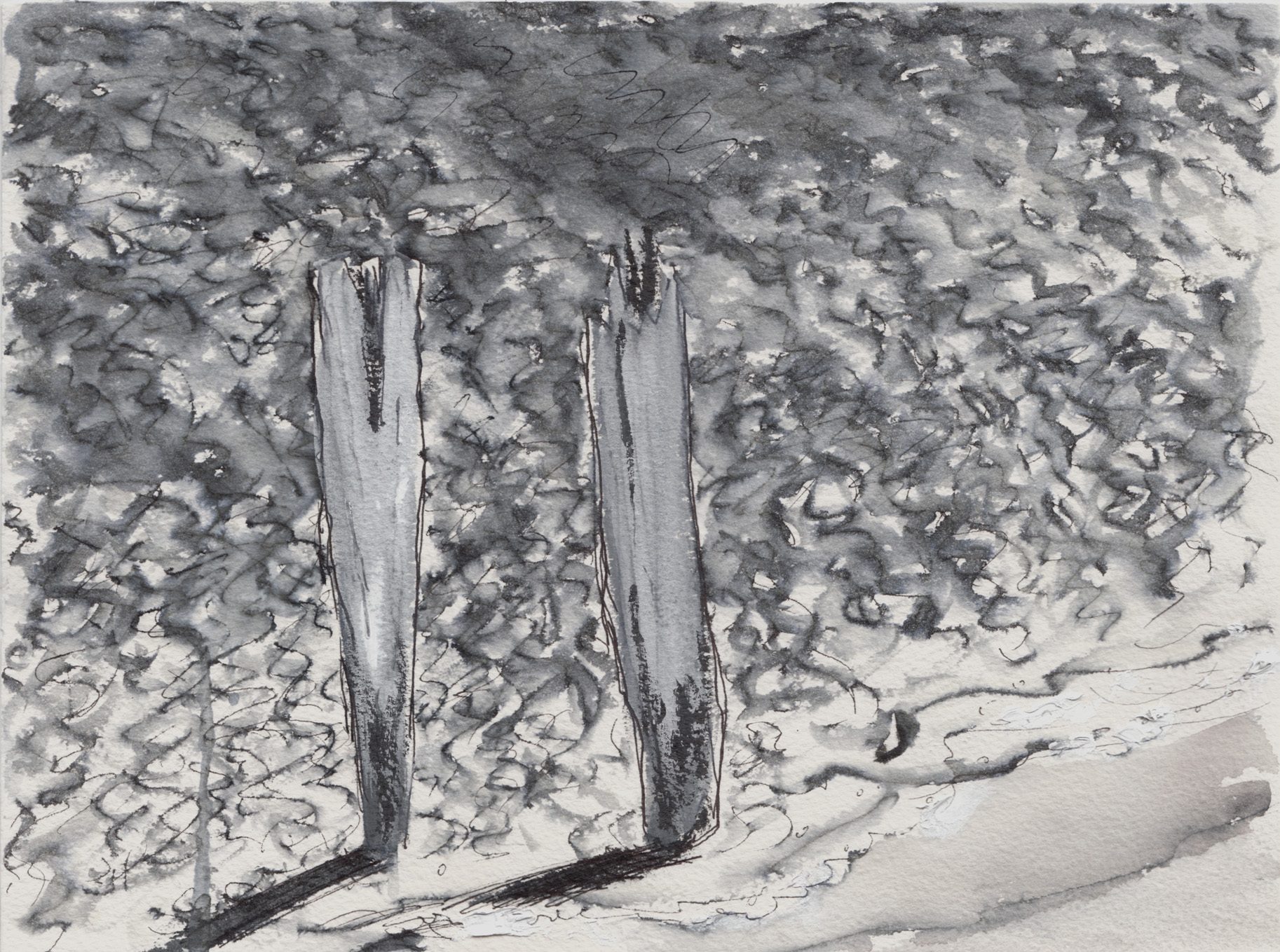
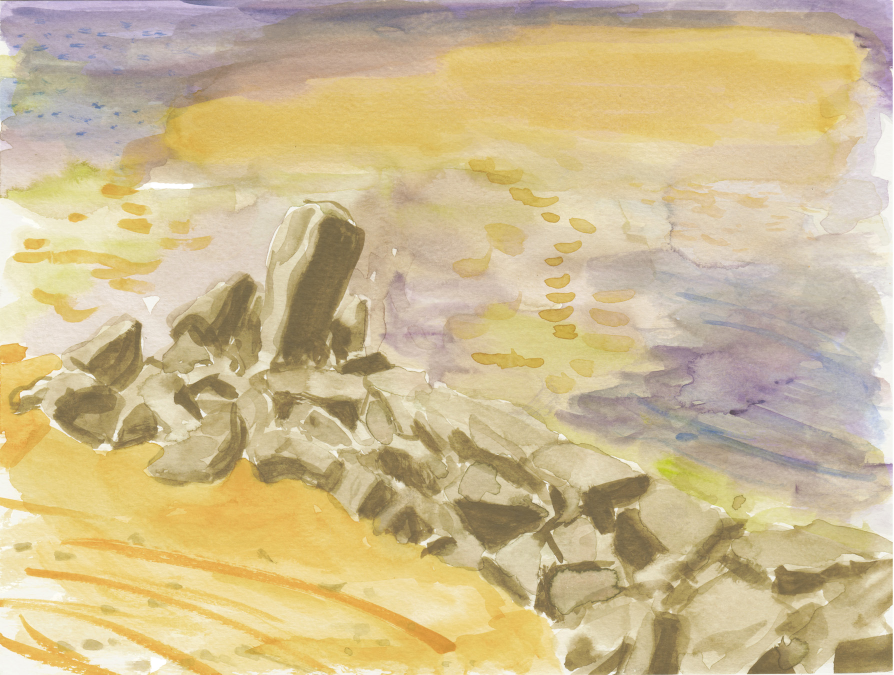
This new project is a wordless comic, and I want to try it as a one-image-per-page story.  Maybe at about 5″ x 5″ or so, I’m not sure.  The title is “Lunatic.” It’s sort of like a children’s story, but not necessarily aimed at children.  I don’t think I’ll explain the story just yet.  I guess it’s got a bit of Victorian sci-fi to it.

The process started, actually, in late 2014, I think.  The story came to me, and I scribbled down a panel-by-panel outline in a sketchbook.  I’ve just now scanned the pages.  They get more scribbly as it moves along, and I can’t really decipher the last page too well myself.  Here they are:

first thumbnails 1

first thumbnails 2

first thumbnails 3first thumbnails 4

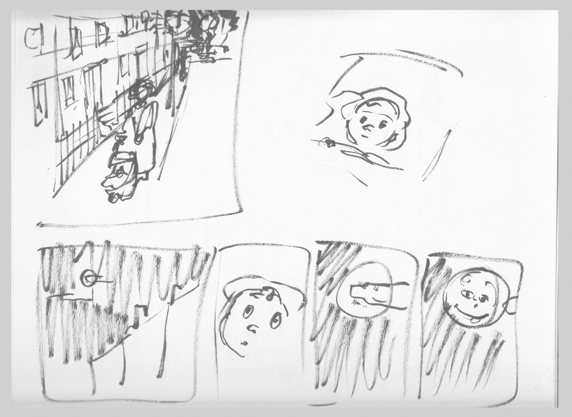
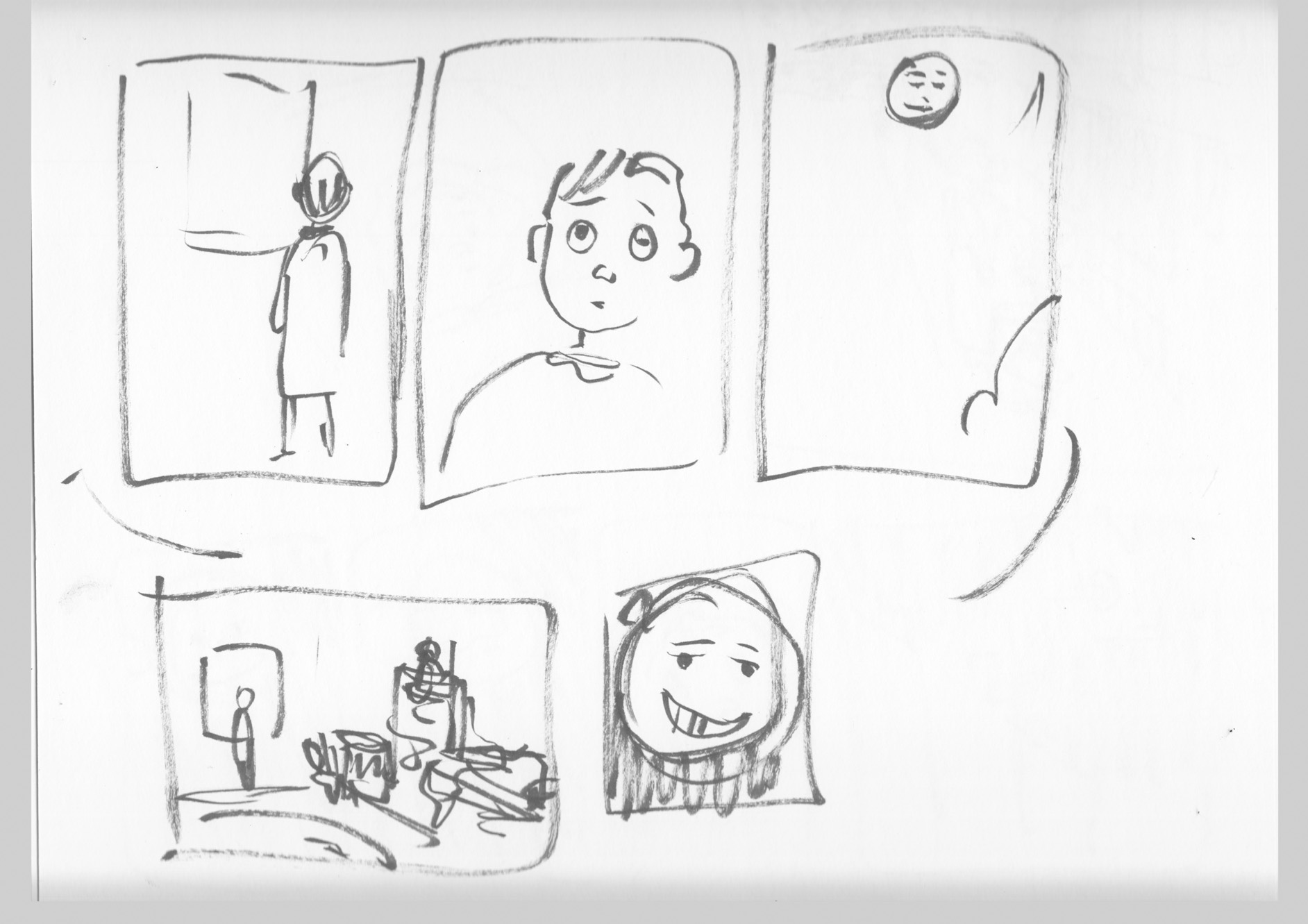
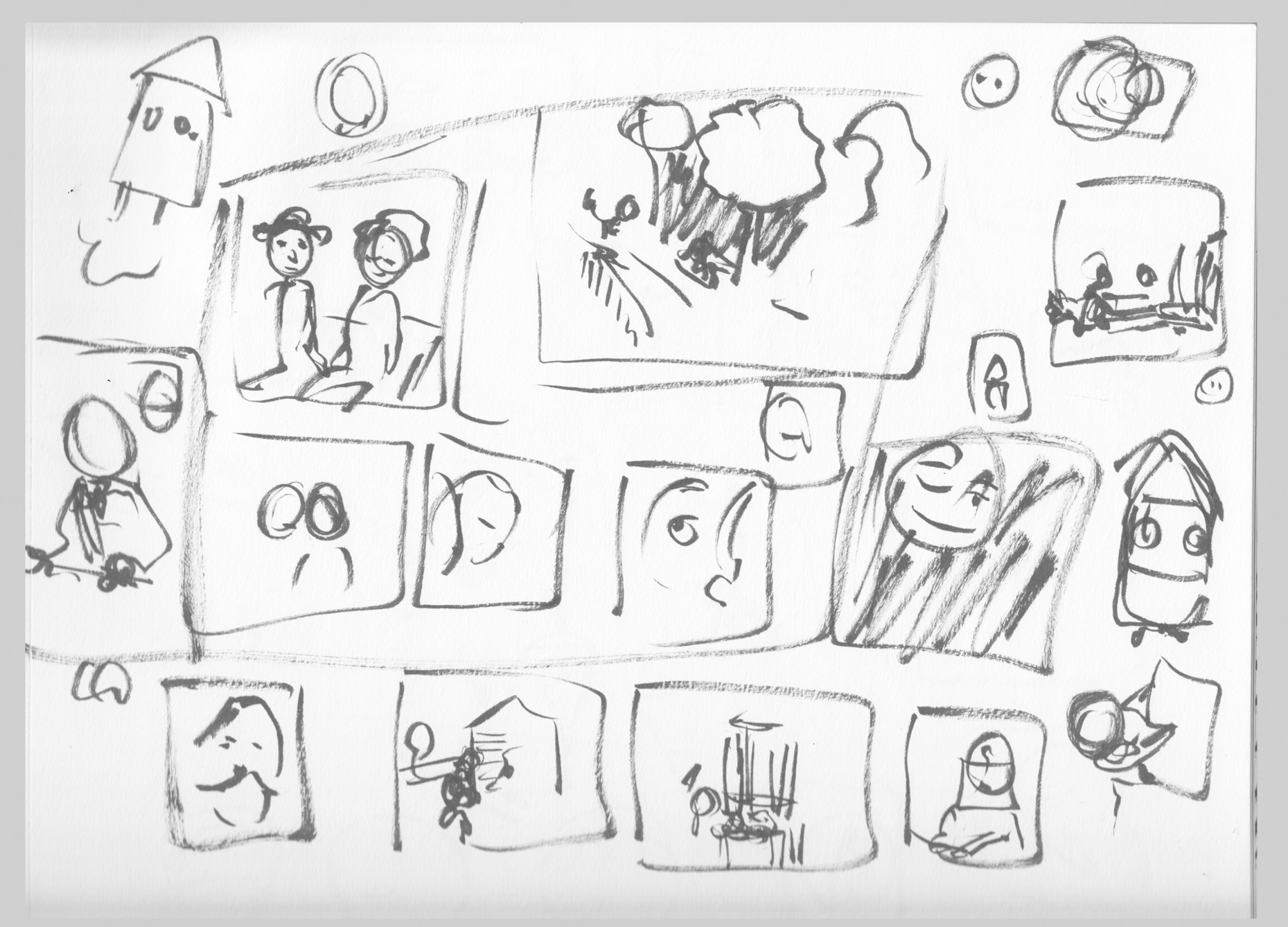
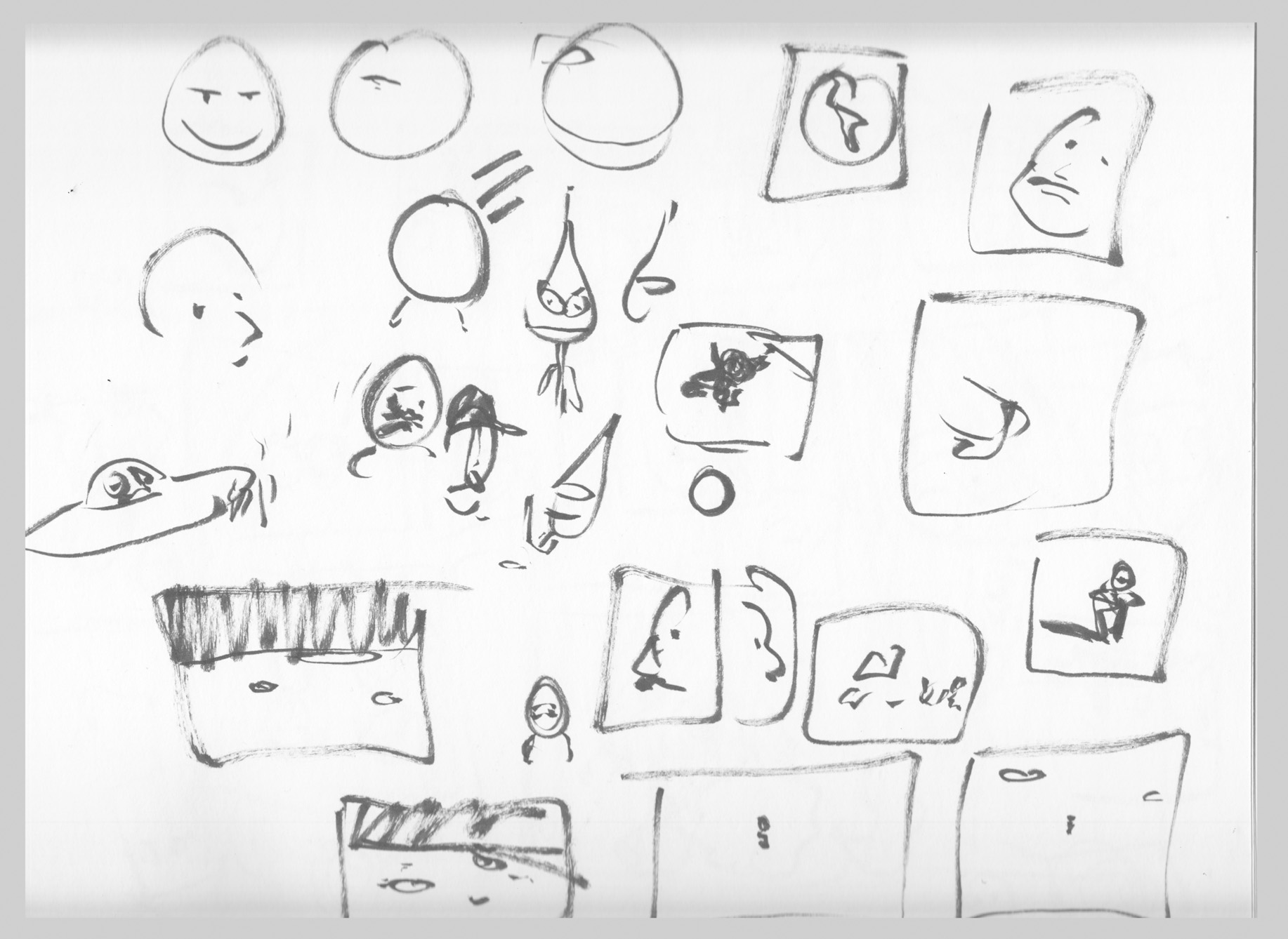
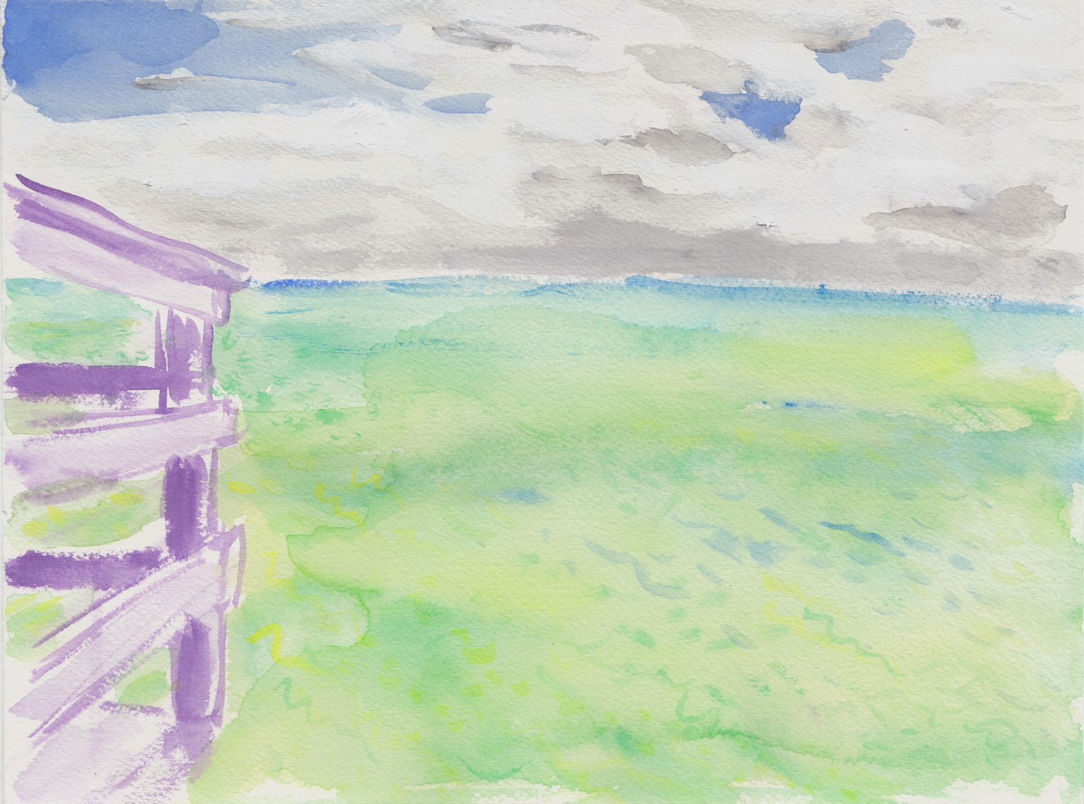
The story’s sort of rattled around in my head since then, and it seems now to have reached the front of the queue.  As I’ve re-told the story to myself I’ve made some conscious changes (like the gender of the protagonist, for instance).  But now, looking at these old thumbnails for the first time in a couple years, I can see that I’ve changed some things about the story in my mind without realizing.   Now I have to assess if I like the changes, or want to go back to the original ideas.   The face in the moon was something that I had forgotten – was that a good idea or not?  It has its charm, and I’m tempted to go back to it.

Water Drawings Part 2

Using inkwash to try to capture the surface of the water at Provincetown.  These were drawn with Rotring Art Pen, then the (non-waterproof) ink drawings worked into with water to create washes. Click to enlarge, if desired.

inkwash water 1c 6-16

inkwash water 2 scan 2 6-16

inkwash water 3

inkwash water 4  6-16

inkwash water 5  6-16

inkwash water 6  6-16

inkwash water 7 scan 2  6-16


Posted in Art

Water Drawings, Part 1

I did a lot of watercolor and other drawings during a four-day trip to Provincetown earlier this month.  I’ve been obsessed with drawing the surface of sea water for some time.

Water 1 6-16

Water 2B 6-16


Water 4 6-16

Water 3 6-16

They’re hard to scan, trying to get the luminosity of the watercolors without washing out the subtleties.  I scan at low contrast and try to punch things up in Photoshop to get as close as possible to what they really look like.

Water 5 scan 2 6-16

Okay, I started cheating and putting stuff beside the surface of the water in the frame:

water 6 scan2 6-16

Water 7 6-16

Water 8 scan 2 6-16

Water  9 6-16

Water 10  6-16

Posted in Art

“My Experiment” or “Process: Ridiculous”

I recently completed drawing John Bell’s autobio/science story “My Experiment,” for the upcoming BCR anthology (and Kickstarter sensation), Boundless.

For this project I once again put into practice my philosophy of the comics-making process, which may be described as: make everything as complicated and torturous as possible and add as many steps as you can (or maybe that should be, “retrace your steps as many times as you can”).  Works for me!

Anyway, “My Experiment” is a six page story, and it started reasonably enough, with some roughs, which i also roughly ink:

roughs

…and I’m ready for final pencils.  (Just as a side note, this comic is drawn at actual print size, unlike the usual 1.5-to-2-times larger, so each drawn page has an image area of about 4.25 x 8 inches, which is kind of challenging.)

My problems started when I pencilled the first page in blue pencil, and just “experimentally” I inked it digitally in Photoshop:

p1-pencil-to-dig-inks-reduced

Hmmm… I liked the slickness of the digital inks, but on the whole I wasn’t satisfied.  I found the effect overall to be clean, yes, but also somewhat tight and finicky. So I resolved to ink the whole thing with a real brush and real ink.  Here’s page one:p1 v2 scan

…and I proceeded to pencil and ink the entire story that way.  Done, right?

Nooo… all the while it kept nagging at me, that the slick, clean digital look was somehow better suited for this story.  Maybe because it was about science and labs and stuff?   There were places where I wasn’t happy with my abiity to draw at this scale with a brush.  I just wasn’t sure, and I felt like the ONLY way to feel confident was, well, to re-ink the entire story digitally.

Which I did by taking each inked page, scanning, and converting to blue…

inks-to-blue-inks

…then adding another layer and digitally inking over the “blue pencils” created from my REAL inks:

blue-to-digital

Gimmicky gifs aside, I ended up with two versions of each page, a traditional ink and a digital ink, and I could make a side-by-side comparison:

p 1 comparison

Click on it to look close, and ask yourself: which did I choose?  Which would you choose?

….

…I couldn’t just choose, though, that would be far too simple.  I decided I overall liked the quality of the real-brush-and-ink lines, but there were some details I was much happier with in the digital. So, since the pages were identically composed (the digital being inked over the traditional) I could just go through and grab details I wanted from the digital and paste them in over the inks.  I hoped that I was being careful enough that the different styles (no, the different media wouldn’t clash.  The final result:

Bell-Mazur p1 final

Can you spot the digital paste-ins (hint: mostly faces).  Anyway, I repeated this ridiculously complicated process for all 6 pages — for some pages I liked the digital overall better, and pasted in some details from the real-inks!

And that, friends, is how we fly across the ocean!

Next stop: MECAF

portland-animationI’ll be in Portland for the Maine Comic Arts Festival on June 4 (along with the BCR of course).  I’ll have “Hooves of Death,” the Maine-set historical romp, “The Jernegan Solution,” plus anthologies galore… Muqtatafat, What’s Your Sign, Girl?, SubCultures, plus who knows what other surprises?  And the BCR will be there too, so save the date, and save your pennies… and no matter where you are, it’s worth a drive to Portland, too!   Look for us in the Fiction/Music area on the main floor, Portland Public Library, 10 AM – 5 PM.

Comics Workbook Magazine: article on Chantal Montellier

Montellier - Les Damnes de Nanterre p1 2005 detailI recently wrote an article about French cartoonist Chantal Montellier, for Comics Workbook Magazine #10, edited by Whit Taylor.

comics workbook cover Comics Workbook is probably the smartest and most interesting journal about independent comics, and appears only in print! I highly recommend ordering a copy from Copacetic Comics. besides my article, there’s comics by Aatmaja Pandya, Hannah Kaplan, and Nicholas Offerman, an interview with Rob Kirby, Keiler Roberts and Scott Roberts, and a converbetween Sara Lautman and Scott Longo.

Since there’s no online edition, here’s a look at the article. (And I will point out that this actually came out BEFORE the Angoulême Festival’s problems with women cartoonists… so don’t think I was just jumping on the bandwagon!)

montellier 1

Montellier 2

Montellier 3montellier 4

And here’s how that page from Damnes des Nanterre looks in color:

Montellier - Les Damnes de Nanterre p1 2005