Upcoming in June from publisher Thames and Hudson, “Comics: a Global History, 1968-present,” written by Alexander Danner and me.  Here are some excerpts, and additional material including some great comics images  that we couldn’t fit in the book. Â
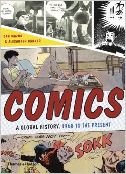
As the title suggests, the book covers the period from, roughly, 1968 until 2010. The introduction, though, provides some background on the development of comics around the world (focusing mainly on Europe, Japan and the U.S.) during the post-war era through the mid-60s. Â Text in italics is directly from the book.
Continuing with the post-war Franco-Belgian comics, and focusing on the two cornerstone comics periodicals of the era, we move from Le Journal de Tintin to:
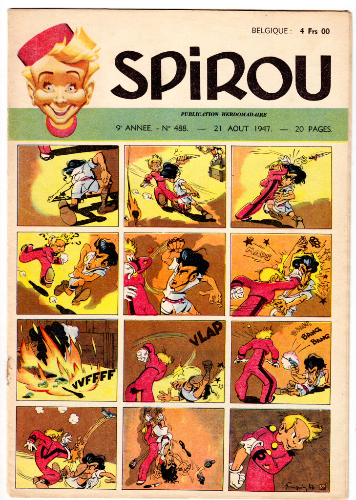
 Spirou cover/strip from 1948, by André Franquin
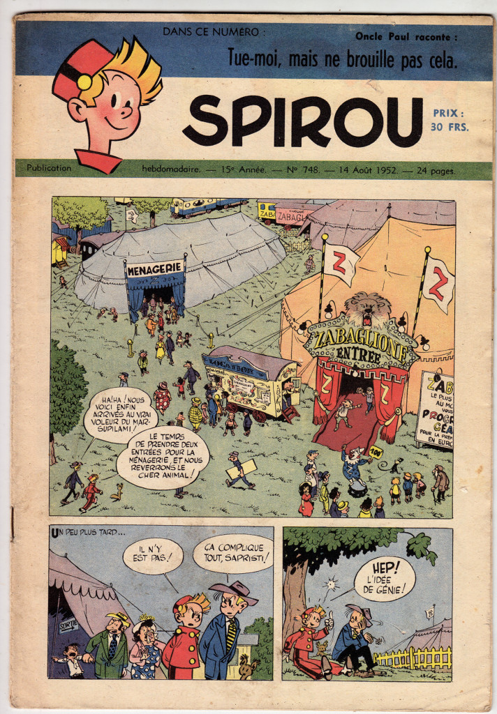
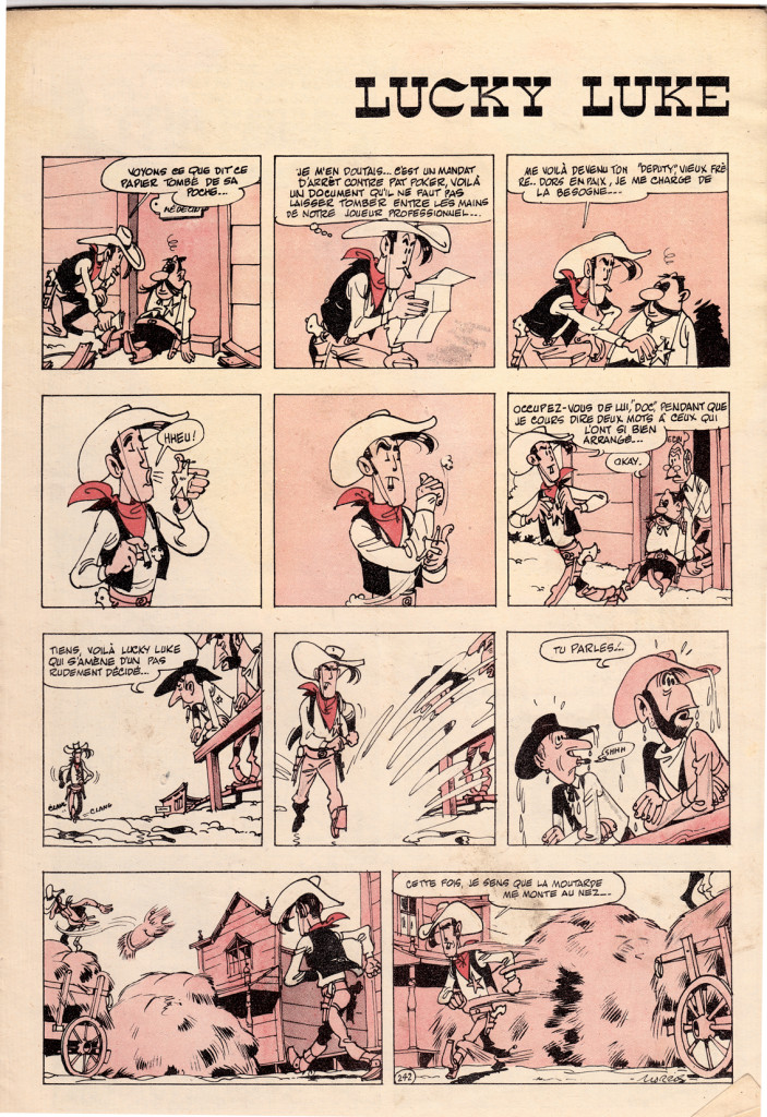
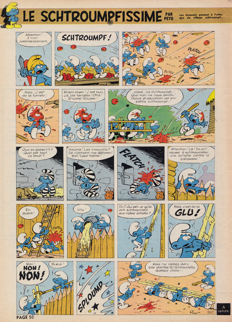
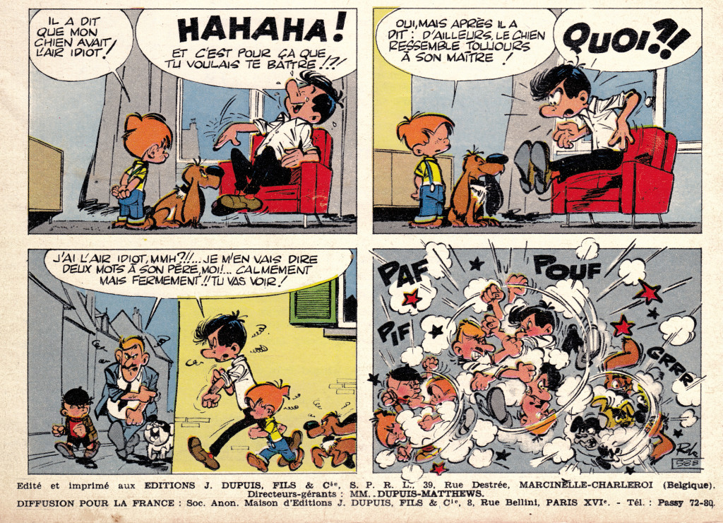
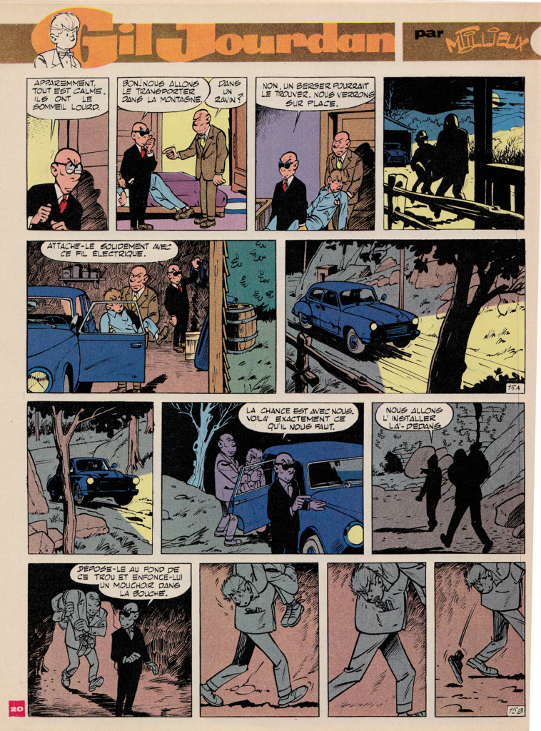
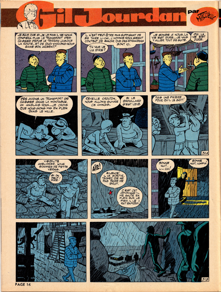
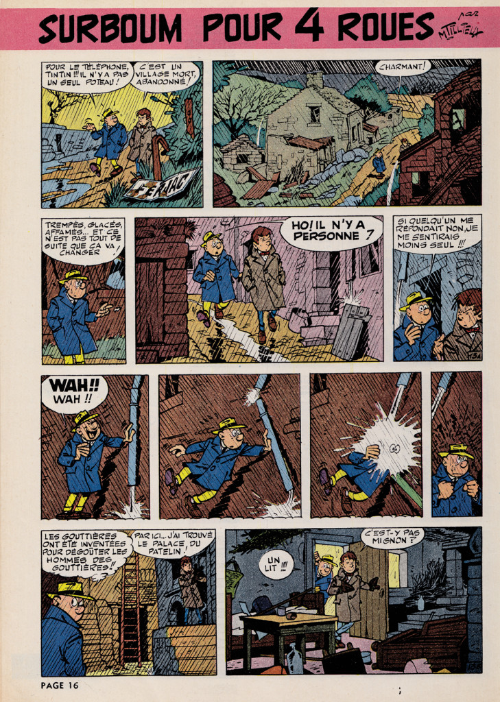
Spirou, first published in 1938, was home to the style known as the École de Charleroi, or École de Marcinelle [for the Brussels neighborhood where Spirou was located], later referred to as the “Atom Style.†In contrast to the precise, cool and orderly approach of the Hergéan Bruxelles style, the Charleroi was more exaggerated and elastic, with a more varied and dynamic quality of line. It was perfected by a strong team of artists, including André Franquin, who took over the title character Spirou and created his beloved sidekick the Marsupilami. Others included Morris (Maurice De Bevere) with Lucky Luke, Peyo (Pierre Culliford) with Les Schtroumpfs (aka   Smurfs), Maurice Tillieux with Gil Jourdan, and Roba, with Boule et Bill.
André Franquin
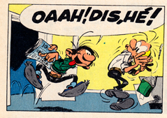
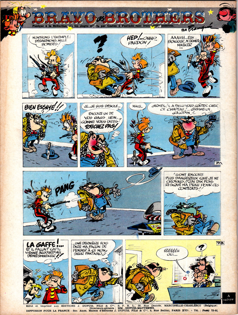
Franquin ranks with Hergé as the most revered bande dessinée artists of the postwar decades. In the late 40s, Franquin took over the title character of Spirou, and soon created the bellboy’s crazy animal sidekick, the Marsupilami.
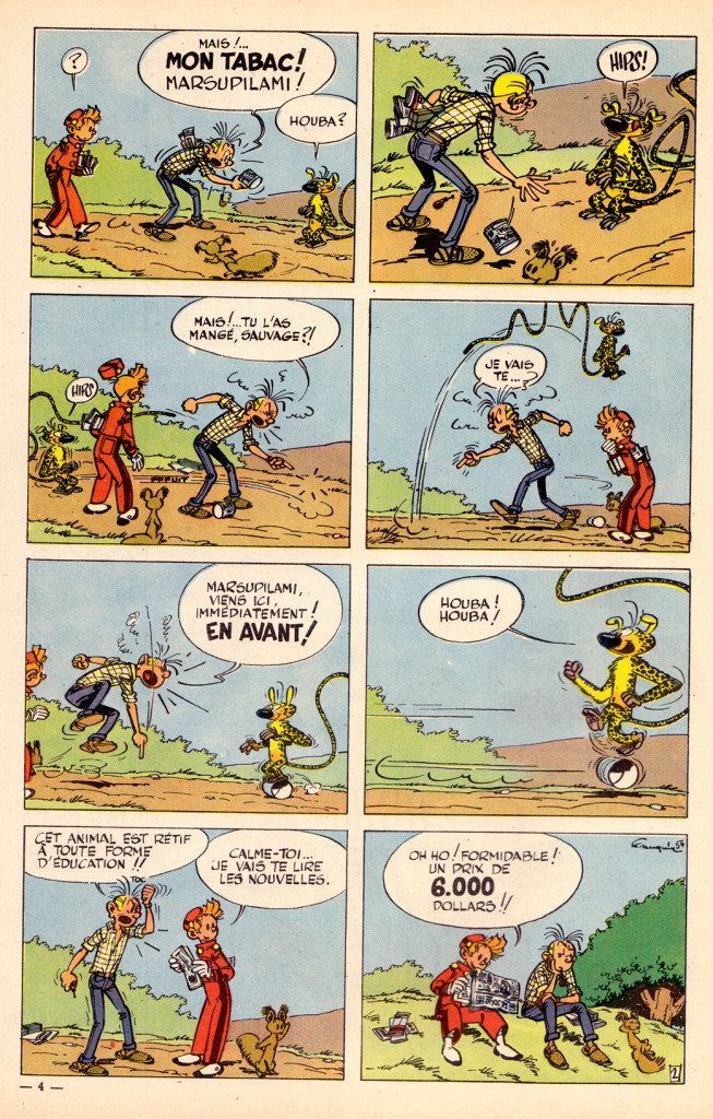
Franquin’s creation Marsupilami, the unspecified-species sidekick of Spirou is one of the most popular characters in Franco-Belgian comics
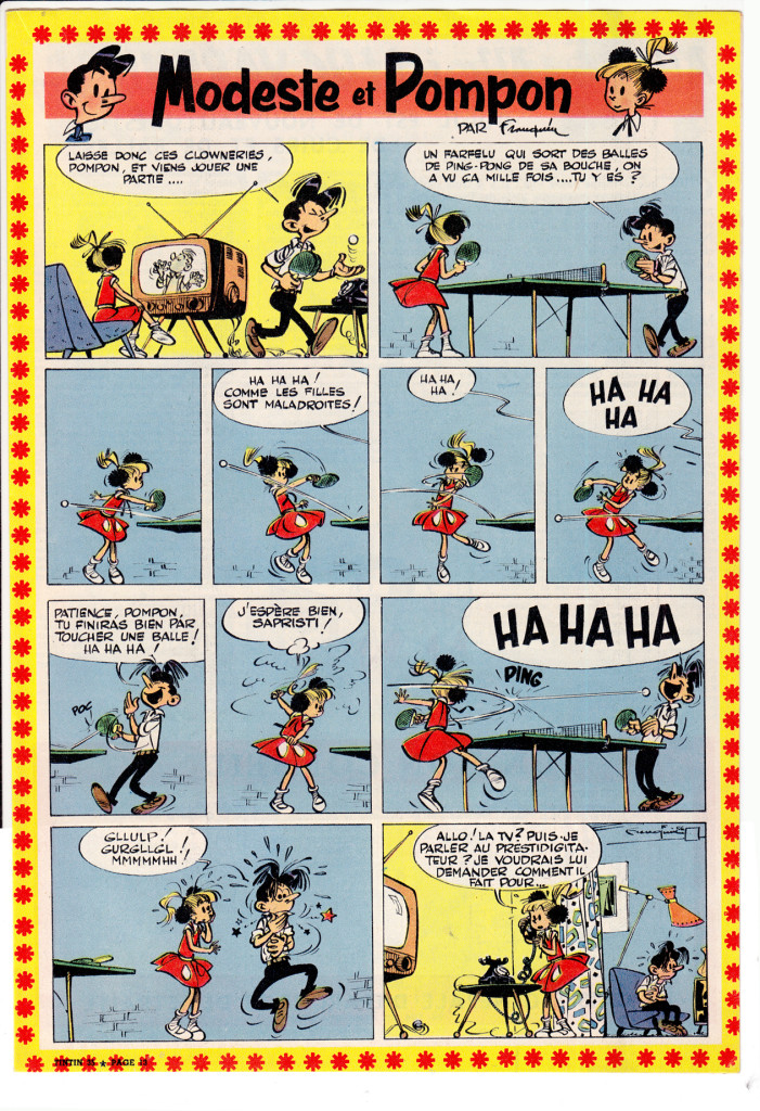
While there’s much in common between L’Ecoles Bruxelles and Marcinelle (particularly on the level of composition and layout), in Franquin’s work the differences become apparent. Instead of the cool clarity of the ligne claire style, we have here a more energetic approach to line and shading, a rounded cartooning style that owes more to the Disney model, but also a more nervous, even violent “graphism” as the French call it (a great word that means more than simply “graphic style,” I think, implying greater depths of content and meaning in the way an artist composes and draws).
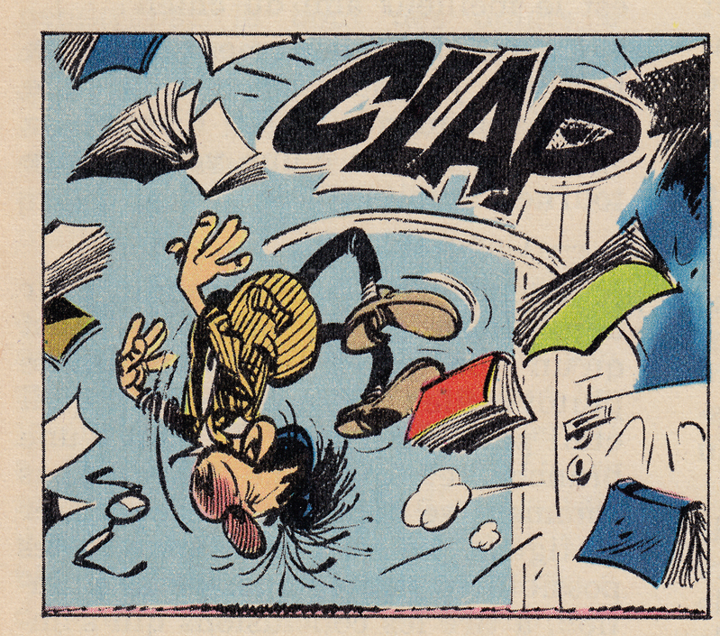
The style bespeaks an undercurrent of anxiety and chaos, as oppose to the comforting stability of the ligne claire, and this is seen also in Franquin’s approach to character.  In the late 50s he created Gaston Lagaffe, a bumbling, lazy office worker, in the words of Matthew Screech, “the first morally ambiguous bande dessinée hero.” (from Screech’s, “Masters of the Ninth Art,” which has the best writing on Franquin in English that I’ve come across, along with great chapters on Hergé, Moebius, Tardi, Goscinny & Uderzo and other topics.)
Maurice Tillieux
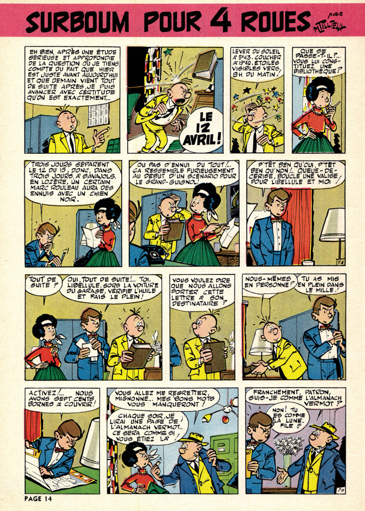
 In his private-eye series Gil Jourdan, Tillieux combined the elegance of the ligne claire with the expressive elasticity of L’ecole de Marcinelle, moving easily from comedy to action and drama, with a great sense of atmosphere.  You can see the influence of Tillieux’s  suave but comical style  on Yves Chaland,  one of the best artists in the revival of the Tintin / Spirou styles in the 198os (more on that in later posts).
The Atom Style
In my opinion, while the Journal de Tintin / ligne claire style reached its peak in the early-mid ’50s., the archetypal Spirou look emerged slightly later, as the cartoonists working in the Charleroi/Marcinelle style fully embraced the aesthetic of 1950s-early 60s Atom-age design.  Joost Swart (another key artist in the 1980s stylistic revival, who also coined the term ligne claire),  later referred to the Spirou sensibility as the “Atom Style,” with reference to this cartoony modernism.
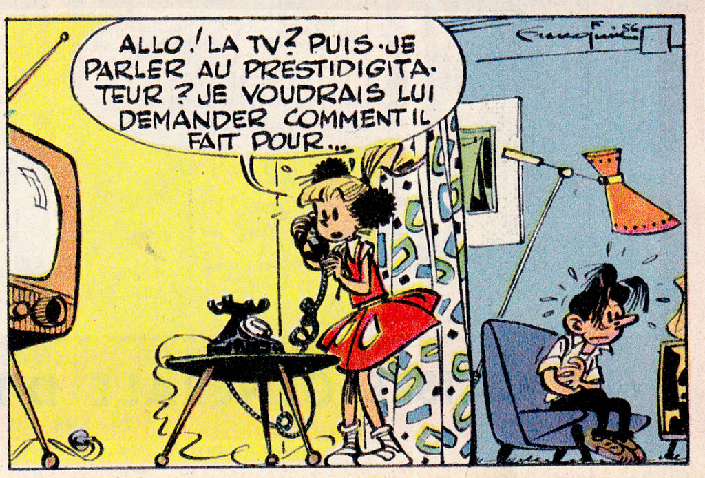
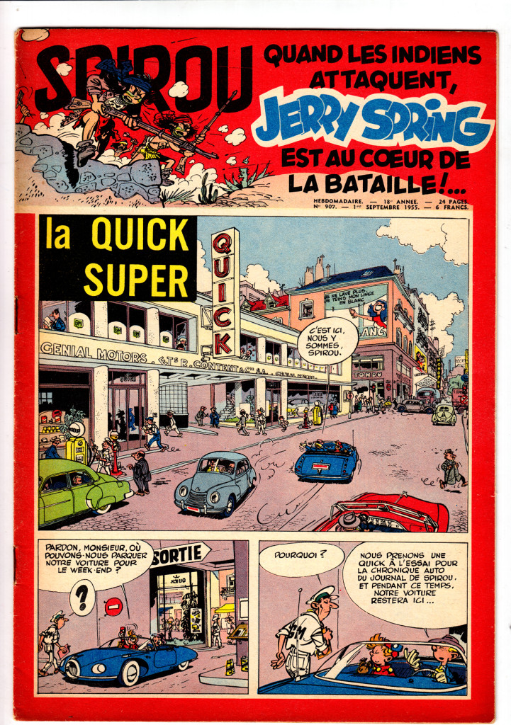
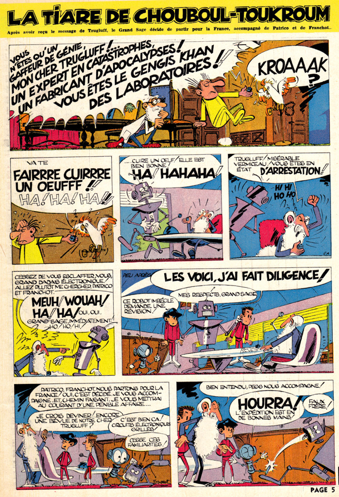
Even a middle-ages-set gag strip can have that “Atom style” look:

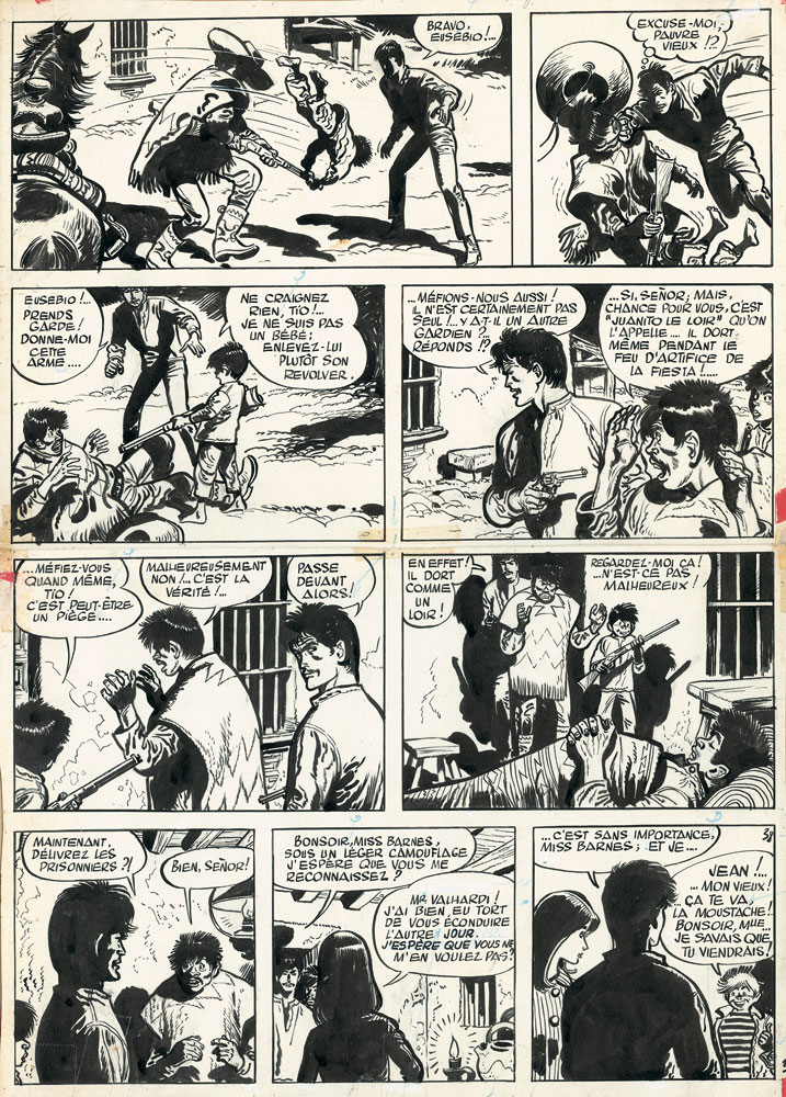
Not all the content of Spirou was comical. Â There was also a large component of muscular action comics, the best featuring the heavy-lined exaggerated styles of Eddie Pappe and Jiji. Two examples, 20 years apart, of the two artists work on the long-running strip Jean Valhardi: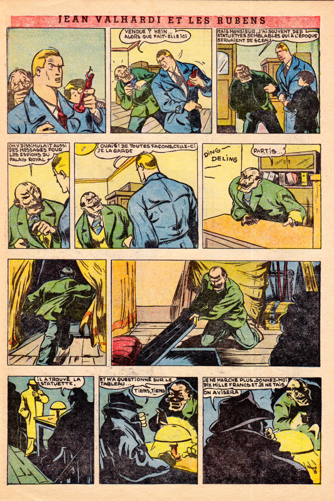
- Eddie Paape – Jean Valhardi – Spirou 436, 1946
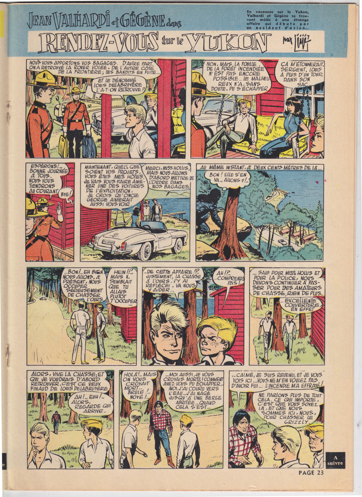
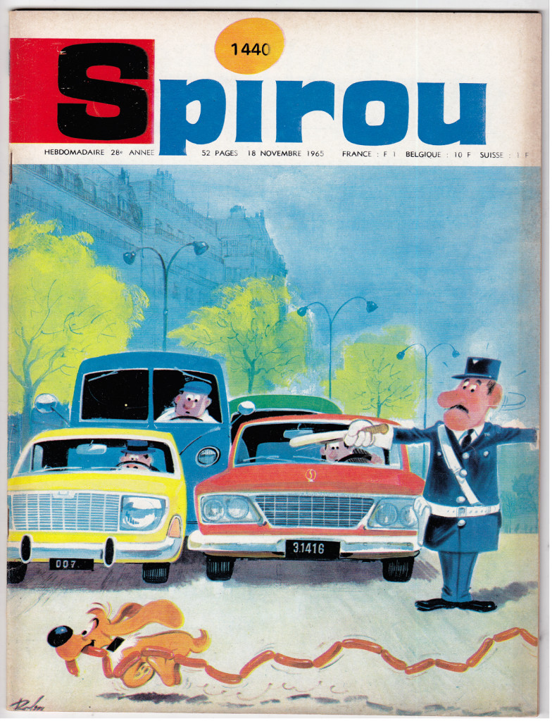
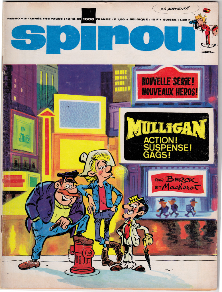
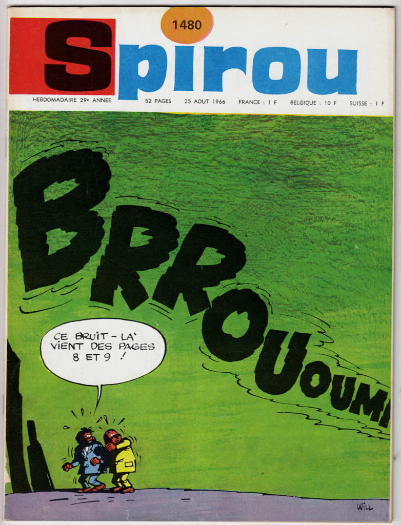
As for covers, since the Spirou approach was generally to run a comic page on the cover, they weren’t as dazzling as in Le Journal de Tintin. Â By the late 60s, though, Spirou shifted to a more conventional approach to cover, with some wonderful results:
